Impulse #7 Etoy: Interaction as Cultural Action

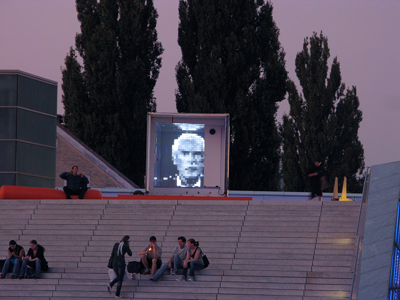
While researching digital activism and intervention for my master’s thesis in Interaction Design, I came across the work of etoy, an international art collective founded in the mid-1990s. Although their work predates many of today’s debates around digital activism, platform power, and interface control, it feels surprisingly relevant to current discussions in interaction design.

etoy became widely known during the so-called Toywar in the late 1990s, a legal and cultural conflict between the art collective and the toy company Toys “R” Us over the domain name etoy.com. What makes this event important is not only the legal outcome, but the way etoy treated the internet as a contested cultural space rather than a neutral technical infrastructure. Their actions were not about usability, efficiency, or communication, but about intervention, appropriation, and visibility.

From an interaction design perspective, etoy’s work challenges the idea that digital systems are primarily tools to be optimized. Instead, they used corporate language, branding, and online infrastructures as material for cultural action. By adopting the structure of a corporation and exaggerating it to an absurd degree, etoy exposed how power, ownership, and control operate in digital environments. Interaction here was not about completing tasks, but about participating in a situation.

This approach strongly connects to the core ideas of my future master’s thesis. My project investigates digital activism not as content production, such as posting messages or sharing information, but as action through visual intervention. Similar to etoy’s practice, the focus is not on what is said, but on what is done. In both cases, meaning emerges through interaction rather than explanation.

Another important aspect of etoy’s work is its ritualistic character. Projects such as Mission Eternity treated digital space as a place for symbolic action and repeated participation. These projects were not efficient, clear, or goal-oriented. Instead, they created moments of reflection and engagement that resisted traditional design logic. This idea directly informs my own approach, which aims to design an artefact where users intervene visually without guidance, ranking, or optimization.
etoy’s work also highlights a key issue in contemporary interface design: the illusion of neutrality. Many digital interfaces present themselves as neutral and objective, while silently enforcing certain behaviors and values. By intervening in these systems, etoy made these hidden structures visible. This resonates with my thesis, which treats interface intervention as a way to expose control, authorship, and power relations embedded in design.

In this sense, etoy can be understood as an early example of interaction as cultural practice. Their projects demonstrate that digital systems can be used not only to communicate or function, but also to resist, disrupt, and question. For my master’s thesis, etoy serves less as an aesthetic reference and more as a conceptual precedent. Their work supports the idea that interaction design can operate beyond usability and become a medium for activism, ritual, and cultural expression.
Impulse #6 Cultural Bias, Moral Choice, and the Role of Interfaces

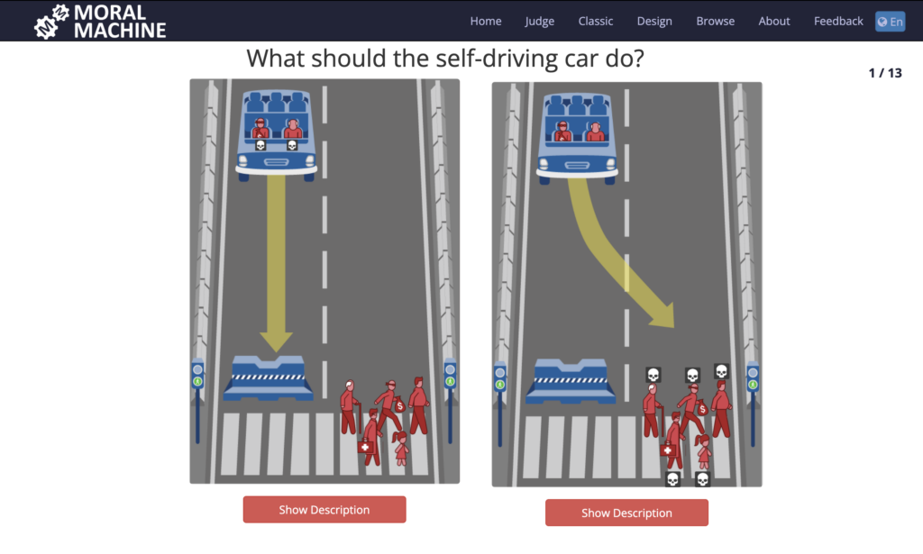
One project that strongly influenced my thinking during my master’s thesis is Moral Machine, an online experiment developed by researchers at the MIT Media Lab. The Moral Machine explores how people from different cultural backgrounds make ethical decisions when faced with unavoidable harm, using the example of self-driving cars. Users are asked to choose between different fatal outcomes, such as whether a car should save passengers or pedestrians, children or elderly people, humans or animals.

What makes the Moral Machine particularly interesting from an interaction design perspective is not only its topic, but the way it maps moral decisions to cultural patterns. By collecting millions of decisions worldwide, the project revealed that moral judgments are not universal. Instead, they are deeply influenced by cultural, social, and regional contexts. For example, some cultures tend to value the protection of the young more strongly, while others prioritize law-abiding behavior or social roles.

This approach highlights an important issue in interaction design: interfaces are never neutral. Even when they appear objective or technical, they embed values, assumptions, and worldviews. In the case of the Moral Machine, the interface becomes a space where users actively project their cultural norms and moral beliefs onto a system. The design does not tell users what is right or wrong; it forces them to act and take responsibility for a choice.

This idea strongly connects to my master’s thesis, which explores digital activism as a form of action rather than communication. While the Moral Machine focuses on ethical decision-making, my project investigates visual intervention and digital appropriation as cultural practices. However, both approaches share a key concern: how interaction reveals underlying values and power structures.

In my thesis project, users intervene visually in interface representations without explanation, ranking, or optimization. Similar to the Moral Machine, the focus is not on reaching a “correct” outcome, but on exposing differences in behavior, emotion, and intention. Where the Moral Machine maps moral choices across cultures, my project highlights how people express critique, resistance, or frustration through visual interference. In both cases, the system acts as a framework that makes invisible attitudes visible.

Another important parallel lies in the rejection of efficiency as the main goal. The Moral Machine does not optimize for usability comfort; instead, it creates discomfort by forcing users to confront difficult decisions. Likewise, my project deliberately avoids smooth interaction and clear guidance. This friction is intentional. It opens space for reflection and turns interaction into a cultural act rather than a task.

Ultimately, the Moral Machine demonstrates how interaction design can function as a research tool for understanding society. It shows that digital systems can capture complexity, conflict, and difference without simplifying them into single solutions. This perspective strongly supports my thesis: that interaction design has the potential to go beyond usability and become a medium for cultural expression, ethical questioning, and activist practice.

#8 IMPULS: Inhalt “Beklaute Frauen”

Für meinen letzten Blogpost möchte ich nochmal einen Schritt zurückgehen und über das Buch sprechen, das eigentlich der Auslöser für das ganze Projekt war: Beklaute Frauen von Leonie Schöler. Nicht als wissenschaftliche Rezension, sondern eher als persönlicher Blick darauf, warum mich dieses Buch so beschäftigt – und auch wohin das inhaltlich führen könnte in der Ausstellung.

Was mich beim Lesen sofort gepackt hat: Das Buch liest sich nicht wie ein trockenes Geschichtsbuch, sondern eher wie eine Sammlung von Stories, die man eigentlich hätte kennen müssen. Frauen, die geforscht, erfunden, geschrieben, gerechnet oder gestaltet haben – und deren Leistungen entweder komplett vergessen wurden oder später ganz selbstverständlich Männern zugeschrieben wurden. Nicht, weil irgendwer „aus Versehen“ ihren Namen vergessen hat, sondern weil das System so funktioniert hat (und teilweise noch immer funktioniert).

Was mir beim Lesen relativ schnell klar geworden ist: Beklaute Frauen ist kein Buch über „einzelne vergessene Genies“, sondern vor allem ein Buch über Strukturen. Es geht weniger darum, möglichst viele individuelle Heldinnengeschichten nachzuerzählen, sondern darum zu zeigen, wie systematisch Geschichte gemacht, verzerrt und weitergegeben wird. Die Kapitel sind thematisch aufgebaut und drehen sich um gesellschaftliche Bewegungen, Machtverhältnisse und Mechanismen – zum Beispiel darum, wer als Bürger:in gilt, wie Ehe als ökonomisches Abhängigkeitsverhältnis funktioniert, warum künstlerische oder wissenschaftliche Arbeit von Frauen strukturell unsichtbar gemacht wird oder wie Erinnerungskultur ganz konkret Politik ist. Einzelne Biografien tauchen immer wieder auf, aber eher als Beispiele innerhalb eines größeren Systems, nicht als Hauptfiguren im klassischen Sinn. Genau diese Mischung finde ich extrem stark: Persönliche Geschichten machen die Strukturen greifbar, aber der Fokus bleibt darauf, dass es nicht um „Ausnahmen“ geht, sondern um wiederkehrende Muster.

Hier sehe ich auch die Verbindung zu meiner Ausstellungsidee. Das Buch könnte man in einer modularen Übersetzung aufarbeiten: einzelne, fokussierte Momente die in Summe das System wiedergeben.

Wenn ich an 4–8 Poster denke, könnte jedes davon ein eigenes Kapitel oder Motiv aufgreifen, vielleicht direkt aufs Buch referenziert, oder auch mit Beispielen außerhalb dieser Literatur – nicht als Nacherzählung, sondern als visuelle Interpretation. Hier ein paar erste Ideen:

– Ein Poster könnte sich mit dem Thema Zuschreibung beschäftigen: Ein Porträt, das sich immer wieder verändert, Namen verliert, überschrieben wird. Vielleicht taucht der Name der Frau nur kurz auf, wird wieder verdrängt, fragmentiert, überlagert.

– Ein anderes könnte sich mit dem Matilda-Effekt beschäftigen: Mehrere Ebenen von Text oder Bild, die übereinander liegen, wobei die „offizielle“ Geschichte zuerst sichtbar ist – und die eigentliche Urheberin erst durch Interaktion freigelegt werden kann.

– Ein Kapitel über frühe Programmiererinnen oder Rechnerinnen ließe sich super über Zahlen, Raster, Algorithmen übersetzen: Ein scheinbar neutrales System, das aber gezielt Informationen ausblendet oder überschreibt.

– Auch spannend finde ich die Idee, Berufsbilder zu visualisieren, die historisch weiblich waren und später männlich „geworden“ sind. Das könnte ein Poster sein, das langsam seine visuelle Sprache wechselt: Farben, Typo, Bildwelt kippen, ohne dass sich der Inhalt ändert.

Ein weiterer Punkt, den ich stark finde, ist, dass viele Geschichten im Buch keinen klaren Abschluss haben. Die Frauen werden nicht plötzlich rehabilitiert. Oft bleibt ein Gefühl von Frust, Ungerechtigkeit oder Leerstelle. Auch das will ich nicht glattbügeln. Interaktion heißt für mich hier nicht „Problem lösen“, sondern sich mit der Störung auseinandersetzen. Vielleicht lässt sich manches Poster nie ganz „freiräumen“. Vielleicht bleibt immer ein Rest Rauschen, ein Fleck, ein fehlender Teil. Solange es bewusst wirkt, kann man die Betrachter auch nicht mit einem positiven Gefühl rausgehen lassen.

Für mich könnte Beklaute Frauen deshalb auch weniger ein konkretes inhaltliches Regelwerk als ein Denkanstoß. Das Buch gibt mir Themen und Muster, aber die Übersetzung mit noch mehr Literatur gespickt, in Bilder, Bewegung und Interaktion ist meine eigene Arbeit. Das Buch ist vielleicht eher der Startpunkt, aber nicht das Endprodukt.

IMPULSE #6 – Board Games

This impulse was not based on a single event, but on several moments over the past months. I played a lot of board games with friends, and some of them stood out more than others. Not because they were the most complex or competitive, but because I genuinely enjoyed the worlds and stories behind them.

While playing, I started to notice that many board games create narrative experiences in subtle ways. Even without explicit storylines, they invite players into specific settings, roles, and situations. This made me realize that board games can be understood as interactive storytelling formats, which connects surprisingly well to my thesis topic on narrative UX and interactive storytelling.

The following games are the ones I played most recently and enjoyed the most.

Catan

In Catan, players arrive on an island and gradually build settlements, cities, and trade routes. There is no written story, yet the game creates a clear sense of exploration and development. Each round feels like a small chapter in the process of colonizing and shaping a new world. What I liked most about Catan is that the story is not told directly, but emerges through interaction. Every decision (where to build, whom to trade with, how to expand) contributes to a unique narrative. This is similar to Narrative UX, where users do not just receive a story but actively shape it through their actions.

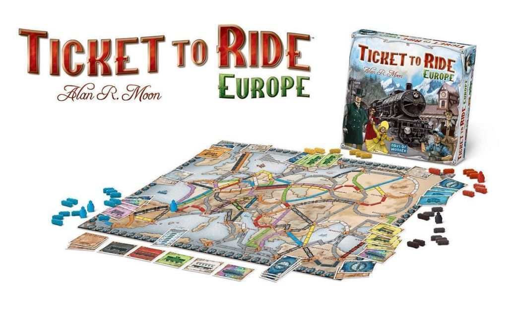
Ticket to Ride: Europe

This game creates a narrative through movement and geography. By building train routes across European cities, players experience a journey rather than a static game board. The visual design of the map, the cities, and the routes makes it easy to imagine travel, connection, and progress. I enjoyed how the game subtly encourages storytelling through its structure. The routes feel like personal travel stories, even though they are based on strategic choices. This connects to interactive web storytelling, where navigation and structure influence how users experience a narrative.

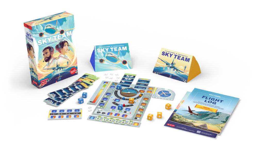
Sky Team

Sky Team is a cooperative game in which two players work together as pilots to land an airplane. Compared to the other games, the narrative here is more direct and intense. Every move feels meaningful because it affects the outcome of the landing. What fascinated me was how the story emerges from tension and collaboration rather than from text or visuals alone. The game shows how constraints and roles can create strong narrative experiences. This is similar to interactive design, where users often experience stories through tasks, challenges, and decisions rather than through traditional storytelling formats.

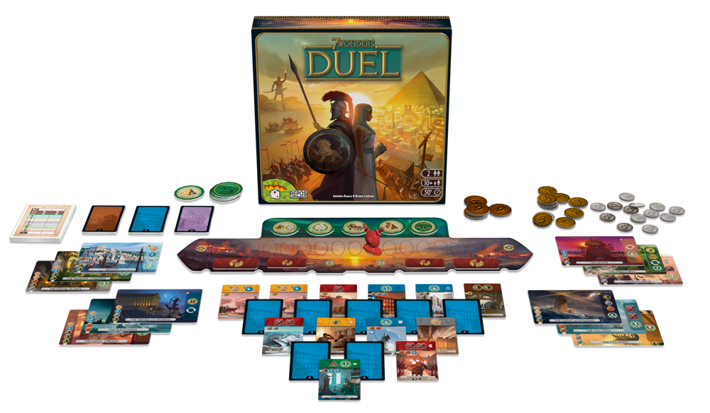
7 Wonders Duel (with Pantheon Expansion)

In 7 Wonders Duel, players build civilizations, construct wonders, and compete across different historical and cultural dimensions. With the Pantheon expansion, mythological elements add another layer of meaning and atmosphere. I liked how the game creates a sense of historical progression and symbolic depth without explicitly telling a story. Over time, each player’s civilization develops its own narrative through strategic choices. This reflects how interactive narratives often unfold gradually, shaped by user decisions rather than predefined plots.

Why This Was an Impulse for My Research

Playing these board games made me realize that storytelling does not always need words, scripts, or linear narratives. Instead, it can emerge from systems, rules, and interactions. The stories I experienced were not written beforehand; they were created through play.

For my thesis, this impulse is important because it shows that Narrative UX can exist beyond digital media. Board games function as analog examples of interactive storytelling, where users co-create meaning through interaction. This perspective helps me think differently about how stories can be designed in web experiences, not as fixed narratives, but as frameworks that invite participation. In this sense, board games became more than just entertainment. They offered insights into how interaction can generate storytelling, which directly relates to my research.

Stuff Worth Clicking A.K.A. Accompanying Links

Disclaimer: This blog post was written with the help of AI for better grammar and correct spelling.

LS3 #4 Reimformen mit oder ohne Normen?

Da ich ja gerade bei den Grundlagen der Reime bin, gibts jetzt hier einmal eine Darstellung verschiedener Differenzierungen, da gibt es nämlich einige.

Reime nach ihrer Position im Vers

Diese Gruppe beschreibt, wo im Vers die Übereinstimmung stattfindet.

  • Endreim: Der Klassiker am Ende des Verses.
  • Binnenreim: Zwei oder mehr Wörter reimen sich innerhalb eines einzelnen Verses.
  • Anfangsreim: Die ersten Wörter aufeinanderfolgender Verse reimen sich.
  • Stabreim (Alliteration): Gleichheit der Anlaute (z. B. „bei Wind und Wetter“). Historisch die wichtigste Form in der germanischen Dichtung (Edda).
  • Pausenreim: Das letzte Wort eines Verses reimt sich auf das erste Wort des folgenden Verses.

Reime nach ihrer Klangqualität/ phonologische Struktur

Diese Kategorie beschriebt wie „perfekt“ der Reim für die Ohren klingt.

  • Reiner Reim: Die Lautfolge ab dem letzten betonten Vokal ist identisch (z. B. Herz / Schmerz).
  • Unreiner Reim: Der Klang ist ähnlich, aber nicht identisch, oft durch Umlaute oder leicht variierende Vokale (z. B. Liebe / Trübe).
  • Erweiterter Reim: Hier ist nicht nur die Endsilbe gleich, sondern auch der Konsonant direkt vor dem betonten Vokal stimmt überein (z. B. Grauen / grauen).
  • Reicher Reim: Dieser Begriff wird oft verwendet, wenn sich zwei oder mehr ganze Silben reimen (z. B. Wanderer / Anderer). Je mehr Silben identisch sind, desto „reicher“ wirkt der Klang.

Reime nach Betonung und Rhythmus/ Silbenzahl/ Reimgeschlecht

Diese Kategorie ist entscheidend für den Rhythmus und das Tempo des Gedichts.

  • Männlich (stumpf): Der Reim endet auf einer betonten Silbe (z. B. Flut / Gut).
  • Weiblich (klingend): Eine betonte Silbe folgt auf eine unbetonte (z. B. singen / klingen).
  • Gleitend (reich): Eine betonte Silbe folgt auf zwei unbetonte (z. B. singende / klingende).

Reime nach morphologisch-lexikalischen Besonderheiten

In dieser Kategorie finden sich spielerische Reime und oft technisch Anspruchsvolles

  • Gespaltener Reim: Ein Wort reimt sich auf eine Kombination aus mehreren Wörtern (z. B. „gingen“ auf „in Gen“).
  • Gebrochener Reim: Ein Wort wird am Versende getrennt, um den Reim zu erzwingen (oft humoristisch).
  • Augenreim: Die Wörter sehen geschrieben gleich aus, klingen aber anders (z. B. frz. „mont“ und „pont“, im Deutschen seltener).
  • Grammatischer Reim: Wörter reimen sich aufgrund identischer Flexionsendungen (z. B. lachte / dachte).
  • Vexierreim: Ein erwartetes Reimwort wird durch ein anderes ersetzt, das den Sinn überraschend verändert.

Reimfolgen

Das sind die Muster, nach denen die Endreime über mehrere Verse hinweg angeordnet sind.

FormSchemaKurzerklärung
Paarreimaa bbEinfach und direkt, oft in Volksliedern.
KreuzreimababKlassisch, wechselhaft und harmonisch.
Umarmender ReimabbaErzeugt eine geschlossene Einheit.
HaufenreimaaaaAlle Verse einer Strophe reimen sich auf denselben Laut.
SchweifreimaabccbEine Kombination aus Paarreim und einem “Schweif”.
Verschränkter ReimabcabcDie Reime greifen über drei Verse hinweg ineinander.
Kettenreimaba bcbBekannt durch Dantes Göttliche Komödie (Terzine).
LimerickaabbaEine feste fünfzeilige Form, meist humorvoll.

Literaturverzeichnis

Benedikt Jeßing, & Köhnen, R. (2017). Einführung in die Neuere deutsche Literaturwissenschaft. In J.B. Metzler eBooks. J.B. Metzler. https://doi.org/10.1007/978-3-476-04494-5

Google. (2024). Gemini (Version 1.5 Flash) [Großes Sprachmodell]. https://gemini.google.com/
J Metzler’sche Verlagsbuchhandlung, & Poeschel, C. (2007). Metzler Lexikon Literatur. In J.B. Metzler eBooks. J.B. Metzler. https://doi.org/10.1007/978-3-476-05000-7

#7 Visual Structure and Movement in Kandinsky’s Work

The ideas behind abstract movement or abstract shapes started long before screens or motion graphics. Kandinsky is one of the clearest examples of this. His work demonstrates that movement can be suggested through compositional reletionships rather than animated changes. In descriptions of Kandinsky’s early abstract works, particularly in the Guggenheim catalogue, paintings are often characterized using terms such as drifting, rising, or colliding (Kandinsky, 2015). Although the images are static, they create a strong sense of direction and energy. This effect results from the placement and interaction of forms. Diagonal lines introduce tension, overlapping shapes suggest depth, and variations in scale guide the viewer’s gaze across the canvas. Motion is not depicted directly but implied through visual structure. That feeling of energy comes from how the eye is guided across the image, not from any actual animation as it is a static picture. It’s interesting how a diagonal line or a cluster of circles can suggest direction or tension just by being placed in a certain way. 

A central idea in Kandinsky’s theory is “inner necessity.” This means that shapes have their own expressive quality, even without representing anything specific. Meaning does not come from what a shape shows, but from how it works inside a composition. A point, line, or shape can feel calm, tense, or dominant depending on its position, direction, and relation to other elements. This shifts the focus away from symbolism and towards how shapes behave visually. (Liu, 2024). 

Composition 8.July 1923 – Oil on canvas – Collection The Solomon R. Gug

As his work developed, Kandinsky reduced objects more and more until they were just pure shapes. The catalogue explains how he let forms stand on their own and turned them into structural elements that hold the painting together . Black lines become anchors. Circles feel like pulses of energy. Small points act like sparks. Nothing needs to be “about” anything to create a strong reaction. The visual meaning appears through how things relate, not what they represent. For motion design, this idea feels incredibly familiar. A movement doesn’t need a story to make sense. Timing, contrast and rhythm are already enough to guide the viewer through a piece. Over time Kandinsky reduceses his objects more and more until only basic shapes remain. These shapes then no longer represent real objects but function as structural elements. Hereby the lines for example help organize the image. Circles often act as visual centers. Small shapes activate the surrounding space. The overall meaning of the painting emerges through balance, contrast, and rhythm rather than through representation.

In animation, movement alone does not automatically create meaning. How something moves is influenced by timing, spacing, repetition, and contrast. Kandinsky’s work shows that movement becomes stronger when the composition already contains tension. Animation can then extend or intensify this tension instead of trying to create it from nothing. Kandinsky often described his paintings using musical terms such as Composition and Improvisation. This reflects his interest in rhythm and structure. Repeating shapes create a visual rhythm, while small changes disturb or shift it. A similar principle exists in motion design, where loops, pauses, and changes in timing influence how movement is perceived. 

Kandinsky’s approach offers a useful way to understand abstract animation without using stories or figurative images. It focuses on structure, relationships, and rhythm as the main sources of meaning. From this view, motion is not the starting point, but a continuation of a composition that is already dynamic. Overall, Kandinsky’s work shows that abstraction is not about having less meaning, but about focusing on essential visual relationships. His paintings show that strong visual tension can exist without movement, and that animation works best when it builds on this existing tension.

Bibliography: 

Kandinsky, W. (2015). Kandinsky. Parkstone International.

Liu, G. (2024). Kandinsky: Pioneer of Abstract Art and Philosopher of Color. Proceedings of the 2024 8th International Seminar on Education, Management and Social Sciences (ISEMSS 2024), Advances in Social Science, Education and Humanities Research, 867. https://doi.org/10.2991/978-2-38476-297-2_56

LS Impulse #6 Musichouse Cypher

On every first Wednesday of the month, the MusicHouse in Graz hosts an open cypher night a very simple powerful and so cool format: there is a microphone, a beat, and whoever feels like it can step up and rap. No tickets or hierarchy, and def no pressure to be professional. You can have years of experience or be on stage for the first time. You just take the mic and start.

I have attended several of these evenings by now, and every time I leave feeling unusually inspired and energized. The atmosphere is raw and spontaneous. Sometimes people perform full verses or prepared tracks, sometimes it turns into playful battles, sometimes it’s just four lines that exist only in that moment and then disappear again. There are always a few experienced regulars who carry the rhythm of the night, but there are also new people each time trying out their voice in public for the first time.

What fascinates me most is how much creativity emerges purely from impulse. There is no overthinking, no polishing, no design process in the classical sense. It’s immediate expression. People react to each other’s lines, pick up words, echo sounds, or build on themes that were mentioned minutes earlier. Language becomes something fluid and collective. It feels less like individual performance and more like a shared system of call and response.
Because these spaces are often still male-dominated, I also joined a Flinta* workshop connected to the cypher. The idea was to create a safer and more supportive environment to experiment with rap and freestyle. During the workshop, we focused on rhyme schemes, multisyllabic rhymes, and even just “sound rhyming” without meaning at first playing with phonetics rather than semantics. We tried to stack syllables, repeat patterns, and gradually move from abstract sounds to actual words. In the end, we also practiced freestyling on the microphone, which felt vulnerable but surprisingly freeing.

This experience made me realize how much rap is about rhythm, structure, and pattern recognition. Even when the content is improvised, there is an underlying framework that holds everything together. Rhyme becomes both a safety net and a playground: it guides you, but it also pushes you to invent new connections.

What does this have to do with communication design?

Although this event seems purely musical at first, I kept thinking about it in terms of design. A cypher is basically a designed communication space. It sets a few simple rules like having a circle, a beat and an open mic and within that framework, people create meaning together. It’s participatory, low-threshold, and highly interactive. In a way, it functions similarly to workshops or co-creation formats in design practice.

More importantly, the way rhymes work in rap feels very close to visual systems. Rhymes create repetition, expectation, and recognition. When a pattern repeats or slightly changes, it produces satisfaction or surprise. These are the same principles we use in layout, typography, or image sequences. It made me wonder if rhyme is not only an auditory phenomenon but a structural one that could also exist visually.

Relevance for my Master’s thesis

Since I am now focusing on the idea of rhyme in visual design for my masters topic, the cypher feels directly connected to it. Experimenting with multisyllabic and mosaic rhymes in the workshop helped me understand rhyme as something physical and rhythmic rather than purely linguistic. It made me more sensitive to patterns, echoes, and variations.

For my research, this raises questions like:
How could “visual rhymes” function similarly to sound rhymes? Can repeating shapes, colours, or compositions create a comparable sense of flow and recognition? And could these rhythmic structures make visual communication especially in activist or participatory contexts more engaging or memorable?

The MusicHouse Cypher reminded me that creativity doesn’t always come from perfect planning. Sometimes it emerges from constraints, repetition, and improvisation. For me, this feels like an exciting methodology for design research as well: testing, reacting, iterating in real time.

In that sense, the cypher is not only a music event but also an experimental lab for language, structure, and collective expression and therefore an unexpected but very relevant impulse for my design practice.

Maybe one day i will also have the courage to go up there hehe

LS Impulse #5 Overlays Exhibition

Recently, on 22nd of January to exact hehe, we organized and presented our collective exhibition Overlays, a showcase of different Master projects from our program. Even though this exhibition was “our own” and not an external cultural event like a museum or talk, I still want to frame it as an impulse for my Design & Research process, because being part of the organizational team influenced me in a very different and practical way than simply visiting an exhibition would have.

I was part of the speaker group, which meant that we were responsible for coordinating the overall structure of the show and mediating between the different majors: communication, media, sound, and interaction. Our role was less about designing one specific piece and more about holding everything together. We had to make sure everyone contributed, everyone felt represented, and that the exhibition worked as one coherent experience rather than four separate fragments. At the same time, we had to communicate with the professors, manage expectations, deal with budgets, and make sure the whole thing would actually happen in a realistic timeframe. In other words: it slowly turned into project management.

What surprised me was how automatically I slipped into that role. Together with Fiona, I often found myself organizing meetings, following up on tasks, reminding people of deadlines, and making decisions just so things would move forward. It wasn’t something I had consciously chosen. In fact, I don’t necessarily see myself as a “manager type.” But because we wanted to avoid chaos and because we cared about the quality of the exhibition, it became necessary to step in.

At times, this was honestly frustrating. Especially within the communication design group, it was sometimes difficult to motivate people or create a shared sense of responsibility. I noticed how much invisible labor goes into coordination work and emotional labor, too. Encouraging people, negotiating, mediating conflicts, and constantly checking if everyone feels heard. I realized that managing creative people can be more exhausting than the creative work itself, particularly if you feel like you are chasing others instead of building momentum together.

At the same time, there were also very positive moments. Our speaker group was extremely motivated, and despite the stress, there was a strong sense of teamwork. And once the exhibition finally opened, everything came together surprisingly well. The projects were presented in a thoughtful and diverse way, the atmosphere felt supportive, and there was a real sense of community. I also held a speech during the opening, which I initially felt nervous about, but ended up really enjoying. Speaking in front of an audience about our collective work made me realize how much ownership I had developed over the whole process.

What does this have to do with communication design?

This experience made me understand communication design less as “making visuals” and more as facilitating relationships and structures. Organizing the exhibition was essentially a large-scale communication task: aligning different voices, translating between expectations, and designing a shared narrative for the public. In that sense, curating and coordinating became a form of design itself.

It also highlighted how exhibitions are not neutral containers. They are designed experiences that shape how projects are perceived. Decisions about placement, hierarchy, space, and storytelling directly influence meaning. Designing these frameworks felt just as important as designing individual artifacts.

Learning?

My biggest learning is that I seem to naturally take on roles that combine design with organization and mediation. Even if I didn’t plan to, I ended up acting as a connector between people, ideas, and structures. For my future practice, this could mean that I’m not only interested in creating visual outcomes but also in designing processes, systems, and collaborative formats.

Organizing the exhibition showed me that design can mean enabling others to speak. And maybe that is a direction I want to explore further: communication design not only as expression, but as facilitation and infrastructure.

Link

https://www.fh-joanneum.at/veranstaltung/ausstellung-overlays/

https://www.overlays.at

https://www.instagram.com/overlays.exhibition/

LS3 #3 Was macht ein Reim daheim?

Fangen wir mal mit den Grundlagen an.

Was ist überhaupt ein Reim, wie ist das Ganze entstanden und was für verschiedene Arten gibt es?

Definition & kurze Geschichte

Wir gehen damit mal kurz zurück in den Deutschunterricht, aber was sind Reime überhaupt? Laut dem Duden sind Reime “gleich klingende [End]silben verschiedener Wörter am Ausgang oder in der Mitte von zwei oder mehreren Versen, Zeilen” (Dudenredaktion, o. J.).

Der Begriff “Reim” kommt ursprünglich von dem französischem Substantiv rime ab und wurde dann im mittelhochdeutsch als rîm verwendet und steht für “Reihe” (Jakobi, 2016).

Die ersten tatsächlichen Reime, die man heutzutage zurückführen kann, befinden sich im Buch der Lieder, eine Gedichtsammlung aus China, welche etwa im 10. Jahrhundert v. Chr. geschrieben wurde (Bauer, 2009, S. 41–43.).

Im Deutschen gilt als erste heruntergeschriebene Schriftdichtung das Evangelienbuch Otfrids von Weißenburg. Es ist eine poetisch Erzählung über das Leben Jesu und aus den vier Evangelien kompiliert und er führt damit den Endreim in die deutsche Literatur ein (von Weissenburg, 2026).

Der Endreim wird dadurch bis zum 20. Jahrhundert als Norm in der Reimsprache und Poesie benutzt, bis die moderne Lyrik sich etwas davon abwendete und sich mehr auf den freien Vers bezog.

Nicht nur in Gedichten, Poesie und Lyrik sind Reime wichtig, sondern vor allem in der Musik der heutigen Zeit – Hip Hop und Rap.

 Der Start des Hip Hops wird durch eine Party in New York 1973 definiert, wo Kool DJ Herc das erste Mal nur den Beat eines Liedes nutzte und wiederholte (Moll, 2023). Hierbei geht es aber erstmal nur umd die Beats und nicht um das Sprachliche. Ein kleiner Deepdive in Reddit hilft bei der Reim Recherche; In den frühen 1980er-Jahren war Rap sprachlich noch vergleichsweise einfach strukturiert. Künstler wie Kool Moe Dee und die Treacherous Three experimentierten jedoch bereits 1980 mit schnelleren, fließenderen Vortragsweisen und begannen, interne Reime innerhalb einer Zeile zu nutzen. Dadurch löste sich der Rap zunehmend vom einfachen Endreim und entwickelte einen dichteren, kontinuierlicheren Sprachfluss („stream of consciousness“). Gleichzeitig verschob sich der Fokus bei Künstlern wie Melle Mel von reiner Klangstruktur hin zu inhaltlicher Bildhaftigkeit und narrativem Erzählen. Die Reimschemata blieben formal schlicht, gewannen jedoch durch soziale und politische Themen an Ausdruckskraft (Skechuz421, 2025).

In der Werbung sind Reime Gang und Gebe vor Allem, wenn es um Slogans geht. Der erste bekannte Werbeslogan wurde von der Marke “Beecham Pills” 1859 erstellt und lautete Beecham Pills: Worth a guinea a Box. Es ging hierbei um Abführmittel Pillen (Marinela Potor, 2022). Welches der erste gereimte Werbeslogan ist, konnte ich bisher nicht herausfinden, aber es ist klar, dass es seither undenkbar in der Werbung ist.

Diese Definition & Geschichte platzieren Reime eindeutig im Bereich der Sprache und Klang, daher finde ich es so interessant auch die visuelle Wirkung davon zu erforschen.

Wie lassen sich verschieden Reime differenzieren:

  • Reime nach ihrer Position im Vers
  • Reime nach ihrer Klangqualität/ phonologische Struktur
  • Reime nach Betonung und Rhythmus/ Silbenzahl
  • Reime nach Reimfolge und Struktur
  • Reime nach morphologisch-lexikalischen Besonderheiten

Aber dazu mehr im neuen Blogpost 🙂

Literaturverzeichnis

skechuz421. (2025). Hip-Hop-Geschichte der fortgeschrittenen Reime. Reddit.com. https://www.reddit.com/r/hiphop101/comments/1mr3sq2/hip_hop_advanced_rhyming_history/?tl=de. Online-Forum-Post.

Bauer, W. (2009). Wolfgang Bauer: Geschichte der chinesischen Philosophie. Konfuzianismus, Daoismus, Buddhismus – Perlentaucher. In Perlentaucher.de (p. S. 41–43.). C.H. Beck Verlag. https://www.perlentaucher.de/buch/wolfgang-bauer/geschichte-der-chinesischen-philosophie.html

Jakobi, S. (2016). KinderundJugendmedien.de – Reim. Kinderundjugendmedien.de. https://www.kinderundjugendmedien.de/index.php/begriffe-und-termini/lyrik/1816-reim

Marinela Potor. (2022, February 23). 10 unvergessliche Werbesprüche. BASIC Thinking. https://www.basicthinking.de/blog/2022/02/23/10-unvergessliche-werbesprueche/

McGlone, M. S., & Tofighbakhsh, J. (1999). The Keats heuristic: Rhyme as reason in aphorism interpretation. Poetics, 26(4), 235–244. https://doi.org/10.1016/s0304-422x(99)00003-0

Moll, S. (2023). Lebensgefühl, unantastbar . Taz.de. https://taz.de/Ausstellung-50-Jahre-HipHop-in-New-York/!5949715/

von Weissenburg, O. (2026). Otfried von Weißenburg, Evangelienbuch | bavarikon. Bavarikon.de. https://www.bavarikon.de/object/bav:BSB-CMS-0000000000004595

Wolff, L. (1930). Zur bedeutungsgeschichte des wortes reim. Zeitschrift Für Deutsches Altertum Und Deutsche Literatur, 67(4), 263–271. JSTOR. https://doi.org/10.2307/20653085

#7 IMPULS: 100 best posters

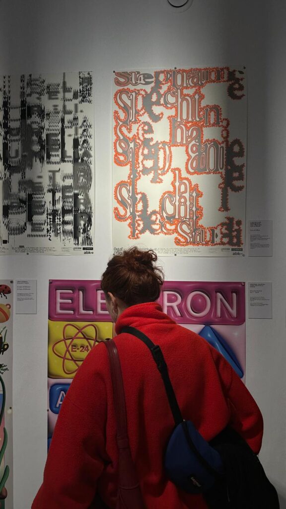
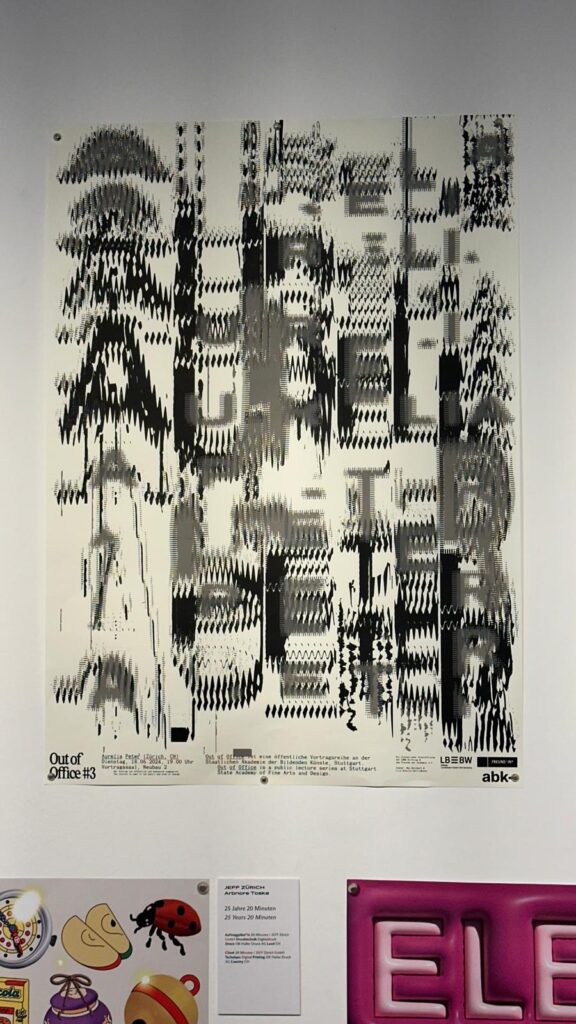
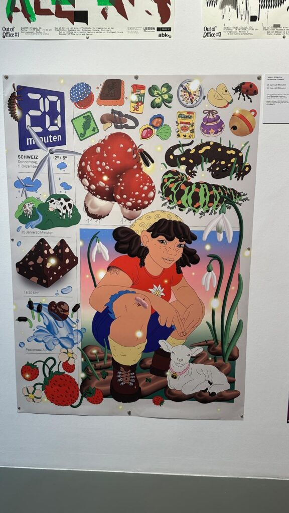
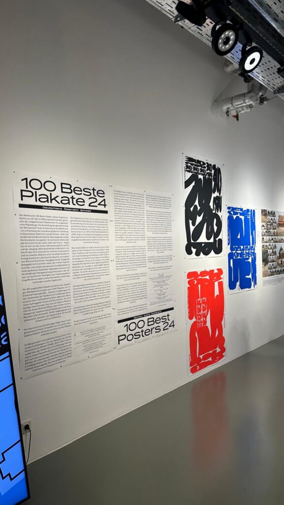
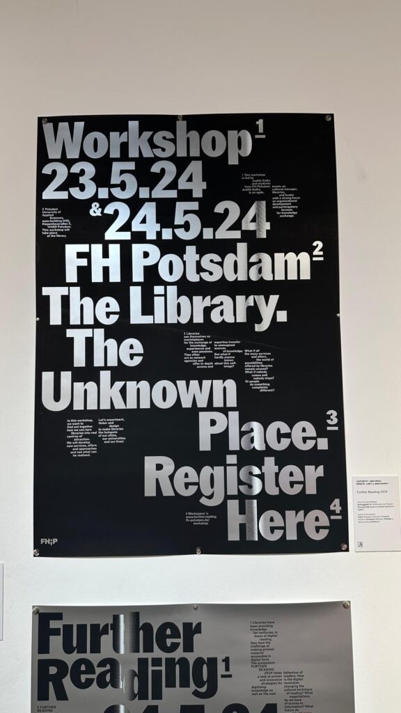
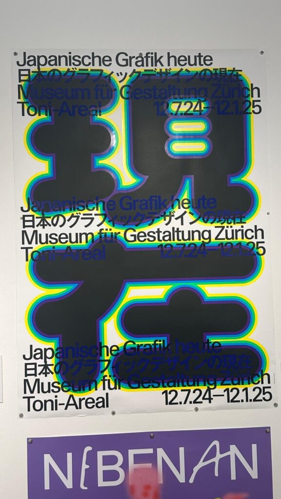
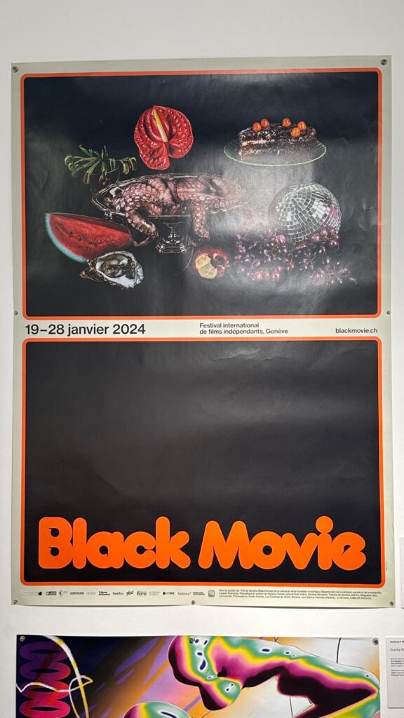
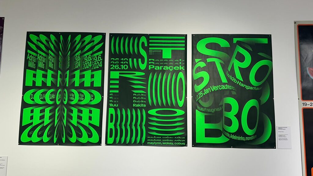
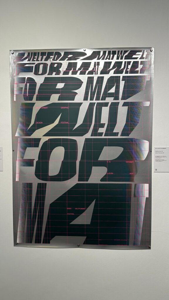
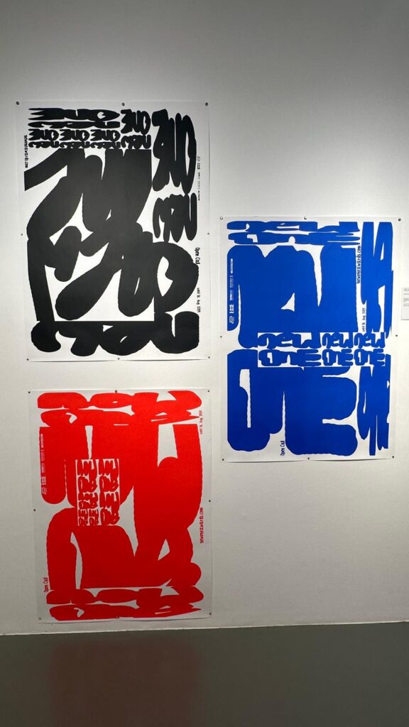
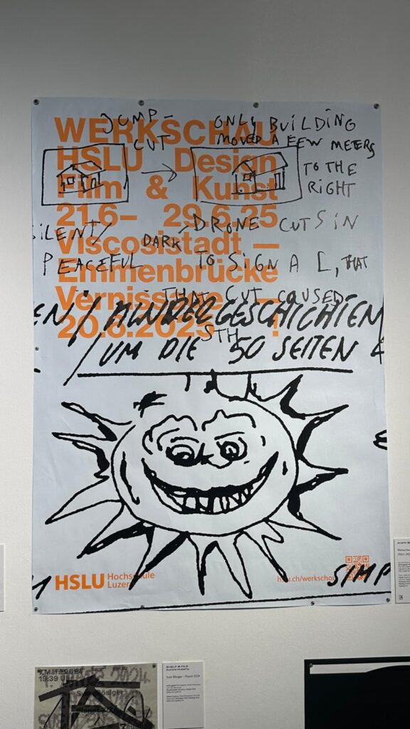
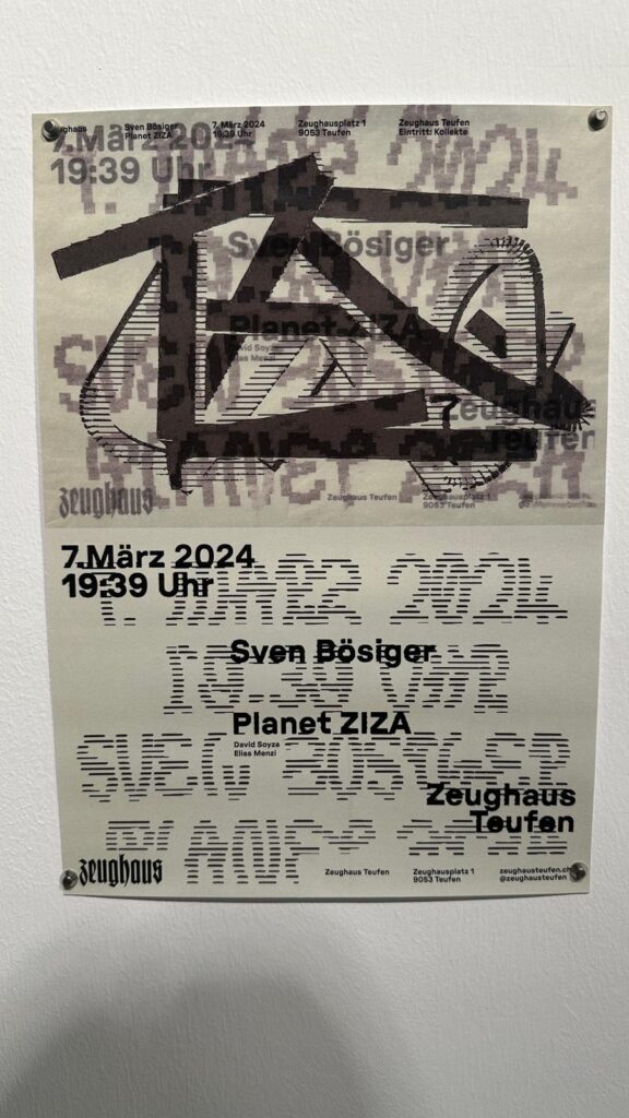
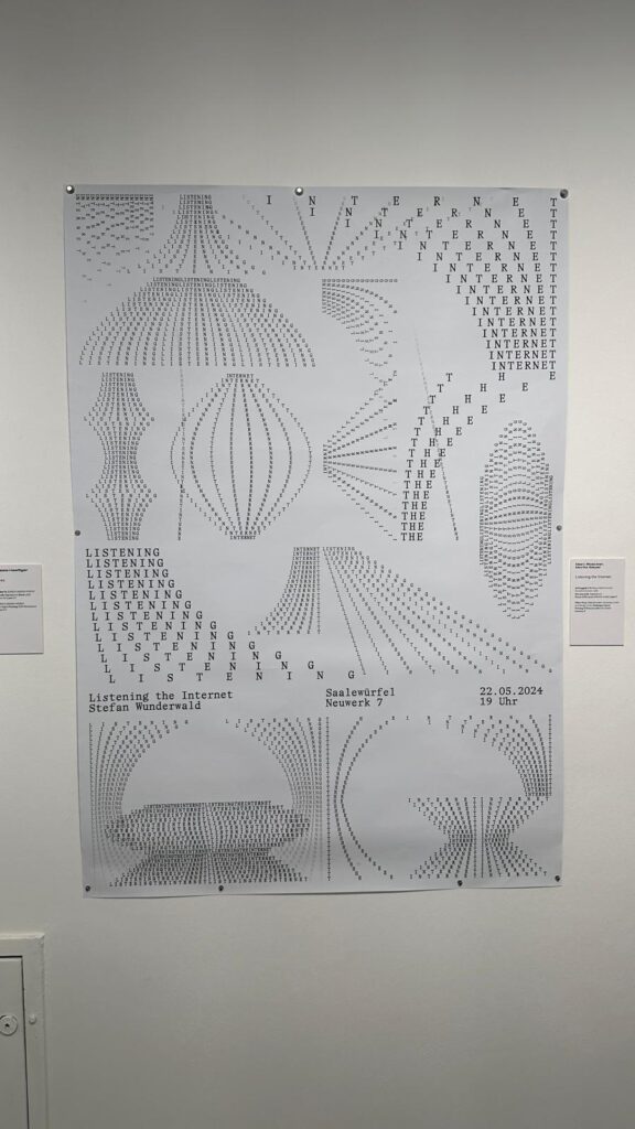
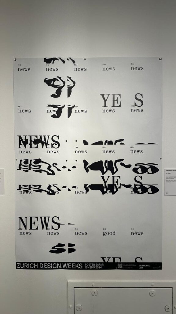
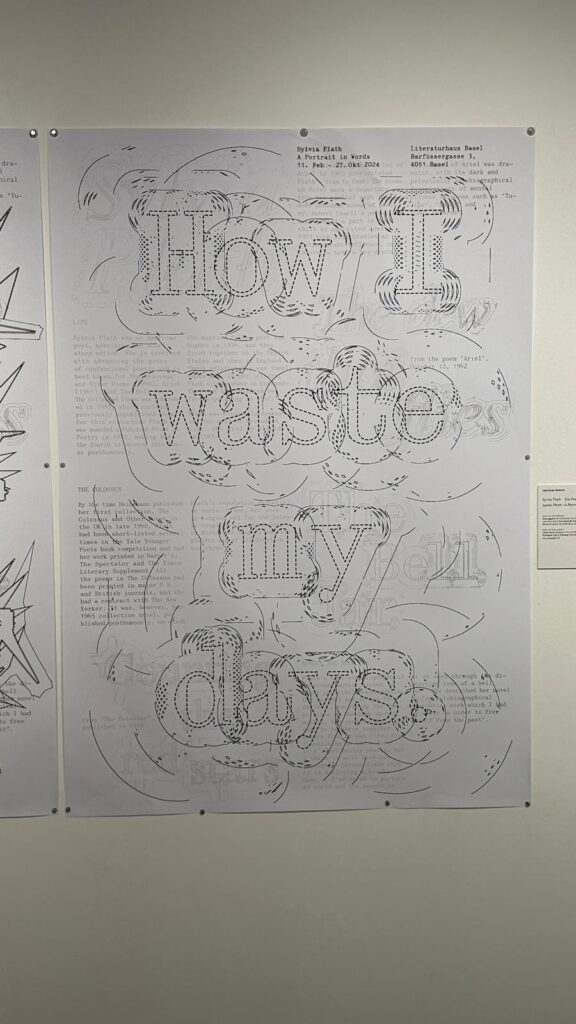
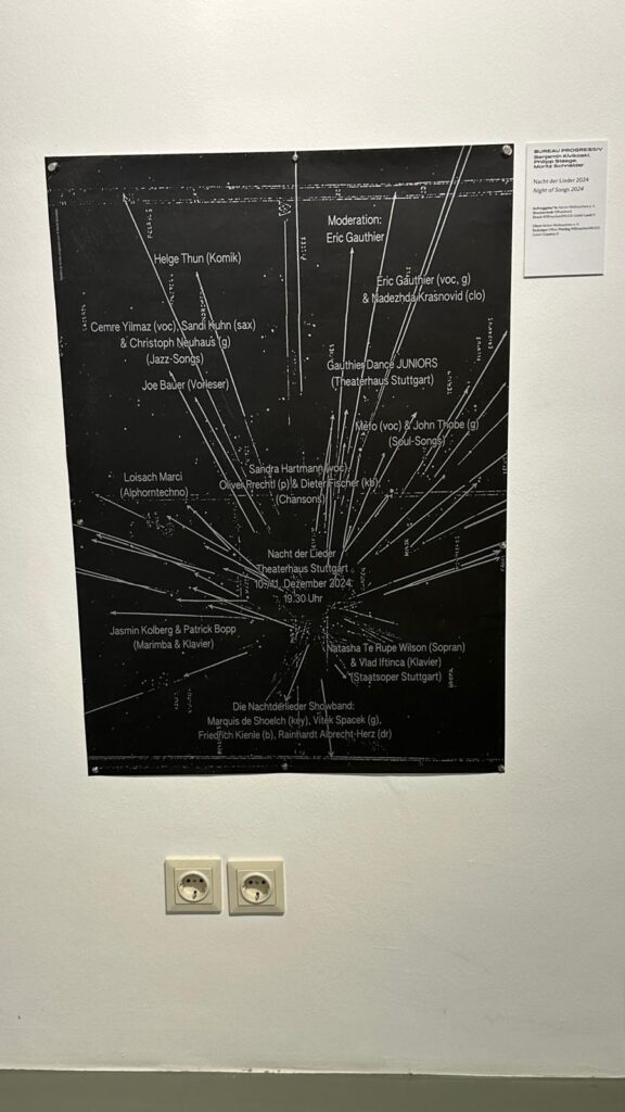
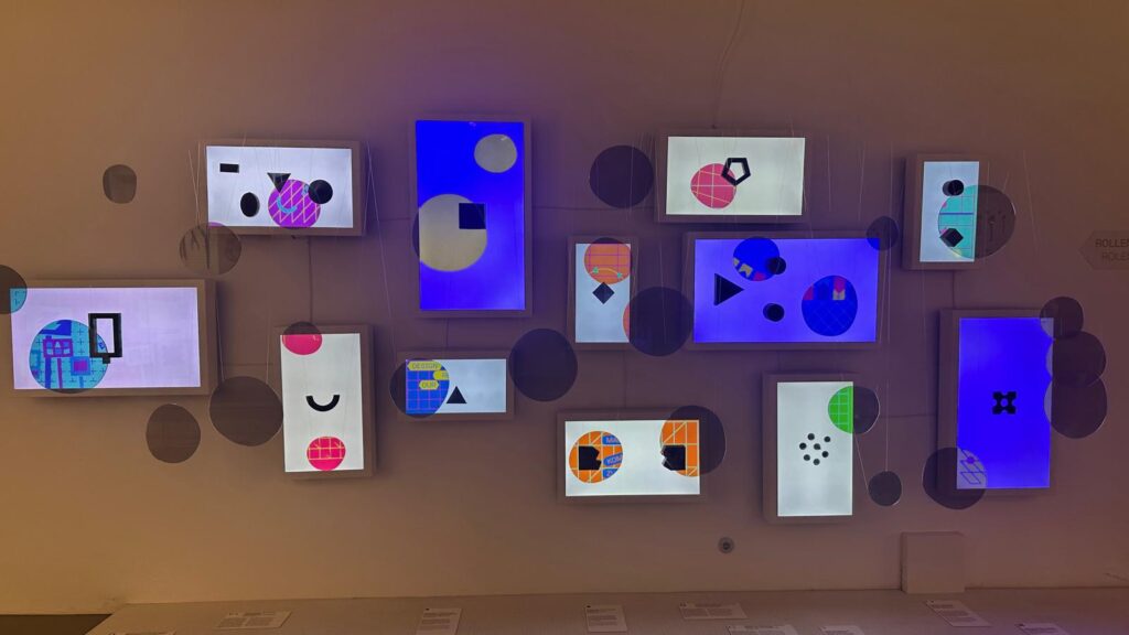
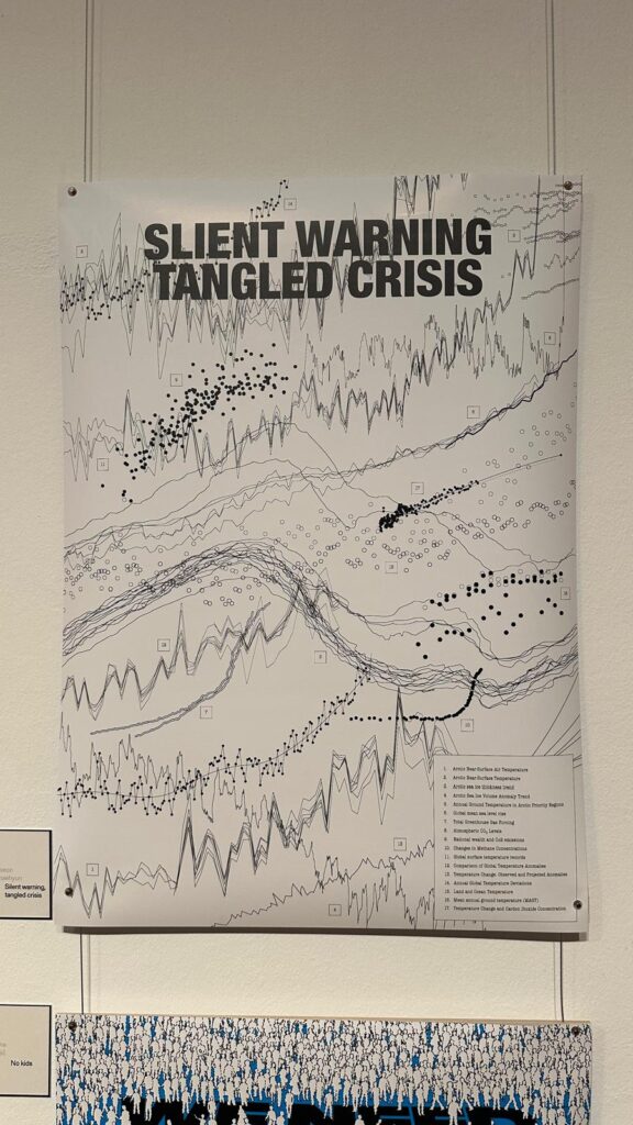
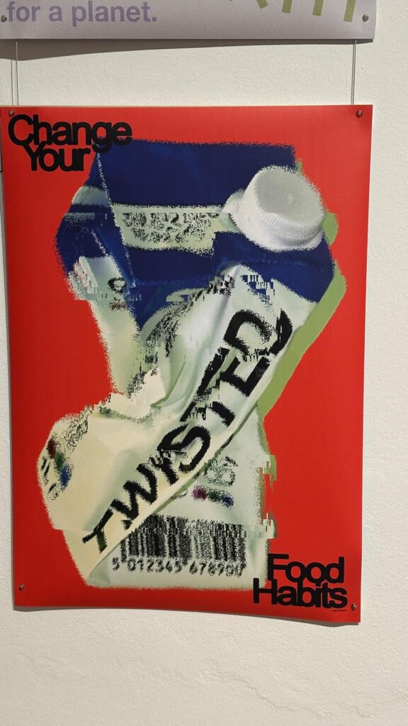
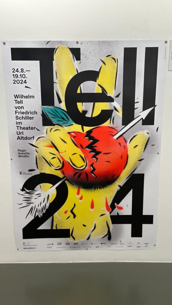
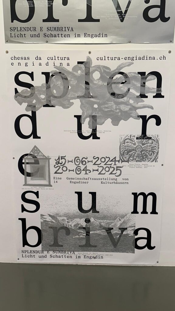
Vor kurzem war ich im MAK Wien in der Ausstellung „100 Beste Plakate 24“, einer jährlichen Schau, bei der die 100 stärksten Plakatgestaltungen aus Deutschland, Österreich und der Schweiz gezeigt werden – ausgewählt aus über 2.500 Einreichungen von mehr als 700 Gestalter:innen. Die Ausstellung ist eine Kooperation des Museums und des 100 Beste Plakate e. V. und bietet einen wirklich breiten Einblick in den aktuellen Stand des Grafikdesigns in der DACH-Region. 
Hier der Link

Was mich sofort beeindruckt hat, war die Vielschichtigkeit der Arbeiten. Es geht hier nicht nur um schöne Poster, sondern um visuelle Konzepte, die oft über klassische Informationsvermittlung hinausgehen und zu kleinen visuellen Erzählungen werden. In vielen Arbeiten spielt Typografie eine größe Rolle. Ein Teil der ausgestellten Plakate arbeitet dabei bewusst mit Materialität und Technik: Einige Poster zeigen experimentelle Drucktechniken wie Cyanotypie oder Reliefstrukturen. Es gibt Arbeiten, die erzählerisch wirken und mit vielen Informationen bepackt sind, und solche, die mit minimalistischem Stil starke visuelle Zeichen setzen.

Gerade die Plakate, die nicht einfach eine Botschaft „transportieren“, sondern visuelle Spannung erzeugen, zeigen, wie stark ein Poster als Medium wirken kann, wenn es nicht nur „schön“ gestaltet ist sondern auch starken Kontext schafft.

Mein eigenes Thema – historisch unsichtbar gemachte Frauen sichtbar zu machen – nutzt ebenfalls ein Bildformat, aber bisher habe ich eher im Konzept „hörbar machen“ bzw. „auslagern in Raum und Interaktion“ gedacht. Die Plakate hier zeigen, dass im Medium Poster selbst noch viel mehr erzählerische und expressive Kraft steckt. Nicht nur durch reine Form, sondern auch durch den Einsatz von Technik, Fokus auf Schrift, Materialität und narrativen Ebenen

Und hier sehe ich auch Anschluss an das Feedback aus dem Final Crit:

– Die Frage nach einem politischen, zeitgenössischen Posterformat. Viele der Siegerplakate transportieren nicht nur Information, sondern Haltung – oft politisch, oft gesellschaftlich relevant, ohne dass sie mit klassischen „Protestplakat“-Klischees arbeiten. 

– Die Pop-, Surreal- und Typo-Ansätze lassen sich auch auf mein Vorhaben adaptieren: Interaktive Poster müssen nicht nur technisch funktionieren, sondern sie müssen auch visuell stark sein und den Betrachtenden scheinbar „mehr erzählen“, als auf den ersten Blick sichtbar ist. 

Ein zentraler Gedanke, den ich deshalb aus dem Besuch mitnehme, ist: Interaktivität und visuelle Gestaltung sind keine getrennten Welten, sondern sie können sich gegenseitig verstärken. Für mein Projekt heißt das konkret: Ich will nicht nur bewegte Bilder auf statische Poster werfen, sondern ein Poster-Medium entwickeln, das selbst ein Erzählraum ist: gestalterisch mit Haltung und technisch hybrid. Die Ausstellung im MAK war dafür ein sehr guter Referenzpunkt, weil sie mir zeigt, wie traditionelles Medium und zeitgenössische Gestaltung miteinander kombiniert werden können.