For this impulse I read the academic paper “A systematic literature review of the speculative design process and a proposed framework for speculative design” published in the Design Science Journal in 2025. The aim of the paper is a systematic literature review of 52 studies to clarify the methodological foundations of speculative design across various fields, including healthcare, AI, and urban planning.
ANOTHER DIAMOND!
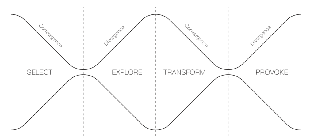
The authors identify a recurring four-phase process throughout the papers and propose an adapation of the oh-so-loved Double Diamond: the Inverted Double-Diamond Framework with the phases select, explore, transform, and provoke.
While the paper acknowledges that speculative design has been practiced for decades, it presents the Inverted Double-Diamond Framework as a new tool for “communicating the core of speculative design” and establishing a shared conceptual foundation for the field.
1. Select (Convergent Thinking)
The goal of this initial phase is selection for speculation: identifying and reframing complex, hidden, or emerging challenges. Designers focus on narrowing down broad topics of concern into a specific issue that will anchor the rest of the process. This may involve:
Projecting potential issues from existing systems if current values persist.
Understanding current issues through stakeholder discussions or data reviews.
Asking future-oriented “what if” questions about emerging technologies.
2. Explore (Divergent Thinking)
The speculative exploration phase involves the imaginative generation of reality-alternative scenarios. It encourages thinking beyond the constraints of the present to consider “what the future could be”. Common methods include:
Scenario-building techniques to situate abstract concepts in a plausible future world.
The “cone of possibilities” model, which categorises futures as probable, plausible, possible, or preferable.
Contrasting utopian and dystopian futures to reveal tensions between empowerment and control.
3. Transform (Convergent Thinking)
In the speculative transformation phase, abstract concepts from the exploration phase are translated into tangible representations. This phase focuses on selecting and refining ideas to create “probes” that bridge imagined realities with the present. Key outputs include:
Prototypes: These can range from low-fidelity models made of everyday materials to polished, high-fidelity physical artefacts.
Fictional Narratives: Stories, audiovisual formats (videos, audio), or printed materials (catalogues, posters) that provide social context and make the speculative world more relatable.
4. Provoke (Divergent Thinking)
The final phase, speculative provocation, uses the developed prototypes and narratives to stimulate critical dialogue, debate, and reflection. The goal is to challenge ingrained assumptions and encourage the audience to think about the ethical and societal implications of potential futures. Methods for provocation include:
Group discussions and debates structured around opposing viewpoints.
Individual reflection activities and qualitative interviews.
Public exhibitions where audiences engage with the artefacts not as products for consumption, but as prompts for active imagination
Healthcare and speculative design
By shifting the focus from commercial production to social and ethical implications, speculative design in healthcare allows researchers to bridge the gap between current medical realities and the consequences of future technological trajectories.
The paper identifies healthcare as one of the primary academic disciplines where speculative design is frequently applied to explore the complexities of contemporary challenges. Rather than focusing on immediate medical solutions, speculative design in this field is used to anticipate emerging needs, ethical dilemmas, and the social implications of future medical technologies.
The paper highlights several specific studies and prototypes that illustrate how speculative design functions within a healthcare context, for example a publication where Zolyomi and Snyder (2024) engaged neurodiverse dyads in a speculative design process to create an “emotion translator,” using low-fidelity prototypes to materialise their ideas.
Source Cardenas Cordova, D., Kelly, N., & Rezayan, L. (2025). A systematic literature review of the speculative design process and a proposed framework for speculative design. Design Science, 11, e38. doi:10.1017/dsj.2025.10030
A couple of months ago I stumbled on the Book “Good Services – How to design Services that work” by Lou Downe (see Impulse.02). I finally came around to reading it!
In this Blog post I want to provide an excerpt of the 15 principles of good service design according to Downe. I chose 5 principles I learned the most from or thought were the most relevant for my research. Additionally, I add a paragraph of reflection on my Thesis to add personal context to the topic.
The 15 Principles
Disclaimer: Instead of repeating repeating “A good service” before every principle statement, this section will imitate the formulation of the book’s chapters.
3.1 Is easy to find
This chapter emphasizes that the name of a service is crucial for user accessibility, as it acts as the primary entry point. Providing a good service is ensuring that users can easily find it, which is often more challenging than it seems.
To improve service discoverability, organizations should prioritize user-friendly names that reflect what users are trying to achieve. This involves:
Understanding users’ goals.
Recognizing their knowledge level regarding available services.
Names should avoid legal or technical jargon and instead describe tasks in straightforward language. Ultimately, service names should bridge the gap between user intent and organizational terminology, facilitating easier access to necessary services.
While I appreciate the importance of making a service easily discoverable, I don’t see naming my e-health platform as my first priority. Since I intend for it to be a nationwide government initiative—similar to ELGA, (amusingly, is an acronym, a no-go according to the book) my focus will initially be on developing the platform itself. I do want the name to be catchy and perhaps even personal, like a first name, to create a sense of connection. However, my immediate priority will be on the platform’s functionality and user experience rather than on the name itself.
3.2 Enables a user to complete the outcome they set out to do
Designing services with the entire user journey in mind is essential. This approach not only enhances user experience but also improves service effectiveness and efficiency. If users understand what they need before reaching your service, they are more likely to succeed in their goals.
Failing to recognize and design for users’ true objectives can have severe consequences. The issue of homelessness illustrates this well; Malcolm Gladwell’s article “Million-Dollar Murray” showcases how inadequate responses to homelessness are often more costly than comprehensive solutions. It highlights the importance of addressing the full scope of user needs rather than piecemeal solutions.
Designing services within the context of a wider user journey can lead to more effective service delivery and reveal gaps in existing offerings. For example, using the wording “Get me home” in a navigation service instead of offering input fields to manually write your destination. When designing services, it’s crucial to ask whether you’re starting at the right point for users and if your service effectively helps them reach their goals.
This chapter is particularly interesting for my design process because the tasks my users should be able to do with my e-health application are very broad and highly dependent on the context the user is in. Ultimately the application should cover all things health related in one place. My plan right now is to have the user set up the front page of their application according to their needs during the onboarding process. This might help with creating a more custom experience while still keeping all possibilities open.
3.3 Clearly explains it’s purpose
To effectively manage user expectations when designing a service, it’s crucial to first understand what those expectations are. Users often base their expectations on past experiences with similar services, so their assumptions may not align with what your service actually provides. There are three types of expectations to consider:
Universal Expectations: These are fundamental service features that most users expect, such as the ability to withdraw money from an ATM at a bank. These expectations are widely recognized and should not need explicit explanation.
Assumed Expectations: These arise when users lack knowledge about a service, leading them to make assumptions that may not be accurate. For example, new users may assume they can open a bank account with minimal documentation. It’s essential to clarify these expectations upfront, either by simplifying the service or clearly communicating what users should expect.
Outlier Expectations: These are unique expectations based on individual users’ previous experiences. For instance, some users might expect instant notifications for transactions based on their experience with app-based banks. While you may not need to address these right away, it’s important to monitor them, as they can evolve into universal expectations over time.
Managing these expectations involves different strategies. Universal expectations should be met without explicit mention, while assumed expectations require clear communication. Outlier expectations should be observed for potential future relevance. A balanced approach that addresses all three types will ensure that your service remains valuable and user-friendly, preventing potential pitfalls from unmet expectations.
This chapter reinforced the importance of having a clear plan for what my users will want to accomplish within my application. To effectively manage expectations for my thesis, I aim to limit options and possibilities. Specifically, I plan to develop around five distinct scenarios and personas, which will allow me to measure how effectively users can complete their desired tasks.
3.4 Require no prior knowledge to use
To ensure a service is usable without prior knowledge, the following strategies should be considered:
Ensure the Service is Findable: Understand when and how users might seek support, along with the language they use during their search. Refer to Principle 1 for more details.
Clearly Define the Service’s Purpose: Users may not be familiar with your organization, but they likely know what they need. Your service should quickly convey what it does and how it can help them achieve their goals. More information can be found in Principle 2.
Avoid Making Assumptions About User Knowledge: Do not assume any prior knowledge or experience with your service or similar offerings. Conduct a thorough review to identify any assumptions within your service. Create a list of these assumptions and determine which ones need to be adjusted or clearly explained to users.
Utilize Familiar Methods: Some approaches are so common that deviating from them can cause confusion. To identify these methods, conduct user research with a diverse group to understand which ones are widely recognized. See Principle 5 for additional insights.
Design Independently of Organizational Structures: Navigating organizational frameworks can be challenging for users unfamiliar with your service. Ensure that your service is easy to use without requiring users to understand who is providing it.
I have given considerable thought to how my e-health application must be user-friendly for the broadest possible audience: essentially everyone in Austria over the age of 18. This diverse user group encompasses varying technological backgrounds, social differences, financial situations, health conditions, and age ranges. That’s why Point 3 of this chapter, “Avoid Making Assumptions About User Knowledge,” really resonated with me; I need to design with all potential users in mind. However, given the rapid pace of technological advancement and my intention to utilize speculative design methods, I will establish some foundational guidelines regarding users’ tech affinity.
Regarding Point 5, “Design Independently of Organizational Structures,” I recognize that the health sector often operates differently. People (at least nowadays) are very critical when it comes to “hiding” where information is coming from or with which part of the service they are currently in contact with. This is an area where I need to engage in deeper research to fully understand the differences in healthcare information.
3.5 Is agnostic of organizational structures
In 2016, British company Thriva was established to allow users to conduct health checks discreetly at home through at-home blood tests for various conditions like diabetes and hormone imbalances. While it has transformed health monitoring, Thriva’s true innovation lies in its integration of multiple components from various organizations, notably utilizing the nationwide network of NHS pathology labs. These labs operate under strict regulations, and Thriva has effectively incorporated these rules into its service.
This type of seamless service, involving collaboration across organizational boundaries, is not typical in many sectors. In today’s digital landscape, users seek services based on their needs rather than the limitations of individual organizations. The focus should be on helping users achieve their goals, even when those goals extend beyond what a single organization can provide.
Traditional services often struggle with fragmentation and siloed experiences due to outdated organizational structures designed for a slower-paced world. These rigid systems tend to specialize in specific tasks, making it challenging to provide cohesive user experiences.
Four key issues contribute to this fragmentation:
Separation of Data: User data is often not shared across organizations, requiring users to repeatedly provide the same information.
Incompatible Processes: Misalignment between the processes of different organizations can disrupt the user journey.
Incompatible Criteria of Use: Different rules across service components can create confusion for users.
Inconsistent Language: Variations in terminology can disorient users trying to navigate the service.
To address these issues, it’s important to understand the historical context of organizational silos. Melvin Conway’s theory suggests that an organization’s structure directly influences its service design. If teams within an organization are siloed, their services will likely be fragmented.
As organizations face increasing demands to integrate services, a new model of experience integration is emerging. This approach involves collaborating across multiple organizations to provide a cohesive user experience, often without altering the individual organizations involved.
However, fostering effective communication and collaboration is challenging. Organizations may have different objectives, paces, and incentives that can hinder cooperation. To support collaboration on shared services, consider these four strategies:
Permission: Create an environment that encourages collaboration beyond day-to-day roles.
Shared Standards: Establish common practices that facilitate teamwork without stifling creativity.
Shared Goals: Develop a unified vision that everyone can support and work towards.
Shared Incentives: Align financial incentives to ensure that collaboration is prioritized over individual agendas.
The most important takeaway here is to be able to recognize potential silos within an organization or with external partners, and if you can’t change the operating model, shift how you communicate and collaborate. Implementing shared standards, goals, and incentives can foster a more collaborative environment, ultimately enhancing the user experience.
I really enjoyed this chapter of the book because it used a healthcare service as an example, which helped me relate this principle even more to my thesis. Considering the insights on organizational silos, it’s clear that my thesis on a nationwide e-health application in Austria must address specific barriers that could hinder its effectiveness. Potential silos might exist between various healthcare providers, such as hospitals, general practitioners, and specialist clinics, all of which may have different systems for managing patient data. Additionally, there could be inconsistencies between public health organizations and private healthcare entities, complicating data sharing and collaboration.
Regulatory frameworks may also create silos, as differing compliance requirements could prevent seamless integration of services across platforms. Also, varying levels of technological adoption among healthcare professionals and patients could lead to fragmentation in user experience. By identifying and addressing these specific silos, I can design an e-health application that not only facilitates communication and data sharing among these diverse stakeholders but also ensures a cohesive and user-friendly experience for all Austrians seeking healthcare services.
I first watched Ethan Hawke’s TED Talk “Give Yourself Permission to Be Creative” quite a while ago. Long enough that I don’t really remember what made me watch it but I did. And what stuck with me is the quiet persistence of its message. It left an impression on me, so much so that I bookmarked it in my browser and even though I don’t watch it regularly, every now and then, even now, months later, I find myself thinking about it.
He opens the talk with the fact that creativity isn’t reserved for the talented, the trained, or the publicly successful. Because it’s not about being good. Instead, creativity is something deeply human — a way of making sense of experience, of reaching toward connection, of expressing something that would otherwise remain unspoken. That idea shifted something in me. It loosened the quiet pressure of having to justify to myself whether what I wanted to make was going to have any value, either to me or others.
Hawke talks about how many of us hesitate to create because we’re worried about judgment — whether what we make will matter, whether it will be taken seriously, whether it proves anything about our worth, something that resonated deeply with me and still does sometimes. So much creative energy got trapped in the question: Will it be good enough? And anytime that question dominates, nothing begins.
One of the most uncomfortable ideas in the talk is also one of the most freeing: the willingness to look foolish. To play the fool, as Hawke puts it. To make something imperfect, uncertain, maybe even embarrassing — and to do it anyway. I realized how rarely I allowed myself that space. I wanted ideas to arrive already formed, already defensible, already safe, to not embarrass myself in front of my peers. And changing that mindset, getting over that fear takes a lot of work. Maybe a lifetime of it.
Another line that stayed with me is the notion that there is no clear path — that the path only appears once you start walking. I used to, and still often, believe that I need a plan before beginning something creative. A concept, a direction, a reason especially. But each time again, I’m shown how much meaning and direction emerges after the first few steps, not before.
Over the past year, one idea from the talk has become especially important to me: giving yourself permission to be good instead of perfect.
It sounds really simple but turns out to be something that needs reminding constantly!
Perfection feels safe. It promises protection from judgment. It delays the moment when something unfinished has to meet the world. Choosing “good” instead of “perfect” means accepting visibility, uncertainty, and the real possibility of failure. It means finishing things. Sharing things. Letting them be incomplete reflections of who you are right now.
And that is uncomfortable, but rewarding.
But looking back after nearly a year of trying, and failing (a lot), I’m reminded of why it’s worth the effort. Because allowing yourself to be good instead of perfect makes work feel lighter. It means you create more and I can now even feel curiosity replacing pressure sometimes. Slowly but surely being creative starts to feel like something I just am and not something I need to do to prove myself.
It’s hard to overstate the impact of Hawke’s TED Talk. I am reminded of it often especially in moments where the fear of embarrassment keeps me from creating. And sometimes I can convince myself to play the fool and do it anyway. Not always but more often than a year ago. And each time I do it has been a gain in one way or another.
I recently started reading parts of the book Enshittification. The title sounds crude but it did its job by catching my eye. Also it’s something that I think we all feel in our bones is happening. I mean, doesn’t it feel like almost every digital product gets worse over time?
In the beginning, things are always clean, filled with useful features, not too many ads, not too much pressure. You download something and it’s nice, looks good and just works. Obviously that’s the phase where companies sometimes sell at a loss and are extra nice to get as many people to sign up as quick as possible.
Then eventually things start to shift. You get shown more ads, there are suddenly pop-ups, features that were once free disappear behind subscription paywalls and/or an algorithm gets introduced that noone really asked for. Not all at once but slowly so everybody has time to get used to the latest shittification before the next gets introduced.
Reading the book felt a bit like hearing what I was feeling anyway. Products don’t seem to stay good. They get optimized, monetized, stretched, squeezed until what is left is just a worse and more expensive product. And I think we all notice it. We complain about it to friends (or at least I do).
But we still keep using everything.
And that feels like the weirdest part. There’s this shared feeling that things are getting shittier, but also this shared acceptance that this is just how it is. Like it’s bad weather you can’t change. While reading, I kept thinking about how normal this has become. Not even shocking or scandalous anymore. Just normal, which is kinda depressing if you think about it too long, no?
What’s just as depressing is how many intentional decisions are behind this slow decline. None of this appears by accident. Someone designs these extra steps, someone decides where the ad goes and someone removes the privacy settings that used to be easy to find. It’s all intentional, even if it’s framed as “improving the experience” or whatever.
I don’t even read this in a super dramatic moral way. It’s more like noticing a pattern that’s been sitting in the background for years. It feels obvious. Of course this keeps happening. Of course growth and profit push things in this direction. Of course users are not really the priority forever.
Still, there’s something interesting about putting a clear name on this shared feeling. We all feel that menus get more confusing or question why instagram changes the menu bar around for the xth time ,because why?? Choices also get more limited unless you pay. And it’s not just one specific app, it’s every app.
I’m not even sure what the right reaction is. Delete everything? Maybe. Accept it? Not great. Noticing and becoming aware of it seems like a good first step.
So yeah, that’s where I’m at after reading a few parts of this book. Not a huge revelation, more like a vague confirmation of a feeling that was already there. But it does reinforce a rebellious feeling inside of me to do better with my design and to never be part of an enshittification process for the sake of money-making.
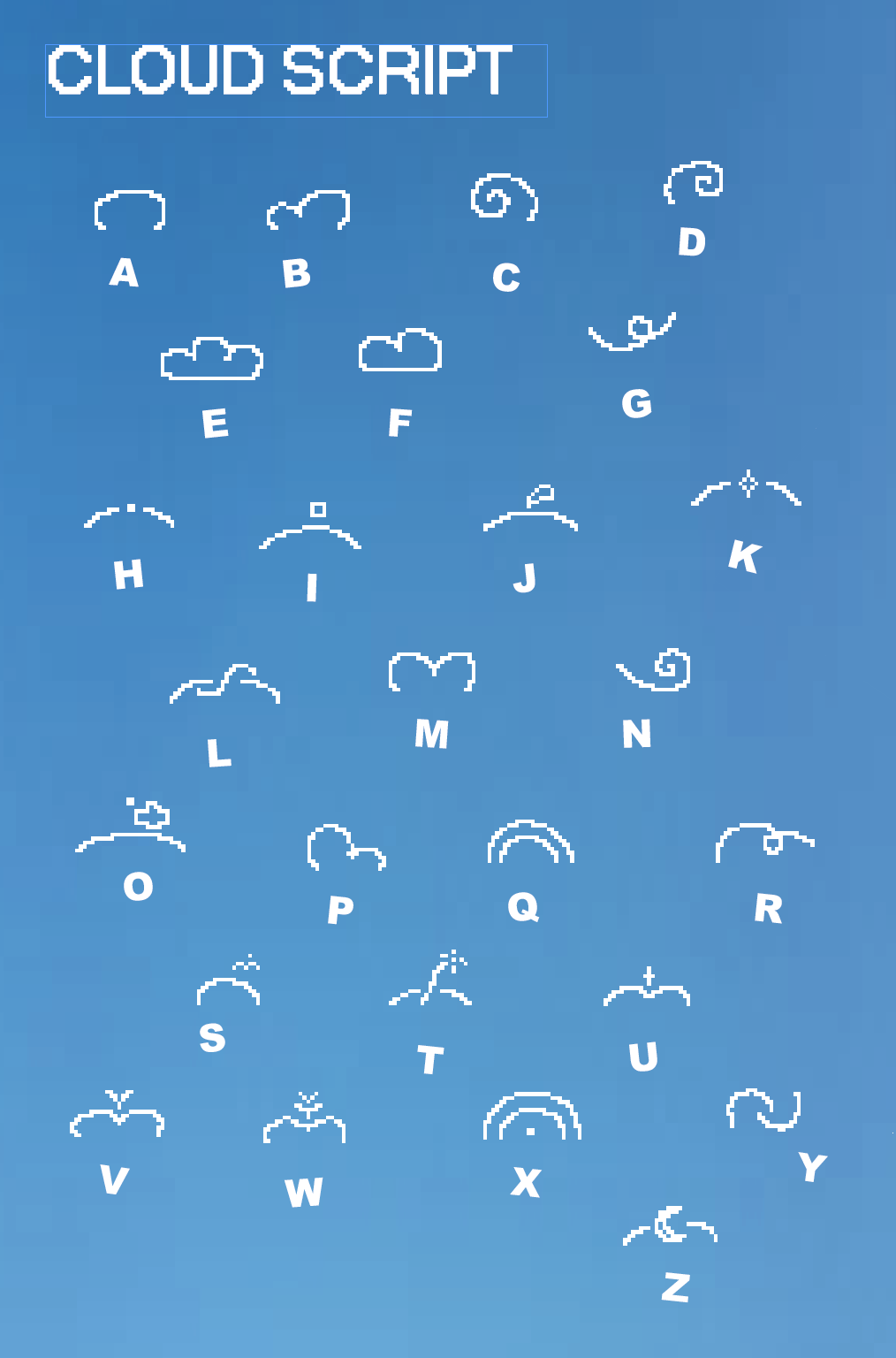
A while ago I saw an interesting post on instagram where someone interpreted elements of nature into letters thus being able to kind of “encode” a message into what looked like a field of flowers at first. I was a big fan of that right off the start and began working on my own “natural” typeface which I dubbed Cloud Script. In short: it utilizes the upper arc of a painted cloud and applies distinct but cloudlike shapes to form a unique cloud shape which can be decoded into a word. One cloud equals one word.
Have a quick look at the decoding table:
The individual letters connect, kind of like cursive, with the goal of creating a beautiful cloud. Size and spacing of each letter has no bearing on the meaning of the word but only serves to make the cloud look better. In addition each cloud can be adorned with stars, smaller, non-descriptive clouds, and more to be made to look like a beautiful drawing rather than a message. Here’s an example: (focus one the upper arc of the cloud, anything inside and outside of the cloud is just decoration)
Excuse me if you decoded it, it’s a bad word but it’s the only example I had at hand.
This little exercise in creating a new whimsical font was a refreshing change from designing things that were “optimal” or perfectly user-friendly, instead focusing purely on aesthetics and how beautiful one can make a cloud. It couldn’t be rushed or made more efficient without destroying the core idea and purpose of it. Instead one had to slow down, maybe redraw and iterate on one cloud a couple of times which could result in a writing speed of 0.1 words per minute. Also I don’t think that anyone reads these blogposts so Fabry if you’re reading this send me something in cloudscript. Byye
There is a certain ritual to going to the opera, I feel… you dress slightly better than usual, you arrive early, you find your seat, you sit down, and you give yourself to the whim of what the opera provides you with. The space is clearly defined: performers on stage, audience in rows, a polite distance between those who create and those who observe. When I went to La Divina Comedia at the Opera Graz, I expected as much but was pleasantly surprised.
The first half of the ballet didn’t take place on stage at all. Instead, it unfolded in the in-between spaces of the opera house: on the stairs, in the café, in the entry hall. Spaces that are usually transitional suddenly became the stage. There was also a physical closeness to the dancers that was usually not given. Movements that would normally be read as abstract shapes from afar became intensely human up close. Muscle tension, hesitation, effort and their facial expressions as a whole became much more visible. I was able to decide where I wanted to stand, when I wanted to move on and how close I wanted to be.
This relocation outside the traditional performance space created a strange intimacy. It felt slightly intrusive at first, and it visibly took people some time to adjust to these new rules, not sure what was allowed and what wasn’t. But that unsureness quickly turned into engagement. The opera house stopped being just a house and became a living organism (which is funny because the narrative of the piece was that we were inside of Dante’s body).
This shift kinda reframed the whole “going to the opera” experience. Usually, distance creates respect. You sit quietly and observe from afar. Here, respect came from closeness instead. You weren’t separated from the art, instead you shared the same space with it. It felt more human, more real, more personal.
When the second half moved back into the traditional setup (dancers on stage, audience seated) the contrast was striking. It felt like an entirely different play. Structured. Predictable. Nothing expected from me, the visitor, except of keeping quiet. And yet, because of what had happened before, the stage felt different too. More charged. More alive. Almost as if I was still as close to the performers as before. The ballet itself was deeply captivating and emotionally overwhelming, but it carried an added layer of something.
This experience reinforced something I’ve been circling around for a while now: design is much more than graphics, print, or web layouts. Design is the orchestration of experience which seeps into almost all aspect of our everyday lives. In this production for example, choreography, lighting, costume, music, architecture, and performance were inseparable. None of them worked alone. Each element was designed in relation to the others, contributing to one cohesive emotional experience.
What moved me most was the realization that design can touch you without asking for interpretation first. There was no interface to learn, no instruction manual, no explanation necessary. The experience spoke directly to the body and only later to the mind. That’s something I rarely encounter in my daily design work.
I left the opera house with a quiet certainty: I need to go to more ballet productions. Not as a cultural obligation, but simply because I enjoy it.
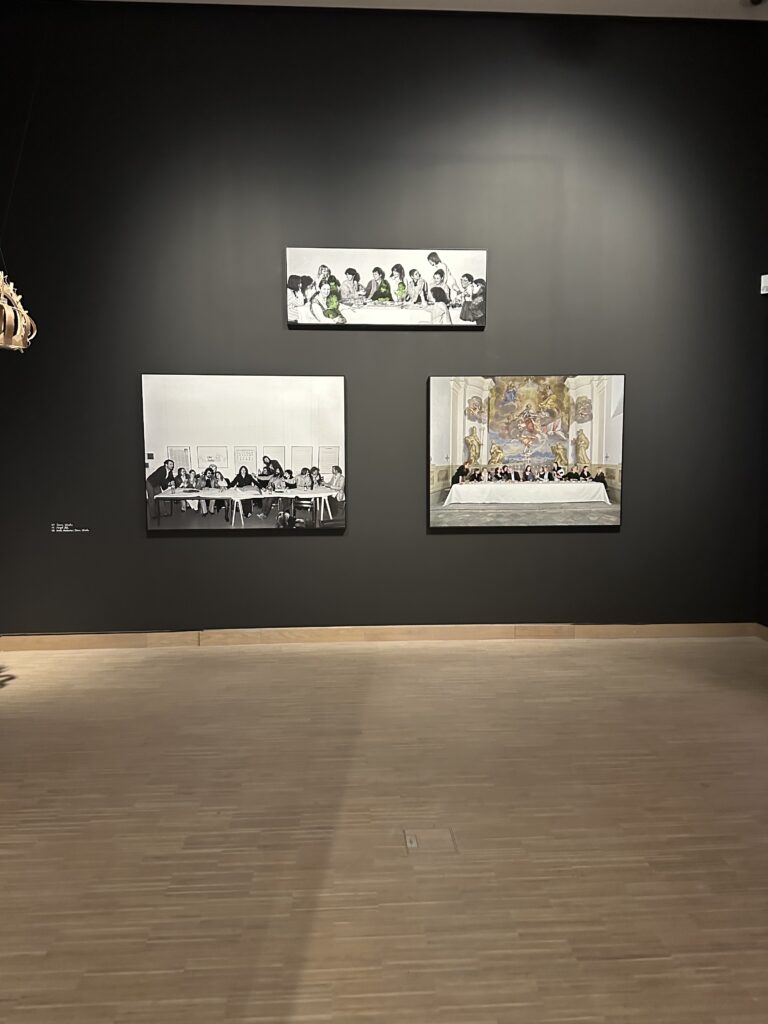
The Last Supper is one of the most iconic images of Christianity and the Catholic Church. Leonardo da Vinci’s painting is not only deeply embedded in religious visual culture, but also loaded with symbolic gestures, spatial hierarchies, power relations and narratives of belonging and exclusion. Over centuries, this image has been reproduced, cited and reinterpreted countless times, becoming almost untouchable in its status. Precisely because of this strong visual and symbolic charge, contemporary artistic reinterpretations of the Last Supper are particularly revealing when viewed through the lens of interaction and participation.
In the exhibition DU SOLLST DIR EIN BILD MACHEN at Künstlerhaus Vienna, the works of Timm Ulrichs and Irene Andessner stood out as a powerful impulse for my design and research process. Rather than creating another static image, both artists transform the Last Supper into a performative act — a lived, temporal situation that unfolds through human presence, roles and interaction.
In 1976, Timm Ulrichs staged the Last Supper as a reenactment with students and friends. He placed himself in the role of Jesus, while in front of him lay a cake shaped like an open book. A piece of it had already been eaten, and the inscription “Take, eat, this is my body. Timm Ulrichs” was still visible. This small but deliberate detail shifts the meaning of the ritual: the sacred act becomes simultaneously personal, ironic and bodily. Consumption, authorship and belief collapse into one gesture. The work is not primarily about provocation, but about making visible how meaning is produced through action and participation.
Thirty-five years later, Irene Andessner revisited Ulrichs’ approach in a series of performances. Her intervention is subtle yet radical: she reverses the gender roles of the table. Andessner herself takes the place of Jesus, Ulrichs occupies the role traditionally associated with John or Mary Magdalene, and the apostles are portrayed by women from the art and cultural field. What remains visually recognizable as “The Last Supper” is transformed conceptually into a commentary on power, hierarchy and exclusion within religious traditions.
From an interaction design perspective, these works can be understood as the transformation of a religious image into a social interface. Roles function as interaction rules, the table as a shared space, the bodies as carriers of meaning. The audience does not merely observe; it witnesses a reconfiguration of a deeply familiar ritual. Meaning emerges not from explanation, but from participation, presence and subtle deviations from expectation.
What makes these reenactments particularly compelling are the small details: the cut cake, the visible children, the exchanged roles. These elements invite closer observation and interpretation, encouraging viewers to engage more deeply with the ritual rather than passively consuming its image. In contrast to institutionalized liturgical settings, where participation is often clearly defined and limited, these artistic approaches open up space for reflection, identification and critique.
For my master’s research, these works highlight the potential of performative and interactive reinterpretations of religious rituals. They demonstrate how interaction does not need to rely on digital interfaces alone, but can emerge through social constellations, embodied participation and symbolic shifts. In a context where many people feel distanced from the Church as an institution, such approaches suggest alternative ways of engaging with spiritual themes — not by simplifying or commodifying them, but by allowing ambiguity, complexity and shared experience.
The Last Supper, reimagined as an interactive performance, becomes less a fixed symbol and more a living process. This shift from image to interaction is a crucial impulse for exploring how contemporary media and design practices might support critical, reflective and inclusive forms of spiritual experience today.
One of the perspectives I’ve enjoyed the most came from a book: Conversational UX Design: A Practitioner’s Guide to the Natural Conversation Framework by Robert J. Moore and colleagues. It’s not a “hot take” on AI; it’s a methodical breakdown of how real human conversations actually work—and what it means to design interfaces that respect those patterns.
The book introduces the Natural Conversation Framework (NCF), which includes an interaction model of expandable sequences, a content format, a pattern language with around 100 generic UX patterns, and a navigation method based on six basic user actions. The core idea is that conversation is not just “free text”; it has a structure—openings, repairs, confirmations, closings—and good conversational interfaces need to explicitly design for those moves rather than hoping the model will improvise.
What really clicked for me is how this maps to multimodal, AI‑augmented tools. The book emphasises that conversational UX is not just about voice or chat; it explicitly talks about multi‑modal, multi‑session, multi‑channel interactions where people are reading screens, tapping buttons, and speaking at the same time. Voice, chat, and interface design are framed as complementary, not mutually exclusive—exactly the stance I’m taking with my hybrid prototypes that combine conversation and GUI controls.
For my thesis, this book is an important reminder that:
A conversational design tool still needs clear turn‑taking and repair mechanisms (e.g., “Did you mean increase by 4 px or 40 px?”) instead of silently guessing.
Multimodal systems should treat voice, text, and touch as different ways of performing the same underlying conversational moves—proposing, clarifying, correcting, confirming—rather than as separate feature sets.
Pattern languages matter: just like GUI design has reusable patterns, conversational and multimodal UX needs named, reusable patterns for things like disambiguation, mixed‑initiative, and context carry‑over.
In other words, Conversational UX Design quietly argues for exactly the kind of interaction thinking my thesis depends on: don’t bolt chat onto an existing interface and hope for the best. Treat conversation as a first‑class interaction mode, design its structure, and then let other modalities—clicks, drags, sliders—plug into that structure in a coherent way.
A recent agency blog on multimodal UI in 2025 described today’s AI platforms as “multimodal by default,” combining text, voice, and image understanding into unified systems and pushing interfaces to feel “less like technology and more like conversation.” Beyond the marketing gloss, three trends they highlighted feel particularly relevant for UX in design tools:
Contextual intelligence – Systems that don’t just parse what you say, but also where, when, and on which device you’re saying it.
Personalized interaction models – Interfaces that adapt to individual communication preferences over time.
Cross‑device continuity – Seamless shifts between voice, visual, and traditional interfaces across an ecosystem.
Reading this through a UX lens, I noticed how often our current tools still behave like “one‑size‑fits‑all” interaction models. Everyone gets the same chat box, the same inspector pane, the same shortcuts—regardless of whether they are a keyboard‑driven power user, a visual thinker, or someone who prefers narrating changes out loud. The blog’s emphasis on personalised interaction models suggests a different future: tools that learn how you like to instruct them and quietly shape the interface around that.
For my thesis, that raises an exciting (and slightly scary) possibility: what if the “right” interaction model for conversational design tools isn’t a single static pattern, but an adaptive one? One designer might lean heavily on chat for structure, then fine‑tune with the mouse. Another might prefer starting with manual layout and only using text prompts for repetitive tweaks. An adaptive system could track those preferences and surface the right modality at the right time, instead of forcing everyone through the same chat‑first funnel.
The catch, of course, is that adaptivity can easily slide into opacity. UX has to ensure that as tools personalise interaction models, they remain legible and predictable. Otherwise, you end up with an interface that feels like a moving target—powerful, but hard to trust. Balancing that tension is exactly the kind of design problem I want to explore: how to make multimodal, adaptive interfaces feel both personalised and stable enough for serious work.
One of the most honest takes I’ve seen on AI in design tools wasn’t a formal article—it was a LinkedIn reflection from a UX researcher experimenting with Figma Make. They described how AI‑generated prototypes could turn research share‑outs into live, interactive workshops instead of static decks, shrinking the gap between insight and design iteration. But in the same breath, they admitted it often took “hours of iterative, granular prompting” to get ideas to come to life.
That phrase—hours of iterative, granular prompting—hit me harder than any polished product announcement. It captures a hidden UX cost I’ve started calling the prompt tax: the cognitive and emotional overhead of trying to wrangle a conversational or generative system into doing what you mean, not just what you say. On paper, the system is “natural language” and “intuitive.” In practice, you spend a lot of time reverse‑engineering how to talk to it.
From a UX perspective, this is a familiar pattern. We’ve seen it with early voice assistants (“sorry, I didn’t catch that”) and with chatbots that require oddly specific phrasing. The twist here is that the stakes are higher: we’re talking about tools for expert work, where precision, repeatability, and explainability matter. When a researcher says they see the potential but also feel the grind of prompting, that’s a clear signal that the interaction model needs more than just good language models.
For my thesis, this post validates a core hunch: conversational interfaces in design tools can’t stand alone. They need supporting structures that reduce the prompt tax—like surfacing relevant controls at the right moment, remembering personal vocabulary, or letting users “draw” corrections instead of re‑prompting. The goal isn’t fewer prompts; it’s fewer frustrating prompts.