Impuls #9 Gaudi Museum Figueres

During my trip through northern Spain (the same journey I already wrote about in my last two blog posts) I also stopped in Figueres. Before going there, I honestly didn’t know much about the city. But then I found out that it is the birthplace of Salvador Dalí. (Many people mix up the names, but Gaudí was actually from Reus, while Dalí was born in Figueres.) So of course, visiting the famous museum dedicated to him was a must.

About Salvador Dalí

Salvador Dalí was one of the most important artists of Surrealism. He was born in 1904 and became known for his dreamlike, sometimes bizarre paintings. One of his most famous works is The Persistence of Memory with the melting clocks (an image almost everyone has seen before).

Dalí had a very unique personality. He was not only an artist but also a master of self-promotion. He loved attention, dressed extravagantly, and was known for his dramatic mustache. Throughout his life, he worked not only as a painter but also as a sculptor, writer, filmmaker, and designer. He even collaborated with filmmakers like Walt Disney.

He often described himself as a genius (and truly believed it). His art was strongly influenced by dreams, psychology, religion, and science. Whether you admire him or not, he definitely left a strong mark on the art world.
The Dalí Museum in Figueres

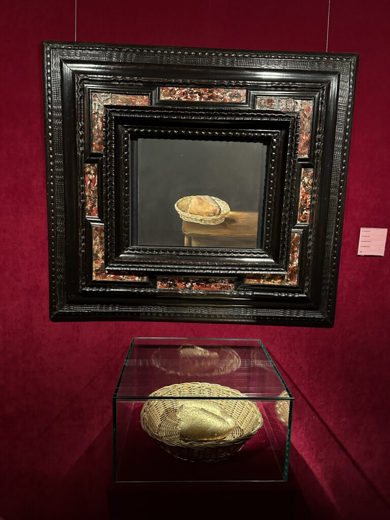
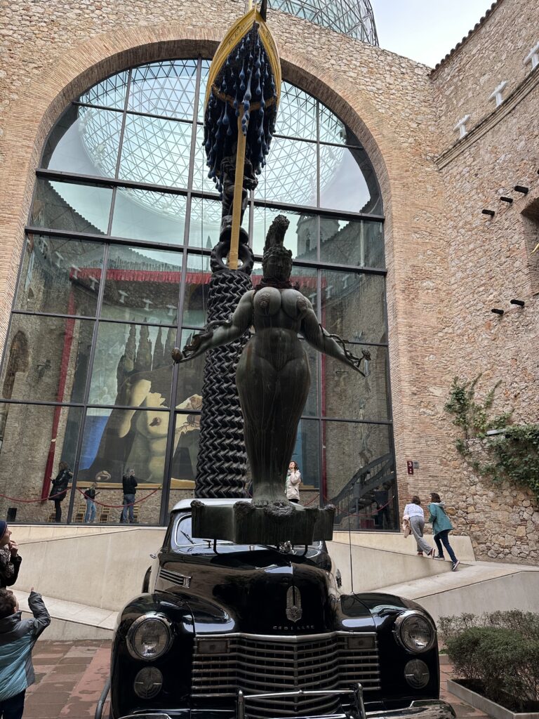
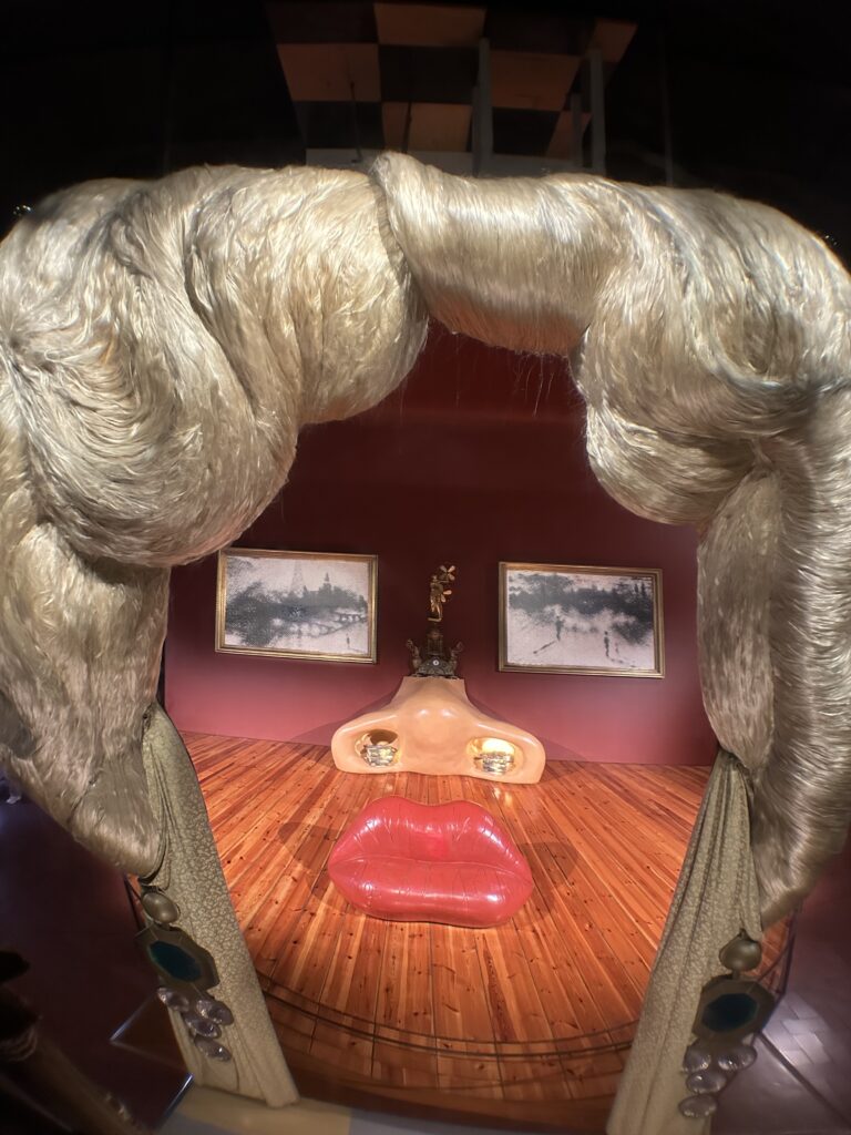
The Teatre-Museu Dalí is probably one of the most unique (in which way ever) museums I have ever visited. It was actually designed by Dalí himself and opened in 1974. The building already looks surreal from the outside with giant eggs on the roof and unusual sculptures decorating the facade.
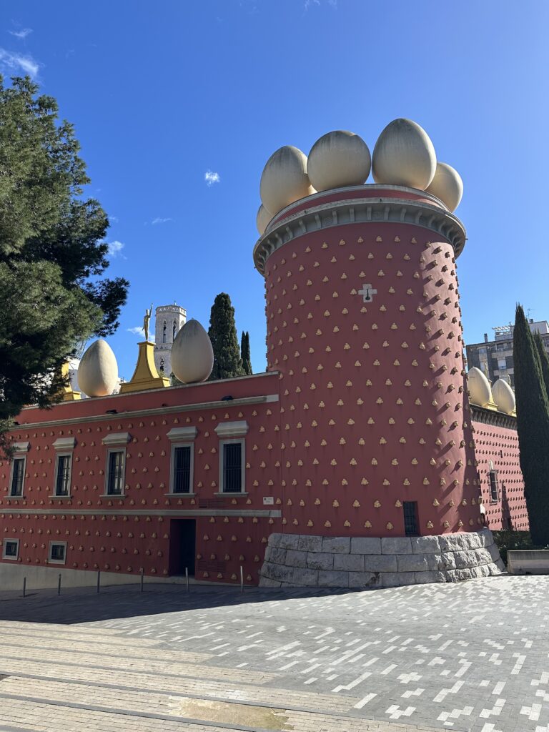
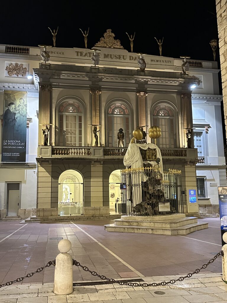
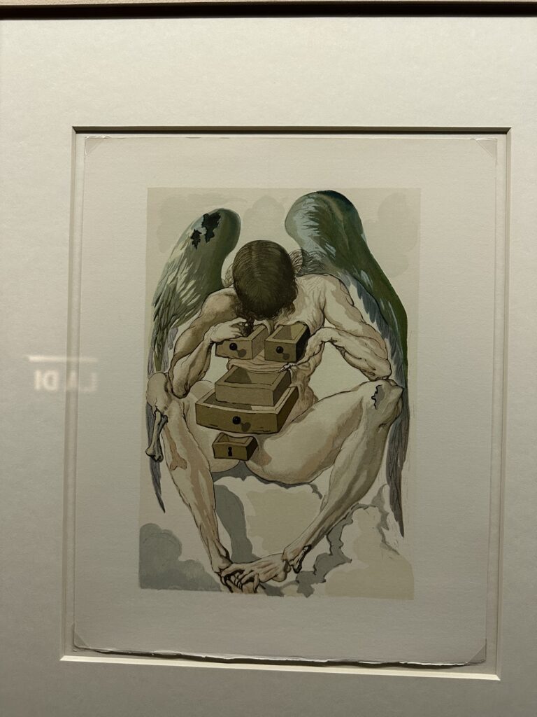
For Dali the egg stood for birth, creation, hope and new life. It represents something fragile on the outside but full of potential on the inside, often connected to themes of rebirth. Besides eggs, Dali frequently used other symbols in his work: melting clocks (time and relativity), ants (decay and death), crutches (human weakness), drawers in bodies (hidden thoughts and the subconscious), and elephants with long, thin legs (fragility and instability).

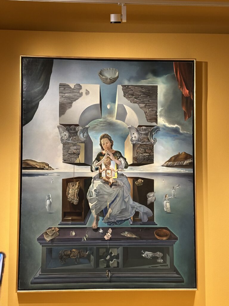
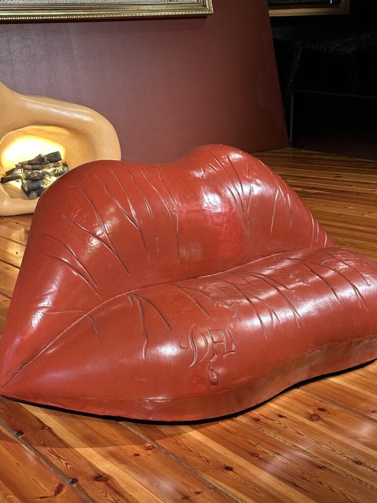
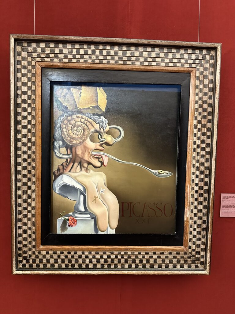
Inside, the museum feels like stepping directly into Dalí’s (weird) mind. The rooms are dramatic, playful, and sometimes confusing. There are large-scale paintings, installations, optical illusions, sculptures, and strange objects. Some artworks are impressive in size and technique, others feel intentionally provocative.
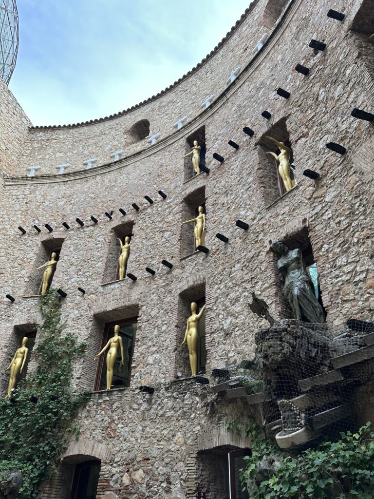
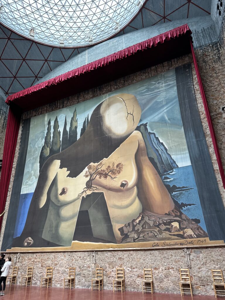
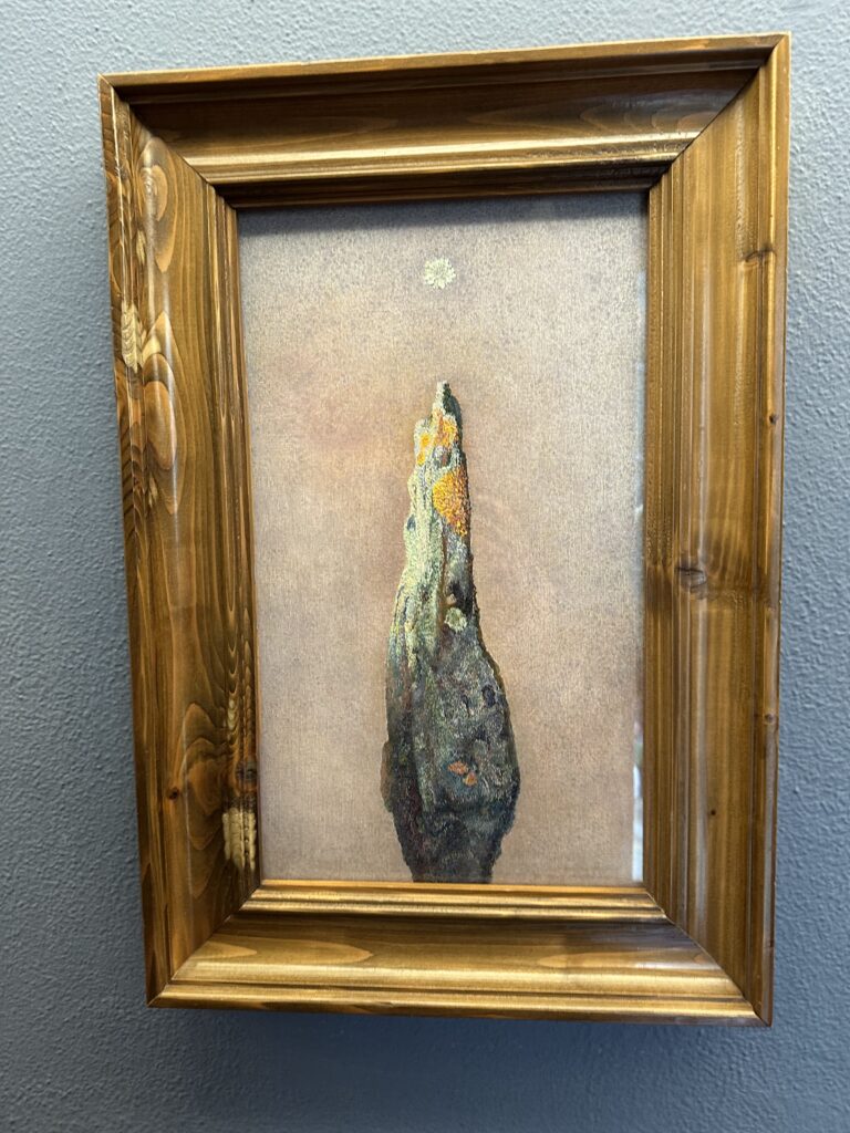
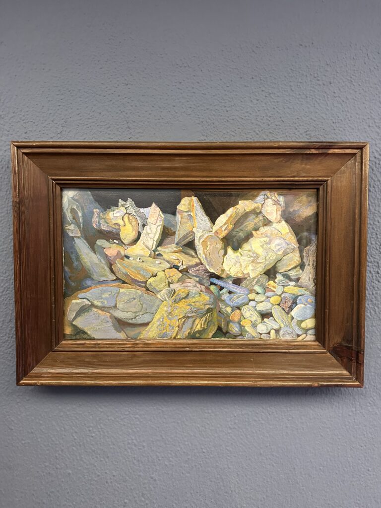
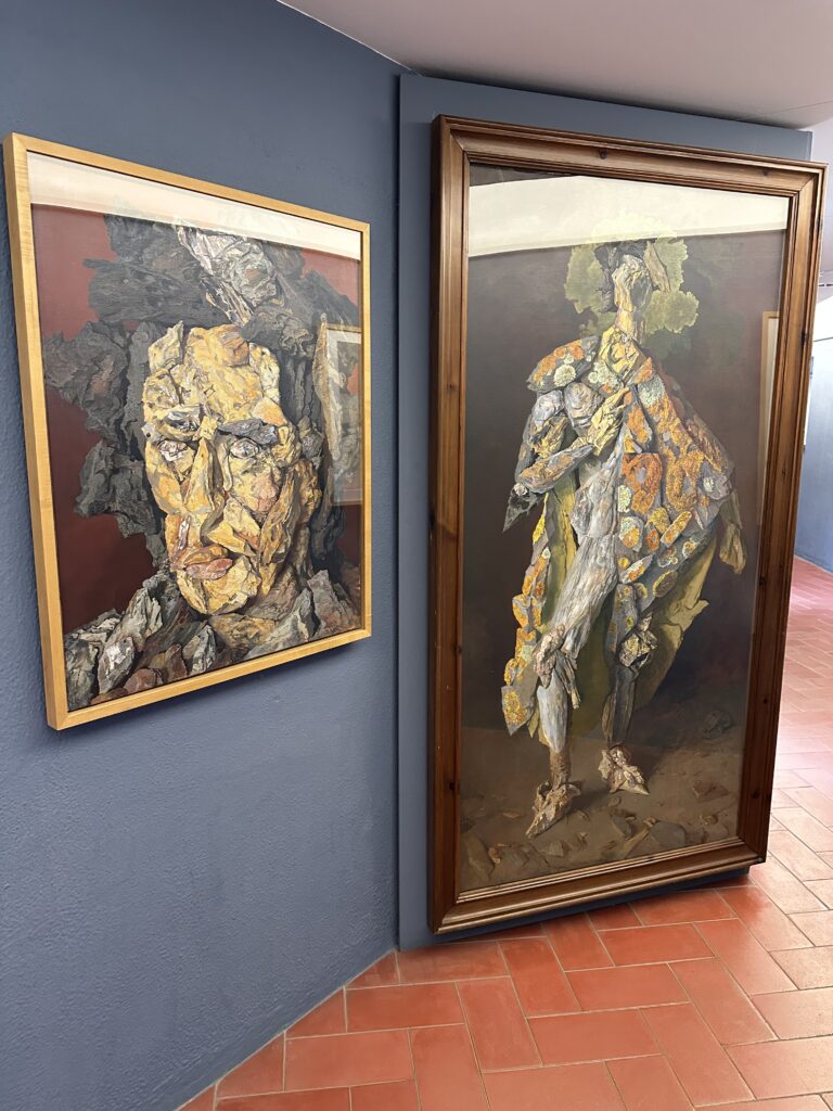
What I didn’t expect was that there were also works by other artists exhibited. One of them was Antoni Pitxot. Pitxot was a Catalan painter and a close friend of Dali. His works often show surreal, rocky landscapes made of human-like stone figures. He was inspired by the natural rock formations of the Costa Brava and transformed them into imaginative compositions. I really liked his paintings, they felt detailed, thoughtful, and somehow calmer than Dalis dramatic works.
My Personal Impression

To be honest, I expected more from the museum. Some parts felt a bit chaotic, and I sometimes missed deeper explanations or background information about certain works. I found some pieces very interesting and inspiring, but others felt overly theatrical or even a bit exaggerated.

I have never been Dalis biggest fan. While I respect his creativity and boldness, I often find his art very kitschy and pseudo-artsy. The building itself is very nice but the interior and what he used for his art was a bit low quality sometimes. Walking through the exhibition, I also had the impression that he must have been not a nice person, very self-centered, maybe even a bit delusional in how highly he thought of himself. Of course, that larger-than-life ego was also part of his artistic identity.

Still, I cannot say that I didn’t enjoy the visit. The museum is an experience. A few paintings inspired me. I also like his “just do it” attitude, his courage to create without worrying about rules or expectations. That mindset is something I find motivating as a creative person myself.

And surprisingly, I really liked the works of Antoni Pitxot. They added another layer to the visit and showed a different side of surrealism.

In the end, the Dalí Museum left me with mixed feelings: critical, curious, and inspired at the same time. But thats fine, because that’s exactly what art is supposed to do.
IMPULSE 7. Clarity Through Conversation: My Coaching Session with Mr. Horst Hörtner

As part of the final phase of our program, we had the opportunity to participate in individual intensive coaching sessions. I met with Mr. Horst Hörtner to discuss my master’s thesis direction, and the conversation turned out to be far more impactful than I expected.

First of all, he is an incredibly sharp and engaged person to talk to. From the beginning, he showed genuine interest in my topic, asked precise questions, and quickly understood the core of what I am trying to explore.

What mattered most to me, however, was the sense of validation I took away from the session.

Up to this point, I had been quite unsure about my topic. I knew it was personally important, but I kept questioning whether it was relevant enough, clear enough, or strong enough in a broader research context. Hearing an experienced expert from the field emphasize that the topic is both timely and necessary was honestly very motivating. It shifted something in my mindset, from hesitation toward commitment.

One of the key dilemmas I brought into the conversation was about audience.

My project deals with Buryat–Mongolian cultural context, but I am developing it within a Western academic and exhibition environment. I was struggling with how to make the installation understandable for two very different audiences:

  • Buryat–Mongolian visitors, who carry the cultural background
  • Western visitors, who may encounter this context for the first time

I was trying to design for both at once, and the more I tried, the more complicated the project felt.

Mr. Hörtner’s response was surprisingly direct and, in a way, liberating.

He advised me to stop designing primarily for the Western audience.

His point was clear: the people most affected by the cultural questions I am addressing are the primary audience. They are the ones who need to fully understand the message and context. Western audiences, he noted, can access background information if needed but they do not have to be the central design reference point.

This reframing removed a significant amount of pressure. Instead of diluting the work to make it universally digestible, I can focus on making it culturally grounded and precise.

Another moment that stayed with me was when he repeatedly thanked me for my bravery. I did not fully expect that reaction. But it served as an important reminder: working with cultural identity especially from a minority perspective is not something to minimize or soften.

If anything, it requires clarity, confidence, and visibility.

I left the session feeling more focused and, importantly, more permitted to stand firmly behind my topic. The conversation did not magically solve every design challenge ahead, but it gave me something equally valuable: direction and reassurance that the work I am doing has weight.

IMPULSE 6. Rethinking Expectations: Interactivity in the Buryat History Exhibition

As part of my ongoing master’s thesis research, I returned to the National Museum in Ulan‑Ude to explore another permanent exhibition, this time dedicated to the broader history of Buryatia. My focus remained the same: to observe how (and if) interactive elements are being used to support learning and engagement.

What I encountered quickly challenged my remaining doubts. This exhibition, larger in scale and historical scope, revealed a noticeably richer layer of interactivity than I expected and, importantly, much of it felt intentionally designed for younger audiences.

Because the historical scope was broader and the exhibition itself larger, the curators had clearly invested in multiple interactive touchpoints throughout the space. And importantly many of them were clearly designed with younger audiences in mind.

The Interactive Map: A Strong First Impression

Right at the entrance, visitors are greeted by a large interactive map of the republic created with projection mapping. It immediately draws attention, both visually and spatially, and works as an inviting gateway into the exhibition.

Visitors can press on different years or regions of the republic to reveal more information. This simple mechanic is extremely effective: it transforms what could have been a static geographic overview into an exploratory learning tool.

But the real cherry on top is the built-in game at the end of the interaction. Visitors can test their knowledge by trying to correctly locate all 22 regions of the republic on the map.

From a design perspective, this is a very strong move. It shifts the experience from passive consumption to active recall, one of the most powerful mechanisms for learning. It is informative, playful, and highly suitable for school-age visitors. I could immediately imagine groups of children gathered around it, competing and learning at the same time.

Distributed Interactivity Across the Hall

Further into the exhibition, the same interaction logic appears in other formats. There is a large interactive screen where visitors can tap on objects and locations to learn more about them.

While technically simpler than the VR experience from the Buddhist exhibition, this type of interface plays an important role. Not every educational moment needs full immersion. Sometimes clarity, accessibility, and speed of interaction are exactly what is needed especially in historically dense exhibitions.

The exhibition also integrates:

  • audio guide stations in selected areas
  • additional projection mapping moments
  • and other small interactive touchpoints

Together, these elements create a layered experience that supports different learning styles: visual, auditory, and tactile.

The Yurt: Learning Through Touch

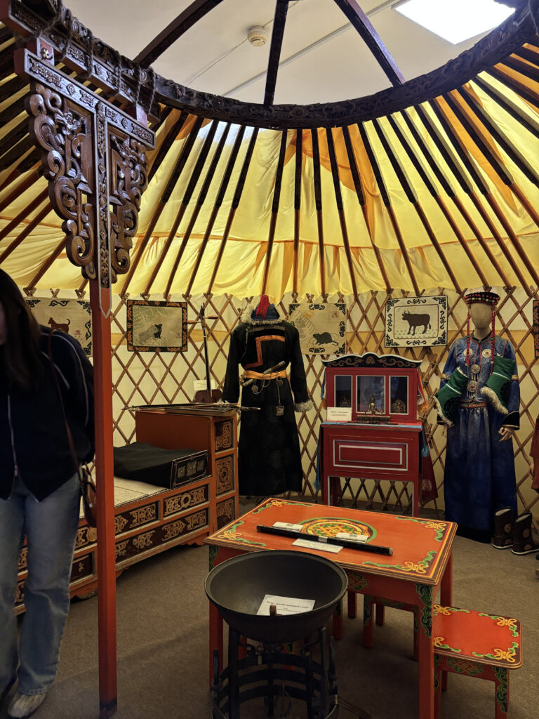
One of the most engaging moments comes at the end of the exhibition: a full-scale traditional Buryat-Mongolian yurt that visitors can physically enter.

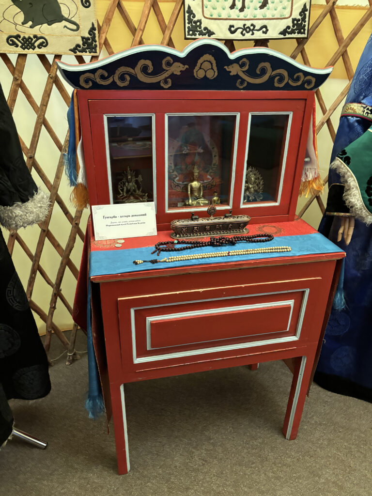
Inside, visitors are encouraged to touch and explore objects of the traditional household. This tactile permission is extremely important. After many museum experiences defined by “do not touch,” this moment creates a sense of openness and embodied learning.

For younger visitors especially, this is likely one of the most memorable parts of the exhibition. It transforms cultural knowledge from something distant into something physically relatable.

A Personal Reflection

I have to admit something honestly.

Before this visit, I carried a slightly arrogant assumption that museums in my hometown would lack contemporary interactive approaches, that they would feel outdated or purely static. This exhibition proved me wrong in the best possible way.

And it genuinely made me happy.

Not because everything was perfect, there is always room for growth but because the intention is clearly there. The museum is trying. It is experimenting. It is thinking about engagement, about younger audiences, about accessibility.

And perhaps most importantly: it shows that meaningful interactive design is not limited to large Western institutions. It is emerging thoughtfully and contextually, in Buryatia as well.

For my master’s research, this visit became an important checkpoint. It helped me better understand the current state of museum interactivity in my republic and positioned my own project within a real, evolving landscape rather than an imagined vacuum.

Sometimes field research does exactly what it should do: it challenges your assumptions and replaces them with something much more valuable, grounded optimism.

IMPULSE 5. Discovering Meaningful Interactivity at the National Museum of Buryatia

As part of my master’s thesis research, I recently visited the National Museum in my hometown of Ulan-Ude. My goal was simple but important: to observe the presence of interactive technology in museums in Buryatia and to reflect on whether interactivity can help local audiences, especially younger generations, better understand the culture, history, and religion of our region.

This question feels particularly urgent in the current political climate, where the connection of ethnic minorities in Russia to their cultural roots is often weakened or overlooked. Museums, in this context, carry a quiet but powerful responsibility. They are not just spaces of preservation but potential spaces of reconnection.

To be honest, and perhaps a bit shamefully, my expectations were quite low. I was prepared to see mostly traditional displays: objects behind glass with minimal explanation, limited contextualization, and little attempt to engage visitors beyond passive viewing.

And while some parts of the museum aligned with those expectations, one experience completely shifted my perspective.

I attended an exhibition about Buddhism in Buryatia that was, overall, very thoughtfully structured and informative. However, what truly stood out to me, and what I want to focus on in this impulse reflection, was the Kunrig Mantra VR project.

It felt like a breath of fresh air.

This project is one of the first VR experiences about Buddhism in Buryatia and among the early examples in Russia. It presents a carefully crafted 3D environment built in Unity, where visitors can slowly move through a virtual natural landscape of our nyutag – our true home. Above stretches a calm night sky. Around you stand sacred statues, each positioned with precise symbolic meaning according to Buddhist cosmology.

As you move from one figure to another, you can learn about who they are and why they are located exactly where they stand. This spatial storytelling is crucial: the mandala is not just visual decoration, it is a structured spiritual map.

Accompanying the visuals is the sound of the Kunrig mantra, softly read or chanted, which deepens the atmosphere and creates a meditative rhythm to the experience.

I want to be honest here: I am often skeptical about VR in museums. Too frequently it feels like technology used for the sake of spectacle, an additional layer that does not truly deepen understanding. But in this case, the VR environment genuinely expanded my perception of the subject. It did not distract from the content; it revealed the logic, depth, and emotional weight of the mandala in a way that static display simply could not.

Another personal detail surprised me. I usually experience strong motion sickness in VR environments. However, this project was executed with remarkable sensitivity. The calm pacing, stable movement, and atmospheric design created a comfortable experience where, for once, I did not develop my usual headache. Perhaps the quietness and grounded feeling of nyutag played a role in this.

After my visit, I read more about the project and was even more impressed. The designers worked very attentively with cultural and religious experts, including consultation with lamas, and continuously validated the accuracy of the environment during development. In projects dealing with sacred material, this level of respect is not just good practice; it is essential.

What I found particularly powerful is how the experience concludes. After immersing yourself in the virtual mandala and gaining contextual understanding, you return to the physical exhibition space where the original statues stand behind glass. But now they feel different. Familiar. Meaningful. You do not just observe them, you recognize them.

The knowledge gained through the interactive experience deepens appreciation of the physical artifacts.

For me, this project stands as a strong example of what meaningful interactivity in museums can be:

  • educational without being didactic
  • aesthetically sensitive
  • emotionally resonant
  • and genuinely engaging

It is also encouraging on a personal level. The project resonates closely with what I hope to achieve in my own master’s thesis artifactб creating experiences that do not simply display culture but help visitors feel oriented within it.

03.10.: Fazit und Ausblick

Ich finde, ohne mich selbst zu viel loben zu wollen, dass sich über diese 17 Blogposts wirklich viel Getan hat. Von einem gänzlich neuen Thema zu einer klaren Idee, mit vorliegender Literatur, die eigentlich nur mehr darauf wartet von mir verschlungen und wiedergegeben zu werden.

Mittlerweile bin ich gut in Zypern angekommen, und ich würde behaupten ich habe mich nicht so schlecht in die Erasmus-Experience eingelebt, wenn man das so sagen kann. Jetzt wird es aber Zeit wirklich ins Tun zu kommen, um am Ende nicht den ganzen schönen Sommer hier auf Zypern vorm Laptop verbringen zu müssen, sondern stattdessen jetzt die harte Arbeit zu leisten. Mit der “ASC-Bibel” und “Painting with Light” habe ich im Zuge dieser Blogposts bereits zwei meiner insgesamt sechs Bücher, die ich als “Basisliteratur” für die Masterarbeit verwenden möchte, inhaliert und zusammengefasst. Die anderen vier liegen bereits neben mir hier am Schreibtisch und warten auf einen Tag, an dem die örtliche Erasmus-Organisation mich nicht unverschämt mit Freibier auf ihren Frat-Parties ködert – aber dieser wird kommen, ich glaube fest daran!

Zusätzlich habe ich mir gerade in Hinblick auf die Finale Einreichung des Exposé noch genauere Gedanken über meine Vorgehensweise bei der Filmanalyse gemacht. Auch wenn der erste Schritt das Zusammenfassen der Literatur sein wird, glaube ich braucht ein gutes Exposé vor allem viel Weitblick. Außerdem lässt es sich dann, finde ich zumindest, viel leichter arbeiten. Dafür habe ich mir bereits zwei E-Books zugelegt – Bücher in meine zypriotische Wohnung zu bestellen war mir dann irgendwie zu umständlich. Einerseits die fünfte Ausgabe von “Film- und Fernsehanalyse” von Knut Hickethier und die dreizehnte von “Film Art: An Introduction” von Bordwell, Thompson und Smith. Meiner Recherche zufolge ist das jeweils das deutsche und internationale Standardwerk zur Filmanalyse. Auch wenn darin natürlich viel mehr behandelt wird, hindert mich das ja nicht daran nur die Kapitel “Zur Analyse des Visuellen” beziehungsweise “The Shot: Mis en scene” zu verwenden, um nicht den Rahmen zu sprengen und mich wirklich auf das was ich behandeln möchte, nämlich die Analyse der Lichtsetzung, zu fokussieren.

Auch das sind bereits zusammen über 100 Seiten aus denen sich gut eine individuelle Matrix bauen lassen sollte, die wissenschaftlich fundiert ist und mithilfe derer ich dann Film für Film abarbeiten kann.

Damit (glaube ich jetzt zumindest) habe ich einen ziemlich guten Fahrplan für die nächsten Woche und Monate, den ich jetzt eigentlich nur mehr umsetzen muss. Das freut mich persönlich besonders, da ich eigentlich nicht wirklich der vorplanende Typus bin und deshalb im Moment des Verfassens dieser Zeilen selbst ein bisschen überrascht von mir selbst bin.

Zusammenfassend kann man also sagen, dass mir diese Blogreihe tatsächlich auf meinem Weg zum Status Quo geholfen hat, da sie mich gezwungen hat, mich früh genug mit der Suche meiner Literatur und mit der Literatur selbst auseinanderzusetzen, sodass ich jetzt bereits wirklich an einem guten Punkt bin, von dem aus ich in Ruhe arbeiten kann. Sofern mich das Wetter in Zypern eben lässt 😉

In diesem Sinne, wünsche ich allen Lesern dieser Zeilen einen schönen und hoffentlich stressfreien Masterarbeitssommer!

Blümel out.

Impuls 8: O´Sullivans Breakdown von “Oppenheimer”

Ich habe schon in ein paar Impulsen für diese Blogserie Filme analysiert und versucht herzuleiten wie und warum die Filmemacher bestimmte Entscheidungen getroffen haben. Schon damals war mir klar, möchte ich ähnliche Analysen auch in meiner Masterarbeit machen (und das möchte ich ja) brauche ich dafür eine zumindest strukturiertere (am besten aber sogar wissenschaftlich genormte) Herangehensweise, sodass meine Ergebnisse einerseits einheitlich zwischen den Filmen, aber auch für Dritte nach außen hin nachvollziehbar sind. Spätestens im Gespräch mit Ursula Lagger wurde diese Vermutung bestätigt, woraufhin ich im letzten Impuls dieser Blogserie einmal kurz nachsehen wollte, wie der Wandering DP seine Filmanalysen (beziehungsweise Breakdowns) so aufzieht. Dafür habe ich mir seinen Patreon Breakdown zum Film Oppenheimer angesehen.

Herangehensweise

O´Sullivan sucht sich im Vorfeld ungefähr 10 bis 15 Szenen aus dem Film heraus, die er in (in diesem Fall) 30 Minuten durchbespricht. Dabei geht er voll allem auf drei Dinge ein: Blocking, also wo stehen die Charaktere im Raum und in welchem Verhältnis zueinander, Kameraposition, also auf welche Seite der line of action befinden wir uns und warum, und Lichtsetzung, also woher kommt das Licht, welche Qualität hat es und warum.

Dies macht er aber ohne echten Leitfaden, also nicht genormt wie bei einer Masterarbeit, dass er Shot für Shot den selben Katalog abarbeitet. Stattdessen konzentriert er sich mehr auf das, was seiner Meinung nach am wichtigsten in dem Shot ist, also warum sind wir beispielsweise hier auf der rechten Seite und nicht auf der linken. Dies erklärt er dann mit allen Vor- und Nachteilen.

Ich denke, dass ich hiervon semi viel für meine Masterarbeit mitnehmen kann. Das worauf er achtet, ist definitiv auch genau das, worauf ich mich in meinen Analysen konzentrieren will. Keine Analyse der Handlung, der Charaktere, oder Ähnlichem, sondern eine Analyse all derer Faktoren, die bestimmen wie das Bild am Ende aussieht, nicht was darin passiert. Dafür brauche ich aber eine striktere Herangehensweise und klare Regeln, um meine Arbeit auf ein wissenschaftliches Niveau zu bringen.

Conclusion – Reflections on Immersive Music Production

This project set out to explore how immersive audio formats can be used as an integral part of music production rather than as an additional or purely technical layer. Over the course of the project, it became clear that working in 3D audio fundamentally affects compositional, arrangement-related, and production decisions. Spatial considerations do not emerge only at the mixing stage, but influence songwriting, recording strategies, and performance choices from an early point onward.

A central insight of the project is that spatial width and motion are most effective when used deliberately and in contrast. Excessive or constant spatial expansion can reduce musical impact, whereas controlled changes in spatial density and focus can significantly enhance the perceived energy of specific song sections. In this context, immersive audio proved particularly valuable for shaping structural contrasts, clarifying arrangements, and reducing perceptual masking through spatial distribution rather than aggressive spectral processing.

From a technical perspective, the comparative use of Ambisonics and Dolby Atmos workflows provided valuable insights into different production philosophies. Ambisonics offered a flexible and performance-efficient environment for exploratory spatial work, while Dolby Atmos proved especially practical for structured production workflows and distribution on current streaming platforms. Neither approach emerged as universally superior; instead, their strengths depended on artistic intent, playback context, and production requirements.

Overall, the project demonstrates that immersive audio can serve as a meaningful compositional and narrative tool in contemporary music production—provided that spatial decisions remain grounded in musical intention and listener perception. Rather than treating 3D audio as a novelty, this work argues for its thoughtful integration as an expressive dimension that supports, rather than overshadows, the music itself.

Acknowledgements

I would like to sincerely thank Alois Sontacchi for his continuous support throughout this project. Our discussions were consistently insightful and inspiring, not only in relation to this work, but also beyond its immediate scope. A special thanks also goes to Benjamin Pohler, who was always available for short (or longer) conversations and quick exchanges of ideas.

Workflow Comparison: Ambisonics vs. Dolby Atmos

Based on practical experience gained throughout the project, both workflows revealed distinct strengths and limitations that influenced artistic decisions, technical handling, and playback outcomes.

One noticeable difference concerned vertical spatial resolution. In the Ambisonics workflow, access to a continuous vertical sound field allowed for more flexible and coherent vertical movements. In contrast, a Dolby Atmos setup, as used in this project, did not include a top center speaker. This limitation became particularly apparent in sections where vertical motion played a structural or emotional role, such as moments where sound elements were intended to move upwards. During playback in the Cube, this difference was emphasized further, as the upper loudspeaker layer consists of five speakers that could not be addressed using the chosen Dolby Atmos configuration.

Despite this limitation, the Dolby Atmos workflow proved to be highly efficient and reliable. The integration of the Dolby Atmos Renderer directly into Cubase and Nuendo allowed for seamless monitoring across different loudspeaker layouts, as well as quick evaluation of stereo downmixes and binaural renders. This level of integration significantly simplified workflow management and made it easy to check translation across formats within a familiar DAW environment.

In comparison, working with Ambisonics in Reaper was considerably more performance efficient. Even with large sessions consisting of 120 to 150 tracks, CPU usage remained comparatively low. The IEM Plugin Suite offered a powerful and intuitive toolset for spatial encoding and decoding, reverberation, and sound design tools, enabling many creative possibilities with minimal system load. This made Ambisonics particularly suitable for exploratory work and complex spatial experimentation.

Another key difference lay in signal organization and processing philosophy. The Ambisonics workflow encouraged early grouping and encoding strategies. The Dolby Atmos workflow, on the other hand, offered greater flexibility for multichannel summing and corrective processing at the subgroup level, particularly through the use of multichannel-capable plugins. While both approaches were effective, they led to different working habits and influenced how spatial and tonal decisions were made during mixing.

From a distribution perspective, the Dolby Atmos workflow proved to be more practical. At the time of writing, immersive music releases on major streaming platforms require delivery in the ADM format. Working directly within a Dolby Atmos environment allows for a straightforward ADM export that aligns with current industry standards for music distribution. This made the Dolby-based workflow particularly suitable for release-oriented productions, whereas Ambisonics workflows typically require additional conversion steps before meeting platform-specific delivery requirements.

Overall, neither workflow proved universally superior. Instead, each approach offered specific advantages depending on artistic intent, technical requirements, and playback context. The comparative use of both workflows throughout the project contributed significantly to a deeper understanding of immersive music production practices.

Practical Limitations and Session Transfer Issues

Although not directly related to the spatial workflows themselves, practical challenges arose during the transfer of sessions to the production studio system. Due to compatibility issues between different versions of the FabFilter plugins (notably Pro-Q 3 and Pro-Q 4), session interchange became unexpectedly time-consuming.

Sessions created with older plugin versions could not be opened using newer versions, and vice versa. Attempts to work around this limitation, such as using user presets, were unsuccessful, requiring all equalization settings to be recreated manually. This significantly increased preparation time and highlighted an often-overlooked aspect of production workflows: plugin version compatibility across different systems.

EAR Production Suite Experiments

As part of the ongoing series on spatial mixing approaches in practice, this post focuses on experimental tests conducted with the EAR Production Suite (EPS). These experiments were carried out at a late stage of the project and aimed to explore alternative ADM-based playback and conversion workflows.

EAR Production Suite Experiments

In parallel, experiments were conducted using the EAR Production Suite (EPS). These tests took place during the weekend prior to the final presentation, which significantly limited the available time for extended troubleshooting and deeper investigation.

The EAR Production Suite is a set of VST plugins developed by BBC R&D and IRT under the EBU, designed to enable immersive audio production using the Audio Definition Model (ADM). It allows for importing, exporting, and monitoring ADM content for various loudspeaker configurations based on ITU-R BS.2051, using the ITU ADM Renderer. The suite is primarily optimized for Reaper and serves as a reference implementation for ADM-based workflows[1].

Using the EAR Production Suite, I tested alternative playback and conversion approaches, including rendering ADM content into Ambisonics formats. However, during these tests, unexpected behavior occurred, such as excessive spatial spread and routing inconsistencies. Resolving these issues would have required more extensive investigation and testing.

Due to limited working time in the Cube and the need for a fail-safe playback solution, I ultimately decided against further experimentation with the EAR Production Suite in this context. Instead, the fully channel-based rendering approach, as mentioned before, was chosen for all listening examples used in the presentation.


[1] “EAR Production Suite,” accessed February 6, 2026, https://ear-production-suite.ebu.io//.

Dolby Atmos – Workflow Comparison and Technical Reflection

Continuing the series on spatial mixing approaches in practice, this post focuses on the Dolby Atmos workflow I used for Alter Me and Caught In Dreams, and on the practical steps taken to prepare ADM exports and playback in the IEM Cube.

For the Dolby Atmos productions, I decided to work in Cubase and Nuendo, as the Dolby Atmos Renderer is already fully integrated into both environments. This allowed for a streamlined workflow without the need for external rendering tools[1].

After completing the stereo mixes of Alter Me and Caught In Dreams to an advanced stage, the sessions were converted into Dolby Atmos projects. Cubase provides an automated conversion process in which all existing tracks are initially routed into a standard bed configuration.

For my workflow, I used the standard bed primarily for reverberation. I also used an Ambisonics bus with the Room Encoder and the FDN Reverb as a reverb send. Since the standard bed in Dolby Atmos is limited to a maximum configuration of 7.1.2, I deliberately avoided placing direct sound sources in this bed. Instead, I created a so-called object bed. In this setup, 11 objects were placed at the exact positions of the loudspeakers (used in the production studio), which in my case was the 7.1.4 configuration at the IEM production studio.

Routing signals into this object bed allowed me to address individual loudspeakers, provided that the loudspeaker positions were correctly defined. While this spatial correspondence was largely accurate in the production studio, minor deviations remained due to differences between the virtual speaker layout and the physical setup (higher elevated top speakers for example).

Subgroup structure and processing

In addition to object-based routing, extensive use of subgroups was made. Instrument groups such as drums, guitars, and vocals were routed into dedicated multichannel buses. For example, the drum signals were routed into a 7.1.4 drum bus, allowing for internal panning decisions as well as group-based processing.

Within these subgroup buses, summing and tonal shaping were carried out using multichannel-capable plugins, primarily from the FabFilter suite. Compared to the Ambisonics workflow, this approach provided greater flexibility for summing and corrective processing at the group level, while the overall structural logic of the routing remained similar.

Signals involving pronounced movement or spatial automation were routed directly to objects. In cases where a sound source only changed position briefly within a song, the track was often routed into the object bed and automated using the track’s multipanner rather than being continuously treated as a Dolby Atmos object.

LFE handling

The Low Frequency Effects (LFE) channel was deliberately not used in this workflow. Although the LFE channel is definitely part of standard Dolby Atmos workflow, it is often not used in music production. By excluding the LFE channel, the separation between the standard bed and the object bed remained clear, as any signal intended to address the LFE channel must be routed in the bed. This decision helped maintain a clean and predictable routing structure.

Export and playback preparation for IEM CUBE

At the end of the production process, an ADM file was rendered directly from Cubase. For playback preparation in the Cube, several approaches were tested with the goal of ensuring a stable and reliable setup for the final presentation of this project.

The ADM file was imported into Nuendo and up-rendered to a 9.1.6 configuration. At the time of production, I was not aware that the production studio system (their Nuendo version) also supported a 9.1.6 setup. In retrospect, creating the object bed directly in 9.1.6 would have been the more precise solution.

The up-rendered 9.1.6 mix was then exported as a channel-based 16-channel WAV file. This file was routed manually and directly to the corresponding loudspeakers in the Cube, ensuring full control over playback and eliminating potential uncertainties related to rendering or decoding behavior.


References:

[1] “Getting Started in Dolby Atmos with Steinberg Cubase and Nuendo,” accessed February 8, 2026, https://professionalsupport.dolby.com/s/article/Getting-Started-in-Dolby-Atmos-with-Steinberg-Cubase-and-Nuendo?language=en_US.