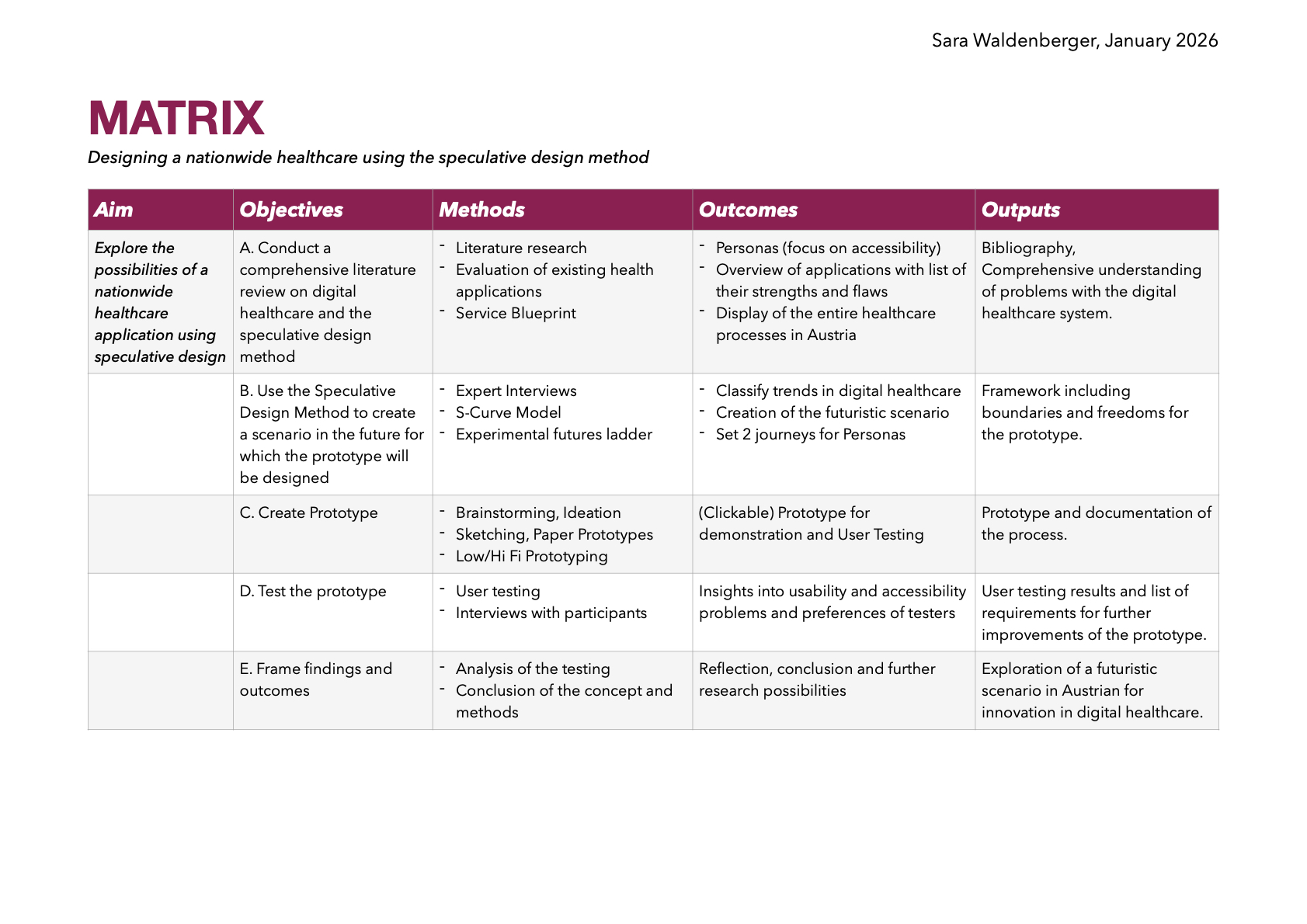
For this impulse I read the academic paper “A systematic literature review of the speculative design process and a proposed framework for speculative design” published in the Design Science Journal in 2025. The aim of the paper is a systematic literature review of 52 studies to clarify the methodological foundations of speculative design across various fields, including healthcare, AI, and urban planning.
ANOTHER DIAMOND!
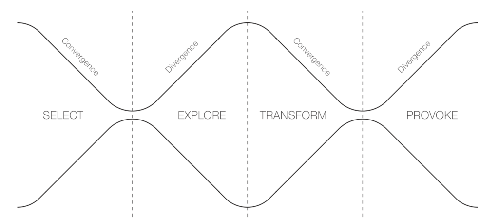
The authors identify a recurring four-phase process throughout the papers and propose an adapation of the oh-so-loved Double Diamond: the Inverted Double-Diamond Framework with the phases select, explore, transform, and provoke.
While the paper acknowledges that speculative design has been practiced for decades, it presents the Inverted Double-Diamond Framework as a new tool for “communicating the core of speculative design” and establishing a shared conceptual foundation for the field.
1. Select (Convergent Thinking)
The goal of this initial phase is selection for speculation: identifying and reframing complex, hidden, or emerging challenges. Designers focus on narrowing down broad topics of concern into a specific issue that will anchor the rest of the process. This may involve:
Projecting potential issues from existing systems if current values persist.
Understanding current issues through stakeholder discussions or data reviews.
Asking future-oriented “what if” questions about emerging technologies.
2. Explore (Divergent Thinking)
The speculative exploration phase involves the imaginative generation of reality-alternative scenarios. It encourages thinking beyond the constraints of the present to consider “what the future could be”. Common methods include:
Scenario-building techniques to situate abstract concepts in a plausible future world.
The “cone of possibilities” model, which categorises futures as probable, plausible, possible, or preferable.
Contrasting utopian and dystopian futures to reveal tensions between empowerment and control.
3. Transform (Convergent Thinking)
In the speculative transformation phase, abstract concepts from the exploration phase are translated into tangible representations. This phase focuses on selecting and refining ideas to create “probes” that bridge imagined realities with the present. Key outputs include:
Prototypes: These can range from low-fidelity models made of everyday materials to polished, high-fidelity physical artefacts.
Fictional Narratives: Stories, audiovisual formats (videos, audio), or printed materials (catalogues, posters) that provide social context and make the speculative world more relatable.
4. Provoke (Divergent Thinking)
The final phase, speculative provocation, uses the developed prototypes and narratives to stimulate critical dialogue, debate, and reflection. The goal is to challenge ingrained assumptions and encourage the audience to think about the ethical and societal implications of potential futures. Methods for provocation include:
Group discussions and debates structured around opposing viewpoints.
Individual reflection activities and qualitative interviews.
Public exhibitions where audiences engage with the artefacts not as products for consumption, but as prompts for active imagination
Healthcare and speculative design
By shifting the focus from commercial production to social and ethical implications, speculative design in healthcare allows researchers to bridge the gap between current medical realities and the consequences of future technological trajectories.
The paper identifies healthcare as one of the primary academic disciplines where speculative design is frequently applied to explore the complexities of contemporary challenges. Rather than focusing on immediate medical solutions, speculative design in this field is used to anticipate emerging needs, ethical dilemmas, and the social implications of future medical technologies.
The paper highlights several specific studies and prototypes that illustrate how speculative design functions within a healthcare context, for example a publication where Zolyomi and Snyder (2024) engaged neurodiverse dyads in a speculative design process to create an “emotion translator,” using low-fidelity prototypes to materialise their ideas.
Source Cardenas Cordova, D., Kelly, N., & Rezayan, L. (2025). A systematic literature review of the speculative design process and a proposed framework for speculative design. Design Science, 11, e38. doi:10.1017/dsj.2025.10030
A couple of months ago I stumbled on the Book “Good Services – How to design Services that work” by Lou Downe (see Impulse.02). I finally came around to reading it!
In this Blog post I want to provide an excerpt of the 15 principles of good service design according to Downe. I chose 5 principles I learned the most from or thought were the most relevant for my research. Additionally, I add a paragraph of reflection on my Thesis to add personal context to the topic.
The 15 Principles
Disclaimer: Instead of repeating repeating “A good service” before every principle statement, this section will imitate the formulation of the book’s chapters.
3.1 Is easy to find
This chapter emphasizes that the name of a service is crucial for user accessibility, as it acts as the primary entry point. Providing a good service is ensuring that users can easily find it, which is often more challenging than it seems.
To improve service discoverability, organizations should prioritize user-friendly names that reflect what users are trying to achieve. This involves:
Understanding users’ goals.
Recognizing their knowledge level regarding available services.
Names should avoid legal or technical jargon and instead describe tasks in straightforward language. Ultimately, service names should bridge the gap between user intent and organizational terminology, facilitating easier access to necessary services.
While I appreciate the importance of making a service easily discoverable, I don’t see naming my e-health platform as my first priority. Since I intend for it to be a nationwide government initiative—similar to ELGA, (amusingly, is an acronym, a no-go according to the book) my focus will initially be on developing the platform itself. I do want the name to be catchy and perhaps even personal, like a first name, to create a sense of connection. However, my immediate priority will be on the platform’s functionality and user experience rather than on the name itself.
3.2 Enables a user to complete the outcome they set out to do
Designing services with the entire user journey in mind is essential. This approach not only enhances user experience but also improves service effectiveness and efficiency. If users understand what they need before reaching your service, they are more likely to succeed in their goals.
Failing to recognize and design for users’ true objectives can have severe consequences. The issue of homelessness illustrates this well; Malcolm Gladwell’s article “Million-Dollar Murray” showcases how inadequate responses to homelessness are often more costly than comprehensive solutions. It highlights the importance of addressing the full scope of user needs rather than piecemeal solutions.
Designing services within the context of a wider user journey can lead to more effective service delivery and reveal gaps in existing offerings. For example, using the wording “Get me home” in a navigation service instead of offering input fields to manually write your destination. When designing services, it’s crucial to ask whether you’re starting at the right point for users and if your service effectively helps them reach their goals.
This chapter is particularly interesting for my design process because the tasks my users should be able to do with my e-health application are very broad and highly dependent on the context the user is in. Ultimately the application should cover all things health related in one place. My plan right now is to have the user set up the front page of their application according to their needs during the onboarding process. This might help with creating a more custom experience while still keeping all possibilities open.
3.3 Clearly explains it’s purpose
To effectively manage user expectations when designing a service, it’s crucial to first understand what those expectations are. Users often base their expectations on past experiences with similar services, so their assumptions may not align with what your service actually provides. There are three types of expectations to consider:
Universal Expectations: These are fundamental service features that most users expect, such as the ability to withdraw money from an ATM at a bank. These expectations are widely recognized and should not need explicit explanation.
Assumed Expectations: These arise when users lack knowledge about a service, leading them to make assumptions that may not be accurate. For example, new users may assume they can open a bank account with minimal documentation. It’s essential to clarify these expectations upfront, either by simplifying the service or clearly communicating what users should expect.
Outlier Expectations: These are unique expectations based on individual users’ previous experiences. For instance, some users might expect instant notifications for transactions based on their experience with app-based banks. While you may not need to address these right away, it’s important to monitor them, as they can evolve into universal expectations over time.
Managing these expectations involves different strategies. Universal expectations should be met without explicit mention, while assumed expectations require clear communication. Outlier expectations should be observed for potential future relevance. A balanced approach that addresses all three types will ensure that your service remains valuable and user-friendly, preventing potential pitfalls from unmet expectations.
This chapter reinforced the importance of having a clear plan for what my users will want to accomplish within my application. To effectively manage expectations for my thesis, I aim to limit options and possibilities. Specifically, I plan to develop around five distinct scenarios and personas, which will allow me to measure how effectively users can complete their desired tasks.
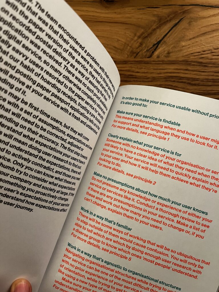
3.4 Require no prior knowledge to use
To ensure a service is usable without prior knowledge, the following strategies should be considered:
Ensure the Service is Findable: Understand when and how users might seek support, along with the language they use during their search. Refer to Principle 1 for more details.
Clearly Define the Service’s Purpose: Users may not be familiar with your organization, but they likely know what they need. Your service should quickly convey what it does and how it can help them achieve their goals. More information can be found in Principle 2.
Avoid Making Assumptions About User Knowledge: Do not assume any prior knowledge or experience with your service or similar offerings. Conduct a thorough review to identify any assumptions within your service. Create a list of these assumptions and determine which ones need to be adjusted or clearly explained to users.
Utilize Familiar Methods: Some approaches are so common that deviating from them can cause confusion. To identify these methods, conduct user research with a diverse group to understand which ones are widely recognized. See Principle 5 for additional insights.
Design Independently of Organizational Structures: Navigating organizational frameworks can be challenging for users unfamiliar with your service. Ensure that your service is easy to use without requiring users to understand who is providing it.
I have given considerable thought to how my e-health application must be user-friendly for the broadest possible audience: essentially everyone in Austria over the age of 18. This diverse user group encompasses varying technological backgrounds, social differences, financial situations, health conditions, and age ranges. That’s why Point 3 of this chapter, “Avoid Making Assumptions About User Knowledge,” really resonated with me; I need to design with all potential users in mind. However, given the rapid pace of technological advancement and my intention to utilize speculative design methods, I will establish some foundational guidelines regarding users’ tech affinity.
Regarding Point 5, “Design Independently of Organizational Structures,” I recognize that the health sector often operates differently. People (at least nowadays) are very critical when it comes to “hiding” where information is coming from or with which part of the service they are currently in contact with. This is an area where I need to engage in deeper research to fully understand the differences in healthcare information.
3.5 Is agnostic of organizational structures
In 2016, British company Thriva was established to allow users to conduct health checks discreetly at home through at-home blood tests for various conditions like diabetes and hormone imbalances. While it has transformed health monitoring, Thriva’s true innovation lies in its integration of multiple components from various organizations, notably utilizing the nationwide network of NHS pathology labs. These labs operate under strict regulations, and Thriva has effectively incorporated these rules into its service.
This type of seamless service, involving collaboration across organizational boundaries, is not typical in many sectors. In today’s digital landscape, users seek services based on their needs rather than the limitations of individual organizations. The focus should be on helping users achieve their goals, even when those goals extend beyond what a single organization can provide.
Traditional services often struggle with fragmentation and siloed experiences due to outdated organizational structures designed for a slower-paced world. These rigid systems tend to specialize in specific tasks, making it challenging to provide cohesive user experiences.
Four key issues contribute to this fragmentation:
Separation of Data: User data is often not shared across organizations, requiring users to repeatedly provide the same information.
Incompatible Processes: Misalignment between the processes of different organizations can disrupt the user journey.
Incompatible Criteria of Use: Different rules across service components can create confusion for users.
Inconsistent Language: Variations in terminology can disorient users trying to navigate the service.
To address these issues, it’s important to understand the historical context of organizational silos. Melvin Conway’s theory suggests that an organization’s structure directly influences its service design. If teams within an organization are siloed, their services will likely be fragmented.
As organizations face increasing demands to integrate services, a new model of experience integration is emerging. This approach involves collaborating across multiple organizations to provide a cohesive user experience, often without altering the individual organizations involved.
However, fostering effective communication and collaboration is challenging. Organizations may have different objectives, paces, and incentives that can hinder cooperation. To support collaboration on shared services, consider these four strategies:
Permission: Create an environment that encourages collaboration beyond day-to-day roles.
Shared Standards: Establish common practices that facilitate teamwork without stifling creativity.
Shared Goals: Develop a unified vision that everyone can support and work towards.
Shared Incentives: Align financial incentives to ensure that collaboration is prioritized over individual agendas.
The most important takeaway here is to be able to recognize potential silos within an organization or with external partners, and if you can’t change the operating model, shift how you communicate and collaborate. Implementing shared standards, goals, and incentives can foster a more collaborative environment, ultimately enhancing the user experience.
I really enjoyed this chapter of the book because it used a healthcare service as an example, which helped me relate this principle even more to my thesis. Considering the insights on organizational silos, it’s clear that my thesis on a nationwide e-health application in Austria must address specific barriers that could hinder its effectiveness. Potential silos might exist between various healthcare providers, such as hospitals, general practitioners, and specialist clinics, all of which may have different systems for managing patient data. Additionally, there could be inconsistencies between public health organizations and private healthcare entities, complicating data sharing and collaboration.
Regulatory frameworks may also create silos, as differing compliance requirements could prevent seamless integration of services across platforms. Also, varying levels of technological adoption among healthcare professionals and patients could lead to fragmentation in user experience. By identifying and addressing these specific silos, I can design an e-health application that not only facilitates communication and data sharing among these diverse stakeholders but also ensures a cohesive and user-friendly experience for all Austrians seeking healthcare services.
In this talk Dr. Avi Mehra an IBM associate partner shared valuable insights on the critical intersection of design and clinical safety in digital health. Avi and his college Flora, a design director at IBM discuss how to create safer healthcare solutions through thoughtful collaboration and user-centered design principles.
The presentation begins with a personal story from the speaker’s early days in an intensive care unit, highlighting a serious patient safety incident caused by miscommunication and outdated information. This story set the stage for the central theme: safety must always be at the forefront of healthcare design. The speakers emphasized that digital health technologies hold immense potential to improve patient experiences but can also introduce significant risks if not carefully managed.
Flora then introduced four key principles for designing with safety in mind:
Design for the edges of the population: Focus on users with complex needs, not just the average user.
Recognize the risks: Understand the serious consequences of missteps in healthcare delivery.
Account for various care settings: Design for the entire patient journey, including home care and telemedicine.
Support adoption from the start: Ensure that new solutions seamlessly integrate into existing workflows and do not overwhelm users.
Screenshot from the presentation
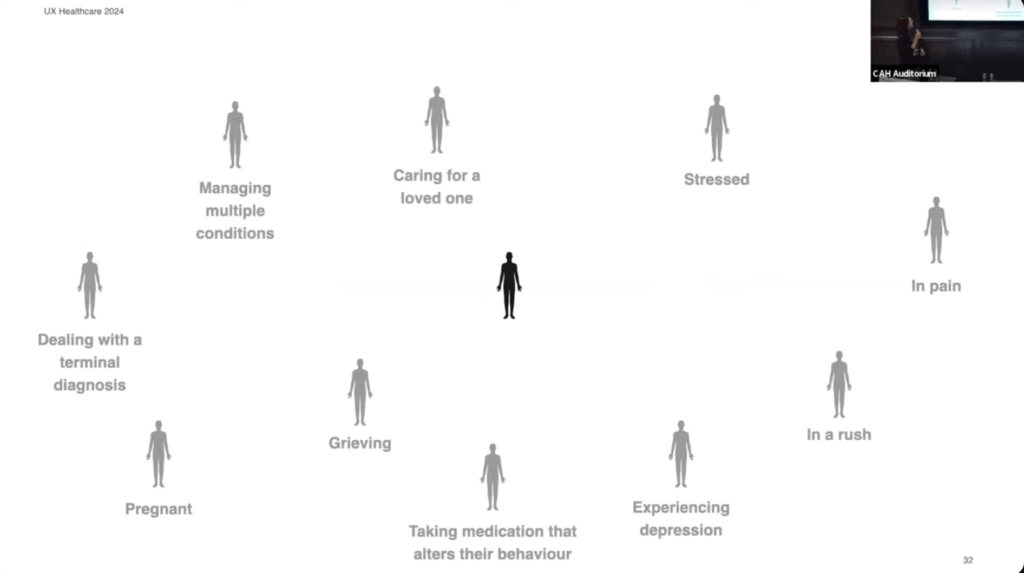
I really appreciate Flora’s perspective on designing for the edges of the population. She highlights that individuals often face multiple challenges simultaneously, rather than just one. This is something I was not considering yet and is something I want to keep in mind as I develop my personas.
Yesterday I listend to the episode Innovating healthcare by the Service Design Podcast. It features Brian Desplinter and Jurgen De Klerck who are collaborating at AZ Groningen, a hospital in Belgium, about healthcare innovation, with a focus on the use of 5G technology for advancements.
They mention that co-creation of solutions for challenges across hospitals and industries are vital for innovations. In health care the potential of messing something up is extremely risky. Especially in highly stressful environments like the hospital.
Something that was super interesting to me was that Brian was asked to shadow medical departments. Over the course of a year he watched the daily activities of the doctors and nurses in different departments to see where there were problems and to come up with new ideas. I’m curious to find out if this innovation center of the hospital in Belgium is comparable to anything here in Austria.
The challenges in healthcare are evident worldwide due to the eldering society which leads to the shortage of staff. This calls for innovative ideas to make processes in health care more efficient. The guests on the podcast mention that innovation is not only about technology. Its how you integrate the technology into the system.
Nowadays the demands and standards from patients are much higher than 10 years ago. People want to have seamless experiences but innovation is slower in healthcare because the bureaucracy that is tied to healthcare is always a problem.
The podcast touches on the use of VR in healthcare, such as in speech and aggresion therapy, highlighting the potential for creating optimal, controlled environments. The future of healthcare, they suggest, will likely be heavily influenced by wearable and on-demand technology.
Looking at the current state and future of healthcare, the speakers articulate the need for a more preventative approach, maintaining health rather than treating disease. They believe the way forward lies in closer collaboration between service designers, healthcare professionals, and patients.
The episode ends with Jurgen stating that people interested should send him a message and he can give them insights of their work of the hospital over a coffee. I’m kind of intrigued to see if he can stand up to this offer. Maybe I will travel to Belgium soon…
When think about how often we interact with services it really is shocking how poorly designed a lot of them are. Good service design, a book by Lou Downe, the former Director of Design for the UK Government. She was involved with the design https://www.gov.uk/. In her book, Downe gives a guideline of 15 points of what to look out for when designing a service.
What is a service?
Short answer: A service helps us do something we want to do
A service can range from something as tiny as buying a bottle of water to something huge like registering to get married. What makes a service a service is that it combines multiple organizations into one (hopefully) seamless experience for the user to get to their desired goal.
The 15 principles for good service design
They have to be easy to find
Clearly explain its purpose
Set a user’s expectations of the service
Enable each user to complete the outcome they set out to do
Work in a way thats familiar
Require no prior knowledge to use
Be agnostic of organizational structures
Require the minimum possible steps to complete
Be consistent throughout
Have no dead ends
Be usable by everyone, equally
Encourage the right behaviours from users and service providers
Quickly respond to chage
Clearly explain why a descision is made
Make it easy to get human assistance
I haven’t read the entire book yet but I would like to point out what really stuck with me and that I want to focus on in my thesis.
In chapter 7 Be agnostic of organizational structures, Downe mentions that it is vital to a service must not show the hidden structures of the organizations it’s combining. She uses the term “siloed” a lot, which basically means that parts of organistations are isolated so much and don’t share data efficiently between each other. It’s less collaboration and more work for the user. I think this is extremely true for health care in Austria because the transfer of data and knowledge relies on so many different tools that it’s confusing and overwhelming to deal with.
Downe believes that the sub-organizations need to agree on a common goal in order to work together seamlessly. Once this foundation is set it can help to create a permissive environment for collaboration.
I really enjoy how effectively this book conveys the most important aspects of service design and I’m sure it will provide lots of guidance when writing my thesis.
Random side note: Even though the overall design of this book is really pleasing I was extremely irritated by the bold font they used for the body text. This is not relevant to the content but it’s something that bothered and reminded me of the importance of visual hierarchy once again.
For this blog post I would like to share some thoughts about a talk about accessibility and neurodiversity and add some personal observations I made spending time with my sister.
Side info: My sister (25) is neurodivergent and struggles to use digital interfaces. Because they are part of every day life she has learnt to deal with the difficulties in her own way but often requires help by my parents, me or my brother.
In October we visited the World Usability Congress (WUC) where I attended the talk by Alide von Bornhaupt about designing for neurodivergent people.
In my experience the term “accessibility” the context of digital design is a highly relevant topic in Design Conferences (as it should be). But the talks usually focus more on physical restrictions or disabilities and less on psychological accessibility. Thankfully, in recent years neurodivergence is talked about more openly and resources are more widely spread.
This is why Alide’s talk stood out to me in the agenda of WUC. She started out her talk with telling her audience why keeping neurodivergent people in mind when designing with some numbers:
every 5th person is neurodivergent
300 000 inhabitants in Graz –> 61 000 people in Graz are neurodivergent
A tram ticket in Graz is 3,50 €. If buying a tram ticket is not possible / challenging for this group of people this could mean more than 213 000 € loss in revenue for the tram company.
I’m aware that Alide used this example to put the whole topic into a business perspective, especially for people that need to convince stakeholders to shine a light on neurodiverse people. Nevertheless I found this example kind of hilarious because buying tickets for public transport is something my sister struggles with a lot. Taking the train to visit me in Graz and going on the tram to my appartement has been challenging every time she visited me in the last year. But because she she has no other option than to buy the ticket, nobody is losing money.
Neurodiversity can be many different things like ADHD, autism, dyslexia. Neurodivergent people often struggle with energy because they mask certain behavioral patterns to not seem different. My sister particularly struggles with reading and comprehending patterns that seem straight forward to allistic patterns. She gets overwhelmed with the “simple” task of buying a ticket and has to seek help from her family. This makes her less independent of her own life and reliant on help from others.
Of course the ideal solution would be to have testing pool of neurodiverse people to evaluate their struggles and needs. But this can be challenging because half of neurodivergent adults are not diagnosed and neurodiversity is so individual. This is why Alide emphasises to test digital products with lots of people. Because the more people you test with, the more neurodiverse people you test with.
As mentioned in previous blog posts, my research topic (nationwide eHealth tool) needs to be something that is designed for everyone. In my thesis I really want to focus on the aspect of designing for neurodiversity. Because technology is evolving so rapidly and even allistic (neurotypical) people are struggling to keep up I really hope to meet the needs of people like my sister when designing tools to make everyday life simpler to navigate through.
University: Aalto University, School of Arts, Design and Architecture
Year: 2021
Link to thesis: https://aaltodoc.aalto.fi/items/dd9f4b4b-f9f7-4f46-90d5-3d8db8ae0040
This thesis examines the evolution and current offerings of design systems in various organizations, highlighting their role in creating better digital products through reusable designs and guidelines. The thesis includes case study of the ABB CommonUX Design System, using qualitative and quantitative data gathered from user and creator interviews. Findings suggest that the complexity of an organization’s product portfolio and its design maturity significantly influence the services offered by design systems.
Overall presentation quality (Grade: 1)
This thesis used a clear structure that was easy to follow. The reader is guided from surface-level general information to in depth and practical research.
Degree of innovation (Grade: 1)
By conducting their own research the author proved a high grade of innovation. All findings and
Independence (Grade: 1)
The author showed their independence clearly by referencing literature but also working together with the ABB CommonUX Team. By conducting clearly structured interviews and making
Organization and structure (2)
In general the thesis was clearly structured. The page numbers were not noted in the table of contents. Especially for people that want to browse the thesis (like me) this was unfortunate. Having the table of figures and images at the start of the thesis irritated me.
Communication (1)
The author used professional language, simple and effective structure, tables and figures when appropriate.
Scope (Grade 1)
The work ranges over 150 pages. This is suitable when considering the spaced out formatting of the thesis. All research questions are answered in depth throughout the thesis and summarized accurately in the summary.
Accuracy and attention to detail (Grade: 2)
Tables and figures are labeled consistently. Unfortunately there are some page numbers missing.
Literature (Grade: 1)
The choses literature offers a broad spectrum from print to online media both very recent (from the time the thesis was published) to classic renowned relevant works from the start of service design.
I even met Richard Dank (DesCode) while donating. He gave me lots of expert insights since he has donated over 100 times already. One of his ideas was to incorporate a system for experienced donors to guide them to choose appointments in times when the blood donations are statistically low. I thought this was a great idea and I’m kind of imagining it like something similar to when you choose travel dates and red and green indicating which days are cheapest to travel.
Check out the video to see the process of my prototype!
Creating a user-friendly questionnaire is essential for gathering valuable insights while ensuring a smooth experience for respondents. In my recent experience with the “Meine Blutspende” app, I encountered significant pain points that highlighted the importance of effective design in questionnaire development. This is why I want to specifically focus on the questionnaire part for my final prototype.
One of the main issues was the terrible formatting of the questionnaire. The red background combined with poorly chosen font colors made the text difficult to read. This lack of readability can lead to frustration and disengagement, causing users to abandon the questionnaire before completion. Proper contrast between text and background is crucial to ensure clarity and maintain user attention.
Additionally, the center-aligned text contributed to the readability problem. Left-aligned text is generally easier for users to follow, as it allows for a more natural reading flow. When designing questionnaires, it’s vital to consider typography choices and alignment to enhance user comprehension.
Another critical aspect of questionnaire design is the clarity of the questions themselves. Users should be able to quickly understand what is being asked without ambiguity. This can be achieved by using straightforward language, avoiding jargon, and breaking down complex questions into simpler, more digestible parts. Providing examples or context can also help clarify what is being asked.
Questionnaire Checklist
I’ve created a checklist for my final prototype to help me focus on the main points of creating a clear questionnaire.
Clear Purpose
= to determine if an individual is eligible to donate blood.
Provide explanation: Align each question with eligibility criteria established by health authorities.
User-Friendly Formatting
Use a clear, readable font size and style.
Ensure high contrast between text and background colors for readability.
Keep the layout simple and organized, avoiding clutter.
Logical Flow
Organize questions in a logical sequence (personal details, health history, travel history).
Group related questions together (medical conditions, medications).
Question Clarity
Use straightforward language and avoid medical jargon.
Phrase questions clearly to minimize confusion
Question Types
Utilize a mix of question types (yes/no, multiple-choice) for variety and engagement.
Progress Indicators
Progress bar or percentage indicator to show how many questions have been completed.
Clearly display the total number of questions at the top.
User Engagement
Use engaging visuals or icons to make the questionnaire more appealing.
Accessibility Considerations
Ensure the questionnaire is accessible to all users, including those with disabilities (e.g., screen reader compatibility).
Use simple language and avoid overly complex sentence structures.
Thank You and Follow-Up
Conclude with a thank-you message, acknowledging the respondent’s time and effort.
Provide information on the next steps or how to proceed if they are eligible to donate.
My experience with the “Meine Blutspende” app underscored these points, demonstrating how poor design can hinder user engagement. Ignore the colors please. I’m also not sure about the category pills.
Anyway… tomorrow is my donation appointment. Let’s see how that goes. I know my last post will be late but at least I’m donating blood, what about you???