I recently read “Working in Public” by Nadia Eghbal (now Asparouhova). I discovered the book during my literature research for the “Proseminar Master Thesis” class with Ursula Lagger and got it through an interlibrary loan. As a former developer-relations researcher at GitHub who interviewed hundreds of developers, she offers a fresh, insightful look at the world of open source that I want to share.
Before diving in, it’s important to understand the difference between “free” and “open source” software. The “free software” movement, started by Richard Stallman, is about freedom, not price. The term “open source” was created later to be more business-friendly, focusing on the practical benefits of shared code rather than the ethics of user freedom.
Eghbal’s book focuses on a key distinction in open source projects today: the size of their audience. She describes two models: the “bazaar,” with many contributors (like Linux), and the “stadium,” with a few maintainers and a huge audience of users. Most projects today are stadiums, often run by a tiny group of 1 to 5 developers.
Many projects follow a similar lifecycle. They often start in private, and once they go public, the creators are looking for engagement and feedback. As a project gets adopted, the role of the maintainers shifts from doing the actual code work to managing the project, the community, and the influx of casual contributors.
This leads to a major challenge: how are these projects financed? For many, the answer is they aren’t. The book details the different ways funding works. There are two main types of funders: institutions (like universities and companies) and individuals. Institutions often care about the quality of the code and their influence on the project’s roadmap. For individuals, the reason for funding is often personal; they might use the project daily and simply want to ensure it continues to exist.
The funding target also matters. Is the money going to a project or an individual? Funding a project makes it easier to manage the money transparently. Funding an individual offers more flexibility, as a developer might work on multiple projects. Asparouhova notes that companies tend to sponsor projects, while individuals tend to fund developers directly through platforms like Patreon or GitHub Sponsors.
This brings me to what I think is the most important takeaway from Eghbal’s work: we need to rethink how we value the different kinds of labor in open source. We tend to celebrate the “creator” – the person who has the initial brilliant idea. But what about the “maintainer”? The person who shows up day after day to fix bugs, answer questions, and keep the project alive. Their work is often less glamorous, but it’s no less critical.
If open source is to be sustainable in the long term, we need to find ways to support the maintainers. This could mean more funding, better tools, or simply a cultural shift in how we think about our responsibilities as users of open source.
As I continue my research, I’m left with a question: How can we, as designers and users, better support the maintainers of the open-source tools we rely on every day? I don’t have the answer yet, but it’s a question I’ll be exploring in the weeks to come.
Ai was used to formulate this blogpost (Gemini + WisprFlow)
Im nächsten Schritt habe ich mein bisher eher offenes Ideen-Setup in ein konkretes Exposé überführt. Ziel war es, meine Gedanken nicht nur visuell (wie im Figma Jam), sondern auch inhaltlich zu schärfen: Was ist eigentlich das Problem, das ich bearbeiten will? Wo setze ich an, und was soll am Ende wirklich entstehen? Hier kommt eine kurze Zusammenfassung, was ich in meinem Exposé festgelegt habe.
Ausgangspunkt meiner Masterarbeit ist die historische Unsichtbarkeit von Frauen, die maßgeblich zu Wissenschaft, Kunst, Politik oder Kultur beigetragen haben. Ein zentraler Bezugspunkt ist dabei das Buch Beklaute Frauen von Leonie Schöler, das sehr deutlich zeigt, wie systematisch weibliche Leistungen über Jahrhunderte hinweg vergessen, marginalisiert oder Männern zugeschrieben wurden. Das ist kein Zufall und auch kein reines Dokumentationsproblem, sondern ein strukturelles: Geschichtsschreibung ist immer von Machtverhältnissen geprägt – und diese waren (und sind) patriarchal.
Was mich dabei besonders interessiert, ist nicht nur das Was (also welche Geschichten fehlen), sondern das Wie: Wie werden diese Geschichten erzählt – und warum erreichen klassische, textlastige Formate viele Menschen heute nur noch begrenzt? Gerade für ein jüngeres, visuell geprägtes Publikum fehlt oft der emotionale Zugang. Genau hier setzt meine Arbeit an.
Meine zentrale Fragestellung lautet daher:
Wie kann Creative Coding als künstlerisch-technische Methode genutzt werden, um vergessene Frauen der Geschichte in einem hybriden Ausstellungsformat visuell erfahrbar zu machen?
Die Idee ist, Erinnerung nicht nur zu vermitteln, sondern erlebbar zu machen. Statt passivem Lesen soll es um Interaktion gehen – um Eingriffe, um Sichtbarmachen, um das Überwinden von Störungen. Daraus ergibt sich auch meine zentrale Annahme: Dass generative, algorithmische Visualisierungen (z. B. Fragmentierung, Rauschen, Überlagerung, Emergenz) starke Metaphern für Auslöschung und Wiederaneignung sein können. Wenn Besucher:innen selbst eingreifen müssen, um Inhalte freizulegen oder zusammenzusetzen, wird Erinnerung zu einem körperlichen, bewussten Akt.
Konkret plane ich, 4–8 interaktive, generative Poster zu entwickeln. Jedes davon widmet sich entweder einer Frau oder einem thematischen Kapitel aus Beklaute Frauen. Diese Poster funktionieren hybrid:
Es gibt ein minimalistisch gestaltetes, gedrucktes Plakat (A1/A2), das im Ausstellungsraum hängt, und darauf eine projektionbasierte Animation, die mittels Creative Coding generiert wird. Die gedruckte Fläche dient dabei bewusst als physischer Anker und Projektionsfläche – nicht als bloßer Träger, sondern als Teil des Konzepts.
Die Animationen reagieren auf Interaktion, voraussichtlich über ein Touch-Interface oder einfache Sensorik. Besucher:innen können Inhalte freilegen, Störungen „wegwischen“, Ebenen verschieben oder neue Zustände auslösen. Wichtig ist mir dabei, dass die Technik nicht Selbstzweck wird, sondern die historischen Inhalte unterstützt und nicht überlagert.
Methodisch arbeite ich nach dem Ansatz Research through Design. Das heißt: Gestalten und Programmieren sind nicht nur Umsetzung, sondern selbst Erkenntnisinstrumente. Neben einer theoretischen Auseinandersetzung mit feministischer Geschichtsschreibung, Memory Studies und Ausstellungsdesign entwickle ich iterativ visuelle und technische Prototypen. Parallel teste ich Materialität, Projektion, Interaktion und Lesbarkeit im Raum.
Die Evaluation erfolgt qualitativ: durch Beobachtungen und Gespräche mit Designer:innen sowie mit einem allgemeinen Publikum. Mich interessieren dabei weniger harte Messwerte, sondern Fragen wie: Wird das Thema verstanden? Entsteht emotionale Nähe? Funktioniert die Metapher?
Am Ende soll kein abgeschlossenes „Museumskonzept“ stehen, sondern ein gestalterischer Ansatz, der zeigt, wie Creative Coding zur feministischen Erinnerungsarbeit beitragen kann. Die Ausstellung möchte ich nach Abgabe meiner Masterarbeit aber tatsächlich, wenn ich einen Raum dafür finde, realisieren.
Feedback zu von Final Crit
Feedback von den zwei profis:
Horst Hörtner is expert in human computer interaction and managing director of the Ars Electronica Futurelab which is known as one of the most important institutions in your study field on the edges of digital media, design, art, science, industry, society.
Er meinte:
super spannendes thema, er möchte gern mehr dazu wissen
Er findet speziell den Umschwung in den 70ern, als human computers von bestehend weiblich auf ein männliches narrativ geändert wurde sehr spannender zeitpunkt, vielleicht da näher darauf eingehen in meiner research
interaktive ausstellung findet er super, aber mit beamer auf poster projezieren diese technik findet er nicht cool.
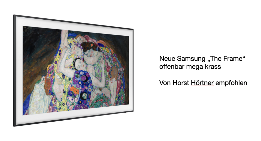
Hat mir gezeigt: der neue Samsung “The Frame” Monitor -> wirkt wie ein Gemälde und man muss komplett nahe gehen um das nicht zu checken. Wenn sich FH leisten kann, wär geil solche zu verwenden. Hier meine Vermutung: eventuell kann ich FH überzeugen, einen solcher bildschirme zu kaufen (kosten so 1200€), aber ich möchte eine ausstellung mit 4-8 solcher poster machen. Das wird sich nicht spielen. Kann man solche bildschirme ausleihen bei samsung? wahrscheinlich nicht.
Für meine weitere Vorstellung der Umsetzung wär mir super wichtig zu wissen, welches Medium ich bedienen werde.
Gespräch Horst Hörtner
Beim Final Crit hatte ich auch ein Gespräch mit Horst Hörtner (HCI-Expertise, Managing Director vom Ars Electronica Futurelab), das für mich vor allem nochmal den größeren Kontext aufgemacht hat. Er meinte direkt, dass er das Thema super spannend findet und gerne mehr darüber wissen würde – was mir gezeigt hat, dass die Richtung nicht nur „nett gestaltet“, sondern auch inhaltlich relevant ist.
Ein konkreter inhaltlicher Hinweis von ihm war, dass ich mir in der Research-Phase ruhig einen bestimmten historischen Kipppunkt genauer ansehen könnte: den Umschwung in den 1970ern, als das Narrativ rund um „human computers“ stärker männlich geprägt wurde, obwohl diese Rolle davor hauptsächlich weiblich besetzt bzw. wahrgenommen war. Er fand diesen Moment als Beispiel für kulturelle Umdeutung extrem spannend – und das passt total zu meinem Grundthema (wer sichtbar ist, wem Leistung zugeschrieben wird, wie Geschichte umgeschrieben wird). Ich nehme das auf jeden Fall als möglichen Fokuspunkt für die theoretische Auseinandersetzung mit.
Zur Umsetzung hat er folgendes gesagt: Die Idee einer interaktiven Ausstellung findet er sehr stark, aber die klassische Lösung „Beamer projiziert auf Poster“ findet er technisch und konzeptuell nicht so überzeugend. Also hier Impuls: weg vom Projection-Setup, hin zu etwas, das im Raum hochwertiger wirkt.
Er hat mir dazu ein sehr konkretes Beispiel gezeigt: den Samsung „The Frame“-Monitor von Samsung. Das Ding wirkt (wenn es gut eingesetzt wird) fast wie ein echtes Bild oder Gemälde – so sehr, dass man ziemlich nah hingehen muss, um überhaupt zu checken, dass es ein Screen ist. Er meinte: Wenn die FH sich sowas leisten kann, wäre das ein extrem gutes Medium für mein Vorhaben, weil es diese „Poster/Art-Objekt“-Ästhetik unterstützt, ohne die typischen Projektion-Probleme.
Gleichzeitig bin ich da direkt in die Realitätsfrage reingelaufen: Ich plane ja eher 4–8 Stationen. Selbst wenn ein Screen „nur“ um die 1200 € kostet, ist das in der Summe unrealistisch. Ich hatte kurz die Idee, ob man sowas eventuell ausleihen könnte (z. B. direkt beim Hersteller), aber ich gehe eher nicht davon aus, dass das easy ist. Trotzdem: Vielleicht kann ich zumindest versuchen, die FH von 1-4 Screens als Prototyp/Leihgerät zu überzeugen? Ich mein wenn der Chef von Ars Electronics so überzeugt von dem Monitor ist, dann könnte man da schon bissl investieren, oder?
Was ich aus dem Gespräch vor allem mitnehme: Für meine nächsten Schritte ist es extrem wichtig, dass ich mich früh auf ein Medium festlege (Screen / Screen + physische Layer / Print + Overlay etc.). Weil davon hängt praktisch alles ab: Gestaltung, Interaktionsidee, Materialität, Setup und auch wie „ausstellungsfähig“ das Ganze am Ende wirkt.
Gespräch Martin Kaltenbrunner
Mein zweites Gespräch war mit Martin Kaltenbrunner (Interface Culture / HCI, Tangible Music Lab, u. a. Reactivision). Er fand die Grundidee – Creative Coding + feministische Erinnerung + interaktive Bild-Formate – direkt spannend und hat ziemlich schnell eine Referenz gedroppt, die thematisch gut passt: den Film „Hidden Figures“. Den kannte ich schon (und mag ihn auch), aber es war trotzdem hilfreich, weil er nochmal bestätigt hat, dass das Thema „Unsichtbarmachung“ und „nachträgliche Sichtbarkeit“ auch außerhalb meiner Buch-Referenz gut ankommt.
Gleichzeitig hat er einen Punkt angesprochen, den ich sowieso schon im Hinterkopf hatte, den ich aber bisher nicht wirklich entschieden habe: Wie stark hängt mein Projekt sichtbar am Buch „Beklaute Frauen“ – und wie gehe ich mit Urheberrecht / Bezugnahme um? Sein Hinweis war ziemlich klar: Entweder ich nehme aktiv Kontakt mit der Autorin (Leonie Schöler) auf, kläre, wie/ob ich Inhalte verwenden darf, oder ich finde einen Weg, das Projekt so zu positionieren, dass das Buch nicht als „so offensichtlicher Ausgangspunkt“ im Vordergrund steht. Also: inspiriert sein ist okay, aber die Arbeit sollte trotzdem als eigenes System funktionieren – mit eigener Auswahl und eigener Narration.
Inhaltlich hat er mir dann noch ein paar Keywords mitgegeben, die ich mir fett notiert habe, weil sie mein Thema gut bündeln:
Interaktivität, dynamisches Bild, politisches Plakat – zeitgenössisch, interaktiv.
Das hat bei mir direkt was ausgelöst, weil es genau diese Richtung verstärkt, die ich eigentlich meine: nicht „nur“ schöne generative Visuals, sondern ein Format, das im öffentlichen Raum oder Ausstellungsraum wie ein Statement funktioniert – nur eben aktualisiert für ein digitales / interaktives Setting.
Auch technisch bzw. vom Setup her kam ein sehr konkreter Vorschlag, den ich super finde: Er meinte, er würde es stärker finden, wenn ich nicht projiziere, sondern mit einem normalen Monitor arbeite, den ich physisch überlagere – zum Beispiel durch Beklebung, Karton, Folien, Schichten oder Material, das das Bild wirklich „verdeckt“. Und dass dann die Interaktion nicht nur „Touch = Effekt“, sondern eher wie ein echtes Freilegen funktioniert: etwas wegrubbeln, abziehen, wegwischen, Schicht für Schicht. Das passt inhaltlich eigentlich gut, weil das „Sichtbarmachen“ dann nicht nur eine Metapher in der Animation ist, sondern wirklich im Material passiert. Wobei ich mir noch nicht sicher bin, ob mir das zu “DIY” wirkt oder ob ich das auch sleek umgesetzt bekomme. Projection Mapping fand er eher weniger professionell und nicht so stark, weil es “nur ein schlechter monitor” ist.
Als letzte Inspiration hat er mich noch aufs Ars Electronica Archiv hingewiesen – als Ort, wo ich Referenzen sammeln kann, die in eine ähnliche Richtung gehen (interaktive Arbeiten, Medienkunst, politische oder gesellschaftliche Themen, die über Interfaces vermittelt werden). Das ist für mich gerade auch deshalb spannend, weil ich dort wahrscheinlich Beispiele finde, die mir helfen, meine eigene Arbeit besser zu verorten: Was ist an meinem Ansatz neu, was ist ähnlich, und wo kann ich bewusst abgrenzen oder weiterdrehen?
Unterm Strich war das Feedback für mich vor allem ein Push in zwei Richtungen: konzeptuell sauberer werden (Buch als Ausgangspunkt vs. eigenes System) und physischer/greifbarer denken (Monitor + Analog statt Projektion).
During the summer, I had a quiet realization: I would probably have to change my topic. The company I originally wanted to collaborate with decided not to work with students, and for a moment, I felt a bit lost. But instead of seeing it as a setback, I treated it as a reset.
I sat down with a blank sheet of paper and started writing. First, I listed problems I would genuinely like to solve, things that felt meaningful to me. Then I wrote down directions and skills I was curious about and wanted to grow in. To make it more visual (and a bit more fun), I rated everything with stars. I marked the most interesting problems and the most inspiring directions.
When I looked at the results, a pattern appeared. Social problems clearly mattered most to me. And when it came to interests, I couldn’t choose just one: UX/UI, 3D printing, and video editing all felt equally exciting.
For the next few weeks, I kept searching for the right problem. Something that felt personal, but also universal. Eventually, I realized I kept coming back to one idea: preserving relationships. No matter if it’s family, friends, or partners, relationships shape our lives. And that became the problem I wanted to explore and solve.
That’s how my Master’s thesis topic was born: connecting and preserving memories by linking the digital and physical worlds in a fun, playful way.
During the semester, I started exploring what would actually keep people engaged in the digital space – the website. Some ideas felt obvious: creating shared albums, playing small games, sending video notes, or voice messages. But “obvious” wasn’t enough. I kept asking myself: How can this feel special? How can it feel memorable? That’s when I remembered how powerful animations can be. Usually, animations are just the cherry on top of UX nice, but not essential. But what if animation became the main engagement driver? I thought about interactions like the weather slider, burning negative stories in How We Feel, or the cracking opening animation in Opal. Those moments stick with people. The only realistic way to build something like that was coding. So, with help from ChatGPT, Claude, and a lot of tutorials, I started learning.
At the same time, another part of the project started forming: the physical object. I want it to feel meaningful, emotionally warm, and easy to carry around, something that feels personal, not just functional. I still don’t know exactly what it will look like, and that’s okay for now. What I do know is that I’ll need to experiment with materials to see which ones work best with NFC tags, maybe 3D prints, air clay, or ceramics.
The connection between the digital and physical worlds will happen through NFC. That part, at least, feels solved
Technically, the project feels challenging but doable. The harder part right now is defining the target group. Because, realistically, everyone has relationships. Everyone has memories.
A meeting with my supervisor, Anika Kronnberger, helped me zoom in. Instead of trying to design for “everyone,” she suggested thinking about specific sectors, like tourism, or focusing on age groups that might find this kind of product especially meaningful and fun.
I recently watched a video by Hello Erika called My Secret to Being Creative, and it really got me thinking about how I approach my own projects. Lately, I’ve been trying to figure out new ways to present my thesis idea and keep my mind fresh, but sometimes I feel stuck in the same patterns. This video reminded me that creativity isn’t about waiting for inspiration to strike. It’s about curiosity, small experiments, and giving yourself permission to explore ideas without worrying about being perfect.
In the video, Erika talks about routines that help creativity flow naturally. She emphasizes the importance of observing the world around you, experimenting with small ideas, and embracing failure as part of the process. Creativity doesn’t just happen during big moments of insight. Most of the time, it comes from consistent, playful practice and letting your mind wander without pressure. She also mentions the idea of combining structure with playfulness, like keeping a notebook handy to jot down anything that sparks curiosity or trying small creative exercises regularly.
Watching this video gave me a lot to think about in relation to my thesis. I started reflecting on how I could bring these principles into my work on connecting digital and physical memories. One idea that came to mind is using collages as a way to present content. Collages feel playful and exploratory, and they allow for combining different types of media, ideas, and visuals in a way that isn’t rigid. In the context of my project, I could use collages to show memories, emotions, or experiences in a more tactile and interactive way. For example, a digital collage could bring together video snippets, photos, text, and small animations to create a richer story. On the physical side, a collage made of printed photos, textures, or even 3D-printed elements could give users something they can hold and explore.
Around the same time, I had an amazing coaching session with Mr. Horst Hörtner, which gave me even more inspiration for playful interactions. During our discussion, we explored ways to make the website experience more engaging and social without thinking about technical implementation. One idea that came up was tagging other people on the website to create connections between memories. Another concept was combining two objects with NFC tags to reveal shared experiences, like common friends, places visited, or memories created together. It felt like a fun way to bring people into the experience, encouraging them to explore connections and stories in an interactive, playful way.
To organize all these ideas, I also started using mind mapping. This technique helps me get a look from above at everything I want to include in my project, from digital features to physical interactions
Overall, both the video and the coaching session motivated me to keep experimenting and stay open to unexpected ideas. It encouraged me to play, to combine approaches, and to see the process itself as part of the creative journey.
Watching Abstract: The Art of Design and learning about Es Devlin’s work reminded me why curiosity is such an important part of being a designer. Around the same time, while I was doing research for my thesis, I discovered products on the market that were quite similar to my idea. I remember feeling a bit discouraged when I first saw them. It made me question whether I was too late or if my idea was still worth developing. For a moment, I felt stuck between continuing and starting over again.
The documentary helped me change my perspective. Es Devlin speaks a lot about exploration, experimentation, and following questions instead of trying to be the first person to create something. That idea stayed with me. It made me realize that design is not only about originality. It is about how you interpret an idea, why you build it, and what kind of experience you create for people. Many ideas already exist in some form, but every designer brings their own story, values, and way of thinking into a project. That realization helped me calm down and look at my project in a healthier way.
Around this time, I also had a meeting with Ursula Lagger, and that conversation was very motivating for me. She spoke about the importance of keeping your mind open and staying curious even when things feel uncertain. She reminded me about the 7W method and encouraged me to keep practicing it. Using questions like who, what, when, where, why, in which way, and with whom helped me step back and look at my project from different angles. Instead of focusing only on the fear that similar products already exist, I started focusing on what I could still discover and improve.
This approach helped me shift my mindset. Instead of thinking that I had to create something completely new that nobody has ever thought about before, I started thinking about contribution. I began asking myself better and more specific questions. What is missing in the products that already exist? What emotional value can I add to the experience? How can I make the interaction feel more playful and more human? How can I connect digital and physical memories in a way that feels natural and meaningful for people?
I also realized that finding similar products is not always a negative thing. Sometimes it means that the problem is real and important enough that multiple people are trying to solve it. It can also be a chance to learn. I started analyzing these products more carefully. I looked at what they do well and where they might be lacking. This helped me see opportunities instead of limitations.
Another important part for me was accepting that the design process is not a straight line. Sometimes you feel confident and clear about your direction. Other times you feel lost or unsure. But both phases are part of creating something meaningful. Staying curious helps you move through both phases without giving up too early.
Right now, I try to remind myself that my goal is not to compete with existing products but to add my own perspective and value. I want to create something that reflects my interests in UX, physical interaction, and emotional connection between people. I want to build something that feels warm, playful, and meaningful instead of just functional.
Looking back, the combination of watching the documentary and having the conversation with Ursula helped me continue moving forward. They reminded me that curiosity is a tool that helps you grow, learn, and discover new possibilities. And for me, that is something I want to keep practicing throughout my thesis and beyond.
This talk from WebExpo 2025 focuses on how to design better search experiences for digital products in 2025 — recognizing search as a core part of many user journeys that’s often overlooked.
1. Understanding How People Search Today Vitaly likely starts with how user expectations around search behavior have evolved — the assumptions users bring, typical frustrations, and common patterns in how they look for information in apps and sites.
2. Designing Better Autocomplete & Type-Ahead Autocomplete isn’t just a feature — it helps users formulate queries, reduces errors, and speeds up search journeys. Best practices include deciding when and what suggestions to offer, how many to show, and ensuring relevance.
3. Handling Complex Filters & Sorting Next, the talk addresses faceted search — complex category filters and sorting tools that help users refine results. Design patterns here include placing filters effectively, choosing defaults wisely, using smart previews, and considering filter presets to reduce cognitive load.
4. Building Effective Search Results Pages (SERPs) A good results page communicates relevance, helps users scan quickly, and gives clear actions. This may include thoughtful info hierarchy, highlighting matched text, using visual cues, and designing for both glanceability and depth.
5. Real-Life Examples, Dos & Don’ts Throughout, the session shares practical examples of good vs. problematic search interfaces — illustrating how small tweaks (e.g., clearer labeling, better feedback, faster interactions) make a big difference. Expect actionable “aha” moments.
Reflections
I found this talk quite interesting, as it covers one of the overlooked aspects of designing interfaces, which is search interfaces and experiences which is an element that I will be looking into more because it treats search as strategic UX, not an afterthought and it helps craft results pages that balance clarity, functionality, and speed.
Disclaimer: AI was used to fix any grammatical mistakes and for better phrasing.
Polka Gallery in Paris is where I attended my first photography exhibition.
After some thorough research on the photography exhibitions that were happening at that time in Paris, I found Salgado’s exhibition, who is one of the pioneers of documentary photography, a Brazilian social documentary photographer and photojournalist. Salgado traveled in more than 120 countries for his photographic projects.
The exhibition for me was like a rare gem that I found in an unfamiliar territory; it was based on Salgado’s photographic book ‘Genesis’, a spectacular body of work. It is a documentation of unblemished landscapes, wildlife, and indigenous communities that demonstrate how urgently the need is to protect these subjects. “What I want is the world to remember the problems and the people I photograph,” he said of his work. “What I want is to create a discussion about what is happening around the world and to provoke some debate with these pictures.”
Sebastião Salgado’s vision combined with practical actions through Instituto Terra not only rehabilitated a devastated landscape but also established a scalable model for environmental restoration that engages and benefits local communities, thereby addressing broader ecological challenges.
He and his wife, Lélia Wanick Salgado, significantly contributed to tree planting and environmental restoration in Brazil through the Instituto Terra, established in 1998. This non-profit organization focuses on the reforestation of the Atlantic Forest, which has faced severe degradation over the years.
Stepping into the gallery after getting a fabulous cup of coffee from Terres de Café, I noticed that the gallery is showcasing several other works from world-renowned photographers on the 1st floor and the official exhibition is being exhibited in the next compound. Anyways, I wandered through and found my way to the gallery where Salgado’s work is and started to meander around, admiring the frames one by one. A few people were there, a light vibe in the air, the calm and the whole endeavor had an analog feel to it, apart from the essence of the work displayed and the meaning behind it and the act of walking around steadily and slowly gazing at photographs that were taken at a certain timeframe in a distant place by such a thoughtful artist and human being. Being both a photographer and a designer, you get gifted with the privilege of perceiving the world as a photographer and thinking about reality like a designer and both energies flow eventually and reflect themselves into one’s work and life.
What links this genre of art and the whole endeavor to my thesis and my lane is the lens through which I see the world. I believe that artistic bodies of work are intertwined and woven through an almost invisible web of truth, meaning and enigma, and when you tune in to that web at least once in your career/life, you will see that true art serves a higher purpose and strikes a chord inside every human being that sparks a paradigm shift or a wake-up call that will eventually alters one’s perception to a greater reality.
Later that year on May 23, I was struck by the news that Sebastiao Salgado passed away from leukemia, which made the experience of witnessing his work even more impactful and made me see the artist in a new light.
We recently finished the Overlays Exhibition. I am writing this blog post because I learned so many new things and discovered new fields of interest. Completing the projects for the exhibition opened up a new way of systematic thinking. Creating working systems is now a core interest of mine. The experience at the exhibition also made me rethink my master’s thesis topic. Let me explain why.
My part in the exhibition
I was part of two very different projects, each of which, of course, had its own challenges. Looking back, the biggest hurdle wasn’t the coding itself, but the process of creating the Portfolio Machine Website. We spent a lot of time going back and forth on which technologies to use. However, once we finally agreed on the stack, everything shifted into high gear. We developed the entire system incredibly fast. It taught me that while picking the right tools matters, getting the whole team on the same page is what truly gets the job done. Also learning about different sensors and getting them to work together into a symbiotic system was absolutely fascinating.
The Deep Breath installation was a stressful part of the past few weeks. We were working with servos and electronics, and for some reason, we just couldn’t get it right. For weeks, we were stuck in a cycle of testing and failing. We managed to find the problem just a few hours before the exhibition started, which was a huge relief because the project was successful in the end. It’s fascinating, and a bit exhausting, how deep you sometimes have to research just to find a single solution. Seeing it finally work perfectly for the audience was such a rewarding experience, especially after so much uncertainty.
Rethinking my master’s thesis
Perhaps the most important thing I gained from Overlays was a fresh start for my Master’s Thesis. To be honest, I wasn’t happy with my previous thesis project at all; it felt stagnant, and I was losing interest in its direction. Being able to successfully integrate web development with electronics, using motors and sensors, gave me a new perspective on what’s possible. I’ve now pivoted my thesis to incorporate these new skills. I am not yet sure where this path will lead me, but I am sure it will be a good time.
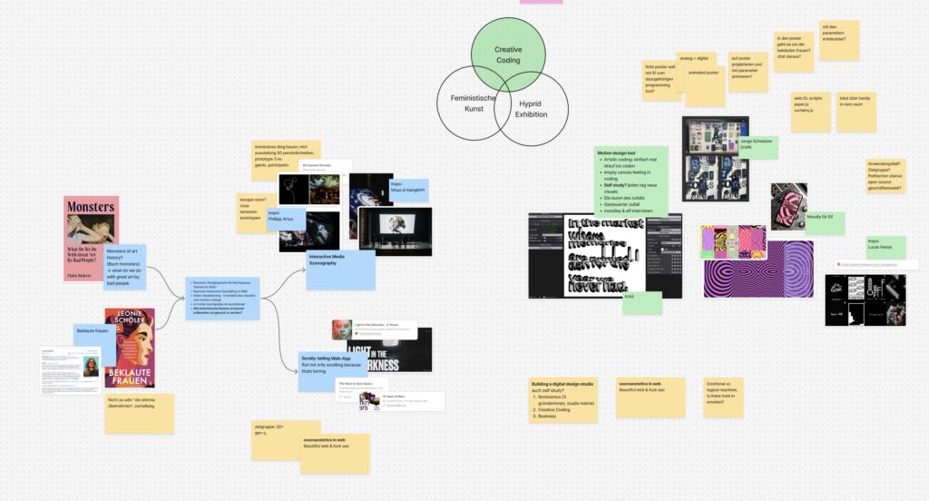
Ich habe meine ersten 3-5 Ideen an Birgit gepitched und ihr Input hat mir sehr geholfen, mein Thema weiter zu denken und auch zu verfeinern. Hier in diesen Screenshot kann man mein erstes Figma Jam board sehen, in dem ich alle Themen mal niedergebracht habe.
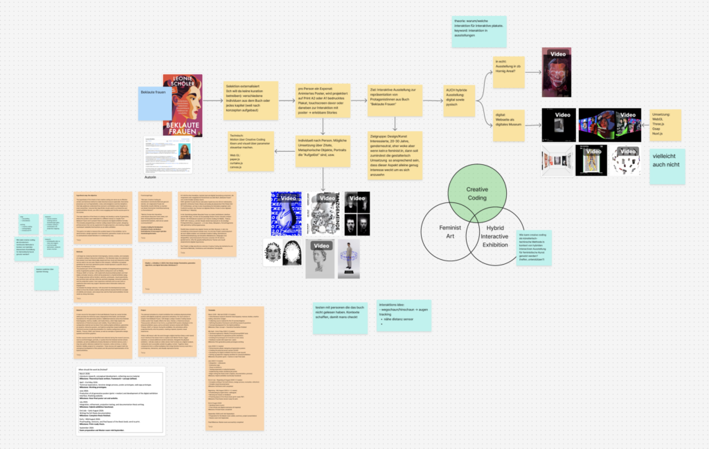
Mein Ziel in diesem Step war, meine Idee im Figma Jam einmal sauber runterzubrechen: Also nicht nur „im Kopf“, sondern als Flow, den ich auch Außenstehenden erklären kann. Inhaltlich hat mich dabei das Buch „Beklaute Frauen“ inspiriert – vor allem die Art, wie es über viele einzelne Biografien und Themen-Kapitel hinweg ein größeres Bild aufmacht.
Nach dem Gespräch habe ich mein Board noch weiter verändert und ausgebaut, folgendes ist aber als Grundentscheidung weiterhin notiert geblieben: Die Auswahl soll externalisiert sein. Ich will an der Stelle keine klassische Kuratorin spielen, sondern eher einen Rahmen bauen, in dem sich unterschiedliche Personen aus dem Buch (oder alternativ je Kapitel, weil das Buch konzeptuell aufgebaut ist) abbilden lassen. Also wenn ich individuelle Schicksale zeige, dann will ich die Auswahl der Person externalisieren – oder ich zeige Konzepte und Gesellschaftsstrukturen, die zu diesem Problem geführt haben, dann kann ich auch andere Literatur heranziehen und selbstständig über die Inhalte der Poster bestimmen. Von diesem Punkt habe ich dann weitergearbeitet, und zwar in die Richtung einer interaktiven Ausstellung mit digital/analogen politischen Postern.
Je nachdem, was in dem Poster dann gezeigt wird, wäre der grobe Aufbau:
Ein animiertes Poster, das als Projektion auf ein gedrucktes Plakat (A2 oder A1) gelegt wird
Dazu Sensoren oder andere Trigger über die man mit dem Poster interagieren kann
Ziel: Die Inhalte werden nicht nur gelesen, sondern als erlebbare Story zugänglich
Ich habe mir dazu auch ein bisschen notiert, wie die Visualisierung pro Poster aussehen könnte. Das soll individuell funktionieren – je nachdem, was zum jeweiligem Inhalt passt. Ideen, die ich gesammelt habe:
Arbeit mit Zitaten als Einstieg oder „Trigger“
Metaphorische Objekte (statt alles nur über Text zu erklären)
Porträts, die sich „auflösen“, fragmentieren oder neu zusammensetzen
Technische Idee der Umsetzung von Projektion auf Poster:
Dann habe ich mir das Ganze nochmal als übergeordnetes Ziel formuliert: Am Ende soll es auf eine interaktive Ausstellung hinauslaufen, die die Protagonistinnen aus „Beklaute Frauen“ repräsentiert – nicht als klassische Info-Tafeln, sondern als hybride, visuell starke Stationen.
Ein wichtiger Punkt im Mapping war auch die Zielgruppe: Ich denke da an design-/kunstinteressierte Menschen, eher genderneutral gedacht, tendenziell offen für politische Themen. Und gleichzeitig: Selbst wenn jemand nicht explizit aus einem feministischen Interesse heraus kommt, soll die gestalterische Umsetzung so anziehend sein, dass man trotzdem hängen bleibt und sich darauf einlässt.
Technisch habe ich eine Richtung festgehalten: Motion über Creative Coding, und zwar so, dass ich die visuellen Elemente über Parameter steuerbar mache (damit das System pro Poster variieren kann). Als mögliche Tools/Libs, die ich dafür am Schirm habe: paper.js, curtains.js und klassisch canvas.js/WebGL, je nachdem wie „grafisch“ vs. „shader-lastig“ es am Ende werden soll.
Und ganz am Ende habe ich mir die Klammer nochmal als Frage notiert, weil das eigentlich der Kern für die Masterarbeit werden könnte:
Wie kann Creative Coding als künstlerisch-technische Methode im Kontext einer hybriden interaktiven Ausstellung für feministische Inhalte genutzt werden – also nicht nur „als Effekt“, sondern wirklich unterstützend?
In the last few months, I had the pleasure of knowing one of the leading professors at FH Joanneum, who happens to be my master’s thesis supervisor by choice, as he possesses real-world knowledge about the UX realm, its intricacies, and fundamentals.
The meetings consisted of a mix of lunches and dinners that gave me the space to talk freely without the boundaries of meeting someone in an office, speaking my mind about the challenges and hurdles that come with doing my master’s studies while working as a product designer and the hustle to juggle between every aspect, including what life throws at you from other directions.
In addition, I introduced my master’s thesis topic and talked about it in terms of the possibilities of how to achieve it, its potential approaches and the importance of striking a balance between theory and practice. I received some great insights from Dr. Konrad, and he introduced me to some fine books. One of these, a master’s thesis from 2018 by a student of FH Joanneum, is particularly noteworthy. The thesis named Data Driven UX Process for MOOC Design by Jacqueline Kircher, which is basically a user experience improvement of the massive open online course platform iMooX, shares the same DNA with my topic since it addresses the UX issues in a platform dedicated to knowledge management.
Scrolling through the thesis, I found a great deal of valuable information, as well as exploring the structure that was used to form and layout a master’s thesis which made me choose this work to be in my bibliography to use it as a reference. Several other books I checked out of curiosity and found what seemed to me the first spark that made me choose digital design as a future path back in 2014, one of them is The Universal Principles of Design.
In conclusion, more and more I’m realizing how valuable to know people who have good experience under their belt and especially those who are pragmatic in their approach to what is going on around them, both professionally and socially and the epiphany of reminding yourself that the more you know, the more you realize that you don’t know.