IMPULSE #8: World Usability Congress | Graz 24 & 25

Attending the World Usability Congress two times was one of those experiences that leaves your brain pleasantly stimulated. It was a gathering of people who genuinely care about how technology fits into real human lives.

What intrigued me first was the strong emphasis on context. Again and again, speakers reminded us that usability doesn’t live in wireframes or prototypes—it lives in messy, unpredictable, real-world situations. Whether it was designing for high-stress environments like healthcare or for everyday tools we barely notice, the message was clear: if you don’t understand the user’s context, you don’t understand the problem. I also gained a deeper appreciation for the maturity of the UX field. There was a noticeable shift away from “best practices” as rigid rules and toward informed decision-making.

Design systems are like LEGO kits; they contain reusable components and instructions, they can be assembled in a variety of ways, and instructions are for both creation and use.

Accessibility was another major takeaway. Not as a checkbox, but as a mindset. Several sessions showed how inclusive design leads to better products for everyone, not just users with specific needs.

I was also reminded that usability is as much about ethics as it is about efficiency. Talks about dark patterns, persuasive design, and user trust highlighted the responsibility we have as practitioners. Just because something can be optimized doesn’t mean it should be. Designing with empathy and integrity is becoming just as important as designing for speed or conversion.

One of my favorite insights was about innovation built by great teams. Great usability doesn’t happen in isolation. Researchers, designers, developers, product managers, and stakeholders all shape the outcome, whether intentionally or not.

Reflections

I left the World Usability Congress 2024 and 2025 genuinely inspired. It reinforced why I care about usability in the first place and why I chose my thesis to be rooted in product UI UX design, because good design respects people’s time, attention, and limitations. And that’s a standard worth continually striving for.

Disclaimer: AI was used to fix any grammatical mistakes and for better phrasing.
IMPULSE #7: Design patterns for search UX in 2025

This talk from WebExpo 2025 focuses on how to design better search experiences for digital products in 2025 — recognizing search as a core part of many user journeys that’s often overlooked.

1. Understanding How People Search Today
Vitaly likely starts with how user expectations around search behavior have evolved — the assumptions users bring, typical frustrations, and common patterns in how they look for information in apps and sites.

2. Designing Better Autocomplete & Type-Ahead
Autocomplete isn’t just a feature — it helps users formulate queries, reduces errors, and speeds up search journeys. Best practices include deciding when and what suggestions to offer, how many to show, and ensuring relevance.

3. Handling Complex Filters & Sorting
Next, the talk addresses faceted search — complex category filters and sorting tools that help users refine results. Design patterns here include placing filters effectively, choosing defaults wisely, using smart previews, and considering filter presets to reduce cognitive load.

4. Building Effective Search Results Pages (SERPs)
A good results page communicates relevance, helps users scan quickly, and gives clear actions. This may include thoughtful info hierarchy, highlighting matched text, using visual cues, and designing for both glanceability and depth.

5. Real-Life Examples, Dos & Don’ts
Throughout, the session shares practical examples of good vs. problematic search interfaces — illustrating how small tweaks (e.g., clearer labeling, better feedback, faster interactions) make a big difference. Expect actionable “aha” moments.

Reflections

I found this talk quite interesting, as it covers one of the overlooked aspects of designing interfaces, which is search interfaces and experiences which is an element that I will be looking into more because it treats search as strategic UX, not an afterthought and it helps craft results pages that balance clarity, functionality, and speed.

Disclaimer: AI was used to fix any grammatical mistakes and for better phrasing.

IMPULSE #6: Sebastião Salgado Photography Exhibition | Paris 2025

Polka Gallery in Paris is where I attended my first photography exhibition.

After some thorough research on the photography exhibitions that were happening at that time in Paris, I found Salgado’s exhibition, who is one of the pioneers of documentary photography, a Brazilian social documentary photographer and photojournalist. Salgado traveled in more than 120 countries for his photographic projects.

The exhibition for me was like a rare gem that I found in an unfamiliar territory; it was based on Salgado’s photographic book ‘Genesis’, a spectacular body of work. It is a documentation of unblemished landscapes, wildlife, and indigenous communities that demonstrate how urgently the need is to protect these subjects. “What I want is the world to remember the problems and the people I photograph,” he said of his work. “What I want is to create a discussion about what is happening around the world and to provoke some debate with these pictures.”

Sebastião Salgado’s vision combined with practical actions through Instituto Terra not only rehabilitated a devastated landscape but also established a scalable model for environmental restoration that engages and benefits local communities, thereby addressing broader ecological challenges.

He and his wife, Lélia Wanick Salgado, significantly contributed to tree planting and environmental restoration in Brazil through the Instituto Terra, established in 1998. This non-profit organization focuses on the reforestation of the Atlantic Forest, which has faced severe degradation over the years.

Stepping into the gallery after getting a fabulous cup of coffee from Terres de Café, I noticed that the gallery is showcasing several other works from world-renowned photographers on the 1st floor and the official exhibition is being exhibited in the next compound. Anyways, I wandered through and found my way to the gallery where Salgado’s work is and started to meander around, admiring the frames one by one. A few people were there, a light vibe in the air, the calm and the whole endeavor had an analog feel to it, apart from the essence of the work displayed and the meaning behind it and the act of walking around steadily and slowly gazing at photographs that were taken at a certain timeframe in a distant place by such a thoughtful artist and human being. Being both a photographer and a designer, you get gifted with the privilege of perceiving the world as a photographer and thinking about reality like a designer and both energies flow eventually and reflect themselves into one’s work and life.

What links this genre of art and the whole endeavor to my thesis and my lane is the lens through which I see the world. I believe that artistic bodies of work are intertwined and woven through an almost invisible web of truth, meaning and enigma, and when you tune in to that web at least once in your career/life, you will see that true art serves a higher purpose and strikes a chord inside every human being that sparks a paradigm shift or a wake-up call that will eventually alters one’s perception to a greater reality.

Later that year on May 23, I was struck by the news that Sebastiao Salgado passed away from leukemia, which made the experience of witnessing his work even more impactful and made me see the artist in a new light.

https://www.artnet.com/artists/sebastião-salgado

https://institutoterra.commercesuite.com.br/livros/artes-e-fotografia-sebastiao-salgado/livro-genesis-pequeno-sebastiao-salgado

IMPULSE #5: Sitdowns with Dr Konrad Baumann

In the last few months, I had the pleasure of knowing one of the leading professors at FH Joanneum, who happens to be my master’s thesis supervisor by choice, as he possesses real-world knowledge about the UX realm, its intricacies, and fundamentals.

The meetings consisted of a mix of lunches and dinners that gave me the space to talk freely without the boundaries of meeting someone in an office, speaking my mind about the challenges and hurdles that come with doing my master’s studies while working as a product designer and the hustle to juggle between every aspect, including what life throws at you from other directions.

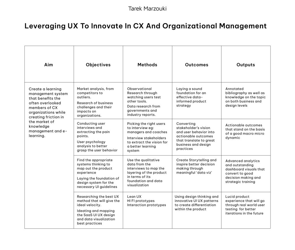
In addition, I introduced my master’s thesis topic and talked about it in terms of the possibilities of how to achieve it, its potential approaches and the importance of striking a balance between theory and practice. I received some great insights from Dr. Konrad, and he introduced me to some fine books. One of these, a master’s thesis from 2018 by a student of FH Joanneum, is particularly noteworthy. The thesis named Data Driven UX Process for MOOC Design by Jacqueline Kircher, which is basically a user experience improvement of the massive open online course platform iMooX, shares the same DNA with my topic since it addresses the UX issues in a platform dedicated to knowledge management.

Scrolling through the thesis, I found a great deal of valuable information, as well as exploring the structure that was used to form and layout a master’s thesis which made me choose this work to be in my bibliography to use it as a reference. Several other books I checked out of curiosity and found what seemed to me the first spark that made me choose digital design as a future path back in 2014, one of them is The Universal Principles of Design.

In conclusion, more and more I’m realizing how valuable to know people who have good experience under their belt and especially those who are pragmatic in their approach to what is going on around them, both professionally and socially and the epiphany of reminding yourself that the more you know, the more you realize that you don’t know.

IMPULSE #4: Sitdown with a UX Consultant at TU Graz

I recently had the pleasure of having dinner with a creative who is a UX consultant at TU Graz and also a professor at FH Joanneum. The sit-down wasn’t based particularly on the field of UX but rather a myriad of other disciplines and life endeavors; however, since meeting with a designer will never end without a good discussion about the intricacies and nuances of the design industry.

I was keen to share my master’s thesis subject and perhaps gain some insights and a fresh perspective on what’s about to come, and since this individual is well versed in working with learning management systems and has been working on one for the past 8 years with TU Graz, although their LMS is university based unlike my thesis topic which is organizations based, but they share the same DNA persay.

I gained a new perspective on many areas in terms of working on an LMS, for example, how to manage knowledge and distribute it within a software pipeline, instill a service that will benefit the organization and create the chance to benefit other organizations as well, through a SaaS package, also in terms of doing the proper research on how to find the right literature and reduce fluff as much as possible, also to always leave room for healthy ambiguity and explore the differences in UX between School LMS and Org LMS and how much those differences impact the product experience.

Additionally, talking about my master’s thesis, which happens to be a project related to my actual work, outloud with a UX professional gives more substance and breathes more life into the whole venture and creates more room for sincere feedback and constructive criticism, as well as having someone that I will get back to for advice whenever I need advisory in my thesis’s process.

Furthermore, the discussion carried on to deeper dives into the relationship between programming patterns and UX UI patterns and how crucial it is becoming crucial for designers to be more knowledgeable about programming patterns.

In conclusion, the sitdown was truly refreshing for me as a person, a traveler and as a designer, and surely for my thesis project, it gave me many insights about the UX market in Graz and Austria as a whole and made me realize again how important networking is and how much it could expand your horizon and potentially create more opprtunities that you never thought of.

IMPULSE #3: UX Workshop with a Google Representative | Tunis 2019

In 2019, I had the incredible opportunity to attend a UX masterclass/workshop led by a representative from Google. As someone deeply interested in user experience design, this event felt like a stepping stone towards the world of UX, a world that had little online material back then. I remember the anticipation building up to the day, eager to explore and absorb knowledge.

The session kicked off with an overview of core UX principles. Our instructor emphasized the importance of user-centered design and the value of empathy in the design process. I learned how critical it is to understand users’ needs, preferences, and pain points. This knowledge is crucial when crafting experiences that resonate with the target audience.

Through interactive discussions, we explored various methodologies, including personas, user journey mapping, and usability testing. Engaging in group activities helped reinforce these concepts. One of the most impactful exercises involved role-playing as users to gain a deeper understanding of their perspectives. It was a unique way to create empathy, allowing me to see through the eyes of others—something I realized was fundamental in UX design.

Next, we delved into sketching practices. The instructor encouraged us to embrace spontaneity and creativity in our designs. Armed with whiteboards and markers, we transitioned into a hands-on sketching session. I was surprised at how liberating it felt to let go of perfectionism and allow ideas to flow freely.

I sketched a variety of wireframes and mockups, understanding that quick sketches can often convey ideas more effectively than detailed designs. The instructor emphasized that “simple is often better;” it’s about communicating concepts clearly rather than getting bogged down in intricate details. This reminder became a valuable takeaway, highlighting that sometimes the simplest solutions are the most effective.

As we continued, we shifted focus to best UI practices. Our instructor shared insights into visual hierarchy, color theory, and typography. Each element can significantly impact how users interact with a design, and I found myself captivated by the nuances of effective UI design.

We studied case studies from successful apps and websites, analyzing what made them user-friendly and visually appealing. Our instructor also discussed the importance of consistency in design elements, addressing how it contributes to brand identity and user trust. This segment reinforced the understanding that good design goes beyond aesthetics—it has a functional purpose.

Walking away from that masterclass, I felt invigorated and inspired. The combination of theoretical knowledge and practical application left a lasting impression on me. I was grateful for the chance to learn from a Google representative, who shared both industry insights and hands-on techniques.

This workshop not only solidified my understanding of UX principles but also sparked a passion for continual learning in the field. I realized that every project is an opportunity to experiment, iterate, and gather feedback to enhance the user experience further. The importance of empathy and user-centered design became pillars of my approach, guiding my journey as a Product Designer.

Disclaimer: AI was used to fix any grammatical mistakes and for better phrasing.

IMPULSE #2: Design Patterns for AI Interfaces

With more tools adopting AI — generative text, code assistants, smart search, content creation — there’s a rush to “add AI” to every product. Without good UI/UX, many of these additions end up confusing or frustrating users. The patterns from this talk offer a more sustainable, user-centric approach to AI integration. As a UI UX designer working with a product team trying to explore AI features, these insights help avoid common pitfalls during research and practice.

The traditional chatbot (a blank text box, open prompt) is often insufficient; it places too much burden on the user to guess what to ask for, how to phrase it, what input format works. Instead, AI UIs should provide structure — templates, guided inputs, preset actions — that shape user intent and make the AI’s capabilities and limitations clear.

Structured Input & Output UX

  • Input UX: Rather than free-form prompts, designers can use structured templates, presets, or guided flows so users don’t need to “guess” how to phrase their request. This improves usability and broadens the accessibility of AI tools to non-expert users.
  • Output UX: AI responses — often long, verbose, or ambiguous — should be presented in a digestible way. Use of rich formatting (e.g. collapsible reasoning traces, style lenses, ranking, color-coding) helps users find value quickly.

Why These Patterns Matter and What They Solve

Lowering friction and cognitive load: Many people don’t know how to “talk to AI.” Structured inputs/templates reduce the intimidation and guesswork.

Making AI more reliable and trustworthy: By clarifying what AI can (and can’t) do, and giving users control (via refinements, options, transparency), designers can avoid “hallucinations,” miscommunication, and user frustration.

Delivering value quickly and predictably: Well-designed AI interfaces help users get useful results with minimal effort — increasing adoption and satisfaction.

Supporting diverse user types: Not everyone is a “power user.” Good patterns make AI accessible to novices while still serving experienced users.

First results from AI often need tuning. Good AI interfaces let users refine — through follow-up prompts, filter buttons, adjustment sliders (e.g. “temperature” or style), or iterative flows — to get closer to what they need. This is more powerful than expecting a single perfect answer.

Rather than isolating AI in a separate “assistant” screen, embed AI features where they feel natural: side-panels, overlays, inline suggestions, context-aware widgets — wherever they support the user’s task flow. This makes AI feel like a seamless extension, not a tacked-on add-on.

Disclaimer: AI was used to fix any grammatical mistakes and for better phrasing.

Design Patterns For AI Interfaces — Smashing Magazine

Design Patterns for AI Interfaces by Vitaly Friedman

IMPULSE #1: Creating an effective & beautiful data visualisation from scratch

It is amazing to me personally that this talk was almost entirely about introducing one
of the most underrated coding language in data viz, D3.js, which is a lang that should
be a staple in every team that wants to create bespoke charts and design beautiful yet
functional dashboards from scratch and proudly enough my master’s thesis main topic
is about a SaaS that has a dashboard that will be created entirely by the unpopular D3.js.

I was and will be involved in designing all the components needed for the dashboard and also in the appropriate research to find out how to develop those components on a web app level which is was done later by a fellow full stack developer.

What is the talk about

  • The talk shows how to build a unique, effective — and “beautiful” — data visualization from nothing but a blank browser window, using D3.js.
  • The goal isn’t simply to produce a standard chart, but to think creatively and intentionally — using “out-of-the-box thinking” and code — combining design sense with technical implementation.

Nadieh’s background: she trained in astronomy, worked in data science, but found her passion in data visualization. Over time she developed a distinct style of data-driven “data art” rather than generic graphs.

Data → Story → Visual

A recurring theme: good visualizations start with a story — or a question — not just with data. You ask: what insight or narrative do you want to reveal? That shapes how you approach the data and what kind of visual you will build.

Nadieh emphasizes that often the best question emerges after a bit of data exploration — so the “question” evolves.

Before designing, you have to understand what the data actually contains: its type (quantitative, categorical, etc.), structure, quirks, what’s important — and who will be reading the visualization. This affects choices like chart type, level of detail, labels, readability.

Not all charts fit all data: pick a visual representation that expresses clearly what you want to communicate — trends, distributions, comparisons, relationships, etc. Sometimes that means abandoning “standard” charts in favor of more creative or custom visuals.

Because people are visual, design elements matter. But they must serve the data, not overshadow it. Use color thoughtfully (e.g., for differentiation, accessibility), maintain consistent palettes, use spacing, hierarchy, alignments to make it easy to read.

Nadieh’s own work often uses vibrant palettes and custom design touches — she argues that if you’re building by hand (e.g., using D3 + SVG), you can push beyond default library charts to create something truly expressive yet still accurate.

Why This Talk Stands Out

This talk offers something beyond standard data-viz best-practices or template-driven dashboards: it’s about treating data visualisation as a creative process, a blend of design, storytelling, and coding.

Seeing the creation from an empty browser to a full chart helps demystify the building process — it shows that you don’t need heavy software or prebuilt templates to produce something expressive and meaningful. You just need data, a clear purpose, and willingness to think visually + code.. This talk is inspiring to me on many levels because my research is based on creating meaningful data visualizations rather than just “reports” or “dashboards”

Disclaimer: AI was used to fix any grammatical mistakes and for better phrasing.

https://slideslive.com/39043157/creating-an-effective-beautiful-data-visualisation-from-scratch?ref=folder-188701

https://www.geeksforgeeks.org/data-visualization/6-tips-for-creating-effective-data-visualizations

https://pixelpioneers.co/blog/designing-data-visualisations-an-interview-with-nadieh-bremer?utm_source=chatgpt.com

Task III: Proseminar Master’s Thesis

Creating the Photographic Film Look:
Intricacies and Misconceptions of Film vs Digital

Author: Niklas Maximillian Dostal
Year: 2024

Overall presentation quality 9/10

The presentation quality of this thesis has surprised me by how much the author researched about the industry of cinematography and tried to look through every crevice to find material that supported his theory and practice, which resulted in a meticulous and astounding presentation of every perspective cited and all the contentions that has been written.

Degree of innovation 8/10

Coming from a photography and filmmaking enthusiasts as myself, I can testify that this thesis is a collection of perspectives and technicalities both from the digital and film realms that were collected attentively, although, the author explored and delved into the eternal question of Digital vs Film which is a subject that is explored and talked about by many people around the globe and still to this day sparks differences of narratives and opinions that sometimes lead to heated debates, however, the thesis still has a significant contribution to the field.

Independence 9/10

There is a unique aspect to this thesis which is that one of the main challenges of the topic that was discussed and detailed in the theory and narratives part was converted into practice in the later stage, which gives an originality to the overall work.

Organization and structure 9/10

The thesis was clear and concise and gave an inside look of the technological shifts in Cinema as well as the perspectives on Film vs Digital, even a beginner can get a decent idea about the subject given the simplicity of how the author presented everything, he presented the narratives logically from both ends inserting screenshots from different films along with citations from well respected cinematographers and filmmakers, finalized by his on the field work, incorporating both technics using the digital to shoot and Davinci Resolve to create the film look in post-production.

Communication 9/10

The human factor in writing and presenting every chapter gave the thesis an organic and realistic approach to the subject, which goes hand in hand with the whole ethos of the work which made the delivery effective to both professionals, connoisseurs and beginners.

Scope 9/10

I believe that the length of the thesis is balanced, not too short to make it shallow and not too long to make it redundant. In terms of depth, it has enough depth both theoretically and practically and when the author delved deep into understanding film explaining all the nuances of Grain, Colours, Halations etc.. he kept it relevant and summarized it well at the end.

Accuracy and attention to detail 8/10

The linguistic and vocabulary aspects of the thesis are above average and were used correctly in accordance with the content of every chapter.

Literature 10/10

The quality of materials used was good enough, from screenshots to illustrations and they were always relevant to what it discussed and cited along with the appropriate description and all the sources at the end.