#10 Why Spatial Immersion Intensifies Emotional Response

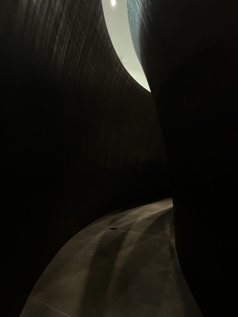
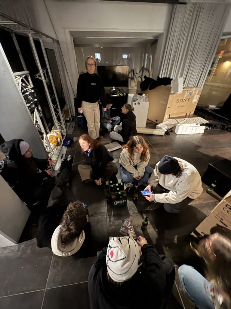
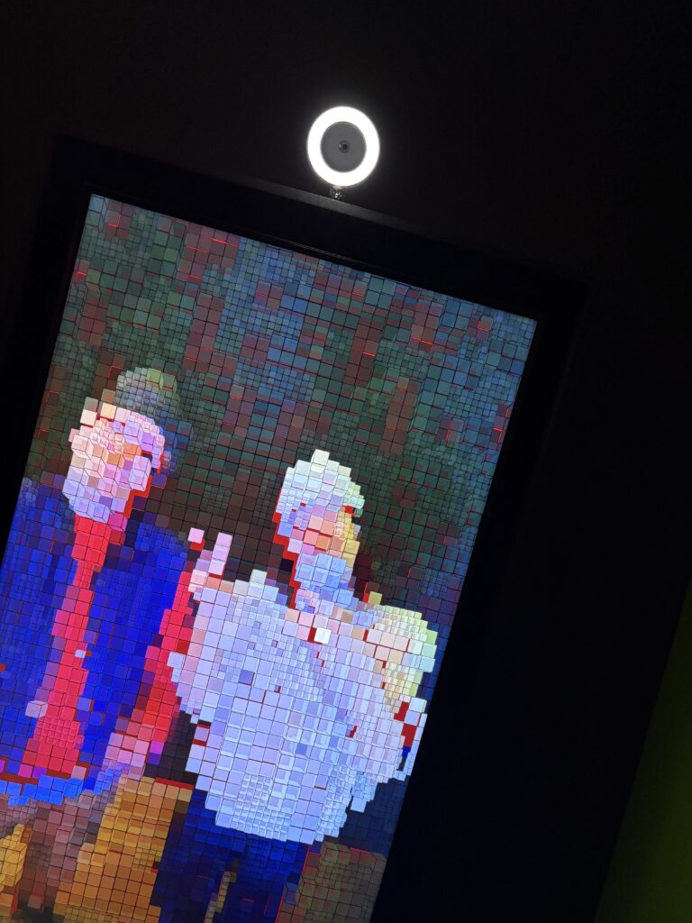
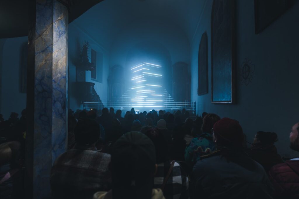
When we experience a traditional painting or a flat screen animation, there is always a clear separation between the viewer and the work. We stand outside, observing. We can maintain a psychological distance. But when we enter a spatial installation, this distance disappears. We are not just observers anymore, we are participants. The work surrounds us, envelops us, and forces our body into the experience. This shift is crucial for understanding how abstract motion design can generate emotions, particularly stress.

Stress, as an emotion, is strongly tied to the body. Heart rate, breathing, tension, and attention all respond to external stimuli. It is a universal, recognizable emotion. It is physiological and psychological. Unlike joy or sadness, it is closely tied to attention, movement, and bodily awareness. In spatial environments, abstract visual elements like moving light, patterns, and shapes no longer sit at a distance. Instead, they occupy the same space as our bodies (Schmitz et al., 2011). The closer the visual and temporal stimuli are to our physical presence, the stronger their potential impact on emotional intensity. By removing the physical and psychological distance, installations intensify bodily exposure to motion parameters. Unlike screen-based animations, where the body can remain passive, spatial designs require active navigation. The viewer’s position, movement, and orientation directly influence what is perceived. This is where motion design principles, such as rhythm, tempo, repetition, and density, can be used in a controlled way to generate emotional effects.

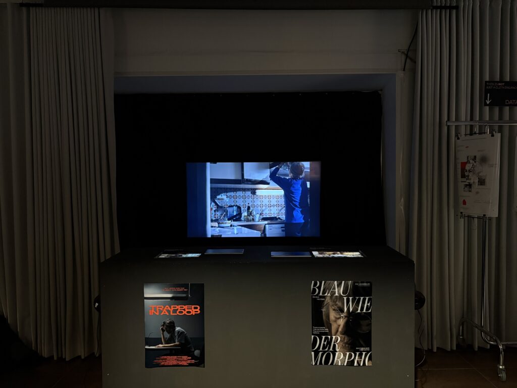
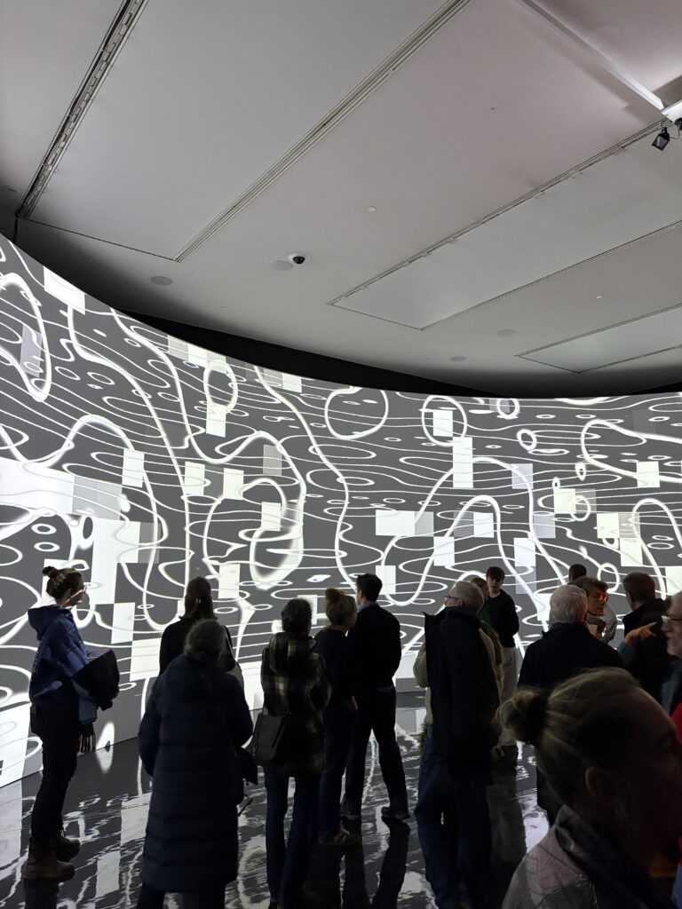
Spatial installations unfold over time.The experience depends on movement and duration. A hallway of pulsing lights, a room of shifting patterns, or a suspended arrangement of floating shapes all change as you move through them. Temporal design, the core of motion design, is therefore a key tool. By carefully orchestrating the timing of visual changes, the designer can escalate intensity, build tension, or release it. Consider stress as an example. Slow, irregular rhythms may feel uneasy. Fast, dense pulses increase physiological arousal. By adjusting tempo and repetition over time, one can simulate the onset of stress in a non-narrative, abstract environment. The visitor experiences these shifts physically, through subtle bodily reactions, before they even cognitively recognize them.

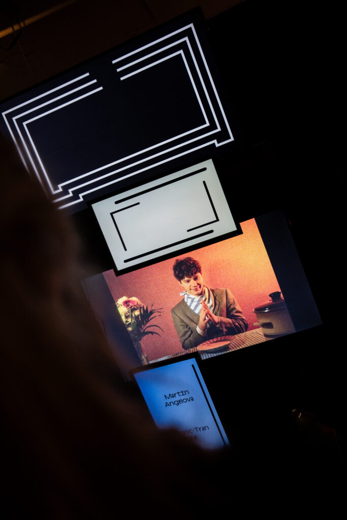
Hereby the role of navigation and orientation is important. Immersive environments create opportunities for multiple perspectives. Moving through a space changes what is seen, how light reflects, and how patterns interact. The visitor is a co-creator of the experience: their choices determine the path, the duration of exposure, and the angles from which stimuli are perceived (Lennon, 2025). Motion design can respond to this movement by creating feedback loops: lights that shift as a person approaches, patterns that densify when more people occupy a space, or visual flows that guide attention. These interactions are key to understanding emotional response. Stress is not only triggered by the motion itself but also by the unpredictability of the environment and the necessity to adapt. When motion and light respond to the visitor, the intensity of the experience increases. For instance, a fast, repetitive movement on a small screen may cause moderate tension. In a 3D installation that surrounds the body, the same movement can create a sense of overwhelm. By controlling rhythm, density, and directionality, designers can amplify the emotional impact without relying on narrative or symbolic content.

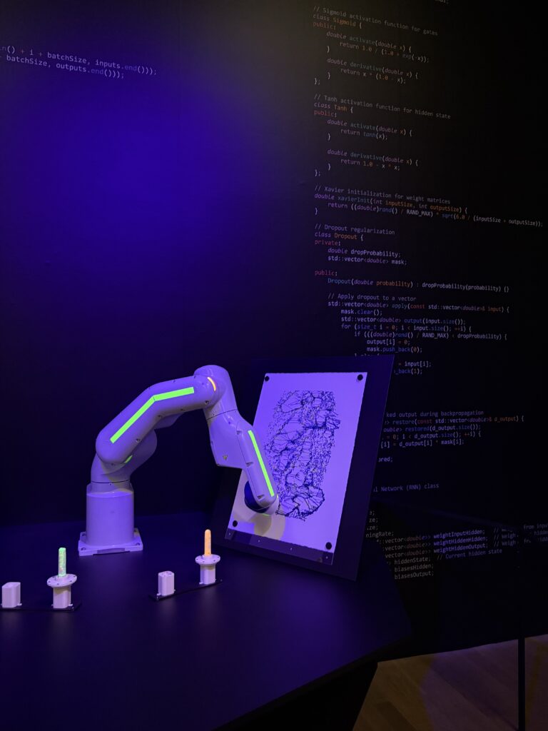
Modern installations often integrate digital technology to create responsive systems. Sensors, projection mapping, LEDs, and sound allow motion parameters to change in real-time based on visitor behavior. These feedback loops enhance immersion and can intensify emotional responses. Stress, in particular, can be modulated dynamically: sudden changes in light rhythm or density in reaction to movement can create moments of heightened tension. Visitors feel as though the space itself is alive, interacting with their bodies and decisions. Spatial installations offer a unique environment to study and apply motion design principles. By integrating rhythm, tempo, repetition, and density with bodily navigation and immersive presence, designers can create abstract experiences that generate stress without narrative or symbolic content. The viewer becomes both subject and co-creator, their body and attention guiding the unfolding of the work.

Bibliography:

Schmitz, A., Merikangas, K., Swendsen, H., Cui, L., Heaton, L., & Grillon, C. (2011). Measuring anxious responses to predictable and unpredictable threat in children and adolescents. Journal of Experimental Child Psychology, 110(2), 159–170. https://doi.org/10.1016/j.jecp.2011.02.014

Lennon, B. (2025). How contemporary installation art uses space, site and scale to create a phenomenological experience for viewers [Master’s thesis, Institute of Art, Design + Technology]. https://hdl.handle.net/10779/iadt.30601340.v1

#9 The Role of the Audience within an Installation

In installation art, the physical presence of the viewer is not optional but it is essential. Ilya Kabakov famously stated that “the main actor in the total installation is the viewer; they are the center toward which everything is directed.” This focus on the viewer, however, often leads to a paradox: instead of being placed at a privileged point, the viewer is physically decentered. There is no single, ideal position from which the work can be fully understood. Meaning emerges only through movement within the space (Bishop, 2005). Another key aspect of installation art is duration. While a painting often suggests an instant or timeless moment, an installation requires time. The viewer must walk through it, pause, return, and explore. In this sense, installation art shares qualities with theater or film, yet differs in one crucial way: the visitor remains autonomous. They choose their own path, pace, and length of engagement (Zhihan Ren, 2025).

Contemporary museums increasingly respond to these demands with dynamic exhibition design. Static white walls are replaced by flexible and mobile elements that can adapt to movement and interaction. A notable example is the exhibition Homo Ludens where visitors were able to change the spatial setup themselves using mobile devices. Architecture becomes a “living” part of the experience, something that reacts and evolves through human presence.

Technological developments have further expanded these possibilities. Hereby immersive exhibitions today often use:

  • High-resolution projection mapping, allowing images to be projected precisely onto irregular surfaces such as columns or curved walls, making architecture appear fluid or unstable (Johnson, 2025a)
  • Spatial sound systems, with multiple speakers creating soundscapes that move around the visitor and envelop them acoustically (Johnson, 2025a)
  • Haptic feedback, such as vibrating floors or handheld controllers, which add a tactile layer to perception (Johnson, 2025a)

These technologies are not meant as pure spectacle. Their goal is to intensify emotional and sensory engagement and to encourage visitors to reflect on their own perception and their relationship to the surrounding world.

Richard Serra and Time as Matter

Richard Serra’s monumental installation The Matter of Time (2005) in the Guggenheim Museum Bilbao is one of the most radical explorations of space, time, and bodily experience. Installed in the 130-meter-long, column-free gallery, the work consists of eight massive Cor-Ten steel sculptures that activate the entire space (Johnson, 2025b).

Rather than presenting individual objects, Serra creates an environment that unfolds through movement. The viewer becomes the subject, and meaning is produced through walking.

  • Physical disorientation: The tilted and curved steel walls create a constant sense of imbalance. Scale and orientation shift continuously, challenging spatial perception.
  • Proprioceptive awareness: Moving through narrow passages makes visitors more aware of their own bodies, their breathing, rhythm, and physical limits. The acoustics of the steel amplify footsteps and ambient sounds, intensifying feelings of isolation or compression.
  • Time as material: The title emphasizes that time itself is sculptural. Each form leads to the next, subtly altering the visitor’s orientation in relation to the museum architecture.

Serra’s approach is influenced by his study of Japanese Zen gardens, which he understood as spatial fields that can only be experienced through movement. In Bilbao, Frank Gehry’s architecture functions as a resonant shell around the sculptures, creating a quiet, almost meditative space where perception slows down.

Olafur Eliasson and Perceiving Perception

Olafur Eliasson places the viewer at the absolute center of his work. His installations often function as tools that invite visitors to step back and reflect on their own actions and sensory processes. Eliasson frequently works with natural elements such as light, fog, water, and ice to heighten sensory awareness. Blurring subject and object: In Your Imploded View (2001), a polished aluminum sphere reflects the surrounding space but distorts it so strongly that viewers see themselves from unfamiliar perspectives. The artwork no longer dominates; instead, a dialogue emerges between observer and object (Malone, 2007).

  • Individual experience: Eliasson’s frequent use of the word “Your” in his titles emphasizes that meaning is personal and shaped by memory, expectation, and physical position.
  • Collective awareness: At the same time, these highly subjective experiences make visitors aware of others sharing the space. Being surrounded by fog or light creates temporary communities and encourages reflection on social responsibility.

A clear example is Beauty, where a rainbow appears through light and fine mist. The rainbow is only visible from a specific angle and exists solely in the act of seeing. Here, the viewer does not just observe the image but actively produces it through their position in space.

Installation art shifts the focus away from the artwork as an isolated object and toward experience as a process. Movement, time, and bodily presence are not secondary effects but core components of meaning. Whether through massive steel structures or fragile light phenomena, these works demand active participation and awareness. Rather than offering clear messages, they create situations in which perception itself becomes unstable, and it is precisely within this instability that reflection begins.

Bibliography

Bishop, C. (2005). Installation Art. Tate Publishing. https://www.scribd.com/document/463827422/Installation-Art-Claire-Bishop-pdf

Johnson, F. (2025a, September). Immersive Art Museum: A Deep Dive into Digital Experiences, Future Trends, and Visitor Engagement. Wonderful Museums. https://www.wonderfulmuseums.com/museum/immersive-art-museum/

Johnson, F. (2025b, November). Richard Serra Guggenheim Museum Bilbao: Exploring the Monumental Steel Sculptures Within Frank Gehry’s Architectural Masterpiece. Wonderful Museums. https://www.wonderfulmuseums.com/museum/richard-serra-guggenheim-museum-bilbao/

Malone, M. (2007, December). Ólafur Eliasson, Your Imploded View, 2001. Mildred Lane Kemper Art Museum. https://www.kemperartmuseum.wustl.edu/learn/learning-resources/eliasson-olafur-your-imploded-view-2001/type/essays

Zhihan Ren. (2025). When the Black Box Meets the White Cube: Spatial Shifts and Postdramatic Aesthetics in Performance Art. ResearchGate. https://www.researchgate.net/publication/392611552_When_the_black_box_meets_the_white_cube_spatial_shifts_and_postdramatic_aesthetics_in_performance_art

#8 Experiencing Installation Art

Over the past decades, contemporary art has shifted away from purely object-based works towards more spatial and experiential forms. Installation art plays a key role in this development. Instead of presenting an artwork as an isolated object, installation art places the viewer directly within the work (Bishop, 2005). The viewer is no longer a distant observer, but an active and physically present part of the artwork. This shift changes how meaning is created. Experience is no longer limited to visual perception, but includes space, movement, and time. Walking through an installation, staying within it, or changing position all influence how the work is perceived by the visitor. Meaning therefore comes through presence and duration rather than through visual observation alone (Lennon, 2025). 

The main difference between traditional object-based art and installation art lies in how the viewer is addressed and how physical space is used. Classical artworks such as paintings or sculptures function as closed objects that are observed from a distance. The viewer remains outside the work and engages with it mainly through vision. Sculptures often emphasize control over material such as marble, bronze, or wood. They are usually placed on pedestals, which separate them from the everyday space of the viewer and maintain a clear distance between artwork and audience (Bishop, 2005). In installation art, space itself becomes an active part of the work. A room filled with colored light is no longer just a container for art, but the artwork itself. The work exists as a unified whole in which objects, spatial proportions, light, and sound are closely connected. This shift from object-based aesthetics to situational experience fundamentally changes perception. The viewer is no longer a detached observer, but a physically present subject whose senses are engaged beyond sight, including sound, touch, and spatial awareness (Kadari Art Gallery, n.d.).

In her critical history of installation art, Claire Bishop describes four main modes of experience. Each of them shows a different understanding of the viewer and their role within the artwork.

Phenomenological experience

This mode is based on the philosophy of Maurice Merleau-Ponty and focuses on the lived body as the main site of perception. The viewer is not an analytical observer, but an active participant who experiences the work through movement, presence, and bodily awareness. The boundary between subject and object becomes less clear (Mildred Lane Kemper Art Museum, n.d.).

Psychological experience

Drawing on psychoanalytic ideas by Sigmund Freud, some installations aim to disturb the viewer’s sense of stability or address deeper psychological layers. Concepts such as the uncanny or unconscious impulses are used to create emotional tension or discomfort (Bishop, 2005). 

Political activation

In this mode, audience participation is understood as a tool for social and political engagement. The active involvement of the viewer is seen as an alternative to the passive consumption encouraged by mass media such as television or film.

Decentering of the subject

This approach challenges the idea of a single, fixed viewpoint. The viewer is confronted with multiple perspectives, which undermines hierarchical models of vision, such as those established by Renaissance perspective (Bishop, 2005).

Among these modes, the phenomenological perspective is especially important. It focuses on the awareness of one’s own body, movement, and position in space. This bodily awareness plays a key role in how installation art is experienced. Studies show that when viewers are physically involved and aware of their presence, the emotional impact of the artwork becomes much stronger.

The development of installation art is closely linked to a critique of the traditional exhibition space known as the “White Cube.” This model, described by Brian O’Doherty, refers to modern gallery spaces with white walls, neutral lighting, and little reference to the outside world (Zhihan Ren, 2025). The goal of the White Cube is to present artworks as timeless and objective, as if they exist outside of history, place, or social context. In this setting, architecture is not a neutral background. It functions as an invisible frame that shapes how viewers engage with the artwork. Installation art challenges this framework. Instead of being confined to a single object, the work extends into the surrounding space. Walls, floors, and the viewer’s position become part of the artwork itself. As a result, viewers are forced to constantly question where to stand and how to move within the space.

In contrast, the “Black Box” offers a highly controlled environment that originates from theatre and cinema. Here, darkness, light, sound, and movement are carefully directed to guide attention and emotion. In contemporary practice, these two models increasingly overlap and form what is often described as a “Grey Zone.” This hybrid space appears when performative works enter museum contexts or when media installations combine the openness of the White Cube with the controlled atmosphere of the Black Box.

Within this Grey Zone, the viewer often becomes an incidental performer. Their movement through the space is no longer random, but part of the overall structure of the work. The experience emerges through presence, movement, and interaction with the spatial setting.

To conclude installation art fundamentally changes the relationship between artwork, space, and viewer. Instead of observing from a distance, the viewer becomes an active part of the work through movement, presence, and sensory engagement. By involving the body and multiple senses, installation art shifts perception from visual observation to spatial and embodied experience. Overall, installation art positions the viewer not as a passive observer, but as a participant whose presence is essential to the work itself.

Bibliography: 

Bishop, C. (2005). Installation Art. Tate Publishing. https://www.scribd.com/document/463827422/Installation-Art-Claire-Bishop-pdf

Kadari Art Gallery. (n.d.). Exploring the Boundaries: Installation Art vs Traditional Sculpture. Retrieved https://kadariartgallery.com/blogs/news/exploring-the-boundaries-installation-art-vs-traditional-sculpture

Lennon, B. (2025). How contemporary installation art uses space, site and scale to create a phenomenological experience for viewers [Master’s thesis, Institute of Art, Design + Technology]. https://hdl.handle.net/10779/iadt.30601340.v1

Mildred Lane Kemper Art Museum. (n.d.). Olafur Eliasson: Your Imploded View (2001). Retrieved https://www.kemperartmuseum.wustl.edu/learn/learning-resources/eliasson-olafur-your-imploded-view-2001/type/essays

Zhihan Ren. (2025). When the Black Box Meets the White Cube: Spatial Shifts and Postdramatic Aesthetics in Performance Art. ResearchGate. https://www.researchgate.net/publication/392611552_When_the_black_box_meets_the_white_cube_spatial_shifts_and_postdramatic_aesthetics_in_performance_art

#7 Visual Structure and Movement in Kandinsky’s Work

The ideas behind abstract movement or abstract shapes started long before screens or motion graphics. Kandinsky is one of the clearest examples of this. His work demonstrates that movement can be suggested through compositional reletionships rather than animated changes. In descriptions of Kandinsky’s early abstract works, particularly in the Guggenheim catalogue, paintings are often characterized using terms such as drifting, rising, or colliding (Kandinsky, 2015). Although the images are static, they create a strong sense of direction and energy. This effect results from the placement and interaction of forms. Diagonal lines introduce tension, overlapping shapes suggest depth, and variations in scale guide the viewer’s gaze across the canvas. Motion is not depicted directly but implied through visual structure. That feeling of energy comes from how the eye is guided across the image, not from any actual animation as it is a static picture. It’s interesting how a diagonal line or a cluster of circles can suggest direction or tension just by being placed in a certain way. 

A central idea in Kandinsky’s theory is “inner necessity.” This means that shapes have their own expressive quality, even without representing anything specific. Meaning does not come from what a shape shows, but from how it works inside a composition. A point, line, or shape can feel calm, tense, or dominant depending on its position, direction, and relation to other elements. This shifts the focus away from symbolism and towards how shapes behave visually. (Liu, 2024). 

Composition 8.July 1923 – Oil on canvas – Collection The Solomon R. Gug

As his work developed, Kandinsky reduced objects more and more until they were just pure shapes. The catalogue explains how he let forms stand on their own and turned them into structural elements that hold the painting together . Black lines become anchors. Circles feel like pulses of energy. Small points act like sparks. Nothing needs to be “about” anything to create a strong reaction. The visual meaning appears through how things relate, not what they represent. For motion design, this idea feels incredibly familiar. A movement doesn’t need a story to make sense. Timing, contrast and rhythm are already enough to guide the viewer through a piece. Over time Kandinsky reduceses his objects more and more until only basic shapes remain. These shapes then no longer represent real objects but function as structural elements. Hereby the lines for example help organize the image. Circles often act as visual centers. Small shapes activate the surrounding space. The overall meaning of the painting emerges through balance, contrast, and rhythm rather than through representation.

In animation, movement alone does not automatically create meaning. How something moves is influenced by timing, spacing, repetition, and contrast. Kandinsky’s work shows that movement becomes stronger when the composition already contains tension. Animation can then extend or intensify this tension instead of trying to create it from nothing. Kandinsky often described his paintings using musical terms such as Composition and Improvisation. This reflects his interest in rhythm and structure. Repeating shapes create a visual rhythm, while small changes disturb or shift it. A similar principle exists in motion design, where loops, pauses, and changes in timing influence how movement is perceived. 

Kandinsky’s approach offers a useful way to understand abstract animation without using stories or figurative images. It focuses on structure, relationships, and rhythm as the main sources of meaning. From this view, motion is not the starting point, but a continuation of a composition that is already dynamic. Overall, Kandinsky’s work shows that abstraction is not about having less meaning, but about focusing on essential visual relationships. His paintings show that strong visual tension can exist without movement, and that animation works best when it builds on this existing tension.

Bibliography: 

Kandinsky, W. (2015). Kandinsky. Parkstone International.

Liu, G. (2024). Kandinsky: Pioneer of Abstract Art and Philosopher of Color. Proceedings of the 2024 8th International Seminar on Education, Management and Social Sciences (ISEMSS 2024), Advances in Social Science, Education and Humanities Research, 867. https://doi.org/10.2991/978-2-38476-297-2_56

IMPLUS 8 – From Concept to Construction

One of the most challenging parts of the Media Design contribution was the planning and realisation of the screen wall. From my perspective, this was also the most demanding task. It wasn’t just about how the screens should be arranged visually, but mainly about how they could be mounted and secured properly. The original plan was to build a screen wall consisting of four 43-inch screens and four 24-inch screens, ideally mounted on a wall. Alongside this, we also had to be very aware of what kind of equipment we needed and make sure to request everything on time from the media center. This required a lot of coordination and forward planning which was sometimes a bit of a struggle for me. Another difficulty was keeping everyone motivated to actively participate in the exhibition. For some people, the importance of the exhibition only really became clear in the final days before the opening, which added extra pressure towards the end.

Together with Valerie, I worked closely on the concept of the screen wall. Valerie also had to focuse on the construction and how the screens could physically hold together, while we jointly developed the visual concept. We decided on a very minimal and reduced style: mostly black and white visuals, clean lines, and slow, monotone movements. Since the screen wall showed individual projects, it was important to us that each project was clearly recognizable and properly credited. This also meant adapting animations and adjusting their lengths so they worked well together. At the beginning, it was difficult to find a smooth workflow. Everything still felt abstract, and even the construction of the screen wall was not fully defined yet, after several discussions and changes, we eventually had to scale down the original idea. In the end, the screen wall consisted of eight screens mounted on a truss, which simplified both the technical setup and the animation work at least a bit more. Even so, the animation process took longer than expected, new ideas, technical hurdles, and last-minute changes kept coming up. Surprisingly, one of the hardest parts was actually finding the right screens, as many were already booked through the media center, but to be fair there were 3 different exhbitions happening in the same week. 

Looking back, one important realization was about workflow efficiency. At first, Valerie and I worked on the same screens together, making all decisions jointly. While this ensured consistency, it was also very slow. Once time pressure increased, we split the animations between us and worked independently. This turned out to be much faster and still worked very well visually.

The final setup of the exhibition was successful overall. Of course, some things had to be adjusted on site, and a few minor issues appeared over the following days. Some projects required more active attention to maintain their intended interaction. Still, the overall planning helped a lot and made the setup process smoother and more efficient.The cinema area was another highlight. With the self-built benches, visitors could sit down, watch the short films, and at the same time see behind-the-scenes material. The screen wall also worked well overall, even if there were small delays or mistakes that probably only Valerie and I noticed (lets hope). In the end, this project taught me how time-consuming exhibition planning really is and how much attention to detail is needed to make something feel professional. I am very grateful that I was able to take on a management role together with Magda and contribute to the exhibition in this way. For future exhibitions, I will definitely take away the importance of even earlier planning and requesting equipment as soon as possible.

IMPLUS 7 – Overlays: Coordination & Responsibility

The exhibition Overlays was the first time I was involved in an exhibition not just as a participant, but as one of the main coordinators. Together with Magda, I was one of the major speakers for Media Design, which meant that we were responsible for coordinating everything related to our major. From around December onwards, we regularly met with the other major speakers to discuss what still needed to be done for the exhibition. These meetings included topics like floor planning, budgeting, and deciding what each major wanted to present. At the same time, we also talked a lot within our own major, not only about what we wanted to show, but also how we wanted to show it. For us, it was important that Media Design would not just present simple screens with films, but create something more thought-out and spatial. Alongside the weekly meetings with the other speakers, we also had occasional update meetings with the major leads. These were important to keep everyone informed about our progress and to clarify open questions early enough.

One of my personal challenges during this time was managing everything alongside the short film project. At that point, the short film was very close to my heart, and I was already deeply involved in it. I noticed that balancing both projects was harder than expected and made me reflect a lot on my time management and prioritisation. It was a good reminder that even exciting projects can become stressful if everything happens at once. Working together with Magda was a very positive experience. I felt like we complemented each other well and balanced out responsibilities and levels of engagement. Especially in stressful moments, it helped a lot to not be alone with decisions and tasks. Before the Christmas break, the exhibition still felt very abstract and far away. After the holidays, however, it suddenly became very real. Deadlines got closer, decisions had to be made faster, and naturally, the stress level increased. For Media Design, selecting projects was relatively straightforward, since multiple projects could be shown on shared screens. One of our main focuses was the “cinema” area, where we planned to show two short films. Additional individual projects were displayed on a screen wall, inspired by an exhibition magda had seen in Switzerland. We also included a separate screen for passion projects. Overall, everyone from the major had the opportunity to submit and exhibit work. Looking back, this phase taught me a lot about coordination, communication, and responsibility. Being part of the organisational side of an exhibition showed me how much work happens behind the scenes before anything becomes visible to the audience.

IMPULS 6 – Inspirational Talk 

In December I had a talk with Daniel Bauer to discuss my ideas for my Master’s thesis. To be honest, before this talk, my feeling towards the Master’s project was quite negative. I felt very overwhelmed and burdened by all the research I had done. It felt more like a heavy task than a creative fun project. But after talking to Daniel, my mindset changed. He gave me a lot of motivation and helped me see the Master’s thesis as something cool and fun rather than just a struggle. In our conversation, we first talked about my general interests. I told him that I really like animation, motion design, and what I did for”Klanglicht”.  I’ve always enjoyed working in an abstract way and creating abstract animations. At that point—which was actually before I directed the short film “Blau wie der Morpho”—I told him that live-action film didn’t really suit me. I thought I would definitely go into the direction of motion design because it felt more like “me.” A big part of our talk was about the abstraction of forms and how they can trigger emotions or reactions in people. Daniel gave me some great examples of this, which I found very helpful for my own thinking process. We discussed a very artistic way of visualizing data. This was a new idea for me, and I became really interested in how to combine data with art and motion. This talk was very important for my personal process because it opened up new directions. It showed me that my interest in abstract forms and motion design could actually become a solid foundation for a Master’s project. I started to think about how I can take something complex, like data, and turn it into something visual and emotional through abstraction. It made me realize that I don’t have to follow a traditional path; I can mix my interest in sound, light, and motion in a way that feels right for me. What I am taking away from this talk with him is that the Master’s project is a chance to experiment. I stopped seeing the research as a burden and started seeing it as a way to find more examples of what I like. Even though I discovered later during the film shoot that I also enjoy directing real people, the thoughts from this meeting about abstraction and data art are still very relevant for my work. I don’t have to decide yet but I guess sonn, but now i feel much more motivated to write my master thesis and explore what subject I am gone be focusing on.

IMPULS 5 – Directing and Decision-Making

The starting point for this post is a memory of a very stressful but also great feeling I had in a week in December. I was the director for our short film “Blau wie der Morpho”. Before this project, I mostly focused on animation because I liked having total control over every detail. Working with real people on a set felt like a huge hurdle for me, and I wasn’t sure if I could handle it. My main inspiration for the style of the short movie was the ideas that were created in the last semester by some other people in my class as well as a short awareness campaign by Aldi. I really liked their style, it was very realistic and short, but it made you think. That was the direction I wanted for our film about Frau Giraldi and her caregiver Elias.

When I look back at the process, it wasn’t just about the filming itself. I spent a lot of time with two teammates rewriting the script. We changed the whole concept to make it shorter and focused more on “awareness”. During the casting, I learned about a theater piece called “Geteiltes Leben,” which is how I met our main actress. She was perfect for the role of Frau Giraldi because she already had experience playing a similar character. The most difficult part for me was the leadership role. I am someone who really needs harmony and I don’t like telling people what to do if it feels like I’m being bossy. On the first day of the shoot I felt very insecure. It was a student project, so everyone had their own ideas, and sometimes it was hard to make the final decision. I was lucky to have Noah and Peter on the team because they supported me a lot when I struggled with my role as a director. I also came to realize that I enjoyed the time on the set the most. The roles were clearly defined, which made it easier for me to focus on the actors and the scenes. It felt very different from animation. It was more about human emotions and quick decisions. However, the post-production was harder again. When we were editing, many different opinions came together, and my need for harmony made it difficult to just say “no” to ideas I didn’t like. I had to learn that as a director, you sometimes have to be firm to protect your vision. In the end, I was really happy because the actors gave me great feedback. They told me they felt I had a very clear vision for the film. I still more interested in doing animations but this project also gave me an impuls to look into directing or art direction in a general sense.  It’s a great feeling to see a vision from your head actually happen in real life. I still need to work on being more confident in my decisions when things get complicated, but I definitely want to do this again. 

IMPULS 4 – Kunsthalle and Miguel Chevalier

When I visited the Kunsthalle in Munich, I honestly had pretty high expectations of what I was about to see. My mom had visited the exhibition previously and was talking about how nice and impressive she experienced it. In the past, I have made a couple of visits to a lot of immersive exhibitions, and many of them start to feel very similar. What surprised me about “Digital by Nature – The Art of Miguel Chevalier” was that I could often imagine how the works were made. I kept thinking about Processing, generative systems, maybe some robotics or AI running in the background. Instead of ruining the magic, this actually made me happy. It didn’t feel like some unreachable high-tech spectacle, but more like something that exists on the same planet as my own small experiments. Because of that, I feel like I moved through the exhibition a bit differently, less like a visitor just taking photos, and more like someone walking through and taking notes on what I could try out as well.

The first big projection room already set the tone. A large curved wall was filled with flowing animations that reacted subtly when people came closer or moved their arms. I liked that the room didn’t explain too much. It just invited you to figure out the system with your body. At first, I thought it was mainly about pretty visuals, but after spending some time there, I realized how choreographed the whole space actually was. The reflections on the shiny floor doubled the image, the sound, or sometimes even the absence of sound, influenced how long people stayed, and the movement of the crowd became part of the composition. It made me realize again how important physical space is for digital work, something I often forget when I’m just sitting in front of my laptop.

Later on, I spent quite a bit of time with the works where Chevalier combines AI with floral motifs. These generative flowers reminded me a lot of a project I saw at Klanglicht 2024, where Processing was used to create plant-like forms that constantly changed shape. Here, the idea felt similar but pushed further. The flowers didn’t just move, they seemed to grow, dissolve, and transform, almost like watching an artificial ecosystem in fast-forward. I noticed that this kind of imagery really speaks to me because it sits somewhere between digital and organic. In general, I have noticed that I like to work with natural elements and not just simply digital things. For my own work, this opened up the idea of using generative techniques not only for abstract visuals, but for forms that reference the real world without directly copying it.

At the same time some rooms felt a bit too polished, almost like they were mainly designed to be photographed. The surfaces were very glossy, the colors extremely intense, and sometimes it felt like the technology was there mostly to impress. I realized that I was more interested in the works that showed some roughness. For example, the drawing robot with its industrial arm and felt-tip pen, or pieces where small delays and glitches were still visible.

One of the nicest feelings I had throughout the exhibition was this sense of “I kind of understand how this could work.” In the past, I often looked at digital installations and thought that they must have been made by huge teams using some kind of very complicated technologies. Here, even if I didn’t know the exact details, I could imagine basic structures: shaders reacting to movement, particle systems, data mapped to color and form, maybe some kind of camera tracking feeding into generative visuals. For my own project, the exhibition gave me a few clear impulses. I want to think more about how people physically move in front of my work and how this movement can become part of the piece, instead of just triggering random reactions. I’m also very interested in this mix of organic imagery and clear digital structure, almost like nature wearing a pixel costume.

IMPLUS 3 – Klanglicht Vertigo 

During Klanglicht, I didn’t only get inspiration from other installations that were spread around Graz, but especially from the one I was working on myself. Being part of the project “Vertigo” changed the way I experienced the festival, because I wasn’t only visiting the installations, but actively working on one of them. Our installation took place in a church, where we built a huge tower made out of LED panels. Visitors were invited to sit down and watch minute-long animated shows. Each group created a seamless animation combined with sound, guiding the visitors through a topic. Even though all animations were very different, they were connected through the same structure and space.

My role in the project was as a media student, so I was part of the animation team. I searched for different ways to show the storyline and to use sound together with visuals by working with shapes and videos. A big part of the process was trying things out, failing, and then testing everything again directly on the final installation. Timing was very relevant, because the sound and the animation only worked well together when they were perfectly aligned. Even small changes in rhythm could completely change the effect. Within my group, we focused on the topic of urbanisation. We wanted to show, not just with our visuals but also with the sound, that more and more urbanisation is taking away from nature and with that also from us. We worked a lot with colors and rhythm to show the different parts of our animation. The city was shown as cold, hard, and very bright, using colors that were almost neon. This was meant to represent a new, superficial world and was supported by loud construction sounds. Nature, on the other hand, was calmer and a bit warmer. This contrast helped to clearly distinguish between the two parts within our storyline.

We also worked with building and destroying elements within the animation. At one point, a tower was built up and then destroyed again. The impact of this moment was made stronger through sound. Sometimes we also used black screens or short pauses, which helped to create an emotional impact and made the moment feel more intense. I also found it very inspiring to see what the other groups had done. One group showed the topic of love only by using colors and shapes that once moved in sync and then slowly left each other again. This project showed me what power simple shapes can have and how different the effect can be depending on movement, timing, and surface.

The installation would not have worked the same way on a normal screen. The LED panels, their vertical construction, and especially the space of the church had a big influence on how everything was perceived. The space also had a strong effect on the sound, making the whole installation feel more immersive. This project really inspired me and also influenced how I think about my master’s thesis. I loved that the work was abstract, but still very specific in the way it showed a storyline so clearly. It made me realize that it’s possible to tell a strong story without being literal, just by working with shapes, rhythm, color, sound, and timing.