IRCAM Forum Workshops 2025 – Promenade Sonore

Sound Meets the City: Nadine Schütz’s Promenade Sonore Transforms a Footbridge into a Living Instrument

We first encountered Nadine Schütz’s fascinating work during her presentation at the IRCAM Forum Workshops 2025, where she introduced her project Promenade Sonore: Vent, Soleil, Pluie (“Wind, Sun, Rain”). The talk offered deep insights into her creative process and the technical and ecological thinking behind the installation.

In the heart of Saint-Denis, just north of Paris, Swiss sound artist Nadine Schütz has reimagined the way we move through and experience urban space. Her project Promenade Sonore: Vent, Soleil, Pluie (“Wind, Sun, Rain”) is not just a public art installation—it’s a multi-sensory experience that turns an ordinary walk across a footbridge into an acoustic encounter with the environment.

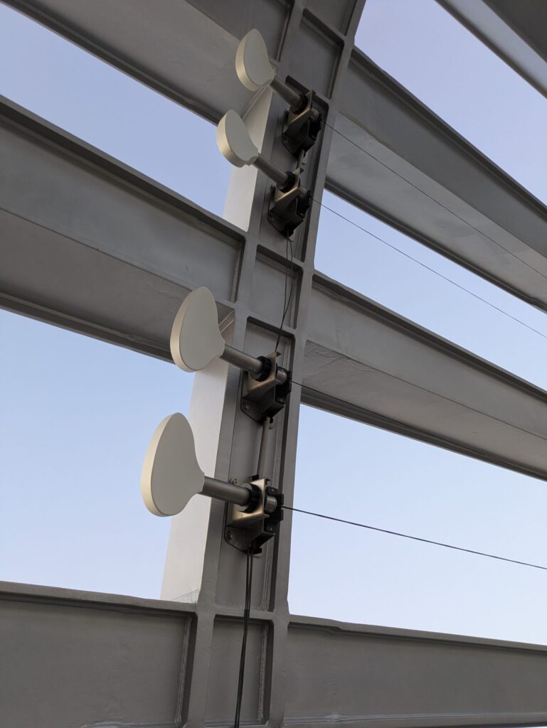
Commissioned by Plaine Commune and developed in close collaboration with architect-engineer Marc Mimram, the installation is located on the Pleyel footbridge, a key link between the neighborhoods of Pleyel and La Plaine. Rather than adding passive sound or music, Schütz has embedded three sculptural sound instruments directly into the architecture of the bridge, each one activated by a different natural element: wind, sun, and rain.

These instruments aren’t just symbolic; they actually respond to the environment in real time. Wind passes through a metal structure that produces soft, organ-like tones. When sunlight hits specific points, it activates solar-powered chimes or sound emitters. During rainfall, the structure becomes percussive, resonating with the rhythm of droplets. The bridge becomes a living, breathing instrument that reacts to weather conditions, turning nature into both performer and composer.

What makes Promenade Sonore truly compelling is how seamlessly it blends technology, ecology, and design. It’s not loud or intrusive—it doesn’t drown out the urban soundscape. Instead, it subtly enhances the auditory experience of the city, encouraging passersby to slow down and listen. It transforms a utilitarian space into a space of poetic reflection.

Schütz’s work is rooted in the idea that sound can deepen our connection to place. In this project, she brings attention to the sonic qualities of weather and architecture—things we often overlook in our fast-paced, screen-driven lives. The soundscape is never the same twice: it shifts with the wind, the angle of the sun, or the mood of the rain. Every walk across the bridge is a unique composition.

More than just an artistic gesture, Promenade Sonore is part of a broader vision of “land-sound” design—a practice Schütz has pioneered that treats sound as an essential component of landscape and urban planning. In doing so, she challenges traditional boundaries between art, science, and infrastructure.

Visit of the pleyel bridge
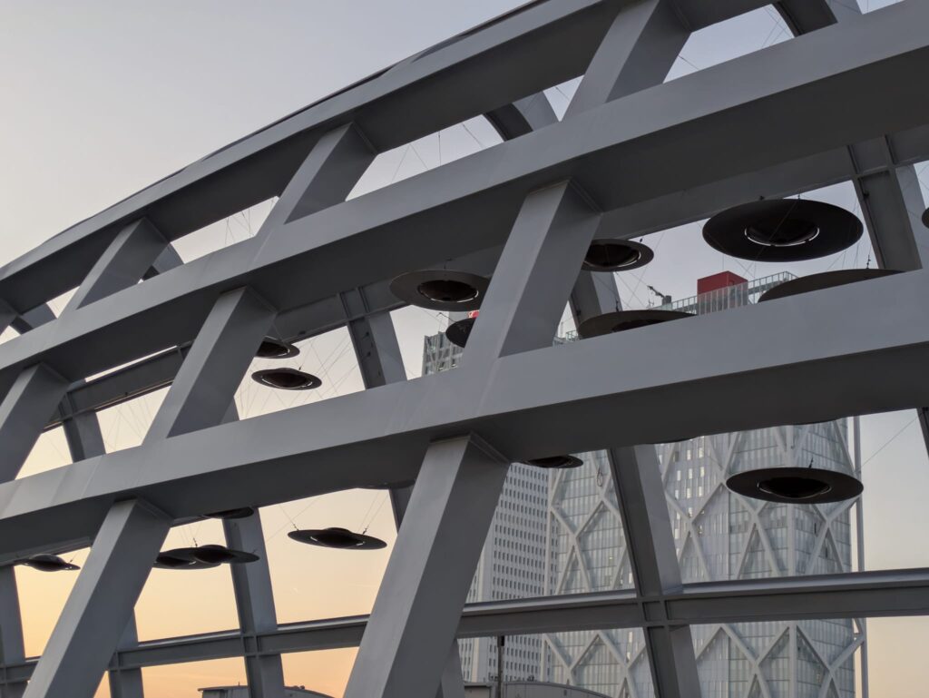
We had the chance to visit the Pleyel footbridge ourselves—and it was a one-of-a-kind experience. Walking across the bridge, immersed in the subtle interplay of environmental sound and sculptural form, was both meditative and inspiring. While on site, we also conducted our own field recordings to capture the dynamic soundscape as it unfolded in real time. Listening through headphones, the bridge became even more alive—each gust of wind, each shifting light pattern, each ambient tone weaving into a delicate, ever-changing composition.

IRCAM Forum Workshops 2025 – ACIDS

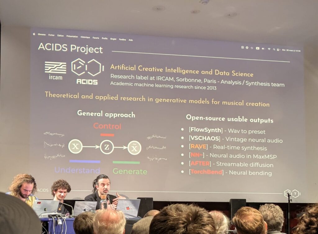
From 26 to 28th of March, we (the sound design master, second semester) had the incredible opportunity to visit IRCAM (Institut de Recherche et Coordination Acoustique/Musique) in Paris as part of a student excursion. For anyone passionate about sound, music technology, and AI, IRCAM is like stepping into new fields of research, discussion and seeing prototypes in action. One of my personal highlights was learning about the ACIDS team (Artificial Creatiive Intelligence and Data Science) and their research projects—RAVE (Real-time Audio Variational autoEncoder) and AFTER (Audio Features Transfer and Exploration in Real-time

ACIDS – Team

The ACIDS team is a multidisciplinary group of researchers working at the intersection of machine learning, sound synthesis, and real-time audio processing. Their name stands for Audio, Communication, Information, Data, and Sound, reflecting their broad focus on computational audio research. During our visit, they gave us an inside look at their latest developments, including demonstrations from the IRCAM Forum Workshop (March 26–28, 2025), where they showcased some of their most exciting advancements. Beside their really good and catchy (also a bit funny) presentation I want to showcase two projects.

RAVE (Real-Time Neural Audio Synthesis)

One of the most impressive projects we explored was RAVE (Real-time Audio Variational autoEncoder), a deep learning model for high-quality audio synthesis and transformation. Unlike traditional digital signal processing, RAVE uses a latent space representation of sound, allowing for intuitive and expressive real-time manipulation.

Overall architecture of the proposed approach. Blocks in blue are the only ones optimized,
while blocks in grey are fixed or frozen operations.

Key Innovations

  1. Two-Stage Training:
    • Stage 1: Learns compact latent representations using a spectral loss.
    • Stage 2: Fine-tunes the decoder with adversarial training for ultra-realistic audio.
  2. Blazing Speed:
    • Runs 20× faster than real-time on a laptop CPU, thanks to a multi-band decomposition technique.
  3. Precision Control:
    • Post-training latent space analysis balances reconstruction quality vs. compactness.
    • Enables timbre transfer and signal compression (2048:1 ratio).

Performance

  • Outperforms NSynth and SING in audio quality (MOS: 3.01 vs. 2.68/1.15) with fewer parameters (17.6M).
  • Handles polyphonic music and speech, unlike many restricted models.

You can explore RAVE’s code and research on their GitHub repository and learn more about its applications on the IRCAM website.

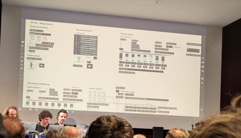
AFTER

While many AI audio tools focus on raw sound generation, what sets AFTER (Audio Foundation Transformer) apart is its sophisticated control mechanisms—a priority highlighted in recent research from the ACIDS team. As their paper states:

“Deep generative models now synthesize high-quality audio signals, shifting the critical challenge from audio quality to control capabilities. While text-to-music generation is popular, explicit control and example-based style transfer better capture the intents of artists.”

How AFTER Achieves Precision

The team’s breakthrough lies in separating local and global audio information:

  • Global (timbre/style): Captured from a reference sound (e.g., a vintage synth’s character).
  • Local (structure): Controlled via MIDI, text prompts, or another audio’s rhythm/melody.

This is enabled by a diffusion autoencoder that builds two disentangled representation spaces, enforced through:

  1. Adversarial training to prevent overlap between timbre and structure.
  2. A two-stage training strategy for stability.
Detailed overview of our method. Input signal(s) are passed to structure and timbre encoders, which provides
semantic encodings that are further disentangled through confusion maximization. These are used to condition a latent
diffusion model to generate the output signal. Input signals are identical during training and but distinct at inference.

Why Musicians Care

In tests, AFTER outperformed existing models in:

  • One-shot timbre transfer (e.g., making a piano piece sound like a harp).
  • MIDI-to-audio generation with precise stylistic control.
  • Full “cover version” generation—transforming a classical piece into jazz while preserving its melody.

Check out AFTER’s progress on GitHub and stay updated via IRCAM’s research page.

References

Caillon, Antoine, and Philippe Esling. “RAVE: A Variational Autoencoder for Fast and High-Quality Neural Audio Synthesis.” arXiv preprint arXiv:2111.05011 (2021). https://arxiv.org/abs/2111.05011.

Demerle, Nils, Philippe Esling, Guillaume Doras, and David Genova. “Combining Audio Control and Style Transfer Using Latent Diffusion.” 

Prototyping III: Image Extender – Image sonification tool for immersive perception of sounds from images and new creation possibilities

Research on sonification of images / video material and different approaches – focus on RGB

The paper by Kopecek and Ošlejšek presents a system that enables visually impaired users to perceive color images through sound using a semantic color model. Each primary color (such as red, green, or blue) is assigned a unique sound, and colors in an image are approximated by the two closest primary colors. These are represented through two simultaneous tones, with volume indicating the proportion of each color. Users can explore images by selecting pixels or regions using input devices like a touchscreen or mouse. The system calculates the average color of the selected area and plays the corresponding sounds. Distinct audio cues indicate image boundaries, and sounds can be either synthetic or instrument-based, with timbre and pitch helping to differentiate them. Users can customize colors and sounds for a more personalized experience. This approach allows for dynamic, efficient exploration of images and supports navigation via annotated SVG formats.

image seperation by Kopecek and Ošlejšek

The review by Sarkar, Bakshi, and Sa offers an overview of various image sonification methods designed to help visually impaired users interpret visual scenes through sound. It covers techniques such as raster scanning, query-based, and path-based approaches, where visual data like pixel intensity and position are mapped to auditory cues. Systems like vOICe and NAVI use high and low-frequency tones to represent image regions vertically. The paper emphasizes the importance of transfer functions, which link image properties to sound attributes such as pitch, volume, and frequency. Different rendering methods—like audification, earcons, and parameter mapping—are discussed in relation to human auditory perception. Special attention is given to color sonification, including the semantic color model introduced by Kopecek and Ošlejšek, which improves usability through clearly distinguishable tones. The paper also explores applications in fields such as medical imaging, algorithm visualization, and network analysis, and briefly touches on sound-to-image conversions.

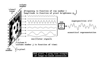
Principles of the image-to-sound mapping

Matta, Rudolph, and Kumar propose the theoretical system “Auditory Eyes,” which converts visual data into auditory and tactile signals to support blind users. The system comprises three main components: an image encoder that uses edge detection and triangulation to estimate object location and distance; a mapper that translates features like motion, brightness, and proximity into corresponding sound and vibration cues; and output generators that produce sound using tools like Csound and tactile feedback via vibrations. Motion is represented using effects like Doppler shift and interaural time difference, while spatial positioning is conveyed through head-related transfer functions. Brightness is mapped to pitch, and edges are conveyed through tone duration. The authors emphasize that combining auditory and tactile information can create a richer and more intuitive understanding of the environment, making the system potentially very useful for real-world navigation and object recognition.

References

Kopecek, Ivan, and Radek Ošlejšek. 2008. “Hybrid Approach to Sonification of Color Images.” In Third 2008 International Conference on Convergence and Hybrid Information Technology, 721–726. IEEE. https://doi.org/10.1109/ICCIT.2008.152.

Sarkar, Rajib, Sambit Bakshi, and Pankaj K Sa. 2012. “Review on Image Sonification: A Non-visual Scene Representation.” In 1st International Conference on Recent Advances in Information Technology (RAIT-2012), 1–5. IEEE. https://doi.org/10.1109/RAIT.2012.6194495.

Matta, Suresh, Heiko Rudolph, and Dinesh K Kumar. 2005. “Auditory Eyes: Representing Visual Information in Sound and Tactile Cues.” In Proceedings of the 13th European Signal Processing Conference (EUSIPCO 2005), 1–5. Antalya, Turkey. https://www.researchgate.net/publication/241256962.

LS EX #1 Let’s turn it upside down?

For the last few weeks, I’ve struggled a lot with idea generation for design & research this semester. As I had already researched the history and definitions of protest and feminist design in the first semester, I couldn’t quite figure out a way to explore protest without organizing a protest itself.
That’s when I started to think about subtle protest and, on the contrary, about subtle inequality that has found its way into our society and isn’t questioned too much in our day-to-day life.


An example would be:
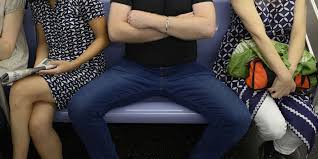
Last week, I was on a fully booked train in Germany, sitting in the bike wagon. Right in front of me was a man sitting with his legs spread out to the sides. Next to him, on the left, sat a woman with her legs crossed, visibly uncomfortable with the situation. On the other side was a free seat—in the fully booked train. But nobody wanted to sit there because a man needed to take up space: the so-called “manspreading” (Merriam-Webster).


And I think a lot of women* can relate to this situation. It happens basically daily and is a subtle sign of how our society works. Men take up space, and women have to be happy with what’s left (Alonso, 2023).


Also, in that moment when I realized it, I tried to do the same—to sit in a way that takes up more space, shows confidence, and also kind of power. And when I did, it felt weird and unnecessary, and I had the feeling that the people around me gave me slightly weird looks when I put my arm on the rest of my chair and sat more with my legs apart.


For some reason, I could not even commit fully to it and only slightly sat more confidently, as it didn’t feel “right”—a feeling that a lot of women have when they are taking up too much space in a way. For too long, women have been conditioned to believe that confidence should be quiet, success should speak for itself, and self-promotion is just another word for arrogance (Saxena, 2025).


It is an internalized concept that comes from ingrained societal beliefs about gender roles and ensures that society continues to function as it is. Therefore, women* should be encouraged to refuse to shrink, take up space, and fight for a world where every girl grows up knowing her worth (Muselmann, 2025).

The Concept:
That’s when I got the idea for a small, animated poster series. The series will show little snippets or photographs of daily life situations like the one described above—but the other way around. Women taking up the space they should own. I want to explore whether it can feel natural, how people react to it, and whether it might even change how I behave in some way.

*In this blog post, I mostly refer to “women” when discussing experiences of inequality and everyday sexism. However, I want to clarify that I am specifically addressing the experiences of people who are read or perceived as female in public spaces. This includes not only cis women, but also many trans, nonbinary, and gender-nonconforming people who are treated according to societal expectations placed on femininity. These dynamics often affect individuals based on how they are externally perceived, regardless of their gender identity, and this post aims to speak to those shared experiences under patriarchal structures.


Co-creating Music with the Magical Musical Mat (NIME Paper Review)

During the interaction design classes with Josef “Seppo” Gründler, we discovered different ways of creating sound. Put simply, we explored how interactions can shape sounds. As part of the course, we were tasked to deepen our knowledge in this domain and check out one NIME Project Paper plus write a review.

What’s NIME?

NIME (New Interfaces for Musical Expression) is a research community exploring innovative ways to create and interact with sound. It brings together artists, designers, engineers, and researchers who develop new musical instruments, interactive sound systems, and experimental performance tools. They blend technology, interaction design, and artistic expression, often incorporating DIY hardware, software, and unconventional interfaces to push the boundaries of musical experience. 

The Magical Music Mat (MMM)

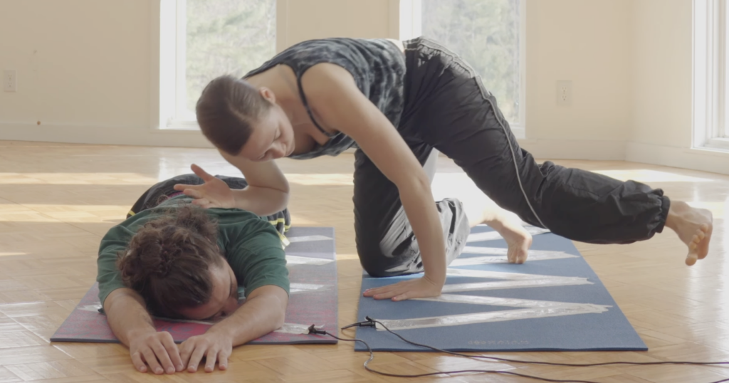
The paper I read was about the Magical Music Mat (MMM), a prototype of two yoga mats, lined with foil, that are connected to an Arduino, which sends MIDI signals to a laptop. The laptop then plays pre determined sound samples or generates sound waves. The idea is, to have two dancers perform on top of the mats, which generates sound, if they touch each other. This way unique performances, connecting sound creation and choreography together, can be created. (see picture below)

To make it easier to understand and comprehend, what the two dancers actually did using the MMM, check out the video below.

The two dancers were given complete freedom when “playing” with the mats and sound. They didn’t know each other nor the sound samples, that were played, beforehand. They made up everything on the spot, letting the sound influence their ideas on how to work with the sounds, they created them selves. The researchers highlighted four key themes:

  1. Choreographer as Composer – Dancers take on a compositional role, treating movement and sound as intertwined creative expressions.For example one dancer played the MMM while the another moved outside.
  2. Playfulness – Play becomes a tool for exploration, breaking rigid structures. The dancers engaged in playful activities like a thumb war or feigning surprise at static sounds, which allows them to discover new movement qualities.
  3. Finding Origins of Movement – Instead of seeking predetermined movements, dancers explore how movement emerges naturally from contact. One dancer positions another’s limbs by touching joints, while another example involves dancers shifting their bodies away from contact points.
  4. Partnering – Interaction and connection between dancers are key. Mirroring movements and communicating through touch (even with closed eyes) deepens their sense of collaboration.

If you want to learn more, her is the link to the Project.

Considerations

In the video it seems like the prototype of the MMM functions more like a button, basically stopping and starting the playback of different sound samples or playing a one shot sound effect. For a performance, that includes dancers influencing sound and being influenced by sound, this should be more “responsive”. Like different levels of sound depending where on the mat a performer stands or how many touch points there are. In the video you can see a performer brushing along the foil, which doesn’t seem to influence the sound that is being generated. Additionally the zig-zag pattern of foil on the mat lead to the performers stepping on a non conductive spot, not creating a sound. For further exploration, this would have to be addressed. Since this is a prototype after all, those “problems” can be surely be fixed.

Thinking about possible uses for this technology I consider this to be an excellent pice of tech to use during a dance performance. I could imagine a whole floor made from MMMs with different connections between performers make different sounds. This could even be used as a new form of instrument to create a new type of orchestra, that uses them selves as instruments. Also this could be incorporated into an acrobatic choreography, with multiple people creating a connection across a long distance, by stacking on top of each other. This could also enable people, who aren’t able to make music with their hands, to make music just using their feet.

***Kick off*** DesRes II

Based on my research in the previous semester, I now would like to dive deeper into aspects of design and photography as a fusion like: What is an editorial shooting and what do main trends look like right now?

Research Title: “Exploring Editorial Photography as a Tool for Emotional Design in Brand Collaborations”

Research Question: How can editorial photography—through the creative use of flash and location—enhance emotional design strategies in brands.

what trends influence this visual language today?


Research Objectives

  1. To explore the role of editorial photography in current branding and design trends.
  2. To experiment with flash photography techniques for creative visual expression.
  3. To analyze how different environments, moods, and photographic styles can evoke emotional responses in the viewer.
  4. To identify the visual elements that resonate with modern editorial aesthetics.

Methodology

1. Literature & Trend Review

  • What is editorial photography?
  • Explore visual & conceptual trends in current editorial shoots (e.g., movement, surrealism, retro flash, candid energy, minimalism).
  • Analyze how photography supports emotional design in brand storytelling.

2. Experimental Setup

Equipment

  • Flash: Godox V100
  • Camera: Canon R6 Mark II
  • Lens: 85mm f/1.2 (plus possible experimentation with other focal lengths)

Techniques to be Tested

  • Flash Power Settings: Low, Medium, High
  • Flash Position: On-camera, Off-camera, Side-lit, Backlit
  • Multiflash Setup: Using two or more flashes to create depth or freeze motion
  • Shutter Techniques:
    • Dragging the shutter for motion blur
    • Zoom burst during long exposure
    • Rear curtain sync
  • Focal Length Variations: 35mm, 50mm, 85mm to compare intimacy and compression
  • Studio vs Outdoor: Controlled lighting vs. reactive improvisation with ambient light

3. Location Scouting

  • Focus: Urban movement & dynamic scenes
  • Target locations in Graz that reflect movement & energy (e.g. skateparks, urban intersections, transit zones, car meets, bike paths)
  • Aim to find locations with architectural contrast or kinetic energy

Graz has many hidden gems, lets find suitable shooting locations for the upcoming experiments. My shotlist includes fast paced environments. Therefore something related to movement would be suiteable. For instance a sport, car,

  • Sports fields in Graz (Running tracks, darts, jumping,…)
  • Austernbad
  • Skatepark
  • G-class experience center

4. Creative Process

Moodboard Creation

  • Curate references from current fashion/editorial shoots
  • Highlight key emotional aesthetics: raw, glamour, gritty, hyperreal, soft nostalgia
  • Align visuals with brand identity cues (colors, tone, audience)

Shotlist Development

  • Include varied scenarios:
    • Fast-paced motion (running, jumping, driving)
    • Still editorial portraits with emotive expression
    • Flash vs. natural light comparisons
    • Unexpected props or elements (e.g., smoke, water, fabrics in motion)

5. Execution & Documentation

  • Conduct a series of experimental shoots
  • Document settings, environment, and intent for each series
  • Collect feedback from peers/target audience (qualitative responses to emotion evoked)

Expected Outcomes

  • A portfolio of editorial-style photos with varied lighting/emotional tones
  • Practical insights into how flash photography can enhance storytelling
  • A visual and technical guide to leveraging flash creatively
  • A framework for applying emotional design strategies through photography in brand collaborations

Reflection & Learnings

  • What techniques created the strongest emotional resonance?
  • Which environments supported or challenged the creative process?
  • How did the technical constraints shape creative direction?
  • What stylistic choices felt most current or trend-aligned?

Resources

2.2 First Briefing ProWork Experiment // Semester 2 preview

After a kick-off meeting with Didi Mosbacher, I’ve officially started into the second Semester with transitioning into the experimental phase of my project. Reflecting on the insights gained during the first semester and the research phase, I began to explore how event design can be approached more practically. Instead of just theorizing, the plan was to work with a “real-life example”—something that brings theory to life.

Since we had already planned to go there, the OFFF Festival in Barcelona presented the perfect opportunity. It allows me to dive deep into a live event experience: observing, documenting, and soaking in every detail on site.

My goal is to understand what event design really needs — or doesn’t need — by analyzing best practices from first-hand experience.

The first step in this journey: analyzing OFFF’s online appearance to understand how their digital identity aligns with their on-site presence.

02.02: Mehr als nur Einführung

Nach Absolvierung der ersten beiden “Lessons” des ausgewählten Kurses halte ich es jetzt mal für angebracht im ersten echten Blogpost ein kleines Zwischenfazit zu ziehen und meine Key-Learnings festzuhalten.

Insgesamt haben mich die beiden großen Eingangs-Tutorials nun eine gute Woche gekostet, wodurch ich auch zum Schluss gekommen, nicht den gesamten Kurs zu absolvieren, da mich damit wohl im vierten Semester noch nicht fertig wäre, sondern nur mehr ausgewählte Lessons zu machen und danach hier darüber zu berichten. Aber jetzt medias in res.

Lesson 1: Track Mattes, Masken und erste Paths

Im ersten, kürzeren Tutorial, ging es um die echten Basics von After Effects. Gottseidank bedeutete dies für mich, dass nicht allzu viel neues auf mich zu kam – anderenfalls müsste man auch meinen bisherigen Studienerfolg in Frage stellen. Zu den Key-Learnings zählt aber definitiv die Animation von Masken-Paths, von der ich nichts wusste, da diese meiner Meinung nach auch relativ versteckt ist. Damit ist es aber z.B. sehr einfach gelungen die im zweiten Shot sichtbaren Balken zu animieren, die, einen Schritt weitergedacht, im Grunde für Balkendiagramme genauso verwendet werden können. Außerdem gab es auch bereits eine Einführung in den Graph Editor und Dinge wie Easy Ease um schnell coolere Ergebnisse zu erzielen, die richtige Keyframe Action begann aber erst in Lesson 2.

Für mich außerdem interessant war die Verwendung von Blend-Modes mithilfe derer man im Grunde aus allen Bildern, die irgendeine Textur haben, diese z.B. auf den Hintergrund übertragen kann. Ich bin zwar noch nicht schlau daraus geworden was genau welches Modus jetzt macht, aber sich einfach durchzuklicken, bis einem etwas gefällt kostet auch nicht zu viel Zeit. Das Ergebnis des gesamten Tutorials ist nett, stellt aber wirklich nur eine grobe Einführung dar.

Lesson 2: Ich glaub´ ich kann jetzt alles

So einfach und anfängerfreundlich die erste Lektion auch wahr, richtige Motion Graphic Action gab es erste in Lesson 2, dafür dort aber richtig. Gefühlt kann ich schon nach dieser Einheit die Welt zerreissen und es ist irre wieviele verschiedene Techniken in gerade einmal 2,5h Einheit verpackt sind (auch wenn man beim Nachmachen sicher ein paar Tage dafür benötigt). Die wichtigen Learnings sind kaum an einer Hand abzählbar, deswegen hier ein Best-Of:

  • Der einfachste Weg um Text oder Zahlen zu erstellen, die man dann als Shapes auch manipulieren kann ist nicht durch Shapes selbst, sondern durch das Text Tool. Mit nur einem Klick (create shapes from text) kann man den dann nämlich umwandeln.
  • Über Null-Objekte auf welche man andere parented kann man super schnell eine ganze Gruppe kontrollieren ohne noch einmal zu precomposen.
  • Key-Frame Manipulation im Graph Editor funktioniert im Grunde immer gleich. Zieht man den die Geschwindigkeitskurve zu Beginn auf volle Kanne und dann immer lamgsamer, hat man in 90% der Fälle einen super smoothen look. Falls nicht, einfach umkehren, eins von den beiden ists immer.
  • Der einfachste Weg Objekte über einen definierten Pfad zu bewegen ist diesen mit dem Pen-Tool zu ziehen und dann mit “create nulls from path” direkt ein sich darauf bewegendes Null zu erzeugen, das auch gleich automatisch einen Progress Slider hat. Dieses dann einfach parenten und fertig.
  • Bounce Animations sind brutal scheisse und aufwendig wenn man sie mit einzelnen Keyframes macht, gibt´s da vielleicht etwas einfacheres???? Hilfe!!!!!

Das ganze Video, das sich meiner Meinung nach wirklich sehen lassen kann sieht nun so aus und beinhaltet meiner Meinung nach wirklich alle essenziellen Techniken für smoothe Motion Graphics:

Fazit

Da ich mit diesen beiden Einstiegskursen bereits das Gefühl habe gut dabei zu sein, werde ich mich in Zukunft mehr auf einzelne brauchbare Tutorials beschränken statt den gesamten Kurs zu machen, und bald davon berichten.

#1 Prototyping Session

Der erste Versuch einen Prototypen für die Vorlesung Des Res 2 ist tatsächlich nicht über mein potentielles Masterprojekt, denn ich habe die Aufgabe mehr als eine rapid Prototyping Übung verstanden. Also habe ich ein Problem genommen, das meinen Alltag prägt (eine sogenannte Alltagsunwürdigkeit) und versucht dafür eine Lösung zu finden. 

Das besagte Problem hier zu sehen: 

Und zwar besitze ich in meiner kleinen 50m2 Wohnung keine Speisekammer oder ähnliches, um muss den Großteil meiner Lebensmittel, die nicht in den Kühlschrank gehören, in zwei sehr tiefe Laden stopfen. Fast täglich gibt es die Situation, dass ich auch von hinten in der Lade etwas brauche und beim Versuch dorthin zu gelangen, schmeiße ich an der vordersten Front alles um.  

Darum muss hier eine Lösung her. Und dabei dachte ich an eine Drehscheibe mit Vertiefungen für die Lebensmittel. 


Die Drehfunktion

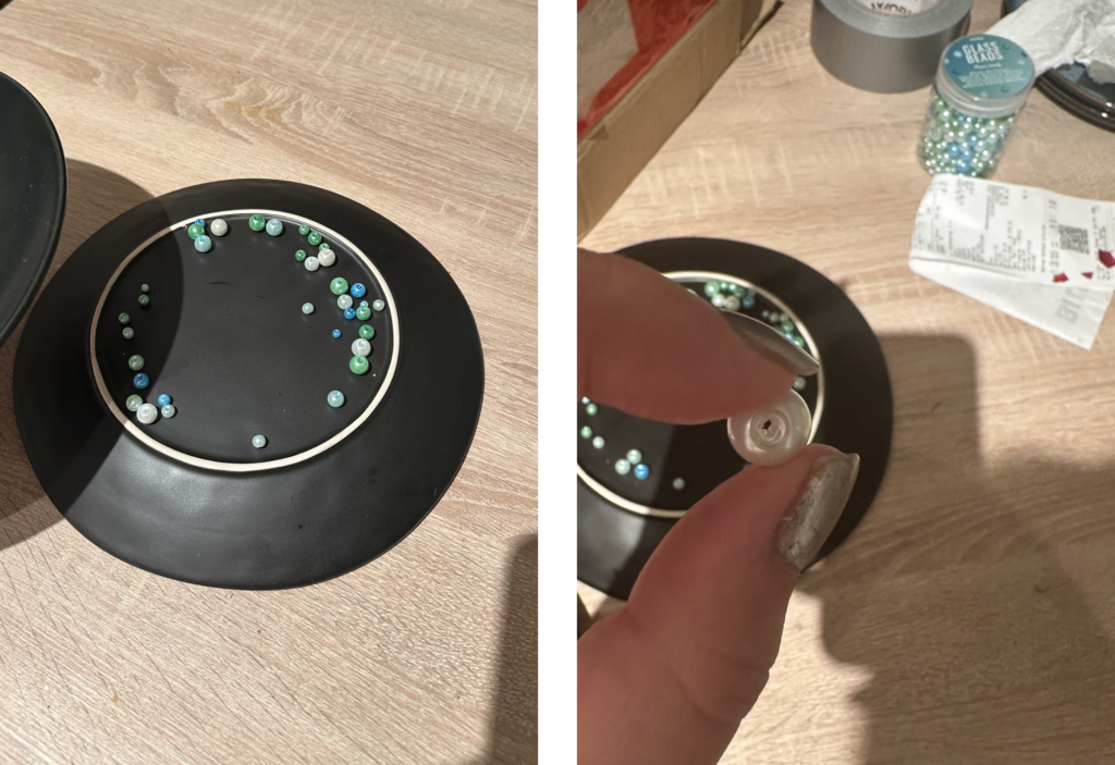
Im ersten Schritt wollte ich dazu zwei Teller nehmen und dazwischen Perlen, die ich bereits Zuhause habe. Quasi ein provisorisches Kugellager. Hat leider eher schlechter funktioniert und sich nicht wirklich gut gedreht. Wahrscheinlich waren die Perlen zu unrund oder nicht alle gleich groß.

Der Inhalt 

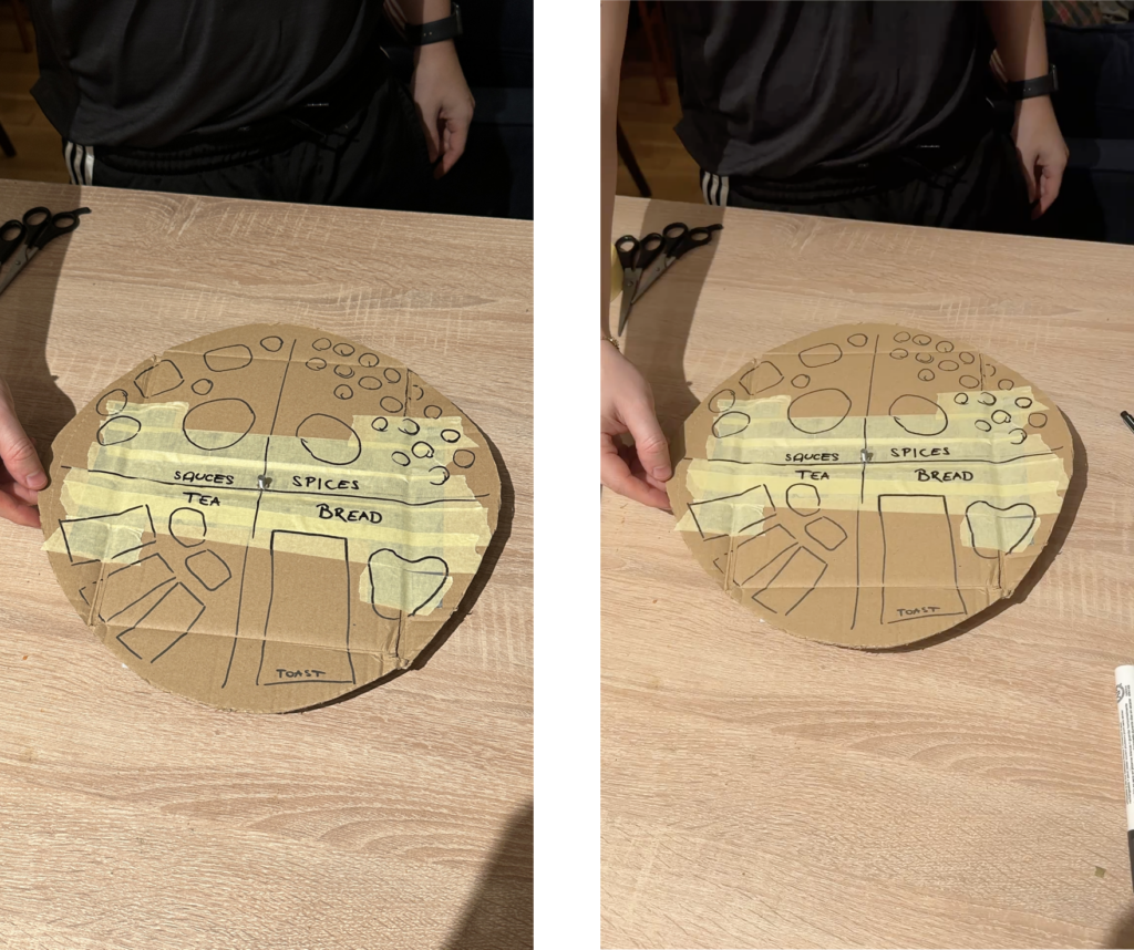
Als erstes wollte ich mich um die obere Lade kümmern. Dafür mussten die einzelnen Lebensmittel kategorisiert werden. Dabei ergaben sich diese 4 Kategorien:

  • Brot
  • Gewürze
  • Soßen
  • Tee

Diese 4 Kategorien nehmen ungefähr die selbe Menge an Platz ein.

Probleme

Während des Prototypings sind einige Probleme aufgetreten.
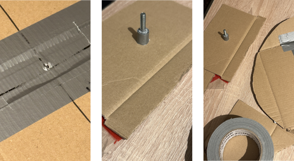
Zum Beispiel, dass der Marker nicht markiert auf dem Panzertape und dass es irgendwie ein Mittelding gebraucht hat, damit zwei Scheiben sich aufeinander drehen. Dafür wurde dann eine Schraube verwendet. Die erste war leider zu lange, mit der zweiten hat die Sache dann schon besser funktioniert.

„Finaler“ sehr Lofi Prototype

Im Endeffekt hatte ich dann eine ganz gut drehbare Scheibe mit Kennzeichnung der einzelnen Bereiche. Meine Kollegen hatten anhand der Beschriftung halbwegs erkannt, was das Objekt machen soll, der Kontext zu meinem Storage konnte aber ohne Erklärung (irgendwie auch logisch)  nicht erkannt werden. 

Fazit

Es hat sehr Spaß gemacht zu tüfteln und kontinuierlich kleine Probleme zu beseitigen. Auch das Speed-Dating war sehr cool. Bin mir nicht sicher, ob ich doch schon an meiner Masterarbeitsidee hätte arbeiten sollen, damit da etwas schneller weiter geht, aber es war auch befreiend, sich mit einem weniger „geladenen“ Thema zu beschäftigen.