#11 Prototyping – Trial and Error

Prototyping Multisensory Data – From Spaghetti Mountains to Shadowed Insights

The task was to create three quick lo-fi prototypes related to our Master’s research—ideally 5–10 minutes each, with a maximum of 20. The goal was to sketch out ideas, test tangible concepts, and move away from screen-based representations. I managed to create two prototypes. Neither went exactly as planned—but both taught me something valuable.


Prototype #1 – The Spaghetti Schlossberg

For this prototype, I attempted to reconstruct the topography of Graz’s Schlossberg using spaghetti. I had a map with Höhenlinien (contour lines) and snapped pieces of spaghetti to match the elevation levels. The plan was to poke them through holes in a cardboard base to create a physical, touchable model of the hill.

The idea:

To offer a tactile experience of elevation, allowing users to feel the form of the mountain. My long-term vision included vibration feedback: depending on which level the user touches, the surface could respond with different intensities or patterns of vibration—giving sensory feedback about height, slope, or perhaps historical or environmental data.

What didn’t work:

  • The holes had to be the exact right size—too big, and the spaghetti would fall through; too small, and it would snap trying to insert it.
  • The spaghetti broke. A lot.
  • I only managed about half the model before deciding to stop.

What I learned:

  • Spaghetti is a fragile material—not ideal for tactile prototyping.
  • Still, the concept of a vibrotactile elevation model is worth pursuing, maybe with more durable materials like wires, foam, or layered acrylic.
  • There’s something powerful about physically feeling data—especially when it’s enhanced with feedback.

Prototype #2 – The Cardboard Box of Shadows

This idea was more experimental. I took a cardboard box, cut one side open, and inserted a slot for sliding a sheet of paper inside. I placed a light behind it, allowing shadows to appear on the back wall of the box.

The idea:

To explore how data can be made visible through shadows—revealing patterns not through direct representation, but through effect and contrast. Initially abstract, the idea grew into something more tactile and layered.

I then thought: what if you could slide two pieces of paper inside the box—each with different shapes, data patterns, or cutouts? Their overlapping shadows would form a dynamic visual, representing the interaction between two datasets.

What this could evolve into:

  • A lo-fi ambient display where the position and layering of paper affects the final output.
  • A metaphor for data complexity—how meaning emerges not from a single source, but from relationships, intersections, and light.

What I learned:

  • Sometimes we build without a clear purpose, and ideas emerge through doing.
  • Light and layering can be compelling tools in multisensory data design—especially when paired with motion, tactility, or time-based changes.

Reflections

These fast prototypes pushed me to translate data into form—without overthinking or refining too early. Both attempts reminded me that multisensory design is not about perfection—it’s about perception. What does data feel like? Sound like? Look like when it hides, flickers, or resists being seen?

Even though I didn’t finish all three, I left with two ideas I might revisit, refine, or completely rethink—successes in their own right.
Documentation & Reflection of the Speed-Dating/Sharing session

Lo-Fi Prototyping: A Hands-On Experiment with Everyday Materials

In one of our recent classes, we were given an interesting assignment:

Create three lo-fi prototypes of a project idea related to your Master’s research and bring one to class for testing. These prototypes could be iterations of previous work, early drafts of a new concept, or entirely different ideas. The key was to keep the process quick and experimental, spending no more than 20 minutes on each prototype.

Each student approached this task differently. Instead of focusing on my research from last semester, I decided to take a completely fresh perspective. My goal was to experiment with rapid prototyping using only materials readily available at home, creating something practical and functional.

Prototype 1: The DIY Charger Holder

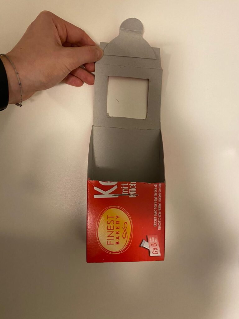
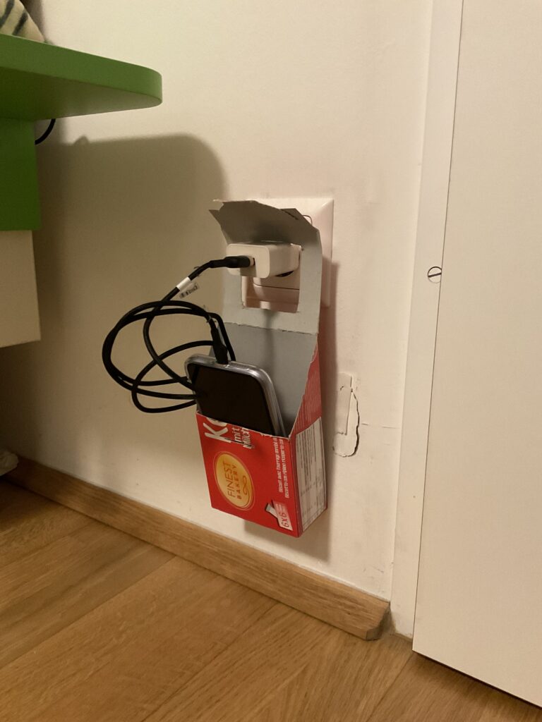
My first prototype was a cardboard charging holder, designed to serve as a portable phone and charger station. The idea came from a common inconvenience—when outlets are located far from tables or shelves, leaving devices on the floor while charging is not ideal. This prototype aimed to solve that issue, especially for travel or spaces with limited furniture.

Using an empty cookie box, I cut out sections to create an opening where the phone and charger could be placed. The structure allowed the box to hang securely on a plugged-in charger, keeping the phone elevated and safe from potential damage.

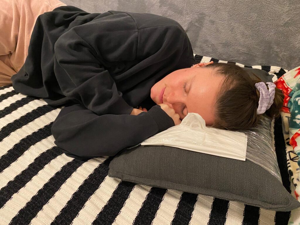
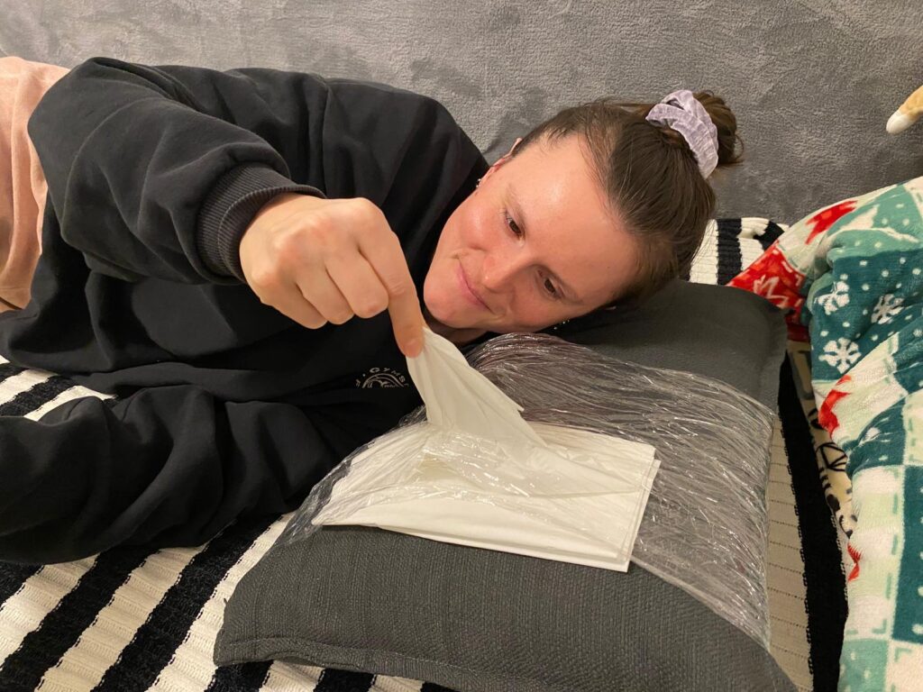
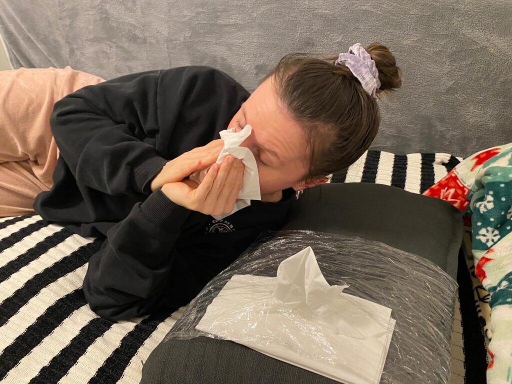
Prototype 2: The Allergy Pillowcase

The second prototype was a pillowcase designed for people with allergies or colds. The concept was simple: integrating a small pocket or compartment to store tissues. This would allow users to access tissues quickly during the night without having to get up or search for them in the dark. While the design was basic, the idea addressed a real pain point and could be refined further.

Observations from the Class Testing Session

For the testing session, I brought my first prototype—the cardboard charging holder—to class. What surprised me the most was how difficult it was for my classmates to identify its purpose. Since I had designed it with a clear function in mind, I assumed it would be immediately recognizable. However, when I asked my peers to guess what it was and how it worked, many had no idea.

Only after I provided a small hint—mentioning that it was related to phone chargers—did they start to piece it together. This experience highlighted an important lesson: as designers, we often assume our ideas are obvious because we are deeply familiar with them. However, what seems intuitive to us may not be clear to others.

Key Takeaways

This experiment reinforced a critical principle in design and product development:

  • Early user testing is crucial. By involving users from the beginning, we can uncover misunderstandings and refine our designs based on real feedback.
  • Imperfect prototypes are valuable. It’s better to test a rough, quick prototype than to wait until a product is ‘perfect.’ Iterative design allows for improvements based on actual user insights rather than assumptions.
  • Context matters. A design that seems simple and logical to its creator may not be immediately clear to others. Communicating ideas effectively is just as important as the functionality itself.

Through this rapid prototyping challenge, I realized that testing, even with basic materials, can lead to unexpected insights. Moving forward, I plan to integrate more user feedback earlier in my design process to ensure that my ideas are not only practical but also easily understandable.

This assignment proved that sometimes, the simplest ideas can spark the most meaningful discussions about usability and design thinking

Plane of Emergence – Music between Machines (IRCAM)

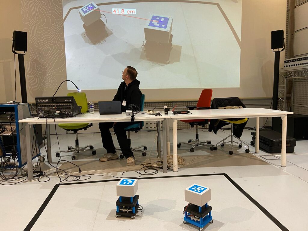
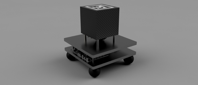
When I arrived at the presentation of Plane of Emergence at IRCAM, the setup looked surprisingly simple at first. On the floor, inside a black marked rectangle, were two small cube-like devices, standing quietly next to each other. A big screen behind them showed a live camera view of the scene. I noticed a line connecting the two cubes on the projection, showing exactly how far they were apart. This was made possible by a motion-tracking camera mounted above, constantly measuring their positions.

The artist explained that these devices were not normal speakers or instruments, but autonomous machines. They were able to listen, react, and transform musical patterns based on how close or far they were from each other. There was no conductor or composer telling them what to play — everything emerged from their interaction alone.

While listening, I could feel how the soundscape was always shifting. Sometimes you could recognize small repetitive patterns, like a rhythm or a melody fragment. But just when you thought something stable was forming, it suddenly dissolved into something new. The artist described this as a balance between “territorialization” — when the devices settle into stable patterns — and “deterritorialization” — when they break free and surprise you with unexpected variations. It felt like watching two creatures communicating and constantly changing their language.

The idea behind it is inspired by the philosopher Deleuze and his concept of the plane of immanence — a space where things don’t follow strict rules but constantly create themselves from within. I liked that you could really hear this concept, it wasn’t just theory.

Technically, the system is based on a previous project called Spatially Distributed Instruments, where the machines not only send sounds but also “listen” to each other without noticeable delay. The sound you hear is not pre-composed, it is created in real-time from their relationship in space.

Unfortunately, as the artist mentioned, only two of the planned interaction methods were working that day. But even with these limitations, it was fascinating to see (and hear) how rich and alive the system already was.

For me, it was less like watching a performance and more like observing a small ecosystem made of sound and technology.

IRCAM Link: https://forum.ircam.fr/article/detail/plane-of-emergence/

A Journey Through Sound – (IRCAM)

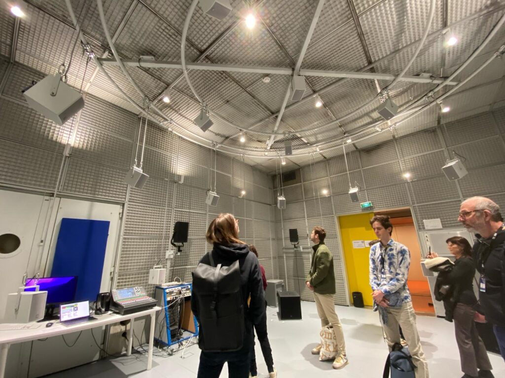
When I entered the installation called ‘Hearing From Within A Crossfade by Lewis Wolstanholme’ at IRCAM, I was immediately surrounded by a very special atmosphere. Sounds were floating through the space — soft, detailed, and constantly changing. It didn’t feel like listening to a normal piece of music. Instead, it felt like the sounds were alive, moving gently around me and transforming into something new all the time.

What made this experience so fascinating was how the sounds seemed to blend into each other without clear breaks. One texture slowly became another, sometimes so smoothly that I barely noticed the change. I later found out that this was made possible by a special technique called Joint Time-Frequency Scattering Transform. This method allows sounds to be transformed and combined in a very natural way, almost like they were breathing.

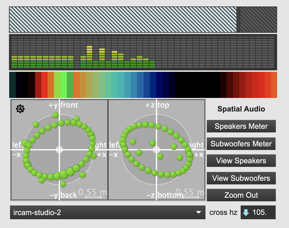
The installation was created by Christopher Mitcheltree together with IRCAM. He used this technique to make sounds not only change over time but also move through space. Depending on how a sound behaved — for example, how much it was vibrating or how high or low it was — it appeared at different places in the room. This made the whole space feel like part of the music.

For me, it felt like I wasn’t just listening, but actually walking inside a sound. It was a very inspiring and calming experience, and I stayed much longer than I had planned.

IRCAM – Link: https://forum.ircam.fr/article/hearing-from-within-a-crossfade/

From Sketch to Virtual Runway: 

How Hard Is It to Create Your Own VR Clothes?

Virtual fashion has experienced explosive growth because virtual reality (VR) worlds now allow people to express their personal style. Developing VR clothing presents an adventurous creative path for your gaming avatar meetups and digital socializing purposes. Virtual fashion dream translation requires what level of difficulty to execute? Let’s break it down.

As a starting point we need to grasp basic principles of virtual reality clothing

The digital garments of VR are virtual garments which attach to digital avatars. VR clothing design happens through software which enables the production of virtual fabrics alongside textural effects plus motion attributes. VR clothing bypasses traditional fashion limitations through its ability to design unconventional designs with no physical boundaries. Designers obtain full creative freedom because they can experiment with no boundaries.

Virtual fashion design needs proper attention to form elements as well as avatar compatibility and natural movement in addition to technical execution. Inadequate design of clothing products may cause items to penetrate the user’s body structure or create abnormal movements thus interrupting their VR experience.

Essential Tools You’ll Need:

  • 3D Design Software: Programs like Blender, Marvelous Designer, or Clo3D are popular for creating realistic clothing simulations. These platforms provide flexibility in shaping garments and adding details.
  • Texturing Tools: Substance Painter and Photoshop help add colors, patterns, and textures, enhancing the garment’s realism.
  • Rendering and Animation Tools: Software like Unity and Unreal Engine allows you to animate the clothing, simulate realistic physics, and visualize it in a VR setting.
  • VR Platforms: Platforms like Decentraland, Roblox, or Meta Horizon Worlds provide spaces to showcase and sell your designs.

The Learning Curve

VR clothing creation poses distinctive challenges especially to new users who start this process. Substantial creative design along with technical abilities create the productive basis of this process. Learning 3D modeling and UV mapping alongside rigging mechanics for avatar garment attachment and creating textures which resemble reality proves difficult until one gains sufficient practice.

  • For Beginners: The initial learning curve might feel steep, particularly when learning to navigate 3D design software. However, countless online resources, tutorials, and communities can help guide you through the process.
  • For Intermediate Designers: If you have experience in graphic design or fashion design, the skills transfer well. Marvelous Designer, for instance, simulates real-world fabric behavior, making it intuitive for those with garment construction knowledge.
  • For Advanced Users: Professionals can experiment with complex materials, intricate textures, and dynamic simulations to push the boundaries of VR fashion.

Pro Tip: Start with simple projects like t-shirts or jackets to understand the basics before advancing to elaborate designs.

Designing Your First VR Garment

Typically design processes require these sequential phases:

  1. Begin by creating sketches or digital representations of clothing designs during conceptualization. Next evaluate how the design will function and react against the avatar’s body structure.
  2. The base shape creation happens through the use of software such as Blender. Virtual fabric simulation on avatar models works best through the tool known as Marvelous Designer.
  3. Texturing provides the method of applying colorful designs with patterns to finalize the visual creation process. By using Substance Painter users can produce realistic material textures.
  4. Through rigging enable your garment to link up with avatar skeletons then it will follow their motions naturally.
  5. Virtual testing enables designers to position their creations through VR for required modifications.

Experimentation and Creativity

Virtual reality fashion allows creators to transcend physical limitations by developing designs that challenge classical dynamics of physics. Virtual fashion designers craft their designs through excellent ideas such as responsive garments which alter with user movements and through outfits made of glowing dresses or fluid metallic materials. You gain full creative freedom to design nonrealistic concepts and futuristic designs without boundaries.

A person in a long dress

Description automatically generatedA person with a ponytail and a scarf around her neck

Description automatically generated

The virtual fashion marketplaces of several platforms make their appearance to users. Developing a personal commitment to digital fashion allows you to turn your designs into income through digital fashion items as well as NFTs and game skins.

Creative Ideas to Try:

  • Gravity-defying capes
  • Interactive garments that change color
  • Transparent holographic outfits
  • Cyberpunk-inspired metallic suits

Challenges You Might Face

The liberating element of virtual fashion brings both strength and obstacles to users. Some common difficulties include:

  1. Proper avatar compatibility and rigging procedures prove to be technical problems during the process.
  2. The large file size of VR clothing creates management problems which impacts system loading speed and operational performance.
  3. Clients may have to dedicate time and professional skill to reach precise fabric simulation results.
  4. Continuous practice together with persistence enables major improvements in most cases. Designers who work in communities often share their procedures along with offering support to other members.

Conclusion: Is It Easy or Hard?

The process of making VR clothing becomes easier after acquiring experience and learning how to design with the right tools matched to your creative ambitions. The technical complexity initiall Beginning simple projects and increasing practical work and trying diverse styles helps both new and experienced users develop their skill level and confidence.

VR fashion provides unlimited opportunities where personal designers can build their creativity toward establishing a virtual presence including the market. All expert fashion designers began their journey at the beginner level thus becoming experts by starting first.

The Challenges of Creating Virtual Reality Clothing: Where Fashion Meets Frustration

Fashion designers encounter multiple hurdles while developing virtual reality apparel which results in significant challenges during the design process.

New technology in Virtual Reality fashion completely changes our approach to wearing clothes. The fashion world uses virtual reality garments along with virtual avatars to let users express their creativity through sustainable fashion options. The creation of digital clothes involves numerous technical obstacles because of the characteristics of the virtual world. VR fashion developers encounter numerous significant difficulties during their work to create virtual reality clothing.

1. Achieving Realistic Fabric Simulation

The movement dynamics of VR clothing depend on simulated fabric behavior because digital fabrics lack natural attributes of physical textiles. Designers need to duplicate the exact textures and movements of all materials including flowing silk alongside rigid leather. becoming realistic demands scientific mastery regarding material behavior along with high-capacity processing systems. VR designs fail unless simulation programming is precisely accurate since it affects the way virtual characters move through their garments.

2. Balancing Aesthetics and Performance

Duplicating intricate fabric patterns together with high-end textures requires processing equipment with great power intensity. Softwares featuring photorealistic clothing offer better immersion yet they put excessive strain on computing devices. Developing VR content requires developers to strike an ideal stability point that maintains performance speed while showing visually pleasing graphics. The preservation of frame rates through texture simplification or polygon number reduction leads to lowered realistic detail in the virtual environment.

3. Avatar Customization and Fit

Physically produced clothing adjusts to accommodate people of all body sizes as well as shapes. The capability to customize in virtual reality systems remains challenging at present. Programmers develop adjustable clothing systems which handle various sizes of virtual characters through automation. Such systems face technical issues which result in improper clothing conformance and garments that expand abnormally.

4. Physics-Driven Collisions and Clipping

VR fashion faces a major difficulty because clothing frequently intersects with both the avatar and other garments in ways that are known as “clipping.” The detection tools that developers embed in their systems stop clothing from interchanging yet they still have difficulty making interactions between objects work flawlessly particularly when characters execute intricate moves. When collisions are inadequately managed in VR programs they destroy users’ immersion and negatively affect their virtual reality experience.

5. Style Limitations and Creative Constraints

Design capabilities within VR exist without border while the system places specific design constraints on users. The designers have to simplify complex elements which display marginal realism during rendering and animation processes. Processing user interactions such as fabric manipulation becomes difficult within virtual environments because it demands specialized equipment.

6. Sustainability vs. Commercial Viability

Virtual reality fashion has environmental benefits because it cuts out the need for conventional fashion products created from real resources. The development process for high-quality digital garments requires extensive resources to create and demands a team of specialized workers to maintain it. Profitability and sustainable practices exist in constant opposition to each other.

Final Thoughts

To make VR clothing you need both technological ability and creative thinking skills. The multiple challenges of creating VR clothing have started to decrease since real-time rendering and adaptive garment technology combined with AI-driven physics continue to progress. Designer opportunities within the metaverse will expand proportionally to the growth of this virtual realm enabling them to transform virtual fashion limitations.

The initial step towards participating in digital outfit development requires comprehension of these challenges for designers, developers, and fashion enthusiasts alike.

Modellkirche und erste Mapping-Tests

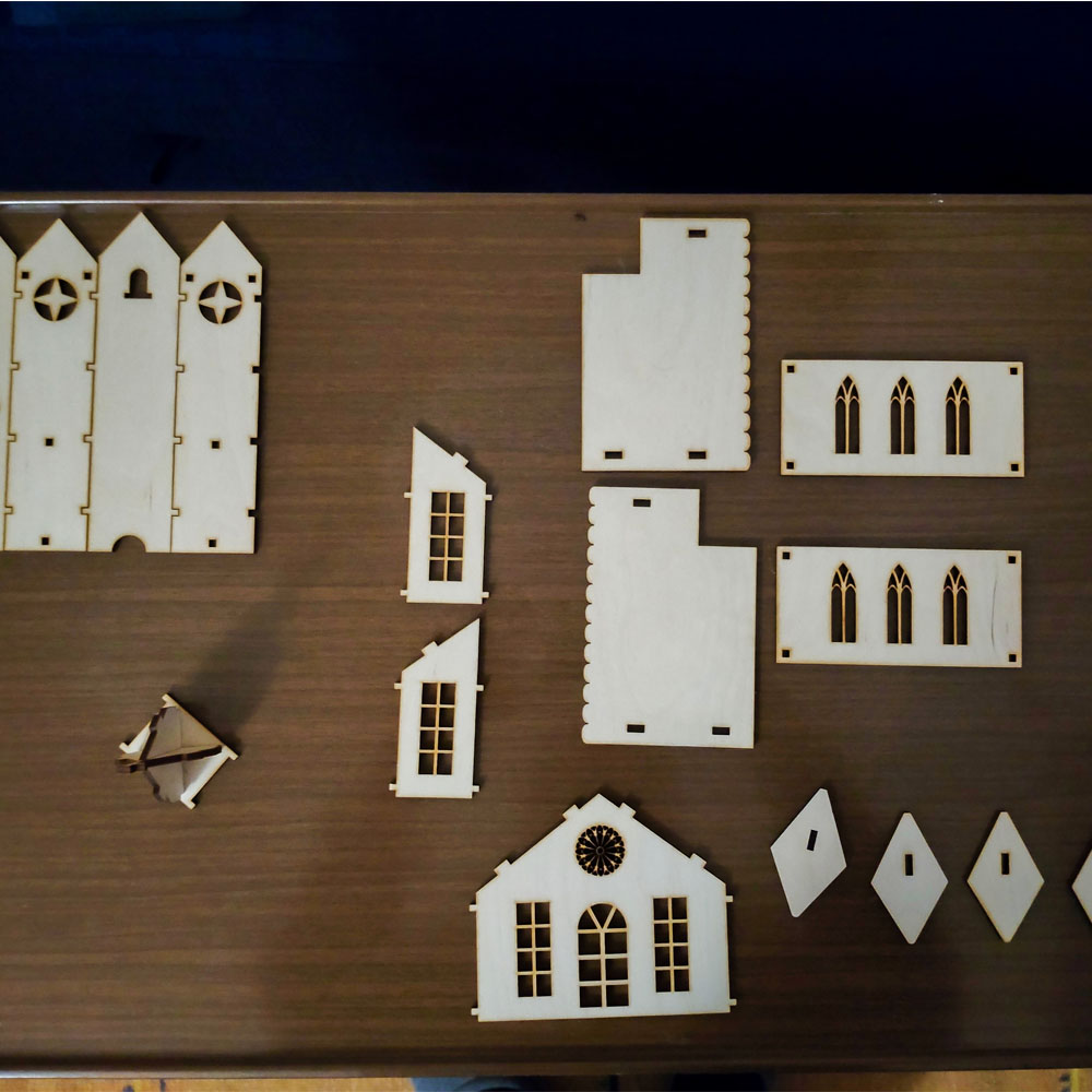
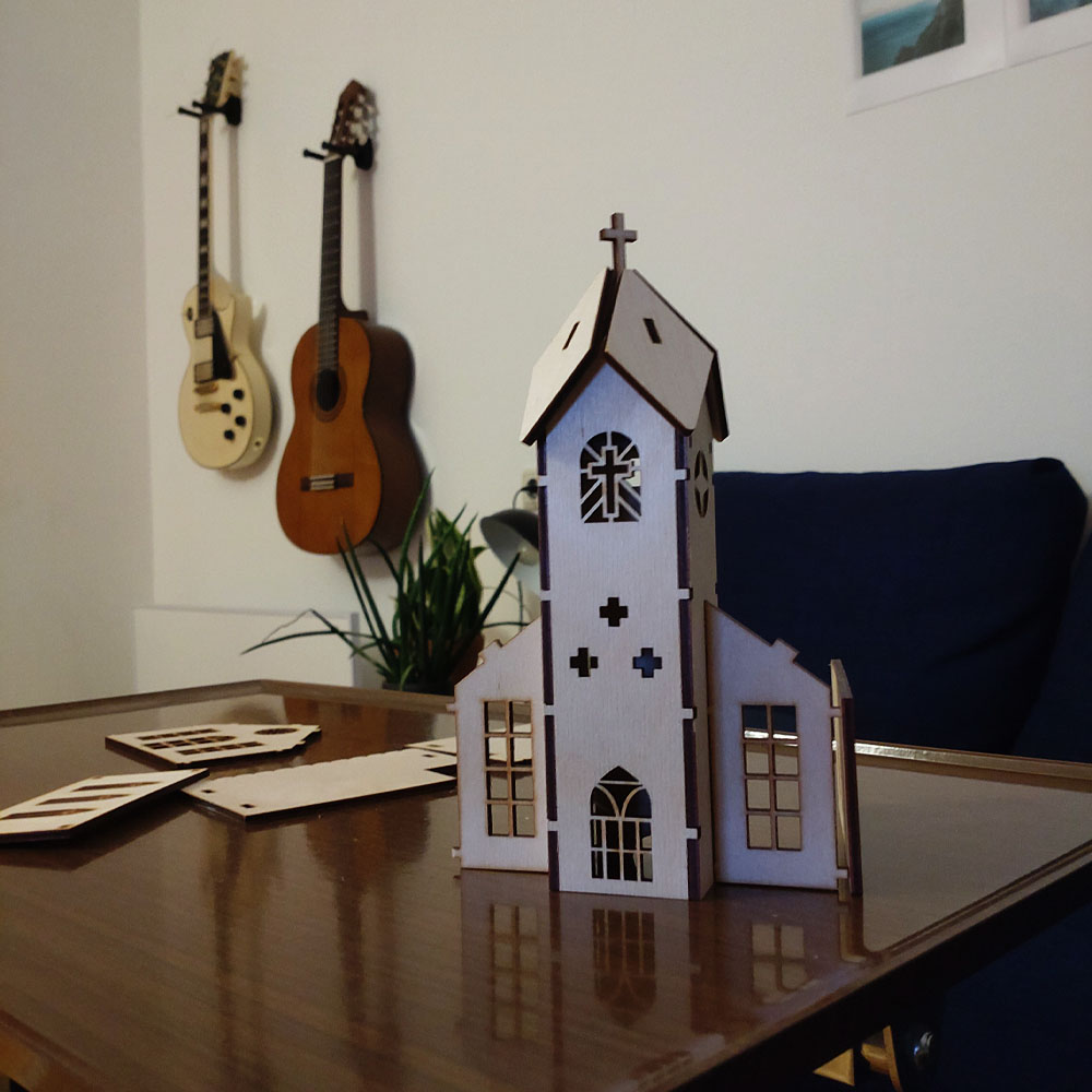
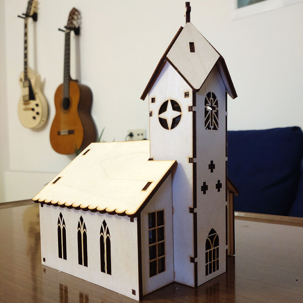
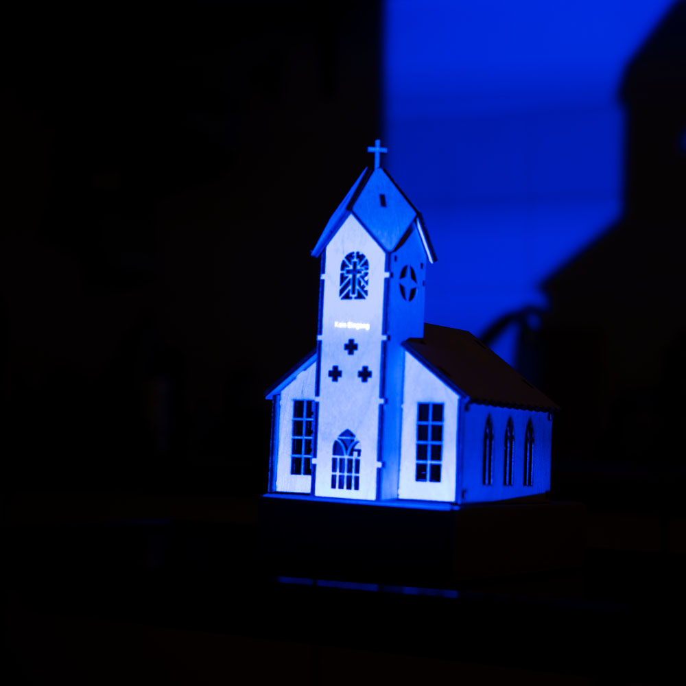
Nachdem die Bauteile für die Modellkirche eingetroffen waren, wurden sie zusammengesetzt, wodurch ein verkleinertes Modell einer Kirche aus Holz entstand. Die Struktur des Holzes erwies sich als leicht faserig mit einem gelblichen Ton. In diesem Zusammenhang stellte sich die Frage, ob ein Anstrich in Weiß vorteilhaft wäre, insbesondere falls sich die ersten Mapping-Tests als nicht erfolgreich erweisen sollten.

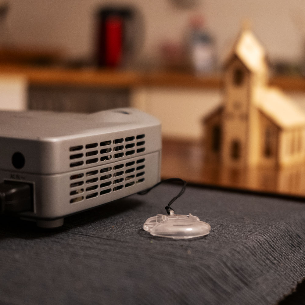
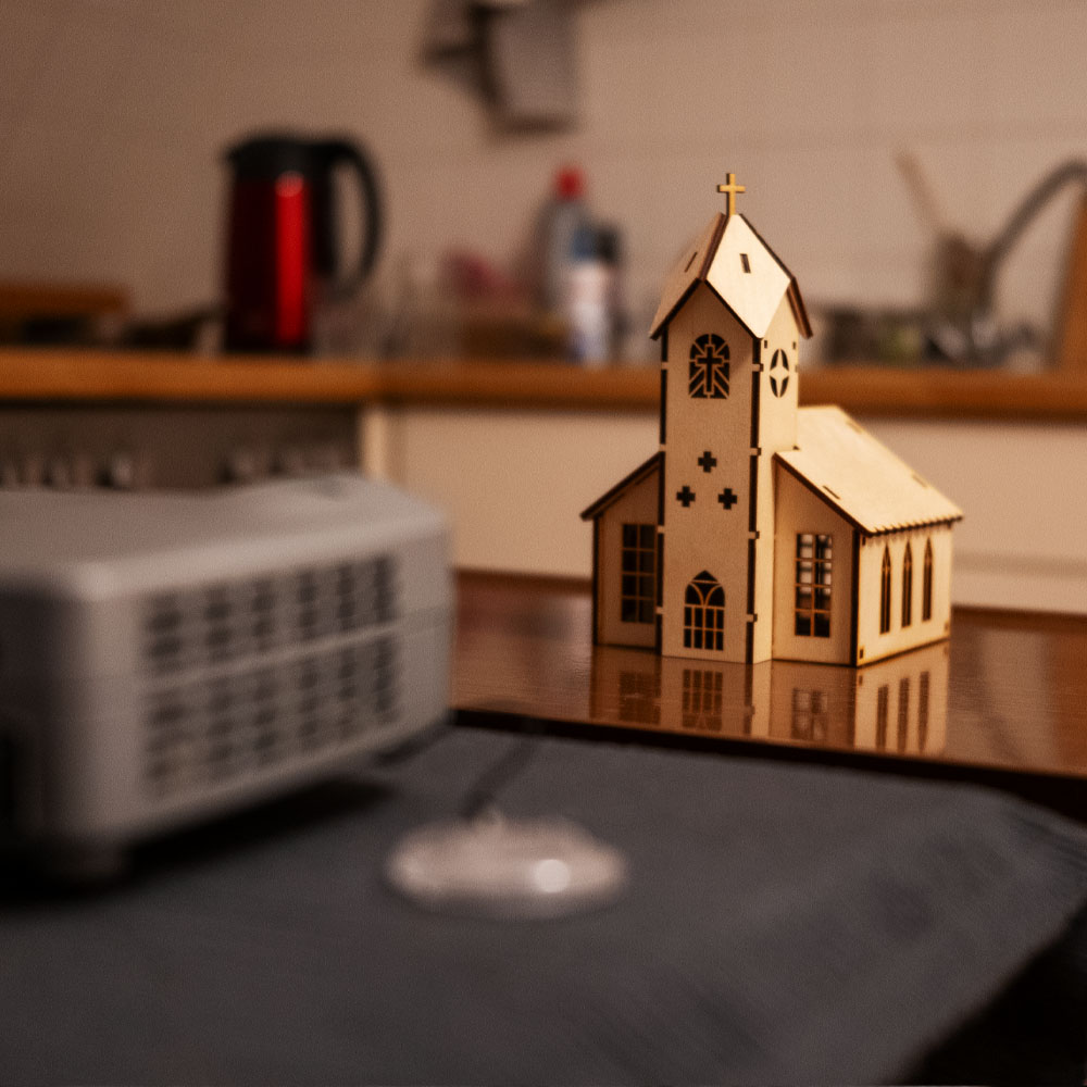
Zur Durchführung der Tests wurde ein Projektor des Modells NEC LT20 aus dem Media-Center entliehen. Dieser mobile Projektor verfügt über einen VGA-Anschluss, weshalb ein USB-C-Adapter erforderlich war, um ihn mit dem Laptop zu verbinden. Erste Tests zeigten eine eingeschränkte Farbwiedergabe, dennoch wurde der Projektor für initiale Projektionen auf das Modell als ausreichend betrachtet.

Der Projektor wurde mit dem Laptop verbunden und die Modellkirche so positioniert, dass eine möglichst hohe Pixeldichte erreicht wurde, ohne die Proportionen des projizierten Bildes zu verzerren. Anschließend wurden in der Software HeavyM erste Masken erstellt, zunächst rudimentär für die Dächer, Fenster und Seitenteile. Unterschiedliche Shader wurden angewendet, variiert in Helligkeits- und Geschwindigkeitsstufen, um die Lesbarkeit und Klarheit der Projektion auf dem Modell zu evaluieren.

Die vorliegenden Foto- und Videoaufnahmen dokumentieren, dass trotz der begrenzten Leistungsfähigkeit des Projektors eine zufriedenstellende Projektion erreicht werden konnte. Dies lässt darauf schließen, dass das Modell als Grundlage für weiterführende Tests geeignet ist. Verschiedene Animationstypen und Mapping-Methoden könnten in weiteren Experimenten systematisch untersucht werden.

Der nächste Schritt besteht in der digitalen Rekonstruktion der Kirche als 3D-Modell, um gezielt 3D-Mapping-Techniken zu erproben. Zudem ist geplant, audioreaktive Animationen zu integrieren. Langfristig wäre es denkbar, ein detailreicheres Modell zu entwickeln und leistungsstärkere Projektionstechnologie einzusetzen.

Bereits die gegenwärtigen Ergebnisse zeigen, dass selbst mit einem einfachen Modell und einem veralteten Projektor aussagekräftige Resultate erzielt werden können. Die bisherigen Erkenntnisse bieten eine solide Grundlage für die Weiterentwicklung der Untersuchung.


Disclaimer zur Nutzung von Künstlicher Intelligenz (KI):

Dieser Blogbeitrag wurde unter Zuhilfenahme von Künstlicher Intelligenz (ChatGPT) erstellt. Die KI wurde zur Recherche, zur Korrektur von Texten, zur Inspiration und zur Einholung von Verbesserungsvorschlägen verwendet. Alle Inhalte wurden anschließend eigenständig ausgewertet, überarbeitet und in den hier präsentierten Beitrag integriert.

01. Turnaround Insights

This semester, I want to focus on modeling a 3D character from 2D concept art. I specifically mention “from 2D concept art” because translating a flat design into a three-dimensional model presents unique challenges—proportions, perspective, and maintaining the stylistic choices of the design which might not translate well in a three-dimensional space. 

After abundant research (a dive into YouTube search for video tutorials), I found the following tutorials and insights useful: 

Creating a Character Turnaround from a Concept Piece – This one goes the simple route of creating a character turn-around by first drawing half of the front piece and then duplicating it so the front would be symmetrical, then copying it in order to do the back-side of the character, after which the side-view is made. While the art was solid it did not give much impression of actual rotation in a 3D space, which, for experienced modellers (of which I am not) might not be an issue. The character design was also incredibly detailed, which of course serves its own challenges.

Another tutorial, more advanced one, for a simpler character concept (How I Make Character TURNAROUNDS and Sheets!) emphasizes the importance of keeping the process simple, as well as well-structured, by thinking about the anatomy of the design and using guiding lines to remain consistent in all the angles – front, back, profile and (!) ¾ view. 

The most useful video I found and which I will use to reference primarily my process was this one: Character Turnarounds: like a Pro! Photoshop Timeline

For the purpose of creating a full turnaround, the animator stresses the need to make 8 individual poses of every single angle the character would be turning in (or 5 in case the design is symmetrical, in which case the different angle poses could be duplicated). This animator, interestingly, started with the ¾ pose and began from there. This, to me, seems to be the most logical step. He states he did that, because it is the main pose in most animated scene where the characters have to both interact with each other and show the majority of their face to the audience. To me, however, it makes even more sense, because the ¾ view is where you get the most context for the shape of the features and the angles and curves of the body. A front view is far too flat, and a side view, while providing information on which parts jut out and which are concave, loses information in regards to the over-all design. After the ¾ is done, the neck is chosen as the pivotal axis on which the character is to revolve (two guides along both lines of the neck and one deadcenter) with additional guides at the outer-most extremities – top of the head, feet, shoulders, waist, chin and mouth, which keeps the proportions in check. Interestingly, the pelvis tilt is different for the front and back ¾ views – which means that the two could not be reversed, as could be done for the front view and the side view. Because of the way the pelvis tilts, it is either tilting upward (in the backview) or upward (in the front view). 

The animator also stresses a key difference between designing for 3D and 2D. In 2D animation, artists often use “cheats”—like Mickey Mouse’s shifting ears, which change position depending on the angle to maintain readability. When translated, the model often looks weird and unnatural. THis can be circumvented by “cheating” the model (automorphing) depending on the angle it is being viewed at, as was done for these two models: https://x.com/CG_Orange_eng/status/1482422057933565953 and https://x.com/chompotron/status/1481553948721180677

But that would be a further blogpost all on its own. 

Now that I’ve gathered these insights, my next task is to select a 2D concept art of a character and create a turnaround sheet before moving into 3D modeling.

02_MadMapper vs. After Effects

After getting a first introduction to projection mapping in my last blog post, it’s time to go further with exploring different program options. Since I’m still figuring out the technical side of things, I decided to test two software options that seem to make the most sens to use for my project: MadMapper and After Effects. As both of them provide different possibilities when it comes to animation and projection mapping I wanted to give both a try. This meant that I started to follow two beginner-friendly tutorials for projection mapping: one for MadMapper and one for After Effects. My goal was not only to understand how these programs and tools work but also to see which one might be the better choice for the project I have planned. As I am right now, also dealing with the challenge of learning a few different platforms at once it sometimes feels like I’m jumping from one tool to another without really getting the chance to master any of them in depth. This makes it difficult to decide which platform to commit to for projection mapping, as I don’t want to add another complicated software to my workflow if it doesn’t help me in the future. 

MadMapper

Starting off with one of MadMapper’s tutorials which introduced me to the basics of the software and started to explain how to set up a projection hereby using simple shapes to create its visuals. What I did like was how intuitive the interface was. Everything seemed to make sense and intuitive, which is great when you want to start learning new software. I started to play around with different shapes and movements, trying to understand how I could later apply these. But mostly it was important to me to just get a sense of the software and understand the basic workaround. When it comes to layering and fine-tuning the animations I however still a bit lost. Since MadMapper is mainly built for projection mapping, it makes sense that it focuses more on mapping visuals rather than creating complex animations from scratch. A big advantage of MadMapper is its real-time contour control, which allows for live adjustments during the production phase and not just before it. That is something After Effects doesn’t really offer, as it mostly stacks layers to create detailed effects.

After Effects

I also wanted to do another After Effect tutorial that was more specifically for projection mapping as this is something I haven’t specifically looked at so far. I already have some basic knowledge of After Effects, so the workflow didn’t feel completely new. The tutorial covered mostly simple animation techniques and how to export the visuals for projection mapping. Which was the part that interested me the most. The biggest advantage I see in using After Effect would be its flexibility. As After Effects is not really made for projection mapping, it still allows for more detailed and layered animations, which could be nice if I decide to go for a more artistic approach when approaching the flowers. At the same time, it also means that I would need another software to actually map the animations onto my objects, which again means I need to familiarize myself with another one and also add another layer of complexity. Another important factor is price. Since I already have access to After Effects through my Adobe Cloud subscription, there would be no additional cost to me. MadMapper, on the other hand, requires a one-time commercial license. I would need to purchase this to be able to use it without watermarks or other restrictions. 

Now that I’ve tested both, I have to decide which one makes more sense for my project. Right now, I feel like MadMapper is the better choice if I want a more direct way to work with projections, while After Effects would allow me to create more detailed visuals. The question is: do I want to focus on animation first and then figure out the mapping part, or should I go straight into projection mapping and accept some limitations in animation?

Concept Idea

Looking at another aspect besides the technical side, I also thought about the mood or concept idea as well as the aesthetic of my project. Since at the end of the project I want to project onto flowers, I have two main ideas. One would be to work with motion that brings the flowers to life, almost like they are moving or shifting beyond a still life. Another idea would be to approach it from a different perspective which would be to visualise the process of photosynthesis more abstractly. I am still thinking about both concept ideas and I will go more into depth maybe brainstorm more and create different animations to work with, but I also don’t want to overcomplicate things especially because this is my first attempt at projection mapping.

Challenges

One of the challenges I already thought about is to balance aesthetic and technical feasibility. And also, I have a bit of a frustration limit. I tend to learn fast but if I get a sense that I am not developing or constantly get the same issues I get frustrated and that leads to procrastination. While I would love to create something detailed and unique, I also have to be realistic about what’s possible with my current skill level. Here I think a good way would be to start with simple shapes and flat surfaces for the next step in my project and then refine the concept once I have a better understanding of the tools.

Erste Testungen: Adobe Firefly Video Model und Sora

Testphase: Visuelle und animierte Elemente mit KI gestalten

Um herauszufinden, wie präzise und leistungsfähig aktuelle KI-Tools im kreativen Gestaltungsprozess sind, habe ich zwei vielversprechende Anwendungen getestet: das Adobe Firefly Video Model sowie Sora von OpenAI. Beide kamen im Rahmen der Entwicklung eines Plakats für eine Veranstaltungsreihe zum Einsatz – mit dem Ziel, sowohl ein visuell ansprechendes Grundmotiv als auch eine subtile, animierte Variante zu erzeugen.

Ausgangslage
Für das statische Design des Plakats wurde zunächst die generative KI in Adobe Photoshop genutzt. Ziel war es, ein Hintergrundmuster zu erstellen, das sich stilistisch harmonisch in die Serie der bereits bestehenden Plakate einfügt. Dabei war wichtig, dass das visuelle Erscheinungsbild – insbesondere die Farbwelt und grafische Struktur – konsistent bleibt, aber dennoch ein eigenständiges Muster aufweist.

Der verwendete Prompt in Photoshop lautete:
„blaue Farben, feine Linien, Stil ähnlich, aber anderes Muster“

Nach einigen Variationen und Anpassungen wurde ein Ergebnis generiert, das sowohl ästhetisch als auch kontextuell gut zum bestehenden Designkonzept passt.

Im nächsten Schritt ging es darum, das statische Motiv dezent zu animieren, um für Social Media eine lebendige, aber nicht aufdringliche Version zu erzeugen. Der Fokus lag auf einer subtilen Bewegung der Linienstruktur, die dem Plakat eine zusätzliche visuelle Tiefe verleihen sollte, ohne den Charakter der Gestaltung zu verändern.

Zur Umsetzung dieser Animation wurden zwei KI-Video-Tools getestet:

  • Adobe Firefly Video Model
  • Sora von OpenAI

In den folgenden Abschnitten werden die jeweilige Vorgehensweise, die generierten Ergebnisse sowie der direkte Vergleich der Tools erläutert.

Adobe Firefly Video Model:

Hier kam das „Bild-zu-Video“-Tool zum Einsatz. Das Hintergrund Bild wurde als Frame hochgeladen, das Videoformat auch Hochformat 9:16 gestellt. Bei Kamera und Kamerabewegung wurde keine Auswahl getroffen. 

Der Prompt lautete: very slow movement; flowy liquid; lines glow in the dark; move very slow; slimy; flowy, liquid close up

Das erste generierte Ergebnis:

  • An sich tolles Ergebnis
  • Linien bewegen sich relativ schnell aber kontinuierlich
  • Lichtpunkte in den Linien nicht ganz optimal
  •  Fällt zum Schluss in der rechten unteren Ecke sehr ab

Da ich noch nicht zu 100% happy war, generierte ich mit den gleichen Einstellungen und dem identen Prompt eine weitere Version, die schlussendlich die finale Fassung des Plakats wurde:

  • Dynamisches Movement, ohne dass ein Teil „wegfällt“
  • Linien leuchten in sich und nicht nur an gewissen punkten
  • Sehr zufrieden mit dem Ergebnis

An sich war ich an diesem Punkt sehr zufrieden, aber dennoch wäre es aus Sicht der Designer:in gut gewesen, noch eine Version, auch eventuell in einem anderen Stil und anderem Movement auszuprobieren. Doch nach dem zweiten Video war leider die Obergrenze der gratis Videos erreicht. 

Pro:
+ schönes Movement
+ auf Anhieb gute Versionen, die dem Visuellen Anspruch gerecht wurden 
+ sehr einfach Anwendung

Con:
– auf 5 Sekunden limitiert, stellt schon eine große Schwierigkeit in der Verwendung des Videos dar
– die Qualität war nicht zu 100% überzeugend
– leider nach 2 Versionen gratis Versuche aus, keine Möglichkeit außer eines Abo-Abschlusses

Sora by OpenAI

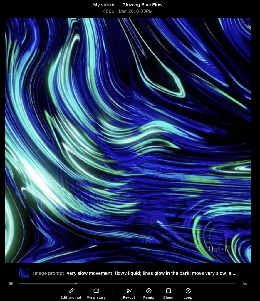
Aufgrund meines ChatGPTs Abos war es mir möglich als zweite Version ein KI-Video von Sora generieren zu lassen. Ebenfalls kam das “Bild-zu-Video”-Tool zum Einsatz. Das Hintergrund Bild wurde als Frame hochgeladen, das Videoformat auf 1:1, 480p, auf 5 Sekunden und auf eine Version gestellt. Hier wäre es an sich möglich, die Dauer des Clips auf 10 Sekunden zu erhöhen, um aber vor allem bei den ersten Versuchen nicht zu viele Credits zu verbrauchen, wählte ich hier ebenfalls die 5 Sekunden. Ebenfalls gibt es in Sora die Möglichkeit ein Storyboard hochzuladen. Generell sind die Möglichkeiten bei diesem Tool großer als bei Adobe Firefly.

Der Prompt lautete gleich wie bei Adobe FireFly: very slow movement; flowy liquid; lines glow in the dark; move very slow; slimy; flowy, liquid close up

Das Ergebnis:

An auch ein sehr großartiges Ergebnis, mit vielen Möglichkeiten, um nachzuschärfen und genau das zu erreichen, das man möchte. Dieses Video „kostete“ 20 Credits.

Pro:
+ länger als 5 Sekunden möglich
+ viele Möglichkeiten der Bearbeitung wie z.B. Remix, Blend oder Loop (siehe Bild)


Con:
– optisch nicht ganz so akkurat wie Adobe Firefly, wirkt so als würde Sora ein eigenes Muster erschaffen und nicht direkt mit dem Bild, das hochgeladen wurde arbeiten (würde sich aber auf jeden Fall durch weiter Prompts und Schleifen ändern und präzisieren lassen)

Fazit:

Sowohl Adobe Firefly als auch Sora von OpenAI haben in meinen Tests visuell beeindruckende Ergebnisse geliefert. Die generierten Inhalte überzeugen durch eine bemerkenswerte Bildqualität, kreative Umsetzung und überraschend hohe Präzision in der Darstellung der Texteingaben.

Wie bereits zuvor erwähnt, bringen beide Tools jeweils ihre individuellen Stärken und Schwächen mit. Insgesamt bieten beide Plattformen spannende Möglichkeiten im Bereich der KI-gestützten Visualisierung. Eine endgültige Bewertung hängt daher stark vom jeweiligen Anwendungsfall und den individuellen Anforderungen ab. In diesem Fall fiel die Wahl auf das Video von Adobe Firefly weil das Ergebnis besser zur Stimmung und Anwendungsfall passt. Dennoch war ich sehr positiv von Sora begeistert und würde für die nächsten KI-Videos definitiv darauf zurückgreifen.