In my first blog post, I refreshed my knowledge about the difference between a treatment and a script and how these are powerful and necessary tools for directors. Now, I want to dive deeper into how AI can enhance this process and other pre-production tasks, making workflows more efficient while preserving creative intent.
The rise of artificial intelligence (AI) in creative industries has sparked both excitement and concern. While some worry that AI might interfere with artistic decision-making, others recognize its potential to streamline production and help directors shape their vision faster and more effectively. In video production, AI can be a valuable tool in the treatment and scripting process, assisting directors without altering their original ideas. It can help by optimizing workflows, improving collaboration, and simplifying pre-production planning.
AI’s Role in the Treatment Process
As we already know, a treatment is the director’s first opportunity to present their vision to clients, producers, and creative teams and AI can assist in multiple ways:
1. Generating Mood Boards and Visual References
AI-powered platforms like Runway ML and MidJourney can generate images that align with the director’s vision. AI can suggest visual references that match the tone, color scheme, and aesthetics of the project, saving directors time searching for reference materials manually. However, some directors prefer tools like Frame Set or Shotdeck, which provide libraries of real film frames rather than AI-generated images, ensuring a more authentic and cinematic look.
2. Enhancing Concept Development
AI tools like ChatGPT can help structure a director’s ideas into a clear and engaging treatment. While the creative idea remains intact, AI can refine phrasing, eliminate redundancies, and improve overall flow. AI-driven insights can also suggest areas that may need more detail, making the treatment more cohesive and professional.
3. Speeding Up Formatting and Organization
Many directors, myself included, struggle with translating creative thoughts into structured documents. AI text generators can format treatments according to industry standards, ensuring consistency and clarity. They also assist with grammar, readability, and tone, reducing the time spent on revisions. But AI can do more than just refine phrasing—it can also help producers streamline the pre-production process. One of the most exciting areas where AI is making an impact is storyboarding.
Storyboarding with AI
During my research, I came across Previs Pro, an AI tool that allows directors to create rough animated sequences to visualize camera movements and scene pacing before production begins. Instead of manually sketching or hiring a storyboard artist, directors can input their script, and AI generates rough animatics that help visualize the flow of a scene.
Other tools like Boords and Storyboard That use text-to-sketch technology, enabling directors to generate quick storyboards without modeling 3D environments. This is a major advantage, as it allows for rapid iteration, making it faster to refine visual storytelling before production.
AI as a Collaborative Tool, Not a Replacement
The key to integrating AI into the treatment process is to use it as a collaborator rather than a replacement for human creativity. AI does not generate original artistic vision—it enhances workflows, eliminates repetitive tasks, and refines ideas that already exist. Directors remain the ultimate decision-makers, ensuring that the final product aligns with their creative intent.
Conclusion
AI is transforming the way directors approach the treatment and scripting phases of commercial video production. From generating visual references and formatting treatments to refining dialogue, automating shot lists, and assisting in pre-production logistics, AI offers practical tools that support—but do not override—the director’s creative vision. By leveraging AI effectively, directors can focus more on storytelling and artistic expression while benefiting from a more efficient and optimized pre-production process.
References
Field, S. (2005). Screenplay: The Foundations of Screenwriting. Dell Publishing.
Trottier, D. (2014). The Screenwriter’s Bible: A Complete Guide to Writing, Formatting, and Selling Your Script. Silman-James Press.
Rabiger, M. & Hurbis-Cherrier, M. (2020). Directing: Film Techniques and Aesthetics (6th ed.). Routledge.
Katz, S. D. (2019). Film Directing Shot by Shot: Visualizing from Concept to Screen. Michael Wiese Productions.
McKee, R. (1997). Story: Substance, Structure, Style and the Principles of Screenwriting. HarperCollins.
Runway ML. (2023). AI-Powered Creative Tools. Retrieved from https://runwayml.com
Final Draft. (2023). AI Story Mapping in Screenwriting. Retrieved from https://www.finaldraft.com
Boords. (2023). Storyboard Software for Filmmakers. Retrieved from https://boords.com
CHATGPT 4.0 was used as grammar and spellchecking-tool
In the world of commercial video production the terms “treatment” and “script” are often used interchangeably by those unfamiliar with all the parts of pre-production. For professionals in the industry, these documents serve essential functions. While both are crucial for ensuring the success of a project, they differ in purpose, structure, and impact of the final video. Understanding the difference between a treatment and a script is fundamental for directors and also for producers, and creatives wanting to produce commercial or narrative videos.
What Is a Treatment?
A treatment is a conceptual document that outlines the creative vision for a video. It is typically created during the pre-production phase and serves as a pitch to clients, agencies, or productions. The treatment provides a clear overview of the look, feel, and storytelling approach before a full script is developed.
A standard treatment includes:
Logline: A one- or two-sentence summary of the concept.
Synopsis: A more detailed narrative explaining the story, visuals, and themes.
Tone and Style: A description of the aesthetic, mood, and overall cinematic approach.
Visual References: Mood boards, color palettes, or sample images to illustrate the intended look.
Character Descriptions (if needed): Brief descriptions of key figures in the video.
Shot Ideas: Possible cinematographic approaches and framing suggestions.
Treatments vary in length, it often depends on the director’s style and on the project’s complexity. They are often designed to be visually engaging, using imagery and design elements to convey the creative direction effectively.
And What Is a Script?
The script is a detailed document that outlines every scene, action, and dialogue in a video or film. Unlike a treatment, which focuses on concept and vision, the script serves as a precise blueprint for the production. It ensures that all elements of the shoot are planned in advance, minimizing confusion on set.
Key components of a script include:
Scene Headings: Indicate the location and time of day (e.g., INT. OFFICE – DAY).
Action Descriptions: Describe the movement and actions of characters or visual elements.
Dialogue: Spoken lines for actors, voice over, or narration.
Camera Directions (optional): Notes on specific shots, angles, or transitions.
Scripts follow standardized formatting to maintain consistency across the industry. They are crucial for directors, cinematographers, and editors to align on how the final video will unfold.
Why Are These Steps Important?
Both the treatment and the script serve essential roles in ensuring a seamless production process. Their impact extends far beyond the pre production phase and directly influences the efficiency and final quality of the video.
Client and Stakeholder Approval
– Treatments are often used in the pitching phase to secure client buy-in. They help non-technical stakeholders visualize the concept before significant resources are committed.
– Scripts provide the final detailed plan, ensuring that all parties agree on the creative execution before production begins.
Creative Alignment
– A well-crafted treatment ensures that the entire creative team, from directors to designers, shares the same vision.
– The script provides detailed instructions for actors, cinematographers, and editors, reducing misinterpretations of the vision.
3. Impact on the Final Video
A strong treatment ensures that the final video aligns with the brand’s message and audience expectations.
A well-structured script guarantees smooth execution and post-production, leading to a polished, professional result.
The Impact of a well executed Treatment and Script:
Picture this, a global fashion brand, Carhartt WIP, commissions a production team to create a commercial that showcases its latest collection. The creative team begins by brainstorming the key themes: authenticity, urban culture, and timeless style. They want to capture the raw energy of streetwear in a way that connects with their target audience.
To set the creative direction, the director develops a treatment that paints a vivid picture of the campaign. The vision centers around a community of young people—skaters, basketballers, dancer —enjoying the time of their life. The treatment includes references to raw textures, color palettes, and shots which enhance the brands style. The client, inspired by the mood and aesthetic, approves the concept.
With the treatment in place, the team moves on to scriptwriting. Each scene is carefully outlined, from a skater grinding along a concrete ledge to a dancer dancing in a abandoned warehouse. The script details every camera movement—close-ups of rugged denim, wide shots of models walking through misty streets, and dynamic handheld shots capturing the pace of people playing ball. Natural lighting, stylized edits, and a pulsating soundtrack are all integrated into the script’s framework.
As production begins, the crew follows the script to execute the planned shots. The DoP ensures each frame aligns with the intended visual style, while the director guides the models and performers to bring out the raw, effortless energy associated with the Brand. In post-production, editors match the pacing of the footage to the music and colorists enhance the film’s industrial aesthetic. When the final cut is delivered, the commercial aligns seamlessly with the initial treatment, creating a compelling campaign that stays true to the brands heritage.
Understanding the difference between a treatment and a script is essential for anyone working in video production. While a treatment establishes the creative vision and secures stakeholder approval, the script provides the detailed framework necessary for execution. Both documents are indispensable for ensuring that a project runs smoothly and delivers a satisfying final product. Mastering their use can significantly enhance the efficiency and quality of video production, making them powerful tools for industry professionals.
References
Field, S. (2005). Screenplay: The Foundations of Screenwriting. Dell Publishing.
Trottier, D. (2014). The Screenwriter’s Bible: A Complete Guide to Writing, Formatting, and Selling Your Script. Silman-James Press.
Rabiger, M. & Hurbis-Cherrier, M. (2020). Directing: Film Techniques and Aesthetics (6th ed.). Routledge.
Katz, S. D. (2019). Film Directing Shot by Shot: Visualizing from Concept to Screen. Michael Wiese Productions.
CHATGPT 4.0 was used as grammar and spellchecking-tool
Der Sinn dieser Blog-Post-Serie im zweiten Semester ist einfach wie eingänglich: Man soll etwas lernen… aber was? Rückblickend auf die ersten zehn Blogposts aus dem vergangenen Semester war das für mich recht klar: Ich möchte meine Datenvisualisierungen auf das nächste Level bringen. Dazu braucht es aber zweierlei, mit dem ich mich in den nächsten neun Blogposts befassen werde.
Einerseits muss die Basis einer jeden guten Datenvisualisierung wissenschaftlich evident gemacht werden. Dazu möchte ich mich durch verschiedenste Fachliteratur kämpfen, um herauszufinden warum manche Visualisierungen funktionieren und manche schlicht nicht. Basisliteratur soll das umfassende (und mir glücklicherweise vom besten Major-Leiter des Instituts zur Verfügung gestellte) Werk “Show Me The Numbers” werden, jedoch möchte ich einen Blogpost auch weiterer Fachliteratur zum Thema widmen.
Um mit diesem Wissen dann aber auch ordnungsgerecht umgehen zu können, muss natürlich eins her: After Effects. Wie bereits in meiner Themenvorstellung vor ein paar Wochen angekündigt möchte ich dazu einen online Kurs belegen. Welcher das jedoch sein wird, war in den letzten Tagen Kern angeregter Diskussionen zwischen mir und meinen drei anderen Persönlichkeiten (sowie meinen Studienkollegen natürlich). Dabei gibt es zwei große Überlegungen: Einerseits gibt es Kurse speziell für Datenvisualisierungen, diese sind aber eher nieschig, oft bereits älter und nicht von renommierten Lehrern oder Bildungshäusern, hätten aber natürlich den Vorteil genauer auf meine Bedürfnisse einzugehen. Andererseits gäbe es aber natürlich auch allgemeinere After Effects oder im speziellen Motion Design Kurse, deren Skills sicher gut auf Datenvisualisierungen umzumünzen wären.
Gerade in Hinblick auf andere Kurse in diesem Semester – ich denke da vor allem an Green Utopia sowie Moya – habe ich entschieden, dass es definitiv mehr Sinn machen würde einen allgemeineren Motion Design Kurs zu belegen, da ich die Fähigkeiten definitiv noch an der ein oder anderen Stelle brauchen werde. Stellt sich also nur die Frage welchen…
Die Auswahl dahingehend ist ja bekanntlich riesig, nicht nur auf Lernplattformen wie Udemy oder Skillshare, sondern auch bei privaten Anbietern. Die beiden Goldstandards in Sachen Motion Design scheinen dabei einerseits der Motion Beast Course und andererseits Design Breakthrough by Ben Marriott zu sein. Beide dieser Kurse warten aber mit horrenden Preisen auf (350 bzw 500 Euro), die ich ehrlicherweise im Moment nicht gewillt bin zu zahlen, auch wenn man mit Investitionen in die eigene Bildung ja eigentlich nie was falsch machen kann. (Ich muss ja auch was essen…) Daher habe ich mich in verschiedenen Foren auf die Suche nach einem preiswerten Ersatz gemacht und bin dabei auf die Seite https://www.learnto.day/aftereffects gestoßen, die im Endeffekt eine Zusammenstellung aller guten kostenfreien Ressourcen und Kurse zum Thema Motion Design darstellt und in einem großen Curriculum einen volleinheitlichen Kurs nachbilden soll. Da laut diverser Forenmitglieder darin mindestens gleich viel, wenn nicht sogar mehr gutes Wissen vorhanden sein soll, als in vielen pay-per-view Kursen habe ich mich schlussendlich dafür entschieden dieses Curriculum auch genau so durchzuarbeiten.
Zusammenfassend lässt sich also sagen, dass das restliche Semester DesRes für mich klar strukturiert ist. Nachfolgend wird es hier mit Ausschnitten und meinen Key-Learnings aus dem After Effects Curriculum weitergehen, da ich dieses Wissen wohl schon eher früher als später auch in anderen Kurse brauchen werde. Danach folgt die Fachliteratur, um am Ende mit all dem gelernten auch ein ansprechendes Werkstück gestalten zu können.
Last semester I used some of my blog entries to summarise and reflect on what I had learned from reading the book “Documentaries …and how to make them” (Glynne, 2007) by Andy Glynne. So far I have written about the pre-production of documentaries, what steps are necessary and how to take them. Now to put what I have learned to a practical use, I want to try to approach this semester’s project by going through all of the steps and stages, but on a smaller scale.
The Idea
I came across the idea for the semester project because I wanted to shine a light on one group or organisation that is unique to Graz. I then remembered having been to two of these car-free Fridays and how I enjoyed the sense of community and togetherness they created. My motivation to showcase this particular movement stems, on one hand, from the desire to learn more about the possibility of car-free city centres, and on the other hand from the wish to show this community to others. I had realised, when talking to my colleagues about my idea, that almost none of them had actually ever heard of Auto:Frei:Tag, even though they all live in Graz, are a similar age as me, and most of them I would also describe as, at least to some extent, invested in climate action. Thus my “Why” was developed; I wanted to raise awareness for the organisation and maybe inspire some of my peers to also take action. Due to the fact that I only want to create a short video and I don’t have a lot of time, I have decided to aim for a target group who is already to some extent interested in topics like climate change or car-free city centres, and just needs some inspiration for possible outlets and ways to show their convictions, rather than trying to convince some 60-something year old who has always taken the car everywhere to completely change their lifestyle.
The Story
When looking for the story behind my idea, there are a few ways I can see it develop. I was thinking I could choose one of the people behind Auto:Frei:Tag and follow their journey of organising one of these events, however when talking to them I found out that it is hardly ever them who actually come up with the idea for an event, but they just provide support for others who want to make themselves heard. So another option would be to find someone with a cause worthy of documenting and follow along with the planning and organisation of a car-free Friday, also highlighting the person and the cause behind it. During this process, it would also be possible to reach out to experts on city planning and traffic politics in Graz to get their opinion and expertise on the topic, adding facts and figures into my documentary. My third option would be to treat the street itself as my main character, showing the stark contrast between everyday traffic, chaos and noise and the complete opposite mood when the same road is taken over by bikes, people, music and community. This version would be less about the specific cause behind one event, but would highlight the opportunities which could open up when removing cars from the equation. For this idea, possible interviews could be a bit more free and abstract, aiming at capturing feelings rather than facts.
Possible obstacles or problems to either of the stories could be issues with permits, unhappy neighbours or the inevitable people in cars coming by and complaining about the street being closed. Moreover, obstacles could be seen in the broader sense of the issue, where legislature, politics and influential citizens are the reasons why some efforts to further reduce traffic in the city might be hindered.
For questions of accessibility, I have already talked to the people behind Auto:Frei:Tag and they have agreed to be filmed and documented, and I also hope for some of the visitors of the event to be willing to be on camera. For filming on a public street I would still need to figure out whether a permit is needed and how to get one.
Conclusion
After writing all of this out, I feel the story is beginning to take shape, but there are still a few key decisions that need to be made in order to get to a more precise and well formulated plan which in the end could theoretically be pitched to potential stakeholders. Within the next few blogposts I want to try to narrow down this idea and get it to where it needs to be to move on.
Im ersten Schritt meiner Recherche zu KI und KI-gestützten Video-Tools habe ich mir einen umfassenden Überblick über die gängigen Anbieter verschafft und die verschiedenen Tools einem ersten Test unterzogen.
Nachfolgend findest du eine detaillierte Auflistung der wichtigsten Funktionen, Preisstrukturen sowie meiner persönlichen Erfahrungen mit den jeweiligen Tools. Abschließend ziehe ich ein Fazit, welches meine bisherigen Erkenntnisse zusammenfasst und eine erste Einschätzung zu den besten Anwendungen für unterschiedliche Anforderungen gibt.
Adobe Firefly Video Model
Adobe Firefly Video Model richtet sich primär an professionelle Anwender aus der Film- und Medienbranche, die hochwertige KI-generierte Clips benötigen. Die Integration in Adobe Premiere Pro macht es besonders attraktiv für bestehende Adobe-Nutzer. In der Anwendung überzeugt Firefly mit einer hohen Qualität der generierten 5-Sekunden-Clips, jedoch sind die aktuellen Funktionen im Vergleich zu anderen KI-Video-Tools noch recht limitiert.
Hauptfunktionen:
Generierung von 5-Sekunden-Clips in 1080p
Integration in Adobe Premiere Pro
Fokus auf Qualität und realistische Darstellung
Preismodell:
Gratis/in der Creative Cloud enthalten: 1.000 Generative Credits für Bild- und Vektorgrafik-Standardfunktionen wie „Text zu Bild“ und „Generatives Füllen“+ 2 KI-Videos
Basis: 11,08€ pro Monat für 20 Clips à 5 Sekunden
Erweitert: 33,26€ pro Monat für 70 Clips à 5 Sekunden
Premium: Preis auf Anfrage für Studios und hohe Volumen
Fazit:
+ Funktioniert an sich sehr gut, einfaches und logisches Interface, generierte Videos sehr gut (mehr dazu im 2. Blogpost „erste Anwendung“),
+ unter Bewegungen hat man eine Auswahl an den gängigsten Kamerabewegungen wie (Zoom in/out, Schwenk links/rechts/oben/unten, statisch oder Handheld)
– leider nur 2 Probevideos möglich, auf 5 Sekunden begrenzt
–> werde für das Projekt eventuell für 1-2 Monate Adobe Firefly Standard kaufen (je nach Intensivität der Nutzung und Länge des Endprodukts vllt sogar die Erweiterte Version)
RunwayML ist eine vielseitige KI-Plattform, die sich auf die Erstellung und Bearbeitung von Videos spezialisiert hat. Mit einer benutzerfreundlichen Oberfläche ermöglicht sie es, Videos aus Texten, Bildern oder Videoclips zu generieren. Besonders hervorzuheben ist die Text-zu-Video-Funktion, die es ermöglicht, aus einfachen Texteingaben realistische Videosequenzen zu erstellen. Zudem bietet RunwayML die Möglichkeit, erstellte Videos direkt zu exportieren, was den Workflow erheblich erleichtert.
Preismodelle:
Basic: Kostenlos, 125 einmalige Credits, bis zu 3 Videoprojekte, 5 GB Speicher.
Aber auch die Möglichkeit „Runway for Educators“. Kann man sich anmelden, werde ich definitiv versuchen (man bekommt einmal 5.000 Credits)
Side note: Runway is incorporated into the design and filmmaking curriculums at UCLA, NYU, RISD, Harvard and countless other universities around the world. Request discounted resources to support your students.
Fazit: sieht an sich sehr vielversprechend aus, werde ich defintiv noch genauer testen,
werde eine Anfrage für Runway for Educators stellen
–> ebenfalls eine Überlegung wert ein Abo abzuschließen für den Zeitraum des Projekts, wird aber je nach Anwendung und nach Ergebnissen noch entschieden
Midjourney ist ein KI-gestützter Bildgenerator, der durch die Eingabe von Textbeschreibungen hochwertige und künstlerische Bilder erzeugt. Die Plattform ist bekannt für ihre Fähigkeit, lebendige und detaillierte Bilder zu erstellen, die den Nutzervorgaben entsprechen. Allerdings liegt der Fokus von Midjourney hauptsächlich auf der Bildgenerierung, und es bietet keine dediziertenText-zu-Video-Funktionen.
Preismodelle:
Basis: $10 pro Monat, begrenzte Nutzung.
Standard: $30 pro Monat, erweiterte Nutzung.
Pro: $60 pro Monat, unbegrenzte Nutzung.
Fazit:
Kann allerdings gut mit den anderen beiden KI-Tools kombiniert werden, z.B. Bilderstellung mit Midjourney und „Animation/Bewegung“ in den anderen Programmen
+ an sich ein tolles KI-Tool, vor allem das feature, dass 4 Bilder generiert werden und man sich mit den Verweisen auf die Bilder beziehen kann, liefert tolle Ergebnisse
– an sich „komplizierter“ als andere KI-Tools dadurch, dass eine „gewisse Sprache“ bei den Prompts verwendet werden muss, macht aber sobald man es einmal verstanden hat keine großen Unterschied
Sora ist ein von OpenAI entwickeltes KI-Modell, das es ermöglicht, realistische Videos basierend auf Texteingaben zu erstellen.
– Text-zu-Video-Generierung: Sora kann kurze Videoclips von bis zu 20 Sekunden Länge in verschiedenen Seitenverhältnissen (Querformat, Hochformat, quadratisch) erstellen. Nutzer können durch Texteingaben Szenen beschreiben, die dann von der KI in bewegte Bilder umgesetzt werden. OpenAI
– Remix: Mit dieser Funktion können Elemente in bestehenden Videos ersetzt, entfernt oder neu interpretiert werden, um kreative Anpassungen vorzunehmen.
– Re-Cut: Sora ermöglicht es, Videos neu zu schneiden und zu arrangieren, um alternative Versionen oder verbesserte Sequenzen zu erstellen.
Preismodell:
– Plus: 20$/Monat includes the ability to explore your creativity through video Up to 50 videos (1.000 credits) Limited relaxed videos Up to 720p resolution and 10s duration videos
– Pro: 200$/Monat includes unlimited generations and the highest resolution for high volume workflows Up to 500 videos (10.000 credits) Unlimited relaxed videos Up to 1080p resolution and 20s duration videos
Fazit:
+ tolles Tool, intuitiveres Interface, vor allem sehr attraktiv, da ich bereits ein ChatGPT Plus Abo haben und im Vergleich zu Adobe kein zusätzliches Abo für die Grundfunktionen notwendig ist
+ ebenfalls inspirierend ist die Startseite, auf der viel Inspo und andere Videos zu sehen sind. Keines der anderes Tools war so aufgebaut und förderte so stark und schnell die Kreativität, vor allem sehr gut, da die Prompts immer angeben sind und einen Einblick geben, wie Prompts formuliert werden müssen um gute Ergebnisse zu erhalten
+ ebenfalls sehr gut gelöst, ist die Tutorial Section
Für meinen weiteren Forschungs- und Projektprozess werde ich die verschiedenen KI-gestützten Videotools weiterhin intensiv testen und ausgiebige Experimente durchführen.
Besonders positiv überrascht hat mich bisher Sora, da der Einstieg dank meines ChatGPT Plus-Abos äußerst unkompliziert war. Bei den anderen KI-Tools prüfe ich derzeit noch, welche Anbieter für meine Anforderungen am besten geeignet sind und ob sich ein Abonnement lohnt. Adobe und Runway stehen dabei aktuell ganz oben auf meiner Liste. Besonders bei Runway hoffe ich, ein Educator-Abo erhalten zu können, um das Tool im vollen Umfang nutzen zu können.
A Short Blogpost on why Colorists should use their own Luts and should create them, themselves. In modern film and video production, Look-Up Tables (LUTs) play a crucial role in the workflows of cinematographers, editors, and especially colorists. LUTs enable consistent color transformations and help efficiently communicate creative looks. However, pre-made LUTs are often inadequate as they fail to meet the specific requirements of a project or reflect a colorist’s, DP’s or Director’s creative vision. Therefore, it is essential for every professional colorist to create their own LUTs to merge technical precision with artistic control. Almost every DP (Director of Photography) has their own LUT that they use on their Job. Even Roger Deakins, one of the best DPs, always uses the same LUT for his films on set. He might let the colorist alter contrast or saturation to fit the mood of the film.
1. The Function and Importance of LUTs
LUTs serve as predefined color transformations that convert an image into a desired color representation. Their primary functions include:
Technical Color Transformation: Converting raw camera material (Log or RAW) into a displayable color spectrum, such as Rec. 709 for standard monitors.
Creative Color Styling: Applying specific color moods or looks to achieve an aesthetic vision.
Consistency in Workflow: Ensuring uniform representation of footage from production through final color grading.
Since each camera has its own color science and different projects have unique requirements, standard LUTs are often insufficient or introduce unwanted color shifts.
2. The Limitations of Standard LUTs
Many filmmakers and colorists rely on pre-existing LUTs, but these have significant drawbacks:
Limited Adaptability: They are not optimized for specific lighting conditions, light sources, or individual camera settings.
Lack of Individuality: Standard LUTs often create generic looks that do not reflect a film’s creative vision.
Lack of Control Over Transformation: A LUT stores a predefined color transformation and cannot perform selective corrections or mask-based adjustments.
For these reasons, professional colorists must create their own LUTs to perfectly balance their creative signature and technical requirements.
3. Types of LUTs: Technical, Creative, and Hybrid
Before a colorist creates their own LUTs, it is important to understand the different types and their applications:
Technical LUTs: These transform the color spectrum and gamma curve of a camera sensor into a standardized color profile (e.g., ARRI LogC to Rec. 709). They are based on pure color science without artistic modifications.
Creative LUTs: These focus solely on aesthetic adjustments. They alter color tones, contrast, and saturation without performing a color space transformation.
Hybrid LUTs: A combination of technical and creative LUTs that incorporates both a color transformation and a specific artistic look. These LUTs are commonly provided by camera manufacturers like ARRI or RED.
4. The Advantages of Custom LUTs for Colorists
Creating custom LUTs offers numerous benefits:
Customization for Individual Projects: Every project requires a specific color mood. Custom LUTs allow colorists to tailor the colors precisely.
Consistency Across Productions: A colorist can maintain their unique visual identity by using similar color palettes for different productions.
Optimization for Specific Camera Systems: Different camera sensors have different color characteristics. A custom LUT ensures that footage is optimally interpreted.
Increased Efficiency in Workflow: Well-designed LUTs provide a strong starting point for color grading, saving time in post-production.
5. Creating Custom LUTs in DaVinci Resolve
Modern color grading software like DaVinci Resolve or nuke provides powerful tools for creating custom LUTs. The process involves several steps:
Setting Up a Proper Test Environment: Selecting reference footage that matches the final shooting material.
Applying a Technical Color Transformation: Performing a neutral color correction to convert the footage from Log or RAW into a usable color spectrum.
Applying Creative Adjustments: Modifying hue, contrast, and saturation to achieve the desired aesthetic.
Exporting the LUT: Saving the color transformation as a .cube file for use in various projects.
Testing & Refining: The LUT should be tested with different shots and lighting conditions and adjusted as needed.
6. Conclusion
A professional colorist should not rely solely on pre-made LUTs but should develop their own to ensure maximum creative control and technical precision. Custom LUTs allow for efficient implementation of desired aesthetics and optimize the workflow. Modern tools like DaVinci Resolve or Nuke offer powerful options for creating and refining LUTs, enabling every colorist to shape and preserve their unique color identity.
The process of creating scene-referred negative emulations requires a meticulous approach, combining traditional film stocks, digital cinematography, precise lighting conditions, and advanced post-processing techniques. This post outlines the essential tools, film stocks, and preparation steps necessary for accurate film profiling, which serves as the foundation for creating high-quality emulations. The aim is to develop LUTs (Look-Up Tables) that emulate the characteristics of film negatives, preserving their unique response to color and light.
1. Film Stocks
To establish a reliable baseline for negative emulations, it is essential to test and profile various film stocks. Luckily a few people already did all the Preparation Parts. I will use scanned film from Nico Fink, an Austrian colourist. He uses the following film stocks for profiling:
Kodak 200T (5213) 35mm Motion Picture Film
Kodak 500T (5219) 35mm Motion Picture Film
Kodak Porta 400 35mm Photo Film
Fuji Superia X-Tra 400
Silbersalz35 Kodak 50D, 250D, 500T & 200T Motion Picture Film (respooled for stills)
Silbersalz35 Fujifilm Vivid 500T Motion Picture Film (respooled for stills)
Rollei VarioChrome (Special Edition)
Agfa (expired 1979)
Some additional Stocks are tested as well, including Kodak 250D (5203), Kodak 50D (5207), Cinestill 800T, Fuji Provia 100, Fuji Velvia 100, Kodak Ektachrome E100, and Kodak Gold 200.
2. Digital Cameras for Profiling
He achieved comprehensive digital profiling, through a selection of high-end cinema cameras. These cameras are chosen based on their sensor characteristics, color science, and dynamic range:
ARRI Alexa Mini
RED Helium (initial test camera)
SONY FX9
Blackmagic Design Pocket 4K or 6K
Additional cameras, such as the RED Komodo, SONY VENICE, and Blackmagic Design URSAmini 4.6K G2, are also included depending on the project requirements.
3. Test Charts
Accurate scene-referred profiling requires precise test charts. These where used to calibrate color response and exposure latitude.
To achieve accurate film emulation, a combination of software tools was used for color matching and LUT generation:
Blackmagic Design DaVinci Resolve (primary color grading and LUT application)
The Foundry Nuke (for precise curve creation and LUT extraction)
Adobe Camera RAW (for stills conversion)
7. Workflow Overview
The workflow for scene-referred negative emulation consists of multiple controlled steps:
Conclusion
Capture test charts under controlled lighting conditions at 5600K and 3200K with a digital camera, exposing from -5 to +5 EV in 1-stop increments.
Expose the same test charts under identical conditions using film stocks.
Develop and scan negatives, ensuring high consistency in digital files.
Align digital and scanned film images in Nuke, adjusting for white balance and exposure.
Create a 1D LUT using grayscale steps for R, G, and B channels.
Use Resolve for color matching, refining the LUT with its built-in tools.
Alternative: Implement Tetrahedral 3D Interpolation via Blink Script for improved color accuracy.
Apply additional filmic effects, such as halation, grain, and gate weave, to enhance realism.
These Are the steps one one would have to make, to get an accurate result. It is very expensive and time consuming and there are so many complicated steps that can alter the result in a good and bad way. Luckily Nico Fink provides his scans for little price on his website. This saves a lot of time and the preparations are done by a professional. Now the digital Part starts. Embark with me on a technical journey on how to profile filmstock. We will try and Profile the EastmanEXR100T and 200T Filmstock.
Nachdem im ersten Blogpost nur grob der Themenbereich genannt wurde, hier noch einmal offiziell: Ich werde mich in diesem Semester mit dem Thema Motion Identity beschäftigen und im Zuge dessen natürlich auch eine entwickeln. Davor gibt es aber noch einiges zu Recherchieren und zu Analysieren! Zuerst schauen wir uns den groben Prozess der Erstellung einer Motion Identity an und finden raus, was da denn alles dazu gehört!
Anders als klassisches Motion Design, das eher projektbasiert, ästhetisch/funktional gestaltet wird, geht es bei der Motion Identity um ein tieferes, systemisches Verständnis für die „Bewegungs-DNA“ einer Brand. Die Entwicklung einer professionellen Motion Identity hat verschiedene Stufen im Designprozess, der Strategie aber auch kreatives Experimentieren und technisches Know-how. In großen Braning-Agenturen wird Motion-Design und die Motion Identity schon zu Beginn des Designprozesses mit-konzipiert und beeinflusst die Brandgestaltung maßgeblich, ähnlich wie Typografie, Farben und Komposition.
In diesem Blogpost möchte ich den Workflow dokumentieren, den ich mir für dieses Projekt zurechtgelegt habe, um eine Motion Identity zu entwerfen. Wir betrachten – weil ich noch unsicher bin worauf es schlussendlich hinaus läuft – zwei zentrale Szenarien: 1. Den Aufbau einer neuen Brand + Motion Identity von Grund auf 2. Die Integration einer Motion Identity in eine bestehende Markenwelt
Bevor es los geht schauen wir uns ein paar Beispiele an, um uns ein Bild davon zu machen, was uns am Ende dieser Reise erwartet:
Zu genaueren Analysen verschiedener Motion Identities kommen wir dann wahrscheinlich später im Prozess!
Also, wie komme ich von Zero zu einer gelungenen Motion Identity:
Herangehensweise 1: Aufbau einer Brand + Motion Identity von Grund auf
Vgl. Koto 2025; Vgl. Gleave Dawncreative 2024
1. Phase: Briefing und Strategie — Das Fundament der Motion Identity
Die erste Phase bei der Erstellung einer Motion Identity besteht aus Recherche zur Marke und Positionierung. Man beginnt hoffentlich auch damit, ein detailliertes Briefing einzuholen, in dem die Stakeholder den Umfang, die Ziele, den Zeitrahmen und das Budget des Projekts definieren (Vgl. Never Sit Still o.D.).
Inhalte des Briefings:
Wer ist die Marke?
Was sind Vision, Mission und Werte?
Wer ist die Zielgruppe?
Was sind zentrale Touchpoints (Website, App, Social Media, Videos, etc.)?
Welche emotionale Tonalität soll die Marke vermitteln? (z. B. verspielt, ernst, exklusiv, technologisch)
Welche Stilistik verfolgt das statische Corporate Design bereits?
Gibt es bestehende audiovisuelle Markenassets?
Ziel ist es, die Positionierung und den emotionalen Markenkern zu erfassen. „Motion reinforces a brand’s personality. To do that, you have to be very clear on just what that personality is“ (Vgl. Gleave Dawncreative 2024).
Diese Grundlage bestimmt später, welche Persönlichkeit ind den Formen oder auch Bewegungsmustern (z. B. verspielt, ruhig, präzise) entwickelt werden. Ein hilfreiches Werkzeug wenn es um Motion geht, sind z.B. Positionierungsskalen (Vgl. Gleave Dawncreative 2024), um visuelle und motion-relevante Attribute festzulegen. Zb.
Einfach ↔ Komplex >> Klarheit vs. Vielschichtigkeit
Zugänglich ↔ Exklusiv >> Breitenansprache vs. Premium
Traditionell ↔ Modern >> Klassisch vs. Zukunftsgewandt
Verspielt ↔ Ernst >> Locker vs. Seriös
Diese Skalen beeinflussen nicht nur Farbwahl und Typografie – sondern es lassen sich auch die späteren Bewegungsverhalten (z. B. dynamisch vs. ruhig) ableiten.
Schritt 2: Entwicklung der visuellen Identität
Auf Basis der strategischen Positionierung entsteht das visuelle Designsystem (darauf wird hier nicht genauer eingegangen):
Logo(s)
Typografie
Farbwelt
Iconografie
Raster- und Layoutsystem
Grafische Elemente (z. B. Linien, Muster, Illustrationen)
Dabei ist wichtig: Schon beim statischen Design an Bewegung denken! Wie wird sich das Logo bewegen? Wie harmoniert das Layout mit Motion Transitions?
Schritt 3: Erste Motion Exploration
Diese Phase konzentriert sich auf Forschung und Entwicklung der Bewegung. In diesem explorativen Stadium werden experimentelle Bewegungsstudien durchgeführt, um zu entdecken, wie sich bestehende Markenelemente bewegen und interagieren. Wie Never Sit Still betont, ist dieser Schritt entscheidend für die Entwicklung von Motion Principles, die die Grundlage eines Motion-Systems bilden (Vgl. Never Sit Still o.D.).
Die Entwicklung einer klaren Botschaft für dein Motion Design wird den Großteil der Entscheidungen bestimmen.
– Welche Geschichte soll die Bewegung erzählen? Kann sie die Markenwerte und die Persönlichkeit bzw. das Produkt oder die Dienstleistung erklären?
– Soll die Bewegung in den Produkten selbst vorkommen oder nur in der Kommunikation und im Marketing verwendet werden?
– Welche Emotionen sollen geweckt werden? Soll die Bewegung nur eine funktionale Unterstützung sein, oder soll sie ausdrucksstark sein?
– Was wollen wir an der Marke hervorheben? Ist sie mit einer bestimmten Kultur, einem Stil oder einem Genre verbunden?
Zu den wichtigsten Aktivitäten in dieser Phase gehören:
Bewegungsstudien für Logo-Dynamiken, Typografie-Verhalten und illustrative Elemente. (Wie kann das Logo auftreten/verlassen?)
Erstellung von Bewegungsprototypen mit verschiedenen Tools wie After Effects, oder Figma.
Vergleichende Analyse mithilfe von Skalen zur Definition des Bewegungsstils: billig vs. teuer, verspielt vs. ernst, traditionell vs. modern (Vgl. Gleave Dawncreative 2024).
Emotionale Mapping: Welche Art von Bewegung erzeugt das gewünschte Gefühl? Welche Art von Energie soll die Marke vermitteln? (Welche Bewegungsstile spiegeln die Marke? Verspielt = bounce, unvorhersehbare Bewegungen; Premium = langsam, subtil, minimal; Technologisch = präzise, linear, geometrisch)
Schritt 4: Entwicklung der Motion Principles
Dieser Schritt überführt das Experimentieren in ein kohärentes System. Motion Principles definieren wie Bewegung das Verhalten und den Tonfall der Marke unterstützt, während Motion Mechanics spezifische Animationsstile und -verhalten beschreiben (Vgl. KOTO 2025).
Motion Principles definieren typischerweise:
– Geschwindigkeit und Rhythmus (langsam, schnell, elastisch)
– Richtung und Bewegungsachse
– Energiedynamik (hüpfend, fließend, scharf)
Motion Mechanics umfassen:
– Spezifische Techniken wie Slide-Ins, Bounce-Ins, Fade-Outs, Zooms
Diese Definitionen gewährleisten Konsistenz über alle Formate und Ausgaben hinweg. Dieser Grundbauplan für das spätere System ist vergleichbar mit einem Styleguide für visuelle Gestaltung. (Vgl. Never Sit Still o.D.; Vgl. IBM Design Language 2023)
Schritt 5: Aufbau eines Motion Systems
Sobald die grundlegenden Prinzipien festgelegt sind, ist eine Verfeinerung erforderlich, um Skalierbarkeit und Praktikabilität sicherzustellen. Basierend auf den Prinzipien entsteht also das Motion System: Ein systemischer Baukasten, der genau definiert, wie sich welche Elemente bewegen.
Beispielhafte Module:
Logoanimation
Typo-Ein- und Ausblenden
Übergänge zwischen Content-Blöcken
Lower Thirds
UI-Elemente: Buttons, Toggles, Formfelder
Auch die Easing-Kurven werden standardisiert: (z. B. ease-in-out für organische Übergänge, bounce für dynamischen Effekt)
Tipp: Entwickle „Motion Mechanics“ – wiedererkennbare Bewegungsmuster mit Alleinstellungsmerkmal.
Zu dieser Phase gehört:
– Testen über verschiedene Plattformen hinweg (Web, Mobile, Video, Print) – Anpassung der Bewegungsparameter basierend auf Nutzerfeedback und Zugänglichkeitsstandards – Festlegung von Bewegungs-Hierarchien (z. B. primäre Bewegungen für große Übergänge, Mikro-Interaktionen für UI/UX) (Vgl. Never Sit Still o.D.).
Es gibt eine große Bandbreite an Motion, die in unterschiedlichen Kontexten und mit unterschiedlichen Absichten eingesetzt werden kann.
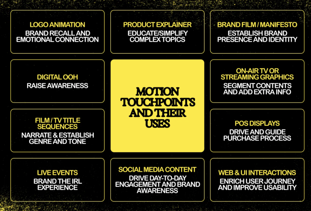
Bei der Entwicklung eines Motion-Systems oder der Guidelines ist es hilfreich, eine Vorstellung davon zu haben, wie Marken typischerweise mit Bewegung umgehen. Hier also ein kleiner Cheat-Sheet von KOTO (https://offbrandkoto.substack.com/p/reel-talk-the-power-of-branded-motion), der die typischsten Anwendungsfälle für Motion in einer Brand festhalten.
Motion Guidelines als PDF mit detaillierten Bewegungsprinzipien, -mechaniken und Anwendungsbeispielen (inkl. Timing-Tabelle, Easing-Library)
Komponentenbibliothek
ev ein Präsentationsdecks für interne und externe Stakeholder (Vgl. Never Sit Still o.D.)
Dadurch wird die Anwendung im Team vereinfacht – von Design bis Video Editing. Dieses Toolkit ist entscheidend für die Markenkonsistenz, insbesondere wenn mehrere Teams oder Agenturen an der Inhaltsproduktion beteiligt sind.
Schritt 7: Anwendung & Testing
Nun erfolgt der Rollout in allen Medienformen. Die Anwendung des Motion-Identity-Systems in realen Szenarien ist der ultimative Test für seine Wirksamkeit. Dazu gehören:
Website und App-Interaktionen (Hover-Zustände, Button-Klicks, Seitenübergänge)
Social Media Content (Intro/Outro-Karten, kinetische Typografie, animierte Infografiken)
Videoproduktion (Intros, Outros, Transitions)
Broadcast- und Präsentationsvideos, Pitchdecks (Logo-Animationen, Erklärvideos, Lower Thirds)
Schritt 8: Pflege & Weiterentwicklung
Motion Identities sind kein statisches Projekt – sie leben mit der Marke mit. Marken entwickeln sich weiter, und das sollte auch ihre Bewegungssprache tun. Bewegungssysteme solltenmodular und erweiterbar sein, um sich an zukünftige Markenerweiterungen und neue technologische Medien anzupassen (Vgl. KOTO 2025).
Regelmäßige Audits und Feedback-Zyklen können helfen:
– Veraltete Bewegungs-Assets zu identifizieren
– Die Zugänglichkeit und das Nutzererlebnis zu verbessern
– Sich an sich ändernde Markenstrategien anzupassen
Tipp: Auch Accessibility-Kriterien (z. B. „reduce motion“ Systemoptionen) sollten regelmäßig geprüft und angepasst werden.
Herangehensweise 2: Integration einer Motion Identity in eine bestehende Marke
Vgl. Gleave Dawncreative 2024; Vgl. Never Sit Still o.D.
Schritt 1: Analyse der bestehenden Marke
Zunächst muss klar sein:
Was ist die aktuelle Markenpersönlichkeit?
Welche Emotionen vermittelt das Design?
Welche Positionierung liegt vor?
Positionierungsskalen helfen auch hier zur Einordnung: „Wenn die Marke ernst, minimal und technologisch wirkt – wie muss dann Bewegung gestaltet sein?“ (Siehe oben)
Schritt 2: Motion Audit
Gibt es bereits Bewegungen?
Videos?
Microinteractions im Interface?
Transitions?
Oft zeigt sich: Es gibt Inkonsequenz, die durch ein konsistentes Motion System gelöst werden kann.
Schritt 3: Motion-Ziele definieren
Welche Funktion soll Motion erfüllen?
Storytelling?
UX-Optimierung?
Brand Recognition?
Welche Emotion soll transportiert werden?
Wo soll Bewegung auftreten – wo nicht?
Schritt 4: Motion Prinzipien festlegen
Basierend auf der bestehenden Brand:
Easing-Typen
Timings
Energielevel
Animationscharakter
Wichtig: Bewegung muss das ergänzen, was die visuelle Marke vorgibt. [Details siehe Prozess oben]
Schritt 5: Animation der zentralen Brand-Elemente
[Details siehe Prozess oben] Alle weiteren Schritte wie oben
Und “few common mistakes to avoid” als Liste von KOTO (Vgl. KOTO 2025):
Don’t overdo it: Too much or overly flashy motion can be distracting. Treat motion like any other design element—focused and intentional. Always return to your strategy to create meaningful movement instead of digital clutter.
Don’t neglect the bigger picture: Every piece of motion should align with your overall strategy and strengthen your brand identity. Ignoring this can weaken your brand’s impact.
Don’t underestimate quality: If you don’t have the resources for high-quality motion design, stick with polished static designs. A professional-looking static asset is always better than poorly executed motion.
Accessibility is key: Motion design should include everyone. Add audio captions where needed and use Harding-FPA tests to ensure flash-heavy videos are safe for those with epilepsy.
Zirka so würde ich im Prozess dann auch vorgehen… hoffe ich! Wir werden sehen! Weiter geht es damit, Inspiration zu sammeln und eine Brand zu (er-)finden, mit der ich arbeiten möchte!
Quellen:
KOTO 2025 KOTO (18.02.2025): Reel talk: the power of branded motion design. In: offbrandkoto, https://offbrandkoto.substack.com/p/reel-talk-the-power-of-branded-motion (zuletzt aufgerufen am 16.03.2025)
Never Sit Still o.D. Never Sit Still (o.D.): Motion Branding. In: Never Sit Still, https://neversitstill.com/motion-branding(zuletzt aufgerufen am 16.03.2025)
*Zuhilfenahme von ChatGPT: Die KI wurde zur Übersetzung, Korrektur und Formulierungshilfe von Texten verwendet. Alle Inhalte wurden anschließend eigenständig ausgewertet, überarbeitet und in den hier präsentierten Beitrag integriert.
Wir leben in einer zunehmend visuell überladenen, lauten und digitalen Welt. Sei es Social Media, Web oder täglich benutzte Apps und „In a world where watching big screen while holding little screen is a relatable feeling, motion is essential, not optional.“ (Vgl. KOTO 2025).
Deshalb wird auch von Brands und Marken erwartet, dass sie auf dynamische, einprägsame und emotional ansprechende Weise mit ihrem Publikum kommunizieren. Viele Marken tendieren immer noch dazu, erst an ihre Motion-Language zu denken, wenn sie plötzlich einzelne bewegte Elemente brauchen, weshalb es oft keine oder wenig Guidelines dafür gibt. Brands starten deshalb jedes mal aufs neue von Null, wenn es um die Konzeption bewegter Elemente geht, was den Prozess ineffizient macht und in einer „moving-image-first“-Welt durchaus für Schwierigkeiten sorgt. Hier kommt die Motion Identity (auch bekannt als Motion Branding oder Motion Design Systems) ins Spiel.
Was ist Motion Identity?
Die Motion Identity ist ein Teil der Visual Identity eines Unternehmens und bezieht sich auf die gezielte und strategische Anwendung von Motion Design auf verschiedene Markenelemente.
Bewegung wird so als wichtiger Kern-Bestandteil der Markenidentität (Corporate und Visual Identity) betrachtet. Während klassische Markenidentitäten primär visuelle Komponenten wie Logo, Typografie, Farben oder Bildsprache definieren, erweitert eine Motion Identity diese Elemente um eine bewegte und dynamische Dimension: Sie beschreibt, wie sich eine Marke bewegt – also, wie sich Logos, Typo, Icons, Layouts und visuelle Elemente im digitalen Raum verhalten (Vgl. KOTO 2025).
Diese Bewegungsmuster sind nicht nur Deko, sondern kommunizieren die Werte, den Charakter und die Haltung einer Marke auf eine subtile und emotionale Art. Die Bewegungen sind wiedererkennbar, präzise definiert und konsistent über alle Kanäle/Touchpoints hinweg. Man nennt es auch eine „Motion Language“ – ein Set aus Bewegungsprinzipien, das über alle Kanäle hinweg Anwendung findet.
Ein solches System entsteht nicht zufällig, sondern durch exploratives Design und präzise Definition in Form von Motion Guidelines, Toolkits und definierter Animationstechniken. (Vgl. Never Sit Still o.D.)
Warum ist eine Motion Identity wichtig?
Wir leben in einer „motion-first world“: Marken werden heutzutage überwiegend in digitalen und bewegten Kontexten wahrgenommen, sei es in Apps, auf Websites, durch Reels, TikToks, Instastories, Showcases, Onboarding Screens oder Werbevideos. Die Ära der rein statischen Corporate Identity naht dem Ende und was früher als eine Ergänzung der Markenidentität galt, ist heute einer der erste Kontaktpunkte: Motion. (Vgl. KOTO 2025) Bewegung wird immer mehr zu einem der primären Informationsträger. Im Gegensatz zu statischen Branding-Elementen fangen Bewegungselemente die Aufmerksamkeit der Betrachter:innen viel schneller ein, vermitteln Emotionen mit zusätzlichen Nuancen und schaffen immersive Markenerlebnisse. (Vgl. Gleave Dawncreative 2024)
Motion Identity spielt eine entscheidende Rolle bei der Steigerung der Markenwahrnehmung. Wenn sie effektiv umgesetzt wird, fördert sie die Wiedererkennung, verstärkt zentrale Markenbotschaften und verbessert das Nutzererlebnis. (Vgl. KOTO 2025).
Motion Identity überbrückt auch die Lücke zwischen Storytelling und Branding, denn Motion Design und Bewegung ist wie dafür geschaffen, Geschichten zu erzählen. Storytelling kann den Wert eines Produktes um bis zu 2706% steigern (https://www.go-globe.com/storytelling-statistics-trends-infographic/#:~:text=Furthermore%2C%20research%20indicates%20that%20stories%20have%20the%20potential%20to%20boost%20product%20perception%20by%202%2C706%25), und schon minimale Transitions (zB im Logo) können eine eben solche Geschichte erzählen! (Vgl. KOTO 2025)
Ein starkes Motion-System bietet einen Rhythmus und Stil, der emotional mit den Nutzern resoniert und den Charakter der Marke symbolisiert. An einem heruntergebrochenen Beispiel erklärt, könnte eine Premium-Marke langsame, sanfte und bewusste Bewegungen und Übergänge verwenden, um Eleganz und Raffinesse zu vermitteln, während ein Tech-Startup schnellere, modularere Bewegungsverhalten einsetzen könnte, um Agilität und Innovation zu signalisieren (Vgl. Gleave Dawncreative 2024).
Vorteile von Motion Identity:
Emotionale Wirkung: Motion ruft sofort eine emotionale Resonanz hervor und transportiert Tonalität und Markenwerte genauso schnell und sogar schneller als Text oder Farbe.
Erhöhte Wiedererkennbarkeit: Logoanimationen, gut eingesetzte Bewegungsmuster oder Transitions erhöhen den Wiedererkennungswert, besonders auf Social Media oder im UX-Kontext.
Informationsvermittlung: Animation unterstützt die kognitive Verarbeitung, denn sie können Hierarchien deutlich aufzeigen, Abläufe erklären und Nutzer:innen durch komplexe Inhalte führen.
Differenzierung: In einem überladenen digitalen Umfeld ist Bewegung ein starker Differenzierungsfaktor und eine eigene Motion Identity hilft womöglich dabei, sich von der Konkurrenz abzuheben.
Anpassen ist einfach: Motion-Systeme können in allen Formaten flexibel angewendet werden – von Microanimation bis Showreel
Consistency in UX: Bewegungsmuster können Navigation, Feedbackmechaniken und Benutzerführung standardisieren und verbessern, was besonders in Apps und auf Websites wichtig ist.
Motion ist also mehr als nur ein Stilmittel – Es ist ein strategisches Werkzeug im Branding (der Markenbildung). „Motion reinforces a brand’s personality“ – das bedeutet, dass die Art der Bewegung genau auf die Markenwerte abgestimmt sein muss: verspielt, klar, ruhig oder dynamisch. Eine einfache Slide-in-Animation kann professionell oder verspielt wirken – je nach Kurvengeschwindigkeit, Timing, Form oder Typo. (Vgl. Gleave Dawncreative 2024)
How much motion does a brand need?
Nicht jede Marke braucht spektakuläre Animationen. Die Menge an Animation hängt von der Persönlichkeit der Marke und vom Anwendungskontext ab:
Low-Motion – Animierte Brand-Assets: Schon ganz dezente Bewegungen können die Werte einer Brand vermitteln, z. B. durch typografische Transitions oder reduzierte Logoanimationen. Startet man mit den Basics und dem Motto „Keep it simple“ reicht es schon, sich mit dem Logo, Symbolen und ev. Überschriften zu beschäftigten
Mid-Level Motion – Motion Systems: Man empfiehlt immer zumindest das basis-level an Motion in einem Branding zu beachten, ultimativ lassen sich aber schnelle und praktische Sets und Systeme für Motion erstellen. Diese sogenannten Motion Systems machen es einfacher, die Bewegungen „up-zu-scalen“, ohne dauerhaft Dinge neu erfinden zu müssen. Durch ein Set an Assets rund um das Thema Motion, kann so vieles abgeleitet werden.
High-Motion Brands — Guidelines und Toolkits: Marken mit vielen digitalen Kontaktpunkten (wie Tech-, Media- und Lifestyle-Unternehmen) brauchen oft eine sehr ausgeprägte Motion Identity und ein gut anwendbares Motion System. Es bietet sich an „accessible and straightforward“ Guidelines zu entwickeln, die dem Team und allen Beteiligten erklärt, wie sich die Brand bewegt. Das stärkt nicht nur das Brand-System, es ermglicht auch ein flexibles Anpassen und Erweitern. Sogenannte Motion Toolkits werden für „motion-heavy industries“, wie Live-TV verwendet. Hier werden editierbare, automatisch anpassbare oder sich ständig updatende Dateien erstellt, die schnell (oder sogar in Echtzeit) mit Daten und Eingaben arbeiten.
Die Regel lautet wie so oft „As much motion as necessary – not as much as possible.“, denn zu viel Animation wirkt überladen und kann ie Nutzer:innen wie auch die Technik überfordern. Ziel ist es, genau so viel Bewegung einzusetzen, wie es der Markenbotschaft, der Plattform und dem Publikum entspricht.
Motion Design vs. Motion Identity vs. Motion System
Das hier ist auch der richtige Moment um die Begriffe ein wenig voneinander zu differenzieren:
Motion Design, ist die Gestaltung einzelner bewegter Inhalte – z. B. Videos, Transitions oder Animationen. Hier liegt der Fokus auf der Kreativität und visueller Umsetzung. Motion Identity, ist die strategisch definierte Bewegungssprache einer Marke – Sie ist systematisch, konsistent und auf Markenwerte abgestimmt und damit ein Teil der Markenidentität. Motion Systems sind technisch-kreative Frameworks die aus Prinzipien, Guidelines, Tools und Templates bestehen. Sie definieren, wie und wo Bewegung markenkonform eingesetzt werden können. (Vgl. Dickinson 2024)
Schlüsselelemente eines Motion-Identity-Systems
– Motion Principles: Grundlegende Regeln, die die Verwendung von Bewegung über verschiedene Markenelemente hinweg steuern. Sie definieren Timing, Geschwindigkeit, Richtung und Easing-Kurven.
– Motion Mechanics: Spezifische Techniken wie Slide-Ins, Fade-Outs, Bounce-Effekte, Skalierung und Rotation, die ein visuelles Vokabular für Bewegung bieten.
Motion Behavior: Die kinetische Signaturpersönlichkeit einer Marke – ihr Rhythmus, Tempo und ihre Elastizität.
Anwendungsrichtlinien: Diese gewährleisten die Konsistenz bei der Anwendung von Bewegung über digitale, gedruckte und umgebungsbezogene Touchpoints hinweg (Vgl. KOTO 2025; Vgl. Never Sit Still o.D.).
Abschließend ein Bild mit ein paar der wichtigsten Touchpoints der Motion Identity:
Motion Identity nicht mehr nur eine oberflächliche, ästhetische Verbesserung, sondern viel mehr ein zentraler Bestandteil moderner Markensysteme! Sie verleiht einer Marke eine Stimme und verbessert sowohl die visuelle Kommunikation als auch die Nutzerinteraktion. Da sich die digitalen Medien immer weiter entwickeln, wird auch die Motion Identity eine immer wichtigere Rolle in der Bereitstellung konsistenter, emotional ansprechender und user-centered Marken spielen.
KOTO 2025 KOTO (18.02.2025): Reel talk: the power of branded motion design. In: offbrandkoto, https://offbrandkoto.substack.com/p/reel-talk-the-power-of-branded-motion (zuletzt aufgerufen am 16.03.2025)
Never Sit Still o.D. Never Sit Still (o.D.): Motion Branding. In: Never Sit Still, https://neversitstill.com/motion-branding(zuletzt aufgerufen am 16.03.2025)
*Zuhilfenahme von ChatGPT: Die KI wurde zur Übersetzung, Korrektur und Formulierungshilfe von Texten verwendet. Alle Inhalte wurden anschließend eigenständig ausgewertet, überarbeitet und in den hier präsentierten Beitrag integriert.
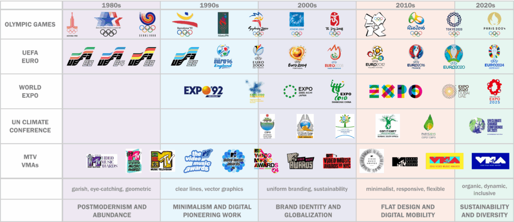
Design Traits: Bright neon colors, geometric shapes, cluttered patterns Influences: Pop culture, Memphis style, commercialization Impact on Events: Bold, colorful logos (e.g., 1984 LA Olympics)
1990s – Minimalism and Digital Pioneering Work
Design Traits: Clean lines, vector graphics, early digital design Influences: Rise of the internet, software like Photoshop & Illustrator Impact on Events: Simpler, cross-media logos (e.g., FIFA, early COP branding)
2000s – Brand Identity and Globalization
Design Traits: Flexible, consistent branding, early flat design Influences: Global market demands, focus on sustainability Impact on Events: Unified branding for global events, emphasis on eco-consciousness
2010s – Flat Design and Digital Mobility
Design Traits: Flat, clear, mobile-optimized, responsive logos Influences: Material Design, digital-first approach Impact on Events: Interactive, media-adaptive designs (e.g., Olympics, World Expos)
2020s – Sustainability, Diversity
Design Traits: Organic shapes, inclusive visuals, dynamic logos Influences: Sustainability, diversity, emotional connection Impact on Events: Logos reflect global awareness and inclusion (e.g., COP, Expos, MTV becomes more subdued)