From Idea to Concept – The Final Project

After deciding to focus on 3D audio, I began shaping the project into a concrete concept. The result? Echoes of Addiction – Breaking Boundaries Through 3D Audio, a 3D audio concept album that explores addiction and dependency through immersive sound design and innovative production techniques.

The idea behind the album is to take listeners on an emotional journey, sonically representing different phases of addiction – from denial and isolation to dependency and recovery. Through spatial sound placement, dynamic movement, and immersive textures, I aim to create an auditory experience that goes beyond traditional music production. The goal is to make the emotional states of addiction tangible through sound.

Sound Design as a Narrative Tool

To achieve this, I will experiment with various sound design techniques that enhance the themes of the album. Some examples may be:

  • Ambisonic and Field Recordings: Capturing real-world environments and spatial depth to create immersive atmospheres that reflect emotional states. For example, the feeling of isolation could be represented by a vast, empty soundscape with distant, echoing voices.
  • Granular Synthesis: Breaking down recorded sounds (e.g., vocals, guitars, ambient noises) into tiny grains, which can be stretched, scattered, and manipulated across the 3D space to create a fragmented, distorted reality—symbolizing confusion or addiction-induced dissociation.
  • Spectral Processing: Transforming recognizable sounds into ghostly, abstract versions of themselves to reflect loss of control and mental instability. For instance, vocals could be decomposed and restructured into eerie, flickering echoes, representing the overwhelming thoughts in an addict’s mind.
  • Modulation and Dissonance: Using amplitude and frequency modulation to create tension, while the interplay between dissonant and consonant harmonies mirrors the chaos and clarity within the addiction cycle.
  • 3D Audio Movement: Sounds will not remain static but move dynamically around the listener, reinforcing the psychological aspects of addiction. A whisper circling the head, for example, could represent obsessive thoughts or withdrawal-induced paranoia.

By combining these techniques, I want to push the boundaries of what a concept album can achieve. The sound design will not only shape the individual songs but also serve as a connective tissue, creating transitions and atmospheric interludes that guide the listener through the emotional arc of the album.

Bringing the Project to Life

From a technical standpoint, I will work with both Ambisonics and Dolby Atmos to create a fully immersive experience. The challenge will be to ensure that the album translates well across different formats – from 3D speaker setups to binaural headphone mixes and even standard stereo. This will allow as many people as possible to experience the album’s message and emotional depth.

The production process will follow a structured timeline:

  1. Research & Concept Development – Deep diving into 3D audio techniques and defining the sound design approach.
  2. Songwriting & Pre-Production – Refining compositions while experimenting with 3D audio integration.
  3. Recording & Sound Design – Capturing performances, field recordings, and designing immersive sonic textures.
  4. Mixing & Finalization – Creating the 3D audio mix, testing binaural and stereo compatibility, and refining the album’s overall sonic identity.

This project is more than just an academic exercise; it is an artistic statement that merges my passion for music, immersive sound, and storytelling. Now that the concept is finalized, the next step is bringing Echoes of Addiction to life.

A Sudden Change of Direction – A New Focus on 3D Audio

Sometimes, things change unexpectedly – and that’s exactly what happened with my master’s project. I had already explored different ideas, including building my own studio monitors or a binaural microphone. But then, my focus suddenly shifted.

For some time now, I’ve been deeply fascinated by 3D audio and how sound can be experienced not just in stereo but in a fully immersive space. The more I explored the topic, the more I realized that this was something I truly wanted to dive into. However, making the final decision wasn’t easy.

About two weeks before my project expose was due, I had an inspiring conversation with Mr Sontacchi. His words gave me the confidence I needed and reinforced my belief that my growing interest in 3D audio was not just a temporary fascination but a real opportunity for my master’s project. This conversation gave me the final push to fully commit to this idea.

Then, I had an epiphany: Why not connect this passion with something I already love? My band, Flavor Amp, is currently working on a concept album about addiction and dependency. Since we want the music to be deeply emotional and immersive, integrating 3D audio into the production seemed like the perfect way to amplify the storytelling aspect of our songs.

Instead of focusing on hardware development, I decided to explore how 3D audio combined with Sound Design can enhance emotional storytelling in music. I want to experiment with different techniques, from Ambisonics to Dolby Atmos, and find out how spatial sound design can strengthen the narrative of our album.

This decision was a turning point for me. It wasn’t just about choosing a project; it was about following a passion that connects my studies, my creative interests, and my band’s music. The next step? Developing a concrete plan and shaping the project into something truly meaningful.

Narrowing Down My Project Ideas

At first I have to say that it was really hard for me to find a topic because I had not enough time to think about it and it’s a hard decision. But there are two main topics which I’m really interested in:

  • Developing and building my own microphone – “Kunstkopf Mikrofon” – like the Neumann KU100
  • Developing and building my own studio monitors

At the moment, I’m focusing more on the studio monitors, that’s the reason why I chose this topic for my second blog post. But I have to say that I’m not 100% sure which topic I will choose.

The “studio-monitor-project” combines my passion for sound quality with a desire to better understand the technical and artistic nuances of audio production. While I am new to the technical aspects of speaker design, I am excited to explore this field and gain knowledge in this area.

Core Purpose

The core purpose of my project is to create a pair of high-quality, custom studio monitors that I can use in my personal work. This project allows me to explore the intersection of acoustics, design, and audio technology.

Goals

  • Technical Learning: Build a foundational understanding of speaker design, including acoustic principles, driver selection, cabinet construction, measurements, …
  • Practical Application: Design and assemble functional monitors using ready-made drivers, amplifiers, and other components
  • Innovative Elements: Integrate an innovative aspect into the design. I’m still considering ideas such as using sustainable materials, exploring transaural speaker technology, or creating a modular design for easy upgrades and customization
  • Aesthetic and Functional Design: Create a design that balances professional audio quality with aesthetic appeal
  • Documentation and Sharing: Document my process and share it with people, which are interested in this topic

Relevance

This project holds personal significance for me as it helps me to widen my horizon and to dive into a (for me) unknown topic, which I’m really interested in. On a broader scale, it explores how accessible and customizable high-quality audio solutions can be created by individuals. Adding an innovative aspect also makes this project suitable for this FH-project, such as sustainability and evolving audio technologies.

Reference Works

I have drawn inspiration primarily from:

  • A project report from the Institute of Electronic Music and Acoustics (IEM), which provided valuable insights into transaural audio
  • Discussions and shared experiences in DIY speaker forums, where enthusiasts offer practical advice and troubleshooting tips

Planned Work Techniques

To structure my approach, I’ve broken the project into distinct phases:

  1. Research Phase: Deepen my understanding of acoustic principles and explore potential innovative aspects like sustainability or modularity
  2. Concept Phase: Create a mind map of possible designs, features, and materials
  3. Design Phase: Finalize the cabinet shape and dimensions, select drivers, and identify suitable amplifier modules
  4. Prototyping Phase: Build a prototype, test the sound, and refine the design
  5. Final Construction and Testing: Build the final version, measuring, measuring, measuring…

Open Questions

Several challenges remain, such as:

  • Deciding which project I’m going to choose

In terms of the “studio-monitor-project”:

  • Deciding which innovative aspect to prioritize and how to implement it effectively
  • Ensuring compatibility between all components
  • Balancing budget constraints with the desire for high-quality components

Over the next few weeks, I plan to:

  1. Decide for a project
  2. Research…

01_Exploring Projection Mapping: The Start of the Journey

Why Projection Mapping?

I’ve been interested in projection mapping for a while now, but I never got around to trying it so far. It always seemed like one of those things that required a lot of technical knowledge, and I wasn’t sure where to start. This semester, I finally decided to change that and use it as my practical project. My plan is to document the whole process—from figuring out the basics to creating a finished projection. Since I have no experience with projection mapping or the software involved, I will be starting completely from the start. 

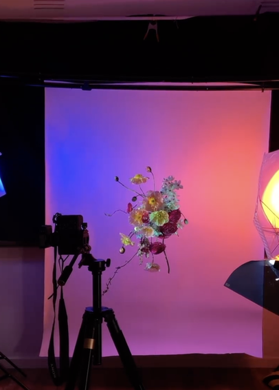
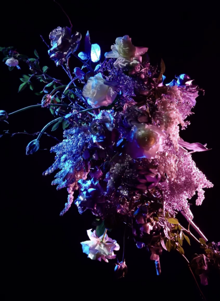
The idea would be to project onto different kinds of flower bouquets hereby working with a different more organic shape to project onto That makes things a bit more difficult because flowers aren’t flat, so I’ll need to be more precise to make it work and maybe do a bit of trial and error to achieve the visuals I want. But before I even get to that part of the project, I need to figure out which software I will be learning to use for this project.

Right now, I don’t have a clear concept yet, just a rough idea of the direction I want to go in. I know I want to create something immersive and simply learn more about projection mapping. I like the contrast between nature and digital projections, and flowers seem like an interesting choice because they’re delicate and always changing. That also makes them a challenge, since most projection mapping is done on flat, static surfaces. I have no idea how well this will work, but that’s part of the reason I want to give it a try.

When researching projection mapping, I quickly realized that there are a lot of ways to approach this but also a lot of different softwares to learn and use. Three of the most commonly used programs that spoke to me are MadMapper, Resolume, and After Effects. Each of them has a different focus, so choosing the right one depends on the specific needs that it can be used for.

Choosing the Right Software

  • MadMapper for example is one of the most well-known tools for projection mapping. It’s designed specifically for this purpose, making it a strong candidate. It allows users to easily map visuals onto different surfaces, and from what I’ve seen so far, it seems relatively intuitive when starting to learn it.
  • Resolume is often used by VJs and performers who need real-time video editing and projection. It has strong capabilities for live performances, which makes it different from MadMapper. However, I’m not sure if it’s the best option for a pre-planned, artistic projection onto flowers and it also seems a bit more complex to get into as a beginner.
  • After Effects is an industry-standard tool for animation and motion design. While it’s not a projection mapping software per se, it allows for highly detailed animations. The downside is that it doesn’t work in real-time, meaning I’d need to pre-render all visuals before projecting them onto the surfaces I plan on using. This could be fine in general however when using different flowers I would constantly have to go back and forth. 

My next step will be to test them out and see how they function in practice. I expect that hands-on experimentation will give me a clearer idea of which tool fits best.

First Practical Steps

To get started with the practical part, I plan to do some small projection tests. Rather than jumping straight to mapping onto flowers, I will begin with a flat surface as they are easier to start with. This will help me understand the basic workflow of the software I choose and allow me to focus on the technical side before adding any more complexity to the whole project.

When starting to test simple projections, I will create a basic shape or animation and project it onto a blank wall or another flat surface to understand how the software works. Following that, I want to experiment with 3D surfaces. Once I am more comfortable with flat surfaces, I will move on to objects with different textures and shapes to see how projection mapping handles uneven surfaces. Another option would be to try different software, where I could compare MadMapper, Resolume, and After Effects to see which one feels most intuitive and produces the best results. However, I might already decided what platform I want to use based on the previous research I did for each of them. After deciding on the software, I will begin designing the visuals for my projection that will be later used for the flowers. Following that will be a lot of trying out and testing, supported by learning from different tutorials and research.

Challenges and Considerations

One of the biggest challenges I think I will encounter is getting into the platform I will choose as well as working with organic shapes later on in the project. Unlike traditional projection surfaces like buildings or screens, flowers are delicate and constantly shifting in shape when using different ones. This means I need to find a way to adapt the projections dynamically or carefully plan around their natural form.

Another technical challenge will be aligning the projections accurately. Since flowers are small and three-dimensional, any misalignment will be much more noticeable than on a larger, flat surface. I may need to experiment with different positioning techniques or adjust the projection settings frequently.

From a creative perspective, I also need to consider what kind of visuals will work best on such an unusual surface. The question is do I want to focus on abstract patterns, realistic imagery, or something completely different? This will be part of my exploration in the coming weeks.

Next Steps

As I move forward, I’ll keep documenting both my research and practical progress. My next steps will focus more on refining the concept and understanding the technical side of projection mapping.

  • Continue researching projection mapping on organic objects, especially how light interacts with different textures like flowers, fruits, and fabric
  • Compare software options: After Effects and MadMapper seem the most relevant, but I want to understand their limitations before committing to one
  • Develop a clearer creative direction, looking at how textures and colors can enhance natural forms
  • Start thinking about technical challenges, like how to align projections correctly on uneven surfaces and how different materials react to light

Measuring the Carbon Footprint of Websites

Introduction

In today’s digital world, websites are an essential part of communication and branding, yet their environmental impact is often overlooked. Every webpage consumes energy, through data centers, user devices, and data transmission. This entry explores how we can measure and reduce the carbon footprint of websites through simple optimizations.

Practical Exercise: Testing Website Carbon Footprints

Step 1: Measuring CO₂ Emissions of Websites

To understand the environmental impact of different website designs, I analyzed three websites using the Website Carbon Calculator:

  1. Wikipedia (https://www.wikipedia.org/) – A text-heavy, minimalistic site.
  2. Apple (https://www.apple.com/) – A high-design, image-rich site with animations.
  3. H&M Online Shop (https://www.hm.com/) – A dynamic e-commerce platform with extensive tracking and interactivity.

Initial Findings:

  • Wikipedia: ~0.02g CO₂ per visit – highly efficient due to minimal design.
Website Carbon Calculator: Wikipedia
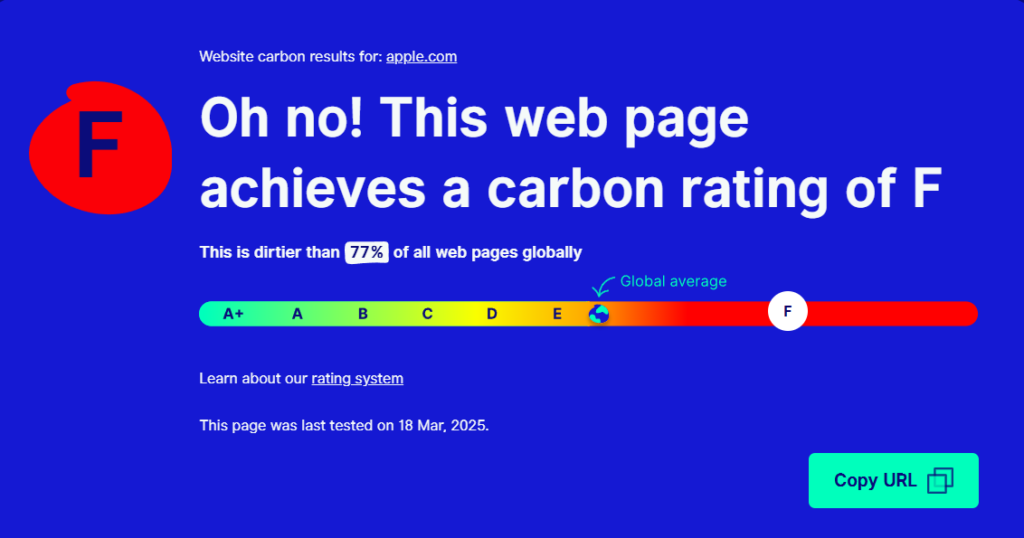
  • Apple: ~0.54g CO₂ per visit – significant energy use due to high-resolution visuals.
Website Carbon Calculator: Apple
  • H&M: ~1.5g CO₂ per visit – the highest footprint, likely due to third-party tracking, interactive elements, and large product images.
Website Carbon Calculator: H&M

These numbers reflect the per-visit emissions, meaning that on a global scale, these websites generate tons of CO₂ per year, depending on their traffic.

Step 2: Estimating the Impact of Optimizations (Using Apple.com as an Example)

To see how much a website’s footprint could be reduced, I modeled potential optimizations for Apple’s homepage.

Before Optimization (Apple.com Homepage)

  • Page size: 5.1 MB
  • Estimated CO₂ per visit: 0.54g CO₂
  • Annual emissions estimate (1M daily visits): ~197 tons of CO₂

Possible Optimizations & Estimated Impact:

OptimizationEstimated Size ReductionNew CO₂ per VisitPotential Annual Savings
Image Compression (WebP instead of PNG/JPEG)~30% reduction0.42g CO₂~43 tons saved
Lazy Loading & Caching~10% reduction0.38g CO₂~19 tons saved
Reducing Animations & Tracking Scripts~20% reduction0.30g CO₂~79 tons saved

After Optimization (Theoretical Best Case)

  • New page size: ~3 MB
  • New estimated CO₂ per visit: ~0.30g CO₂
  • Annual emissions estimate (1M daily visits): ~109 tons of CO₂ (a ~45% reduction!)

These calculations demonstrate how even basic changes, like compressing images and reducing animations, could make a website significantly more sustainable.

Key Learnings & Takeaways

 Web design choices have a measurable environmental impact.
Simple optimizations can cut CO₂ emissions almost in half.
Sustainable design isn’t just about print, digital design matters as well.

Resources

Prototyping II: Image Extender – Image sonification tool for immersive perception of sounds from images and new creation possibilities

Expanded research on sonification of images / video material and different approaches:

Yeo and Berger (2005) write in “A Framework for Designing Image Sonification Methods” about the challenge of mapping static, time-independent data like images into the time-dependent auditory domain. They introduce two main concepts: scanning and probing. Scanning follows a fixed, pre-determined order of sonification, whereas probing allows for arbitrary, user-controlled exploration. The paper also discusses the importance of pointers and paths in defining how data is mapped to sound. Several sonification techniques are analyzed, including inverse spectrogram mapping and the method of raster scanning (which already was explained in the Prototyping I – Blog entry), with examples illustrating their effectiveness. The authors suggest that combining scanning and probing offers a more comprehensive approach to image sonification, allowing for both global context and local feature exploration. Future work includes extending the framework to model human image perception for more intuitive sonification methods.

Sharma et al. (2017) explore action recognition in still images using Natural Language Processing (NLP) techniques in “Action Recognition in Still Images Using Word Embeddings from Natural Language Descriptions.” Rather than training visual action detectors, they propose detecting prominent objects in an image and inferring actions based on object relationships. The Object-Verb-Object (OVO) triplet model predicts verbs using object co-occurrence, while word2vec captures semantic relationships between objects and actions. Experimental results show that this approach reliably detects actions without computationally intensive visual action detectors. The authors highlight the potential of this method in resource-constrained environments, such as mobile devices, and suggest future work incorporating spatial relationships and global scene context.

Iovino et al. (1997) discuss developments in Modalys, a physical modeling synthesizer based on modal synthesis, in “Recent Work Around Modalys and Modal Synthesis.” Modalys allows users to create virtual instruments by defining physical structures (objects), their interactions (connections), and control parameters (controllers). The authors explore the musical possibilities of Modalys, emphasizing its flexibility and the challenges of controlling complex synthesis parameters. They propose applications such as virtual instrument construction, simulation of instrumental gestures, and convergence of signal and physical modeling synthesis. The paper also introduces single-point objects, which allow for spectral control of sound, bridging the gap between signal synthesis and physical modeling. Real-time control and expressivity are emphasized, with future work focused on integrating Modalys with real-time platforms.

McGee et al. (2012) describe Voice of Sisyphus, a multimedia installation that sonifies a black-and-white image using raster scanning and frequency domain filtering in “Voice of Sisyphus: An Image Sonification Multimedia Installation.” Unlike traditional spectrograph-based sonification methods, this project focuses on probing different image regions to create a dynamic audio-visual composition. Custom software enables real-time manipulation of image regions, polyphonic sound generation, and spatialization. The installation cycles through eight phrases, each with distinct visual and auditory characteristics, creating a continuous, evolving experience. The authors discuss balancing visual and auditory aesthetics, noting that visually coherent images often produce noisy sounds, while abstract images yield clearer tones. The project draws inspiration from early experiments in image sonification and aims to create a synchronized audio-visual experience engaging viewers on multiple levels.

Software Interface for Voice of Sisyphus (McGee et al., 2012)

Roodaki et al. (2017) introduce SonifEye, a system that uses physical modeling sound synthesis to convey visual information in high-precision tasks, in “SonifEye: Sonification of Visual Information Using Physical Modeling Sound Synthesis.” They propose three sonification mechanisms: touch, pressure, and angle of approach, each mapped to sounds generated by physical models (e.g., tapping on a wooden plate or plucking a string). The system aims to reduce cognitive load and avoid alarm fatigue by using intuitive, natural sounds. Two experiments compare the effectiveness of visual, auditory, and combined feedback in high-precision tasks. Results show that auditory feedback alone can improve task performance, particularly in scenarios where visual feedback may be distracting. The authors suggest applications in medical procedures and other fields requiring precise manual tasks.

Dubus and Bresin review mapping strategies for the sonification of physical quantities in “A Systematic Review of Mapping Strategies for the Sonification of Physical Quantities.” Their study analyzes 179 publications to identify trends and best practices in sonification. The authors find that pitch is the most commonly used auditory dimension, while spatial auditory mapping is primarily applied to kinematic data. They also highlight the lack of standardized evaluation methods for sonification efficiency. The paper proposes a mapping-based framework for characterizing sonification and suggests future work in refining mapping strategies to enhance usability.

References

Yeo, Woon Seung, and Jonathan Berger. 2005. “A Framework for Designing Image Sonification Methods.” In Proceedings of ICAD 05-Eleventh Meeting of the International Conference on Auditory Display, Limerick, Ireland, July 6-9, 2005.

Sharma, Karan, Arun CS Kumar, and Suchendra M. Bhandarkar. 2017. “Action Recognition in Still Images Using Word Embeddings from Natural Language Descriptions.” In 2017 IEEE Winter Conference on Applications of Computer Vision (WACV), 978-1-5090-4941-7/17. DOI: 10.1109/WACVW.2017.17.

Iovino, Francisco, Rene Causse, and Richard Dudas. 1997. “Recent Work Around Modalys and Modal Synthesis.” In Proceedings of the International Computer Music Conference (ICMC).

McGee, Ryan, Joshua Dickinson, and George Legrady. 2012. “Voice of Sisyphus: An Image Sonification Multimedia Installation.” In Proceedings of the 18th International Conference on Auditory Display (ICAD-2012), Atlanta, USA, June 18–22, 2012.

Roodaki, Hessam, Navid Navab, Abouzar Eslami, Christopher Stapleton, and Nassir Navab. 2017. “SonifEye: Sonification of Visual Information Using Physical Modeling Sound Synthesis.” IEEE Transactions on Visualization and Computer Graphics 23, no. 11: 2366–2371. DOI: 10.1109/TVCG.2017.2734320.

Dubus, Gaël, and Roberto Bresin. 2013. “A Systematic Review of Mapping Strategies for the Sonification of Physical Quantities.” PLoS ONE 8(12): e82491. DOI: 10.1371/journal.pone.0082491.

Blog 1: Lo-Fi Prototyping & Speed-Dating Reflections: Designing an Elevator for a 1000-Story Building

Introduction: A Thought Experiment in UX Design

How would you design an elevator interface for a 1000-story building? While this scenario may seem surreal, it presents an exciting challenge in user experience design. Inspired by a Google interview question, I decided to explore this concept and create a lo-fi prototype. The goal was to think through the navigation experience in such an extreme case, considering how users would interact with the system efficiently and intuitively.

Defining the Context & Target Users

To make this concept work, I first established some basic assumptions:

  • The building serves both residential and office purposes, potentially housing thousands of people
  • Multiple elevators exist, but each one needs a way to direct users efficiently
  • The elevators operate using a restricted access system where only authorized individuals can reach specific floors

The target users would include:

  • Residents – People living in the building
  • Employees – People working in office spaces
  • Visitors – Guests visiting residents or businesses
  • Security Persons – Ensuring safety and restricted access where necessary

The Prototype: Navigating this big Skyscraper

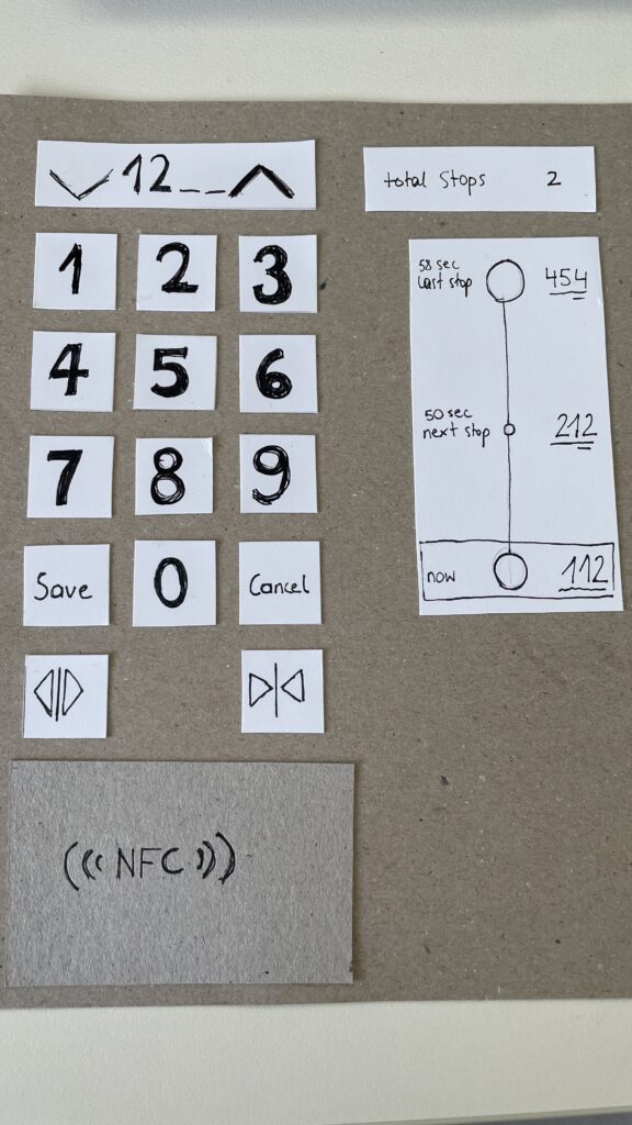
My prototype focused on the elevator interface, aiming to make navigation simple despite the overwhelming number of floors. In that 20 Minute Prototype Session was included:

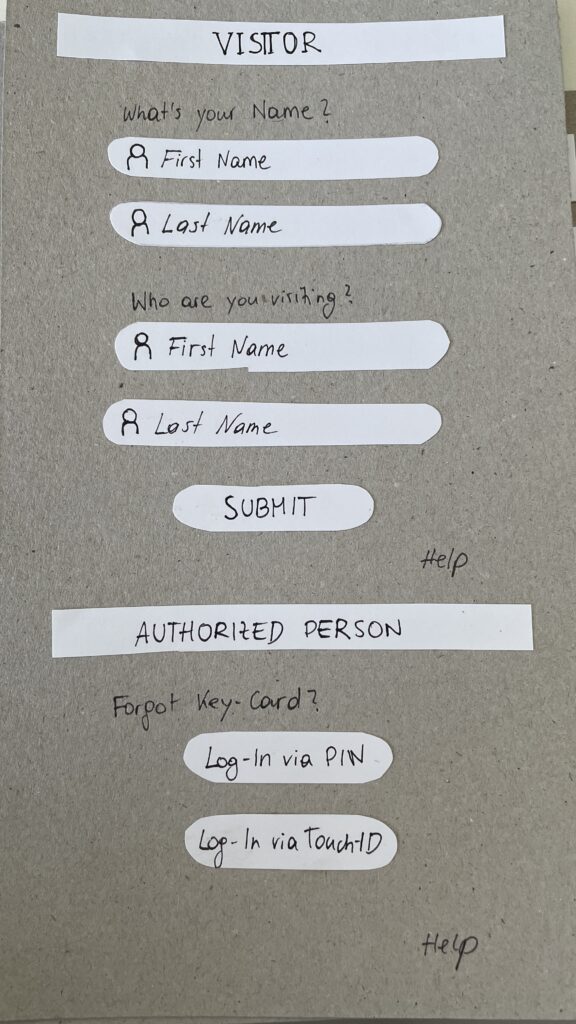
  1. Entry Screen – Users authenticate using an NFC card, PIN, or biometric login to verify access / Guests login via their name and the name of the host
  2. Floor Selection – A personalized interface displaying only authorized floors to reduce cognitive overload
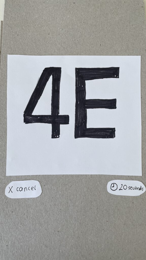
  3. Elevator Assignment – Users are directed to a specific elevator to optimize efficiency
  4. In-Elevator Controls – A secondary screen inside the elevator allows floor changes or emergency actions, ensuring flexibility mid-ride
Entry Screen
Floor Selection
Elevator Assignment
In-Elevator Controlls

Speed-Dating Prototype Discussion: Key Takeaways

The Speed-Dating session provided invaluable feedback from different perspectives. Here are some key insights:

1. Initial Reactions – What Problem Am I Solving?

  • Many participants struggled to recognize the interface as an elevator control system
  • Some assumed it was a hotel check-in or a security login screen
  • The concept of restricted floor access confused some users

2. Feature Suggestions – What Would You Add?

  • Instead of buttons labeled Save and Cancel, participants suggested clearer icons like a checkmark and a [X]
  • Emergency contact options were missing and should be easily accessible
  • Accessibility concerns arose, suggesting the need for a tactile number pad and Braille support

3. If My Prototype Had a Dating Profile…

  • The elevator system would market itself as “Your fastest and most efficient ride to success” or “Seamless mobility, one floor at a time.”
  • While the system served everyday users, i think the real customers would be building developers looking to optimize user flow in high-rise buildings

4. Future Vision – What Would Make This TED-Worthy?

  • While no 1000-story buildings exist today, high-rise architecture continues to evolve
  • Future cities may require advanced wayfinding systems, making this prototype a glimpse into possible urban design challenges

5. Unexpected Feedback – What Surprised Me?

  • The first login screen was misleading, making users think they were logging into a website rather than an elevator
  • Participants felt that unauthorized users could bypass security by following someone into restricted floors
  • The experience was unusual since most people are accustomed to standard button-based elevator panels

Final Thoughts & Next Steps

Exploring this extreme scenario was a fun and thought-provoking design exercise. However, given its impracticality, I won’t continue developing this prototype. Instead, I want to shift my focus to real-world mobility and wayfinding challenges, potentially designing solutions for navigation in large public spaces like airports, malls, or grocery stores.

This experience has reinforced how UX design is about clarity, accessibility, and user expectations. Designing for mobility is not just about efficiency, it’s about making interactions intuitive and seamless.

In the next blog post, I will explore potential project directions that build upon the learnings from this prototype.

Setting the Foundation: Key Takeaways from the First Master-Thesis Meeting

Before diving deeper into any research this semester, it was important for me to reflect on last semester, as well as also finally setting up the groundwork for the thesis itself. It was therefore essential to find the right supervisor and contact from a different interdisciplinary field, that could guide me through this ongoing research and testing process. It was particularly important for me to learn and gain knowledge from user testings as well as web-specific content. It was important to find out in advance whether the desired topic was suitable for a Master’s thesis. During a two-hour discussion round with Professor Baumann we were abled to set appropriate milestones for further research. The focus of the first phase of research in this semester will be on a wide range of neurodesign principles that I have already researched in my bachelor thesis. In the further process, five of these categories are to be determined and researched within wireframes in user testing. For this purpose, two different versions of wireframes will be created in the next step. Another big topic we had during our discussion was the title and establishment of the topic:

Moi: Neurodesign combines principles from neuroscience and psychology with design thinking. The idea is to create user interfaces and web experiences that align with how the brain processes information and emotions.

Professor Baumann: Okay, I see. But isn’t design already focused on user experience and interaction? What’s different here?

Moi: That’s exactly where Neurodesign is different. Traditional UX design focuses on usability, accessibility, and aesthetics, but it often relies on intuition, trends, or best practices. Neurodesign, on the other hand, uses data-driven insights from brain science to predict how users will react cognitively and emotionally to design elements.

Professor Baumann: Interesting. But how do you actually apply neuroscience to web design?

Moi: It’s about understanding how users’ brains respond to stimuli like colors, shapes, layouts, and even motion on a website. For example, certain colors may trigger emotional responses, while specific layouts could reduce cognitive load. Neurodesign aims to optimize these responses by using neuroscientific data, like eye-tracking or EEG studies, to inform the design decisions.

Professor Baumann: But how practical is this? How can designers realistically incorporate neuroscience into their workflow?

Moi: That’s where I see a gap in the design community. Right now, most designers don’t use these insights because they seem complex or inaccessible. My thesis aims to change that by advocating for tools and methods that can bridge neuroscience and design. For example, integrating neurodesign principles into widely-used design software or developing educational resources so designers can learn to think more scientifically about user responses.

Professor Baumann: I get your point. But isn’t this too theoretical? How would a web designer practically apply this without extensive knowledge in neuroscience?

Moi: Great question. The goal isn’t to turn designers into neuroscientists but to give them simplified, actionable principles that come from neuroscience. Think of it as adding another layer to their current toolkit. Just like how color theory or usability heuristics are standard knowledge, neurodesign principles could be distilled into easy-to-follow guidelines.

Professor Baumann: So, you’re talking about evolving the design practice by making scientific data more accessible to designers.

Moi: Exactly! It’s about evolving the design community to adopt more research-based, futuristic approaches. Neurodesign could lead to more personalized and engaging web experiences, where sites are not only visually pleasing but also scientifically optimized to fit the user’s mental processing and emotional engagement.

Professor Baumann: Now that makes sense. You’re essentially trying to reform the design community with these forward-thinking approaches. It sounds like you’re paving a path toward more scientifically-backed design methods.

Moi: Yes, and I think it’s a much-needed shift. Right now, design often feels like it’s based on trends or gut feelings as well as very outdated principles that are not questioned enough in my opinion. Who says that in a world that constantly changing, our behaviour isn’t? Another very big factor in pursuing this is simply the want to grow. How can we as a community or artists grow if we don’t leave our comfort zone? Change can only happen when we try something new, not if we keep designing after the same old rules. With neurodesign, we could bring objectivity into the creative process and push the community towards creating truly user-centered experiences, where every design decision is backed by how the brain actually works.

Professor Baumann: Alright, I think I’m getting the bigger picture now. This is definitely an exciting direction. Let’s refine your proposal further and see how you can build a strong case for this shift in your thesis.

Moi: Thank you, Professor. I’m really excited about it too!

The next step in my research will be the A/B Testing with the established Wireframes that have yet to be finished.

2.1. Prototyping & Reflection of the Speed-Dating

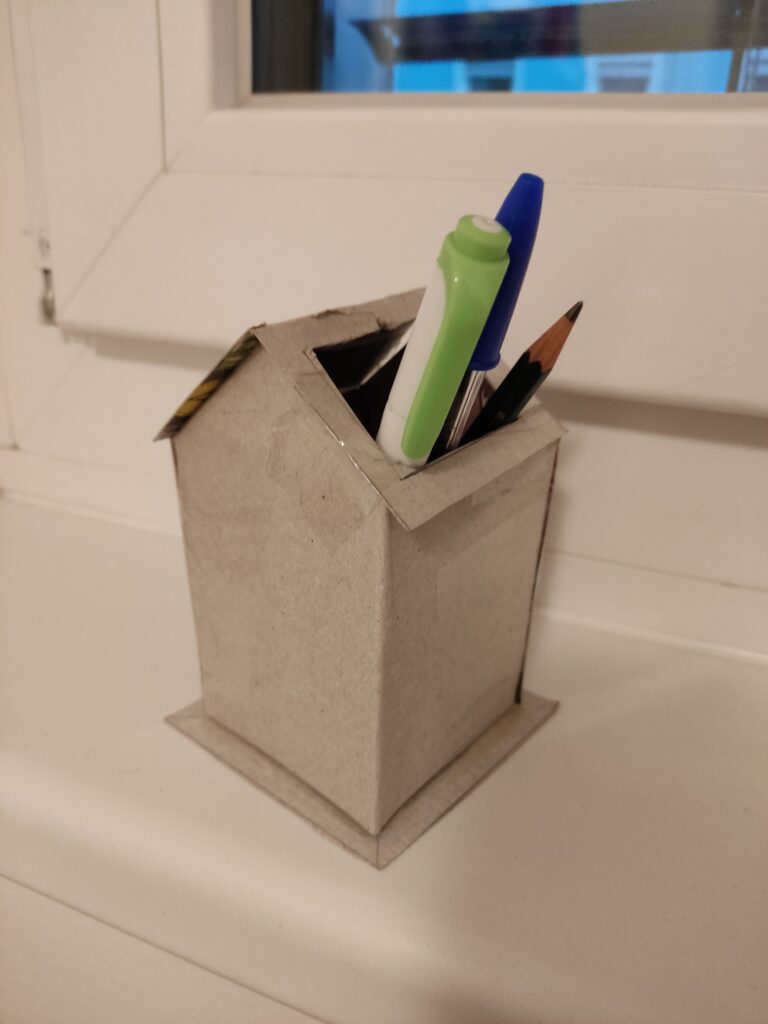
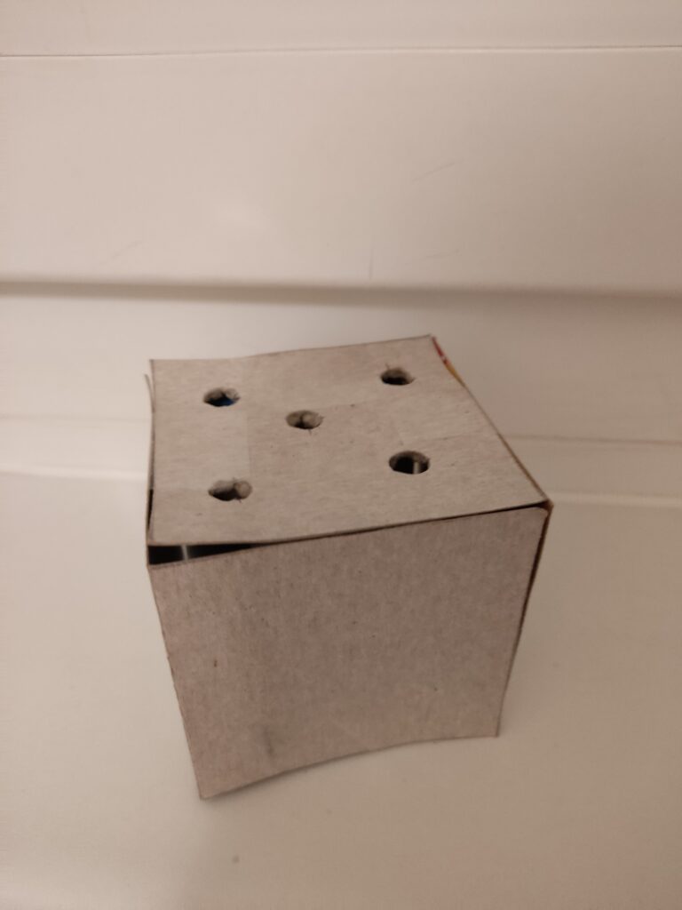
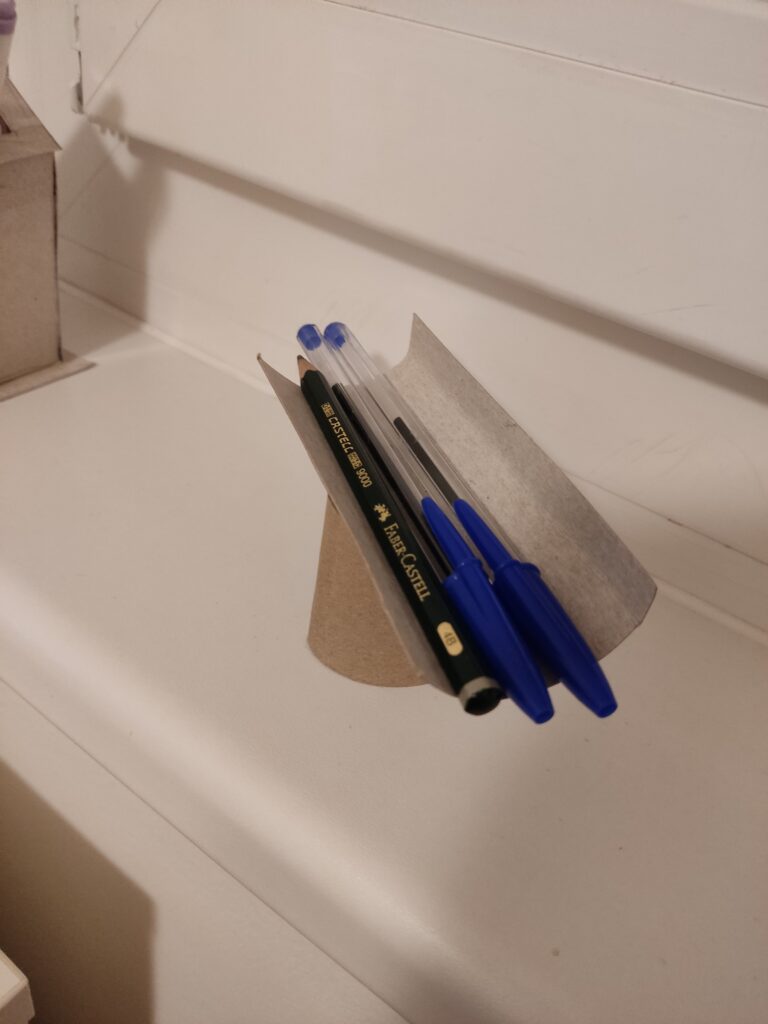
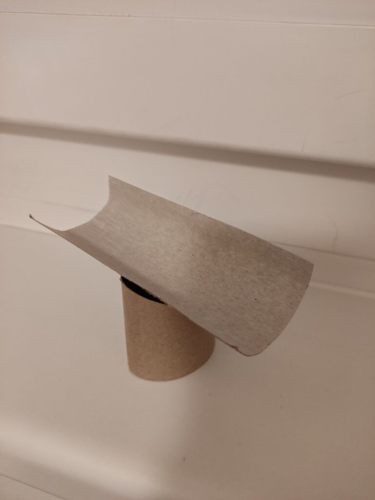
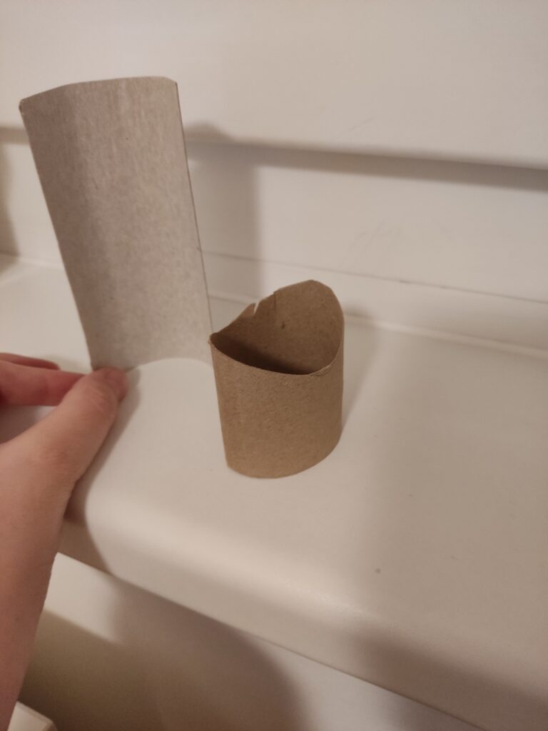
My previous topic focused on the physical and digital worlds surrounding museums. Currently, my research does not provide any concrete ideas on what this entails. So, for this task, my thought process has led me to consider creating something that doesn’t rely on technology for its primary function. As a result, I created a collection of three prototype pencil holders. I chose to work with cardboard as my primary material because it is lightweight, easy to cut and shape, and allows for quick iteration. This choice allowed me to try out different structures and improve my ideas without the limits of more rigid materials.

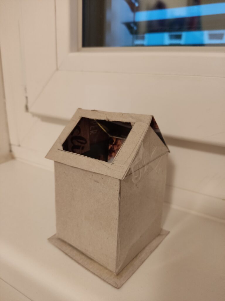
Prototype 1: The House
The first prototype takes the form of a small house, featuring a hole in its roof for storing pens, pencils, markers, and other writing instruments. This was the most complex design of the three, and due to its complexity, it took the longest to construct as I had to experiment with the angles of the roof and the positioning of the storage opening to achieve the right balance between aesthetics and usability.

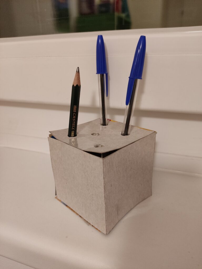
Prototype 2: The Cube
The second prototype is a simple cube with five holes on one side, designed to hold pens and pencils perfectly. Its geometric structure made it the easiest to assemble, as I only needed to ensure that the holes were the right size for standard writing tools.

Prototype 3: The Abstract Shape
The third prototype differs from traditional forms, featuring a curved plank resting on a cylindrical base. Unlike the first two, which have clear, recognizable shapes, this design leans toward abstraction. Although this was the fastest prototype to construct, it required the most conceptual thinking. I spent a lot of time considering its form and how it could function as a pencil holder. The final piece is a sculpture that sparks interest while also being useful.

Observations from the Speed-Dating Session
For the in-class speed-dating session, I decided to bring Prototype 3. Given its abstract form, I was particularly interested in seeing how people would interpret it without any prior explanation. As the session began, people appeared uncertain about its intended function. Instead of immediately revealing its purpose, I encouraged them to make guesses based on its shape and structure.

Many speculated that it might serve as a rest for the chin or arm, while others imagined it as a support for chopsticks or another type of tool. When I revealed that it was meant to be a pencil holder, people had mixed reactions. Some were surprised, while others wondered if it really worked well for that purpose.

The most valuable feedback from this session suggested refining the concept by focusing on holding a single, special object rather than multiple everyday writing tools. One person suggested that the design could be changed from a typical pencil holder to a display case for a special calligraphy pen or another important writing tool. This idea created new options for how the prototype could become a more meaningful object.

Overall Thoughts
The speed-dating experience proved to be a valuable exercise in the iterative design process. Observing how people engaged with my prototype, interpreted its function, and provided feedback allowed me to rethink my approach and the intended use of the design. I realized that the way something looks affects how people understand and use it. It’s important to create ideas that clearly show what they are for or, on the other hand, encourage people to engage with them through uncertainty.

11-Quick Concept Prototype and Speed Dating Session

Early Prototype: Designing the Home Screen for an Information Scrubbing and Management Tool

From Idea to Prototype

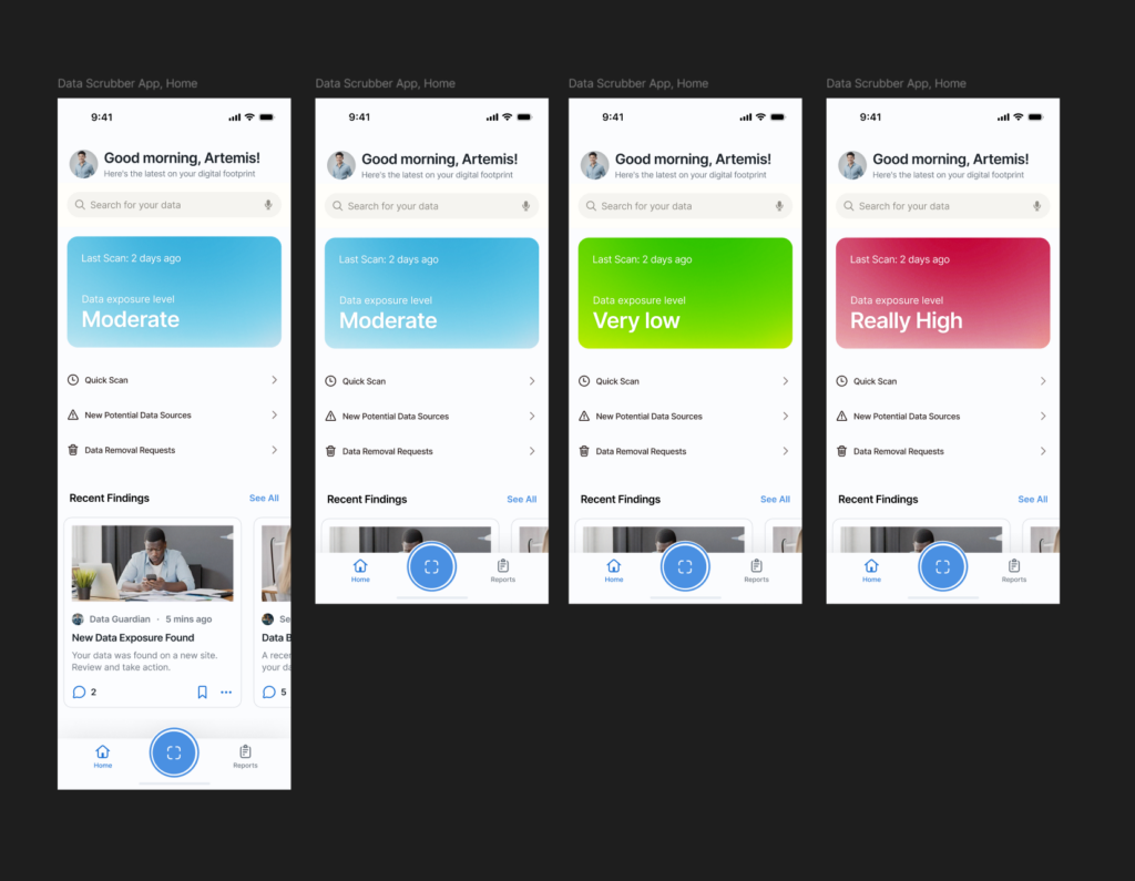
For my latest project work, I started sketching out the home screen/dashboard for an information scrubbing tool, a mobile app designed to help users find and remove their personal data from the internet with ease. For some context, I’m planning on working on a thesis about effectively managing our digital footprints on the internet, and as part of that, I started sketching out the home screen/dashboard for a privacy scrubbing tool—a possible mobile app designed to help users find and remove their personal data from the internet easily. Since privacy management can often feel overwhelming, my goal was to make the interface simple, clean, and user-friendly right from the start.

I created a prototype, exploring the ways users could interact with the tool. Since this is meant to be a mobile app, I focused on layouts that would feel intuitive on a phone screen. The main elements I worked on included:

  • A clear status overview (showing how much data has been found and removed).
  • A quick action button for immediate scanning.
  • Navigation tabs for different privacy tools and settings.

I focused on the layout, content structure, and information hierarchy to see what felt the most natural.

What I Learned from Testing

After creating the prototype, I brought it to class for testing. The feedback was reassuring—most people understood the purpose of the app right away, with very little explanation. That was a good sign that the design was intuitive. There was also curiosity about what additional features could be included in future iterations, which gave me ideas for expanding its functionality.

Speed Dating and Unexpected Insights

During class, we did a fun rapid feedback session where we shared our prototypes in short, fast-paced rounds. Each person I spoke with provided different perspectives, and I got some valuable insights:

  • People grasped the concept quickly, meaning the layout and flow were already on the right track.
  • They were excited about seeing more features, suggesting that users would appreciate a more in-depth look at what the tool could do beyond just scrubbing data.
  • If my project had a “dating personality,” it would be ‘careful’—which makes sense, given that the app is all about privacy and cautious data management!
  • We were asked to give the most unexpected feedback on our prototypes and one date gave feedback that the “scan now” button felt like a button to launch the camera for a QR code scanner (this means the icon definitely needs some work🤣🤣)

This session helped me validate the direction I was going while also giving me fresh ideas to improve the user experience. Next, I’ll refine the prototype based on this feedback and start thinking about more detailed interactions.