06 How Bias effects (UX) Design

“Life can only be understood backwards, but it must be lived forwards” ~ Soren Kierkegaard
A quote that is also very fitting, when talking about bias in design. Most of the time you can only understand, that a decision could have been made due to a bias, after the changes have already been deployed. Looking a bit deeper into the topic of biases and how they affect (UX) design, here are some interesting stories, how products turned out biased towards or against parts of their user groups.

1 – Spotify Shuffle Button

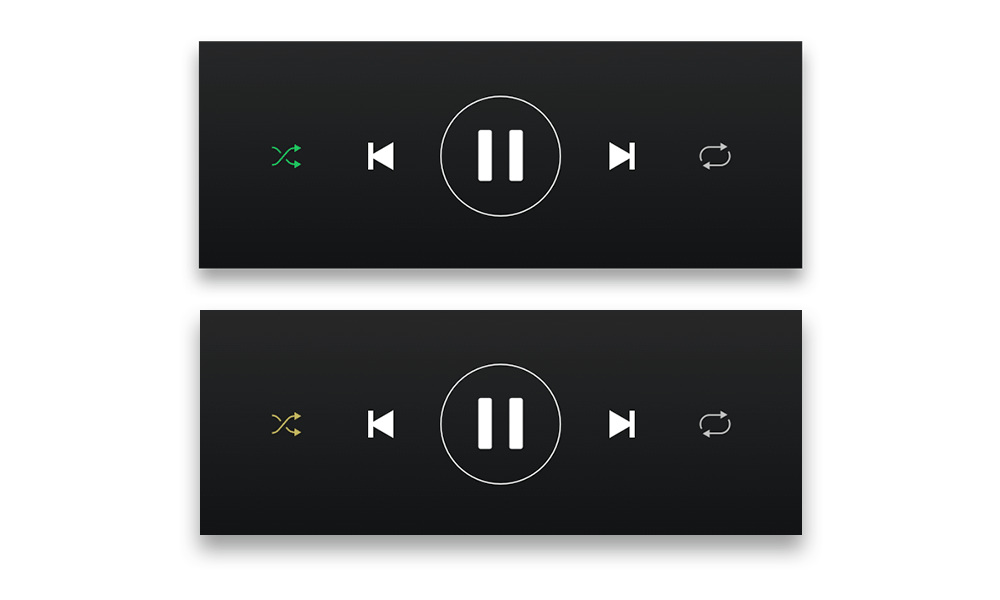
In a reddit form, a user requested, that the shuffle button in the Spotify app would have a circle around it, since they are color blind and have a hard time seeing the difference between the active and inactive shuffle button. (see picture below) (cf. Reddit) Put simply, this might have happened due to a blind spot affecting Spotifys design team. Not all people perceive colors the same way, some have a hard time, especially seeing red and green. Approximately 8% of men and 0.5% of women are affected by this type of color blindness. (cf. the Guardian) This simple change could be a big difference for certain subsets of users.

Approximation of how a colorblind user with protanopia color blindness may see the Shuffle button in Spotify. Source

2 – Cars and Seat Belts 

Here is a fun one, in the 1960s, most crash test for cars were done with crash test dummy, modeled after an average male physique (height, weight & stature). Therefore safety design decisions were mostly tailored to men, neglecting woman, children, smaller or bigger individuals. Although crash test have been conducted with “female” crash test dummies, but they were only placed in the passenger seat. (cf. User interviews) When talking about safety, one hopes, that all possible users have been considered.

This happened very likely due to the “sampling bias”: “Sampling bias occurs when a sample does not accurately represent the population being studied. This can happen when there are systematic errors in the sampling process, leading to over-representation or under-representation of certain groups within the sample.” (Simply Psychology)

3 – Facebooks “Year in Review” 

In 2014 Facebook introduced the “year in review” feature, which showed the user their best performing posts of the past year. The algorithm would identify the “best” posts/moments depending on the amount of likes. Now this is all fun and games, until you see a lost loved one in your year review. While the algorithm might work for most users, some will have a different, less satisfying experience. (cf. Forbes)

Who ever had the idea for this feature, handed their bias over to the algorithm who automatically creates these reviews. Due to the optimism bias people to believe that they are less likely to experience negative events and more likely to experience positive ones. This bias can lead to overly optimistic expectations about the future, underestimating risks, or failing to prepare for potential challenges. Designers assumed that users’ most engaged photos and moments would always be joyful, leading to a feature that unintentionally surfaced painful memories for some users.(cf. The Decision Lab)

Source

These are just three examples of how biases can affect design and there are many more, this was just the beginning. Although I have noticed, that a lot of bias related “fails” happened, because the designers or researchers focused on one part of their users. There is another bias, that might be the basis for all of this: The majority bias, cognitive bias where people focus on the larger or more visible part of a group, often overlooking minority perspectives. This bias assumes the majority is representative or correct, leading to the neglect of smaller groups or less common viewpoints. Which could lead to neglect of a bunch of smaller groups, which all together would form the majority. (cf Nature)

05 Austria’s 2024-2030 eHealth Strategy

Early on in my research I came across the document “eHealth-Strategie Österreich” created by the Ministry of Social Affairs (Sozialministerium) published in June 2024.

The digitalization of healthcare in Austria was significantly accelerated by the pandemic. For the first time, there were large-scale online appointment bookings and teleconsultations, the hotline 1450 was expanded, and the e-prescription has now become established. To further advance digitalization, the federal government, states, and social insurance will provide an additional 51 million euros annually as part of the healthcare reform. The “eHealth Strategy Austria” defines the focus areas and priorities for implementation in the coming years.

This document presents Austria’s eHealth strategy for 2024–2030, aiming to digitally transform its healthcare system. It outlines strategic and operational goals, including improved digital access, telehealth services, infrastructure development, and data utilisation. The strategy emphasises patient-centric care, incorporates a participatory stakeholder process, and addresses challenges like digital literacy and data governance. Implementation plans and monitoring frameworks are detailed, with a commitment to regular updates. International best practices and the European Health Data Space are also considered.

The Austrian eHealth strategy aims to define a shared vision for eHealth and digitalisation in the health and care sector in Austria, with a focus on further development. The strategy seeks to contribute to the maintenance and restoration of health through the appropriate use of digitalisation. It addresses various target groups, including citizens, patients, healthcare providers, and those involved in research and system management.

Eight strategic goals, each with specific measures are designed to achieve the objectives of the strategy:

  1. Enabling digital access to the healthcare system. This involves ensuring all citizens and healthcare providers have access to the public health telematics infrastructure (GTI) and that digital services are integrated across all levels of care, while maintaining analogue options.
  2. Creating telehealth prevention and care solutions. This aims to develop a network of telehealth services to improve patient care and enhance collaboration among healthcare providers, with clear legal and organisational frameworks.
  3. Further developing the public health telematics infrastructure (Gesundheitstelematik-Infrastruktur GTI). The goal is to establish a robust and convergent infrastructure to support digitalisation in the health and care sectors. This includes ensuring the GTI’s operation, updating its architecture, and expanding its connectivity to all relevant healthcare providers.
  4. Providing central eHealth services/components. This involves offering essential services and components to support participation in the public GTI, utilizing the existing e-government infrastructure.
  5. Establishing registers relevant to healthcare and governance. This focuses on having a defined set of registers for health data, both statutory and virtual, which are essential for improving care quality, patient safety and system management.
  6. Strengthening the secondary use of health data. The strategy aims to create a secure platform for the secondary use of health data in research and system management, ensuring compliance with data protection standards and the European Health Data Space (EHDS).
  7. Making innovation accessible. This involves creating a structured approach to innovation within the public health system, setting up transparent processes for introducing external innovations, and ensuring that innovative projects receive sufficient support and funding.
  8. Strengthening digital skills. The strategy seeks to ensure that both patients and healthcare providers have the necessary digital skills, with readily available training and support.

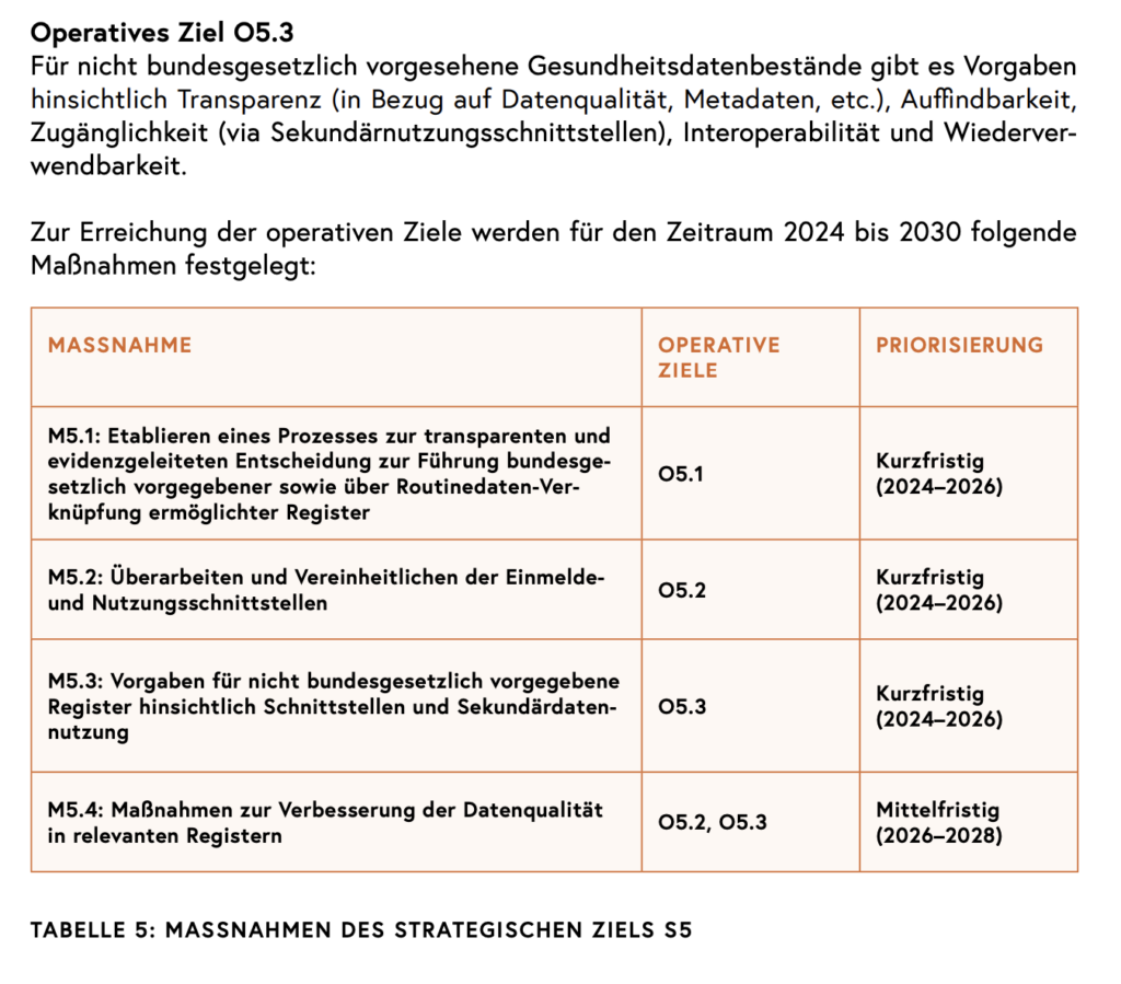
Each goal is then broken down into operational goals and specific measures. The following screenshot shows what this looks like for the 5th goal “Establishing registers relevant to healthcare and governance“.

By actively engaging users in the design and testing phases, the Austrian eHealth strategy aims to create digital health solutions that are both effective and accepted by the public. The paper states that the development process must be user-centred and participatory, involving potential users in the design process.

The strategy is designed to be a living document, and will be updated every five years, aligning with financial equalisation periods. It is also intended to align with the health reform of 2023, the Federal Target-Based Governance Contract of 2024 and the “digital before outpatient before inpatient” (digital vor ambulant vor stationär) principle. The eHealth strategy is designed to be a collaborative effort that involves all relevant stakeholders and aims to create a patient-centred digital health system.


References

BMSGPK (2024): eHealth-Strategie
Österreich. v1.0 im Juni 2024. Bundesministerium für Soziales, Gesundheit,
Pflege und Konsumentenschutz, Wien

https://www.sozialministerium.at/Themen/Gesundheit/eHealth/eHealth-in-Oesterreich.html

#09 Creating Interactive Installations

In this post, I want to explore the process of designing and creating interactive installations.

Process of designing an interactive installation

Creating an interactive art installation involves several steps, from defining the concept and technology to the final implementation.

Defining the concept
The first step is to brainstorm and define the core idea of the installation. Interactive Art flourishes from storytelling and creating memorable experiences. These questions can help defining the concept.

  • What is the main theme or message of the installation?
  • How will the audience engage with the artwork?
  • What emotions or experiences should be evoked?

The focus of the concept should always be on the emotions and the story that is to be conveyed. Immersive and interactive art aims to create connections and often uses human behavior as a narrative element. The theme can be a personal interest, an abstract idea or social problems. The more meaningful and moving the topic, the greater the likelihood that it will appeal to people. 

Additionally, identifying and understanding the target audience is crucial for interactive installations. It helps to tailor the experience to their preferences, needs and behaviors. While designing, accessibility should always be a priority, to ensure that the installation is inclusive and engaging for everyone – regardless of background, ability or familiarity with digital art.

Choose the right setting
The physical environment where the installation should be is crucial for the planning, since it influences technical as well as artistic decisions. Whether the installation is in a museum or in a public place, the size and location of the space, accessibility, light and sound and general infrastructure are important factors that need to be considered. 

Public spaces are particularly suitable for interactive installations as they enable a high level of participation and reach many people in urban areas. Placing art in public spaces not only makes it more accessible but also allows it to be seamlessly integrated into people’s everyday lives. However, designing for public spaces requires careful consideration of any necessary permits and insurance.

Choose Technology and Medium
As soon as the concept is done, the next step is to decide which sensory elements like light, sound and touch will transport the theme the best. If the goal is to create dynamic visuals that transform a space – projection mapping might be the right choice. If there should be different layers of interaction and the viewer should fully immerse with the installation AR or VR might be the right technology. The selection of the right sensor (e.g., motion, touch, proximity) and output devices (e.g., displays, projectors, speakers, actuators) is essential to bring the vision to life. It is also important to determine whether the installation will be physical, digital, or both. Each element and technology should smoothly integrate with each other to enhance the overall experience, creating a seamless and immersive environment for the audience. 1 2 3

Software and Tools that can be used

  • Processing: A simple programming environment to develop visually oriented applications. It is a design and prototyping tool which is used for creating large-scale installations. 4
  • TouchDesigner: A node-based visual programming environment and a great tool for interactive shows and installations. 5
  • Max/MSP: A visual programming language for creating interactive software. 
  • Unity: A real-time development platform often used for creating 3D interactive experiences. 7
  • Arduino: An open-source electronics platform based on easy-to-use hardware and software. It’s intended for anyone making interactive projects. 8
  • MadMapper: A reference application for Projection Mapping, LED installations and laser shows. 9
  • Resolume Avenue & Arena: It is the industry-leading software used by VJ’s. 10

Prototyping and Redefining
Prototyping is an essential step before building the full installation, allowing to test and refine the ideas. This phase provides an opportunity to experiment with various interactions and responses to identify the most effective setup. 

Implementing and Testing
Once a working prototype has been created that does justice to the concept, the next step is to build the physical environment of the installation. Whether it’s an entire room, a sculpture or digital screens, this forms the basis for the entire installation. Once the foundation is in place, the next step is to implement the technology – placing the sensors, projectors or programming a computer. After implementing the final installation, it is important to test everything again very carefully to check if all interactions such as movement, touch or other sensors work.

Observing
Interactive installations thrive on the involvement of visitors – it is therefore advisable to be present and observe how people interact with the installation. This way, any adjustments can be made. 1 2 3

Challenges in interactive Installations/art

Although interactive installations or interactive art is very captivating and modern right now, they come with some challenges – whether be technical, creative or logistical. These factors can make creating interactive installations a complex task.

Technical Challenges in Implementation
Interactive installations usually involve different technologies – sensors, software and hardware – which can be a challenge to bring all these individual elements smoothly together. Issues with the accuracy of sensors, the response time from input to output or the stability of the system can complicate the process. It is therefore even more important to test everything carefully before launch.

Balancing artistic vision and technological feasibility
One of the biggest challenges is finding the right balance between artistic creativity and the limitations of technology. It can easily happen that the creative idea is too complex and ambitious and exceeds the possibilities of the technology. It is therefore important to discuss expectations and ideally explore the technical possibilities early on in the concept in order to create a working and realistic interplay between creativity and technology to make the interactive installation a reality.

Collaborative challenges in multidisciplinary teams
In order to create an interaction that captivates people and creates a high level of engagement, it possibly requires the collaboration of different disciplines such as artists, designers, developer, engineers or even psychologists or sociologists. A large interdisciplinary team brings many advantages, and each person can contribute their own ideas and expertise. However, a large team can also quickly become a challenge. It is therefore important to have clear communication so that everyone is on the same page when it comes to the project. This is the only way to ensure good cooperation, which in turn leads to a successful interactive installation. 11


Sources

[1] S. Zafeiriou, „The Ultimate Guide to Immersive Art Installations: Creating Engaging and Interactive Art Experiences | Steve“, Steve Zafeiriou, 18. Januar 2025. https://stevezafeiriou.com/guide-to-immersive-art-installations/

[2] „Exploring Interactive Art Installations: History, Examples, and Creation“, Visual Alchemist, 29. Juni 2024. https://visualalchemist.in/2024/07/22/exploring-interactive-art-installations-history-examples-and-creation/

[3] D. Team, „Interactive Art Installation: Tips & Best Practices“, Daisie Blog, 18. Juli 2023. https://blog.daisie.com/interactive-art-installation-tips-best-practices/#concept-of-interactive-art

[4] „Processing overview“, Processing. https://processing.org/tutorials/overview

[5] Elburz, „What is TouchDesigner? A TouchDesigner FAQ“, The Interactive & Immersive HQ, 8. November 2024. https://interactiveimmersive.io/blog/touchdesigner-lessons/what-is-touchdesigner/

[6] „What is Max? | Cycling ’74“. https://cycling74.com/products/max

[7] „Echtzeit-Entwicklungsplattform von Unity | 3D, 2D, VR- und AR-Engine“, Unity. https://unity.com/de

[8] „Arduino – home“. https://www.arduino.cc/

[9] „MadMapper Home“. https://madmapper.com/

[10] „Avenue & Arena – Resolume“. https://www.resolume.com/software/avenue-arena[11] T. Emb, „The Intersection of Art and Technology in Interactive Installations“, EMB Blogs, 16. April 2024. https://blog.emb.global/art-and-technology-in-interactive-installations/#emotional-impact-of-interactive-art

5. Cerebellum, Hippocampus, and Amygdala

CEREBELLUM: MUSIC AND MOVEMENT

The cerebellum, primarily known for its role in coordinating movement, plays a crucial part in our rhythmic and physical responses to music. This interaction enhances the emotional experience of music through embodied engagement.

Synchronization with Rhythm: The cerebellum helps align our body’s movements with the rhythm of music. This is why we naturally tap our feet, sway, or dance to a beat. It connects auditory inputs with motor outputs, creating a physical embodiment of musical patterns.
Emotional Amplification: The cerebellum interacts with the brain’s emotional centers, amplifying feelings associated with music. Rhythmic patterns and tempo changes influence the intensity of these emotional responses. For instance, a fast, driving rhythm might energize us, while a slow, steady rhythm can calm us.
Evolutionary Perspective: Levitin suggests that the cerebellum’s role in rhythm and movement likely evolved to foster social cohesion. Group activities like singing and dancing strengthened bonds and facilitated communication in early human societies.

HIPPOCAMPUS: MUSIC AND MEMORY

The hippocampus, essential for memory formation and retrieval, plays a central role in how music connects to our personal histories and emotions, making it a powerful tool for nostalgia and therapeutic interventions.

Music as a Memory Trigger: Music activates the hippocampus, often unlocking vivid memories tied to specific songs. This is why hearing a song from childhood can transport us back in time, complete with emotional context.
Emotional Encoding: Music’s emotional impact strengthens memory encoding. Songs experienced during emotionally significant moments (e.g., a wedding or breakup) are more deeply imprinted in the brain, making them easier to recall later.
Neurological Basis for Music Therapy: Levitin points to studies showing how music engages the hippocampus even in individuals with memory disorders like Alzheimer’s. Familiar songs can evoke memories and emotions that seem otherwise inaccessible, providing a therapeutic effect.

AMYGDALA: MUSIC AND EMOTION

The amygdala, the brain’s emotional processing center, helps explain why music has such a profound effect on our mood and why it can be used to evoke specific emotional states.

Emotional Resonance: The amygdala assesses the emotional content of music, influencing feelings like joy, sadness, or fear. For example, dissonant harmonies can activate the amygdala’s fear response, while consonant melodies may evoke feelings of peace or happiness.
Fight-or-Flight Response to Sound: The amygdala’s evolutionary role in processing auditory stimuli is tied to survival. Sudden, loud sounds might trigger a fight-or-flight response, while gentle, soothing sounds signal safety and relaxation. Music capitalizes on this mechanism to create tension and release, often driving emotional highs.
Interplay with Memory: The amygdala works closely with the hippocampus, reinforcing the emotional weight of memories associated with music. This partnership explains why emotionally charged songs often leave a lasting impression.

4. Exhibition Design

EMOTIONALLY DIRVEN ROOMS

Emotionally driven rooms in interactive design use music and visuals to create specific emotional atmospheres that immerse participants. By pairing the right kind of music with complementary visuals, these rooms evoke feelings such as calmness, excitement, or awe. For instance, a “Calm Room” could feature slow-tempo, minor-key music alongside visuals of flowing water and cool colors like blues and purples, providing a serene atmosphere. In contrast, an “Excitement Room” might use fast-paced, syncopated rhythms paired with sharp, dynamic visuals in warm tones like reds and oranges, generating energy and intensity. To further enhance the experience, environmental factors such as scent or temperature can be incorporated—cool air and the scent of lavender could accompany the calm setting, while the excitement room could feel warmer with energetic vibrations in the floor. Visitors can also influence the tone of the room through touchscreens or voice commands, adjusting the mood and music to create a more personalized emotional response.

Real-world examples of emotionally driven rooms include the “Museum of Ice Cream”, which creates various themed environments using color and music to evoke joy and nostalgia, and “TeamLab Borderless in Tokyo“, where interactive, immersive rooms shift based on visitors’ movements, evoking a range of emotions.

INTERACTIVE MUSIC-VISUAL FEEDBACK SISTEMS

Interactive music-visual feedback systems allow visitors to control both sound and visuals in real-time, giving them agency in shaping their own emotional experiences. Gesture-based systems, for instance, use motion sensors to detect users’ movements, letting them “conduct” music or trigger visual effects through their actions. As visitors move their hands upward, they might increase the pitch of the music, while corresponding changes in lighting or visual elements could brighten or shift in color. Wearable technology, like gloves or bracelets, could be used to control sound parameters such as pitch or tempo, creating a seamless blend of touch and sound that is directly reflected in the visuals. Collaborative interaction is also a possibility—several participants can engage with the system simultaneously, creating a shared musical and visual experience that blends their input into a unique, communal result.

Real-life examples of interactive systems include the “Dandelion Dome at Expo 2020 Dubai”, where visitors could blow on virtual dandelions to trigger sound and visuals, and Google’s AI Experiments, such as the “Chrome Music Lab”, which allows users to manipulate sound and visuals together in a digital format. Another example is the “Wavefield in Montreal“, where users swing on illuminated swings that trigger musical notes and synchronized lighting changes.

Wavefield in Montreal

EMOTIONALLY RESPONSIVE INSTALLATIONS

Emotionally responsive installations use AI and biometric data to dynamically adjust music and visuals based on participants’ emotional states, creating a deeply personalized experience. These systems can monitor facial expressions, heart rate, or skin responses to gauge how a person is feeling. For example, an AI system might detect signs of tension and shift the music to a calming melody while changing the visuals to soothing, fluid patterns. This creates a responsive environment that adapts to the user’s emotions. Additionally, layered responses can allow users to interact with the system, letting them customize aspects such as tempo or color in reaction to the emotional cues detected by the AI. This dynamic interplay between AI and human interaction guides visitors through emotional transitions, helping them move from a state of anxiety or stress to relaxation or excitement.

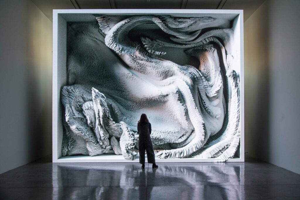
A real-world example of emotionally responsive technology includes “The Alchemist’s Garden in Prague“, where AI analyzes participants’ emotional states and adjusts the music and visual patterns accordingly. IBM’s Mood Mixer, used in collaboration with the Grammys, also offers a similar experience, where users’ responses help generate a personalized music playlist with visuals designed to match their emotional profile. Refik Anadol’s art installations, such as “Melting Memories,” utilize biometric data to generate dynamic, mesmerizing visual patterns synchronized with ambient soundscapes, further demonstrating the power of AI in creating emotionally responsive art.

Refik Anadol’s art installation “Melting Memories,”

ENHANCEMENTS TO CONSIDER

To enhance the emotional depth of these exhibitions, designers can incorporate immersive technologies like 360-degree projection mapping, spatial audio, or virtual reality (VR). These tools fully envelop the visitor in a multi-sensory environment, heightening emotional engagement. Additionally, exhibitions can serve an educational purpose by showing how music and visuals work together to influence emotion. Visitors might see how specific changes in tempo or key can alter the tone of an environment, or how visual elements like lighting or color shift alongside the emotional trajectory of the music. For a broader impact, cross-cultural elements can also be integrated, showcasing how different cultures use music and visuals to evoke emotions, allowing visitors to explore diverse emotional languages and experiences. Combining these enhancements with sound and visual integration can transform any exhibition into a deeply personal and emotionally engaging journey for each visitor.

3.Integrating Music, Visuals, and Emotional Triggers

Music and visuals have immense power to evoke emotions and immerse participants in interactive experiences. By combining the insights from Chapter 1 of This Is Your Brain on Music with design principles, we can create emotionally engaging designs. Below is a framework for how music, visuals, and interactivity can work together, with examples and practical applications.

EMOTIONAL TRIGGERS AND THEIR INTERACTIVE USES

1. Pattern Recognition and Expectation

An interactive design application could incorporate dynamic lighting that reacts to musical patterns, such as intensifying lights during a crescendo and dimming or shifting colors during resolution. To encourage participation, users could control musical sequences through touch panels or motion sensors, creating harmonious results that satisfy their pattern-seeking instincts and evoke joy. For example, a touch-sensitive wall could allow participants to tap and create melodies, triggering synchronized visual effects like ripples or sparks that align with melodic expectations.

2. Tension and Release

Emotional arcs in music, such as the buildup and resolution of tension, mirror life experiences, making them deeply relatable. Designers can enhance these arcs by pairing music with immersive visuals that reflect emotional shifts. For instance, tense musical passages could be accompanied by jagged, dark visuals, which then transform into soft, flowing imagery as the music resolves. Interactive exhibits can further engage participants by giving them control over tension and release, such as pressing a button to trigger a visual explosion synced with a musical climax. An example could be a VR experience where users navigate an environment that becomes brighter and more colorful as the music resolves, evoking feelings of triumph or relief.

3. Visual Analogies (Colors and Shapes)

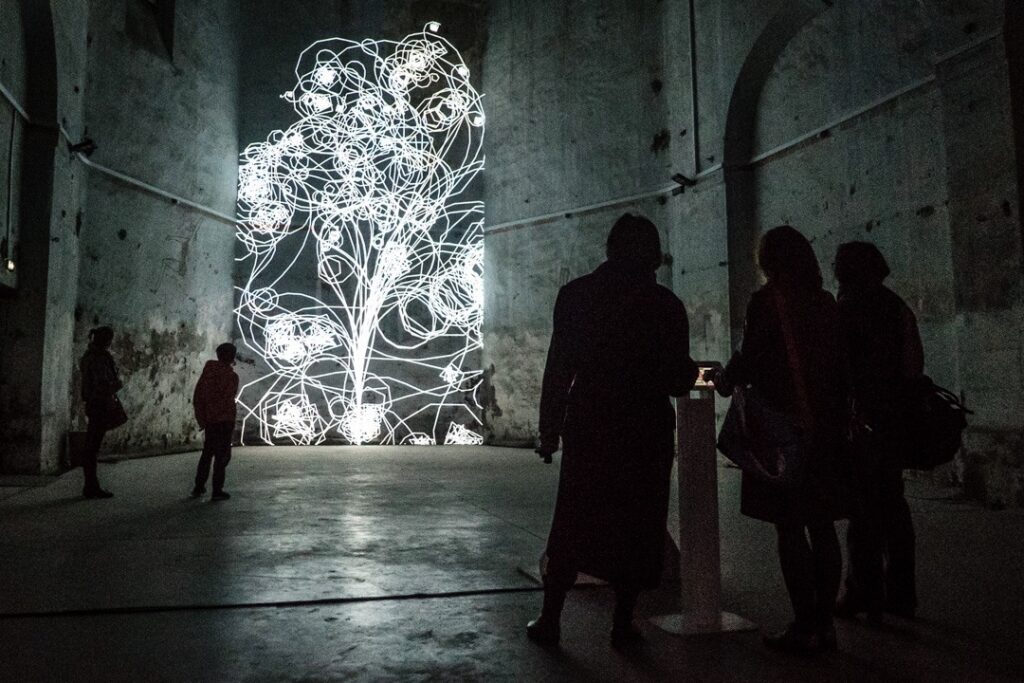
The brain naturally links musical qualities with visuals, such as warm colors for happy music or smooth shapes for calm music. Aligning music with complementary visuals amplifies its emotional impact. Designers can map musical elements to visual stimuli, like using higher pitches to trigger vibrant colors (reds, yellows) and lower pitches to evoke cool tones (blues, purples). Rhythmic changes could influence shapes, with sharp angles for fast tempos and flowing curves for slower ones. Interactive experiences can further engage users by allowing them to mix visual effects or adjust color schemes in sync with musical features, fostering a sense of agency over the emotional tone. For example, an interactive light installation could let participants control both the soundtrack and visuals, where selecting a major key generates bright, colorful imagery, while a minor key creates darker, subdued visuals.

“FLORA” light installation, 2015/2016, Philipp Artus

DESIGN CONSIDERATIONS

Designing for maximum emotional impact in interactive exhibitions requires a seamless integration of sound and visuals, leveraging their ability to evoke and amplify emotions. Synchronizing music with visual transitions ensures an immersive and cohesive experience, while personalization fosters a sense of agency, making the interaction deeply engaging and memorable. By incorporating contrast and surprise, designers can mimic music’s tension-and-release mechanism to create emotional highs and lows. Finally, considering cultural contexts ensures the experience resonates universally, honoring diverse interpretations of sound and imagery. Together, these principles can transform exhibitions into powerful, multisensory journeys that connect deeply with audiences.

2. What is Music?

In the opening chapter of This Is Your Brain on Music, Daniel J. Levitin lays the foundation for understanding music as a structured collection of sounds that appeal to our brain’s innate ability to recognize patterns. He breaks down the core components of music-pitch (how high or low a note is), rhythm (the timing of sounds), and harmony (how different notes work together)-and explores their role in eliciting emotional responses.

HOW MUSIC TRIGGERS EMOTIONS IN OUT BRAIN

Levitin emphasizes that music’s emotional power lies in its ability to play with our brain’s expectations. Our brains are wired to predict patterns in sensory information, and music leverages this predictive mechanism to create moments of satisfaction, surprise, or tension. The brain processes music through several interconnected systems:

Pattern Recognition: The auditory cortex is responsible for identifying musical patterns. When a melody resolves in a way our brain predicts, it brings feelings of comfort or pleasure. Conversely, when a pattern is disrupted bye a surprising chord or rhythm, it can evoke excitement, curiosity, or even anxiety.
Tension and Release: Music creates emotional arcs by building tension and then resolving it. For example, a suspended chord creates a sense of unease that resolves when it transitions to the expected harmonic endpoint. This mirrors emotional experiences in life, such as anticipating and resolving conflict, which makes the emotional impact of music relatable.
Dynamic Contrasts: Changes in loudness and tempo can influence the intensity of emotional responses. A gradual crescendo builds excitement and anticipation, while a sudden decrescendo might evoke calmness or introspection.
Cultural and Personal Context: Our emotional reaction to music is shaped by prior experiences and cultural conditioning. For instance, certain scales (like the major scale) are culturally associated with happiness, while others (like the minor scale) are linked to sadness.

EXAMPLES OF EMOTIONAL TRIGGERS

Pitch and Emotion: High-pitched melodies are often perceived as bright or happy, while low-pitched tones convey seriousness or sadness. For instance, a slow cello piece in a minor key might evoke the image of a dark, moody landscape, resonating with feelings of sadness or introspection.
Rhythm and Excitement: Fast, syncopated rhythms (like those in dance music) stimulate the brain’s motor areas, often triggering excitement and a physical urge to move.
Timbre and Texture: The unique “color” of an instrument’s sound can evoke specific associations. For instance, the sharp, brassy timbre of a trumpet might evoke energy or heroism, while the soft timbre of a flute might suggest tranquility or nostalgia.

INSIGHTS

Levitin’s analysis of music in Chapter 1 reveals that the emotions triggered by music stem from the brain’s inherent drive to find order, combined with the sensory and cultural associations we attribute to sound. The visual and color analogies he uses underscore the multi-sensory nature of our emotional experiences with music, showing how sound transcends auditory processing to evoke vivid, almost tangible feelings and images.

#10 Using A/B Testing to Measure Awareness and Behavior Changes Around Digital Footprints

How do we encourage individuals to adopt more sustainable digital habits? One way to find out is by testing the effectiveness of tools designed to raise awareness. A/B testing is a proven method for evaluating whether such tools—like an app to track your digital footprint—can lead to meaningful behavior changes.

In this blog post, I’ll explain the basics of A/B testing, how I plan to use it to test a digital footprint tracker, and share examples of similar research that demonstrate the power of controlled experiments in behavioral studies.

What is A/B Testing?

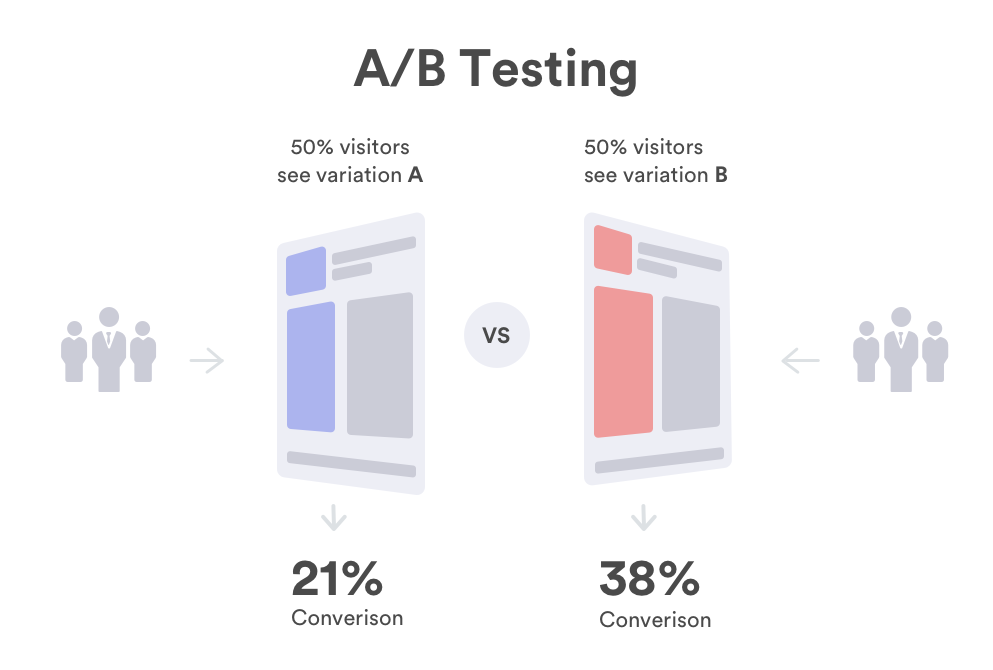
A/B testing is a method of comparing two groups to evaluate the impact of a specific variable. Group A receives the intervention or tool being tested (in this case, the digital footprint tracker), while Group B serves as a control and does not receive it. After a predetermined period, the behaviors, attitudes, or results of the two groups are compared to assess the tool’s effectiveness.

For example, in the context of my proposed app, Group A would use the app to monitor their digital footprint for a set period (e.g., one week or one month). Group B would continue with their regular digital habits without any additional awareness tools.

The Hypothesis

The hypothesis driving this test could be:
“Users who track their digital footprint through the app will demonstrate greater awareness of their digital energy consumption and reduce unnecessary usage compared to users who do not have access to the tracker.”

Designing the A/B Test

  1. Recruiting Participants
    A diverse group of participants would ensure a representative sample. Ideally, this would include individuals with varying levels of digital usage and environmental awareness.
  2. Intervention (Group A)
    Group A would be introduced to the app, which would allow them to track activities like time spent on social media, streaming, cloud storage usage, and the corresponding carbon emissions. The app could also provide tips for reducing their footprint.
  3. Control (Group B)
    Group B would not use the app and would continue with their regular habits.
  4. Metrics to Measure
    Metrics could include:
    • Average time spent on digital activities (e.g., social media, streaming).
    • Volume of data stored or transferred (e.g., cloud usage).
    • Self-reported awareness of their digital energy impact (via surveys).
  5. Analysis
    After the testing period, compare the two groups’ behaviors. Did Group A reduce their digital energy consumption more than Group B? Did awareness levels increase? The results would indicate whether the app was effective in driving behavioral change.

Examples of Similar Research

Several studies and experiments have demonstrated the value of A/B testing in behavioral science:

Energy Usage Feedback
A widely cited study by Allcott and Rogers (2014) measured the impact of providing households with real-time feedback about their energy consumption. Households that received feedback via an energy-monitoring device reduced their electricity usage by 2-4% compared to the control group.

The Short-Run and Long-Run Effects of Behavioral Interventions: Experimental Evidence from Energy Conservation

Health and Fitness Trackers
Research on fitness trackers shows that users who monitor their steps and activity levels are more likely to engage in physical exercise than those who do not use tracker. This aligns with the principle that awareness can lead to behavior change.

Digital Well-Being Studies
In a study focused on reducing screen time, researchers tested the effects of apps designed to monitor phone usage. Participants who received weekly reports about their screen time reduced their usage by 20% compared to those who did not receive feedback.

Challenges to Consider

While A/B testing is highly effective, it’s important to consider potential challenges:

  • Sample Bias: Participants may alter their behavior simply because they know they’re being observed (the Hawthorne effect).
  • Consistency: Ensuring that both groups adhere to the test conditions is crucial for accurate results.
  • Long-Term Impact: Measuring behavior change over a longer period (beyond one week or one month) may require additional follow-ups.

Using A/B Testing to Inspire Awareness

The results of this test could inform the design and functionality of the digital footprint tracker. For instance:

  • If Group A reduces their cloud usage, the app could highlight the most impactful actions users can take.
  • If awareness alone is insufficient, the app could incorporate behavioral nudges, such as gamification or rewards for sustainable habits.

Ultimately, the findings could shape not just this app but broader efforts to raise awareness about the environmental impact of digital activities.

Conclusion

A/B testing provides a scientific and measurable way to evaluate whether tools like a digital footprint tracker can drive awareness and behavior change. By comparing the actions of two groups, we can gain valuable insights into what motivates people to adopt more sustainable habits—and how design can play a role in fostering awareness.

Resources:

https://vwo.com/ab-testing

The Short-Run and Long-Run Effects of Behavioral Interventions: Experimental Evidence from Energy Conservation

https://publications.jrc.ec.europa.eu/repository/bitstream/JRC133518/JRC133518_01.pdf?utm_source

(PDF) Effectiveness of behavioural interventions to reduce household energy demand: A scoping review

#09 Personal Motivation: Reflecting on My Own Digital Footprint

We live in a hyperconnected world, but how often do we pause to consider the environmental cost of our digital habits? Personally, I rarely did—until now. This blog post is an honest reflection on my digital footprint and how learning about it has motivated me to take small but meaningful steps toward sustainability.

My Digital Habits

I’m no different from most people. I spend around 43 minutes a day on Instagram, stream Netflix at the end of a long day, and rely on cloud storage to back up my files. These seem like harmless activities, but when I started exploring their environmental impact, I was stunned. For example, I currently pay for 200 GB of iCloud storage, and it’s completely full. I hadn’t thought much about the energy required to maintain this space, but storing data in the cloud isn’t as “weightless” as it seems. Data centers that power services like iCloud are massive energy consumers and a significant source of carbon emissions.

The Digital Footprint of My iCloud Storage

The Medium article, “Carbon and the Cloud”, sheds light on just how energy-intensive cloud storage is. Data centers around the globe account for about 1% of global electricity use and emit as much CO2 annually as the entire aviation industry. Even as these centers become more energy-efficient, the sheer growth in digital activity means their emissions are still rising.

For my 200 GB iCloud plan, storing data in the cloud generates approximately 40 kg of CO2 per year—similar to the emissions from driving a small car 160 km. What’s troubling is that much of this storage is filled with old photos, unused documents, and duplicate files—data I don’t even need but continue to store indefinitely.

This is a reminder of the broader challenge: While cloud storage feels infinite and invisible, it relies on physical infrastructure that consumes vast amounts of electricity, much of which is still generated by fossil fuels.

Calculating My Total Digital Footprint

To better understand the impact of my digital habits, I did some rough calculations:

Instagram: Spending 43 minutes a day creates 0.84 kg of CO2 per week or over 43 kg per year.

iCloud Storage: My 200 GB plan adds another 40 kg of CO2 annually.

Streaming: Watching an hour of Netflix in HD produces roughly 0.4 kg of CO2 , so even two hours a week adds up.

Altogether, my digital habits contribute to over 100+ kg of CO2 annually, the equivalent of flying from London to Paris or powering an average home for a month.

The Emotional Toll of Digital Overload

Beyond the environmental cost, I’ve realized how mentally exhausting my digital clutter can be. My iCloud is filled with thousands of old photos and files I’ll likely never look at again, yet I’ve been reluctant to declutter. Combined with constant notifications and endless scrolling on social media, it’s no wonder I often feel overwhelmed.

Action Steps

Learning about the hidden costs of my digital habits could be a motivation to make some changes:

  1. Decluttering iCloud: Going through old photos, deleting duplicates, and archiving only the essentials.
  2. Reducing Social Media Time: Cutting my Instagram usage to 20 minutes a day has halved its carbon footprint.
  3. Researching Sustainable Practices
  4. Exploring Alternatives: Services like Backblaze offer energy-efficient cloud storage options for those conscious of their footprint.


This journey isn’t about guilt—it’s about awareness. By reflecting on my habits and their environmental impact, I’ve become more intentional about how I use digital spaces. Whether it’s decluttering my iCloud or reducing Instagram time, small actions can add up to meaningful change.

Resources:
https://medium.com/stanford-magazine/carbon-and-the-cloud-d6f481b79dfe

https://greenspector.com/en/6168-2/

#08 How to Show the Problem via Visual Storytelling?

The energy footprint of digital spaces is an abstract problem, but visual storytelling can bring it to life. From infographics to videos, effective visuals can simplify complex data and create an emotional connection to the issue.

What is Visual Storytelling?
Visual storytelling combines imagery, graphics, and narratives to simplify complex topics and evoke emotions. It’s not just about presenting numbers; it’s about making those numbers resonate with people.

What Makes Visual Storytelling Effective?

Simplifying Complex Data
Raw statistics about digital energy consumption can be overwhelming. A well-designed infographic can make this information digestible. For instance, breaking down how a single email with an attachment generates roughly 4 grams of CO2 helps people visualize their daily impact.

Evoking Emotional Connections
Imagery plays a crucial role in storytelling. For example, showing a visual of a large, smoke-belching power plant labeled “This Powers the Cloud” can create a strong association between digital habits and their real-world environmental consequences.

Encouraging Interactivity
Interactive tools can be even more impactful. Platforms like Carbon Footprint Calculator or Our World in Data allow users to input their habits, such as hours spent streaming or browsing, and see the resulting carbon emissions.

https://www.infographicdesignteam.com/blog/trends-and-principles-of-visual-storytelling/

Examples of Visual Storytelling

Before/After Comparisons: Visualizing the reduction in energy usage when switching to eco-friendly digital practices.

Flowcharts: Illustrate the lifecycle of data in the cloud.

Interactive Tools: Websites like CarbonCalculator.org allow users to input their digital habits to see their energy impact.

Connecting Storytelling with Awareness and Design

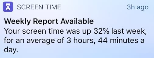
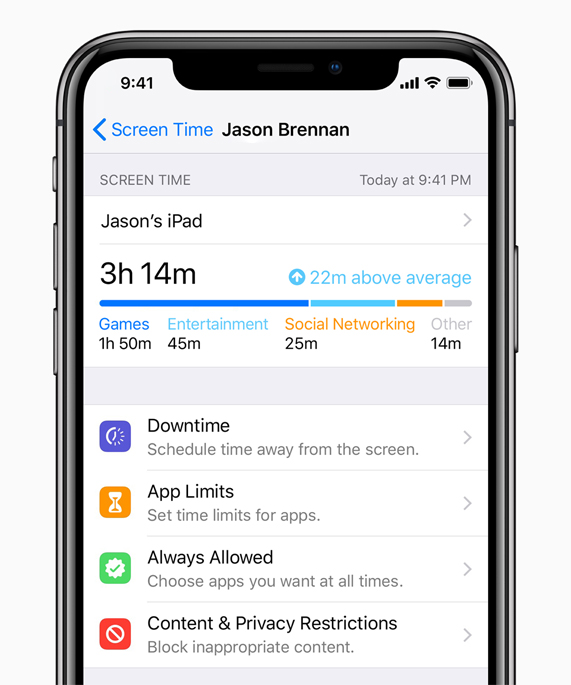
Visual storytelling doesn’t just highlight problems—it can also inspire solutions. For instance, designing an application that tracks your digital footprint could combine awareness with interactivity. Users could log their time spent on apps like Instagram or Netflix and instantly see their weekly, monthly, or yearly CO2 emissions. Features like tips to reduce energy use, rewards for sustainable actions, or comparisons with others could gamify the process and motivate change.

Such a tool would serve as both a personal accountability tracker and an educational platform, encouraging more people to adopt sustainable digital practices. Designers could even integrate AR or VR elements to show users a visual representation of their digital footprint, making the issue impossible to ignore.

Why Visual Storytelling Works

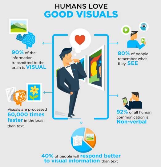
The human brain processes visuals 60,000 times faster than text, making them far more engaging. Combined with the emotional pull of good design, visual storytelling has the potential to spark widespread awareness and inspire behavioral changes.

Conclusion
The invisible nature of the digital energy footprint makes it a challenging issue to address. However, visual storytelling has the unique ability to simplify the complex, evoke emotions, and encourage action. By combining data with creativity, we can bring this hidden problem into the spotlight and empower individuals to make more sustainable choices.

Resources:

10 Trends and Principles of Visual Storytelling That Every Designer Must Follow