The energy footprint of digital spaces is an abstract problem, but visual storytelling can bring it to life. From infographics to videos, effective visuals can simplify complex data and create an emotional connection to the issue.
What is Visual Storytelling?
Visual storytelling combines imagery, graphics, and narratives to simplify complex topics and evoke emotions. It’s not just about presenting numbers; it’s about making those numbers resonate with people.
What Makes Visual Storytelling Effective?
Simplifying Complex Data
Raw statistics about digital energy consumption can be overwhelming. A well-designed infographic can make this information digestible. For instance, breaking down how a single email with an attachment generates roughly 4 grams of CO2 helps people visualize their daily impact.
Evoking Emotional Connections
Imagery plays a crucial role in storytelling. For example, showing a visual of a large, smoke-belching power plant labeled “This Powers the Cloud” can create a strong association between digital habits and their real-world environmental consequences.
Encouraging Interactivity
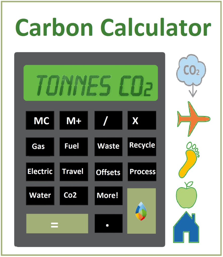
Interactive tools can be even more impactful. Platforms like Carbon Footprint Calculator or Our World in Data allow users to input their habits, such as hours spent streaming or browsing, and see the resulting carbon emissions.
https://www.infographicdesignteam.com/blog/trends-and-principles-of-visual-storytelling/
Examples of Visual Storytelling
Before/After Comparisons: Visualizing the reduction in energy usage when switching to eco-friendly digital practices.

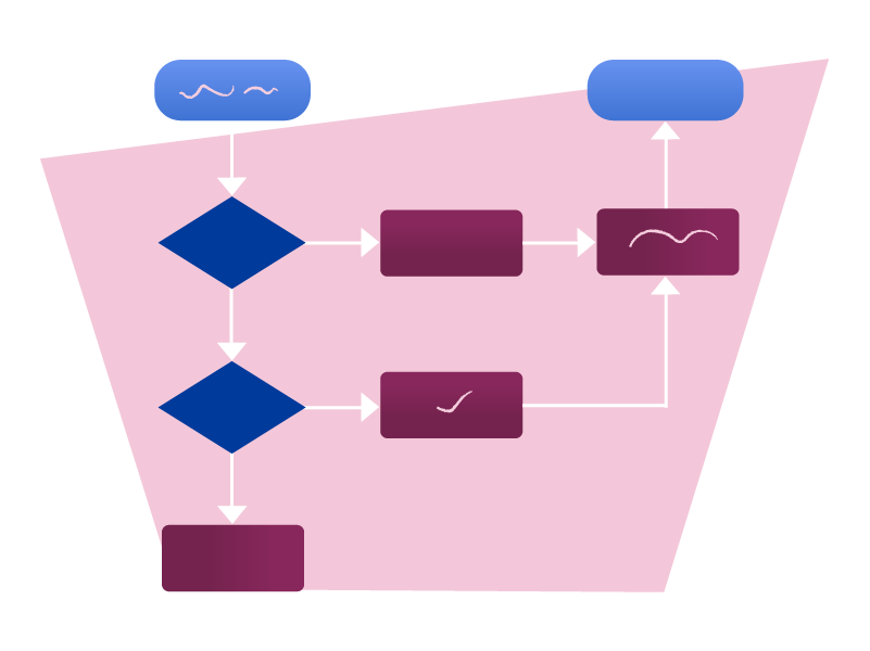
Flowcharts: Illustrate the lifecycle of data in the cloud.
Interactive Tools: Websites like CarbonCalculator.org allow users to input their digital habits to see their energy impact.
Connecting Storytelling with Awareness and Design
Visual storytelling doesn’t just highlight problems—it can also inspire solutions. For instance, designing an application that tracks your digital footprint could combine awareness with interactivity. Users could log their time spent on apps like Instagram or Netflix and instantly see their weekly, monthly, or yearly CO2 emissions. Features like tips to reduce energy use, rewards for sustainable actions, or comparisons with others could gamify the process and motivate change.
Such a tool would serve as both a personal accountability tracker and an educational platform, encouraging more people to adopt sustainable digital practices. Designers could even integrate AR or VR elements to show users a visual representation of their digital footprint, making the issue impossible to ignore.
Why Visual Storytelling Works
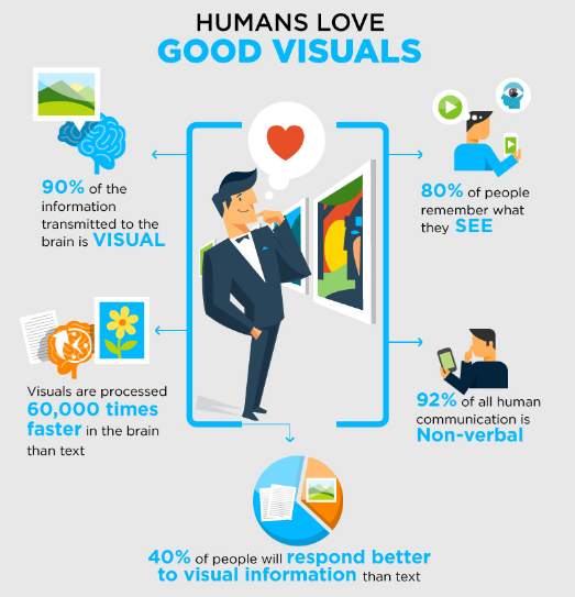
The human brain processes visuals 60,000 times faster than text, making them far more engaging. Combined with the emotional pull of good design, visual storytelling has the potential to spark widespread awareness and inspire behavioral changes.
Conclusion
The invisible nature of the digital energy footprint makes it a challenging issue to address. However, visual storytelling has the unique ability to simplify the complex, evoke emotions, and encourage action. By combining data with creativity, we can bring this hidden problem into the spotlight and empower individuals to make more sustainable choices.
Resources:
10 Trends and Principles of Visual Storytelling That Every Designer Must Follow