IMPULSE #5 – Escape Room

In my first four blog posts, I was still experimenting and trying out different directions for my thesis topic. I deliberately explored a wide range of activities and formats, not because I was unsure of what I liked, but because I wanted to understand what could meaningfully connect to my field of Interaction Design. Instead of committing too early, I tested ideas, interests, and approaches to see where a consistent theme might emerge.

In December, I finally made a decision about my thesis topic. I realized that many of the things I had been drawn to: books, talks, presentations, videos, and digital experiences, had one thing in common: strong storytelling. This led me to focus on Narrative UX & Interactive Web Storytelling. Looking back, the connection seems obvious, but it took time to translate a general interest in stories into a concrete design-related research direction.

During the Christmas break, I visited an escape room with friends and unexpectedly found a clear connection to this topic.

The Event

The escape room was called Top Secret. The scenario was introduced with the following description:

“You are locked inside a high-security military facility with the mission to steal the plans for a revolutionary weapon. Every step you take is monitored by advanced systems and security traps, so you must act quietly, swiftly, and with precision. Only the best spies can successfully complete this deadly mission and escape without a trace.”

The room had a difficulty rating of 10/10. We had one hour to complete the mission and managed to escape in the very last minute. The puzzles were demanding and required close attention, logical thinking, and collaboration. What stood out to me was not only the complexity of the tasks, but the way every clue, object, and interaction was integrated into the narrative setting.

Escape Rooms as a Form of Storytelling

Escape rooms rely on storytelling in a specific way. Unlike films or books, they do not present a linear narrative. Instead, participants experience the story through interaction with space, objects, and systems. The narrative is gradually revealed through actions rather than explanations.

While playing, I began to see parallels to Interaction Design. The escape room functioned like an interactive system in which users navigate a designed experience. Storytelling was embedded in spatial design, visual cues, sound, and physical interfaces. Each interaction revealed a fragment of the story, similar to how users explore and interpret content in interactive digital environments.

From this perspective, escape rooms can be understood as physical examples of Narrative UX. They demonstrate how narratives can be structured through interaction rather than through traditional storytelling formats.

Why This Was an Impulse for My Research

This experience helped me reconsider how storytelling operates within design. It showed that narratives can emerge from interaction, structure, and user decisions, not only from text or visuals.

For my thesis, this impulse is relevant because it highlights how storytelling principles function across different media. It encourages me to examine how narrative strategies in physical interactive spaces can inform the design of interactive web experiences. Instead of treating storytelling as an additional layer, I now see it as an integral part of interaction design.

The escape room therefore became more than just a leisure activity. It provided a concrete example of how narrative and interaction intersect, which directly relates to my research focus on narrative UX and interactive web storytelling.

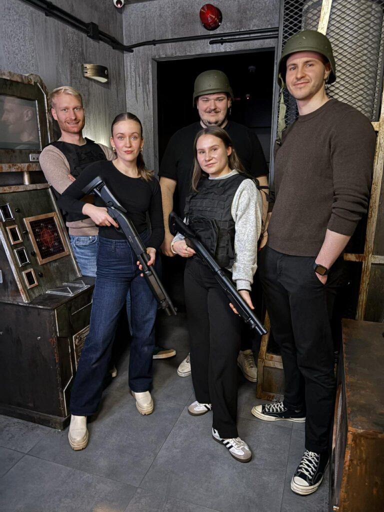
And a cringe photo as a proof that I was there:
Stuff Worth Clicking A.K.A. Accompanying Links

Disclaimer: This blog post was written with the help of AI for better grammar and correct spelling.
#6 Das Gegenteil von Tiefenschärfe

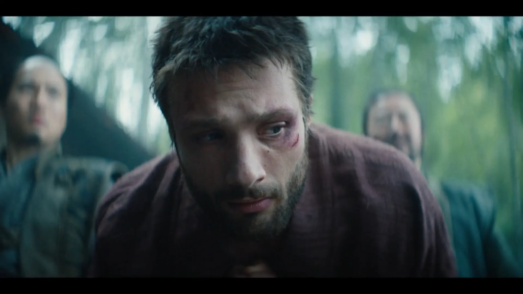
Aktuelle High-End-TV-Produktionen wie Shōgun, The Bear oder The Last of Us markieren einen signifikanten Paradigmenwechsel in der visuellen Gestaltung: Die Abkehr vom „Deep Focus“ hin zu einer extrem geringen Schärfentiefe (Shallow Depth of Field). Basierend auf aktuellen technischen Analysen von IndieWire und The Ringer untersucht dieser Beitrag die technologischen Kausalitäten (Großformatsensoren) und die medienpsychologischen Funktionen (subjektive Wahrnehmung) dieses Trends.

1. Fallstudie: Optische Verzerrung als narratives Mittel in Shōgun

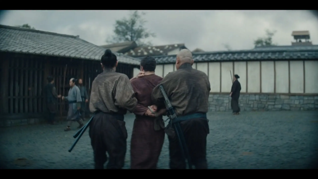
Wie The Ringer in seiner Analyse der FX-Serie Shōgun darlegt, ist die visuelle Unschärfe kein bloßes Stilmittel, sondern erfüllt eine spezifische narrative Funktion. Die Serie nutzt anamorphotische Objektive (spezifisch: Hawk V-Lite and class-X) in Kombination mit digitalen Sensoren (Sony Venice), um bewusst optische Fehler zu erzeugen.

Normalerweise gelten Randunschärfen und Verzerrungen als technische Mängel. In Shōgun jedoch wird die sogenannte geometrische Aberration und das „Swirly Bokeh“ (der strudelförmige Unschärfebereich) semantisch aufgeladen. Sie visualisieren den psychologischen Zustand des Protagonisten John Blackthorne. Die optische Desorientierung korreliert mit seiner kulturellen Desorientierung im feudalen Japan. Das Bild wird klaustrophobisch; die Ränder der Wahrnehmung verschwimmen buchstäblich, was den Zuschauer zwingt, den Fokus exklusiv auf das Zentrum des Geschehens zu richten. Dadurch wird natürlich auch das Center-Framing zu einem wichtigen Teil der Bildgestaltung.

2. Die Physik des „Large Format“: Warum der Hintergrund verschwindet

Der Trend zur Unschärfe ist nicht rein ästhetisch motiviert, sondern technisch determiniert durch den Industriewechsel zu Großformatsensoren (Large Format / Full Frame), wie sie in den Emmy-nominierten Produktionen dominieren.

Der physikalische Zusammenhang lässt sich wie folgt beschreiben:

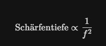
Um auf einem größeren Sensor denselben Bildwinkel (Field of View) zu erhalten wie auf einem herkömmlichen Super-35mm-Sensor, muss die Brennweite (f) des Objektivs verlängert werden. Es gilt das optische Prinzip:

Das bedeutet: Eine Vergrößerung der Brennweite führt – bei gleichbleibender Blende und Distanz – zu einer exponentiellen Abnahme der Schärfentiefe.

Filmemacher sind durch die Nutzung moderner Kameras wie der ARRI Alexa LF oder Sony Venice physikalisch dazu gezwungen, mit unschärferen Hintergründen zu arbeiten, sofern sie nicht extrem stark abblenden (was wiederum mehr Licht erfordert). Die „Kinematographie der Unschärfe“ ist somit eine direkte Konsequenz der Sensor-Evolution.

3. Die „Re-Analogisierung“ des digitalen Bildes

Ein weiterer Aspekt, den IndieWire beleuchtet, ist die Gegenbewegung zur digitalen Perfektion. Moderne 4K- und 8K-Kameras liefern ein klinisch reines Bild, das oft als „steril“ oder „videospielartig“ (Hyperrealismus) empfunden wird.

Um diese digitale Härte zu brechen, nutzen Kameraleute (DoPs) das Verfahren des „Detuning“. Dabei werden moderne Objektive modifiziert oder Vintage-Gläser verwendet, um:

  • Chromatische Aberrationen (Farbsäume)
  • Vignettierung (Randabdunklung)
  • Sphärische Aberrationen (Weichzeichnung)

wieder einzuführen. Diese Artefakte verleihen dem Bild eine „organische“ Textur. Oft wird auch ein Höherer ISO Wert benutzt um mehr Details in then Highlights des Bildes zu behalten und den digitalen “Grain” zu verstärken.

Die Entscheidung solch einen Look für eine TV Serie zu benutzen verstehen nicht alle die SHOGUN gesehen haben. Die Serie erntete viel Kritik für ihr Aussehen. Darcy Touhey, director, producer, und camera assistant der als Film Loader bei Shogun gearbeitet hat, versichert, dass alles an diesem Look beabsichtigt war. 12-14 Monitore am Set zeigten genau das Bild, das die Zuschauer jetzt sehen. Außerdem fügte er hinzu:
“people are focused on the lenses way too much when considering the cinematography of [Shogun]. The cinematography shines in this show because of the intense commitment from every department towards realism and authenticity. The sets, both studio and location, were unbelievable. The attention to detail was astounding. … A good show looks good because of every aspect of production.”

Fazit

Die aktuelle Dominanz der geringen Schärfentiefe ist das Resultat einer Konvergenz aus technologischer Notwendigkeit (Large Format Sensoren) und narrativer Strategie (Fokus auf subjektive Psychologie). Filme und Serien bilden nicht mehr eine objektive Realität ab (wie im Deep Focus des klassischen Hollywood-Kinos), sondern simulieren eine selektive, oft fragmentierte Wahrnehmung, die stark mit Themen wie Isolation und individueller Überforderung in der modernen Gesellschaft resonieren kann.

Im Falle der Serie SHOGUN: Die anfänglich starke visuelle Verzerrung (durch die Linsenwahl) nimmt im Verlauf der Serie bewusst ab. Dies folgt einer klaren narrativen Logik: Die visuelle „Grammatik“ spiegelt die Entwicklung des Protagonisten Blackthorne wider. Während zu Beginn seine Desorientierung durch optische Effekte visualisiert wurde, klärt sich die Bildsprache in späteren Folgen, sobald er die Sprache lernt und die Kultur besser versteht. Obwohl die technische Ausrüstung (Kameras und anamorphotische Objektive) über die gesamte Staffel identisch blieb, wurde der Grad der Verfremdung reduziert, um diese Anpassung darzustellen. Alles daran war eine aktive und bewusste Entscheidung um den Zuschauer das Gefühl der Story weiterzugeben.

Im Endeffekt ist es eine Entscheidung die vor der Produktion des Films getroffen wird. Alles hängt davon ab was der Story helfen wird. Jede Entscheidung sollte bewusst sein und darauf hinauslaufen den Film immersiver und glaubwürdiger zu gestalten. Außer das Ziel ist genau das Gegenteil davon.

Surrey, M. (2024, April 8). Why does ‘Shōgun’ look like that? The Ringer. https://www.theringer.com/2024/04/08/tv/shogun-cinematography-tv-background-blur-anamorphic-lens-effect

O’Falt, C. (2020, August 13). Emmy Cinematography Survey: The Cameras and Lenses of the Nominees. IndieWire. https://www.indiewire.com/features/general/emmy-cinematography-cameras-lenses-best-tv-1234581022/

Impulse #5 Exploring Digital Activism Through Visual Intervention

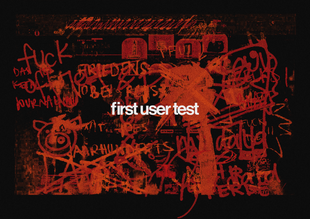
As part of my research for my thesis, I conducted an initial exploratory study to better understand how people express emotions, critique, and resistance through visual intervention. The broader context of my thesis focuses on digital activism as a form of action rather than communication, and on how individuals appropriate digital interfaces as cultural spaces.

For this first study, I worked with four participants. Instead of using interactive prototypes or digital tools, I chose a deliberately simple and low-tech approach. I selected a range of websites and printed them on paper. These included websites that are often considered controversial by the general public, as well as neutral corporate websites and generic online stores. Each participant received one printed website.

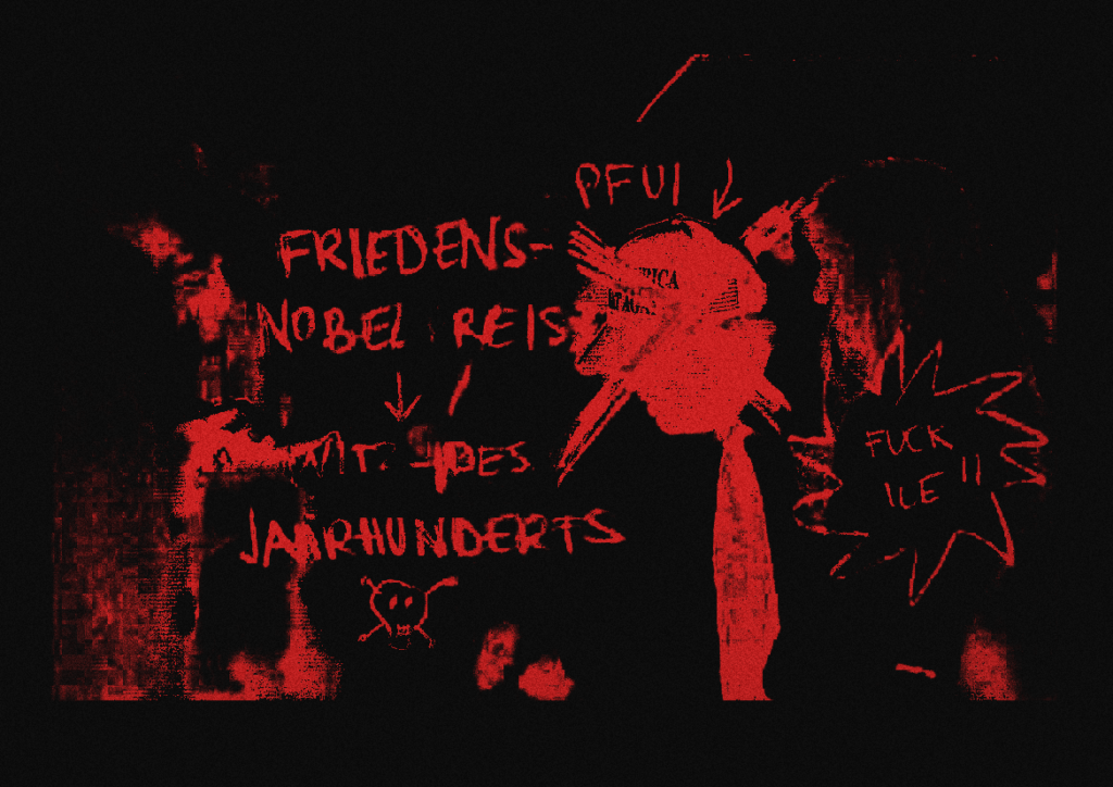
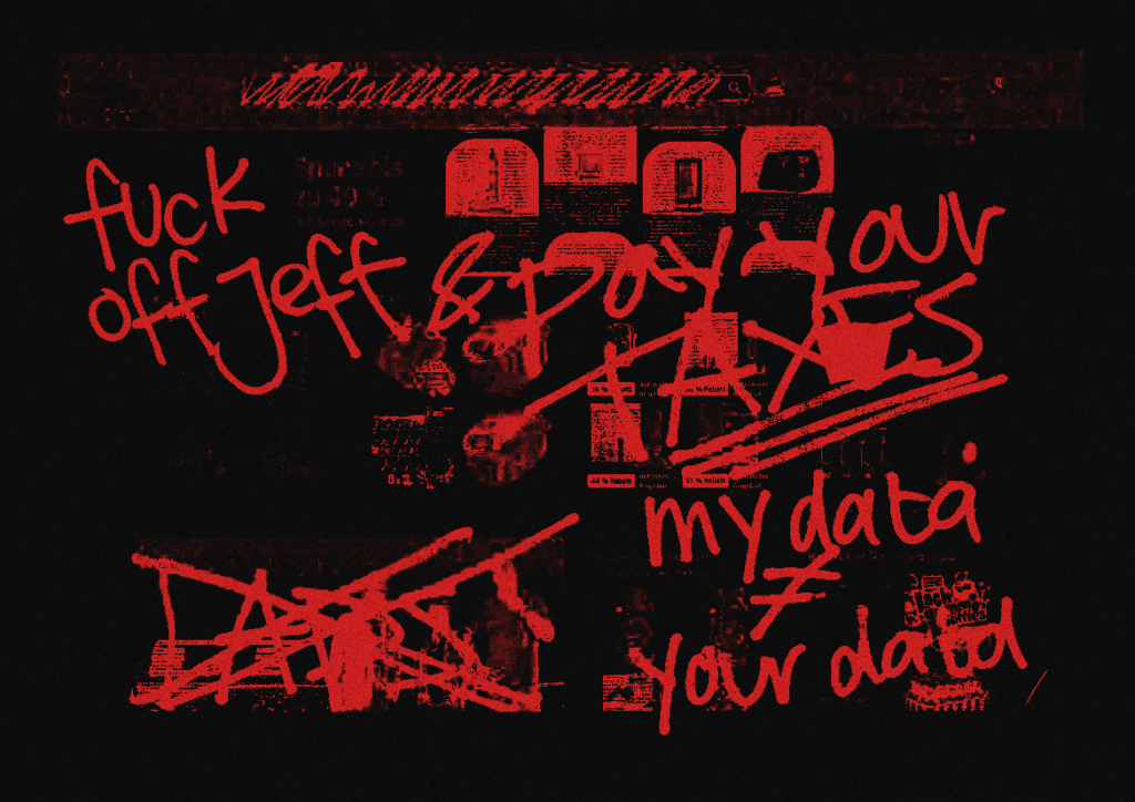
The task was intentionally open-ended. Participants were asked to draw, write, mark, or alter the printed website in any way they wanted. The only instruction given was to express their thoughts and emotions freely and to react honestly to what they saw. There was no specific goal, no design task, and no expectation to improve the interface. Participants were not given a time limit and could stop whenever they felt finished.

To avoid influencing the process, I left the room during the exercise. This decision was made consciously, as I wanted the intervention to feel private and unobserved. The absence of the researcher reduced performance pressure and allowed participants to treat the activity as an emotional outlet rather than a test situation. In this way, the act of drawing or marking became closer to a spontaneous reaction than a designed response.

The results of this study are a collection of visual artefacts. Participants crossed out elements, added aggressive or ironic comments, highlighted specific interface components, exaggerated logos, or covered parts of the page entirely. Some interventions were chaotic and emotional, while others were more precise and symbolic. Despite the small number of participants, clear patterns began to emerge. Many participants focused on branding elements, headlines, or images rather than functional components such as navigation or buttons. This suggests that emotional reactions are often directed toward symbolic aspects of an interface rather than its usability.

It is important to note that this study was not intended to evaluate usability, efficiency, or user satisfaction. Instead, it functions as an exploratory intervention study. Its purpose was to observe how people visually appropriate interfaces when they are allowed to act freely and without constraints. In this sense, the printed format proved valuable, as it removed technical barriers and enabled direct physical interaction.

This first experiment strongly influenced the direction of my master’s project. It confirmed that visual intervention can act as a form of expression and critique, even without clear messages or explanations. More importantly, it highlighted how interfaces can become sites of emotional and cultural engagement, not just tools for task completion. These insights directly informed the concept of my final artefact, which aims to translate this act of visual intervention into a digital, but equally non-optimized, environment.

LS3 #2 Nevermind this is what I want to do

I will start writing in german from here on since I will probably also write my thesis in german 🙂

Worüber schreibe ich eigentlich – auch wenns im vorherigen Blogpost noch was ganz Anderes war?

In kurz: Reime, die bleiben und warum Wortspiel im Design vielleicht mehr ist als Spielerei?

Reime begleiten uns seit wir sprechen können. In Kinderliedern, Gedichten, Songtexten, Werbeslogans, politischen Parolen, Memes, oder oder oder. Überall tauchen sie auf, bleiben hängen, machen Spaß oder nerven sich hartnäckig ins Gedächtnis. Trotzdem werden Reime im visuellen Kommunikationsdesign oft eher beiläufig eingesetzt (These): intuitive & spontan. Genau hier möchte ich mit meinem Masterarbeitsthema ansetzen.

Warum Reime wirken

Aus der Sprachwissenschaft, Psychologie und Werbeforschung weiß man schon lange und es gibt viele STudien dazu: Gereimte Aussagen werden oft als einprägsamer, leichter verständlich und sogar glaubwürdiger wahrgenommen als nicht-gereimte. Begriffe wie Processing Fluency oder der Rhyme-as-Reason Effect beschreiben, dass unser Gehirn gereimte Sprache schneller verarbeitet und ihr dadurch manchmal mehr Gewicht gibt, als sie objektiv und inhaltlich verdient.

Diese Forschung bezieht sich jedoch meist auf gesprochene Sprache oder reine Texte. Was aber passiert, wenn Reime visuell werden? Wenn sie nicht nur gelesen, sondern gestaltet, gesetzt, skaliert, gerahmt oder gebrochen werden?

Reime im visuellen Kommunikationsdesign

Im Design tauchen Reime natürlich (schon immer) überall auf: auf Plakaten, in Kampagnen, auf Protestschildern, in Social-Media-Posts. Oft sind sie witzig, manchmal provokant, manchmal unangenehm oder sehr plump. Neutrale Reime gibt es selten. Trotzdem gibt es kaum systematische Untersuchungen dazu wie Reime im Zusammenspiel mit Typografie, Layout/ Grid, Hierarchien oder der gewähltenForm wirken.

Mich interessiert besonders diese Schnittstelle: Reime nicht als dekoratives Stilmittel, sondern als sprachliche Struktur, deren Wirkung sich erst durch visuelle Gestaltung entfaltet. Ein Reim in fetter Grotesk auf einem Plakat wirkt anders als derselbe Reim in einer fragilen Serifenschrift, im Hochformat, im öffentlichen Raum oder auf Instagram.

Worum es dann also in meiner Masterarbeit geht

In meiner Masterarbeit möchte ich mich damit beschäftigen, wie Reime und wortspielerische Sprache die Wahrnehmung, emotionale Aktivierung und Erinnerbarkeit visueller Botschaften beeinflussen und das dann im Vergleich zu nicht-gereimter Sprache setzen. Dabei interessiert mich auch, wo die Grenzen liegen: Wann wird ein Reim zu banal? Wann untergräbt er Ernsthaftigkeit und schafft Lächerlichkeit? Und wann kann er komplexe oder schwere Themen vielleicht sogar zugänglicher machen?

Methodisch bin ich noch ganz am Anfang, aber will dann mit einer Mischung aus Theorie, Analyse bestehender Beispiele und eigenen gestalterischen Experimenten arbeiten. Geplant sind unter anderem Reim- und Nicht-Reim-Versionen gleicher Inhalte, die in A/B-Tests verglichen werden mit empirischer Recherche. Wenn es sich zeitlich ausgeht, würde ich auch gerne qualitative Rückmeldungen zu Emotion, Humor, Irritation oder Verständlichkeit bekommen.

Zwischen Humor, Aktivismus und Ernst

Ich hab mich ja in vielen vorherigen Blogposts mit den Thematiken Femisnismus und Protestdesign auseinandergesetzt. Dieser Bereich liegt jetzt zwar nicht mehr so stark im Fokus, ist aber dennoch interessant für meine Recherche.

Reime haben in diesem Bereich natürlich auch eine lange Tradition durch Sprechchören/ chants und Plakate mit Slogans. Sie funktionieren so oft als niedrigschwellige, kollektive Sprache. Gleichzeitig bewegen sie sich oft auf der Grenze zwischen Witz und Ernst, was ich auch sehr interessant finde, wie findet man diese Grenze? können Reime politisch sein, ohne ihre Schärfe zu verlieren? Können sie komplexe Inhalte vermitteln, ohne sie zu verharmlosen? Und wie kann Gestaltung diese Spannung sichtbar machen?

Das Werkstück als Experiment

Was genau am Ende für ein Werkstück bei rumkommt steht noch etwas in den Sternen.  Denkbar sind zum Beispiel eine Poster-Serie, ein Booklet, eine Installation oder ein hybrides, auch analoges Format. Die finale Form soll sich aus den Forschungsergebnissen ergeben bzw eine Art Vergleich finde ich spannend.

IMPLUS 8 – From Concept to Construction

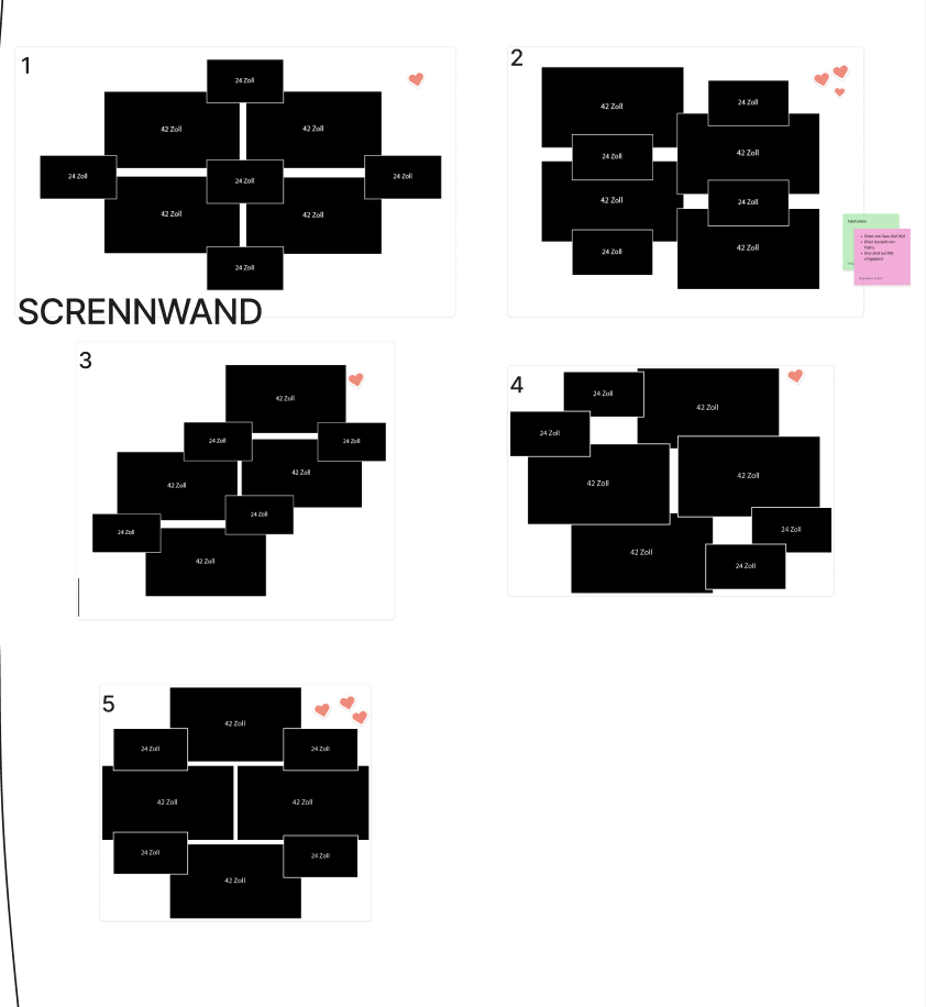
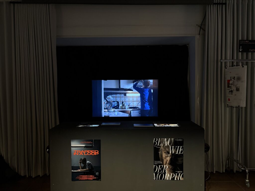
One of the most challenging parts of the Media Design contribution was the planning and realisation of the screen wall. From my perspective, this was also the most demanding task. It wasn’t just about how the screens should be arranged visually, but mainly about how they could be mounted and secured properly. The original plan was to build a screen wall consisting of four 43-inch screens and four 24-inch screens, ideally mounted on a wall. Alongside this, we also had to be very aware of what kind of equipment we needed and make sure to request everything on time from the media center. This required a lot of coordination and forward planning which was sometimes a bit of a struggle for me. Another difficulty was keeping everyone motivated to actively participate in the exhibition. For some people, the importance of the exhibition only really became clear in the final days before the opening, which added extra pressure towards the end.

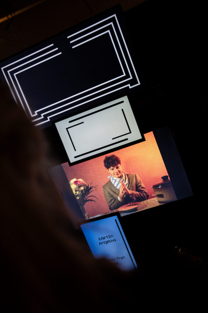
Together with Valerie, I worked closely on the concept of the screen wall. Valerie also had to focuse on the construction and how the screens could physically hold together, while we jointly developed the visual concept. We decided on a very minimal and reduced style: mostly black and white visuals, clean lines, and slow, monotone movements. Since the screen wall showed individual projects, it was important to us that each project was clearly recognizable and properly credited. This also meant adapting animations and adjusting their lengths so they worked well together. At the beginning, it was difficult to find a smooth workflow. Everything still felt abstract, and even the construction of the screen wall was not fully defined yet, after several discussions and changes, we eventually had to scale down the original idea. In the end, the screen wall consisted of eight screens mounted on a truss, which simplified both the technical setup and the animation work at least a bit more. Even so, the animation process took longer than expected, new ideas, technical hurdles, and last-minute changes kept coming up. Surprisingly, one of the hardest parts was actually finding the right screens, as many were already booked through the media center, but to be fair there were 3 different exhbitions happening in the same week. 

Looking back, one important realization was about workflow efficiency. At first, Valerie and I worked on the same screens together, making all decisions jointly. While this ensured consistency, it was also very slow. Once time pressure increased, we split the animations between us and worked independently. This turned out to be much faster and still worked very well visually.

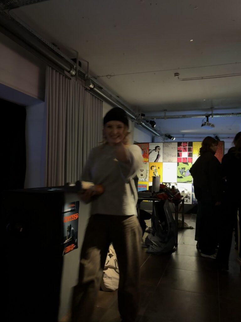
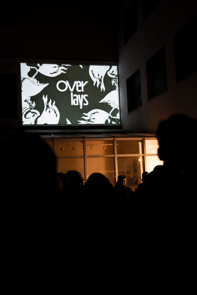
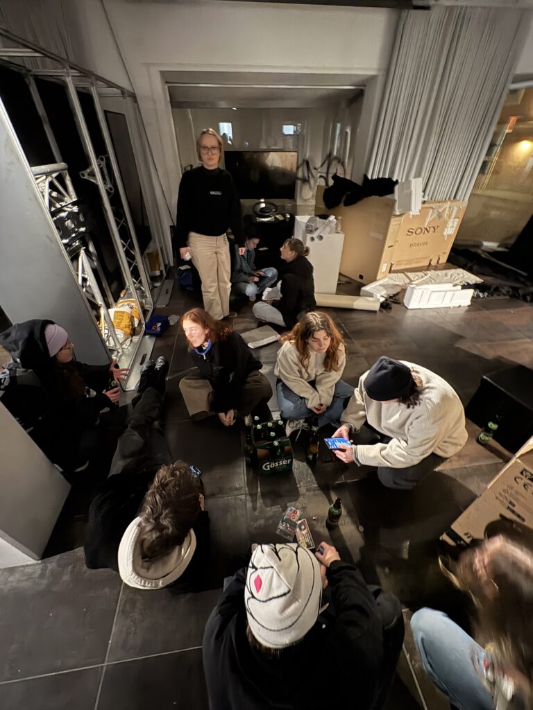
The final setup of the exhibition was successful overall. Of course, some things had to be adjusted on site, and a few minor issues appeared over the following days. Some projects required more active attention to maintain their intended interaction. Still, the overall planning helped a lot and made the setup process smoother and more efficient.The cinema area was another highlight. With the self-built benches, visitors could sit down, watch the short films, and at the same time see behind-the-scenes material. The screen wall also worked well overall, even if there were small delays or mistakes that probably only Valerie and I noticed (lets hope). In the end, this project taught me how time-consuming exhibition planning really is and how much attention to detail is needed to make something feel professional. I am very grateful that I was able to take on a management role together with Magda and contribute to the exhibition in this way. For future exhibitions, I will definitely take away the importance of even earlier planning and requesting equipment as soon as possible.

IMPLUS 7 – Overlays: Coordination & Responsibility

The exhibition Overlays was the first time I was involved in an exhibition not just as a participant, but as one of the main coordinators. Together with Magda, I was one of the major speakers for Media Design, which meant that we were responsible for coordinating everything related to our major. From around December onwards, we regularly met with the other major speakers to discuss what still needed to be done for the exhibition. These meetings included topics like floor planning, budgeting, and deciding what each major wanted to present. At the same time, we also talked a lot within our own major, not only about what we wanted to show, but also how we wanted to show it. For us, it was important that Media Design would not just present simple screens with films, but create something more thought-out and spatial. Alongside the weekly meetings with the other speakers, we also had occasional update meetings with the major leads. These were important to keep everyone informed about our progress and to clarify open questions early enough.

One of my personal challenges during this time was managing everything alongside the short film project. At that point, the short film was very close to my heart, and I was already deeply involved in it. I noticed that balancing both projects was harder than expected and made me reflect a lot on my time management and prioritisation. It was a good reminder that even exciting projects can become stressful if everything happens at once. Working together with Magda was a very positive experience. I felt like we complemented each other well and balanced out responsibilities and levels of engagement. Especially in stressful moments, it helped a lot to not be alone with decisions and tasks. Before the Christmas break, the exhibition still felt very abstract and far away. After the holidays, however, it suddenly became very real. Deadlines got closer, decisions had to be made faster, and naturally, the stress level increased. For Media Design, selecting projects was relatively straightforward, since multiple projects could be shown on shared screens. One of our main focuses was the “cinema” area, where we planned to show two short films. Additional individual projects were displayed on a screen wall, inspired by an exhibition magda had seen in Switzerland. We also included a separate screen for passion projects. Overall, everyone from the major had the opportunity to submit and exhibit work. Looking back, this phase taught me a lot about coordination, communication, and responsibility. Being part of the organisational side of an exhibition showed me how much work happens behind the scenes before anything becomes visible to the audience.

Vorbereitungen: Story Outline

Für meinen Dokudreh Anfang Februar habe ich schon einiges an Ideen und Plänen gesammelt über die letzten Monate hinweg. Was ich jedoch noch nicht gemacht habe, ist mich für eine dieser Ideen zu entscheiden und sie detaillierter auszuführen. Diese Entscheidung habe ich inzwischen endlich getroffen (zumindest vorläufig). In diesem Blogpost will ich grob beschreiben, wie der Ablauf der Doku aussehen soll, in welche thematischen Abschnitte der Film aufgeteilt werden soll und wie sich diese von einander unterscheiden. Außerdem habe ich auch schon angefangen Shot-Ideen für einzelne Szenen zu sammeln und werde eine ausführlichere Liste in einem der nächsten Blog Beiträge erstellen.

Narrative Arc

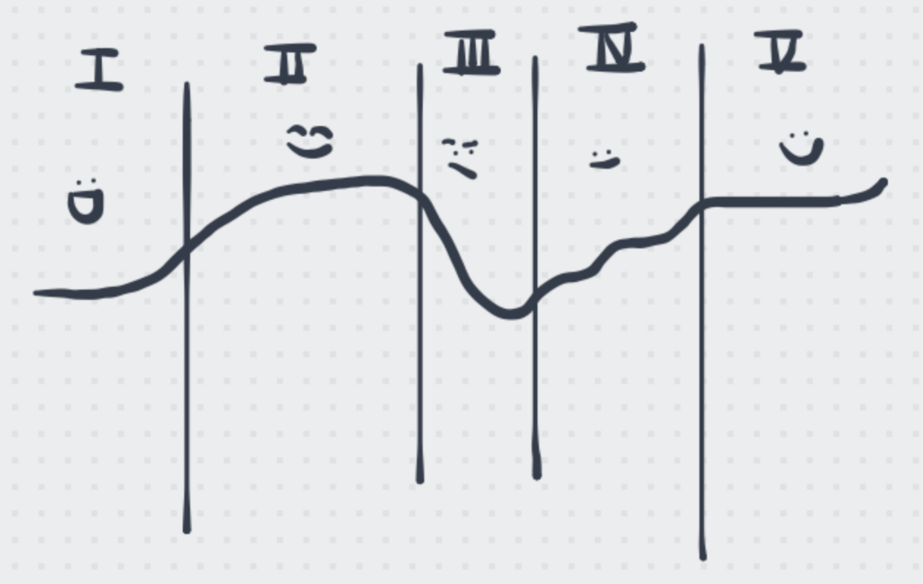
In dieser Grafik habe ich versucht höchst professionell zu visualisieren, wie sich die Geschichte der Dokumentation über die unterschiedlichen Phasen hin entwickeln soll. Die einzelnen Phasen beschreibe ich im Folgenden genauer:

PHASE 1: Die Menschen
Stimmung: aufgeregt, euphorisch, hibbelig, aufgedreht, Vorfreude
Wir lernen zum ersten Mal unsere Reiseteilnehmer kennen, anfangs nur flüchtig über Aufnahmen beim Packen, kurze aufgeregte Blicke und eilige Schritte. Wir sehen wie die einzelnen Charaktere aufeinander treffen. Es herrscht überschwängliche Freude, aber man merkt auch, dass Nervosität und Aufregung in der Luft liegen. Niemand weiß so recht, was ihn erwartet.

PHASE 2: Die Anreise
Stimmung: Beruhigung, in sich kehren, es sich bequem machen, leiser, bedachter, vielleicht etwas mulmig
Die Gruppe wird ruhiger, kommt im Zug an und stellt sich auf die lange Fahrt ein. Es werden noch Zähne geputzt und Betten gemacht, das kann noch aufgedreht und leicht überfordert sein. Die anfängliche Überdrehtheit lässt nach, die Zweifel und Ängste bleiben vielleicht noch, aber man ist auch im ruhigen Reisemodus angekommen. Es werden vielleicht noch geflüsterte Gespräche geführt, vielleicht noch gelesen und aus dem Zugfenster geschaut. Dann nur noch Zuggeräusche, vorbeiziehende Lichter. Die Stimmung wird wieder aufgedrehter als nach dem Frühstück im Zug langsam der Endbahnhof näher kommt. Vielleicht werden noch Reisepläne besprochen, Vermutungen und Vorfreuden geäußert.

PHASE 3: Kritische Auseinandersetzung
Stimmung: hektisch, voll, überfüllt, hinterfragend, kritisch, reflektierend, erschöpft
Nach der Ruhe im Zug kommt die Gruppe in der Stadt an, der Bahnhof ist voll, der Weg zum Hotel wird nicht sofort gefunden, die Stimmung wird wieder gestresster. Reflexion und Zweifel werden nicht offen erklärt sondern über Gesprächsfetzen erfahrbar gemacht. Vielleicht gibt es Gespräche darüber, dass nachhaltig reisen Dinge auch komplizierter macht, vielleicht darüber dass es ein Privileg ist so reisen zu können. Man fragt sich, wo die Verbindung bleibt, wie man mit Locals in Kontakt kommen soll und warum man sich vielleicht fremd und unwillkommen fühlt.

PHASE 4: Wege finden
Stimmung: hoffnungsvoll aber vorsichtig, zaghaft, hinterfragend, kritisch, viel Diskurs und Dialog
Die Reise nach Lappland geht weiter, der Zug fungiert wieder als Ort für Pause und Reflexion. Vielleicht spricht man über das Erlebte, vielleicht über das was noch kommt. In Lappland angekommen gibt es direkten Kontakt mit Einheimischen, mit deren Lebensweise und Werten. Reisen fühlt sich richtig an, nachhaltig. Zwischen Sauna, Kartenspielen und Skitouren finden Gespräche statt die zusammenschweißen. Vielleicht gibt es Meinungsverschiedenheiten, vielleicht tauchen Probleme auf, aber in Summe ist die Gruppe eine Einheit. Durch das Ankommen bei sich selbst kann man sich auch für Neues öffnen und auf andere zugehen. Phase 4 lebt vom Austausch und vom gegenseitigen Respekt. Zuseher lernen gemeinsam mit den Reisenden. Man sieht was Nachhaltigkeit bedeutet.

PHASE 5: Zaghafter Optimismus
Stimmung: optimistisch, auch kritisch, Fazit ziehen, zufrieden, selbstsicher
Die Heimreise wird angetreten, man muss sich wieder von Lappland verabschieden. Die Hinreise wird gespiegelt, aber die Stimmung ist beruhigter, reflektierter und zufriedener. Die Reisenden haben etwas über das Land, seine Menschen und sich selbst gelernt. Man merkt wie die Reise nachwirkt in den Köpfen der Reisenden. Nicht nur Erinnerungen sondern vielleicht auch neue Freundschaften und neues Bewusstsein sind entstanden. Man erkennt eingespielte Dynamiken in der Gruppe. Man kann auch mal gemeinsam Schweigen und einfach nur sein.

ENDE

Im Allgemeinen soll dieser Film nicht erklären sondern zeigen. Er soll nicht belehrend sein sondern Zuseher mitnehmen und sie beobachten lassen wie es aussehen kann, wenn Nachhaltigkeit mit Überzeugung gelebt wird. Dass es nicht immer nur schön und leicht ist, sondern auch schwer sein kann und man manchmal vielleicht beginnt zu zweifeln. Dass man sich sehr wohl seiner privilegierten Lage bewusst sein muss und anderen immer mit Respekt und Wertschätzung gegenübertreten soll. Dass echte Verbindungen und prägende Erlebnisse dann entstehen können wenn man bereit ist sich zu öffnen und auf andere zuzugehen, auch wenn einem das vielleicht die eigenen Fehler und Unzulänglichkeiten vor Auge führt.

Allerdings ist mir auch bewusst, dass ich die Emotionen Anderer nicht planen kann und nicht entscheiden kann, welche Gespräche geführt werden und was passieren wird. Alles in Allem will ich versuchen, einen klaren roten Faden in meinem Kopf zu haben, der mir als Anhaltspunkt dafür dient, was ich einfangen will und welche Stimmungen ich audiovisuell darstellen will. Gleichzeitig will ich aber auch flexibel genug bleiben um Abweichungen von meiner Storyline nicht zu ignorieren sondern genauso festzuhalten und offen dafür zu bleiben, meine Pläne auch noch zu ändern.
Ich denke, am Wichtigsten wird es sein, immer bereit und aufmerksam zu sein und in den richtigen Momenten auf REC zu drücken.

IMPULSE: Short Film Shoot

One of the projects that gave me the biggest sense of accomplishment this semester was our short film shoot in December. Although it was also really stressful and exhausting at times, I loved how we all came together as a group and everyone gave their best and played their role to create an amazing product.

I found it incredibly interesting and inspiring to get somewhat of an insight into what it might look like on a real film set and working with a large team. All of the practical experience I have had so far outside of FH was with event after movies or smaller commercial productions where a team of maximum 3 people did everything from lighting, a little bit of scripting, camera and editing. However, with all of these shoots it was mostly just interviews or statements of company CEOs or employees talking about their work, so there wasn’t much creative freedom in it.
This is also why I enjoyed it so much to work with real actors and see a story come to life that we as a group developed further from an initial idea.


It also gave me a whole new appreciation for how much work goes into just a couple of minutes of professionally produced films or shows. How much time it takes to plan out every single shot, get the lighting just right, think of everything needed for the set design and so many more steps that need to be taken before even turning on a camera.
In comparison the work I usually do takes a lot less preparation and planning beforehand, but you also need to be a lot more flexible and spontaneous with filming because there are some situations which you cannot simply redo if the focus or camera movement were off.
I think having experienced both situations will greatly help me with my master’s project in order to combine thorough planning and thinking of storytelling with having to be spontaneous when things happen that cannot be planned for. During documentary filming, depending on the style of documentary, you might have to stay very vigilant not to miss shots that will help your planned story along or maybe even ask the right questions to the right people in order to achieve your goal for the movie.

One personal takeaway I got from the film shoot was that I am very bad at saying no, which often lands me in situations where I’m in over my head. That is also when I become frustrated and I’m always scared that I am very rude to others just because of my own exhaustion and stress. So in the future I want to be able to just clearly declare the tasks I want to do and have the capacity for without feeling bad for saying no to other tasks.

I still don’t know whether in the future I would rather be involved in more creative projects that are thoroughly planned and staged or whether I prefer capturing real moments with real people even if that means not being able to influence the captured story all that much.

IMPULSE #3: UX Workshop with a Google Representative | Tunis 2019

In 2019, I had the incredible opportunity to attend a UX masterclass/workshop led by a representative from Google. As someone deeply interested in user experience design, this event felt like a stepping stone towards the world of UX, a world that had little online material back then. I remember the anticipation building up to the day, eager to explore and absorb knowledge.

The session kicked off with an overview of core UX principles. Our instructor emphasized the importance of user-centered design and the value of empathy in the design process. I learned how critical it is to understand users’ needs, preferences, and pain points. This knowledge is crucial when crafting experiences that resonate with the target audience.

Through interactive discussions, we explored various methodologies, including personas, user journey mapping, and usability testing. Engaging in group activities helped reinforce these concepts. One of the most impactful exercises involved role-playing as users to gain a deeper understanding of their perspectives. It was a unique way to create empathy, allowing me to see through the eyes of others—something I realized was fundamental in UX design.

Next, we delved into sketching practices. The instructor encouraged us to embrace spontaneity and creativity in our designs. Armed with whiteboards and markers, we transitioned into a hands-on sketching session. I was surprised at how liberating it felt to let go of perfectionism and allow ideas to flow freely.

I sketched a variety of wireframes and mockups, understanding that quick sketches can often convey ideas more effectively than detailed designs. The instructor emphasized that “simple is often better;” it’s about communicating concepts clearly rather than getting bogged down in intricate details. This reminder became a valuable takeaway, highlighting that sometimes the simplest solutions are the most effective.

As we continued, we shifted focus to best UI practices. Our instructor shared insights into visual hierarchy, color theory, and typography. Each element can significantly impact how users interact with a design, and I found myself captivated by the nuances of effective UI design.

We studied case studies from successful apps and websites, analyzing what made them user-friendly and visually appealing. Our instructor also discussed the importance of consistency in design elements, addressing how it contributes to brand identity and user trust. This segment reinforced the understanding that good design goes beyond aesthetics—it has a functional purpose.

Walking away from that masterclass, I felt invigorated and inspired. The combination of theoretical knowledge and practical application left a lasting impression on me. I was grateful for the chance to learn from a Google representative, who shared both industry insights and hands-on techniques.

This workshop not only solidified my understanding of UX principles but also sparked a passion for continual learning in the field. I realized that every project is an opportunity to experiment, iterate, and gather feedback to enhance the user experience further. The importance of empathy and user-centered design became pillars of my approach, guiding my journey as a Product Designer.

Disclaimer: AI was used to fix any grammatical mistakes and for better phrasing.