NIME Review – “Sound Kitchen”

The paper “Sound Kitchen: Designing a Chemically Controlled Musical Performance” presents a project in which chemical reactions were created and used to trigger different sounds. The reactions were sampled and mapped into a “sound recipe” and showcased as a live performance. Different chemical processes and substances were carefully selected based on certain criteria like availability, safety, controllability, and range. The creation of sound was the main focus; however, since it was meant to be a live performance, visual appeal was also considered (colorful liquids like red wine and orange juice were chosen over clear vinegar). Chemical reactions are used not just as metaphors (or visuals) in performance, but as literal sound generators. Through the manipulation of chemical properties—like electrolyte mixtures and their reactive behaviors—electrical signals are generated and fed into computer systems, where they are shaped and sonified.

The project was created as part of a course called “Human Computer Interaction Theory and Practice: Designing New Devices.” It is an interesting study of the process of creation—drawing parallels between the art of cooking and the art of music: creating a carefully crafted dish and composing a piece of music. Different ingredients and processes alter the final outcome, directed by a composer or chef who controls the composition and final product.

Personally, this new angle of looking at music and approaching composition in such a tangible way was very interesting. Especially as someone who doesn’t know a lot about music and sonification, but is very interested in cooking and baking, I found this experiment gave me a new perspective on the composition of music.

What’s especially interesting about this idea for me as an interaction designer are the implications for almost every interdisciplinary design field and place for interaction. It is a powerful reminder to look beyond the obvious tools. It encourages us to rethink the boundaries of materiality, data, and performance, and expands our definition of what can be an interface or generate usable data (or how something seemingly unrelated can be made usable). I am thinking especially about how this can reshape how we engage with technology, nature, and art. Invisible processes, for example (in nature, cooking, our surroundings, etc.), can be uncovered—not just (as usual) via visuals, but perhaps through sound. This is a channel I, and many other installations, projects, or products, often overlook. However, in terms of ambience or even accessibility, this should be considered and explored much more.

Another thought that is more closely related to artistic aspects of the project would be the visual components of the “instrument.” I feel like it has great potential, and while already considered in some parts, I see a lot of room for improvement, since chemical reactions offer a huge amount of visually appealing options to work with. Phenomena like synesthesia come to mind, and it would be very interesting to see a close relation between the visual reactions and the generated sounds. Moving away from performance art and more into immersive, interactive, and participatory projects, this could, for example, mean an entirely new dining experience that engages all senses in a new and enhanced way.

In conclusion, this paper serves as a strong starting point for rethinking how we design—by considering and combining different sensory experiences in innovative and unexpected ways to create new experiences.


Sound Kitchen: Designing a Chemically Controlled Musical Performance: https://www.nime.org/proceedings/2003/nime2003_083.pdf
Sustainable Typography – Does Font Choice Affect Energy Consumption?


Introduction

Typography plays a central role in digital and print design, but it’s not just about aesthetics. Fonts can influence load times, data usage, and even printing efficiency. This entry explores whether certain fonts are more sustainable than others, both in terms of web performance and resource consumption in print.


Practical Test: Font Choices & Sustainability

Step 1: Set Up Different Font Types

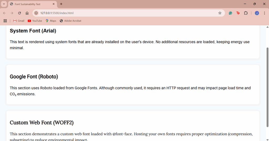
I created a simple HTML page using different font types, including:

  • System fonts (e.g., Arial, Georgia, Helvetica)
  • Google Fonts (e.g., Roboto, Lato, Montserrat)
  • Custom web fonts loaded via @font-face
  • Eco-friendly print fonts like Ecofont

This allowed me to measure load time differences for digital use and ink usage for print scenarios.

Step 2: Measure Digital Performance

Using Lighthouse and WebPageTest, I tested the page with different font combinations. Key findings:

  • System fonts loaded the fastest and required no external requests, resulting in lower page weight.
  • Google Fonts slowed down load time slightly due to external fetching.
  • Custom fonts had the highest environmental impact, especially when served without optimization (e.g., not subsetted or compressed).

Result: Switching from custom or Google fonts to system fonts saved up to 100–300 KB per page load, depending on font size and styles used.

Step 3: Print Efficiency

For print testing, I compared a basic document printed in:

  • Arial (standard sans-serif)
  • Ecofont Vera Sans
  • Times New Roman

With Ecofont, small perforations in the letters reduced ink usage by up to 20%, while maintaining readability.


Conclusion

Typography may seem like a minor design decision, but it can have a real environmental impact. In digital environments, using system fonts can significantly reduce file size and loading energy. In print, using ink-saving fonts like Ecofont leads to measurable reductions in material usage.

These are low-effort changes that don’t compromise design quality and they scale well across large projects.


Key Takeaways

  • Use system fonts for faster and lighter web performance.
  • Optimize custom fonts with subsetting and compression (e.g., WOFF2 format).
  • Try Ecofont for print materials to save ink and reduce environmental impact.
  • Avoid loading multiple font weights or families if not necessary.

Tools Used

Dark Mode vs. Light Mode – Energy Consumption Test


Introduction

As web design evolves, dark mode has gained significant popularity not only for its aesthetic appeal but also for its potential benefits in terms of reducing energy consumption. This blog entry explores the energy impact of dark mode vs. light mode by testing a simple webpage’s performance with a toggle feature that allows users to switch between the two modes. The goal is to understand the impact of these modes on the energy consumption of an existing webpage without significant redesign or effort.


Practical Test: Implementing Dark Mode and Light Mode

Step 1: Test Setup

To begin the experiment, I created a simple webpage that includes a button to switch between light mode and dark mode. This functionality was implemented with basic HTML, CSS, and JavaScript. The webpage contains text that is easy to read, and the button allows users to switch modes at will.

The page features:

  • A light mode by default with a clean, white background and black text.
  • A dark mode with a dark background and light text when activated.

Step 2: Code Overview

The HTML contains the basic structure of the page, including a button for toggling modes. The CSS handles the styling for both modes, with smooth transitions to ensure a seamless experience when switching. The JavaScript enables the toggling of the dark mode by adding or removing a dark class on the body element.

Here’s a quick breakdown of the functionality:

  • The button toggles between the two modes.
  • When dark mode is active, the background becomes dark and text turns light.
  • The button text changes accordingly to inform the user about the current mode.

Step 3: Energy Consumption Testing

To test the energy consumption, I used the Website Carbon Calculator and browser extensions that allow measuring the energy usage of websites. I then toggled the mode between light and dark while keeping the content identical. The measurements were taken under normal browsing conditions to simulate real-world use.

  • Light Mode: This mode showed higher energy usage on devices with traditional LCD screens due to the bright background and high contrast.
  • Dark Mode: On OLED screens, dark mode consumed less power because OLED technology uses less energy to display dark pixels. The energy consumption was reduced by approximately 17% compared to light mode.

Step 4: Energy Savings and Impact

In this test, dark mode provided noticeable energy savings, especially on devices with OLED screens. The energy savings were not as significant on standard LCD screens, but it’s clear that for OLED devices, dark mode can help save battery and reduce energy consumption over time.


Conclusion

The findings of this test support the idea that dark mode can offer energy savings, particularly for users with OLED screens. While the difference in energy consumption may seem small on a simple webpage, on devices where dark pixels consume less power (such as OLED), the savings can be more substantial. For web designers, implementing a dark mode toggle is relatively easy and can contribute to sustainability efforts by reducing energy usage for users, especially in mobile or app-based designs.

Sustainable Images – Finding the Most Eco-Friendly Formats

Introduction

Images are central to digital design, used in branding, storytelling and user interfaces. However, visuals also account for a significant share of web data and therefore, energy consumption. Choosing the right format and compression can significantly reduce a page’s environmental footprint. This blog post explores which image formats are the most sustainable and how compression affects both performance and visual quality.


Practical Exercise: Format & Compression Testing

Step 1: Test Setup

For this experiment, I selected a standard high-resolution image (1920×1080 px) often used in digital design and exported it using various formats and compression settings. The goal was to analyze both file size and quality across commonly used formats: JPEG, PNG, WebP, and AVIF.

Step 2: Results

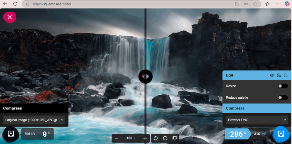
FormatFile SizeCompression Ratio (from ~777 KB original JPEG)
JPEG (80%)233 KB~70% smaller
PNG2995 KB+286% larger
WebP153 KB~80% smaller
AVIF232 KB~70% smaller
  • WebP produced the smallest file size with minimal quality loss, making it the most efficient format tested.
  • AVIF performed similarly to JPEG in size, with slightly more compression artifacts in fine detail.
  • PNG, while lossless, resulted in the largest file by far, almost four times the original file size, making it unsuitable for large photographic content.

Step 3: Visual Quality Evaluation

In a side-by-side comparison, JPEG, WebP, and AVIF maintained strong visual fidelity suitable for most web use cases. PNG retained perfect clarity but at a significant cost in file size. The results show that lossy formats like WebP and AVIF provide the best balance between sustainability and design quality.

Squoosh online tool for image formats (here to PNG)

Conclusion

Choosing the right image format is a simple but effective way to reduce the environmental impact of digital design. Based on this test:

  • Using WebP for web visuals when broad browser support is needed.
  • Using AVIF when maximum compression is required and support allows.
  • Using PNG usage to icons or images with transparency where necessary.

Even small reductions in image file size can scale into major energy savings across thousands of page views.

3D Modell Kirche

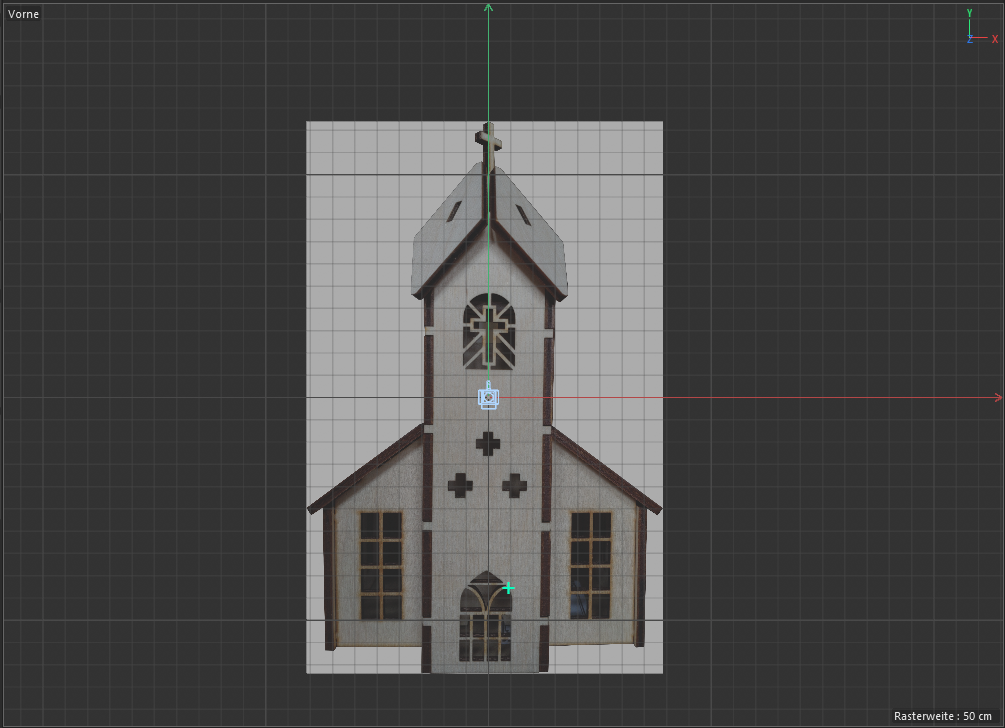
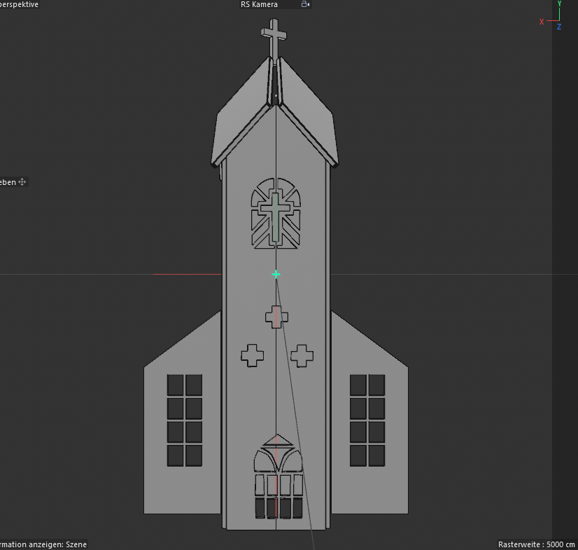
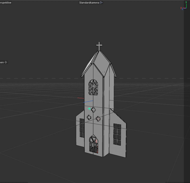
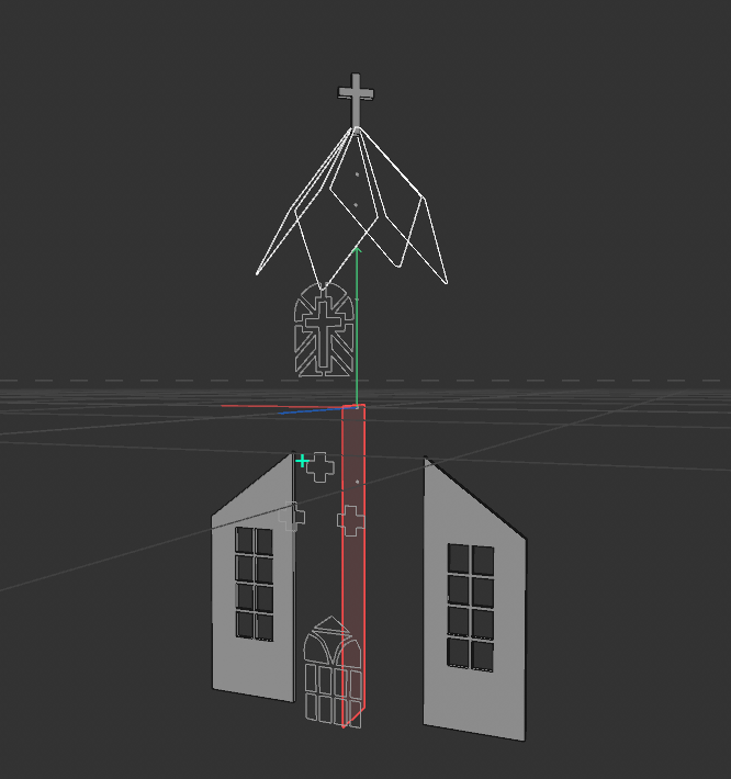
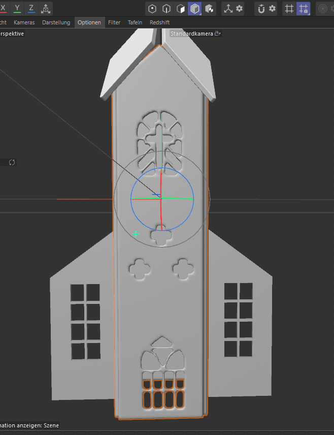
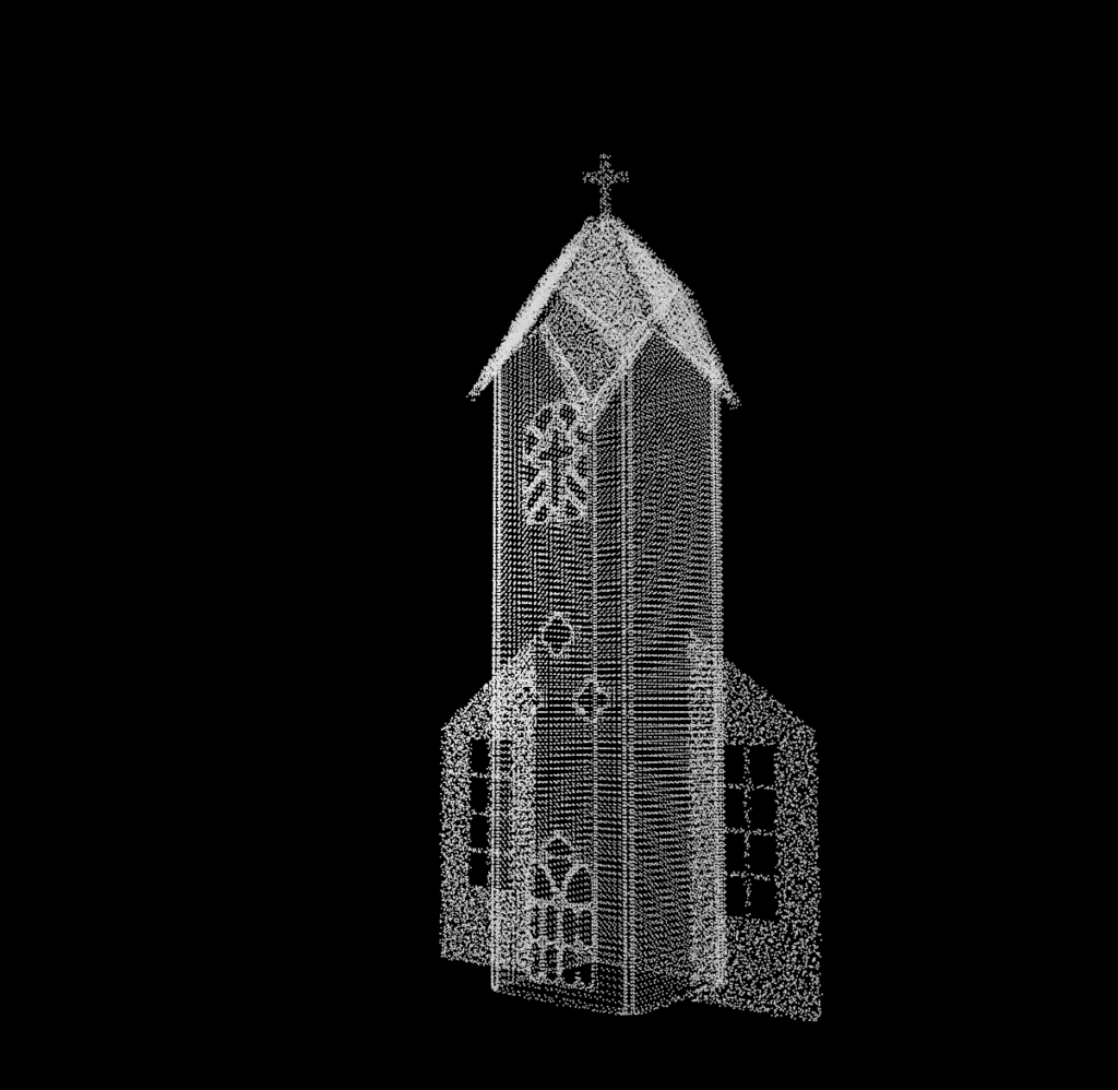
Im nächsten Schritt wurde die Frontfassade der Kirche digital rekonstruiert. Ein frontal aufgenommenes Foto diente als Grundlage, das in Photoshop freigestellt und perspektivisch entzerrt wurde. Anschließend wurde es in Cinema 4D als Vorlage für den Nachbau in der Frontalansicht verwendet. Die Architektur wurde mithilfe von Splines, Extrude-NURBS und Boole-Operationen detailliert nachgebaut. Um die unregelmäßige Geometrie in eine brauchbare Topologie zu überführen, kam zunächst ein Volumenmesher, anschließend ein Volumenerzeuger und schließlich ein Remesher zum Einsatz. Ziel war eine gleichmäßigere Oberfläche für spätere Animationen und Simulationen – mit teils zufriedenstellenden Ergebnissen.

Erste Materialexperimente kombinierten originalgetreue Texturen mit alternativen Shadern. Außerdem wurde eine einfache Partikelsimulation erstellt, die das Volumen des Meshes als Emitter nutzte, ergänzt durch ein Turbulenzfeld zur Bewegungskontrolle.

Beim Rendern wurde gezielt darauf geachtet, dass das Format exakt der nativen Auflösung des verwendeten Beamers entsprach (1024 × 768 Pixel). Auch die Kameraeinstellungen wurden zentral und ohne Rotation gewählt, um perspektivische Verzerrungen zu vermeiden.

Das Ergebnis wurde in HeavyM geladen und auf die reale Fassade projiziert. Dabei zeigte sich jedoch ein perspektivisches Problem: Die Fenster ließen sich nicht exakt auf die physische Struktur anpassen. Ob der Fehler bei der Modellierung, dem Export oder dem Mapping liegt, muss nun untersucht werden. Erst wenn das Frontalmapping fehlerfrei funktioniert, sollen auch die Seitenflächen modelliert und ein vollständig räumliches Mapping getestet werden.


Disclaimer zur Nutzung von Künstlicher Intelligenz (KI):

Dieser Blogbeitrag wurde unter Zuhilfenahme von Künstlicher Intelligenz (ChatGPT) erstellt. Die KI wurde zur Recherche, zur Korrektur von Texten, zur Inspiration und zur Einholung von Verbesserungsvorschlägen verwendet. Alle Inhalte wurden anschließend eigenständig ausgewertet, überarbeitet und in den hier präsentierten Beitrag integriert.

2.3 OFFF case study – Online presence

PREVIOUS DESIGNS
Before heading to Barcelona, I took a deep dive into OFFF’s online appearance — past and present. Interestingly, in previos years there was no fixed logo in the classic sense. Instead, each edition is represented through bold, playful artworks and posters, often leaning heavily into 3D renderings and vibrant compositions. Typography has become increasingly heavier in weight over the years, giving the overall visual language a strong presence that goes with the time.


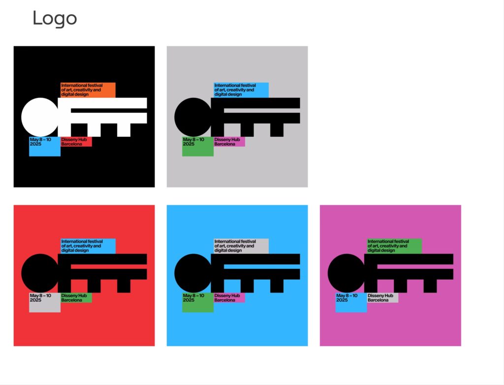
LOGO
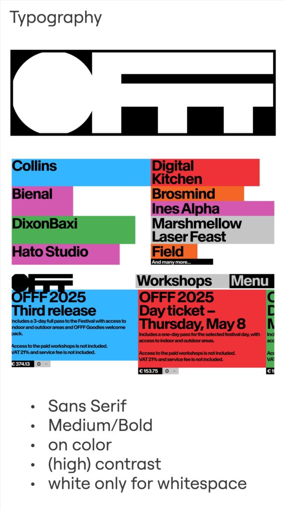
The current word mark is no exception — its chunky silhouette almost reminds me of a key or solid block. It usually appears in color, depending on the context and contrast needed. One thing I noticed: OFFF rarely shows the logo by itself—it’s almost always paired with event details, always building the connection between the identity and the experience.


COLOR
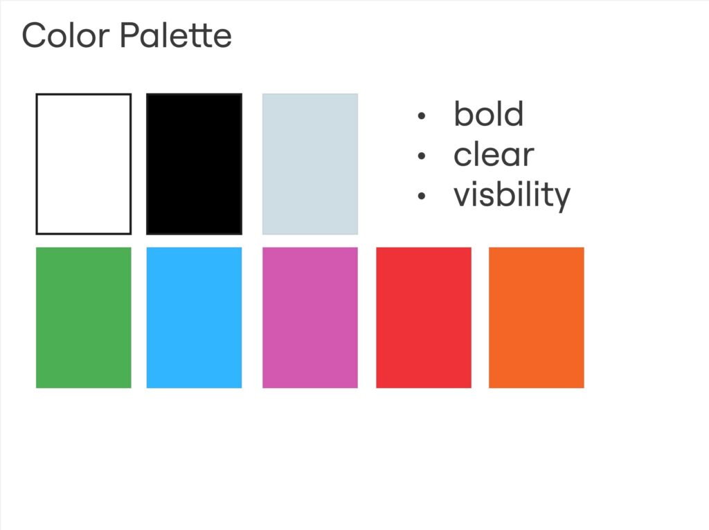
When it comes to color, OFFF doesn’t shy away. Bold and high-contrast combinations dominate the visuals: greens, blues, violets, reds, oranges — often set against black, white, or soft greys.
It’s loud, but intentional.


TYPOGRAPHY
Typography plays a big role too. Always sans serif, always Medium or Bold. Text is placed in colored blocks or directly on color backgrounds, always with strong contrast. White is reserved for whitespace or the logo — never for body text.


WEBSITE
The website itself reflects this clarity: minimal in imagery, focused on mood-setting visuals that match the color palette. The layout is responsive, switching from a 4–5 column grid on desktop to 1–2 columns on mobile. It’s clean, well-structured, and puts color and typography at the center of the user experience continuing the corporate color scheme.


SUMMARY
OFFF presents itself with a bold and expressive visual identity that breaks away from traditional branding rules. Instead of relying on a fixed logo, the festival embraces strong typography and vibrant colors. The overall design is playful yet structured — minimal in layout, maximal in expression. It’s an identity that adapts, surprises, and stays visually powerful and is a solid foundation for a strong design language on site in Barcelona.

Prototyping V: Image Extender – Image sonification tool for immersive perception of sounds from images and new creation possibilities

Integration of AI-Object Recognition in the automated audio file search process:

After setting up the initial interface for the freesound.org API and confirming everything works with test tags and basic search filters, the next major milestone is now in motion: AI-based object recognition using the GeminAI API.

The idea is to feed in an image (or a batch of them), let the AI detect what’s in it, and then use those recognized tags to trigger an automated search for corresponding sounds on freesound.org. The integration already loads the detected tags into an array, which is then automatically passed on to the sound search. This allows the system to dynamically react to the content of an image and search for matching audio files — no manual tagging needed anymore.

So far, the detection is working pretty reliably for general categories like “bird”, “car”, “tree”, etc. But I’m looking into models or APIs that offer more fine-grained recognition. For instance, instead of just “bird”, I’d like it to say “sparrow”, “eagle”, or even specific songbird species if possible. This would make the whole sound mapping feel much more tailored and immersive.

A list of test images will be prepared, but there’s already a testing matrix for different objects, situations, scenery and technical differences

On the freesound side, I’ve got the basic query parameters set up: tag search, sample rate, file type, license, and duration filters. There’s room to expand this with additional parameters like rating, bit depth, and maybe even a random selection toggle to avoid repetition when the same tag comes up multiple times.

Coming up: I’ll be working on whether to auto-play or download the selected audio files, and starting to test how the AI-generated tags influence the mood and quality of the soundscape. The long-term plan includes layering sounds, adjusting volumes, experimenting with EQ and filtering — all to make the playback more natural and immersive.

NIME paper review

I read Participatory Design of a Collaborative Accessible Digital Musical Interface with Children with Autism Spectrum Condition by Balázs Iványi, Truls Tjemsland, Lloyd May, Matt Robidoux, and Stefania Serafin and would like to state my opinions, thoughts, feedback and critique in the following paragraphs.

I really like the core idea of creating a tool specifically for children with autism. I’ve always found neurodiversity fascinating—how differently people on the spectrum perceive the world and react to interventions. The brain is such a powerful thing, and seeing projects that try to meet neurodivergent individuals on their level is super cool. Giving kids a medium to explore social skills through music feels like a thoughtful and interesting approach.

What I really appreciate is that this project doesn’t just design for children with ASC but instead designs with them. The participatory design (PD) process is such a respectful and inclusive way to work—especially with a population that’s often overlooked in design and research processes. It’s great to see the researchers really leaning into methods like fictional inquiry and narrative-based workshops to engage the children on their terms.

At the same time, one thing that left me a bit puzzled was how quickly the team settled on the idea of a “music box” app. While music can be therapeutic and collaborative, the paper doesn’t fully explain how this specific medium connects with the needs or strengths of autistic children. Why music over other sensory or communication-based tools? That connection could’ve been explored more deeply, especially since kids on the spectrum can have such different sensory profiles—some love sound, others might be overwhelmed by it.

Another interesting point for me was recognizing the iterative prototyping process—it was like a flashback to what we’ve learned in our own courses. Start with simple experiments (like trying sounds on the phone), move on to lo-fi prototypes (like a cardboard box), and finally develop a more polished product. It’s encouraging to see this familiar design thinking structure being applied in a real research context and to such a meaningful user group.

Still, I would’ve liked more details about the final version of the prototype—what exactly can it do now? How do kids use it? Will it be made publicly available or used long-term in schools? The evaluation section gave some hints, but it stayed pretty vague. I also wonder how they plan to address the issue of physical proximity being uncomfortable for some kids—especially when the app is meant to be collaborative and used by multiple users on a single iPad. Would separating controls or even offering individual interfaces be a better fit?

One suggestion might have been to involve a music therapist earlier in the design process. Some teachers mentioned this toward the end, and I think it could’ve really helped bridge the gap between musical expression and social skill development in a structured way. Also, while the aesthetic design choices were touched on (like using retro-futuristic visuals), I wonder how much user testing went into determining if those visuals were actually appealing or helpful for the kids.

Overall, I think the project has great intentions, a solid foundation in participatory research, and shows sensitivity to working with children with ASC. I just wish there had been more insight into the real-life impact of the final product—and how the kids actually felt using it in the long run. But as a student myself, I find it really encouraging to see how others apply the methods we’ve learned in such a creative and inclusive way.

#NIME 🦕 Dinosaur Choir: Designing for Scientific Exploration, Outreach, and Experimental Music

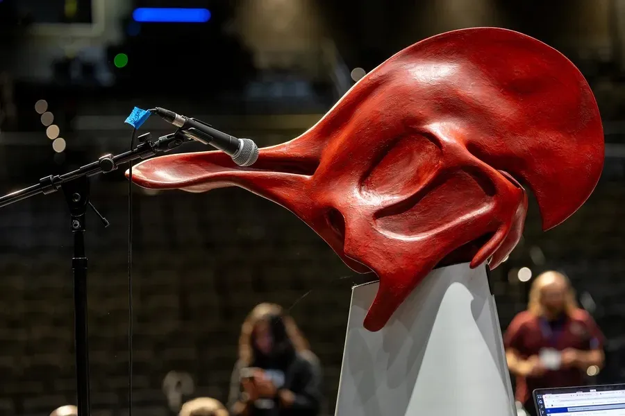
The Dinosaur Choir is a project that focuses on lambeosaurine hadrosaurs—duck-billed dinosaurs known for their distinctive hollow cranial crests, which likely functioned as resonating chambers for vocal communication. By utilizing CT scans of hadrosaur skulls and integrating paleontological research, the team reconstructs these crests and nasal passages with a 3D printer to emulate the sounds these dinosaurs might produced.

How it works: Users give voice to the dinosaur by blowing into a mouthpiece, exciting a larynx mechanism, and resonating the sound through the hadrosaur’s full-scale nasal cavities and skull. This action allows an embodied glimpse into an ancient past.

Firstly it was presented in 2011 by Courtney Brown:

However, concerns about hygiene, especially highlighted during the COVID-19 pandemic, prompted a redesign. The team transitioned to a computational model, allowing users to produce sounds by blowing into a microphone, with the system simulating the vocalizations digitally.

The latest prototype got 3rd place at the 2025 Guthman Musical Instrument Competition at Georgia Tech

There are a few limitations to consider in this research.

First, even with sophisticated modeling techniques, the simulations may simplify the way sound would have realistically traveled through and been shaped by a dinosaur’s skull. Second, expanding the project to include other species would be both time-consuming and costly, with each new model still relying on a significant degree of speculation.

I think the idea behind the project is amazing. I’ve always wondered how people came up with the sounds of dinosaurs in movies and cartoons—I wasn’t sure if any of them were based on real research or just made up. But producing sound from even one real dinosaur skull is really impressive. I like that they brought it to the public through museums and exhibitions because it gives people a chance to immerse themselves in the world of the distant past.

Between Space and Sound—How Instruments Can Shape the Room

As an interaction design student, I’m always fascinated by how technology, form, and human experience intersect. Recently, I read the paper “Exploring Design Patterns for Spatial Instruments” by Enrique Tomás, Florian Goeschke, and Martin Kaltenbrunner—and it offered a fresh perspective on how sound can be more than just something we hear. It can be something we shape, move, and play with in space. The authors argue that spatialization tools—the systems and interfaces we use to place and move sound in 3D space—should be considered musical instruments in their own right.

What I liked as a designer

What stood out to me is how the authors focus on the user—how artists and performers find creative ways to control spatial sound, often by reusing or adapting existing tools. It reminded me that great design doesn’t always start from scratch.

I also loved the idea of music as space—that sound can actually shape how we feel in a space, not just exist within it. That concept feels very close to interaction design, where space, experience, and emotion often connect.

Things that could be improved

At times, the paper was very technical and hard to follow, especially the parts about synthesis techniques and mathematical descriptors. As someone without a lot of experience in this field, I found myself getting a bit lost sometimes. I would have loved more diagrams or simple examples to make some of those parts easier to understand.

Also, while the artistic examples are great, I wish there was more discussion about how these instruments could be made more accessible—both in terms of cost and learning curve. A lot of the setups seem very complex or custom-built, which makes it harder for newcomers to try them out.

Interesting Case Study

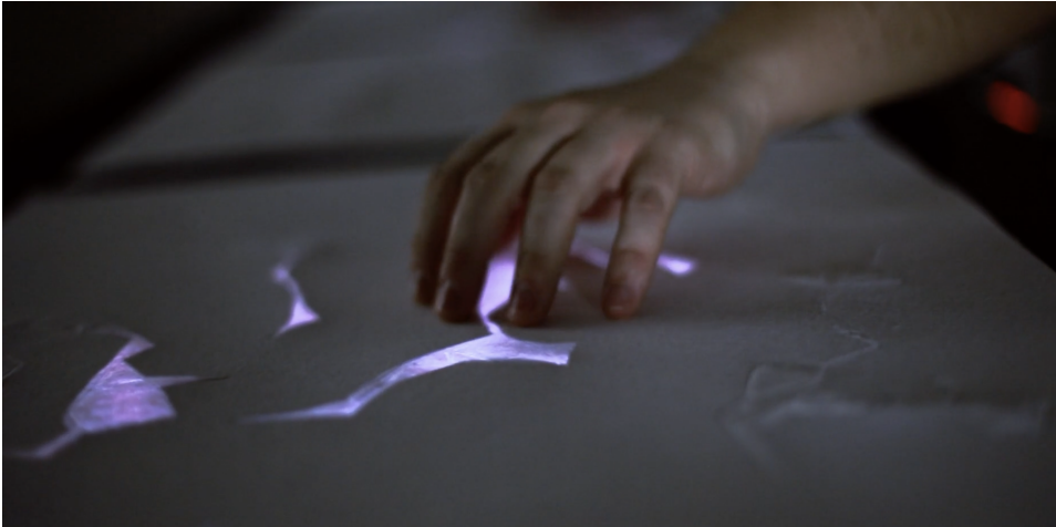
The most exciting example for me was Tangible Granular Spatialization. It’s a physical object you play with your hands, and the sounds you make are analyzed and broken into small pieces (sound grains). Each grain is sent to a different spot in 3D space based on its timbre. So when you change the texture of your touch, the sound doesn’t just change—it moves differently in space. That’s amazing to me. It turns sound design into a physical, spatial performance.

A tangible score. Photo Elisa Unger

As a designer, it makes me ask:

What other objects could work like this? How can we make sound feel more tactile and intuitive? Can we design interactions where space and sound feel like one thing?

Final Thoughts

This paper reminded me that sound isn’t just something you hear. It can be something you move, something you sculpt, and something that can even shape your perception of a space. As a designer, that inspires me to think beyond screens and apps – and to consider how physical, spatial experiences can become creative tools too.

Source

https://nime.org/proceedings/2024/nime2024_19.pdf