PREVIOUS DESIGNS
Before heading to Barcelona, I took a deep dive into OFFF’s online appearance — past and present. Interestingly, in previos years there was no fixed logo in the classic sense. Instead, each edition is represented through bold, playful artworks and posters, often leaning heavily into 3D renderings and vibrant compositions. Typography has become increasingly heavier in weight over the years, giving the overall visual language a strong presence that goes with the time.

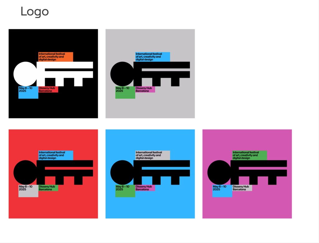
LOGO
The current word mark is no exception — its chunky silhouette almost reminds me of a key or solid block. It usually appears in color, depending on the context and contrast needed. One thing I noticed: OFFF rarely shows the logo by itself—it’s almost always paired with event details, always building the connection between the identity and the experience.
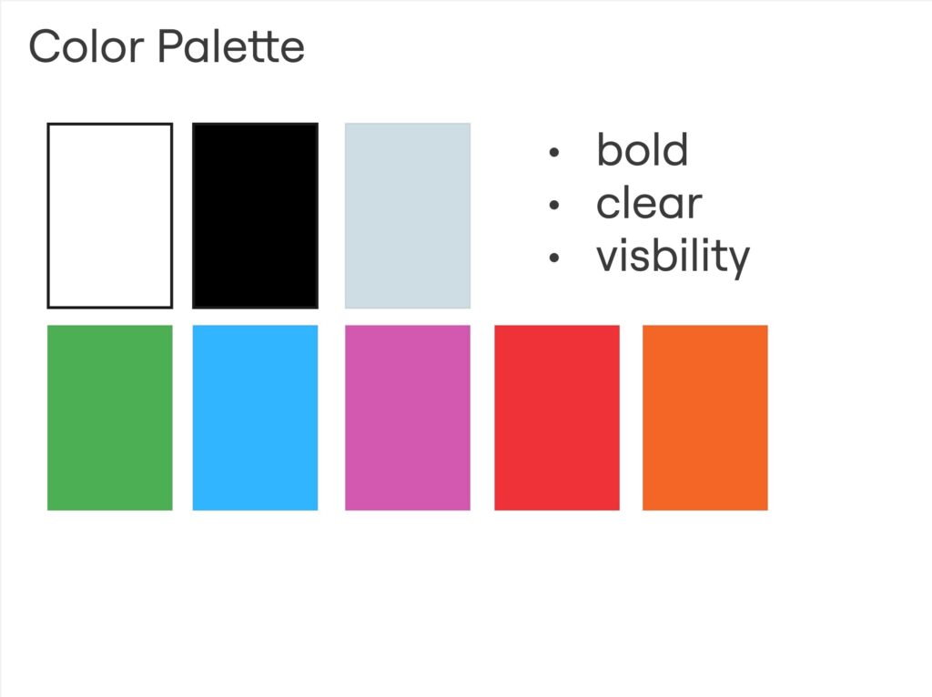
COLOR
When it comes to color, OFFF doesn’t shy away. Bold and high-contrast combinations dominate the visuals: greens, blues, violets, reds, oranges — often set against black, white, or soft greys.
It’s loud, but intentional.
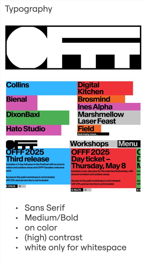
TYPOGRAPHY
Typography plays a big role too. Always sans serif, always Medium or Bold. Text is placed in colored blocks or directly on color backgrounds, always with strong contrast. White is reserved for whitespace or the logo — never for body text.
WEBSITE
The website itself reflects this clarity: minimal in imagery, focused on mood-setting visuals that match the color palette. The layout is responsive, switching from a 4–5 column grid on desktop to 1–2 columns on mobile. It’s clean, well-structured, and puts color and typography at the center of the user experience continuing the corporate color scheme.

SUMMARY
OFFF presents itself with a bold and expressive visual identity that breaks away from traditional branding rules. Instead of relying on a fixed logo, the festival embraces strong typography and vibrant colors. The overall design is playful yet structured — minimal in layout, maximal in expression. It’s an identity that adapts, surprises, and stays visually powerful and is a solid foundation for a strong design language on site in Barcelona.