This talk from WebExpo 2025 focuses on how to design better search experiences for digital products in 2025 — recognizing search as a core part of many user journeys that’s often overlooked.
1. Understanding How People Search Today Vitaly likely starts with how user expectations around search behavior have evolved — the assumptions users bring, typical frustrations, and common patterns in how they look for information in apps and sites.
2. Designing Better Autocomplete & Type-Ahead Autocomplete isn’t just a feature — it helps users formulate queries, reduces errors, and speeds up search journeys. Best practices include deciding when and what suggestions to offer, how many to show, and ensuring relevance.
3. Handling Complex Filters & Sorting Next, the talk addresses faceted search — complex category filters and sorting tools that help users refine results. Design patterns here include placing filters effectively, choosing defaults wisely, using smart previews, and considering filter presets to reduce cognitive load.
4. Building Effective Search Results Pages (SERPs) A good results page communicates relevance, helps users scan quickly, and gives clear actions. This may include thoughtful info hierarchy, highlighting matched text, using visual cues, and designing for both glanceability and depth.
5. Real-Life Examples, Dos & Don’ts Throughout, the session shares practical examples of good vs. problematic search interfaces — illustrating how small tweaks (e.g., clearer labeling, better feedback, faster interactions) make a big difference. Expect actionable “aha” moments.
Reflections
I found this talk quite interesting, as it covers one of the overlooked aspects of designing interfaces, which is search interfaces and experiences which is an element that I will be looking into more because it treats search as strategic UX, not an afterthought and it helps craft results pages that balance clarity, functionality, and speed.
Disclaimer: AI was used to fix any grammatical mistakes and for better phrasing.
Polka Gallery in Paris is where I attended my first photography exhibition.
After some thorough research on the photography exhibitions that were happening at that time in Paris, I found Salgado’s exhibition, who is one of the pioneers of documentary photography, a Brazilian social documentary photographer and photojournalist. Salgado traveled in more than 120 countries for his photographic projects.
The exhibition for me was like a rare gem that I found in an unfamiliar territory; it was based on Salgado’s photographic book ‘Genesis’, a spectacular body of work. It is a documentation of unblemished landscapes, wildlife, and indigenous communities that demonstrate how urgently the need is to protect these subjects. “What I want is the world to remember the problems and the people I photograph,” he said of his work. “What I want is to create a discussion about what is happening around the world and to provoke some debate with these pictures.”
Sebastião Salgado’s vision combined with practical actions through Instituto Terra not only rehabilitated a devastated landscape but also established a scalable model for environmental restoration that engages and benefits local communities, thereby addressing broader ecological challenges.
He and his wife, Lélia Wanick Salgado, significantly contributed to tree planting and environmental restoration in Brazil through the Instituto Terra, established in 1998. This non-profit organization focuses on the reforestation of the Atlantic Forest, which has faced severe degradation over the years.
Stepping into the gallery after getting a fabulous cup of coffee from Terres de Café, I noticed that the gallery is showcasing several other works from world-renowned photographers on the 1st floor and the official exhibition is being exhibited in the next compound. Anyways, I wandered through and found my way to the gallery where Salgado’s work is and started to meander around, admiring the frames one by one. A few people were there, a light vibe in the air, the calm and the whole endeavor had an analog feel to it, apart from the essence of the work displayed and the meaning behind it and the act of walking around steadily and slowly gazing at photographs that were taken at a certain timeframe in a distant place by such a thoughtful artist and human being. Being both a photographer and a designer, you get gifted with the privilege of perceiving the world as a photographer and thinking about reality like a designer and both energies flow eventually and reflect themselves into one’s work and life.
What links this genre of art and the whole endeavor to my thesis and my lane is the lens through which I see the world. I believe that artistic bodies of work are intertwined and woven through an almost invisible web of truth, meaning and enigma, and when you tune in to that web at least once in your career/life, you will see that true art serves a higher purpose and strikes a chord inside every human being that sparks a paradigm shift or a wake-up call that will eventually alters one’s perception to a greater reality.
Later that year on May 23, I was struck by the news that Sebastiao Salgado passed away from leukemia, which made the experience of witnessing his work even more impactful and made me see the artist in a new light.
We recently finished the Overlays Exhibition. I am writing this blog post because I learned so many new things and discovered new fields of interest. Completing the projects for the exhibition opened up a new way of systematic thinking. Creating working systems is now a core interest of mine. The experience at the exhibition also made me rethink my master’s thesis topic. Let me explain why.
My part in the exhibition
I was part of two very different projects, each of which, of course, had its own challenges. Looking back, the biggest hurdle wasn’t the coding itself, but the process of creating the Portfolio Machine Website. We spent a lot of time going back and forth on which technologies to use. However, once we finally agreed on the stack, everything shifted into high gear. We developed the entire system incredibly fast. It taught me that while picking the right tools matters, getting the whole team on the same page is what truly gets the job done. Also learning about different sensors and getting them to work together into a symbiotic system was absolutely fascinating.
The Deep Breath installation was a stressful part of the past few weeks. We were working with servos and electronics, and for some reason, we just couldn’t get it right. For weeks, we were stuck in a cycle of testing and failing. We managed to find the problem just a few hours before the exhibition started, which was a huge relief because the project was successful in the end. It’s fascinating, and a bit exhausting, how deep you sometimes have to research just to find a single solution. Seeing it finally work perfectly for the audience was such a rewarding experience, especially after so much uncertainty.
Rethinking my master’s thesis
Perhaps the most important thing I gained from Overlays was a fresh start for my Master’s Thesis. To be honest, I wasn’t happy with my previous thesis project at all; it felt stagnant, and I was losing interest in its direction. Being able to successfully integrate web development with electronics, using motors and sensors, gave me a new perspective on what’s possible. I’ve now pivoted my thesis to incorporate these new skills. I am not yet sure where this path will lead me, but I am sure it will be a good time.
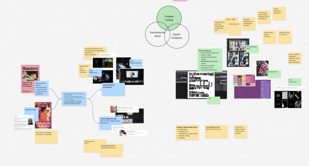
Ich habe meine ersten 3-5 Ideen an Birgit gepitched und ihr Input hat mir sehr geholfen, mein Thema weiter zu denken und auch zu verfeinern. Hier in diesen Screenshot kann man mein erstes Figma Jam board sehen, in dem ich alle Themen mal niedergebracht habe.
Mein Ziel in diesem Step war, meine Idee im Figma Jam einmal sauber runterzubrechen: Also nicht nur „im Kopf“, sondern als Flow, den ich auch Außenstehenden erklären kann. Inhaltlich hat mich dabei das Buch „Beklaute Frauen“ inspiriert – vor allem die Art, wie es über viele einzelne Biografien und Themen-Kapitel hinweg ein größeres Bild aufmacht.
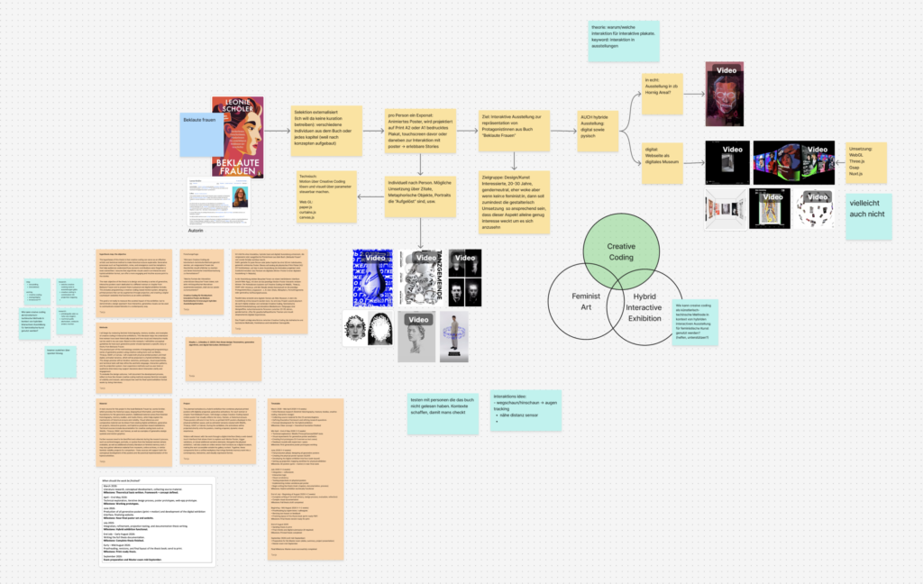
Nach dem Gespräch habe ich mein Board noch weiter verändert und ausgebaut, folgendes ist aber als Grundentscheidung weiterhin notiert geblieben: Die Auswahl soll externalisiert sein. Ich will an der Stelle keine klassische Kuratorin spielen, sondern eher einen Rahmen bauen, in dem sich unterschiedliche Personen aus dem Buch (oder alternativ je Kapitel, weil das Buch konzeptuell aufgebaut ist) abbilden lassen. Also wenn ich individuelle Schicksale zeige, dann will ich die Auswahl der Person externalisieren – oder ich zeige Konzepte und Gesellschaftsstrukturen, die zu diesem Problem geführt haben, dann kann ich auch andere Literatur heranziehen und selbstständig über die Inhalte der Poster bestimmen. Von diesem Punkt habe ich dann weitergearbeitet, und zwar in die Richtung einer interaktiven Ausstellung mit digital/analogen politischen Postern.
Je nachdem, was in dem Poster dann gezeigt wird, wäre der grobe Aufbau:
Ein animiertes Poster, das als Projektion auf ein gedrucktes Plakat (A2 oder A1) gelegt wird
Dazu Sensoren oder andere Trigger über die man mit dem Poster interagieren kann
Ziel: Die Inhalte werden nicht nur gelesen, sondern als erlebbare Story zugänglich
Ich habe mir dazu auch ein bisschen notiert, wie die Visualisierung pro Poster aussehen könnte. Das soll individuell funktionieren – je nachdem, was zum jeweiligem Inhalt passt. Ideen, die ich gesammelt habe:
Arbeit mit Zitaten als Einstieg oder „Trigger“
Metaphorische Objekte (statt alles nur über Text zu erklären)
Porträts, die sich „auflösen“, fragmentieren oder neu zusammensetzen
Technische Idee der Umsetzung von Projektion auf Poster:
Dann habe ich mir das Ganze nochmal als übergeordnetes Ziel formuliert: Am Ende soll es auf eine interaktive Ausstellung hinauslaufen, die die Protagonistinnen aus „Beklaute Frauen“ repräsentiert – nicht als klassische Info-Tafeln, sondern als hybride, visuell starke Stationen.
Ein wichtiger Punkt im Mapping war auch die Zielgruppe: Ich denke da an design-/kunstinteressierte Menschen, eher genderneutral gedacht, tendenziell offen für politische Themen. Und gleichzeitig: Selbst wenn jemand nicht explizit aus einem feministischen Interesse heraus kommt, soll die gestalterische Umsetzung so anziehend sein, dass man trotzdem hängen bleibt und sich darauf einlässt.
Technisch habe ich eine Richtung festgehalten: Motion über Creative Coding, und zwar so, dass ich die visuellen Elemente über Parameter steuerbar mache (damit das System pro Poster variieren kann). Als mögliche Tools/Libs, die ich dafür am Schirm habe: paper.js, curtains.js und klassisch canvas.js/WebGL, je nachdem wie „grafisch“ vs. „shader-lastig“ es am Ende werden soll.
Und ganz am Ende habe ich mir die Klammer nochmal als Frage notiert, weil das eigentlich der Kern für die Masterarbeit werden könnte:
Wie kann Creative Coding als künstlerisch-technische Methode im Kontext einer hybriden interaktiven Ausstellung für feministische Inhalte genutzt werden – also nicht nur „als Effekt“, sondern wirklich unterstützend?
In the last few months, I had the pleasure of knowing one of the leading professors at FH Joanneum, who happens to be my master’s thesis supervisor by choice, as he possesses real-world knowledge about the UX realm, its intricacies, and fundamentals.
The meetings consisted of a mix of lunches and dinners that gave me the space to talk freely without the boundaries of meeting someone in an office, speaking my mind about the challenges and hurdles that come with doing my master’s studies while working as a product designer and the hustle to juggle between every aspect, including what life throws at you from other directions.
In addition, I introduced my master’s thesis topic and talked about it in terms of the possibilities of how to achieve it, its potential approaches and the importance of striking a balance between theory and practice. I received some great insights from Dr. Konrad, and he introduced me to some fine books. One of these, a master’s thesis from 2018 by a student of FH Joanneum, is particularly noteworthy. The thesis named Data Driven UX Process for MOOC Design by Jacqueline Kircher, which is basically a user experience improvement of the massive open online course platform iMooX, shares the same DNA with my topic since it addresses the UX issues in a platform dedicated to knowledge management.
Scrolling through the thesis, I found a great deal of valuable information, as well as exploring the structure that was used to form and layout a master’s thesis which made me choose this work to be in my bibliography to use it as a reference. Several other books I checked out of curiosity and found what seemed to me the first spark that made me choose digital design as a future path back in 2014, one of them is The Universal Principles of Design.
In conclusion, more and more I’m realizing how valuable to know people who have good experience under their belt and especially those who are pragmatic in their approach to what is going on around them, both professionally and socially and the epiphany of reminding yourself that the more you know, the more you realize that you don’t know.
Today, 29/1/2026, we had what was called a “Final Crit.” It wasn’t really a class, but rather a 25-minute one-on-one meeting with Horst Hörtner from Ars Electronica. I went into it still feeling unsure about my master’s thesis topic, and I left with a much clearer sense of what I am not doing anymore, and where I need to look next.
Most of our conversation focused on how I have been framing my topic so far: communicating social anxiety through tangible interaction. While this sounds coherent on paper, I realized during the discussion that it doesn’t fully translate to what I actually want to achieve. Social anxiety is a broad and complex subject. It is experienced differently by everyone, and it can easily become abstract or even misleading if you try to “represent” it too directly.
When I talked about my project, I noticed that I kept drifting into the technical side: how to visualize anxiety, how to show it, how to make it interactive. But that is not really my core intention. I am not interested in creating a visual metaphor of anxiety. What I care about is how people feel in certain spaces and situations, and how interaction design can shape that experience.
One of my initial ideas was to create a space that does not make people feel like they are performing or being put in the spotlight. The feeling of being watched, judged, or evaluated is something many people with social anxiety experience strongly. I wanted to avoid designing something that forces visitors to act, react, or expose themselves. Instead, I imagined a space where interaction is optional, slow, and self-directed.
At the same time, the meeting reminded me of something important: there is no single experience of social anxiety. Some people feel uncomfortable around strangers, while others feel safer with people they do not know. Some enjoy attention, others avoid it. We can never fully know how someone feels when they enter a space. That makes the task more complicated, but also more interesting. It means I am not designing for a fixed emotion, but working with uncertainty, subjectivity, and difference.
What became clearer to me is not a final answer, but a shift in how I need to think about the topic. Instead of trying to “show” social anxiety, I need to rethink what my role is as a designer in relation to it. The question is less about representation and more about how my own perspective, values, and experiences can shape the way I approach this subject.
I don’t yet know what the final form of the work will be. But I do know that I need to move away from purely technical solutions and spend more time clarifying what I actually want to communicate through interaction, space, and material.
AI was used for corrections, better wording, and enhancements.
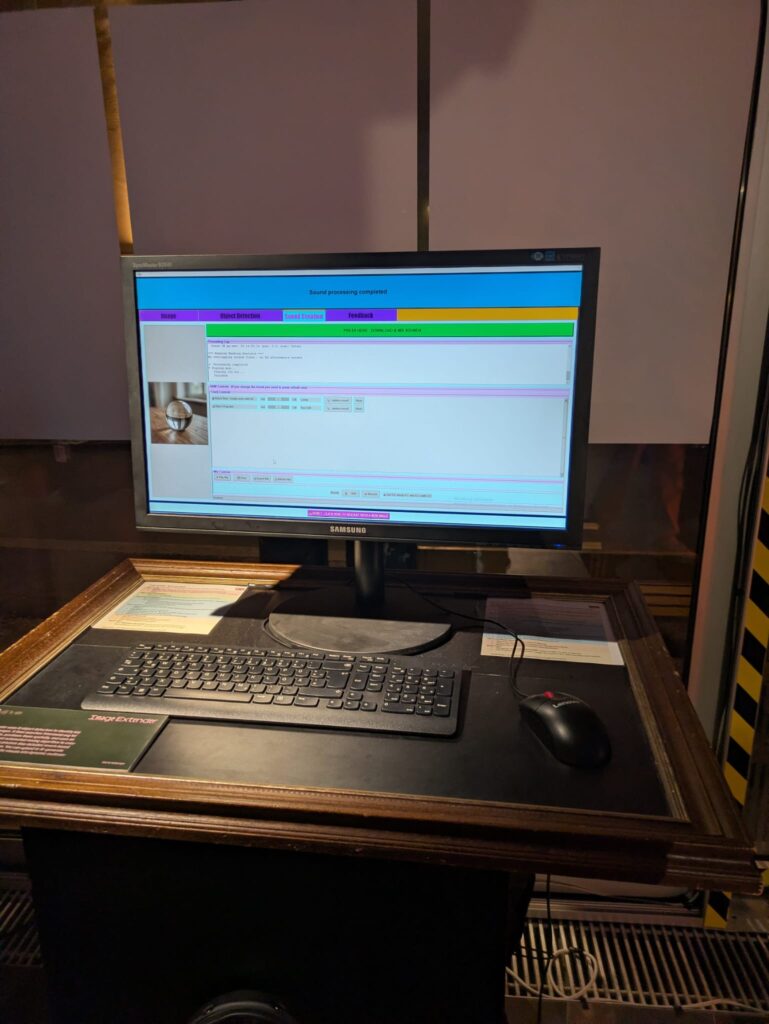
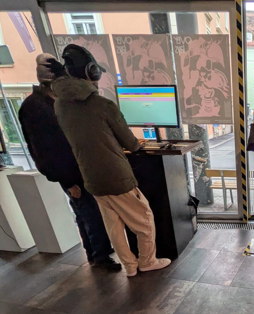
From Notebook Prototype to Local, Exhibitable Software
This iteration was less about adding new conceptual capabilities and more about solidifying the system as an actual, deployable artifact. The core task was migrating the image extender from its experimental form into a standalone local application. What sounds like a technical refactor turned out to be a decisive shift in how the system is meant to exist, be used, and be encountered.
Until now, the notebook environment functioned as a kind of protected laboratory. It encouraged rapid iteration, verbose configuration, and exploratory branching. Moving out of that space meant confronting a different question: what does this system look like when it stops being a research sketch and starts behaving like software?
The transition from Colab-style execution to a locally running script forced a re-evaluation of assumptions that notebooks quietly hide:
Implicit state becomes explicit
Execution order must be deterministic
Errors can no longer be “scrolled past”
Configuration must be intentional, not convenient
Porting the logic meant flattening the notebook’s narrative structure into a single, readable execution flow. Cells that once assumed context had to be restructured into functions, initialization stages, and clearly defined entry points. This wasn’t just cleanup, it was an architectural clarification.
In the notebook, ambiguity is tolerated. In running software, it accumulates as friction.
Reduction as Design: Cutting Options to Increase Clarity
One of the more deliberate changes during this phase was a reduction in exposed settings. The notebook version allowed extensive tweaking, model switches, resolution variants, prompt behaviors, fallback paths, all useful during development, but overwhelming in a public-facing context.
For the exhibition version, optionality became noise.
Instead of presenting the system as a configurable toolkit, I reframed it as a guided instrument. Core behaviors remain intact, but the number of visible parameters was intentionally constrained. This aligns with a recurring principle in the project: flexibility should live inside the system, not on its surface.
Adapting for Exhibition: Y2K as Interface Language
Alongside the structural changes, the interface was visually adapted to match the exhibition context. The decision to lean into a Y2K-inspired color palette wasn’t purely aesthetic; it functioned as a form of contextual grounding.
The visual layer needed to communicate that this is not a neutral utility, but a situated artifact. The Y2K styling introduced:
High-contrast synthetic colors
Clear visual hierarchy
A subtle nod to early digital optimism and machinic playfulness
Rather than competing with the system’s conceptual weight, the styling makes its artificiality explicit.
Stability Over Novelty
Another quiet but important shift was prioritizing stability over feature expansion. The migration process exposed several edge cases that were easy to ignore in a notebook but unacceptable in a live context: silent failures, unclear loading states, brittle dependencies.
Addressing these didn’t add visible functionality, but they fundamentally changed how trustworthy the system feels. In an exhibition setting, reliability is part of the experience. A system that hesitates or crashes invites interpretation for the wrong reasons.
Here, robustness became a form of authorship.
Reframing the System’s Status
By the end of this iteration, the most significant change wasn’t technical, it was ontological. The system is no longer best described as “a notebook that does something interesting.” It is now a runnable, bounded piece of software, designed to be encountered without explanation.
This transition marks a subtle but important moment in the project’s lifecycle:
From private exploration to public behavior
From configurable experiment to opinionated instrument
From development environment to exhibited system
The constraints introduced in this phase don’t limit future growth, they define a stable core from which growth can happen meaningfully.
If earlier updates were about expanding the system’s conceptual reach, this one was about giving it a body.
As part of my ongoing research into how digital and interactive media intersect with spiritual and liturgical experiences, I recently took a closer look at contemporary prayer apps. In particular, I explored Hallow, one of the most prominent Catholic prayer apps internationally, as well as the Austrian project einfach beten. Both platforms aim to support spiritual practice through digital means—yet they approach this goal in very different ways.
At first glance, Hallow stands out through its highly polished design. The visual language feels modern, minimal, and clearly targeted at a younger audience. Navigation is intuitive, typography is clean, and the overall aesthetic would not immediately be associated with religious or church-related content. From a purely interface-driven perspective, this neutrality is a strength: it lowers the threshold for entry and avoids overt religious symbolism that might deter hesitant users.
However, the longer I spent with the platform, the more ambivalent my perception became. The absence of real people is striking. Instead, the app relies heavily on illustrations—human figures without faces, stylized and distant. While this may be a deliberate attempt to remain inclusive or universal, it also creates a sense of emotional detachment. The interface feels curated but strangely cold, almost sterile. In some moments, this abstraction even felt unsettling, as if spirituality were being removed from lived human experience and translated into a controlled, aestheticized environment.
A major limitation of Hallow is its strict access model. Without registering—and, in many cases, subscribing—very little content is available. This raises questions about accessibility and inclusivity. Prayer, traditionally understood as a freely accessible spiritual practice, becomes gated behind logins, data collection, and payment models. As several critical articles point out, this creates tension between spiritual support and commercial interests. When prayer becomes a product, the line between guidance and manipulation becomes blurred.
These concerns are echoed in media coverage questioning whether Hallow functions primarily as a spiritual companion or as a tool of subtle influence. The use of persuasive design strategies—such as streaks, reminders, and emotionally framed audio content—can foster dependency rather than reflection. From an interaction design standpoint, this raises ethical questions: When does “supporting spiritual practice” turn into behavioral steering?
In contrast, einfach beten presents a very different approach. Visually, the platform is far less refined. The design feels dated and lacks the clarity and appeal of more contemporary apps. However, what it lacks in aesthetic sophistication, it partially compensates for through openness. Access to audio prayers is fast and uncomplicated, and users can engage with content without immediate registration. This simplicity aligns more closely with traditional understandings of prayer as something accessible, personal, and non-exclusive.
That said, einfach beten also reveals the challenges of translating spiritual practice into digital form. The lack of thoughtful interaction design limits engagement, especially for users accustomed to high-quality digital experiences. While the content may be meaningful, the interface does little to invite reflection or sustained use. This highlights a central tension: accessibility alone does not guarantee meaningful interaction.
Comparing these two platforms has been highly relevant for my master’s thesis. Both apps demonstrate that digital tools can support spiritual practices—but they also show how easily technology can reshape, frame, or even distort them. Neither solution feels fully convincing. One prioritizes design and branding at the risk of commercialization and emotional distance; the other prioritizes content while neglecting experiential quality.
For my research, this comparison reinforces the importance of critical, reflective interaction design in religious contexts. Digital tools should not aim to replace liturgical or spiritual experiences, nor should they instrumentalize them. Instead, they should create spaces that allow for openness, ambiguity, and personal interpretation—qualities that are central to spiritual experience but often difficult to translate into digital systems.
Ultimately, prayer apps reveal less about technology itself and more about the values embedded in their design decisions. They force us to ask: What does it mean to “support” spirituality digitally? Who defines what a good spiritual experience looks like? And how much control should technology exert over practices that are deeply personal and reflective by nature?
Rückblickend war das Projekt, welches im Rahmen der Lehrveranstaltung Design and Research 2 entstanden ist, eines jener Projekte, bei denen mir erstmals klar wurde, dass sich meine bisher eher intuitiv verfolgten Interessen an historisch akkuraten Gefechten in Filmen und Videospielen tatsächlich zu einem tragfähigen Masterarbeitsthema formen lassen könnten. Die Arbeit mit den Schwertkampfchoreografien von den Teilnehmer:innen aus INDES Wien machte viele der theoretischen Überlegungen, die mich bereits zuvor beschäftigt hatten, nach und nach greifbar und praktisch überprüfbar.
Ich war bei diesem Projekt aktiv am Dreh beteiligt und sowohl während der Generalprobe am Vortag als auch beim eigentlichen Dreh hauptverantwortlich für die Kameraarbeit. Anschließend kümmerte ich mich ebenso um die Postproduktion im Alleingang. Die Choreografien selbst wurden von den Teilnehmenden des Kurses ausgearbeitet und waren nicht speziell für die Kamera adaptiert, sondern entsprachen in ihrer Struktur und Ausführung weitgehend realistischen, trainingsnahen Abläufen. Genau das machte das Projekt für mich besonders interessant, da ich anhand der zuvor gesendeten Handyvideos und zur Finalisierung direkt bei der Generalprobe Kamerabewegungen und -winkel definieren musste, um ebenjene Kampfabläufe visuell lesbar zu machen. Die einzige Vorgabe, die die Teilnehmenden nach Absprache zwischen dem Trainer Thomas Hofer und mir bekamen, war, dass die Choreografien zwischen 30 und 60 Sekunden maximal dauern dürfen.
Insgesamt wurden vier Choreografien umgesetzt, darunter eine mit langem Messer sowie drei mit langem Schwert, wobei zwei davon zusätzlich mit Dolch als Beiwaffe gearbeitet waren. Diese Vielfalt an Waffen stellte unterschiedliche Anforderungen an die Bildauswahl, denn gerade bei den Kombinationen mit Beiwaffen wurde mir spätestens beim Schnitt bewusst, wie schnell Bewegungen oder auch der Waffenwechsel visuell unübersichtlich werden können, wenn Kameraposition in dieser Situation nicht präzise gewählt sind oder nicht früh genug gezeigt wird, dass die Kontrahent:innen eine Sekundärwaffe mit sich führen. Aspekte wie die korrekte Wahl der Achse, dem Einsatz spezieller Techniken, wie beispielsweise das Winden oder Ringen in der Messerchoreografie, sowie die Beziehung der beiden Fechtenden im Raum zueinander spielten dabei eine wichtige Rolle und ich merkte spätestens bei der zweiten Choreografie, dass kleine Entscheidungen in der Kameraposition oder des Winkels bereits großen Einfluss darauf haben, ob eine Aktion für den Zuseher nachvollziehbar bleibt, spektakulär in Szene gesetzt ist oder aufgrund von Unübersichtlichkeit ihre Wirkung verliert.
Auch das Tempo der Choreografie war ein nicht zu unterschätzendes Element bei der Produktion. Besonders Team 2 mit Ben und Simon setzte ihre Choreografie mit etwa 70% der möglichen Geschwindigkeit um, um die Handlungen weiterhin lesbar zu machen. In einer Statischen Totalaufnahme setzten sie die Choreografie in 90%iger Geschwindikeit um, was für mich als Kenner der Materie bereits schwer war, alle Aktionen klar nachzuvollziehen. Das Tempo war jedoch beeindruckend, stellte mir jedoch vor die Frage ob ich einerseits das benötigte Können habe, um eine solch schnelle Szene auf professionellen Level zu filmen schaffe, oder ob es mehr Sinn macht, etwas Tempo einzubüßen und dafür die Nachvollziehbarkeit in den VOrdergrund zu bringen. LEtztendlich habe ich mich mit gemeinsamer Absprache mit Tom für zweiteres entschieden, da auch 70%ige Geschwindigkeit für die meisten Menschen ausgesprochen schnell wirkt.
Spannend war für mich war während der Produktion auch, wie stark sich die Kameraarbeit und Choreografie gegenseitig beeinflussen, denn während der Generalprobe konnte ich gut beobachten und erproben, welche Bewegungen gut lesbar sind, aus welchem Winkel die Kamera am besten die Darsteller samt Waffen verfolgen sollte und wo es zu potentiellen Brüchen kommen könnte, was durch die Raumgröße der Location von Zeit zu Zeit gegeben war. EIn großer Fokus lag für mich bei der Lesbarkeit der Aktionen und darauf, Bewegungsabläufe verständlich abzubilden, ohne dabei die Nähe der Charaktere zu verlieren, jedoch habe ich beim Schnitt wiederum gemerkt, wie ich wiederholt dazu tendierte, mich in Nahaufnahmen zu verlieren, welche die Emotionen besoders in den Vordergrund stellte, was wiederum Orientierung und Nachvollziehbarkeit der Choreografie einbüßte.
Die Arbeit mit INDES Wien hat mir gezeigt, dass sich reale, historisch fundierte Kampfabläufe sehr wohl filmisch umsetzen lassen, wenn Kameraarbeit, Timing, fechttechnisches Know-How und räumliches Verständnis bewusst zusammenspielen. Gerade im Kontext der historischen Fechtkunst ist diese Übersetzungsleistung ziemlich anspruchsvoll, da die historisch belegten Techniken oft weniger ausladend und fürs ungeschulte Auge unsichtbarer sind, als es filmische Konventionen erwarten lassen.
Wie ganz zu Beginn genannt, war diese Produktion der Start, an dem ich begann, mein Design&Research Thema als ernst zu nehmenden Teil einer möglichen Masterarbeit zu betrachten und nicht mehr nur als ein spannendes Projekt, welches sich als interessante Abwechslung in meinem Portfolio anbieten würde.
Das Gespräch mit Daniel Bauer, welches wir im November hatten, drehte sich rund um mein voraussichtliches Masterarbeitsthema und stellte für mich einen wichtigen Moment im bisherigen Themenfindungsprozess dar. Ich ging in dieses Treffen mit dem Grundgedanken, dass ich mich thematisch noch nicht zu hundert Prozent festgelegt hatte und plante daher ihm zwei unterschiedliche Grundideen vorzustellen und diese gemeinsam zu diskutieren.
Das erste Thema beschäftigte sich mit Visual Storytelling in bewaffneten Duellszenen und Kampfchoreografien. Mich interessiert dabei vor allem die Frage, wie Bildgestaltung, Kameraführung und Editing die Wahrnehmung solcher Szenen beeinflussen und formen. Dieses Themenfeld begleitet mich bereits seit vergangenen Semester und zieht sich durch meine bisherigen Blogposts ebenso wie durch einige meiner praktischen Arbeiten, in denen ich mich intensiv mit choreografierten Schwertkampfszenen auseinandergesetzt habe.
Doch ursprünglich hatte ich, als ich dieses Masterstudium begonnen hatte, einen anderen Plan für meine Masterarbeit, da ich im Rahmen dessen endlich die Idee eines Dokumentarfilms über Historisches Fechten umsetzen wollte. Diese Idee begleitet mich seit nun drei Jahren, allerdings ist mir bis zuletzt kein Forschungsthema eingefallen, das sich sinnvoll mit dieser Vision vereinen ließ. Deshalb wollte ich beide Ansätze im Gespräch vorstellen und gemeinsam mit Daniel Bauer entscheiden, welcher davon sich besser für eine Masterarbeit eignen würde.
Der Verlauf des Gesprächs entwickelte sich jedoch anders als erwartet, denn bevor ich überhaupt dazu kam, meine zweite Idee ausführlich zu pitchen, begann ich zuerst noch grob über meine bisherigen Blogposts und die gefilmten Schwertkampfchoreografien der vergangenen Semester zu erzählen, um das Thema greifbarer zu machen. Daniel reagierte sehr positiv auf diesen Überblick, meiner Begeisterung für dieses Thema und bezeichnete es als eine extreme Nische, die inhaltlich jedoch wirklich spannend klinge.
Besonders in Erinnerung geblieben ist mir seine Rückmeldung, dass gerade meine Expertise und mein Fachwissen kombiniert aus beiden Bereichen, Historisches Fechten und Film, dieses Thema zu einem sehr interessanten Masterarbeitsthema machen würden. Er meinte, dass genau diese Kombination selten sei und großes Potenzial habe. Seine Aussage „Diese Masterarbeit würde ich mir sogar echt gern durchlesen“ wirkte auf mich sehr motivierend und bestätigte mich in meinem bisherigen Ansatz.
Im Gespräch kamen wir zudem auf mögliche inhaltliche Schwerpunkte zu sprechen, welche die Thematik gut ergänzen würden. Dabei ging es vor allem um unterschiedliche Typologien von Actionszenen und um die Frage, wie bewaffnete Duelle je nach kulturellem Kontext inszeniert werden. Aspekte wie Schnitt, Dramaturgie und Mimik spielten dabei eine zentrale Rolle, ebenso der Unterschied zwischen nüchterner und überstilisierter Darstellung, wie man es beispielsweise aus asiatischen Kampfkunstfilmen im Kontrast zu den US-Actionfilmen kennt.
Gleichzeitig wies er jedoch auch darauf hin, dass dieses Thema sehr schnell sehr umfangreich werden könne und die Analyse von Kampfszenen viele Ebenen zum Erforschen eröffne und ich daher einen gezielten Fokus zum Ausarbeiten wählen sollte, wie beispielsweise die Kameraführung. Daher riet er mir dazu, das Thema klar einzugrenzen und bewusst Schwerpunkte zu setzen, um den Rahmen der Masterarbeit nicht zu sprengen.
Einerseits kam ich dadurch leider nicht mehr dazu, meine ursprüngliche Idee zum Dokumentarfilm ausführlich vorzustellen. Andererseits hat mich genau dieses Gespräch sehr darin bestärkt, den bisher eingeschlagenen Weg aktiv weiterzuverfolgen. Die Begeisterung für das Thema und das konstruktive Feedback motivierten mich, mich stärker auf Visual Storytelling, Kampfchoreografie und deren filmische Wahrnehmung zu fokussieren.