Einfluss, Ästhetik und Literatur

Wie meine Masterarbeit meinen Werdegang beeinflussen kann

Das Ergebnis meiner Masterarbeit soll nicht nur eine wissenschaftliche Leistung darstellen, sondern auch meinen beruflichen und künstlerischen Werdegang positiv beeinflussen und neue Türen öffnen. Deshalb möchte ich Überlegungen anstellen, wie sich die Arbeit am besten „vermarkten“ lässt, um ein breites Publikum zu erreichen und potenzielle Kunden auf mich aufmerksam zu machen.

Die Idee, Kirchen als Austragungsort zu wählen, gefällt mir besonders gut, da sich in diesen Räumen zahlreiche gestalterische Möglichkeiten bieten: Die einzigartige Architektur, die reiche Symbolik und die besondere Akustik schaffen ein ideales Umfeld für experimentelles Video-Mapping.

Persönlich haben mich Kirchen als architektonische Bauwerke schon immer fasziniert. Gleichzeitig stehe ich ihrer Geschichte und den damit verbundenen Machtmissbräuchen kritisch gegenüber. Diese Ambivalenz hat mich zu einer – zugegeben leicht humorvollen – Überlegung geführt: Als Selbstständiger führe ich, gemessen an meinen Verhältnissen, recht hohe Summen an Kirchensteuer ab. Vielleicht ist es Zeit, mir etwas zurückzuholen – durch ein Konzept oder eine audiovisuelle Show, die die Architektur von Kirchen würdigt, ohne dabei zu stark auf religiöse Inhalte einzugehen.

Eine neue Perspektive auf Kirchen durch Video-Mapping

Mein Ziel ist es, ein Werk zu schaffen, das Kirchen als Ort der Ruhe und Reflexion neu interpretiert. Kirchen sollten Räume sein, in denen Menschen innehalten können, um über sich selbst oder andere nachzudenken – sei es in Trauer, Freude oder Sehnsucht. Ein Ort, der Geborgenheit vermittelt und zum Nachdenken einlädt.

Allerdings kann der religiöse Hintergrund vieler Kirchen manche Menschen, insbesondere solche mit Zweifeln oder kritischer Einstellung zur Religion, davon abhalten, diesen Raum so zu erleben. Hier sehe ich die Chance, Video-Mapping als Medium einzusetzen, um solche Barrieren zu überwinden. Eine meditative, beruhigende audiovisuelle Show könnte Menschen ansprechen, die nicht unbedingt einen spirituellen Zugang zu Kirchen haben, und ihnen eine neue Perspektive bieten.

Kirche als Bühne für Kunst und Reflexion

Durch Video-Mapping lässt sich die symbolische und architektonische Schönheit der Kirche betonen, ohne sie auf religiöse Inhalte zu reduzieren. Die visuelle und akustische Gestaltung könnte dabei helfen, einen universellen Zugang zu schaffen – einen Raum, der alle Menschen willkommen heißt, unabhängig von ihrem Glauben oder ihrer Haltung zur Religion.

Gestaltung und Ästhetik im Fokus

Ein zentrales Ziel in der Weiterentwicklung meines Projekts ist es, neben dem Ausbau technischer Fähigkeiten, die Gestaltung und Ästhetik des Video-Mappings gezielt zu vertiefen. Dabei könnten Künstler und Stilrichtungen aus der Renaissance eine inspirierende Grundlage bieten. Besonders faszinierend ist die Verbindung von Raum, Licht und Symbolik in den Kunstwerken dieser Epoche, die viele Parallelen zur modernen Mapping-Ästhetik aufweist.

Um dieses Verständnis zu erweitern, plane ich, Geschichten und Kunstwerke aus dem Mittelalter und der Renaissance eingehender zu studieren. Ein guter Einstieg hierfür ist das wohl bekannteste Standardwerk der Kunstgeschichte:
Ernst H. Gombrich: Die Geschichte der Kunst (Phaidon Verlag). Dieses Buch hat bereits in meinem Kunststudium eine zentrale Rolle gespielt und wird mir erneut als Grundlage dienen, um die Kunst und ihre geschichtlichen Zusammenhänge zu analysieren.


Relevante Literatur für die Masterarbeit

Nach ersten Recherchen habe ich eine Auswahl an Literatur zusammengestellt, die mir wertvolle theoretische und praktische Impulse für die Masterarbeit liefern könnte:

  1. Wahrnehmungspsychologie: Der Grundkurs
    • Autor(en): E. Bruce Goldstein (Autor), Hans Irtel (Herausgeber)
    • ISBN: 978-3827417668
    • Amazon-Link: Wahrnehmungspsychologie: Der Grundkurs
    • Inhalt: Dieses Buch bietet eine fundierte Einführung in die Wahrnehmungspsychologie, die einen wichtigen Bestandteil meines Forschungsansatzes darstellt. Es behandelt Themen wie neuronale Mechanismen, Farbwahrnehmung, Objekterkennung, räumliche Wahrnehmung und akustische Wahrnehmung. Besonders die Kapitel über räumliche Wahrnehmung und die Verarbeitung akustischer Reize könnten für meine Arbeit in sakralen Räumen äußerst relevant sein.
  2. The Media Equation: How People Treat Computers, Television, and New Media like Real People and Places
    • Autor(en): Byron Reeves, Clifford Nass
    • ISBN: 978-1575860527
    • Amazon-Link: The Media Equation
    • Inhalt: Dieses Buch untersucht, wie Menschen Medien und Technologien sozial ähnlich behandeln wie reale Personen und Orte. Die Erkenntnisse könnten dazu beitragen, zu verstehen, wie Zuschauer audiovisuelle Projektionen in einem sakralen Kontext erleben und auf sie reagieren.
  3. Das Heilige und das Profane: Vom Wesen des Religiösen
    • Autor(en): Mircea Eliade
    • ISBN: 978-3458339426
    • Amazon-Link: Das Heilige und das Profane
    • Inhalt: Eliades Werk untersucht die symbolische Bedeutung des Heiligen im Kontrast zum Profanen. Dieses Buch liefert tiefere Einblicke in die kulturellen und religiösen Bedeutungen, die mit sakralen Räumen verbunden sind, und wie diese sich auf die Wahrnehmung auswirken.
  4. Fractal Geometry in Architecture & Design
    • Autor: Carl Bovill
    • ISBN: 978-0817637958
    • Amazon-Link: Fractal Geometry in Architecture & Design
    • Inhalt: Dieses Buch analysiert die Anwendung von Fraktalen in der Architektur als visuelle Sprache. Es könnte wertvolle Impulse für die Gestaltung komplexer visueller Strukturen in meinem Projekt liefern, insbesondere im Zusammenspiel von Architektur und Mapping.
  5. Dichte Beschreibung: Beiträge zum Verstehen kultureller Systeme
    • Autor: Clifford Geertz
    • ISBN: 978-3518282964
    • Amazon-Link: Dichte Beschreibung
    • Inhalt: Geertz’ Konzept der „dichten Beschreibung“ bietet eine tiefgründige Methodik, um kulturelle und symbolische Systeme zu verstehen. Dieses Werk könnte mir helfen, die kulturellen Kontexte von Kirchen und ihrer Rezeption durch ein breites Publikum besser zu analysieren.

Topic Introduction: The Memory of Stories 

The  following and upcoming blogposts intend to dive into the topic of story-based methods and their impact on people living with dementia / Alzheimer’s disease. First steps would be to analyze the illness and both traditional and new treatment methods, as well as to explore the usage of story-based formats such as digital storytelling during treatment or/and as a tool for communication. For further understanding of the topic there shall be an explanation as to what story-based approaches are, what (digital) storytelling is, how it is currently being used and eventually it should be defined what kind of approach could be implemented for a practical application of the obtained knowledge into a real-life project. The idea is to use a story-based format as a foundation for developing a creative approach in dealing with and/or raising awareness for the topic. 

This first blogpost will briefly touch upon the topic of dementia and its subtypes in order to gain some insight into the illnesses and the symptoms connected to it.

INTRODUCTION: DEMENTIA

One of the defining processes of the 20th century was the global population aging, with its consequences continuing into the 21st century. Populations are growing even though fertility rates are falling, meaning that the world population of elderly people will overtake the number of children. (Sosa-Ortiz, 2012)

Generally, it can be said that with the population’s rising life expectancy, the rates of dementia are increasing as well. (Rincon, 2022) Globally speaking, the number of  people living with dementia is expected to rise to 82 million over the next 11 years – in 2019, the number was significantly lower, with 50 million people suffering from dementia. (World Health Organization [WHO], 2019). 

There are various types of dementia, which, according to diagnostic criteria can be divided into subtypes such as Alzheimer’s disease, fronttemporal dementia or vascular dementia. A construct frequently used to describe groups of people that are at risk of developing dementia is called mild cognitive impairment (MCI), which is especially important to recognize in order to be able to take preventative measures. (Sosa-Ortiz, 2012)

Overall „Dementia is a syndrome caused by different disorders that affect cerebral structures and functions, causing progressive deterioration of memory, other mental functions and behavior.“  (Sosa-Ortiz, 2012, 600)

Dementia is an umbrella term that includes a broad range of symptoms but it is not in itself a disease. These symptoms commonly include memory decline, changes in the ability to think, judge or reason, loss of focus and attention as well as changes in behavior and language. (Graff-Radford, 2024)  

Peoplesuffering from dementia will be impaired in their ability to perform everyday tasks, which has tremendous effects on a person’s autonomy and independence. This can be challenging for all parties involved, including the patient themselves, caregivers and families. (Sosa-Ortiz, 2012, 600-601)

Dementia can generally occur at any age, however, the risk of developing it increases with a person’s age and is more common in the demographic group of people above the age of 60. There are also other factors that can contribute to the risk of developing dementia, such as high blood pressure, diabetes, genes or smoking. (Loh, 2023)

TYPES OF DEMENTIA

Alzheimer’s disease 

Even though the terms are often used interchangeably, dementia and Alzheimer’s are not the same thing. Alzheimer’s disease is a specific brain disease marked by symptoms of dementia that gradually become more and more severe. As mentioned above, it is the most common dementia type. It affects the part of the brain responsible for learning, which is why early signs often include changes in thinking, memory and reasoning skills. With the disease progressing, also the symptoms worsen and can include behavioral changes or confusion amongst others. (Graff-Radford, 2024)
Alzheimer’s disease is thought to emerge due to abnormal protein deposits forming in the brain, disrupting the communication between the brain cells. (Loh,2023)

Vascular Dementia 

Vascular dementia is caused by a reduced blood supply of the brain due to blocked, narrow, or damaged  blood vessels, often connected to a stroke or damaged blood vessels caused by diabetes or high blood pressure. Following this diminished blood supply, the brain is deprived of oxygen and essential nutrients. It is also a common form of dementia. (Loh,2023)

Lewy body Dementia

When there is a build-up pf protein deposits called Lewy bodies it can lead to Lewy Body Dementia. As is the case with Alzheimer’s disease, the protein deposits disrupt the function of a person’s brain cells and lead to a decline of cognitive abilities and issues with movement, amongst others. Since the symptoms can be similar, Lewy body Dementia could be confused with Parkinson’s disease. (Loh,2023)

Frontotemporal Dementia

Frontotemporal dementia is caused by the progressive degeneration of nerve cells in the temporal and frontal lobes of the brain and characterized by behavioral and personality changes as well as alterations of the language abilities. It is a rare form of dementia. (Loh,2023)

Most types of dementia can not be cured, however, certain treatment methods and strategies can help with the symptoms and improve the patients’ quality of life.  (Loh, 2023)

The next blogpost will elaborate on the topic of story-based treatment methods such as digital storytelling and explain the fundamentals of the concept. 

SOURCES

Aviation Design – Parachute Upcycling in Fashion

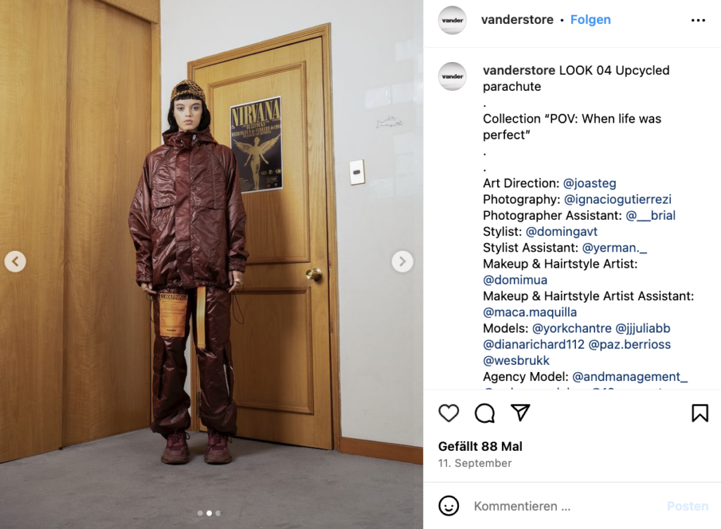
Home bedding & bath linens are a huge opportunity in the circular economy. Often made up of mono-materials, like 100% cotton and 100% linen, they are what we call high value textiles, the types that can be easily fiber-to-fiber recycled and entered back into new textiles streams. But what about the fabric of parachutes? Nylon is hard to process and therefore rarely recycled.

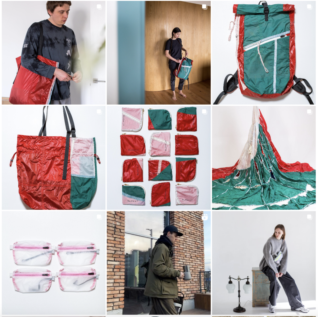
Parachute upcycling: The fabric is soft, ultralight and semi-transparent and 100% nylon // SLOWLY Brand on Instagram: https://www.instagram.com/stay_slowly/

https://slowlyupcycling.com/shop

Garments Made out of Parachute Fabric

maharishi 5091 Upcycled Parachute Kimono for €515: https://www.maharishistore.com/products/5091-upcycled-parachute-kimono-olive

Calling your product Parachute Hoodie can lead to some confusion.  Reading the name, I thought the hood would blow up into a large canopy to slow down your descent when you jump out of a plane.  But, alas, it doesn’t. Instead, it’s actually just a good-looking hoodie made from recycled parachute materials. Made in Switzerland, the garments are constructed out of surplus Swiss military air-brake parachutes.  Each Parachute Hoodie uses two different colors (orange and white) of the parachutes as its primary material.  For further military surplus recycling, it also uses tape taken from the original parachutes for the seams, as well as jersey cuffs ripped out of military balaclavas. Only 100 of the garments have been made, all of them handcrafted. Further: Parachute Hoodies https://www.coolthings.com/parachute-hoodies/

FIELDSOUTFITTING

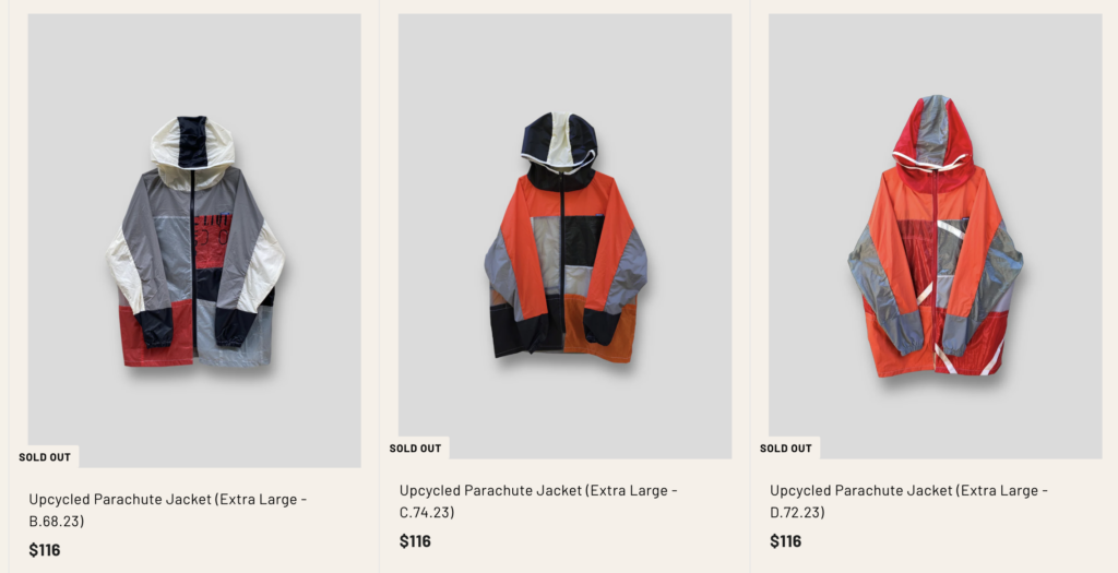
Upcycled Parachute Jacket (Large – D.65.23) Price $165: https://www.fieldsoutfitting.com/collections/baumm

Paragliding Jacket: https://owlstore.eu/en/producto/retro-4/

Paraglider upcycling windbreaker with zip, two outer pockets with zippers and inner pocket with zip, wide cut and longer hem on the back.

  • Outer fabric: 100% Upcycling Paragliders – 100% Rypstop Nylon
  • Lining: 50% Recycled Cotton / 50% Recycled Weight – 150gr / m2 Certified by: RECYCLED-COTEXMO®
  • Maintenance: For greater durability of the material and its attributes such as impermeability, we advise cleaning with a damp cloth, in case of washing: Cold wash, iron at low temperature, do not use dryer.

RЕwind is a Ukrainian clothing brand for adventurers with the wind in their hearts and the sea in their minds. REwind recycles old used sails and reinvents them into stylish items of clothing: polo, jackets, pants, mittens and backpacks.: https://rewind.com.ua/collections/demilitarization

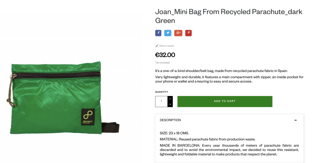
DEMANO Shop creates bags from various outdoor fabrics, also Kitesurf Sails and Parachutes: https://demano.net/en/bum-bags/2023-joanmini-bag-from-recycled-parachutedark-green.html

Further Research Ideas:

  • How to source fabric from suppliers
  • Collecting ideas for the use of white fabric from rescue canopies
  • Textile research: Nylon fabric behavoir when sewing

Automotive UX: Understanding the Fundamentals

The automotive industry is going through a transformation driven by technological advances and changing user expectations. As vehicles become increasingly connected, autonomous and electric, the role of user experience (UX) design becomes essential in creating a safe, intuitive and enjoyable driving experience.

(source: https://www.linkedin.com/pulse/driving-success-critical-importance-ux-design-gerard-chaustow/)

User-Centered Design: Drivers come first.

The basis of automotive UX is user-centred design – an approach that prioritises the needs, behaviours and preferences of drivers and passengers.

Unlike traditional vehicles, where mechanical performance was at the centre of the focus, modern cars are increasingly defined by their digital interfaces and features. Designers need to make sure that all interactions with the vehicle – whether it’s setting the climate controls or navigating the infotainment system – are intuitive and seamless.

To achieve this, designers carry out a wide research on how users interact with vehicles in different contexts. This includes understanding how drivers perceive information while driving, how they interact with touchscreens or voice commands, and how they handle distractions. The goal is to minimise cognitive load so that drivers can focus on what’s most important: safe driving.

(source: https://www.ramotion.com/blog/automotive-ux-design/)

Safety as a Fundamental Principle

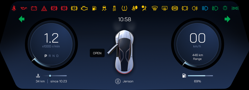
Safety is a fundamental consideration when designing UX in the automotive industry. With the development of advanced driver assistance systems (ADAS) such as lane keeping assist or automatic emergency braking, it is essential that these systems are reliable and easy to use. Poorly designed interfaces can lead to confusion or even accidents if drivers misinterpret warnings or have difficulty operating safety features.

A key aspect of safety-focused UX is information hierarchy – making sure critical information is displayed clearly and at the right time. For example, speed limits or collision warnings should be visible on dashboards or head-up displays (HUDs), while less urgent information can be hidden in secondary menus. In addition, haptic feedback (such as steering wheel vibration) can provide non-visual signals to alert drivers without overwhelming them with too much visual information.

(source: https://medium.com/design-bootcamp/what-product-designers-should-know-about-vehicle-warning-system-design-1a0f91e0b632)

The Role of Connectivity and Infotainment

Modern vehicles are no longer standalone machines, but part of a wider ecosystem of connected devices. From smartphone integration to real-time traffic information updates, connectivity has become an essential part of the automotive UX. Infotainment systems now offer a wide range of features such as Apple CarPlay, Android Auto, voice assistants such as Amazon Alexa, and even streaming services. With these added features, however, comes the challenge of making sure they don’t distract drivers from the driving experience. Designers must strike a balance between offering a wide range of features and keeping the controls simple. Voice control has become a popular solution for limiting screen interaction while driving, allowing users to make phone calls or change music hands-free.

(source: https://www.autoblog.com/features/apple-carplay-next-generation-data)

References:

https://www.uxpin.com/studio/blog/automotive-ux/

https://www.ramotion.com/blog/automotive-ux-design/

https://makolab.com/insights/user-experience-design-for-in-car-systems

https://ordergroup.co/resources/article-business-and-technical/what-are-the-UX-and-Ul-challenges-in-the-automative-industry/

Designing for short attention spans by reducing cognitive load in UI/UX Design

In a world where users attention spans are becoming increasingly shorter, the question arises:
How can designers create digital experiences that thrive in this new age of the attention economy?
Modern platforms like TikTok and Instagram Reels have fostered a culture where content must engage users within seconds. This shift not only changes how people consume media but also how they interact with digital products.

My Personal Motivation

I chose this topic because it is not only timely but also a crucial phenomenon shaping the future of UI/UX design. Understanding how to design for evolving user behaviors is not just about keeping up with trends, it’s about creating experiences that are inclusive, engaging and user-friendly. On a personal level, I’ve always been intrigued by the intersection of psychology and design. How do visual and interactive elements influence what we focus on? How can we use design to reduce frustration and enhance usability? These are questions that fuel my curiosity and drive my research. In this blog, I will explore (for now, I’ll see where this topic takes me) the challenges and opportunities posed by shortened attention spans and discuss smart design strategies that can deliver optimal user experiences.


Why This Topic Is More Relevant Than Ever

The relevance of designing for shortened attention spans has never been greater. As digital consumption habits evolve, designers are facing unprecedented challenges and opportunities. Here’s why this topic matters today:

Modern Digital Behaviors: As users attention spans are impacted by fast-paced platforms (TikTok, Instagram), they bring these expectations to every app or website they interact with. UI/UX design needs to adapt to keep users engaged without overwhelming them.

Optimizing User Performance: Reducing cognitive load helps users focus on key tasks, leading to better performance, conversions, and overall satisfaction.

The Rise of Short-Form Content

Platforms like TikTok, Instagram Reels, and YouTube Shorts have redefined how users consume media. According to a report by Statista (2023), TikTok users spend an average of 95 minutes per day on the app, often scrolling through hundreds of short videos. This trend has created an expectation for quick, engaging interactions across all digital platforms.
Users now demand:

  • Immediate gratification
  • Minimal friction in navigation
  • Engaging visuals that deliver value in seconds

Cognitive Overload in the Digital Age

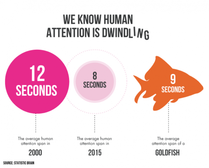
The constant exposure to digital stimuli has a measurable effect on our cognitive capacities. Studies, such as one conducted by Microsoft (2015), suggest that the average human attention span has dropped from 12 seconds in 2000 to 8 seconds in 2015. This number is likely even lower today due to the rise of short-form content platforms.

For designers, this means that traditional, text-heavy or overly complex interfaces are losing effectiveness. The challenge is to simplify interactions without sacrificing functionality or depth.

Economic Impact

Shortened attention spans have direct implications for businesses:

  • E-commerce Conversion Rates: According to a Baymard Institute Report (2023), nearly 70% of online shopping carts are abandoned, often due to overwhelming or confusing interfaces.
  • Ad Revenue: Digital ads are now designed to capture attention within the first few seconds as users skip or scroll past them if they don’t immediately engage

Designers who fail to address these shifts risk losing users, revenue and relevance in competitive markets.

The Shift in Learning and Education

Attention spans are also affecting how people learn and process information. The rise of microlearning platforms like Duolingo or Blinkist reflects the need for bite-sized, focused content that aligns with modern user behaviors. Designing for shorter attention spans isn’t just about entertainment, it’s about enabling users to achieve their goals more effectively.

The Attention Economy

The concept of the attention economy – where attention is treated as a finite resource has become a central topic in UI/UX design. Every app, website and platform is competing for user attention, often at the expense of user well-being. The challenge is to design ethically, balancing engagement with cognitive health. When discussing “user well-being” I plan to dedicate an entire blog post to exploring the ethical implications and the darker side of digital products and platforms that exploit attention in harmful ways. This includes practices like Netflix Kids use of gamification to encourage binge-watching by rewarding children with patches for every movie they complete, highlighting how attention can be manipulated through design. But stay tuned for this one.

Why Designers Must Act Now

Addressing these issues isn’t optional, it’s a necessity. Designers must:

  1. Adapt to Changing Behaviors: Interfaces must align with the fast-paced consumption habits of today’s users.
  2. Reduce Cognitive Load: Simplified designs help users focus on key tasks and avoid frustration.
  3. Ensure Ethical Design Practices: Designers have a responsibility to create experiences that are engaging but not exploitative.


If this topic sparks your interest, join me on this journey as we delve deeper into the nuances of attention spans and design in the upcoming blog posts.

Literature:

Statista (2023)
https://www.statista.com/topics/8309/tiktok-marketing/#topicOverview

Microsoft Attention Span Study (2015)
chrome-extension://efaidnbmnnnibpcajpcglclefindmkaj/https://sherpapg.com/wp-content/uploads/2017/12/MAS.pdf

Baymard Institute Report (2023)
https://baymard.com/research/checkout-usability

Interesting talk about Designing for Short Attention Spans by Victor Yocco (UX Burlington 2019)
https://www.youtube.com/watch?v=6WBS6YYMAcE

01 The influence of cognitive biases on UX Work

Before reading this please answer this question (even if you don’t read the blog):

Results in next post ;D

Background

One of the reasons, who I got into UX Design in the first place is behause it connects three of my fields of interest: Design, Psychology and working with people. I want to find out more about what makes people click and what drives their perception of a design. Considering unconcious factors that influence how a user percieves a product is an important step to make a product truely userfriendly and human centered. Being aware of these factors and biases can really help to correctly approach a UX problem. Is this a „real“ finding or is this problem due to a bias?

What is a Bias?

First things first: “[A] cognitive bias is the tendency to think certain ways, often resulting in a deviation from rational, logical decision-making.” (CXL) The occurs in all areas of life, there is a bias for almost every area of life, they impact how we buy, sell, interact with friends, think, feel, etc. Feeling guiltier about a certain situation than you should, according to friends and family, you could be experiencing the egocentric bias. (cf. CXL) It’s important to remember that biases can occur on both sides during user research, both the user and the researcher can be subject to predetermined believes, affecting the outcome of the research. Some are already well known like the confirmation bias. (cf. Smashing Magazine)

Source

Impact on UX Design

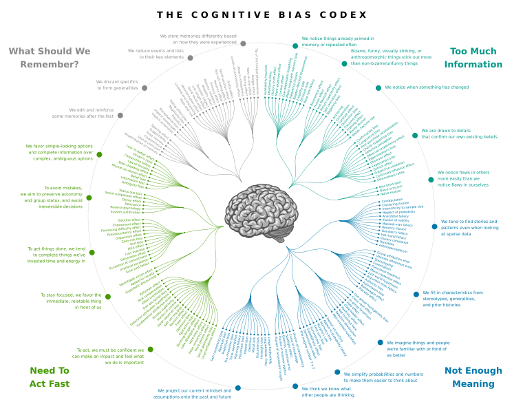
In UX design, a bias can emerge at any stage, from topic selection to data interpretation, due to influences from researchers, participants, or other external factors. This is particularly concerning since designers and researchers may not be aware of them, potentially leading to skewed results or exclusionary designs. (cf. Clara Purdy) Take a look at the picture below, the cognitive bias codex, the list of biases designers make come across is nearly endless. Everyone can be subject to any of those biases, whether you come across it and recognize it or it effects yourself.

Source

Research Goals

Right now I can’t really tell where this research journey is going to take me, for now I will focus on biases and their effects of UX work. BUT during the researcher for this post, I realized how deep the rabbit hole around UX design and psychology goes. (Study guide for the rabbit hole ;D)

For now, a desirable outcome would be, to create a collection of biases and other effects, that influence people. Since one would have to become sensitive to these topics before they can conquer them. In addition to just generating awareness, there should also be info on why this matters and how to adjust to these effects. In the end there should be a lexicon about common effects, to be aware of and how to combat them. A deeper understanding of perceptual psychology will greatly impact how a designer approaches upcoming problems, to deepen the understanding for actions different users take.

Thanks for reading through my blog!
Leave a comment, if you are interested in this topic and tell me what you want to read about next! ;P

Invisible Connections in Public Spaces: How Communication Design Can Reveal and Strengthen Everyday Rituals of Belonging

Public spaces are more than just places we pass through—they are where communities grow, and social connections silently form. The concept of social capital—the value created through relationships and social networks—often thrives in these shared spaces, but it’s rarely noticed or understood. Additionally, there are countless unseen roles and small contributions made by individuals that keep these spaces welcoming and functional. From janitors who clean early in the morning to street vendors who create a sense of familiarity, these “unseen workforces” form an essential part of the community fabric.

Taking Inspiration from Interactive Projects

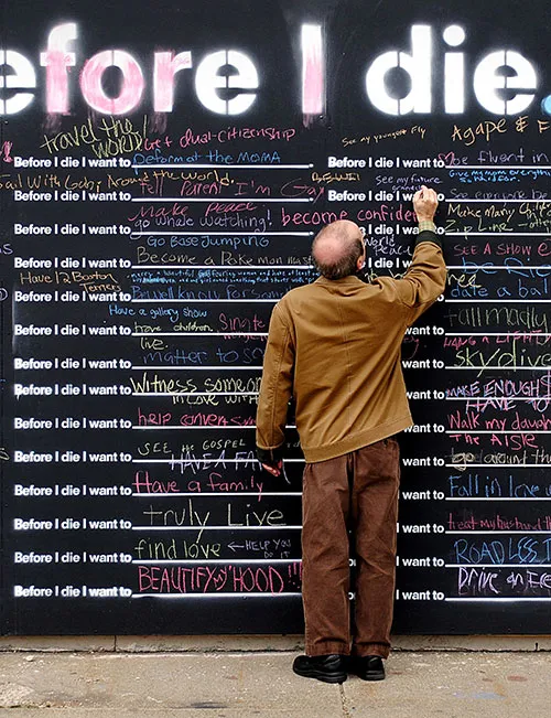
Communication design can illuminate these hidden layers of social capital and unseen labor, making these connections visible and appreciated. For example, artist Candy Chang’s Before I Die project, launched in New Orleans, invites people to share personal hopes on public chalkboard walls, creating spontaneous, shared moments that strengthen community ties.

Similarly, Subway Therapy by Matthew “Levee” Chavez took place in New York City’s subway stations. By encouraging commuters to leave sticky notes with messages, he created a shared, empathetic space during a time of high tension.

Krzysztof Wodiczko’s Place des Arts projection in Montreal, Canada is another powerful example. Using video projections, Wodiczko gave a platform to marginalized voices, allowing individuals to share their personal stories and feel seen within their own city.

Towards an Inclusive and Interactive Future

Looking forward, the design of public spaces is moving toward a more inclusive approach—one that fosters a sense of belonging for people of all backgrounds. By understanding and revealing the invisible rituals that already exist, we can create environments where everyone feels seen and heard, even without speaking. Communication design has the potential to amplify these subtle, often overlooked interactions, turning everyday moments into powerful experiences of connection.

Over the next few semesters, I will be diving deeper into how communication design can illuminate these unseen social bonds. This will involve exploring case studies, conducting field research, and experimenting with new design approaches. The goal is to create design interventions that not only highlight invisible connections but also strengthen them, making the silent rituals of public life more visible and meaningful to all who encounter them.

Impact of Social and Cultural Trends on the Evolution of Design within the Visual Context of Major Events

Impact of Social and Cultural Trends on the Evolution of Design within the Visual Context of Major Events explores how significant social and cultural shifts shape design language, particularly in the context of large scale events. These events – such as the Olympics or FIFA World Cups – serve as global stages where design reflects current societal values, cultural identities, and technological advancements.

The project is working out how evolving trends like sustainability, inclusivity, and technological innovation influence the visual and thematic choices of event branding, logos, and overall aesthetics.
It seeks to highlight the relationship between design and society, demonstrating how design not only reflects but also shapes public perception and values during large scale events. This analysis contributes to a deeper understanding of design as a tool for cultural communication and its responsiveness to the dynamic nature of social trends.


Possible events to examine throughout this project work:

Overall Sport Events like the Olympic Games
The visual identity of the Olympic Games (logo, mascots, posters, colors) often reflects the zeitgeist, values, and culture of the host country. Each edition shows changes in the design language that emphasize social trends, environmental sustainability and cultural diversity. 

Special Tournaments like FIFA World Cup or UEFA EUROs
Similar to the Olympic Games, the design of the FIFA World Cup/ UEFA EURO reflects the host country and its cultural symbols. Trends such as the increasing importance of diversity and environmental protection can also be observed here. 

International Fairs like World Expos
Expo has a long tradition of presenting innovations and technological advances that also reflect design trends. For example, the countries’ pavilions showcase different approaches to architecture, ecology and interactive design.

Political Conferences like G7 summit or UN climate conferences (COP)
The design of these events (logo, color scheme, visual communication) has evolved towards sustainability, inclusivity and globalism, reflecting societal priorities.

Events of pop-cultural importance like The Met Gala 
The annual Met Gala is a cultural highlight in the fashion and design world and often focuses on socially relevant aspects. The choice of themes and the corresponding design of the exhibitions provide insights into cultural trends and the influence of social debates on visual design. 

American Sports Events like Super Bowl and Halftime Shows
The branding, commercials and stage design of the Super Bowl Halftime Shows often reflect current trends and social discussions, especially in pop culture and advertising. 

Film Festivals like Cannes Film Fetsival and Oscars 
The visual design and branding of these events have evolved with societal changes, such as an emphasis on diversity, cultural representation and sustainability. 

Music Fetsivals like Coachella and Tomorrowland
music festivals are a mirror for lifestyle and design trends. They often show social developments in the use of technology, sustainability and community spirit and provide creative ideas and inspiration for event design. 

Fashion Weeks
These annual fashion events set trends and represent cultural trends, values and social issues through visual presentations and staging of the latest collections. These events offer a variety of opportunities to analyze the development and transformation of design language in the context of social trends.

#1 Experimenting with Letterforms or Experimental Typography?

In this very first post of the research phase, I will be explaining terminology to get a better understand of the title and create clary of this wide field of design. Speaking of Experimental Typography, I already set boundaries to my research. But how would I find a title for this research topic, without setting any boundaries? Finding a more general description is a goal in this first phase.

There is an important difference between Typography, Typeface, Font and Type Design. These terms are often being used in discussions about visual communication. These terms have unique meanings and serve different purposes in typography. Grasping their distinctions is essential for designers or anyone aiming to enhance their typography expertise.

Terminology Explanation

Typography is the art and skill of arranging text to make it clear, readable, and visually appealing. It involves elements like letterforms, spacing, alignment, and layout, serving as the foundation of written communication in both print and digital formats. Typography conveys meaning and emotion while creating a visually balanced experience for the reader.

A Typeface is the design styles that give characters their unique look, defined by features like shape, weight, and proportions. They reflect the designer’s vision and set the tone.

Fonts, though often confused with typefaces, are the ways used to display typefaces. They include variations like bold, italic, or regular within a typeface family, such as Arial Regular and Arial Bold Italic. Fonts ensure consistent text “rendering” across devices and other media. In other words, it is how the Letters will be delivered, be it wood printing, letter press or digital (OTF, TTF) Files etc.

Type Design, involves creating and developing a complete set of characters, symbols, and glyphs that form a unified and visually consistent typeface. Designers carefully craft each letterform to achieve clarity, readability, and visual harmony, ensuring it works well across different sizes and media.

Expanding the boundaries

Above, I was clarifying some terminologies important to understand my further research. I want to expand my knowledge in experimenting with these definitions of these words. Experimental typefaces, for example, explore new possibilities in form, structure, and presentationHow do designers experiment in the creation of a Typeface? What are the digital and analogue techniques. This field is continually inspires me by new discoveries, technologies, and ideas, using research and experimentation to push the boundaries of how letters are used and perceived. So I might rethink the title of this project to something like: Experimenting with Letterforms.

Source:

https://medium.com/design-bootcamp/what-is-the-difference-between-typography-typefaces-and-fonts-85da85e0a72f#:~:text=To%20summarize%2C%20typography%20is%20the,on%20screens%20and%20in%20print.

https://letterformarchive.org/fonts-and-typefaces/?srsltid=AfmBOooobo4MFttbSK2-JXvhKRrNgtLKb-W-LuMWoULF3w96dGXZNsnX

https://www.creatopy.com/blog/what-is-typeface-design/

Neuro what? How Neurodesign can revolutionize graphic design

We cannot solve problems with the same thinking we used when we created them.

Albert Einstein