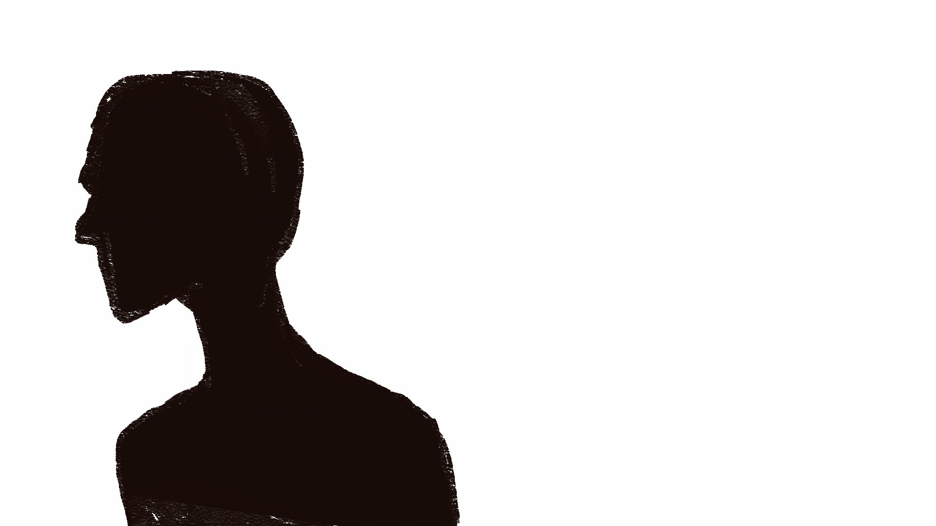
In this blogpost I’m including stills from my animated sequences, beacuse I’m to lazy to reexport them as gifs.
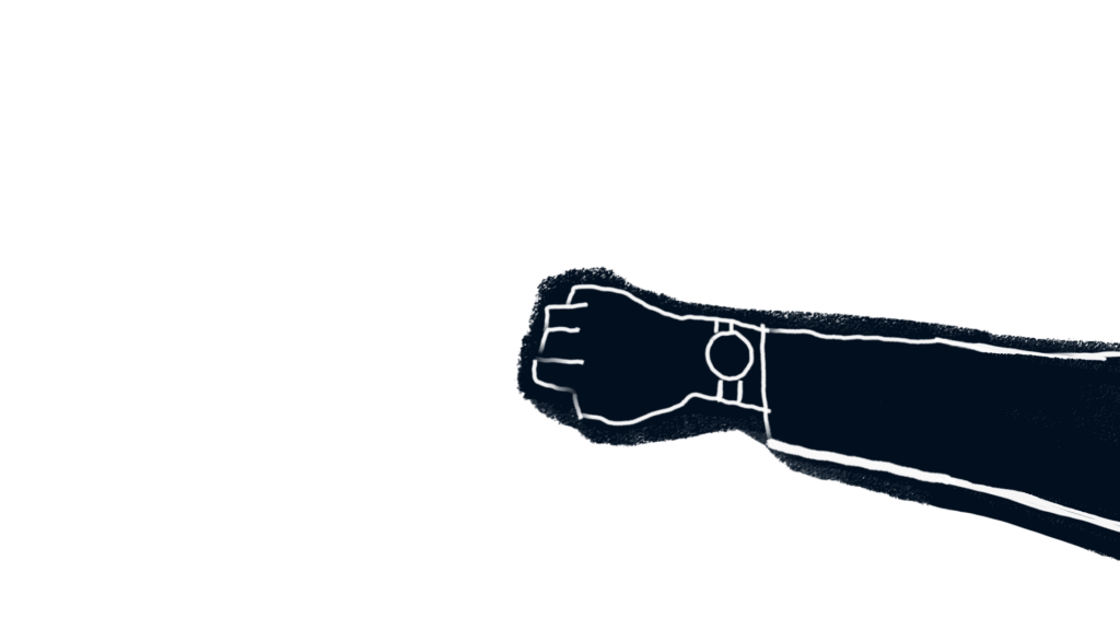
Teachings from this part of the process: maybe fake more in after effects the next time….
In this blogpost I’m including stills from my animated sequences, beacuse I’m to lazy to reexport them as gifs.
Teachings from this part of the process: maybe fake more in after effects the next time….
Starting with the backgrounds for the short,
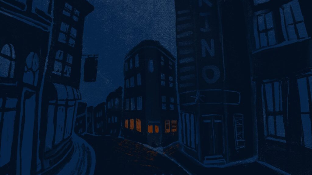
The background of the exterior scenes.
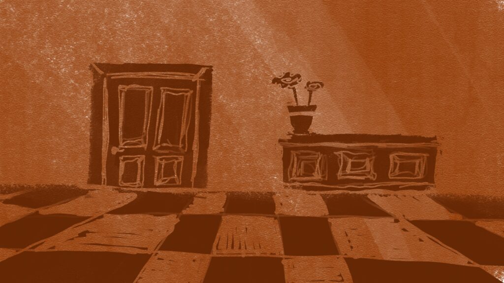
Background for one of the interior scenes (i really dont like the colourpallete, will change it later)
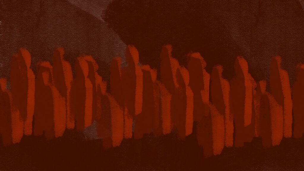
Crowd background for interior scenes.
I want the colour pallet to go from cold to warm, but the colours right now are a bit off, so ill tweak them in photoshop.
First thing I started animating after finishing the backgrounds was… a door.
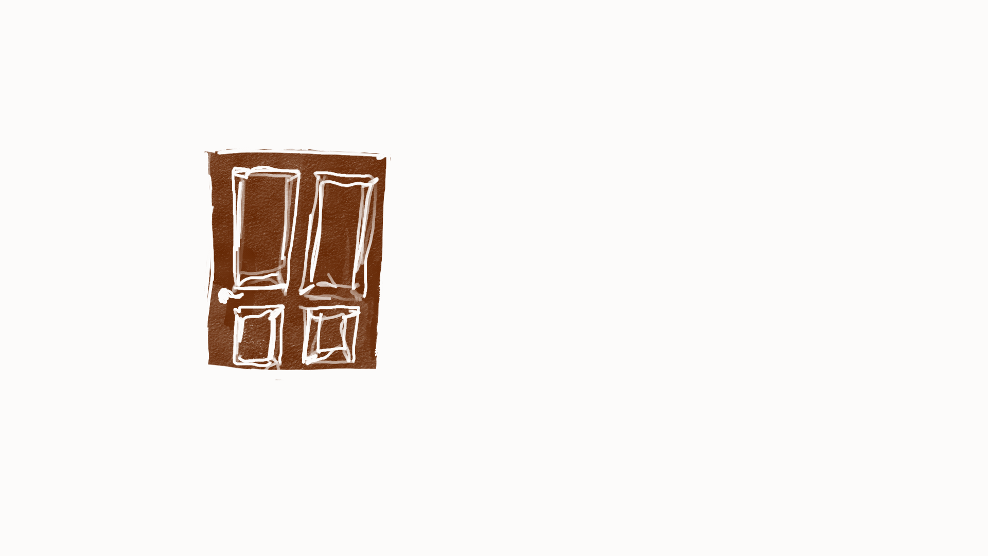
The thought process was that i’d start with the simpler animations to get the out of the way. What i realised when I was about two thirds of the way done with smoothly animating this door was that I probably didn’t need the animation to look like this at all.
This is a so called secondary action, that I want to be responsive to the main/primary action in the scene, my character opening the door and then slamming it.
Lesson learned: I should start with the main actions. It also makes sense in a crunch time perspective, to get the main action and story bearing elements done first, and add nice touches and secondary elements if I have time.
Also planning out and making a prioritized list of shots would be nice… so here it is
Remembering something Roman said way back when I had my initial concept presentation, (and I might remember it wrong, take with a pinch of salt) he adviced that the sound design should come before the animation. In my head it makes sense because I suck at sound design, so it would be easier to tweak the animation to the sound rather than opposite.
So i chose a jazz track for the film.
Its this one
Short MOYA generate 25 intermission.
For Generate 25, I made some loopable animations to use as part of my groups visuals during the DJ-sets.
This head turn animation was made using my reflection in a mirror as a reference. It was animated pose to pose; I started with the extremes and middle positions and filled in inbetweens until it hade the right feel and timing.
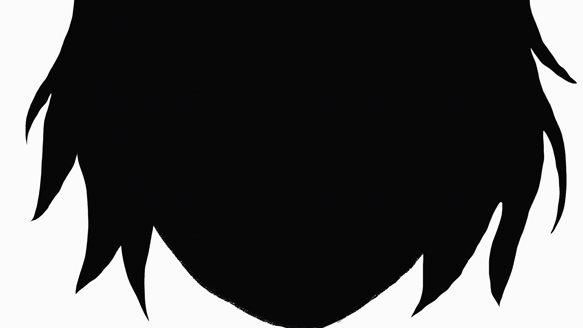
The hair in this animation was animated straight ahead, which for sure is a more time consuming method of animation, but that allows for more fluid motion and made it easier to make sure all the individual moving parts were moving in a direction that made sense with the “wind”. The face was animated pose to pose, filling un just enough inbetweens to make the right timing.
Here is the thingy, workpiece that i made! wow amazing iknow
Some soundesign is missing, and will be tweaked in the future maybe
TOPIC IS CHOSEN: urban planning
The project went in the direction of urban gardening and creating good city spaces for people. I have been very inspired by Jan Gehl, the danish architect behind the “human friendly cities” movement and the urban strategy company Gehl. They work with relationships between people, their communities, and the broader systems that sustain the planet.
The key difference between standard of living and quality of life, as I see it, is that standard of living comes down to the money we have and how we spend it, whereas quality of life is about the time we have and how we spend it. One is more about quantity, the other is more about quality
Gehl 2019
David Sim, the creative director at Gehl, wrote an article about the Soft City, of how to design the physical environment of our cities and towns, neighbourhoods, and streets to give us more time for the things that give us meaning (Gehl 2019). They emphasis that the “time left” in your day, should be spent doing something meaningful and not commuting, or running stressful errands far away from where you live. Their take on the problem is to design urban spaces that gives you closer proximity to the places we visit on a daily basis like school, work, shops, parks, and freetime activities.
When in the universe of urban planning, I wanted to do something that could contribute to solving more than one problem. What if I tried to design a space in the city that could do this?
From research, I found that green areas do good for people and the environment. Therefore, I went into the universe of urban gardening. Also that co-locating everyday activities into one place in close proximity to home would give better lives as you would spend less time in transit. A necessity for these spaces is also that it can bring enjoyment and fulfilment, for example by making a practical task like getting to work more pleasantly by biking through a park (Gehl 2019). So how to give peoples lives more meaning through urban spaces?
The idea came down to create a space between the houses, that could function as a place to rest, to meet with your neighbours or friends, and to give you the opportunity to work on a garden. These assets I thought to be a good combination, and something that both can boost an individuals life, but also boost the community in the neighbourhood.
An inspiration for vegetable garden is a garden association in Trondheim (see picture below), by study town in Norway, where you can sign up and join gardening in the middle of the city. When a member, you both contribute, but also get to enjoy the benefits and the produce.
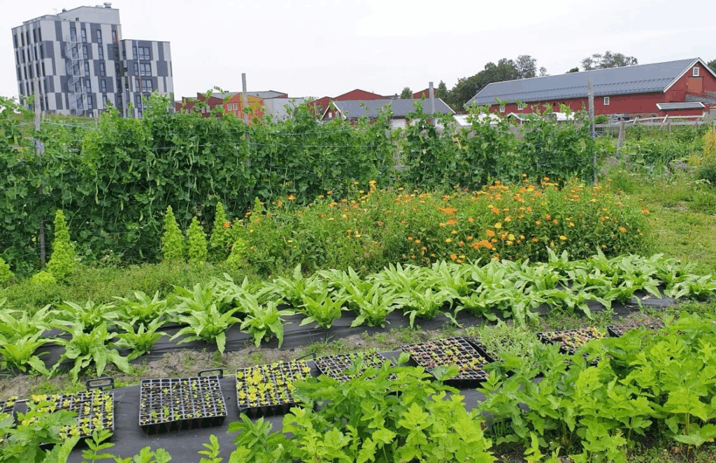
Local vegetable garden, Markedshager Norge
Other inspiration is “Grow more”, a modular urban gardening set that accommodates a hangout area:
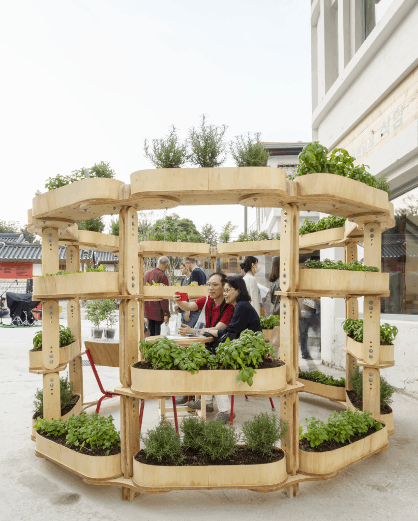
Grow more, by Sine Lindholm
What I want to include is:
Should be:


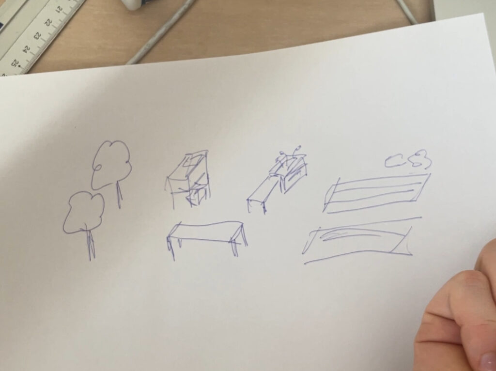
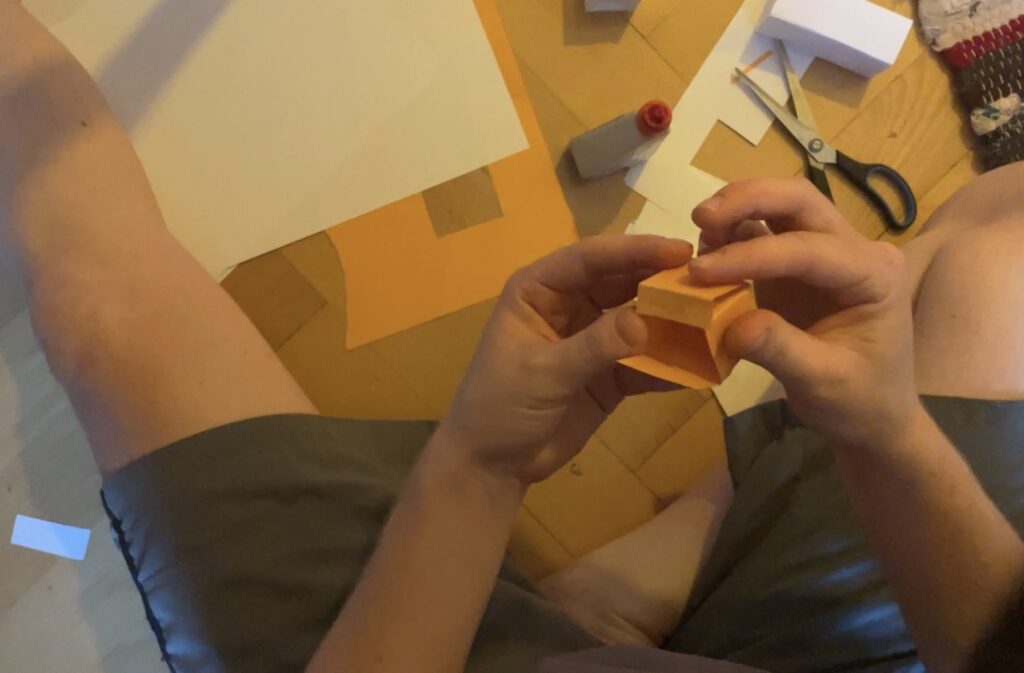
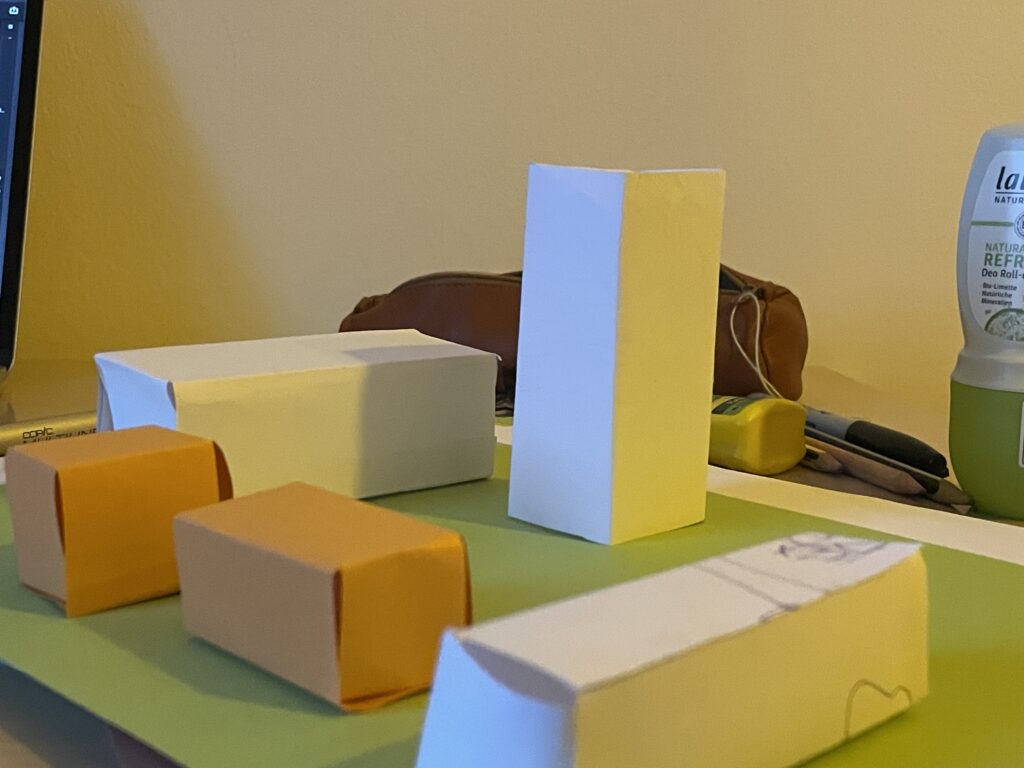
I am very glad I chose paper when prototyping the modules. The end result worked perfectly fine for visualising the idea, even though each one of them where very lo-fi and not perfect.
The final idea is a modular set of seating area, plant boxes, tool crates, work benches and everything else needed for the urban gardening space. In the first round, I want to make a toolkit for planning and envisioning the space – for anyone who would like to implement this. In the future, I would like to make real size modules and try them out in an actual city context.
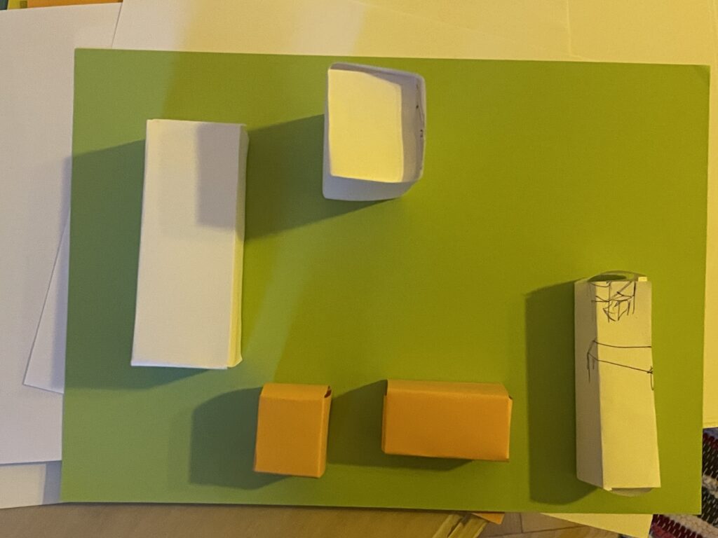
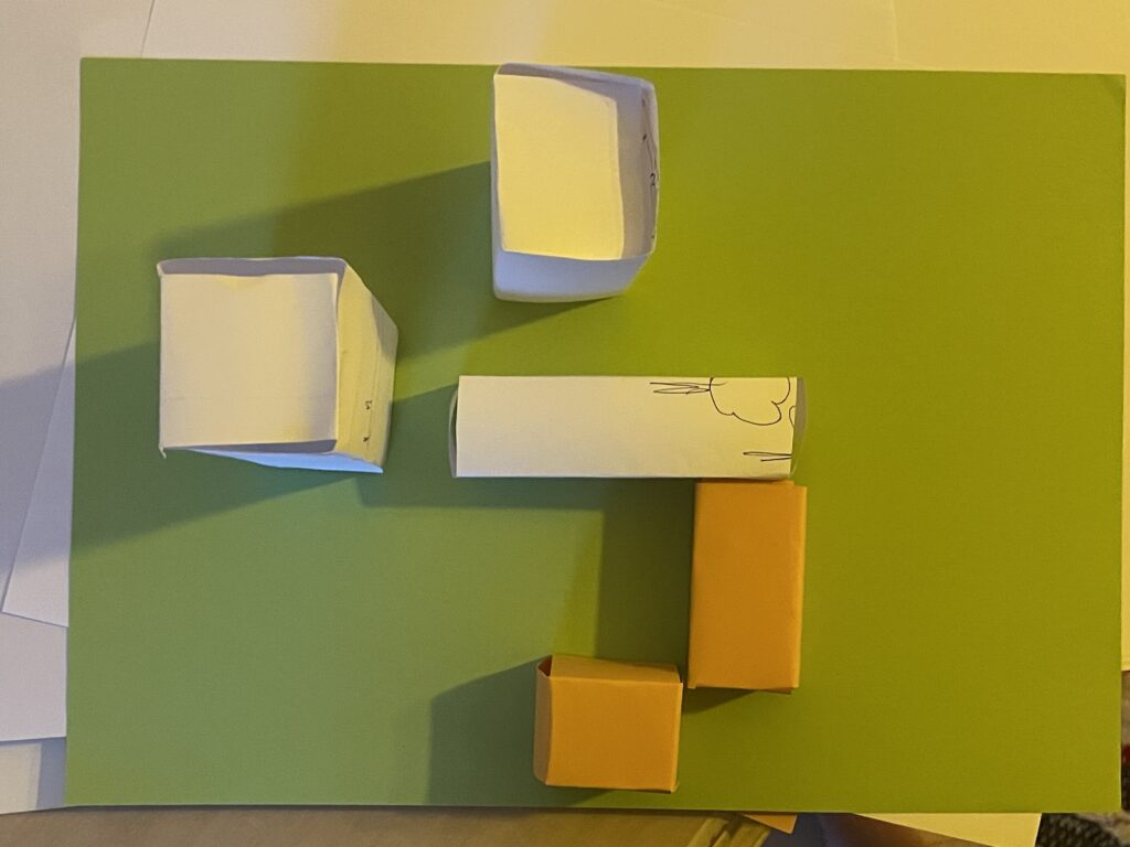
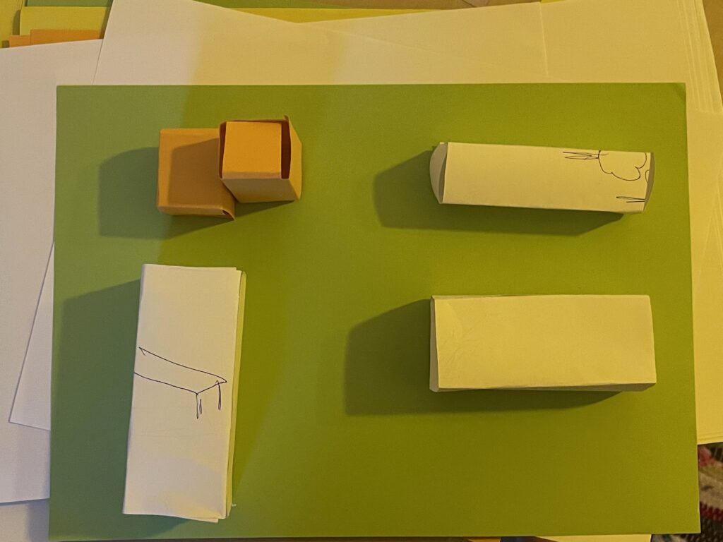
For the first prototype, the modules consist of a set of paper boxes in different shapes that represent different assets for the urban space. They can be assembled in different ways to quickly and easy test different setups for the space. The vision is that the act of planning and putting together the modules is a perfect activity for a neighbourhood community – for them to co-design, work together and therefore gain more relation and responsibility of the area (and each other!).
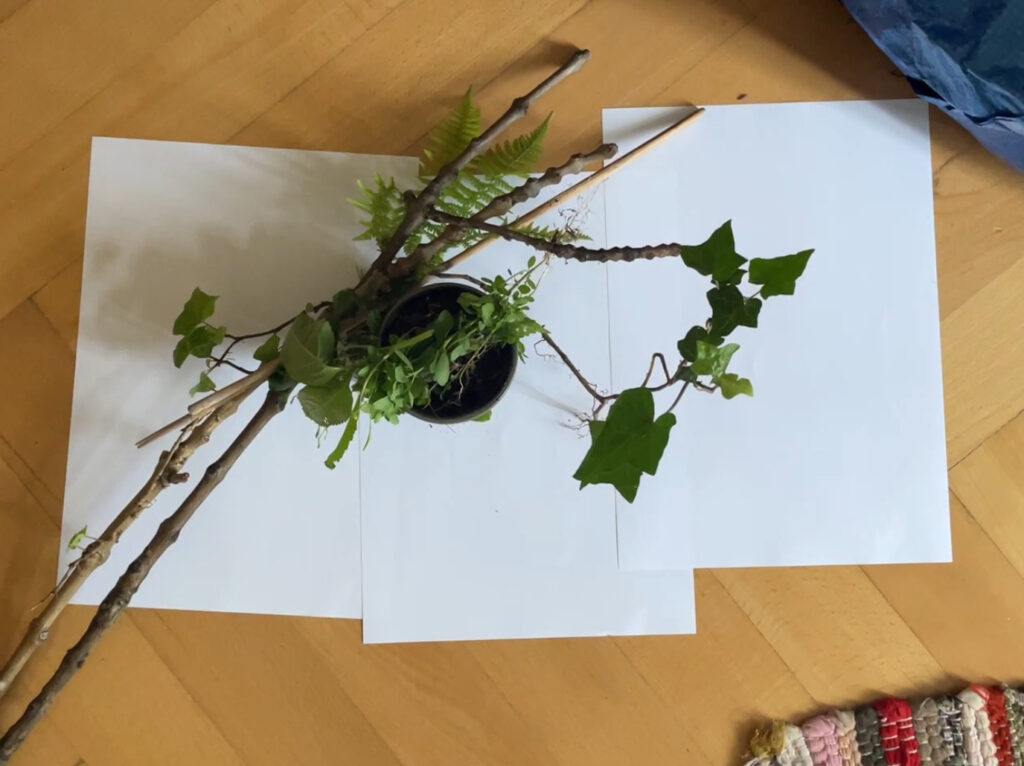
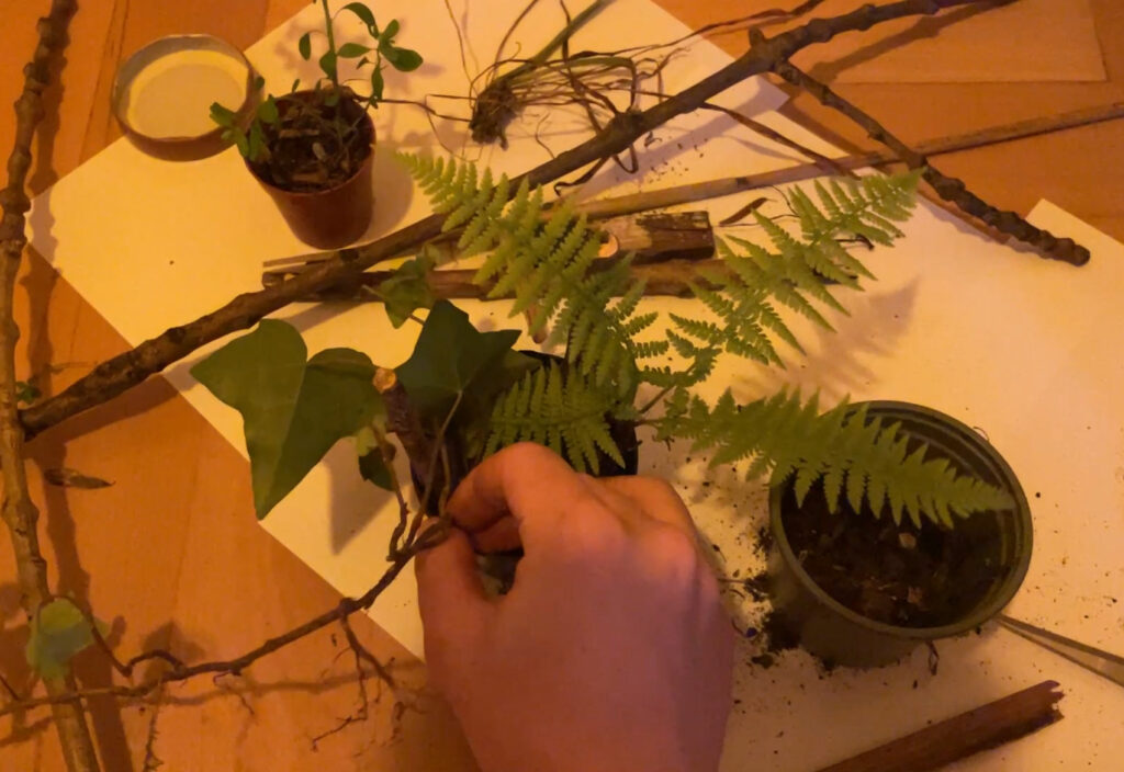
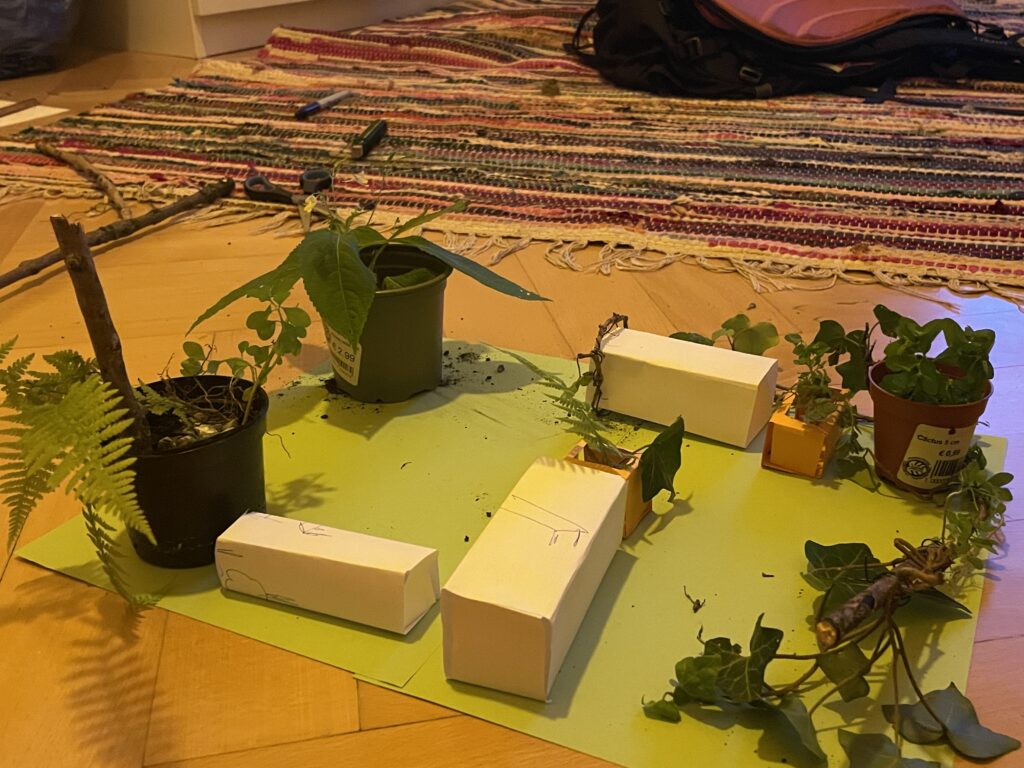
For the second prototype, I really wanted to use real life things, but especially found things. My vision was that with different textures, colours and actual plants, the idea of the modules could become more real. Therefore, I went down in the backyard of my apartment and gathered everything I could find from sticks, plants and trash. I found this part of the process especially fun, since I have a profound love for miniature things and figures. Like, I LOVE lego and small model worlds – I think I need to get myself a terrarium because THE SMALL PLANTS? Love it.
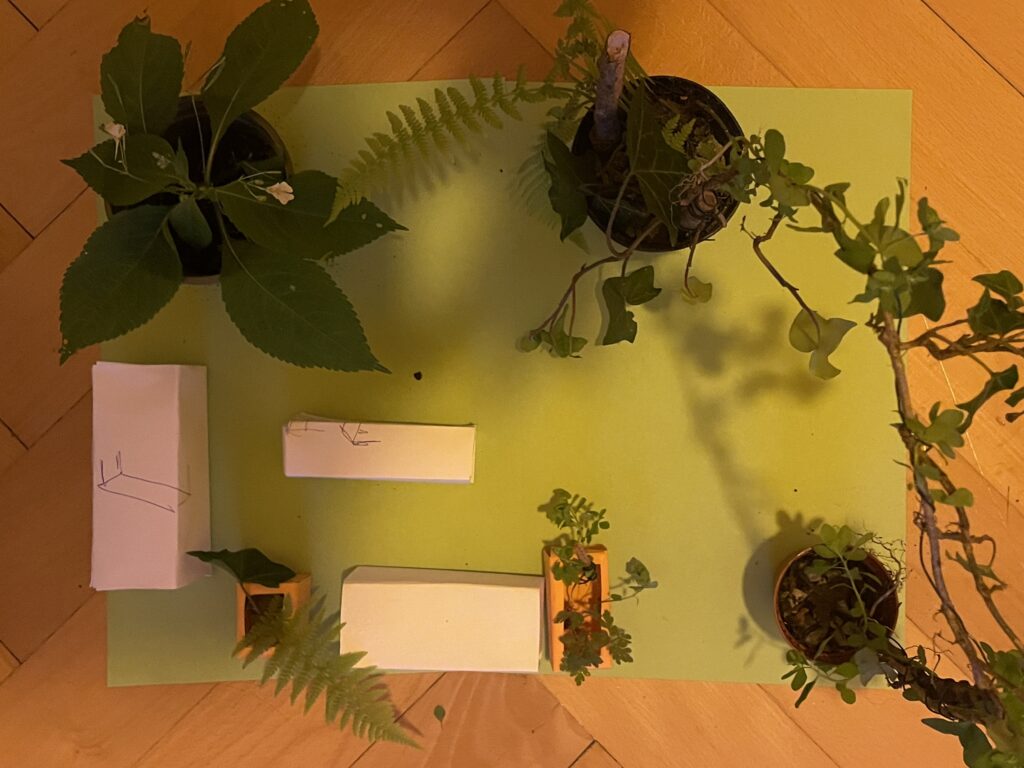
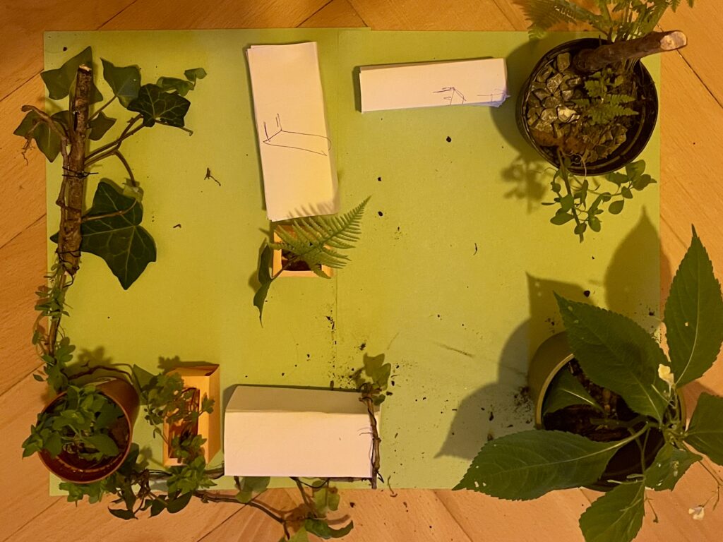
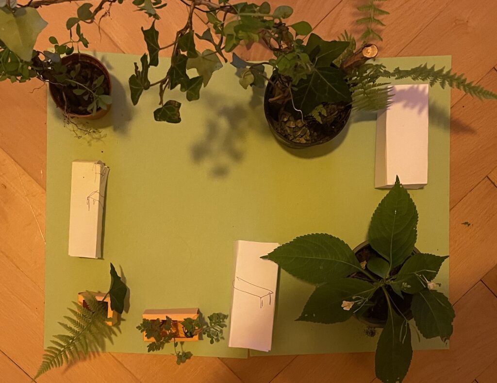
This is the final visualisation of how the blocks can be used with more context and details added. In this way, it is easier to envision how the final, real world space would look like.
For the process video, see the next blog post.
Sources:
Gehl, Jan & Sim, David. 2019. Soft City: Building Density for Everyday Life. Island Press. Excerpt published at: https://www.gehlpeople.com/knowledge-hub/publications/soft-city-the-time-of-your-life
Lindholm, Sine. https://www.sinelindholm.com/new-page-3
Markedshager Norge. 2022. Trøndelag – Oppstartsprogram for markedshager i 2022/23. https://www.markedshage.no/kalender/2022/10/trondelag—oppstartsprogram-for-markedshager-i-202223/
MadMapper offers many creative possibilities when it comes to shaping projections, but one function that changed a lot about the visual control is the use of masks. Until now, my process was more about experimenting with shapes and textures, projecting videos onto surfaces, and adjusting effects to see how they behave. Masks, however, introduced a new level of focus and intention. They let me decide exactly where the light should appear, and where it should disappear. A mask in MadMapper allows you to isolate certain parts of your projection. Instead of applying movement or animation to the whole area, you can restrict it to a small detail, a corner, a line, or even a floating shape.
To better understand how the masking system works, I followed a very clear and practical tutorial by Thomas Grogan on YouTube. The video introduced not only the basic tools but also demonstrated how to use masks in a structured and creative way. What helped me most was the clear, hands-on approach that didn’t overcomplicate things. It was a reminder that even simple setups can be powerful if they’re used with intention.
A few things stood out to me in the tutorial:
Instead of focusing on abstract technical explanations, the tutorial showed how to apply these techniques in a small, realistic setup — and that inspired me to try the same with my own material. I didn’t need a huge concept; just isolating a piece of an image or a shape was enough to change the whole feel of the projection.
I started with simple test cases, animating only a section of an image while keeping the rest completely still. It created a calm, almost surreal atmosphere. As I got more comfortable with the tools, I began to experiment with overlapping masks, animating their shapes, and adjusting transparency. Instead of turning everything on at once, I could now reveal one layer at a time. This change also had a big effect on how I worked with different materials. I went back to some previous test setups and applied masks to see how they behaved differently. One of them was my photo wall with analog images. I had used it before, but now I could focus on just one part of a photo and bring only that fragment to life. To better understand and reflect on these moments, I documented the process more carefully this time. I recorded short video clips and took still photos from different angles. The most valuable insight from this experiment was that limiting the projection area made the overall visual stronger.
In a world where stories are often digital and fleeting, I wanted to create something that lingers not just in the mind, but in the hands. My project began with a simple but powerful question: How can a story be not only read, but felt?
The Goal: A Tangible Story
The core idea was to create a poetic experience that would stay with the reader through touch, materiality, and craftsmanship. Studies show that we remember things better when we physically interact with them , like turning pages or feeling the texture of paper. I wanted to use this principle to create a story that engages through physical experience.
Concept Development
My first concept was ambitious: a fold-out poster that would reveal more of the story as it unfolded. Movement and storytelling, combined. I planned to use linocut printing to add a textured, handmade quality to the visuals.
But concept met reality. The unfolding mechanism didn’t feel smooth, and the printing process proved too slow and unpredictable. Instead of giving up, I opened the door to a new idea: a foldable book. This format gave me more freedom, to build the story step by step, page by page, and to lean into a more personal and handcrafted approach.
From Idea to Execution
Switching to a book format was a turning point. It allowed me to pace the story naturally and gave structure to the narrative and the illustrations.
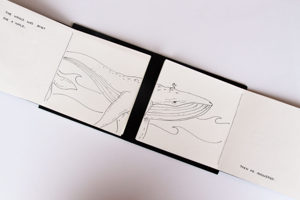
Story & Illustrations
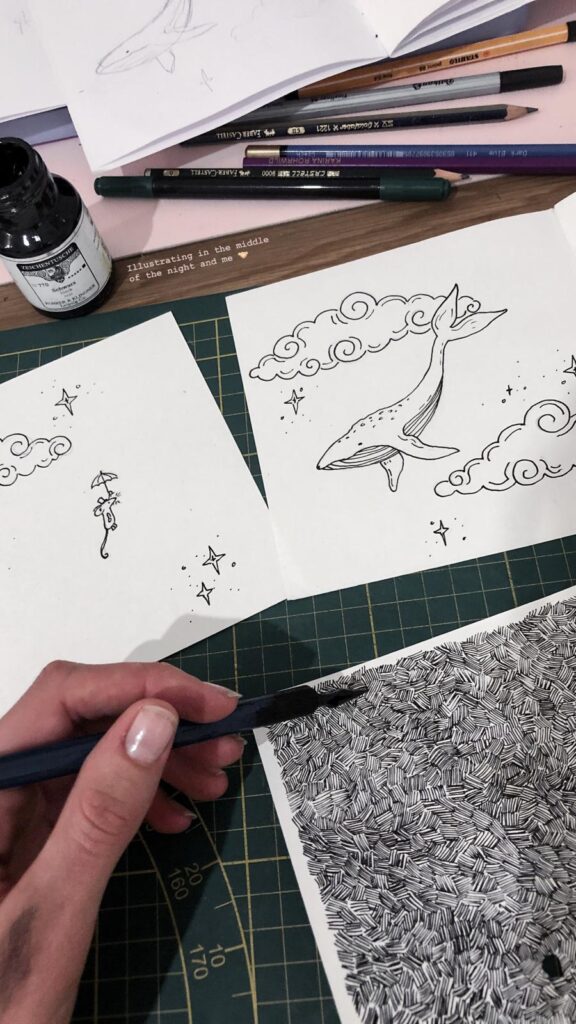
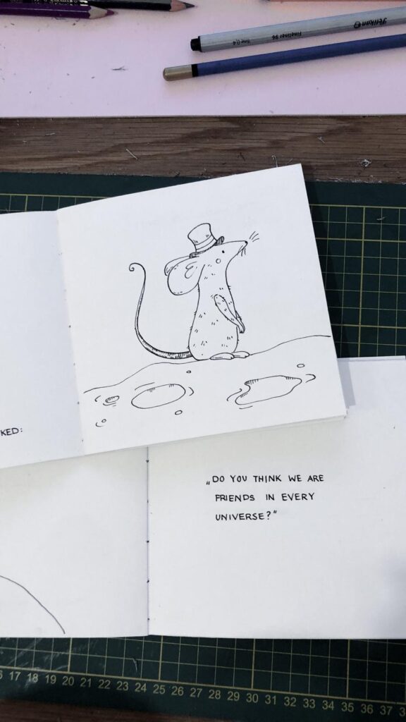
The story began with a long brainstorming session. I knew I wanted something short, poetic, and emotionally resonant. I’ve always had a soft spot for animal stories and small, meaningful anecdotes so the story became a kind of modern fable. For the visuals, I chose ink. It offers soft lines and strong contrasts, perfect for the quiet, emotional tone of the story.
Handcrafting the Book
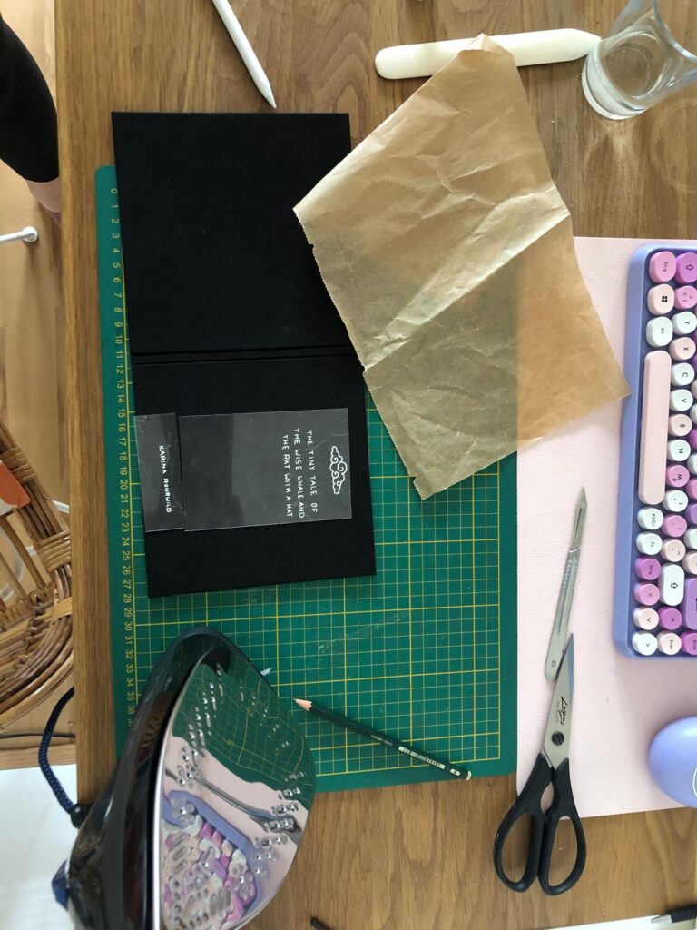
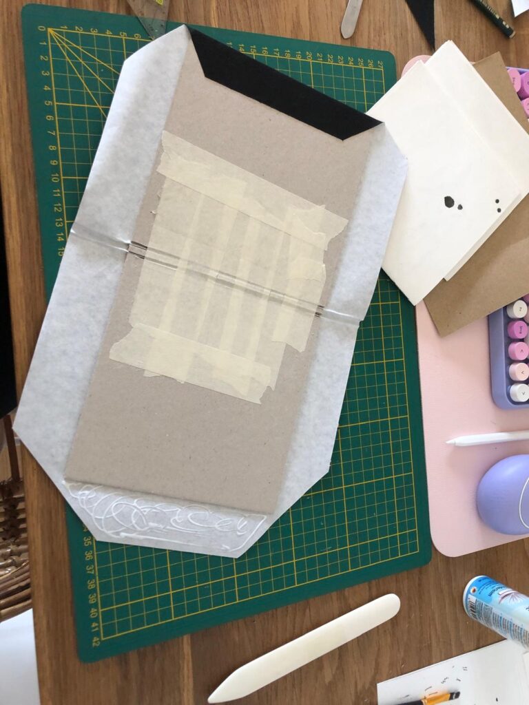
Every part of the book was made by hand: I cut the paper myself, bound the pages using thread binding, and handwrote the text alongside the illustrations. For the cover, I used my bookbinding skills to give the book a clean, professional look. I cut the title using my digital cutting machine.
Reflection
What began as a poster evolved into a sensory storytelling experience. Each page invites the reader not just to read, but to touch, unfold, and feel. This project taught me the power of flexibility in the creative process. Letting go of the original plan allowed me to discover something more fitting and personal. In the end, I didn’t just create a story. A quiet, tactile book that tells its tale through both words and materials. This project has inspired me to focus more on this topic in my master’s thesis and to explore the subject of haptic storytelling further.

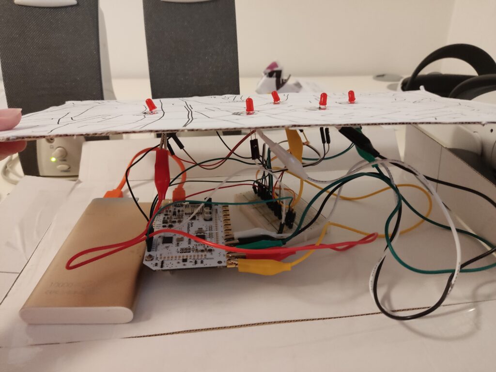
After testing the Touch Board’s basic functionality, I began developing a full working prototype that links place, sound, and interaction into a tactile map of hidden Graz stories. The idea? Visitors touch different points on a map to reveal short audio snippets, each one tied to a local legend or curious landmark. Below, I’ll walk you through the full process of bringing this lo-fi phygital experience to life.
From Idea to Interaction
I knew I wanted each touchpoint to reveal a different layer of the city. Something you wouldn’t notice in a regular guided tour. The early concept centered around a physical map enhanced with conductive elements that trigger audio clips. The experience needed to be screen-free, intuitive, and portable.
Core goals:
Deciding on the Content
I wanted the experience to feel like a walk through Graz’s secret personality, curious, playful, sometimes surreal. I avoided the most obvious tourist sites and instead chose places that are either tucked away, easily missed, or rich with local legend. Each spot adds a different tone or texture to the map:
Together, these five spots form a kind of “hidden Graz sampler”, part folklore, part urban oddity, part emotional landscape.
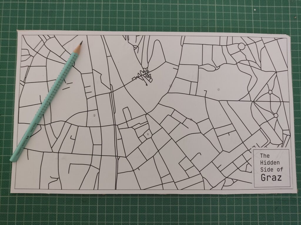
Designing the Map
To keep the locations roughly geographically accurate, I used Snazzy Maps to pin my selected places. There are many styles to choose from, so I picked a minimal line-drawing style. I took a screenshot, imported it into Illustrator, and used Image Trace to vectorize the lines for a cleaner look.
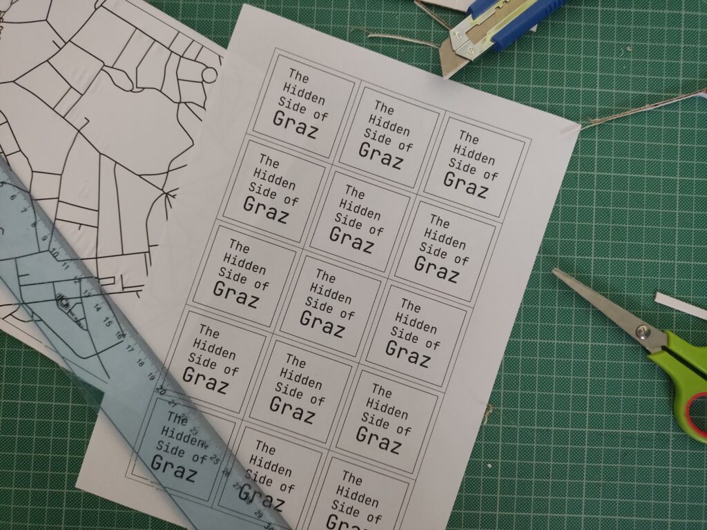
I also added custom name tags for each spot, arranged everything into an A3 layout, and sent it to print.
Each location was represented by a small circle symbol on the printed map. I used copper tape and stick them directly on paper, then connected them to the Touch Board’s electrodes using crocodile clips and jumper wires.
Crafting the Audio
I wanted the audio to feel charming and a bit mysterious, so I wrote short descriptions for each location and turned them into narrated clips using an online text-to-speech AI tool. Each clip is around 20 seconds long. To make them more immersive, I layered in soft background sounds using Premiere Pro.
Tools used:
Here are the short audio texts:
Der Kleine Elefant
Tucked high above a quiet Graz street, a tiny stone elephant watches the world go by. It’s a gentle echo of 1629, when a real circus elephant marched through the city, astonishing everyone. This little statue keeps that memory alive.
Glockenspiel
In the heart of Graz, when the clock strikes 11, 3, or 6, wooden shutters creak open high above Glockenspielplatz. A boy and a girl twirl to the chime of 24 bells, and at the end, a golden rooster flaps its wings and crows. It’s like a music box tucked into the rooftops.
Double Spiral Staircase
Inside an old building, two stone staircases spiral like vines, crossing paths again and again. They separate, meet, part, and rejoin, like two people forever drawn to each other. Built in 1499, they’re called the “stairs of reconciliation”, a quiet dance carved in stone.
Kunsthaus
Across the Mur, among red-tile rooftops, lives a blue, blob-shaped creature. It looks like it came from space. Locals call it the “Friendly Alien”, a living sculpture, glowing with energy. Inside, the art is always changing.
Der Türke
Look up at Sporgasse 2. There’s a wooden man in a turban watching the street. Legend says that during the 1532 siege, a cannonball crashed through a window and struck a Pascha’s roast. Shocked by the blast, the Turks fled Graz. The figure still stands there, watching… and remembering.
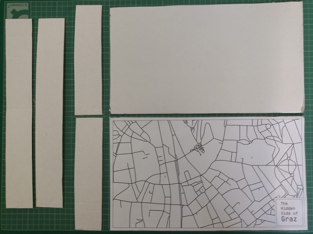
To enhance the presentation, I created a cardboard box to hide the microcontroller, battery, and all the wires. The result features a map on top, with circle-shaped copper tape marking the interactive areas. By hiding the components inside the cardboard box, this setup made the experience feel more like an artifact than a technology demonstration.
I brought the prototype to a few friends and watched how they used it. Here’s what I noticed:
What worked:
What could improve:
Building this prototype showed me how simple tech, when well-combined, can lead to memorable interactions. The most exciting part wasn’t the circuitry; it was watching someone touch a spot on a map and hear something they didn’t expect. That brief surprise, that moment of discovery, is what I want to design more of.