IMPULS 4 – Kunsthalle and Miguel Chevalier

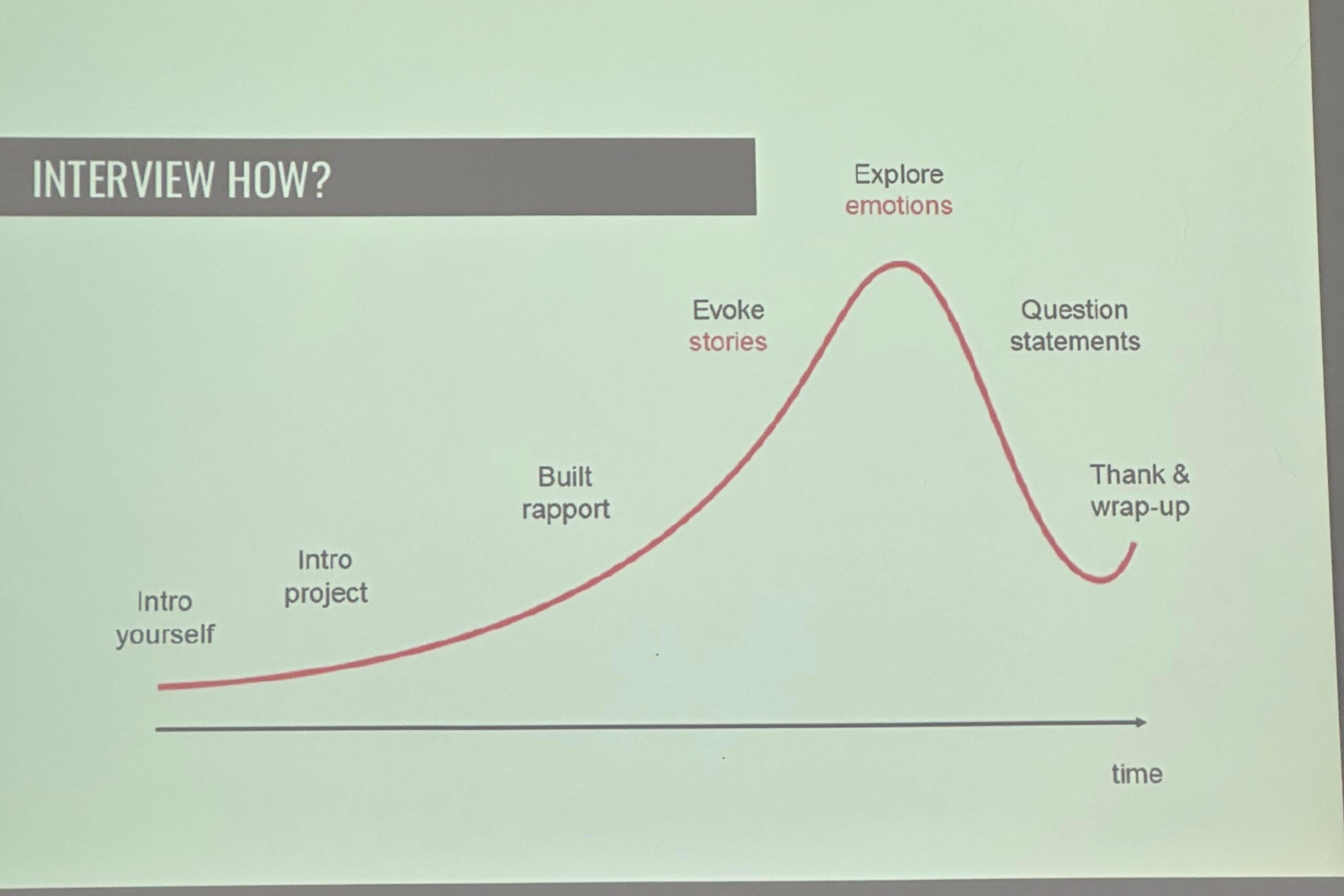
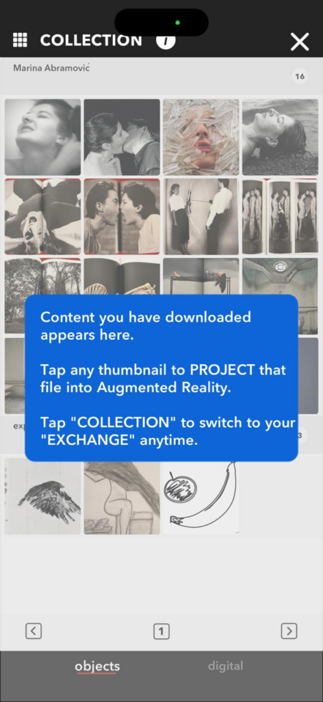
When I visited the Kunsthalle in Munich, I honestly had pretty high expectations of what I was about to see. My mom had visited the exhibition previously and was talking about how nice and impressive she experienced it. In the past, I have made a couple of visits to a lot of immersive exhibitions, and many of them start to feel very similar. What surprised me about “Digital by Nature – The Art of Miguel Chevalier” was that I could often imagine how the works were made. I kept thinking about Processing, generative systems, maybe some robotics or AI running in the background. Instead of ruining the magic, this actually made me happy. It didn’t feel like some unreachable high-tech spectacle, but more like something that exists on the same planet as my own small experiments. Because of that, I feel like I moved through the exhibition a bit differently, less like a visitor just taking photos, and more like someone walking through and taking notes on what I could try out as well.

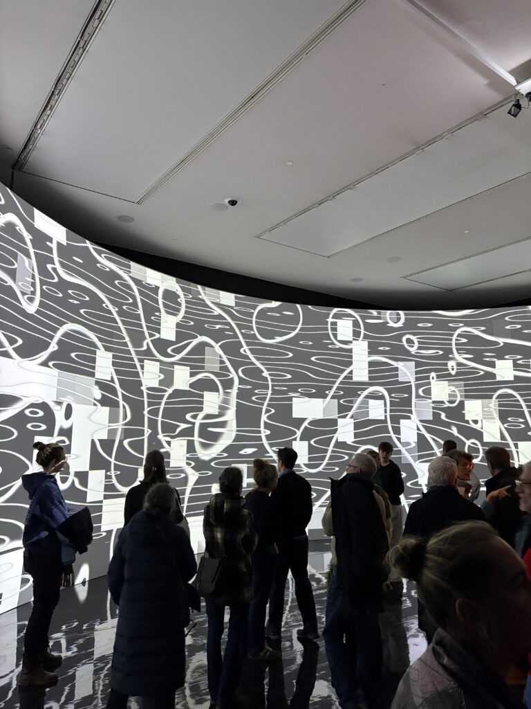
The first big projection room already set the tone. A large curved wall was filled with flowing animations that reacted subtly when people came closer or moved their arms. I liked that the room didn’t explain too much. It just invited you to figure out the system with your body. At first, I thought it was mainly about pretty visuals, but after spending some time there, I realized how choreographed the whole space actually was. The reflections on the shiny floor doubled the image, the sound, or sometimes even the absence of sound, influenced how long people stayed, and the movement of the crowd became part of the composition. It made me realize again how important physical space is for digital work, something I often forget when I’m just sitting in front of my laptop.

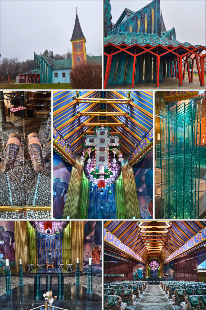
Later on, I spent quite a bit of time with the works where Chevalier combines AI with floral motifs. These generative flowers reminded me a lot of a project I saw at Klanglicht 2024, where Processing was used to create plant-like forms that constantly changed shape. Here, the idea felt similar but pushed further. The flowers didn’t just move, they seemed to grow, dissolve, and transform, almost like watching an artificial ecosystem in fast-forward. I noticed that this kind of imagery really speaks to me because it sits somewhere between digital and organic. In general, I have noticed that I like to work with natural elements and not just simply digital things. For my own work, this opened up the idea of using generative techniques not only for abstract visuals, but for forms that reference the real world without directly copying it.

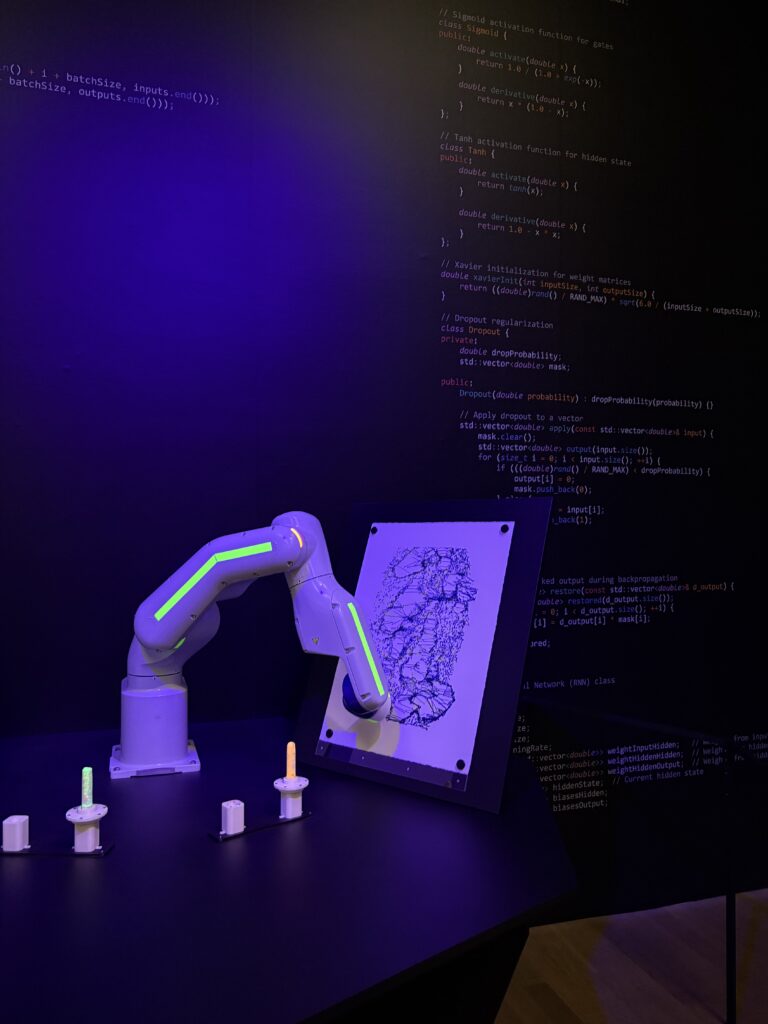
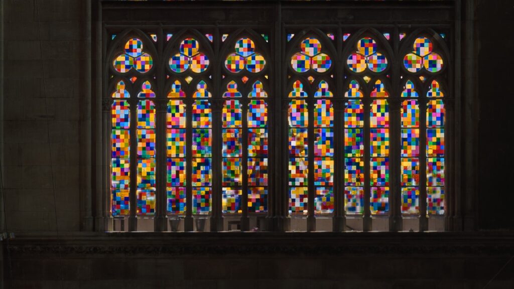
At the same time some rooms felt a bit too polished, almost like they were mainly designed to be photographed. The surfaces were very glossy, the colors extremely intense, and sometimes it felt like the technology was there mostly to impress. I realized that I was more interested in the works that showed some roughness. For example, the drawing robot with its industrial arm and felt-tip pen, or pieces where small delays and glitches were still visible.

One of the nicest feelings I had throughout the exhibition was this sense of “I kind of understand how this could work.” In the past, I often looked at digital installations and thought that they must have been made by huge teams using some kind of very complicated technologies. Here, even if I didn’t know the exact details, I could imagine basic structures: shaders reacting to movement, particle systems, data mapped to color and form, maybe some kind of camera tracking feeding into generative visuals. For my own project, the exhibition gave me a few clear impulses. I want to think more about how people physically move in front of my work and how this movement can become part of the piece, instead of just triggering random reactions. I’m also very interested in this mix of organic imagery and clear digital structure, almost like nature wearing a pixel costume.

IMPULSE: When UI Meets Reality: A Lesson from Alserkal Avenue

I was wandering through Alserkal Avenue in Dubai recently to soak up the creative vibe when I stumbled into the Gulf Photo Plus gallery. I wasn’t expecting to have my entire perspective on visual storytelling flipped upside down. That is exactly what happened when I saw the work of Majd Arandas.

The exhibition avoided high-end gear or perfect lighting. It was raw. It was literally composed of mobile phone photos and screenshots of chat logs. Majd is from Gaza and the work documented his daily life there as he simply updated his friends abroad on his status.

Here is what blew my mind as a designer:

We spend so much time obsessing over high-resolution assets and perfect composition. But Majd’s work proved that context creates the strongest content.

  • The Medium: Seeing the familiar UI of a chat bubble, which we see hundreds of times a day, juxtaposed with the reality of life in Gaza immediately broke down the “fourth wall.”
  • The Effect: It didn’t feel like looking at art. It felt like holding a friend’s phone. It forced me directly into the situation.

It made me question a lot about how we try to manufacture emotion in design. We usually try too hard. This exhibition taught me that approachability is the key to empathy. By keeping it lo-fi and incredibly human, the impact was heavier than any polished editorial could ever be.

Sometimes the most powerful design tool isn’t Photoshop but the raw and unedited truth.

The Glitch in the Reality – Using Cognitive Dissonance in Storytelling

As designers we are usually taught to make things smooth and frictionless. We want the user experience to be easy. But in storytelling friction is everything. If everything makes sense and everyone is happy you have a boring movie. I have been researching a concept called Cognitive Dissonance to help structure my screenplay. It was developed by the psychologist Leon Festinger in the 1950s and it describes the mental discomfort we feel when we hold two conflicting beliefs or values at the same time. Festinger found that humans have a powerful inner drive to hold all our attitudes and beliefs in harmony. When there is inconsistency, or “dissonance,” we feel psychological stress and are motivated to reduce it, often by changing our beliefs or justifying our actions to make them fit.

Humans hate this feeling. We will do anything to get rid of it. If we smoke cigarettes but we know smoking kills we have dissonance. To fix it we either quit smoking or we convince ourselves that the science is wrong. We change our reality to stop the pain.

In film narrative this theory is incredibly potent. Dissonance creates a gap that the audience desperately wants to close. There is a related concept called the “Expectancy Violation Theory” by Judee Burgoon which says that when someone behaves in a way that violates our social expectations it triggers arousal and forces us to pay closer attention. We stop operating on autopilot and start analyzing the situation to understand why the norm was broken.

In my film I am creating a massive cognitive dissonance for the audience and for the main character. The premise itself is a contradiction. The protagonist is a teacher of “Political Education.” Her job is to explain the Austrian constitution and the importance of voting to teenagers. She is the voice of the state. She represents the system. But at the same time she is not a citizen. She cannot vote. The state that she represents does not represent her.

This creates a tension that vibrates through every scene. Imagine a scene where she is grading a student’s test about democracy. The student failed the test but can vote because he is 16 and Austrian. She aced the test because she is the teacher but she cannot vote. This is illogical. It hurts the brain to think about it. That mental pain is what keeps the viewer engaged. They want to resolve this glitch. They want the world to make sense again.

I am also using this to play with the character’s internal psychology. Festinger says we often reduce dissonance by lying to ourselves. My character is doing exactly that. She tells herself that if she just works hard enough and speaks German well enough she will belong. She is performing “Austrian-ness” perfectly to reduce the dissonance between her life here and her legal status. But the reality keeps hitting her in the face. This makes her an “unreliable narrator” not because she is malicious but because she is in denial. She is trying to protect her own sanity.

We can even see this dissonance in how audiences might react to her. Research on “Intersectional Invisibility” shows that Black women often don’t fit the standard prototypes for race or gender which makes them “invisible” or confusing to observers. By placing a Black woman in a position of high authority (a Gymnasium teacher) I am creating a visual dissonance for the audience. I am violating their expectations. According to the theory this should make them pay more attention to her but it might also make them uncomfortable. My goal is to lean into that discomfort rather than smooth it over. I want the audience to feel the same friction that she feels every day. It is not just a story about a sad situation, it is a psychological experiment in empathy through dissonance.

Festinger, L. (1957). A theory of cognitive dissonance. Stanford University Press.

Festinger, L., & Carlsmith, J. M. (1959). Cognitive consequences of forced compliance. The Journal of Abnormal and Social Psychology, 58(2), 203–210. https://doi.org/10.1037/h0041593

The Architecture of Empathy or Why We Cry for Pixels

Have you ever sat in a dark cinema and found yourself crying over a character who you know does not exist? It is a strange phenomenon when you really think about it. We are looking at pixels on a screen or light projected onto a wall. We know it is fake. We know there is a camera crew standing right outside the frame and that the actor is probably thinking about what they will have for lunch. Yet our bodies react as if the pain or joy were real. My master’s thesis is largely about figuring out how this mechanism works so I can use it for my own film. It turns out that emotion in film is not just magic. It is a design process just like architecture or typography.

Carl Plantinga

I have been reading a lot about Cognitive Film Theory and it completely changed how I look at directing. There is this theorist named Carl Plantinga who wrote a book called Moving Viewers. He talks about something called the “Scene of Empathy.” This is not just any sad scene. It is a specific structural device filmmakers use to force a connection. Plantinga argues that empathy is not a constant stream but a moment we have to build. The key ingredient is the human face. When we see a face in a close up for a long duration our brain does something wild. Our mirror neurons fire up. We subconsciously start to mimic the micro expressions we see on screen. If the actor tightens their jaw in suppressed grief our own jaw muscles might tense up just a tiny bit. This physical mimicry sends a signal to our brain that says we are sad. We literally catch the emotion like a virus.

Another concept I want to use is the “Mood Cue Approach” by Greg M. Smith. He says that films do not just trigger sudden emotions like “bang, now you are scared.” Instead they build a mood over time like a primer coat of paint. You use lighting and sound and rhythm to create a low level state of anxiety or sadness. Once that mood is set you only need a tiny trigger to get a big emotional reaction. For my film I am thinking about the sound design of the school. I want the background noise of the students to feel overwhelming and chaotic. This research made me realize that directing is not just about telling actors where to stand. It is about being an architect of the audience’s physiology. We are designing their heart rate and their tears. That is a huge responsibility but it is also what makes filmmaking such a powerful tool for social change. If I can make people physically feel the stress of my character they might understand the struggle on a level that a news article could never reach.

Plantinga, C. (2009). Moving viewers: American film and the spectator’s experience. University of California Press.
Smith, G. M. (2003). Film structure and the emotion system. Cambridge University Press.

IMPULSE: The perfect video topic

I recently photographed the Migrant Advisory Board conference in Graz. Alexander Pollak gave a powerful talk about the “democracy deficit.” He spoke about people who live here but are excluded from voting.

It is a tough reality. Even people born in this country are often left without a political voice. This exclusion is not just a legal issue, it is deeply emotional.

While taking photos, I realized: this would make an incredible short film. It’s a topic that hits home. It’s about the feeling of belonging vs. the reality of being “invisible” on paper.

This also connects perfectly to my Master’s thesis. I’m researching how films use “narrative deception” to make viewers feel what a character feels.

Imagine a film where you think a character is a full part of society, until a single moment reveals they are structurally excluded. It’s a powerful way to use character identification to show the truth of this injustice.

Preparing a Qualitative Interview:

Learning How to Ask the Right Questions and Document it

Rather than relying solely on secondary sources, I wanted to gain expert insight through a qualitative interview. With this in mind, I prepared and sent a formal interview request to AKH Vienna, hoping to have the opportunity to speak with a specialist. I am not aiming for a long or demanding interview session; even 10–15 minutes would already provide valuable perspectives that could meaningfully inform my research. I drafted a formal interview request to AKH Vienna, in which I briefly introduce myself as a master’s student at FH JOANNEUM and outline the research motivation behind my project. The email explains my interest in gaining psychological insights.

Using Academic Input from FH Joanneum: Design & Research

A major influence on my preparation process was the Design & Research course at FH Joanneum, taught by U. Lagger. One of the key takeaways from the course was that interviewing is not just about asking questions, but about creating a structured, respectful, and open conversational space.

From the lecture input (see Image 1: “Interview How?”), the interview process was presented as a timeline rather than a rigid script. It begins with introducing oneself and the project, followed by building rapport, encouraging storytelling, exploring emotions and experiences, and only then moving into more focused questions. The interview should end with a clear wrap-up and expression of gratitude. This visual structure helped me understand that a good interview has an emotional rhythm and that trust and openness develop over time, not instantly.

Practical Interview Conduct: What to Keep in Mind

In addition to the course material, I researched general best practices for qualitative interviews and identified several key principles that I plan to follow during the interview:

  • Do not interrupt the interviewee
  • Accept pauses, as they give space for reflection and thought
  • Convey neutral attention through body language and tone
  • Avoid suggestive or leading questions
  • Ask follow-up (probing) questions to better understand meanings

These points align closely with the recommendations from qualitative research literature and reinforce the importance of listening rather than directing the conversation.

Documentation and Transcription Strategy

If the interview takes place, I plan to record it (with explicit consent) and transcribe it afterwards. For transcription support, I intend to use AmberScript, a tool that assists with speech-to-text transcription and can significantly reduce the technical workload.

However, I am aware that automatic transcription tools are not perfect and always require careful review and correction. The final transcript will therefore be manually checked and refined to ensure accuracy and clarity.


Insights from the PDF: Interview, Transkription & Analyse

Based on the article Interview, Transkription & Analyse by Dresing and Pehl, several important methodological points stand out Praxisbuch_Transkription-2:

  • Interviews should be planned according to the research question, not convenience
  • Transcription rules must be defined before starting the transcription
  • A transcript is not neutral; it is always a reduction and interpretation of spoken language
  • Simple, content-focused transcription systems are often sufficient for design and media research
  • Time planning is crucial: transcription can take 5–10 times longer than the interview itself

Format and Structure: How the Interview Should Be Written

Based on the examples shown in class and materials, the interview documentation should follow a clear and transparent structure:

  1. Participant Information (age, profession, location, anonymised)
  2. Consent Confirmation and recording notice
  3. Dialogue Format (Interviewer: / Participant:)
  4. Clear chronological flow
  5. Postscript, describing how, when, and under which conditions the interview was conducted

This format not only improves readability but also ensures academic traceability and ethical clarity.

Even if the interview does not take place immediately, this preparation process has already deepened my understanding of qualitative research and strengthened my ability to approach complex human-centered topics with care and structure. Lets hope for the best.

Course & Class Literature

  • Dresing, T., & Pehl, T. (2018). Praxisbuch Interview, Transkription & Analyse (8th ed., PDF). Course material, FH JOANNEUM, Graz.
  • Lagger, U. (2024). Design & Research: Interview Methods [Lecture slides]. FH JOANNEUM – University of Applied Sciences, Graz.
  • Institution / Interview Context
    Allgemeines Krankenhaus der Stadt Wien (AKH Wien). (n.d.). Universitätskliniken & Fachbereiche. Retrieved from
    https://www.akhwien.at

    Tools I may use
    AmberScript. (n.d.). Audio- und Video-Transkription. Retrieved from
    https://www.amberscript.com/de/transkription/

    Supplementary Learning Resources
    YouTube. (n.d.). Qualitative research interview tutorials. Various creators. Used for general understanding of interview preparation, conduct, and documentation.

Disclosure

In the development of this blogpost, AI (ChatGPT) was used as a supportive writing and structuring tool. I provided the conceptual content, research direction, theoretical preferences, and methodological decisions, while the AI assisted in translating it to English, refining the wording, organising the material and generating coherent academic formulations based on my input. The AI did not produce research or arguments but helped transform my ideas into a clear and well-structured text draft.

6. IMPULS: Besuch in Thal

Im folgenden Impuls-Blogbeitrag geht es um eine Exkursion zur Kirche St. Jakob und die dabei gewonnenen Eindrücke. Wegen ihrer besonderen Architektur und Lichtstimmung empfahl mir Roman P., diese Kirche zu besuchen.

Fotos by Joschua Hohenbrink

Die Pfarrkirche wurde vom Wiener Künstler Ernst Fuchs im Stil der Wiener Schule des Phantastischen Realismus* gestaltet und 1994 nach einer Umbauphase wiedereröffnet.


„Ernst Fuchs beließ es, als Kenner der biblischen Schriften sowie der jüdischen und christlichen Symbolik, nicht bei der künstlerischen Ausgestaltung. Er erweiterte das gesamte architektonische Konzept zu einem Gesamtkunstwerk mit phantasievoller Farben- und Formenvielfalt und beeindruckenden Lichteffekten.
‚Man muss schon von weitem erkennen: Dies ist ein heiliger Ort. Wo auch immer die Augen hinblicken, es muss etwas zu sehen geben.‘“

(Quelle: Wikipedia – Pfarrkirche Thal)

Der vorherige IMPULS-Blog behandelte die Lichtgestaltung sakraler Räume im Computerspiel Diablo IV. Diese Auseinandersetzung prägte auch meinen Blick auf den Kirchenbesuch. Allerdings bot das natürliche Licht in St. Jakob aufgrund des Nebels keine idealen Beobachtungsbedingungen.

Für einen Euro ließ sich das Kirchenlicht für vier Minuten aktivieren. Die farbenfrohe Gestaltung der vielen architektonischen Elemente wirkt einladend und freundlich. Strassverzierungen an Wänden und Boden erzeugen jedoch stellenweise optische Überladung und verleihen dem Raum eine leicht kitschige Note. Auch das wuchtige Glas-Kreuz über dem Altar, mit seinen spiegelnden Ornamenten, zieht die Aufmerksamkeit stark auf sich und wirkt gleichzeitig etwas fremd im Gesamtbild.

Aus Sicht des Video Mappings ist dieser Ort jedoch interessant. Die vielfältigen Formen, Farben und Materialien bieten zahlreiche Möglichkeiten für Experimente.

Ein Gedankenexperiment:
Mit einem mobilen Beamer-Setup könnten kleine Objekte wie Statuen, Kreuze oder Verzierungen sowie mittelgroße Flächen – etwa Säulen, Altar oder Türen – bespielt werden. So ließe sich untersuchen, wie Licht, Reflexionen und Projektionen den Raum verändern und welche Stimmungen dabei entstehen.

Der größte Mehrwert für meine Masterarbeit liegt für mich in der vertieften Auseinandersetzung mit Ernst Fuchs und dem Phantastischen Realismus.

Der Phantastische Realismus entstand nach demZweiten Weltkriegin den deutschsprachigen Ländern und den Niederlanden. Diese Stilrichtung verbindet Einflüsse desSurrealismus, insbesondere vonHans BellmerundSalvador Dalí, mit Elementen desMagischen Realismus. Charakteristisch ist die fein ausgearbeitete, oft grotesk-figürliche Bildsprache, die symbolische oder erotische Tendenzen aufweist. Themen stammen häufig aus demAlten Testament, derApokalypse, derMythologieoder ausTräumen.
(Quelle:Wikipedia – Phantastischer Realismus)


Hinweis zur Verwendung von KI-Tools

Zur sprachlichen Optimierung und für Verbesserungsvorschläge hinsichtlich Rechtschreibung, Grammatik und Ausdruck wurde ein KI-gestütztes Schreibwerkzeug (Perplexity 2026) verwendet.

Kirchenfenster: Schnittstelle zwischen sakralem Raum & Außenwelt

Kirchenfenster sind die Schnittstelle zwischen dem sakralen Raum und der Außenwelt. Durch sie wird das natürliche Licht gebündelt und auf die Innenarchitektur geführt. In diesem Beitrag werden drei besondere und unterschiedliche Kirchenfenster-Projekte näher betrachtet und verglichen.

Alle drei Projekte nutzen Licht als zentrales Medium, aber sie tun es mit völlig unterschiedlichen Strategien: abstrakte Farbmatrixe, roher Beton und gerichteten Lichtfugen oder mit figürlicher, tiefblauer Glasikonografie.

Gerhard Richter, Domfenster Kölner Dom (2007)

Raster aus ca. 11.500 farbigen Quadraten in 72 Tönen, basierend auf „4096 Farben“, erzeugt ein abstraktes, vibrierendes Farblichtefeld ohne Figuration.​

Gleichmäßige Streuung von Farbflächen, keine narrative oder ikonographische Lesbarkeit.

Das Fenster wird als „Farbteppich“ beschrieben, dessen Wirkung sich mit dem Tageslicht permanent verändert und der die traditionelle Heiligenikonografie durch reine Farbatmosphäre ersetzt.

Im Gegensatz zu traditionellen Kirchenfenstern, die Heiligengeschichten ins Licht schreiben, verweigert Richters Werk jede figürliche Deutung. Das Licht tritt selbst zum Bildträger und erzeugt eine Atmosphäre, die gleichermaßen transzendent wie konzeptuell wirkt.

Holy Redeemer Church, Las Chumberas (Fernando Menis, 2022)

Die Holy Redeemer Church in Las Chumberas liegt in einem Problemstadtteil von San Cristóbal de La Laguna (Teneriffa), und wurde von Fernando Menis / Menis Arquitectos entworfen. Für mich besonders spannend, weil ich selber für 2 Wochen in La Laguna zu Besuch war und überlegt hatte, hier für eine Weile zu Wohnen und zu arbeiten.

Der Komplex erscheint als Gruppe aus vier großen, scheinbar aus Vulkanfelsen gehauenen Betonvolumen, die in einem Geländeeinschnitt wie eine geologische Formation sitzen. Natürliches Licht fällt ausschließlich durch die schmalen Fugen und eine ausgeschnittene Kreuzform ein; klassische Fenster wurden bewusst vermieden, um jede Ablenkung vom mystischen Charakter zu verhindern.

Innen entsteht ein höhlenartiger Raum, in dem Licht und Schatten die rohe Betonoberfläche modellieren; Licht fungiert als primäres Gestaltungsmaterial. Die Kirche verbindet topografische Symbolik (Vulkankrater, Felsformation) mit theologisch codiertem Licht und einem klaren sozialräumlichen Auftrag (Community Centre, urbaner Katalysator).

​Zwischen diesen massiven Körpern entstehen schmale Spalten, in die Metall-Glas-Strukturen eingesetzt sind. Hier dringt das Licht ein, sodass die Kirche wirkt, als würde der vulkanische Boden selbst aufreißen und Licht freigeben. Bei Sonnenaufgang fällt ein Lichtschwall durch das Kreuz hinter dem Altar und beleuchtet das Taufbecken.

​Die Monochromie (Farben der vulkanischen Landschaft Teneriffas) lässt die Lichtstrahlen umso stärker wirken: jede Öffnung wird als Ereignis gelesen, nicht als banale Belichtung. Monolithische Betonblöcke, deren schmale Fugen und ein ausgeschnittenes Kreuz das Licht wie Strahlen in eine höhlenartige Innenwelt leiten.​ Tageslicht ist exakt auf die sieben Sakramente choreografiert (Morgenlicht am Taufbecken, Mittagslicht am Altar etc.), sodass Licht selbst zum liturgischen „Akteur“ wird.

Marc Chagall, St. Stephan, Mainz (1978–1985)

Neun Fenster mit dominierendem „Chagall-Blau“, in dem alttestamentliche und neutestamentliche Szenen, Engel und Figuren schweben.​

Die Fenster sind vor allem in intensiven Blau- und Violetttönen gehalten; darin schweben biblische Figuren, Engel, Tiere und Symbole, die Altes und Neues Testament dialogisch verbinden.

Das blaue Licht taucht den Kirchenraum in eine sehr dichte, fast traumartige Atmosphäre. Häufig beschrieben als „mystisch“ oder „meditativ“ und macht die Versöhnungsbotschaft buchstäblich „sichtbar“.

Hier kommen eine klare figürliche Ikonografie mit einer stark atmosphärischen, farbdominierten Lichtinszenierung zusammen. Die Fenster gelten als Zeichen jüdisch‑christlicher Versöhnung; das blaue Licht taucht den gesamten Raum in eine kontemplative, fast traumartige Atmosphäre.


Richter zeigt, wie sakrales Licht zu einer scheinbar säkularen, abstrakten Licht-Atmosphäre werden kann, die trotzdem in der Liturgie verankert bleibt.

Holy Redeemer macht deutlich, dass sakrale Lichttradition auch ohne Glasbilder funktioniert: Licht wird über räumliche Schnitte und Materialkontraste zum eigentlichen Bild.

Chagall demonstriert, wie stark Licht weiterhin als Träger klarer religiöser Ikonografie und politisch‑historischer Versöhnungsbotschaften eingesetzt werden kann.

Diese drei Fälle markieren drei Pole: abstrakt‑säkulares Farblicht (Richter), architektonisch modelliertes Tageslicht (Menis) und figürlich-symbolisches Versöhnungslicht (Chagall).


Licht ist eines der zentralen atmosphärischen Elemente sakraler Architektur.


Hinweis zur Verwendung von KI-Tools

Zur sprachlichen Optimierung und für Verbesserungsvorschläge hinsichtlich Rechtschreibung, Grammatik und Ausdruck wurde ein KI-gestütztes Schreibwerkzeug (ChatGPT, OpenAI, 2025) verwendet.

IMPULSE: Suddenly, AR feels less challenging.

I came across a YouTube channel called Immersive Insiders, I stumbled upon a YouTube channel called Immersive Insiders, and I had no idea it would give me even more hope that AR is not that challenging. He’s not one of those huge, widely known tech YouTubers, and maybe that’s exactly why I found his content so interesting. It feels focused, on point, and honest — less about advertisements or useless information and more about actually understanding immersive technology. I’ve been interested in AR and VR for a while, mostly from a design and experience perspective, but there has always been one thought in the back of my mind: I’m not a programmer. Because of that, immersive technology often felt exciting, but also slightly out of reach.

Watching Immersive Insiders gave me hope.

The channel focuses mainly on augmented reality, virtual reality, and immersive technologies, but without the pressure of sounding overly technical or exclusive. Instead of making things feel complicated, the creator explains ideas step by step, in a way that feels realistic and human. It feels less like a polished tech show and more like someone genuinely sharing what they’ve learned.

For me, this was important. Many AR and VR resources online assume that you already code or that you’re comfortable in complex development environments. Immersive Insiders feels different. It communicates the idea that you don’t need to know everything from the beginning —curiosity and willingness to experiment are enough to start.

One video from Immersive Insiders that I may genuinely use and test is about  “AR Indoor Navigation Using MultiSet Quest SDK.” In this tutorial, he walks through the whole process of building an indoor AR navigation application — from scanning the environment to mapping it and finally deploying it on a Meta Quest 3 device.

What struck me about this video wasn’t just the topic — indoor navigation — but how he explained it. The video breaks the process down into clear, approachable steps:

  • building the final app for testing.
  • setting up a developer account
  • mapping the physical environment
  • creating a Unity project for the AR scene
  • adding navigation points and logic

What I appreciate most about this channel is that it doesn’t pretend AR and VR are effortless. There is still learning involved, still problem-solving, still mistakes. But the fear of “not being technical enough” slowly fades away. The content shows that immersive technologies are not only for programmers or engineers, but also for designers, artists, storytellers, and people who think visually and conceptually.

This really resonated with me. I don’t see AR as a technical achievement alone, but as a tool for shaping perception, interaction, and experience. Seeing someone approach it in a grounded and accessible way made me feel more confident about my own direction. It reminded me that it’s okay to learn slowly and to grow into a tool rather than mastering it instantly.

This Impulse post is mainly dedicated to how important it is to find the source that works for you. It all about how presentation and tone can change the way we approach learning.

I still don’t consider myself a programmer, and that hasn’t changed. What has changed is the feeling that immersive technology is something I can explore, step by step, without needing to hire someone. And sometimes, that quiet encouragement is exactly what makes a difference.

Links

In the development of this impulse post, AI (ChatGPT) was used as a supportive writing and structuring tool. I provided the conceptual content, research direction, theoretical preferences, and methodological decisions, while the AI assisted in translating it to English, refining the wording, organising the material, and generating a coherent text draft based on my input. The AI did not produce research or arguments but helped transform my ideas into a clear and well-structured text draft.

Exploring AR in Art: The AN ART App

During my recent visit to the Albertina, I discovered a sticker on a Marina Abramović exhibition book pointing to an AR app called AN ART.  I was immediately intrigued by the app because I assumed it would be a high-quality app and wanted to compare it to one I had previously seen. I thought it might have more interesting features and details. 

The AN ART App is part of a broader AR platform developed by the art technology initiative An Art Company. The app’s purpose is to allow audiences to activate and experience augmented reality content connected to artworks, exhibitions, and artistic projects directly through their mobile devices. It is available for download on both iOS and Android, and once installed, users can scan marked objects or images — like the sticker I saw on the Abramović book — to unlock digital layers of content. One thing to point out is even without a QR code or the image, the user can see the design at home and place it accordingly. all the designs can be dowloaded and saved in your device for free.

As I understood it is primarily designed as a tool for artists, publishers, galleries, and museums to attach AR content to physical objectssuch as books, posters, artworks, or exhibition materials.

USER EXPERIENCE REVIEW:

The application is experiencing significant glitches. I tested the application on my friends’ Android phone, and I believe that only higher-performance devices are fully supported. Older or less powerful phones or tablets may only function in an experimental mode or may perform poorly. This can result in poor AR tracking or crashes on lower-end devices. The interface is confusing and frequently redirects me to the main page. I have already downloaded an object, but I need to download it again within an hour. Some buttons are not even functional at times. Currently, the application is not opening. 

Here we can see that the original cone shape can be changed and adjusted directly in the AR environment. Both the form and its position are flexible, which makes it possible to adapt the object to the space. The sound linked to the cone was initially too loud, so finding the right placement was important to make the audio feel balanced. After adjusting the position, the sound worked as intended. However, the experience later became glitchy, and the object can no longer be accessed or edited in the same way as before, which shows some technical instability in the system. We also have the option of recording it with this app.

Meanwhile while I did more research about In the meantime, while I delved deeper into researching the tools likely used to create the acute art experience (Marina Abramović AR/VR project).Acute Art does not publicly list a detailed development stack, we can see in some of the previews and behind the scene footage some hints. As far as we currently understand, the types of tools and platforms that are used in creating such AR/VR artworks are.

most likely used:

Unity or Unreal Engine

Blender (open-source 3D modeling)

Maya / 3ds Max (industry modeling and animation tools)

Marina Abramović – Acute Art AR/VR Project:
https://www.acuteart.com/discover/marina-abramovic?itemId=dwexa8zkulmp1xtuckspzebzexz7w0

AN ART App – AR Experience Platform:
https://www.anartcompany.com/app

AN ART ReadyMade Creator Platform:
https://www.anartcompany.com/readymade

In the development of this post, AI (ChatGPT) was used as a supportive writing and structuring tool. I provided the conceptual content, research direction, theoretical preferences, and methodological decisions, while the AI assisted in translating it to English, refining the wording, organising the material and generating a coherent text draft based on my input. The AI did not produce research or arguments but helped transform my ideas into a clear and well-structured text draft.