Gaussian Spladdering & Particle Object Change

Gaussian Splatting

Letzte Woche hatten wir in der DESPRESS-Lehrveranstaltung die Gelegenheit, unsere Themen in der Gruppe vorzustellen. Dabei präsentierten wir jeweils drei Folien, auf denen wir unser Forschungsgebiet, die letzten drei Blogartikel und ein kleines Vision Board darstellten. Während meiner Präsentation erklärte ich u.a., dass ich mich intensiver mit Photogrammetry auseinandersetzen möchte. Daraufhin erhielt ich von Roman P. den Tipp, mich auch mit Gaussian Splatting auseinanderzusetzen – einer neuen Technik, die möglicherweise der Photogrammetrie überlegen sein könnte. 

Dieser Hinweis weckte mein Interesse, und ich begann, mich in das Thema einzuarbeiten. Ich sammelte Links, las Artikel und verschaffte mir einen Überblick. Aber was ich heute teilen möchte, sind meine ersten praktischen Erfahrungen mit dieser Methode.

Erste Erfahrungen mit Gaussian Splatting: Ein Testlauf mit Polycam

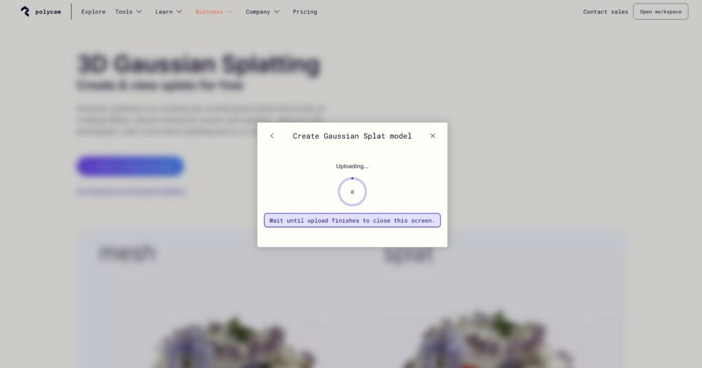
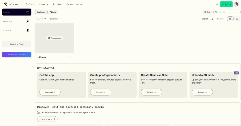
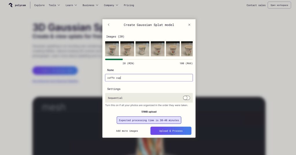
Nach einigen Recherchen stieß ich auf die Plattform Polycam. Dort können Nutzer Fotos oder Videos hochladen, um daraus im Browser 3D-Modelle zu generieren. Für meinen ersten Testlauf nutzte ich mein in die Jahre gekommenes Sony-Smartphone mit einer eher langsamen und wenig leistungsstarken Kamera. Mein Ziel war es, einen einfachen Kaffeebecher in 3D darzustellen.

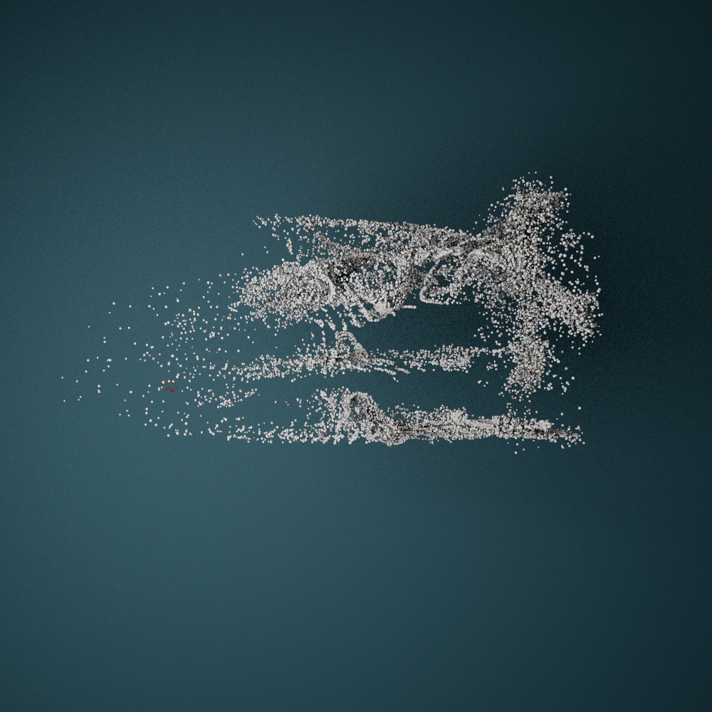
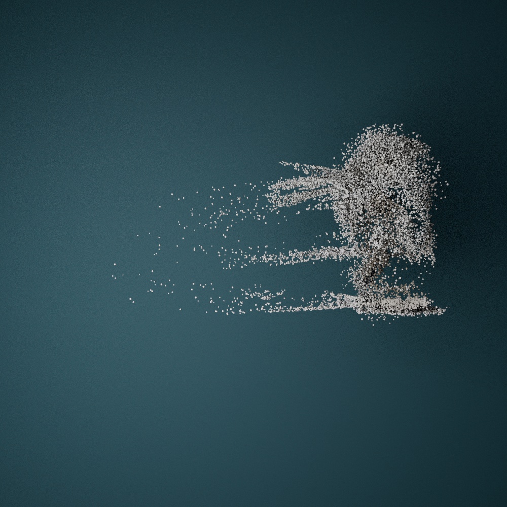
Zunächst erstellte ich 20 Fotos des Kaffeebechers – das ist die Mindestanzahl, die die Software für die Verarbeitung benötigt. Zusätzlich nahm ich ein kurzes Video des Bechers auf. Anschließend lud ich beides hoch. Die Software wandelte sowohl die Fotos als auch das Video jeweils in ein 3D-Modell um. Das Ergebnis war direkt im Browser sichtbar, konnte ausprobiert und sogar als Datei heruntergeladen werden.

Die Ergebnisse waren jedoch noch nicht optimal: Das Modell war lückenhaft und löchrig, was auf Verbesserungspotenzial hinweist. Dennoch war ich beeindruckt, wie schnell und unkompliziert die Erstellung ablief, selbst mit einer unzureichenden Kamera und minimaler Vorbereitung.

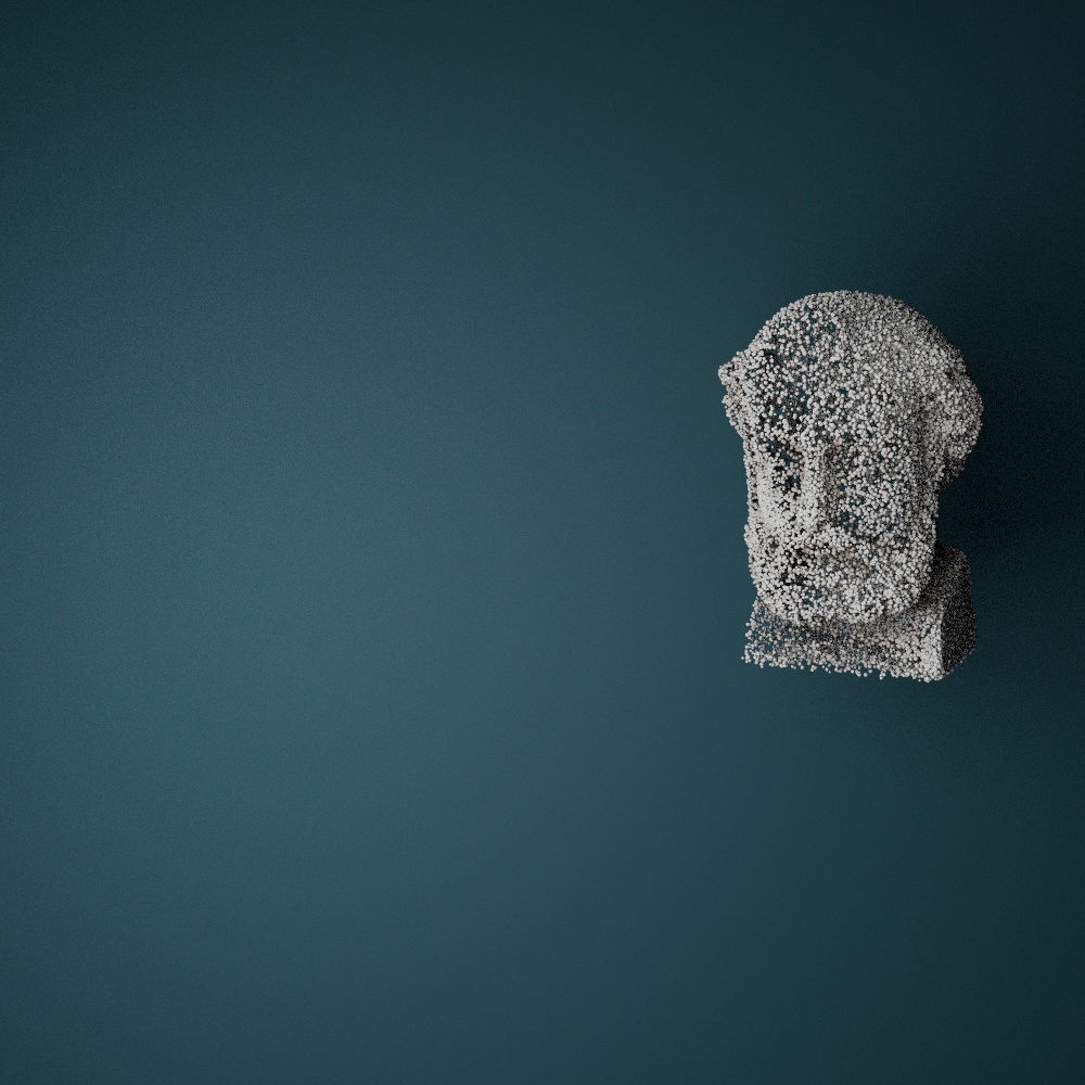
Dieser erste Test motiviert mich, tiefer in die Materie einzutauchen. Insbesondere möchte ich die Technik mit besserer Hardware testen und herausfinden, wie sich Gaussian Splatting auf die Reproduktion von Objekten anwenden lässt – beispielsweise von Statuen oder anderen Elementen, die man in einer Kirche finden könnte. Ich sehe großes Potenzial darin, diese 3D-Modelle später mit Partikelsystemen zu kombinieren, um interessante visuelle Effekte zu erzeugen.

Mein Fazit: Es gibt noch viel zu lernen und zu optimieren, aber die ersten Ergebnisse sind vielversprechend. Ich freue mich darauf, diesen Weg weiterzugehen und tiefer in die Welt des Gaussian Splatting einzutauchen.

https://poly.cam/tools/gaussian-splatting
Gaussian Splatting: Ein Überblick

Gaussian Splatting ist eine innovative Technik in der Computergrafik und -vision, die eine schnelle und effiziente Darstellung von 3D-Szenen mit hoher Genauigkeit ermöglicht. Im Gegensatz zu traditionellen Neural Radiance Fields (NeRFs), die auf volumetrischen Darstellungen und umfangreichen neuronalen Netzwerkberechnungen basieren, verwendet Gaussian Splatting eine spärliche Wolke von 3D-Gauß-Funktionen zur Modellierung der Szene. Hier ein Überblick über die wichtigsten Aspekte:

Kernprinzip:

  • Die Methode beginnt mit der Erzeugung einer 3D-Punktwolke (z.B. durch Structure-from-Motion-Techniken).
  • Jeder Punkt wird in eine Gauß-Funktion mit Eigenschaften wie Kovarianz, Farbe und Opazität umgewandelt.
  • Das Rendern erfolgt durch “Splatting” dieser Gauß-Funktionen auf einen Bildschirm, wobei sie sich überlappen, um das gewünschte Bild zu erzeugen, ohne für jeden Punkt Abfragen an ein neuronales Netzwerk zu richten.

Vorteile:

  • Geschwindigkeit: Reduziert die Rechenkosten durch Fokussierung auf die relevanten Teile einer Szene und Vermeidung leerer Räume.
  • Qualität: Erhält oder übertrifft die visuelle Genauigkeit von NeRFs durch direkte Optimierung der Gauß-Eigenschaften mittels stochastischer Gradientenabstieg.
  • Flexibilität: Erweitert auf dynamische Szenen (bekannt als 4D Gaussian Splatting) durch Einbeziehung zeitlicher Komponenten zur effizienten Darstellung von Bewegung.

Anwendungen:

  • Gaussian Splatting hat großes Potenzial in Bereichen wie Echtzeit-Rendering, Filmproduktion und interaktiven 3D-Medien.
  • Seine Fähigkeit, dynamische Szenen effizient zu rendern, macht es ideal für sich entwickelnde Anwendungen wie VR, AR und Echtzeitanimationen.

Diese Methode adressiert viele der rechnerischen Ineffizienzen früherer 3D-Modellierungstechniken und wird voraussichtlich zukünftige Fortschritte im Echtzeit-Grafik-Rendering prägen. 

Quelle: (https://en.wikipedia.org/wiki/Gaussian_splatting) 


Particle Object change

Experimentieren mit Partikelsystemen in Cinema 4D: Ideen und Herausforderungen

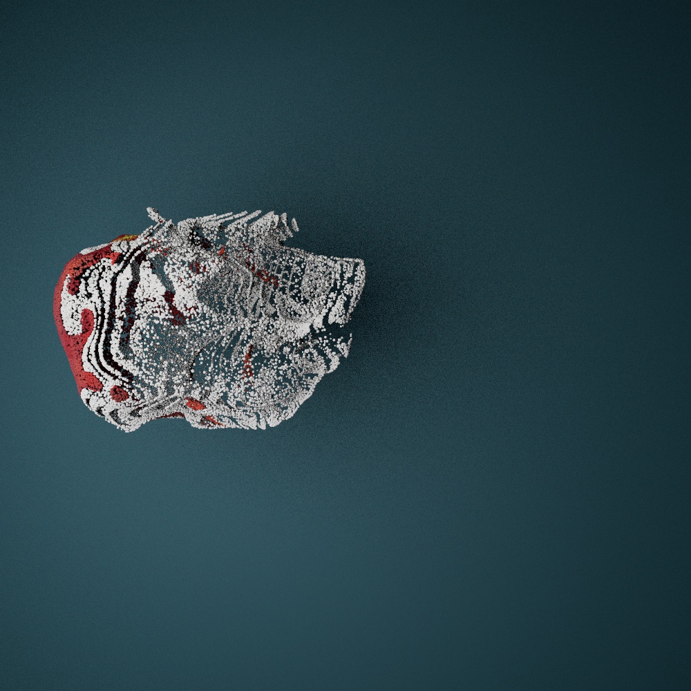
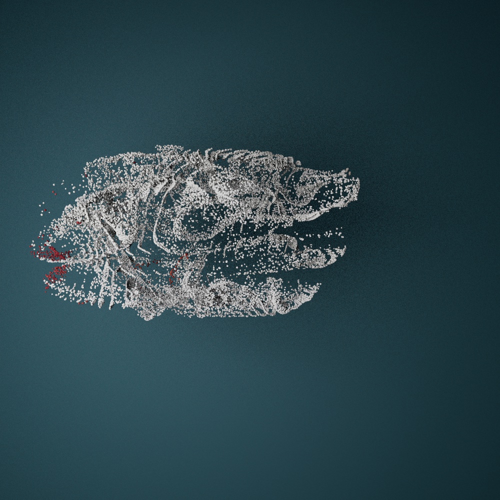
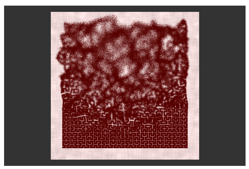
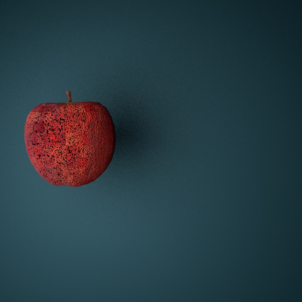
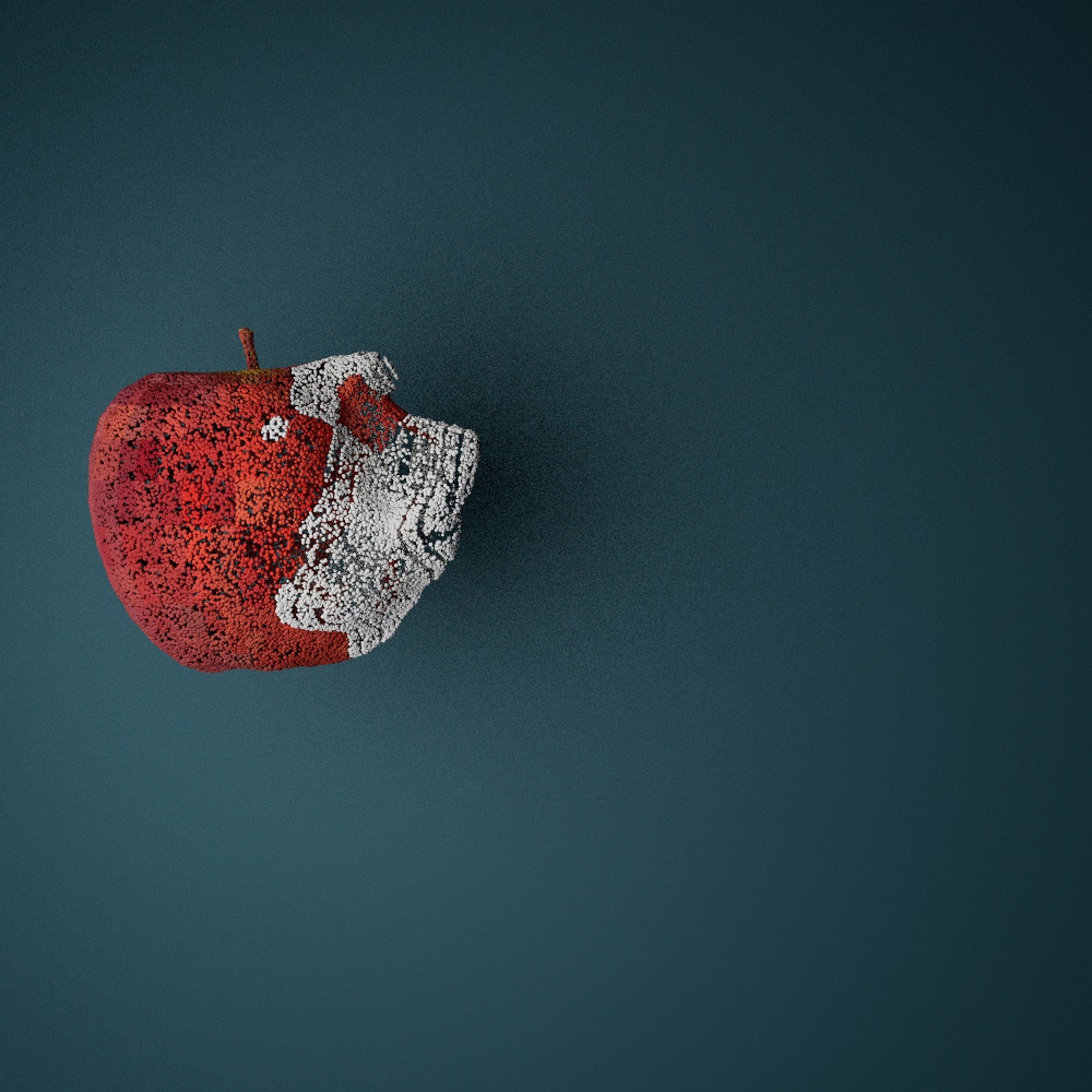
Ein weiterer Bereich, mit dem ich mich in letzter Zeit intensiv beschäftigt habe, ist die Arbeit mit Partikelsystemen in Cinema 4D. Mein Fokus lag dabei darauf, Objekte zu transformieren – genauer gesagt, das Morphen von einem Objekt in ein anderes mithilfe einer Partikelwolke. Die Idee ist, ein Objekt zunächst in Partikel aufzulösen, diese Partikel durch den Raum fliegen zu lassen und sie an einer anderen Stelle zu einem neuen Objekt zusammenzufügen. 

So könnten eingescannte oder zuvor erstellte 3D-Objekte dem Mapping eine neue Dynamik verleihen, indem sie mithilfe von Partikelsimulationen und audio-reaktiven Mechanismen ineinander übergehen. Zum Beispiel könnte eine Statue in Partikel zerfallen, sich über eine Fläche bewegen und sich an einer anderen Stelle zu einer völlig neuen Statue zusammensetzen.

Um diese Konzepte zu verfeinern, habe ich weitere Tutorials studiert und erste Experimente durchgeführt. Dabei sind mir einige Herausforderungen begegnet, insbesondere in Bezug auf die Texturierung der Objekte. Damit die ursprünglichen Formen und Details erkennbar bleiben, werden die Texturen mittels Shadern auf die Partikel projiziert. Das funktioniert grundsätzlich gut, jedoch zeigen sich Einschränkungen bei Objekten mit sehr unterschiedlichen Texturen. Ein Beispiel: Das Morphen von einem roten Apfel in eine weiße Statue wirkt visuell weniger harmonisch, da die Unterschiede in Farbe und Struktur zu groß sind. Es scheint sinnvoll, zunächst ähnliche Objekte mit vergleichbaren Texturen zu verwenden, um eine überzeugendere Transformation zu erreichen.

Neben der klassischen Partikelauflösung finde ich die Idee spannend, Objekte in größere Splitter oder sogenannte „Chunks“ aufzulösen. Kombiniert mit Simulationstechniken wie Rigid Body Dynamics oder Voronoi-Zerlegungen könnte man beeindruckende Effekte erzielen. Dadurch würde sich eine weitere Ebene der Animation eröffnen, die nicht nur visuell ansprechend, sondern auch für narrative Zwecke interessant sein könnte.

Ein persönliches Ziel ist es, meine Fähigkeiten in diesem Bereich so weit auszubauen, dass ich ein neues Showreel erstellen kann. Mit diesem könnte ich an Firmen herantreten, deren Arbeit im öffentlichen Raum – beispielsweise in Kirchen und Museen – stattfindet und Einsatzmöglichkeiten für solche Techniken bietet. Es wäre fantastisch, wenn meine Experimente Anklang finden und ich vielleicht sogar langfristig in diesem Bereich Fuß fassen könnte.

Für mich ist klar: Dieses Feld bietet viel Raum für kreative Spielereien und technisches Lernen. Ich bin hochmotiviert, weiter an diesen Ansätzen zu arbeiten und freue mich darauf, die Möglichkeiten von Partikelsystemen in Cinema 4D noch intensiver zu erkunden.
#2 Illustrations and Brand Identity

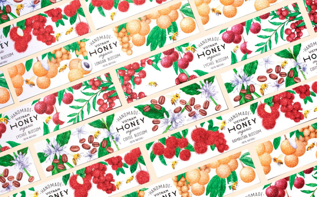
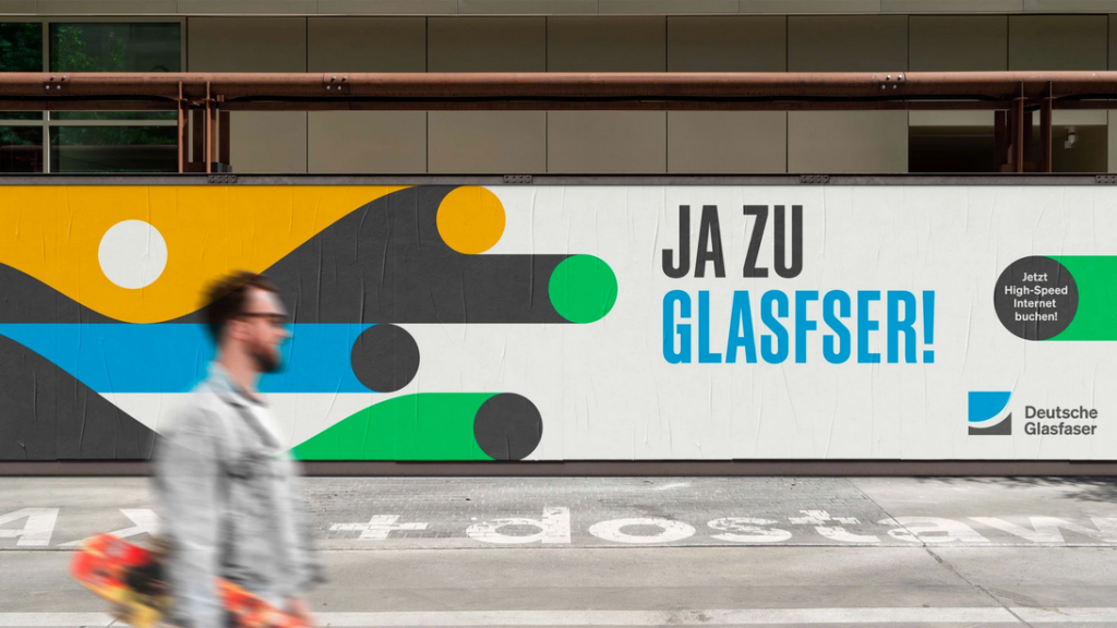
Illustrations are much more than simple drawings – they have become into an important design element that supports brands in countless ways. Wheater on packaging, in advertising, in web design or as part of a logo: Illustrations offer a wide range of creative possibilities They can be used either as stand-alone logos, as part of logos or as creative design elements such as symbols, pictograms or scenes. The key is to align the aesthetic and style with the brand to emphasise its idendtity. With illustrations, creativity knows no bounds.

Benefits of Illustrations as Brand Ambassadors:

Creating  attention:

Illustrations are visually appealing und more appealing than plain text, which is often perceived as intimidating. Infographics or other design elements can make complex content more accessible and quicker to communicate. At a time when attention spans are decreasing,it is crucial to use clear shaps and coulors that can be immediatly associated with a brand.

Evoking emotions:

Illustrations can be used to create strong emotions through targeted couloring and stylistic orientation. They are creativ, personal and can convey moods and feelings in an impressive way. Whether the aim is to bring characters to life or to create a certain atmosphere – illustrations connect on an emotional level that words alone often can´t achieve.

Conveying information:

Illustrationen sind hervorragend geeignet, komplexe Prozesse oder abstrakte Inhalte einfach darzustellen. Im Gegensatz zu Fotos, die in manchen Kontexten begrenzt sind, können Illustrationen Sachverhalte visuell auf den Punkt bringen. Besonders bei technischen oder abstrakten Themen helfen sie, Inhalte zugänglicher zu machen, Geschichten zu erzählen und Fantasie zu wecken. Zudem überbrücken sie kulturelle und sprachliche Barrieren, da sie universell verständlich sind.

Illustrations are ideal for representing complex processes or abstract content in a simple way. Unlike photos, which can be limiting in some contexts, illustrations can clarify facts visually. Particulary with technical or abstract topics, they help to make content more accessible, tell stories or awaken the imagination. Besides that they bridge cultre and linguistic barriers as they are universally understandable.

Individuality:

Custom-created for a brand, illustrations reflect its values and character. They can be easily adjusted to diffrent target groups or purposes and therefore are offer a high level of flexibility. In contrast to photos, which are often considered interchangeable, illustrations are standing out thorgh their idividuality. With the so-called “modular illustration system” (“Illustrations-Baukastensystem“), design elements can be easily customised and expanded. For example parts such as heads, hair, cloths or scenery objects are created, which can then be individually assembled.

Building recognition:

A consistent illustration style strengthens brand identity and makes it possible to recognize a brand by its visual elements alone. The use of brand-specific colours and design elements creates an individual recognition value that makes illustrations clearly superior to photos.

Application on different channels:

Illustrations can be flexibly adapted to different formats and media – whether online or offline. They can be customised for different channels and are therefore a multifunctional tool for strengthening brand visibility.

Resources

www.concrete-designs.deIllustrationen-im-Markendesign

www.factor.partners.deVisuelle-Markenkraft;  S.Stroth

www.wirdesign.de – Mit Illustrationen die Marke prägen; S.Conzatti; 2021

www.designstripe.com – How to use Illustrations for your-Brand; J.Pereira

Pictures

Products design illustration – www.concrete-designs.de

Informations graphic – www.designstripe.com

abstract illustration for technical brand – www.factor.partners.de

Blue for boys, pink for girls: Color theory & rethinking gender

Designers must navigate cultural differences, as color associations vary widely across regions. For instance, while white symbolizes purity in Western cultures, it is associated with mourning in many Asian countries. Color has also played a defining role in reinforcing gender norms in design. From the stereotypical “pink for girls” and “blue for boys” dichotomy to the subtle color cues used in advertising and branding, color theory has often been a tool for segmenting audiences along gender lines. However, as more and more people become aware of the fluidity of gender, we are beginning to challenge these conventions, seeking to create visuals that exploit these traditional norms and promote inclusivity.

The Origins of Gendered Color Associations

Let’s take a look at where the association with color and gender originates from, as it is more of a social construct rather than an inherent association. In the early 20th century, retailers and manufacturers began using color to market baby clothes and toys, with the pink/blue binary gaining prominence only in the mid-20th century. These marketing strategies reinforced cultural norms, embedding these associations into societal consciousness. But is blue really for boys and pink for girls?

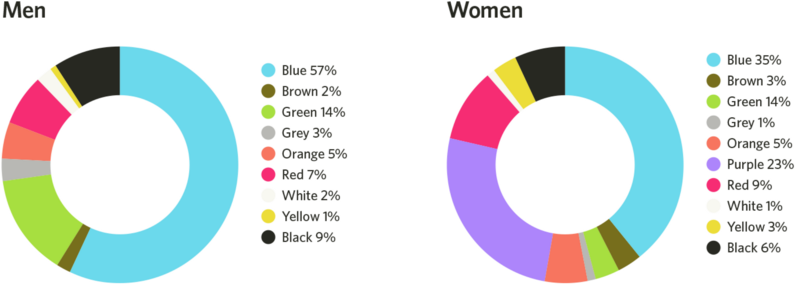
A study published in 2018 in Frontiers in Psychology examined global color preferences and found that while certain trends exist, individual preferences are shaped more by cultural and personal experiences than by gender. To add to that, blue is both men and women preferred primary color, as it’s associated with clean water, the sky, etc. This goes for a few different colors such as red and green. This challenges that specific colors are inherently masculine or feminine.

Shades or tints?

But it is also nut just the color itself, more than the tint or the shade: a study found, that women heavily prefer soft tints of colors (such as pink) whereas men prefer bright shades (such as ruby red). So although red is shown as a favorite color for both men and women, the subsets of reds they like are very different.

The genetics also play a role in this: women can see more colors than men, as the color vision depends on color cones in our eyes, which are carried on the X-chromosome. Men only inherit one X-chromosome instead of two. These cones tell our brains what color we are experiencing by interpreting wavelengths of light. Because men don’t inherit the same combinations of cones women do, men’s brains often require slightly longer wavelengths of light to experience the same colors. This may be the reason why men prefer colors with short wavelengths, like darker shades of blue and green, or they prefer shades without any wavelengths at all, like white, black, and gray.

The Solution: Gender-Inclusive Color Palettes

Many brands have moved away from rigid gendered color schemes in favor of more inclusive approaches. By doing so, they create a sense of openness and inclusivity that appeals to a broad audience. Gender-neutral color palettes in branding prioritize inclusivity and focus on balanced, universal tones such as greens, yellows, greys, or earth tones.By choosing colors that transcend traditional gender associations, brands can create more inclusive and appealing designs for diverse audiences, fostering a broader sense of belonging and engagement. This approach not only differentiates the brand but also conveys a sense of creativity and adaptability.

To implement gender-neutral color palettes, brands can focus on processes that prioritize diversity and inclusivity, like testing color combinations with diverse user groups to ensure they evoke a universal appeal. Neutral tones could be paired with complementary shades to maintain visual interest while avoiding stereotypical gender cues. But its important to also emphasize the cross-cultural and contextual meanings of colors to avoid reinforcing localized gender norms, thus creating designs that resonate globally.

Additional Sources:

https://link.springer.com/article/10.1057/s41262-020-00216-4

https://www.emerald.com/insight/content/doi/10.1108/ejm-11-2014-0723/full/html

https://www.designerinaction.de/design-wissen/genderneutrale-farben

https://core.ac.uk/download/pdf/236071469.pdf

https://www.psychologytoday.com/intl/blog/color-psychology/202410/beyond-pink-and-blue-how-gender-shapes-color-preferences

https://www.colormatters.com/color-symbolism/gender-differences

The Core Principles of Sustainable Graphic Design

Sustainable graphic design is guided by several foundational principles that inform eco-friendly practices:

  1. Resource Efficiency
    Prioritize using materials that are renewable, recycled, or responsibly sourced to minimize environmental degradation.
  2. Energy Consciousness
    Consider the energy demands of both print and digital production. For example, optimizing file sizes for websites reduces server load, which translates to lower energy consumption.
  3. Durability and Longevity
    Create designs that stand the test of time, reducing the need for frequent updates or reprints.
  4. Minimalism
    Adopting simplicity in design not only aligns with aesthetic trends but also minimizes resource usage and reduces waste.

Practical Applications

  • Choosing eco-friendly printing methods, such as waterless printing or using soy-based inks, to reduce harmful emissions.
  • Designing for digital sustainability by optimizing websites and digital assets for lower energy usage.
  • Incorporating recycled materials in packaging or printed media to reduce reliance on virgin resources.

A Designer’s Responsibility Designers hold the responsibility to create with intention and foresight, ensuring their work contributes to a healthier planet. By embracing these principles, the design industry can lead the way toward a more sustainable future.

What is Sustainable Graphic Design?

The Lifecycle Approach

One distinguishing feature of sustainable graphic design is its focus on the lifecycle of a project. This involves asking key questions:

  • What are the environmental impacts of the materials being used?
  • Can the project be executed with fewer resources or in a more energy-efficient way?
  • What happens to the product after it has served its purpose? Is it recyclable, reusable, or biodegradable?

Why It Matters

The urgency of climate change and resource depletion has placed significant pressure on industries to adopt sustainable practices. Graphic design, with its influence on consumer behavior and product development, holds a unique position in driving this change. By adopting sustainable methods, designers can create meaningful work that supports both environmental and social well-being.

02 The Bias Blindspot

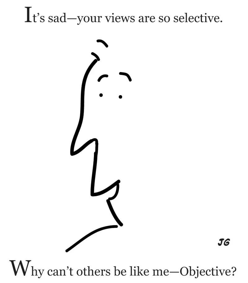
In my last blogpost, I linked a survey, which sadly no enough people answered, but what was it all about? I wanted to test something I read about while researching for my first blogpost: The bias blindspot. Explained simply this means, that we detect biases easier than in ourselves. Sadly not enough people took part, so I can’t make any assumptions on our study program. Still this is an important topic to talk about, this can pave the way for us to understand biases better and learn how to overcome their influence.

What is the Bias Blindspot exactly?

People are mostly unaware of their own biases, although they can easily detect them in the judgement of others. They tend to believe that they are less biased than their peers. There are many examples of this, that you will surely recognize, maybe you have already been in a similar situation before. If you ask physicians if gifts from pharmaceutical companies would influence their decision about what medicine they prescribe, most claim that they would not be influenced by this. If you turn the question around and ask if they think, other physicians would be influenced by gifts, most will agree. This disparity can occur in many different types of judgements or decisions. (cf. CMU)

A study found that only one out of 661 adults said, that they were more biased than the average person, all other 660 were sure, that they are less biased than the average person. In addition most people have no idea, how biased they actually are but are sure people around them are more biased than themselves. There is a good reason to why this happens, since society teaches us from a young age, that being biased is bad, we don’t want to see ourselves as people, who do bad things.(cf. IxDF)

The bias blindspot is a combination of two mental short cuts, the “introspection illusion” and “naive realism”. (cf. Scopelliti, Irene Scopelliti et. al.; pos. 1-2) The “introspection illusion”, says, that we tend to rely on our own thoughts and memories, when we think about whether we are biased or not. Although this introspection doesn’t reveal subconscious factors that are influencing us. (cf. Renascence) “Naive realism” describes, that we think we see the world how it is, without any distortion, although this is most likely not true. We underestimate the possibility that we are fooling ourselves. (cf. Medium a)

What is the influence of a Bias Blindspot?

The biggest problem of the bias is, if we operate within our blindspot, we are less likely to accept input from our peers and/or experts. In addition, we are less likely to benefit from education and training concerning our particular biases. (cf. IxDF) Not only that but we will underestimate the influence of our own biases, which can lead to skewed design decisions, that fail to cater to diverse user needs. Mitigating biases is essential to gain reliable insights into user behavior and preferences. (cf. Medium b)

So this means for UX Design, this means, that if we fail to learn about flaws in our design, we can’t create an experience that truly caters to the users needs. We might even make mistakes over and over again.

How can we overcome the Bias Blindspot?

First things first, overcoming bias is hard and takes a lot of work and self reflection. To overcome the bias blindspot is to be aware that it exists and it influences a lot of our decisions. Then to truly overcome the bias blind spot, UX designers have to engage in self-reflection, constantly challenge assumptions, and foster an open and inclusive design process. (cf. IxDF, cf. Medium b)

This is quite complex, and I want to give the topic of overcoming biases the room, that it deserves. There will be a follow up post about this topic.

Thanks for reading through my blog! 
Leave a comment, if you are interested in this topic and tell me what you want to read about next! ;P

Fun Fact

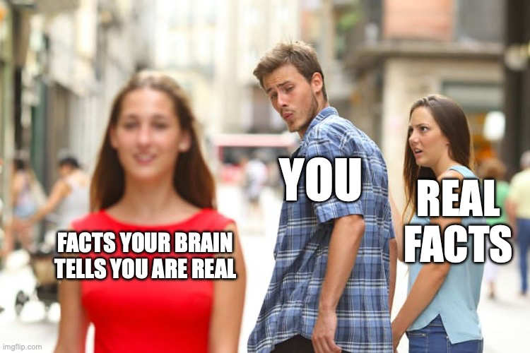
While writing this blogpost, I realized, that I thought to myself: “That could never happen to me.”, a second later, I realized, that this was exactly what was going on. So even if you are aware that something like this exists, you will fall into your own traps, over and over again.

by me (using imgflip-MemeGenerator)

03: Knight Lab. Schlechter als erwartet!

Das zweite Online-Tool, das ich mir in Hinblick auf meine Masterarbeit genauer angesehen habe ist Knight Lab. Soviel vorweg: Es war nicht gut.

Über Knight Lab

Knight Lab ist eine Initiative der amerikanischen Northwestern University und stellt einfach nutzbare Baukästen für digitales Storytelling zur Verfügung. Derzeit werden sechs verschieden Baukästen unterstützt. Diese sind: Juxtapose (bei dem man mithilfe eines Sliders Fotos vergleichen kann), Scene (das eine Geschichte im Google-Street-View Stil ermöglicht), Soundcite (das die Integration von Audio in Textabschnitten ermöglicht), Storyline (mit dem man Graphen interaktiv beschriften kann), StoryMap (mit dem man Punkte auf Karten mit Text versehen kann) und TimeLine (das wie man vermuten würde Geschichten mit einer zugrundeliegenden Timeline als Navigationsmöglichkeit anbietet). Wie auch schon in Datawrapper können alle Ergebnisse dann entweder als Fotos oder Embed-Code exportiert werden. Da für mein Thema, die Datenvisualisierung, im Grunde nur zwei der Baukästen Sinn machen (StoryLine und StoryMap) habe ich mir diese beiden genauer angesehen und ausprobiert. Die Ergebnisse waren erstaunlich schlecht.

StoryMap: Geschichten in Karten erzählen

StoryMap war von beiden Baukästen noch jener, der eher ein ansehnliches Ergebnis liefern konnte. Dabei kann man, ähnlich wie in Microsoft Powerpoint Slides bauen, die aus Bild, Titel und Text bestehen und diese dann über eine Adresse lokalisieren. Das Tool baut daraus dann eine interaktive Karte, mit der man entweder geführt von einer Slide auf die nächste kommt und auf der Karte sehen kann wo man sich gerade befindet, oder direkt auf der Karte an eine Stelle springen kann. Auch wenn das Ergebnis recht ansehnlich ist, Gestaltungsspielraum bleibt kaum. Weder die Farben, noch das Layout lassen sich groß verändern. Das Standard-Design ist klassisch, aber ist gerade in den Farben fad.

Als Topic habe ich mich für Fußball entschieden und versucht die teuersten Fußballer der Welt auf der Karte mit ihren Geburtsorten darzustellen. Das Ergebnis ist okay, gerade das Layout der Karte ist aber einfallslos und lässt sich nur in noch schlechtere Designs ändern. Da sich WordPress, wie auch schon bei Datawrapper, weigert die jeweiligen Embed-Codes schön darzstellen, habe ich die folgende Bildschirmaufnahme gemacht um die StoryMap zu zeigen.

Storyline: Beschriftungen eines Graphen

Das zweite Tool von Knight Lab, Storyline, soll Storytelling und Liniendiagramme vereinen, macht dies aber äußerst rustikal. Konnte man bei der StoryMap als eine der wenigen Einstellungen zumindest noch die Schriftart verändern bleiben individuelle Einstellungen hier komplett auf der Strecke, was schade ist, da das Standarddesign kaum unansprechender sein könnte. Auch die Funktionsweise ist eher unorthodox. Als Daten zugrunde liegt der Storyline ein Google Sheet, das man öffentlich freigeben und verlinken muss. In vier Spalten (Datum, Daten, Titel der Anmerkungen, Anmerkungen) gestaltet man dann die Storyline. Im Tool muss man dann nur noch zuweisen welche Spalten was beinhalten, mehr geht aber leider auch nicht. Alles in allem enttäuschend.

Als Thema habe ich hier die Preisentwicklung des Bitcoin recycled, da ich diese Daten sowieso schon vom Datawrapper Versuch hatte und ein Preis sich einfach gut visualisieren lässt. Für neue Datensätze, die ich in meinen zukünftigen Programmen verwenden kann, bin ich natürlich immer offen^^ Da sich diese Grafik in WordPress gleich gar nicht (und nicht nur schlecht) einbetten lässt, auch hier wieder ein Video.

Fazit

So gut und professionell Knight Lab auch scheint – angeblich würden die größten US-Medienhäuser es für ihre Geschichten nutzen – so schlecht und absolut unbrauchbar ist es in der Realität. Nicht nur Individualisierungsmöglichkeiten sind quasi kaum vorhanden, auch das Standard-Design ist unansprechend. Für mich ein klares No-Go in Hinblick auf meine weitere Arbeit.

Latest Trends in Automotive UX Design

As the automotive industry experiences a digital transformation, user experience (UX) design is becoming a key factor in shaping the way drivers and passengers interact with vehicles. Modern vehicles are no longer just vehicles, but are transforming into connected, intelligent spaces that integrate seamlessly into our digital lives.

Personalisation and integration of artificial intelligence

One of the most significant UX trends in the automotive industry is the rise of personalisation, which is driven by artificial intelligence (AI) and machine learning. Vehicles are now adapting to individual user preferences and offering tailored experiences that enhance comfort and convenience. Everything from seat positioning and climate control to in-car entertainment and driving modes can be automatically adjusted based on user profiles. Predictive technologies are also becoming more prevalent, with systems suggesting routes, stops or even adjusting settings based on previous behaviour.

(source: https://nix-united.com/blog/ai-in-automotive-a-new-edge-of-the-automotive-industry/)

Augmented reality (AR) and immersive displays

Augmented Reality (AR) is bringing a major innovation to vehicle interfaces by overlaying digital information onto the real world. AR heads-up displays (HUDs) project navigation instructions, safety alerts and vehicle diagnostics directly onto the windshield, allowing drivers to focus while receiving important information. This trend improves safety and convenience by providing real-time data without distracting the driver from driving.

(source: https://iot-automotive.news/huawei-ar-hud-debuts-at-iaa-mobility-2021-delivering-a-new-driving-experience/)

Voice assistants and natural language processing

Voice assistants using advanced natural language processing (NLP) are becoming a central feature of the in-car experience. These systems allow drivers to control various functions – such as navigation, media playback or even air conditioning – hands-free through spoken commands. This trend not only improves safety by reducing distractions, but also makes interactions more intuitive. AI-powered voice assistants can also integrate into natural conversations, making driving more enjoyable.

(source: https://www.theturnsignalblog.com/guidelines-for-designing-an-in-car-voice-assistant/)

Entertainment and games in the car

The concept of cars as entertainment centres is gaining popularity. With the rise of high-speed connectivity and advanced infotainment systems, passengers can now enjoy streaming services, multiplayer games and even immersive virtual reality experiences while driving. Some vehicles now feature large displays for backseat passengers or even integrate gaming platforms into the car’s ecosystem. This trend is turning long commutes or car journeys into immersive experiences for all passengers.

(source: https://www.audi-mediacenter.com/en/press-releases/holorides-cutting-edge-in-car-entertainment-platform-launches-for-select-audi-models-15004)

References:

https://medium.com/@sreelakshmis.dilip/exploring-the-latest-trends-in-automotive-ux-a39ec4f9e95c

https://medium.com/@yujdesigns23/steering-into-the-future-ux-trends-reshaping-the-automotive-sector-2b45d9d56fd7

https://jobya.com/library/roles/kI6swA4r/vehicle_user_experience_researcher/articles/kI6swA4r_future_of_vehicle_UX

https://digitalcreative.cn/blog/latest-automotive-hmi-design-trends

Upcycled Furniture Made from Recycled Parachutes

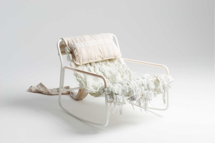
LAYERS x RAEBURN – parachute edition 2019

The designers focused specifically on using surplus ex-military parachutes and aircraft brake parachutes, made from ultra-thin ripstop nylon material, and worked with one of the head seamstress at Raeburn to create the finished products.

The material used comes from old military parachutes and from the brake parachutes of aircraft, which basically function like parachutes. Two of the chair designs boast a more tousled look, achieved by draping layers of the parachute material over their framework. One features a mixture of white and peachy tones, while the other is coloured in a palette of blacks and greys.

The other style sees a multi-coloured parachute material tightly wrapped around its metal structure for a taut finish, making it clearer what purpose the material once served.

Each of the textiles were secured with a combination of concealed zips and different textile techniques, including hidden seams and French seams. Extra parachute material has been wrapped around the armrests. Recycled parachute material wrapped over welded steel frames make up this collection of rocking chairs and screens by Benjamin Hubert‘s design agency Layer and the eponymous label of fashion designer Christopher Raeburn.

Welded steel frameworks provided a “blank canvas” for the designers, enabling them to make the parachute material the standout element in each product.
“The Canopy Collection uses the strict geometry of the steel frames as a base on which to experiment with innovative and forward-thinking recycled parachute upholstery,” said the creators.

“[It] is tuned into the semantics of a parachute in flight – the lounge chair gently rocks back and forth whilst the re-configurable screen takes inspiration from the section and construction of a wing,” they added. The ability to layer the ultra-thin ripstop nylon to create durable furniture pieces with innovative forms was a particular area of interest.

According to Hubert, one of the biggest challenges was templating from the military parachutes, as they contain existing panels, in addition to being very large in size and circular in form. Rather than creating “pseudo-panels”, the designers wanted to use the parachute as it was.

Resources:

Further research:
– Contact Paratec for an interview

The Oh So Many Languages of Creative Coding

The programming environments most commonly used for creative coding are Processing, P5.js, and vvvv. In this blog I’d like to explore each environment, and in so doing, provide examples for all that creative coding can encompass. 

The difference between Processing and P5.js is that processing’s language is based in java (though greatly simplified), whereas p5.js is in javascript with the key difference between the two being that the former is built primarily for independent applications, whereas the latter is made for the web. (cf. Geeksforgeeks 2024)  P5.js is meant to be used directly in the web browser. 

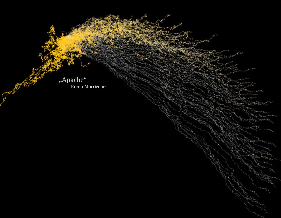
Fig. 1: Narrative 2.0 by Matthias Dittrich, a Processing sketch visualizing music. (src: https://www.matthiasdittrich.com/projekte/narratives/visualisation/index.html)

Processing was first released in 2001 as an open source project to teach programming with instantaneous visual feedback. It has since grown and has become a valuable tool with its own implementation, such as in the simplified programming language Ruby -(https://ruby-processing.github.io/about/)  or with the  general-purpose scripting language Clojure (https://github.com/rosado/clj-processing) It has also been connected to third party libraries for the purpose of accomplishing more complex tasks, such as drawing in 3D (http://py.kantel-chaos-team.de.s3-website-us-east-1.amazonaws.com/13gr3d/), reading XML (https://contribs.processing.org/reference/XML.html), connecting to an Arduino (https://www.arduino.cc/education/visualization-with-arduino-and-processing/) and interfacing with other Application Programming Interfaces. (cf. Pearson 2011)

Fig. 2: Processing Interface

Fig. 3: Sketch created with p5.js (src: https://p5js.org/sketches/2174234/)

P5.js is a javascript library for creative coding available online under the URL https://editor.p5js.org/.  It could also be run locally by downloading their library. (https://p5js.org/download/) From the get-go it can interface with text, sound, video, and gain access of your camera. Like processing, it has a simplified syntax, which makes it easy to learn, lets you see in real time the changes in your code by visually displaying the manipulations in your code. (geeksforgeeks 2024) 

Fig. 4: p5.js Interface

Other free notable contestants for code-based creative coding programs are Context Free Art (https://www.contextfreeart.org/), OpenFrameworks (https://openframeworks.cc/download/), and Structure Synth (https://structuresynth.sourceforge.net/learn.php).

vvvv is a node-based creative coding framework as old as Processing – first created in 2002. Like Processing, it is used for data visualization, interaction-design and generative-design, with also added VR integration and machine learning. There are open-source libraries of nodes available for downloading to the software. The coding languages making up the nodes can be written in plain C# ir F#. vvvv calls their generative process “live-programming” – you can make realtime changes to the output by applying changes to the nodes. (TheGrayBook n.d.) As the main homepage of vvvv states: “There is no need to write any code, unless you really want to.” (Visual Programming n.d.) 

Fig. 5: vvvv Interface

Other node-based creative coding applications worth mentioning are Cables (https://cables.gl/), Isadora (https://troikatronix.com/), Max (https://cycling74.com/), Jitter (https://cycling74.com/products/jitter), Pure Data (https://puredata.info/), Touchdesigner (https://derivative.ca/), Vuo (https://vuo.org/), and NodeBox (https://www.nodebox.net/). 

References: 

https://www.geeksforgeeks.org/difference-between-java-and-javascript

https://www.visualprogramming.net

https://www.geeksforgeeks.org/p5-js

https://thegraybook.vvvv.org/reference/getting-started/cc/introduction-for-creative-coders.html

Pearson, Matt: Generative Art. 2011