#02 Loneliness?

Loneliness is a universal human experience, yet it manifests in ways that are deeply personal and varied. What exactly is loneliness, and how can we better understand its dimensions and impact?

What is Loneliness?

Several studies describe a different definition of loneliness. As a discrepancy between the social interactions and relationships an individual desires and those they currently experience, which leads to a negative feeling of being alone. Here, however, being alone is not the same as feeling lonely. It is described as a perceived lack of social contact, 2 or as the unavailability or unwillingness of others to engage in social and emotional experiences 3, or as a condition in which an individual can interact with others but does not do it. 4

Loneliness is a multidimensional phenomenon due to its variations in intensity, causes, and circumstances. Therefore, it can be distinguished between three types of loneliness: emotional loneliness, social loneliness and collective loneliness.

Emotional loneliness “results from the lack of a close, intimate attachment to another person”. Someone, like a spouse or best friend, whom one can rely on for emotional support during hard times and validates one’s values.

Social loneliness is the absence of quality relationships with family or a group of friends who share the same interests and activities. 6  

Collective loneliness pertains to an individual’s sense of disconnection from their valued social identities or “active network” (e.g., group, school, team, or national identity), where one can engage with like-minded others, even if only at a distance, within the broader social context. 7

How to measure Loneliness?

Since loneliness is a subjective experience, its measurement can be challenging. It cannot be directly observed, and there are no objective indicators to assess it. As a result, loneliness is typically measured through self-reported methods, such as surveys and questionnaires. There are two types of measuring loneliness: direct and indirect. 

Direct Measures: People are asked directly if they are feeling lonely in a certain period of time. 

Indirect Measures: People are asked several questions but without using words like lonely or loneliness. The questions are about feelings and experiences related to loneliness. Like the wish to have someone to rely on or talk to about private topics. 

Over the time several scales have been developed for measuring loneliness. The two most known ones are the “University of California Los Angeles Loneliness Scale” created by Russell and Peplau and the and the “De Jong Gierveld Loneliness Scale” created by De Jong Gierveld and Kamphuis. 8

University of California Los Angeles Loneliness Scale (UCLA Loneliness Scale)

The survey consists of 20 statements, and respondents are required to indicate how frequently each statement applies to them. O: I often feel this way, S: I sometimes feel this way, R: I rarely feel this way, N: I never feel this way.  9
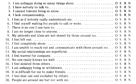
Source: D. W. Russell, L. A. Peplau: Developing a Measure of Loneliness
De Jong Gierveld Loneliness Scale

The original survey consists of eleven statements, in 2000 they created a shortened version with only six statements. Three of the statements are positively formulated and the other three are negatively formulated. The statements need to be answered with “no”, “more or less” or “yes”. This survey also considers the difference between emotional loneliness and social loneliness. 8

6 questions: 

  • I experience a general sense of emptiness.
  • I miss having people around.
  • I often feel rejected.
  • There are plenty of people I can rely on when I have problems.
  • There are many people I can trust completely.
  • There are enough people I feel close to.

What is Social isolation?

Loneliness and social isolation are frequently discussed in tandem or treated as synonymous concepts. 2 However, loneliness describes a subjective experience, whereas social isolation is an objective situation where someone is alone or lacks meaningful social interactions. 10 A person who has little contact to the family, friends or other people of a community is socially isolated. 11

Since belonging is seen as a fundamental human motivation. 12 A core aspect shared by most individuals is the need for love, acceptance, and understanding, which often motivates significant efforts to avoid experiencing loneliness. 


Sources:

[1] L. A. Peplau and D. Perlman, “Loneliness,” in Encyclopedia of Mental Health, H. S. Friedman, Ed., vol. 1, San Diego: Academic Press, 1998, pp. 571–581.

[2] G. C. Wenger, The Supportive Network: Coping with Old Age, 1st ed. Allen and Unwin, London, 1984

[3] K. S. Rook, “Research on social support, loneliness, and social isolation: Toward an integration,” Review of Personality & Social Psychology, vol. 5, pp. 239–264, 1984.

[4] S. Shalev, “On loneliness and alienation,” Isr. J. Psychiatry Rel. Sci., vol. 5, pp. 236–245, 1988.

[5] L. M. Heinrich, E. Gullone und School of Psychology, Psychiatry, and Psychological Medicine, Faculty of Medicine, Nursing, and Health Sciences, Monash University, VIC 3800, Australia, „The clinical significance of loneliness: A literature review“, 2006. doi: 10.1016/j.cpr.2006.04.002.

[6] R. S. Weiss, Loneliness: the experience of emotional and social isolation. 1974. [Online]. Verfügbar unter: http://psycnet.apa.org/record/1974-22306-000

[7] S. Cacioppo, A. J. Grippo, S. London, L. Goossens und J. T. Cacioppo, „Loneliness: Clinical Import and Interventions“, The Author(s), 2015. doi: 10.1177/1745691615570616.

[8] S. V. Schnepf, B. D’Hombres und C. Mauri, Hrsg., Loneliness in Europe. 2024. doi: 10.1007/978-3-031-66582-0.

[9] D. W. Russell, L. A. Peplau, Iowa State University, University of California, Los Angeles und Letitia Anne Peplau, „Developing a Measure of Loneliness“, Journal Of Personality Assessment, Juli 1978, doi: 10.1207/s15327752jpa4203_11.

[10] J. de Jong Gierveld, “Developing and testing a model of loneliness,” J. Personal. Soc. Psychol., vol. 53, pp. 119–128, 1987.

[11] C. Victor, S. Scambler, J. Bond und A. Bowling, „Being alone in later life: loneliness, social isolation and living alone“, Reviews in Clinical Gerontology, Bd. 10, Nr. 4, S. 407–417, Nov. 2000, doi: 10.1017/s0959259800104101.[12] Baumeister, Roy F. and Leary, Mark R., “The Need to Belong: Desire for Interpersonal Attachments as a Fundamental Human Motivation”, Psychological Bulletin 1995, Vol. 117, No. 3, 497-529

08: Exposure. Funktioniert.

Als dritten Webseitenbaukasten habe ich mir die etwas unbekanntere Seite “Exposure” angesehen, die gerade mit einem sehr einfachen Layout wirbt. Auch wenn diese die bisher einzige ist, auf der man bereits gratis live gehen kann, überzeugt sie mich nicht restlos.

Über Exposure

Exposure ist ein amerikanisches Tool, das gerade den privaten Einzelanwender addressiert und für einfache Anwendungen wie Reise- oder Fotoblogs gedacht ist. Im Gegensatz zu Pageflow und Shorthand, kann auch bereits im freien Abonnement veröffentlicht werden, wenn auch natürlich nicht auf der eigenen Domain. Auch preislich bietet Exposure Vorteile: Schon ab 14 Dollar im Monat ist man voll dabei. Die Ausrichtung auf den unerfahrenen Amateuranwender, der nur schnell seine Urlaubsschnappschüsse teilen möchte ist dabei aber Fluch und Segen zugleich. Eine Übersicht über die Webpage gibt es als Video unten, da eine Gratisveröffentlichung nicht möglich war.

Vorteile von Exposure

Von allen bisher verwendeten Tools bietet Exposure definitiv die intuitivste Bedienung. Das Tool kommt gänzlich ohne Sidebars aus und die Gestaltung der Homepage sieht im Backend fast genauso aus wie im Frontend, was die Gestaltung sehr vereinfacht. Der größte Vorteil von Exposure ist aber definitiv, dass es einfach funktioniert. Alle Grafiken, egal von welchem Hersteller können spielend eingebettet werden und behalten sowohl die Interaktivität als auch etwaige Animationen. Auch äesthethisch ist Exposure recht ansprechend, wenn auch einfach.

Nachteile von Exposure

Die einfache Bedienung hat aber natürlich auch eine Kehrseite: die Individualisierungsmöglichkeiten sind extrem eingeschränkt. Schon am einfachen einfärben von Text oder freien Platzieren eines Texts stößt Exposure an seine Grenzen. Im Endeffekt ist es einfach ein großes Template, das für einige Anwendungsfälle sicher genau passt, aber einfach nicht ausreicht wenn es mehr sein soll. Auch die Grafiken funktionieren, können in Exposure aber nicht mehr in Größe oder Farbe bearbeitet werden.

Fazit

Die Suche nach dem perfekten Tool geht leider weiter. Exposure ist zwar einfach zu bedienen, aber gerade dann, wenn es eigentlich spannend wird, schon wieder am Ende. Persönlich ist es definitiv das Tool, das ich in Zukunft am unwahrscheinlichsten weiter verwenden werde, auch wenn kein Besseres mehr kommt. Shorthand und Pageflow haben zwar alle ihre Fehlerchen, sind am Ende durch mehr Individualiserungsmöglichkeiten aber einfach brauchbarer.

02. Understanding Gamification Mechanics: Turning Engagement into Action

In the previous blog post, I briefly explored how gamification can revolutionize preventive healthcare by enhancing user engagement and driving long-term behavioral changes. But what makes gamification so effective? At its core, gamification relies on carefully designed mechanics that tap into human psychology, motivating users to participate, persist, and achieve goals. In this post, I’ll dive deeper into these mechanics and understand how they can be applied effectively.

History of gamification

But before diving into types of mechanics let’s explore the history of gamification. The gamification strategy was developed in 2002 by Nick Peiling. However, the concept of applying game elements to nongame contexts — such as loyalty programs and customer rewards systems — has been around for much longer.

The rise of video games in the 1970s and 1980s influenced the early development of gamification. The addictiveness of playing video games and the engagement video gameplay generated sparked interest in applying game elements to other areas. In the 1990s, educational games like Math Blaster and Carmen Sandiego introduced gamification to the classroom. These games aimed to make learning more engaging and interactive.

With the success of early gamification efforts, companies like Nike and Starbucks began incorporating gamification into their marketing campaigns and loyalty programs in the early 2000s. One example is Nike+, a fitness tracking gamification campaign that Nike launched in 2006 which ranked friends’ fitness scores on social leaderboards. This marked the beginning of the widespread adoption of gamification in various industries. The advent of smartphones, social media, and mobile apps accelerated the popularity of gamification.

Types of game mechanics

The Core Mechanics of Gamification Gamification mechanics are the building blocks of any engaging experience. These include:

Points and Rewards: Providing instant feedback and a sense of accomplishment.

Badges and Achievements: Recognizing milestones and rewarding dedication.

Levels and Progress Bars: Offering clear goals and a sense of progression.

Challenges and Quests: Encouraging users to complete tasks with meaningful rewards.

Leaderboards: Fostering a sense of competition and social recognition.

As was already mentioned in the previous post, gamification strategies are successfully implemented in various fields, such as education, finance, employee training, customer engagement, and health.
Here are some examples of them:

Retail and E-Commerce. Companies such as McDonalds, Nike, and Sephora implement loyalty programs that leverage game mechanics like badges, bonus points, and rewards to motivate customers to interact with a brand

Education and eLearning. Online learning platforms such as Khan Academy and Duolingo incorporate game elements to engage learners in studying languages and programming. They provide immediate feedback, leaderboards, progress tracking, and rewards to engage students.

Gamification works because it aligns with intrinsic and extrinsic motivators. Intrinsic motivation drives users from within – the joy of achievement or curiosity to explore. Extrinsic motivation, on the other hand, involves tangible rewards or social recognition. Effective gamification blends these motivators to create a balanced experience.

Take, for example, a healthcare app that uses daily step-count challenges, the motivation might come from feeling healthier, while extrinsic motivation comes from earning points and competing with friends.

For example, in a preventive healthcare app, the early stages might focus on education and building habits, while later stages could involve challenges and community interaction.

Why gamification doesn’t engage users?

With 1 in 3 adults globally living with chronic conditions and the rise in smartphone ownership, mobile health apps have become a famous tool for managing lifestyle-related health behaviors and mental health. However, high rates of app abandonment pose challenges to their effectiveness.

The observation about sustaining long-term engagement in healthcare apps is derived from common insights in user experience (UX) design and behavioral psychology, specifically regarding app engagement and retention challenges. Research and case studies on healthcare apps, such as Fitbit, MyFitnessPal, and similar platforms, often highlight these issues:

  • Repetitive Tasks and Loss of Interest: Users often abandon mHealth apps due to boredom and loss of motivation, which can result from engaging in repetitive tasks without sufficient variation or enjoyment
  • Lack of Immediate Rewards: Behavioral psychology emphasizes that immediate gratification reinforces behavior. When rewards are delayed or too distant, engagement drops.
  • Sense of Stagnation: Users may feel a sense of stagnation in their progress, leading to disengagement from the app.

The goal of gamification in healthcare should always center around enhancing user well-being, not exploiting vulnerabilities. For instance, some apps use overly aggressive notification systems or create artificial scarcity of rewards, pressuring users into compulsive behavior rather than fostering genuine engagement. These tactics can undermine trust and ultimately reduce long-term participation.

Conclusion

Understanding gamification mechanics is not just about adding game-like features, it’s about crafting experiences that resonate with users. When done right, gamification can bridge the gap between intention and action, especially in fields like preventive healthcare.

I’ll dive into how gamified solutions can improve outcomes for chronic diseases such as diabetes and hypertension, focusing on enhancing patient engagement, medication adherence, and progress tracking.

LS #5 Unpacking Sexism and Misogyny in Design of Advertisements

Whilst in the last blog post I explored different ways and a bit of history of feminism in graphic and communication design, I want to dive deeper on the reasons why it is necessary in Design as well. Reproduced gender stereotypes, representation and oppression was and is common especially in advertisement but in all other design areas as well.

Advertisements 20th Century

Common examples of historical advertisements of the 20th century show the objectifying and sexualising of women and reflect how women* were seen and valued in the time period (Rare Historical Photos, 2021). Sexist vintage advertisements often relied heavily on the sexualisation of women, portraying them as passive objects to appeal to male consumers. These ads typically featured women in exaggeratedly submissive or provocative roles, reinforcing harmful stereotypes about gender dynamics. While the “sex sells” approach aimed to elicit positive responses from men, it frequently alienated women, who were more likely to perceive such ads as lacking value and agency. For example, iconic vintage ads for products like cigarettes or kitchen appliances often depicted women in highly stylized, sexualized poses, accompanied by slogans that trivialized their roles or intelligence (Keller et al., 2020).

These are bold and controversial examples of sexism in graphic design that already sparked a few discussions at the time but are nowadays an integral part within the debate of gender discrimination.

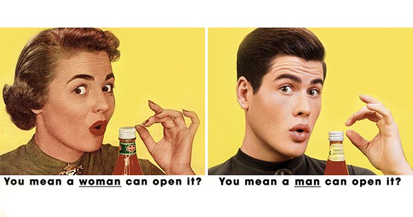
In 2018, Photographer Eli Rezkallah from Beirut, Lebanon joined the conversation with a humoristic approach, by recreating sexist vintage advertisements with reversed gender roles in the photo series “ in a parallel universe (Arushi Lohia, 2018).

Advertisements 21st Century

As the examples above are from another century, one may argue that this kind of sexism and objectifying does not happen anymore nowadays. Obviously, it is not happening as bold as then, but it is the subtle sexism that does about the same harm.

Gaps Kids

2016 – Gap’s kids advertisement, limiting their interests by highlighting stereotypes that girls like pink and to gossip, they are “the talk of the playground” and boys have “genius ideas” and bright future ahead, in blue of course (Kennedy, 2016). This advertisement primarily relies on the stereotypes of color theory, assigning pink to girls and blue to boys. This reinforces a clear division of genders, leaving no room for exceptions.

Tradwives

In 2022 and 2023, the Tradwives Trend on TikTok went viral and gained momentum. The videos are made by women that promote traditional gender roles, advocating for a lifestyle centered around homemaking, submission to husbands, and traditional family values. While most people cannot even understand how this lifestyle can be attractive for any women, there is a brought audience that aligns with the values and supports the idea (Toma-Toader, 2024).

The videos often use nostalgic imagery and styling, evoking the 1950s “ideal housewife” aesthetic like vintage dresses, immaculate kitchens, and choreographed depictions of domestic bliss. Many proponents link their lifestyle to religious beliefs or traditional cultural practices, framing their roles as morally superior or more fulfilling than modern egalitarian arrangements. Also, a common theme in the trend is the rejection of feminism, with creators claiming that feminist movements have “robbed” women of their happiness by encouraging careers and independence over family-oriented roles (Saskia Papenthin, 2024).

Campaign Brief’s Creative Leaders List (2023)

The Campaign Brief’s Creative Leaders List is an annual feature by an Australian advertising industry publication, showcasing what it considers the top creative leaders of the year. The 2023 list sparked controversy for including 20 men and no women, drawing attention to the ongoing gender imbalance in leadership within the creative sector. While the publisher claimed the list simply reflected the current makeup of chief creative officers in the industry, its lack of female representation subtly reinforces systemic sexism. By failing to recognize or elevate women in creative leadership, it perpetuates the notion that such roles are predominantly male, overlooking the structural barriers and biases that limit women’s opportunities to advance in the field. This omission serves as a stark reminder of the deep-seated gender inequalities that persist in advertising and beyond (Cleal, 2024).

In this blog post, I primarily use the term “women” when discussing feminism and related issues. This choice is grounded in the historical context of feminist movements, which have traditionally centered on the experiences and struggles of women. However, it is important to emphasize that this usage is meant to include and apply to all individuals who fall under the FLINTA umbrella (Female, Lesbian, Intersex, Nonbinary, Trans, and Agender people).

Sources

Arushi Lohia. (2018, January 18). Photographer Gives Sexist Vintage Ads A Role Reversal To Show How Misogynistic Advertising Can Be. ScoopWhoop. https://www.scoopwhoop.com/life/sexist-vintage-ads-role-reversal/

Cleal, O. (2024, October 15). “Toxic, misogynistic, exclusionary”: Campaign Brief criticised for male-dominated list of creative directors. Women’s Agenda. https://womensagenda.com.au/latest/toxic-misogynistic-exclusionary-campaign-brief-criticised-for-male-dominated-list-of-creative-directors/

Keller, M., Walker, M., & Reutner, L. (2020, June 3). Sex Sells? The Role of Female Agency in Sexualized Advertisements| Social Psychological Bulletin. Spb.psychopen.eu. https://spb.psychopen.eu/index.php/spb/article/view/2643/2643.html

Kennedy, M. (2016, August 1). Gap accused of sexism over “social butterfly” children’s T-shirt ad. The Guardian. https://www.theguardian.com/fashion/2016/aug/01/gap-accused-sexism-social-butterfly-pink-childrens-t-shirt

Rare Historical Photos. (2021, September 9). Sexist and offensive vintage ads that would never fly today, 1940-1980 – Rare Historical Photos. Https://Rarehistoricalphotos.com/. https://rarehistoricalphotos.com/offensive-sexist-vintage-ads/

Robertson, T. (2024, July 3). Fury at “sexist” ad campaign with Team GB rugby stars in lingerie as former Olympian slams use of ‘porn und… The Sun. https://www.thesun.co.uk/sport/28923240/fury-sexiest-campaign-olympics-team-gb-rugby-stars/?utm_source=chatgpt.com

Saskia Papenthin. (2024, March 15). “Tradwives”-Trend: Eine Rückwärtsrolle für den Feminismus. Brigitte.de; BRIGITTE.de. https://www.brigitte.de/aktuell/gesellschaft/-tradwives–trend–eine-rueckwaertsrolle-fuer-den-feminismus-13784198.html

Toma-Toader, A. (2024, March 7). Propaganda mit dem Kochlöffel. Taz.de. https://taz.de/Antifeminismus-auf-Tiktok/!5995016/

07: Pageflow. Eigentlich genial, aber…

Nachdem Shorthand gerade auf Datenebene Schwächen offenbarte, habe ich mir für diesen Blog Pageflow als nächstes Tool angesehen, das gerade mit einer Partnerschaft zu Datawrapper zu überzeugen weiß. Genau diese sollte sich aber noch als Problem herausstellen.

Über Pageflow

Pageflow ist ähnlich wie Shorthand, jedoch wurde das Tool ursprünglich vom deutschen WDR speziell für journalistischen Content entworfen. Heute ist es öffentlich per Abo-Modell zugänglich und gerade im Journalismus-Space beliebt. Ein persönliches Abo kostet derzeit 8 Euro im Monat, damit können bis zu 3 Stories veröffentlicht werden, sollen es unendlich viele werden liegt Pageflow vergleichbar mit Shorthand bei 40 Euro im Monat. Da auch hier keine Gratis Erstveröffentlichung möglich war, wieder hier ein Link zur Preview. Ziel war es die gleiche Geschichte wie schon in Shorthand hier besser aufzubereiten, dies ist teils gelungen, teils aber leider auch nicht.

Vorteile von Pageflow

Grundsätzlich ist Pageflow ähnlich aufgebaut wie Shorthand und arbeitet mit Slides. Auch wenn die Anpassungsmöglichkeiten (etwa Schriftarten, Größen, Ausrichtungen etc.) definitiv geringer sind als in Shorthand, so finde ich das gesamte Erscheinungsbild von Pageflow um einiges seriöser. Außerdem sind die verschiedenen Bausteine der Seite um einiges übersichtlicher und geben sehr professionelle Ergebnisse. Andere Effekte, wie der Parallax- oder Zoomeffekt, den man ganz einfach auf den Hintergrund anwenden kann, geben dem gesamten Scroll-Erlebnis außerdem eine coolere Ästhetik.

In Hinblick auf das große Manko von Shorthand, die Integration der Grafiken, wartet Pageflow mit einer ganz besonderen Kooperation auf: Grafiken von Datawrapper fügen sich ganz ohne Einbettcode nahtlos in Pageflow ein und auf Datawrapper selbst gibt es sogar ein eigenes Layout für Grafiken die später in Pageflow verwendet werden sollen. Dies macht die Integration super easy und im Gegensatz zu Shorthand bleiben damit auch in Pageflow noch diverse Anpassungsmöglichkeiten um die Grafiken noch nahtloser in die Geschichte zu integrieren.

Waren es in Shorthand eigentlich nur Text, Bild und Video so kann man in Pageflow nicht nur zusätzlich die Grafiken von Datawrapper, sondern auch Audio-Files und Counter einfügen, um Zahlen besser zu veranschaulichen. Das macht Pageflow fast schon zum perfekten Tool für Scrollytelling.

Der Haken…

Leider gibt es aber natürlich etwas, das nicht funktioniert. Gerade da das gesamte Interface auf Deutsch ist und Pageflow auch noch leistbar wäre, wäre es ja zu schön, wenn alles funktionieren würde…

Durch die Kooperation mit Datawrapper bietet Pageflow leider keinen Support für Grafiken von anderen Tools, auch nicht über Umwege. Weder über Embeds direkt, das Textfeld, oder andere Wege konnte ich die animierten Grafiken von Flourish in Pageflow integrieren. Das ist natürlich gerade in Hinsicht darauf, dass Datawrapper keine Animationen unterstützt und mich Flourish im Test wirklich auf allen Ebenen überzeugt hat, ein großer Letdown.

Fazit

Bis kurz vor Schluss dachte ich Pageflow ist das beste Tool, das man finden kann. Leider war die fehlende Integration von externen Grafiken sowas wie ein Genickbruch. Alternativen gibt es, diese werden als nächstes erkundet. Sollte sich dabei nichts Besseres finden, wird der Weg aber definitiv wieder zurück zu Pageflow führen, denn bis auf die Flourish-Integration ist Pageflow perfekt.

06: Shorthand. Gut, aber nicht für Daten.

Als nächsten Schritt Richtung Masterarbeit möchte ich mir Tools ansehen, mit denen man die neu gewonnen Grafiken bestmöglich in immersives Scrollytelling verwandeln kann. Den Anfang macht hierfür Shorthand, der Marktführer im visual storytelling.

Über Shorthand

Shorthand ist das Tool wenn es um visuelles Storytelling oder Scrollytelling geht. Ähnlich einem Baukastensystem kann man in der Anwendung seine Webpage konfigurieren und bearbeiten. Vor allem im Marketing-Bereich bekannt, findet das Tool aber auch für journalistische Inhalte seine Anwendung. Das Preismodell ist dabei eher rigoros, gratis ist keine Veröffentlichung möglich, das günstigste Paket startet bei 40 Euro im Monat, daher ist es mir auch nur möglich eine Preview anzuhängen.

Das Projekt

Um Shorthand mit allen seinen Ecken und Kanten auszuprobieren, habe ich, basierend auf den bereits erstellten Grafiken, eine fiktive Geschichte erfunden und versucht diese in Shorthand zu digitalisieren. Bei der Story an sich handelt es sich natürlich um eine reine Erfindung, sie eignet sich aber sehr gut um den Funktionsumfang zu testen. Hier geht es zur Preview.

Vorteile von Shorthand

Grundsätzlich ist Shorthand recht einfach zu benutzen. Ähnlich dem Interface von Powerpoint, in der man Slides aneinanderreihen kann, funktioniert die Anwendung wie ein Baukasten. Dabei gibt es diverse Vorlagen für Text, Zitate, Bilder, Slideshows und vieles mehr. Zusätzlich können die Templates als Split-Screens verwendet werden, also zum Beispiel fortlaufender Text links und passende Fotos gleich daneben. Praktisch dabei ist, dass alle Slides direkt auf das Scrollen ausgelegt sind, also alle Fotos, alle Funktionen sind stets mit der “Scroll”-Bewegung animiert, dies ist sehr praktisch. Auch die Integration der Embed-Codes, sowohl von Datawrapper als auch von Flourish funktioniert und die Grafiken bleiben interaktiv und müssen nicht als PNGs eingefügt werden, was ihren Tod bedeuten würde.

Nachteile von Shorthand

Klingt das bisher gesagte schon recht gut, so war die allgemeine Erfahrung mit Shorthand für meinen Bereich, und das ist nunmal die Datenvisualisierung und nicht visuelles Storytelling, doch eher negativ. Einerseits sind die 25 Templates aus denen man auswählen kann recht langweilig und einseitig. Alle bestehen aus Text und Bild in verschiedensten Varianten, entweder pur, geteilt, mit Bild als Hintergrund etc. Dies hat mehrere Nachteile. Einerseits finde ich Darstellungen mit Text, der über ein Bild fliegt, ästhetisch nicht sehr ansprechend. Sieht man sich etwa prominente Beispiele von digitalem Datenjournalismus oder auch anderen Scrollytellings an, so wird dies immer stärker vermieden je professioneller die Plattform ist. Das zweite Problem das sich mit der Bild- und Textlastigkeit ergibt, ist die fehlende Integration von Embeds. Will man die Grafiken von Flourish oder Datawrapper mitsamt ihrer Interaktivität einbetten so muss man dies im Text über einen Einbettcode machen. Dies hat mehrere entscheidende Nachteile. Einerseits können die Grafiken so (nicht wie Bilder) vollflächig angezeigt werden, außerdem ist es nicht möglich sie mithilfe des Scrollens zu animieren, wie das etwa mit Bildern sehr gut funktioniert. Zusätzlich ergibt sich das Problem, dass die eingebetteten Grafiken im Text nur sehr schwer individualisierbar sind, weil Shorthand die fremden Grafiken natürlich nicht erkennt und damit auch nicht verändern kann, wenn man etwa das allgemeine “Theme” des Templates ändert. Die Grafiken passen sich dann schlicht und einfach nicht der Umgebung an und schauen schlecht aus.

Zusätzlich zu diesen technischen Schwächen ist Shorthand natürlich unfassbar teuer. 40 Euro pro Monat im Jahresabo um überhaupt publizieren zu können ist für den Einzelanwender natürlich ein Brett. In welcher Form die veröffentlichte Webpage dann daherkommt, kann ich daher auch nicht beurteilen, da meine Story ja nicht veröffentlicht wurde.

Fazit

Shorthand ist einfach und gut, aber eben nicht für Datenjournalismus. Arbeitet man hauptsächlich mit Text, Bild und Video, also klassischen Multimedia-Stories, ist Shorthand wirklich ein sehr spannendes Tool. Gerade mit eingebetteten Grafiken hat das Programm aber seine Schwächen. Da diese in meiner Masterarbeit aber das Hauptaugenmerk haben werden, wird Shorthand (außer ich finde wirklich nichts Besseres) für mich in Zukunft denke ich keine große Rolle mehr spielen.

Hier nochmal der Link zur Story-Preview.

05: Flourish. Geht es auch animiert?

Dies ist Teil 2 meiner Erfahrung mit Flourish. Nachdem in Teil 1 schon klar wurde, dass Flourish wohl DAS perfekte Tool für interaktive Datenvisualiserungen ist, möchte ich mich hier genauer mit den nativen Animationsmöglichkeiten dieser Grafiken auseinandersetzen. Soviel vorweg: Auch die sind super!

Viele Wege führen nach Rom

Grundsätzlich kann man in Flourish über mehrere Wege an eine animierte Grafik kommen. Einerseits bieten ein paar Grafiken eine direkte Animation an, diese sind: Bar Charts, Line Charts, Pie Charts und diverse Sportgrafiken. Aber auch alle anderen können über Umwege animiert werden. Flourish bietet nämlich neben dem Standardoutput auch die Möglichkeit an eine “Story” zu bauen. Das bedeutet eine eingebettete Slideshow, durch die man ganz einfach mehrere verschiedene Grafiken auf einmal einbetten kann. Nimmt man aber immer wieder dieselbe Grafik und spult diese leicht verändert durch die Slideshow entsteht ebenfalls eine kleine Animation. Diese ist natürlich nicht so sauber wie die nativen Möglichkeiten, ist aber praktisch sollte man unbedingt etwas außerhalb der nativen Charts animieren wollen.

Flourish bietet außerdem die Funktion an verschiedene Grafiken direkt als Scrollytelling-Geschichte einzubetten. Dieses Feature ist aber kostenpflichtig und daher nicht für den Einzelanwender gedacht, weshalb ich dieses nicht ausprobieren konnte.

Animierte Linien und sich verschiebende Kreise

Für meinen Versuch habe ich auf beide Arten eine Animationsgrafik erstellt. Wie auch schon für interaktive Grafiken sind die Einstellungs- und Veränderungsmöglichkeiten der Charts quasi unendlich. Als erstes habe ich mich an einer nativen Animation versucht und dafür einen Line Chart Race mit den Daten aller Nationalratswahlen seit 1945 gefüttert. Das Ergebnis kann sich meiner Meinung nach sehen lassen und einerseits mit den Prozentergebnissen und andererseits mit der jeweiligen Rangfolge angesehen werden.

Als Slideshow habe ich die bereits in Teil 1 gezeigte Verteilung der Staatsbürgerschaften von in Österreich lebenden Menschen statt mit Blasen auf einem Donut dargestellt und die einzelnen Jahre hintereinander abspielen lassen. Sieht nicht so flüssig und dynamisch aus wie die native Variante, hat aber den Vorteil, dass der Leser jederzeit pausieren und weiter in die Tiefe gehen kann. Leider funktioniert diese Einbettung in WordPress nicht, weshalb ich nur den Link unten teilen kann.

Slideshow

Fazit

Flourish kann wirklich alles. Auch wenn sich die Slideshows nicht perfekt dafür eignen Animationen herzustellen, sondern eher dafür mehrere Grafiken um ein Thema geschickt zu verpacken, macht sich sogar diese Notlösung nicht schlecht. Die nativen Animationsgrafiken sind top, schnell, einfach und anpassbar. Einzig das Feature die Grafiken direkt in immersives Scrollytelling zu verpacken fehlt noch um nie wieder eine andere Software verwenden zu müssen, aber dazu gibt es ja immerhin viele andere Programme, die sich darauf spezialisiert haben. Dazu aber in den nächsten BlogPosts mehr. Mit Flourish endet die Suche nach weiteren Anwendungen zur Datenvisualisierung, denn es ist zu gut um es nicht zu benutzen.

The Politics of Waiting: How Design Reveals Power, Privilege, and Inequality

Waiting is something we all experience, but rarely think about. Whether we’re queuing for coffee, sitting in a hospital waiting room, or waiting for a response to a job application, waiting is a moment we all share. But what if waiting itself reveals something deeper about our society? It isn’t just about passing time; it’s often a political act. The way we wait and where we wait can reflect who holds power, who has access, and who doesn’t.

In many parts of the world, waiting in line also happens in contexts of poverty, displacement, or crisis. Refugees in camps or people seeking asylum in different countries often experience waiting as a form of silence, a pause that represents uncertainty, powerlessness, and marginalization. In contrast, those in more privileged positions often experience waiting in comfortable, organized environments like airports or exclusive healthcare clinics. This disparity highlights the way social systems are structured and how public spaces can reinforce inequalities.

Transitional Spaces and the Impact of Design

The spaces where we wait are not just functional areas, they have a strong influence on our emotional and psychological state. The design of a waiting area can either intensify the stress of waiting or help alleviate it. In healthcare settings, for example, well-designed waiting rooms with soft lighting, comfortable seating, and natural elements can reduce anxiety and create a sense of calm. In contrast, cramped, cold spaces with little thought to comfort can intensify frustration and feelings of isolation.

In fact, the design of transitional spaces – those spaces where we pass through or wait – has a powerful impact on how we experience time. Architects and designers use spatial elements like ceiling heights, lighting, and layout to guide our emotional responses. Narrow, confined spaces can create a sense of urgency and pressure, while expansive areas encourage us to slow down, reflect, and take our time. This manipulation of space to affect time and emotion is something that’s as relevant to communication design as it is to architecture.

Reimagining Waiting: More than Just a Pause

Waiting doesn’t have to be a passive activity; it can be an opportunity for connection, reflection, and even solidarity. By rethinking the design of waiting spaces, we can transform them from uncomfortable, isolating areas into spaces that invite interaction and empathy. This is especially important in public settings, where waiting often brings people together in shared, communal experiences.

For example, in public assistance centers, where people wait for food, shelter, or other forms of aid, designers could create environments that foster a sense of dignity and belonging, rather than reinforcing feelings of powerlessness. The inclusion of communal seating, interactive displays, or elements that invite participation can make waiting feel less like a time of discomfort and more like a shared experience.

Connecting Space, Time, and Experience

In both architecture and communication design, the manipulation of space and time can create meaningful experiences. Just as architects use compression and expansion in physical spaces to guide emotional responses, communication designers use pacing, rhythm, and layout to guide how users engage with information. Whether in physical environments or digital platforms, the way we structure time through pauses, delays, or moments of engagement influences how we connect with our surroundings and each other.

In the end, waiting is more than just filling time. It’s a reflection of who we are as a society, how we treat each other, and what we value. By rethinking the spaces where how we wait, we design experiences. We can start to create environments that not only ease the discomfort of waiting but also challenge the systemic inequalities that make waiting so painful for some.

1.5 Mental Health Apps Market: Trends, Opportunities and What’s Next

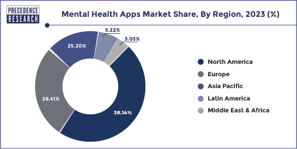
The mental health app market has witnessed significant growth, driven by technological advancements and a global focus on mental well-being. Valued at $6.12 billion in 2023, it is projected to expand further in the coming years. Here’s a snapshot of the current trends, market segmentation and future possibilities.

Image Source: Precedence Research

Market Segmentation

By App Type:

  • Depression and Anxiety Management: apps designed to help users cope with depression and anxiety through tools like CBT, mood tracking and guided exercises.
  • Meditation Management: apps like Calm and Headspace offering guided meditations, breathing exercises, and sleep aids.
  • Stress Management: platforms focused on stress-relief strategies, such as Happify, incorporating gamified exercises to engage users.
  • Wellness Management: apps aimed at holistic well-being, integrating fitness, nutrition, and mental health support.
  • Others: includes niche apps addressing specific challenges like postpartum depression, grief or addiction recovery​.

By Target Audience:

  • Individuals Seeking Self-Help: students, working professionals and retirees seeking accessible, affordable mental health tools.
  • Healthcare Providers: clinicians using apps to complement traditional treatment plans.
  • Corporates: employers implementing wellness apps like Spring Health to enhance workplace well-being and productivity​.

By Region:

North America leads the market with robust app adoption and mental health awareness, Asia-Pacific is growing rapidly, driven by increasing smartphone use and stress-related health concerns.

Image Source: Precedence Research

Key Trends

  • AI-Driven Personalization: apps are using AI to provide tailored mental health experiences. For example, Wysa and Woebot offer conversational AI support, while Kintsugi employs vocal biomarker analysis to detect emotional states​​.
  • Gamification for Engagement: apps like Happify use gamification to make mental health practices more engaging, particularly for younger audiences​.
  • Integration with Wearables: real-time tracking of mental health indicators, like stress and emotional states, through wearable devices is becoming increasingly common.

Opportunities

  • Expanding Accessibility: affordable or free mental health apps can address gaps in underserved regions.
  • Corporate Wellness: more employers are expected to incorporate mental health apps into their benefits packages.
  • Enhanced Privacy and Trust: apps prioritizing user data security and ethical practices will gain consumer confidence.

What’s Next?

  • Niche Specialization: apps targeting specific demographics or conditions, such as adolescent mental health or postpartum support.
  • Integrated Care Models: enhanced collaboration between apps and healthcare providers for comprehensive mental health solutions.
  • Ethical AI Development: transparent and inclusive AI tools designed to meet high clinical standards.

As the market evolves, innovation and user-centric approaches will be crucial in addressing the diverse needs of a global audience.

Sources

  1. “Mental Health Apps Market Analysis by Size, Share, Trends, Growth and Forecast (2024–2032) | UnivDatos.” LinkedIn. Accessed: Dec. 28, 2024. [Online.] Available: https://www.linkedin.com/pulse/mental-health-apps-market-analysis-size-share-trends-growth-ali-bvfsc/
  2. “Mental Health Apps Market Size, Share, and Trends 2024 to 2033.” Precedence Research. Accessed: Dec. 28, 2024. [Online.] Available: https://www.precedenceresearch.com/mental-health-apps-market
  3. “Mental Health Apps Market Size was valued at USD 6.012 Bn in 2023 and is expected to reach USD 16.47 Bn by 2030, at a CAGR of 17.01%.” LinkedIn. Accessed: Dec. 28, 2024. [Online.] Available: https://www.linkedin.com/pulse/mental-health-apps-market-size-valued-usd-6012-bn-2023-komal-kadam-uktbe/

04: Flourish. Einfach nur genial!

Das dritte und letzte Online-Tool zur Datenvisualisierung, das ich mir angesehen habe ist Flourish, eine Canva-Tochter mit immensem Funktionsumfang. Diese hat mich auf allen Ebenen überzeugt.

Über Flourish

Flourish Studio ist ein kostenloses Online-Tool zur Datenvisualisierung aus dem UK. Es gibt zwar zwei Bezahlvarianten “Publisher” und “Enterprise”, diese sind jedoch bereits für größere Newsrooms und Organisationen gedacht und nicht für den Einzelanwender. Damit könnte man sich zum Beispiel eigens gebrandete Templates bauen, die die eigene CI beinhalten. Alles andere ist aber bereits in der Gratis-Version vorhanden, Veröffentlichung inklusive.

Im Grunde ist der Funktionsumfang von Flourish grenzenlos. Von einfachen Linien- und Barcharts über Karten, Scatterplots, Piktogramme, Wählerstromdiagramme bis zu Fußballaufstellungen und Heatmaps gibt es Templates für alles was das Herz begehrt. Das Beste daran: nicht nur die einzelnen Diagrammarten scheinen schier grenzenlos auch die Anpassungsmöglichkeiten gehen ins Unermessliche. Jede Farbe, jede Schriftart, jeder Zeilenabstand, jede Anordnung, jedes Pop-Up und jeder Hover sind von A-Z anpassbar. Aber damit nicht genug. Sogar dieser alte WordPress-Blog kann mit den Einbettungslinks von Flourish arbeiten und alle Grafiken behalten ihre Interaktivität. Während meines Tests habe ich mir keine einzige Grafik vorstellen können, die man nicht im Handumdrehen hätte erstellen können. Daten importieren, Zeilen und Spalten festlegen, formatieren, fertig.

Da Flourish aber nicht nur interaktive sondern auch animierte Grafiken und direkt in einem Guss entstehende “Daten-Geschichten” anbietet, möchte ich diesem Programm zwei BlogPosts widmen. In diesem hier werden zwei weitere Beispiele für interaktive Grafiken gezeigt, die mit bisherigen Softwares unmöglich gewesen wären. Die zugehörigen Daten habe ich einfach random vom StatCube der Statistik Austria geladen. Im zweiten Teil, schaue ich mir die Weiterführung dessen an, worum es in meiner Masterarbeit eigentlich gehen soll: Wie bekomme ich diese tollen Grafiken nun in eine fesselnde Geschichte. Aber dazu später mehr.

Piktogramme, Blasen und mehr

Als erstes habe ich mir ein Blasen Diagramm mit Unterkategorien genauer angesehen, in diesem habe ich die Bevölkerungsdaten Österreichs aus dem Jahr 2023 visualisiert. Darin zu sehen die Staatsbürgerschaft der österreichischen Bevölkerung, die großen Blasen demonstrieren Kontinente, die kleineren unterteilen diese. Durch Hovern über die Grafik, kann man genaue Zahlen auslesen und durch eine Selektion oben, kann man genauer auf einen Kontinent eingehen.

Im zweiten Schritt habe ich ein Piktogramm erstellt, das die österreichische Bevölkerung nach ihrem höchsten Bildungsabschluss aufschlüsselt. Durch hovern über die jeweiligen Kolumnen, kann man mehr Informationen erfahren, etwa die Aufteilung nach Geschlechtern.

Fazit

Flourish kann alles, und zwar wirklich alles. Hätte ich mit diesem Programm begonnen, hätte ich mir den ganzen Blog sparen können. Es ist unfassbar welche Power hinter dieser Gratis-Anwendung steckt. Inwieweit man mit Flourish nun auch den nächsten Schritt gehen und Grafiken animieren oder gar direkt in Storytelling integrieren kann, möchte ich als nächstes herausfinden. Bis dahin ist aber klar, ein weiteres Tool zur Datenvisualisierung braucht es nicht.