#01 Multisensory Data Visualisation

Introduction to Multisensory Data Visualisation

Multisensory data visualization refers to the use of multiple sensory modalities—such as sight, hearing, and touch—to represent complex data sets in more intuitive and accessible ways. While conventional visualization techniques rely on graphs, charts, and maps, these predominantly visual methods can become overwhelming or fail to convey subtle patterns, especially when dealing with high-dimensional or time-sensitive data. Beyond auditory cues (e.g., sonification), incorporating tactile feedback (e.g., haptic vibrations) and other sensory channels has the potential to significantly enhance data interpretation by distributing cognitive load and addressing diverse user needs.


Background and Inspiration

During my bachelor and bachelor project, I initially explored and dealt with “traditional” forms of data representation, which led me to examine various approaches to accessibility in design. This exploration was further enriched by the talk “Lessons Learned From Our Accessibility-First Approach to Data Visualisation” by Kent Eisenhuth from the Usability Congress in Graz. There I first consiously encountered signification of data and was instantly intrigued.


Why Consider a Multisensory Approach?

  1. Reduced Cognitive Overload
    Representing data through multiple senses can distribute the processing demands across different sensory channels. For instance, tactile cues (such as haptic vibrations) and auditory cues (such as high or low sounds) can indicate threshold crossings or significant deviations in data, relieving some of the burden placed solely on visual elements.
  2. Enhanced Engagement and Emotional Resonance
    Research indicates that incorporating different sensory modalities—particularly auditory and tactile—may intensify user engagement. Whether through auditory signals highlighting sudden shifts or vibrations indicating key events, users often develop deeper cognitive and emotional connections when more than one sense is involved.
  3. Expanded Accessibility
    For users with visual impairments, sonification and tactile feedback can serve as vital tools for understanding data trends and outliers. Similarly, for users with hearing impairments, strategic use of visual and tactile elements can ensure equal access to critical insights. A truly multisensory system can be configured to accommodate a broad range of abilities.
  4. Detection of Subtle or Transient Patterns
    Time-sensitive or multi-dimensional data (e.g., financial fluctuations, climate patterns, or sensor readings) can be challenging to track visually. By adding non-visual modalities, patterns that might be overlooked in a purely visual chart can become more apparent through changes in pitch, rhythm, or tactile pulses.

Next Steps

My next steps will focus on gathering and analyzing data on how combining visual, auditory, and potentially tactile elements can influence user comprehension, retention, and emotional engagement with complex information. This research will involve reviewing existing literature, examining various sensory-mapping strategies, and identifying critical factors (e.g., cognitive load, accessibility requirements, and user preferences) that shape effective multisensory data representations. Comparative studies and expert interviews may inform which modalities are most beneficial for certain data types or user groups. These insights will guide the theoretical framework for understanding multisensory design principles, culminating in recommendations for inclusive and impactful data visualization practices.


Keywords for my Research

AI generated list of keywords to help me in my research.

  1. Sonification
  2. Tactile Feedback / Haptic Interfaces
  3. Data Accessibility
  4. Inclusive Design
  5. Universal Design
  6. Cognitive Load
  7. Sensory Mapping
  8. Multimodal Interaction
  9. Cross-Modal Perception
  10. User Experience (UX) Testing
  11. Threshold Detection
  12. Emotional Resonance
  13. Accessibility Guidelines (e.g., WCAG)
  14. Alt Text and Descriptive Metadata
  15. Adaptive/Assistive Technologies
  16. Perceptual Illusions in Multisensory Design
  17. Pattern Recognition in Data
  18. Interaction Design Principles
  19. Context-Aware Computing
  20. Sensory Substitution

Literature

T. Hogan and E. Hornecker, “Towards a Design Space for Multisensory Data Representation,” Interacting with Computers, vol. 29, no. 2, pp. 147–167, Mar. 2017, doi: 10.1093/iwc/iww015.

S. Tak and L. Toet, “Towards Interactive Multisensory Data Representations,” in Proceedings of the International Conference on Computer Graphics Theory and Applications and International Conference on Information Visualization Theory and Applications (IVAPP-2013), 2013, pp. 558–561. doi: 10.5220/0004346405580561.

A. Storto, “Using Data Visualisations in a Participatory Approach to Multilingualism: ‘I Feel What You Don’t Feel’,” 2024. doi: 10.2307/jj.20558241.11.
Exploring the In-Between: The Power of Unnoticed Spaces in Design

We spend a lot of our lives in spaces that we don’t always notice: the brief moments between destinations, the corridors we walk through, the stairways, the waiting areas. These “in-between” spaces are often overlooked in design and in everyday life, but they carry immense potential in shaping our experience of belonging, culture, and connection.

The In-Between: More Than Just a Transition

In architecture and design, much of the focus tends to go toward the main destinations: the rooms where we live, work, or socialize. But the spaces in between, those hallways, stairwells, or passageways, are just as crucial in determining how we experience a place. Often, we think of these as mere transitions, as if they are less important than the final destination. However, these spaces play an essential role in our sense of belonging.

Take, for example, the waiting areas in public transport stations or airports. These spaces aren’t just for waiting—they are places where we engage with our surroundings, observe others, and reflect on our journey. Whether we’re waiting for a train, a flight, or simply passing through, these moments offer a unique opportunity to be in the “in-between,” to pause for a moment, breathe, and assess where we are, both physically and mentally.

Cultural Approaches to Transitory Spaces

Just as different cultures view waiting differently, they also approach these transitional spaces in diverse ways. In some cultures, the “in-between” is seen as a place of ritual, a space for connection and reflection. For example, in Japan, the concept of “Ma” refers to the space between things—the pause or gap that carries meaning. This idea isn’t just about the physical gap but also about the mental space between actions. The design of public and private spaces in Japan often emphasizes transitions, with spaces that allow for moments of contemplation or interaction, even in the most fleeting moments.

On the other hand, in Western contexts, the focus might be more on efficiency. Public spaces designed for movement, like subway corridors or office lobbies, often prioritize functionality over reflection. These spaces are created to move people from one place to another quickly and without disruption. However, there’s an opportunity to rethink these places, to design them not just as functional transitions but as moments where culture, connection, and belonging can emerge.

The Unnoticed and the Invisible

What about the spaces we don’t consciously notice at all? The hidden corners, the forgotten alleyways, or even the backrooms of cafes and shops? These unnoticed areas can tell us just as much about culture and power as the more visible spaces we focus on. For example, in many public spaces, the back areas where staff work are intentionally separate from customer-facing areas. These spaces are often overlooked in design discussions, yet they reveal much about the social dynamics of service and power. The people who work in these hidden areas, often out of view, are an essential part of the experience—yet they are often forgotten or marginalized in both design and society.

The unnoticed also relates to how we perceive and belong in spaces. In certain cultural contexts, the idea of “invisibility” is linked to exclusion. How do we design spaces that make these unnoticed areas more visible, more inclusive, and more engaging? How can we take the invisible and make it a part of our understanding of community and belonging?

Transitory Spaces as Opportunities for Connection

In some of the world’s busiest cities, designers have started to embrace the potential of these in-between moments. For example, parks in urban centers aren’t just places of recreation; they also act as spaces for connection and community. These spaces are often transitory, where people pass through or take a moment to pause. Yet, they offer a sense of belonging and inclusion that transcends the mere act of passing through.

Similarly, cafes, train stations, and public plazas can become places of community if designed thoughtfully. Imagine a train station not just as a waiting area, but as a space where people can connect, sit, talk, or even collaborate. By incorporating comfortable seating, green spaces, or art, designers can transform the in-between into a space that fosters belonging, even in the briefest moments of transition.

Power and Privilege in the In-Between

Just as in the previous blog entry, we cannot overlook how these unnoticed, in-between spaces reveal power and privilege. The way we experience transitory spaces often reflects our position in society. For example, people in more privileged social positions might experience these spaces differently, finding comfort in spaces designed for efficiency and ease, while those from less privileged backgrounds might be more familiar with the uncomfortable, neglected spaces where they have to wait or pass through without much regard for their comfort.

In public spaces, who gets the comfortable seat? Who gets to wait in the air-conditioned room, and who is left standing in the sun? These questions of who belongs where and why are part of the complex web of power dynamics that influence how we experience public space.

04 – Tools for Digital Footprint Management: Helping Users Take Control

Introduction

Imagine walking into a room full of strangers who know intimate details about your life—what you like, where you’ve been, and even your habits. This is what happens online when we fail to manage our digital footprints. Thankfully, there are tools that can help us regain control of our data. In this post, we’ll explore some of the most effective tools and strategies for managing digital footprints.

The Problem with Staying Invisible Online

Our digital activities generate massive amounts of data that companies track, analyze, and sometimes sell. Without tools to manage this, users are often left vulnerable to:

  • Targeted ads that intrude on privacy.
  • Data breaches that expose sensitive information.
  • A lack of understanding of what’s being tracked.

Example: Many people don’t realize that free email services scan inboxes to serve targeted ads.

Privacy Tools That Empower Users

  1. Privacy Settings in Apps and Platforms:
    Social media platforms like Facebook and Instagram offer privacy controls to limit data collection.
    • Tip: Adjust visibility settings to restrict who can see your posts and personal information.
  2. Browser Extensions:
    Tools like uBlock Origin, Privacy Badger, and DuckDuckGo Privacy Essentials block trackers and ads.
    • Example: DuckDuckGo provides private browsing and tracker-free search.
  3. Password Managers:
    Apps like LastPass and 1Password strengthen account security with unique, strong passwords for each login.
  4. VPNs (Virtual Private Networks):
    Services like NordVPN or ExpressVPN encrypt your internet connection, making it harder for third parties to track your activity.
  5. Personal Data Management Platforms:
    Tools like DeleteMe help you scrub your info off the internet periodically.

The Role of Design in Privacy Tools

Good design ensures these tools are easy to use for everyone, not just tech-savvy users. Designers can improve privacy tools by:

  • Simplifying Interfaces: Use clear, intuitive layouts to guide users.
  • Adding Visual Feedback: Icons or progress bars showing the level of privacy protection.
  • Transparency: Include plain-language explanations of what each feature does.

Challenges to Address

  1. Balancing Simplicity and Functionality: Too many options can overwhelm users, while oversimplification might remove critical features.
  2. User Awareness: Many users don’t know these tools exist or how to use them.
  3. Trust Issues: Privacy-focused tools must gain user trust through transparency and proven reliability.

My Personal Motivation

I believe privacy is a fundamental human right. Tools that empower users to reclaim control of their data align with my passion for ethical design. By creating accessible, intuitive privacy tools, designers can build a safer digital ecosystem for everyone.

03 – A History of Data Privacy and Designing for Informed Consent: Clarity in Privacy Choices

Introduction

Data privacy has become a hot topic in recent years, but concerns about personal information are far from new. The evolution of data privacy highlights how the digital landscape has shifted from respecting personal boundaries to monetizing user data. In this post, we’ll explore key moments in the history of data privacy, landmark cases that shaped it, and why ethical consent mechanisms are more critical than ever. We’ll also discuss the groundbreaking work of organizations like noyb.eu (None of Your Business) and how design can ensure users truly understand what they’re agreeing to.

The History of Data Privacy

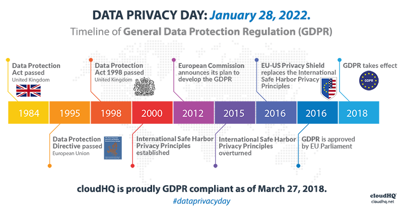
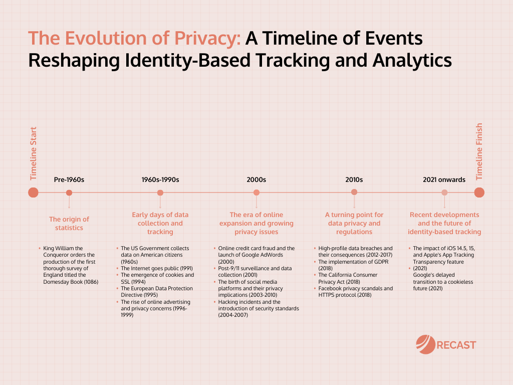
Data privacy debates date back decades. In 1973, the U.S. Fair Information Practices principles laid a foundation for protecting personal data, emphasizing transparency and consent. Later, Europe’s Data Protection Directive (1995) and General Data Protection Regulation (GDPR, 2018) set global benchmarks for user privacy rights. GDPR established a crucial requirement for “explicit consent,” sparking significant changes in how companies request and handle user data.

Image source: Recast

Case Example: The Cambridge Analytica scandal (2018) exposed how personal data harvested via Facebook was used for political profiling without user knowledge, sparking global outcry and reinforcing the need for ethical consent practices.

image source: CloudHQ


Why Consent Still Fails

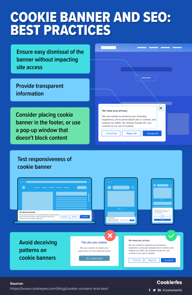
Despite legal advancements, informed consent is still far from universal. Many companies use dark patterns—design tricks that nudge users into agreeing to data collection they might not fully understand. Ambiguous language, pre-checked boxes, and overly complex privacy policies make it hard for users to make informed decisions.

Example: A cookie consent popup that makes “Accept All” the easiest option while burying granular controls under multiple layers of navigation.

image source: CookieYes

noyb.eu: Leading the Charge Against Privacy Violations

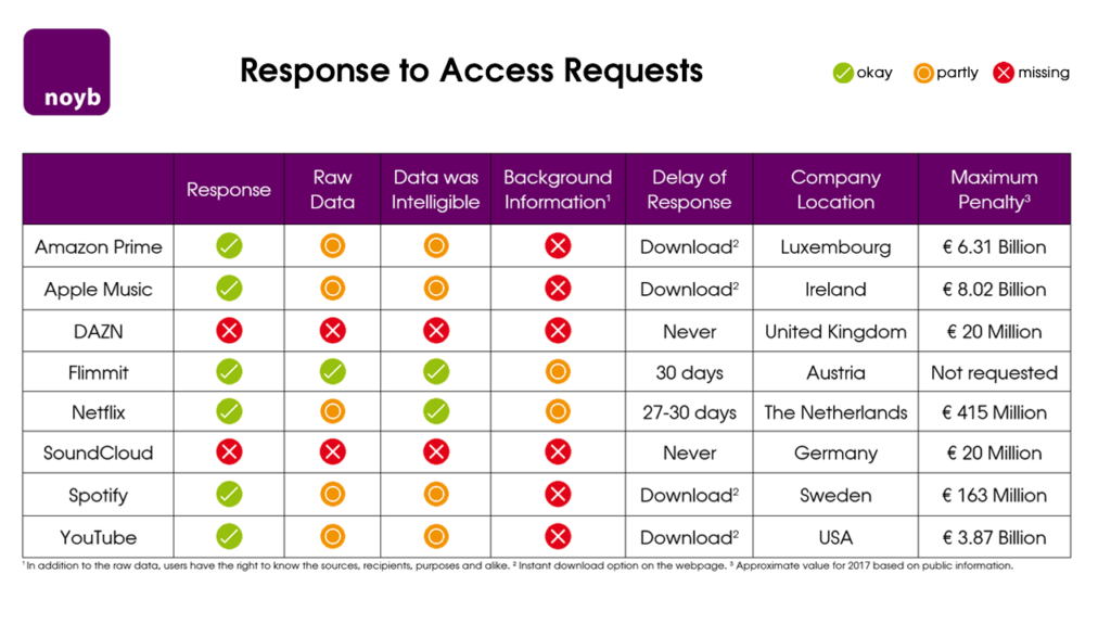
Founded by privacy activist Max Schrems, noyb.eu challenges companies that violate GDPR regulations. The organization has filed complaints against major corporations for failing to obtain valid user consent, often citing the use of manipulative interfaces. noyb.eu emphasizes transparency and user empowerment, aligning closely with the principles of ethical design.

Example: In 2021, noyb filed hundreds of complaints about deceptive cookie banners, pushing companies to adopt clearer, more compliant designs.

Image source: EDRi

How can design simplify and improve informed consent for users in light of historical and ongoing privacy challenges?

  • What lessons can be learned from past privacy violations to improve future consent mechanisms?
  • How can organizations like noyb inspire better design practices?

Design Approaches to Solve the Issue

  1. Simplify Language: Use clear, jargon-free language to explain consent choices. Example: Replace “We use cookies to improve your experience” with “We track your activity to show ads. You can opt out.”
  2. Visual Aids: Use graphics or icons to represent data usage (e.g., icons for tracking, ads, or personalization). Example: A pie chart showing how your data is used.
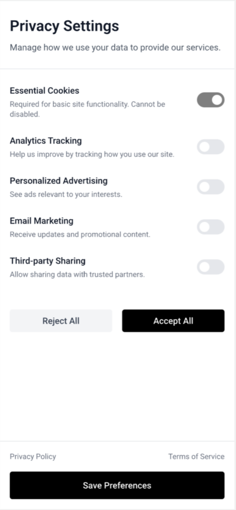
  3. Granular Controls: Allow users to toggle specific permissions rather than forcing all-or-nothing decisions. Example: Separate toggles for tracking, personalized ads, and email subscriptions.
  4. Actionable Transparency: Show real-time examples of how data will be used. Example: “We will use your email to send weekly updates—no spam.

Why This Matters for Design

Informed consent isn’t just about compliance—it’s a design challenge that affects user trust and brand reputation. Ethical consent mechanisms can be a competitive advantage, making users feel respected and empowered. Designers have a responsibility to move beyond dark patterns and craft experiences that genuinely prioritize user choice.

Challenges and Personal Motivation

Crafting effective consent mechanisms is tricky. Balancing simplicity with compliance often conflicts with corporate interests in data collection. However, I’m deeply motivated by the idea that design can bridge the gap between user needs and ethical practices, turning complex legal requirements into intuitive experiences for everyone.

02 – What is a Digital Footprint? Why You Should Care About Ethical Design in a Digital World

What is a Digital Footprint?

Have you ever thought about the trail you leave behind online? Every post, search, and click contributes to your digital footprint. It’s a record of your online activity, and it’s something everyone should understand. In this post, we’ll explore what digital footprints are, why they matter, and how ethical design can help you manage them.

What is a Digital Footprint?

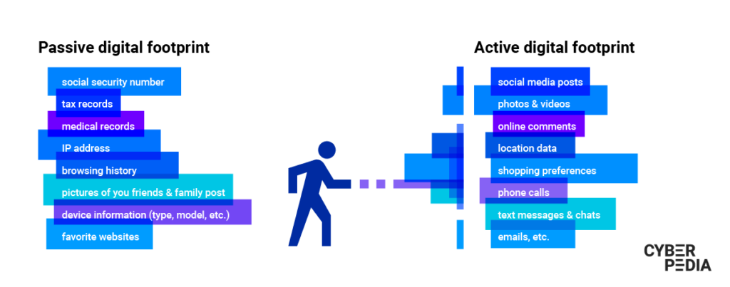
A digital footprint is the trail of data you leave behind as you navigate the internet. It comes in two types:

  • Active Footprints: Data you share intentionally, like social media posts, comments, or filling out online forms.
  • Passive Footprints: Data collected without you realizing it, like browsing history or location data from your smartphone.

Analogy: Think of it like footprints in the sand—some you leave on purpose, and others are left just by walking around.

image source: Bitdefender

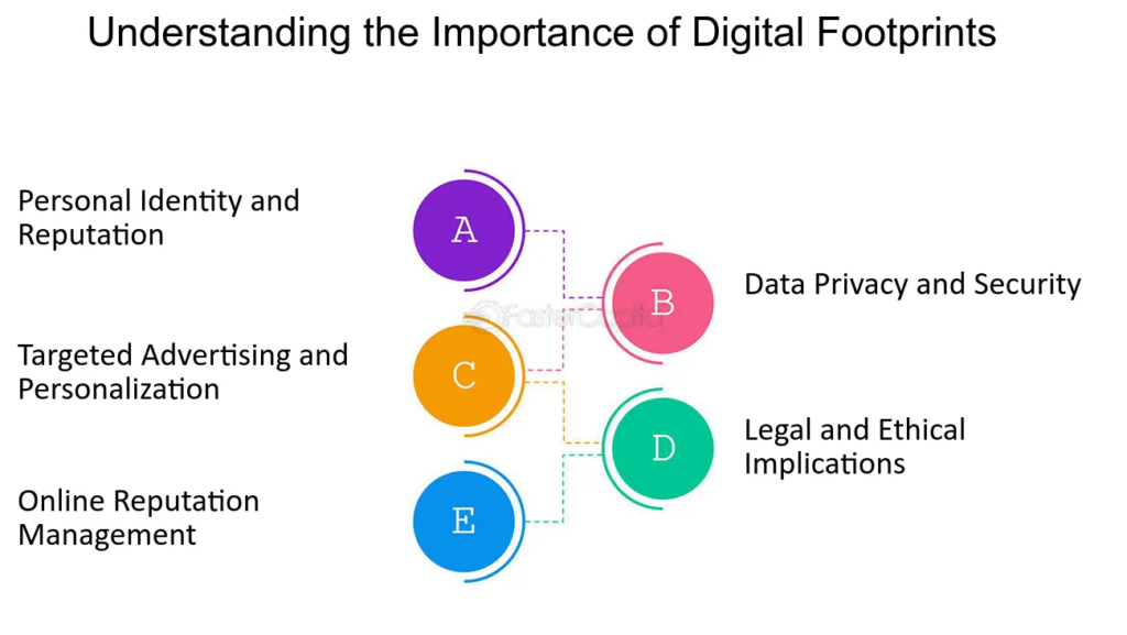
Why Do Digital Footprints Matter?

Your digital footprint is valuable because it reveals a lot about you. Here’s why it’s important:

  • Privacy: Your online activities shape your digital identity.
  • Security: Unmanaged footprints can expose you to risks like data breaches.
  • Influence: Companies use your data to target ads and shape your online experience.

Real Example: In 2018, Facebook’s data misuse scandal with Cambridge Analytica showed how social media activity could be used to manipulate political opinions.

image source: FasterCapital

The Role of Ethical Design

Designers have a huge role in making digital spaces safer. Ethical design means creating experiences that:

  • Avoid Deception: Don’t use tricks to collect data.
  • Provide Transparency: Clearly show what data is collected and why.
  • Empower Users: Make privacy settings easy to find and use.

Take a Simple First Step

Start by checking the privacy settings on your favorite apps. Make sure you know what data is being tracked and why. This is the first move in managing your digital footprint more effectively.

04. Lessons from Chronic Disease Apps for Preventive Healthcare Solutions

In the previous post, we explored some apps that support mental health. In today’s post, I will focus on apps designed to help manage chronic diseases. In recent years, healthcare apps have become essential tools in supporting both patients and healthcare providers. From mental health support to fitness tracking, digital solutions are reshaping how we approach well-being. However, one category stands out for its complexity and impact: apps designed specifically for managing chronic diseases. But what makes these apps different, and what can we learn from them for broader healthcare applications?

Omada Health

Navigating chronic conditions isn’t easy. After all, so much of managing issues like diabetes comes down to small decisions that happen between visits to the doctor. Too many patients don’t have the kind of support that they need: convenient, evidence-based, and easily accessible. And employers are having to shoulder the ever increasing cost of care. In 2011, two IDEOers founded Omada Health to help fill that gap and create a more human-centered approach to health care. The platform combines digital tools, behavior change methods, and health coaching to improve outcomes, while lowering costs. More than a decade after its founding, one million lifetime members have enrolled with Omada Health to manage their weight, pre-diabetes, diabetes, behavioral health, hypertension, and joint and muscle health, and build a foundation for lifelong better health.

Omada Health is a standout example of a digital platform designed to support individuals with chronic diseases. The app combines behavioral science, coaching, and data analytics to deliver personalized care plans:

1. Free Welcome Kit with monitoring devices

Participants in the Omada Health program typically receive a free welcome kit when they join. This kit often includes health monitoring devices such as a scale, a blood pressure cuff, or a glucose meter, depending on the individual’s health needs and goals. The kit is part of the program’s commitment to supporting users in their health journey by providing them with the necessary tools to track their progress. 

2. One-on-One Health Coaching

Users receive one-on-one coaching tailored to their health goals. Coaches provide ongoing support and motivation to help users stick to their plans

3. Health Monitoring

Integration with devices like glucose meters, blood pressure cuffs, and fitness trackers allows real-time data tracking.

4. Personalized Insights

Chatting with a coach and personalized data analytics provide actionable recommendations based on user behavior, helping individuals make informed decisions about their health.

5. Community Support

Group discussions and peer support networks foster a sense of accountability and encouragement. Users can share their journey insights and even such easy recommendations as meal prep

Key Success Metrics:

Omada’s effectiveness is reflected in measurable health improvements among its users:

  • Reduced Risk Factors: Participants have shown significant reductions in weight, blood pressure, and blood glucose levels.
  • Improved Adherence and Long-Term Engagement: With a personalized approach users demonstrate better adherence to medication and treatment plans. Many users stay engaged with the program well beyond the initial intervention period.
  • Positive Health Outcomes: Analytics have shown sustained health improvements, including a lower risk of developing more severe complications (58% of participants achieved normal A1C at 12 months in the program, 43% of participants lost 5% or more of their initial weight at 12 months)

Challenges

Scalability: Complex systems with coaching and medical integrations may be harder to scale affordably, it needs constant investments

Conclusion

Apps like Omada have proven that digital tools can effectively support people in managing chronic diseases through a blend of technology, personalization, and professional oversight. The next step is to explore how these lessons can be applied to preventive healthcare on a broader scale. With thoughtful design and user-centric features, preventive healthcare apps can move beyond simple reminders and trackers to become truly impactful tools for long-term well-being.

Risography in the Art & ComDes Scene

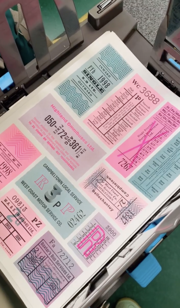
There’s been a resurgence in Riso over the past few years, with a new wave of printmakers relying on a trusty Risograph to bring their illustrations to life.

The relevancy for communication design includes publishing magazines, illustrations, patterns, making limited editions, and introducing the general public to the wonders of this accessible technique. 

My Featured Artists

While Risography has gained popularity among artists, it is generally used as a medium rather than a defining aspect of an artist’s fame. Many contemporary illustrators and designers leverage Risography to create distinct works, but they are often celebrated for their broader artistic style rather than the technique alone. Here are a few notable artists and studios associated with Risography:

Kevin Garrison

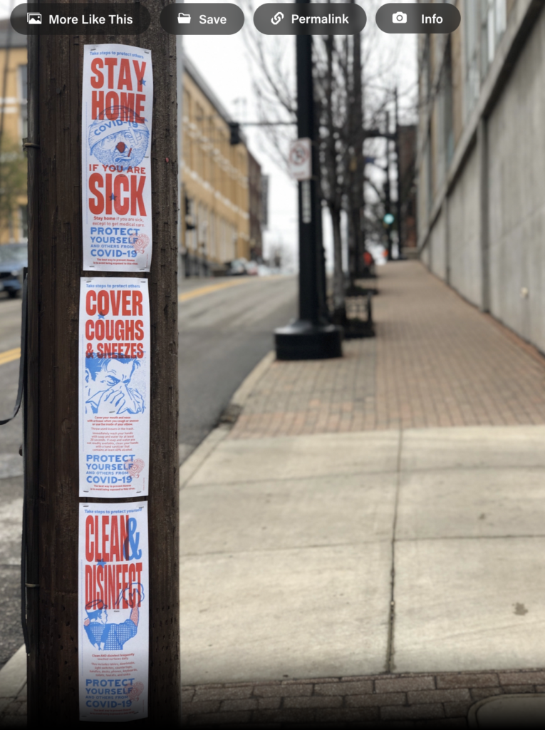
Using the power of Risograph printing to self publish a poster series using design for good. Copy points are from the CDC.gov website at the time of publishing. All of these precautions were necessary in the beginning of the outbreaks before the public knew how the corona virus was transmitted. Subsequent variants caused additional confusion and vaccine resistance by certain groups further compounded the herd immunity goals of the CDC. These posters were “Wild postings” in Kansas City, Missouri during the initial phases of the COVID-19 global pandemic. 

Joe Maccarone

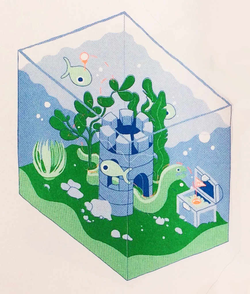
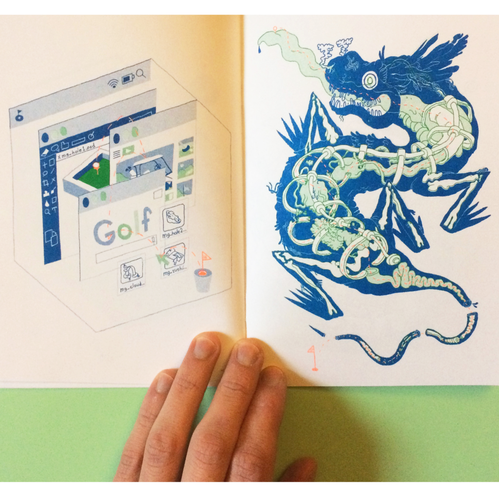
Joe Maccarone is an illustrator living and working in Pittsburgh, with a BFA in illustration from Maryland Institute College of Art. He’s really into slime, ooze, and goo, and would like to live on top of a mountain one day. He currently draws green owls at Duolingo. He’s collaborated with The New York Times, The New Yorker, VICE, Buck, and Bleacher Report.

This zine is risograph printed in green, blue, and fluorescent orange in collaboration with Colour Code in Toronto.

Becky Mann

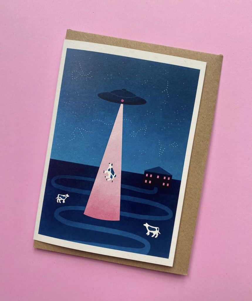
Becky is a freelance illustrator based in Leeds. She uses overlapping colours and shapes in her illustrations, often in the style of risograph. Becky’s influences include favourite foods and meals, animals and nature, music and film.

Conclusion

Concluding this research, it became evident that Risography is not widely utilized in contemporary marketing or communication strategies by major brands as part of their branding efforts. Instead, it remains predominantly within the realm of illustrators and artistic communities, where it is celebrated for its unique aesthetic and used primarily to create limited edition prints, posters, and zines.

Risography has become a creative tool in communication design, offering a unique aesthetic that combines bold colors, texture, and the imperfections of manual printing. This makes it particularly appealing for projects where originality, artistic expression, and tactile qualities are valued. But it remains to be a niche.

More Inspiration

Duplikat • Risograph Studio https://www.instagram.com/duplikatpress/?hl=en

Resources

03. Overview of Health Apps

Introduction to Chronic Disease Management

Chronic diseases, such as diabetes, hypertension, and mental health disorders, are long-term health conditions requiring continuous care and consistent management. Unlike acute illnesses, these diseases often necessitate daily routines, medication adherence, and lifestyle adjustments. Despite the availability of treatment plans, one of the biggest challenges in chronic disease management is ensuring patients remain motivated and consistent over time

The Role of Gamification in Chronic Disease Management

Gamification, the integration of game-like elements into non-game contexts, has emerged as an innovative tool in healthcare. By incorporating features like rewards, progress tracking, and challenges, gamification can transform mundane health tasks into engaging activities. This approach motivates patients to stay involved in their treatment plans and fosters long-term adherence.

How Gamification Motivates Patients to Engage in Daily Health Routines

Gamification taps into human psychology by offering immediate feedback, achievable goals, and rewards. For example, health apps often use points, badges, or streaks to reward users for taking medication on time or completing daily exercises. These small wins create a sense of achievement, encouraging users to stick with their routines.

Gamified systems are particularly effective in promoting long-term behavioral changes. Whether it’s regular exercise, a balanced diet, or mindfulness practices, gamification helps users establish and maintain healthier routines. Features like daily challenges, habit streaks, and milestone rewards provide positive reinforcement for maintaining these habits.

Case Studies & Success Stories

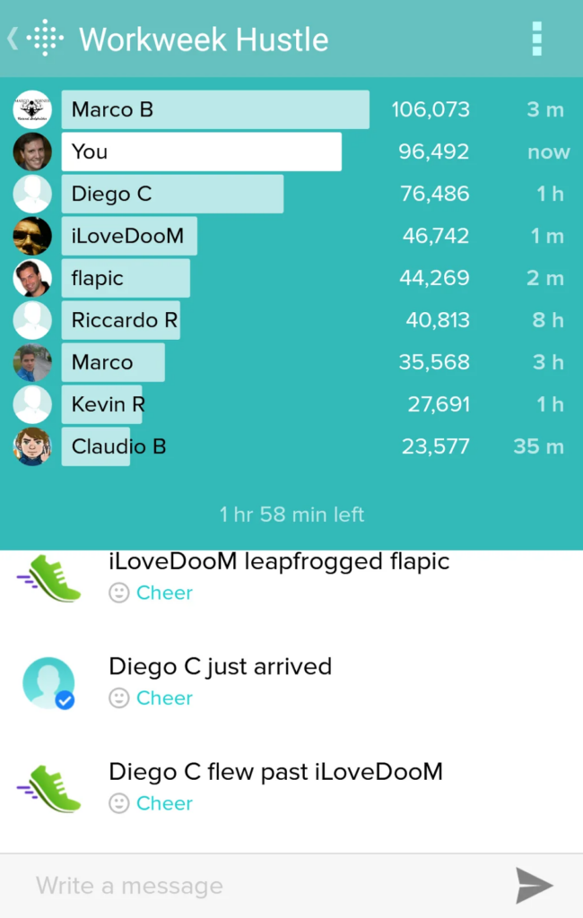
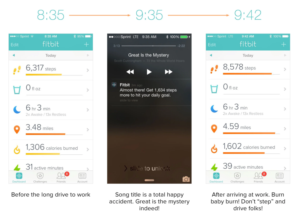
Known for its gamified step-tracking features, Fitbit encourages users to meet daily fitness goals. Fitbit rewards you with badges as certain milestones are achieved.

You can customize the total daily steps goal, set calorie, weight, sleep goals and then get multiple motivational notifications throughout the day

It’s simple, intuitive, and visually appealing, and has important features in setting like silent alarm and goals

You can easily go to the pool or have a shower without worries


From the user review, Fitbit still counted steps when the user waved his hands and added them to the daily goal. Furthermore, Fitbit accidentally added steps while the user air drummed on his leg while listening to music on his way to work and gathered 2,261 “steps”

Also, Fitbit counted steps while user mowed the lawn

It was Saturday, June 27th. I spent 3 – 4 hours on my mower on this particular day. Apart from this, I only took my normal relaxed weekend strides around the house. Somehow I racked up a whopping 22,125 steps by the end of the day! Look at my following day Sunday, June 28th. I look like a lazy butt comparatively. The only difference in my behavior? Sitting on a riding mower for a few hours.

Unless you keep your phone’s Bluetooth setting activated persistently, you will never receive any low-battery notifications, because it’s not able to send you this message

❌ Difficult to put it on

It’s quite possible that the design rationale maybe if it’s really difficult to put on, it will be really difficult to accidentally take off. Maybe so, but mine has come off numerous times on accident during house cleaning and other occasional occurrences of catching it on various surfaces.

SuperBetter is a motivational app that comprises a series of games and challenges.

SuperBetter is built on research by Jane McGonigal, a game designer and psychologist. The app is scientifically proven to help reduce symptoms of anxiety and depression, improve resilience, and enhance overall well-being.

It uses techniques such as positive psychology, cognitive behavioral therapy (CBT), and resilience-building strategies.

✅ Uses effective game mechanics to engage users:

It uses game mechanics like quests, power-ups, and challenges to keep users motivated and engaged.

Challenges or triggers that represent obstacles to achieving goals.

Users earn points and badges for completing quests, defeating bad guys, or using power-ups. goals and break them into manageable tasks, promoting a sense of accomplishment.

The app is intuitive and easy to navigate, even for users unfamiliar with gamified tools.

Users can invite friends or family members as Allies to offer encouragement and accountability.

The app provides instant responses to user actions, like completing a quest or using a power-up

Although this is one of the best apps on the market, I found some problems:

Some users find the tasks repetitive over time, which may reduce long-term engagement.

Occasional bugs and glitches have been reported by users.

Gamification has proven to be a powerful tool in chronic disease management by increasing patient engagement, improving adherence, and fostering healthier habits. As technology continues to evolve, the potential for gamification in healthcare remains vast. By making health management more interactive and rewarding, gamification promises to improve outcomes and enhance the quality of life for millions of patients worldwide.

Conclusion

While gamification has shown significant success in motivating patients and improving engagement in chronic disease management, it’s clear that no single approach can address the diverse and complex needs of patients living with chronic conditions.

This brings us to an important consideration: How can healthcare platforms be better tailored to meet the unique physical, emotional, and behavioral needs of these patients?

In the next post, I’ll dive deeper into how platforms can go beyond generic solutions, offering personalized tools, adaptive experiences, and targeted support to effectively address the specific needs of chronic condition patients


10: Fazit.

In den letzten Monaten, vorallem aber der letzten Woche, habe ich experimentiert was das Zeug hält. Ich habe nach Tools gesucht, sie ausprobiert, bin oft gescheitert, verzweifelt, habe publiziert und wieder runtergenommen, aber am Ende immer noch das gefunden, was ich gesucht habe. Und dafür war dieser Blog da. Mit Flourish und Vev habe ich, soweit ich das heute beurteilen kann, zwei kostengünstige und unfassbar gut funktionierende Tools gefunden, mit denen ich alles und mehr machen kann als ich eigentlich je wollte. Damit endet dieses Kapitel, aber das nächste steht schon vor den Toren.

Wo bleibt After Effects?

Gute Frage, bessere Antwort: Ich habe bewusst auf andere Varianten zur Datenvisualiserung verzichtet – eigentlich sollten neben Plug and Play-Lösungen ja nicht nur AE sondern auch Coding zum Einsatz kommen – da sich im Verlauf des Semesters meine Ansichten etwas geändert haben. Einerseits war der Processing Kurs leider nicht darauf ausgelegt wirklich sinnhafte Visualisierungen herzustellen, sondern einfach nur randomisierte Zeichnungen zu coden. Das mag schön und nett sein, hilft mir in meinem weiteren Arbeitsleben nur leider nicht weiter. Da ich aber nicht einmal die randomisierten Zeichnungen verstanden habe, bin ich zum Entschluss gekommen gänzlich auf Coding als Visualisierungsmöglichkeit zu verzichten. Nicht nur Processing sondern auch R, die Programmiersprache mit der wir im Bachelor gearbeitet haben, liefert mit gleichem Aufwand einfach nie derart gute Ergebnisse wie die von mir ausprobierten Tools.

Die Entscheidung auch auf After Effects zu verzichten, kam mit der Entdeckung von Flourish. Bis dahin war mir nämlich nicht bewusst, dass es ein derart starkes Tool einfach kostenlos im Internet gibt. Es gibt nichts was Flourish nicht kann, nichts was sich nicht bearbeiten ließe und nichts was sich nicht visualieren ließe – und das innerhalb von Minuten. Deshalb macht es für mich einfach keinen Sinn Stunden in Datenvisualisierungen in After Effects zu stecken, die gerade bei meinem Können, nie so gut aussehen werden wie jene von Flourish. Für mich, der sich eigentlich mit dem schreiben von Geschichten beschäftigt und nicht mit dem Design, ist Flourish einfach genial.

Wie gehts jetzt weiter?

Jetzt wo die technische Komponente soweit geklärt ist, geht es an die Theorie. Wann machen Datenvisualisierungen Sinn? Wieviel kann man mit Text erklären, wofür braucht man Grafik? Was kann welches Diagramm? Welche Prinzipien gelten für Diagramme? Und so weiter. Alle diese Fragen brauchen handfeste Antworten auf Basis von Fachliteratur, wenn sie in meiner künftigen Masterarbeit beantwortet werden wollen. Sollte dieser Blog also im zweiten oder gar auch dritten Semester fortgeführt werden, so ist das der nächste Schritt: Die Theorie hinter der Praxis zu erkunden.

Bis dahin fließt aber noch viel Wasser die Mur hinunter und auch ich habe noch viel Zeit mich noch genauer mit Vev und Flourish auseinander zu setzen, denn Daten sind meine Leidenschaft. Nichts kann Geschichten so genau erzählen wie Daten und nichts kann so außergewöhnliche Geschichten erzählen wie Daten. Außer vielleicht Video. Das kann das auch.

09: Vev. Mehr geht nicht.

Ich kann es kaum glauben, aber es ist passiert. Nach schier endlosen Stunden in schlechtem Webdesign dürfte mir heute, am letzten Tag dieses Jahres, der Durchbruch gelungen sein. Vev kann nämlich alles, wirklich alles. Aber zurück zum Anfang.

Über Vev

Vev ist ein eher neueres Tool, das 2017 gegründet wurde und vorallem für interaktive Webseiten und “creatives” gedacht ist. Obwohl “Scrollytelling” nicht das Hauptaugenmerk von Vev ist, so beinhaltet der Baukasten dennoch viele extra darauf abgestimmte Features, auf die ich später genauer eingehen werde. Vev ist zwar bei weitem nicht das intuitivste Tool, das ich bisher getestet habe, bietet aber mit Abstand den größten Funktionsumfang. Da gratis keine Veröffentlichung zur Verfügung steht, habe ich unten ein kurzes Video von der Page hinzugefügt.

Vorteile von Vev

Grundsätzlich ist Vev genauso wie alle anderen Tools ein No-Code Website-Baukasten, jedoch in massiv aufgwerteter Form. Das Layout erinnert an Programme von Adobe und ist voll von Einstellungsmöglichkeiten, die einen am Anfang fast erschlagen. Von Scrollytelling Features wie Bildern, Videos und Text, über Animationen und Parallax-Effekte bis hin zur Möglichkeit wirklich alles einzubetten was das Herz begehrt bietet Vev wirklich einen unfassbaren Funktionsumfang, sodass dann doch das ein oder andere Tutorial benötigt wird. Genau das ist aber der größte Pluspunkt von Vev: es kann alles, sogar Grafiken. Einerseits bringt Vev ein ganz eigenes Tool mit, mit dem man im Website-Builder Daten importieren und native, interaktive Grafiken erstellen kann. Dies ist gerade für einfache Barcharts sehr praktisch und lässt diese wunderbar aussehen. Der größte Vorteil ist aber, dass ähnlich wie zwischen Pageflow und Datawrapper, eine Art Partnerschaft zu Flourish besteht, meinem liebgewonnen Visualisierungstool. Damit lassen sich Grafiken von Flourish noch besser integrieren und behalten volle Funktionalität. Sogar alle Effekte und Einstellungsmöglichkeiten können auf die Grafiken angewandt werden, mehr geht nicht.

Neben dem riesigen Funktionsumfang halten sich auch die Kosten von Vev im Rahmen. Mit einem Einzelabo werden nur 7 Dollar monatlich pro Webseite fällig, für den persönlichen Anwendungsfall kommt dies um einiges günstiger als die Konkurrenz. Will man unbegrenzt viel veröffentlichen ist der Preis gleich wie bei anderen Tools bei rund 40 Dollar im Monat.

Nachteile von Vev

Grundsätzlich ist Vev genial, es kann alles, ist kostengünstig und kommt dennoch ohne Code aus. Gerade als Anfänger kann Vev aber überwältigend sein. Ich habe mir unzählige Tutorials angeschaut und gesehen was mit Vev alles möglich ist, dennoch sieht die von mir erstellte Seite nicht zwingend besser aus, als jene die ich etwa mit Exposure gemacht habe. Für die von Exposure brauchte ich aber vielleicht 30 Minuten, in Vev mehrere Stunden. Das liegt aber nicht am Programm sondern einfach an mir. Vev kann einfach mehr, mehr als ich, um genau zu sein. Das führt natürlich dazu, dass nicht alles so intuitiv abläuft wie bei den anderen Baukasten-Tools.

Den einzigen echten Nachteil den ich bei Vev soweit gefunden habe ist aber die fehlende Möglichkeit, die erstellte Seite automatisch für verschiedene Endgeräte anzupassen. So muss man in Vev sowohl für Laptop, Tablet und Mobil Schrift- und Bildgrößen anpassen, damit sie auf jedem Design gut aussehen. Bei allen anderen Tools geschah dies automatisch und hat auch immer einwandfrei funktioniert.

Fazit

Trotz dessen, dass Vev sicherlich das zeitintesivste Tool aller vorgestellten ist, hat es mich mit seinen Funktionen und dem nativen einbetten von Flourish-Grafiken überzeugt. Ich werde mich weiterhin mit verschiedenen Designs spielen und Vev erkunden, weil es einerseits Spaß macht und andererseits auch funktioniert. Ich glaube ich habe mit Vev das gefunden wonach ich gesucht habe, auch wenn es mir lieber gewesen wäre eines der “klassischeren” Tools wie Shorthand oder Pageflow, die primär für Journalisten gedacht sind und nicht für Designer, hätte alle diese Funktionen gehabt, da diese für Anfänger natürlich deutlich schneller gute Ergebnisse liefern.