Cognitive Load and the Hook Model by Nir Eyal

What is Cognitive Load?

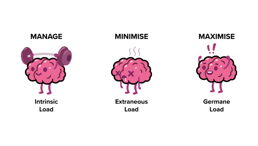
Cognitive load refers to the amount of mental effort required to process and interact with information. It’s rooted in cognitive psychology and is often categorized into three types:

  1. Intrinsic Load: The inherent complexity of the task itself. For example, learning advanced physics naturally requires more effort than reading a children’s book.
  2. Extraneous Load: Unnecessary complexity introduced by poor design, such as cluttered layouts or unclear instructions. This is where designers have the most control.
  3. Germane Load: The effort devoted to learning or understanding something meaningful, which is essential for building knowledge and skills.

In UI/UX design, minimizing extraneous load while optimizing germane load is key to creating intuitive and enjoyable experiences.
The Psychological Foundation of Cognitive Load

The concept is deeply tied to working memory, a limited resource that processes and holds information temporarily. According to Miller’s Law, humans can hold about 7 (plus or minus 2) items in their working memory at a time. When users are presented with overly complex interfaces, their working memory becomes overwhelmed, leading to frustration and disengagement.

Strategies to Reduce Cognitive Load in Design
Designers can make tasks easier by focusing on these principles:

  1. Simplify Navigation
    • Using clear pathways and avoid hidden menus
    • Example: Amazon’s one-click purchasing reduces decision fatigue
  2. Employ Progressive Disclosure
    • Show information only when users need it. For instance, a sign-up form that breaks into multiple steps feels less overwhelming than one with all fields displayed at once
  3. Leverage Visual Hierarchy
    • Use size, color, and spacing to guide focus. Bold headings, contrasting buttons, and whitespace can help users prioritize key actions
  4. Chunking Information
    • Break content into digestible pieces, similar to paragraphs in a book
    • Example: Spotify organizes songs into playlists, making it easier for users to find their favorites


The Hook Model: Turning Attention into Habits

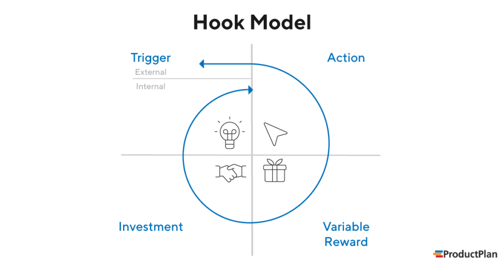
Once cognitive load is minimized, designers can focus on engaging users more deeply through Nir Eyal’s Hook Model. This four-step process transforms interactions into habits:

  1. Trigger
    • External: Notifications, reminders, or prompts (e.g., a Duolingo streak notification).
    • Internal: Emotional cues like boredom or loneliness, which lead users to open an app instinctively.
  2. Action
    • Simplify actions to reduce friction. A swipe on Tinder or a tap on Instagram’s heart icon feels effortless.
  3. Variable Reward
    • Unpredictability enhances engagement. For example, social media likes or gaming loot boxes keep users coming back.
  4. Investment
    • Encourage users to invest time or effort, making them more likely to return. Examples include creating Pinterest boards or uploading photos to Google Photos.
Literature:

Cogitive Load:
https://www.barefootteflteacher.com/p/what-is-cognitive-load-theory

https://www.interaction-design.org/literature/topics/cognitive-load?srsltid=AfmBOorxdSOspYzd9iiUNoqJMX98LoCbl-tSMbZI7iAFoIc9BH2h2D69

Hooked: How to Build Habit-Forming Products by Nir Eyal

Miller’s Law:
https://medium.com/design-bootcamp/simplifying-complexity-demystifying-millers-law-in-ux-design-7-2-49db4fa8346a#:~:text=Miller’s%20law%20states%20that%20the,human%20memory%20and%20cognitive%20processing.

Hook:
https://inappstory.com/blog/mobile-native-hooks-and-triggers

The Power of Visual Hierarchy in Capturing Attention

In a world of fleeting attention spans, visual design is not just a supporting player – it’s the lead actor in guiding user focus. Whether it’s a landing page, an app interface or an online form, the way information is visually presented can make or break user engagement. Let’s explore how visual hierarchy helps capture attention and simplify user interaction.

Why Visual Hierarchy Matters

Visual hierarchy is the arrangement of elements in a way that suggests importance and guides the viewer’s eye. Steve Krug, in his book “Don’t Make Me Think“, emphasizes that users scan web pages, they don’t read them. This means designers must make the most crucial elements stand out immediately, leading users seamlessly through a page or app.

For short attention spans, clarity is key. A cluttered or confusing interface demands too much cognitive load, causing users to disengage. By establishing a clear hierarchy, you can reduce mental effort and keep users focused on what matters.

Techniques for Effective Visual Design

Here are actionable techniques to create visual designs that capture and hold attention:

  1. Typography: Use font sizes and weights to differentiate headings, subheadings, and body text. A bold headline grabs attention, while smaller, lighter text provides supporting details.
  2. Color Contrast: Colors are powerful cues. High contrast between text and background improves readability, while accent colors draw attention to CTAs.
  3. Spacing: Adequate whitespace (or negative space) helps declutter layouts, giving users visual breathing room.
  4. Iconography and Imagery: Icons and images act as visual shortcuts, instantly conveying meaning. However, ensure they align with the context and don’t overwhelm the design.
  5. Consistent Alignment: Align elements cleanly to establish order and predictability, making navigation intuitive.

Examples: Good vs. Bad Visual Hierarchy

Good Example: Apple’s website showcases excellent visual hierarchy, using bold headlines, simple imagery, and plenty of whitespace to guide attention to its products.

Bad Example: Overloaded landing pages with flashing banners, competing colors, and tiny fonts (think early 2000s design) overwhelm users and make key information hard to find.

A Human-Centered Approach
Ultimately, good visual design isn’t just about aesthetics – it’s about empathy. Understanding how users perceive and process information ensures that your designs meet their needs while respecting their attention.

Literature:

Don’t Make Me Think” by Steve Krug

Dark Patterns in Attention Design

Is grabbing user attention always ethical?

In the race to capture user attention, some designs cross a critical ethical line. These manipulative tactics, often referred to as dark patterns, exploit human psychology to benefit businesses at the expense of users. Let’s dive into examples where engagement becomes exploitation and why designers must tread carefully when wielding the power of attention design.

The Netflix Gamification Experiment

Netflix once tested a feature that gamified TV watching for kids. By introducing “patches” as rewards for every show or movie watched, they encouraged children to binge content. The more they watched, the more patches they earned—a clever yet ethically questionable move. Critics argued this design preyed on children’s psychology, fostering addictive behavior under the guise of fun. After backlash, Netflix scrapped the idea.

Why It Matters:
This is a clear example of using gamification not to enhance experiences, but to trap users into spending more time on the platform.

Social Media’s Infinite Scroll

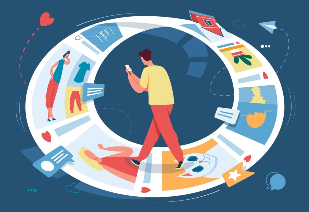
Social media platforms like Instagram and TikTok use the infinite scroll feature to keep users endlessly consuming content. This design taps into a psychological phenomenon known as the “novelty-seeking” bias – the constant pursuit of something new. As a result, users often spend hours scrolling without realizing it.

Why It Matters:
While it boosts engagement metrics, infinite scroll often leaves users feeling drained and unproductive, raising questions about its long-term impact on mental health.

E-Commerce and Fake Scarcity

Online retailers frequently use fake scarcity tactics like “Only 2 items left in stock!” or countdown timers during sales. These practices create a sense of urgency, manipulating users into making impulsive purchases out of fear of missing out.

Why It Matters:
While effective for increasing sales, such tactics can lead to buyer’s remorse and erode trust in the platform.

Mobile Game Microtransactions

Many mobile games use dark patterns to encourage spending. For instance, games often use loot boxes – randomized rewards players pay for without knowing what they’ll get. This taps into the psychology of gambling, exploiting players desires for rare or valuable items.

Why It Matters:
Loot boxes have been criticized for targeting vulnerable groups, particularly children, and leading to financial exploitation.

Positive Examples: Ethical Attention Design

Not all attention-focused designs are manipulative. Companies like Nintendo and Apple are taking steps to address attention ethics:

Nintendo: The company included built-in reminders in its consoles to encourage players to take breaks, especially in family-oriented games like Animal Crossing. (don’t know if they’re still doing it)

Apple Screen Time: iPhone’s Screen Time feature provides detailed insights into how users spend their time, empowering them to set limits and make informed decisions about their digital habits.

These examples show how design can promote healthier interactions with technology, respecting user autonomy while fostering engagement.

As designers, we hold significant influence over how people interact with technology. Let’s use it responsibly.

Literature:

Talk by Victor Yocco (UX Burlington 2019)
https://www.youtube.com/watch?v=6WBS6YYMAcE

Infinite Scroll:
https://uxdesign.cc/why-the-infinite-scroll-is-so-addictive-9928367019c5

Netflix Patch:
https://www.digitaltrends.com/movies/netflix-tests-patches-for-kids/

Good source about types of scarcity:
https://uxdesign.cc/5-types-of-scarcity-how-to-influence-anyone-using-these-7f309d328dbb

can also recommend “the social Dilemma” on Netflix

Are We Living in Non-Places?

In the rush of daily life, we rarely stop to think about the spaces we inhabit. Yet, our cities are filled with what Marc Augé describes as non-places like airports, malls, highways, and waiting rooms. These are not destinations but places of transit, designed to be functional rather than meaningful.

Augé’s concept of non-places is rooted in supermodernity, a world defined by excess: too much information, too many choices, and too little time to reflect. In this environment, spaces become stripped of identity and connection. They exist only to move people along efficiently, anonymously, and often in isolation.

The Decline of Third Places

In contrast to non-places, sociologist Ray Oldenburg introduced the idea of third places: informal gathering spots like cafés, parks, or community centers. These spaces foster relationships, spark conversations, and create a sense of belonging.

But as cities expand and modernize, third places are disappearing. Public spaces are increasingly privatized, and social hubs are replaced by commercial zones. Where people once gathered to share stories, we now find sprawling malls or cookie-cutter cafés designed more for profit than community. The result? A sense of isolation that permeates our everyday lives.

Supermodernity and the Human Disconnect

Supermodernity doesn’t just shape the spaces we move through; it’s also reshaping the way we design. In our quest for efficiency and innovation, we often lose sight of the human element. Think about the rise of AI-generated art and design. While these tools are undeniably powerful, they sometimes lack the warmth, imperfection, and emotion that make human creations resonate.

Take the design of a campaign, for example. Comparing two Prada posters: one generated by AI and one created in the 1990s. The AI poster might flawlessly follow current trends, optimizing composition and color for maximum engagement. But the 90s poster carries a distinct cultural context, emotional depth, and an imperfect charm that resonates on a personal level. Supermodernity prioritizes speed and scalability, but at what cost?

What We’re Losing

The loss of third places and the rise of non-places highlight a deeper issue: the erosion of shared experiences and community. Third places like lively cafes, local libraries, and neighborhood parks once fostered connection and creativity. They weren’t just physical spaces but cultural hubs where people exchanged ideas and found belonging. Design in these spaces reflected the communities they served, with typography, posters, and art carrying personal and local meaning.

Today’s minimalist coffee shops, with their sterile aesthetics, often feel transactional rather than inviting, completely unlike the vibrant, conversational spaces of the past. Public squares, laundromats, community centers, and traditional marketplaces have largely been replaced by services focused on speed and convenience.

These losses aren’t just physical. The mental well-being tied to spontaneous connection and shared experiences has also diminished. Without true third places, design risks becoming generic and disconnected, shaped more by algorithms than human insight, losing the vibrancy that once made it meaningful.

Reclaiming the Human Element

So how do we push back against this trend? How can designers, especially communication designers, bring humanity back into their work?

One way is by focusing on storytelling. Every non-place has a story waiting to be told whether it’s the history of a train station, the hidden lives of workers in a shopping mall, or the personal journeys of travelers in an airport. Through typography, visuals, and interactive media, designers can turn these spaces into places of connection and meaning.

Another approach is to embrace imperfection. Hand-drawn illustrations, experimental layouts, or unexpected textures can remind audiences of the human touch behind the design. Instead of striving for sleek, AI-perfected results, we can celebrate the messy, emotional side of creativity.

Supermodernity in Design

Designers also need to critically examine their role in a supermodern world. Are we creating for convenience, or are we creating for connection? The rise of AI and automated systems has its benefits, but we must ensure these tools enhance, rather than replace, the human aspect of design.

For instance, an AI can generate a visually stunning ad campaign, but it’s up to the designer to ensure that campaign resonates on a deeper level tapping into cultural symbols, emotions, and shared experiences.

In a world dominated by non-places, designers have the power to make people pause, reflect, and connect. By reclaiming the human element in design, we can transform even the most impersonal spaces into meaningful experiences. It’s not just about making something look good, it’s about making it feel alive.

Scenarios and Use Cases

How Short Attention Spans Impact Everyday Interactions

Picture this: You’re on a flight, settling into your seat, and the safety instructions start. In the past but still even today at short flights or cheap ones without a screen, flight attendants stand in the aisle demonstrating seatbelt use and emergency exits. Most passengers barely pay attention in this case. Now, airlines like Air New Zealand or Qatar Airlines play high-quality safety videos featuring celebrities, humor or even movie themes to capture your focus. It’s no longer just about compliance – it’s about engagement.

This is just one of many situations where attention makes all the difference. Let’s explore real-world use cases where shortened attention spans have reshaped how information is delivered and understood.

Scenario 1: Safety in Airplanes

In-flight safety instructions are crucial, yet passengers often ignore them. Airlines responded by turning mandatory safety briefings into mini-movies. Using famous actors, creative storytelling, and even animation, they transform what could be monotonous into something entertaining.

Use Case Example:
Qatar’s safety video has featured Kevin Hart. By tapping into comedy and acting, they ensure passengers actually pay attention – potentially saving lives in an emergency.

Scenario 2: Manuals

Instruction manuals have a bad reputation for being overwhelming and full of technical language. With shrinking attention spans, fewer people want to wade through dense text to figure out how to assemble furniture or install snow chains.

Use Case Example:
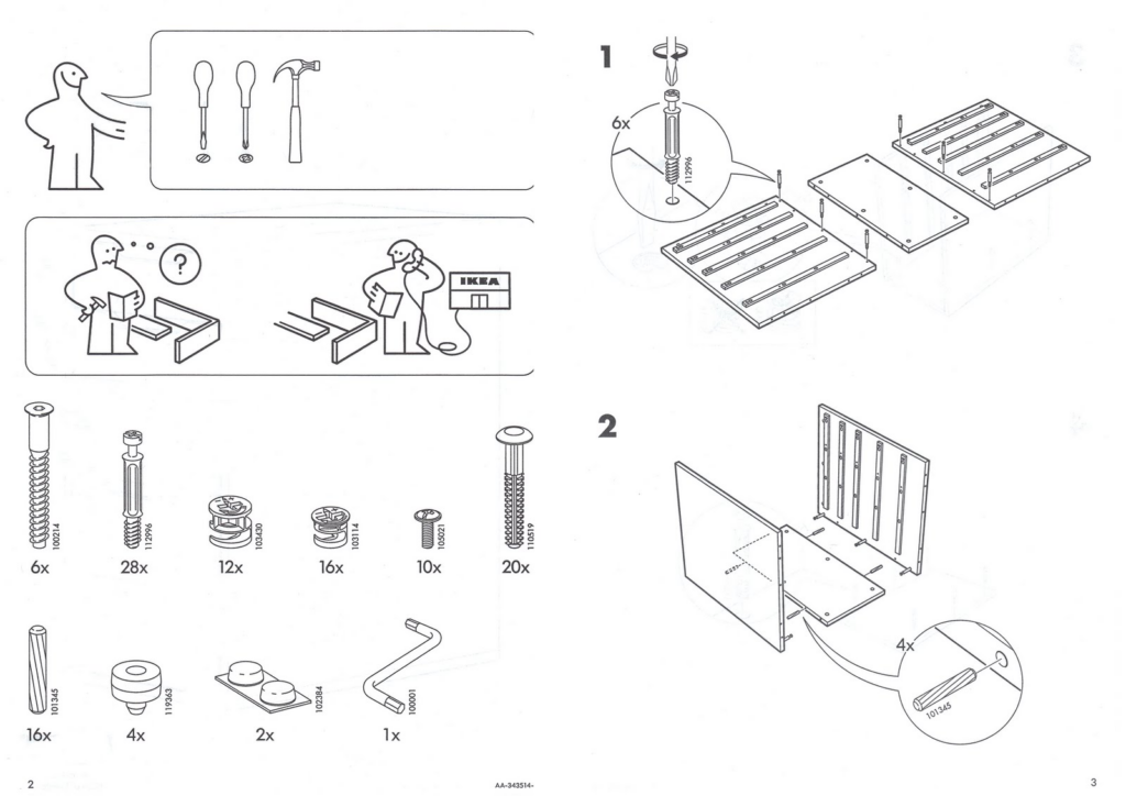
IKEA’s picture-based assembly instructions are a brilliant response to this challenge. By using simple visuals and step-by-step illustrations, they eliminate the need for lengthy explanations, making the process faster and frustration-free. Similarly, many car manufacturers now include video tutorials for tasks like attaching snow chains, further reducing cognitive load.

Scenario 3: Learning in the Digital Age

Attention challenges aren’t limited to entertainment or shopping, they’re reshaping education too. Microlearning apps like Duolingo and Blinkist are thriving because they align with modern attention spans, breaking complex topics into bite-sized lessons that fit into busy lives.

Use Case Example:
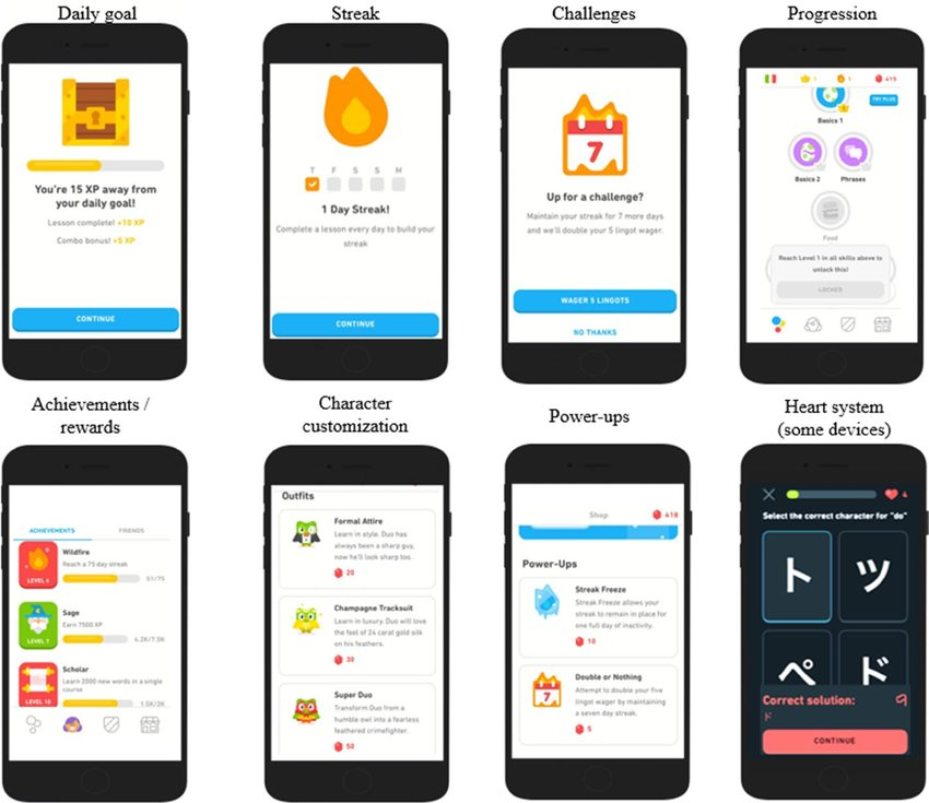
Duolingo uses gamification to keep users engaged, with short exercises, streaks, and rewards. Each lesson is designed to feel achievable, ensuring users stay motivated without feeling overwhelmed.

Why These Scenarios Matter

Each of these examples highlights how attention plays a critical role in real-life situations. From life-saving instructions to everyday usability, the ability to capture and guide attention isn’t just nice to have, it’s essential. Designers and creators must embrace these evolving behaviors to communicate effectively and create better experiences.

Stay tuned for the next post, where we’ll dive deeper into the ethical dilemmas of designing for attention.

Literature:

Safety Video with Basketball Team:

Flight attendant performs funny safety routine:
https://www.youtube.com/watch?app=desktop&v=JEyp2p-bzcU&t=65s

Qatar Airways with actors like a comedy movie:
https://www.youtube.com/watch?v=SNtlxmtH3ZA

IKEA:
https://www.ikea.com/

Duolingo:
https://www.researchgate.net/figure/duolingos-gamification-elements_fig1_351746804

What is Attention and why is it shrinking?

As humanity shifts more into the digital universe where the chances of distraction increase by the minute, understanding the science of attention is already a requirement. Attention is not a simple mental process that can be neglected, rather, it is the basic framework that we use to move, engage with and comprehend any given digital experience. For instance, designers need to have a sound understanding of attention so as to estimate the boundaries are designing user-interfaces that are friendly, engaging, and effective.

Types of Attention and Their Design Relevance

In psychology, attention has been subdivided into many forms and the following two are applicable in design:

Transient Attention

This is our brain’s quick concentration on anything for a micro duration, for example, how one would look at a notification for contact.

Relevance in Design: Many products define their features as impression creation. In such cases, content designers need to have simple and distinct content which is easy for users to focus on.

Sustained Attention

This means the ability of someone to concentrate with little or no distraction for a long period of time.

Relevance in Design: For elements that require more time like reading an article or filling forms. The standard interface design needs to be directly proportional to the time spent on navigating through several elements within that interface.

In the current attention economy, both of these types are under a lot of distress as users start adapting to new fast-moving platforms such as tiktok and instagram among others.

The Decrease of Attention in the Digital Era (Study Analysis)

Microsoft (2015), in a study that is much cited and discussed, claims that the average human attention span reduced from twelve seconds in the year 2000 to eight seconds. Not every individual agrees with these numbers, but what is unquestionable is the fact that we are getting worse at concentrating on a single thing. It is apparent that this regression is attributable to a number of interrelated factors:

Overconsumption: We are overfeeded with content from different devices and different mediums.

Desire of Immediate Satisfaction: There is a strong desire to interact with the app immediately providing quick reward as is the case with TikTok.

Cognitive Overload: There are too many alternatives or sources of stimulation which in turn causes our brains to evolve and opt for the quicker, more superficial engagement instead of deep thinking.

This requires, on the one hand, attention that needs to be drawn to the product, but on the other, there is the need to minimize user confusion.

Psychological Frameworks In Design

Cognitive Load: Psychologist John Sweller concept describes the information processing burden of an individual. Interfaces that are too busy or complex can quickly exhaust users, leading to frustration and drop-off.
Design Tip: Trim interfaces down and extract major functional purposes. Avoid any unnecessary interference.

Selective Attention: Our brains filter out irrelevant stimuli to focus on what’s important. Design Tip: Apply and yes even exploit the basic principles of design which are contrast, hierarchy and space to the users attention.

Attention Span Metrics: Working memory is always situational. For instance:
Social Media: Attention grabbing takes 1-3 seconds.
Reading: A user scans through content with a view of determining whether that worth reading or not.

The same set of principles affirms the need to design interfaces adapted to the short-lived focus of users as well as those supporting longer attention span when necessary.

Consequences for Designers

A profound grasp of attention is far more than an intellectual activity, it determines the success or failure of a digital product. Considering the fact that users are flooded with a range of stimuli, designers should understand that attention is a scarce commodity. This is a necessary consideration and failure to take it into account can result in:

User Drop-Off: Interfaces that fail to capture or sustain attention lose users quickly, often before they even engage meaningfully with the product.

Missed Opportunities: Any pertinent information, an urgent request or advertise, or some other valuable content may be missed provided it does not correspond to the user’s attention span.

Cognitive Overwhelm: If a person is exposed to overly intricate designs they will most probably become fatigued and that will lower their satisfaction and degree of convenience.

No one is saying that all the attention can be focused on the design, understanding the psychology users will be using to view and interact with the offered products is equally important, to put it into one’s design, all of these factors make the correct understanding of interaction between the elements and devising of possible problems a vital issue.

Literature:

Department of Education; Sweller, John: Cognitive Load Theory in Practice.

Microsoft Attention Span Research (2015):
chrome-extension://efaidnbmnnnibpcajpcglclefindmkaj/https://dl.motamem.org/microsoft-attention-spans-research-report.pdf

Smashing Magazine:
https://www.smashingmagazine.com/2020/09/designing-for-attention/

PMC:
https://pmc.ncbi.nlm.nih.gov/articles/PMC3882082

Interaction Design Foundation:
https://www.interaction-design.org/literature/topics/cognitive-load?srsltid=AfmBOorxdSOspYzd9iiUNoqJMX98LoCbl-tSMbZI7iAFoIc9BH2h2D69

04 Bias in Ai

Taking a little detour from my actual topic, I wanted to explore an issue of our time, bias in Ai. A topic that comes up a lot, when reading about Ai. I wanted to know, what can be done about it and how it could be avoided. Could this have an additional impact on our society?

Artificial Intelligence (AI) is transforming industries, and (UX) Design is no exception. Ai already has the ability to deliver high quality design work and is going to continue to evolve. It’s reshaping how we approach design, offering tools that enhance efficiency, streamline workflows, and even generate creative outputs, it’s already capable to deliver high quality design work. While AI excels at analyzing data, creating prototypes, and even predicting user behavior, the heart of UX design lies in empathy, problem-solving, and collaboration, skills uniquely human in nature. (cf. Medium A)

Ai can analyze vast amounts of user data to uncover patterns and insights that inform design decisions, helping designers better understand their audience. It can also generate initial design drafts or prototypes, saving time and allowing designers to focus on refining creative and strategic elements. Predictive algorithms powered by AI can anticipate user behavior, enabling the creation of more intuitive and personalized experiences. By automating repetitive tasks and offering data-driven insights, AI empowers designers to elevate their craft while maintaining a human-centered approach. (cf. Medium A)

But what if the data the Ai gets is already biased towards a certain user group, making it’s outputs biased as well a therefore influencing UX work. Addressing bias in AI is not just a technical challenge; it’s an ethical imperative that impacts the lives of millions.

Examples of Bias in Ai

  1. Healthcare Disparities: 
    An algorithm used in U.S. hospitals was found to favor white patients over black patients when predicting the need for additional medical care. This bias arose because the algorithm relied on past healthcare expenditures, which were lower for black patients with similar conditions, leading to unequal treatment recommendations.
  2. Gender Stereotyping in Search Results
    A study revealed that only 11% of individuals appearing in Google image searches for “CEO” were women, despite women constituting 27% of CEOs in the U.S. This discrepancy highlights how Ai can perpetuate gender stereotypes.
  3. Amazon’s Hiring Algorithm
    Amazon’s experimental recruiting tool was found to be biased against female applicants. The Ai, trained on resumes submitted over a decade, favored male candidates, reflecting the industry’s male dominance and leading to discriminatory hiring practices. (cf. Levity)

How does bias in Ai form?

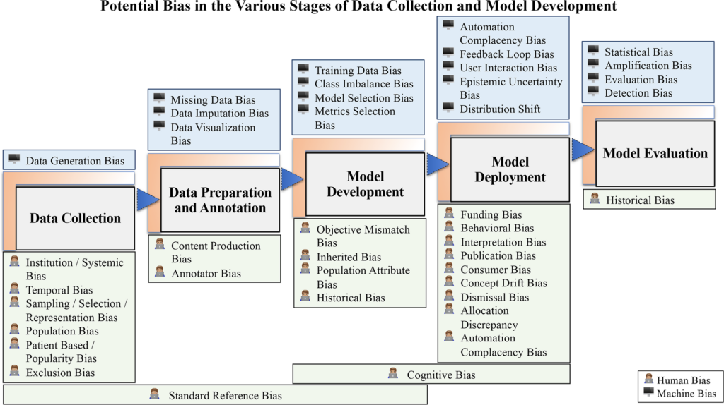
Bias in Ai often forms due to the way data is collected, processed, and interpreted during the development cycle. Training datasets, which are meant to teach AI models how to make decisions, may not adequately represent all demographics, leading to underrepresentation of minority groups. Historical inequities embedded in this data can reinforce stereotypes or amplify disparities. Additionally, the way problems are defined at the outset can introduce bias; for instance, using cost-saving measures as a proxy for patient care needs can disproportionately affect underserved communities. Furthermore, design choices in algorithms, such as prioritizing overall accuracy over subgroup performance, can lead to inequitable outcomes. These biases, when unchecked, become deeply ingrained in AI systems, affecting their real-world applications.

Source: Judy Wawira Gichoya, pos. 3

Sometimes, the problem the Ai is supposed to solve is framed using flawed metrics. For instance, one widely used healthcare algorithm prioritized reducing costs over patient needs, disproportionately disadvantaging Black patients who required higher acuity care. (cf. Nature) When training datasets lack of diversity or reflect on historical inequities, Ai models learn to replicate these biases. Also, a well-designed system can fail in real-world settings if deployed in wrong environments it wasn’t optimized for. (cf. IBM) Decisions made during model training, like ignoring subgroup performance—can result in inequitable outcomes. (cf. Levity)

How to address bias in Ai

To avoid bias in Ai thoughtful planning and governance is important. Many organizations rush Ai efforts, leading to costly issues later. Ai governance establishes policies, practices, and frameworks for responsible development, balancing benefits for businesses, customers, employees, and society. Key components of governance include methods to ensure fairness, equity, and inclusion. Counterfactual fairness for example addresses bias in decision-making even with sensitive attributes like gender or race. Transparency practices help ensure unbiased data and build trustworthy systems. Furthermore a “human-in-the-loop” system can be incorporated to allow human oversight to approve or refine Ai-generated recommendations. (cf. IBM)

Reforming science and technology education to emphasize ethics and interdisciplinary collaboration is also crucial, alongside establishing global and local regulatory frameworks to standardize fairness and transparency. However, some challenges demand broader ethical and societal deliberation, highlighting the need for multidisciplinary input beyond technological solutions. (cf. Levity)

06. Navigating Challenges and Considerations in Preventive Healthcare Design

In previous posts, we’ve explored the potential of preventive healthcare and how interactive design can play a role in making health habits more engaging. However, designing solutions in healthcare isn’t just about innovation and creativity. It’s also about addressing real-world challenges and ensuring ethical responsibility. In this post, we’ll dive into the key challenges and ethical considerations designers face in the field of preventive healthcare.

Common Challenges in Preventive Healthcare Design

Accessibility

Preventive healthcare tools must cater to diverse demographics, including those with disabilities or limited technical proficiency. Accessibility involves more than just adding screen readers or large fonts; it means designing interfaces that are intuitive and user-friendly for people of all abilities. Testing apps with diverse user groups helps identify accessibility barriers early in the design process.

Data Privacy

Preventive healthcare apps handle not only user habits but also sensitive data, imagine if this sensitive data were compromised. The consequences would be devastating, from identity theft to financial fraud.

Equity and Inclusion

Equity in preventive healthcare design faces significant challenges that often stem from socio-economic, geographic, and cultural disparities. Limited access to devices remains a prominent issue, with studies showing that over 2.6 billion people worldwide still lack access to the internet (https://www.edisonalliance.org/home). For example, rural communities in sub-Saharan Africa face significant barriers to accessing internet and mobile technologies, limiting their ability to benefit from digital health tools. Similarly, internet connectivity issues create a significant gap in underserved regions, where infrastructure remains insufficient for reliable access.

Another key intersection between challenges and ethics lies in behavioral design. Techniques like gamification and habit loops can be powerful motivators, but they must be applied ethically. Over-reliance on addictive design patterns or fear-based nudges might drive short-term compliance but can lead to long-term psychological harm.

By understanding how these challenges intertwine with ethical considerations, designers can approach their work with a more holistic mindset. Ethical design isn’t an afterthought—it’s an ongoing commitment that starts from addressing the root causes of these challenges.

Possible solutions to address challenges

While the challenges are significant, several strategies can help address these barriers effectively:

1. Offline Functionality

Many users in underserved areas lack reliable internet access. Designing apps with offline functionality ensures that users can still track their health data, access educational content, and receive essential reminders even without an internet connection. For example, local data storage allows users to input and save health information, which can later sync with cloud servers when a connection becomes available.

2. Simplified User Interfaces

Digital literacy varies significantly across user demographics. Simplified user interfaces prioritize clarity and usability, with clean layouts, intuitive navigation, and recognizable icons. Features like step-by-step tutorials, voice guidance, and error prevention tools make these apps more accessible to first-time users and older adults.

3. Community Health Programs

Digital tools alone might not be enough to drive change, especially in regions with limited technology adoption. Community health programs can bridge this gap by pairing digital solutions with in-person support. Health ambassadors or trained volunteers can educate users, assist with app navigation, and answer questions, fostering greater trust and adoption.

4. Partnerships with Governments and business

Collaboration with governments and non-governmental organizations can address structural barriers to equity. Partnerships can lead to initiatives like subsidized internet plans, distribution of affordable devices, and region-specific health campaigns. For example, partnerships in sub-Saharan Africa have successfully introduced SMS-based healthcare reminders to improve vaccination rates.

5. Multilingual Support

Language barriers can prevent effective communication and reduce app adoption rates. Offering app content in multiple languages, along with regional dialect support, ensures inclusivity. Additionally, voice commands and audio instructions can further break down linguistic barriers for users with limited reading skills.

Conclusion

Designing for preventive healthcare isn’t just about creating visually appealing interfaces or engaging gamification techniques. It’s about understanding the real-world challenges users face, addressing inequities, and maintaining ethical responsibility. As designers, developers, and innovators, we must ensure that our solutions are inclusive, transparent, and genuinely beneficial for all.

Link to articles:

The EDISON Alliance connecting billions of people globally

SMS-reminder for vaccination in Africa: research from published, unpublished and grey literature

#7 Retro Design Styles

Design is constantly changing, but retro illustrations remain popular. They capture the style of the past and continue to inspire today. Retro styles such as Art Deco or Pop Art show the colours, shapes and themes of their respective eras and evoke nostalgic feelings. Retro illustrations date from the early 20th century to the 1980s. They reflect the style and culture of those times. Each era has its own unique character and offers many ideas for today’s artists.

Diffrence between Retro and Vintage Design

The differnce between retro and vintage design is that vintage refers to real designs and objects from the past, while retro describes modern designs that imitate the stils of the past. In practice, these two terms are blurred and are partly used as synonyms.

Why are they timeless?

Retro illustrations remain relevant because they look familiar and bring back memories. Their charm and wide range of uses in advertising, fashion or social media make them interesting for designers. They combine old trends with modern ideas and therefore remain relevant. They are versatile and have a strong cultural relevance, as they visually pick up on current trends and social phenomena.

Timeless aesthetics: Retro designs appeal to generations with their bold colours and simple shapes and outlast trends.

Versatile uses: They can be used in various areas such as branding, packaging and social media, combining nostalgic elements with modern design.

Cultural relevance: Retro illustrations remain relevant through cyclical cultural trends such as vinyl or retro gaming and offer a visual reflection of social movements.

Retro design styles

Art Deco

Art Deco is an elegant and luxurious design style that reached its peak in the 1920s and 1930s. It is characterised by geometric shapes, clear lines, symmetrical patterns and opulent materials. Art Deco illustrations often use shiny surfaces such as gold, silver and chrome, as well as bold colours and contrasting combinations. The style combines classic elegance with modern, industrial influences and celebrates both the advances in technology and the luxury of the time. Advertising and posters in particular often feature stylised, almost futuristic depictions of figures and objects.

Art Noveau

Art Nouveau illustrations are characterised by their curved lines, floral patterns and strong orientation towards nature. This style, which was popular at the end of the 19th and beginning of the 20th century, broke with the straight lines and classical forms of earlier eras and instead focussed on organic, flowing movements that are often inspired by plants, flowers and curved shapes. Art Nouveau illustrations often feature female figures. The illustrations are characterised by attention to detail and decorative elements.

Mid-Century Modern

Mid-Century Modern is a design style that was popular in the 1940s to 1960s and is characterised by clear, simple lines and functional shapes. In illustration, this style is often characterised by minimalist designs, bright colours and geometric patterns. Figures and objects are often simplified and stylised, with the focus on clear shapes and a modern, often futuristic look. Illustrations in the Mid-Century Modern style are often uncomplicated and focus on the essentials, making the style timeless and easily accessible. Playfulness and a certain lightness are also typical.

Pop Art

Pop Art is an art style that became popular in the 1950s and 1960s and is strongly influenced by mass culture. In illustration, Pop Art uses bright colours, clear lines and often familiar symbols from advertising, comics or everyday objects. Things such as cans, celebrities or logos are often depicted in a playful, exaggerated way to emphasise the importance of popular culture. The illustrations are colourful, eye-catching and sometimes look like something from a comic or advertisement.

Psychedelic Art

This style that developed in the late 1960s and was strongly influenced by experiences with drugs and hippie culture. In illustration, this style manifests itself through vibrant, often exaggerated colours and crazy, distorted patterns that sometimes depict almost surreal or dreamlike scenes. The shapes seem to liquefy or shift, and there is often a focus on imaginative, psychedelic scenes.

Punk

Punk illustrations reflect the rebellious and anti-establishment spirit of the punk movement of the 1970s and 1980s. The illustrations often use rough, hand-painted designs, black colours and bold, unpolished lines that create a wild and chaotic atmosphere. The images are often provocative and show symbols such as skulls, safety pins or anarchist signs.

Ressources

05. The Psychology Behind Gamification in Healthcare

In this post we’ll dive deep into the psychological principles that make gamification effective in healthcare, exploring how they influence behavior, motivation, and long-term habit formation.

1. Psychological Principles at Play

Gamification draws heavily from behavioral psychology, leveraging principles like reinforcement, gratification, and reward systems to encourage healthier behaviors:

A study by Fogg (2009) introduced the Behavior Model, which highlights the importance of motivation, ability, and prompts in driving behavior change.

“Behavior happens when Motivation, Ability, and a Prompt come together at the same time. When a behavior does not occur, at least one of those three elements is missing.”

Apps like MyFitnessPal use positive reinforcement through celebratory notifications after users log meals or complete exercise goals.

Instant Gratification vs. Long-Term Rewards
Many gamified healthcare apps provide short-term rewards (like virtual badges) while emphasizing long-term health outcomes (e.g., weight loss or improved fitness levels). For example, Fitbit rewards users with daily step achievements while showing long-term progress graphs.

The Role of Dopamine
When users achieve small milestones dopamine is released, creating a sense of satisfaction and reinforcing the habit.

2. Motivational Psychology

Motivation is a core driver in gamification, and it can be divided into intrinsic and extrinsic categories.

Intrinsic vs. Extrinsic Motivation

According to Deci and Ryan, extrinsic motivation is a drive to behave in certain ways based on external sources and it results in external rewards (1985). Such sources include grading systems, employee evaluations, awards, and the respect and admiration of others.

On the other hand, intrinsic motivation comes from within. There are internal drives that inspire us to behave in certain ways, including our core values, our interests, and our personal sense of morality.

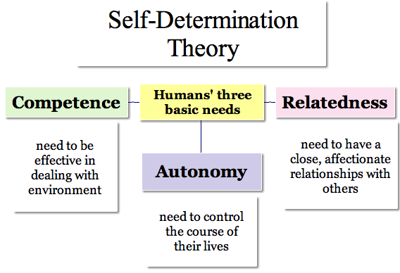
Self-Determination Theory (SDT)
SDT emphasizes three psychological needs—autonomy, competence, and relatedness. Apps like Nike Run Club allow users to set personal goals (autonomy), track progress (competence), and connect with friends (relatedness).

3. Social Psychology in Gamification

Humans are social creatures, and gamification often leverages social dynamics to enhance engagement. Social dynamics play a crucial role in gamification, as elements like social proof, peer influence, and healthy competition leverage our natural desire for connection, validation, and achievement to boost engagement and motivation.

4. Habit Formation

Building lasting habits is critical in healthcare, and gamification supports this through structured reinforcement.

Small Wins and Micro-Habits: Apps like Duolingo and WaterMinder break larger health goals into smaller, manageable tasks, encouraging users to celebrate incremental victories.

Consistency Reinforcement: The Duolingo app rewards users by giving diamonds for completing daily tasks, reinforcing consistency and forming habits over time.

How to Earn Gems in Duolingo (2025) » Lingoly.io

5. Challenges and Ethical Considerations

While gamification is effective, it’s not without challenges.

Overuse of Rewards: Excessive reliance on rewards can lead to diminishing intrinsic motivation. The same research by Deci highlights this risk, emphasizing the importance of balance.

Privacy and Data Security: Many healthcare apps collect sensitive personal data, raising ethical concerns. Transparent privacy policies are essential.

Equity and Access: Not everyone has equal access to technology. Designing inclusive gamified solutions ensures wider adoption and impact.

6. Conclusion

Gamification in healthcare works not because of flashy rewards, but because it taps into deep-rooted psychological principles—motivation, habit formation, and social influence. By understanding these mechanisms, designers and healthcare professionals can create more effective and engaging health interventions. The key lies not only in designing appealing game elements but also in understanding the minds of those who play.