What is Risk Communication?

Understanding the basics of risk communication is essential for my master’s thesis because it provides the foundational knowledge necessary to explore more complex aspects. By grasping the core principles, methods, and challenges, i can delve deeper into how risk communication interacts with UX design. It’s important to identify gaps in order for me to make innovative solutions, and contribute meaningfully to the field, especially in addressing critical global issues like climate change and disaster management.

For me it’s easier to understand new subjects with short video explanations. This one took COVID-19 an example to demonstrate some dilemmas and practical issues.

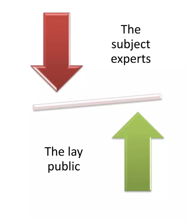
So risk communication is the real-time exchange of information, advice, and opinions between experts and individuals facing threats to their well-being. Its purpose is to help people make informed decisions to mitigate the effects of hazards, such as disease outbreaks, and to adopt protective measures.

The Role of Community Engagement

Community engagement is about developing relationships and structures that involve communities as equal partners in creating emergency response solutions. It empowers communities to take an active role in planning and implementing health emergency responses. Lessons learned from past emergencies show that integrating risk communication with community engagement leads to more effective, equitable, and inclusive preparedness and response efforts. 
Risk communication and community engagement works alongside other technical areas to ensure that accurate information is delivered to communities in ways that are acceptable and workable for them. nse efforts.

The Process of Risk Communication

Risk communication involves explaining critical information in ways that enable people to make informed decisions about risks to their health, safety, and or environment. It is not merely a one-way transfer of information but a dynamic, multi-directional process involving ongoing engagement among stakeholders. This is crucial, especially when risks are uncertain or rapidly changing.

Goals and Challenges

The goals of risk communication vary. For users, it helps understand risks and benefits, while for institutions, it minimizes disputes and prevents communication breakdowns. However, firms often struggle to create communications that are both legally compliant and beneficial for users. Effective risk communication should aim to build trust, foster consensus, and support risk management decisions.

Making It Work

Effective risk communication requires identifying and understanding the audience, crafting clear messages, and selecting appropriate communication methods. While it may not guarantee consensus on risk management approaches, it enhances community involvement, raises awareness of public perceptions, and clarifies how risk assessments inform decision-making.

Conclusion

Risk communication is essential for empowering communities to make informed decisions during emergencies. By fostering trust and ongoing engagement, it contributes to more effective and inclusive risk management strategies, ultimately enhancing community resilience.

Bewegungsrichtung und -orientierung + Unsichtbare Bewegungsführung

„Irgendwas passt nicht“ oder „Mein Übergang ist einfach nicht smooth…“
Und damit willkommen beim Thema Bewegunsgrichtung und -orientierung.

Flüssige Animationen und damit die Aufmerksamkeit des Publikums zu halten ist wohl eine der größten Herausforderungen im Motion Design. Eine Technik die den Blick und die Aufmerksamkeit der Zuschauer:innen gezielt lenkt – ohne dabei manipulativ zu wirken – nennt sich „Eye Tracing“ (nicht zu verwechseln mit Eye Tracking). Es gibt jede Menge Prinzipien die sich in den letzten Jahrzehnten etabliert haben, um Geschichten mit dieser Technik fesselnd und klar zu erzählen! (Vgl. Richardson/Plummer 2024)

Was ist Eye Tracing?
Bei Eye Tracing geht es darum, die Bewegung des Hauptobjektes zu nutzen, um den Blick und die Aufmerksamkeit der Betrachter:innen gezielt zu lenken.
Dabei kombiniert diese Technik verschiedene Ansätze, wie Bewegung, Bildkomposition, Farbe und Kontrast – jedemenge Dinge die schon in vorherigen Blogposts eine große Rolle gespielt haben! Das Ziel von gutem Eye Tracing ist es, dass der Blick der Betrachter:innen unbewusst und flüssig über den Bildschirm wandert und immer dort ankommt, wo die wichtigen visuellen Elemente präsentiert werden.  (Vgl. Richardson/Plummer 2024)

Was heißt das jetzt Motion Designer? (Oh nein, noch mehr zu bedenken?!) Die Bewegungen in der Animation müssen nicht nur “gut” aussehen, sondern müssen auch so gestaltet werden, dass sie den Blick genau an die richtige Stelle lenken. Das macht die Animationen nicht nur spannender, sondern verbessert auch effektiver in der visuellen Kommunikation. (Vgl. Richardson/Plummer 2024)


Dieses kleine Video zum Thema Eye Trace fasst schnell und kurz zusammen, worum es in diesem kapitel grundsätzlich gehen wird:

Warum Eye Tracing nutzen?
Jacob Richardson und Ryan Plummer beschreiben die Funktion von Eye Tracing wie das Rufen eines Freundes auf der anderen Straßenseite: Man lenkt zuerst mit einem akustischen Reiz die Aufmerksamkeit auf sich und nutzt dann eine zusätzliche visuelle Geste, wie Winken, um den Blick zielgerichtet zu führen. (Vgl. Richardson/Plummer 2024)

In der Animation geschieht dies durch visuelle oder akustische Reize, etwa das Aufblitzen eines Objekts oder durch Soundeffekte. Diese Signale aktivieren die instinktive Aufmerksamkeit der Betrachter:innen und lenken den Blick gezielt auf bestimmte Bildbereiche. (Vgl. Richardson/Plummer 2024)

Ein wundervolles Beispiel dazu von „Ordinary Folk“ (wahrscheinlich den Götter der Animation und Motion Graphics):

Aber wie kommt man da hin?
In erster Linie kann man sich das Animationsprinzip Staging noch einmal genauer ansehen, denn dieses versucht Aktionen, Emotionen und Szenen auf klare, kohärente und verständliche Weise zu vermitteln, sodass die Zuschauer:innen mühelos der Handlung folgen können (Vgl. DeeDee Animation Studio o.D.).


Das DeeDee-Studio aus Vietnam unterteilt die wesentlichen Aspekte des Staging in 3 Punkte: Das Schauspiel (der Character), das Timing der Animation und das Setting.

  1. Schauspiel (Acting)
    Besonders wichtig in der Charakter-Animation sind ausdrucksstarke (und durchaus übertriebene) Posen und Aktionen. Schon in frühen Disney Animationen – damals noch schwarz und weiß–  wurde der Fokus auf klare, aussagekräftige Silhouetten gelegt, um Handlungen einfach und effektiv darzustellen – ein Prinzip, das bis heute in 3D-Produktionen Anwendung findet. Ein gutes Beispiel ist der Film Spider-Man: Into the Spider-Verse, der kraftvolle Posen nutzt, um Figuren und Aktionen zu betonen (Vgl. DeeDee Animation Studio o.D.).
  2. Timing
    Das Timing ist entscheidend, um den Fluss einer Szene zu kontrollieren und die Aufmerksamkeit der Zuschauer:innen gezielt zu lenken – das wird auch durch die Beispiele oben deutlich. Klare Trennung von verschiedenen Aktionen und die richtige Dauer der Bewegungen ermöglichen ein besseres Verständnis der Handlung und Betrachter:innen können besser folgen. (Vgl. DeeDee Animation Studio o.D.).
  3. Settings
    Das Setting soll die Hauptcharaktere hervorheben und durch Hierache klar eine „Haupt-Neben-Beziehung“ festlegen. Eine Überladung mit Details kann die Aufmerksamkeit vom Wesentlichen ablenken – wie wir bereits im Kapitel „Überladung“ besprochen haben. Ein effektives Arrangement von Hintergrundelementen unterstützt jedoch die Persönlichkeit und Emotionen der Figuren, beispielsweise im Erklärvideo von Eye Tracing: Das Auge folgt der Form und wird nicht davon abgelenkt dass Sterne im Hintergrund erscheinen, sie werden aber dennoch wahrgenommen und sorgen für Details und Qualität (Vgl. DeeDee Animation Studio o.D.).

1.2 Wie Bewegungsführung den narrativen Fluss unterstützt

Für diesen Abschnitt können auch jene Quellen hinzugezogen werden, die nicht spezifisch über Animation, sondern über Film sprechen, denn Bewegungsführung spielt eine entscheidende Rolle in beiden Medien, um den narrativen Fluss zu fördern und Zuschauer:innen durch die Geschichte zu leiten.
Es werden verschiedene Bewegungsrichtungen eingesetzt, um visuelle Kontinuität herzustellen. Walter Murch beschreibt in In the Blink of an Eye die Bedeutung einer klaren visuellen Abfolge, denn durch gezielte Bewegungen der Charaktere oder Objekte innerhalb des Frames wird der Fokus verstärkt, wodurch der narrative Zusammenhang erhalten bleibt. Murch betont, dass Bewegungsrichtungen immer in den narrativen Kontext eingebettet sein sollten. Eine bewusst gewählte Bewegungsrichtung kann nicht nur die logische Abfolge der Handlung sicherstellen, sondern auch emotionale Botschaften vermitteln – etwa Vorwärtsbewegungen für Fortschritt oder Rückwärtsbewegungen für Unsicherheit und Rückzug. (Vgl. Murch 2001, S. 18–23).

Bewegunfsführung, also die Bewegungsrichtung und Orientierung , unterstützt die Geschichte und erzeugt eine emotionale Wirkung, denn durch die gezielte Ausrichtung von Bewegungspunkten innerhalb der Animation wird der Blick so gelenkt, sodass wichtige narrative Details hervorgehoben werden. (Vgl. Adobe o.D.).

Ein paar konkrete Anwendungsbereiche nach Murch (Vgl. Murch 2001, S. 18–23):

Fluss zwischen Schnitten durch Bewegungsrichtung:

In aufeinanderfolgenden Szenen bestimmt die Bewegungsrichtung ob visuelle Kontinuität zu gewährleisten. Ein Beispiel wäre es zum Beispiel Achsensprünge zu vermeiden oder spezifischer: Eine Figur, die im ersten Shot nach rechts läuft soll auch im nächste Shot weiterhin in die gleiche Richtung zeigen. Wird die Bewegungsrichtung ohne Grund und plötzlich geändert, kann das für Verwirrung sorgen und den narrativen Fluss unterbrechen. (Vgl. Murch 2001, S. 18–23).

– Führung des Blicks innerhalb des Frames
Bewegungsrichtungen lenken den Blick der Zuschauer:innen innerhalb des Bildausschnitts, wie beim EyeTracing genauer erklärt. Im Film könnte eine Szene etwa damit beginnen, dass eine Person von links nach rechts durch das Bild geht und diese Bewegung in weiterer Folge dann als visuelle Führung dient. Der Fokus liegt dann auf dem nächsten wichtigen Punkt im Frame, sei es ein Objekt, das aufgegriffen wird, oder ein anderer Charakter, der ins Bild kommt.(Vgl. Murch 2001, S. 18–23).

– Rhythmus und Übergang durch Bewegungsrichtung

Die Bewegungsrichtung kann auch den Rhythmus einer Sequenz betonen, indem beispielsweise eine Figur hektisch durch den Raum läuft und durch die Schnittfolge und wechseln Bewegungsrichtungen das Gefühl von Chaos entsteht. Wenn die Figur in weiterer Folge abrupt stoppt oder die Richtung wechselt, kann das als ein emotionaler oder auch narrativer Wendepunkt genutzt werden.

Verschiedene Bewegungsebenen

Man kann in einer Animation, sofern man sie nicht damit überlädt, verschiedene Bewegte Ebenen nutzen. So trägt man schon mit subtilen Animationen dazu bei, dass Tiefe und Dynamik erzeugt werden.Robert Parent beschreibt die Technik des Layering in seiner Arbeit als parallele Bewegung auf verschiedenen Ebenen – wie beispielsweise Charakteranimationen im Vordergrund und subtilen Hintergrundbewegungen – die dann ein realistischeres und immersiveres visuelles Erlebnis schaffen (Vgl. Parent 2012, S. 45–48). Dass kann beispielsweise natürliche Bewegung der Umgebung sein – wie Wolken oder Bäume im Wind – oder auch eine Art Parallax Effekt durch die Kamerabewegung.

Visuelle Bewegungsebenen haben des Weiteren auch in der Erzählung eine Bedeutung. Scott McCloud erläutert, wie parallele Bewegungsebenen genutzt werden können, um komplexe Geschichten zu erzählen, indem die Haupt- und Nebenbewegungen kombiniert werden und es so ermöglichen, mehrere narrative Stränge gleichzeitig darzustellen. So kann Komplexität und Vielschichtigkeit einer Szene betont wird. In einem Beispiel beschreibt McCloud eine Szene, in der die Hauptfigur im Vordergrund eine Handlung ausführt – beispielsweise das Öffnen eines Briefs – während im Hintergrund unscheinbare Bewegungen stattfinden, die ebenfalls zur Geschichte beitragen, z.B. eine tickende Uhr oder eine andere Figur, die unauffällig den Raum verlässt. Während die Hauptbewegung die zentrale Handlung zeigt, liefert die Nebenbewegung weitere Informationen und Atmosphäre. (Vgl. McCloud 1993, S. 42–47).

Quellen

DeeDee Animation Studio (o.D.).
DeeDee Animation Studio (o.D.): 12 Principles of Animation: All You Need to Know About Staging in Story Design and Layout. In: www.deedeestudio.net, https://www.deedeestudio.net/en/post/principles-animation-staging-animation(zuletzt aufgerufen am 06.01.2025)

Richardson/Plummer 2024
Richardson, Jacob/Plummer,Ryan (o.D.):Master Engaging Animation with Eye Tracing In: schoolofmotion,
https://www.schoolofmotion.com/blog/eye-tracing-animation (zuletzt aufgerufen am 06.01.2025)

Adobe o.D.

Adobe (o.D): Die 12 Prinzipien der Animation. In: Adobe/Animation/Discover, https://www.adobe.com/de/creativecloud/animation/discover/principles-of-animation.html (zuletzt aufgerufen am 05.01.2025)

Murch 2001

Murch, Walter (2001): In the Blink of an Eye. Los Angeles: Silman-James Press (2001)

Parent 2012

Parent, Robert (2012): Computer Animation: Algorithms and Techniques, Thesis, The Ohio State University, Ohio 2012, In: https://www.researchgate.net/publication/239008265_Computer_Animation_Algorithms_and_Techniques

McCloud 1993

McCloud, Scott (1993): Understanding Comics. NewYork: Mark Martin(1993)

Disclaimer: 

This text was proofread for punctuation, grammar and spelling errors with the help of ChatGPT 4o. The content of the text remains unaffected.

Micro-Motion: Kleine Bewegungen, große Wirkung

Ich dachte das Kapitel zu Mirco-Motion wird unglaublich lang und detailliert. Nach frustrierenden Stunden der Recherche lässt sich allerdings feststellen: Wenn man nicht gerade in die Psychologie der Mikro-Bewegungen im Menschlichen Körper eintauchen möchte ist es tatsächlich relativ schwierig seriöse Quellen zu finden, die das Thema auf dem hier nötigen Level behandeln.

Das mag an der Begrifflichkeit liegen, oder aber auch daran das Micro-Motion wohl nicht nur in der Animation sondern in so einigen Bereichen unseres Lebens eine rolle spielen: Sei es in einem simplen Dialog, im UI-Design oder aber auch in der Physik und Mechanik!

Aber, darum soll es nicht gehen. Was sind denn diese Micro Motions, mit denen ich mich beschäftigen wollte:

Micro Motions, nach meiner eigenen Definition, wären minimale Bewegungen, welche die Betrachter:innen nicht aktiv wahrnehmen, die aber die allgemeinen Wahrnehmung der Szene maßgeblich beeinflussen: Sei es das leichte Bouncen eines Objekts, oder eine micro-facial-expression. Im UI-Design wurden auf diversesten Websites aufgegriffen und beispielsweise wie folgt beschrieben „If you take a closer look at modern UI designs , you’ll notice that micro-animations have become an essential part. These aren’t your grand animations that dominate the screen and make visitors’ jaws drop. You can think of them as non-verbal cues, replacing lengthy explanations that would otherwise be essential for a smooth user experience.“ (Alpha Efficiency o.D.)

Das kann man wohl auch auf Animationen beziehen: Es sind jene Dinge, die deine Animation flüssiger und natürlicher wirken lassen. Beispielsweise können subtile Bewegungen, wie ein leichtes Zittern oder Schimmern, Informationen über emotionale Zustände und Texturmerkmale detaillierter darstellen. Kleine Bewegungen, z. B. das Heben einer Augenbraue, verleihen Figuren Tiefe und Authentizität. Mikro-Bewegungen können abstrakte Animationen bereichern, indem sie rhythmische Strukturen visualisieren und die Verbindung zwischen akustischen und visuellen Elementen stärken (Vgl. Moshammer 2023, S. 2-17).


Worauf kann man in erster Linie besonders achten? Die Prinzipien von Thomas und Johnston bieten einen guten ersten Anhaltspunkt. Prinzipien wie 
Secondary Actions, also Bewegungen, die eine Hauptaktion ergänzen, oder das Timing und Spacing,  also wie die Platzierung und Geschwindigkeit subtiler Bewegungen die Wahrnehmung beeinflussen können perfektioniert werden.

Um auf Charakteranimation einzugehen:
Micro-Animations in der klassischen Animation gehören subtile Bewegungen wie ein leichtes Zucken der Mundwinkel, Blinzeln oder das Anheben einer Augenbraue, die jeweils dazu beitragen, feinste Emotionen zu vermitteln. (Vgl. Thomas/Johnston 1981, S. 50) Auch bringen beispielsweise Atembewegungen oder ein sichtbarer Puls Leben in Figuren. Nicht außer acht zu lassen sind physikalische Einflüsse auf die Szene, wie Haaren oder Kleidung, die im Wind schwingen. (Vgl. Williams 2009, S. 189).

Was sind Micro- und Macro-Expressions:
Makroexpressionen sind „normale“ Gesichtsausdrücke, die zwischen 0,5 und 4 Sekunden dauern und meist inhaltlich sowie im Ton mit dem Gesagten übereinstimmen. Mikroexpressionen hingegen sind kurze, flüchtige emotionale Reaktionen, due nur weniger als 0,5 Sekunden dauern. Diese mini Bewegungen werden oft nicht wahrgenommen und daher missinterpretiert, denn sie treten unbewusst auf und spiegeln meist versteckte Emotionen wider. Es sind meist Gesichtsausdrücke oder Gesten die unabhängig von Kultur, Sprache oder Hintergrund sind.

Mikroexpressionen spielen eben wegen dem universellen Auftreten und der Unkontrollierbarkeit eine wichtige Rolle. In der Psychologie is das Erkennen dieser emotionalen Pannen entscheiden um die emotionale Intelligenz bewerten zu können oder Täuschungen zu erkennen. (Vgl. Ekman 2022).

Aber ist das so wichtig? Die Forschung von Tianyu Hou bestätigt beispielsweise, dass Menschen Mikroexpressionen in animierten Figuren mit hoher Genauigkeit erkennen können. Es haben aber verschiedene Faktoren Einfluss auf die Wirkung. Übertreibungen steigern beispielsweise zwar die Intensität und Erkennbarkeit der gezeigten Emotionen, verringern jedoch die Natürlichkeit. Der gewählte visuelle Stil der Charaktere beeinflusst vor allem die Intensität der Emotion, wobei stylisierte Figuren als weniger intensiv wahrgenommen werden als realistische. Auch unterscheidet sich die Wahrnehmung bei unterschiedlichen Emotionen, wie beispielsweise Glück, Trauer und Überraschung –  diese werden besser erkannt als Angst.(Vgl. Hou 2021)

Auch in Motion Graphics oder anderen eher künstlerischen Anwendungen schaffen Micro Animationen Details und narrative Tiefe – mal abgesehen von jenen subtilen Bewegungen die in den Animations-Prinzpien ohnehin schon aufgeschlüsselt wurden. In Datenvisualisierungen können beispielsweise subtile Bewegungen von Datenpunkten die Aufmerksamkeit auf Schlüsselinformationen lenken. Subtil animierte Typografie erzeugt visuelles Interesse, was als gestalterisches Element in Erklärvideos und Kurzfilmen genutzt werden kann.

Quellen: 

Alpha Efficiency o.D.
Alpha Efficiency (o.D.): Micro Animations: Why Are They Crucial And How To Use Them Properly? In: Alpha Efficiency Blog, https://alphaefficiency.com/micro-animation (zuletzt aufgerufen am 05.01.2025)

Moshammer 2023

Moshammer, Gerald  (2023): Abstract animation, emergent audiovisual motion and micro-expression. A case study of analogue music tracking with Robert Schumann’s Forest Scenes in AudioVisualizer. In: ResearchGate, https://www.researchgate.net/publication/373684415_Abstract_animation_emergent_audiovisual_motion_and_micro-expression_A_case_study_of_analogue_music_tracking_with_Robert_Schumann’s_Forest_Scenes_in_AudioVisualizer (zuletzt aufgerufen am 05.01.2025)

Hou 2021
Hou ,Tianyu: PERCEPTION OF MICRO-EXPRESSIONS IN ANIMATED CHARACTERS WITH DIFFERENT VISUAL STYLES, Thesis, Faculty of Purdue University. West Lafayette 2021

Williams 2009

Williams, Richard (2009): The Animator’s Survival Kit. A Manual of Methods, Principles and Formulas for Classical, Computer, Games, Stop Motion and Internet Animators. NewYork: Farrar, Straus and Giroux 2009

Thomas/Johnston 1981

Thomas, Frank/Johnston, Ollie(1981): The Illusion of Life: Disney Animation. NewYork: Abbeville Pr; Collectors Edition 1981

Adobe o.D.

Adobe (o.D): Die 12 Prinzipien der Animation. In: Adobe/Animation/Discover, https://www.adobe.com/de/creativecloud/animation/discover/principles-of-animation.html (zuletzt aufgerufen am 05.01.2025)

Ekman 2022
Ekman, Paul (2022): Micro Expressions. In: Paul Ekman Group, https://www.paulekman.com/resources/micro-expressions/ (zuletzt aufgerufen am 05.01.2025)

Disclaimer: 

This text was proofread for punctuation, grammar and spelling errors with the help of ChatGPT 4o. The content of the text remains unaffected.

Übersättigung und visuelle Überladung (in der Animation)

Um über Übersättigung und Überladung zu sprechen kommt man wohl nicht darum herum, auch den Begriff des Minimalismus zu benutzen. Denn so scheint alles was für Minimalismus spricht das ideale Gegenargument für Übersättigung zu sein. In der Recherche musste ich etwas ausholen um zu jenen Arbeiten, Studien und Informationen zu kommen, die nötig sind um das Thema fundierter zu behandeln.

Übersättigung und visuelle Überladung in der Animation wir in diesem Kapitel von zwei Seiten betrachtet: Überladung bezogen auf die visuelle Komposition und bezogen auf die Ebene der Bewegung in der Animation (over-animation). Außen vorgelassen wird eine allgemeine, narrative Überladung durch eine zu hohe Informationsdichte.

Wann ist etwas Überladen? Ist das subjektiv?

Was ist Überladung, wann ist etwas überladen und ist all das nicht subjektiv?

Ich möchte visuelle Überlastung aus der Perspektive der Cognitive Load Theory von Paul Chandler &John Sweller betrachten. 

In der Cognitive Load Theory wird in 3 Gedächtnisarten unterschieden:
– Das Sensorisches Gedächtnis, welches Umgebungsinformationen behandelt

– Das Arbeitsgedächtnis, welches 5-9 Informationsstücke gleichzeitig verarbeitet und entscheidet, ob diese verworfen oder in das Langzeitgedächtnis übertragen werden.

Und das Langzeitgedächtnis, welches Informationen in sogenannten Schemas organisiert und strukturiert. (Vgl. Medical College of Wisconsin 2022)

Als Cognitive Load bezeichnet man die Menge an Informationen, die das Arbeitsgedächtnis zu einem Zeitpunkt verarbeiten kann. Das Ziel bei Informationsvermittlung ist es, eine Überlastung zu vermeiden, damit Informationen effektiv ins Langzeitgedächtnis übertragen werden können. (Vgl. Medical College of Wisconsin 2022)


Arten der kognitiven Belastung

Es gibt verschiedene Arten der kognitiven Belastung.

  1. Intrinsische Belastung:
    Diese Belastung hängt von der inhärenten Schwierigkeit des zu lernenden Materials ab, bzw. umgelegt auf Animationen von der Schwierigkeit der vermittelten Information ab. Die Präsentation bzw der Stil der Arbeit hat darauf keinen Einfluss.
  2. Extrinsische Belastung:
    Extrinsische Belastungen Wiederrum beziehen sich spezifisch auf die Art der Informationspräsentation. Diese Belastung kann durch Design und Methodik optimiert werden um das Verstehen zu erleichtern.
  3. Germane Belastung:
    Die Germane Belastung bezieht sich auf den Aufwand, die Informationen zu verarbeiten und in Langzeitgedächtnis zu integrieren. Diese Belastung ist produktiv und wünschenswert.

    (Vgl.
    Medical College of Wisconsin 2022)

Was ist dann eine kognitive Überlastung? Diese tritt auf, wenn die Summe aus intrinsischer, extrinsischer und germane Belastung die Kapazität des Arbeitsgedächtnisses übersteigt.


Wie kann man dieser Überlastung entgegen wirken?

  1. Balance und Reduktion von extrinsischer Belastung:
    Wenn die Informationen visuell und auditiv kohärent präsentiert werden hilft das dabei, die extrinsische Belastung zu minimieren
  2. Das Sensorische Gedächtnis kann entlastet werden indem Ablenkungen wie unnötige Geräusche oder überflüssige visuelle Details vermieden werden.
  3. Es muss eine Balance zwischen den verschiedenen Arten der Belastung bestehen, beispielsweise je schwieriger die Inhalte oder das zu vermittelnde Material ist, desto weniger sollte man die Betrachter:innen extrinisch belasten – es gilt also eine minimalistische, reduzierte Aufarbeitung des Themas zu schaffen. SO kann effektiv Kommuniziert werden.

Was kann man hier als bedeutend für Animation und visuelle Gestaltung ableiten?

Das Verständnis von Cognitive Load Theory ist für die Animation entscheidend, um visuelle Überladung zu vermeiden und effektive Kommunikation sicherzustellen.

Es gibt auch diverse Design Prinzipien die zur Reduktion der kognitiven Belastung genutzt werden können.
Anhand von Webdeisgn erläutert Jon Yablonski verschiedene Methoden um die Belastung zu optimieren. Die Hauptursachen für eine cognitive Overload beschreibt er zu viele Möglichkeiten, zu viel „Mitdenken verlangen“ und zu wenig Klarheit. Seine Prinzipien lassen sich auch auf Animationen umlegen, wie in den folgenden Absätzen aufgearbeitet:

1. Unnötige Elemente vermeiden
Ein Design oder auch eine Animationen sollten keine überflüssigen visuellen Reizen beinhalten. All jene Elemente, die nicht direkt zur Erzählung oder zum Verständnis der Animation beitragen, erhöhen die kognitive Belastung, da sie verarbeitet werden müssen, weshalb es diese zu minimieren gilt. (Vgl.Yablonski 2015) Das kann beispielsweise übermäßig viele Farben, unnötige Bewegungen oder redundante visuelle Details betreffen.

2. Vertraute Muster nutzen
Wie bei Designs im Print und Web ist es auch in der Animation von Vorteil, bekannte Stilmittel und Elemente anzuwenden und zu wiederholen. Wenn die Zuschauer:innen Elemente in der Animation wiedererkennen, benötigen sie weniger Energie, um deren Funktion oder Bedeutung zu entschlüsseln. (Vgl. Yablonski 2015) Beispielsweise lassen sich sowohl narrativ als auch visuell die Strukturen und Rollen in der Animation besser erkennen.

3. Lesbarkeit fördern
In Animationen kann Lesbarkeit auf die Klarheit visueller Informationenbezogen werden, wie Typografie oder Farbwahl. Eine eindeutige visuelle Hierarchie und eine ästhetisch ansprechende Gestaltung lenken den Fokus, erleichtern das Verständnis und verhindern Ablenkungen. (Vgl. Yablonski 2015).

5. Vorsichtiger Einsatz von Symbolik
Komplexe oder abstrakte visuelle Metaphern in der Animation können Betrachter:innen ähnlich wie Icons im Webdesign kognitiv überfordern, da sie zusätzliche Verarbeitung und Verständnis erfordern. Das Phänomen lässt sich auch auf Social Media erkennen, denn scheint etwas verwirrend, unklar oder zu komplex wird sofort zum nächsten Video weiter geklickt. Symbolik sollten daher klar und mit begleitenden Erklärungen oder Kontext eingesetzt werden (Vgl. Yablonski 2015).

Visuelle Komposition

Angewendet werden diese Prinzipien beispielsweise auch im „Minimalist Cinema“ 

Den Minimalismus im Film baut seine Emotionalität und Wirkung durch simplen Szenen, Wiederholungen und Reduktion auf. Kennzeichen dafür sind lange Takes, minimaler Dialog. Bekannte Filmdirektoren im Minimalist Cinema sind beispielsweise Andrei Tarkovsky, Yasujiro Ozu, and Chantal Akerman, denn ihre Filme entschleunigen die Zeit und schaffen Raum um sich tiefern mit den gezeigten Themen auseinander zu setzen. (Douglas C. Youvan 2024)

Um visuelle Überlastung (und damit auch eine kognitive Überlastungen) in der Animationen zu vermeiden, müssen Designer:innen und Animator:innen die kognitive Belastung ihrer Zuschauer:innen berücksichtigen. Sie müssen Inhalte so zu gestalten, dass sie einfach zu erkennen, zu verarbeiten und intuitiv verständlich sind. Die Botschaft einer Animation kann klar und effektiv vermittelt werden, indem unnötiger Elemente reduziert werden, vertrauter Muster eingesetzt werden und klarer Hierachien unterstützt werden.  (Vgl. Yablonski 2015).

Over Animating: Überlastung durch zu viel Animation/Bewegung

„Überanimation“ oder im Englischen „Over animating“ ist ein häufiges Problem in der Animation. Dabei handelt es sich um  überflüssige Bewegungen, die den Zweck der Animation verwässern. Oft tritt dieses Phänomen auf, wenn Animator:innen nach Perfektion streben und deshalb unnötige Details hinzufügen. Ironischerweise wird dadurch das Ziel die Szene realistischer oder emotional ansprechender zu gestalten, oft verfehlt (Vgl. Businessofanimation o.D.).

Wie verhindere ich es, Opfer dieser Überanimation zu werden?

1. Beschränke Bewegungen auf das Wesentliche: Ähnlich wie in der visuellen Komposition gilt: Weniger ist mehr! Es ist nicht nötig, dass jede Figur oder jedes Objekt sich ständig bewegt. Beispielsweise in Dialogszenen können wenige, aber dafür durchdachte Bewegungen die Stimmung und Aussage deutlich effektiver transportieren (Vgl. Businessofanimation o.D.).

2. Realistische Bewegungen als Referenz verwenden
Ein Tipp der auch im Rotoskoping Anwendung findet ist das Erstellen von Referenzvideos mit realen Bewegungen. Dies kann dabei helfen,  die Bewegungen natürlicher wirken zu lassen, unnötiges zu vermeiden und der Szene Authentizität verleihen (Vgl. Businessofanimation o.D.).

3. Emotionale Glaubwürdigkeit priorisieren
Charaktere sollten sich so verhalten, wie Menschen in ähnlichen Situationen reagieren würden. Übertriebene Mimik oder Gestik kann den Realismus mindern. Es ist wichtig, den Figuren Zeit zu geben, Emotionen und Reaktionen authentisch zu zeigen (Vgl. Businessofanimation o.D.) Nichtsdestotrotz gilt das Prinzip der Übertreibung nach den Disney-Animatoren Thomas und Johnston: Die Reaktion realitätsnah sein, aber durch eine leichte Abwandlung und Übertreibung Spannung, Klarheit und Verständnis zu erzeugen. Ein breiteres Grinsen, stärkere Tränen oder ein übertrieben offener Mund verstärken den Ausdruck (vgl. Adobe, o. D.; Thomas/Johnston 1981).

4. Schauspieltechniken studieren
Was im Realfilm funktioniert kann sich auch in der animation als nützlich herausstellen: Einblicke in verschiedene Schauspielmethoden können Animator:innen dabei helfen, Bewegungen und Emotionen glaubwürdiger darzustellen. Andere Ressourcen wären auch das Buch “Acting for Animators” von Ed Hooks, welches praktische Tipps bietet, um Charaktere durch ausdrucksstarke Handlungen lebendiger zu gestalten (Vgl. Businessofanimation o.D.).

Fazit: Weniger ist mehr aber nicht an Lust und Liebe für Animation sparen! Wenig ist nicht nichts, denn das Wenige muss gut durchdacht sein 🙂

Quellen:
Medical College of Wisconsin 2022
Medical College of Wisconsin (05.2022): Cognitive Load Theory. A Guide to Applying Cognitive Load Theory to Your Teaching. In: Medical College of Wisconsin, https://www.mcw.edu/ (zuletzt aufgerufen am 04.01.2025)

Jon Yablonski 2015
Yablonski, Jon (30.11.2015): Design Principles for Reducing Cognitive Load. In: Medium, https://blog.prototypr.io/design-principles-for-reducing-cognitive-load-84e82ca61abd#.v5d8iluy0  (zuletzt aufgerufen am 04.01.2025)

Businessofanimation o.D.

Businessofanimation (o.D.): 6 Ways to Avoid Over-Animating Scenes. In: Businessofanimation, https://businessofanimation.com/ways-to-avoid-over-animating-scenes/ (zuletzt aufgerufen am 04.01.2025)

Douglas C. Youvan 2024

Youvan, Douglas C. Youvan (16.10.2024): The Essence of Less. Exploring Abstract and Minimalist Concepts Across Art, Design, Technology, and Philosophy. In: Researchgate, https://www.researchgate.net/profile/Douglas-Youvan (zuletzt aufgerufen am 04.01.2025)

Disclaimer: 

This text was proofread for punctuation, grammar and spelling errors with the help of ChatGPT 4o. The content of the text remains unaffected.

1.2. How Interactive Technologies Shape Visitor Experiences

Technology is redefining the museum experience, turning static exhibitions into engaging, immersive journeys. By integrating tools such as augmented and virtual reality (AR/VR), interactive tables, projection mapping, and motion-sensing installations, museums offer visitors innovative ways to engage with their collections. These advancements not only entertain but also enhance learning, accessibility, and emotional connection.

Interactive spaces/Projection Mapping

Interactive spaces and projection mapping are transforming traditional museum visits into dynamic, multi-sensory experiences, engaging visitors through immersive storytelling and tactile exploration. At the Experimentarium in Copenhagen, the Interactive Film Theatre [1] combines live-action sequences and projection mapping to create a participatory cinematic experience. Visitors influence the story’s direction by interacting with physical objects in the space, blending narrative and interactivity seamlessly.

Similarly, the Exploratorium’s Tactile Dome [2] in San Francisco invites guests to navigate a completely dark, hands-on environment, emphasizing touch as the primary sense. These spaces demonstrate how interactive design and innovative technologies deepen engagement, making museum experiences more memorable and accessible.

Interactive Tables/ Touchscreens

Interactive tables and touchscreens offer hands-on learning, allowing visitors to explore exhibits through intuitive gestures. At Tokyo’s Miraikan, the Geo-Cosmos Geo-Scope [3] connects a touch-sensitive table to a global display, enabling users to navigate real-time data on climate, disasters, and human activity. These tools simplify complex topics, making museum visits both engaging and memorable.

Similarly, the ARTLENS Wall [4] at the Cleveland Museum of Art features a massive touchscreen where visitors can explore the entire collection, learn about artworks in depth, and curate personalized tours. These tools make complex information accessible, blending education and engagement seamlessly.

Augmented Reality (AR) and Virtual Reality (VR)

AR enriches exhibits by overlaying digital content onto physical artifacts, offering interactive and educational experiences. Visitors can access additional information, animations, and reconstructions, making learning more dynamic and accessible. For instance, The Science Museum Group’s Wonderlab AR [5] app encourages students to explore scientific concepts interactively, even outside of the museums. It helps them connect with the real world and understand the scientific innovations that shape everyday objects and our lives.

VR provides immersive, interactive exhibits that allow exploration of historical sites, distant cultures, and intricate details of artifacts that might be inaccessible in physical form. The CoSA – Center of Science Activities in Graz features “ARdventure,” [6] a VR and AR experience where visitors solve puzzles and interact with a digital world to learn about science and technology in an engaging and innovative way.

Benefits and Drawbacks [7], [8]

Benefits

  1. Accessibility: Digital collections, virtual tours, and mobile apps expand access, especially for remote audiences or those with disabilities.
  2. Immersive Learning: AR, VR, and interactive exhibits offer deeper engagement, making learning interactive and fun. VR enhances experiences with first-person, immersive perspectives.
  3. Enhanced Experience: AI personalizes visits, while citizen science and crowdsourcing foster community involvement.
  4. Sustainability: Museums are adopting eco-friendly practices, such as energy-efficient lighting and sustainability-focused exhibits.
  5. Wider Reach: Social media and online events keep museums connected with global audiences, promoting engagement and participation.

Drawbacks

  1. High Costs: AR, VR, and 3D technologies are costly to implement and maintain, with significant expenses for hardware, software, and content creation.
  2. Access and Usability Issues: Not all visitors have the technology or skills for digital experiences, and VR may be difficult for older adults or those with disabilities due to motion sickness or discomfort.
  3. Technical and Hygiene Problems: Museums face equipment malfunctions and hygiene concerns with shared VR gear, requiring frequent cleaning and the use of disposable masks.
  4. Distraction from Core Content: VR can overshadow physical exhibits, diverting attention away from the museum’s educational offerings.
  5. Health and Social Impact: Prolonged VR use may cause discomfort like eye strain or headaches, and virtual experiences can reduce social interaction and engagement typically found in physical visits.

A Vision for the Future

As technology continues to evolve, the possibilities for museums are endless. Interactive technologies in museums are likely to evolve toward more immersive, personalized, and accessible experiences. AR, VR, and AI will enhance engagement, offering tailored content and real-time interactions. As these technologies become more affordable, they will seamlessly integrate with physical exhibits, creating mixed-reality experiences. The focus will also be on sustainability and inclusivity, ensuring that all visitors can benefit. In conclusion, the future will blend digital and physical experiences, transforming how we engage with cultural content, though challenges like cost and accessibility will need careful attention.

Sources

  1. Experimentarium, “The Interactive Film Theatre.” [Online]. Available: https://www.experimentarium.dk/the-interactive-film-theatre/
  2. Exploratorium, “Tactile Dome.” [Online]. Available: https://www.exploratorium.edu/exhibits/tactile-dome.
  3. Miraikan, “Geo-Cosmos: The World in Real-Time,” National Museum of Emerging Science and Innovation. [Online]. Available: https://www.miraikan.jst.go.jp/en/exhibitions/tsunagari/geo-scope/
  4. Cleveland Museum of Art, “ARTLENS Wall,” ARTLENS Gallery. [Online]. Available: https://www.clevelandart.org/artlens-gallery/artlens-wall.
  5. Science Museum Group, “Wonderlab AR,” Learning Resources. [Online]. Available: https://learning.sciencemuseumgroup.org.uk/resources/wonderlab-ar/
  6. CoSA Graz, “ARdventure.” [Online]. Available: https://www.museum-joanneum.at/cosa-graz/ardventure.
  7. MuseumNext, “The Disadvantages of Using Virtual Reality in Museums,” MuseumNext. [Online]. Available: https://www.museumnext.com/article/the-disadvantages-of-using-virtual-reality-in-museums/.
  8. MuseumNext, “What Are the Innovations of Museums?” MuseumNext. [Online]. Available: https://www.museumnext.com/article/what-are-the-innovations-of-museums/.

Science Communication

In order to be able to communicate scientific findings and events, such as the FHJ Arctic Expedition is going to be, it is necessary to explore the topic and principles of science communication. This blog post will give an introduction over the topic, explain its relevance, and define the term itself.

Introduction

Scientific knowledge and information are the foundation of the modern knowledge and media society, with scienctific knowledge increasingly spreading within our society and shaping the actions of both individuals and political, economic, and other institutions.

A lot of this knowledge is being spread via the media, be it „classic“ mass media such as newspapers, papers, radio, TV, or, with the rise of online media, increasingly social media and other digital platforms. These channels are important for many people and are often the sole sources of information which contribute to their knowledge of scientific topics. Therefore, it is also important in what way scientific results, organizations and contributors in their respective fields are being presented and communicated to the public, how their reputation and believability can be ensured and what effects they have on their audiences. ( https://link.springer.com/chapter/10.1007/978-3-658-12898-2_1 , S.3)

While it is harder these days to separate public communication about scientific topics (such as journalistic or educative contents from museums or fictional/entertainment formats like films or comics) from non- or semi-public science communication, where scientific knowledge is created, tried and circulated (within science conferences or scientific publications), causing the boundaries between the scientific and societal public to blur, the significance of science communication is undeniable, shaping the understanding and the image people have of science. (Ibid S.4)

The Relevance of Science Communication

Humans have to make an abundance of decisions throughout their entire lifespan. These decisions often include science-related topics – parents have to decide whether or not they want to vaccinate their child, people suffering from an illness have to decide whether or not they are willing to risk certain treatment methods or operations, companies have to decide what investments they are willing to make, and political decision makers have to contemplate whether nuclear power is worth the risk, just to name a few examples. For each of these question there is a variety of (and sometimes very controversial) answers, that can be considered. Also, there is scientific knowledge available that can be used in these considerations. (https://books.google.at/books?hl=de&lr=&id=yGZ4DwAAQBAJ&oi=fnd&pg=PP3&dq=wissenschaftskommunikation&ots=cSROIHTbdL&sig=avDg8h2jssbOfunrRWv95PYuW0M#v=onepage&q=wissenschaftskommunikation&f=false S.11) While scientific results may not always prove to be correct and must always be seen as some sort of work in progress even when something is „proven“ (due to some probability of  failure/wrongness), science produces the best kind of knowledge that individuals, societies and institutions can use as the foundation for making decisions. Scientific knowledge has one deciding factor in its favor: the systematic, methodological approach of creating and gaining knowledge.

Defining science communication 

As scientific knowledge is produced, the way it is being communicated is of great importance – and this leads us to the field of science communication. The exact definition is not always clear, as interpretations of it differ. The following definition by  Schäfer et. Al. from 2015 tries to capture the term with all its facets, defining it as follows: 

Science communication includes all forms of communication that are focused on scientific knowledge or scientific work, both within and outside of the institutionalized science, including their production, content, usage and effects. This definition includes therefore also science journalism, knowledge-based mass-communication and relevant PR, but also exceeds these. For one, science communication can happen within and between social groups. Also, the media communication of such topics can differ: we can differentiate between science-internal communication, which is mainly targeted at experts („scholarly communication“) and science-external communication targets outer-science audiences such as the broad public or also more specified groups of people (such as deciders in politics or economy). Both forms of science communication can happen on different levels of publicity, ranging from topic-centered public spaces such as conferences, museums, science slams or conferences to the usage of mass-media such as newspapers, online-forums or TV-shows for science communication.

Many forms of science communication have become increasingly important. Science-internal communication has seen significant growth corresponding to the rise of sciences themselves. Also science-external, public communication has increased over the years. (Ibid. 12-14)

Small Details, Big Impact: How Microinteractions Keep Users Engaged

Those small, subtle animations or responses embedded in user interfaces are quietly revolutionizing digital design. These seemingly minor details can make or break an experience by holding user focus and adding delight, particularly when catering to short attention spans.

Let’s take a look into what microinteractions are, their role in maintaining user engagement, and how to implement them effectively.

What Are Microinteractions?

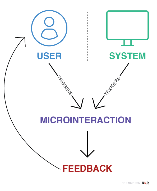
Microinteractions are small, contained product moments designed to accomplish a single task or provide feedback. Think of the “like” button on Instagram, the loading animation on YouTube, or the vibration your phone makes when toggling between modes.

They might seem insignificant, but their power lies in their ability to provide feedback, enhance usability, and inject personality into digital products.

Role in UX Design:

  • Feedback: Inform users that an action has been completed successfully (a checkmark when a form is submitted)
  • Guidance: Show users what to do next or highlight key features (animated tooltips)
  • Engagement: Create moments of delight to keep users intrigued

How Microinteractions Hold User Focus

Microinteractions work particularly well for short attention spans because they provide:

  1. Instant Feedback: Users are reassured their action has been registered. For example, a thumbs-up animation confirms a “like”
  2. Seamless Transitions: Animations such as loading skeleton screens (which mimic the layout of the actual content) make waiting feel shorter than traditional spinners
  3. Engagement Through Playfulness: A well-placed animation can surprise and delight users, creating positive reinforcement to keep interacting

Best Practices for Microinteractions in Short Attention Spans

  1. Keep It Subtle: Avoid overloading the interface with animations, they should enhance, not distract.
  2. Prioritize Speed: Ensure microinteractions are fast and efficient, aligning with the limited patience of today’s users
  3. Make Them Functional: Delightful design is essential, but utility should remain the priority.
  4. Test and Iterate: Regularly test microinteractions to ensure they’re intuitive and effective for your audience


Literature:

https://medium.com/@aemd2donchev/enhancing-user-engagement-with-advanced-micro-interactions-a-deep-dive-into-an-essential-web-d9040772f235

https://ruttl.com/blog/enhancing-user-engagement-and-satisfaction

https://uxdesign.cc/micro-interactions-why-when-and-how-to-use-them-to-boost-the-ux-17094b3baaa0

https://www.interaction-design.org/literature/article/micro-interactions-ux?srsltid=AfmBOoqKKY1EVplgrHsOAcIs2V444EiTtmizTwvCjw6biE0720ujLp3i

https://www.nngroup.com/articles/microinteractions

1.6 How AI Is Reshaping Mental Health Support

Artificial intelligence is revolutionizing mental health care by breaking down barriers like cost, stigma, and accessibility. With features like chatbots, biofeedback, and voice analysis, AI offers innovative solutions for mental health support. While AI can’t replace human therapists, its ability to complement traditional care makes it a valuable tool.

Venture capital reports reveal that mental health is the fastest-growing marketplace category, with a growth rate exceeding 200% in 2023. This surge reflects a rising demand for accessible mental health solutions as AI continues to play a critical role in meeting that need.

How AI Powers Mental Health Apps

AI-Driven Chatbots

AI chatbots provide immediate, tailored support for users in need:

  • Wysa offers CBT-based exercises and mindfulness prompts, creating a safe space for users to manage stress and anxiety.
  • Woebot adapts its conversations to users’ emotions, providing tools for real-time mental health management.
  • Cass combines emotional support and psychoeducation, offering adaptive responses that cater to individual needs.

In May 2024, Inflection AI launched Pi, a bot designed for emotional support and conversational companionship. Unlike other chatbots, Pi openly acknowledges its limitations, avoiding the pretense of being human while focusing on honest and straightforward interactions.

Wearables and Biofeedback

Wearable devices enhance AI’s ability to provide real-time insights into users’ mental states:

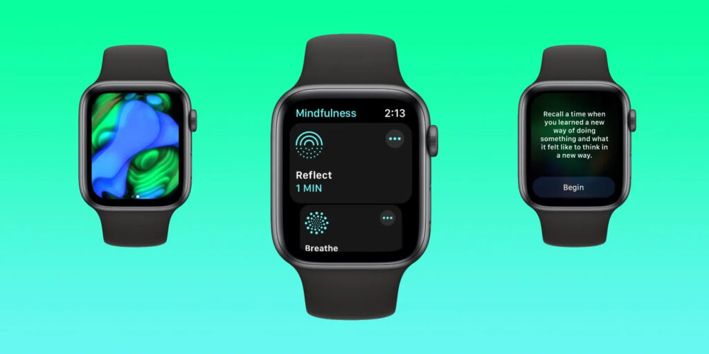
  • Moodfit and Spring Health use wearable data, like heart rate and stress levels, to deliver personalized mental health strategies.
  • Kintsugi analyzes vocal biomarkers to detect signs of anxiety or depression, offering users actionable insights based on their voice patterns.
Image Source: 9to5Mac

These integrations bridge the gap between physical and emotional health, empowering users to take control of their well-being.

Opportunities in AI Mental Health Care

AI’s advantages lie in its ability to make mental health support more accessible, personalized, and inclusive:

  • Immediate and affordable: tools like Headspace’s Ebb and Wysa provide around-the-clock support at a fraction of the cost of traditional therapy.
  • Engagement and effectiveness: a 2022 review found that AI tools could improve engagement and reduce symptoms of anxiety and depression. However, experts emphasize that AI works best as a supplement, not a substitute, for traditional therapy. As Dr. Chris Mosunic of Calm explains, “Having a human in the driver’s seat with improved therapy AI tools might be just the right blend to maximize engagement, efficacy, and safety.”
  • Personalized support: apps like Woebot and Youper adapt their recommendations to the user’s changing emotional needs, creating a more tailored experience.
Image Source: Business Wire

Challenges and Ethical Considerations

While AI offers promising solutions, it also presents challenges:

  • Limited empathy: AI tools often lack the emotional depth of human therapists, which can leave users feeling unsupported in complex situations.
  • Bias and inclusivity: non-diverse training data can lead to biased responses, potentially failing marginalized communities that rely more heavily on these tools due to systemic barriers.
  • Privacy concerns: AI tools require access to sensitive data. Apps like Talkspace use encryption to protect user information, but trust in data security remains a significant hurdle.

As these tools evolve, balancing innovation with ethical responsibility will be critical – a topic that will be explored further in upcoming articles.

Sources

  1. A. Fiske, P. Henningsen, & A. Buyx. (2019). Your robot therapist will see you now: Ethical implications of embodied artificial intelligence in psychiatry, psychology, and psychotherapy. Journal of Medical Internet Research, 21(5), e13216. https://doi.org/10.2196/13216
  2. A. Thakkar, A. Gupta, & A. De Sousa. (2024). Artificial intelligence in positive mental health: A narrative review. Frontiers in Digital Health, 6. https://doi.org/10.3389/fdgth.2024.1280235
  3. “Can AI help with mental health? Here’s what you need to know.” Calm. Accessed: Jan. 4, 2025. [Online.] Available: https://www.calm.com/blog/ai-mental-health
  4. “Meet Ebb | AI Mental Health Companion.” Headspace. Accessed: Jan. 4, 2025. [Online.] Available: https://www.headspace.com/ai-mental-health-companion
  5. P. Gual-Montolio, I. Jaén, V. Martínez-Borba, D. Castilla, & C. Suso-Ribera. (2022). Using artificial intelligence to enhance ongoing psychological interventions for emotional problems in real- or close to real-time: A systematic review. International Journal of Environmental Research and Public Health, 19(13), 7737. https://doi.org/10.3390/ijerph19137737
  6. “Rise of AI therapists.” VML. Accessed: Jan. 4, 2025. [Online.] Available: https://www.vml.com/insight/rise-of-ai-therapists

Importance of (UX-) Design in Risk communication  

Introduction 

Last September, Austria experienced a devastating flood event, highlighting the growing impact of simultaneous and systemic crises like climate change, armed conflicts, and pandemics. These events cause massive damage and disrupt lives, yet understanding and utilizing technical data to prepare for such crises often remains a significant challenge. 

To address this, the “RiskLIM” project, spearheaded by the Safety and Disaster Studies working group at Montanuniversität Leoben, aims to optimize cross-border climate services. By collaborating with organizations such as GeoSphere Austria, the German Weather Service, and the Avalanche Warning Centre, this EU-funded initiative focuses on creating actionable risk impact assessments, particularly for avalanches and snow loads. The project emphasizes bridging the gap between technical data and effective communication to better equip society for short-term hazards and long-term climate adaptation. 


Personal motivation 

As a graphic designer and content creator at the Montanuniversität Leoben, I’ve had the privilege of exploring diverse research fields, gaining valuable insights into how visual communication can simplify complex concepts. My interest in safety and disaster studies was piqued early on, particularly through discussions with the program coordinator. These conversations opened the door to integrating design into risk communication, shaping the idea of developing a master’s thesis around this critical topic. 

This intersection of research and design is incredibly compelling to me. Visual communication isn’t just about aesthetics; it’s a tool to make technical information understandable and actionable, especially in high-stress situations where clarity and usability can save lives. 


Design relevance  

Effective risk communication is more than just disseminating information; it’s about ensuring the right message reaches the right audience in a manner they can understand and act upon. Interaction design offers powerful tools to achieve this goal by simplifying interfaces, prioritizing critical information, and addressing the user’s state of mind during crises. 

For example, interactive maps can visualize real-time risk data, helping individuals and organizations make informed decisions. By employing principles of user experience (UX) design—such as clarity, accessibility, and user-centered design—these tools can transform how communities respond to emergencies. This approach aligns seamlessly with the objectives of the RiskLIM project, providing a unique opportunity to enhance risk communication through design. 


Possible Research Questions 

Since I haven’t yet gained much insight into the project and don’t know exactly in which direction it is developing, it is difficult to formulate a precise research question. That’s why I thought very generally and asked myself the following questions: 

  • How can visual design improve the accessibility and comprehension of technical data in risk communication? 
  • What role does interactive design play in facilitating community preparedness for natural hazards? 
  • How can user experience principles be adapted to meet the challenges of high-stress scenarios in risk communication? 

Expected Challenges 

Working with scientific experts: Collaboration with experts from technical fields who may not fully understand the potential of design could pose challenges. Bridging this gap will require careful communication and showcasing how design complements their expertise. Additionally, gathering feedback from diverse user groups to create universally accessible tools might demand extensive testing and iteration. 

Knowledge Gap: Gaining in-depth understanding of risk communication and technical aspects of the project may require extensive self-study. 


Next steps  

My plan to move forward: 

  1. Deepen my understanding of risk communication and its existing methodologies. 
  1. Engage with the RiskLIM project team to identify key areas where design can add value. 
  1. Develop prototypes, such as interactive maps, to demonstrate how UX design can enhance risk communication. 

Links 

The project: https://www.sds-unileoben.at/risklim-2/ 

A. Cleaveland, G. Gordon, J. Newman and S. Weber, “Designing Risk Communications,” University of California, Berkeley, Dec. 2020, doi: https://cltc.berkeley.edu/wp-content/uploads/2020/12/Designing_Risk_Communications.pdf 

Demographic Differences: Crafting Engagment for Diverse Users with Short Attention Spans

The way users engage with digital interfaces isn’t just shaped by their fleeting focus – it’s also influenced by demographic factors such as age, gender, income, education, and cultural background. Designing for short attention spans requires not only an understanding of cognitive psychology but also a keen awareness of the diverse needs and preferences of different user groups.

This blog explores the impact of demographics on UI/UX design, offering strategies for creating inclusive and effective digital experiences tailored to varied audiences.

1. Age: Designing for Generational Differences

Young Users (Gen Z and Millennials):
These groups are digital natives accustomed to fast interactions, intuitive designs, and visually engaging content. Platforms like TikTok and Instagram exemplify their preference for micro-content and gamified elements.

  • Key Strategy: Use dynamic visuals, animations, and bite-sized content. Gamification features such as badges and rewards can extend engagement without overwhelming users.

Older Adults (Baby Boomers and Seniors):
Older users often require simpler interfaces with clear navigation and larger touch targets. They value functionality over novelty and are less likely to experiment with unfamiliar features.

  • Key Strategy: Prioritize readability with larger fonts, high contrast, and intuitive design patterns. Avoid clutter, and include guided onboarding for new users.

2. Gender: Preferences in Visual and Functional Design

Gender differences can subtly influence design preferences. For example, studies show that women often prefer clean, visually appealing layouts, while men may lean toward functionality and performance-driven interfaces.

  • Key Strategy: Conduct gender-inclusive research and testing. Avoid stereotypical design choices (color-coding pink and blue), and focus on accessibility and usability for all genders.

3. Income Level: Accessibility and Aspirational Design

Users from different income brackets approach digital products with varied expectations and constraints. Lower-income users may prioritize functionality and affordability, while higher-income users might seek premium aesthetics and advanced features.

  • Key Strategy: For budget-conscious users, focus on essential features and avoid unnecessary complexity. For higher-income audiences, invest in polished visuals and personalized experiences.

4. Education: Designing for Diverse Knowledge Levels

Education shapes how users interact with interfaces, especially in terms of content comprehension and task complexity. Highly educated users may appreciate advanced tools and in-depth information, while less educated users benefit from straightforward language and guided interactions.

  • Key Strategy: Incorporate progressive disclosure, where advanced options are hidden until needed. Use plain language and visual aids to ensure clarity across all education levels.

5. Cultural Background: Localization and Cross-Cultural Design

Culture significantly influences how users process information and engage with digital products. Western users often favor minimalist aesthetics and fast-paced interactions, while Eastern users may appreciate rich, information-dense layouts.

  • Key Strategy: Localize your design for different regions by adapting color schemes, typography, and information density to match cultural expectations.

Literature:

Cross Cultural Design by Senongo Akpem

Cross Cultural Design – Nielsen Norman Group:
https://www.nngroup.com/articles/crosscultural-design

https://digital.gov/topics/usability

Age Groups: