#02 Human Senses

How do different combinations of visual, auditory, and tactile cues influence users’ ability to detect and interpret complex pattern in data?

Human Senses and Beyond

When we talk about the human senses, the classic list of sight, sound, smell, touch, and taste usually comes to mind. However, there is growing evidence that humans perceive the world through far more than these five fundamental channels. In addition to balance, proprioception (awareness of body position), and temperature sensation, researchers continue to uncover other nuanced ways in which we sense and interpret our surroundings.
https://aeon.co/videos/aristotle-was-wrong-and-so-are-we-there-are-far-more-than-five-senses

For the scope of this research, I will concentrate on sight, sound, and touch—particularly regarding how data can be represented and experienced through these modalities.


Accessibility in Design

In modern design practice, accessibility is a fundamental principle rather than an afterthought. Whether creating websites, data visualizations, or interactive installations, designers should integrate accessibility guidelines from the start. These guidelines typically include:

  • Color Contrast and Shape Differentiation
    Ensuring legibility and clarity for individuals with various visual abilities, including color blindness.
  • Alternative Text and Descriptions
    Providing alt text for images and clear labeling for data charts to support screen readers.
  • Flexible Interaction Methods
    Offering keyboard or alternate navigation modes for users who cannot interact with a mouse or touch interfaces.

Adhering to these practices benefits not just users with disabilities; it often leads to improved usability and clarity for everyone.
https://accessibility.huit.harvard.edu/data-viz-charts-graphs

Listen, Feel, Hear the Data

Sonification: Transforming Data into Sound

Definition and Rationale
Sonification involves mapping numerical data or other abstract information to audible properties such as pitch, volume, rhythm, or timbre. Its fundamental goal is to leverage the human auditory system’s sensitivity to changes in frequency and amplitude. This can be particularly useful when data contains temporal patterns or fluctuations that might be more readily perceived through sound than sight.

  • Time-Based Patterns: For datasets that evolve rapidly, detecting a small uptick or sudden dip is sometimes easier when it’s rendered as a change in pitch or tempo.
  • Parallel Processing: The brain processes auditory and visual stimuli along different pathways, so combining both channels can help distribute cognitive load.
  • Inclusive Experiences: Individuals with visual impairments or color-vision deficiencies can gain richer insights by “listening” to data, reducing reliance on purely visual cues.
Design Considerations
  1. Data-to-Sound Mapping: Deciding which data variables map to pitch, volume, or rhythmic patterns is crucial. Overly complex mappings can overwhelm users, while oversimplified mappings might convey only superficial insights.
  2. Contextual Meaning: Providing brief textual or spoken labels can clarify what changes in pitch or tempo signify, helping users build intuitive mental models.
  3. Avoiding Auditory Overload: Continuous, intense auditory cues can be fatiguing. Subtle sound cues or situational “alerts” (playing a specific note only when a threshold is crossed) often strike a better balance.

https://www.loudnumbers.net
https://datasonifyer.de/en/
https://science.nasa.gov/mission/hubble/multimedia/sonifications/


Tactile Interfaces: Feeling the Data

Definition and Applications
Tactile interfaces, often called haptic interfaces, communicate information through the sense of touch—vibrations, pressure, temperature changes, or textural shifts. This approach is notably valuable for individuals with visual or auditory impairments, but it also holds potential for creating richer, more immersive data experiences for all users.

  • Vibrotactile Feedback: Short pulses or vibration patterns can indicate specific data thresholds or events, such as crossing a predefined limit or detecting an anomaly.
  • Physical or 3D Representations: Tactile data displays can take the form of raised surfaces, 3D-printed graphs, or shape-changing interfaces. Users can literally feel the peaks, troughs, or relationships in data.
  • Thermal or Pressure Feedback: Emerging technologies allow for subtle temperature changes or pneumatic feedback. For instance, temperature gradients might mirror climate data, enabling users to “feel” environmental shifts over time.
Design Considerations

Integration with Other Senses: Tactile interfaces often work best with visual or auditory cues. Each modality can reinforce or clarify the other, fostering a more complete understanding of the data.

Tactile Resolution: Human touch has limits in distinguishing small differences in vibration frequency or texture. Designers must tailor the granularity of feedback to what users can reliably perceive.

Attention and Comfort: Continuous or intense haptic signals can lead to sensory fatigue. Designers should consider using event-based or gentle transitions to avoid discomfort.


Connecting Sensory Design and Accessibility

The overarching theme linking these ideas is that designing for accessibility often creates a more inclusive, engaging experience for everyone. This approach demands thoughtful consideration of how data is conveyed: beyond color and labels, it involves weaving together sight, sound, and touch. Whether in assistive technologies, artistic installations, or everyday data dashboards, a multisensory perspective can expand what is possible in data communication.

Level Up Your Gains: Current Landscape of Gamified Strength Training Apps

The hype around fitness and the growth of a more health-conscious generation has not only led to a rise in fitness studio subscriptions but also fitness related apps supporting users in their fitness journey.
It is not surprising that some have went beyond simply tracking progress and started gamifying your workouts. However, while the market for gamified endurance sports apps is well developed, strength training remains an area with potential. This post investigates a range of current strength training and rep-tracking apps, analyzing their strengths, weaknesses, and gaps that a gamified mascot-based strength app could fill.

1. HeroFit

HeroFit gamifies strength training by letting users level up avatars and earn rewards through workout completion. Its leaderboard and progression features encourage friendly competition and consistent use.

Where it falls short:
The app only scratches the surface of gamification and lacks more engaging content/functions which could lead to getting disinterested quickly. It’s focus on external competition may also discourage users who are not driven by rankings or social comparison. Additionally, it lacks personalized, adaptive challenges based on the user’s progress.

2. Workout Quest

Workout Quest integrates RPG-style quests, where users earn experience points and “level up” by completing exercises. The adventure-based narrative adds a fun twist to strength training.

Where it falls short:
Its gamification is mostly surface-level, with limited integration into actual workout tracking. The app could offer more robust analytics and deeper customization for different fitness levels.

3. Nerd Fitness Journey

Nerd Fitness Journey uses gamification to help users progress through fitness “missions” in a game-like format. It combines nerd culture with fitness, providing users with creative challenges tied to fandoms like Star Wars or superheroes.

Where it falls short:
While its themes are engaging, the app lacks strong rep-tracking features and strength-specific guidance. Additionally, the gamified missions often feel loosely connected to actual strength progression, making it less effective for serious lifters.

4. Treeceps

Treeceps offers a mix of workout tracking and gamified elements, encouraging users to complete strength-training workouts to progress within the game.

Where it falls short:
The app struggles to differentiate itself from competitors. Its narrative and progression systems feel underdeveloped, and it lacks unique elements that would make it stand out.

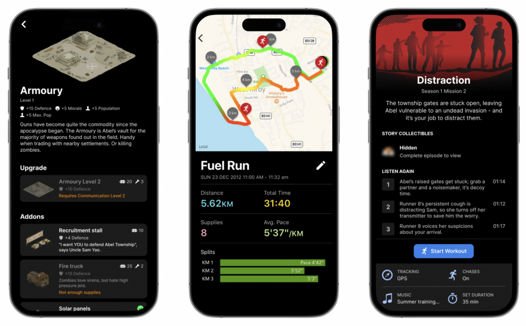
5. Zombies, Run! (Endurance Sport Example)

This app demonstrates how to create an immersive narrative experience, motivating users with a compelling storyline and rewards tied to activity.

Where it falls short (for strength training):
Zombies, Run! is heavily focused on cardio. While it succeeds in gamifying endurance training, it provides little insight for adapting similar concepts to strength workouts.

General Takeaways

Across the board, these apps face several challenges:

1. Shallow Gamification: Many apps fail to integrate gamification deeply into the workout process. Points, badges, and leaderboards are motivating but often lack a sense of long-term progression or narrative depth.

2. Lack of Personalization: Few apps offer truly adaptive systems that adjust based on user progress, fitness goals, or skill level.

3. Limited Emotional Engagement: Existing apps rarely create a personal connection with users, relying on extrinsic motivation rather than intrinsic factors like emotional investment.

The Opportunity: A Mascot Based Strength Tracking App

A Mascot-based app for strength training could fill a unique niche in this space by addressing the above gaps. Here’s how:

Deep Emotional Engagement: Users could “raise” a virtual character (like a Tamagotchi) whose progress and well-being depend on their workouts. Skipping a session could lead to setbacks for the character, creating a sense of responsibility and emotional connection.

Intrinsic Motivation: Instead of external competition, users would focus on caring for their character and watching it grow. This fosters a more personal and sustained sense of motivation.

Adaptive Progression: The app could introduce challenges and “boss battles” tailored to the user’s fitness level. For example, attempting a personal record could unlock a new stage in the game.

Story-Driven Narrative: Much like Zombies, Run!, the app could incorporate an engaging storyline that evolves as the user trains, adding depth and continuity to the gamified experience.

Conclusion

While the current offerings in gamified strength training have laid a solid foundation, they leave much to be desired in terms of depth, personalization, and emotional engagement. A Tamagotchi-inspired app could bridge these gaps, creating a new standard for gamified fitness that is both fun and meaningful. By combining interactive storytelling, adaptive challenges, and emotional investment, such an app has the potential to revolutionize how people approach strength training.

Introduction to the Research

Leveraging AR and IoT to Revolutionize Retail: A Comprehensive Introduction

1. Overview of the Project

Purpose of the Research

This research investigates how the integration of Augmented Reality (AR) and the Internet of Things (IoT) can fundamentally reshape the retail shopping experience. By overlaying digital content in physical store environments (using AR) and incorporating real-time, data-driven insights through IoT, the project aims to:

  1. Enhance Customer Engagement

• AR-based virtual product try-ons and in-store navigation.

• Immersive experiences that keep shoppers engaged and informed.

  1. Streamline Operations

• IoT-enabled personalized shopping recommendations and automated inventory management.

• Real-time inventory tracking and dynamic promotions or price adjustments.

  1. Foster a Seamless Physical-Digital Integration

• Intuitive user interfaces that merge AR and IoT data into one cohesive retail journey.

• Improved customer satisfaction and loyalty through technology-driven interactions.

Ultimately, the study will examine how intuitive interfaces and seamless integration can increase convenience, boost sales, and elevate the overall brand experience.

2. Understanding the Technologies

2.1 Internet of Things (IoT)

Definition

The Internet of Things (IoT) is a network of interconnected devices capable of collecting, transmitting, and acting upon data. Examples range from everyday consumer products (AC units, TVs, smart thermostats) to specialized sensors (smoke detectors, temperature and humidity monitors).

IoT Architecture Essentials

  1. Device Layer

General Devices (e.g., ACs, TVs, Lights).

Sensing Devices (e.g., smoke detectors, temperature, humidity, light sensors).

• These devices gather environmental data and communicate with each other through a gateway.

  1. Gateway or Aggregation Layer

• Manages data flow between devices and the Processing Layer.

• Employs protocols such as MQTT and HTTP to handle varied data formats.

• Acts as a message broker, bridging different networks and ensuring data consistency.

  1. Processing Engine or Event Processing Layer

• Processes the incoming data, performs analytics, and triggers appropriate actions.

• Stores information in databases for real-time dashboards and long-term analysis.

  1. Application Layer (API Management)

• Provides the interface (web portals, dashboards, mobile apps) for users to interact with the system.

• Handles external API calls and integrates with other services (e.g., cloud analytics platforms).

  1. Security and Identity Management

• Device managers and identity/access managers safeguard the entire ecosystem.

• Ensures data privacy, handles secure logins (OAuth2), and maintains policy control.

Why IoT Matters in Retail

Real-Time Inventory & Promotions: Retailers can monitor stock levels, adjust prices, and promote items based on real-time data.

Smart Shopping Assistance: Automated recommendations (e.g., nutritional info, expiration dates) can be pushed to customers’ devices.

Operational Efficiency: Reducing manual inventory checks and automating repetitive tasks can lower costs and free staff to focus on customer service.

Challenges in IoT

Interoperability: Multiple devices, sensors, and networks using different protocols.

Power and Bandwidth Constraints: Many IoT devices operate in low-power environments with limited connectivity.

Security & Privacy: Large volumes of data require robust security standards (e.g., ISO 30141) and compliance with data protection laws.

2.2 Augmented Reality (AR)

Definition

Augmented Reality (AR) integrates digital elements into a real-world environment, enhancing user perception via overlays on a physical space.

Types of AR

  1. Marker-Based AR

• Relies on predefined triggers (QR codes, images, or specific objects) to launch an AR experience.

• Commonly used for virtual try-ons, visualizing furniture in-home, or interactive product packaging.

  1. Markerless AR

• Utilizes GPS, sensor data, or computer vision to map surroundings in real-time, enabling more dynamic and spontaneous overlays.

• Often used for in-store navigation or advanced outdoor experiences; typically requires more complex hardware and higher computational power.

  1. Projection-Based AR

• Projects digital images directly onto physical surfaces. For retail, this could be used in interactive displays that overlay information onto products in-store.

Why AR Matters in Retail

Immersive Customer Experiences: Virtual try-ons for clothing or makeup, making it easier for customers to visualize products.

In-Store Navigation: AR can guide customers to specific products, highlight promotions, or provide additional product details.

Customer Confidence: By seeing how products look or work in real-time, shoppers are more likely to make informed purchasing decisions.

Retail-Specific AR Use Cases

Virtual Try-Ons (Fashion, Cosmetics)

One of the most common AR applications in retail is the virtual try-on feature. By using a smartphone camera or a smart mirror in-store, customers can see how clothes or makeup products look on them before making a purchase. This reduces the need for physical trials and can help customers explore different styles more quickly.

Interactive Product Demos (Furniture, Electronics)

Imagine seeing how a new coffee table or TV would fit in your living room without having to measure or rearrange furniture. AR applications allow shoppers to “place” digital models of products into their homes. This not only boosts customer confidence in the purchase decision but also cuts down on returns and exchanges.

Software Tools

Unity: A popular game engine that supports AR development through various plugins.

Vuforia: One of the first AR development platforms; integrates well with Unity for marker-based AR experiences.

ARKit (iOS) and ARCore (Android): Native AR development kits from Apple and Google, respectively. These frameworks offer markerless tracking, surface detection, and more advanced features to create realistic AR scenes.

Hardware Considerations

Smartphones: Currently the most ubiquitous AR hardware. Almost everyone has a smartphone with a camera, making AR experiences accessible to a large audience.

AR Glasses: Headsets like Microsoft HoloLens and Magic Leap provide more immersive AR experiences but remain niche due to cost and technical limitations. As these devices become cheaper and more user-friendly, expect broader adoption in retail settings—think hands-free product info while browsing store aisles.

3. Research Goals

  1. Personalized Shopping Experience

• Combine real-time IoT data with AR overlays to deliver tailored recommendations.

• Present nutritional information, expiration dates, or usage tips directly in the user’s field of view.

  1. Smart Shopping Assistance

• Provide interactive support (e.g., store maps, automated product suggestions) via AR-enabled apps or devices.

  1. Real-Time Inventory and Promotions

• Automate stock level tracking and display in-store promotions directly through AR.

• Empower retailers to push timely offers based on customer proximity or item popularity.

  1. Automated Checkout

• Minimize queues and human interaction by using IoT sensors and AR scanning capabilities.

• Enhance the checkout experience with seamless scanning of items and instant payment.

4. Methodological Framework

4.1 Data Collection

Quantitative Methods

Surveys: Gauge customer satisfaction, user adoption rates, and staff usability feedback.

Metrics: Track sales figures, AR engagement (e.g., session length, feature usage), and inventory accuracy before and after implementation.

Qualitative Methods

Interviews & Focus Groups: Collect in-depth feedback from both customers and retail staff on the usability and perceived value of AR/IoT features.

Observational Studies: Observe shopper behavior in-store to identify friction points and measure how AR/IoT interventions affect the shopping flow.

4.2 Data Analysis

Quantitative Analysis

Descriptive Statistics: Summarize average sales uplift, user engagement, and inventory discrepancies.

Inferential Statistics: Conduct regression or correlation analyses to link technology usage with sales performance or customer satisfaction levels.

Qualitative Analysis

Thematic Coding: Identify recurring themes in interviews (e.g., ease of use, perceived convenience, privacy concerns).

Member Checking: Share initial interpretations with participants to ensure accuracy and credibility.

4.3 Validity and Reliability

Triangulation: Combine multiple data sources (e.g., surveys, interviews, observation) to confirm findings.

Pilot Testing: Conduct small-scale trials of AR/IoT prototypes to refine the user interface and data collection methods.

Member Checking: Involve users and participants in reviewing preliminary results to validate interpretations.

4.4 Ethical Considerations

Informed Consent: Clearly explain the study’s purpose, benefits, and any potential risks to participants.

Confidentiality: Protect personal data through anonymization and secure storage.

Regulatory Compliance: Adhere to data protection standards (GDPR, CCPA, etc.) when dealing with user data.

4.5 Limitations

Adoption Variability: Some stores may be more technologically prepared than others, affecting consistency.

Response Bias: Survey and interview responses might not always reflect true behaviors.

Resource Constraints: The scope of the study may be limited by budget, time, and available technical infrastructure.

5. Expected Outcomes

  1. Enhanced Customer Engagement

• AR visualization makes shopping more interactive, driving increased product interaction and brand affinity.

• IoT-driven personalized offers encourage deeper connections between shoppers and retailers.

  1. Improved Operational Efficiency

• Real-time inventory management through IoT reduces stock discrepancies and optimizes restocking processes.

• Automating routine tasks enables employees to focus on higher-value interactions with customers.

  1. Increased Sales and Revenue

• AR’s ability to illustrate product features fosters higher conversion rates.

• Personalized journeys (e.g., recommendations, targeted promotions) strengthen customer loyalty and repeat purchases.

  1. Seamless Physical-Digital Integration

• Blending AR and IoT creates a unified shopping environment that minimizes friction between online and offline channels.

• User-friendly interfaces ensure smooth navigation and maintain consistent brand experiences.

  1. Scalability and Adoption Potential

• Identifying best practices for integrating AR and IoT can expedite rollout across diverse retail formats (grocery, fashion, electronics, etc.).

• The insights gained may influence broader digital transformation initiatives in the retail sector.

6. Key Challenges and Opportunities

6.1 Challenges

  1. High Implementation Costs

• AR headsets or advanced sensors can be expensive, creating barriers for smaller retailers.

• Ongoing software updates, training, and maintenance add to the total cost of ownership.

  1. Data Privacy and Security

• Personal data is central to delivering tailored experiences, making robust encryption and compliance essential.

• Potential data breaches could erode customer trust and trigger legal ramifications.

  1. Technical Integration Issues

• Merging AR and IoT systems with existing infrastructures is complex (network protocols, legacy systems).

• Requires specialized IT expertise and thorough testing to ensure reliability.

  1. Customer Adaptation

• Not all customers are familiar or comfortable with AR/IoT features; education and onboarding are crucial.

• Risk of alienating less tech-savvy shoppers if the interface is not intuitive.

  1. Dependence on Internet Connectivity

• Stable, high-speed connections are essential for real-time data exchange.

• Some retail locations may have inadequate infrastructure, leading to potential downtime or degraded experience.

6.2 Opportunities

  1. Enhanced Customer Experience

• AR delivers immersive product interactions, while IoT personalizes offers—together, they significantly boost satisfaction and loyalty.

  1. Operational Efficiency

• IoT can automate and optimize many back-end processes (inventory counts, ordering), reducing errors and labor costs.

  1. Increased Sales and Retention

• Visual demonstrations, try-ons, and personalized suggestions boost purchase confidence and encourage repeat visits.

  1. Competitive Advantage

• Early adopters gain an edge, positioning themselves as innovative, tech-forward brands.

  1. Data-Driven Insights

• Detailed analytics on shopper behavior enable informed decision-making and tailored marketing strategies.

  1. Scalability Across Sectors

• AR/IoT solutions are highly adaptable, spanning groceries, fashion, cosmetics, consumer electronics, and more.

7. Concluding Remarks

This research sets the stage for how AR and IoT might seamlessly merge to create a reimagined, future-ready retail environment. By addressing key challenges—such as cost, security, and user acceptance—retailers can unlock unprecedented levels of personalization, operational efficiency, and customer satisfaction.

The combination of robust methodology, ethical data handling, and iterative prototyping will ensure that findings are both credible and practically valuable. In the long run, scalable best practices that emerge from this work can shape industry standards, helping more retailers adopt AR/IoT ecosystems and stay competitive in a rapidly evolving market.


↬ Vergleich des Prozesses eines analogen und eines digitalen Fotos

Aufnahme des Bildes: Licht trifft auf Film vs. Sensor

  • Analog:
    • Licht passiert das Objektiv und belichtet einen chemisch beschichteten Film.
    • Die lichtempfindliche Emulsion reagiert und speichert ein latentes Bild (nicht sofort sichtbar).
  • Digital:
    • Licht passiert das Objektiv und trifft auf einen elektronischen Bildsensor (CMOS oder CCD).
    • Der Sensor wandelt das Licht in elektrische Signale um, die sofort in digitale Daten umgerechnet werden.

Hauptunterschied: In der analogen Fotografie wird das Bild durch chemische Reaktionen „gespeichert“, während es in der digitalen Fotografie als elektronische Datei erzeugt wird.


Entwicklung vs. Verarbeitung

  • Analog:
    • Der belichtete Film muss entwickelt werden.
    • Dazu wird er in chemische Bäder getaucht (Entwickler, Fixierer, Stoppbad).
    • Nach der Entwicklung entsteht ein Negativ, das dann weiterverarbeitet wird.
  • Digital:
    • Das Bild wird sofort als Datei gespeichert (z. B. JPEG oder RAW).
    • Es kann direkt auf einem Bildschirm betrachtet oder am Computer weiterbearbeitet werden.
    • RAW-Dateien ermöglichen erweiterte Nachbearbeitung, ähnlich wie die analoge Dunkelkammer.

Hauptunterschied: Die analoge Fotografie erfordert einen physischen Entwicklungsprozess mit Chemikalien, während digitale Bilder sofort verfügbar und bearbeitbar sind.


3. Speicherung und Archivierung

  • Analog:
    • Das Bild existiert physisch als Negativ oder Abzug.
    • Negative müssen archiviert werden, sind aber langlebig, wenn sie richtig gelagert werden.
    • Fotos altern natürlich (Vergilbung, Kratzer, chemische Veränderungen).
  • Digital:
    • Das Bild wird als Datei auf Speichermedien abgelegt.
    • Digitale Bilder können beliebig oft kopiert werden, ohne an Qualität zu verlieren.
    • Ohne regelmäßige Backups können sie durch Hardware-Fehler oder Format-Inkompatibilitäten verloren gehen.

Hauptunterschied: Analoge Fotos existieren als physische Objekte, während digitale Bilder von Speichermedien abhängig sind und nicht „altern“.


Bildbearbeitung & Manipulation

  • Analog:
    • Bearbeitung ist begrenzt und erfolgt in der Dunkelkammer (z. B. durch Maskierung, chemische Prozesse oder Mehrfachbelichtung).
    • Jede Veränderung erfordert handwerkliches Geschick und ist nicht unbegrenzt reproduzierbar.
  • Digital:
    • Bilder können mit Software wie Photoshop oder Lightroom umfangreich bearbeitet werden (z. B. Farbkorrekturen, Retusche, künstliche Effekte).
    • Jede Änderung ist verlustfrei speicherbar, sodass das Originalbild erhalten bleibt.

Hauptunterschied: Während analoge Bearbeitung auf physische Prozesse beschränkt ist, bietet digitale Fotografie unbegrenzte Manipulationsmöglichkeiten, was auch die Authentizität beeinflussen kann.


Betrachtung & Präsentation

  • Analog:
    • Fotos werden als Abzüge betrachtet (z. B. in Alben oder gerahmt an der Wand).
    • Das haptische Erlebnis und die physische Präsenz verstärken die emotionale Wirkung.
  • Digital:
    • Bilder werden meistens auf Bildschirmen betrachtet (Smartphone, Tablet, PC).
    • Oftmals bleiben sie in digitalen Archiven oder sozialen Netzwerken und werden weniger bewusst wahrgenommen.

      Hauptunterschied: Analoge Fotos haben eine physische Präsenz, während digitale Bilder oft flüchtig konsumiert werden.

Research on Asian Events

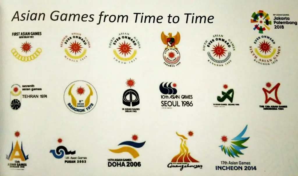
My research about major Asian events shows that similiar to the african events, most of the asian events have strong cultural roots, but often do not have a regularly changing corporate identity (CI) or logo language.

Traditional festivals such as the Lunar New Year, Holi or lantern festivals are based on stable, culturally influenced symbols that hardly change. These designs are usually timeless and traditional, with little influence from current design trends.

In contrast, events such as the Asian Games or the Asian Cup of Nations offer regularly changing logos and visual identities that reflect social trends and design developments. Modern styles, color schemes and technologies can be seen here, which are combined with the cultural diversity of the host countries.

Overall, the influence of design trends in Asia is more visible at sportive or international events, while traditional festivals and events typically retain a constant, culturally anchored design language.

Asian Cup of Nations // Logo Evolution

Asian Games // Logo Evolution

The rise of digital & it’s impact on Design

As my last research in neon-printed riso illustrations led to a dead end of my research I pivot and go straight to the source of it. A Modern Take.

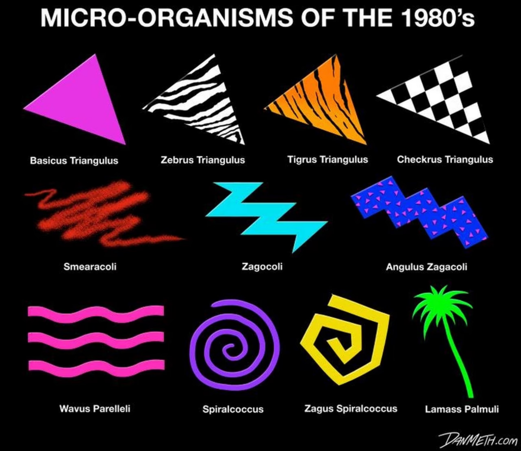
Graphic design in the 80s was bold and groundbreaking. Neon colors, sharp typography, and eye-catching designs defined the era.

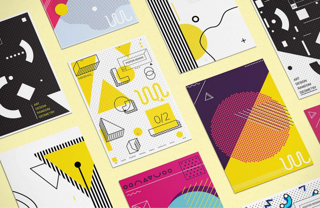
With the rise of design software, artists could create 3D images and experiment with layouts, colors, and fonts like never before. This led to a new “Deconstructive” style, using non-linear, mixed-type designs. Geometric patterns, vibrant colors, and new tech gave 80s design a futuristic feel.

The Internet of the 80s

The Internet during the decade of the 80s was still in its developmental phase. The global Internet further developed in the academic space and for commercial use in the latter half of the 80s or the data exchange via the Internet, Fidonet, USENET, and the Bulletin Board System. In 1989, Tim Berners-Lee developed the concept of the World Wide Web, which he had been developing since 1980. In 1989, the Internet and networks of most first-world countries were linked to a global system of transatlantic satellites. These were the first commercial internet services available.

However, until the early nineties, the first website ever went online. On August 6, 1991, the first website in human history went online. The website was developed and published by Tim Berners-Lee.

Graphic design for website content during the 80s was nonexistent, as no websites were online. The only aspect of the internet influenced by graphic design was the font types and graphical user interface. Graphic design for the internet was mainly used in print ads to advertise the advancements of the internet.

The first generation of personal computers

In the early to mid-80s, the first mass-produced Personal Computers were introduced. The first color displays with mid to high res resolutions were developed then.

The display with a significantly higher resolution than the previous models and a color display, the first generation of Personal Computers, opened the door to a whole new world of graphic design.

The IBM personal computer & apple

One of the most significant dates in Computer history was August 12, 1981. IBM released on this day the first mass-produced Personal Computer, the model 5150. The model significantly influenced the PC market and became the industry standard. The majority of current PCs are based on this industry standard. At that time, Apple was the only competition from a non-compatible platform for IBM. On January 24, 1984, Apple, led by Steve Jobs, introduced the Macintosh 128k.

Raster graphics & gaming / Bits vs. vectors

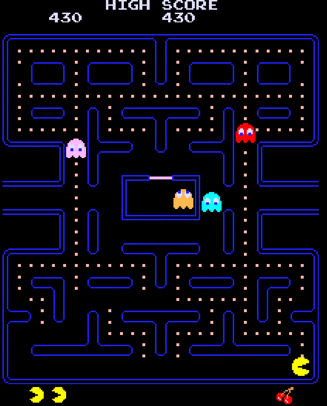
Probably the best-known visualization system is the grid graphic. A grid or bitmap graphic consists of a grid-like arrangement of square pixels. Each pixel is assigned a color; if you put them together, you get powerful, color-intensive images. However, these raster images are not scalable and appear blocky and pixelated when zoomed in.

The arcades had introduced raster graphics very early in the 80s. The spectrum of colors was not extensive (unlike today), and the color palettes were limited. Until the mid-eighties, the colors were limited to black and white and 8-bit; around 1986-87, it was possible to use 16-bit.

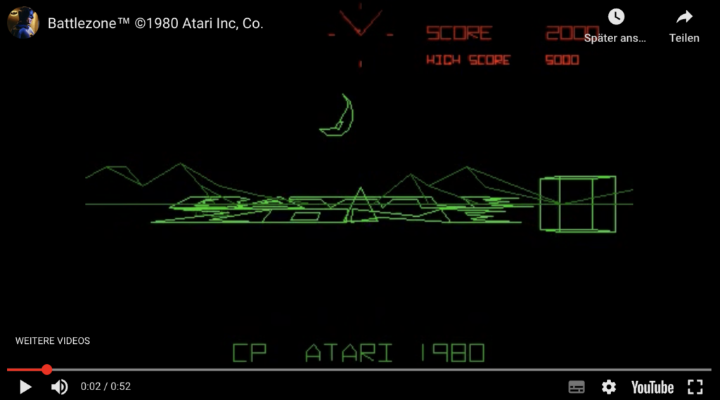
In games, vector graphics use an x, y coordinate system, like today’s designs. These systems made rotation and scaling easier. For example, tanks in Battlezone could appear more prominent as they approached due to the scaling feature. It was only possible to draw the vector outlines, but it wasn’t possible to fill the object with color at this point. You could only draw vector lines inside the object, which was only segmenting it internally but wasn’t filling the internal part of the vector shape with color.
Adobe Illustrator (AI)

Adobe started developing the Software Adobe Illustrator for the Apple Macintosh in 1985. The software was published and shipped in 1987. Adobe Illustrator was conceived as a companion product for Photoshop. While Photoshop was created for raster-based digital photo manipulation, the vector-based Adobe Illustrator was explicitly designed for typesetting and Logo Design.

The vector-based approach allowed the user to draw cúrves and adjust them with the Bézier Curve function, the perfect tool to create sharp and evenly curved lines.

The vector-based approach of Illustrator made the designs created with it infinitely scalable, contrary to the raster-based software programs.

The neon color palette

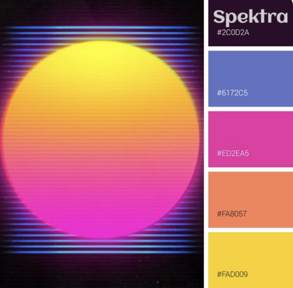
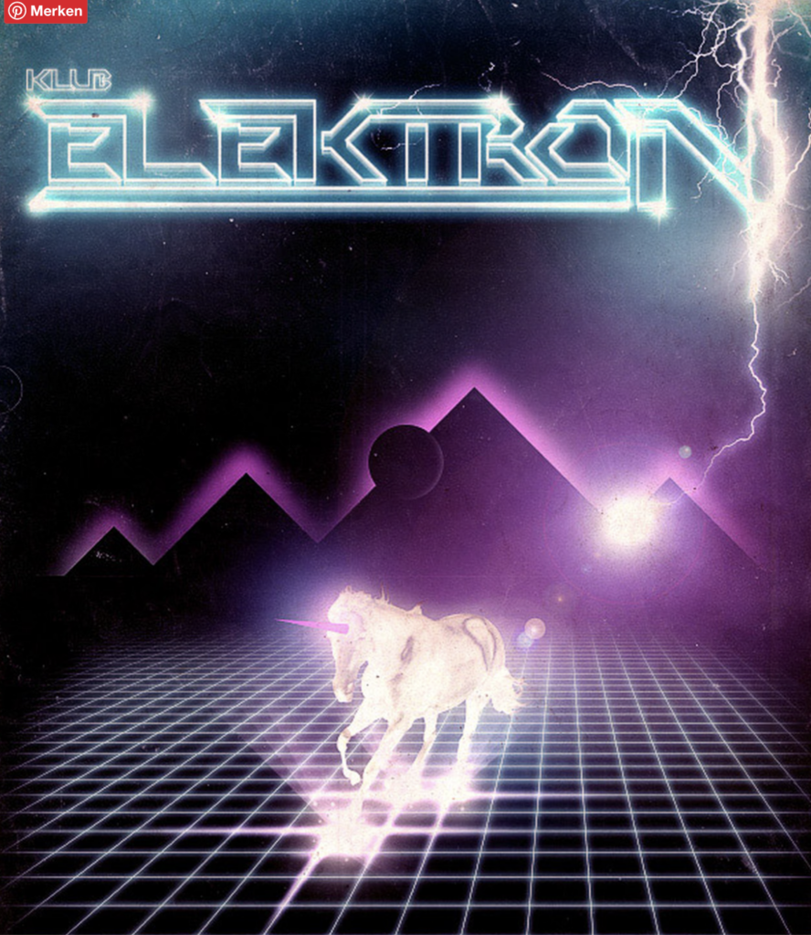
The bright colors of the 80s design styles were dominated by bold and saturated neon colors and jewel colors. The background was often kept in dark blue, dark purple, and black and contrasted with saturated neon pink, neon yellow, neon green, neon orange, and intense saturated blue and purple hues.

It is no coincidence that the palette was used primarily in the cyberpunk film genre that emerged during the 80s decade, such as Tron (1982) and Blade Runner (1982).

Interestingly, the color pendulum swung back in the decade of the nineties to a deeper, more earth-toned, and subdued palette during the grunge period.

Typography

Typography in the 80s was bold and experimental. Before the technical advancements made available in the 80s, graphic designers had to go to a typesetter and get their marketing ads, magazines and newspapers printed. These graphic designers now had a personal computer, a laser printer with new graphic design software, and layout programs, which offered many options to align and stylize their lettering in ways that weren’t possible before.

The typical bold 80s neon color palette was contrasted sharply against a pitch black or a dark blue or dark purple background, making the bold letters pop even more.

The ’80s saw a strong revival of elements of art deco in design. This was also noticeable in a bold typography. The Art Deco revival typography of the 80s was sans serif, had thick, additional strokes, and displayed strong ornamentation, angles, and curves. Hard edges and chevron patterns were omnipresent. Many 80s Art Deco-inspired typefaces use only uppercase letters, and almost all display typefaces because they are highly decorative.


During the ’80s, chrome lettering was seen everywhere: block-like, solid letters with light reflections that imitated the chrome material. In toy commercials, video games, and movies. The look reflected advanced technology and progress, the euphoric look to the future because that is what the 1980s advertising wanted to convey, progress and the excited anticipation of the future.

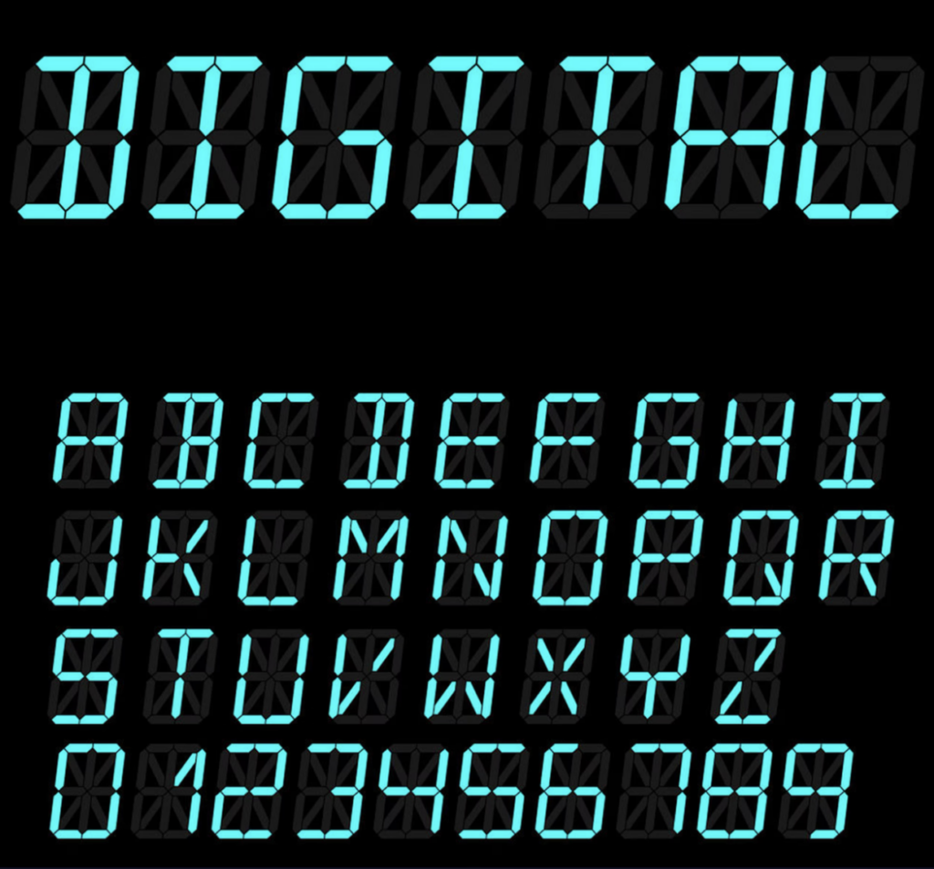
LCD digital fonts were all the rage during the 80s decade. The digital aspect of the font rode the wave of the 80s enthusiasm for all things progress and future related. The popularity of this font type symbolized the switch during the 80s from classic analog to digital watches.

The 80s pastel colors

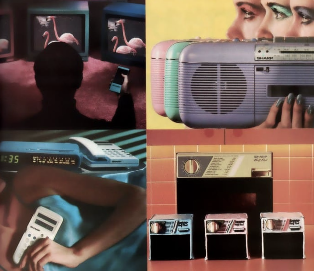
Another prominent 80s color trend was pastel colors. Especially during the early 80s, the pastel color trend peaked, and the intense neon color palette later contrasted with the pastel color palette in the mid-to-late 80s.

It was a more subdued look than the bold neon palette. The focus was on softness and delicacy instead of progress and technology. One of the favorite patterns to combine with the pastel trend was flowers. Especially in interior design, the pastel trend was initiated by the home decors of Laura Ashley. The color mauve was one of the most popular colors.
The movement for pastel colors, especially pastel pink combined with a pastel turquoise, was further initiated in the 1980s television series Miami Vice. The series paved the way for pastels in men’s fashion.

Bold Colors & Gradients: Bringing the 80s Back to Life

Most aesthetics of a particular decade often return in cycles, and retro designs are pick and further develop with a twist. In marketing, the term nostalgia marketing was coined. Especially the 80s nostalgia trend was targeting early millennials, as this decade represented their mostly analogous childhood. In this pre-internet time, you came home and watched MTV or played a heavily pixelated video game with a repetitive soundtrack.

But in 2024, it’s crucial to consider color psychology and accessibility. Understanding how colors evoke emotions and ensuring sufficient contrast for visually impaired users is essential. Instead of simply mimicking loud color palettes, designers can use bold hues strategically to create focal points or guide the user’s eye. Gradients can also be employed subtly to add depth and dimension to a design.

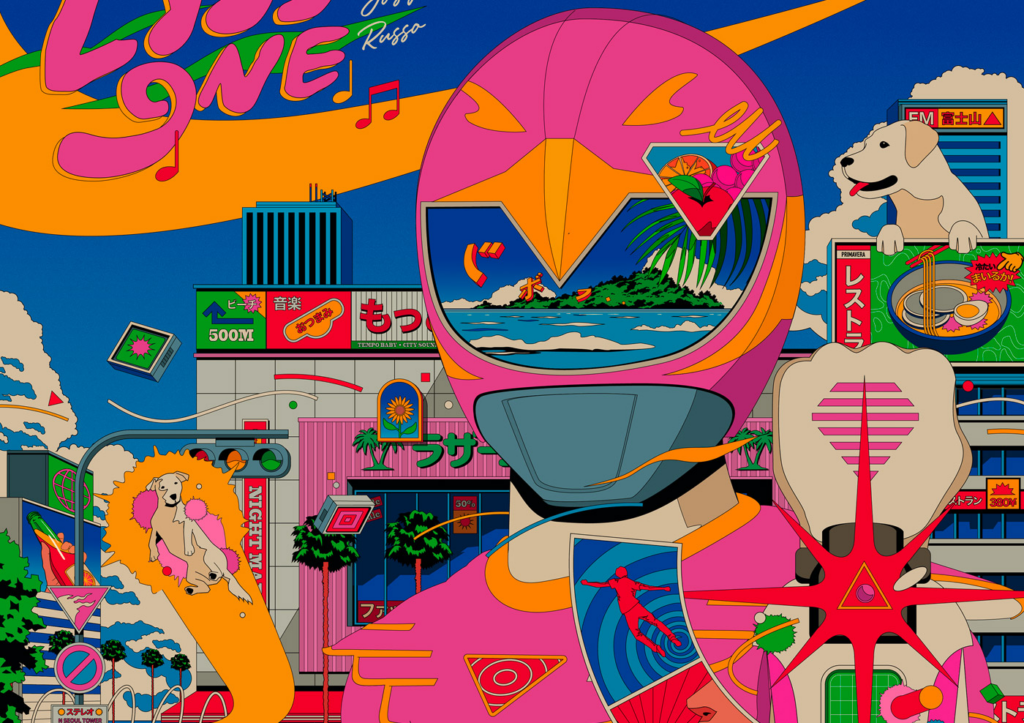
The influence of 80s design isn’t limited to theory. Here are some real-world examples of how contemporary designers are remixing 80s aesthetics for a modern audience:

Stranger Things

The 80s craze suddenly perked up again with the launch of the super successful Netflix series Stranger Things. The series plays during the 1980s and is about a group of American teenagers confronted with supernatural forces. Almost all the posters paid homage to the classic 80s sci-fi blockbuster poster design during the Netflix marketing campaign for the series.

Conclusion

The enduring appeal of 80s graphic design lies in its boldness, playfulness, and ability to evoke emotions. By understanding the core principles of this era and reinterpreting them for a modern audience, designers can create visuals that are both nostalgic and fresh. So next time I am brainstorming design ideas, I will take a trip down memory lane and see how the 80s can inspire my next creative.

Resources

03 Informal survey

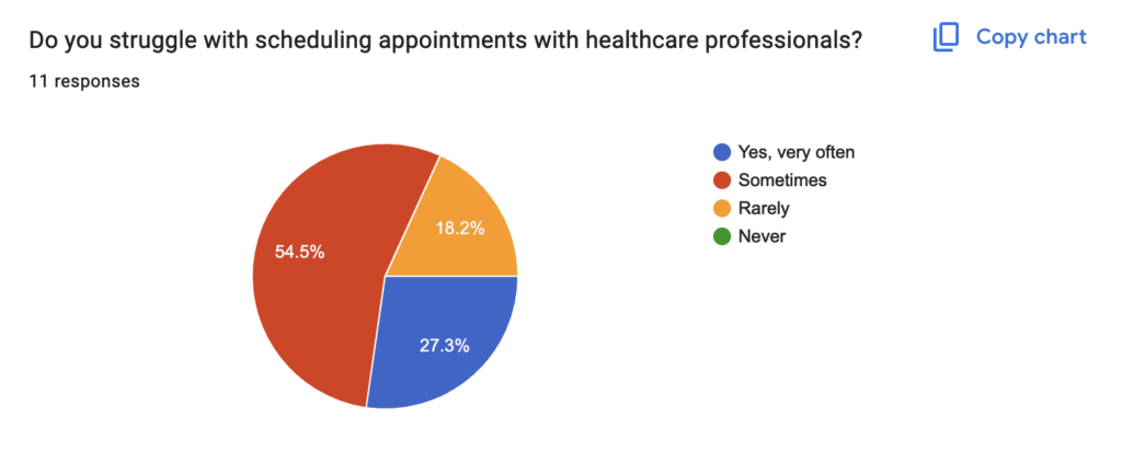
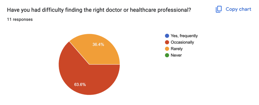
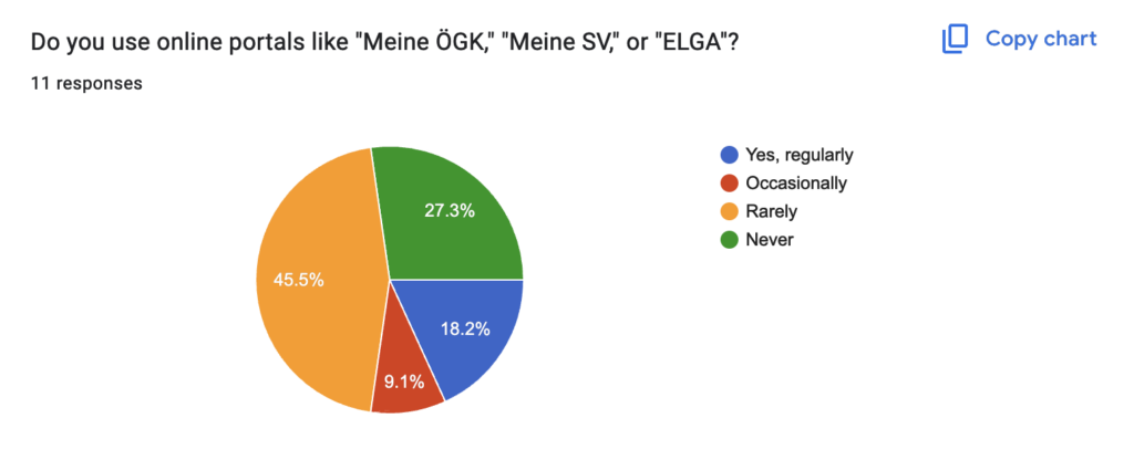
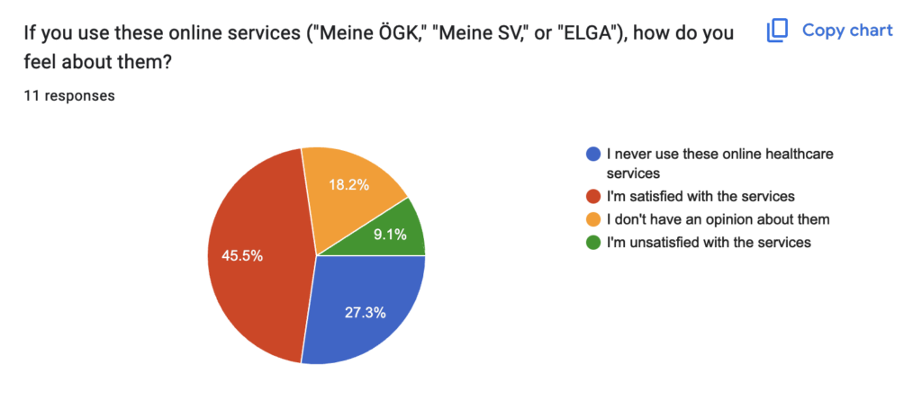
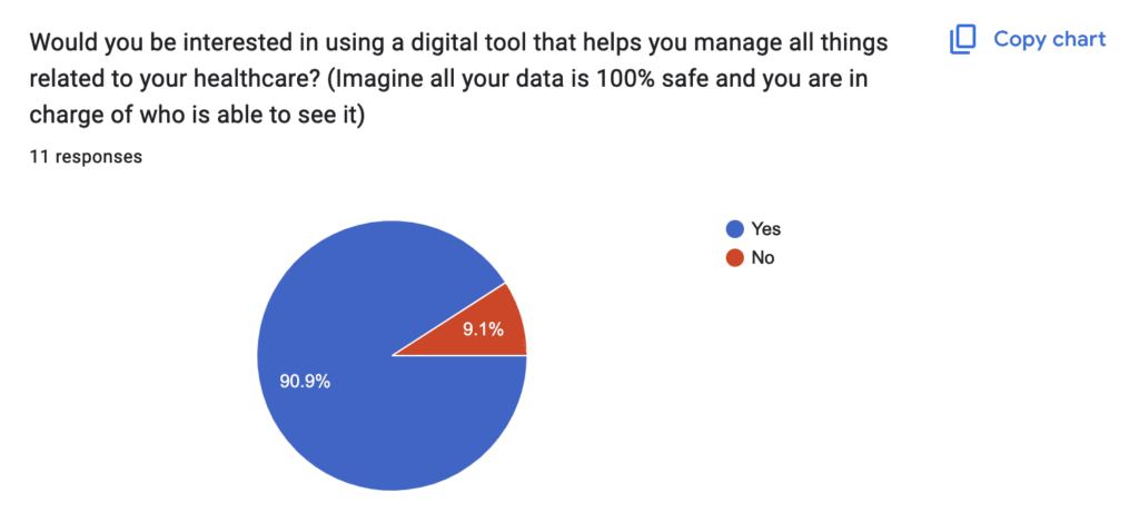
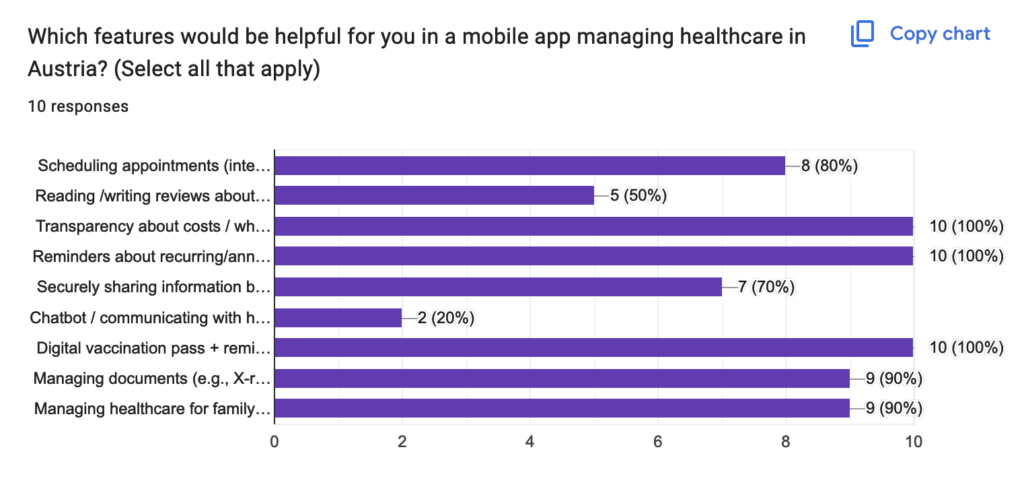
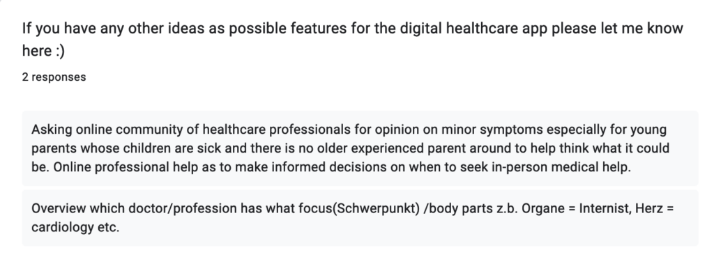
Before the Christmas break I created a quick survey to determine whether the people in my bubble share similar frustrations with current digital healthcare solutions. It’s not a highly scientific study; rather, I’m gathering ideas and seeking confirmation that there’s room for improvement in the digital health sector.

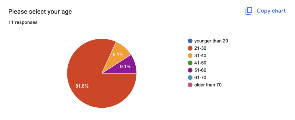
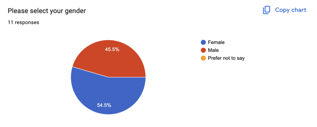
I received 11 responses and learned that many people may not engage with questionnaires, even short ones. Maybe it was also due to the holidays and people were busy eating cookies. For my official survey, I’ll need to reach out to a larger audience or focus on obtaining quality data rather than just quantitative results. If you’re reading this and would like to contribute, you can participate in the questionnaire by following this link. It only takes 5 minutes 😉 https://forms.gle/rSiXXLivi6TypXwUA

Results

Below you will find screenshots of the results.

In conclusion, this informal questionnaire has served as a valuable test run, providing insights into what I need to consider for the official round as I move closer to completing my thesis.

#2 Letter combinations in ABC Learning Cards

Integrating word combinations into the ABC learning cards is highly beneficial. It reinforces the alphabetic principle, enhances phonemic awareness, builds word recognition, supports spelling and writing development, provides contextual learning, and allows for a gradual increase in complexity. These elements collectively contribute to a robust foundation in early literacy.

For practical implementation, starting with simple consonant-vowel-consonant (CVC) words (e.g., cat, dog) and gradually introducing more complex combinations as children’s skills develop.

1. Reinforcing the Alphabetic Principle: The alphabetic principle is the understanding that letters and letter patterns represent the sounds of spoken language. Introducing simple word combinations helps children grasp this concept by demonstrating how individual letters blend to form words. This foundational understanding is crucial for reading development.

2. Enhancing Phonemic Awareness: Phonemic awareness—the ability to recognize and manipulate individual sounds in words—is vital for reading success. By including word combinations, children practice blending sounds, which strengthens their phonemic skills and aids in decoding new words. 

3. Building Word Recognition Skills: Exposure to common word families (e.g., cat, bat, hat) through combinations enables children to recognize patterns, facilitating quicker word recognition and improving reading fluency. This pattern recognition also supports spelling skills by highlighting common letter combinations. 

4. Supporting Spelling and Writing Development: Understanding how letters combine to form words lays the groundwork for spelling and writing. Children learn common letter patterns and word structures, which they can apply in their writing, enhancing their overall literacy skills. 

5. Providing Contextual Learning: Presenting letters within the context of words offers meaningful learning experiences. Children see practical applications of letters, making learning more engaging and relevant, which can boost motivation and retention.

6. Gradual Increase in Complexity: Introducing word combinations allows for a structured progression from simple to more complex concepts. Starting with single letters and advancing to word combinations aligns with educational best practices, ensuring children build on their knowledge systematically.

Combinations:

1. Single Letters (Essential)

  • Purpose: Build foundational recognition and sound association for individual letters.
  • Implementation: Each card focuses on one letter with a matching word and image.
  • Example:
    • Card for “A”: Big “A/a,” picture of an apple, and the word “apple.”

This is the most crucial step for beginners and forms the basis for more advanced combinations.

2. Word Families (Highly Useful)

  • Purpose: Help children recognize patterns in rhyming words and understand sound consistency.
  • Implementation:
    • Include common word families as part of an activity set (on the back of the cards or as an extension).
    • Highlight the shared ending sound (e.g., “-at”).
  • Examples:
    • “-at” family: cat, bat, hat.
    • “-op” family: hop, mop, top.

Word families are great for introducing patterns, even if your primary focus is still the alphabet.

3. Simple Words (CVC Words – Good Addition)

  • Purpose: Introduce blending of letters into short, easy-to-read words.
  • Implementation: Include examples of CVC words associated with the letter on the card.
  • Examples:
    • For “C,” you could show the word “cat.”
    • For “D,” include “dog.”

This reinforces the idea that letters form words and connects letters to phonemes.

4. Vowel-Consonant (VC) and Consonant-Vowel (CV) Words (Optional)

  • Purpose: Begin with short words to build phonemic confidence.
  • Examples:
    • VC: at, in, on, up.
    • CV: me, no, go.

These can be introduced later but aren’t essential in the earliest stages.

5. Consonant Digraphs (Introduce Later)

  • Purpose: Teach that some letter pairs create unique sounds.
  • Examples: ch (chip), sh (ship), th (that).

Digraphs are better suited for a more advanced stage once children are comfortable with basic letters and sounds.

6. Consonant Blends (Introduce Later)

  • Purpose: Teach blending of two or more consonants where each retains its sound.
  • Examples: bl (blue), tr (tree), st (stop).

Similar to digraphs, blends can be introduced in a follow-up set once children master single letters.

7. Silent Letters, Long Vowels, and Advanced Combinations (Skip for Now)

  • Examples:
    • Silent letters: kn (know), wr (write).
    • Long vowels: bake, kite, hope.
    • Complex combinations: eigh (eight), ough (though).

These are too advanced for beginner ABC learning cards and are better suited for advanced phonics resources.

Sources:

Reading Rockets. (n.d.). The alphabetic principle and its role in reading. Retrieved January 8, 2025, from https://www.readingrockets.org/topics/phonics-and-decoding/articles/alphabetic-principle

HMH Blog. (n.d.). What is the alphabetic principle? Retrieved January 8, 2025, from https://www.hmhco.com/blog/what-is-the-alphabetic-principle

The Fidget Game Blog. (n.d.). Word families and their importance in early literacy. Retrieved January 8, 2025, from https://www.thefidgetgame.com/blogs/blog/word-family

LS #6 Pink for Girls, Blue for Boys: Are We Still Stuck in the 1950s?

Stereotypes in graphic design are deeply ingrained assumptions that shape how visual elements are used to convey meaning. These stereotypes often reflect societal norms and expectations, influencing how audiences perceive design and the messages it communicates. From colors and typography to imagery and layout, these elements can reinforce outdated gender roles or cultural biases, limiting creativity and inclusivity. Below are some common examples and aspects of stereotypes in graphic design and their implications.

Color

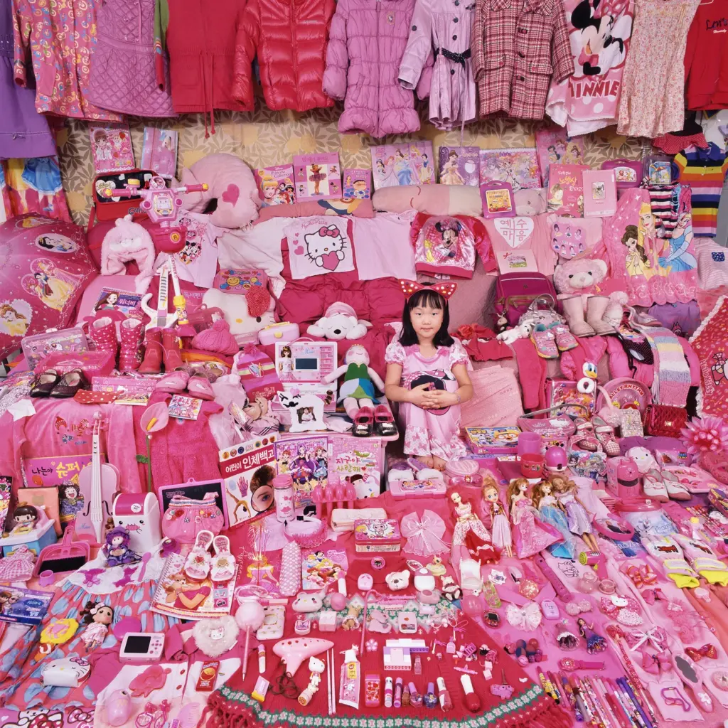
Color is one of the most universal tools in graphic design, but its use is often bound by stereotypical associations. For instance, pink is commonly assigned to femininity and used in products targeted at women, while blue is linked to masculinity and dominates designs for men.


This clear difference is especially noticeable in children’s marketing, where girls’ toys are packaged in pastels and boys’ toys use bright primary colors. These choices not only limit creative freedom but also reinforce societal expectations about gender from a young age (Horne, 2019).

What is the History of this bold and definite color differences for girls and boys? It was even once advertised the reversed way. In 1918 the trade publication Earnshaw’s Infants’ Department it was said that the “generally accepted rule is pink for the boys, and blue for the girls. The reason is that pink being a more decided and stronger color, is more suitable for the boy, while blue, which is more delicate and daintier, is prettier for the girl.” (Grannan, 2016).

After World War II, the association of blue with boys and pink with girls became more widespread, influenced by changing gender norms and growing consumerism. Marketing played a key role, with companies using color to distinguish products for boys and girls. By the 1950s, blue was linked to strength and masculinity, while pink was tied to softness and femininity, reflecting traditional family roles of the time (PBS Digital Studios, 2018).

Typography
Typography significantly influences design aesthetics, with certain fonts traditionally associated with specific genders. Curved, script-like, or handwritten fonts are often labeled as “feminine,” suggesting elegance or delicacy. In contrast, bold, angular, and blocky fonts are deemed “masculine,” symbolizing strength or authority. This classification is evident in various industries (Fernández, 2015):

  • Beauty Brands: Companies frequently use ornate, decorative fonts to appeal to a female audience, reinforcing traditional notions of femininity.
  • Sports and Automotive Brands: These sectors typically employ heavy, geometric typefaces to convey masculinity and power.

Such typographic conventions perpetuate narrow definitions of gender, often overlooking the diverse preferences of audiences. By adhering to these stereotypes, designers may inadvertently reinforce outdated gender norms, limiting creative expression and failing to engage a broader, more inclusive audience (Wong, 2021).

Challenging these conventions can lead to more inclusive and innovative design practices that resonate with a wider demographic. Marie Boulanger (2021) explains that the perceived femininity or masculinity of a font has nothing to do with its physical aspect, a little to do with its name, but “everything to do with a third gender marker – usage”. By moving beyond traditional gendered typography, brands can better reflect the diversity and complexity of their audiences.

But Typography does not only reinforce stereotypes in regard to gender roles, but some typefaces nowadays are exclusively used with a stereotypical connotation of a culture or country. When you think of a restaurant selling Chinese Food, I bet you have an exact image of a font (which is very likely part of the Logo). Same goes for Japanese or African shops/ items/ music etc.

 The “African” Typeface Neuland is often used for anything that has exotic, adventurous, jungle or ethnic attributes like for example the Lion King Posters, Madagascar Movies or even the American Spirits Logo (Graphéine, 2020).

Originally, the font has nothing to do with Africa as it was created by German Designer Rudolf Koch with the purpose of modernizing Typefaces in Germany for Display and Advertisements (Giampietro, 2004).

This kind of stereo typography is discriminating as it can produce Cultural Oversimplification (by summarizing a whole continent with different countries, cultures and languages with one typeface, the vast diversity of the continent goes missing and it supports the idea, that ‘all Africa is the same) and Cultural Appropriation (By linking the font to the African culture, it can reinforce the stereotypes of Africa being untamed, a tribal culture and primitive, which strips away the deeper meaning and complexity of all the cultures).

Imagery and Iconography
The imagery used in graphic design often carries stereotypical associations that dictate how products or messages are perceived. Designs targeting women frequently include motifs like flowers, hearts, or butterflies, projecting ideas of softness or care. On the other hand, male-oriented designs might incorporate industrial symbols like gears or vehicles, emphasizing utility and toughness. This binary approach reduces people to simplistic roles and misses the opportunity to create designs that resonate across different identities. A study by Dimaandal and Espineda (2023) researched how toy packaging differentiates between toys for boys or girls. The results align with the described above; Girls toys often displayed icons and Imageries like Unicorns, princesses, fashion, flowers, or animals while Boys Toys showed sports, dinosaurs, fight scenes, heroes, tools, science or police.

As an example the picture above, the toy is basically the same but it is advertised completely different. The ‘Diamond Ring Rattle is “for a sweet baby girl” wile the hammerin’ Rattle is “for a busy baby boy”. Also, hard to miss is the iconography, the girls version is full of flowers, hearts and a crown – all in pink of course- while the boys version is yellow and blue using simple icons like dots and circles.

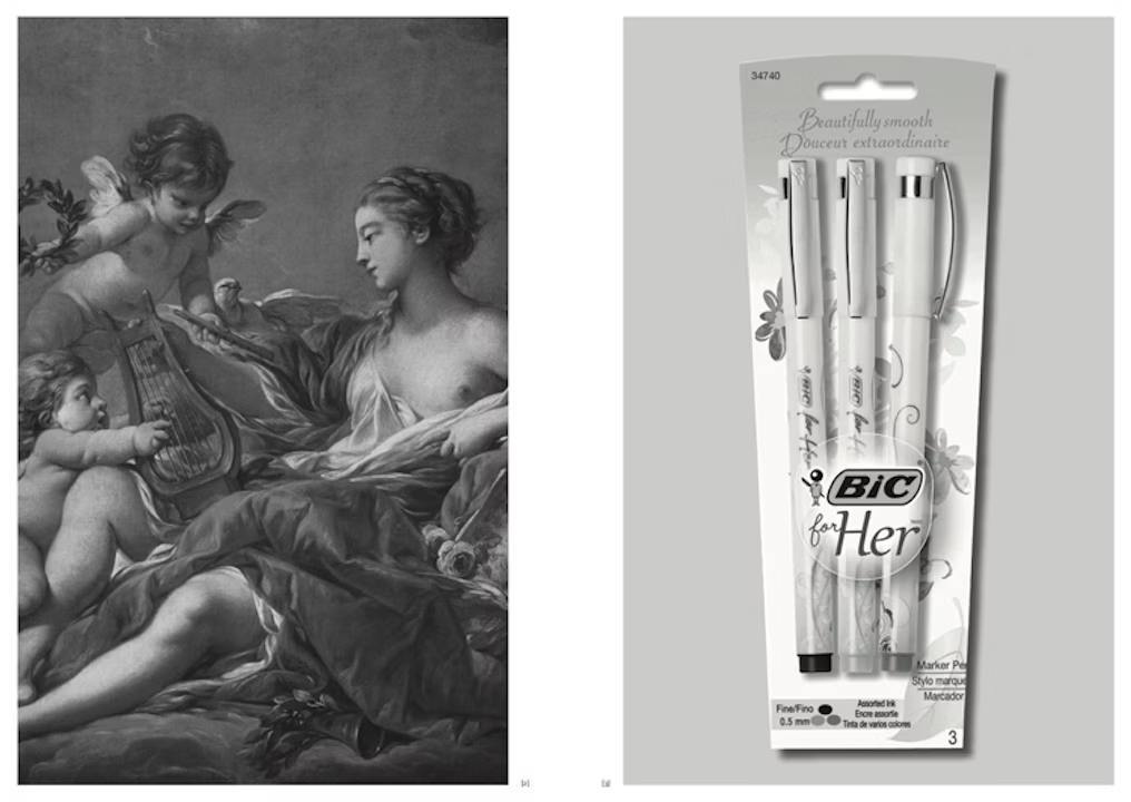
Another quite hilarious example is the picture below, an advertisement for a bic pen for women ‘for her’. It was a campaign and product published in 2012 earning a lot of backlash and critic, as it should. The only thing different to a ‘normal’ bic pen is the iconography on the pen, flowers and flowy llines (Vinjamuri, 2012).

Layout and Composition
The way elements are arranged in a design can also reflect stereotypes. Feminine designs often feature soft, organic layouts with flowing lines and asymmetry, evoking a sense of approachability or emotion. Masculine designs, in contrast, tend to favor structured, grid-based compositions with sharp edges, conveying order and control. For example, advertisements for personal care products might use a light, airy composition for women and a solid, rigid layout for men. These stylistic choices reinforce traditional notions of gender, limiting how designs can connect with broader audiences.

Example of Gilette Advertisements: On the left is for men with straight lines, bold colors and bold – sans serif fonts, on the right the contrast for women, pastel colors, flowy lines and the fonts are thin and flowy as well with an often high contrast (Tempesta, 2019).

Sources

Boulanger, M. (2021, May 3). XX, XY : Sex, Letters and Stereotypes. Kickstarter. https://www.kickstarter.com/projects/xx-xy/xx-xy-sex-letters-and-stereotypes

Dimaandal, R. J. H., & Espineda, M. N. (2023). Gender-Inclusive Children’s Toy Package Design: An Alternative Approach to Gender-Neutral Design Based on Children’s Perceptions. Archives of Design Research, 36(4), 141–161. https://doi.org/10.15187/adr.2023.11.36.4.141

Fernández, N. (2015, November 19). It Ain’t Necessarily So. It Ain’t Necessarily So. https://itaint-necessarilyso.squarespace.com/articles/2015/11/17/stereotypes?utm_source=chatgpt.com

Giampietro, R. (2004). Lined & Unlined · New Black Face: Neuland and Lithos as Stereotypography. Linedandunlined.com. https://linedandunlined.com/archive/new-black-face/

Grannan, C. (2016). Has Pink Always Been a “Girly” Color?. In Encyclopædia Britannica. https://www.britannica.com/story/has-pink-always-been-a-girly-color

Graphéine, T. (2020, February 2). Stereotypography: typical, even racist, typefaces. Graphéine – Agence de Communication Paris Lyon. https://www.grapheine.com/en/graphic-design-en/stereotypography-typefaces-racist

Horne, L. (2019). The Evolution of Stereotypical Color-Coded Childhoods. Wired. https://www.wired.com/story/color-coded-childhoods-photo-gallery/

PBS Digital Studios. (2018). Origin of Everything | Why was Pink for Boys and Blue for Girls? | Season 1 | Episode 19. Www.pbs.org. https://www.pbs.org/video/why-was-pink-for-boys-and-blue-for-girls-6ikwzr/

Tempesta, E. (2019, January 16). Gillette slammed over “pink tax” in the wake of controversial ad video. Mail Online. https://www.dailymail.co.uk/femail/article-6596095/Gillette-slammed-pink-tax-wake-controversial-ad-campaign.html

Vinjamuri, D. (2012). Bic For Her: What They Were Actually Thinking (As Told By A Man Who Worked On Tampons). Forbes. https://www.forbes.com/sites/davidvinjamuri/2012/08/30/bic-for-her-what-they-were-actually-thinking-as-told-by-a-man-who-worked-on-tampons/

Wong, H. (2021, May 25). Why gender stereotypes in typefaces can stifle creativity. Design Week. https://www.designweek.co.uk/issues/24-30-may-2021/why-gender-stereotypes-in-typefaces-can-stifle-creativity/?utm_source=chatgpt.com

Verzerrungen und unrealistische Bewegungen in Animation


Verzerrungen? Warum wie was?

Ein häufiges Problem bei Animationen – vor allem in der Charakter-Animation – ist es, dass Bewegungen nicht flüssig genug erscheinen. Woran liegt das? Bei der Analyse von Live-Action-Filmen fällt einem dann vielleicht auf, dass es bei schnellen Kopfbewegungen zu einem “Unschärfe-Effekt” kommen kann – sogenanntem Motion Blur. (Vgl. Deja 2018)

Grumpy by Bill Tytla.

In der traditionellen Animation von beispielsweise Disney – die meist mit scharfen Konturen und flächigen Farben arbeiten – würden die Animationen ohne Verzerrungen steif wirken, weshalb, wie im Bild oben (aus einer Szene mit Grumpy, die von Bill Tytla animiert wurde) die grenzen der Verzerrung ausgetestet wurden um die Bewegungen fließend erscheinen zu lassen. Wichtig ist dass diese Verzerrungen nicht von den Zuschauer:innen als solche wahrgenommen werden, weshalb sie nur einen einzelnen Frame lang sein dürfen.Wäre die Verzerrung für zwei Frames sichtbar, würde die Illusion zerstört werden. (Vgl. Deja 2018)

Bewegungsverzerrung (Motion Blur)

Manch eine:r kennz den Motion-Blur Button in Aftereffects oder Premiere. Motion Blur, zu deutsch Bewegungsunschärfe, ist ein visuelles Phänomen, dass dann aufkommt, wenn sich Objekte schneller bewegen, als das Auge oder die Kamera erfassen kann – also wenn sich ein Objekt während der Belichtungszeit bewegt. In der Animation – welche aus statischen Bildern besteht – fehlt diese natürliche Unschärfe, wenn man sie nicht bewusst künstlich hinzufügt, um die Realität zu simulieren. (Vgl. Autodesk o.D.)
Mit moderne Hard- und Software ware ist es möglich, „per-Pixel- oder per-Objekt-Unschärfe“ auf einzelne Elemente anzuwenden. Die Entwicklung im Bereich KI könnte diesen Prozess weiter automatisieren. (Vgl. Autodesk o.D.)

Vorteile der Bewegungsunschärfe

  1. Realitätsnähe: Motion Blur passt deine animierte Szenen besser an die natürliche Wahrnehmung des Menschen an.(Vgl. Autodesk o.D.)
  2. Vermeidung von Ruckeln: Ohne Unschärfe wie dem Motion Blur wirken Übergänge zwischen Frames abrupt und unnatürlich – so wird die Animation flüssiger (Vgl. Autodesk o.D.)
  3. Fokussierung: Unschärfe wird gezielt genutzt, um die Aufmerksamkeit auf bestimmte Stellen zu lenken und andere abzudecken oder davon abzulenken. (Vgl. Autodesk o.D.)

Animationsprinzipien:

Ein paar Arten der Verzerrung haben wir in diesen Blogbeiträgen schon kennengelernt, nämlich im Rahmen der Animationsprinzipien!
Kurz zur Wiederholung – und im Sinne der vollständigen – jene Prinzipien in denen Verzerrung am deutlichsten angewendet wird:
Squash and Stretch: Hier werden Bewegungen durch Dehnen und Strecken dargestellt, um Gewicht und Flexibilität darzustellen – z.B. ein Charakter springt, wird beim Aufprall zusammengedrückt und dann gedehnt. (Vgl Adobe o.D.)

Exaggeration: Die Übertreibung verstärkt die Bewegungen über das Realistische hinaus und erzeugt humorvolle oder dramatische Effekte – z.B. ein extrem dehnbarer Arm bei einem schnellen Schlag. (Vgl Adobe o.D.) Auch bei Bewegungen und Verzerrungen wie oben besprochen gilt ein bisschen Übertreibung als wichtig, um die Bewegungsunschärfe zu ersetzen.

Arcs (Bögen): Laut den Animationsprinzipien folgen viele unserer Bewegungen unsichtbaren Bögen – im Sinne von Bewegung darf man diese zur Verzerrung nutzen und sogar brechen, um den Effekt zu unterstreichen. (Vgl Adobe o.D.)

Im Zuge der Übertreibung möchte ich noch einmal näher auf physikalisch unmögliche Bewegungen eingehen
In der Animation werden oft Bewegungen gezeigt, die physikalisch nicht möglich sind. Diese „unmöglichen“ Bewegungen sind in der Regel übertrieben oder verzerrt, um eine emotionale oder visuelle Wirkung zu erzielen. Es wird genutzt um durch die übertriebene Darstellung Humor und Dramatik zu erzeugen.Hier lässt sich die Begründung beispielsweise wieder im Animationsprinzip der Übertreibung finden. (Vgl Adobe o.D.)

Quelle: Disney Pocahontas, https://www.youtube.com/watch?v=MuqDDwvlW1s

Betrachtet man Disney Animationen fällt diese Übertreibung auch auf, indem die Figuren sich offensichtlich unnatürlich bewege und auffällige Bewegungen vollziehen. Diese Bewegungen brechen bewusst die Physik um den Eindruck von Energie und Dynamik zu vermitteln. (Vgl. Adobe o.D.)


WB Kids Looney Tuesdays, https://www.youtube.com/watch?v=LD2t-xk-gwM

Eine „alte“ oder auch alternative Form des Motion Blurs sind Smear Frames:
Smear Frames

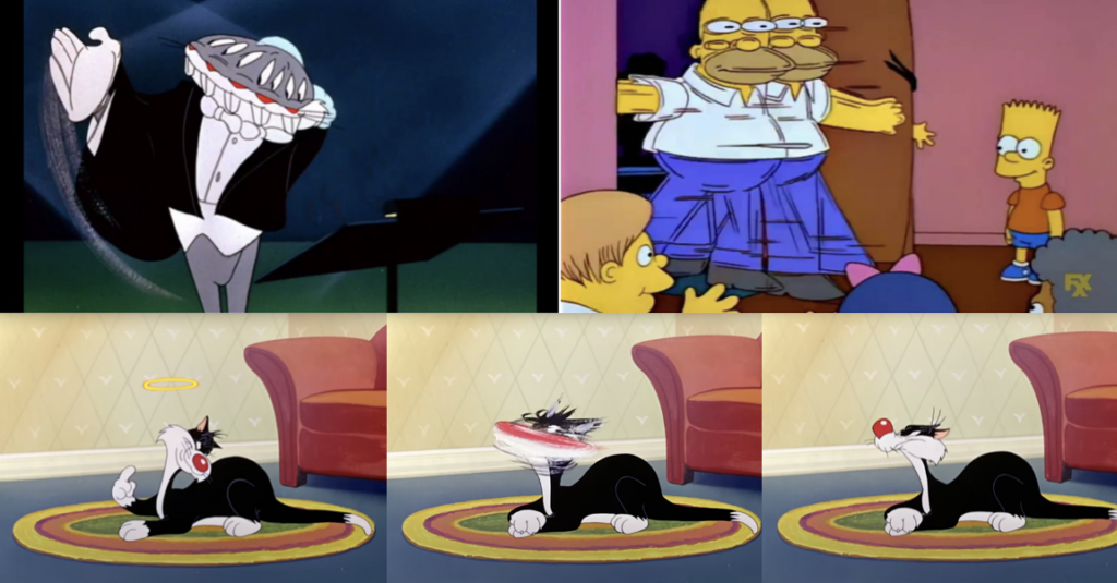
Smear Frames sind ein Stilmittel, um schnelle und dynamische Bewegungen in der Animationen darzustellen. Ein Smear Frame ist ein einzelner Frame, der Bewegung durch eine Übertreibung oder Verzerrung eines Elements unterstreicht. Die Beispiele zeigen wie sich ein Charakter innerhalb eines Frames verzerrt, was den Zuschauer:innen unbewusst dabei hilft, die Bewegung wahrzunehmen. (Vgl. Dupre 2024)

Quelle: Looney Tuesdays, https://www.youtube.com/watch?v=LD2t-xk-gwM, Die Simpsons


Der häufigste Einsatz von Smear Frames ist die Simulation von Bewegungsunschärfe, die mit der Kamera aufgenommen wird, wenn schnelle Bewegungen eingefangen werden – also ein Motion Blur (Vgl. Dupre 2024)

Warum Animator:innen Smear Frames verwenden

Quelle: Spider-Man Into the Spider-Verse

 Smear Frames kommen ursprünglich aus der traditionellen 2D-Animation, sind aber auch in anderen Animationsarten weit verbreitet, wie z.B. in der 3D-Animation. Ein besonderes Beispiel ist Spider-Man: Into the Spider-Verse, denn hier verwendetenAnimator:innen Smear Frames besonders deutlich, um das Comic-Gefühl zu imitieren. Smear Frames betonen den Bewegungsweg eines Objekts und sorgen für flüssige Übergänge zwischen Szenen, Posen oder Aktionen. (Vgl. Dupre 2024)

Es gibt zwei Haupttechniken für Smear Frames nach Dupre

Multiple Smears: Hierbei wird das Subjekt entlang seiner Bewegungsbahn dupliziert und leicht unscharf gemacht, um eine schnelle Bewegung zu simulieren, siehe Looney Tunes.
– Elongierte Zwischenbilder: Dabei wird das Element in einem oder zwei Frames überdehnt, um die Bewegung zwischen zwei Key-Posen zu verdeutlichen, siehe Naruto.

Quelle: Naruto; Looney Tuesdays;


Die Technik von Smear Frames wird allerdings immer seltener, da verschiedene Programme inzwischen automatisch Motion-Blur nachahmen können. Neuere Animationsproduktionen, wie bei Spider-Man: Into the Spider-Verse, nutzen Smear Frames, um einen „Retro-Look“ nachzuahmen. (Vgl. Dupre 2024)

Quellen:

Adobe o.D.
Adobe (o.D): Die 12 Prinzipien der Animation. In: Adobe/Animation/Discover, https://www.adobe.com/de/creativecloud/animation/discover/principles-of-animation.html (zuletzt aufgerufen am 17.11.2024)

Dupre 2024
Dupré, Gwénaëlle (16.12.2024): Mastering Motion: How Smear Frames Enhance Animation. In: CG Wire, https://blog.cg-wire.com/smear-frames/ (zuletzt aufgerufen am 06.01.2025)

Deja 2018
Deja, Andreas (09.09.2018): Distortions. In: Deja View, https://andreasdeja.blogspot.com/2018/09/distortions.html (zuletzt aufgerufen am 06.01.2025)

Thomas/Johnston 1981
Thomas, Frank/Johnston, Ollie: The Illusion of Life. Disney Animation. New York: Abbeville Press 1981

Autodesk o.D.
Autodesk (o.D.): Motion blur. Add a dose of reality to film, TV, and games. In: autodesk.com, https://www.autodesk.com/solutions/motion-blur (zuletzt aufgerufen am 06.01.2025)