Stereotypes in graphic design are deeply ingrained assumptions that shape how visual elements are used to convey meaning. These stereotypes often reflect societal norms and expectations, influencing how audiences perceive design and the messages it communicates. From colors and typography to imagery and layout, these elements can reinforce outdated gender roles or cultural biases, limiting creativity and inclusivity. Below are some common examples and aspects of stereotypes in graphic design and their implications.
Color
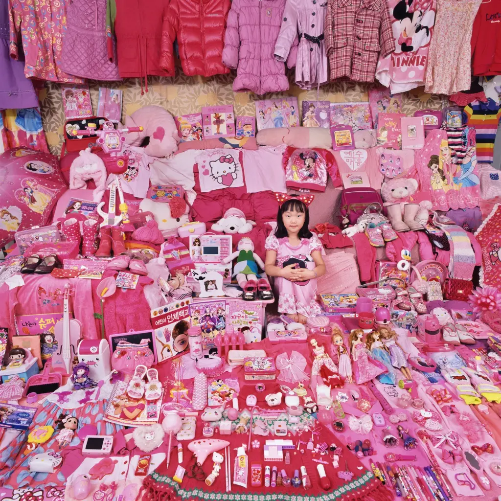
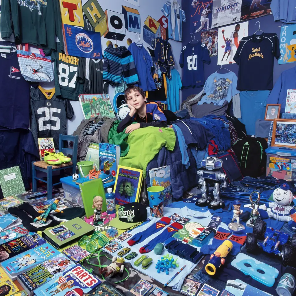
Color is one of the most universal tools in graphic design, but its use is often bound by stereotypical associations. For instance, pink is commonly assigned to femininity and used in products targeted at women, while blue is linked to masculinity and dominates designs for men.
This clear difference is especially noticeable in children’s marketing, where girls’ toys are packaged in pastels and boys’ toys use bright primary colors. These choices not only limit creative freedom but also reinforce societal expectations about gender from a young age (Horne, 2019).
What is the History of this bold and definite color differences for girls and boys? It was even once advertised the reversed way. In 1918 the trade publication Earnshaw’s Infants’ Department it was said that the “generally accepted rule is pink for the boys, and blue for the girls. The reason is that pink being a more decided and stronger color, is more suitable for the boy, while blue, which is more delicate and daintier, is prettier for the girl.” (Grannan, 2016).
After World War II, the association of blue with boys and pink with girls became more widespread, influenced by changing gender norms and growing consumerism. Marketing played a key role, with companies using color to distinguish products for boys and girls. By the 1950s, blue was linked to strength and masculinity, while pink was tied to softness and femininity, reflecting traditional family roles of the time (PBS Digital Studios, 2018).
Typography
Typography significantly influences design aesthetics, with certain fonts traditionally associated with specific genders. Curved, script-like, or handwritten fonts are often labeled as “feminine,” suggesting elegance or delicacy. In contrast, bold, angular, and blocky fonts are deemed “masculine,” symbolizing strength or authority. This classification is evident in various industries (Fernández, 2015):
- Beauty Brands: Companies frequently use ornate, decorative fonts to appeal to a female audience, reinforcing traditional notions of femininity.
- Sports and Automotive Brands: These sectors typically employ heavy, geometric typefaces to convey masculinity and power.
Such typographic conventions perpetuate narrow definitions of gender, often overlooking the diverse preferences of audiences. By adhering to these stereotypes, designers may inadvertently reinforce outdated gender norms, limiting creative expression and failing to engage a broader, more inclusive audience (Wong, 2021).
Challenging these conventions can lead to more inclusive and innovative design practices that resonate with a wider demographic. Marie Boulanger (2021) explains that the perceived femininity or masculinity of a font has nothing to do with its physical aspect, a little to do with its name, but “everything to do with a third gender marker – usage”. By moving beyond traditional gendered typography, brands can better reflect the diversity and complexity of their audiences.
But Typography does not only reinforce stereotypes in regard to gender roles, but some typefaces nowadays are exclusively used with a stereotypical connotation of a culture or country. When you think of a restaurant selling Chinese Food, I bet you have an exact image of a font (which is very likely part of the Logo). Same goes for Japanese or African shops/ items/ music etc.

The “African” Typeface Neuland is often used for anything that has exotic, adventurous, jungle or ethnic attributes like for example the Lion King Posters, Madagascar Movies or even the American Spirits Logo (Graphéine, 2020).
Originally, the font has nothing to do with Africa as it was created by German Designer Rudolf Koch with the purpose of modernizing Typefaces in Germany for Display and Advertisements (Giampietro, 2004).
This kind of stereo typography is discriminating as it can produce Cultural Oversimplification (by summarizing a whole continent with different countries, cultures and languages with one typeface, the vast diversity of the continent goes missing and it supports the idea, that ‘all Africa is the same) and Cultural Appropriation (By linking the font to the African culture, it can reinforce the stereotypes of Africa being untamed, a tribal culture and primitive, which strips away the deeper meaning and complexity of all the cultures).
Imagery and Iconography
The imagery used in graphic design often carries stereotypical associations that dictate how products or messages are perceived. Designs targeting women frequently include motifs like flowers, hearts, or butterflies, projecting ideas of softness or care. On the other hand, male-oriented designs might incorporate industrial symbols like gears or vehicles, emphasizing utility and toughness. This binary approach reduces people to simplistic roles and misses the opportunity to create designs that resonate across different identities. A study by Dimaandal and Espineda (2023) researched how toy packaging differentiates between toys for boys or girls. The results align with the described above; Girls toys often displayed icons and Imageries like Unicorns, princesses, fashion, flowers, or animals while Boys Toys showed sports, dinosaurs, fight scenes, heroes, tools, science or police.

As an example the picture above, the toy is basically the same but it is advertised completely different. The ‘Diamond Ring Rattle is “for a sweet baby girl” wile the hammerin’ Rattle is “for a busy baby boy”. Also, hard to miss is the iconography, the girls version is full of flowers, hearts and a crown – all in pink of course- while the boys version is yellow and blue using simple icons like dots and circles.
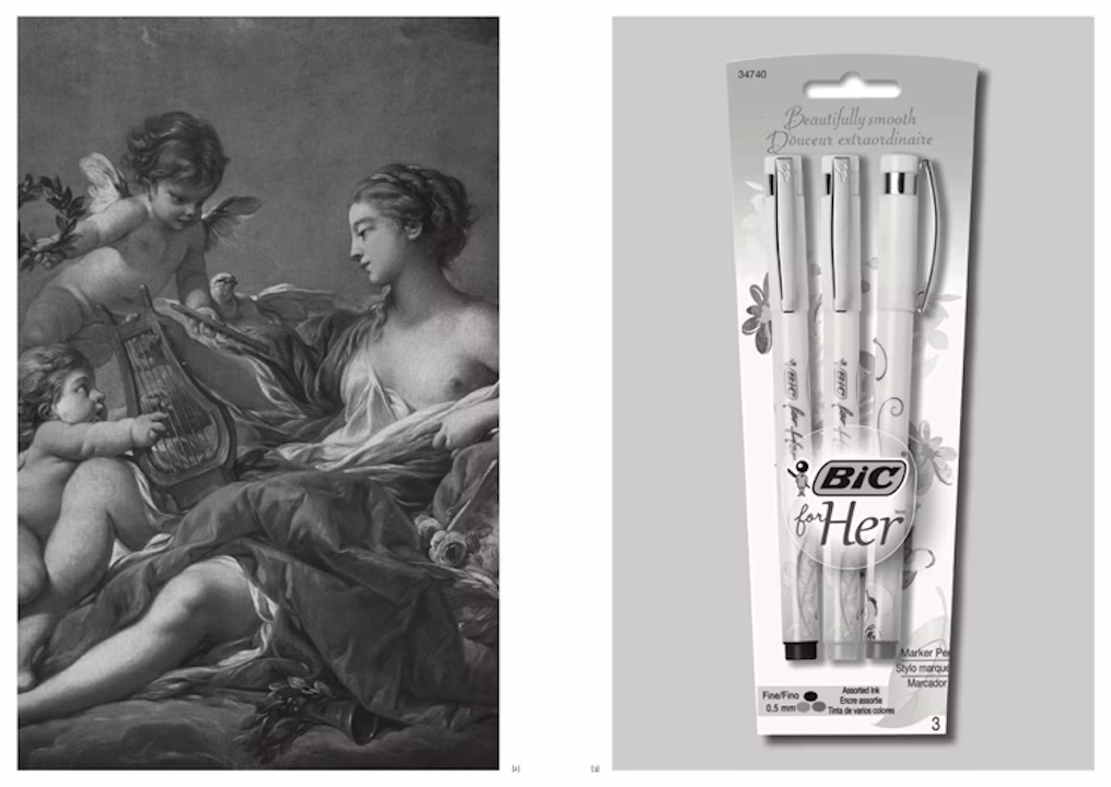
Another quite hilarious example is the picture below, an advertisement for a bic pen for women ‘for her’. It was a campaign and product published in 2012 earning a lot of backlash and critic, as it should. The only thing different to a ‘normal’ bic pen is the iconography on the pen, flowers and flowy llines (Vinjamuri, 2012).
Layout and Composition
The way elements are arranged in a design can also reflect stereotypes. Feminine designs often feature soft, organic layouts with flowing lines and asymmetry, evoking a sense of approachability or emotion. Masculine designs, in contrast, tend to favor structured, grid-based compositions with sharp edges, conveying order and control. For example, advertisements for personal care products might use a light, airy composition for women and a solid, rigid layout for men. These stylistic choices reinforce traditional notions of gender, limiting how designs can connect with broader audiences.

Example of Gilette Advertisements: On the left is for men with straight lines, bold colors and bold – sans serif fonts, on the right the contrast for women, pastel colors, flowy lines and the fonts are thin and flowy as well with an often high contrast (Tempesta, 2019).
Sources
Boulanger, M. (2021, May 3). XX, XY : Sex, Letters and Stereotypes. Kickstarter. https://www.kickstarter.com/projects/xx-xy/xx-xy-sex-letters-and-stereotypes
Dimaandal, R. J. H., & Espineda, M. N. (2023). Gender-Inclusive Children’s Toy Package Design: An Alternative Approach to Gender-Neutral Design Based on Children’s Perceptions. Archives of Design Research, 36(4), 141–161. https://doi.org/10.15187/adr.2023.11.36.4.141
Fernández, N. (2015, November 19). It Ain’t Necessarily So. It Ain’t Necessarily So. https://itaint-necessarilyso.squarespace.com/articles/2015/11/17/stereotypes?utm_source=chatgpt.com
Giampietro, R. (2004). Lined & Unlined · New Black Face: Neuland and Lithos as Stereotypography. Linedandunlined.com. https://linedandunlined.com/archive/new-black-face/
Grannan, C. (2016). Has Pink Always Been a “Girly” Color?. In Encyclopædia Britannica. https://www.britannica.com/story/has-pink-always-been-a-girly-color
Graphéine, T. (2020, February 2). Stereotypography: typical, even racist, typefaces. Graphéine – Agence de Communication Paris Lyon. https://www.grapheine.com/en/graphic-design-en/stereotypography-typefaces-racist
Horne, L. (2019). The Evolution of Stereotypical Color-Coded Childhoods. Wired. https://www.wired.com/story/color-coded-childhoods-photo-gallery/
PBS Digital Studios. (2018). Origin of Everything | Why was Pink for Boys and Blue for Girls? | Season 1 | Episode 19. Www.pbs.org. https://www.pbs.org/video/why-was-pink-for-boys-and-blue-for-girls-6ikwzr/
Tempesta, E. (2019, January 16). Gillette slammed over “pink tax” in the wake of controversial ad video. Mail Online. https://www.dailymail.co.uk/femail/article-6596095/Gillette-slammed-pink-tax-wake-controversial-ad-campaign.html
Vinjamuri, D. (2012). Bic For Her: What They Were Actually Thinking (As Told By A Man Who Worked On Tampons). Forbes. https://www.forbes.com/sites/davidvinjamuri/2012/08/30/bic-for-her-what-they-were-actually-thinking-as-told-by-a-man-who-worked-on-tampons/
Wong, H. (2021, May 25). Why gender stereotypes in typefaces can stifle creativity. Design Week. https://www.designweek.co.uk/issues/24-30-may-2021/why-gender-stereotypes-in-typefaces-can-stifle-creativity/?utm_source=chatgpt.com