K-pop Album package design 

The physical packaging of K-pop albums stands out as an art form in its own right, serving as a tangible manifestation of the artist’s concept and an immersive experience for fans. In the following the distinctiveness, significance, and creative evolution of K-pop album design will be explored.

Distinctive Features of K-pop Album Packaging

Unlike standard CD or digital album releases in Western markets, K-pop albums are often created with extraordinary attention to detail. A typical K-pop album package is not just a plastic case with a disc but an elaborate collection of items that reflect the album’s theme. These may include:

Photobooks: High-quality photo spreads featuring the artists in thematic visuals linked to the album’s concept.

Photocards: Collectible cards featuring individual or group member photos, often designed to encourage fans to trade and collect different versions.

Posters: Folded or rolled posters that add a visual centerpiece to the package.

Custom Inserts: Stickers, lyric booklets, postcards, or even unique items like puzzle pieces, bookmarks, or tattoos.

Innovative Packaging Formats: Ranging from box sets and slipcases to hardcover book-style albums or even packages resembling novels, treasure chests, or other creative formats.

This holistic approach to packaging elevates the album to a collectible artifact, making it a desirable item for fans and enhancing the emotional connection to the music and the artist.

The Role of Concept and Narrative

K-pop album packaging is deeply tied to the concept and narrative of the album itself. Each release is typically centered around a theme, whether it is fantasy, nostalgia, rebellion, or romance. Designers collaborate closely with artists, agencies, and creative directors to ensure that the visuals align with the music and storytelling.

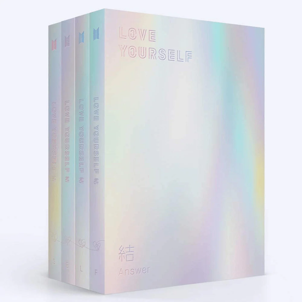
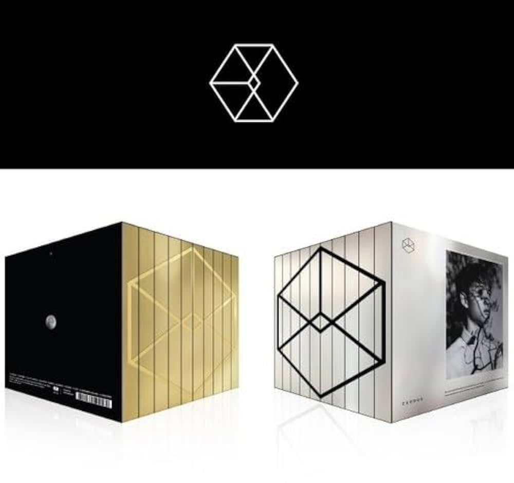
For example, BTS’s Love Yourself series employed a design aesthetic across multiple releases, using soft pastel hues, intricate floral motifs, and elegant typography to convey themes of self-love and growth. On the other hand, EXO’s EXODUS album used sleek metallic designs and dual-language photobooks to reflect their futuristic and cosmopolitan concept.
Fan Engagement and Interactivity

A critical component of K-pop album packaging is its ability to foster fan engagement. By including random elements such as photocards, albums create an interactive experience. Fans are encouraged to trade photocards of their favorite group members or purchase multiple versions of an album to collect all designs. Limited-edition or pre-order bonuses further enhance the sense of exclusivity and excitement.

Moreover, the design often integrates Easter eggs or hidden messages, rewarding fans who pay close attention. Albums like LOONA’s pre-debut releases featured intricate lore embedded in their design, encouraging fans to piece together a larger narrative over time.

Trends and Innovations

The evolution of K-pop album design continues to push boundaries. Recent trends include:

Sustainability: Groups like MAMAMOO have incorporated eco-friendly packaging, reducing plastic use and opting for recyclable materials.

Augmented Reality (AR) Integration: Albums like ATEEZ’s Treasure series have included AR features, allowing fans to unlock digital content by scanning items in the album.

DIY and Personalization: Some albums include customizable elements, like blank pages for fans to write on or stickers for decorating.

Luxury Appeal: Special editions featuring premium materials, such as embossed leather, holographic effects, or metal accents, elevate the albums to luxury collectibles.

Challenges in Album Design

While K-pop album packaging is celebrated, it is not without challenges. The cost of producing elaborate designs can be high, particularly for smaller or rookie groups with limited budgets. Additionally, concerns about environmental sustainability are increasingly pressing as the industry continues to produce vast quantities of physical goods. Striking a balance between creativity, affordability, and eco-consciousness is a challenge that the industry must address.

Conclusion

K-pop album package design is a testament to the industry’s innovation, blending music, art, and culture into a cohesive and immersive experience. As K-pop continues to expand globally, its album designs not only captivate fans but also set new benchmarks for creativity in the music industry. By embracing sustainability and technological advancements, the future of K-pop album packaging promises to remain as dynamic and influential as the music it represents.

References

Kim, J. (2020). Visual Storytelling in K-Pop: Aesthetic Trends in Album Design. Korean Journal of Popular Music Studies, 14(2), 45-67.

Park, S. (2019). The Role of Physical Albums in the Digital Era: K-Pop as a Case Study. International Journal of Music Business, 11(3), 22-34.

Lee, H. (2021). Sustainability in K-Pop Packaging: Addressing Environmental Concerns. Design and Culture Journal, 8(1), 78-95.

Choi, Y., & Kim, D. (2018). Fan Culture and Collectibles: The Impact of Photocards on K-Pop Album Sales. Journal of Media and Cultural Studies, 5(3), 101-119.

Jung, M. (2022). K-Pop’s Global Aesthetic: How Album Packaging Shapes Cultural Perception. Global Pop Music Review, 3(4), 33-50.

https://www.korea.net/NewsFocus/HonoraryReporters/view?articleId=235526
https://fliphtml5.com/hcflr/srxc/basic
https://lup.lub.lu.se/luur/download?func=downloadFile&recordOId=9015386&fileOId=9019459
https://fliphtml5.com/hcflr/srxc/basic/51-62
https://www.aodr.org/xml/33127/33127.pdf

Androgynous Styling in Kpop Boy Groups

Challenging traditional notions of masculinity, androgynous fashion in K-pop merges elements of both feminine and masculine aesthetics, creating a unique visual language that transcends conventional boundaries. In the following, the origins, cultural significance, and impact of androgynous styling within K-pop boy groups will be explored, examining how it reflects broader societal shifts and contributes to the genre’s global appeal.

Historical Context

The roots of androgyny in fashion can be traced back to various cultural movements, from the glam rock era of the 1970s to the gender-fluid styles of the 1980s and 1990s. However, in South Korea, traditional cultural norms have long emphasized distinct gender roles, with conservative attitudes toward masculinity. K-pop boy groups began to disrupt these conventions in the late 1990s and early 2000s. Groups such as H.O.T. and Shinhwa incorporated softer, more delicate styling into their wardrobes, signaling the beginning of a shift. As K-pop evolved, the second and third generations of boy groups—TVXQ, BIGBANG, and SHINee—pushed the boundaries further, incorporating bold makeup, unisex clothing, and experimental hairstyles into their aesthetics. This set the stage for the current wave of androgynous fashion in fourth-generation K-pop groups.

Defining Androgynous Styling in K-pop

Androgynous styling in K-pop is characterized by a blending of traditionally masculine and feminine elements. This can include clothing, makeup, hairstyles, and overall appearance. Male idols often wear clothes traditionally associated with femininity, such as skirts, lace, and pastel colors, paired with sharper, tailored pieces to create a balance. Accessories like chokers, earrings, and nail polish are frequently used to accentuate this aesthetic.

One key aspect of androgynous styling is the use of makeup. Many K-pop boy group members regularly wear eyeliner, eyeshadow, and lip tint, enhancing their features in ways that blur gender lines. Hairstyles—ranging from long, flowing locks to brightly colored dye jobs—further contribute to the androgynous image. Groups such as BTS, Stray Kids, and TXT have embraced these elements, presenting themselves as versatile figures who defy conventional gender expectations.

Examples

BTS: As one of the most prominent K-pop groups globally, BTS has incorporated androgynous elements into their style. From their “Boy With Luv” era pastel suits to their gender-neutral Louis Vuitton ensembles, BTS exemplifies how androgynous fashion can enhance artistic storytelling.

ATEEZ: Known for their theatrical concepts, ATEEZ often blends masculine and feminine elements to reflect the duality of their music. In their performance of “Answer,” the members wore ruffled blouses and intricate jewelry, juxtaposed with sharp blazers and combat boots.

Stray Kids: Stray Kids’ recent fashion choices highlight an experimental approach to androgyny. Members like Hyunjin and Felix have become style icons, frequently sporting makeup, crop tops, skirts, and elaborate accessories that challenge gender norms.

Conclusion

Androgynous styling in K-pop boy groups is more than just a fashion trend; it is a cultural statement that challenges societal norms and expands the boundaries of self-expression. By blending masculine and feminine elements, K-pop idols create a dynamic visual language that resonates with fans across the globe. As the genre continues to grow in influence, its embrace of androgyny offers a powerful commentary on the fluidity of identity and the evolving nature of gender in contemporary society. K-pop’s fearless approach to fashion not only redefines masculinity but also paves the way for a more inclusive and diverse cultural landscape.

Herman, T. (2020). “How BTS Redefined Masculinity in K-pop”. Billboard.

Kim, H. J. (2021). “Stage Performance and Fashion: ATEEZ’s Androgynous Aesthetic”. Korea JoongAng Daily.

Park, S. (2022). “The Rise of Androgyny in Fourth-Generation K-pop”. The Korea Herald.

http://posturemag.com/online/is-kpop-as-queer-as-it-appears-to-be-androgynous-fashion-fan-service-and-boy-love-in-korean-pop-culture/

https://www.tatlerasia.com/lifestyle/entertainment/gender-neutral-androgynous-fashion-kpop

https://www.google.com/url?sa=t&source=web&rct=j&opi=89978449&url=https://ijmmu.com/index.php/ijmmu/article/download/6437/5207&ved=2ahUKEwiIlYr9-v-KAxWXExAIHfMXCWoQFnoECBMQAQ&usg=AOvVaw0WSB_USObgMFCiw8zT11W_

https://www.scmp.com/magazines/style/celebrity/article/3091754/k-pops-lgbt-and-androgynous-idols-amber-liu-and-nuests
https://www.koreaherald.com/article/1771827
https://stuyspec.com/article/androgynous-fashion-and-the-appeal-of-mark-tuan
https://digitalcommons.denison.edu/cgi/viewcontent.cgi?article=1099&context=studentscholarship
https://www.diva-portal.org/smash/record.jsf?pid=diva2%3A1341295&dswid=3597

Gender in Design & Styling

Design reflects the socio-cultural norms and values of the time. Whether in fashion, architecture, product development, or digital interfaces, gender has historically played a significant role in shaping the outcomes of design processes. However, the evolving discourse on gender inclusivity and diversity challenges traditional norms, influencing designers to adopt more unbiased approaches. 

Gender Bias in Historical Design

Historically, design has often maintained gender stereotypes. Products and spaces have been made to fit binary and patriarchal perceptions of gender. For example:

  1. Fashion: Women’s clothing has emphasized beauty and conformity, while men’s attire prioritizes functionality and authority. This contrast reinforces gendered expectations about appearance and roles (Crane, 2000).
  2. Architecture: Public and private spaces have frequently been designed to serve to men’s needs and interests. Historically, offices and urban spaces were conceptualized with male users in mind, often marginalizing women’s experiences (Spain, 1992).
  3. Product Design: Consumer goods, such as razors, toys, and electronics, have been marketed through gendered aesthetics, like pink for women and blue for men, further establishing binary perceptions (Pinker, 2002).

The Shift Towards Inclusivity

In recent decades, the design world has increasingly embraced gender inclusivity, reflecting broader societal shifts. Several initiatives and movements have played pivotal roles:

  1. Unisex and Androgynous Fashion: Brands like Rad Hourani and Telfar champion unisex clothing lines, rejecting binary norms. This trend allows individuals to express themselves without adhering to traditional gender roles (Steele, 2018).
  2. Inclusive Architecture: Architects now focus on creating spaces that accommodate diverse users. For instance, gender-neutral bathrooms and lactation rooms in workplaces recognize the needs of non-binary and female users (Anthony, 2001).
  3. Tech and Digital Design: In user interface (UI) and user experience (UX) design, inclusive practices include diverse avatars, non-binary gender options, and features that avoid gender assumptions (Schlesinger et al., 2017).
  4. Grassroots Movements: Feminist and LGBTQ+ advocacy has amplified the importance of inclusivity in design, influencing industries to adopt more equitable practices (Ahmed, 2012).

Remaining Challenges

Despite progress, gender inclusivity in design is far from universal. Challenges include:

  • Resistance to Change: Traditionalists often view inclusivity efforts as unnecessary or politically motivated (Huppatz, 2015).
  • Intersectionality: Designers frequently overlook how gender intersects with race, class, ability, and other identities, resulting in partial inclusivity (Crenshaw, 1989).
  • Tokenism: Some efforts toward inclusivity are superficial, failing to address systemic issues (Powell, 2020).

Gendered Design in K-Pop

K-pop offers a fascinating lens through which to examine gender in design. 

  1. Challenging Norms Through Androgyny: Many K-pop idols, such as G-Dragon and Taemin, blur traditional gender lines in their fashion and performances. They adopt fluid aesthetics that challenge the binary notions of masculinity and femininity, inspiring fans and designers worldwide to embrace non-conformity (Epstein & Turnbull, 2014).
  2. Fashion as a Tool for Expression: K-pop stylists use bold and innovative designs to create personas that defy stereotypes. Male idols often wear makeup, jewelry, and clothing traditionally associated with women, while female idols experiment with powerful and androgynous looks (Kim, 2016).
  3. Fan Engagement and Gender Representation: K-pop’s interactive culture encourages fans to explore their identities. Music videos, album art, and merchandise design often incorporate inclusive and aspirational elements that resonate with diverse audiences (Oh, 2019).
  4. Critiques of Exploitation: Despite its progressive image, K-pop faces criticism for commodifying gender fluidity without fully addressing the societal issues surrounding gender equality. Some argue that while idols’ appearances challenge norms, their tightly controlled public personas perpetuate traditional hierarchies (Lie, 2015).

Conclusion

Gender in design is a multifaceted and evolving field. While historical biases have long shaped the landscape, contemporary movements and industries like K-pop demonstrate the potential for design to challenge stereotypes and foster inclusivity. However, true progress requires not only aesthetic changes but also systemic efforts to undo oppressive structures. By critically examining and addressing these complexities, the design world can create spaces, products, and experiences that authentically represent and empower all individuals, regardless of gender.

References

Ahmed, S. (2012). On Being Included: Racism and Diversity in Institutional Life. Duke University Press.

Anthony, K. H. (2001). Designing for Diversity: Gender, Race, and Ethnicity in the Architectural Profession. University of Illinois Press.

Crane, D. (2000). Fashion and Its Social Agendas: Class, Gender, and Identity in Clothing. University of Chicago Press.

Crenshaw, K. (1989). “Demarginalizing the Intersection of Race and Sex: A Black Feminist Critique of Antidiscrimination Doctrine, Feminist Theory and Antiracist Politics.” University of Chicago Legal Forum, 1989(1), Article 8.

Epstein, S., & Turnbull, J. (2014). “Girls’ Generation? Gender, (Dis)Empowerment, and K-pop.” Journal of Asian Studies, 73(1), 141-164.

Huppatz, D. J. (2015). “Revisiting Gender and Architecture in Theory and Practice.” Architectural Theory Review, 20(2), 144-158.

Kim, Y. (2016). “Idols of Development: The Globalization of K-pop and the Gender Politics of the Male Idol.” Media International Australia, 161(1), 122-130.

Lie, J. (2015). K-pop: Popular Music, Cultural Amnesia, and Economic Innovation in South Korea. University of California Press.

Oh, C. (2019). “Queering Hallyu: K-pop, Gender Nonconformity, and Global Fandom.” The Korean Wave: Korean Popular Culture in Global Context, edited by Youna Kim, Routledge.

Pinker, S. (2002). The Blank Slate: The Modern Denial of Human Nature. Penguin Books.

Powell, R. (2020). “Tokenism in Design: Moving Beyond Representation to Real Change.” Design Issues, 36(3), 67-78.

Schlesinger, A., Edwards, W. K., & Grinter, R. E. (2017). “Intersectional HCI: Engaging Identity through Gender, Race, and Class.” CHI Conference on Human Factors in Computing Systems Proceedings, 5412-5427.

Spain, D. (1992). Gendered Spaces. University of North Carolina Press.

Steele, V. (2018). Paris Fashion: A Cultural History. Bloomsbury Publishing.

https://events.forum-holzbau.com/pdf/meran10_Brandes.pdf
https://www.tandfonline.com/doi/abs/10.1080/13527266.2014.918050
https://www.taylorfrancis.com/books/mono/10.4324/9781315254593/gender-design-marketing-gloria-moss
https://www.jstor.org/stable/1511881
https://dl.acm.org/doi/abs/10.1145/3290605.3300283

LS #9  Unveiling Taboos with Design?

After exploring feminist movements and the bold visuals of protest design in my previous posts, I began to wonder about the power of design in addressing issues that society often avoids altogether. While protest design fights for visibility and action, it also lays the groundwork for addressing the topics we shy away from: taboos. These are the subjects—like menstruation, mental health or sexuality and sex—that have been held in stigma and silence for generations (Bentley, 2022).

Design, with its unique ability to provoke thought and evoke emotion, is emerging as a powerful force to challenge these unspoken issues. Through creativity, designers are bringing these topics into the open, encouraging dialogue, and fostering a culture of understanding.

First of all, why do we even have Taboos?

Taboos exist to maintain social order and protect cultural values. They help define the boundaries of acceptable behaviour, shaping how individuals interact within a community. By setting these boundaries, societies ensure the stability of relationships, prevent harm, and preserve traditions. Taboos also reflect deeper fears, beliefs, and the need for respect in various contexts, from moral codes to personal boundaries (Jones et al., 2008).

Taboo of Menstruation

Menstruation has long been a taboo topic, shrouded in euphemisms and discomfort. For decades, advertisements depicted blue liquid instead of blood and avoided any realistic portrayal of menstruation (Germerott, 2023). But in recent years, bold design has been at the forefront of breaking these stereotypes (United Nations, 2024).

Bodyform’s “#BloodNormal” Campaign was a groundbreaking campaign in 2018 that broke away from sanitized norms by using realistic depictions of period blood in ads. By showing what menstruation actually looks like, the campaign normalized periods and encouraged open conversations about them (Campaigns of the World, 2017).

Mental Health: From Stigma to Awareness

For decades, mental health has been surrounded by silence and stigma, but design is helping break this cycle.

  • The Semicolon Project: A simple semicolon, representing a pause rather than an end, has become a powerful symbol of hope for those struggling with mental illness. The project was established in 2013 to raise awareness and to start talking about mental health issues like depression, addiction, self-injury and suicide (Project Semicolon, 2025). This minimalist yet emotional design has been embraced globally, often appearing in tattoos as a sign of solidarity.
  • Posters and Campaigns: Organizations like Time to Change use bold, brightly colored posters to encourage open discussions about depression, anxiety, and therapy (Time To Change, 2019). These designs often feature approachable typography paired with direct, compassionate messaging.

Sexuality and Gender Identity: Breaking Norms Through Visibility

Design has played a central role in fostering acceptance and inclusivity for topics like sexuality and gender identity. For Example, Gilbert Baker’s iconic rainbow flag started as a symbol of LGBTQ+ pride (Gilbert Baker Foundation, 2019). It has since evolved into numerous variations, like the Progress Pride Flag, which incorporates stripes for transgender and people of colour communities. These designs visibly represent diversity and inclusivity and has created a safe space and form of identity that has helped a lot of people to talk and learn about their sexuality as it wasn’t accepted for many years.

Also, the topic of sex education is so important for the youth but wasn’t properly talked about for so long. The design of sex education materials, including apps, websites, or even physical models, navigates the tension between education and cultural taboos and can often be done anonymously which eliminates possible shame (Buchmann, 2023).

For instance, Planned Parenthood designs user-friendly, non-judgmental interfaces for teens seeking sexual health information (Planned Parenthood, 2019).

Why Design Works

The power of design lies in its ability to bypass language and cultural barriers. A single image or symbol can convey a message instantly and provoke an emotional response (PwC, 2017). For example, a vivid poster on body positivity or a sculpture addressing domestic violence can evoke empathy and challenge ingrained biases.

Design also creates visibility for marginalized groups. When a taboo is represented visually, it gains legitimacy and enters public discourse, making it harder to ignore (Celestine, 2023).

Challenges and Criticisms

Using design to address taboos isn’t without challenges. Pushback from audiences who find the work provocative or inappropriate is common. There’s also the risk of commodification. When corporations adopt taboo-breaking designs for profit without authentic commitment to the cause, the message can feel hollow or exploitative (Najafi et al., 2024).

Lastly, Are Taboos a good thing sometimes?
There are voices that state thatit is important to have taboos in some contexts and they play a crucial role in building civil society. They establish boundaries that protect collective values and prevent harmful rhetoric from destabilizing social harmony. For instance, taboos against hate speech or discriminatory language reinforce ethical standards and preserve respect (Singh, 2023).

Yet, the line between a constructive and oppressive taboo is delicate. Overuse or misuse of taboos risks silencing necessary discussions, freezing consensus, and stifling progress. When taboo topics are avoided, their underlying issues can fester in silence, leading to backlash or misunderstanding. Conversely, a thoughtful re-evaluation of taboos can lead to renegotiation of societal norms, as seen in shifts around LGBTQ+ rights or discussions of racial inequality.

In the age of the internet, where taboos are routinely challenged and reshaped, the question is not merely whether breaking a taboo is good, but whether it leads to meaningful, constructive change. Breaking certain taboos can liberate dialogue, but it also risks eroding protections that took centuries to establish. Navigating this tension thoughtfully is essential to ensure that what is unspeakable remains a safeguard for humanity, not a barrier to progress (Schwartz, 2019).

Sources

Bentley, M. (2022). A New Model of “Taboo”: Disgust, Stigmatization, and Fetishization. International Studies Review, 24(3). https://doi.org/10.1093/isr/viac028

Buchmann, M. (2023, July 24). Shedding Sexual Shame After Really Bad Sex Ed. Momotaro Apotheca. https://momotaroapotheca.com/blogs/vaginal-wellness/shedding-sexual-shame-from-poor-sex-education-in-america?srsltid=AfmBOor6Da7NbSbF4bwm5_27zJUtcJrihYD2jCCYhK0WAeUUu9WQUXuD

Campaigns of the World. (2017, October 21). Bodyform – “Periods are normal. Showing them should be too.” #BloodNormal – Best Advertising Campaigns & Marketing Strategy. Campaigns of the World. https://campaignsoftheworld.com/digital-campaigns/bodyform-blood-normal-campaign/

Celestine, A. (2023, August 22). The Power of Design to Drive Positive Social Change. Celestine’s Design Journal. https://medium.com/design-grip/the-power-of-design-to-drive-positive-social-change-e9830da28584

Germerott, I. (2023, March 2). Blut und Scham: Wie die Menstruation zum Tabuthema wurde. National Geographic. https://www.nationalgeographic.de/geschichte-und-kultur/2023/03/blut-und-scham-wie-die-menstruation-zum-tabuthema-wurde-religion-patriarchat-wissenschaft-medizin

Gilbert Baker Foundation. (2019). Rainbow Flag: Origin Story. Gillbert Baker. https://gilbertbaker.com/rainbow-flag-origin-story/

JONES, J. P. G., ANDRIAMAROVOLOLONA, M. M., & HOCKLEY, N. (2008). The Importance of Taboos and Social Norms to Conservation in Madagascar. Conservation Biology, 22(4), 976–986. https://doi.org/10.1111/j.1523-1739.2008.00970.x

Planned Parenthood. (2019). Planned Parenthood. Plannedparenthood.org. https://www.plannedparenthood.org/learn

Project Semicolon. (2025). Project Semicolon – Suicide Prevention and Mental Health Awareness Organization – Your Story Isn’t Over. Project Semicolon – Your Story Isn’t Over. https://www.projectsemicolon.com/

PwC. (2017). The Power of Visual Communication.

Schwartz, A. E. (2019, March 14). Opinion | Why We Need Taboos. Moment Magazine. https://momentmag.com/opinion-why-we-need-taboos/?srsltid=AfmBOoo74N415TBzmN44zEsTbExTaJPz8NJCwg2p-gCuQOZIzByF1pDL

Singh, P. (2023, September 24). Taboos have played a significant role in shaping human societies throughout…. Medium. https://medium.com/@soamsila/taboos-have-played-a-significant-role-in-shaping-human-societies-throughout-548705671451

Time To Change. (2019). Time to Change | Let’s End Mental Health Discrimination. Time-To-Change.org.uk. https://www.time-to-change.org.uk/

United Nations. (2024). Breaking the taboos around menstrual health for gender equality. OHCHR. https://www.ohchr.org/en/stories/2024/05/breaking-taboos-around-menstrual-health-gender-equality

Slack vs. Discord product innovation and UX strategy

What comes to your mind when you hear the word Slack?

I presume business and workplace communication. What comes to your mind when you hear the word, Discord? I guess games.

If I can bore you further with more rhetorical questions, is there a specific industry to which you can align WhatsApp, iMessage, or Facebook messenger? I supposed not. This brings up the question, what makes Discord and Slack different?

The scheme is simple – it’s the UI and UX design of the app. When you open Discord, you don’t need an additional clue to know this application is designed primarily for game enthusiasts. The app’s interface was designed with its target users, namely gamers, in mind, making it an innovation worth investing billions of dollars in. The same goes for Slack. The app’s features, interactions and user interface define the brand’s target audience, use cases and strategy to differentiate it from the competition.

When comparing Slack and Discord in terms of UI/UX design, the key difference lies in their target audiences, primary use cases, and design philosophies, which affect how the two platforms approach product differentiation and innovation.

1. Target Audience

  • Slack is primarily designed for business and professional communication. Its UX is optimized for productivity, with a focus on helping teams collaborate and manage projects.
  • Discord initially targeted gamers but has since expanded to a wider audience, including content creators, hobbyist groups, and communities. Its UX is designed to create a social, fun, and interactive environment with voice, video, and text chat functionalities.

2. Interface and Navigation

  • Slack:
    • Organized Channels: Slack’s UI emphasizes structure, with channels and direct messages taking center stage. The sidebar navigation is key here, with well-organized folders and the option to pin or highlight important conversations.
    • Minimalist, Professional Aesthetic: The design prioritizes clarity and productivity. It features a simple, streamlined aesthetic, avoiding unnecessary distractions, which helps maintain focus on work.
    • Customization: While Slack offers some customization options, such as themes, the design is relatively restrained. The goal is consistency and ease of use, not heavy personalization.
  • Discord:
    • Fluid Social Interface: Discord’s UI is much more vibrant, with more customization options, including custom themes and the ability to change channel aesthetics. This plays into the casual, personal, and creative ethos of the platform.
    • Server-centric Design: Discord organizes communication around servers, which function as distinct communities. Within these servers, users can create various text and voice channels, making it easier for communities to have multiple ongoing conversations in parallel.
    • Customization and Personalization: Discord places a strong emphasis on personalization, with users able to customize their profiles, avatars, status, and more. The design is more visually engaging than Slack’s, allowing for a high level of user-driven interaction.

3. Focus on Collaboration vs. Socialization

  • Slack:
    • Work Collaboration: Slack’s design is built for productivity—tasks, project management, integrations with work tools (Google Drive, Asana, etc.), and communication are all tightly integrated. Slack’s UX emphasizes creating a unified workspace where everything is connected and easily accessible, with clear paths for team communication.
    • Threads and Mentions: Slack’s thread functionality is key for maintaining organized conversations, while @mentions and notifications are designed to streamline communication and reduce noise.
  • Discord:
    • Social Collaboration: While Discord has added some work-oriented features (like integrations with GitHub, Trello, and more), it remains heavily focused on social interaction. The UX design reflects this social-first approach with emphasis on easy, free-flowing conversations, voice chats, and a sense of community.
    • Voice & Video Chat: Discord’s standout feature is its robust voice and video communication, making it perfect for informal meetings or casual hangouts. The design for these features is very fluid, with easy-to-access buttons for voice channels, screen sharing, and video chats.

4. Innovation and Feature Set

  • Slack:
    • Workflow Builder: A key innovation for Slack has been its Workflow Builder, which enables users to automate routine tasks and streamline processes. This is a feature aimed at improving work efficiency and enhancing team productivity.
    • Advanced Search and Integration: Slack’s search functionality is highly robust, allowing users to find specific messages, files, and data across channels. Slack also stands out for its deep integrations with third-party work tools and apps, such as project management tools, CRM systems, and cloud storage.
    • Channel-specific Design: Slack’s innovation in organizing work around channels is a hallmark of its design. Channels can be highly customized to fit the needs of a specific team, project, or topic, creating tailored workspaces that increase focus.
  • Discord:
    • Custom Emoji and Bots: Discord has led innovation in enabling fun and personalization with custom emojis and bots that help automate server tasks or add fun features like games or interactive content.
    • Rich Media Sharing: Discord’s chat features allow seamless media sharing (images, video, links) and have a more immersive design for games, streamers, and content creators, with features such as screen sharing, live streaming, and in-game overlays.
    • Live Streaming and Video Integration: While Slack has video calling, Discord took things a step further by offering low-latency live streaming for server members and integrations that allow communities to watch games together or participate in live events.

5. Notifications and Alerts

  • Slack:
    • Professional, Focused Notifications: Slack’s notifications are designed to keep users on task without overwhelming them. There’s a granular level of control over notification preferences, such as muting specific channels, only getting alerts for direct mentions, or customizing how notifications appear across different devices.
  • Discord:
    • Engaging and Fun Notifications: Discord’s notifications, by contrast, are more dynamic and customizable. Users can be notified for mentions, new messages, or even activities like voice channel activity, giving users a more interactive experience.

6. Design Approach and Responsiveness

  • Slack:
    • Slack’s design is relatively consistent across platforms, including desktop and mobile. It focuses on ease of use and scalability for businesses and enterprises. The UX is clean and offers a high level of accessibility, supporting various assistive features (e.g., keyboard shortcuts, screen readers).
  • Discord:
    • Discord’s design is equally responsive across desktop and mobile but is more visually oriented. It adapts well to both casual users and communities, emphasizing user-driven design choices (custom emojis, themes) that allow for more individual expression.

Conclusion

  • Slack: Best for businesses and teams where communication is primarily task-oriented and needs to stay streamlined, professional, and integrated with various productivity tools. Slack’s UX design reflects its focus on work collaboration and task management with an emphasis on clean, minimalist interfaces and a strong focus on productivity.
  • Discord: Ideal for community-based or social communication, with a focus on casual interactions, community building, and content creation. Discord’s UX design is more vibrant, with interactive, customizable elements aimed at fostering communication and engagement in an informal environment.

In terms of innovation:

  • Slack innovates through its integrations, workflow automations, and focus on creating a professional, focused workspace.
  • Discord shines in its flexibility, personalization, and features aimed at fostering community engagement, such as live streaming, custom emojis, and interactive bots.

Ultimately, the UI/UX design of both platforms is tailored to their respective use cases—Slack emphasizes streamlined productivity, while Discord emphasizes social interaction and creative expression.

References

UI and UX Design for better product strategy by Dodonut

How UI and UX design drive digital product innovation

UI and UX design is designing and improving a user’s overall experience with a product or service. It involves understanding the needs and expectations of the users, as well as researching and testing various design solutions to create a functional and enjoyable product. Killer UX design considers a user’s entire experience with a product, including usability, accessibility, and overall satisfaction with the product.

User research

UX research is critical for understanding user needs, behaviors, and preferences to inform the design and creation of a product. It centers on testing the usability of a product with real users and potential customers to identify areas for improvement. It can ensure that product vision is on the right track. Based on validated user research, companies identify ways to improve their products, meaning simplify them, add new features, or birth an entirely new product.

Microsoft effected this through multiple observations, research, and testing and redesigned the expired Internet Explorer interface to create a better experience. The new Edge is zippy, loads websites faster, and uses less RAM than Chrome.

Customer segmentation

Customer segmentation divides a target market into smaller groups based on specific characteristics, behaviors, or preferences. It can be demographic, geographic, psychographic, or behavioral. The goal is to understand better the needs and behaviors of different customer groups to provide more targeted marketing and product strategies.

Businesses can leverage UI and UX design in customer segmentation to identify new growth opportunities, develop well-targeted marketing campaigns, and tailor product development and customer support to specific customer groups. This is why Google launched YouTube Kids, adjusting its features to create friendlier UI and UX for kids. The application has default tablet views and parent control settings. If you use the original YouTube application, YouTube disables miniplay, autoplay, and other features on content made for kids.

Competitive advantage

The UX design phase often brings innovation to the product and updates it by introducing new or improved features and customization. Companies can create a competitive advantage by updating their product design to meet customers’ demands. The ultimate secret of Apple’s immense success is not releasing the latest technology nor offering a lower price, but their good customer experience, embedded in tremendous designs.

User-centered design

Companies investing in UI and UX during product innovation often achieve excellent user-centered solutions. It is why Discord has Game icons for its users and Slack uses the name acronym. It is about understanding your users and tailoring your product design accordingly. A website targeted at senior citizens may have a larger text font than conventional fonts most websites use – the same goes for users with disabilities.

Enhanced user experience


User-centered design, also known as UCD, deals with designing products, services, or systems with the end-users needs, goals, and preferences in mind. UCD is a critical approach to ensure that every developed product and service is user-friendly and meets the target audience’s needs.

The UCD process typically starts with research and analysis. This stage involves researching the needs and preferences of the end users, understanding their behavior, and the context in which they will use the product. Elon Musk practicalized through a tweet where he asked users for their top requests for Twitter. “What are your top requests for Twitter features & bug fixes? We will prioritize by the number of likes times ease of implementation,” he tweeted.

#06 Designing for Connection: Prioritizing People in Public Space Design

Public spaces can foster social connections, promote inclusivity, and nurture a sense of community. In today’s fast-paced world, where technology often replaces face-to-face interaction and individuals retreat into private spaces, designing public areas that encourage connections has become more crucial than ever. Achieving this goal, however, requires a more human-centered approach — one that focuses not just on the physical environment, but also on how individuals experience and interact with the space. Eric Klinenberg’s concept of social infrastructure provides a compelling framework to understand why these spaces are vital for addressing inequality, polarization, and community resilience. 1 2

Social Infrastructure

Klinenberg believes that a healthy community is not only about shared values, but also about shared spaces so he defines social infrastructure as “the physical places and organizations that shape the way people interact.” As mentioned in the previous posts such places include libraries, playgrounds, parks, but also sidewalks or community gardens. Klinenberg states that the social infrastructure is as essential for society as the infrastructure for power or transportation. 1 2

Designing for people not just for purposes

People have diverse needs, given a wide range of demographics, abilities, and social backgrounds, yet surprisingly often, design decisions for public spaces are done either in favor of functionality or aesthetics alone. Designing public spaces needs to address this diversity by prioritizing accessibility, visibility and inclusivity. In the book “Life Between Buildings” Gehl highlights, that a human-centered approach to public spaces creates meaningful social interactions. 3

First life, then spaces, then buildings. The other way around never works. – Jan Gehl

Principles of Human-Centered Public Space Design

Designing public spaces with a focus on people, rather than just on aesthetic or functional objectives, is guided by human-centered principles. These principles aim to meet users’ physical needs while also addressing their emotional, social, and cultural well-being. These are some qualities of human-centered public urban spaces: 

Spatial qualities:

Accessible: Public spaces must be accessible to all individuals, regardless of socio-economic status, gender, ethnicity, or ability. Everyone should have equal opportunities to use and benefit from the space and its amenities.

Walkable: Neighborhoods designed with walkable pathways and well-connected bike lanes promote physical activity while decreasing dependence on cars. This is especially important in rural areas, where limited transportation options often make car travel the primary means of getting around.

Safe: Well-lit, open spaces without blind spots enhance safety and make public areas more inviting. Gehl highlights that poor visibility fosters fear and exclusion, while transparent, well-lit environments promote comfort, interaction, and community.

Delightful: Public spaces need to incorporate human-scale design, aesthetics and pleasant microclimate like greenery, clean streets and inviting storefront to turn these areas into destinations that foster social connections. 

Comfortable: A comfortable space for spending time and engaging in various activities like walking, standing, sitting, people-watching, and having conversations.

Socio-spatial qualities:

Liveable: Public spaces should be designed with areas for a variety of activities, from quiet reflection to lively social gatherings. This multifunctionality allows individuals to engage with the space in ways that suit their preferences and needs.

Inclusive: Inclusive and welcoming to all, free and open. Urban spaces that foster a diverse range of users and activities.

Sociable: Spaces should be designed to foster social engagement by encouraging natural gatherings. Key elements include thoughtfully arranged seating, pedestrian-friendly walkways, and dedicated areas for social interaction. 1 3 4 5 6

Participation in Urban Planning

While human-centered design provides a strong foundation, its true value lies in practical application that prioritizes community voices. A truly human-centric approach relies on understanding “what people want” by using qualitative tools that assess the social and emotional well-being of residents, including their perceptions, motivations, emotions, ways of living, and values, rather than focusing only on quantitative metrics like the number of blocks or units installed. Tools such as focus groups, workshops, and community-led design sessions help planners shape spaces that align with community needs and wishes while strengthening shared civic identities. However, often the easiest way to gain insights is by talking to the people who are affected by infrastructural proposals. 7

Meaningful public participation becomes increasingly important and is also identified as a core human need. This participation is vital for upholding the principles of participatory democracy, enhancing the effectiveness and quality of the planning process, and improving as well as validating political decision-making. In such a perspective, residents are empowered to have their say in decisions influencing their daily life, ensuring better community involvement. The goal of participatory planning is to incorporate public perspectives into the design of public spaces, recognizing residents not only as stakeholders but as active users, alongside organizations, experts, and professionals. 8


Sources:

[1] E. Klinenberg, Palaces for the People: How Social Infrastructure Can Help Fight Inequality, Polarization, and the Decline of Civic Life, New York, NY: Crown Publishing Group, 2018.

[2] Palaces for the People,” 99% Invisible, Spotify. [Online]. Available: https://open.spotify.com/episode/7fE5rzAYtoCyVMzJnuwf0H?si=b64OVUphRBaOdbErUuyFtg&t=2399. [Accessed: Jan. 13, 2025].

[3] J. Gehl, Life Between Buildings, New York: Van Nostrand-Reinhold, 1987.

[4] M. Almahmood, N. M. Gulsrud, O. Schulze, T. A. Carstensen und G. Jørgensen, „Human-centred public urban space: exploring how the ‘re-humanisation’ of cities as a universal concept has been adopted and is experienced within the socio-cultural context of Riyadh“, Urban Research & Practice, Bd. 15, Nr. 1, S. 1–24, Okt. 2018, doi: 10.1080/17535069.2018.1539512.

[5] “Human-centered design for inclusive urban environments: Building cities that embrace diversity and accessibility,” Buildings. [Online]. Available: https://www.buildings.com/architecture/article/55139034/human-centered-design-for-inclusive-urban-environments-building-cities-that-embrace-diversity-and-accessibility. [Accessed: Jan. 13, 2025].

[6] R. Oldenburg, The Great Good Place: Cafes, Coffee Shops, Bookstores, Bars, Hair Salons and Other Hangouts at the Heart of a Community, New York: Marlowe & Company, 1999.

[7] “Making Cities Human-Centric,” One Works. [Online]. Available: https://www.one-works.com/journal/relate/making-cities-human-centric/. [Accessed: Jan. 13, 2025].[8] E. J. Cilliers und W. Timmermans, „The Importance of Creative Participatory Planning in the Public Place-Making Process“, Environment And Planning B Planning And Design, Bd. 41, Nr. 3, S. 413–429, Apr. 2014, doi: 10.1068/b39098.

The Rise of the Modern “Tradwife”: Nostalgia or Empowered Choice?

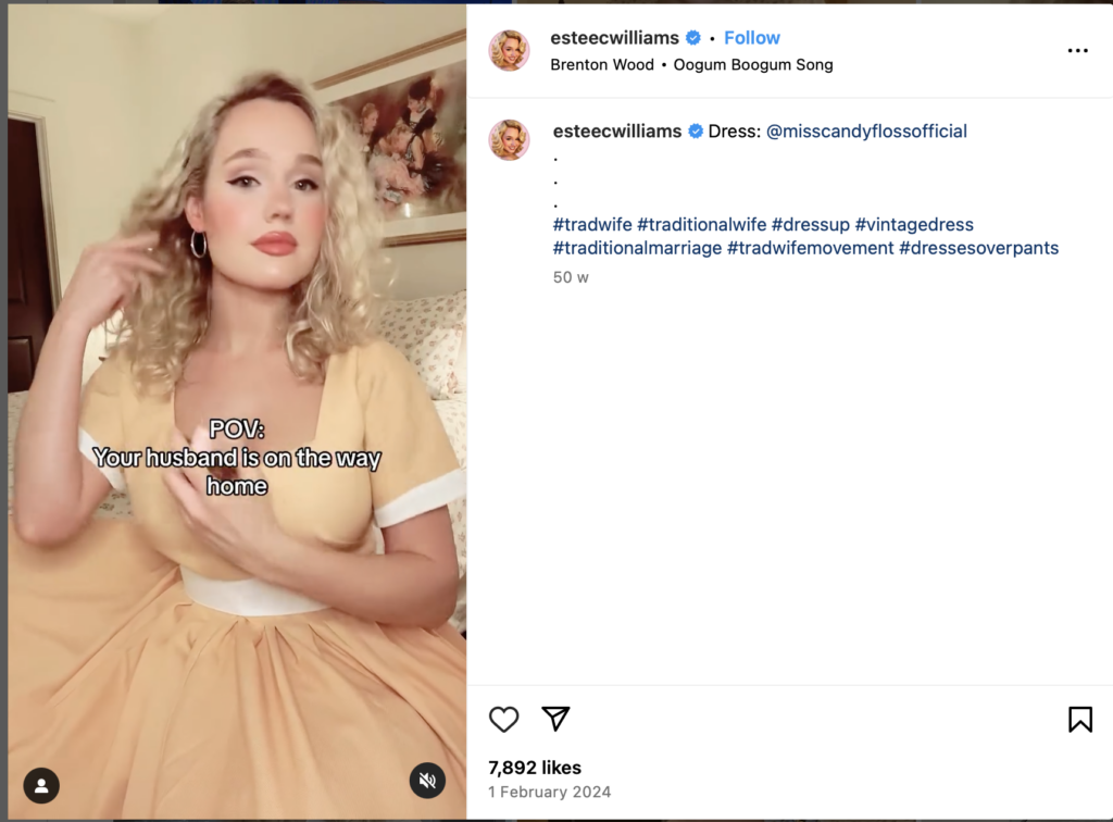
In corners of TikTok, Instagram, and YouTube, a growing contingent of women has taken up a lifestyle that many would consider a throwback to the 1950s: the “traditional housewife.” Figures like Nara Smith, who has amassed a large following on TikTok, showcase daily vlogs of home cooking, tidying routines, and meticulously styled outfits reminiscent of an era where the man of the house was the primary breadwinner, and the woman’s role revolved around homemaking. Under hashtags such as #TradWife, #TraditionalLifestyle, or #WifeLife, these influencers share snapshots of a life that appears orderly, domestic, and, to some viewers, refreshing in its simplicity.

Source: Instagram/esteecwilliams

However, this new revival of housework is not just a pastime. Rather, it is a constellation of viewpoints and experiences. Some women see it as an empowering personal choice, freeing them from the pressures of business life and the stressful juggling of two incomes. Others argue that it reinforces patriarchal norms and oversimplifies the very real social, economic, and political achievements that women have made over the last century. Regardless of perspective, the phenomenon is now too widespread to ignore and raises questions about nostalgia, identity, and autonomy in society. (Garfinkle, 2024). 

Escape from the ‘hustle culture’

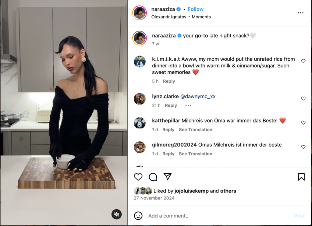
Source: Instagram/naraaziza

The longing to escape the demands of ‘hustle culture’ is a common theme among self-proclaimed ‘trad wives’. At a time when digital networking is blurring the lines between personal space and professional obligations, many people – including women – are feeling burnt out by the relentless productivity standards that exist in today’s culture. For some, withdrawing from their professional lives and focusing on the home is a relief. In her TikTok videos, Nara Smith often talks about the peace she finds in a cozy home environment where she plans home-cooked meals and maintains a daily routine free from performance reviews or endless Zoom calls (Walden, 2024). In an economy that prioritizes ambition and measurable success, such a change can seem radical. Critics see it as a retreat from women’s hard-won gains in the public sphere, but supporters argue that the choice, to go from CEO to homemaker actually validates the spirit of personal preference that feminism has always advocated. In other words, the opportunity to ‘ plug into’ domestic life is just as valid for some as the opportunity to have a high-powered career. 

Rapid technological changes, political tensions, and social turmoil can stir up a longing for supposedly simpler times. An important selling point in the #TradWife scene is the idea of stability. Traditional domestic roles are portrayed as an anchor in a chaotic world: The man’s role is clearly defined as a provider, and the woman’s role is equally clear as a nurturer of home and family. Although it is debatable whether the 1950s were really as idyllic as they were portrayed in black-and-white television programs – given the raging gender and racial inequalities – the romantic image remains strong to this day (Gerhard, 2021b). The #TradWife trend, as seen on Nara Smith’s feed, capitalizes on this romanticization: carefully set dining tables, slow-cooked recipes and a calm domestic atmosphere resonate with followers seeking a sense of security or control.

A remarkable twist in the modern version of being a housewife is the very public way in which this domestic life is presented. While historical housewives lacked the platforms and networks to share tips beyond their local communities, today’s ‘trad wives’ foster online communities that reach a wide audience. Influencers share recipes, household tips, and relationship dynamics – all in real time. Some even fund their content through sponsorship or affiliate marketing, turning homemaking into a revenue-generating business. This complicates the question of whether this lifestyle is ‘regressive’.From a certain perspective, these modern housewives are not just domestic helpers, but also content creators, small business owners, and community leaders. Their brand is based on a nostalgic aesthetic but utilizes the tools of modern entrepreneurship – social media analytics, influencer marketing, and virtual networks.

For many feminists and social activists, the glorification of the 1950s housewife role somewhat ignores the inequalities that characterized this era as well. In the past, women did not always have the free choice to stay at home but it was expected and seen as the norm within society. Social norms and legal structures often excluded them from higher education, significant careers, and financial independence. Today, critics worry that the portrayal of domesticity as an escape from ‘toxic’ modern culture masks the real barriers that women still face, including pay inequality, discrimination in the workplace, and the burden of unpaid care work that can maintain dependence on a partner’s income (Tradwife-Trend: Nostalgie Oder Antifeministisches Risiko? – ING, n.d.).Others question whether celebrating the #TradWife trend risks fostering a romanticized illusion. The curated nature of social media can mask the realities of domestic labor, financial vulnerability or the dissatisfaction that can arise from leaving the workforce. Furthermore, in families dependent on a sole earner, the economic risks are multiplied when a spouse loses their job or faces unexpected difficulties – factors that are not easily captured in aesthetically pleasing Instagram images (Schuster, 2024).

Ultimately, the resurgence of traditional housewife ideals embodies the tension between choice and cultural influence. For some, staying home is a personal preference that can foster fulfillment, strengthen mental health, and create strong family bonds. For others, it raises broader societal concerns about eternalizing gender roles that restrict future opportunities. Maybe the real question is whether society can embrace diversity in how women choose to structure their lives—be it as full-time homemakers, professionals, or something in between. While hashtags like #TradWife represent a specific aesthetic and worldview, there is room in modern discourse to acknowledge that not all women (or men, for that matter) find empowerment in the same roles. By understanding the motivations, challenges, and appeals of the trend, we can foster more conversations about identity, family, and the evolving meaning of work in the 21st century.

Sources: 

Garfinkle, M. (2024, July 29). What Is a Tradwife? All About the Controversial Lifestyle — And Why It’s Having a Viral Moment. People.com. https://people.com/what-is-a-tradwife-8684651#:~:text=Researcher%20Mariel%20Cooksey%20defined%20%E2%80%9Ctradwifery,norms%2C%E2%80%9D%20per%20the%20Political%20Research

Gerhard, U. (2021b, December 7). 50 Jahre Gleichberechtigung – eine Springprozession – Essay. bpb.de. https://www.bpb.de/shop/zeitschriften/apuz/31157/50-jahre-gleichberechtigung-eine-springprozession-essay/

Schuster, K. (2024, September 15). Tradwife: Warum der TikTok-Trend gefährlich ist. ZDFheute. https://www.zdf.de/nachrichten/politik/ausland/tradwife-bewegung-trend-tiktok-100.html

Tradwife-Trend: Nostalgie oder antifeministisches Risiko? – ING. (n.d.). ING-DiBa. https://www.ing.de/wissen/tradwife-trend/

Walden, K. (2024, August 16). 5 times Nara Smith made us question if #TradWife life is just a big joke. Brit + Co. https://www.brit.co/nara-smith/

Inclusive Design: Brand Analysis

In an industry dominated by hyper-feminine and hyper-masculine branding, Aesop stands out as a benchmark for gender-neutral design. The luxury skincare brand has cultivated an aesthetic that feels both refined and universal, proving that effective design doesn’t need to rely on traditional gender cues. But what makes Aesop’s approach so successful? And what can other brands learn from it?

Stripping Away Gendered Clichés

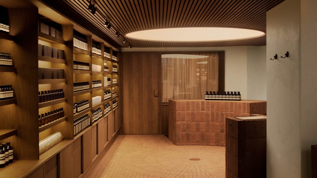
Many skincare brands lean heavily on gendered marketing—soft pastels and floral motifs for women, dark packaging and bold typography for men. Aesop rejects this binary entirely. Instead of relying on color-coding or stereotypical imagery, the brand embraces minimalism, neutral tones, and functional elegance.

  • Packaging: Aesop’s signature amber bottles and uniform labeling eliminate gendered visual cues, making the products feel accessible to all.
  • Typography: The brand uses clean, sans-serif fonts with consistent, evenly spaced lettering—avoiding decorative or aggressive typefaces often associated with gendered branding.
  • Fragrance: While many brands market scents as distinctly “masculine” or “feminine,” Aesop’s botanical blends are designed to be universally appealing, balancing earthy, herbal, and citrus notes.

By prioritizing simplicity and consistency, Aesop creates a design language that feels timeless, sophisticated, and non-exclusive.

Designing for Experience, Not Gender

Aesop’s gender-neutral approach extends beyond packaging—it’s embedded in the brand’s entire retail experience. Each store is uniquely designed to reflect its local surroundings, reinforcing the idea that Aesop is for everyone, everywhere.

  • Neutral Materials: Stores favor natural materials like wood, stone, and metal, rather than stereotypically “masculine” industrial designs or “feminine” luxury aesthetics.
  • No Gendered Sections: Unlike many skincare retailers that divide products into men’s and women’s categories, Aesop organizes by function and need—ensuring that customers select based on skincare concerns, not societal expectations.
  • Consultation-Driven Shopping: Aesop’s retail experience is centered around personalized consultation rather than gendered marketing, reinforcing a human-first approach to beauty and self-care.

This philosophy ensures that every customer feels equally considered and valued, regardless of gender identity.

What Other Brands Can Learn

Aesop’s success in gender-neutral design isn’t just about aesthetics—it’s about rethinking how brands communicate with their audiences. Here are key takeaways:

  1. Function Over Stereotypes: Instead of designing for “men” or “women,” focus on what the product does and how it benefits the user.
  2. Consistency is Key: A clear and minimalist design language ensures that branding feels cohesive and inclusive.
  3. Experience Matters: Beyond visuals, consider how retail spaces, digital touchpoints, and customer interactions reinforce a neutral, welcoming brand identity.

Why Aesop’s Approach Works

Aesop proves that gender-neutral design is not about being bland—it’s about being intentional. By stripping away unnecessary gendered cues and focusing on quality, functionality, and experience, the brand has built an identity that resonates across demographics.

As more industries move toward inclusivity, Aesop stands as a powerful example of how brands can create design-first, human-centered experiences that transcend gender norms.

Sources

  1. Aesop’s Official Design Philosophy
  2. Minimalist Branding & Gender Neutrality in Design
  3. How Aesop’s Retail Spaces Create Inclusive Shopping Experiences

The living room of society

When talking about loneliness and human connection so called „third places“ often come up. The term was first coined by Ray Oldenburg who defined first places (home), second places (work) and finally the idea of third places, which he defines as spaces for „informal, free social interaction“, for example libraries, cafés, restaurants, museums etc. He even goes so far as to say that as places of free speech (and allowing a certain level of equality), third spaces can be seen as the “precursors of democracy“. They are places in which we meet friends and strangers, foster connections and create new ones [1]. This is especially interesting when talking about loneliness, since even small and short social interactions can improve mental wellbeing and create a feeling of belonging and connection [2].

When designing Third Places it is important to remember that they are dynamic spaces that are constantly changing, evolving and adapting: „A public space cannot be finished any more than the city in which it resides can be“ [3]. This also means that a key element of a good public space is good management, to be able to keep up with the needs and constant changes of the communities and people. Big issues when creating spaces (besides real estate prizes and restrictive regulations [4]) has been that much of the planning and building has been done from the top down, by experts such as architects and urban planners. The main factor however are the people: „Normal citizens are the best experts that you can ask for when planning how a place should be designed or used“ [3]. Citizen participation could therefor be an interesting topic for the design process of third places, asking questions like How can people be motivated to engage and participate in community building? And How can we make Third Spaces accessible for all people? [5]

“Libraries shouldn’t shush, they should roar”
In her Talk Maarya Rehman makes an interesting case about libraries as good Third Places, even or especially in the digital age. She opens up an entirely new angle to think about libraries, describing her own experience when she was given the opportunity to reopen a library in Pakistan. Rehman states that a place like a library doesn’t have just one function and can be many different things to many different people, depending on their needs. Another important attribute – as mentioned previously – is that Third Places act as social levelers. This means that it doesn’t matter who a person is (where they come from, how much money they make, etc), in Third Places like libraries they are simply a citizen. Finally she makes the point, that the existence of these Places in the real world is as relevant as ever with a large amount of our lives shifting into the digital online world where our connections become intangible data and we are constantly overloaded with information. Libraries can take many forms and help people connect over one thing at a time. Be it a common interest or a shared problem that can be solved together. [6, 7]

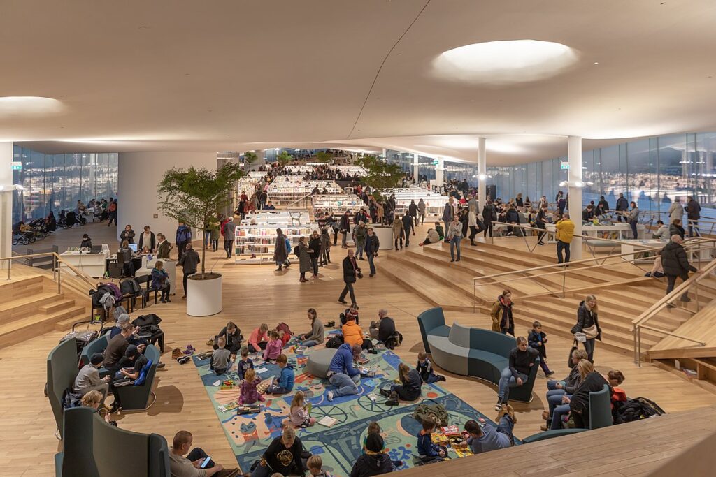
Several places have taken up this idea and basic concept of a library and adapted it to their needs. One of the most famous examples is Finland with its Oodi library, that not only rents out books, but is an entire three story building detected to bringing people together for creative collaboration, co-working and connecting [7]. It has a restaurant and cafe for people to eat and chat, but also several different areas of creative work like sewing machines. It is a small ecosystem with everything that is needed for different types of communities and connection. It makes co-working possible but also offers workshops for people to learn and bond over new experiences. Studios with expensive equipment can be rented to work on projects and create together. It is also inclusive to all generations offering family solutions for people with children. All in all it is an incredibly diverse place, designed for many types of different interaction and existing for many different people and a very interesting starting point for thinking about the potentials of public spaces.

Oodie Public Library, Finland https://de.wikipedia.org/wiki/Oodi


Sources

  1. R. Oldenburg, The great good place: Cafes, Coffee Shops, Bookstores, Bars, Hair Salons, and Other Hangouts at the Heart of a Community. Da Capo Press, 1999.
  2. J. Murray, “Are third places the cure for loneliness?,” Wondermind, May 16, 2024. https://www.wondermind.com/article/third-place/
  3. “To make a great third place, get out of the way.” https://www.pps.org/article/to-create-a-great-third-place-get-out-of-the-way
  4. C. Diaz and S. M. Butler, “‘Third places’ as community builders,” Brookings, Sep. 14, 2016. [Online]. Available: https://www.brookings.edu/articles/third-places-as-community-builders/
  5. M. Lerner, “Redefining third spaces: Modern approaches to informal urban gathering places – Urban Land Magazine,” Urban Land, Aug. 16, 2024. https://urbanland.uli.org/redefining-third-spaces-modern-approaches-to-informal-urban-gathering-places
  6. M. Rehman, “Libraries – the good (third) place,” TED Talks. [Online]. Available: https://www.ted.com/talks/maarya_rehman_libraries_the_good_third_place?subtitle=en
  7. “Home – Oodi,” Oodi, Jan. 02, 2025. https://oodihelsinki.fi/en/