Mastering Design Principles: The Key to Compelling Creations 

Design principles serve as the backbone of any successful visual composition. They guide us designers in creating pieces that are not only aesthetically pleasing but also functionally effective. Whether crafting a website, designing a logo, or creating a product interface, understanding and applying these principles can elevate the work. Let’s delve into the core design principles and how they contribute to exceptional designs. 

Balance: The Foundation of Harmony 
Balance refers to the distribution of visual weight across a design. When balance is achieved, no single element feels heavier than the others, creating a sense of harmony. There are two main types of balance: 

  • Symmetrical Balance: This occurs when elements are evenly distributed on either side of an axis. Think of a butterfly’s wings – perfectly mirrored. 
  • Asymmetrical Balance: Here, balance is achieved through contrast. For instance, a small, dark object on one side of a composition can balance a large, light object on the other. 

Balance provides stability and structure, ensuring that the design feels cohesive and complete. 

Contrast: Highlighting Differences 
Contrast is all about juxtaposing elements to make them stand out. It can be achieved through differences in color, size, shape, texture, or even font style. A classic example is using a bold, dark font against a light background to emphasize text. 

Why is contrast so important? It: 

  • Draws attention to key areas. 
  • Enhances readability. 
  • Creates visual interest. 

Without contrast, designs risk feeling flat and uninspiring. 

Emphasis: Guiding the Viewer’s Eye 
Emphasis ensures that the audience knows where to look first. It’s about creating a focal point—a part of the design that grabs attention immediately. Techniques to achieve emphasis include: 

  • Using a pop of color in a monochromatic scheme. 
  • Increasing the size of a specific element. 
  • Positioning an object prominently within the composition. 

Think of emphasis as a spotlight in a theater, directing attention to the main act. 

Repetition: Building Unity and Consistency 
Repetition involves using the same elements throughout your design. This could be a recurring color palette, font, or shape. By repeating elements, you create a rhythm that ties the design together. 

Repetition is especially useful in branding. For example, consistent use of a company’s logo, colors, and typography builds familiarity and trust with audiences. It’s a subtle yet powerful tool for creating a cohesive identity. 

Proportion: Achieving Visual Balance 
Proportion relates to the size and scale of elements in relation to one another. It ensures that all parts of the design work together harmoniously. For instance, a human figure in an illustration should have arms and legs proportional to its body. 

Good proportion helps maintain visual order. When proportions are off, the design may feel awkward or jarring to the viewer. 

Movement: Creating a Visual Journey 
Movement guides the viewer’s eye through the design in a purposeful way. This principle helps create a sense of flow and narrative. Designers use lines, shapes, or strategic placement of elements to lead the audience from one point to another. 

Movement keeps viewers engaged and ensures they interact with your design as intended. 

White Space: The Power of Simplicity 

White space, also known as negative space, is the area around and between elements. Far from being “empty,” white space is a powerful tool that enhances readability, reduces clutter, and gives designs room to breathe. 

Key benefits of white space include: 

  • Highlighting key elements. 
  • Providing visual clarity. 
  • Creating an elegant, minimalist aesthetic. 

Think of white space as the silent pause in a song—essential for rhythm and impact. 

Alignment: Structuring Your Design 

Alignment ensures that elements are arranged in a visually pleasing way. Whether it’s left, right, center, or justified alignment, this principle organizes content and creates a polished look. 

Alignment is like the glue that holds a design together, giving it structure and professionalism. 

Unity: The Goal of Cohesion 

Unity is achieved when all elements in a design work together as a whole. It’s the culmination of applying other design principles effectively. A unified design feels intentional, complete, and aesthetically pleasing. 

Unity can be fostered through: 

  • Consistent use of colors, fonts, and styles. 
  • Repetition of patterns or motifs. 
  • Careful consideration of spacing and proportions. 

When unity is present, the design resonates with the viewer and communicates its message effectively. 

Conclusion 

Mastering design principles is essential for creating compositions that are both beautiful and functional. By focusing on balance, contrast, emphasis, repetition, proportion, movement, white space, alignment, and unity, you can elevate your designs to a professional level. These principles are not rigid rules but flexible guidelines that allow for creativity while ensuring that your designs remain effective. 

Whether you’re a seasoned designer or just starting out, revisiting these principles can provide valuable insights and fresh perspectives. Remember, great design isn’t just about what you add—it’s also about how you arrange, emphasize, and refine. 


Reference

https://www.linearity.io/blog/design-principles/ 18.01.25, 19:54

https://medium.com/@celestenorth/guiding-design-decisions-ecfefec92e50 19.01.25, 21:09

https://muz.li/blog/principles-driving-innovative-products/ 19.01.25, 21:15

https://jpamental.medium.com/guiding-principles-for-design-1ab90d190c11 18.01.25, 19:23

https://www.toptal.com/designers/gui/principles-of-design-infographic 19.01.25, 21:21

How Spatial Audio Can Transform the Perception Art

Art is often viewed as a visual medium, but there’s a growing recognition that engaging multiple senses can deepen and expand the impact of artwork. With more artists exploring sound, touch, and smell as tools for evoking responses, the blending of art and audio is an exciting space for both creators and audio professionals alike. New technologies are allowing immersive audio experiences that go beyond mere background noise, with sound becoming a vital and integral part of the art itself.

Sound as an Immersive Tool for Art

One of the remarkable things sound can do in a museum setting is to stop time and bring visitors into a present, deeply engaged state. The immersive power of sound offers a break from the constant bombardment of information and distractions in daily life. It creates a unique, curated journey that invites visitors to truly focus on the artwork and its surrounding atmosphere. Whether it’s a subtle hum of a distant conversation or a carefully designed soundscape that matches the theme of an exhibit, sound can enhance emotional responses and provide deeper context for understanding art.

Integrating Spatial Audio in Museum Experiences

Spatial audio, which positions sound within a 3D space, is revolutionizing how visitors experience art. A perfect example of this is the Japan Supernatural exhibit at the Art Gallery of New South Wales in Sydney. Through an innovative platform by Art Processors, visitors experienced a spatial soundscape that shifted based on their location. As they moved through the exhibit, they could choose whether to listen to a narrative voice or simply absorb the rich auditory atmosphere surrounding the artwork. This approach allowed visitors to control their experience, making the audio an active, responsive element that enhanced their understanding and enjoyment of the art.

This method of blending sound with visual elements is different from the traditional approach of background audio that merely accompanies an exhibit. Here, the sound is designed to be integral—responding to the visitor’s movements and choices, becoming as essential to the experience as the visual art itself.

Designing for Emotional and Cognitive Impact

Sound can connect directly with our emotions in ways that visuals alone cannot. In designing immersive spaces, curators and sound designers focus on creating a balance between emotional and cognitive experiences. Sound is often used to underscore or trigger specific emotional responses, guiding the viewer’s journey through the space. For instance, more intellectual or factual elements of an exhibit might be complemented with music or sounds that guide the visitor into an emotional moment, creating a dynamic narrative flow.

Accessibility in Audio Design

In the design of immersive audio experiences, accessibility is a central concern. Many museums and cultural institutions are now integrating accessible options for visitors with different needs, from closed captioning to sign language videos and sonified wayfinding for blind or low-vision individuals. These advancements are part of a broader effort to ensure that everyone, regardless of ability, can fully engage with the museum’s offerings.

The Future of Audio in Museums

The use of spatial audio is still evolving, but studies have shown its potential to significantly enhance the museum experience. In a study conducted in a Cognitive Immersive Room, participants showed a clear preference for soundscapes that were congruent with the exhibition’s theme. This approach was not only more immersive but also helped reduce distractions and increase focus. More than half of the participants preferred soundscapes that complemented the visual art, indicating that a well-designed auditory experience can deepen engagement with the art and the space.

References:

https://acoustics.org/enhancing-museum-experiences-the-impact-of-sounds-on-visitor-perception

https://www.aam-us.org/2022/08/26/transforming-museums-with-immersive-sound/

https://www.artprocessors.net/projects/art-gallery-new-south-wales-japan-supernatural

https://www.inavateonthenet.net/features/article/audio-technology-opens-a-new-frontier-in-the-art-market?

Weniger Köpfe, mehr Fokus: Die Teamdynamik kleiner Filmcrews

Kleine Forschungsteam veröffentlichen laut Studien originellere und bahnbrechendere Erkenntnisse als größere Gruppen. Ein Ursache dafür könnte sein, dass der mensch sich oft bei zu vielen Menschen den gruppenkonsens anschließt und dadruch innovative Ideen auf der Stercke bleiben.

Unsere Fähigkeit zum kreativen Denken ist eine kombination aus bekannten wissen und auch entwickler völlig nueer idden. Dies ist besonders fruchtbar wenn Menschen sich untereinander ausstauschen und in Gruppen arbeiten. Außerdem ist das direkte miteinander viel ideenfördernter als ein online Brainstorming. Martin Lercher von der Universität Düsseldorf und Itai Yanai von der New York University untersuchten, wie viele Gesprächspartner notwendig sind, um kreative Ideen zu fördern. Ihre Forschung aus dem Jahr 2019 analysierte 65 Millionen wissenschaftliche Veröffentlichungen, Patente und Softwareprodukte, um die optimale Teamgröße für Innovationen und Forschungserfolg zu bestimmen.

Die Ergebnisse zeigen, dass kleine Teams mit ein bis drei Mitgliedern deutlich häufiger bahnbrechende neue Konzepte entwickeln, die das jeweilige Fachgebiet nachhaltig beeinflussen können. Im Gegensatz dazu konzentrieren sich größere Gruppen eher darauf, bestehende Ideen weiterzuentwickeln. Lercher erklärt, dass Arbeiten mit vielen Autoren zwar oft zitiert werden, aber selten originelle Ansätze enthalten, während die kreativsten Ideen typischerweise von kleinen Teams stammen.

Nach Ansicht der Forscher sind kleine Gruppen besonders gut darin, kreative Ideen zu entwickeln. Entgegen der Annahme, dass mehr Menschen automatisch zu mehr Ideen führen, zeigt sich, dass kleine Teams oft innovativer sind. Laut Lercher ist die kleinste Gruppe – zwei Personen – am besten für den kreativen Austausch geeignet, da hier die Dynamik überschaubar bleibt und der kreative Prozess weniger gestört wird.

In größeren Gruppen hingegen dominieren häufig die lautesten Stimmen, unabhängig von deren inhaltlicher Qualität. Andere Mitglieder passen sich dann dem Gruppenkonsens an und halten ihre eigenen Ideen zurück. Dadurch werden unkonventionelle Gedanken oft im Keim erstickt. Beim Austausch zu zweit spielen solche sozialen Dynamiken eine geringere Rolle, da es weniger darum geht, andere zu beeindrucken, und mehr Raum für echte Innovation entsteht. (scinexx.de. (n.d.). Zu zweit sind wir am kreativsten. Abgerufen am 19. Januar 2025, von https://www.scinexx.de/news/psychologie/zu-zweit-sind-wir-am-kreativsten/?utm_source=chatgpt.com)

Die Verbesserung der Teamdynamik ist essenziell für die Effizienz und das Wohlbefinden in modernen Arbeitsumgebungen. Gassmann identifiziert fünf zentrale Strategien zur Optimierung der Zusammenarbeit in Teams:

  1. Klare Rollen und Verantwortlichkeiten definieren: Unklare Zuständigkeiten können zu Missverständnissen und Konflikten führen. Durch transparente Festlegung von Rollen und regelmäßige Überprüfung der Aufgabenverteilung wird die Zusammenarbeit harmonisiert.
  2. Effektive Kommunikation fördern: Eine offene und regelmäßige Kommunikation ist das Fundament erfolgreicher Teams. Methoden wie tägliche Stand-up-Meetings und eine etablierte Feedback-Kultur unterstützen den Informationsfluss und minimieren Missverständnisse.
  3. Vertrauen durch gemeinsame Erlebnisse aufbauen: Gemeinsame Aktivitäten, wie Teambuilding-Events oder das Feiern von Erfolgen, stärken das Vertrauen und den Zusammenhalt innerhalb des Teams.
  4. Konflikte konstruktiv lösen: Konflikte sind unvermeidlich, doch ein proaktiver und offener Umgang fördert die Lösungsfindung und verhindert langfristige Spannungen. Frühzeitiges Eingreifen und moderierte Gespräche sind hierbei hilfreich.
  5. Diversität und Inklusion fördern: Vielfältig zusammengesetzte Teams profitieren von unterschiedlichen Perspektiven. Ein inklusives Umfeld, in dem sich alle Mitglieder wertgeschätzt fühlen, steigert die Kreativität und Innovationskraft.

Zudem wird die Bedeutung der psychologischen Sicherheit hervorgehoben. Ein Umfeld, in dem Teammitglieder ohne Angst vor negativen Konsequenzen ihre Meinungen äußern können, fördert Offenheit und Kreativität. Maßnahmen wie die Etablierung einer Fehlerkultur, Förderung offener Kommunikation und Empathie seitens der Führungskräfte tragen dazu bei, diese Sicherheit zu gewährleisten.

Abschließend betont mindshyft.ch, dass die kontinuierliche Pflege der Teamdynamik entscheidend für den langfristigen Erfolg ist. Regelmäßige Reflexion und Anpassung der genannten Strategien helfen, ein produktives und harmonisches Arbeitsumfeld zu schaffen. (Gassmann, M. (2024, 15. September). Teamdynamik: 5 effektive Strategien um deine Dynamik im Team zu verbessern. Mindshyft. Abgerufen am 19. Januar 2025, von https://mindshyft.ch/strategien-um-teamdynamik-zu-verbessern/)

Aus eigener Erfahrung ist es wichtig, dass die Filmteams schon einmal miteinander gearbeitet haben und die Personen sich untereinander kennen. So versichert man, dass Stresssituationen nicht eskalieren und jeder den anderen kennt und weiß wie zu reagieren ist. Außerdem weiß man wie die anderen Arbeiten und kann seine eigene Arbeitsweise daran anpassen. Jeder muss am Set wissen was der andere macht. So lassen sich Abläufe verschnellern und angenehmer Arbeiten. Ein Problem das Auftritt, wenn weniger Crew benutzt wird ist, dass es wahrscheinlich in der Produktion mehr Drehtage werden. Um die Drehtage so wenig wie möglich zu halten ist eine sehr gute Pre-Production von Nöten. Dies sollte normal immer der Fall sein, wird aber manchmal aus Zeitgründen vernachlässigt.
Das Arbeiten im Team ist immer eine sehr soziale Sache und hängt starken von den Menschen ab. Die richtigen Menschen muss man im Laufe seiner Berufslaufbahn finden und dann versuchen diese um sich zu halten um Zukünftige Projekte mit kleineren aber besser arbeiteten Teams zu bewältigen.

07 Designing for Vulnerable Populations: Privacy for Everyone

Introduction

Not all users interact with digital platforms in the same way. Vulnerable populations, such as children, the elderly, and those with limited technological literacy, often face unique challenges in managing their digital footprints. This post explores how privacy tools and frameworks can address these diverse needs, ensuring inclusivity and accessibility. These considerations will play a significant role in refining my thesis goals of creating possible solutions that works for everyone.

Why Vulnerable Populations Need Special Consideration

Certain groups are more susceptible to privacy risks due to limited understanding or access to tools:

  1. Children: Often unaware of data tracking, making them targets for ads or manipulative designs. Example: Gaming apps that collect location data without parental consent.
  2. Elderly Users: Many find privacy tools overwhelming or confusing, leaving them exposed to scams or data misuse.
  3. Low-Literacy or Non-Tech-Savvy Users: Struggle with complex settings or opaque terms of service, leading to accidental oversharing.
Certain groups are more susceptible to privacy risks due to limited understanding or access to tools

How can privacy tools and frameworks be designed to accommodate the unique needs of vulnerable populations?

  • What barriers prevent vulnerable groups from effectively managing their digital footprints?
  • How can accessibility principles improve privacy tool design?

Design Strategies for Inclusive Privacy Tools

  1. Simplified Interfaces: Prioritize clean layouts and clear labels. Example: A single dashboard with large buttons for enabling/disabling permissions (e.g., “Stop Location Sharing”).
  2. Parental Controls: Design features that empower parents to manage their children’s digital activity. Example: Tools that notify parents about apps collecting sensitive data.
  3. Educational Content: Embed tutorials or interactive guides that explain privacy concepts in simple terms. Example: A short video explaining what cookies are and how to manage them.
  4. Localization and Accessibility: Ensure tools are available in multiple languages and compatible with assistive technologies. Example: Text-to-speech options for visually impaired users.

These strategies will be incorporated into the possible solutions I will develop to ensure inclusivity is a core component.

Challenges in Addressing Vulnerable Populations’ Needs

  1. Diverse Requirements: Balancing simplicity with functionality to meet varied user needs.
  2. Awareness Gaps: Educating users about privacy risks without overwhelming them.
  3. Compliance with Laws: Adhering to regulations like COPPA (Children’s Online Privacy Protection Act) and ADA (Americans with Disabilities Act).

Relevance to My Thesis Goals

Inclusivity is central to my work. By addressing the needs of vulnerable users, I can ensure the solutions I propose are effective for a wider audience. These insights will help shape design guidelines that prioritize accessibility and equity, making privacy tools genuinely universal.

06 Transparency in Data Use: Building Trust Through Clear Communication

Introduction

Trust is the foundation of any user-platform relationship, and transparency is the key to earning it. Users need to know what data is being collected, why, and how it’s being used. In this post, I’ll explore how clear communication about data use can strengthen user trust and discuss practical design strategies for achieving transparency. These insights will inform my thesis objectives: creating a Privacy Framework for companies and prototyping a tool for managing personal data online.

Why Transparency Matters

Transparency transforms uncertainty into trust. When users understand how their data is used, they’re more likely to engage with a platform. Without it, users feel manipulated, leading to distrust and disengagement. Example: Many users became wary of Facebook after the Cambridge Analytica scandal because the platform failed to communicate how user data was being shared and exploited.

Key Elements of Transparent Data Use

  1. Clarity: Use plain language to explain data practices. Example: Replace “We may collect certain information to enhance services” with “We use your email to send weekly updates.”
  2. Visibility: Make privacy policies and settings easy to find. Example: A single-click link labeled “Your Data Settings” at the top of a webpage.
  3. Real-Time Feedback: Show users how their data is being used in real time. Example: A privacy dashboard that displays which apps or services are currently accessing your location.
Possible transparency settings that can be introduced by companies

Case Studies of Transparency in Action

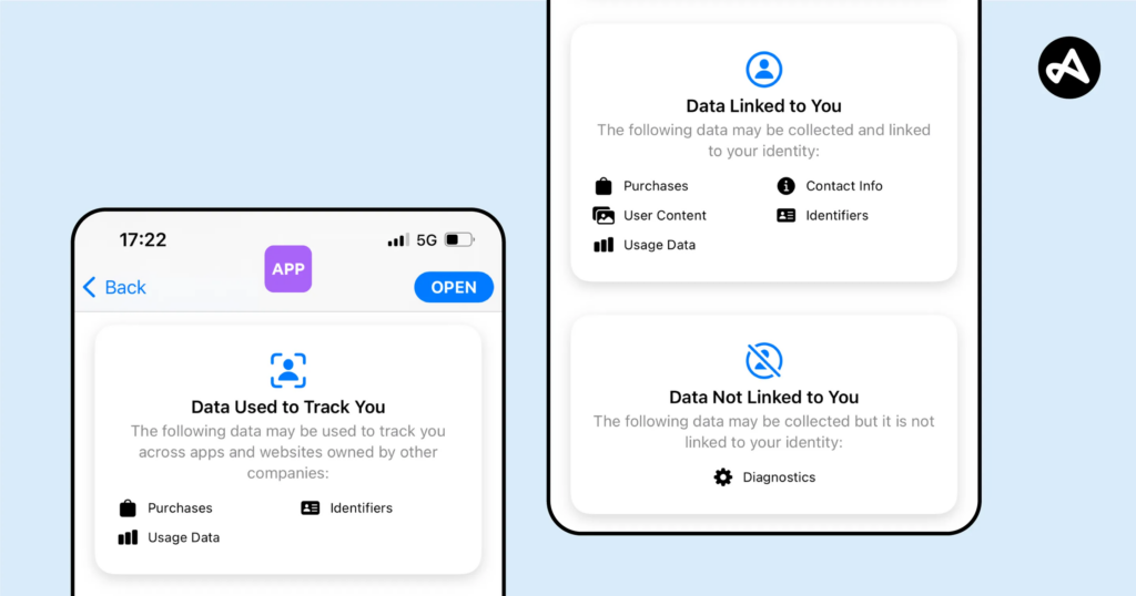
  1. Apple’s Privacy Nutrition Labels: These labels show, at a glance, what data an app collects and how it is used, simplifying complex privacy policies into digestible bits of information.
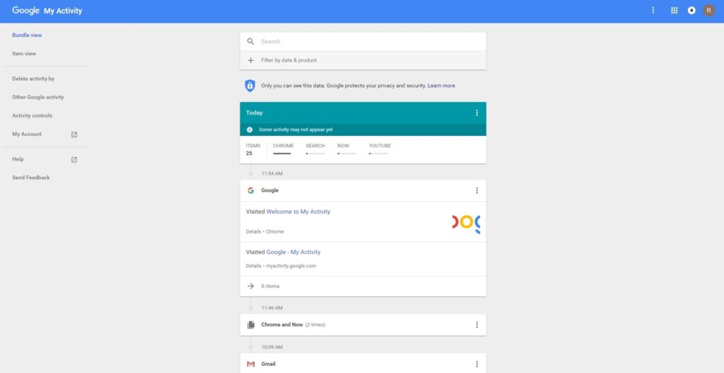
  2. Google’s My Activity Dashboard: Google allows users to view and manage their activity data, offering options to delete or limit collection.
  3. noyb.eu’s Advocacy Work: By challenging platforms that obscure their data use, noyb has pushed for greater clarity and compliance with GDPR.

These examples demonstrate how transparency fosters trust and aligns with ethical design principles.

Apple lets you know what data is being used.
image source: Adjust
Google has a “My Activity” section tyhat shows relevant info.

How can design effectively communicate data use to build trust and ensure transparency?

  • What visual and interactive elements improve users’ understanding of data use?
  • How can transparency features integrate seamlessly into existing platforms?

Designing for Transparency

To achieve transparency, platforms can:

  1. Integrate Visual Feedback: Use graphics, charts, or icons to explain data use. Example: A pie chart showing how much of your data is used for ads vs. analytics.
  2. Streamline Privacy Policies: Provide short, bulleted summaries of key data practices. Example: “We collect: your email for updates, your location for recommendations, and your browsing history for ads.”
  3. Offer Customization: Allow users to adjust permissions directly. Example: Toggles for enabling/disabling specific data categories like tracking or personalization.

These approaches will also inform the Privacy Framework I’m developing, ensuring it includes actionable guidelines for platforms to improve data transparency.

Challenges and Personal Motivation

Transparency isn’t always easy to achieve. Challenges include balancing clarity with detail, overcoming user distrust, and addressing corporate reluctance to reveal data practices. However, I’m motivated by the potential to create tools and frameworks that make transparency accessible and actionable for users and companies alike.

1.8 Gamification in Mental Health Apps: Engagement or Overload?

Gamification, the integration of game-like elements into non-gaming contexts, has emerged as a popular strategy in mental health apps to boost user engagement and foster positive behavioral changes. By using rewards, progress tracking, and interactive challenges, gamification helps users stay motivated and engaged in achieving their mental health goals. The concept leverages the human tendency to seek immediate gratification, making long-term health routines feel more enjoyable and rewarding. This approach transforms otherwise mundane or challenging tasks into engaging and rewarding experiences, encouraging users to adhere to their mental health practices over time.

The Framework of Gamification: Mechanics, Dynamics, and Aesthetics

Gamification in mental health apps often revolves around the Mechanics-Dynamics-Aesthetics (MDA) framework:

Mechanics are the visible, interactive elements that users directly engage with, such as progress bars, badges, leaderboards, and daily check-ins. Apps like SuperBetter allow users to adopt secret identities, complete challenges, and invite allies for support. Similarly, Finch lets users nurture a virtual bird as they complete self-care tasks, turning progress into a tangible reward.

Dynamics focus on processes like goal-setting, progress tracking, and feedback mechanisms that sustain user engagement. For example, I Am Sober allows users to track their sobriety, showing tangible benefits like money and calories saved over time, which reinforces their commitment. Apps like Happify use adaptive challenges to maintain motivation, rewarding users with points for completing in-app activities tailored to their goals.

Gamification in Finch, Image source: App Store
Gamification in I Am Sober, Image source: App Store

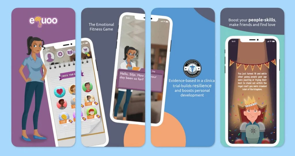
Aesthetics evoke emotions such as motivation and connection through design and storytelling. eQuoo, for instance, uses fantasy storytelling and interactive challenges to teach emotional resilience. Meanwhile, SuperBetter embraces bold visuals and empowering language to encourage users to tackle “bad guys” like self-criticism.

Storytelling in eQuoo, Image source: One Mind Psyber Guide

Benefits of Gamification

Enhanced Engagement

Gamification makes mental health routines more enjoyable and accessible. Features like badges, progress tracking, and leaderboards reward users for their efforts, fostering a sense of accomplishment. For instance, Happify uses positive psychology techniques to help users reduce anxiety and loneliness while promoting emotional well-being​​.

Encouraging Healthy Habits

Apps like Finch and Rootd help users form consistent routines by rewarding daily actions, such as journaling or practicing mindfulness. These small, gamified nudges support users in developing healthier habits over time​.

Gamification in Rootd, Image source: New Ventures BC

Challenges of Gamification

App Fatigue

Over-reliance on repetitive tasks and extrinsic motivators like badges can lead to disengagement. When users feel overwhelmed by excessive prompts or redundant activities, the risk of app fatigue increases​.

Balancing Game and Therapy

Adding too many game elements can dilute the therapeutic value of an app. Research shows that increasing gamified features doesn’t always enhance outcomes, underscoring the need for thoughtful design​​.

Ethical and Practical Considerations

Customization and Personalization

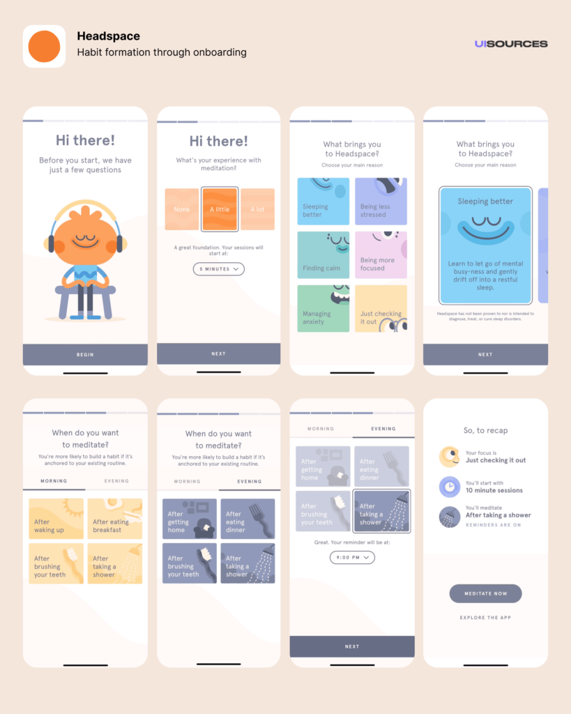
Personalized experiences are key to keeping users engaged. Apps like Headspace offer tailored meditation tracks based on user input, while Rootd adapts its activities to help users manage anxiety and panic attacks effectively.

Onboarding Screens in Headspace, Image Source: UI Sources

Meaningful Interactions

Apps should prioritize outcomes over screen time. For instance, Headspace ensures users benefit from its programs without feeling pressured to overuse the app. Its studies show that completing at least 10 meditation sessions in eight weeks significantly reduces symptoms of depression.

Conclusion

Gamification has great potential to make mental health apps more engaging and effective. By thoughtfully combining game elements with therapeutic goals, these apps can support users on their well-being journeys. However, careful design is crucial to ensure they remain meaningful, balanced, and beneficial.

Sources

  1. Cheng, V. W. S., Davenport, T., Johnson, D., Vella, K., & Hickie, I. B. (2019). Gamification in apps and technologies for improving mental health and well-being: Systematic review. JMIR Mental Health, 6(6), e13717. https://doi.org/10.2196/13717
  2. Hamdoun, S., Monteleone, R., Bookman, T., & Michael, K. (2023). AI-based and digital mental health apps: Balancing need and risk. IEEE Technology and Society Magazine, 42(1), 25–36. https://doi.org/10.1109/MTS.2023.3241309
  3. “How To (and Why You Should) Incorporate Gamification Into Your Mental Health Care App.” SF AppWorks. Accessed: Jan. 19, 2025. [Online.] Available: https://www.sfappworks.com/blogs/incorporating-gamification-into-your-mental-health-care-app
  4. Santoso, I. S., Ferdinansyah, A., Sensuse, D. I., Suryono, R. R., Kautsarina, & Hidayanto, A. N. (2021). Effectiveness of gamification in mHealth apps designed for mental illness. Proceedings of the 2nd International Conference on ICT for Rural Development (IC-ICTRuDev), Jogjakarta, Indonesia, 1–6. https://doi.org/10.1109/IC-ICTRuDev50538.2021.9655706
  5. “The Power of Gamification in Mental Health Apps – And how they benefit well-being.” MedPage Today. Accessed: Jan. 19, 2025. [Online.] Available: https://www.medpagetoday.com/opinion/kevinmd/106239
  6. Valentine, L., D’Alfonso, S., & Lederman, R. (2023). Recommender systems for mental health apps: Advantages and ethical challenges. AI & Society, 38(4), 1627–1638. https://doi.org/10.1007/s00146-021-01322-w

Nostalgia as a Coping Mechanism

The in-between moments of life whether waiting at a train station or scrolling aimlessly through our phones often feel hollow, like pauses in a song that never quite resolve. These spaces, both physical and emotional, are markers of our supermodern world, a concept that philosopher Marc Augé describes as defined by non-places, spaces of transience and anonymity where human connection feels incidental.

In this landscape of fleeting interactions and relentless motion, a curious phenomenon has emerged: an overwhelming yearning for the past. Nostalgia has become more than a wistful longing for simpler times, it’s a response to the alienation of modern life, a coping mechanism for the loss of grounding.

Why Nostalgia Now?

The rise of nostalgia is not random. Moments of uncertainty like the pandemic disrupt our sense of continuity, leaving us detached. When the present feels unstable and the future overwhelming, the past becomes a refuge. We turn to it not just for comfort but for clarity, a reminder of who we are and where we come from.

But this surge in nostalgia isn’t just personal; it’s cultural. It’s reflected in the return of vinyl records, the revival of 90s fashion, and the rise of retro aesthetics in branding and media. Even the way we consume content has shifted: the grainy, imperfect visuals of film photography are back, standing in stark contrast to the high-definition polish of digital life.

Nostalgia in the Age of Supermodernity

Supermodernity surrounds us with spaces and experiences designed for function, not connection. The clean, efficient lines of minimalism, the ubiquity of algorithmically curated feeds, the soulless sprawl of urban planning, they all prioritize performance over personality. In this environment, nostalgia reintroduces warmth, texture, and humanity into a world that can feel sterile and detached.

Consider the design of non-places like airports, shopping malls, and chain hotels. They are spaces without memory, where individual stories blur into the background of globalized sameness. Nostalgia offers a counterbalance, grounding us in the precision of memory and the uniqueness of our personal histories. It asks us to pause and notice the details—the handwritten note, the faded poster, the uneven cobblestones—that make us feel rooted.

The Role of Design in Nostalgia

Design has always played a key role in shaping how we experience the world, and nostalgia is no exception. Today, brands are tapping into this sentiment, not just through retro aesthetics but by embracing imperfection. Consider the resurgence of “wabi-sabi” in design, a Japanese philosophy that celebrates the beauty of impermanence and the incomplete. Or the trend of “photo dumps” on social media, where casual, uncurated snapshots resonate more deeply than polished, posed images.

These movements reflect a growing fatigue with perfection and a desire for authenticity. Nostalgia helps fill this void by reminding us of a time when things felt more real, when objects had weight, spaces had character, and connections felt tangible.

Nostalgia as a Guide

Rather than viewing nostalgia as escapism, we can see it as a guide, a way to reimagine how we design for connection in an increasingly disconnected world. By understanding what draws us to the past, we can begin to apply those principles to the present. This might mean designing spaces that encourage lingering instead of rushing, embracing imperfections instead of hiding them, or creating systems that prioritize people over efficiency.

The in-betweens of life both physical and emotional can be places of profound meaning if we allow them to be. Nostalgia teaches us to pause, to notice, and to find value in what we often overlook. In doing so, it offers us a way to reclaim our humanity in a world that too often feels impersonal.

As we continue to explore these ideas, let’s consider: How can we design not just for function, but for emotion? How can we create spaces digital or physical that honor the past while embracing the present?

05 Designing Privacy-Centric User Experiences: Case Studies and Practical Insights

Introduction

Creating platforms that respect user privacy isn’t just a moral obligation; it’s a necessity in today’s data-driven world. In this post, I focus on designing privacy-centric user experiences, showcasing real-world case studies and exploring actionable design strategies. These insights will directly inform my thesis goals of developing a framework for companies and prototyping a simple privacy tool to empower users to manage their digital footprints more effectively.

What Makes a Privacy-Centric User Experience?

A privacy-centric experience ensures that users are informed, in control, and confident about their data. It prioritizes transparency, simplicity, and respect for user consent while avoiding deceptive practices. This means:

  1. Clarity: Clear communication about what data is collected and why.
  2. Control: Tools that allow users to customize their privacy preferences easily.
  3. Trust: Ethical practices that build long-term confidence.

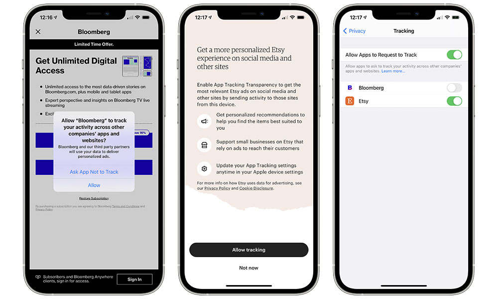
Example: Apple’s App Tracking Transparency feature asks users if they want to allow tracking, giving them a clear choice with simple language.

Case Studies of Privacy-Centric Platforms

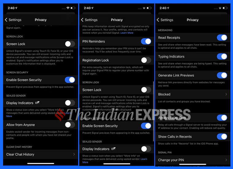
  1. Signal (Messaging App): Signal prioritizes privacy by offering end-to-end encryption and collecting minimal metadata. Users trust Signal because it’s transparent about its data collection policies—essentially none—and offers simple privacy controls.
  2. DuckDuckGo (Search Engine): Unlike Google, DuckDuckGo doesn’t track users or store personal information. Its clean interface and privacy-first branding make it a favorite for those seeking anonymity.
  3. Joindeleteme.com (Data Removal Tool): This tool simplifies the process of removing personal data from online platforms, offering a user-friendly experience with automated data removal requests.
image source: IndianExpress
Image source: iDrop

How Do These Examples Inform Design Practices?

These platforms succeed by embedding privacy into the user experience, demonstrating best practices for designers:

  1. Default Privacy: Assume users want to opt out of tracking. Signal doesn’t track by default, removing the burden of choice.
  2. Simplified Consent: Make choices clear and accessible. DuckDuckGo eliminates tracking entirely, so users don’t need to worry about settings.
  3. Automation: Joindeleteme.com automates repetitive tasks, minimizing user effort while maintaining control.

How can design principles from successful privacy-centric platforms be adapted into frameworks or tools for broader use?

  • What features of these platforms are most effective at fostering user trust?
  • How can automation and default settings simplify privacy management for users?

Designing a Framework for Companies

To guide companies in creating privacy-centric platforms, a framework should include:

  1. Transparency Guidelines: Require clear communication about data collection. Example: Dashboards showing what data is collected in real time.
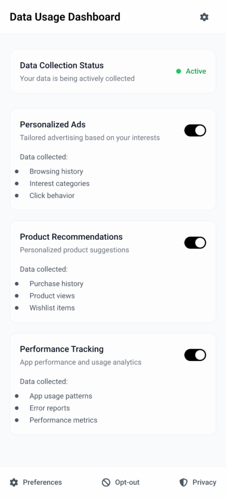
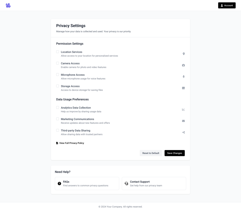
  2. User Empowerment: Include tools that allow users to opt out of tracking with a single click. Example: Privacy toggles for ads, location tracking, and analytics.
  3. Ethical Compliance Checks: Provide a checklist for meeting GDPR and other privacy laws. Example: Assessing whether consent dialogs meet “informed consent” criteria.
Possible permissions users can control if companies implement Privacy Transparency Guidelines

Designing a Prototype Privacy Tool

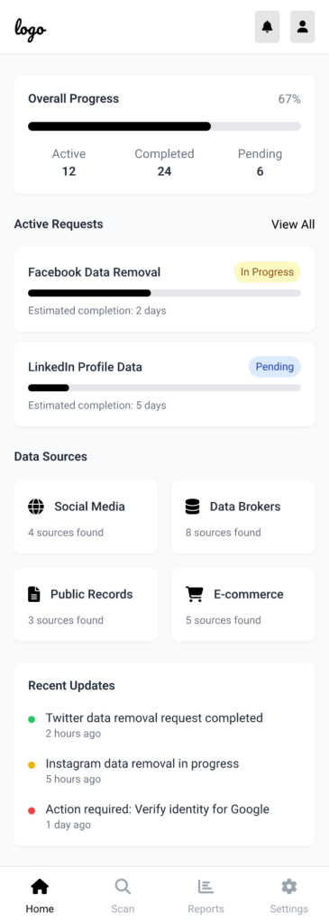
Inspired by joindeleteme.com, the proposed tool could:

  1. Identify Data Sources: Help users find where their personal information exists online.
  2. Simplify Requests: Automate data deletion requests based on privacy laws like GDPR.
  3. Track Progress: Provide real-time updates on data removal processes for transparency.
Mockup of a possible view of the tool

Challenges in Execution

  1. Data Mapping Complexity: Identifying all the platforms where a user’s data exists is a significant technical hurdle.
  2. User Trust: Convincing users to trust the tool with sensitive data requires a flawless UX and a proven ethical stance.
  3. Corporate Pushback: Companies reliant on data monetization may resist the widespread adoption of privacy frameworks.

My Personal Motivation

The more I explore privacy-first platforms, the more I realize how empowering ethical design can be. I’m motivated to create solutions that reduce friction for users while making privacy the norm rather than the exception.

Wieso LED Lichter die Zukunft sind

LED-Beleuchtung vs Ursprüngliche Beleuchtung.

Effizienz, Flexibilität und kreative Kontrolle in der Filmproduktion Die Beleuchtung in der Filmproduktion hat sich in den Jahrzehnten stark verändert. LED übernehmen den Markt und sind auf jedem Filmset vertreten. Sie sind kaum mehr wegzudenken, auch wenn es noch vereinzelt Leute gibt die mit älteren Technologien Arbeiten. In diesem Blogeintrag werfen wir einen blick darauf, wie LED die Filmindustrie zum besseren verändert und warum kein weg drumherum führt. Halogen und Glühlampen. Mit der Erfindung der Glühlampe zu Beginn des 20. Jahrhunderts und später der Halogenlampe in den 1950er Jahren, erlebte die Filmbeleuchtung einen großen Schritt nach vorn. Diese Lampen boten eine zuverlässigere und leistungsfähigere Lichtquelle und ermöglichten eine präzisere Steuerung der Beleuchtung für unterschiedliche Szenen. Besonders Halogenlampen wurden für ihre hohe Helligkeit und ihren stabilen Lichtausstoß geschätzt.

Vorteile: Sie ermöglichten eine konstante Lichtquelle für die Dauer eines Drehs und waren verhältnismäßig kostengünstig.

Nachteile: Halogenlampen erzeugen erhebliche Wärme und verbrauchen viel Energie. Für große Sets oder Außenaufnahmen war es notwendig, zusätzliche Kühlungssysteme zu verwenden, um Überhitzung zu vermeiden. Dies führte zu höheren Produktionskosten und logistischen Herausforderungen. Die Verwendung von Halogenlampen wurde durch HMI-Leuchten ersetzt, die in den 1970er Jahren aufkamen. Diese bogen das Licht in einem weiteren Bereich und boten eine noch stärkere Lichtleistung. (Landau, David. Lighting for Cinematography. Focal Press, 2012)

HMI-Leuchten

Der Standard für große Produktionen HMI (Hydrargyrum Medium-Arc Iodide) Lampen revolutionierten die Filmbeleuchtung und sind noch heute eine bevorzugte Wahl für groß angelegte Filmproduktionen. Sie liefern ein intensives Licht, das vor allem in Außenaufnahmen und großen Studios unverzichtbar ist. Ihre Hauptvorteile liegen in der hohen Lichtleistung und der Fähigkeit, eine Farbtemperatur zu erzeugen, die mit Tageslicht vergleichbar ist (5600K).

Vorteile: HMI-Leuchten bieten eine hervorragende Helligkeit, die für weite Außenszenen oder große Filmsets notwendig ist. Sie erzeugen auch eine sehr hohe Farbwiedergabequalität (CRI), was sie für Filmemacher attraktiv macht, die Wert auf präzise Farben legen. HMI-Lampen gehen bis 200KW Leistung. Diese Lampen werden oft zur Ausleuchtung von „Mondsets“ benutzt.

Nachteile: HMI-Leuchten sind jedoch teuer, schwer und benötigen eine lange Aufwärmzeit. Falls sie unabsichtlich abgeschaltet werden muss, mindestens 30 Minuten gewartet werden bis die Lampen abgekühlt sind und wieder angeschaltet werden können. Zudem erzeugen sie eine enorme Wärmeentwicklung. Außerdem sind sie teuer. Ein Brenner für die Lampe kostet oft 2000€ bis 10000€. Die Wartung dieser Lampen ist auch sehr hoch und muss mit großer Sorgfalt von statten gehen. Obwohl HMI-Beleuchtung nach wie vor in vielen großen Filmproduktionen verwendet wird, sind die damit verbundenen Kosten und logistischen Anforderungen für kleinere Produktionen und flexiblere Drehs oft nicht ideal. Die Lampen sind riesig und haben viel Gewicht was mehr Crew und größere logistische Herausforderungen mit sich bringt. Außerdem müssen Starkstrom Leitungen vorhanden sein oder Generatoren am Set benutzt werden. (Stump, david. Digital Cinematography: fundamentals, tools, Techniques and Workflows. Routledge, 2017)

200KW HMI Light

LED-Technologie

Die Zukunft der Filmbeleuchtung Die LED-Beleuchtung hat in den letzten Jahren die Filmproduktion verändert, vor allem aufgrund ihrer Effizienz, Flexibilität und Benutzerfreundlichkeit. LED-Leuchten bieten viele Vorteile gegenüber herkömmlichen Lichtquellen und sind heute die bevorzugte Wahl für eine Vielzahl von Produktionen – von kleinen Indie-Filmen bis hin zu großen Hollywood-Blockbustern.

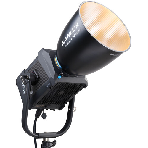
Vorteile: LED-Leuchten sind energieeffizient, erzeugen wenig Wärme und bieten eine exzellente Farbwiedergabe (mit CRI-Werten über 95). Sie sind in der Lage, die Farbtemperatur von 2700K bis 6500K zu variieren, was eine enorme kreative Kontrolle ermöglicht. LEDs bieten eine nahezu sofortige Reaktionszeit, ohne dass zusätzliche Filter oder Diffusoren benötigt werden. Diese Flexibilität erleichtert es den Filmemachern, schnell auf sich ändernde Lichtsituationen zu reagieren. Moderne LED-Panels, wie Litepanels oder Astera Titan Tubes, sind nicht nur leistungsstark, sondern auch leicht, kompakt und mobil. Diese Eigenschaften machen sie besonders für kleinere Teams und Projekte, die oft mit begrenztem Platz und Ressourcen arbeiten, attraktiv. Firmen wie Aputure, Nanlight, Godox und Arri produzieren LED-Lichter. Viele davon sind sehr preiswert und vielfältig und allen Ausführungen. Nachteile: Es gibt wenige bis gar keine Nachteile von LED-Lampen.

Ein Nachteil ist, dass viele eingefleischte Beleuchter sich nicht mit neuen Technologien abgeben möchten und deswegen nicht umsteigen. Andere Behaupten die Lichtqualität von HMI sei viel besser. Wieder Andere Leuchten mit Glühlampen oder Halogen da das ein „authentischeres“ Bild ergibt. LEDs sind besonders vorteilhaft in der heutigen Filmproduktion, die zunehmend auf natürliche Beleuchtung setzt und oft an wechselnden Außen- oder Indoor-Locations dreht. Die Möglichkeit, die Lichtquelle direkt an die natürliche Umgebung anzupassen, ohne aufwändige Änderungen an der Beleuchtungsausrüstung vorzunehmen, ist ein großer Pluspunkt für kleinere Teams, die schnelle und flexible Lösungen benötigen.

Als Fazit lässt sich sagen, dass LED-Lampen in der Zukunft eine immer größere Rolle spielen werden. Filme wie „Der Creator“ und andere benutzen nur noch LED-Technologie und schneller, einfacher und günstiger durch den Shooting Prozess zu navigieren. Durch Leichte und kleine, aber trotzdem Leistungsstarken Lampen können Setkosten reduziert, Zeit eingespart und Crew eingespart werden. Es wird das reisen zu bestimmten Locations leichter und die Bilder werden authentischer. Natürlich haben HMI-Lichter immer noch ihre Berechtigung, aber wie lange noch? Ich glaube es wird im nächsten Jahrzehnt alles von LED- Abgelöst.

Quellenangaben

  1. Landau, D. (2012). Lighting for Cinematography. Focal Press.
    • Bezieht sich auf die Informationen zu Halogenlampen und deren Eigenschaften sowie die Entwicklung von HMI-Leuchten.
  2. Stump, D. (2017). Digital Cinematography: Fundamentals, Tools, Techniques and Workflows. Routledge.
    • Bezieht sich auf die technischen Details und Vorzüge von HMI-Leuchten, einschließlich ihrer Lichtleistung, Farbwiedergabe und logistischen Herausforderungen.

How K-Pop Album Package Design Choices Influence the Fandom

Unlike traditional music releases, K-pop albums are multifaceted packages that function as collectible artifacts, fostering a unique relationship between artists and fans. This post examines how K-pop album package design choices influence the fandom, shaping their behaviors, emotional connections, and communal activities, with a specific focus on how gender representation and androgyny are reflected in album designs.

The Emotional Connection Between Fans and Album Design

K-pop album packaging serves as a physical extension of the music and concepts artists wish to convey. Each album is designed to evoke emotions through meticulous attention to aesthetic details. Photobooks, for instance, immerse fans in the artistic vision of the album. When fans see their favorite idols embodying a theme imagery deepens their connection to both the music and the artist.

Additionally, elements like handwritten notes from the members, personal messages, or exclusive artwork create a sense of intimacy. These touches reinforce the parasocial relationship that many fans feel with their favorite idols, turning the album into more than just a product. For fans, owning an album becomes a way of preserving a cherished emotional experience.

Androgyny and Gender Representation in Album Design

One of the defining features of K-pop is its embrace of androgyny and fluid gender representation, which is often reflected in album designs. 

For instance, album designs often feature concepts that highlight duality or fluidity. BTS’s Love Yourself: the album employed soft pastel colors and delicate floral motifs, traditionally associated with femininity, while contrasting these elements with bold typography and minimalist layouts. Similarly, Taemin’s Never Gonna Dance Again album showcased dark, moody imagery combined with flowing fabrics and ethereal lighting, embodying both strength and vulnerability.

Photobooks included in K-pop albums frequently portray idols in gender-neutral or androgynous styles, using fashion, makeup, and poses that challenge binary expectations. Fans may interpret these visual choices as empowering, as they encourage broader discussions about gender fluidity and redefine beauty standards within the fandom.

Collectability and Fan Behavior

One of the defining aspects of K-pop album design is the inclusion of random and limited-edition elements. Photocards, a staple of K-pop albums, are typically distributed randomly within each package. Fans often buy multiple copies of an album to collect all photocards associated with a group, driving sales and fostering a sense of exclusivity. This practice transforms album purchasing into a gamification.

The Role of Design in Creating Fandom Rituals

K-pop album designs often encourage rituals that strengthen fan loyalty. Packaging that incorporates puzzles, hidden messages, or other interactive elements transforms album unboxing into an event. Fans share their unboxing experiences online, posting photos and videos that spread excitement and build anticipation within the fandom.

Coming back to to LOONA’s pre-debut albums which incorporated lore-based visuals and Easter eggs, encouraging fans to speculate and theorize about the group’s overarching narrative. Such design choices foster a participatory culture, where fans actively engage with and contribute to the artist’s storytelling.

Moreover, pre-order incentives like posters, postcards, or bonus photocards turn the act of purchasing an album into a collective event. Fans often coordinate mass-buying projects to boost their favorite group’s album sales on charts, demonstrating how packaging incentives and fandom goals intertwine.

Cultural and Social Significance

Album designs often integrate cultural motifs that resonate with fans on a deeper level. By incorporating traditional Korean elements such as hanbok-inspired visuals, calligraphy, or folklore references, K-pop groups introduce global fans to Korean culture. This not only strengthens fans’ appreciation for the group but also fosters cultural exchange.

At the same time, the embrace of androgyny in design choices reflects broader societal shifts. Idols like G-Dragon and Hyunjin have become style icons for their gender-defying fashion, and their album visuals mirror this ethos. By celebrating non-conformity and fluid aesthetics, K-pop album designs provide fans with a sense of liberation and representation that they may not find in other cultural spaces.

Economic Implications and Industry Influence

The elaborate design of K-pop albums has also set a precedent in the global music industry, influencing how other artists approach physical releases. Western artists like Taylor Swift and Olivia Rodrigo have incorporated photobooks and collectible elements into their albums, borrowing from the K-pop playbook.

For fans, these design choices blur the line between consumption and participation. Purchasing an album is not just a transaction; it is an investment in the group’s success. Fans view their purchases as contributions to album sales, chart performance, and overall recognition, fueling their dedication to the fandom.

Conclusion

K-pop album package design choices have a profound influence on fandom dynamics, shaping emotional connections, fostering community interactions, and encouraging creative expression. By integrating artistic, cultural, and interactive elements, these designs elevate the fan experience, transforming albums into more than just music carriers. Furthermore, the industry’s embrace of androgyny and fluid gender representation in album packaging reflects its progressive ethos, resonating deeply with fans and setting a new standard for inclusivity in popular culture. As K-pop continues to grow globally, its innovative approach to album packaging will undoubtedly leave a lasting legacy on the music industry and its audiences.

References

Choi, Y., & Kim, D. (2018). Fan Culture and Collectibles: The Impact of Photocards on K-Pop Album Sales. Journal of Media and Cultural Studies, 5(3), 101-119.

Jung, M. (2022). K-Pop’s Global Aesthetic: How Album Packaging Shapes Cultural Perception. Global Pop Music Review, 3(4), 33-50.

Kim, J. (2020). Visual Storytelling in K-Pop: Aesthetic Trends in Album Design. Korean Journal of Popular Music Studies, 14(2), 45-67.

Park, S. (2019). The Role of Physical Albums in the Digital Era: K-Pop as a Case Study. International Journal of Music Business, 11(3), 22-34.

Lee, H. (2021). Sustainability in K-Pop Packaging: Addressing Environmental Concerns. Design and Culture Journal, 8(1), 78-95.