Architektur und Orte für Video Mapping: Kapellen als Inspirationsquelle

🏛️-📍-🎥-✨-⛪-💡

Architektur und Orte für Video Mapping: Kapellen als Inspirationsquelle

In diesem Blogpost möchte ich mich näher mit möglichen Austragungsorten für Video Mapping auseinandersetzen – insbesondere mit der Architektur und den spezifischen Eigenschaften von Kapellen. Im Laufe meiner Überlegungen wurde mir klar, dass ich weniger in oder an großen Kirchen Video Mapping betreiben möchte. Stattdessen interessieren mich vor allem Kapellen, die entweder schlicht und ursprünglich gehalten sind oder durch ein modernes, minimalistisches Design bestechen. Im Folgenden stelle ich einige Beispiele vor, die mich besonders inspiriert haben.

Bruder-Klaus-Feldkapelle in Wachendorf

Ein gutes Beispiel ist die Bruder-Klaus-Feldkapelle in Mechernich-Wachendorf, die dem heiligen Nikolaus von Flüe (auch Bruder Klaus genannt) gewidmet wurde. Diese privat gestiftete Kapelle dient als Ort der Stille, Meditation und des Gebets.
Was mich besonders an ihr fasziniert, ist das spannende Design und das Zusammenspiel von Licht und Schatten. Die Architektur strahlt eine abstrakte, reduzierte Ästhetik aus, die perfekt für experimentelles Video Mapping geeignet ist. Obwohl sie etwas abgelegen südlich von Bonn auf dem Land liegt, möchte ich sie gerne besuchen, wenn ich einmal in der Nähe bin. Durch ihre klaren Formen und die schlichte Bauweise bietet sie zahlreiche Möglichkeiten für beeindruckende Mapping-Projektionen.


Die sieben Wegkapellen im Schwäbischen Donautal

Ein weiteres spannendes Projekt sind die „Sieben Wegkapellen“ im Schwäbischen Donautal. Diese Kapellen wurden entlang der Radwege von der Siegfried-Denzel-Stiftung errichtet, um Kunst und Kultur in der Region zu fördern.
Die Kapellen wurden von verschiedenen Architekten wie John Pawson, Hans Engel und Christoph Mäckle entworfen. Sie zeichnen sich durch eine minimalistische Bauweise aus und kombinieren oft natürliche Materialien wie Holz mit religiösen Symbolen wie dem Kreuz. Besonders faszinierend finde ich die Einheitlichkeit der Gestaltung: Jede Kapelle ist einzigartig, aber sie alle teilen eine ähnliche Ästhetik, die Ruhe und Klarheit ausstrahlt. Für Video Mapping eignen sich diese Kapellen hervorragend, da ihre reduzierte Architektur die Aufmerksamkeit auf die Projektionen lenkt.


Kapelle am Grödnerjoch in den Dolomiten – 🏆

Mein persönlicher Favorit ist die Kapelle am Grödnerjoch in den italienischen Dolomiten. Auf den ersten Blick wirkt sie traditionell und altertümlich, doch tatsächlich wurde sie erst 2004 eingeweiht. Sie liegt auf dem Grödnerjoch (Passo Gardena) in der Gemeinde Wolkenstein in Gröden.
Die Kapelle fügt sich harmonisch in die alpine Landschaft ein und bietet durch ihre modernen, klaren Linien eine beeindruckende Kulisse für Video Mapping. Aufgrund ihrer Lage in den Bergen wäre ein mobiles Mapping-Setup notwendig – beispielsweise mit ausreichend Akkuleistung, einem Generator oder Solarstrom. Doch diese Herausforderung könnte ich in einem späteren Blogpost genauer beleuchten.

Alpin Kapelle am Grödner Joch
Ortsch. Grödner Joch
Wolkenstein – Gröden


📚 – Literatur:

Sieben Wegkapellen – Architektonische Landmarken an den Radwegen im Schwäbischen Donautal (Kleine Kunstführer)


📸 – Fotoquellen:

Google Maps, Motion Array, https://7kapellen.de/
08 Emerging Trends in Privacy and Data Management: What’s Next?

Introduction

The landscape of privacy and data management is constantly evolving. From the rise of decentralized data systems to advancements in AI-powered privacy tools, staying informed about emerging trends is essential for creating future-ready designs. In this post, I’ll explore these trends and their implications for ethical design.

Emerging Trends Shaping the Future of Privacy

  1. Decentralized Data Management: Technologies like blockchain are enabling users to store and control their data independently, reducing reliance on centralized platforms. Example: Platforms like Solid (by Sir Tim Berners-Lee) give users full control over their data pods, allowing selective sharing.
  2. AI-Powered Privacy Tools: Artificial intelligence is being used to identify privacy risks and automate data management. Example: Jumbo Privacy App scans your accounts, recommends privacy settings, and automates actions like deleting old posts.
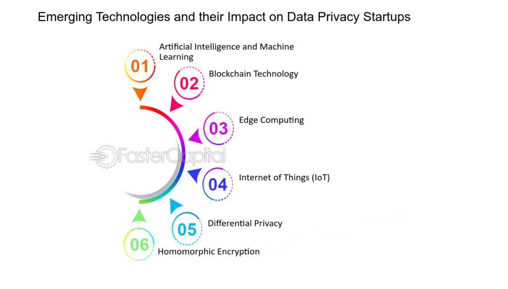
  3. Privacy-Enhancing Technologies (PETs): Tools such as differential privacy, homomorphic encryption, and federated learning enable data analysis without compromising user privacy. Example: Apple’s differential privacy techniques allow them to collect usage trends without identifying individual users.
  4. Legislative Momentum: New laws like Brazil’s LGPD and India’s DPDP Act are expanding global privacy standards, pushing companies to prioritize user data protection.
image source: Faster Capital

How can emerging privacy trends shape the design of tools and frameworks that empower users to manage their digital footprints?

  • How can decentralized technologies and PETs be integrated into practical user tools?
  • What role does legislation play in influencing design practices?

Design Implications of These Trends

  1. Incorporating Decentralization: Designers should consider how platforms can allow users to store data locally or use blockchain to share information securely. Example: A prototype privacy tool could use a decentralized network to manage opt-out requests without relying on third parties.
  2. Leveraging AI for User Empowerment: AI can simplify complex tasks like identifying where personal data exists or automating deletion requests. Example: An AI-driven privacy dashboard that highlights vulnerabilities and recommends actionable steps.
  3. Embedding PETs into Design: Designers can use privacy-enhancing technologies to build trust. Example: A visualization tool showing anonymized data usage in real time.
  4. Adapting to Laws: Incorporating compliance into the user experience ensures platforms meet legal standards while simplifying the process for users. Example: Pre-designed templates for GDPR-compliant consent forms.

Challenges in Adopting Emerging Trends

  1. Technical Complexity: Decentralization and PETs often require advanced infrastructure, making adoption challenging for smaller organizations.
  2. User Education: Explaining complex concepts like differential privacy or blockchain to users in simple terms can be difficult.
  3. Corporate Resistance: Companies may resist adopting PETs or decentralized models due to reduced control over user data.

Relevance to Thesis

Integrating these trends ensures that platforms are forward-looking and adaptable to future technologies and regulations. For instance, the data scrubbing tool I’m proposing could use AI to automate data deletion or blockchain to enhance data security, aligning with global privacy standards.

Lowering the Costs of Climbing Boards: Affordable Alternatives and Techniques

Climbing boards like the MoonBoard and Kilter Board are transformative tools for climbers, but their high costs can be a significant barrier, especially for smaller gyms or home setups. Fortunately, there are creative ways to lower these costs without compromising on quality or functionality. In this post, we explore various cost-saving techniques, including alternatives to LED systems, affordable materials, and innovative technologies like projectors and augmented reality (AR).


1. Using a Projector or AR Instead of LEDs

LED integration is one of the most expensive components of modern climbing boards. Substituting LEDs with a beamer (projector) or augmented reality system can significantly reduce costs while still providing a dynamic climbing experience.

How it Works:

  • A projector mounted near the climbing wall can highlight specific holds based on routes selected through a mobile app.
  • AR systems, often used in conjunction with smartphones or tablets, overlay route information directly onto the wall via the device’s camera.

Benefits:

  • Eliminates the need for complex LED wiring and associated costs.
  • Provides flexibility in displaying routes and patterns.
  • Easy to update or customize without replacing hardware.

Challenges:

  • Requires a dimly lit environment for optimal projector visibility.
  • Initial setup for AR systems can be complex.

Cost Savings:

  • Projectors range from $300 to $1,000, significantly less than integrated LED systems.
  • AR apps often have low subscription costs or one-time fees.

2. Simplifying the Hold Layout

Commercial climbing boards often include an extensive variety of holds, which can be expensive to replicate.

Cost-Saving Strategies:

  • Use fewer holds while still ensuring a good mix of crimps, jugs, and slopers.
  • Focus on modularity: start with a basic set and add more holds over time.
  • Utilize resin or plastic holds rather than pricier wooden or custom-made options.

Benefits:

  • Reduces initial investment without sacrificing usability.
  • Allows gradual upgrades as budget permits.

Cost Savings:

  • Basic hold sets can cost $300 to $500, compared to $1,000+ for premium collections.

3. Repurposing Existing Infrastructure

For gyms that already have climbing walls, retrofitting them into training boards can be a cost-effective option.

Steps to Consider:

  • Add a uniform grid and a selection of training-specific holds.
  • Use projectors or AR for route visualization.
  • Leverage existing resources like lighting and wall mounts.

Benefits:

  • Saves space and reuses materials already on hand.
  • Provides a dual-purpose setup for regular climbing and training.

Challenges:

  • May not match the precision or consistency of commercial boards.

Cost Savings:

  • Retrofitting typically costs $500 to $1,500 versus a full new installation.

4. Exploring Open-Source Software and Community Tools

Open-source apps and tools can replicate much of the functionality provided by proprietary systems without the hefty price tag.

Examples:

  • OpenClimb: Allows climbers to log and share routes using a mobile device.
  • Homemade LED controllers, which can be paired with cheaper components.

Benefits:

  • Free or low-cost solutions for route management and tracking.
  • Opportunity to customize software to specific needs.

Challenges:

  • May require some technical know-how for setup.

Cost Savings:

  • Open-source solutions eliminate recurring subscription fees.

Conclusion: Affordable Climbing Board Solutions

While premium climbing boards like the MoonBoard and Kilter Board offer exceptional training features, their high costs can deter gyms with limited budgets. By exploring alternatives like projectors, simplified hold layouts, and open-source software, gyms can create cost-effective training solutions that deliver excellent value. Embracing community involvement and leveraging existing resources further enhances these setups, ensuring climbers of all levels have access to effective training tools without breaking the bank.

How Attention and Vision shape User Experiences

Design is more than aesthetics, it’s about creating experiences that align with how the human brain processes information. As designers, understanding how attention works and how visual and cognitive mechanisms interact is crucial to crafting meaningful interfaces. In this Blog I want to explore how the brain, working memory, and the eye’s unique structure, including the fovea and peripheral vision, influence how users perceive and engage with design.

The Brain and Attention: A Limited Resource

Human attention is a finite resource, closely tied to our working memory. Working memory acts as a mental workspace, holding information temporarily while we focus on tasks. However, its capacity is limited to around 5–7 unrelated concepts at a time.

While the brain processes an astounding 11 million bits of sensory data per second, it can only consciously handle about 50 bits. This bottleneck forces the brain to prioritize information, directing attention based on personal goals and relevance. This selective focus explains why, in moments of distraction – such as when interrupted mid-task – information in working memory is often lost.

In interface design, this limitation underscores the need for clarity and prioritization. Overloading users with information can lead to cognitive fatigue and poor retention. Simplicity is key to holding attention and enhancing usability.

Vision: The Fovea and Peripheral Guidance

The human eye is a gateway to the brain, but it doesn’t work uniformly. A tiny part of the retina, the fovea, plays a disproportionately large role in how we perceive detail. The fovea, only about 1.5 mm wide, provides high-resolution vision and transmits data directly to the brain without compression. Although it makes up just 1% of the retina, the brain dedicates nearly 50% of its visual processing resources to it.

This narrow field of focus contrasts sharply with our peripheral vision, which is low in resolution but highly sensitive to motion. Peripheral vision serves as a guide, directing the fovea to areas of interest. While peripheral vision fills in missing details based on memory and expectations, it can also deceive us, creating the illusion of seeing everything clearly.

For designers, this means users don’t view interfaces as a whole but scan them, focusing on points of contrast or motion. Ensuring key information is compact, visually distinct, and aligned with user goals is essential.

Design Principles Inspired by Attention and Vision

To optimize user experiences, design should account for the brain’s and eye’s processing limits. Here are a few key strategies:

  1. Proximity and Grouping:
    Leverage the Gestalt principle of proximity to group related elements. For example, error messages should appear near input fields to prevent users from missing them during task-focused interactions.
  1. Contrast and Motion:
    Highlight essential elements, such as call-to-action (CTA) buttons, using bold colors or subtle animations. These visual cues draw the eye and reinforce the hierarchy of information.
  1. Simplification:
    Reduce cognitive load by presenting only the most relevant information at any given moment. Clear navigation and uncluttered layouts help users process information efficiently.

Inattentional Blindness: The Pitfall of Irrelevance

Despite our brain’s remarkable ability to process sensory data, it is inherently goal-driven. Information that doesn’t align with our objectives is often filtered out, a phenomenon known as inattentional blindness. This explains why users may overlook critical details in a design unless they are highlighted with visual cues.

For instance, when users focus on completing a task – like filling out a form – they may miss an unrelated error message placed elsewhere on the page. Designers can overcome this by ensuring all relevant information is integrated within the user’s current focus area.

Looking Deeper into the Science

The science behind these findings is supported by cognitive psychology and neuroscience. Books like Designing with the Mind in Mind by Jeff Johnson provide in-depth insights into how our brain, memory, and sensory systems influence design. Other resources, such as Don’t Make Me Think by Steve Krug and The Distracted Mind by Adam Gazzaley and Larry D. Rosen, further explore the challenges of designing in an era of constant distraction.

Conclusion

By understanding how attention, vision, and memory shape user behavior, designers can create interfaces that are not only functional but also deeply intuitive. Every pixel and interaction should respect the limits of the human brain while leveraging its strengths. In doing so, we can craft experiences that feel natural, effortless, and memorable – ultimately enhancing how users connect with the products we create.

Sources

Johnson, Jeff. Designing with the Mind in Mind.

Krug, Steve. Don’t Make Me Think: A Common Sense Approach to Web Usability.

Gazzaley, Adam, and Larry D. Rosen. The Distracted Mind: Ancient Brains in a High-Tech World.

Various academic sources on cognitive psychology and attention systems.

https://uxplanet.org/designing-for-human-attention-ac0abe3d657d

The Attention Economy

The Attention Economy: Designing for a Limited Resource

In the modern digital landscape, attention has become one of the most sought-after resources. The term “attention economy” refers to the economic principle where human attention is treated as a scarce and valuable product. In an age of information overload, countless platforms, apps, and advertisements compete to capture and hold our focus.

This concept, first popularized by economist and psychologist Herbert A. Simon (source at the end if you are interested), explains that an abundance of information creates a corresponding scarcity of attention. As our cognitive capacity remains finite, the demand for attention outpaces its availability. For businesses, capturing this resource often translates directly into revenue, as more time spent engaging with a product or service typically leads to higher advertising revenue, data collection, and user loyalty.

However, this relentless pursuit of attention poses challenges – not just for users but also for designers tasked with creating meaningful and ethical experiences.

How the Attention Economy Shapes Digital Experiences

The attention economy fundamentally shapes the way platforms and apps are designed. Features like infinite scrolling, autoplay videos, push notifications, and personalized recommendations are engineered to keep users engaged. Social media platforms such as Instagram, TikTok, and YouTube are particularly adept at exploiting these mechanisms. By using algorithms that surface highly relevant or emotionally charged content, they encourage users to spend hours scrolling, swiping, and clicking.

While these strategies are effective in increasing user engagement, they often lead to unintended consequences, such as:

  • Cognitive Overload: Constant exposure to information fragments makes it harder for users to focus or prioritize tasks.
  • Decreased Well-Being: Excessive engagement with digital platforms has been linked to anxiety, stress, and reduced mental health.
  • Erosion of Trust: Practices like dark patterns (e.g., deliberately misleading interfaces) undermine user confidence in technology.

The attention economy doesn’t just impact individual users – it influences society at large. Shortened attention spans, reduced capacity for deep work, and addictive behaviors are just a few of the cultural shifts driven by this phenomenon.

The Ethical Challenges of Competing for Attention

Designing within the attention economy comes with a significant ethical dilemma: Should businesses prioritize engagement at all costs, or should they take responsibility for the long-term impact of their designs on users?

Many platforms measure success using metrics like screen time, click-through rates, and daily active users. These KPIs encourage designs that exploit cognitive biases, such as:

  • The Zeigarnik Effect: Users feel compelled to complete tasks or consume unfinished content, such as an autoplay series or a “you’re almost there” progress bar.
  • FOMO (Fear of Missing Out): Platforms use notifications and alerts to create urgency, ensuring users return frequently to avoid missing updates or promotions.
  • Variable Rewards: Like a slot machine, apps randomize rewards (e.g., likes, comments, or surprises) to keep users hooked.

Designing Responsibly in the Attention Economy

Ethical design offers an alternative to the exploitative practices often associated with the attention economy. By focusing on user empowerment and long-term value, designers can create experiences that respect attention rather than monopolize it.

1. Reduce Cognitive Overload
Simplifying interfaces and prioritizing information helps users navigate digital spaces without becoming overwhelmed. For example, clear navigation menus and focused calls-to-action guide users effectively, reducing unnecessary distractions.

2. Encourage Mindful Engagement
Instead of maximizing screen time, platforms can promote conscious usage. Features like YouTube’s “Take a Break” reminders or Instagram’s “You’re All Caught Up” notification show how small interventions can nudge users toward healthier habits.

3. Avoid Dark Patterns
Transparency in design builds trust. For instance, making it easy to unsubscribe from a service or turn off notifications respects users’ autonomy, fostering loyalty over time.

4. Redefine Success Metrics
Moving away from engagement-focused KPIs toward metrics like user satisfaction, retention based on value, or task completion rates can help align business goals with ethical practices.

5. Design for Disengagement
Ironically, designing ways for users to log off or take breaks can create a more positive user experience. When users feel that a product respects their time, they are more likely to return willingly.

The Future of the Attention Economy

As awareness of the attention economy grows, users are becoming more discerning about how they spend their time online. This shift presents an opportunity for designers and businesses to rethink their approach. Emerging trends, such as digital wellness tools, context-aware systems, and AI-driven personalization, offer the potential to create user experiences that align with ethical standards.

The future of the attention economy doesn’t have to be about exploitation. By respecting the finite nature of human focus, designers can build systems that prioritize user well-being, fostering trust, satisfaction, and sustainable engagement.

Sources


Herbert A. Simon. Designing Organizations for an Information-Rich World (1971)

Nir Eyal.Hooked: How to Build Habit-Forming Products (2014)

Tristan Harris and the Center for Humane Technology: https://www.humanetech.com/

Sweller, J. (1988). Cognitive Load During Problem Solving: Effects on Learning. Cognitive Science, 12(2)

Daniel Kahneman. Thinking, Fast and Slow (2011)

https://medium.com/@Tathagat8889/attention-economy-designing-for-users-in-a-world-of-constant-distractions-30bda1160538#:~:text=The%20Future%20of%20Attention%2DAware,but%20also%20meaningful%20and%20mindful.

https://www.nngroup.com/articles/attention-economy

Can We Designers Change Something Against Climate Change?

Did you know that the information and communication technology sector is currently responsible for around 1.5 – 4 % of global greenhouse gas emissions? I certainly didn’t.
This statistic highlights the significant role that digital systems play in climate change, primarily due to energy-intensive networks, data centers, and end-user devices. As designers, we can no longer ignore our influence on this issue. Our choices can either contribute to or help mitigate environmental damage.

Understanding the Digital Carbon Footprint

Every digital interaction—whether it’s loading a website, streaming a video, or using a mobile app—requires energy. The classic example of the image carousel illustrates this point well. While visually engaging, carousels often consume excessive data and provide minimal usability. By eliminating such elements, we not only improve the user experience and site performance but also reduce the carbon footprint. This simple design change can lead to a substantial reduction in energy consumption, setting a precedent for more environmentally conscious design decisions.

The Philosophy of Designing for Social Good

“Designing for social good” is a concept that places human needs and ethical considerations at the forefront of design projects. This approach encourages designers to think beyond aesthetics and functionality to consider the broader social and environmental implications of their work. The aim is to create designs that benefit society, foster sustainability, and address pressing global challenges like climate change.

The Importance of Sustainable Design Practices

Sustainable design goes beyond aesthetics; it’s about creating systems that support long-term environmental health. This involves optimizing digital products to use less data, reducing unnecessary features, and prioritizing energy-efficient practices. Resources like DesignForce and Cyber-Duck provide valuable insights into how sustainable design can help combat climate change.

The Role of UX Design in Sustainability

User Experience design plays a critical role in sustainability. Poorly designed systems can increase energy consumption, leading to greater environmental impact. By focusing on efficient, user-friendly designs, we can reduce the energy needed to power digital interactions. This approach not only benefits the environment but also enhances the user experience, making it a win-win scenario.

How we Designers Can Make a Difference

Designers have a unique opportunity to lead the charge in reducing the digital carbon footprint. Here are some actionable steps to consider:

  1. Conduct a Digital Footprint Audit: Assess the energy consumption of your digital products and identify areas for improvement.
  2. Focus on Efficiency: Simplify designs to reduce data usage and improve performance.
  3. Educate Stakeholders: Raise awareness about the environmental impact of design choices and advocate for sustainable practices.
  4. Innovate Sustainably: Explore new design methods that prioritize sustainability and reduce environmental impact.

Moving Towards a Sustainable Future

As designers, our work has the power to shape the digital world and, by extension, its environmental impact. By adopting sustainable design practices, we can contribute to the global effort to combat climate change. Our designs should not only meet the needs of today but also preserve the planet for future generations.

https://razgo.medium.com/design-for-the-climate-crisis-an-updated-approach-d74f2b318c95  25.12.2024, 19:12

https://designforce.co/blog/the-fundamentals-of-social-impact-design 30.12.2024, 20:24

https://www.linkedin.com/pulse/ux-vs-climate-change-sustainableux-retrospective-james-christie 02.01.2025, 17:52

https://www.cyber-duck.co.uk/insights/how-sustainable-design-can-help-climate-change 20.01.2025, 20:53

https://medium.com/design-bootcamp/climate-change-and-its-impact-on-ux-design-a-call-for-sustainable-practices-c653cb2fec6e 20.01.2025, 19:02

https://uxdesign.cc/the-hidden-impact-of-ux-design-on-climate-change-ec5f6e758638 20.01.2025, 19:32

#07 How Interaction Design can shape Public Spaces

In our today’s fast paced and connected world, public places are gradually shifting from passive environments to places of interaction and engagement. As technology continues to change and improve, so too do the ways in which we experience and engage with the world around us. Public spaces are not only for physical gatherings but also serve as a platform for digital interaction, social engagement, and sensory experience. Interaction Design plays an important role in transforming these spaces. 

Interaction Design vs. Experience Design

Interaction Design:

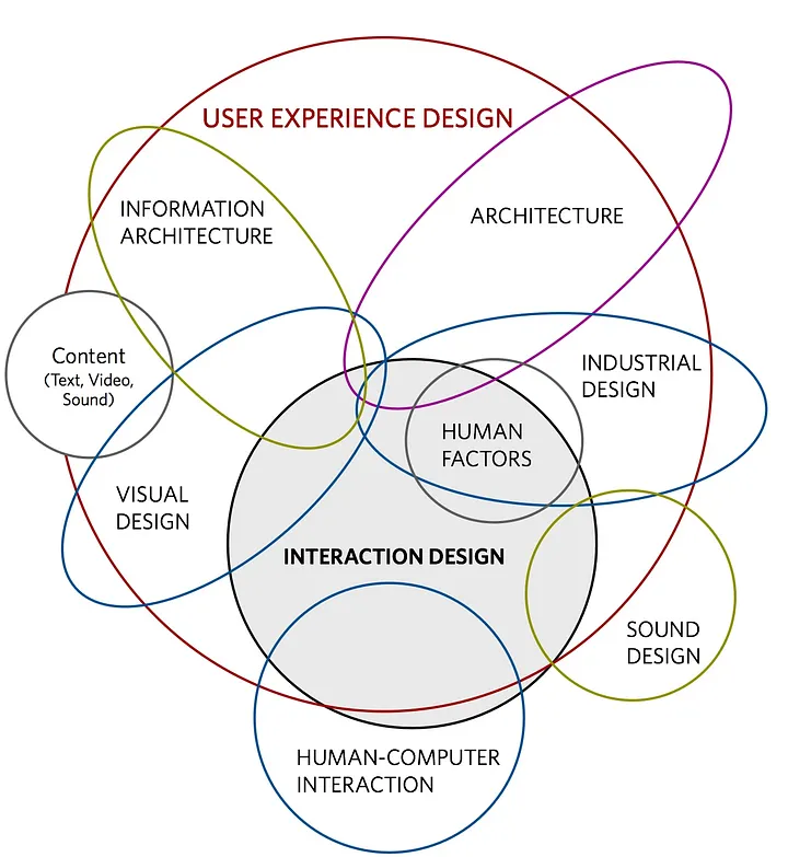
This field focuses on how individuals interact with technology, their surroundings and the environment and, most importantly, one another. Its primary aim is to improve users’ understanding of what can be done, what is currently happening, and what has just occurred. Interaction design integrates principles from psychology, design, art, and emotion to create a positive and enjoyable experience for users.  

Source: https://uxdesign.cc/10-steps-to-interaction-design-ixd-6abe778cb8b8
Experience Design:

This practice focuses on creating products, services, processes, events, and environments with an emphasis on the overall quality and enjoyment of the user’s experience. The goal is to ensure a seamless, engaging, and meaningful interaction throughout every stage of the experience. 2

How Interaction Design shapes public spaces

How people perceive the world around them is a key question in urban planning, and it’s central to Kevin Lynch’s groundbreaking book, The Image of the City (1960). In this work, Lynch explores how individuals create mental maps of their surroundings, which mirrors how user interface (UI) research looks at how people interact with digital designs.Integrating UX/UI principles into urban planning can enhance the environment by improving usability, accessibility and user experience. 3

Human-Centered Design

One of the most important reasons why Interaction Designers should be incorporated into urban planning is that architects and urban planners concentrate more on the spatial layout and functionality. Interaction Designer focus on the people who use the space. They prioritize the human needs, capabilities and behaviors first, before designing. 2

Digital integration

Public spaces are no longer just physical places. With the increasing presence of technology in our everyday lives, these spaces are also becoming more and more digital. Since it influences how people move through the city and interact with each other in public spaces we need a new approach that combines both the physical and digital dimensions – Urban Interaction Design. 4 5 

Wayfinding and Navigation

Large public spaces such as parks, transfer areas and city centers can quickly become confusing and overwhelming. With an intuitive navigation system, these places are accessible and more user-friendly. Such systems could include interactive maps, apps or digital signs.

Facilitating Social Interaction

The goal in public spaces or in third spaces is to encourage people to connect — not just with the space itself, but with each other. Since Interaction Design focus on how people interact with physical and digital elements, they can help creating environments that feel alive and are adapting for the needs and wishes of the people. 

Interaction design can therefore also make a small contribution to breaking loneliness and social isolation in public spaces.

Multidisciplinary Approach

However, a multidisciplinary approach between architects, urban planners and interaction designers is best. When all disciplines bring their expertise to the planning, a holistic approach can be created that combines functionality, aesthetics and the human experience. This leads to an accessible, inclusive and engaging space.

Interaction Design has the potential to reshape how public spaces come alive, become centered around people, and connect with the very people they serve. Embracing human-centered design principles, integrating digital systems, and collaborating in design enables shaping public spaces that create valuable social connections.


Sources

[1] S. Li, H. Duan, Y. Yao, W. Zhang und J. Cho, „Enhancing User Experience: A Study of Interaction Design in Coastal Public Spaces“, Asia-pacific Journal Of Convergent Research Interchange, Bd. 10, Nr. 1, S. 473–483, Jan. 2024, doi: 10.47116/apjcri.2024.01.37.

[2] D. Norman, The Design of Everyday Things: Revised and Expanded Edition. Hachette UK, 2013.

[3] J. Kiviluoto, „The lost connection between urban planning and interface design: Ideas towards a re-enactment | LAB Open“, LAB Open, 9. Oktober 2024. https://www.labopen.fi/en/lab-rdi-journal/the-lost-connection-between-urban-planning-and-interface-design-ideas-towards-a-re-enactment/

[4] „Urban Interaction Design – Civic Interaction design“. https://civicinteractiondesign.com/projects/urban-interaction-design/#:~:text=Urban%20Interaction%20Design%20is%20an,design%20approach%20from%20multiple%20perspectives.

[5] „Minor urban interaction design – Minor urban interaction design“. https://urbaninteractiondesign.nl/home/

Designing the In-Between: Imperfection and Randomness

In a hyper-curated world where content is planned, polished, and algorithmically optimized, there’s a growing fascination with what feels raw, imperfect, and fleeting. We see it in the rise of Instagram photo dumps, the adoption of grainy, retro-inspired visuals, and even in how brands have begun to embrace a sense of randomness in their storytelling. This cultural shift is not just a stylistic trend but a broader reflection of our need to reconnect with the in-between moments of human experience—those small, often overlooked fragments of life that feel authentic and unfiltered.

From Nostalgia to the Present Moment

Nostalgia plays a role in this shift, but it’s not the end goal it’s the gateway. As explored previously, nostalgia offers comfort in a disconnected world, but what’s more interesting is how it has evolved into a tool for reclaiming presence and celebrating imperfection. Today’s creators and designers aren’t just looking to the past; they’re using nostalgia-inspired aesthetics to elevate the in-between moments of everyday life, making the ordinary feel extraordinary.

This shift reflects a broader cultural fatigue with perfection. From Instagram’s carefully curated grids to the rise of AI-generated content, the overly polished has begun to feel soulless. In response, creators and designers are leaning into imperfection not as a rejection of design, but as a rethinking of its role in fostering connection and meaning.

The Photo Dump: A Study in Randomness

One of the most visible manifestations of this new aesthetic is the photo dump. These collections of random, loosely connected images have redefined how we share our lives online. Unlike the hyper-curated grids that dominated social media in the mid-2010s, photo dumps embrace imperfection and spontaneity. A single post might include a blurry shot of a sunset, a close-up of a coffee cup, a candid of friends laughing, and a seemingly unrelated image of a wrinkled shirt on a chair.

What makes photo dumps so compelling is their unpredictability and intimacy. They feel less like a performance for an audience and more like flipping through a friend’s camera roll—messy, eclectic, and personal.

Randomness Feels Human

There’s something inherently human about randomness. It resists optimization and rejects the calculated perfection that AI and algorithms are so adept at producing. Take Rhode, Hailey Bieber’s skincare brand, as an example: their campaign visuals mix glossy lip products with playful, unscripted imagery like a piece of toast dripping with honey or sticky fingers holding a donut. Similarly, Jacquemus, known for its innovative campaigns, once used a slab of butter as a prop, adding an unexpected, almost absurd twist to their fashion storytelling. These pairings feel spontaneous and alive qualities that resonate in a world increasingly dominated by automation and artificiality.

This kind of storytelling feels genuine because it mirrors the way we naturally navigate our surroundings. It’s imperfect, chaotic, and often surprising. In contrast to the overly polished, hyper-aestheticized visuals that dominated platforms like Instagram during the late 2010s, this new approach doesn’t strive for unattainable perfection. Instead, it embraces the beauty of imperfection, making the experience feel more grounded and relatable.

The photo dump aesthetic and the broader embrace of randomness in design is about more than just style. It’s a reaction to a cultural moment defined by disconnection and overstimulation. In an age of AI-generated content, endless scrolling, and hyper-curated branding, we’re yearning for something that feels real. Randomness, with its unpolished edges and unexpected connections, offers that sense of authenticity.

For designers, this is an opportunity to rethink how we create and communicate. How can we use design to capture the fleeting, in-between moments that make life meaningful? How can we embrace imperfection and randomness as tools to foster connection in a disconnected world? It’s about finding beauty in the messiness of life and using design to highlight those moments. In a world where perfection is easy to replicate, imperfection becomes the ultimate mark of authenticity. The in-between spaces of our lives, the random, fleeting moments we rarely stop to notice are where meaning resides.

01. #08 The redemption of Comic Sans?

Few fonts have sparked as much debate as Comic Sans. Once a popular and approachable typeface, it eventually became the subject of ridicule and memes. However, in the context of designing child-friendly reading materials, Comic Sans might just find its redemption. Let’s explore the history of this infamous font and why it could have a renewed purpose in literacy education.

The Rise of Comic Sans
Comic Sans was created in 1994 by Vincent Connare, a typographer at Microsoft. Inspired by comic book lettering, Connare designed the font to be friendly, informal, and approachable. It was originally intended for Microsoft’s “Bob” software but gained traction after being included in Windows 95 and subsequent Microsoft Office programs.

During the late 1990s and early 2000s, Comic Sans became a favorite for a wide range of informal uses—from birthday invitations to school newsletters. Its playful and casual style resonated with many, offering a stark contrast to the rigid formality of Times New Roman or Arial.

The Fall of Comic Sans
As its popularity grew, so did its misuse. Comic Sans began appearing in inappropriate contexts—professional documents, gravestones, and even corporate branding. Critics argued that its whimsical appearance made it unsuitable for serious purposes.

This overuse and perceived lack of sophistication led to widespread backlash. By the mid-2000s, Comic Sans became a cultural punchline, with designers and typographers labeling it as the epitome of bad taste. Websites, memes, and even a movement called “Ban Comic Sans” emerged, cementing its reputation as the most hated font in the world.

The Redemption of Comic Sans
Despite its tarnished reputation, Comic Sans has unique qualities that make it surprisingly effective in specific contexts, particularly for early readers:

Simplified Letterforms
Comic Sans may never shake off its controversial reputation entirely, but in the right context, it has the potential to shine once more. For children learning to read, its clear, accessible, and friendly design can make a meaningful difference. Perhaps it’s time to give Comic Sans the redemption arc it deserves, recognizing its unique qualities as an ally in literacy education.

Dyslexia-Friendly Features
Studies have shown that Comic Sans can be helpful for individuals with dyslexia. Its irregular letter shapes prevent characters from being mirrored or flipped in the mind of the reader. While specialized fonts like OpenDyslexic exist, Comic Sans remains a readily available option for creating accessible materials.

Approachable and Playful Design
For young children, the informal and playful appearance of Comic Sans can make reading feel less intimidating. Its design aligns well with the needs of early literacy materials, such as storybooks, flashcards, and worksheets.

Comic Sans may never shake off its controversial reputation entirely, but in the right context, it has the potential to shine once more. For children learning to read, its clear, accessible, and friendly design can make a meaningful difference. Perhaps it’s time to give Comic Sans the redemption arc it deserves, recognizing its unique qualities as an ally in literacy education.

1.5. Building Community Through Museums

How Can We Tie DIY and Interactive Technologies to Community Building?

Museums have long been seen as places of quiet reflection, where visitors admire static exhibits from a distance. However, a new wave of transformation is sweeping through these spaces, shifting the focus from passive observation to active participation. The power of DIY projects, interactive exhibits, and co-created spaces is reshaping how we experience culture, making museums more inclusive, dynamic, and community-driven than ever before.

The Shift from Passive Viewing to Active Participation

Hands-on activities

Modern museums have transformed from passive spaces into collaborative hubs where visitors actively shape their experiences. Through hands-on activities and DIY workshops, visitors become co-creators, contributing their voices to cultural narratives and fostering a deeper sense of belonging and inclusion [1]. These participatory initiatives provide platforms for self-expression and meaningful interaction, enabling diverse groups to share unique perspectives and cultivate shared ownership of museum spaces [3].

For marginalized groups, such efforts offer a powerful means of self-empowerment and storytelling, allowing individuals to showcase their creativity and lived experiences. By breaking down societal barriers, these activities foster inclusivity and encourage dialogue among people from varied backgrounds, enriching the cultural fabric of museums [3], [5].

Digital activities

Museums are increasingly using collaborative interactive activities to foster social connections among visitors. Tools like augmented reality, digital storytelling, and interactive displays encourage shared experiences that strengthen community bonds. For example, the Science Museum’s Disease Controller game in the Medicine and Communities gallery allows four players to collaboratively manage the spread of an epidemic in a city. Participants must make quick decisions, such as issuing public health campaigns or vaccinations, highlighting the challenges of urban health and the impact of infectious diseases [7]. These activities transform museums into vibrant spaces where visitors connect through shared exploration and learning.

Museums and Wellbeing

Museums are essential for promoting psychological and social well-being by providing restorative environments that encourage connections. Participatory activities like DIY projects and collaborative exhibits help foster identity, community and enhance self-esteem while reducing stress. Research shows that interactive and co-creative museum activities lead to personal growth, sense of accomplishment, and strengthen social bonds. [2], [4].

One great example is the Holburne Museum’s “Image – Peer Supported Museums Group” which is designed for individuals with lived experience of mental health challenges, providing a supportive environment to foster creativity and independence. The group engages in specialist artist-led workshops covering skills like bronze clay jewelry, acrylic painting, and printmaking, followed by independent development. Members aim to enhance creativity using museum collections, develop skills, exhibit their work, and promote inclusion and well-being through art. [6]

A Future of Collaborative Communities

Museums are evolving beyond their traditional role of showcasing artifacts, becoming spaces that foster collaboration and community engagement. By incorporating these participatory elements ensures that museums are not just institutions for knowledge but vibrant spaces for social connection and shared experiences [3]. These innovations allow museums to serve as community hubs, where shared experiences and social bonds are nurtured. The future of museums lies in their ability to empower visitors to actively shape the experience, fostering a sense of belonging and deeper understanding while building stronger, more connected communities.

References

[1] Moura, H., et al., “Collaborative Museums: An Approach to Co-Design,” ACM CSCW 2012, pp. 681–684, 2012.

[2] Šveb Dragija, M., and Jelinčić, D.A., “Can Museums Help Visitors Thrive?,” Behav. Sci., vol. 12, no. 458, pp. 1–17, 2022.

[3] Wallen, L., and Docherty-Hughes, J.R., “Caring Spaces: Individual and Social Wellbeing in Museum Community Engagement Experiences,” J. Museum Education, vol. 47, no. 1, pp. 93–102, 2022. 

[4] “Transforming Community Engagement in Unexpected Spaces,” MuseumNext. [Online]. Available: https://www.museumnext.com/article/transforming-community-engagement-in-unexpected-spaces/

[5] “Inclusive Museum Community,” Doubleknot. [Online]. Available: https://www.doubleknot.com/blog/inclusive-museum-community.

[6] “Image – Peer Supported Museums Group,” The Holburne Museum. [Online]. Available: https://holburne.org/learning-and-creativity/mental-health-and-creativity/pathways-to-wellbeing/peer-led-museums-group/

[7] Science Museum, “Medicine: The Wellcome Galleries,” Science Museum. [Online]. Available: https://www.sciencemuseum.org.uk/see-and-do/medicine-wellcome-galleries.