Reading the Signs: An Analysis of the SLF Early Warning System

In alpine regions, where snow and avalanche hazards can pose significant risks to both residents and visitors, early warning systems are indispensable. The WSL-Institut für Schnee- und Lawinenforschung (SLF) has developed an early warning system designed to inform and protect those in high-risk areas. Today, I want to dive into this system, exploring its design, functionality, and overall effectiveness in communicating risk.

Why Early Warning Systems Matter
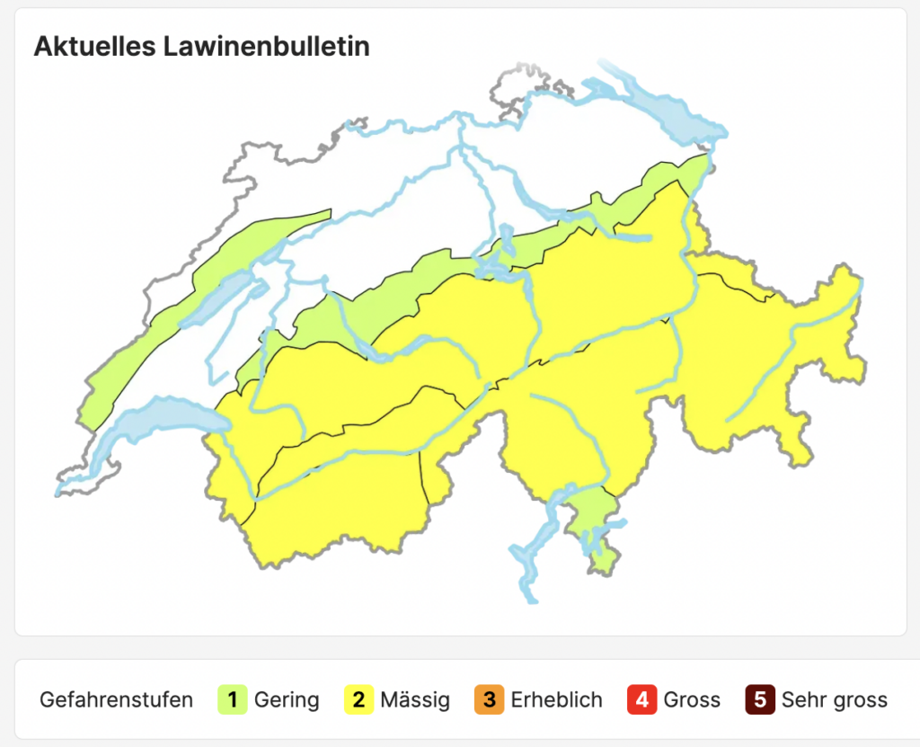
In mountain regions, conditions can change in a matter of minutes. With avalanches and heavy snowfall posing serious threats, timely and accurate information is critical. Early warning systems aim to provide real-time updates on weather and hazard conditions so that individuals and communities can take proactive steps to safeguard lives and property. The SLF system, available at whiterisk.ch/de/conditions, is a prime example of how technology and design converge to make these life-saving communications possible.

Overview of the SLF Early Warning System

The SLF early warning system is dedicated to monitoring and reporting conditions related to snow and avalanches. Upon visiting the site, users are greeted with clear information about current conditions. The interface is designed to provide essential details at a glance—weather forecasts, risk levels, and recent changes in avalanche conditions. The system categorizes risk levels in an accessible manner, often using color-coding and icons that immediately convey the severity of the situation.

The website’s design focuses on simplicity and clarity. The information is structured so that even non-experts can quickly understand the current risk and decide on necessary actions. By providing regular updates, the system ensures that users remain informed as conditions evolve.

Design and Usability: Strengths and Opportunities

One of the SLF system’s standout features is its user-centered design. The layout is intuitive, and the color schemes used to indicate different risk levels are both aesthetically pleasing and functionally effective. This design choice not only helps capture users’ attention but also makes the data easily digestible. For instance, a red icon immediately signals a high-risk condition, while milder colors suggest more stable conditions.

The site also employs responsive design principles, ensuring that users can access critical information on various devices—whether they’re checking conditions on a smartphone while on a mountain or at home on a desktop. This flexibility is essential in emergency situations, where quick access to information can be life-saving.

However, there are areas where the system could further enhance its impact. While the information is clear, integrating interactive elements—such as dynamic maps or customizable alerts—could empower users to engage more deeply with the data. Imagine a feature where you could input your location to receive personalized risk assessments or projections for your specific area. This level of customization could further bridge the gap between raw data and actionable insights.

Connecting SLF to the Broader Landscape of Risk Communication

The SLF early warning system fits into a broader trend of leveraging data visualization and interactive design for risk communication. Similar to NASA’s Climate Time Machine or Ed Hawkins’ “Show Your Stripes” visualization, the SLF system demonstrates how well-designed data presentations can make complex information accessible and compelling. By turning technical data into clear visual cues, the SLF system not only informs but also prepares communities to respond appropriately to imminent hazards.

Moreover, by emphasizing clarity and immediacy, the SLF system aligns with the goals of projects like RiskLIM, which focus on making climate risk information both understandable and actionable. The lessons learned from SLF’s design—such as the importance of simplicity, responsive design, and the potential for interactive features—can serve as valuable insights for any project aiming to enhance risk communication.

The Future of Early Warning Systems

The SLF early warning system is a powerful tool in the ongoing effort to protect communities in alpine regions from snow and avalanche hazards. Its clear, user-friendly design exemplifies how data visualization can transform complex scientific data into actionable, life-saving information. While there is always room for improvement—particularly in the realm of interactivity and personalization—the SLF system sets a high standard for early warning tools.

As we continue to face the challenges posed by climate change, the integration of effective risk communication and innovative design will be crucial. Systems like SLF remind us that when data is presented in an accessible, engaging way, it can not only inform but also inspire action. For designers and researchers alike, these systems offer a roadmap to creating even more impactful tools that make the invisible dangers of our world visible and, ultimately, manageable.


Research

https://whiterisk.ch/de/conditions

https://www.slf.ch/de

10. Interplay between immersion and appeal in video games

Immersion and appeal are two critical factors that contribute to the success and enjoyment of video games. Immersion, the feeling of being deeply absorbed in a game’s world, is often cited as a key element of player experience. Similarly, appeal—the attractiveness and likability of a game—plays a significant role in whether players choose to engage with a game in the first place and continue playing it over time. While both factors are widely recognized as important, their relationship has not been thoroughly explored. The paper “The interplay between immersion and appeal in video games” by Georgios Christou delves into the connection between immersion and appeal, drawing insights from a study, examining these factors across two popular games: World of Warcraft (WoW), a Massively Multiplayer Online Role-Playing Game (MMORPG), and Half-Life, a First-Person Shooter (FPS).

Immersion is often described as the ability of a game to draw players into its world, creating a sense of presence and engagement. This feeling of being absorbed in a game is a major contributor to player enjoyment and is frequently cited as a key factor in the success of games like WoW and Half-Life. Appeal, on the other hand, is what initially attracts players to a game. It encompasses factors such as visual attractiveness, likability, and the overall impression a game makes on potential players. Without appeal, players may never even start playing a game, let alone become immersed in it.

The study in the paper aimed to investigate the relationship between immersion and appeal across two different game genres and two categories of players: those with prior experience playing the game and those without. The games chosen for the study were WoW, an MMORPG with a focus on long-term player retention, and Half-Life, an FPS with a linear narrative and a clear endpoint.

Participants were divided into four groups: inexperienced and experienced players of WoW, and inexperienced and experienced players of Half-Life.

Inexperienced players were defined as those who had never played the game before, while experienced players were those who had either completed Half-Life or reached the maximum level in WoW. Participants were asked to play the game for a set period and then complete questionnaires measuring their perception of the game’s appeal and their level of immersion.

The study revealed several important insights into the relationship between immersion and appeal:

The results showed a significant positive correlation between immersion and appeal across both games and player groups. Players who found a game appealing were also more likely to report higher levels of immersion, and vice versa. This suggests that these two factors are deeply interconnected, with one influencing the other.

The study found that WoW players reported higher levels of both immersion and appeal compared to Half-Life players. This could be due to the nature of WoW as an MMORPG, which offers a persistent world, social interactions, and long-term goals, all of which may enhance immersion and appeal. In contrast, Half-Life’s linear narrative and first-person perspective may limit its ability to engage players in the same way.

For inexperienced players, the initial appeal of a game played a significant role in their overall experience. Players who found WoW appealing from the start also reported higher levels of immersion, while those who were less impressed with Half-Life were less likely to become immersed. This highlights the importance of creating a strong first impression to draw players in and keep them engaged.

Interestingly, the study found no significant difference in immersion or appeal between inexperienced and experienced players. This suggests that a player’s initial impression of a game may have a lasting impact on their experience, regardless of how much time they spend playing it.

The findings of this study have important implications for game designers; first, they underscore the importance of creating games that are both visually appealing and immersive. Designers should focus on crafting engaging worlds, compelling narratives, and intuitive gameplay mechanics to capture players’ attention and keep them invested.

Second, the study highlights the role of first impressions in shaping player experience. Games that fail to make a strong initial impact may struggle to retain players, even if they offer deep and immersive gameplay later on. This is particularly relevant for MMORPGs like WoW, where player retention is crucial for long-term success.

The strong correlation between immersion and appeal suggests that these two factors should be considered together when designing and evaluating games. By understanding how they influence each other, designers can create more engaging and enjoyable experiences for players. Immersion and appeal are two sides of the same coin, both playing a vital role in the success of video games. This study demonstrates that these factors are deeply interconnected, with appeal driving immersion and vice versa.

By focusing on creating games that are both attractive and engaging, designers can captivate players from the very beginning and keep them coming back for more.

09. On creature designs

On the topic of good design, it made me consider the importance of appeal in character, especially animal designs, in games, as well as other media franchises. To that end, I found the article by Alex Daud Briggs for gamerbraves.com, named “The Importance of Good Monster Design In Pokemon, Digimon and Other Games”.

Monster design is a cornerstone of many beloved video game franchises, from Pokémon and Digimon to Final Fantasy and Shin Megami Tensei. These creatures are more than just enemies or collectibles—they are the heart and soul of their respective worlds, shaping the tone, identity, and emotional connection players have with the games. This article explores how iconic franchises use monster design to create memorable experiences and why these designs are so crucial to the success of RPGs and monster-collecting games.

As the biggest media franchise in the world, Pokémon has set a high standard for monster design. Overseen by artist Ken Sugimori, Pokémon designs are intentionally crafted to be approachable and memorable. Sugimori emphasizes the importance of balance, often adding “uncool” or quirky elements to make creatures stand out. For example, Oshawott, an otter-like Pokémon, has three freckles on its cheeks. While removing them might make Oshawott cuter, the freckles add a unique touch that makes the design more memorable. This approach reflects the role of Pokémon in their universe: they are meant to feel like natural, everyday animals with exaggerated, cartoonish features. By taking a simple theme—like an otter using a shell as a weapon—and amplifying it, Pokémon designs feel both unique and grounded in their world. This balance of familiarity and creativity has helped Pokémon remain a cultural phenomenon for decades.

In contrast to Pokémon’s friendly and approachable designs, Digimon takes a darker, more surreal approach. Designed primarily by Kenji Watanabe, Digimon range from cute mascot-like creatures to humanoid warriors and grotesque demons. Inspired by 90s American comics, Digimon designs often feature belts, knives, tattoos, and guns, giving them a distinct edge.

One standout example is Vademon, a Digimon based on 50s-style space aliens. Its giant brain-like head, wiry body, and beefy arms make it both bizarre and unforgettable. This design philosophy aligns with the Digimon universe, where these creatures are intelligent beings capable of speech, higher thinking, and even creating technology. The use of weapons and armor reinforces their identity as more than just wild animals—they are complex, dangerous, and deeply integrated into their world.

Monster design isn’t limited to monster-collecting games. Many RPGs use their bestiaries to establish the tone and identity of their worlds. For example, Dragon Quest’s iconic Slimes, with their cartoonish smiles, set the stage for a lighthearted adventure, while Final Fantasy’s larger-than-life beasts like Chocobos and Cactuars emphasize the epic fantasy elements of the series.

The upcoming Final Fantasy XVI is doubling down on this tradition by spotlighting summons—recurring creatures that embody the grandeur and drama of the franchise. Similarly, Shin Megami Tensei and Yo-kai Watch draw on mythology and pop culture to create monsters that feel both familiar and fresh. These designs not only enhance the gameplay but also help players connect with the world and its lore.
Why Monster Design Matters. At its core, good monster design is about creating a lasting impression. Whether it’s the quirky charm of a Pokémon, the edgy intensity of a Digimon, or the mythical grandeur of a Final Fantasy summon, these creatures define the tone and identity of their games. They are the constant elements that tie together different entries in a series, providing a sense of continuity and nostalgia for long-time fans.

Moreover, monsters are often the first thing players encounter in a game, setting the stage for the adventure ahead. A well-designed monster can evoke emotions, tell a story, and immerse players in the world. In games like Pokémon and Digimon, where the monsters are the main attraction, their designs are even more critical. They need to be visually appealing, thematically consistent, and memorable enough to stand out in a crowded field of competitors.

From Pokémon’s balanced cuteness to Digimon’s surreal edge, monster design plays a pivotal role in shaping the identity and success of video game franchises. These creatures are more than just pixels on a screen—they are the heart of the worlds they inhabit, the companions on our journeys, and the adversaries that challenge us. As games continue to evolve, the importance of good monster design remains constant.

08. Irritating companions to disrupt bad habits

For this paper I drew information from “Caring for a companion as a form of self-care. Exploring the design space for irritating companion technologies for mental health” by Jordi Tost, Rahel Flechtner, Rahel Maué. It deals with the problematic of creating assistive technology for people with Social Anxiety Disorder, which would provide them with meaningful companionship and support.

Recent research explores the potential of companion technologies to address this challenge. Unlike traditional mental health apps that focus on task-driven routines, such as journaling or meditation, companion technologies aim to evoke empathy and emotional responses. However, overcoming anxiety disorders often requires stepping out of one’s comfort zone. This is where the concept of positive irritation comes into play: “Nevertheless, considering that anxiety disorders can only be overcome by gradually expanding one’s comfort zone, these companions need to be more irritating and confrontational. We argue that there is a need for irritating qualities of user experience that support the disruption of established patterns of behaviour and thought. With this, we propose that both empathetic and irritating dimensions of user experience are crucial in supporting individuals coping with SAD because they can leverage behaviour change and support social inclusion.”

Positive irritation refers to intentionally designed interactions that disrupt established patterns of behavior and thought. While empathy and emotional connection are crucial, irritation can serve as a catalyst for perspective change and personal growth. For individuals with SAD, this means gradually expanding their comfort zone through small, manageable challenges.

The idea of integrating irritating qualities into companion technologies is inspired by frameworks from psychology and human-computer interaction (HCI). For example, the Tamagotchi, a virtual pet that demands care, represents a counterpoint to traditional assistive technologies. Instead of serving the user, the Tamagotchi requires the user to care for it, fostering a sense of responsibility and emotional attachment. This dynamic shifts the relationship from “technology assisting people” to “people caring for technology,” which can enhance self-compassion and well-being.

At the heart of this approach is the metaphor of caring for the companion as a form of self-care. By nurturing a virtual companion, users learn to care for themselves. This reciprocal relationship integrates the companion into daily routines, creating opportunities for emotional growth and social inclusion.

The metaphor operates on three levels:

Connection with the Companion: Building emotional bonds through meaningful interactions.

Connection with Oneself: Encouraging users to reflect on their needs and resources.

Connection with the Social Environment: Promoting inclusion by bridging the gap between the digital and physical worlds.

To operationalize this metaphor, researchers propose eight principles for designing companion technologies that foster positive irritation:

Metaphorical Design: Using metaphors to give the companion a unique personality and story. For example, the companion could be designed as a friendly ghost or an externalization of the user’s anxiety, helping users reframe their mental models.

Strangeness: Incorporating unexpected behaviors to evoke curiosity and wonder. Strangeness can make the companion feel more alive and relatable, especially for individuals who feel “strange” themselves.

Reciprocity: Creating a give-and-take relationship where both the user and the companion care for each other. This dynamic promotes a sense of teamwork and shared control.

Synchronicity of Needs: Aligning the companion’s needs with the user’s emotional state. For instance, if the user feels anxious, the companion might exhibit similar emotions, encouraging the user to address their own feelings.

Adaptability and Careful Integration: Tailoring interactions to the user’s individual needs and context. The companion should balance proactivity with respect for the user’s boundaries.

Provocation and Confrontation: Using warm-hearted teasing or unexpected behaviors to challenge negative thought patterns. This principle draws from provocative therapy, where humor and confrontation are used to reframe perspectives.

Humour and Irony: Creating a light-hearted atmosphere through playful interactions. Humor can disrupt harmful thinking patterns and make self-care feel less daunting.

Embodied Experience: Integrating the companion into the user’s physical environment to enhance emotional connection. For example, the companion could respond to real-world stimuli, such as the user’s movements or surroundings.

While the potential of irritating companion technologies is promising, there are significant challenges to address. For instance, what one user finds humorous or motivating, another might perceive as intrusive or triggering. This highlights the need for careful adaptation to individual preferences and sensitivities.

Additionally, the use of generative AI in companion technologies raises ethical concerns. While AI can facilitate dynamic and personalized interactions, it also risks generating harmful or inappropriate content. Future research must explore how to model complex nuances, such as humor and provocation, in a way that aligns with users’ psychological needs.

Companion technologies for mental health represent a new frontier in HCI and psychology. By combining empathy with positive irritation, these technologies can support individuals with SAD in overcoming anxiety and expanding their comfort zones. The metaphor of caring for the companion as self-care and the accompanying principles provide a framework for designing meaningful and transformative interactions.

As technology continues to evolve, so too does the potential for innovative approaches to mental health care. By embracing the power of irritation, one can create companions that not only provide support but also inspire growth, resilience, and connection.

07. Pixel art aesthetics

For this post, I drew the information from the paper “A Study on the Scalability of Design Content Using Pixel Art” by Qianqian Jiang and Jeanhun Chung.

Pixel art, a distinctive and nostalgic art form, has carved out a unique niche in the world of digital and traditional art. Its origins can be traced back to the limitations of early computer technology, where low-resolution displays and restricted color palettes forced artists to work within tight constraints. However, what began as a technical necessity has evolved into a beloved artistic style, celebrated for its retro charm and creative potential.

The pixel art style emerged in the 1960s as a direct result of the limitations of early computer graphics. With low-resolution screens and limited color options, artists were forced to create images using small, blocky pixels.

“In the early stages of pixel art’s development, technical limitations resulted in artists being able to only use black and white pixels or limited colors to shape image elements. This creative method initially formed the basis of pixel art. With the gradual maturity of technology, although the high-resolution and rich colors of images become possible, pixel art has been inherited and developed because of its unique visual charm and retro feelings.”

These constraints, however, gave birth to a unique aesthetic that would later become synonymous with retro gaming and digital art. Interestingly, the roots of pixel art can be traced even further back to traditional art forms such as cross-stitch and mosaic art. These crafts, which rely on small, discrete units to create larger images, share a striking resemblance to the pixelated visuals of early computer graphics. This connection underscores the deep historical origins of pixel art and its ties to human creativity across different mediums.

The development of pixel art can be divided into several key stages, each marked by advancements in technology and shifts in artistic expression: in its early days, pixel art was characterized by stark black-and-white images or limited color palettes, often using no more than 256 colors. Games like “Super Mario Bros” epitomized this 8-bit style, with its simplified shapes, sharp edges, and abstract designs. Despite these limitations, early pixel artists managed to create iconic and enduring works that continue to resonate with audiences today.

As technology advanced, so did the possibilities for pixel art. The introduction of isometric pixel art, as seen in games like “SimCity 2000”, allowed artists to create the illusion of depth and dimension on a 2D plane. This style, characterized by its 45-degree angles and equal proportions, added a new layer of complexity to pixel art. Meanwhile, the rise of voxel art, popularized by games like Minecraft, brought pixel art into the third dimension, using 3D pixel blocks to create intricate and modular structures.

In the 21st century, pixel art has continued to evolve, embracing high-definition techniques while retaining its core aesthetic. HD pixel art, for example, uses larger canvases and richer color palettes to create detailed and textured images, all while maintaining the clarity and charm of individual pixels. This fusion of traditional pixel art principles with modern technology has allowed the style to remain relevant and adaptable in an ever-changing digital landscape.

Today, pixel art has transcended its origins in gaming and computer graphics, finding applications in a wide range of design industries. Its unique aesthetic—marked by pixelated visuals, jagged edges, and matrix arrangements—has made it a popular choice for everything from fashion to environmental design.

In the world of fashion and accessories, pixel art has been embraced for its retro appeal and bold geometric patterns. Brands like APM Monaco have incorporated pixel art into their jewelry designs, using sharp contrasts and simple shapes to create pieces that are both modern and nostalgic. Similarly, clothing designs featuring pixelated game characters or patterns evoke the golden age of video games while appealing to contemporary tastes.

Pixel art has also made its mark in environmental design, where its modular and geometric qualities lend themselves to innovative architectural and interior projects. For example, the pixelated dome restaurant in Oman uses reflective glass and concave-convex shapes to create a dynamic and interactive space. In France, an apartment building in Nanterre features a facade designed with pixel block color contrasts, transforming the structure into a visually striking pixel sculpture.

In web design, pixel art’s bright colors, retro fonts, and dynamic effects have been used to create engaging and interactive user experiences. Websites like Piskel and Habitica incorporate pixel art into their interfaces, using it to enhance usability and evoke a sense of nostalgia. These applications demonstrate the versatility of pixel art as a visual language, capable of conveying both functionality and emotion.

As technology continues to advance, the potential for pixel art seems limitless. With the rise of new media and digital tools, artists and designers have more opportunities than ever to experiment with and expand upon the pixel art style. From 16-bit and 32-bit styles to block art and pixel puzzle styles, the diversity of pixel art sub-styles reflects the ongoing fusion of technology and creativity.

Pixel art’s enduring appeal lies in its ability to evoke nostalgia while remaining adaptable to modern trends. Its simplicity and clarity make it accessible, while its potential for complexity and innovation ensures its continued relevance. For designers and artists, mastering pixel art offers a unique way to connect with audiences, blending the past and present in visually compelling ways. Pixel art is more than just a relic of early computer technology—it is a vibrant and evolving art form with deep historical roots and boundless creative potential.

06. Gamification vs. Ludicization

In the ever-evolving landscape of education and motivation, the concepts of gamification and ludicization have emerged as powerful tools to enhance engagement, learning, and behavior change. While both approaches emphasize playful experiences to support pedagogical and motivational goals, they differ significantly in their mechanics and underlying philosophies. Drawing from Qi Zhang’s insightful paper, “Investigating the Effects of Gamification and Ludicization on Learning Achievement and Motivation: An Empirical Study Employing Kahoot! and Habitica,” this blog post delves into the nuances of these two concepts, their differences, and their applications in real-world scenarios.

Gamification is a well-known approach that integrates game-like elements—such as points, badges, leaderboards, and challenges—into non-game contexts to motivate and engage participants. The term itself derives from the Latin word “facere,” meaning “to make,” which underscores its focus on creating game-like experiences within existing frameworks. Gamification is often described as an essentialist approach, as it enables participants to enjoy a ludic (playful) phenomenon by simulating real-world contexts.
For example, platforms like Kahoot! use gamification to transform traditional quizzes into interactive, competitive experiences. By incorporating elements like timed questions, scoring systems, and leaderboards, Kahoot! motivates learners to engage more deeply with the material. The simulation of real-world contexts—such as competition and achievement—encourages participants to immerse themselves in the activity, fostering both learning and motivation.

In contrast, ludicization takes a different approach to playful engagement. The term combines “ludus” (Latin for “game” or “play”) with “-icization,” which emphasizes the transformation of a reference situation into an idealized, playful experience. Unlike gamification, which focuses on making activities game-like, ludicization highlights the participants’ willingness to engage in playful experiences by metaphorizing their desired behaviors into imaginary meanings (Sanchez et al., 2016).

Ludicization simulates reference situations through analogical relationships between target activities and virtual ideas. For instance, Habitica—a habit-tracking app—transforms mundane tasks like exercising or completing chores into a role-playing game. Users create avatars, earn rewards, and battle monsters by completing real-life tasks. This metaphorical approach encourages participants to view their daily activities through the lens of an imaginative narrative, making the experience more engaging and meaningful.

While both gamification and ludicization aim to enhance engagement through playful experiences, they differ in their underlying mechanics and goals:

Gamification simulates real-world contexts to promote involvement. For example, a leaderboard in a classroom setting mirrors real-world competition, motivating students to perform better. On the other hand, ludicization uses metaphorical relationships to transform activities into playful, imaginary scenarios. Habitica’s use of avatars and monsters is a prime example of this metaphorical approach.

Gamification focuses on the action of making activities game-like, often through extrinsic motivators like points and badges. Ludicization, however, emphasizes the transformation of the activity itself, creating an idealized, playful version of the experience.

Gamification aligns activities with real-world contexts, making them more relatable and practical. Ludicization, in contrast, creates imaginary contexts that allow participants to explore idealized scenarios without real-world consequences.

The growing interest in gamification and ludicization has led to their application in diverse fields, from education to health and wellness. For instance, gamification has been used to spread awareness about thyroid cancer through purpose-designed games (de Oliviera, de Figueiredo, & Rodrigues, 2024). These games simulate real-world scenarios, educating players about the disease while engaging them in a competitive or collaborative experience.

Similarly, ludicization has been employed to motivate individuals with intellectual disabilities to engage in physical activities (Mooney, 2022). By transforming exercise routines into playful, imaginative experiences, ludicization makes physical activity more accessible and enjoyable for this demographic.

Both approaches tap into fundamental human desires for play, achievement, and meaning. Gamification leverages extrinsic motivators like competition and rewards to drive engagement, while ludicization appeals to intrinsic motivators by creating meaningful, imaginative experiences. Together, they offer a versatile toolkit for educators, designers, and motivators to create engaging and effective experiences.

Gamification and ludicization represent two distinct yet complementary approaches to enhancing engagement and motivation. While gamification focuses on making activities game-like through simulation and extrinsic rewards, ludicization transforms activities into idealized, playful experiences through metaphor and imagination. Both approaches have proven effective in diverse contexts, from education to health, and their continued exploration promises to unlock new possibilities for playful learning and engagement.

Blogpost – Based on Pixel Vienna the Final Day’s Video


Unfortunately, I wasn’t able to attend the last day of Pixel Vienna, but I watched the recorded session on YouTube. Based on that, I wanted to share my thoughts and insights in this blog post.

A Look Back at the Event
Watching the video, I could feel the enthusiasm and energy from both the panelists and the audience, even thought it was right after the party . The discussions were insightful, and the topics explored—especially diversity and representation in animation—felt incredibly relevant to today’s creative industries.

The Panel & Key Discussions
The panel shows experienced professionals from the worlds of video game design, animation, and production, each bringing their unique perspectives on character design and storytelling. One of the most impactful moments was the discussion about how animated characters influence us from a young age, shaping our views on identity, diversity, and representation.

Hearng the panelists reflect on characters that inspired them while growing up reminded me how much media influences our perception of the world. They also highlighted the importance of avoiding stereotypes in character design, ensuring representation is authentic and meaningful rather than just symbolic.

The Role of Storytelling in Diversity
A key takeaway from the discussion was that diversity in animation shouldn’t just focus on end results but on real, multi-dimensional characters. We need to do more research and actually talk with people who has more experience or even lived the life of the character. A well-developed character is not just defined by their background but by their experiences, relationships, and growth. The conversation also touched on how studios like Pixar have teams dedicated to accurate and respectful representation, something that should become an industry standard.

The Future of Representation in Animation
One of the most exciting aspects of the discussion was looking at the next generation of artists and storytellers. The panelists were optimistic that upcoming creators are pushing for greater inclusivity in animation and gaming, breaking traditional molds, and telling stories that better reflect today’s world.

Final Thoughts
Even though I wasn’t there in person, watching the final day of Pixel Vienna online still left a lasting impression on me. It showed how animation is not just about entertainment, but a powerful tool for storytelling and change. The discussions made me think about he animations i have watched and how relevant and accurate they are. and how we, as designers, can contribute to more inclusive and meaningful narratives.

If you missed it, no worries I highly recommend watching the recordings on YouTube — Enjoy!

UVP as the Foundation for Meaningful Design

Unique Value Proposition (UVP) is a critical element in UI/UX design because it defines what makes a product stand out in a competitive marketplace. It communicates why users should choose your product over others and addresses a specific need or pain point in a way that no other competitor does. When properly integrated into UI/UX design, a strong UVP can significantly enhance the user experience, build trust, and drive engagement. Here’s how UVP plays a crucial role in UI/UX design:

1. Clear Communication of Benefits

The UVP helps clarify the key benefits of a product, guiding the design team to create experiences that directly highlight these benefits for users.

  • UI/UX Role: A good UI/UX design ensures that the core benefits of the product are front and center. This is reflected in design elements such as calls to action (CTAs), navigation, and content hierarchy. By making the UVP the focal point of the design, users quickly understand what the product offers and why it matters to them. The design should minimize confusion and guide users toward the value that differentiates your product.Example: On Dropbox’s website, their UVP is clearly communicated with the statement “Simplify your workflow.” This message is immediately visible and supported by simple, intuitive UI elements, making it clear what Dropbox’s core benefit is. The user flow is designed to highlight this value at each step (e.g., the simple process of uploading and sharing files).

2. Guiding Product Features and Functionality

The UVP directly influences the product’s features, helping ensure that the features designed and developed are aligned with user needs. This alignment creates a product experience that resonates more deeply with users.

  • UI/UX Role: In UI/UX design, focusing on the UVP means emphasizing the key features that support the value proposition. This could be done through design choices like user onboardingfeature prioritization, and ensuring features are easy to find and use. The interface should not be overloaded with features that don’t contribute to the UVP.ExampleEvernote’s UVP focuses on helping users “Remember Everything.” This is reflected in its design, where all features—note-taking, organization, search, and syncing across devices—are designed with this core purpose in mind. The UI is simple, with clearly defined sections for creating, searching, and organizing notes, ensuring users can quickly find the value in the product.

3. Differentiation in a Competitive Market

A well-articulated UVP helps a product stand out in a crowded market. It conveys the unique advantages your product has over competitors, whether it’s ease of useadvanced featurescustomization, or cost-efficiency.

  • UI/UX Role: Design can emphasize differentiation by using unique visual elementsinteractive features, or personalized experiences that support the UVP. For example, custom animations, bold color choices, or a particular design language can reflect the brand’s unique positioning. The UI and UX should consistently reinforce how your product is different from others in a way that’s meaningful to users.ExampleSlack’s UVP is to make team communication faster, simpler, and more organized. The design supports this by providing an intuitive, chat-like interface, allowing users to quickly access channels, direct messages, and integrations—all while keeping the interface clean and easy to navigate. The distinct visual design (e.g., colorful and playful elements) helps it stand out from more traditional, business-focused tools like email.

4. Trust Building and User Confidence

A UVP is closely tied to the credibility and trustworthiness of a product. If the UVP is clear, realistic, and promises real value, users are more likely to feel confident in using the product.

  • UI/UX Role: The design can enhance this trust by making the user interface cleanreliable, and predictable. Offering clear feedback, intuitive interactions, and a smooth flow from one step to the next ensures that the user feels comfortable and confident in their actions. Trust-building elements such as testimonialssecure payment gateways, or clear privacy policies should also be visually incorporated into the design.ExampleAirbnb’s UVP focuses on “Belong Anywhere,” offering unique and local travel experiences. Their design builds trust through user reviews, secure booking interfaces, and clear policies about safety. This reassures users that they can rely on Airbnb for both quality and safety during their travels.

5. Consistency Across Touchpoints

A strong UVP ensures coherence across all user touchpoints, including mobile apps, websites, customer support, and marketing materials. Consistency in how the UVP is represented in design creates a seamless experience and reinforces the product’s promise.

  • UI/UX Role: UI/UX design ensures that the UVP is consistently communicated across all screens and platforms. Whether users are interacting with a product via a mobile app or desktop website, the design should make sure the UVP is present in every interaction and aligned with the user’s journey.ExampleApple’s UVP is centered around the premium, seamless experience of their devices. The design of Apple products—whether on an iPhone, MacBook, or in-store—always reflects this message with minimalist design, smooth transitions, and intuitive interactions that emphasize the premium user experience.

6. Simplifying the Decision-Making Process

A strong UVP helps users make decisions more quickly by showing them the most relevant information right away, which speeds up their journey to conversion (e.g., sign-up, purchase, or other key actions).

  • UI/UX Role: In UI/UX design, this is achieved through clarity and simplicity. A good UVP should be showcased prominently in the hero section of a webpage or first screen of an app, so users immediately understand why they should continue exploring the product. Additionally, design elements such as progress indicators or easy-to-understand CTAs help users make decisions without feeling overwhelmed.ExampleDropbox’s sign-up page showcases the UVP (“Simplify your workflow”) with a minimalist design and clear CTAs. The design eliminates distractions, making the path to sign-up very straightforward.

7. Enhanced User Retention and Engagement

A UVP that is deeply ingrained in the UI/UX design not only attracts users but also keeps them engaged by continually reminding them of the value they’re receiving. A strong UVP encourages users to return to the product because it consistently addresses their needs in a way that’s unique and impactful.

  • UI/UX Role: Good design ensures that the UVP is consistently reinforced through visual feedbackpersonalization, and easy navigation. Whether through notificationsreminders, or a personalized dashboard, the UI keeps reinforcing the core value of the product.ExampleSpotify’s UVP revolves around personalized music recommendations and easy access to music. Their design focuses on creating a personalized listening experience, with features like Discover Weekly and Daily Mixes that keep users coming back, as the app constantly delivers new and tailored content based on their preferences.

8. Emotional Connection

A UVP is not just about features and benefits—it’s also about the emotional connection the product establishes with the user. When a product speaks to users’ emotions or aspirations, the design can further enhance that connection.

  • UI/UX Role: In UI/UX design, creating an emotional experience is about making the interface appealingengaging, and delightful. The choice of colors, animations, and overall aesthetic can help users connect emotionally with the product and its value proposition.ExampleHeadspace, the meditation app, has a UVP centered around mental well-being and mindfulness. The design uses soothing colors, simple animations, and a calming aesthetic that reinforces the product’s promise of relaxation and mental clarity.

Conclusion: UVP as the Foundation for Meaningful Design

The Unique Value Proposition is integral to UI/UX design because it directly influences how a product is perceived, interacted with, and utilized by users. A UVP ensures that design decisions are focused on highlighting and delivering the core benefits users expect, which leads to better user engagement, trust, and retention. When a UVP is well integrated into UI/UX, the product becomes not just a tool, but a solution that clearly communicates its value to users at every touchpoint.

References

Unique Value Proposition by Dodonut, Justyna Weronika Łabądź

Product Strategy and Business Strategy as Two Sides of The Same Coin

Product strategy and business strategy are closely intertwined, especially when it comes to product design. Both strategies must align to ensure that a product not only solves a user problem but also drives the company’s broader goals, growth, and long-term success. Here’s a breakdown of how these two strategies work hand in hand in shaping product design:

1. Defining Market Positioning and User Needs

  • Business Strategy: The business strategy outlines the company’s overarching goals, including target markets, competitive advantages, revenue streams, and brand positioning. It sets the direction for where the business wants to go and how it plans to compete.
  • Product Strategy: The product strategy defines how the product will support and align with the business goals, emphasizing how it will meet specific user needs and stand out in the marketplace. This strategy determines the product’s key features, design principles, and positioning within the market.
  • How They Work Together: The business strategy identifies the target audience, customer segments, and market positioning. The product strategy takes this information and translates it into actionable design decisions, ensuring the product resonates with the identified market. For instance, if the business strategy aims to enter a new market, the product strategy will adapt the design to cater to that specific user base, creating features and interfaces that appeal to their preferences.Example: If a company’s business strategy is to position itself as a premium brand in the tech industry, the product strategy will focus on creating a high-quality, sophisticated user experience, with design elements that reinforce that premium positioning (e.g., sleek interfaces, high-end materials, or unique features that stand out from competitors).

2. User-Centric Design Aligned with Business Goals

  • Business Strategy: A strong business strategy will focus on growthprofitabilitymarket share, and brand reputation. It identifies key business metrics, customer pain points, and competitive factors that drive the company’s financial success.
  • Product Strategy: The product strategy aims to ensure that the product solves real user problems or improves their experience while also driving revenue and customer satisfaction. This is where product design becomes crucial: the user experience should align with business objectives, such as increasing conversionsimproving engagement, or driving brand loyalty.
  • How They Work Together: Business strategy provides the company with overarching goals, while product strategy turns these goals into user-focused features. In product design, this means creating a product that’s both useful and profitable. If the business strategy prioritizes scaling quickly in a particular market, the product design will focus on creating a simple, scalable interface that can easily be adopted by a wide range of users, encouraging rapid adoption.Example: If the business strategy focuses on customer retention, the product strategy might emphasize user-friendly designs that keep users engaged (like gamification features, personalization, or subscription models). A well-designed product that’s intuitive and rewarding to use helps reinforce business goals like loyalty and lifetime value.

3. Innovation and Differentiation

  • Business Strategy: For a company to be successful, its business strategy should include innovation as a competitive advantage. This could involve entering new markets, offering unique features, or creating new product categories. Business strategy drives the decision-making process regarding which areas of innovation to prioritize.
  • Product Strategy: The product strategy then focuses on how to incorporate innovative features into the product’s design. This involves balancing cutting-edge technology with user needs and ensuring that new features are both usable and desirable to the target audience.
  • How They Work Together: The business strategy guides the direction of innovation (e.g., AI integrationsustainability, or customizability), while product strategy ensures that those innovations are translated into seamless user experiences. Disruptive product designs often emerge from a deep alignment between both strategies, where a business identifies a unique opportunity and the product design brings that opportunity to life in a way that is easy to use and value-driven.ExampleTesla’s business strategy includes disruption in the automotive industry with electric vehicles. Their product strategy focused on creating an intuitive and innovative design (e.g., touch interface in cars, self-driving features) that supports the brand’s vision. The product design wasn’t just about aesthetics; it was about integrating cutting-edge technology in a way that would appeal to both eco-conscious users and tech enthusiasts, reinforcing the company’s position as an innovator.

4. Market and Competitive Analysis

  • Business Strategy: A key element of business strategy is performing market and competitive analysis. This involves understanding competitors, customer needs, and market trends to identify opportunities and threats in the business landscape.
  • Product Strategy: The product strategy uses this market research to identify gaps or opportunities in the current market. This helps define the product’s unique value proposition and differentiators, directly influencing the design choices (e.g., a unique feature or design aspect that sets the product apart from competitors).
  • How They Work Together: The business strategy informs the design team about market trendscustomer preferences, and competitive advantages, while the product strategy leverages these insights to design products that fill market gaps and offer something unique to consumers. Product design must continuously adapt to market shifts to maintain competitive advantage.ExampleApple’s business strategy focused on premium consumer electronics, with a strong emphasis on design and innovation. In the smartphone market, Apple’s product strategy created a sleek, minimalist design that distinguished the iPhone from competitors. By analyzing consumer behavior and competitive offerings, Apple made sure the design of the iPhone stood out as a high-quality, premium device that offered unmatched ease of use.

5. Brand Identity and Cohesion

  • Business Strategy: A company’s brand identity is an important pillar of its business strategy. The business strategy will define the brand’s core values, mission, and how it wants to be perceived in the market.
  • Product Strategy: The product strategy ensures that the product design reflects this brand identity. It creates designs that align with the company’s mission, tone, and values while providing users with an experience that is consistent with the brand’s promise.
  • How They Work Together: When a product is designed with the business strategy’s brand goals in mind, it reinforces the company’s identity and creates stronger connections with customers. The aesthetic design, user experience, and features must align with the brand’s core message and create an emotional connection with users.ExampleNike’s business strategy revolves around empowerment, performance, and innovation. The product strategy ensures that every design element—from the ergonomic design of sportswear to the sleek interfaces of their fitness apps—reinforces these values. The cohesive design across products builds brand loyalty, contributing to the business strategy of being a top premium athletic brand.

6. Metrics and KPIs (Key Performance Indicators)

  • Business Strategy: The business strategy defines the KPIs that the company will measure to track success, such as revenue growthcustomer retention, and market penetration.
  • Product Strategy: The product strategy, in turn, ensures that the product’s design aligns with achieving these KPIs. Design decisions are made with these metrics in mind, ensuring the product not only looks good but also performs well in terms of user acquisition, retention, and engagement.
  • How They Work Together: Business strategy defines the goals to measure, while the product strategy focuses on designing products that are optimized to meet those goals. The product design must ensure that features are designed to encourage repeat usage (e.g., subscription models, personalized recommendations) or conversion optimization (e.g., streamlined checkout, intuitive UI).ExampleAmazon has a business strategy centered around customer obsession, with KPIs focusing on customer satisfaction and repeat purchases. The product design of Amazon’s website and app is continuously optimized to simplify the purchasing process, encourage reviews, and create personalized shopping experiences, all designed to boost customer loyalty and increase revenue.

Conclusion:

The relationship between product strategy and business strategy is symbiotic. While the business strategy sets the big picture direction and overarching goals (e.g., market share, revenue), the product strategy ensures that these goals are realized through well-designed products that meet user needs, create value, and drive the company’s success. Product design serves as the bridge between these strategies, translating business vision into a tangible user experience. When both strategies are aligned, companies are better equipped to deliver products that not only delight users but also contribute to the long-term success of the business.

References

Paradigm Shift: Report on the New Role of Design in Business and Society By Gjoko Muratovski

Designing for Business Value: How Understanding Strategy Unlocks Success By Pragmatic Editorial Team

Product Strategy as the Backbone of Disruptive Product Design

Product strategy plays a crucial role in shaping disruptive product design because it drives how a product evolves, responds to market needs, and differentiates itself from competitors. The alignment between product strategy and design thinking determines whether a product will truly disrupt an industry, solve problems in novel ways, and provide a better experience for users than existing solutions. Here’s how product strategy can influence disruptive design:

1. Understanding and Identifying Unmet Needs

Disruptive products often emerge from identifying unmet or overlooked needs in the market. Product strategy involves conducting thorough market research, gathering user feedback, and spotting gaps in the current offerings.

  • Disruptive Design Impact: A deep understanding of these needs allows designers to create solutions that radically rethink existing products or services. For instance, Spotify’s disruption of the music industry wasn’t just about offering a music player; it was about addressing user desires for ease of access to a vast library without the need for ownership. The design of Spotify’s product was driven by the strategy to offer streaming as a frictionless, user-friendly experience, which was disruptive in comparison to traditional music download models.

2. Focus on Simplicity and Accessibility

Disruption often involves simplifying complex processes or technologies, making them more accessible to a broader audience. Product strategies that emphasize user-centric design and ease of use can help make complex products approachable for non-experts.

  • Disruptive Design Impact: Consider Airbnb—its product strategy was to make travel accommodation as simple as possible for both hosts and guests. The design of the platform focused on a clean, easy-to-navigate interface, making it intuitive for anyone to list their home or book a stay. The disruptive element was the democratization of the lodging experience, allowing everyday people to monetize their spaces, while the product design made it accessible to anyone with a smartphone.

3. Scalability and Flexibility

Disruptive products often need to be scalable, catering to a rapidly growing user base. A product strategy focused on scalability will prioritize designs that can handle increased complexity without sacrificing the user experience.

  • Disruptive Design Impact: For example, Amazon started as a simple online bookstore but its strategy to scale quickly and diversify led to designing a robust platform that could handle millions of products and users. The UX/UI design was constantly updated to ensure the platform could accommodate diverse product categories, customer preferences, and growing logistical needs, from recommendations to inventory tracking. This scalability was essential in enabling Amazon’s disruption of the retail industry.

4. Iteration and Continuous Improvement

Disruptive product design is rarely a one-time achievement. A good product strategy will place a strong emphasis on iteration, meaning that products evolve based on user feedback and market demands.

  • Disruptive Design ImpactFacebook is a great example—its product strategy was centered on constantly iterating the design based on the needs of its users, expanding from a social platform for college students to a global network. Through user research and testing, Facebook’s design evolved to include features like the news feed, friend suggestions, and marketplace, gradually becoming an essential part of daily life. Each design iteration was directly tied to its product strategy of expanding its user base and increasing engagement.

5. Innovation as a Core Competitive Advantage

A disruptive product is often one that redefines a market, offering something new that competitors can’t easily replicate. In this case, the product strategy will prioritize innovation in design and technology, making sure the product introduces new capabilities or transforms existing ones.

  • Disruptive Design ImpactTesla’s electric vehicles disrupted the automotive industry, but Tesla’s product strategy wasn’t just about creating an electric car—it was about designing innovative technology that would lead to greater energy efficiency, autonomy, and aesthetics. Their UI/UX design for the vehicle itself, especially the intuitive touchscreen interface, became a key differentiator, combining cutting-edge technology with an easily accessible user experience that was radically different from traditional car controls.

6. Democratizing Technology

Disruptive product designs often make advanced technology or services available to the mass market, often lowering barriers to access. A product strategy that focuses on affordabilityaccessibility, and user-friendliness can open up new opportunities for users who previously wouldn’t have been able to access such technology.

  • Disruptive Design Impact: Take Google Search—its product strategy was aimed at creating the most powerful yet simple search engine. It took the complex world of information retrieval and streamlined it, allowing even novice users to easily search for anything on the internet. The design was minimalistic, focusing on delivering fast results without overwhelming users with unnecessary features. This made the internet more accessible, thereby changing how people interact with information.

7. Technology Integration and Ecosystem Development

Disruptive products often involve integrating technologies or creating ecosystems that extend their functionality. A product strategy that incorporates integrations with other services or products can be a key factor in creating a compelling and disruptive user experience.

  • Disruptive Design ImpactApple disrupted multiple industries, from personal computing to music, with a strategy that revolved around integrating hardware, software, and services into a seamless ecosystem. The iPhone’s design was not only about being a phone; it was about integrating apps, media, communication, and business tools into one unified device. This cohesive ecosystem was supported by a strong design philosophy that ensured a consistent, high-quality user experience across all Apple devices and services, providing disruption to how people thought about computing and media consumption.

8. Brand Identity and Emotional Design

A disruptive product doesn’t just solve problems; it often creates emotional connections with its users. Product strategy involves defining a brand identity that resonates with users, which can lead to loyalty and advocacy.

  • Disruptive Design ImpactNike is an example of a brand that disrupted the sportswear market by designing products that went beyond function and became part of an emotional experience for consumers. The Nike+ ecosystem (integrating products with fitness tracking apps and devices) was designed with the strategy of turning athleticism into an identity. This emotional connection was reflected in the design of their digital products and apps, which kept users engaged in their fitness journey, creating a strong user community.

9. Ethical and Sustainable Design

Sustainability and ethics are increasingly becoming important factors in disruptive product strategies. A product strategy focused on ethical considerations or sustainability can disrupt industries that have traditionally been wasteful or harmful to the environment.

  • Disruptive Design ImpactPatagonia, for example, integrated sustainability into its product strategy, which drove its design choices—from using eco-friendly materials to creating designs meant to last longer and reduce waste. The company’s product design was disruptive to the fashion industry, which traditionally emphasized fast fashion and disposable products. By focusing on eco-conscious design and making it a key part of the brand identity, Patagonia disrupted consumer perceptions around clothing and sustainability.

Conclusion: Product Strategy as the Backbone of Disruptive Design

The core of disruptive product design lies in a strategic vision that places user needs, technological innovation, and simplicity at the forefront. Product strategy impacts how a product is conceptualized, how it evolves, and how it aligns with market demands and user expectations. Disruptive designs are usually not born out of isolated design decisions but emerge from a comprehensive strategy that blends vision, usability, and technology to solve significant problems in ways that are scalable, accessible, and emotionally engaging. Whether through simplicityiterationinnovation, or ecosystem building, product strategy is the foundation for designing products that shake up industries and change user behavior.

References

Designing for Product Strategy by O’Reilly Media, Inc.