05. Negative side-effects of gamification

Hualong Yang and Dan Li, the authors of the paper „Understanding the dark side of gamification health management: A stress perspective“, investigate the behaviour and stress responses to participants in a person-environment fit, using the Chinese health management app „WеcChat Sports“. The findings of the paper are that, while utilization of gamification in healthcare contexts, does provide positive results, they are either not universal or they are not long-lasting. There are also privacy concern risks involved.

Concerning the non-universal appeal, a challenges and rewards system appears to be daunting to a certain group of people, in some cases those in need of the health support, are the ones who are revolted away from the whole system, whereas those who continue on using it for longer, are the goal-oriented, striving after achievement types, for whom the app is not designed.

„For example, with a health management app, some gamification characteristics may lead many users with health management needs to stop using the app, with only users who want to win game achievements and rewards continuing to us the app. This means that the role of the app cannot be fully played, which eventually leads to some users’ failure in health management.
Thus, gamification design may be a double-edged sword, and designers must consider the negative consequences as well as positive consequences of gamification design.“

The authors cite gamification-, or tech- rather, exhaustion as another reason for why participants would tire of the gamified health system. Constatly keeping up with rules and striving after achievements can be exhausting, especially in a technology-dominated world. The last thing you would want to do after a hard day at work on the computer and scrolling social media would be to spend more time at a device using social media elements for your health.

„An increasing number of users are abandoning gamification health management programs or becoming less involved in them. One possible reason is that gamification health management causes stress for users, which then exhausts them. Previous studies have noted that stress can lead to technological exhaustion (Cao et al., 2018b; Maier, Laumer, Weinert & Weitzel, 2015), which is an aversive, unconscious psychological response to stress that reflects the level of tiredness users feel when using technology (Lee, Son & Kim, 2016; Xiao & Mou, 2019). In gamification health management, technological exhaustion refers to users’ weariness and aversion to the gamification design, which leads to a decrease in users’ health management performance and perhaps makes them stop using their health management app. The integration of the game design and social media functions in health management apps may also lead to potential stressors (e.g., social overload and privacy invasion), which can lead to users’ technological exhaustion.“

The gamified aspect also provides a stress-factor, as the motivation for partaking in the rules of the game is to keep yourself under a constant state of suspense.

„That is, although applying gamification design and social media functions may enhance interaction and competition between users, the social media element of the app can make the gamification design become a strain for users, tiring users and leading to gamification exhaustion. In addition, the gamification design can increase the frequency of interaction and information sharing between users. This mutual circulation of information and data among users may lead to feelings of personal privacy invasion and social overload, which leads to the gamification design becoming a source of stress for users.“

There is also the element of privacy issues: in order to integrate a competitive aspect to the health app, one has to integrate a social leaderboard, which then inevitably has to share private user data regarding their activity history and current and past health status.

„In the field of health management, sharing of health-related information and data is an important privacy issue and the achievement mechanism of a gamification health management app may reveal information about the user’s health and personal behavior. The social media functions may also reveal the user’s health information in the app, thus possibly leading to invasion of the user’s privacy and personal life. Moreover, the competition and interaction mechanisms of gamification design strengthen the information flow and mutual attention between users. Friends and family members in the same social network pay special attention to the health of users, which will increase the frequency of communication on health issues. This may lead to the stressor of social overload of users. Thus, the social media element of gamification may increase the stressors that can be associated with gamification design, among which social overload and privacy invasion are the most likely negative effects in gamification health management.“
Ongoing Interview

As a final post for this semester, I wanted to share the questions I sent to Hayley Mortin, knitwear designer and editor of Needlebound (the publication I mentioned in an earlier post), since she graciously offered to share her perspective on my topic and her view on the knit world. (Expecting the answers by the end of February)

Part 1

  • Can you share a bit about your journey into textiles and knitting? What first drew you to this field?
  • How did you develop your unique aesthetic, and what influences have shaped your design style?
  • Your interest in AI and your interest in knitting seem quite contradictory, could you talk a bit about how these fields relate to you/how you created this connection and intersection where your work now resides? 
  • Do you feel like the rising interest in knitting and other textile crafts can be connected to fears or doubts about AI?
  • Since you mention the community building of crafts a lot in your work (esp. Needlebound), how do you experience the community and culture of crafts in relation/contrast to your field of design?
  • Which aspects around the craft of knitting and fibre arts/textile arts would you like to transport into the design world? Or your daily life in general?
  • Where do you see the influence and importance of textiles in contemporary thought and design?

Part 2

  • How do you approach the design process when working with knitted textiles? Do you start with sketches, swatches, or another method?
  • Are there any designers, artists, or textile traditions that have particularly inspired your work?
  • What role does technology (e.g., digital knitting machines, software) play in your work?
  • Which possibilities do you see in fibre arts and knitting as a medium for data visualisation, as someone with a background in data analysis? 
  • Besides your captcha series and images from data report, did you experiment with any other combinations of the digital and analogue in your work? 
  • I read that you create your knitting charts on stitch fiddle, and mock them up yourself. In which ways do you feel like the limitations of the grid, and the inaccuracy of v shaped “pixels” contribute to the design, your vision of the work and the process? 
  • Do you have a favorite material or fiber to work with? How does material choice affect your design decisions?
  • Do you see a difference between works like yours, and purely practical knitwear designs? And if so, where do you draw the line? 
  • How do you balance functionality and aesthetics in your textile designs?

Part 3

  • What do you think makes knitting unique as a medium within textile design?
  • How do you see knitting and textiles evolving in fashion and design today?
  • If you could push the boundaries of knit(wear) and textile design in any way, what would that look like?

↬ Analoge Fotografie im digitalen Zeitalter – Nostalgie oder echte Alternative?

In einer Welt, in der täglich Millionen von digitalen Bildern entstehen, erlebt die analoge Fotografie eine bemerkenswerte Renaissance. Doch warum greifen immer mehr Künstlerinnen, Designerinnen und Fotografie-Enthusiast*innen wieder zu Filmkameras, Polaroids und Dunkelkammerprozessen? Ist es nur eine nostalgische Sehnsucht nach der Vergangenheit oder bietet das Analoge etwas, das im Digitalen fehlt?

Materialität und Authentizität – Der besondere Wert des Analogen

Ein zentraler Unterschied zwischen analoger und digitaler Fotografie liegt in ihrer Materialität. Während digitale Bilder als immaterielle Dateien existieren, sind analoge Fotos physische Objekte, die altern, Gebrauchsspuren tragen und damit eine eigene Geschichte erzählen. Walter Benjamins Konzept der Aura beschreibt diesen besonderen Charakter eines Originals – etwas, das durch digitale Reproduzierbarkeit oft verloren geht.

Hinzu kommt der Faktor Authentizität. Digitale Bilder werden oft optimiert, retuschiert oder mit Filtern verändert, während analoge Fotos in ihrer Rohheit bestehen bleiben. Byung-Chul Han kritisiert in „Undinge“ die digitale Perfektion, die Bilder austauschbar macht. Das Analoge hingegen steht für das Echte, Unperfekte und somit Menschliche.

Punctum und Imperfektion – Warum analoge Fotos emotionaler wirken

Roland Barthes beschreibt in „Die helle Kammer“ das Konzept des Punctum – das persönliche, oft unbewusste Detail in einem Bild, das uns emotional berührt. In der analogen Fotografie treten diese Momente besonders stark hervor, da sie nicht nachträglich bearbeitet oder inszeniert werden.

Auch die ästhetischen „Fehler“ spielen eine Rolle: Lichtlecks, Filmkorn oder Farbveränderungen werden in der analogen Fotografie nicht als Mängel, sondern als kreative und emotionale Elemente wahrgenommen. Während die digitale Welt nach Perfektion strebt, feiert das Analoge das Einzigartige und Unwiederholbare.

Analoge Nostalgie und die Sehnsucht nach Entschleunigung

Ein weiterer Grund für die Rückkehr zur analogen Fotografie liegt in der Entschleunigung des Prozesses. In einer Zeit, in der digitale Bilder sofort gemacht, bearbeitet und geteilt werden, erfordert analoge Fotografie Geduld – von der Aufnahme über die Entwicklung bis hin zum fertigen Bild. Dominik Schrey beschreibt dies als mediale Nostalgie, als Reaktion auf eine beschleunigte, datengetriebene Kultur.

Dieses Bedürfnis nach bewusstem Fotografieren zeigt sich auch in kommerziellen Trends: Marken und Künstler*innen nutzen analoge Ästhetik, um Authentizität und Emotionen zu erzeugen. Retro-Filter, Filmkörnung und Polaroid-Optik sind längst in der Mode-, Musik- und Werbebranche etabliert.

Fazit – Zukunft der analogen Fotografie

Die Renaissance der analogen Fotografie ist mehr als nur eine Modeerscheinung. Sie ist eine Antwort auf die digitale Bilderflut und ein Ausdruck des Wunsches nach echten, greifbaren Erlebnissen. In einer Zeit, in der das Digitale dominiert, bietet das Analoge eine wertvolle Alternative, die nicht nur technisch, sondern auch kulturell und emotional relevant bleibt.

Ob als Gegenbewegung zur digitalen Perfektion, als künstlerisches Statement oder als bewusste Entschleunigung– analoge Fotografie erinnert uns daran, dass nicht jedes Bild optimiert werden muss und dass wahre Schönheit oft in der Imperfektion liegt.

From Invisible to Unmissable: How Atlas of the Invisible and 100 Karten Inspire Risk Communication

In my previous blog posts, I explored risk communication, data visualization, and the RiskLIM project, all centered around one essential question: How can we communicate climate risks in a way that is clear, accessible, and action-driven?

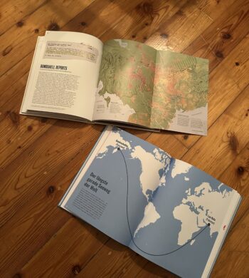
Scientific reports and raw data alone are not enough. The way we visualize and present climate risks determines whether people ignore the information or act upon it. While researching this topic, I came across two fascinating books: Atlas of the Invisible by James Cheshire & Oliver Uberti and 100 Karten, die deine Sicht auf die Welt verändern by Hoffmann & Campe. Both books illustrate how maps and data visualization can reshape our understanding of the world, revealing hidden patterns and making abstract issues tangible.

Their core message is also at the heart of RiskLIM: climate risks are not always visible, but that doesn’t mean they aren’t real. The challenge is to make them undeniable—so clear, so well-visualized, and so engaging that people feel compelled to act.

Why Visualizing Climate Risks Matters

One of the biggest challenges in climate communication is that risks often feel distant and abstract. Rising temperatures, melting glaciers, or shifting wind patterns don’t necessarily seem like urgent problems when they unfold over decades. Data alone doesn’t create urgency—visuals do.

Both Atlas of the Invisible and 100 Karten showcase how maps, diagrams, and interactive tools can help people see the connections they might otherwise overlook. These books are filled with visualizations that turn hidden global patterns into something concrete, localized, and understandable.

A striking example from Atlas of the Invisible is a map showing how global wind patterns have shifted due to climate change. Wind is invisible to the human eye, but the visualization makes it clear, urgent, and real. In 100 Karten, a similar approach is taken to show unexpected global connections—such as mapping food supply chains or the true size of countries when projections are corrected. Both books reveal that how we map the world influences how we perceive it.

This is precisely what risk communication needs to do—transform invisible environmental changes into something tangible that demands attention.

Risk Communication in Action: Lessons for RiskLIM

The RiskLIM project focuses on improving how climate risks—such as avalanches and snow loads—are communicated. But what can it learn from these books and other powerful visualizations?

NASA’s Climate Time Machine is a great example of how data can be made engaging and exploratory. This interactive tool allows users to see how sea levels, CO₂ levels, and temperatures have changed over time, making climate change undeniable. RiskLIM could apply a similar strategy by developing an interactive risk map that illustrates how avalanche or flood risks evolve over time, helping communities prepare for potential dangers before they happen.

Another example is Ed Hawkins’ “Show Your Stripes”, a simple yet powerful visual representation of global temperature trends. Instead of overwhelming people with complex graphs and numbers, this design reduces climate change to a sequence of colored stripes, moving from blue to red as the world gets warmer. The simplicity of this design makes it universally understandable. RiskLIM could take inspiration from this approach and create a visual early warning system that instantly communicates climate threats in a way that everyone can grasp at a glance.

Risk communication also needs to be personal and localized. Maps that show global trends are informative, but they often fail to create a sense of urgency. People need to see how their own homes, towns, or regions are affected to feel compelled to act. A customized local risk indicator—where users enter their location and immediately see how their area is impacted by climate risks—would make the information far more relevant and actionable.

Beyond just making climate risks visible, risk communication must also create an emotional connection. The way information is presented can mean the difference between awareness and inaction. Atlas of the Invisible and 100 Karten show that visual storytelling is just as important as the data itself. A map, when designed effectively, does more than just inform—it engages, persuades, and motivates.

From Understanding to Action: A Call for Smarter Risk Design

Climate data alone won’t change the world. But how we visualize and communicate that data can. If RiskLIM could develop an interactive map like NASA’s Climate Time Machine, or a risk indicator as intuitive as “Show Your Stripes”, it could bridge the gap between scientific prediction and public action.

Both Atlas of the Invisible and 100 Karten demonstrate that maps can challenge perceptions and change how people see global risks. They remind us that what we see—how data is presented—shapes what we believe and how we react.

The future of risk communication is not just about displaying climate data—it’s about designing it for action. By making the invisible visible, we ensure that the consequences of climate change are no longer distant or abstract, but urgent and real. The world of risk communication is evolving, and designers have a unique opportunity to shape how people see—and respond to—these challenges. Now is the time to use design as a tool for awareness, engagement, and most importantly, action.


Reference

Cheshire, James; Uberti, Oliver: Atlas of the Invisible – Maps & Graphics That Will Change How You See the World, Dublin, 2021

100 Karten, die deine Sicht auf die Welt verändern, Hoffmann und Campe Verlage, Hamburg, 2019

↬ Indexikalität und das Festhalten von Zeit

Schrey diskutiert, wie analoge Fotos durch ihre direkte physische Verbindung zur Realität (Licht trifft auf Film) einen starken Bezug zur Vergangenheit aufbauen. Diese sogenannte Indexikalität (das direkte Verweisen eines Fotos auf die Realität) wird in der digitalen Fotografie abgeschwächt, da digitale Bilder manipulierbar und oft künstlich nachbearbeitet sind.

Vergänglichkeit und Dauer: Die Patina der Zeit

Ein weiterer bedeutender Unterschied liegt in der Art und Weise, wie analoge und digitale Bilder altern. Analoge Fotos tragen die Spuren der Zeit – sie vergilben, verkratzen, verblassen oder bekommen Flecken. Diese Alterungsprozesse sind nicht nur Zeichen physischer Vergänglichkeit, sondern verstärken auch die emotionale Verbindung zum Bild. Die sichtbaren Spuren des Alterns machen analoge Fotografien zu Zeitzeugen, die eine Geschichte in sich tragen.

Digitale Bilder hingegen sind theoretisch unvergänglich. Sie existieren in der Cloud oder auf Festplatten in einer zeitlosen, unveränderten Form. Doch gerade diese Beständigkeit kann paradoxerweise dazu führen, dass digitale Bilder an emotionaler Wirkung verlieren. Sie sind jederzeit reproduzierbar und wirken oft losgelöst von der Zeit – ein Moment wird eingefroren, aber nicht von der Zeit gezeichnet. Dadurch kann die emotionale Tiefe und die intime Beziehung zum Bild geschwächt werden.

Die Bedeutung der Materialität in der Fotografie

Die digitale Fotografie bietet zweifellos viele Vorteile, doch sie verliert etwas, das für die analoge Fotografie essenziell ist: die physische Spur der Realität, die sichtbare Vergänglichkeit und die damit verbundene emotionale Tiefe. Analoge Fotos erinnern uns nicht nur an Vergangenes, sondern lassen uns die Zeit selbst spüren. Sie sind mehr als nur Bilder – sie sind Objekte mit Geschichte.

Vielleicht ist es gerade diese materielle Dimension, die die Renaissance der analogen Fotografie in der heutigen digitalen Welt erklärt. Während sich digitale Bilder in der Flüchtigkeit der modernen Medienlandschaft verlieren, behalten analoge Fotos ihren einzigartigen Charakter als authentische Zeugen der Vergangenheit.


#10 Information Aesthetics – Designing Data for Meaning and Emotion

Listen, Hear, Feel the Data

Data is more than numbers and patterns—it holds meaning, tells stories, and can evoke emotions. The concept of information aesthetics explores how data can be visually, sonically, and physically designed to stimulate perception, enhance comprehension, and create emotional engagement.

When we experience information through multiple senses, its impact extends beyond cognition into intuition, memory, and even decision-making. Whether through color, sound, movement, or tactile feedback, aesthetically designed data fosters deeper interaction and stronger connections between people and information.


The Art of Seeing, Hearing, and Feeling Data

We often judge visualizations based on their clarity and efficiency, but aesthetics play a crucial role in guiding what we focus on, how we interpret relationships, and how long we stay engaged. A well-designed data experience is not just informative—it is compelling. Consider how:

  • Color Theory Influences Interpretation: A thoughtful color palette can enhance clarity, while poor color contrast can distort perception.
  • Rhythmic Sonification Structures Attention: Sounds designed with natural rhythm and progression help listeners identify anomalies and trends.
  • Spatial Composition Guides the Eye: The placement of elements determines where users look first, how they navigate data, and what insights they extract.

Just as visual artists and musicians use balance, contrast, and movement to evoke responses, information designers must think beyond efficiency to craft experiences that engage both the analytical and emotional mind.


Aesthetic Principles in Multisensory Data Design

  1. Minimalism vs. Expressiveness – Some data benefits from minimalist clarity, while other datasets gain meaning through rich, expressive representation. Over-simplification can strip data of nuance, while overly complex displays risk overwhelming users.
  2. Flow and Rhythm – In interactive data experiences, transitions and animations should mirror the natural way we process information—progressively revealing insights rather than dumping data all at once.
  3. Contrast as a Communication Tool – Just as bold colors or sharp sound changes draw attention to key insights, subtle variations add layers of meaning without overpowering the primary narrative.

A well-balanced information aesthetic does not compete with understanding—it enhances it.


Multisensory Aesthetics in Action

  • Sound-Responsive Data Sculptures: Transforming datasets into physical, auditory installations allows users to walk through and experience information in space.
  • Generative Music from Climate Data: Environmental conditions translated into dynamic, evolving compositions make shifting weather patterns tangible.
  • Interactive Narrative Dashboards: Rather than static charts, users navigate data as a story unfolding in time, with smooth transitions and layered insights.

Data, when designed aesthetically, is not just understood—it is felt, remembered, and lived.

#09 Multisensory Accessibility: Expanding Inclusive Design Through Sensory Substitution

As digital environments become increasingly immersive, multisensory design is transforming the way we interact with data, technology, and the world around us. However, ensuring these experiences are accessible to all remains a challenge. Traditional accessibility efforts have largely focused on visual-centric approaches, often excluding those who rely more on auditory, tactile, or cross-modal interactions.

A promising solution lies in sensory substitution techniques, which translate one sensory input into another. These techniques, often used in assistive technologies, have the potential to move beyond niche applications and become mainstream tools that enhance accessibility for everyone.


Beyond Visual-First Interfaces: Rethinking Multisensory Accessibility

Most digital interfaces prioritise visual information—charts, text, and images dominate how we consume data. However, not everyone experiences the world through sight. A more inclusive design approach considers:

  • Sonification for Blind and Visually Impaired Users: Mapping data trends to sound (pitch rising for higher values) enables auditory pattern recognition.
  • Haptic Feedback for Deaf and Hard-of-Hearing Users: Vibrations and force feedback provide real-time alerts and spatial awareness.
  • Multisensory Adaptation for Neurodivergent Users: Some individuals process information better when it’s presented in multiple overlapping modalities, such as visual cues paired with subtle audio reinforcement.

Rather than designing separate assistive solutions, multisensory experiences should be natively inclusive, allowing users to select the sensory mode that best suits them.


Sensory Substitution: A Bridge to Universal Access

Sensory substitution devices (SSDs) replace information from one sensory modality with another, making data accessible in novel ways. For example:

  • Visual-to-Auditory Substitution: Devices like The vOICe convert camera images into real-time soundscapes, allowing users to “hear” shapes and motion.
  • Visual-to-Tactile Interfaces: Systems like BrainPort translate images into electrical pulses felt on the tongue, enabling spatial navigation for the visually impaired.
  • Cross-Modal Mapping in Mainstream Design: Everyday interfaces can integrate these concepts—imagine a navigation app that offers both vibration-based and sound-based guidance, allowing all users to choose their preferred sensory format.

Despite their proven effectiveness, SSDs have not yet seen widespread adoption. A key challenge is that they are often designed only as assistive devices, rather than as features that could benefit all users in various contexts.


Real-World Applications of Inclusive Multisensory Design

By embedding sensory substitution and multisensory feedback into mainstream products, we unlock new ways of engaging with technology:

  • Tactile Data Exploration: Raised surfaces, interactive touchpads, or vibration-based data encoding allow users to physically experience data trends.
  • Multisensory VR & AR Experiences: Augmented and virtual reality environments can become more accessible by incorporating soundscapes, haptic responses, and cross-modal cues that extend beyond sight.
  • Flexible Accessibility in Public Spaces: Interactive kiosks and wayfinding systems should support dynamic mode-switching, allowing users to receive information through visual, auditory, or tactile outputs based on their needs.

Designing for Multisensory Accessibility

To create truly inclusive multisensory experiences, designers must:

  1. Prioritize Sensory Adaptability – Allow users to customize how they receive information (toggling between visual, auditory, and tactile cues).
  2. Focus on Cross-Modal Integration – Ensure sensory inputs reinforce each other rather than competing (subtle haptic cues guiding users toward an audio source).
  3. Adopt a Universal Design Perspective – Move away from “assistive add-ons” and instead create mainstream products that naturally support diverse sensory abilities.

By making multisensory design accessible to all, we enhance usability for disabled users while also creating richer, more engaging experiences for everyone. Instead of viewing accessibility as an afterthought, it should be the foundation of future technology.

References

T. Lloyd-Esenkaya, V. Lloyd-Esenkaya, E. O’Neill, et al., “Multisensory inclusive design with sensory substitution,” Cognitive Research, vol. 5, no. 37, 2020, doi: 10.1186/s41235-020-00240-7.

M. Leung, “A look toward the future: The power of creating accessible multisensory experiences,” Accessibility.com, Feb. 19, 2024. [Online]. Available: https://www.accessibility.com/blog/a-look-toward-the-future-the-power-of-creating-accessible-multisensory-experiences. [Accessed: Jan. 31, 2025].

#08 The Role of Ambient Displays in Multisensory Data Representation

As digital interfaces evolve, ambient displays are becoming a critical tool for integrating multisensory data into everyday environments. Unlike traditional visualisations that demand direct attention, ambient displays operate at the periphery of perception, using light, sound, temperature, or movement to subtly communicate information. However, as these displays evolve, so does the need to understand their relationship with data and the context in which they exist.

Beyond Peripheral Awareness: Understanding Context in Ambient Displays

Historically, ambient displays have been discussed in terms of peripheral awareness—providing information in a non-intrusive manner. However, research by Vande Moere & Offenhuber (Beyond Ambient Display) suggests that ambient displays should not only be classified based on how they present data but also on the context in which they exist. Their model proposes three categories:

  1. Visualisation as Translation – Data is presented in an abstract form, independent of its environment (an ambient color-changing orb that visualises air quality).
  2. Visualisation as Augmentation – The display integrates into an existing object, enhancing its natural affordances (a lamp that glows brighter based on energy consumption).
  3. Visualisation as Embodiment – The display itself is the context, shaping meaning through its physical presence (large-scale urban installations that respond to public data).

By categorising displays in this way, designers can better align the modality, environment, and function of ambient displays to create more intuitive and meaningful interactions.

Designing for Subtlety and Context

The effectiveness of ambient displays lies in their ability to convey meaning without overwhelming users.

  • Selecting the Right Modality – Light, sound, or haptics should be chosen based on how users engage with their environment. A museum exhibit might use soft pulses of sound to indicate visitor density, while a wearable device could use gentle temperature shifts.
  • Context Sensitivity – Displays should align with their physical and social context. A public installationvisualising air pollution might use smoke-like visuals, reinforcing an intuitive connection between representation and data.
  • Balancing Functionality and Presence – An ambient display should enhance awareness without becoming the focal point. If too dominant, it shifts from being “ambient” to demanding attention, which can disrupt the user experience.

The Future of Ambient Displays in Multisensory Data Design

By rethinking ambient displays as context-sensitive interfaces rather than just passive visualisations, designers can integrate seamless, non-disruptive data experiences into everyday life. Whether through urban-scale data sculptures, responsive architectural spaces, or adaptive environmental displays, the next wave of ambient visualisation will focus on how context shapes perception—blurring the line between information and environment.

Reference

D. Offenhuber, “Beyond Ambient Display,” International Journal of Ambient Computing and Intelligence, 2009.

Designing and Evaluating Ambient Information Systems: Workshop at Pervasive 2007, The 5th International Conference on Pervasive Computing, Toronto, ON, Canada, May 13, 2007.

Weltanschauen

When I was in the process of finding my research topic and narrowing down what I wanted to write about, I was talking to my mom at some point about the idea of covering sustainable travel and wanting to document the issue. During this call I mentioned how I would love to help showcase a solution to overtourism, but that I did not see myself as capable enough to be the one to actually come up with a solution by myself. That was when my mom said “Why don’t you ask Christoph?”. Now, you have to know, Christoph is the dad of one of my former classmates. Their family lives in the same small and quiet Upper Austrian town I am from, where everyone knows everyone. So, naturally my mom also knows Christoph and what he does for a living. But what is it that he does? Well, he happens to be the founder and leader of a travel agency called “Weltanschauen”.
“Weltanschauen” is focused on sustainable as well as socially and culturally responsible travel, so actually the perfect fit for the topic I was exploring. I’ll be honest, when my mom mentioned Christoph I was kind of embarrassed that I didn’t immediately think of his company myself.
But I guess that, even at 24, moms do still save the day from time to time.

The Setting

But let’s go back to the beginning. What exactly does “Weltanschauen” do and how did it come to be that among all places in Austria, “Gallneukirchen” was the one to start a movement towards a more responsible tourism. I first have to brag just a little bit and mention that unlike other small, rural Austrian towns, my hometown has been quite open minded, inclusive and environmentally conscious ever since I can remember. This also means that there is quite a substantial target group for sustainable tourism in the travel agency’s immediate vicinity.

The Founder

Christoph Mülleder was working at Caritas when they started offering group travels to areas which they support in the form of different social projects. During these travels the main focus was on visiting projects and getting to know the people they helped, but there was of course also always time for a bit of sightseeing an being tourists in the classical sense. These journeys were organized by Christoph, who with his acquired knowledge and his background in economics as well as humanitarian aid, took the leap in 2012 of founding his own company, “Weltanschauen”.

The Company’s Spirit

“Weltanschauen” aims to create opportunities for interaction and exchange with people in social and economical hotspots. This provides insights reaching the core of a society and culture which go beyond the usually highly polished tourist experiences. Challenges and struggles of the respective society provide visitors with a better understanding of the country they are traveling to. Additionally, journeys planned by “Weltanschauen” also include visits to social aid projects and a heavy focus on sustainability and environmental issues in the host country. The agency aims to show visitors the clear connection between environmental and socio-economical justice.
Every journey organized by “Weltanschauen” is joined by one Austrian guide with extensive knowledge on the host country and one local guide, leading the tour.
The company states its is to show travelers a multi-facetted version of the country they travel to, showcasing all of its beauty without having to hide the unpolished, imperfect parts or looking away from social hardships. It aims to educate travelers by showing them, raw and unfiltered, how others live their lives and also how our actions and choices can influence social as well as ecological issues. The hope is that through raising awareness while traveling, people also start to see their responsibility to live sustainably in their daily lives.

The Team

“Weltanschauen” works with multiple Austrian as well as international travel guides and tourism experts as well as various different agencies and NGOs focused on sustainable travel. The travel agency also still works together with Caritas, organizing journeys to their partners and social aid projects once or twice a year.

The Outlook for my Project

I have already talked to Christoph about a possible cooperation for my master project and he seemed almost as enthusiastic as myself. We talked about the possibility to create a short documentary movie about sustainable and responsible travel, visualized on the example of one of his travel agency’s journeys. As the execution of the master project is still in the far future, there is still a lot that can change or come up, but in general I would be really excited about the idea of getting to document the process of planning and executing a sustainable journey to places one might not get to see as a standard tourist. I am hoping that documenting and sharing this with a larger audience can lead to some of the documentary’s viewers to reflect on their travel behavior and maybe implement some of the learnings I might have into their future holiday planning.
(Weltanschauen, 2025)

Literature

Between What Is and What Could Be

When I started this research, I wasn’t looking for a specific topic, I was chasing a feeling. Something felt missing in design, in media, in the way we experience the world. I was drawn to the in-between, the fleeting, unnoticed, overlooked moments that shape us without us even realizing.

I explored the simple concept of waiting, non-places, liminal spaces, randomness, imperfection trying to understand why certain moments feel soulless and disconnected while others feel deeply human. I found myself coming back to the same question:

“How can design capture these in-between moments and use them to create meaning?”

Designing for What We Don’t See

Most design focuses on what’s visible like logos, posters, polished branding. But what about what’s not seen? What about the things we pass by every day, the torn posters, the scribbled notes, the things left behind? What if design didn’t just fill space, but instead highlighted what was already there?

Some of the most powerful design projects aren’t the ones that impose meaning, but the ones that reveal it. Candy Chang’s “Before I Die” walls, where people publicly write their hopes and regrets, aren’t about permanence, they’re about capturing a fleeting moment of honesty. Krzysztof Wodiczko’s projections on public buildings, giving marginalized voices a platform, use impermanence as a tool to make people stop and pay attention.

Maybe good design isn’t about creating something new, but about amplifying what already exists.

The Imperfect, the Unfinished, the Fleeting

Throughout this research, I realized that the most human experiences are imperfect, unfinished, and fleeting. Whether it’s the randomness of a photo dump, the nostalgia for something we can’t quite place, or the quiet intimacy of a shared waiting space, these moments matter.

But we rarely design for them. We design for function, efficiency, longevity. Maybe it’s time to rethink that. What if design embraced imperfection, transience, and randomness? What if, instead of creating perfect spaces, we designed for serendipity, interaction, and human presence?

Designing for the In-Between

At its core, design is about shaping experiences, not just through what is seen, but also through what is felt, passed by, and sometimes even ignored. The challenge isn’t just to create something visually appealing, but to design in a way that acknowledges human presence, interaction, and imperfection. We see this in branding shifting toward raw, unpolished aesthetics, in urban spaces that encourage spontaneous participation, and in digital design that prioritizes authenticity over perfection. The in-between moments whether in public spaces, media, or digital interfaces are where connection happens. Instead of filling every gap with content, design has the power to highlight what already exists, giving meaning to what was once overlooked. The question is: how can we, as designers, create spaces, both physical and digital that make people pause, notice, and feel something real?

What Comes Next?

I don’t have all the answers yet, and that’s the point. This research wasn’t about finding a conclusion, it was about opening a conversation. Maybe the most meaningful design isn’t the loudest, the biggest, or the most perfectly curated. Maybe it’s the quietest the thing that makes you stop for a second, notice what’s been there all along, and feel connected, even if just for a moment. Because sometimes, meaning isn’t in the final design. It’s in the spaces in between.