One of the main reflections that I took from this talk is the fact that search UX patterns are often overlooked and misused, even in very important websites like governmental websites or e-commerce web shops you will struggle to find what you’re looking for and the speaker emphasized something that is really important in fixing this issue which is that searching, filtering and sorting should be treated as one UX pattern both on a design and development level.
Also the notion of selective scanning which is a mental behavior that users use intentially and unintentially to scan interfaces for information relevant to them which highlights the importance of using visual hierarchy along with real usability testing to determine the right UI patterns.
During the semester, I have been in many conversations with my colleagues about our projects and thesis ideas. These exchanges are always inspiring because they reveal how different our approaches are, and at the same time, they remind me that we all struggle with similar questions: Which topic really fascinates us? What feels relevant enough to dedicate months of research and experimentation to? And how do we make sure we do not just follow a trend but instead choose something that we personally connect with?
During one specific talk in the bitki cafe, we talked about churches. Not the institution but the building itself and how the atmosphere they create fascinates people no matter if they are religious or not. Whenever I enter a church building, I am struck by its dual nature. On the one hand, churches are impressive architectural masterpieces: the high ceilings, the stained-glass windows, the play of light and shadow. On the other hand, there is also something heavy and almost intimidating about them — a reminder of history, power, and traditions that do not always align with the values of today’s society.
This tension between admiration and critique made me rethink my thesis topic. I had initially focused on risk communication, a subject that is relevant and important, especially in the face of climate change and natural disasters. But at some point, I realized that while I find risk communication meaningful, it doesn’t excite me on a personal, creative level in the same way. Choosing a thesis topic is a long journey, and as one colleague reminded me: it has to be something you truly enjoy working on, because you will spend a lot of time with it. That advice helped me to accept that it was okay to let go of my old idea and embrace a new one that feels closer to my interests and creative practice.
So here I am now, beginning a new path: exploring the church and its role in contemporary society from a critical perspective. I want to ask questions like: Is the Catholic Church still a relevant institution? Why are so many people leaving it, especially in Europe? What does the symbolism of church spaces communicate, both intentionally and unintentionally? And how can design, especially projection mapping, help to visualize these tensions, contradictions, and maybe even open new ways of reflecting on the subject?
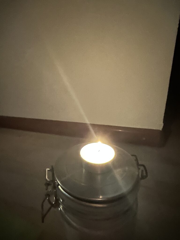
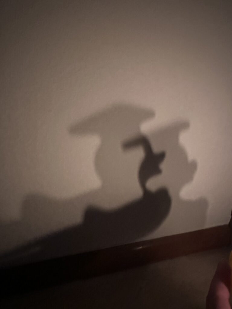
To approach this big and somewhat abstract topic, I decided to start small. My first prototype will be a very simple experiment with light and symbolism: placing an object in front of a candle and projecting onto it. I want to see how the interplay between shadow, light, and projection can change meaning. For example, I will experiment with different setups — using a small candle, a large candle, and two candles side by side. These small variations can already create very different moods. A single, small candle may evoke fragility or intimacy, while a large candle can symbolize power and authority. Two candles could suggest dialogue, duality, or conflict.
The candle is, of course, a strong religious symbol on its own. It carries connotations of prayer, remembrance, mourning, but also of hope and celebration. By using it as the basis of my prototype, I am starting with something that is minimal but at the same time culturally loaded with meaning. My goal is to explore how visual projection can either reinforce these traditional associations or disrupt them — for example, by projecting unexpected images or patterns onto the flame or the surrounding space.
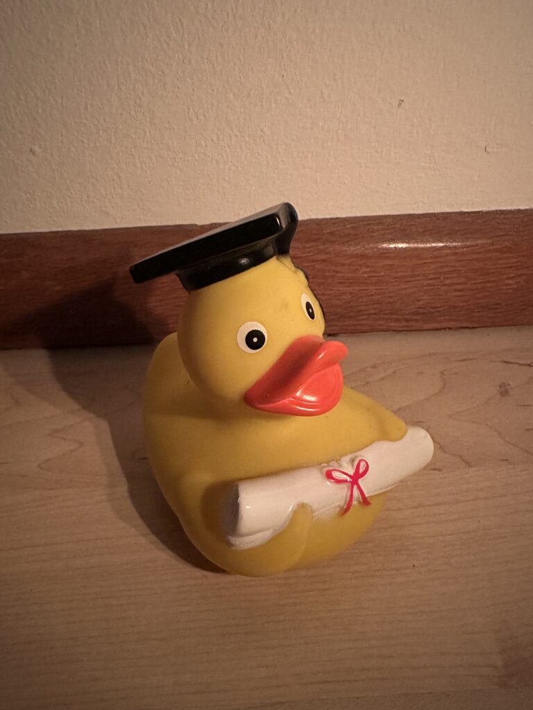
The chosen random Object:
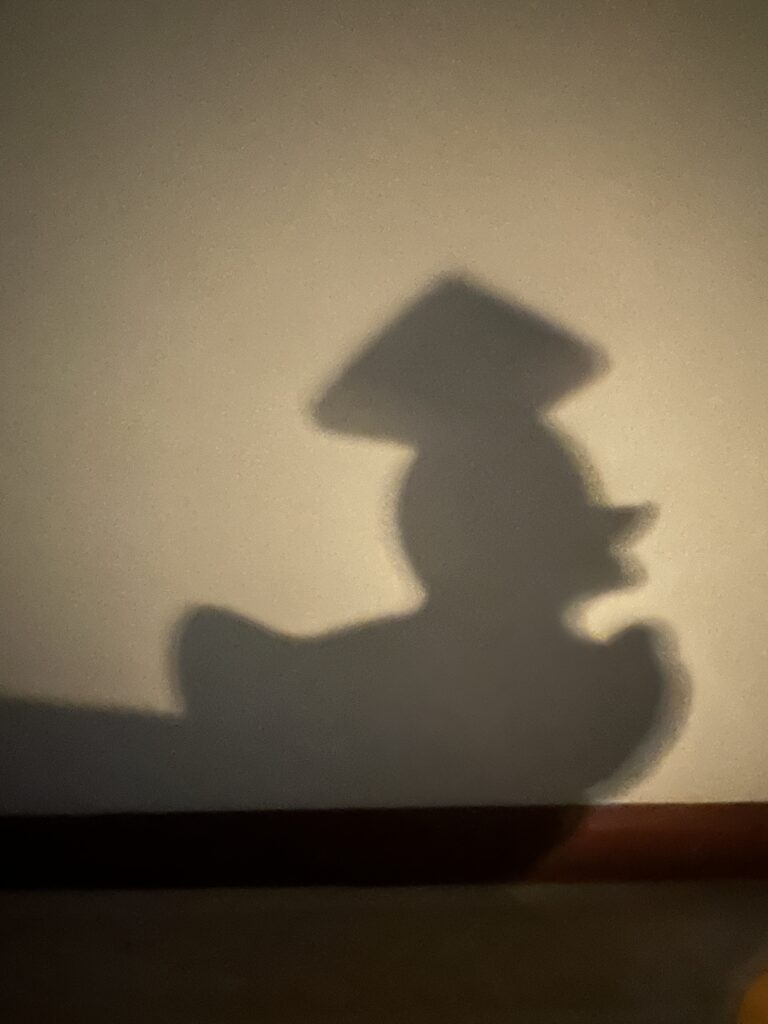
One small candle:
One bigger candle:
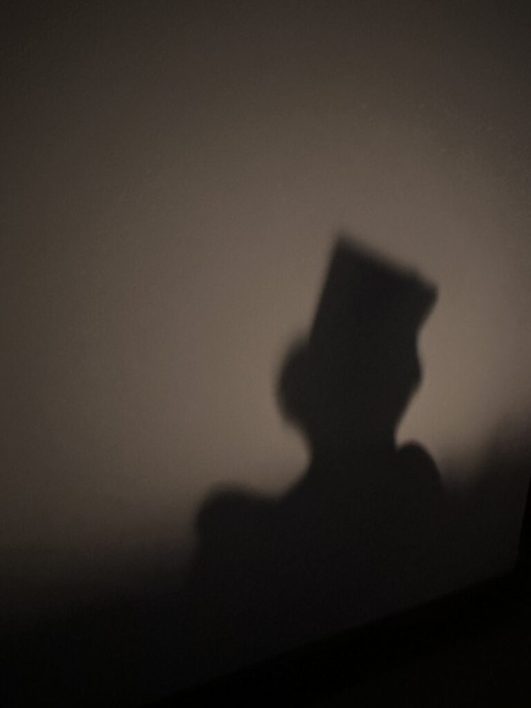
Two light sources:
Projection mapping can quickly become technically complex, involving software, 3D modeling, and large-scale surfaces. But I want to remind myself that the foundation is always the relationship between light, object, and viewer. With a candle and a wall, I already have a stage to experiment on, and from there I can gradually build toward more advanced prototypes.
I also see this as a metaphor for my thesis journey: starting small, with something personal and symbolic, and then slowly expanding it into a larger critical exploration. The candle experiment may not answer my big research questions yet, but it sets the tone for how I want to work — engaging with symbols, questioning traditions, and using projection mapping as a tool not just to decorate but to provoke thought.
Following this, I plan to continue developing this idea, possibly by testing projections on different surfaces or even architectural miniatures that resemble parts of a church.
For now I am happy to have found a new direction that excites me. Talking with my colleagues helped me realize that a thesis topic doesn’t just need to be “important” in an abstract sense — it needs to feel important to me. And for me, exploring the role of the church through the lens of projection mapping feels like the right path.
We had a speed dating event in class, where everyone had to quickly present their prototypes to others. The idea was to share concepts in short conversations, get immediate reactions, and see how our ideas land when explained to someone new. On paper, this format sounded exciting — a chance to practice communication, to sharpen my ideas, and to get outside perspectives. In reality, it turned out to be a bit of a wake-up call for me.
In my brainstorming-phase I came up with three different prototype ideas connected to the RiskLIM project:
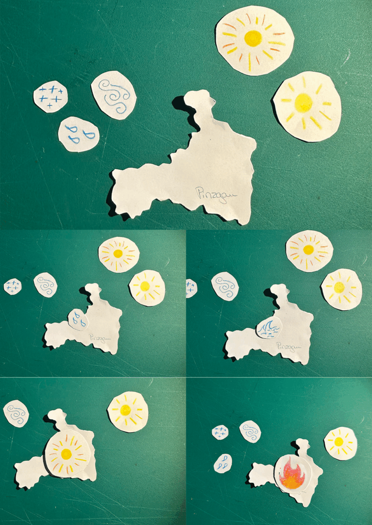
An Interactive Risk Map, developed as a very simple low-fidelity digital prototype, where users could theoretically click on different regions to see hazard levels.
A Gamified Avalanche Simulation, which I imagined as a paper prototype or even a very basic web app. The idea here was to make avalanche scenarios more tangible and playful, so that people could experiment and learn.
A Minimalist Data Visualization of an avalanche warning system, which I actually managed to realize. The concept was to strip the warning message down to its essentials and communicate information in the clearest, simplest possible form.
I decided to try make prototypes of the interactive map and the data visualization.
On the surface, these sound like solid starting points. But the truth is, I never really felt comfortable with them. Already while brainstorming, I was struggling. The ideas felt forced, as if I was trying to push myself into a framework that doesn’t quite fit me. When I finally built them, the process was just as frustrating. None of the prototypes felt natural, and I couldn’t shake the sense that I was circling around a topic that doesn’t fully resonate with me.
The speed dating format only amplified that feeling. Explaining my prototypes to someone else, I noticed how hesitant I was in my own words. My conversation partner — and this was the most telling part — also didn’t really understand the RiskLIM project. And at that moment, I realized: maybe I don’t understand it deeply enough either. If I can’t explain it in a clear, simple way through my prototypes, then maybe I’m missing the essence of what the project is really about.
That was a difficult realization. There’s a kind of despair that comes with working hard on something and still feeling like you’re not moving forward. After the event, I had to admit to myself that I’m back at the beginning again, standing at zero. That’s not an easy place to be, especially when you want to make progress and see results.
But after sitting with that frustration for a while, I started to think differently. Maybe being “back at zero” isn’t necessarily a failure. Maybe it’s an invitation to rethink. The fact that my prototypes didn’t quite land might just mean I need to dig deeper into the project, or maybe even allow myself to shift direction to something that connects more strongly with my own interests.
For now, what I take away from this exercise is that communication is just as important as the design itself. If I can’t explain what my prototype does, then maybe the design isn’t working — or maybe the foundation of my concept isn’t strong enough yet. Either way, the speed dating event forced me to confront that gap. And as uncomfortable as that was, it might be the most valuable lesson of all.
So yes, I feel like I’m starting from scratch again. But maybe that’s okay. Sometimes you need to break things down before you can build them up stronger.
I even met Richard Dank (DesCode) while donating. He gave me lots of expert insights since he has donated over 100 times already. One of his ideas was to incorporate a system for experienced donors to guide them to choose appointments in times when the blood donations are statistically low. I thought this was a great idea and I’m kind of imagining it like something similar to when you choose travel dates and red and green indicating which days are cheapest to travel.
Check out the video to see the process of my prototype!
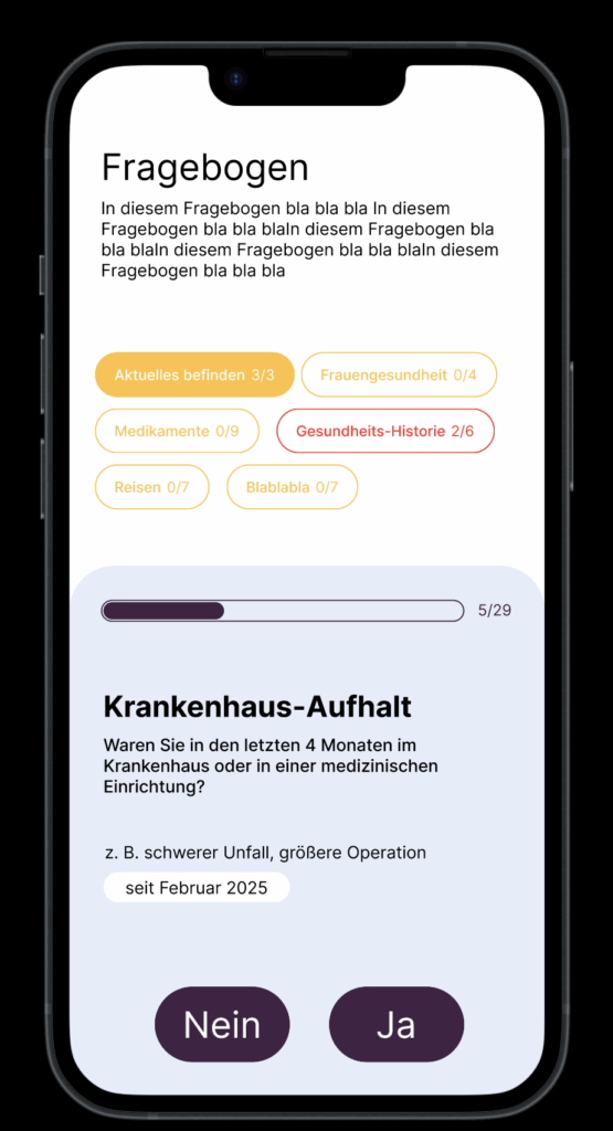
Creating a user-friendly questionnaire is essential for gathering valuable insights while ensuring a smooth experience for respondents. In my recent experience with the “Meine Blutspende” app, I encountered significant pain points that highlighted the importance of effective design in questionnaire development. This is why I want to specifically focus on the questionnaire part for my final prototype.
One of the main issues was the terrible formatting of the questionnaire. The red background combined with poorly chosen font colors made the text difficult to read. This lack of readability can lead to frustration and disengagement, causing users to abandon the questionnaire before completion. Proper contrast between text and background is crucial to ensure clarity and maintain user attention.
Additionally, the center-aligned text contributed to the readability problem. Left-aligned text is generally easier for users to follow, as it allows for a more natural reading flow. When designing questionnaires, it’s vital to consider typography choices and alignment to enhance user comprehension.
Another critical aspect of questionnaire design is the clarity of the questions themselves. Users should be able to quickly understand what is being asked without ambiguity. This can be achieved by using straightforward language, avoiding jargon, and breaking down complex questions into simpler, more digestible parts. Providing examples or context can also help clarify what is being asked.
Questionnaire Checklist
I’ve created a checklist for my final prototype to help me focus on the main points of creating a clear questionnaire.
Clear Purpose
= to determine if an individual is eligible to donate blood.
Provide explanation: Align each question with eligibility criteria established by health authorities.
User-Friendly Formatting
Use a clear, readable font size and style.
Ensure high contrast between text and background colors for readability.
Keep the layout simple and organized, avoiding clutter.
Logical Flow
Organize questions in a logical sequence (personal details, health history, travel history).
Group related questions together (medical conditions, medications).
Question Clarity
Use straightforward language and avoid medical jargon.
Phrase questions clearly to minimize confusion
Question Types
Utilize a mix of question types (yes/no, multiple-choice) for variety and engagement.
Progress Indicators
Progress bar or percentage indicator to show how many questions have been completed.
Clearly display the total number of questions at the top.
User Engagement
Use engaging visuals or icons to make the questionnaire more appealing.
Accessibility Considerations
Ensure the questionnaire is accessible to all users, including those with disabilities (e.g., screen reader compatibility).
Use simple language and avoid overly complex sentence structures.
Thank You and Follow-Up
Conclude with a thank-you message, acknowledging the respondent’s time and effort.
Provide information on the next steps or how to proceed if they are eligible to donate.
My experience with the “Meine Blutspende” app underscored these points, demonstrating how poor design can hinder user engagement. Ignore the colors please. I’m also not sure about the category pills.
Anyway… tomorrow is my donation appointment. Let’s see how that goes. I know my last post will be late but at least I’m donating blood, what about you???
Now that I’m starting to get deeper into the prototyping process I have decided to create a mind map using physical post-its to visualize the user flow. While I typically rely on digital tools like Miro or Figma for convenience, trying out physical post-its offered a refreshing change. I found that having something tangible in my hands, even if it was just paper and pen, helped boost my creative flow. Within just 10 minutes, I was able to outline the most important aspects of my app.
However, I still prefer digital methods because I enjoy drawing arrows to illustrate connections between different flows, which wasn’t feasible with post-its. For future projects, I might consider using a large sheet of paper to combine the tactile experience with the ability to create more detailed visual connections.
Something that came to mind while thinking through the process was the aspect of gamifying the donation process a little bit. I want to incorporate some statistics and maybe a point system for inviting friends to donate.
At the start of this semester, I was uncertain whether to stay with my original concept or move on to something new. Now, having decided to base my project on the book Beklaute Frauen, I feel much more confident in my direction.
Engaging in conversations with others, especially conducting that first interview, was very important. It revealed to me that I might have been focusing the wrong medium for my story, which in turn led me to rethink my approach.
With these insights, I arrived at the idea of an interactive installation and was inspired by the work of audio-visual artist Philipp Artus. His translation of user input into abstract visual forms helped me see new possibilities for my own prototype.
Through the prototyping process I learned that I need to bind the narratives of these women more deeply to the visitor’s interactions, perhaps even making this connection into an auditory dimension.
Of course, all of this is based on finding an exhibition venue willing to host my work. I still need to determine whether I can secure a official exhibition spot or whether I should explore alternative ways to present the installation without one.
Have fun with this Video to find out what my actual Prototype is.
Reflection
This project began with a vague idea to visualize CO₂ emissions — and slowly took shape through cables, sensors, and a healthy amount of trial and error. Using a potentiometer and a proximity sensor, I built a simple system to scroll through time and trigger animated data based on presence. The inspiration came from NFC tags and a wizard VR game (yes, really), both built on the idea of placing something physical to trigger something digital. That concept stuck with me and led to this interactive desk setup. I refined the visuals, made the particles feel more alive. I really want to point out how important it is to ideate and keep testing your ideas, because there will always be changes in your plans or something won’t work etc. Let’s go on summer vacation now 😎
Over the past few weeks, this project slowly evolved into something that brings together a lot of different inspirations—some intentional, some accidental. Looking back, it really started during the VR project we worked on at the beginning of the design week. We were thinking about implementing NFC tags, and there was something fascinating about the idea that just placing an object somewhere could trigger an action. That kind of physical interaction stuck with me.
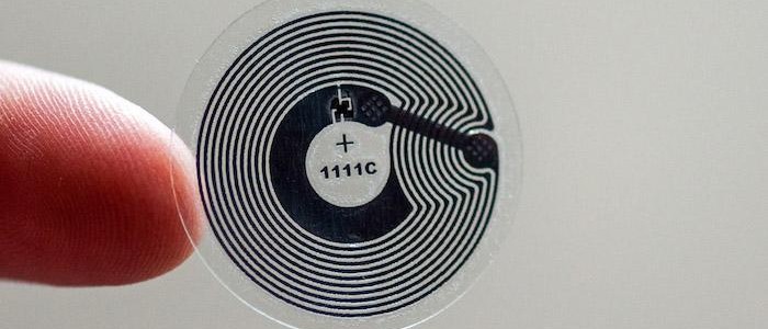
NFC Tag
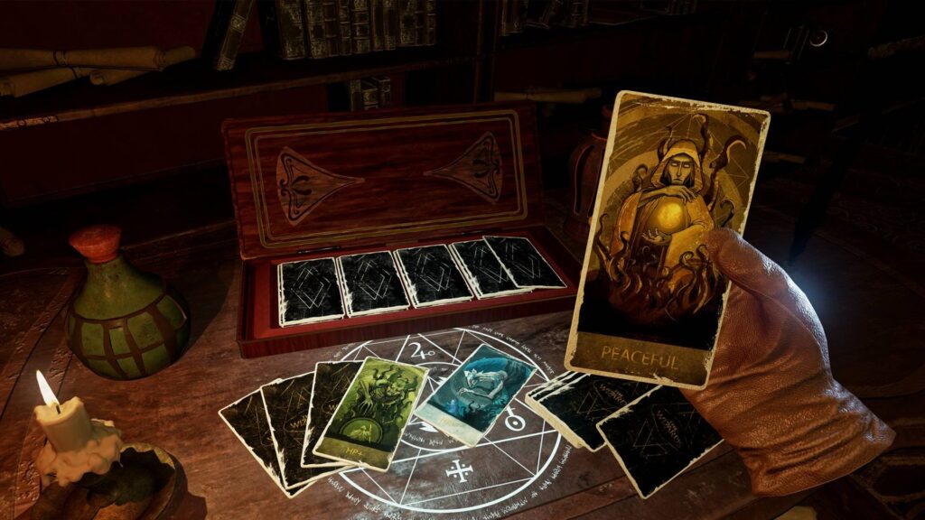
Around the same time, we got a VR headset to develop and test our game. While browsing games, I ended up playing this wizard game—and one small detail in it fascinated me. You could lay magical cards onto a rune-like platform, and depending on the card, different things would happen. It reminded me exactly of those NFC interactions in the real world. It was playful, physical, and smart. That moment clicked for me, I really like the idea that placing something down could unlock or reveal something.
Wizard Game
Closing the Circle
That’s the energy I want to carry forward into the final version of this project. I’m imagining an interactive desk where you can place cards representing different countries and instantly see their CO2 emission data visualized. For this prototype, I’m keeping it simple and focused—Austria only, using the dataset I already processed. But this vision could easily scale: more countries, more visual styles, more ways to explore and compare. Alongside developing the interaction concept, I also took time to refine the visualization itself. In earlier versions, the particle behavior and data mapping were more abstract and experimental—interesting, but sometimes a bit chaotic. For this version, I wanted it to be more clear and readable without losing that expressive quality. I adjusted the look of the CO2 particles to feel more alive and organic, giving them color variation, slight flickering, and softer movement. These small changes helped shift the visual language from a data sketch to something that feels more atmospheric and intentional. It’s still messy in a good way, but now it communicates more directly what’s at stake.