Evaluation Academic theses

Autor: Marius Lessiak 
Titel: Interaktionsdesign in Webapplikationen 
Jahr: 2007 
Institution: Technische Universität Wien, Fakultät für Informatik 
Betreuung: Ao. Univ.-Prof. Dr. Gerald Steinhardt, Univ.-Ass. Dipl.-Ing. Dr. Hilda Tellioglu 
Typ: Diplomarbeit 

Zugänglichkeit: Original in der Hauptbibliothek der TU Wien 

Oder 

https://repositum.tuwien.at/bitstream/20.500.12708/14588/2/Lessiak%20Marius%20-%202007%20-%20Interaktionsdesign%20in%20Webapplikationen.pdf

Struktur: 

  1. Einleitung 
  1. Usability 
  1. Interface & Interaktion 
  1. Entwicklung des Interaktionsmodells 
  1. Implementierung 
  1. Evaluierung 
  1. Zusammenfassung & Ausblick 

Artefakt: 

Die Arbeit enthält ein eigenständig entwickeltes Interaktionsmodell für Webapplikationen, das mithilfe aktueller Webtechnologien (AJAX, DOM, JavaScript) in einer funktionierenden Anwendung („Zeitspur“) umgesetzt und technisch evaluiert wurde. 

1. Overall Presentation Quality 

Die Arbeit ist klar gegliedert, sauber formatiert und sprachlich konsistent. Tabellen, Abbildungen sowie Diagramme werden sorgfältig eingesetzt und mit Quellen belegt. Grundsätzlich eine gute wissenschaftliche Aufbereitung, wenn auch mit älterem Layout-Standard. 

2. Degree of Innovation 

Wenn meine Recherche richtig ist, war zum Zeitpunkt der Verfassung (2007) AJAX ein relativ neues Paradigma. Die Verbindung von Interaction Design Principles mit der technischen Realisierung einer Webapplikation ist innovativ und interdisziplinär gedacht. Eine Arbeit die einen hohen Innovationsgrad durch theoretisch fundierte Modellbildung und experimentelle Umsetzung aufweist.  

3. Independence 

Marius Lessiak zeigt deutlich Eigenständigkeit in der Entwicklung des Interaktionsmodells und seiner technischen Umsetzung. Die Arbeit geht über eine reine Literaturstudie hinaus und verbindet Theorie mit einem realen Prototyp. 

4. Organization and Structure 

Die Arbeit folgt einer klaren, nachvollziehbaren Logik: Von den theoretischen Grundlagen über Usability und HCI bis zur Entwicklung und Evaluation. Querverbindungen zwischen Theorie und Praxis sind deutlich erkennbar, wenn auch stellenweise etwas textlastig. 

5. Communication 

Sprache und Stil sind präzise und sachlich, mit hohem wissenschaftlichem Anspruch. Englischsprachige Fachliteratur wird korrekt eingebunden. Die Formulierungen sind klar, teilweise etwas technisch-nüchtern. 

6. Scope 

Die Arbeit bewegt sich in einem angemessenen Umfang (~65 Seiten Text + Visualisierungen). Sie deckt sowohl theoretische Tiefe (HCI, Design Patterns) als auch praktische Breite (AJAX, DOM) ab. 

7. Accuracy and Attention to Detail 

Quellen sind sorgfältig zitiert, Fachbegriffe korrekt verwendet, Diagramme (UML, Hypertext-Strukturmodelle etc.) präzise ausgeführt. 

8. Literature 

Die Literaturbasis umfasst zentrale Arbeiten aus der HCI-Forschung (Cooper, Shneiderman, Beaudouin-Lafon) und relevante technische Quellen (AJAX, DOM, W3C). Für 2007 ist der Stand aktuell und wissenschaftlich solide. 

Beurteilung des Artefakts 

Dokumentation: 

Das Artefakt („Zeitspur“) ist detailliert beschrieben, mit Diagrammen. Die Dokumentation erlaubt ein gutes Verständnis der Funktionsweise. 

Zugänglichkeit: 

Das System war als funktionsfähige Webapplikation umgesetzt, die Interaktionsprinzipien konkret veranschaulicht. Zugang erfolgt theoretisch über TU Wien-Bibliothek (kein Link zu Live-System). 

Theorie–Praxis-Verknüpfung: 

Sehr stark. Das entwickelte Modell wird nicht nur theoretisch erläutert, sondern praktisch umgesetzt und technisch evaluiert. 

Qualität des Artefakts: 

Für mich wirkt es sehr anspruchvoll, sowohl technisch als auch gestalterisch niveauvoll für den damaligen Stand. 

Gesamturteil 

Stärken: 

  • Exzellente theoretische Fundierung (Verbindung HCI ↔ Webtechnologie) 
  • Eigenständiges Interaktionsmodell 
  • Klare, logische Struktur 
  • Fundierte Evaluation 
  • Solide wissenschaftliche Sprache 

Schwächen: 

  • Begrenzte empirische Evaluation (Fokus auf technische, nicht auf Nutzerstudien) 
  • Text teilweise zu detailverliebt in technische Aspekte 
  • Gestaltung/Visualität des Artefakts könnte stärker diskutiert werden 

Marius Lessiak liefert eine inhaltlich und methodisch überzeugende Diplomarbeit, die den Stand der Webentwicklung Anfang der 2000er-Jahre reflektiert und ihn mit HCI-Theorien verbindet. Das Werk zeigt, wie Interaktionsdesign strategisch und technisch zusammengedacht werden kann. Ein Beitrag, aus dem man heute noch methodisch relevantes Wissen beziehen kann. 
Evaluation of a Master’s thesis

Autor: Matthias Müller, BSc
Titel: Applying Service Design on Free Open Source Software (FOSS)
Erscheinungsjahr: 2017
Hochschule: Graz University of Technology
Master: Software Development and Business Management
Quelle: https://repository.tugraz.at/publications/yq1qq-qwe76

This master’s thesis takes a closer look at how open-source software projects actually work. While open-source tools are built “by users, for users” and have changed the tech world in many ways, their success often depends on more than good code. The author uses service design methods to explore the Austrian open source project “Catrobat”, mapping everyone involved, their roles, and how they work together. The goal is to find out what helps or holds back open-source projects and how better collaboration and understanding can lead to more innovation long-term success.

Presentation quality 

Overall, the master’s is well made, the layout is simple yet fitting, since the layout itself probably wasn’t part of the scope. Simple paragraphs, some graphics and pictures, highlighted quotes, nothing special, although you could find some gaps in the text due to the full justification. Long, bloated sentences and swollen language make the text difficult to read. But the arguments made follow a logically form, from explaining the open-source context to applying service design tools.

Degree of innovation & independence

What stood out to me is how service design is connected to the world of open-source software, since any design practices are usually hard to be implemented into open source projects. The work shows a high level of independence, especially in how the author adapts existing design tools to fit the unique dynamics of Catrobat. Although making assumptions for the whole world of open source might be a bit farfetched, since open source projects can be very different, not only in size but number of users, supporters or funders, distribution channels and much more. Meaning this is a great case study but doesn’t really contribute to making the open source more design friendly.

Organization and structure 

The thesis is well structures, although sometimes hard to understand. The author is very thorough, service design & Catrobat are both very well defined and explained. Before using a service design tool, the author explains the reason for using it first, explains the process, shows the results and their conclusion in the end. The flow of the work seems natural, and additionally the usage of graphics and pictures, as well as bullet points really help to clarify.

Communication 

Like I have said before, the language is hard to understand, or in other words very academic. However, this might just be due to my background being in design and not more science driven studies, like computer science or information technology. In the eyes of a student of the technical university of Graz, the tone might be common.

Scope 

The topic is handled with an appropriate level of detail overall, although personally I would have pot emphasis on different topics, as the author did. Catrobat is explained in a lot of detail, while user research or testing of proposed improvements fell short, although those are key elements of servicer design.

Accuracy and attention to detail 

Citations are well made, if they are taken word by word, they are visually different from the rest of the text. Footnotes as well as inline citations are flawless and all figures are accurately described. I also couldn’t find any grammar or spelling mistakes, luckily writing software like microsoft word gets better at catching those mistakes.

Literature 

The literature review is solid, with relevant sources from design, service research, and technology studies. It combines classic design theory with more recent publications about open collaboration. The references are well integrated and show that the author understands the academic conversation around the topic

My personal reason to pick out a master’s thesis like this one was to get a better grasp on open source in general, since I want to write my thesis about the same topic, although with a different scope. I used this exercise to get more insight into the opinions of non designers working on open source software. But as I pointed out, grasping the topic and the conclusion was hard, due to me not being able to understand and comprehend the way sentences were written.

Disclaimer:
This blog post was supported by AI (ChatGPT) to help with structuring and phrasing.

Impulse #2: Inclusive Design 

At the World Usability Congress, I attended the talk “When Responsibility Meets Reality: Strategies for Making Inclusive Design Happen” by Nina Hundhausen. The talk explored an issue that feels very relevant. It’s not only a think in designing products but also in how we design experiences, visuals, and even conversations around complex social topics. 

Hundhausen spoke about the gap between responsibility and reality. In theory, we all want to create inclusive, responsible, and sustainable solutions , the thing all call “Design for All.” But in practice, daily pressures, business KPIs, and limited resources often win. What struck me most was how she framed inclusion not only as an ethical demand but also as a strategic one: inclusion is not just “the right thing to do,” it’s also a smart investment in the long term. 

Listening to this, I started thinking about what “inclusive design” could mean within the context of religion, specifically, in relation to my master’s thesis. Religion is often about belonging, but it can also be deeply exclusionary. Visual and spatial expressions of faith (like churches, rituals, or symbols) are powerful, but they can also send subtle messages about who is welcome, and who is not. 

Therefore I asked myself what an inclusive design approach to religion would look like?Maybe it’s about creating spaces — physical or digital — where belief and doubt can coexist. Maybe it’s about representing religious symbols in ways that invite dialogue rather than define boundaries. And maybe it’s about acknowledging the non-believers, those who still seek meaning and connection outside traditional institutions. 

Inclusive design asks us to look closely at who we design for — and who we might be leaving out. Applying that to my work means asking: who am I designing for? What do I want to achieve? How can I use projection and light to open up conversation, not close it down? 

Hundhausen’s talk reminded me that inclusion doesn’t happen automatically. And that maybe, the most responsible form of design is one that leaves room for everyone — even those who don’t fit neatly within the frame. 

Dissclaimer: AI was used here for a better wording 

My Review of “Designing for Slow Reflection” by Gkounta & Wijayantha (2025)

The master thesis “Designing for Slow Reflection: Using a Physical Artifact to Reflect on Screen Exposure” was written by Dimitra Gkounta and Hasini Wijayantha, from the Master’s Programme in Human Computer Interaction and User Experience at the Umeå University in 2025. It explores how design can encourage people to think more deeply about their screen habits before going to sleep. In the current world, where most echnologies are designed to be fast and efficient, the authors experiment with slow technology; a design approach that promotes patience, reflection, and awareness instead of instant gratification.

Their research question is clear:

How can slow technology design qualities be implemented in an artifact to foster reflection on screen exposure before sleep?

To explore this, they used a Research through Design approach and created a low-fidelity prototype figurine that changed it’s appearance based on participants self reported screen time and sleep quality over the span of three days. The figurine represented the users behaviour visually through torn clothes or dirt (representing poor sleep or excessive screen time) or a neat appearance (representing healthier habits).

Pre-Evaluation

The figurine is well documented in this thesis. The authors describe its material, design choices, and the reasoning behind each visual change, such as torn clothing or posture adjustments. Photos and diagrams show the figurine in different stages of transformation thus painting a clear picture of the development process. It is also explained why the figurine was kept low-fidelity, giving a very well documented impression overall.

Though it is not publicly accessible the detailed explanation of the process would allow an interested party to recreate a similar setup.

The theoretical arguments and the practical implementation align convincingly which can be seen by a clear representation of three slow technology qualities (explicit slowness, ongoingness, and pre-interaction). There is a deliberate delay between data reporting and visual change (explicit slowness), the figurines gradual deterioration (ongoingness), and the morning audio journaling (pre-interaction). Though some participants reacted poorly to the delayed feedback, that just confirmed the expected challenge of introducing slowness into an environment that is accustomed to fast-technology.

Overall the documentation is clear and comprehensible. Each methodological step is described in detail, easy to follow and participant quotes give quick insight into how the figurine was perceived.

In my opinion, the quality of this thesis fully meets the standards expected of a master’s thesis and could be used as a shining example. It demonstrates a strong link between theory and design, creative experimentation, and careful reflection.

Main Evaluation

Overall Presentation Quality
The thesis is professionally presented and well structured. There is a clear line leading from theory to practice and both the term slow technology and the design process of the figurine are explained well. The thesis reads very easily without loosing its scientific tone which was a pleasant surprise.

Degree of Innovation
I think this work is highly original, at least I haven’t seen anything similar before. It combines slow technology with self tracking through data which is very interesting. The delayed feedback approach was very new to me since most technologies focus on near instant feedback and quick responses. The figurine also introduced a certain ambiguity to the data which is a refreshing idea, hopefully leading to more meaningful engagement. Overall the thesis provided a fresh perspective by focussing on designing for reflection rather than efficiency.

Independence
The authors show strong independence and creativity. They designed and created the figurine themselves, developed the study setup, and critically reflected on their own design choices. And though it was not without its challenges (e.g. participant misinterpretation), they adjusted their method accordingly.

Organization and structure
This thesis is organized very logically. Each section builds upon the previous one and has a clear focus. The transitition from theory to practice is clear and the documentation of both design and analysis is easy to follow. Photos of the figurine add to an easily digestable reading experience.

Communication
The writing style is professional yet clear and easy to understand. Concepts like explicit slowness, ongoingness, and pre-interaction are well explained. In my opinion the authors successfully combined technical language with narrative elements such as participant quotes which made the whole thesis engaging to read.

Scope
The scope fits the level of a master thesis. The project focuses on a specific, manageable question and a small user group of six participants. My only critique would be that the study frame was very short (three days) and could’ve been expanded.

Accuracy and Attention to Detail
The study reads very careful and precise. The theoretical foundation seems solid and the design and analysis are documented in such detail, that it makes it easy to understand how the figurines transformations came about.

Literature
This thesis makes great use of literature by connecting classical theories of reflection (Schön, 1987) with more recent studies on slow design and personal informatics. The authors also situate their project in a broader research context by showing how their study fills a gap in applying slow technology in self-tracking before sleep.

Overall Assessment

This thesis was super interesting to read, gave plenty of new perspective, food for thought, and was overall a thoughtful piece of research. It had a strong theoretical foundation, a creative new concept and a more than sufficiently reflective analysis. I think the application of slow technology principles, through a physical figurine into personal informatics is innovative and refreshing and made for an engaging read. A minor weakness is the short duration of the study, which limits insight into long-term behavioral change and could question the validity of the study outcome. Still, this thesis offers some inspiration for designers/researchers who want to rethink the role of slowness and reflection in todays fast paced environment. Slowing down could actually help us see ourselves more clearly.

IMPULS #1: Kerstin Röse (WUC)

Take-away: Vortrag von Kerstin Röse – „Digital Exclusion“

Der Vortrag von Kerstin Röse beim World Usability Congress war für mich ganz spannend, weil er ein Thema behandelt hat, das man im UX/UI-Design oft vergisst: ältere Menschen als Zielgruppe. Wir designen meistens neue Interfaces, informieren uns über die neusten KI Modelle oder das Internet of Things, dabei gibt es gleichzeitig eine ganze Generation, die sich von dieser „digitalen Welt“ ausgeschlossen fühlt oder gar keinen Zugang hat. Eigentlich ein Thema, dass uns in Betracht unserer Großeltern auch bewusst ist, aber es war trotzdem interessant, noch ein paar empirischere Daten und noch mehr sensibilisierung zu dem Thema zu bekommen. Jedenfalls ging es im Vortrag um digitale Exklusion, speziell bei Menschen ab 65 Jahren, und was wir als Designer*innen dagegen tun können.

Röse hat in ihrem Talk den Satz gesagt: „Every generation will get their silverliners.“ – also, jede Generation bekommt irgendwann ihre „Silberrücken“, ihre älteren Menschen, die mit den technologischen Entwicklungen Schritt halten müssen. Sie hat auch schön gezeigt, wie sich die digitale Interaktion über die Jahrzehnte verändert hat – von Kommandozeilen über grafische Interfaces bis hin zu KI Inputs meist über Sprache. Ich hab mich gefragt, welche technische Neuerung wohl kommen wird, wenn ich ein silverliner bin und mit der Weiterentwicklung kämpfe.

Ein zentrales Thema war, dass digitale Transformation nur dann erfolgreich ist, wenn sie alle einschließt. Damit hat sie deutlich gemacht, dass digitale Teilhabe nicht nur ein soziales, sondern auch ein wirtschaftliches Thema ist. Anscheinend gewinnt man nämlich nur so Konzerne dazu, Inklusion zu betreiben: Wenn ältere (oder anderwertig beeinträchtigte) Menschen ausgeschlossen bleiben, verlieren sowohl sie als auch Unternehmen wichtige Potenziale. Und schließlich geht es immer um den Umsatz.

Ein weiterer wichtiger Punkt war die Studie „D21 Digital-Index 2020/21“, die sie zitiert hat. Darin wurde untersucht, was sogenannte „Offliner“ – also Menschen, die das Internet nicht nutzen – motivieren würde, doch digital aktiv zu werden. Die Ergebnisse waren so:

  • 23 % würden sich mehr trauen, wenn ihnen jemand zeigt, wie es funktioniert.
  • 20 % wünschen sich einfachere Bedienung.
  • 19 % würden sich überzeugen lassen, wenn sie einen klaren persönlichen Nutzen sehen.

Diese Zahlen zeigen ziemlich deutlich, dass es beim Thema „Digital Inclusion“ nicht nur um Technik geht, sondern um Verständnis, Empathie und gute Kommunikation. Als Designer*innen sollten wir besondern bei der “einfachen Bedienung” einwirken können – indem wir Produkte schaffen, die intuitiver sind, Vertrauen aufbauen und Menschen Schritt für Schritt begleiten. Den letzten Punkt mit “persönlichen Nutzen” verstehe ich nicht ganz. Wenn sie eh keinen Zweck für an einem digitalen Gerät sehen, weil sie ihr Leben ev. mithilfe von Verwandten oder offline Medien regeln können, dann seh ich auch keinen anderen Nutzen, außer kommerz, den Offlinern unbedingt das Internet aufzubürden.

Was ich aus dem Vortrag wiedermal mitgenommen habe, ist vor allem: Design hat Verantwortung. In meiner Masterarbeit wird es wahrscheinlich nicht um ältere Menschen oder Barrierefreiheit im Web gehen, aber ev. um die Benachteiligung von Frauen in Kunst und Wissenschaft, und der Grundtenor “Exklusion” bleibt auch hier derselbe.


Hier der Link zu der Studie:

https://initiatived21.de/uploads/03_Studien-Publikationen/D21-Digital-Index/2020-21/d21digitalindex-2020_2021.pdf

Es kommen bei dem Digitalisierungsindex jährlich Zahlen raus, in wie weit die Digitalisierung in Deutschland fortgeschritten ist.

IMPULSE #1: 7 Minutes of Writing

Yesterday in class, we did a simple, yet for me, annoying exercise: write continuously for seven minutes, starting with the phrase “I am writing my master’s thesis about…” No stopping, no editing, no thinking too much … just writing. 

What began as a stream of random thoughts quickly turned into something more revealing. I switched from English to German almost instantly, because it felt more natural — and maybe also because the topic touches something personal. I found myself writing about how religion, especially Catholicism, still influences me, and how my relationship with it has changed over time. 

I realized that my thesis isn’t just about “religion and millennials” in an abstract sense. It’s about the tension between belief and institution, between faith and church. I wrote about how many of my friends have turned away from religion, how the Church has lost credibility, and yet how my personal faith still gives me strength. That contradiction — being supported by something that many reject — feels like the heart of what I want to explore. 

During those seven minutes, I also wrote about my uncertainty: How can I make this topic interactive? How can I visualize something as internal and emotional as belief? I imagined a projection inside St. Stephen’s Cathedral, a space that already carries so much symbolic weight. But what would I actually project? What is the question behind the light? 

By the end of the exercise, I was exhausted and a little frustrated. Seven minutes can feel endless when you’re forced to confront your own thoughts without a filter.  The writing helped me see that I don’t need to have all the answers yet.  

This small exercise reminded me that creative research isn’t only about collecting data or designing interfaces. It’s also about listening to yourself, about noticing what questions keep returning, even when I tried to avoid them. Question like: Can faith exist without the institution of the Church? But my topic includes the topic of distance as well. Maybe something i should focus more on and something i can work with in my interactive part. 

Dissclaimer: AI was used here for a better wording 

Final Prototype: An Interactive Projection Experience

I’m thrilled to share that I’ve completed my final prototype! The journey wasn’t without its challenges, especially when connecting my laptop to the projector, but I managed to get everything up and running in the end.

For this prototype, I utilized Zig Sim, Max and Resolume Arena to create an interactive layer. The key feature is that the projection changes color based on the movement of the projector. When you move the projector, the image shifts from full color to black and white, emphasizing the theme of perspective.

My aim was to not only enhances the visual experience but also invites viewers to interact with the projection in a unique way.

I won’t lie, I wasn’t sure if I could implement what I had created in my head. However I’m even more excited to see how this concept evolves.

Exploring Projection

I finally got a mini beamer and tested it for the first time. Until now, I had been working mainly with candlelight and flashlights to project my cut-out patterns, but having a proper projector opened up an entirely new range of possibilities.

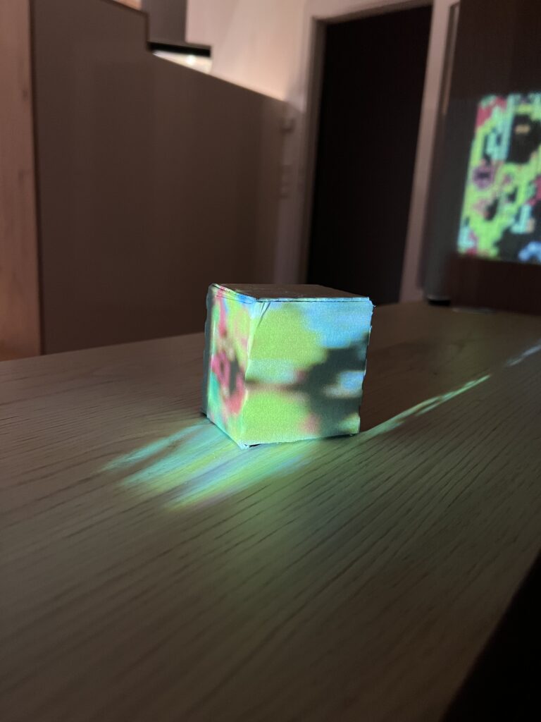
The test went surprisingly well. The beamer worked smoothly, and I was able to project both my digital Illustrator pattern and the physical stencils I had created. What struck me immediately was how powerful the combination of the two approaches can be. The crispness of the digital projection layered with the soft, imperfect shadows from the cut-out patterns created a unique visual depth. At times the two aligned to reinforce one another, while in other moments they clashed, resulting in distortions and unexpected visual tensions.

Seeing the religious symbols I had cropped, resized, and transformed behave in this hybrid space was fascinating. Some appeared monumental when enlarged across the cube’s surface, while others dissolved almost completely into abstraction. This play between clarity and fragmentation ties directly back to my concept of questioning authority and representation in the visual language of the Church.

Overall, this first experiment confirmed that working with both analog and digital projection is a promising direction. The interaction of light, shadow, and symbol not only adds complexity but also reinforces the idea that meaning is never fixed—it shifts depending on context, scale, and perspective.

My next step will be to bring in ZIG SIM to explore the interactive dimension. By integrating sensor-based input, I want to see how projection can dynamically respond to movement or touch. The goal is to eventually merge all three elements—the beamer, the stencil projections, and interactivity—into one cohesive experiment.

Exploring Symbols: From Research to Projection

In my latest step, I started to look more closely at the symbols I associate with the Church and Christianity. I didn’t want to only rely on my personal impressions, so I also did some research on Christian iconography. Very quickly, I came across recurring motifs: the cross, a particular style of fish representation, the Alpha and Omega, the dove, and, of course, the candle. These are all powerful, recognizable elements that carry centuries of meaning and interpretation.

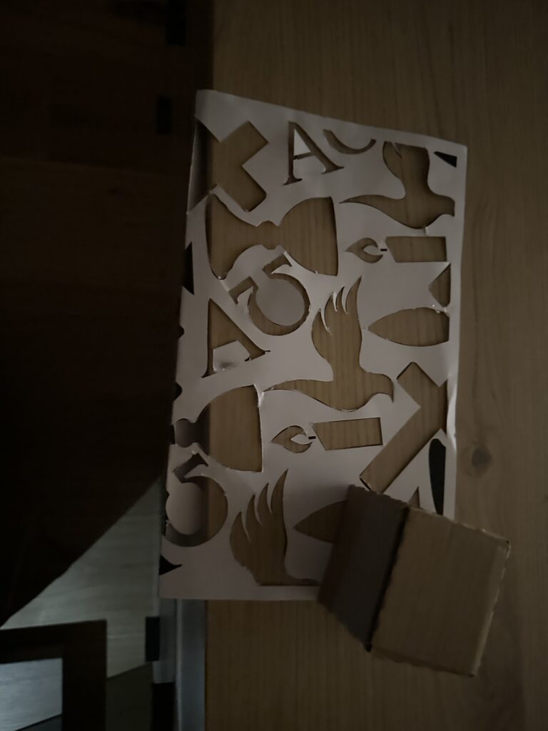
I decided to collect these symbols and transform them into a pattern in Illustrator. Instead of keeping them whole and perfectly visible, I chose to crop them in different ways. This meant that some parts of the pattern are cut off, others are enlarged, and some are reduced to fragments. My idea behind this was to create a visual language where not everything is always visible in its entirety. Sometimes the symbols appear distorted, sometimes they seem larger or smaller than expected. This connects to my concept of questioning clarity and authority in religious representation—how symbols are never neutral, but always shaped by context and perception.

While working with the pattern, I also experimented with its size. At first, the motifs were too large, which limited the effect I was aiming for. By reducing them, I was able to create a denser composition that worked better both visually and conceptually.

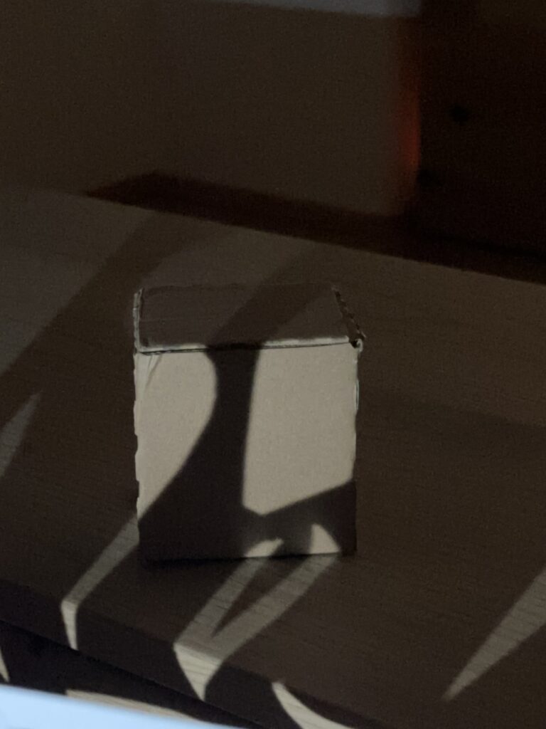
After finishing the pattern, I cut it out and began experimenting by projecting it onto my cardboard cube. I was curious to see how the cropped symbols would behave on a three-dimensional surface, and what kinds of distortions or new combinations would emerge as the light wrapped around the edges of the cube. Already, the results were interesting: the fragments became more abstract, sometimes unrecognizable, and at other times they gained a new intensity by being enlarged or stretched.

The next step will be to introduce another layer to this experiment. I decided to get a mini-beamer in order to project not just with candlelight or flashlight, but also digitally. This way, I can explore the combination of analog cut-out patterns with digital projections. For example, I could project the Illustrator pattern directly, or use an image, and layer that with the shadows created by the physical stencil. I am especially curious to see how the two techniques interact—whether they will reinforce each other or create unexpected contradictions.

Creating an effective & beautiful data visualisation from scratch

It is amazing to me personally that this talk was almost entirely about introducing one of the most underrated coding language in data viz, D3.js, which is a lang that should be a staple in every team that wants to create bespoke charts and design beautiful yet functional dashboards from scratch and proudly enough my master’s thesis main topic is about a SaaS that has a dashboard that was created entirely by the unpopular D3.js.
I was involved in designing all the components needed for the dashboard which is called “Steering” and also in the appropriate research to find out how to develop those components on a web app level which is was done later by a fellow full stack developer.