What I learned as the Best Practices For Designing an Intuitive Mobile Dashboard

A mobile dashboard may not offer the full functionality of its desktop counterpart, but it can still provide users with a scannable view of top-line data and statistics to let them make informed decisions. It can also give managers and executives the necessary tooling to quickly approve orders, contracts, and procedure and policy documents.

I drew from experience and other proficient UX Designers some of the best practices and key aspects that designers can use to design better mobile dashboards:

Smooth Navigation

Let’s start with navigation as this is how users will get acquainted with your dashboard and find the information they’re looking for. If the navigation for your mobile dashboard is clumsy or disjointed, or your search bar or navigation menu isn’t well suited to touch-based interactions, you are likely to turn off users.

Visual prioritization is key. Responsive mobile dashboards should communicate information quickly and prioritize it in a clear visual hierarchy. Another dashboard design best practice is using the principle of progressive disclosure to reveal information only when the user needs it.

Consider space, button styles, and the user’s first impression when converting a desktop design into its mobile counterpart. (Coinbase)

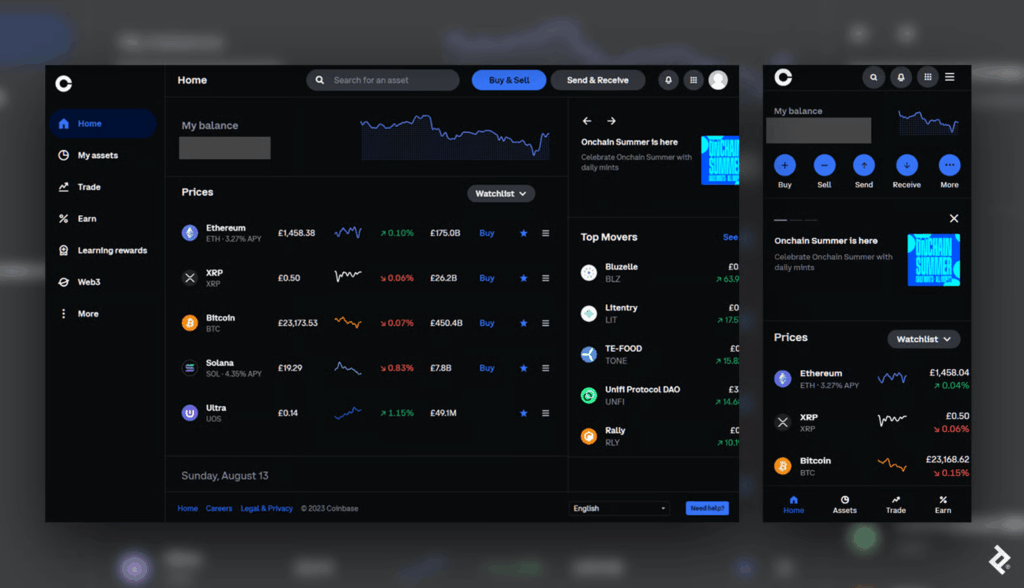
This mobile dashboard effectively uses space to prioritize the most essential options. Crucial buttons from the left-hand panel on desktop become the bottom navigation bar on mobile, a standard for mobile menus as the position falls into the “Z” page scanning pattern where users’ attention tends to land.

Responsive Tables and Charts

Designing responsive mobile tables and charts can be a challenge, but in my experience, the customer satisfaction it provides is worth it.

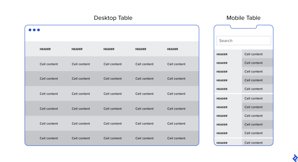
Generally, I advocate for responsive web designs that send a single code set to all devices but use fluid grids and media queries to change the appearance of elements based on a device’s size and orientation. This common and effective method is used in mobile dashboards to collapse table row headers into column headers in a set of stacked, standalone cards that can be scrolled through vertically. The approach offers an elegant mobile presentation that avoids squishing cells, while allowing the user to quickly peruse large amounts of data.

Button Design

Arguably, one of the biggest challenges in creating a responsive mobile dashboard is sizing and arranging buttons. Why? Because, unlike on desktop, you touch them, rather than select them with a cursor or keyboard command. They need to be big enough and spaced out enough to be tapped comfortably, and, due to the limited screen space, some will have to be collapsed into sub-menus or even hidden.

Kebab menus save space on mobile screens by enabling users to access hidden buttons.

Standard button design principles should apply to your mobile designs. I tend to divide button design into two main principles: You should present buttons in a range of styles (sizes, colors, and shapes) that denote their relative importance through visual cues; and the text label or icon associated with a button should connote its semantic meaning and intended function—for instance, whether the button affirms an action, selects a tool, navigates to a new page, or cancels an action.

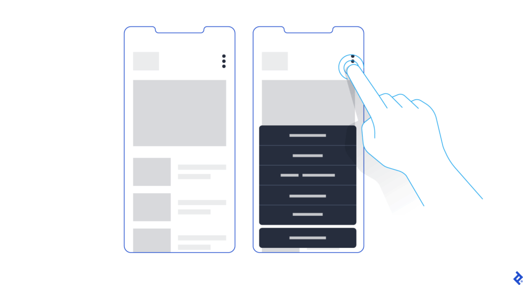
But you may have important buttons that can’t be hidden. As an alternative to the kebab menu, you could simply increase the button size to meet the mobile guidelines and then stack them vertically. Another alternative would be to leave the most crucial buttons at full size and make secondary buttons smaller by replacing the text label with an icon. When considering which technique to use, decide which buttons are most essential on each page.

Conclusion

When the project scope and budget allow, it’s most efficient to consider how a responsive mobile dashboard will look and function as you’re building out the desktop version. This will save time and development costs later in the product life cycle, and it will also help ensure brand consistency across devices. It’s also paramount to recruit a skilled developer to assess the feasibility of various design approaches, and, where needed, define CSS rules for reconfiguring tables and charts. Above all, try to faithfully recreate as much of the desktop experience as you can: You may have to eliminate some features and functionality, but it’s important not to dumb down the design and to follow the UX design process.

Mobile dashboard UI shouldn’t be an afterthought. If designed with care and foresight, mobile dashboards can provide significant value to users.

13. Exploring tools: Connecting WhatsApp and Google Calendar

It all started with a simple idea of booking appointments just by chatting on WhatsApp. I wanted to test this hypothesis without diving into complex paid tools right away. So I rolled up my sleeves and began researching how to connect WhatsApp with a calendar system in the most efficient, hands-on way possible.

As I combed through forums, websites, and YouTube videos, I came across platforms like Libromi. This company specializes in implementing chatbots for messaging apps. Their tool stood out because it offered something I wasn’t even looking for at first: a multi-agent chat system. This means multiple people can manage customer support and sales conversations using a single WhatsApp number, while keeping performance and access control in check. It was impressive.

Libromi also offered neat perks: integration with Google Sheets, payment gateways, automation for Facebook/Instagram lead ads, and most importantly, a ready-made booking system. Tempting? Very. But I decided not to use it. Since my focus was testing just one specific idea, I challenged myself to build the booking feature on my own instead. + Why pay 50$ per month for functions that might not be used 🙃

Before diving into development, I needed to make a key decision: Should I use the WhatsApp Business App or go for the WhatsApp Business API? Here’s what I learned:

The WhatsApp Business API is where the real power lies. With no device limits, full automation, integration support, and no broadcast caps, it’s made for businesses that want to scale. Naturally, this was the right choice for what I had in mind.

The WhatsApp Business App is great for small businesses. You can connect up to 5 devices, but it’s not designed for automation or integration. There’s also a limit on broadcasts (256 contacts), which can quickly become a bottleneck.

From Idea to Execution

Next, I needed to bridge WhatsApp and Google Calendar using the API. After evaluating several tools, I found that platforms like Zapier and Twilio could help make the connection smoother. They allow you to set up triggers and automate workflows, like creating calendar events based on user messages.

But here’s where I hit a roadblock: I couldn’t connect a chatbot to just any WhatsApp account. It has to be a verified business account through Facebook. So I created a Facebook Business Account, which is a must-have if you want to access the WhatsApp API and integrate it with any external tools.

What’s Next?

At this point, I’ve laid the groundwork: I understand the tools, I’ve set up the business account, and I’ve mapped out the data flow. The next step is to actually build the interaction where a user can chat with the bot, choose a time slot, and get a confirmation automatically logged into a calendar.

06_Comparing Different Animation Styles on Surfaces

So for the next approach I wanted to focuse more on the animation itself. The idea was to find out how different styles of animation actually look and feel when they’re projected onto various surfaces,  especially organic ones like plants and flowers as that is something I still want to explore. I mostly thought the animation itself would be the main focus, but I realized quickly that the object you’re projecting on plays just as big of a role. Maybe even more as it’s the canvas that need to match. So this time was all about experimenting. I went back to some loops I had made earlier in After Effects, just some basic stuff like flowing lines, waves, and one with more chaotic movement and bright white areas. The first test was with my big Monstera leaf. I focused on just one leave with big holes and clear structure, and I didn’t expect the result to be that different depending on the animation. However it was. When I projected the animation with strong lines, it worked really well. The structure of the leaf kind of guided the movement. It looked like the animation belonged there and the lines followed the leaf’s shape in a calm, quiet way. The whole thing felt very intentional, even though it wasn’t planned to fit that exact shape. I was surprised by how harmonious the result was. 

But the moment I switched to the more chaotic animation – the one with more movement and bright areas – it felt not fitting and a bit wrong. It clashed with the natural texture and rhythm of the Monstera. Instead of adding something, it distracted from the leaf and just didn’t work. The animation no longer felt like it was interacting with the surface but just slapped on top. Next up: I wanted to use the Lavender flower. Small, thin, vertical, and textured. When I used the wave animation here, it didn’t really work. Most of the effect got lost because the flower is so detailed and broken up into tiny parts. It looked static and flat, like the animation was struggling to land anywhere properly. But when I tried a stripe animation with vertical movement which is soft it worked. It almost felt like the Lavender was moving with the wind. Super subtle, but so much better than the “arty” stuff. 

These differences became really obvious when I looked at the footage I took. In the videos, you can actually see how much more natural certain combinations feel. The Monstera with the line animation looks slow and meditative, while the same leaf with the chaotic one looks messy. These tests showed me something I already expected but again good to know is that you can’t just create one “good” animation and expect it to work on every surface. The object is part of the visual. It shapes the outcome. If the animation and the surface don’t match, it feels off or even if the animation looks cool on its own. Projection mapping is more like a collaboration between light and object. Every surface has its own texture, shape, and depth and the projection needs to respect that. In a way, it reminded me a bit of sound design in film. You can have a beautiful soundtrack, but if it doesn’t fit the scene, it ruins the mood or creates a total new one. 

#2.02 Designing for Focus in an Age of Distraction

When I sit down to do work, I often only find myself deep in a rabbit hole of Reels or TikToks or reorganizing my phone, only after 30 minutes into the task. And to be honest even while working on this blog post I got distracted several times by my phone. This is why I decided to explore the topic of distraction in a digital life but I think it is also broadly relevant, since I feel like a lot of people struggle with getting distracted easily these days.

Are we living in an attention crisis?

There is a rising discourse around attention crisis, brain rot and digital burnout, since our days are increasingly fragmented by notifications, being constantly online and temptation of endless scrolls. In his book Stolen Focus, Johann Hari, talks about the effects of this crisis such as reduced productivity, heightened stress levels and even a weakening of our capacity to build deep and meaningful relationships. [1] A study from Microsoft says that our attention span shrank from 12 seconds in 2000 to 8 seconds nowadays, leading to humans having a shorter attention span than a goldfish. [2]

On average, people spend 4.5 hours a day on their phones [3], with 2.5 of those hours dedicated to social media. [4] Big tech companies like Meta and Google generate revenue by maximizing user engagement, turning out attention into a profitable business model. As a result, we get bombarded with dopamine-driven feedback loops that make it extremely hard to put the phone away to concentrate on a single task. [5]

Spending so much time on social media and doom scrolling for hours also affects people. In October 2024 “Brain Rot” was chosen for the Oxford Word of the Year. Brain Rot refers to the cognitive decline and mental exhaustion experienced by individuals, particularly adolescents and young adults, due to excessive exposure to low-quality online materials, especially on social media.“ [6]

Brain rot is an emerging concern among adolescents and young adults navigating today’s tech-saturated word. Marked by symptoms such as brain fog and reduced concentration, this condition seems to worsen with excessive screen time and constant exposure to trivial online content, ultimately contributing to a decline in cognitive function. [6]

Creative professionals like designers, writers, artists, musicians need uninterrupted time to enter a state of flow, where ideas can surface and evolve without constant context-switching. But even with productivity tools, focus apps, and “Do Not Disturb” settings, our smartphones still act like behavioral magnets. They promise us connection, innovation, and escape and they’re designed to be hard to ignore. Notifications, dopamine loops, and habit-forming UX patterns pull us away from the present moment, often without us realizing it.

So, the central question guiding my prototype this semester is:
How might a tangible interface reduce smartphone-related distractions for creative professionals?

The Concept: A Lamp That Helps You Focus

Rather than building yet another app to solve the problem, I want to explore a physical, ambient object that supports intention and presence in a gentle, non-coercive way. My prototype will be a lamp/phone dock – a small, aesthetically calming object that lives on your desk and invites you to temporarily “put the phone away” without demanding rigid rules or screen-time shaming.

The lamp will produce a gentle, ambient light when the phone is in the dock; it may change color gradually to show how much time was spent in focused mode. The lamp may respond softly by changing its color temperature, dimming slightly, or providing a quite auditory cue if the phone is taken out too often. These feedback loops are intended to raise awareness, encourage behavior, and support the user’s initial goal of remaining focused on their job rather than to punish.

Why a Tangible Interface?

I’m interested in how tangible interaction, physically placing the phone somewhere, seeing a change in your environment, can help ritualize focus in a way that’s more embodied and emotionally resonant than tapping a digital button.

What’s next?

In my next blogpost I want to look at some theories and frameworks such as:

  • Theory of Flow
  • Calm Technology
  • Persuasive Design

After getting into those theories and frameworks I am going to start with the first simple prototype.


My goal isn’t to eliminate distractions entirely, that’s unrealistic and probably undesirable. Instead, I’m curious about how design can create moments of pause. How can we introduce friction in a respectful, aesthetic, and emotionally intelligent way? How might we design tools that gently invite reflection, rather than enforce rules?

Literature

[1] Johann Hari, Stolen Focus: Why You Can’t Pay Attention – and How to Think Deeply Again (New York: Crown Publishing, 2022)

[2] Microsoft Canada Consumer Insights Team. Attention Spans: Consumer Insights. Spring 2015. Toronto: Microsoft Canada.

[3] Fabio Duarte, “Time Spent Using Smartphones (2025 Statistics),” Exploding Topics (blog), June 5, 2025, https://explodingtopics.com/blog/smartphone-usage-stats.

[4] Josh Howarth, “Worldwide Daily Social Media Usage (New 2025 Data),” Exploding Topics (blog), June 5, 2025, https://explodingtopics.com/blog/social-media-usage.

[5] Shehzad Batliwala Do Mgm, “The Attention Crisis: A Visionary’s Perspective on the Stolen Focus Epidemic,” Medium, September 10, 2023, https://medium.com/@visionarydoc/the-attention-crisis-a-visionarys-perspective-on-the-stolen-focus-epidemic-eff6692abbf9.

[6] Ahmed Mohamed Fahmy Yousef et al., “Demystifying the New Dilemma of Brain Rot in the Digital Era: A Review,” Brain Sciences 15, no. 3 (March 7, 2025): 283, https://doi.org/10.3390/brainsci15030283.

2.2. Returning to where I began

Reframing My Focus: Designing Phygital Interactions for Cultural Spaces

In my first post, I shared the process behind three pencil holder prototypes I designed. While that exercise helped me develop hands-on design skills, I’ve realized that the topic didn’t truly excite me. What does drive my curiosity is how phygital interactions, those that blend the physical and digital, can reshape the way we experience museums and cultural spaces.

Last semester, I began exploring this direction and outlined some guiding categories for my research:

  • Define the audience
  • Select an area of content interest
  • Explore physical + tangible interactions in depth

While these categories helped structure my thinking early on, I now find the idea of defining a target audience too limiting, especially for museum contexts, where visitors come from a wide range of backgrounds and ages. So, I’ve decided to narrow my focus to content, interaction methods, technology, and prototyping.

My New Direction

For this course, my goal is to develop a physical prototype that investigates how phygital approaches can make themes like history and cultural heritage more engaging, playful, and emotionally resonant. I’m especially interested in designing interactions that draw in people who might not typically connect with traditional exhibits.

To inform my design process, I’ve been researching successful case studies of museum installations focusing particularly on phygital projects. Each of these case studies provides valuable insights into how various interaction modes influence the visitor experience.

Phygital Experiences related to history and cultural heritage

Longbow & Quarterstaff” (Tangible Interaction)

The Longbow & Quarterstaff [1],[2] experience is a phygital, motion-tracked exhibit that blends physical play with digital storytelling to bring Nottingham Castle’s Robin Hood legends to life. It’s a full-body interactive game where visitors use real medieval-style weapons, safely reimagined, to trigger digital reactions on-screen, learning skills and stories as they go.

Key Characteristics

  • Visitors physically draw a longbow or wield a quarterstaff, mimicking medieval training exercises.
  • Responds in real time. Sensors track movement and trigger animated, story-driven challenges like dueling Little John or mastering archery.
  • Teaches by doing. Combines fun with history. No reading panels, just action-based learning.
  • Inclusive and intuitive. Designed for all ages and abilities, no prior gaming experience needed.
  • Blends heritage and innovation. Reframes historical content through immersive, hands-on play.
  • Keeps visitors engaged longer, encouraging exploration and return visits.
  • Makes memories. Creates moments of laughter, achievement, and embodied storytelling.
  • Durable hardware and responsive tech withstand high traffic without compromising experience quality.
“Sen” (Virtural Reality)

Sen [3], [4] is an immersive virtual reality experience that reimagines the Japanese tea ceremony through the perspective of a tea spirit. Created by Japanese VR artist Keisuke Itoh and produced by Cinemaleap, the 15-minute experience invites participants to embody “Sen,” a tiny lifeform born from within a handcrafted Raku tea bowl. As the spirit, the viewer observes and drifts through a poetic world, experiencing cycles of life, death, and rebirth—symbolizing the transience of existence and the meditative essence of Chado (the Way of Tea).

Key characteristics:

  • Meditative tone inspired by the Japanese tea ceremony and Zen philosophy
  • Non-verbal storytelling that emphasizes emotion, atmosphere, and symbolism
  • Themes of reincarnation, impermanence, and spiritual connection to nature
  • Handcrafted visual style, blending traditional Japanese aesthetics with digital craftsmanship
  • Technology: High-resolution Virtual Reality using a VR headset and spatial audio for full sensory immersion
  • Viewers hold a physical replica of the tea bowl while in VR, which becomes the central object in the experience triggering Sen’s journey and deepening tactile connection without buttons or controllers
A Forest Where Gods Live (Projection Mapping)

teamLab’s A Forest Where Gods Live [5] is an immersive digital art exhibition set in Mifuneyama Rakuen, an ancient Japanese forest and garden with deep spiritual significance. The project blends interactive technology with cultural heritage and nature, creating a respectful dialogue between the past and the present.

Key Characteristics

  • Digital artworks are projected onto real trees, rocks, and ruins, transforming the natural environment without altering it. The forest becomes the canvas.
  • The experience changes based on where you walk, how you move, and even the time of day. Flowers bloom, animals appear, and lights shift in real time.
  • The project honors Shinto beliefs that spirits inhabit nature. Instead of overwhelming the site, the art quietly coexists with its sacred atmosphere.
  • The visuals evolve with weather, seasons, and time, offering a different experience with every visit, echoing the Japanese idea of impermanence (wabi-sabi).
  • Carefully placed soundscapes and ambient lighting deepen the sense of wonder and connection with the natural surroundings.
“Experience Guide” (Environmental Sensing + Feedback)

The Experience Guide [6] is a fully integrated digital system designed to enhance both visitor engagement and museum operations. It’s a smart platform that uses indoor positioning technology to deliver personalized, real-time content to visitors’ smartphones as they move through a museum. It also helps museum staff manage and analyze visitor behavior and exhibit conditions from a single system.

Key Characteristics

  • Acts like a smart, invisible guide. Delivers personalized, location-based audio-visual content to visitors’ smartphones.
  • Automatically plays relevant audio and visual content based on where you are in the museum.
  • Replaces the need for QR codes, physical guides, or borrowed devices.
  • Includes features like ticketing, real-time updates, and accessibility support.
  • Continues the experience post-visit with summaries or reports.
  • Centralizes data on visitor flow, exhibit usage, and system performance.
  • Integrates with CRM, ticketing, and content management.
  • Supports staff in planning, maintaining, and improving the visitor journey.
“Botanical Atlas” (Digital)

The Botanic Atlas [7] is an interactive online platform developed by Google Arts & Culture in collaboration with institutions like the Botanical Research Institute of Texas, CRIA in Brazil, and the University Herbarium of Cambridge. It showcases over 30,000 plant species through a dynamic world map powered by Google AI, allowing users to explore botanical specimens from various regions.

Key Characteristics

  • Purely Digital Platform: Accessible online via Google Arts & Culture, with no physical component—fully immersive and interactive.
  • Uses Google AI to showcase over 30,000 plant species from around the world on a dynamic map.
  • Combines scientific research (botanical specimens, taxonomy) with cultural heritage (historical and artistic stories).
  • Users can select different perspectives like Woodland Explorer, Botanical Scientist, Forest Activist, or Tree Historian to customize their experience.
  • Highlights the cultural significance of plants, botanical art history, and regional forest stories.
  • Designed to educate a global audience through immersive storytelling, interactive exploration, and rich multimedia content.
  • Covers diverse ecosystems and plants from many countries, emphasizing the global importance of botanical knowledge.

Common Aspects of Interaction Methods and Technology

  • Emotion-driven storytelling: Focus on playful, memorable learning rather than info delivery.
  • Seamless physical-digital integration: Tangible actions directly trigger digital responses.
  • Real-time responsiveness: Sensors and tracking enable immediate, dynamic feedback.
  • Multisensory engagement: Combines touch, visuals, and sound for immersive experiences.
  • Context-aware design: Respects and enhances cultural and physical settings.
  • Inclusive and intuitive: Easy to use for all ages and abilities, minimizing barriers.
  • Personalized content: Adapts to visitor location, interests, or pace via smart tech.
  • Robust technology: Durable hardware/software for consistent, high-quality use.

What’s Next

This framework can help guide me in developing my prototype by emphasizing the following key areas:

  • Creating physical touchpoints that trigger rich digital responses.
  • Ensuring interactions feel natural and immediate.
  • Designing for diverse visitors with simple, engaging interfaces.
  • Embedding experiences meaningfully within a cultural context

The upcoming blog post will focus on selecting a topic related to history and cultural heritage, as well as researching technology and making choices for my prototype.

Sources

[1] PRELOADED, “Longbow & Quarterstaff – Nottingham Castle,” PRELOADED, 2025. [Online]. Available: https://preloaded.com/work/longbow-quarterstaff/

[2] K. A. Oliver, “Nottingham Castle,” kaioliver.co.uk, Portfolio. [Online]. Available: https://kaioliver.co.uk/?portfolio=nottingham-castle.

[3] ArtScience Museum, “SEN,” Marina Bay Sands, ArtScience Museum Exhibitions. [Online]. Available: https://www.marinabaysands.com/museum/exhibitions/sen.html.

[4] MuseumNext, “SEN: A transcendent virtual tea ceremony exploring reincarnation,” MuseumNext. [Online]. Available: https://www.museumnext.com/article/sen-a-transcendent-virtual-tea-ceremony-exploring-reincarnation/.

[5] teamLab, “teamLab: A Forest Where Gods Live,” teamLab Exhibitions. [Online]. Available: https://www.teamlab.art/e/mifuneyamarakuen/.

[6] Dotdotdot_it, “The first fully integrated digital system customised to visitor and museum needs,” Medium, Oct. 27, 2022. [Online]. Available: https://dotdotdot-it.medium.com/the-first-fully-integrated-digital-system-customised-to-visitor-and-museum-needs-a2661079dfce

[7] Google Arts & Culture, “Botanic Atlas,” 2025. [Online]. Available: https://artsandculture.google.com/experiment/botanic-atlas/xwFwFQ2goojMUw.

Blog Post 5: Creating Information Architecture for the prototype

As my project continues to take shape, this phase focused on defining the Information Architecture (IA)a crucial step in turning research insights into a functional prototype. Building on earlier blog posts about how people relate to digital photo memories, the IA sets the foundation for a smooth and emotionally engaging user experience.

Structuring the Experience

The goal was to design a flow that feels intuitive, while supporting two key user goals:

  • Organizing and uploading photos
  • Viewing memories through slideshows

The process starts with turning on the device, which takes users to the Saved Photos Dashboard. From there, they can either connect their smartphone to manage photos or choose a folder to start a slideshow.

Connecting and Managing Photos

Users can connect their smartphone using a cable or QR code, with potential for cloud storage integration in the future. Once connected, the phone’s photo gallery appears, and users can:

  • Create new folders
  • Add selected photos or videos
  • Add content to existing folders

After organizing, users can disconnect and return to the dashboard. This structure was designed to support personal storytelling, allowing users to curate moments by events, people, or emotions.

Viewing the Slideshow

For those wanting to revisit memories, the right path of the IA focuses on playing photo slideshows. Users select a folder and can apply filters by:

  • Date
  • Year
  • Folder name
  • Occasion (e.g. birthday)

Once the content is selected, the slideshow mode displays the images full screen—creating space for reflection and emotional connection.

From Research to Design

This IA was informed by insights from earlier stages, particularly the need for emotional accessibility and ease of use. People want to interact with their photos without feeling overwhelmed or lost in complicated interfaces. The flow reflects that: it’s linear, visual, and customizable.

Next, I began translating these flows into wireframes, designing each screen with clarity and emotion in mind. In my next post, I’ll dive into those wireframes and early feedback from users.

Blogpost 6: How to measure trust in UX

Trust is a cornerstone of user experience, influencing how users interact with digital products and services. However, unlike metrics such as load time or click-through rates, trust is intangible and multifaceted, making it challenging to quantify. Yet, understanding and measuring trust is essential for creating user-centric designs that foster loyalty and satisfaction. In UX design, trust refers to a user’s confidence in a product’s reliability, integrity, and ability to meet their needs. It’s built over time through consistent, transparent, and user-friendly interactions. Factors influencing trust include usability, visual design, content clarity, and perceived security.

(Source: http://hyunah-kim.com/project/designing-trust-into-ux)

To effectively measure trust, a combination of qualitative and quantitative methods is recommended:

1. Surveys and Questionnaires

Structured surveys can capture users’ perceptions of trust. Tools like the System Usability Scale (SUS) or custom Likert-scale questions assess aspects such as reliability and credibility. For instance, the SUPR-Q (Standardized User Experience Percentile Rank Questionnaire) includes trust-related items to evaluate website credibility. 

2. User Interviews and Feedback

Conducting interviews allows for in-depth exploration of users’ trust-related experiences. Open-ended questions can uncover specific design elements that enhance or hinder trust. This qualitative data provides context to quantitative findings.

3. Behavioral Analytics

Analyzing user behavior offers indirect insights into trust levels. Metrics such as bounce rates, session durations, and return visits can indicate trustworthiness. For example, a high bounce rate may suggest users don’t find the site credible or relevant.

4. Usability Testing

Observing users as they interact with a product can reveal trust issues. Hesitations, errors, or reliance on help features may indicate areas where trust is lacking. Usability tests help identify and rectify these pain points.

5. Physiological Measurements

Advanced methods like eye-tracking or facial expression analysis can detect unconscious reactions to design elements.These insights help understand users’ emotional responses, which are closely tied to trust.

Implementing Trust Measurements in Design

  • Incorporating trust measurement into the design process involves:
  • Setting clear objectives: Defining what aspects of trust are most relevant to the product.
  • Choosing appropriate methods: Selecting measurement techniques that align with the objectives and resources
  • Iterative testing: Regularly assessing trust throughout the design lifecycle to identify and address issues promptly.
  • Stakeholder collaboration: Sharing findings with stakeholders to inform design decisions and prioritise trust-building features.

Final Video Prototype

Source:

https://www.uxstudioteam.com/ux-blog/increase-trust-through-ux-design

https://www.youtube.com/watch?v=BWqTuNO4Epk

https://medium.com/@thefinchdesignagency/building-user-trust-in-ux-design-proven-strategies-for-better-engagement-c975aa381516

https://articles.ux-primer.com/the-hidden-power-of-emotion-and-trust-in-ux-design-5ae3d286d57e?gi=a9243f2f3c4b

https://www.stan.vision/journal/building-trust-in-saas-ux-ui-design

Blogpost 5: Designing for Both Sides of the Experience

In the landscape of UX design, we often prioritise the end user = the customer tapping on the app, making a reservation, or reading a restaurant review. But in service contexts like dining, the experience is co-created. Behind every safe and satisfying gluten-free meal is a team of restaurant staff managing food prep, communication, and customer care.

For individuals with celiac disease, eating out is a high-stress situation. The stakes are medical, not just personal. Users rely heavily on restaurant staff to understand and accommodate their needs. But the staff, in turn, must navigate complex orders, time pressure, and varying levels of knowledge – all while delivering consistent, empathetic service.

So, how can UX design empower both groups?

By designing systems that are intuitive, informative, and motivating, we can bridge this empathy gap and create experiences that feel safe, human, and trustworthy – for everyone involved.

Dual empathy in UX

Human-centered design isn’t just about the end user, it’s about every person who interacts with the system.

In a restaurant context, that includes:

  • Kitchen staff interpreting special orders
  • Waiters translating customer needs
  • Customers navigating digital menus and allergy filters

This shared ecosystem requires tools that are mutually supportive, rather than one-sided.

(Source: https://medium.com/@mis9385/ux-design-research-part-2-week-9-restaurant-design-function-af5407866d5b)

Empowering staff through UX features

Designers have an opportunity to reduce friction and boost trust by building restaurant-facing features that support communication and clarity.

  • Live dietary alerts and preferences: for example a tablet in the kitchen or at the waiter station that instantly shows: “Table 4: Gluten-Free. Cross-contamination alert enabled.”
  • Customer preference profiles: Frequent diners could have optional saved settings that flag dietary needs early in the booking or ordering process.
  • Smart checklists for order confirmation: A visual checklist (“Separate cutting board used? Dedicated fryer confirmed?”) reinforces habits without slowing the workflow.

These features don’t just protect the user. They lighten the cognitive load for staff and create a system of shared responsibility.

(Source: https://www.eleken.co/blog-posts/14-impressive-ux-statistics-to-prove-the-value-of-great-design)

Designing the interface between two humans

At its core, this is about facilitating human connection through design. The app is the medium, but the real exchange happens between diner and staff.

  • If the app provides transparency, both sides feel informed.
  • If the system feels empathic, both sides feel heard.
  • If the training is engaging, both sides benefit from better service and reduced anxiety.

This kind of design (dual-perspective UX) is where real inclusivity happens.

Creating safe, enjoyable restaurant experiences for celiac diners doesn’t stop at user interfaces. It extends to the tools, training, and touchpoints that staff rely on to deliver those experiences. When designers design for both diners and providers, they reinforce trust, reduce risk, and elevate hospitality from a transaction to a shared act of care. Good design doesn’t just protect the user, it equips the provider. And when both feel supported, the result is an experience that’s not just functional, but truly human.

Source:

https://uxdesign.cc/what-is-service-design-and-why-it-matters-e1ed3fc86e7b

https://www.broworks.net/blog/design-for-business-designing-for-a-real-users

https://uxdesign.cc/a-guide-to-business-driven-ux-connecting-business-strategy-with-user-needs-19b74e2cba42

https://www.kioskbuddy.app/blog/human-centered-design

https://codenomad.net/blog/how-to-design-a-user-friendly-restaurant-app-interface/

Blogpost 4: UX Designing for Trust

For individuals living with celiac disease, everyday activities such as dining out or traveling often involve many decisions. Choosing a restaurant isn’t just a matter of taste or location – it’s a high-stakes choice where a single mistake could trigger a serious autoimmune response. The fear of gluten cross-contamination, inaccurate labeling, or staff miscommunication creates anxiety and can lead to avoidance behaviors.

In these emotionally charged contexts, trust becomes the most critical design currency. It’s not enough for an app or website to simply “work.” The interface must communicate safety, offer reassurance, and build confidence. The tools that help accomplish this come from emotional design, a UX approach that creates positive emotional responses while addressing users’ deep-seated fears and needs.

(Source: https://uxplanet.org/the-design-of-trust-13d68df6e52f)

Key trust-building strategies in UX/UI Design

Warm, Human-Centered UI

Trust begins at first glance. Visual design plays a subtle yet powerful role in signaling safety. Warm colour palettes (like soft greens and blues), rounded shapes, and friendly typography (e.g., sans-serif fonts with balanced kerning) make interfaces feel approachable and calm. It is important to avoid stark, sterile layouts – these may seem clinical and uninviting.

Images that reflect diverse, real-world diners with dietary needs, or inclusive illustrations, can build emotional rapport.

Community-driven verification

Trust is social. Many users rely on others’ experiences before making their own decisions, especially when safety is involved. User-submitted reviews, gluten-free ratings, or crowdsourced verification tools (e.g., “5 celiac users confirmed this restaurant”) can add layers of trust that go beyond the brand.

This also makes the interface emotionally participatory. Users don’t feel like passive consumers. They feel like contributors to a shared mission of safety.

Clear and calming messaging

When alerts or warnings are necessary, how they are phrased and delivered matters greatly. Alarming, fear-based messages (“Warning: You might get sick here!”) can overwhelm users and create distrust in the platform.

Instead, using calm, empowering messages is a better solution:
“We couldn’t verify gluten-free practices at this location. Consider choosing a nearby verified spot.”
“This restaurant has a dedicated gluten-free menu, confirmed by multiple users.”

Tone of voice should be empathetic, not mechanical. Speaking like a friend who understands the user’s needs.

Transparent data and certifications

Showing how the data was gathered is the key. If a restaurant is marked gluten-free, it is good to clarify if the information came from the restaurant itself, a third-party certification, or user verification. Transparency in labeling reduces guesswork and helps users feel in control.

A good example: “Verified by Gluten-Free Food Program (GFFP), last updated May 2025.”

(Source: https://www.uxstudioteam.com/ux-blog/increase-trust-through-ux-design)

Emotional trust as a UX metric

Traditional UX metrics like time-on-task or conversion rates don’t capture the full picture in emotionally sensitive situations. In these contexts, trust, reassurance, and confidence become key success indicators.

It could be measured through:

In-app feedback surveys after bookings (“Did you feel confident in your choice?”)

Emotional sentiment analysis of reviews

User return rate for safety-verified features

For users with celiac disease, digital trust isn’t a luxury, it’s a necessity. Interfaces must go beyond usability and tap into empathy, comfort, and shared values. Emotional design is the bridge between fear and freedom.

Designers have the power to transform digital platforms into safe, emotionally intelligent spaces, where users don’t just complete tasks, but feel heard, protected, and empowered.

Sources:

https://www.interaction-design.org/literature/article/trust-building-the-bridge-to-our-users?srsltid=AfmBOoqwQbSdcqbM2LcoZvx0fZRmBXgi1mKs0qCGJF9w9YppYST-oT6T

https://www.codebridge.tech/articles/emotional-design-in-ui-ux-creating-memorable-user-experiences

https://www.uxdesigninstitute.com/blog/role-of-emotion-in-ux-design/

(Source: https://www.interaction-design.org/literature/article/trust-building-the-bridge-to-our-users)

Blogpost 3: The Power of Emotional Decision Points in UX

Micro-interactions are those tiny, often subconscious moments of feedback. It is a play of a surprisingly large role in shaping how users feel when engaging with a digital product. Whether it’s a small animation after clicking a button, a soft vibration after completing a form, or a sound that signals success, these interactions offer reassurance, guidance, and delight.

But what happens when the user’s experience is layered with heightened emotional stakes, such as when managing a medical condition like celiac disease while traveling?

For many celiac travelers, the simple act of choosing a restaurant becomes a complex, emotionally charged decision. The fear of gluten cross-contamination, misunderstandings with staff, and lack of reliable information can lead to anxiety and hesitation. In these scenarios, micro-interactions must evolve beyond aesthetics and usability – they must become emotional decision points that build trust and provide comfort.

Micro-Interactions as emotional anchors

Micro-interactions are traditionally used to provide feedback or indicate progress, but when reframed as emotional decision points, they take on a deeper role. These are the moments when users need reassurance, not just that a button was clicked, but that a decision they’re making is safe, validated, and understood.

For example a user booking a table at a restaurant labeled gluten-free. A simple message saying “Reservation confirmed” is informative, but emotionally neutral. Comparing this to: “You’re all set! This place is 100% gluten-free certified—dine with confidence!“.

That message acknowledges the user’s concerns and offers emotional validation as a small, powerful shift in tone and intent that can ease anxiety and enhance trust.

(Source: https://www.uxdesigninstitute.com/blog/microinteractions-in-ui-design/)

Emotional design and empathy in UX

The concept of Emotional Design, introduced by Donald Norman, outlines how products evoke emotions through three levels of experience:

Visceral: What we see and feel instantly. For example, clean visual design and friendly icons that suggest safety.

Behavioral: How well the product works. Is the app intuitive, and does it answer the user’s needs – like finding gluten-free restaurants nearby?

Reflective: How the product aligns with our values and identity. For celiac users, a product that respects their condition and supports their lifestyle reflects empathy and shared understanding.

In practice, this means designing with:

Clear feedback: Messages like “This meal is prepared in a dedicated gluten-free kitchen” reduce doubt and increase user confidence.

Calming UX language: Words matter. Using reassuring phrases like “You’re in safe hands” or “We’ve got your back” adds a human tone that speaks to the user’s emotional state.

Affirmative confirmations: Simple, positive reinforcements “You’ve successfully reserved a celiac-safe meal” turn transactions into trust-building moments.

Consistency across touchpoints: Whether it’s during onboarding, navigation, or checkout, emotional design should remain present. Repeated positive interactions reinforce the app’s reliability.

(Source: https://medium.muz.li/the-art-of-emotion-normans-3-levels-of-emotional-design-88a1fb495b1d)

Designing for high-stress use cases

The empathy gap – the disconnect between what designers assume and what users actually feel can be especially wide in health-related or stress-inducing use cases. Closing this gap requires more than good visuals or flawless functionality. It means designing for how users feel in critical moments.

For instance, if a user is traveling in a foreign country, unsure of the local language or food labeling laws, they need an interface that goes beyond “working” – they need one that soothes, educates, and protects.

Examples of emotional UX features for celiac users could be:

Verified restaurant badges with explanations and visual indicators.

A “safe zone” color palette (greens and blues) used during confirmation steps.

Optional peer reviews specifically from other celiac travelers.

Emergency cards with translated gluten-free phrases that can be generated and saved.

(Source: https://www.justinmind.com/web-design/micro-interactions)

When designing UX for high-sensitivity scenarios like celiac travel, every micro-interaction becomes a chance to support the user emotionally. By turning these moments into emotional decision points, infused with clarity, empathy, and trust, designers can create not only functional products but emotionally intelligent ones. In a world full of decisions, it is important to help the users feel that every choice they make is the right one.

Sources:

Norman, D. A. (2004). Emotional Design: Why We Love (or Hate) Everyday Things. Basic Books.

https://medium.muz.li/the-art-of-emotion-normans-3-levels-of-emotional-design-88a1fb495b1d

https://medium.com/uxcentury/the-three-levels-of-emotional-design-0f7ff723af04

https://medium.com/swlh/three-levels-of-design-donald-a-norman-4f36a8db82d6

https://www.veroke.com/micro-interactions-in-ui-ux-small-details-big-user-impact/