Stand by – Song Idea for my Einzelprojekt

We’ve already written eight songs for the album. Every time we move toward recording a new track, we sit down as a band and evaluate which song we want to take out of the pre-production phase and develop further. The last one we recorded was a song called ‘Stand By’. Since we had only recently written it, the energy and momentum around the track were still fresh — we were all highly motivated to fully produce it and spend more time engaging with its emotional and sonic layers. Not all of the songs we’ve written will make it onto the final album, and the writing process is still ongoing. We’re planning to write additional songs over the summer, including sessions with external professional songwriters to expand our creative input and further explore the theme from new perspectives.

Concept of the song

Stand By’ is a raw and emotional track that dives deep into the suffocating reality of being trapped in a toxic relationship—a dynamic that mirrors the psychological and emotional patterns often found in addiction. The song paints a vivid picture of circular thinking and emotional dependency: the feeling of giving everything and receiving harm in return, the confusion of being hurt by someone who once promised love, and the inner battle of wanting to leave but being psychologically unable to do so.

The metaphor of being ‘on stand by’ captures a state of paralysis—still connected, still present, but unable to act or move forward. In the context of our concept album on addiction and dependency, this song stands as a powerful metaphor for emotional entrapment. Just like with substance or behavioural addictions, the individual becomes stuck in a loop: knowing something is damaging but feeling incapable of breaking away.

These are the final lyrics of the song ‘Stand by’ – FLAVOR AMP:
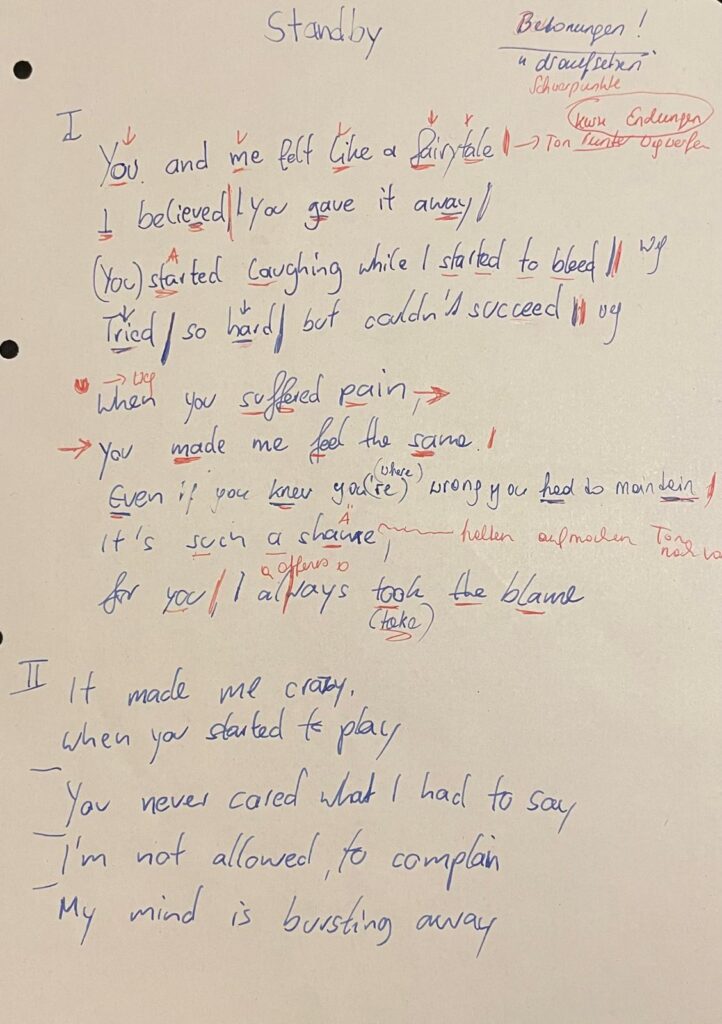
[Verse 1]
You and me felt like a fairytale,
I believed, you gave it away
(You) started laughing while I started to bleed
Tried so hard fulfilling your needs

[Verse 2]
When you suffered pain you made me feel the same
Even if you know you’re wrong you had to maintain
It’s such a shame
For you, I always take the blame

[Chorus 1]
I’m running in circles
Forced to stay
I want to leave this place
But I can’t get away
It’s frustrating
And suffocating
Promised paradise is a lie
So I stay on stand by

[Verse 3]

It made me crazy when you started to play
You never cared what I had to say
I’m not allowed to complain
My mind is bursting away

[Chorus 2]

I’m running in circles
Forced to stay
I want to leave this place
But I can’t get away
It’s frustrating
And suffocating
Promised paradise is a lie
So I stay on stand by

[Build up]

[Breakdown]

[Chorus 3]

I’m running in circles
Forced to stay
I want to leave this place
And I can’t get away
It’s frustrating
But suffocating
[Post Chorus]

Promised paradise is a lie

Promised paradise is a lie
So I stay on stand by

With the core structure of the song now in place, we moved on to recording the drums — a key step in shaping the track’s sonic identity.

The Monochrome UI Challenge – Can Less Color Mean More Sustainability?

In today’s digital landscape, color is a powerful tool. It guides users, creates emotional connections and establishes brand identity. But what if we took a step back and asked: How sustainable are our color choices? Could using fewer colors, or even just shades of one color, reduce the environmental footprint of our digital products while maintaining usability and aesthetic appeal?

This blog post explores the Monochrome UI Challenge, a practical experiment in designing interfaces with limited color palettes and what it means for digital sustainability.


Why Focus on Color for Sustainability?

Many modern devices, especially those with OLED and AMOLED screens, consume more power when displaying bright and colorful pixels. White backgrounds and vibrant colors require more energy to light up pixels, draining battery faster than darker or monochrome displays.

By simplifying color usage, designers can potentially reduce energy consumption on users’ devices. While the energy saved per user may seem small, when scaled across millions of visits, these savings add up significantly.


What is the Monochrome UI Challenge?

The Monochrome UI Challenge asks designers to create an interface using only shades of one color, usually grayscale, rather than a full color palette. This means no bright blues, reds, or greens, just blacks, whites and varying grays.

The challenge is to maintain clear visual hierarchy, usability, and even aesthetic beauty despite the limited palette. It forces designers to rethink:

  • Typography: Using font weight, size, and spacing to create contrast and guide the user.
  • Layout: Using whitespace strategically to avoid clutter.
  • Icons and Graphics: Simplifying or converting colorful assets into monochrome versions.
  • User feedback and states: Using shapes, patterns, or opacity instead of colors alone.

The Experiment: Two Versions of a Blog Homepage

To test this idea, I created two versions of a simple blog homepage:

1. Full Color Version:

  • Vibrant header and buttons
  • Colorful images and icons
  • Clear but colorful call-to-action elements

2. Monochrome Version:

  • Shades of gray replacing all colors
  • Grayscale images
  • Strong typographic hierarchy for readability
  • Subtle shadows and borders for depth

Findings and User Reactions

  • Usability: Most users found the monochrome design easy to navigate. They appreciated the clean and minimal look without distraction.
  • Readability: Contrast was maintained through typography and spacing, ensuring legibility.
  • Aesthetic Appeal: While some missed the “pop” of color, many found the monochrome look elegant and calming.
  • Energy Impact: Simulations on OLED devices showed the monochrome page used about 20-30% less energy due to reduced pixel illumination.

Sustainability Beyond Energy

Limiting color palettes also encourages more thoughtful design decisions:

  • It pushes designers to focus on content and structure rather than flashy visuals.
  • It reduces the need for multiple image assets, potentially lowering data transfer and load times.
  • Monochrome designs often align well with accessibility standards, making interfaces clearer for users with color vision deficiencies.

How to Take on the Monochrome UI Challenge Yourself

  1. Choose a Page or Interface: Pick a simple page like a blog, landing page, or app screen.
  2. Remove Color: Convert all colored elements to grayscale or a single color palette.
  3. Focus on Contrast and Hierarchy: Use typography (size, weight), spacing, and borders to guide users.
  4. Test Readability: Get feedback from users to ensure the design remains clear and appealing.
  5. Measure Impact: Use tools to estimate load times, file sizes, and if possible, energy consumption on OLED devices.

Final Thoughts

The Monochrome UI Challenge isn’t about stripping away color. Instead, it’s an invitation to rethink how we use color, balancing brand identity and user delight with sustainability and accessibility.

By embracing simplicity and focusing on what truly matters, we can create digital experiences that are both beautiful and responsible. The challenge shows that sometimes, less color can mean more impact, for users and the planet alike.

Exploring Art Through the Artist’s Room: My First Interactive Prototype

My idea began with a simple question: How can we bring people closer to art, especially those who might not know much about it? Museums often present artworks as static, untouchable objects. You’re meant to look, admire, and move on. But what if there was a way to help people feel art more directly, to experience the context in which it was created?

My original idea was to create miniature versions of famous artists’ studios. The idea came from something I’ve always found fascinating: an artist’s workplace can reveal so much about their process, personality, and even their emotional world. The arrangement of objects, the choice of lighting, the mess or the order, it all speaks. A workspace tells the story behind the art, sometimes more clearly than a wall label ever could.

I first truly felt this while visiting Yoshitomo Nara’s installation “My Drawing Room” in Baden-Baden. It was a scaled-down version of his studio, full of intimate, personal touches: scribbled notes, half-used materials, posters on the wall, and most memorably, cute little toys and dolls scattered across the room. These weren’t just decorations, they were expressions of his character and influences, part of the world he builds when he works. Even his favorite rock music was playing in the background. It felt like stepping into a hidden part of his mind. And for someone unfamiliar with Nara’s art, this room offered a beautiful, gentle entry point.

After my first consultation with Birgit, we realized it could be even more compelling if the room wasn’t just something to look at but something you could interact with. Art in museums is often so untouchable, so distant. This could be different. That’s when I decided to dive into Arduino and sensors to make a room that actually responds to you.

For the first prototype, I didn’t focus too much on the detailed decoration of a specific artist’s studio. Instead, I created a simplified miniature room, kind of like my own room here in Graz. You know, I am something of an artist myself.

Then I began researching what kinds of Arduino interactions are possible and which sensors could work for what I had in mind. The first obvious choice was a door interaction: when you enter the room, the light turns on. Simple, but already gives the space life. Then I found tutorials about TV or laptop interactions and added those as well. One by one, the room began to feel more real.

Here are the sensors and interactions I used in the prototype:

  • KY-010 Beam Sensor (door sensor): detects when the door is open, triggering the room light.
  • KY-018 Photoresistor: simulates natural lighting—when the room is dark (like at night), the behavior changes but for my prototype I used to detect the lack of light, so if you go to bed and cover it with a blanket, it turns the light off.
  • Conductive Tape Sensor (drawer interaction): when the drawer is open, a soft light turn on.
  • Ultrasonic Sensor (HC-SR04): detects if someone approaches the TV. When you get close, the TV turns on and a soft startup sound plays. When you leave, it powers off with a shutdown sound.
  • Button and Buzzer: originally used as a basic interaction tool to test sound responses, I used it a doorbell.

By combining all these elements, I planned to create a small room that responds to the presence and actions of a visitor. The lights change. Sounds react. It’s still just a prototype but already it’s something you don’t just look at. You feel it. And maybe, through this interactive experience, someone who doesn’t normally connect with art might pause and think: “Wait… this is actually interesting.”

The Carbon Cost of Motion: Do We Really Need All Those Animations?

Measuring the Energy Impact of Animations on Websites

In digital design, animation has become a staple for enhancing user engagement. Microinteractions, scroll effects, and parallax motion all contribute to polished and visually dynamic websites. But how sustainable are they really?

In this entry, I wanted to find out: Do animations significantly increase the energy consumption of websites?
To explore this, I created two versions of a simple landing page:

  • One static with no animations.
  • One animated using CSS and JavaScript transitions.

I then compared the performance and energy use of both versions using Greenframe and Lighthouse performance reports in Chrome DevTools.

static website
animated website

Results & Findings

The static version performed better across all key metrics: faster load times, reduced rendering workload, and less energy consumed during interaction.

VersionPage SizeTime to InteractiveLighthouse PerformanceEstimated CO₂ per Visit
Static (No Motion)83 KB0.6 s990.04 g
Animated Version194 KB1.2 s860.11 g

The animation-rich version was visually engaging, but also added unnecessary weight and longer processing times, especially noticeable on lower-end devices. While animations aren’t inherently unsustainable, they must be used deliberately, not just as aesthetic decoration.


Conclusion

Animations do have a place in design, especially when they aid usability. But from a sustainability standpoint, designers should evaluate:

  • Is this animation improving functionality?
  • Could it be simplified or removed?
  • Can it be optimized with lightweight CSS instead of JavaScript?

Even small choices like reducing motion intensity, using system-based transitions, or respecting users’ reduced motion preferences can help lower energy consumption.

Accessibility and Sustainability in UI Design

Can accessible design also be more sustainable?

UI design improves user experience and contributes to sustainability by optimizing code structure, reducing page weight and supporting inclusive digital use. I created two comparable websites, one that follows accessibility best practices and one that intentionally ignores them. Then, I measured and analyzed how the design choices affect sustainability and usability.


Creating Two UI Versions

I developed two simple landing pages using basic HTML and CSS in Visual Studio Code.

Accessible Version

  • Semantic HTML tags (<header>, <nav>, <main>, <footer>)
  • Proper heading hierarchy
  • Clear and descriptive labels for form inputs
  • Keyboard-navigable links and buttons
  • Visible focus styles for accessibility
  • Descriptive button text and aria-labels
The full accessible code uses clean HTML and includes screen reader support and best practices for form interaction.

Non-Accessible Version

  • Uses only <div>s and <span>s, no semantic structure
  • No form labels
  • Placeholder text instead of labels (bad for accessibility)
  • No keyboard or screen reader support
  • No visible focus states
The visual design is similar, but the structure lacks meaning for assistive technologies and introduces usability issues.

Testing & Comparison

I tested both versions using:

  • Lighthouse in Chrome DevTools (focusing on accessibility and performance)
  • WebsiteCarbon.com (to estimate CO₂ emissions)

Results:

MetricAccessible PageNon-Accessible Page
Accessibility Score10054
Performance Score9889
Estimated CO₂ Emission0.14g per visit0.22g per visit
Page Size9.3 KB15.1 KB
DOM Elements2234
Screen Reader Compatible✅ Yes❌ No
Keyboard Navigation✅ Yes❌ No

What I Learned

While building and testing both pages, I found that:

  • Semantic HTML makes the structure clearer for both browsers and assistive tech.
  • Accessibility best practices often lead to cleaner and smaller code, which is easier to maintain and faster to load.
  • The accessible version had fewer DOM elements, lighter styles and required fewer workarounds.
  • The non-accessible version relied on <div> structures, custom styling hacks and was bloated despite its simple appearance.

Conclusion

Making websites accessible is not just an ethical or legal concern, it can also lead to better-performing and more sustainable digital products. Cleaner code, semantic structure and user-friendly interactions reduce friction, device strain and energy use over time.

For designers and developers, this is an important reminder that good UX and sustainable development go hand in hand.

Can We Make AR Try-Ons More Personal?

During one of our design research classes, I had the opportunity to interview someone in connection with my research topic digital try-ons and the future of virtual fashion experiences. The conversation turned out to be more insightful than I expected.

One simple, but great question they asked was:
“What if I want the oversized look?”

It made me pause. In the current world of online shopping and AR filters, we often focus on how a garment fits but not how someone wants it to fit. Sometimes the goal isn’t to see if a shirt hugs your waist, but how it hangs off your shoulders. This led to an even deeper point:

“What if I just want to see how it looks on my body—oversized or not?”

That moment made me wonder: are digital fashion tools really reflecting our bodies—or just a generic mannequin?

Later, while browsing an outlet’s website, I came across something interesting: a quiz feature that helps users determine their body type. It made me think—what if this same input could be used to generate a personalized 3D body model? Not just a one-size-fits-all avatar, but a real approximation of how clothes might fall on your unique shape.

Imagine this:

  1. You answer a few questions in a body type quiz just like in OUTNET
  2. The system generates a simplified 3D model based on your input.
  3. You can try on clothes virtually—with options to toggle fits like oversized, slim, or relaxed.

It sounds futuristic—but maybe not that far off. I already found something really really close to the thing I was searching for and it is Zalando’s virtual fitting rooms allow users to adjust the fit of an item on their avatar (tight vs. loose). its pilot version but still coming soon…

From Body Scan to Personalized Avatar

Zalando’s Size & Fit team is leveraging body measurement technology to create tailored 3D avatars—beyond generic mannequins, these avatars reflect real proportions, helping users visualize how clothes will look and feel 

Dynamic Fit Visualization

They’re experimenting with dynamic poses sitting, stretching, walking—to better showcase how an item behaves in real life. To communicate fit, they’ve used color-coded overlays to highlight tight or loose areas, recognizing that fit is style-dependent and context matters

The Path to Trust & Sustainability

Zalando aims to reduce size-related returns, contributing to more sustainable shopping. By prioritizin accuracy, positivity, and inclusivity, and involving real customers in testing, their virtual fitting room has already reached tens of thousands of early users 

I’ll share some visuals from the outlet site below that sparked this idea. Let me know what you think—could this be the next step in personalized AR try-ons?

references

https://ww.fashionnetwork.com/news/Zalando-tests-a-virtual-fitting-room-in-its-25-markets,1509717.html

https://medium.com/zalando-design/bringing-irl-into-digital-with-the-zalando-virtual-fitting-room-4cacc037b943

Note: This text was created and corrected with the assistance of AI to improve clarity and structure.

What if We Make a Collaboration of Luma AI and Aero – for Resale?

While doing some research ,I randomly came across Luma AI and I was instantly impressed. The quality of the 3D scans it can produce from just a phone blew my mind. I had already worked with Adobe Aero before, so the idea naturally came to me:
What if we combined the power of Luma AI with Aero?

Especially in the context of resale, this could open up exciting new possibilities for creating immersive, trustworthy product experiences.

Technologies
LumaAI requires as an input a set of object photos or a video of an
object and then cuts the video into frames as input for the NeRF
algorithm {2} . NeRF is an algorithm in the field of computer vision
and 3D imaging. It is used to reconstruct a 3D spatial model from
2D photographs taken from different angles. NeRF algorithm uses
a neural network to build a ray field (radiance field) for 3D space.
This ray field describes the probability of each point in 3D space
emitting a ray of light in all directions and the color of that ray. It
will first receive the cropped data set from the video that we pass
in, and then use a neural network to build a radiance field for the
3D space. This ray field describes the probability of each point in
3D space emitting a ray of light in all directions and the color of
that ray. A neural network consists of two parts: an encoding part
and a decoding part. The encoder converts the 3D coordinates and
the direction of view at a point in 3D space into a corresponding
vector. This helps the model learn the relationship between the
points in the 3D space and the corresponding 2D image .
In addition to leveraging A-Frame for AR development, we will
enhance our project by integrating LumaAI’s modeling capabilities.
It will first receive the cropped data set from the video that we pass
in, and then use a neural network to build a radiance field for the
3D space. This ray field describes the probability of each point in
3D space emitting a ray of light in all directions and the color of
that ray. A neural network consists of two parts: an encoding part
and a decoding part.
With the integration of LumaAI, we can expedite the creation of 3D
models for our augmented reality applications. This enables us to
enrich the user experience by incorporating lifelike virtual objects
seamlessly into the real environment. Whether it’s furniture, prod-
ucts, glasses, clothe or architectural elements, LumaAI empowers us to generate

How LumaAI and Aero Enhance the Shopping Experience

LumaAI leverages an advanced technique called Neural Radiance Fields (NeRF), transforming simple 2D photos or video clips of furniture into highly detailed, interactive 3D models. Aero, on the other hand, enables users to create immersive AR experiences with intuitive, drag-and-drop simplicity.

  • Rotation and Zoom: Customers can easily rotate furniture models, viewing them from all angles.
  • Spatial Placement: Using their smartphone cameras, users can visualize exactly how the piece fits and looks in their own space.
  • Real-Time Interaction: Adjustments such as changing positions or orientations of furniture happen smoothly and realistically.

Overview of Augmented Reality / Virtual Reality
Virtual reality (VR) is a technology that simulates a computer-generated three-dimensional image or environment, allowing the user to interact with it in such a way that it looks realistic or physical. To do this, users use special electronic devices such as helmets with screens or gloves with sensors to interact

AR has been applied in many mobile applications, especially in the areas of learning support, content comprehension, memory protection, and motivational learning .

Currently, various agencies, companies, and universities are actively promoting research and application of augmented reality technology.. They collaborate with Chiet Giang University, the Optics Department of the Beijing Institute of Technology , Microsoft , Google [1], and others.

System Workflow: LumaAI / Aero

LumaAI Process:

  1. Capture: Users take a short video or series of images.
  2. Upload: The video is uploaded for processing.
  3. Processing: Employs NeRF to generate dynamic 3D models.
  4. Interaction: Users interact via AR-enabled apps.

Aero Process:

  1. Import: Users import existing 3D models.
  2. Design: Utilize Aero’s intuitive tools to design interactive AR experiences.
  3. Publish: Deploy instantly viewable AR scenes.

Benefits of Implementing AR (LumaAI & Aero)

  • Enhanced Customer Experience: Accurate and immersive visualizations boost shopper confidence.
  • Reduced Product Returns: Clear visualization decreases returns due to mismatched expectations.
  • Market Differentiation: Retailers adopting AR set themselves apart with unique, interactive shopping experiences.

Key Insights & Challenges

While AR significantly enhances customer interactions, there are some considerations:

  • Technical Precision: Accurate face and object recognition can still be challenging, affecting user experience.
  • Accessibility: Advanced AR functionalities may not yet be globally available, often restricted to specific regions.

Conclusion: A Vision for the Future

The use of AR in furniture shopping, as exemplified by LumaAI and Aero, is not merely innovative—it’s transformative. With these systems, we’re moving toward a retail environment where physical showrooms merge seamlessly with digital convenience. As technology advances and becomes universally accessible, AR-driven shopping will become the new standard, providing customers unparalleled confidence and satisfaction in their online purchases.

References

[1] Google AR&VR, https://arvr.google.com/ .
[2] Luma AI, https://lumalabs.ai/.

This blogpost was corrected for clarity with the support of ChatGPT, OpenAI.

#12 A lot of different ideas

This blogpost I wish to dedicate to all my ideas and all the directions I have thought about going. Since I have researched such a broad topic, I also have a broad list of ideas I would like to do.

Ceramic Plate

I really wanted to make a clay plate. For a long time, I have wanted to learn ceramics, and thought: maybe I can use this semester to learn this skill! I also found inspiration from a company from New Zealand who became really popular from their “Boring Platter” (see picture below)

The Boring Platter from Author Ceramics

Pros:

  • I might learn a new skill
  • This project moves into the community living world, where multiple people live together and where it may encourage people to share meals

Cons:

  • difficult to get hold of a ceramic workshop and equipment
  • expensive equipment
  • does not make a lot of impact

Stackables

I have also thought about making stackable kitchenware or furniture. This can be stackable tables, chairs, beds, sofas or kitchenware like pots, plates and cups.

It is under the topic of finding new ways to live – with fewer items, in a smaller area, and with multiple people. It tries to tackle the problems of living small and with less – and how to make smart solutions for this. Another factor of these products would of course be that they are made of sustainable or reused materials. I find this very interesting, since I can see myself trying to live like this at some point in my life – and already see the necessity of these kind of products from having a camper. I also like working with my hands, and would love to get better known with different materials, and how to potensially upcycle or reuse something for a different purpose.

Public furniture to encourage interaction

Another way I see myself going is to focus on creating better urban lives. This can be done through welldesigned streets and areas between the houses. I was inspired from seeing a danish series called Byenes Mester, translated to The Master of Cities, featuring the danish architect Jan Gehl. He is one of the earliest architects to talk about planning cities for humans that encourage social interaction and well being, rather than cars and industry. Through the series, we see how his visions transformed some well known cities like Melbourne, New York and Oslo from empty, sad, grey cities into walkable and flourishing cities. I was very inspired by this series to contribute to making cities more human friendly. MaybeI I could do it through making furniture?

By creating an easy to use, accessible and perhaps multipurpose furniture, some urban areas might become a more inviting and better space. This can again increase the chance of someone interacting with each other if it is a stranger or a neighbour – and through this creating community (jippi!!)

A piece of furniture alone will of course not be able to transform a place, but seeing it as a part of a whole would be very interesting. I could also see myself trying to design whole areas, including positioning of the furniture, green areas, the intended flow of people in an existing urban area – so actually going into the world of architecture.

Material Tests

Since this topic is so big, I might try to narrow it down to something very small and tangible. Perhaps investigating what materials (to potentially use for these furnitures) do people like the most. Maybe conduct smell, touch and visual tests to find out what people would like to be surrounded by.

Urban Gardening

Another related topic is urban gardening. This is something I see very important, very useful and as a easy and tangible solution to a lot of problems. As for my self, I am very into gardening and see the values of doing so. I have also used a lot of time and energy to research topics such as urban green areas, biodiversity loss, the environmental crisis, and how green areas are good for peoples mental health – LIKE PLEASE JUST STICK YOUR HANDS IN THE DIRT PLEASE! Science says its good for you!!

The Rest

Now this post is getting very long so I will just list the other ideas/topics I believe in:

  • Research the sociology/psychology aspect of what makes people interact with each other
  • Create the ultimate community(!!!)
    • and perhaps research what are the barriers for “normal” middle class people to live more community like
  • Try to point out and transfer some of the co-living traits to modern urban living
    • case study: what exists of community styles out there?
  • TO GO EVEN BIGGER: try to join the “circular economics” movement – can I contribute here?

Thankyou.

Prototype FINAL – Micropmapping

Fazit:
Das Projekt hat gezeigt, dass Lernen vor allem durch praktische Anwendung entsteht und dass nicht jedes Experiment ein perfektes Ergebnis liefern muss, um wertvoll zu sein.

Deshalb gibt es an dieser Stelle auch kein visuell bahnbrechendes Video, sondern einfach nur vier Screenshots 🥲

In diesem Sinne: Frohes Mapping

Miniaturmapping als Experimentalfeld – Abschließende Reflexion

Das finale Setup sah eine leicht gedrehte Positionierung der Kirche vor: nicht frontal, sondern in einem gezielten Winkel zum Beamer hin. Dieser Winkel wurde in das digitale 3D-Modell übernommen und diente als Grundlage für die Projektionsinhalte.

Auf das Modell wurden verschiedene zuvor getestete Texturen gelegt. Es kamen mehrere visuelle Herangehensweisen zum Einsatz: darunter das Auflösen des Meshes in eine Partikelwolke, das Fracturing des Modells sowie die Umwandlung der Kanten in Splines, welche mit einem “Seil-Tag” animiert wurden, eine Technik, die bereits im vorigen Blogpost beschrieben wurde.

Die Projektion erfolgte schließlich mithilfe eines Mini-Beamers, der auf einem Stativ aus kurzer Distanz arbeitete. In HeavyM mussten die perspektivischen Verzerrungen je nach Sequenz manuell angepasst und entzerrt werden. Die Animationen bestanden aus Bildsequenzen, teilweise Videos, teilweise hintereinander abgespielte PNG-Stills. Insgesamt funktionierte das gut, auch wenn das Bild an Schärfe verlor, was sich nicht vollständig klären ließ.

Im Ergebnis entstand eine Abfolge von experimentellen Szenen, die sich als Sammlung verschiedener technischer Zugänge verstehen lässt, allerdings (noch) ohne durchgängige visuelle Choreografie oder ein abgestimmtes Sounddesign. 

Der ursprünglich angestrebte künstlerische Gesamteindruck konnte im Rahmen dieses Prototyps nicht vollständig realisiert werden.

Trotzdem kann das Projekt als erfolgreiche Case Study gelten. Der Lernwert war hoch: Techniken wie Warping, Splinemodifikation, Mapping auf unregelmäßige Geometrie oder der Umgang mit Licht und Materialität im Kleinformat konnten praktisch erprobt werden. Besonders deutlich wurde, wie Farben, Licht und Perspektive auf physisch vorhandenen Oberflächen wirken – und wo technische Grenzen liegen.

Die Idee des Mikromappings im Modellmaßstab bleibt weiter spannend. Auch wenn dieses Projekt noch nicht publikationsreif ist, liefert es eine solide Grundlage für weitere Experimente – vielleicht in einem neuen Kontext, mit anderen Objekten oder stärker durchkomponierten Abläufen.


Disclaimer zur Nutzung von Künstlicher Intelligenz (KI):

Dieser Blogbeitrag wurde unter Zuhilfenahme von Künstlicher Intelligenz (ChatGPT) erstellt. Die KI wurde zur Recherche, zur Korrektur von Texten, zur Inspiration und/oder zur Einholung von Verbesserungsvorschlägen verwendet. Alle Inhalte wurden anschließend eigenständig ausgewertet, überarbeitet und in den hier präsentierten Beitrag integriert.