#3 Was ist Kino? André Bazin.

In der Geschichte der Filmtheorie gibt es kaum eine Figur, deren Einfluss so tiefgreifend und deren Philosophie so zeitlos relevant geblieben ist wie der französische Kritiker André Bazin. Als geistiger Vater der Nouvelle Vague und Mitbegründer der Cahiers du Cinéma entwickelte Bazin in seinen gesammelten Essays, insbesondere im ersten Band von Qu’est-ce que le cinéma? (Was ist Kino?), eine Theorie, die das Kino nicht primär als eine Kunst der Manipulation, sondern als eine Kunst der Offenbarung versteht. Für Bazin ist die Kinematographie – die Arbeit mit Licht, Objektiv, Bildausschnitt und Aufnahmedauer – weit mehr als ein technisches Handwerk zur ästhetischen Verschönerung einer Erzählung. Sie ist ein ontologisches Instrument, ein Werkzeug zur Erforschung des Seins, das die Fähigkeit besitzt, die emotionale Distanz zwischen dem Zuschauer und der Welt auf eine Weise zu überbrücken, wie es keiner anderen Kunstform möglich ist (Bazin, 1967).

Um die emotionale Tragweite der Kinematographie bei Bazin zu begreifen, muss man zunächst seine radikale Definition des fotografischen Mediums verstehen. In seinem grundlegenden Essay “Die Ontologie des fotografischen Bildes” (1945) legt Bazin das Fundament seiner gesamten Filmtheorie. Er beginnt nicht mit Technik, sondern mit Psychoanalyse und Geschichte.

Der Mumienkomplex

Bazin verortet den Ursprung der bildenden Künste (Malerei, Skulptur) in einem tief menschlichen psychologischen Bedürfnis: dem Kampf gegen den Tod. Er nennt dies den “Mumienkomplex”. Die Ägypter, so argumentiert er, balsamierten ihre Toten ein, um das körperliche Erscheinungsbild gegen den Verfall zu immunisieren. Der Tod wird hier als der “Sieg der Zeit” über den Menschen definiert. Die künstliche Fixierung des Körpers ist der Versuch, das Leben aus dem Fluss der Zeit zu reißen und es “im Laderaum des Lebens zu verstauen”.   

Diese historische Perspektive ist entscheidend für das Verständnis der Kinematographie. Jede Statue, jedes Porträt war historisch gesehen ein magischer Akt des Überlebens, ein “After-Life” durch Repräsentation. Doch die Malerei scheiterte letztlich an ihrer eigenen Subjektivität. Egal wie realistisch ein Gemälde von Holbein oder Rembrandt sein mag, der Betrachter weiß intuitiv, dass es sich um eine Interpretation handelt, gefiltert durch den Geist und die Hand des Künstlers. Es ist eine Ähnlichkeit (Resemblance), aber keine Identität. Die Emotion, die ein Gemälde auslöst, ist daher immer eine ästhetische, die durch das Bewusstsein der künstlerischen Intervention gebrochen wird.   

Das Totale Kino. Die perfekte Illusion

Bazin geht in seinem Essay “Der Mythos vom Totalen Kino” noch einen Schritt weiter und behauptet, dass das Kino nicht als technologische Erfindung begann, sondern als eine Idee. Die Erfinder des Kinos (Edison, Lumière, Marey) waren getrieben von einem uralten Menschheitstraum: der totalen Reproduktion der Realität.   

Dieser Mythos ist der Wunsch nach einer Welt, die der unseren vollkommen gleicht, aber nicht den Gesetzen der Vergänglichkeit unterworfen ist. Bazin argumentiert: “Kurz gesagt, das Kino ist noch nicht erfunden worden!”. Jede technische Neuerung – Ton, Farbe, 3D, Cinemascope – ist ein weiterer Schritt auf dem Weg zu diesem asymptotischen Ziel der totalen Realität.   

Für die emotionale Wirkung bedeutet dies: Je näher die Kinematographie der totalen sensorischen Reproduktion der Realität kommt, desto geringer wird die Distanz zwischen Zuschauer und Geschehen. Die “perfekte Illusion” ist jedoch paradox. Wäre die Illusion perfekt, wäre sie keine Kunst mehr, sondern das Leben selbst. Die Kunst der Kinematographie besteht also darin, diese Spannung zwischen der Realität (dem Rohmaterial) und dem Rahmen (der Leinwand) aufrechtzuerhalten. Die Emotion entsteht in diesem Spannungsfeld: Wir wissen, dass es ein Film ist, aber unsere Sinne und unser Unterbewusstsein akzeptieren es als Realität. 

Die Ästhetik der Manipulation: Der Glaube an das Bild

Zu den Regisseuren, die “ihren Glauben in das Bild setzen”, zählt Bazin vor allem die sowjetischen Montagetheoretiker (Eisenstein, Kuleschow) und die deutschen Expressionisten (Wiene, Murnau in seinen frühen Phasen).

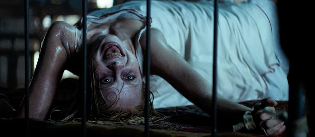
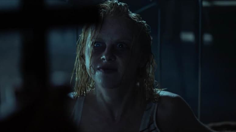
  • Der Expressionismus (Plastizität): Im Film Das Cabinet des Dr. Caligari wird die Emotion durch massive Manipulation der Mise-en-scène erzeugt. Verzerrte Kulissen, extremes Make-up und theatralische Beleuchtung schaffen eine künstliche Welt. Bazin kritisiert dies nicht per se, aber er sieht darin eine Sackgasse für den Realismus, da die Realität in eine “halluzinatorische Welt der Illusion” verbannt wird. Die Emotion ist hier das Produkt einer stilistischen Überwältigung.   
  • Die Montage (Zeitliche Manipulation): Noch kritischer sieht Bazin die Montage, wie sie von Eisenstein propagiert wurde. Im Kuleschow-Effekt wird die Bedeutung (und damit die Emotion) nicht durch den Schauspieler oder die Aufnahme selbst erzeugt, sondern ausschließlich durch die Juxtaposition (Nebeneinanderstellung) zweier Bilder. Ein neutraler Gesichtsausdruck + Suppe = Hunger. Ein neutraler Gesichtsausdruck + Sarg = Trauer. Bazin nennt dies “Schatten des Bildes”, projiziert auf das Bewusstsein des Zuschauers.   

Für Bazin ist diese Art der Emotionserzeugung autoritär. Sie schreibt dem Zuschauer genau vor, was er zu fühlen hat. Sie zerstückelt die Welt in Zeichen und Symbole und beraubt die Realität ihrer Mehrdeutigkeit (Ambiguität).

Die Tabelle der zwei Schulen

Um die Unterschiede in der emotionalen Wirkungsweise zu verdeutlichen, lässt sich Bazins Klassifizierung wie folgt strukturieren:

MerkmalGlaube an das Bild (Die Imagisten)Glaube an die Realität (Die Realisten)
Primäres WerkzeugMontage, Plastizität (Licht/Dekor), ExpressionismusTiefenschärfe, Plansequenz (Long Take), Location-Dreh
Philosophisches ZielBedeutung erzeugen oder interpretierenBedeutung enthüllen, die in der Realität liegt
Umgang mit ZeitKomprimierung, Dehnung, Fragmentierung (abstrakt)Respekt vor der Kontinuität und Dauer (konkret)
Umgang mit RaumZerstückelung zur Lenkung der Aufmerksamkeit (Kuleschow)Bewahrung der räumlichen Einheit (Ambiguität)
SchlüsselfigurenEisenstein, Wiene (Caligari), GanceStroheim, Murnau, Flaherty, Renoir, Welles, Wyler
Emotionale WirkungSuggestiv, gelenkt, intellektuell konstruiertViszeral, partizipativ, aus der Ambiguität geboren

Der Glaube an die Realität

Dem gegenüber stehen die Regisseure, die “ihren Glauben in die Realität setzen”. Hierzu zählt Bazin in der Stummfilmzeit Erich von Stroheim, F.W. Murnau und Robert Flaherty, und später Jean Renoir, Orson Welles und William Wyler.   

Diese Regisseure nutzen die Kinematographie nicht, um die Welt zu zerlegen und neu zusammenzusetzen, sondern um sie in ihrer räumlichen und zeitlichen Integrität zu bewahren. Stroheims Philosophie beschreibt Bazin so: “Schau dir die Welt genau an, schau immer wieder hin, und am Ende wird sie dir all ihre Grausamkeit und Hässlichkeit offenbaren”.   

Hier wird die Kamera zum Instrument der Geduld. Die Emotion wird nicht gemacht, sie wird gefunden. Flahertys Nanook of the North erzeugt Spannung nicht durch schnelle Schnitte, sondern indem er den Kampf des Inuit gegen die Elemente in seiner tatsächlichen Dauer zeigt. Wir fühlen die Kälte und die Erschöpfung, weil die Kamera uns zwingt, die Zeit mit dem Protagonisten zu durchleben (Bazin, 1967).

Einige modernere Beispiele wären:
1917 – Sam Mendes

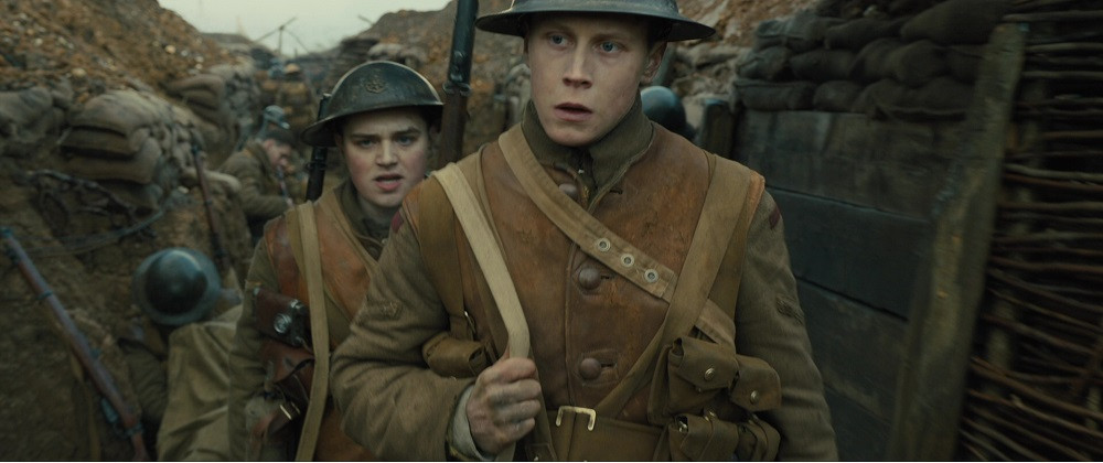
https://offscreen.com/view/1917-the-hard-work-of-the-digital-long-take

Children of Men – Alfonso Cuarón

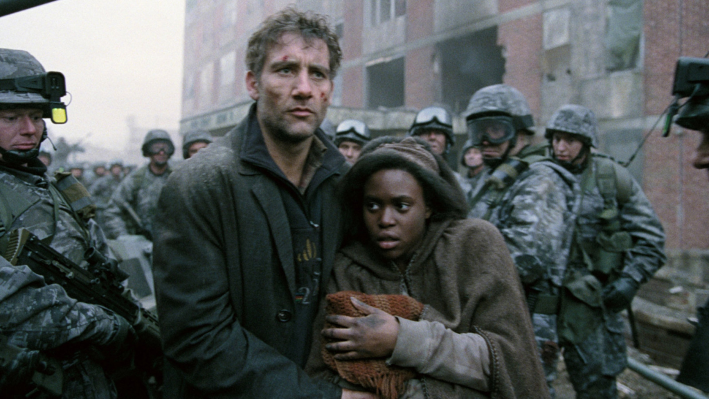
https://www.nytimes.com/2018/03/14/movies/children-of-men-alfonso-cuaron-ifc-center.html

Note von mir: Ein Film hat oft den Zweck, ein ganz bestimmtes Gefühl zu vermitteln – gerade in der Werbung. Schnitt und Montage sind dabei essenzielle Werkzeuge, um die Emotionen der Zuschauer zu lenken. Auch expressionistische Ansätze funktionieren heute sehr gut, weil sie visuell aus der Masse herausstechen.

Aber es stimmt: Realitätsnahe Filme, die fast ohne sichtbare Schnitte auskommen, erzielen oft die tiefste Wirkung. Hier zeigt sich ein klarer Trend im Kampagnenfilm hin zu mehr Immersion und Authentizität. (“Through your Eyes” – Leve Kühl: https://mobile.riffrafffilms.tv/uk/leve-kuhl#through-my-eyes, Adidas Kampagne 2025: https://www.adidas-group.com/en/magazine/behind-the-scenes/behind-the-2025-brand-campaign-we-all-need-someone-to-make-us-believe-you-got-this)

Bazin, A. (1967). What is cinema? 1. Univ. of Calif. Press.


Impulse #4 Film Emulation Class

Am vergangenen Samstag bin ich tief in Filmemulation eingetaucht. Im TAC Resolve Training “The Feel of Film” mit Sam Wiles (ehemaliger Senior Color Engineer bei FilmConvert und Kopf hinter CineMatch & Nitrate) ging es nicht um Presets, sondern um die Anatomie und Chemie von photochemischem Film.

Für meine Masterarbeit, die sich intensiv mit der Wahl des Aufnahmemediums und dem ontologischen Unterschied zwischen “Film vs. Digital” auseinandersetzt, war dieser Workshop ein absoluter Schlüsselmoment. Wir haben die Frage erarbeitet: Was macht Film so authentisch, so greifbar? Und warum fühlt sich ein digitales Bild oft so anders an?

Die Physik des Lichts vs. Die Wahrnehmung des Auges Ein zentrales Learning war die Rückbesinnung auf die Physik. Licht verhält sich physikalisch linear, und auch unsere Kamerasensoren zeichnen es linear auf. Unser Auge (und unser Gehirn) hingegen verarbeitet Helligkeit nicht-linear. Um Film wirklich zu verstehen und digital zu emulieren, mussten wir unsere Pipeline also dort beginnen, wo das Licht physikalisch existiert: im Linear Gamma Space.

Digitale Emulsion bauen Der spannendste Part war der praktische Bau eines Powergrades, der eben nicht nur einen “Look” drüberlegt, sondern simuliert, wie Licht physisch auf einen Filmstock trifft. Wir haben den Prozess dekonstruiert, indem wir das Signal in drei parallele Nodes (RGB) aufgesplittet haben. Damit haben wir effektiv die echten, chemischen Emulsionsschichten von Analogfilm nachgebaut.

Grain, Sharpening und Softening wurden nicht global angewendet, sondern individuell in diese Farbschichten integriert. Das Ergebnis ist ein völlig anderes: Das Filmkorn “sitzt” nicht einfach als Overlay auf dem Bild, sondern es reagiert in den Schichten. Schärfe und Textur entstehen aus der Tiefe des Materials heraus, genau wie bei echtem Zelluloid.

Next Steps: Scene Referred Workflow Momentan verarbeite ich diesen Input. Die Herausforderung besteht nun darin, diesen physikalisch korrekten Ansatz, der im Linear Space operiert, in meinen modernen Scene Referred Workflow zu integrieren. Das erfordert einiges an Umdenken in meiner Node-Struktur, aber dieser Powergrade ist mehr als nur eine Vorlage, er ist das Fundament für mein Verständnis, wie wir digitale Bilder organisch “atmen” lassen können.

Es geht nicht darum, das Alte blind zu kopieren, sondern die Ästhetik des Analogen mit der Präzision des Digitalen zu verstehen.

Hier ein Ratespiel eines davon ist echter 16mm Filmstock:

Product VII: Image Extender

Room-Aware Mixing – From Image Analysis to Coherent Acoustic Spaces

Instead of attempting to recover exact physical properties, the system derives normalized, perceptual room parameters from visual cues such as geometry, materials, furnishing density, and openness. These parameters are intentionally abstracted to work with algorithmic reverbs.

The introduced parameters are:

  • room_detected (bool)
    Indicates whether the image depicts a closed indoor space or an outdoor/open environment.
  • room_size (0.0–1.0)
    Represents the perceived acoustic size of the room (small rooms → short decay, large spaces → long decay).
  • damping (0.0–1.0)
    Estimates high-frequency absorption based on visible materials (soft furnishings, carpets, curtains vs. glass and hard walls).
  • wet_level (0.0–1.0)
    Describes how reverberant the space naturally feels.
  • width (0.0–1.0)
    Estimates perceived stereo width derived from room proportions and openness.

All parameters are stored flat within the same dictionary as objects, panning, and importance values, forming a single coherent scene representation.

Dereverberation: Explored, Then Intentionally Abandoned

As part of this phase, automatic analysis of existing reverberation (RT60, DRR estimation) and dereverberation was evaluated.

The outcome:

  • Computationally expensive, especially in Google Colab
  • Inconsistent and often unsatisfactory audio results
  • High complexity with limited practical benefit

Decision:
Dereverberation is not pursued further in this project. Instead, the system relies on:

  • Consistent room estimation
  • Controlled, unified reverb application
  • Preventive design rather than corrective processing

The next step will be to focus on the analysis of the sounds (especially rt60 and drr values) to make the reverb (if its a closed room) less on the specific sound.

The different Modes of Documentaries

Here is a very brief overview of the six different Modes of Documentary Film by Bill Nichols as described in his 2010 book: 

The Poetic Mode

This mode is more focused on conveying specific moods, feelings, and experiences to the viewers rather than just facts. The editing of poetic documentaries is very intentional and specific (Nichols, 2010, p. 162). Like in the expository mode, the poetic mode will often not focus the relationship between individuals and the filmmaker. Individuals are shown but viewers never really get to know them (Nichols, 2010, p. 156). 

The Expository Mode

In expository documentary films viewers are addressed directly in order to convey information to them. Sometimes filmmakers will use the Voice-Of-God, a stylistic choice where we cannot see the speaker but hear them throughout the film. This is the classical voice over used in many documentaries (Nichols, 2010, p. 167). In expository documentaries rhetoric methods are used to make points as clear as possible. These types of documentaries usually move within a framework that has existed beforehand. They add to the viewers’ knowledge pool, but they do not question or challenge existing structures (Nichols, 2010, p. 169).

The Observational Mode

While poetic and expository documentaries often collect raw material aiming to edit it into something aesthetically compelling or informative, fitting their exact ideas of the film, observational documentary filmmakers will often just see what happens in front of the camera without any intervention. Often there will also be no voice over or commentary in observational documentaries (Nichols, 2010, p. 172). This also allows for viewers to choose the focus instead of the filmmakers (Nichols, 2010, p. 174). With more authentic pacing of the films, the viewers also get to experience the actual timing more realistically (Nichols, 2010, p. 176).
The development of newer, lighter, more mobile equipment has helped observational documentaries flourish by guaranteeing the camera almost disappears (Nichols, 2010, p. 172). Individuals ideally tune out the cameras as much as possible, especially when being preoccupied with their own struggles. This authenticity and closeness to ones struggling can many times be uncomfortable to watch, feeling very intrusive. This has raised some ethical questions about this mode of documentaries as well (Nichols, 2010, p. 174). Also, the non-involvement of the filmmakers in this mode of documentaries can create some ethical dilemmas. Moreover, the omission of any form of commentary or clarification can lead to a problematic misrepresentation of certain situations or behaviors (Nichols, 2010, p. 175).

The Participatory Mode

In participatory documentaries the filmmaker does not just passively observe the subjects but actively interacts with them and influences the events. Conversations and interviews are an important part of these documentaries and the film becomes a reflection of the interactions between filmmaker and individuals (Nichols, 2010, p. 179). The filmmaker develops from some ominous, neutral presence into an actual human, interacting with others (Nichols, 2010, p. 182). Like in the observational mode and the performative mode, participatory documentaries feel like meeting the individuals. The influence filmmakers have on them, however, can raise some ethical questions (Nichols, 2010, p. 157).
With some participatory documentaries, the interaction does not stop with filmmaker and subject, but also the viewers can participate via interactive websites or art installations (Nichols, 2010, p. 180). However, participatory documentaries are not the first example to foster interaction with their audience. For example radio shows where hosts and callers interact, or anthropologists living among their research subjects also rely on the interaction between individuals (Nichols, 2010, p. 181).

The Reflexive Mode

Where the participatory mode provides exchange between filmmaker and subject, the reflexive mode focuses on the interaction of filmmakers and viewers. Reflexive documentaries do not just talk about history, facts or experiences, but about their representation within the film. The focus is shifted from the content to the film itself (Nichols, 2010, p. 194). 

The Performative Mode

Similar to the poetic mode, the performative mode of documentary filmmaking tries to convey emotions instead of facts. The focus is less on delivering information and more on creating emotional understanding (Nichols, 2010, p. 199). Performative documentaries are also often used by filmmakers to talk about their own personal experiences or those of communities they are a part of (Nichols, 2010, p. 205).

This was just a brief overview of the existing modes of documentaries; there is a more detailed table describing more specific qualities for each of the mentioned modes which I might include in the appendix. For analyzing and categorizing documentary films, this more extensive information will surely be useful, but I believe that for this part of my work the shortened down version of the description will suffice in giving an overview of the different modes.

History of The Modes of Documentary

This and the next blog post will be a deep dive into Bill Nichols’ Modes of Documentaries. In this first part I will give an overview into what these modes are, how they can be used to classify documentary films and how they developed over time. The two sources I used are both books written by Nichols, one published in 1991 and one in 2010. I also briefly talk about the changes made between the two books, but will occasionally combine informations found in both of the books as I deem them fitting for specific passages.

The In his book Representing Reality (1991), Bill Nichols first introduced what he called “Documentary Modes of Representation”: The Expository Mode, The Observational Mode, The Interactive Mode, and The Reflexive Mode (NICHOLS, 1991, p. 32). 
These initial four modes have since been amended with two more, Poetic and Performative, which are explained in depth in Nichols’ 2010 book Introduction to Documentary, Second Edition. Furthermore, Nichols changed the name of The Interactive Mode into The Participatory Mode, while the ideas stayed more or less the same (Nichols, 2010, pp. 149–153).
Additionally to the initial modes of documentaries, Nichols also talks about another way of categorizing documentary films: different models for documentary film, taken from other nonfictional types of media such as biographies, reports, or essays. In comparison, models for documentary film are a categorization lent from other types of media which are also nonfictional, while the modes of documentary film are categories which can also applied to other, also fictional, types of film, but not to other media. These two systems of classification, when used in combination provide a useful tool for analyzing documentary films (Nichols, 2010, p. 148). While Nichols also gives a brief overview of the different nonfictional models, as well as many different documentary example which he categorized according to model and mode, the main focus of the chapter in his book, as well as this part of this thesis will be on the six different modes of documentary film (Nichols, 2010, pp. 149–153).

In his 1991 book Nichols talks about the development of the different Documentary Modes of Representation. While he does state that some of the modes have predominant time periods as well as geographical areas, this does not mean that one followed after the other or that some are inherently better than others. All of the modes have existed next to each other and still do. Moreover, a film can usually not just be categorized as one mode, but is usually a mixture of two or more (NICHOLS, 1991, p. 33). Nonetheless, Nichols tries to give some insights into what might have motivated the emergence of each of the four initial modes. The expository mode of documentaries was developed as a reaction to fiction films, which were considered to be too distracting and too focused on entertainment instead of conveying information. The poetic mode was created with the desire in mind to talk about historical information while showing the world in a new and different way. With the emergence of newer, more mobile technologies in the 1960s, observational documentaries emerged. They were also a counter-reaction to the morales in expository documentaries. Once the observational documentaries felt too passive and limiting, interactive documentaries were created, establishing more interaction with the subject and enabling filmmakers to visualize past events through witness statements instead of reenactments. Finally, reflexive documentary films were driven by the desire to question the representation of the topics itself as well as conventions of documentaries (NICHOLS, 1991, pp. 32–33). Seemingly, new modes have always been developed when old ones were found to be lacking. However, Nichols suggests that this might just have been due to the world meant to be represented in documentaries had changed and thus also the modes of representation had to adapt and still do. Especially developments like technological advances have had tremendous effects on documentary films throughout history. Also now, the fact that almost every major event is being filmed by multiple phone cameras changes the available footage immensely (Nichols, 2010, p. 160). 

To conclude, while the different modes have developed out of some dissatisfaction with previous ones, each of these six modes is still being used in modern documentaries and has its application. With changing topics, filmmakers, subjects and frameworks, the ideal way to approach a documentary project will vary greatly and will most of the time require aspects and ideas from more than one of the different modes.

03.06.: Das 1×1 des Gaffers

Nach einer genaueren Einführung wie man Licht eigentlich misst und was eine gute Belichtung ausmacht, möchte ich mich in diesem Blogpost genauer mit dem Equipment beschäftigen, das auf Filmsets genutzt wird. Dies hilft mir später auch das richtige Equipment für meinen Kurzfilm auszuwählen. Außerdem enthält dieser Blogpost einen kurzen Exkurs in die physikalischen Eigenschaften von Licht.

Lichtquellen

Phil Rhodes teilt Lichtquellen in Tageslicht, Licht aus Glühbirnen (Incandescent), Leuchtstofflampen (bei uns oft fälschlicherweise Neonlampen genannt), Lichtogenlampen (HMI, CMH, Plasma, Xenon) und LED´s ein. Jedem dieser Lichtquellen widme ich nun eine kleine Erklärung.

Tageslicht

Temperatur, Intensität und Qualität von Tageslicht hängt von vielen Faktoren ab, wie Wetter, Uhrzeit, Ort und Seehöhe. Grundsätzlich lässt sich aber definieren, dass Tageslicht an einem wolkenlosen Tag sehr hart und viel stärker als das Umgebungslicht des restlichen Himmels ist. Daraus ergeben sich kantige Schatten und ein Key-to-Fill Ratio von etwa 7:1. An bewölkten Tagen verhalten sich die Wolken wie eine riesige Softbox und erzeugen damit verbunden auch eine fast schattenlose, durchgehende Ausleuchtung. Tageslicht besteht außerdem aus dem vollen Spektrum an sichtbarem Licht, was viele Vorteile bietet.

Exkurs Metamerismus:

Das sichtbare Licht besteht aus verschiedenen Lichtwellen mit unterschiedlicher Wellenlänge. Die Wellenlänge bestimmt dabei in welcher Farbe ein Licht wahrgenommen wird. Natürliches Licht wie Sonnenlicht enthält alle Farben des Spektrums, die dann gemeinsam als weiß wahrgenommen werden. Dies ist aber nicht zwingend nötig. Technische Geräte nutzen ja oft nur drei Farben – Rot, Grün und Blau – und können durch Mischung dieser genauso weiß aussehen. Solche Farben, die für das menschliche Auge gleich aussehen, aber durch Mischung unterschiedlicher Farben entstanden sind, nennt man metamer. Das Problem dabei ist, dass Kamerasensoren aber nicht gleich funktionieren wie das Auge. Stellt man eine Farbe mit einem unvollständigen Spektrum dar, also zum Beispiel nur mit Rot, Grün und Blau, besteht die Gefahr, dass ein Kamerasensor etwa sensitiver auf Grün ist als auf Blau, ein anderer vielleicht umgekehrt. Währen die Farben dann also für den Menschen gleich aussehen, werden sie in den Kameras verschieden aufgezeichnet. Deshalb ist die Farbqualität bei einem vollen Spektrum immer besser als bei einem unvollständigen. Als Faustregel kann man Festhalten, dass jegliche Arten von natürlichem Licht meist ein volleres Spektrum haben als künstliches.1

Glühbirnen

Glühbirnen sind eine der ältesten Formen von Lichtquellen, die aber bis heute bestehen. Da in einer Glühbirne Metall durch Erhitzung zu “verbrennen” beginnt, hat das Licht, das dabei abgesondert wird, einer sehr hohe Qualität, jedoch wird viel von der Energie am Ende nur als Hitze abgesondert. Klassische Glühbirnen, in denen Halogen als Gas enthalten ist, um zu verhindern, dass der Draht wirklich durchbrennt, haben fast alle die gleiche Farbtemperatur: 3200 Kelvin. Damit sind sie sehr warm (oft Tungsten genannt).

Leuchtstoffröhren

Das Licht aus Leuchtstoffröhren ist in seiner Qualität zwar bei weitem nicht mit Glühbirnen und Tageslicht zu vergleichen, hat aber andere Vorteile. So zum Beispiel, dass es automatisch weicher ist. Außerdem entsteht nicht so viel Hitze und die Energie wird besser in Licht umgesetzt.

Lichtbogenlampen (HMI, CMH etc.)

Lichtbogenlampen funktionieren in der Hinsicht ähnlich wie Glühbirnen, als dass in einem abgeschlossenen Raum durch elektrische Spannung etwas zum Glühen gebracht wird. Während das bei klassischen Glühbirnen meist ein Wolfram-Draht ist, sind es bei Lichtbogenlampen meist Gase, die man mit einem Hochspannungsblitz quasi aufwärmt und dann unter Dauerstrom zum Leiten und damit zum Leuchten bringt. Die bekanntesten sind HMI Lampen, die mit Quecksilberdampf funktioniert. Der Vorteil gegenüber klassischen Glühbirnen, liegt in der viel größeren Lichtausbeute. Außerdem sondern die Gase automatisch ein Licht mit etwa 6000 Kelvin ab, was sie super als Tageslichtlampen eignet. Alternativ können in solchen Lichtbogenlampen auch andere Gase und Substanzen vorkommen, wie Xenon. Die Unterschiede bestehen dann etwa in der Effektivität, Farbtemperatur oder Farbqualität.

LED´s

LED´s funktionieren anders als alle bisherigen Lichtquellen. Sie nutzen im Grunde einen negativen und einen positiven Pol und einen Halbleiter, der halb positiv und halb negativ geladen ist. Fließt Strom zwischen diesen Polen wird er als Photon und damit Licht abgesondert. Dies hat unsagbare Vorteile in der Energieeffizienz, da per se kein Objekt glühen oder leuchten muss. Erzeugt aber ein sehr einseitiges Spektrum an Licht. Dieses kann je nach dem genutzten Halbleiter die verschiedensten Farben haben. Um weißes Licht zu erhalten werden dann entweder rote, grüne und blaue LED´s gemischt (was ein sehr unvollständiges Spektrum erzeugt) oder eine blaue LED durch zugabe von Phosphor der gelb leuchtet, zu weißem Licht aufgewertet (was ein volleres aber immer noch nicht volles Spektrum erzeugt).

Durch diese Techniken ergeben sich verschiedenste Möglichkeiten sie in vollständigen LED-Lampen einzubauen. Tageslicht-LED Lampen sind meist nur mit Phosphor-Konvertierten Dioden versehen, das erzeugt hohen Output und ausreichend gute Farbqualität. Bi-Color Leuchten sind meist mit zwei verschiedenen Phosphor-Konvertierten Dioden ausgestattet. Die eine Hälfte bleibt eher bläulich, die andere sehr warm. Durch mischen der Dioden werden dann verschiedene Temperaturen erzeugt, diese sind aber in ihrer Farbqualität nicht optimal. Die dritte Variante, also full color Leuchten sind dann entweder mit drei verschiedenen LED´s, roten, grünen und blauen, oder zusätzlich einer weißen, oder sogar zwei weißen, einer kühlen und einer warmen ausgestattet. Grundsätzlich gilt, je mehr verschiedene Dioden verwendet werden, desto besser die Farbqualität, da sie mehr Farben mischen und damit ein volleres Spektrum erzeugen können. Dies geht jedoch auf die Lichtausbeute, da natürlich nie alle Dioden gleichzeitig leuchten werden.2

Gels

Ist man mit der Farbtemperatur des Lichts nicht zufrieden, gibt es jedoch noch immer eine allerletzte Lösung: Gels. Im Grunde nichts anderes als farbige, lichtdurchlässige Materialien, die man vor den Lichtstrahl hält. Ehemals aus Gelatine (daher der Name) und heute meist aus Polyester, können aber auch Gels natürlich nur bedingt helfen, da sie im Grunde nur gewisse Frequenzen aus dem bestehenden Licht rausblocken und andere durchlassen. Sie fügen kein Licht hinzu. Heißt: Das resultierende Licht ist in seiner Qualität schlechter als davor, da mehr Frequenzen fehlen, es hat eben nur eine andere Farbe. Besteht aber keine andere Möglichkeit, das Licht auf “natürlichere” Weise, direkt beim Entstehungsprozess in der Farbe zu verändern sind Gels natürlich hilfreich. Die wichtigsten sind hierbei CTB´s und CTO´s, was für Color Temperature Blue und Orange steht, also im Endeffekt das Licht abkühlt oder aufwärmt.3

vgl.

  1. Vgl. Rhodes, Phil: Light Sourcs and Lighting Instruments. In: Mullen, Merritt David (Hrsg.) und Hummel, Rob (Hrsg.): American Cinematographer Manual. Eleventh Edition. Los Angeles: The ASC Press 2023. S. 105-108. ↩︎
  2. Vgl. Rhodes, Phil: Light Sourcs and Lighting Instruments. In: Mullen, Merritt David (Hrsg.) und Hummel, Rob (Hrsg.): American Cinematographer Manual. Eleventh Edition. Los Angeles: The ASC Press 2023. S. 125-132.  ↩︎
  3. Vgl. Rhodes, Phil: Light Sourcs and Lighting Instruments. In: Mullen, Merritt David (Hrsg.) und Hummel, Rob (Hrsg.): American Cinematographer Manual. Eleventh Edition. Los Angeles: The ASC Press 2023. S. 143f. ↩︎

The Unheard Voice: Why 1.4 Million People Can’t Vote in the Country They Call Home

Imagine you were born in Vienna. You went to school here, you speak the dialect, you pay your taxes, and you teach history—the history of the very democracy that defines this nation. Now imagine, when election day comes, you are politely, but firmly, asked to stay outside. You have no vote. No say. No voice.

This isn’t a dystopian concept; it’s the reality for over 1.4 million people of voting age in Austria. They are excluded from the most fundamental civic act simply because they lack an Austrian passport. This glaring democratic deficit struck me as an invisible, systemic failure, and it became the theoretical core of my current master’s project.

One of my ideas for the short film: designed to visually implement this theme and analyze its emotional impact, focuses on the character Vanessa. She is a 28-year-old high school history teacher in Vienna, born and raised here, the daughter of immigrants who run a small Afroshop. Vanessa embodies perfect integration, yet she is politically marginalized. Her personal struggle to acquire the right to vote, the basic premise of her life being determined by others, is the lens through which this story concept examines this systemic contradiction.

But why is Vanessa’s struggle so difficult? To illuminate this gap, we need to understand the facts and the sheer absurdity of the hurdles involved.

The Systemic Failure: 20% of Austria Is unrepresented

The sheer scale of the exclusion is staggering. Nationwide, roughly 20 percent of the resident population aged 16 and over cannot vote in federal (Nationalrat) elections. This situation is the direct consequence of the ius sanguinis (right of blood) principle governing Austrian citizenship, which stipulates that you inherit citizenship from your parents, not from your birthplace.

In a major metropolitan hub like Vienna, this figure rockets to an astonishing 35 percent. This isn’t an issue affecting only newly arrived migrants. It’s a generational one. For a child born and raised here, whose parents also hold foreign passports (known as third-country nationals), the struggle for a voice is a fight for their very identity.

The result is a societal split: a huge segment of the population is deemed essential for the country’s economic and social function—working in healthcare, logistics, and education—yet they are systematically denied the right to political self-determination. They are the system-relevant but politically irrelevant.

The Roadblock: The absurd Journey to Citizenship

Why don’t these well-integrated people simply get a passport? The path to Austrian citizenship is one of the most difficult and expensive in Europe. For someone born in Austria to non-EU parents, who has met every requirement, the journey is not a reward for integration—it is an exhausting, costly, and precarious bureaucratic marathon.

1. The Financial Barrier: The Price of Belonging

The costs associated with naturalization are prohibitively high, often reaching well over €5,000 when factoring in all necessary steps:

  • Application Fees & Knowledge Tests: Significant administrative costs for filing and testing required knowledge of Austrian history and democracy.
  • Language Certificates (C1/C2 Level): Expensive courses and exams, even for those who speak perfect, native-level German.
  • The Final Act: A substantial fee for the actual “conferral” of citizenship.

For a young professional like our potential protagonist, Vanessa, this means years of saving money—money that could have gone towards an apartment deposit or building a stable future—just to purchase the right to vote. The kicker? If the application is rejected for any reason, the fees are generally non-refundable. The fight for a passport is a high-stakes, uninsurable gamble.

2. The Document Trap: The Unsolvable Riddle

Beyond the financial stress, the most common reason for application failure is the inability to produce required documents, particularly the “release from previous citizenship” (§ 10 Abs. 1 StbG).

Austrian law typically demands that an applicant renounce their previous citizenship. This creates an impossible situation if the applicant’s country of origin (like many conflict zones or unstable states) either:

  • a) Refuses to issue release papers, or;
  • b) Is unable to issue reliable official documents due to political instability.

The result is a Catch-22: You are deemed fully integrated by Austrian society, you pass every test, you meet the financial criteria, but because a bureaucratic office in a country you may never have visited can’t issue a piece of paper, your entire life in Austria remains legally provisional.

Designing for a Voice: The Master’s Thesis Context

The central theme of this work and the driving force behind my short film concepts is the deep irony that someone like Vanessa, who teaches her students about the importance of democratic participation, is systematically silenced. The thousands of Euros she spends are not for luxury; they are the price tag on a basic human right.

The master’s thesis, “Emotional Resonance through Narrative Deception: Strategies of Viewer Guidance and Character Identification in Fictional Short Film,” leverages this factual injustice to analyze emotional storytelling. The key strategies employed are:

  • Narrative Deception: The film intentionally misleads the audience to believe the character’s financial stress is due to a typical housing issue or student debt. This maximizes the emotional impact when the political cause (the passport fees) is revealed.
  • Emotional Resonance: The contrast between the character’s native-level competence and legal marginalization generates intense empathy and outrage, turning a statistical issue into a personal tragedy.
  • Irony as Guidance: The consistent use of irony (teaching about the right she lacks) serves as a potent tool for viewer guidance, ensuring the narrative climax delivers a powerful, unambiguous message.

The goal of this project is to turn that silent majority into a visually and emotionally potent force, demanding that the system recognize the simple truth: If you call this place home, you deserve a voice in shaping it.

Sources: 

Bundesministerium für europäische und internationale Angelegenheiten. (2023). Staatsbürgerschaftsgesetz 1985 (StbG). (Cited for the legal hurdles and the requirement to renounce prior citizenship, § 10 Abs. 1 StbG).

Republik Österreich. Bundes-Verfassungsgesetz (B-VG). (Cited for the necessity of Austrian citizenship to exercise the right to vote in the Nationalrat election).

Statistik Austria. (2024). Bevölkerungsstand und Staatsangehörigkeit. (Cited for the absolute numbers of non-eligible voters in the voting age population (16 and over) and the estimate for Vienna. Data based on the latest available surveys).

Testing AR Platforms for Seamless Product Experience

1. AR Code – The Most Seamless Experience, But at a Cost

Website: https://ar-code.com

What I really liked about AR Code is how simple and fast the experience is. You don’t need to download any app the product appears directly in AR in just two taps. This is a huge advantage for customers, especially in retail, where any extra step can lead to drop-off.

However, the downside is the pricing model. It works on a paid membership basis, and the free version is extremely limited. it’s also really expensive with standard membership 79 eur per month and pro membership 890eur per month. I was only able to test it with basic text-based AR, not with the core features that actually make it powerful, but it is only free feature available.

These locked features include:

  • 3D object scanning
  • Face filters
  • Video in AR
  • Advanced interactive elements

Where AR Code Has Limitations / What to Check

Dependence on network/web — Because it’s Web AR, users need decent internet connection. Offline usability is not possible (maybe unlike AR apps).

So while the platform is technically impressive and extremely customer-friendly, it’s not very accessible for students or small creators without a budget. I would say its pretty good for prototype development.

2. Overly – Affordable and Surprisingly Elegant

Website: https://overlyapp.com

Overly feels like a budget-friendly alternative to AR Code. The pricing is very accessible around 19 euros, which makes it much more realistic.

Visually, I actually prefer Overly’s display and viewing experience more than any of others. The way display and animation appear feels clean and intuitive. One very interesting interaction detail is that the animation triggers automatically when the camera sees the image — there is no need to scan QR code which can be really esthetically pleasing for costumers. Also its just needs 1 sec and without taping on the screen animation starts. This is especially effective for customers who might not realize they need to interact with the screen.

However, there is also an important limitation:

  • You cannot create AR content directly inside the mobile app ( which I find good, it will not confuse users)
  • The app works mainly as a viewer / review tool
  • Creation happens externally and then gets imported

Still, from a user experience perspective, Overly feels very polished and customer-friendly. you can design it in the way where it will activate when u will see the poster or painting, which can be used in retails. Of course with some limitations it should be complex enough for the program to recognize it.

3. Adobe Aero – Powerful, But Coming to an End

Support update: https://helpx.adobe.com/aero/aero-end-of-support-faq.html

Unfortunately, Adobe Aero is slowly being phased out. Adobe officially announced the end of support, and this directly affects long-term usability.

  • The app is already facing technical issues and limited stability

This is especially problematic for students and researchers (like me) who invested time into building scenes inside Aero. Even if you already have it installed, it will not be a reliable long-term solution.

4. ARLOOPA – Weak Performance and Limited Results

Website: https://www.arloopa.com

Out of all the platforms I tested, ARLOOPA gave me the weakest results. The AR tracking felt unstable, object placement was inaccurate, and several features simply did not work properly on my phone.

They do offer:

  • web-based preview
  • maybe Pro version might perform better

But based on my current testing experience, the free version felt unreliable and low in quality. It may be usable with a professional subscription, but in its basic form it’s not convincing for serious product visualization.

So shortly:

  • AR Code offers the smoothest experience, but at a high financial entry barrier
  • Overly is the best budget-friendly and customer-oriented solution for viewing.
  • Adobe Aero is no longer future-proof
  • ARLOOPA currently feels too unstable for serious use

#6 How Motion created meaning 

A square slowly growing or a rectangle slipping across the screen seemed too minimal to create anything emotional. But the more I read about the effect moving shapes have on our preception the more I realise that motion itself can carry a kind of langueage. It doesn’t need details. It needs rhythm, timing and space. The viewers then fill the rest. I noticed this most clearly when I watched Rhytmus 21. Nothing dramatic really happens in the film however the black and white shapes feel strangely confident in how they move (Richter, 1921). A shape that is growing feels like pressure and a shape shrinking feels like realse in a sort of way. Its not a narrative but it can create a flow that is easy to follow. It shows that timing has a purpose as it creats structure in the whole experience. 

Around the same time I was reading a psychology paper that explored how people react to abstract motion. This study shoes that viewers look for strucutre even when visuals are extremly simple (Bloom & Veres, 1999). There is no need for faces or objexts or any sort of representational content. As soon as movement has rhythm or direction, our brain starts to organise it. This helped me to understand why Richters film feels so intentional even though nothing is “doing” anything. The viewers mind gives the motion sense just because the timing fits together. Here I also learned that direction of motion matters. Forward motion feels way more natural. Reversed motion feels off and it breaks the sense of progression. That alone showed me how sensitive we are to timing and order, even in minimal animations. This also might explain why a loop can feel smooth in one version and confusing in another even fi the shapes are identical. 

I came across another study which then again changed my understanding of moving shapes. The study here focused on how small, more abstract motions can create emotional impressions without them needing any kind of character (Bartram & Nakatani, 2010). Here it surprised me that even very little motion has a big effect and can feel very expressive. A soft drift can feel more calm whereas a quick movment or jitter can make it feel more tense. In a way it makes a lot of sense but these are still just objects moving around randomly. Even movements that are barely visible can change how we read an animation. This outcomes also connects very well back to Richer’s film as the shapes there are extremely simple, yet they already carry athomsphere and feeling just through how they move. Reading this also made me think differently about how to animate. I sometimes do assume that there is a ceratin need for details however here the opposite seems to be true. Even small changes in acceleration or smoothness can change how the viewer expereinces the whole piece. 

Following that I also looked into other design research papers that examined how physical structures influence the movement of shapes. Here the study focused more on mechanical models, but the findings can still apply well to abstract animations (Harrison et al., 2015). Here the authors explained that motion depends on the relationships between parts. Some changes in the structure can change the experience completely. Motion worked only when the relationships between the shapes stayed in balance. If one angle or distance changed too much, the flow of the movement broke and suddenly looked irregular or unstable. This shows that abstract motion follows a kind of internal logic. When timing and spacing support that logic, the movement feels smooth and coherent. When they don’t, the viewer notices it immediately, even if the shapes themselves remain simple. It highlights how sensitive motion is to structural consistency, and how much the quality of a movement depends on the conditions that allow it to unfold naturally.

All of this showed again that motion can have a big impact on the shapes’ perception. The shapes themselves are simple, but their relationships, timing, and rhythm create structure, flow, and atmosphere. Motion can communicate emotions even when nothing represents anything.

Bibliography:

Bartram, L., & Nakatani, A. (2010). What makes motion meaningful? Affective properties of abstract motion. 2010 Fourth Pacific-Rim Symposium on Image and Video Technology, 468–474. https://doi.org/10.1109/PSIVT.2010.85

Bloom, P., & Veres, C. (1999). The perceived intentionality of groups. Cognition71(1), B1–B9.

Harrison, L., Earl, C., & Eckert, C. (2015). Exploratory making: Shape, structure and motion. Design Studies.41, 51–78.

Richter, H. (Director). (1921). Rhythmus 21 [Video]. https://www.youtube.com/watch?v=R_kceafWtbE&list=RDR_kceafWtbE&start_radio=1

Impuls 6: The Possession of Hannah Grace

In meiner zweiten Filmanalyse dreht sich alles um den Horrorfilm The Possession of Hannah Grace, den ich bis dato selbst noch nicht gesehen hatte, aber aus gutem Grund ausgewählt habe. Er war zum Zeitpunkt der Veröffentlichung 2018 nämlich der erste Feature Film der in voller Länge auf einer spiegellosen Sony Kamera, der A7SII, gedreht wurde. Also genau das was ich vor habe.

Generelle Überlegungen

Der gesamte Film spielt in einer Leichenhalle und ist dementsprechend durchgehend Low-Key geleuchtet. Laut dem 1st AC, war dies auch exakt das was das menschliche Auge am Dreh gesehen haben soll. Heißt: Die Dunkelheit wurde nicht durch das Runterziehen der Schatten in der Post erzeugt, sondern das Set war wirklich so dunkel. Laut ihm wurde fast alles auf ISO 3200 geshootet, was eben diese Vorgehensweise ermöglicht hat. Zusätzlich, so hat man es im BTS gesehen, wurde anscheinend etwas gemacht, was ich so als Ratschlag noch in keinem Video gefunden habe: Irgendwie hatte es nämlich den Anschein, dass manche Szenen wirklich von den Practicals geleuchtet wurden. Auch wenn die Practicals, jetzt in diesem Fall keine klassischen Tischlampen hinten am Schreibtisch, sondern fette Neonröhren an der Decke waren, hat mich das doch sehr verwundert. Der (aus meiner Sicht) damit induzierte Effekt war natürlich, dass das Licht automatisch viel toppiger kam, und tiefe Schatten unter den Augen erzeugte. Als Beweis dafür, was ich damit meine, hier zwei Screenshots aus dem BTS des Films. In beiden Fällen kann ich eigentlich nur eine Lichtquelle ausmachen. Im Falle der Spiegelszene wahrscheinlich ein Tube-Light über dem Spiegel, und im Gang die Practicals an der Decke.

Frame 1-3: Die Heldin

Der erste Frame ist ein klassischer Shot im Film. Noch (oder gerade) geht keine Bedrohung von der halbtoten besessenen Leiche im Kasten aus, und die Hauptdarstellerin macht einfach ihren Job als Nachtarbeiterin in der Leichenhalle. Jedoch wird sogar schon hier mit einem extrem starken Kontrastverhältnis im Gesicht und mit extrem hartem Licht gearbeitet. In diesem Fall wird das Key-Light von der nebenstehenden Gerätschaft samt ihrem beleuchteten Arbeitsplatz motiviert, der mit Neon-Röhren ausgestattet ist, wie man in anderen Einstellungen sehen kann. So dunkel wie die Fill-Seite ist, dürfte kaum aus dem Frame draußen wohl eine fette Flag mit negative Fill gestanden sein, um das Gesicht so kontrastig hinzubekommen.

Im zweiten Frame ist sie bei der Einführung in ihren neuen Job zu sehen. Wie in der Einleitung beschrieben, sehr toppig geleuchtet, womöglich sogar wirklich mit den Deckenlampen am Set. Auch hier finde ich die Schatten im Gesicht, diesmal unter den Augen, sehr prominent. Besonders gut gefällt mir aber, wie ihr Chef in dem Licht herausgearbeitet wird. Anscheinend (zumindest soll es so den Eindruck machen) steht er direkt zwischen zwei Neonröhren. Die kameranahe gibt ihm Licht auf die Schulter, die ferne noch weiter hinten auf die Brust, sein Kopf inzwischen ist fast unbeleuchtet. Ich könnte mir vorstellen, dass sie dafür einfach die Practicals (sofern es mit diesen geleuchtet ist) mit schwarzem Stoff innen abgeklebt haben, um zu verhindern, dass sie streuen. Dadurch entsteht dann diese schöne Separation und der hohe Kontrast.

Im dritten und letzten Frame der Heldin wird es schon spannender, denn sie hört die ersten Geräusche und geht diesen auf den Grund. Was auffällig ist: Ab hier werden die Kontraste auf ihr eigentlich immer geringer, da sie als gesamtes immer dunkler wird. Wie vorher kommt das Licht sehr toppig, aber viel schwächer als vorher, was dafür spricht, dass die Practicals vermutlich Tubes sind, die das Team frei in ihrer Helligkeit kontrollieren konnte.

Besonders gut gefallen mir hier die Kontraste um sie herum. Die einzelnen Tische und Arbeitsflächen, die Bildschirme, die roten Knöpfe hinter ihr etc.. In diese Einstellung hätte man wirklich kaum mehr Lichttupfer einfügen können, ohne das es gestellt wirkt, immer schön mit der Separierung, dass zumindest kurz dazwischen schwarz ist. Außerdem ist nicht nur ein Kontrast zwischen hell und dunkel, sondern auch warm und kalt gegeben, da sie eindeutig kühler daherkommt, als die Tischlampen seitlich.

Frames 4-6: Die Besessene

Im ersten Frame ist die Anfangsszene zu sehen, in der der ursprüngliche Exorzismus am Mädchen scheitert. Für mich hier am auffälligsten ist die Farbe des Lichts, denn ihr weißes Gewand scheint eigentlich fast schon türkis, so kalt ist das Licht, das sie für diesen Shot gewählt haben. Das erzeugt natürlich auch auf der Haut extrem unnatürliche Töne, die einem das Gefühl vermitteln, dass hier etwas ganz und gar nicht passt. Verwunderlich finde ich die in diesem Fall recht gleichmäßige Ausleuchtung ihres Gesichts. Vielleicht war hier das Ziel, soviel von der Verrücktheit in ihren Augen mitzunehmen wie möglich.

Dieses fast schon türkise Licht zieht sich auch weiter durch ihre Darstellungen. Im Fall des zweiten Frames aber im Winkel mehr wie ich es eigentlich erwarten würde, nämlich sehr seitlich, mit starkem Kontrast zur Fill Seite. Auch sehr interessant: Das Backlight, das ihre Schultern und Haare vom Hintergrund abhebt. Dieses kommt nämlich aus einer sehr ähnlichen Richtung wie das Key – kann aber meiner Meinung nach nicht das gleiche sein, da sich das physikalisch nicht ganz ausgehen würde. Dadurch erreichen die Filmemacher aber natürlich einen recht interessanten Effekt: Sie können verhindern, dass die Darstellerin im dunklen Hintergrund absäuft, ohne irgendwie die Helligkeit der Fill-Seite angreifen zu müssen, und können diese ganz dunkel lassen.

Im letzten Frame ist dann die Kacke wirklich am Dampfen, denn der Dämon fordert in diesem Moment sein (glaube ich) drittes Opfer. Und drastischer geht es eigentlich auch kaum. Abgesehen davon, dass der Charakter eigentlich völlig absäuft und fast komplett dunkel daherkommt, ist die gesamte Umgebung in der signalstärksten aller Farben geleuchtet und das Spitzlicht an ihren Haaren macht mit dem Sensor der Kamera sowieso was es will. Also eigentlich gibts im gesamten Frame nur die drei RGB Values für schwarz, weiß und rot, mehr ist nicht.