Der Film Sentimental Value im KIZ Royal war für mich ein guter Impuls, weil er zeigt, wie stark Erinnerungen an Gegenständen hängen können. Der Film erzählt mehrere Geschichten, in denen Alltagsobjekte plötzlich einen hohen emotionalen Wert bekommen – einfach, weil eine bestimmte Person damit verbunden ist. Das passt direkt zu meinem Forschungsthema.
Was mir gefallen hat: Der Film ist sehr ruhig und verzichtet auf große Dramen. Dadurch denkt man automatisch über eigene Erinnerungsstücke nach. Ich habe gemerkt, dass Erinnerungen oft an kleinen Details hängen, nicht an „großen Momenten“. Für mein Designprojekt heißt das: Man muss Erinnerungen nicht überladen oder künstlich emotional gestalten. Es reicht oft, wenn man einen kleinen, persönlichen Anknüpfungspunkt bietet.
Interessant war auch, wie unterschiedlich Menschen im Film mit Erinnerungsobjekten umgehen. Manche heben alles auf, andere verlieren Dinge versehentlich oder geben sie weiter. Das zeigt, dass Erinnerungsdesign flexibel sein muss. Nicht jede Person will das Gleiche, und nicht jede Beziehung zu einem Verstorbenen funktioniert gleich.
Der Film hat mir außerdem bewusst gemacht, dass Erinnerungen nicht immer visuell funktionieren. Oft entsteht Bedeutung erst, wenn man innerlich eine Verbindung herstellt. Das heißt für mein Projekt: Interaktivität sollte nicht nur „etwas auslösen“, sondern eine kleine Reflexion anstoßen.
Im Kino ist mir aufgefallen, wie ruhig der Saal war. Man hat richtig gemerkt, dass viele Zuschauer über eigene Geschichten nachdenken. Diese Atmosphäre – ein kollektiver, aber stiller Reflexionsmoment – wäre etwas, das ich gern auch in meinem Projekt erzeugen würde. Kein Zwang zu Emotion, sondern ein Raum, in dem sie von selbst entstehen kann.
Was ich mitnehme:
Erinnerungsdesign muss nicht komplex sein. Ein kleines Element kann reichen.
Bedeutung entsteht durch persönliche Verbindung, nicht durch Effekte.
Nicht jede Interaktion muss aktiv sein – auch stille Räume wirken stark.
Gegenstände können gute Ausgangspunkte für erinnerungsbasierte Gestaltung sein.
Der Besuch im CoSa (Center of Science Activities) im Joanneumsviertel war für mich überraschend inspirierend – und zwar viel stärker, als ich vorher gedacht hätte. Wir waren ja mit dem ganzen Studiengang dort, um uns mit unterschiedlichen Gamification-Ansätzen auseinanderzusetzen, und es war spannend zu beobachten, wie unterschiedlich Menschen auf spielerische Formate reagieren. Obwohl das Museum eigentlich ein Wissenschafts- und Technikfokus hat, konnte ich total viel für mein eigenes Thema mitnehmen: nämlich wie man Menschen niedrigschwellig in Interaktion bringt, ohne dass sie sich „belehrt“ fühlen.
Was mir sofort aufgefallen ist: Alles im CoSa ist darauf ausgelegt, dass Besucher*innen ausprobieren, anfassen, testen und reagieren. Es geht nicht um reines Wissen, sondern um Erleben. Genau das fehlt oft in klassischen Formen des Erinnerns oder Gedenkens – da wird meist geschaut, gelesen, vielleicht gehört, aber selten mitgemacht. Dabei kann Interaktion total viel auslösen, gerade wenn es um persönliche Geschichten oder Emotionen geht.
Ich fand spannend, wie das CoSa Komplexität herunterbricht. Viele Stationen wirken auf den ersten Blick simpel, aber sobald man anfängt, sich damit zu beschäftigen, versteht man, wie viel dahintersteckt. Dieser Ansatz könnte total relevant für Erinnerungsdesign sein: Nicht alles muss sofort tief oder schwer sein. Vielleicht braucht es zuerst einen spielerischen Einstieg, der Menschen öffnet, bevor es emotionaler wird.
Ein Beispiel war eine Installation, bei der man durch Bewegungen bestimmte Reaktionen ausgelöst hat. Das hat mich sofort daran erinnert, wie man Erinnerungen körperlich erfahrbar machen könnte – vielleicht durch Gesten, durch Berührung, durch kleine Interaktionen, die etwas sichtbar oder hörbar machen. Es muss nicht immer High-End-Technologie sein; manchmal reicht schon eine einfache, intuitive Handlung, um eine Verbindung herzustellen.
Was ich auch mega wichtig fand: Gamification heißt nicht, dass alles witzig oder leicht ist. Es geht darum, Menschen zu motivieren, aktiv zu werden. Und gerade im Kontext von Trauer könnte das einen großen Unterschied machen. Viele Menschen sprechen nicht gerne über verstorbene Angehörige, weil es schwer oder unangenehm ist. Aber wenn Erinnerungen in Form eines spielerischen, neugierig machenden Elements auftauchen – zum Beispiel als kleine Mission, als Entdeckung oder als interaktive Geschichte – könnte das den Zugang erleichtern.
Natürlich muss man da total sensibel sein, weil Gamification schnell respektlos wirken kann, wenn sie falsch eingesetzt wird. Aber der Besuch im CoSa hat mir gezeigt, dass Gamification nicht automatisch bedeutet, etwas ins Lächerliche zu ziehen. Es kann auch bedeuten: Prozesse verständlich machen, Hemmschwellen abbauen, Emotionen sanft aktivieren, Menschen zum Dranbleiben motivieren.
Was ich mitnehme:
Interaktivität muss nicht kompliziert sein.
Spielerische Elemente können Menschen emotional öffnen.
Gamification kann würdevoll sein, wenn sie empathisch gestaltet ist.
Erinnerungen lassen sich durch Handlung statt reine Betrachtung aktivieren.
Damit bestätigt der CoSa-Besuch für mich, dass ich in meinem Projekt auf jeden Fall stärker mit spielerischen Elementen arbeiten kann – nicht als „Game“, sondern als Ansatz, Erinnern erlebbar und zugänglich zu machen.
„Belly of the Best“ war für mich ein überraschend intensiver und gleichzeitig sehr leiser Impuls, der noch lange nachgewirkt hat. Auf den ersten Blick wirkt das Stück fast unscheinbar: Es spielt „nur“ in einer Bar, einem Ort, den man kennt, an dem man schon unzählige Gespräche geführt und Nächte verbracht hat. Doch genau diese Vertrautheit macht den Raum so stark. Während drei Freund:innen gemeinsam eine Party vorbereiten, entfaltet sich im Hintergrund etwas viel Größeres: Beziehungen beginnen zu bröckeln, alte Verletzungen kommen hoch, und Nähe wird plötzlich kompliziert. Das Stück pendelt ständig zwischen Humor, Überforderung und Melancholie. Man lacht, obwohl es wehtut, und genau das fühlt sich extrem menschlich an.
Besonders spannend fand ich, wie viel über das Ungesagte erzählt wird. Viele Konflikte werden nicht offen ausgesprochen, sondern bleiben zwischen Blicken, Pausen oder beiläufigen Kommentaren hängen. Diese Lücken erzeugen eine enorme Spannung, weil man als Zuschauer:in gezwungen ist, selbst zu fühlen und zu interpretieren. Für mein Forschungsthema war das ein wichtiger Gedanke: Erinnerungen funktionieren oft genauso. Sie sind selten klar oder abgeschlossen. Stattdessen bestehen sie aus Fragmenten – kurzen Szenen, bestimmten Geräuschen, Gerüchen oder Körpergefühlen. Man erinnert sich nicht an alles, aber das, was bleibt, ist emotional aufgeladen und bedeutungsvoll.
Auch das Bühnenbild hat mich stark beschäftigt. Die Kabel, Dosentelefone und die fest installierte Handykamera wirkten zunächst chaotisch, fast improvisiert. Doch je länger man hinsah, desto klarer wurde die Symbolik dahinter. Alles drehte sich um Kommunikation: Wer spricht mit wem? Wer hört zu? Wer bleibt ausgeschlossen? Gleichzeitig wurde sichtbar, wie abhängig die Figuren voneinander sind und wie sehr Nähe und Distanz ineinandergreifen. Diese visuelle Unordnung hat mir gezeigt, dass Gestaltung nicht immer aufgeräumt oder „schön“ sein muss, um zu funktionieren. Gerade für das Thema Erinnerung kann es sinnvoll sein, Widersprüche sichtbar zu lassen und nicht alles glattzubügeln.
Besonders berührt haben mich die Songs im Stück. Musik hat die Fähigkeit, Emotionen sofort auszulösen und Erinnerungen fast körperlich spürbar zu machen. Ein Lied kann einen schlagartig in einen bestimmten Moment zurückwerfen, ohne dass man genau sagen kann, warum. Das hat mir deutlich gemacht, wie wichtig Soundgestaltung für mein eigenes Projekt sein könnte – nicht als bloße Untermalung, sondern als aktiver Auslöser von Erinnerung und Gefühl.
Was ich letztlich aus „Belly of the Best“ mitnehme, ist vor allem die Bedeutung von Authentizität. Das Stück zeigt Emotionen, die unangenehm, widersprüchlich oder sogar peinlich sind. Aber genau darin liegt seine Stärke. Für mein Design bedeutet das, Erinnerungsräume zu schaffen, die nicht nur idealisierte Bilder zeigen, sondern auch Brüche zulassen. Räume, in denen Trauer, Nähe, Überforderung und Liebe nebeneinander existieren dürfen – so unordentlich und echt wie das Erinnern selbst.
Takeaways für mein Projekt:
Emotionen wirken stärker, wenn sie nicht geglättet werden.
Metaphorische Objekte können Erinnerungen aufladen.
Musik kann als emotionales Interface funktionieren.
Der Besuch von „Never Again Peace“ beim steirischen herbst war für mich emotional deutlich intensiver als erwartet. Das Stück basiert zwar auf einem älteren Text von Ernst Toller, wirkt aber unglaublich aktuell. Es geht um Krieg, Angst, Manipulation, politische Verschiebungen – aber eigentlich auch um Erinnerung: Was passiert, wenn eine Gesellschaft vergisst, was einmal war?
Für meine Recherche war vor allem spannend zu sehen, wie Erinnerung im Theater nicht einfach erzählt, sondern gefühlt wird. Die Inszenierung hat mit Übertreibung, Satire und ernsten Momenten gespielt, und genau dadurch entsteht dieser Kloß im Hals. Das zeigt mir: Erinnerung muss nicht immer harmonisch oder schön sein. Manchmal hilft gerade Irritation, um Gefühle auszulösen.
Ich fand auch interessant, wie das Publikum reagiert hat. In manchen Momenten wurde gelacht, in anderen war es plötzlich ganz still. Diese kollektive Reaktion zeigt, wie stark geteilte Erfahrung wirken kann. Erinnern passiert also nicht nur im eigenen Kopf, sondern auch in Gruppen – was wiederum relevant für Trauerkultur ist. Vielleicht braucht es Räume, in denen Menschen gemeinsam erinnern können, ohne dass es gleich eine „offizielle Zeremonie“ ist.
Das Stück hat auch die Frage aufgeworfen, wie Erinnerungen politisch beeinflusst werden. Man sieht im Stück, wie leicht sich Menschen von Angst leiten lassen und wie schnell Feindbilder entstehen. Dadurch habe ich gemerkt, dass Erinnerungsdesign Verantwortung trägt: Wenn ich Erinnerungsräume gestalte, muss ich mitdenken, wie sie wirken können – nicht nur emotional, sondern auch gesellschaftlich.
Was ich außerdem mitnehme: Theater ist extrem körperlich. Licht, Stimme, Bewegung, Nähe – all das erzeugt Erinnerungen, die sich nicht so leicht wieder auflösen. Genau diese Körperlichkeit könnte man in neuen Formen der Trauerbewältigung nutzen. Vielleicht braucht Erinnern manchmal einen performativen Aspekt, etwas, das im Moment passiert statt im Nachhinein konsumiert wird.
Takeaways für mein Projekt:
Erinnerung darf unbequem sein.
Gemeinsame Emotionen können starke Bindung erzeugen.
Performative Elemente könnten neue Wege der Trauerkommunikation öffnen.
Dieser Ausstellungsbesuch war auf den ersten Blick nicht gerade ein klassisches „Trauer-Thema“, aber eigentlich war er für meine Recherche super relevant. „Demokratie, heast!“ beschäftigt sich stark mit Partizipation, Perspektivenvielfalt und Zuhören – und genau diese Aspekte lassen sich überraschend gut auf Erinnerungskultur und den Umgang mit Erinnerungen an Verstorbene übertragen. Gerade weil die Ausstellung nicht explizit über Trauer spricht, eröffnet sie einen anderen, vielleicht sogar freieren Blick auf das Thema.
Was mich gleich zu Beginn angesprochen hat, war die Offenheit der Ausstellung. Sie gibt keine klare Richtung vor und zwingt einem keine Haltung auf, sondern lädt eher dazu ein, mitzudenken, stehen zu bleiben und eigene Positionen zu hinterfragen. Es gibt Stationen, bei denen man eigene Gedanken teilen kann, Fragen beantworten oder einfach anderen Stimmen zuhören. Dadurch entsteht kein festes Narrativ, sondern ein vielschichtiger Raum aus Meinungen, Erfahrungen und Fragmenten. Mir ist dabei klar geworden: Erinnerungen funktionieren ganz ähnlich wie Demokratie – sie sind vielstimmig. Jeder Mensch erinnert anders, jeder bringt seine eigene Geschichte, seine eigene emotionale Färbung und seinen eigenen Zugang mit.
Diese Vielstimmigkeit ist etwas, das in klassischer Erinnerungskultur oft zu kurz kommt. Häufig gibt es dominante Erzählungen, offizielle Formen des Gedenkens oder „richtige“ Arten, zu trauern. Die Ausstellung zeigt dagegen, wie wertvoll es sein kann, Widersprüche auszuhalten und unterschiedliche Perspektiven nebeneinander stehen zu lassen. Für mein Projekt bedeutet das: Erinnerungsdesign sollte nicht versuchen, Erinnerungen zu vereinheitlichen oder zu ordnen, sondern Räume schaffen, in denen Unterschiedlichkeit Platz hat.
Besonders stark fand ich den Fokus aufs Zuhören. In der Ausstellung wurde Zuhören als demokratische Grundkompetenz dargestellt – nicht nur reden, nicht nur Meinung äußern, sondern auch Raum geben, um andere Stimmen wahrzunehmen. Für mein Projekt heißt das: Vielleicht braucht Erinnerungsdesign nicht nur Tools zum Erzählen, sondern auch Tools zum Gehörtwerden. Es geht nicht nur darum, Erinnerungen zu speichern oder sichtbar zu machen, sondern Resonanz zu ermöglichen. Also Situationen zu schaffen, in denen jemand das Gefühl hat: Meine Erinnerung wird wahrgenommen, auch wenn sie leise, fragmentarisch oder unvollständig ist.
Mir hat außerdem gefallen, dass die Ausstellung insgesamt nicht laut oder überfordernd war, sondern ruhig und einladend. Es gab keine grellen Effekte, keinen moralischen Zeigefinger, keinen Zwang zur Interaktion. Man konnte mitmachen, musste aber nicht. Genau das ist für Trauer extrem wichtig: Menschen brauchen Raum, aber keinen Druck. Sie brauchen Angebote, keine Aufforderungen. Vieles war niedrigschwellig gestaltet – visuell, sprachlich und interaktiv. Diese Zurückhaltung wirkt respektvoll und würdevoll, ohne distanziert zu sein.
Das ist für Erinnerungsdesign ein zentraler Punkt. Würdige Erinnerung braucht keine großen Gesten oder Pathos. Sie braucht Offenheit, Zeit und die Möglichkeit, sich auf eigene Weise einzubringen. Die Ausstellung hat mir gezeigt, dass gute Gestaltung Beteiligung schaffen kann, auch ohne komplexe Technologie oder spektakuläre Inszenierung. Oft reicht eine klare Haltung, eine gute Frage oder ein Raum, der Sicherheit vermittelt.
Was ich aus diesem Ausstellungsbesuch mitnehme, geht über den konkreten Inhalt hinaus. Er hat mir gezeigt, dass Erinnerung nicht etwas rein Individuelles ist, sondern immer sozial entsteht. Sie entsteht im Austausch, im Zuhören, im Nebeneinander verschiedener Stimmen. Und genau dort liegt für mich großes Potenzial für neue Formen der Erinnerungskultur.
Was ich mitnehme:
Erinnerung ist sozial, nicht nur individuell.
Gute Gestaltung schafft Beteiligung, auch ohne Technologie.
Zuhören sollte im Erinnerungsdesign eine viel größere Rolle spielen.
Extending the System from Image Interpretation to Image Synthesis
This update marked a conceptual shift in the system’s scope: until now, images functioned purely as inputs, sources of visual information to be analyzed, interpreted, and mapped onto sound. With this iteration, I expanded the system to also support image generation, enabling users not only to upload visual material but to synthesize it directly within the same creative loop.
The goal was not to bolt on image generation as a novelty feature, but to integrate it in a way that respects the system’s broader design philosophy: user intent first, semantic coherence second, and automation as a supportive, not dominant, layer.
Architectural Separation: Reasoning vs. Rendering
A key early decision was to separate prompt reasoning from image rendering. Rather than sending raw user input directly to the image model, I introduced a two-stage pipeline:
Prompt Interpretation & Enrichment (GPT-4.1) Responsible for understanding vague or underspecified user prompts and rewriting them into a semantically complete, realistic scene description.
Image Synthesis (gpt-image-1 → DALL-E 2/3) Dedicated purely to rendering the final image from the enriched prompt. Through implementation, I discovered that while the original spec referenced gpt-image-1, OpenAI’s actual models are DALL-E 2 (60% cheaper, faster, but less detailed) and DALL-E 3 (higher quality but more expensive).
This separation mirrors the system’s audio architecture, where semantic interpretation and signal processing are deliberately decoupled. GPT-4.1 acts as a semantic mediator, while the image model remains a deterministic renderer.
The Response Format Learning Curve
During implementation, I encountered a subtle but important API nuance that forced a deeper understanding of the system’s data flow: DALL-E models return URLs by default, not base64 data. The initial implementation failed with a confusing “NoneType” error because I was trying to decode a base64 field that didn’t exist.
The fix was elegantly simple, adding response_format=”b64_json” to the API call—but the debugging process revealed something more fundamental about API design: different services have different default behaviors, and understanding those defaults is crucial for robust system integration.
This also led to implementing proper fallback logic: if base64 isn’t available, the system gracefully falls back to downloading from the image URL, ensuring reliability across different OpenAI model versions and configurations.
Interactive Workflow Integration with Toggle Architecture
To maintain consistency with the existing interactive toolset while adding flexibility, I implemented a mode-toggle architecture:
Upload Mode: Traditional file upload with drag-and-drop support
Generate Mode: Text-to-image synthesis with prompt enrichment
State Preservation: The system maintains a single IMAGE_FILE variable that can be overwritten by either mode, ensuring seamless transitions between workflows
The interface exposes this through clean toggle buttons, showing only the relevant UI for each mode. This reduces cognitive load while preserving full functionality, a principle I’ve maintained throughout the system’s evolution.
Cost-Aware Design with Caching and Model Selection
Image synthesis presents unique cost challenges compared to text generation or audio processing. I implemented several cost-mitigation strategies learned through experimentation:
Resolution Control: Defaulting to 1024×1024 or 512×512 (for DALL-E 2)
Quality Parameter Awareness: Only DALL-E 3 supports quality=”standard” vs “hd”—using the wrong parameter with DALL-E 2 causes API errors
The cost considerations weren’t just about saving money—they were about enabling iteration. When artists can generate dozens of variations without financial anxiety, they explore more freely. The system defaults to the cheapest viable path, with quality controls available but not forced.
Prompt Realism as a Soft Constraint
Rather than enforcing hard validation rules (e.g., predefined lists of places or objects), I chose to treat realism as a soft constraint enforced by language, not logic.
User prompts are passed through a prompt-enrichment step where GPT-4.1 is instructed to:
Reframe the input as a photographic scene
Ensure the presence of spatial context (location, environment)
Ground the description in physical objects and lighting
Explicitly avoid illustrated, cartoon, or painterly styles
This approach preserves creative freedom while ensuring that the downstream image generation remains visually coherent and photo-realistic. Importantly, the system does not reject user input—it interprets it.
Design Philosophy: Generation as a First-Class Input
What this update ultimately enabled is a shift in how the system can be used:
Images are no longer just analyzed artifacts
They can now be constructed, refined, and immediately fed into downstream processes (visual analysis, audio mapping, spatial inference)
This closes a loop that previously required external tools. The system now supports a full cycle: imagine → generate → interpret → sonify.
Crucially, the same principle that guided earlier updates still applies: automation should amplify intent, not replace it. Image generation here is not about producing spectacle, but about giving users a controlled, semantically grounded way to define the visual worlds their soundscapes respond to.
The implementation journeyfrom API quirks to cost optimization to user experience design, reinforced that even “simple” features require deep consideration when integrating into a complex creative system. Each new capability should feel like it was always there, waiting to be discovered.
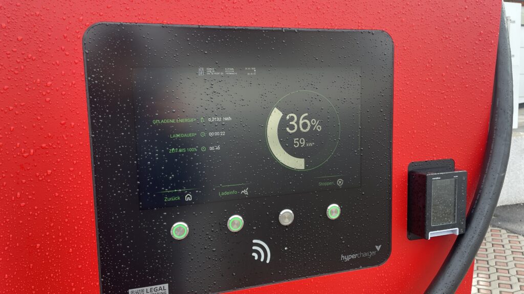
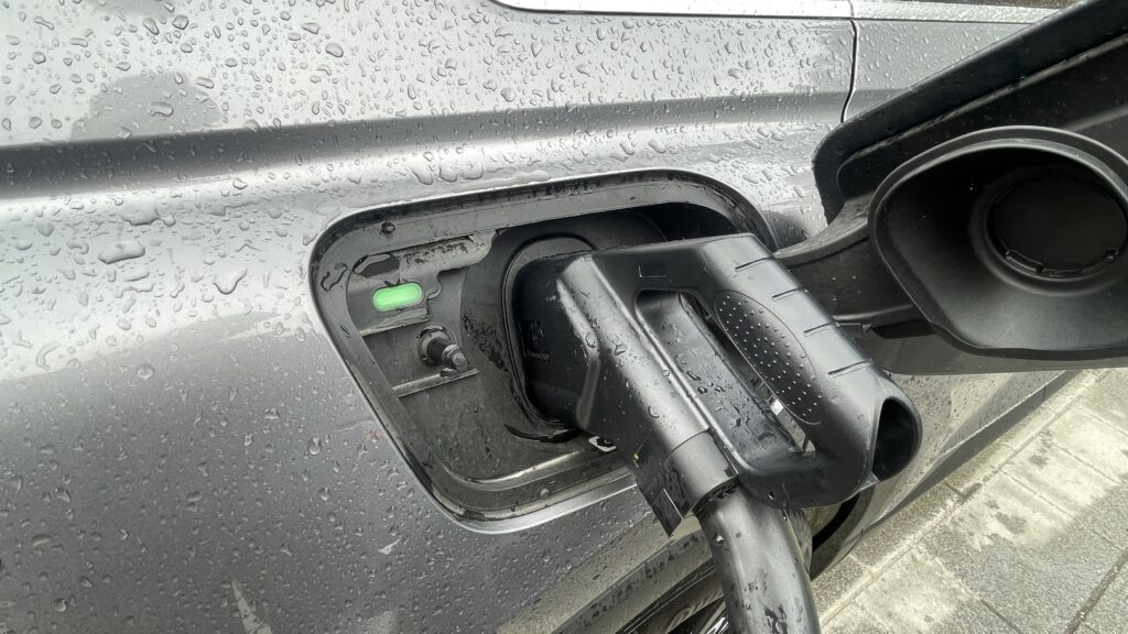
For this impulse I finally left my laptop and went outside. I borrowed a friend’s Audi Q4 e‑tron for two weeks and tried to live like a “real” EV driver. I drove between Graz and Vienna, searched for chargers on the road and in the city, and tried to feel what first‑time users feel. It was exciting, but also often very frustrating.
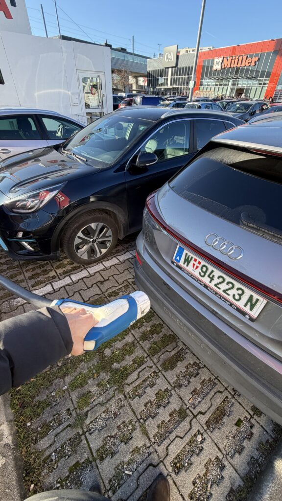
The first big problem was something very simple: cable length and parking. Two times I could not charge because the cable was way too short. The cars next to me were parked very close and very wide, so I could not place the Audi in a position where the plug reached the port. I stood there with the fast‑charging cable in my hand and could only laugh and be angry at the same time. It felt so stupid: the charger was free, my battery was low, but the physical layout made it impossible to start the session.
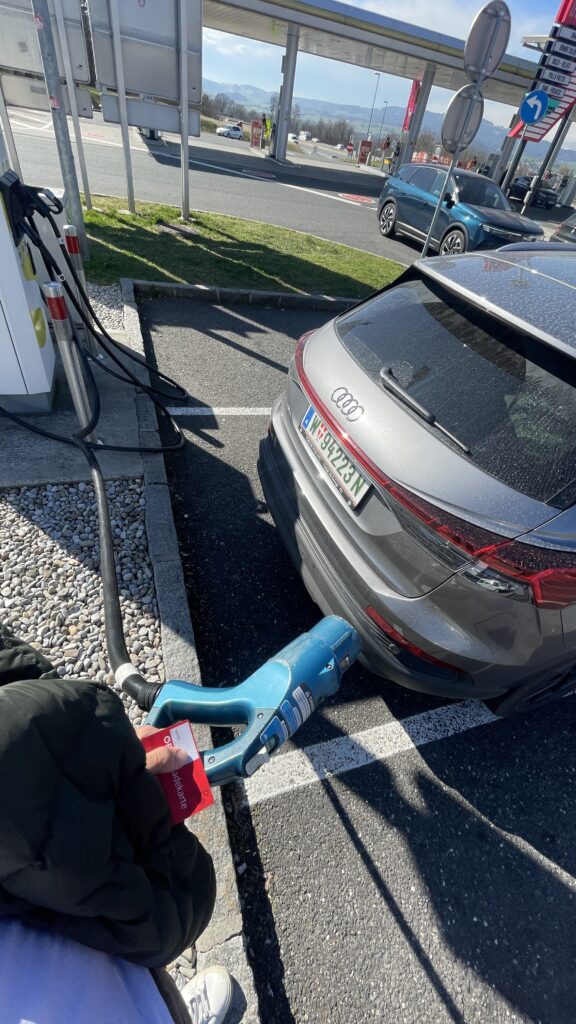
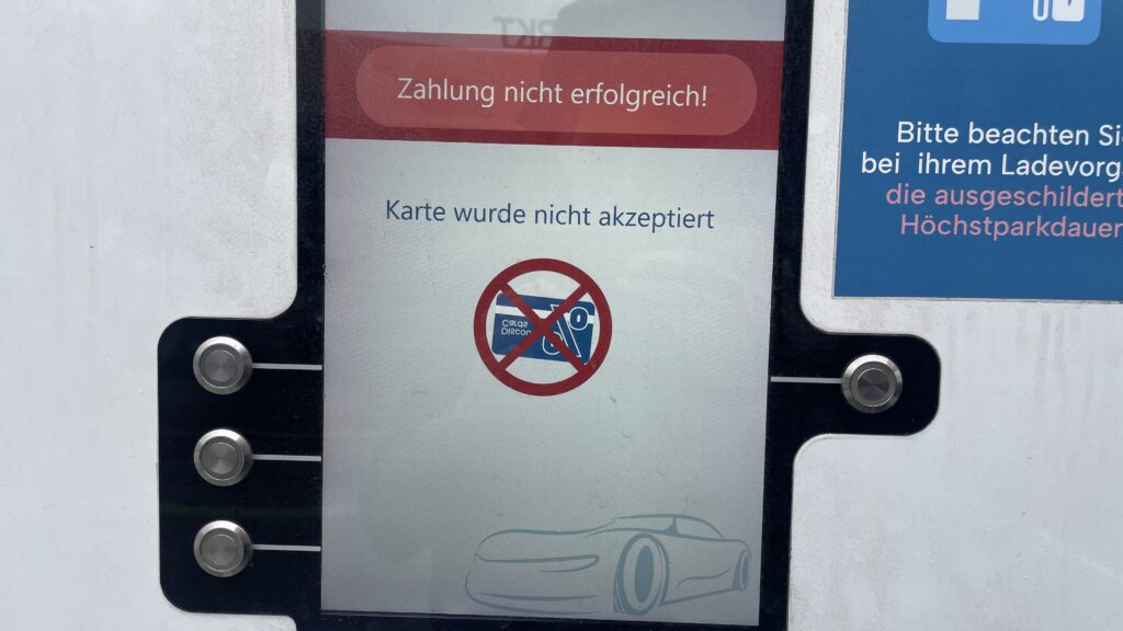
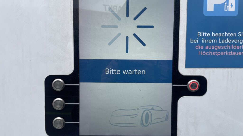
The second repeating problem was payment. My main charging card was sometimes not accepted at all. I had to try other cards and apps until something finally worked. Each time I stood there thinking: “If I was a total beginner, this would be the moment i give up.” I felt my own frustration rise, but at the same time I thought, this is good for my research. Now I do not just read about these pain points – I experience them with my own hands.
Route planning also showed interesting gaps. On the trip from Graz to Vienna I had some clear wishes. I wanted a charger with more than 300 kW so I do not have to wait too long. I wanted something with food nearby, because I was hungry. And I wanted a provider that is not SMATRICS, because I already had problems with them before. I thought these are basic, logical filters. But in the Audi system I could not filter for any of this. The car offers a nice tool that estimates how far I can still drive and suggests chargers on the way. Technically, this is very smart. But I could not set my own preferences. I could not select only “high‑power” chargers, or exclude specific networks, or search for stations with restaurants. I had to check everything manually, station by station.
Another missing detail was live information. Often it was not clear in the interface if a charger was free or busy. Sometimes I did not even see how many plugs the station had in total. For confidence this is important: if I drive ten minutes off the highway, I want to know if I really have a chance to plug in.
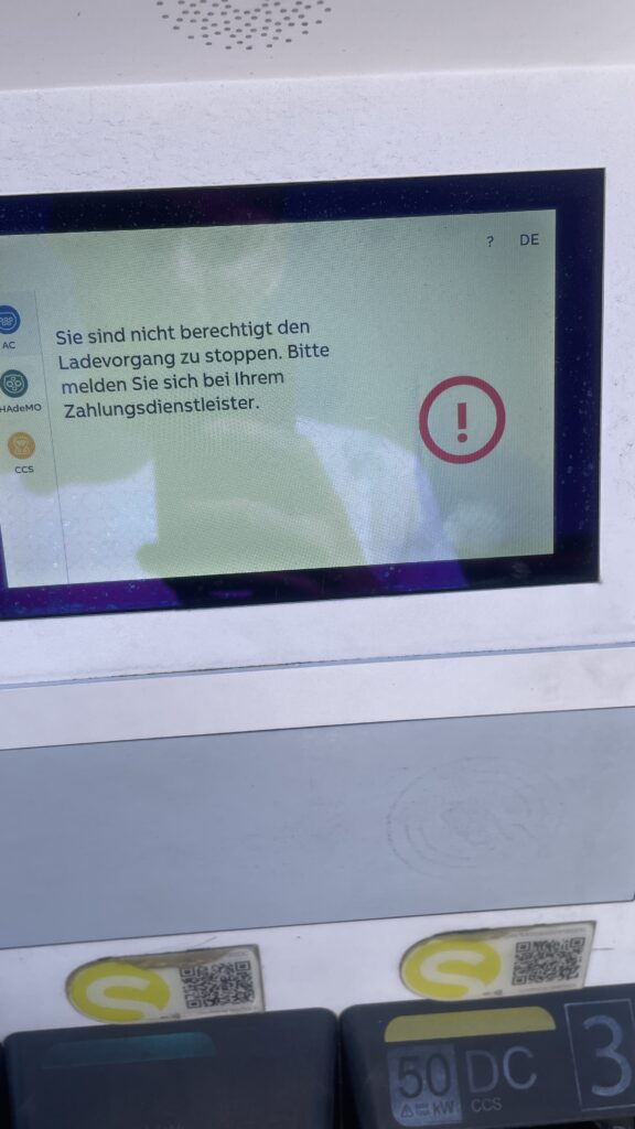
One of the most stressful moments happened when I came back to the car after charging. I wanted to unplug and continue my trip, but the connector was stuck and did not want to come out. The card did nothing anymore. I locked and unlocked the car several times and tried to pull with more and more force. After some minutes it finally released, but I never really understood which action solved it. For onboarding this is a nightmare: if something goes wrong, the system should clearly tell the user what to do, step by step. Here I had only trial and error.
Emotionally, these two weeks were a mix of curiosity, anger, and calm observation. In some moments I was really mad – especially when three small problems (finding a station, cable too short, card not accepted) came together. In other moments I felt almost grateful, because now I know these issues are not abstract. They really happen in everyday life, even with a premium car like an Audi Q4 e‑tron.
For my master thesis this impulse is very valuable. It helps me see how many barriers are not just software problems, but also physical design and service design problems: parking layout, cable reach, live status, contract jungle. It also shows how important personal preferences are. A good onboarding should not only explain “how to plug in”, but also support users in choosing the right charger for their needs: power, price, nearby services, and trust in the operator. These two weeks in the car gave me a much richer picture of what “first‑time public EV charging” really feels like – messy, fragile, but full of opportunities for better design. And I know imagine how a person that is less tech-savvier then me would do all these tasks. Crazy…
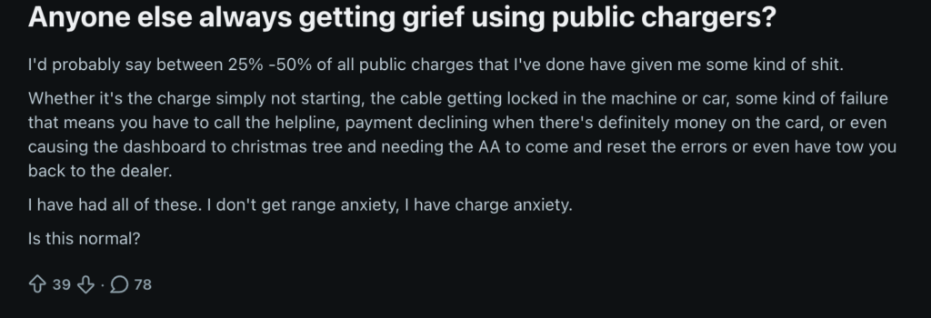
Last week I spent hours scrolling through Reddit, Trustpilot and German EV forums like GoingElectric. I was looking for honest user stories about public charging, not this polished marketing stuff, but real frustration, real emotions. what I found is exactly what my master thesis needs to understand.
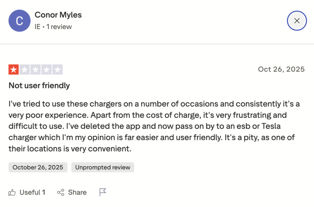
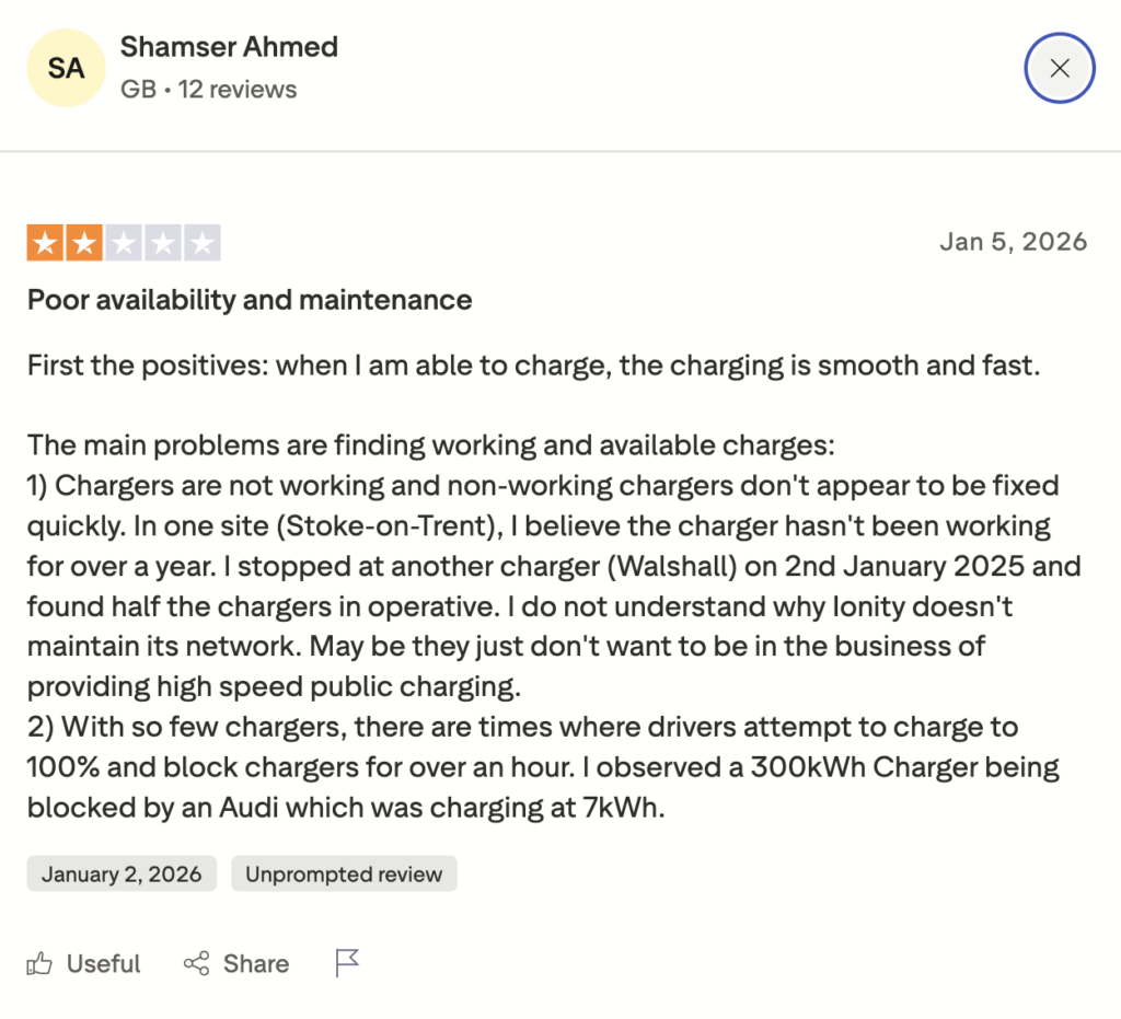
The most striking thing is not just that things break. It is the feeling behind it. One user on Reddit wrote something like: “I used to have range anxiety. Now I have charger anxiety.” Another person mentioned they estimate 25 to 50 percent of their public charging sessions go wrong somehow – either the charger does not start, the cable gets stuck, or the app crashes. One user tried four times to charge at an Ionity station, typing in their credit card each time. Nothing worked. They called the hotline and were told “Your car is broken.” It was not. https://www.trustpilot.com/review/ionity.eu
What surprised me most is how stressed people feel before they even arrive at a station. They do not know if it will work. They do not know what it will cost. On Trustpilot, someone paid 73€ to charge from 2% to 70% battery and then the support person told them this was normal. Normal! One person wrote: “Why does it have to be 10 times more complicated than buying diesel?”
I noticed a pattern of main problems:
Payment chaos Different cards, different apps, unclear pricing. Pre-authorizations that get stuck and take weeks to refund. One person had 40 pounds taken from their account three times and then had to wait seven days for each refund.
Technical failures Chargers that start but stop after one minute. Cables that lock and won’t unlock. Had this problem also often by myself! Really frustrating when the cable is stuck and locked. App screens that freeze for 30 seconds. About 25% of payment readers broken. Half of the remaining chargers “freeze up” at least once.
No clear instructions People write things like “I wasted 15 minutes trying to figure out how to start charging. No step-by-step. Just… chaos.” One person said nobody explains what order to do things in – lock the car first, or plug in first? Nobody knows.
Emotional states The feeling is stressed, frustrated, sometimes angry. One comment said “beyond frustrating.” Others use words like “rip-off” and “scandal.” I also noticed something interesting: people who figured out a workaround share it like a secret tip. One person discovered you have to turn off your car, exit, lock it, unlock it again, THEN plug in. This should not be a secret. This should be obvious. https://www.reddit.com/r/ElectricVehiclesUK/comments/1q35bo8/if_range_anxiety_isnt_the_real_issue_whats/
For my thesis, this is gold. These are real first-time users (or experienced ones still struggling) describing exactly what breaks down in their mental model and confidence. They did not expect charging to be so complicated. They expected it to work like gasoline – simple, clear, fast.
I also found that Austria is not special in this problem. The same complaints come from the UK, Germany, Netherlands. It is a European-wide issue.
What does this mean now for my own research? It tells me that onboarding is not just about the touchpoint where the user stands at the station. It starts with trust. Will this station work? What will it cost? How do I do this? The first-time user is already anxious before they arrive. My job is to design away that anxiety, as i often mention through clear guidance, transparent pricing, and step-by-step help across all touchpoints: the app, the car, the station, the website.
These user voices of these forums was really worth reading through and gave me new pain points i havent thought about yet and will definetly help me for the thesis. They are reminding me: design for the stressed, confused person. Not for someone who has charged 100 times.
Disclaimer: This blog post uses real quotes and themes paraphrased from public Reddit discussions, Trustpilot reviews and forum posts. No direct copy-paste was used, but the emotional tone and pain points are taken directly from user experiences shared online. AI (Perplexity) was used to better and faster find these forums in the internet.
When you open a magazine or read a long online article, you rarely think about it consciously, but illustration and typography are constantly having an impact on eachother. Sometimes text clearly takes the lead, sometimes an illustration. That made me wonder: in editorial design, who is actually leading: illustration or type? And does one really have to follow the other and how can they be combined perfectly?
Typography
Typography is often one of those things you only notice when something feels off. When it works, it stays in the background and lets you focus on the content. But without you realizing it, typography decides how you move through a text where your eyes slow down, where they jump ahead, and whether reading feels easy or exhausting.
In editorial design, type is like a quiet guide. Headlines pull you in, subheadings help you orient yourself, and body text carries you through the story. Spacing, line length, and alignment create natural pauses, almost like breathing spaces between thoughts. When typography is done well, it doesn’t ask for attention. It simply works. And even though it feels functional, it’s never neutral, every typeface has a mood and carry emotions. Its job is to support the content and make reading feel natural. Because of that, it often ends up leading the experience without ever feeling dominant.
How Typography Shapes the Reading Flow
You can really feel the impact of typography when you compare two texts with the same content but different layouts. Imagine a long article set in a very small font, with tight line spacing and long line lengths. Even if the writing is good, reading it feels tiring. Your eyes struggle to find the next line, and you lose focus quickly.
Now imagine the same text with more generous spacing, a slightly larger font, and clear breaks between paragraphs. Suddenly, the article feels lighter. You move through it more slowly and comfortably. You’re more likely to keep reading, not because the text changed, but because the typography respects your attention.
This means typography can encourage readers to slow down, to stay longer with a thought, or to skim when that makes sense. And that rhythm strongly influences how illustrations are perceived, too. An illustration placed in a well-paced layout feels like a moment of rest, not a distraction.
Illustration
Compared to typography Illustration is rarely invisible. Even when it’s subtle, it adds emotion, personality and interpretation. An editorial illustration doesn’t just show something, it comments on the text and is able to change the context.
Especially in essays, cultural topics or opinion pieces, illustration can open the door emotionally. It can simplify complex ideas, add irony, or create a mood that words alone struggle to convey. In that sense, illustration often leads on a more emotional level, even if typography still structures the page. Unlike photography, illustration allows for abstraction. It doesn’t need to explain everything. Sometimes it just sets a feeling and that feeling stays with the reader longer than the text itself.
When Typography Clearly Leads
There are many situations where typography should be in charge. Long reads, investigative articles, academic or journalistic content all heavily on clarity and readability. In these cases, illustration usually plays a supporting role.
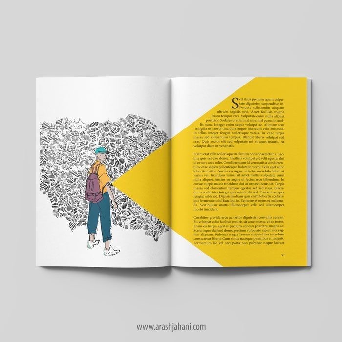
The image might appear at the beginning or between sections, offering a pause or a visual metaphor, but it doesn’t interrupt the flow. Here, illustration follows typography, not because it’s less important, but because the text needs space to breathe. Here you see a few examples where typography is leading clearly:
When Illustration Takes the Lead
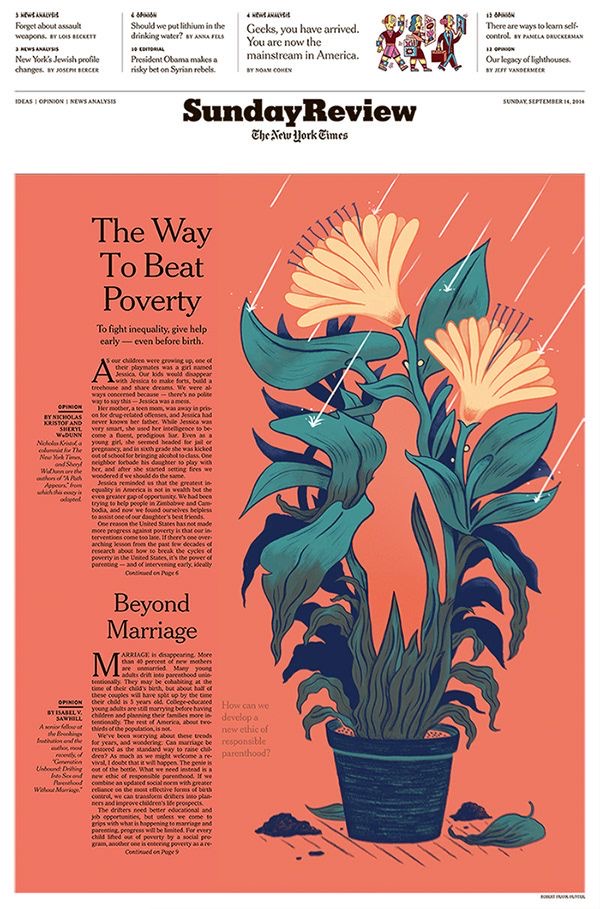
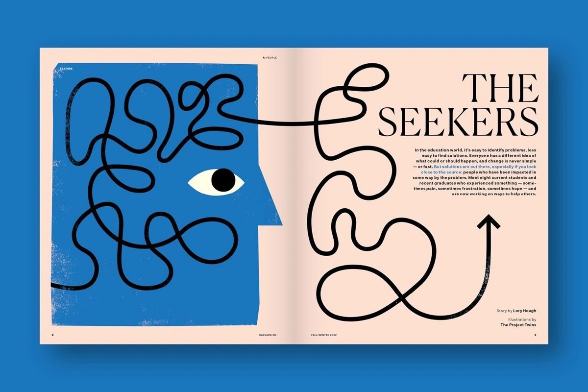
Then there are moments when illustration is the main entry point. Think of magazine covers, opening spreads, or essays built around a strong idea or mood. In those cases, illustration often pulls the reader in first, while typography steps back and becomes quieter. Type becomes simpler, calmer, sometimes even neutral just enough to support the image without competing with it. When done well, this kind of layout feels generous. It gives the illustration room to speak and trusts the reader to slow down. Here are a few examples for this:
It’s All About The Balance
The most interesting editorial design doesn’t feel like a hierarchy at all. It feels like a dialogue. Illustration and typography react to each other. One leads for a moment, then steps back. The other responds. Problems usually appear when both try to dominate at the same time like loud type paired with expressive illustration. Or when neither has a clear role, leaving the layout flat and forgettable.
What We Can Learn From This
For illustrators, it helps to think beyond the single image. How does the illustration live on the page? What does the typography already say and what doesn’t it say yet?
For designers, illustration shouldn’t be treated as decoration added at the end. It’s part of the storytelling. When illustration and type are developed with mutual respect, the result feels intentional, calm, and confident.
Final Thoughts
So who leads, and who follows? The honest answer is: it changes and depends. The best editorial layouts don’t force a winner. They create space for collaboration. When illustration and typography trust each other, the reader feels it and it feels natural.
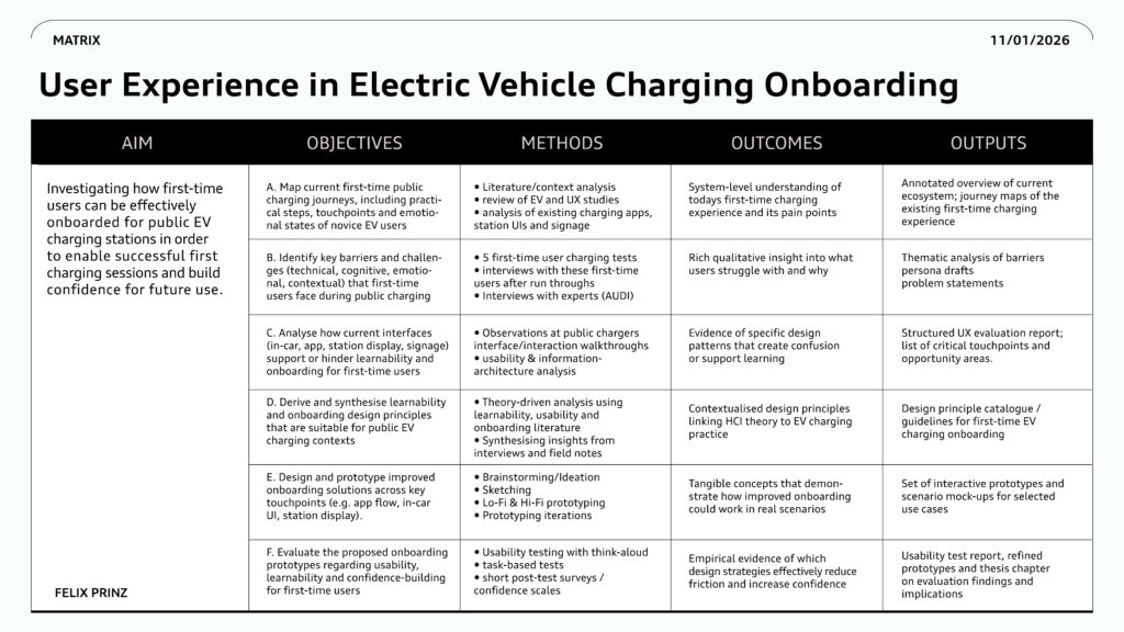
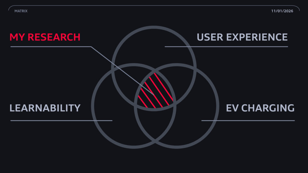
This master project explores how first‑time users can charge an electric car at public charging stations in a simple and confident way. I focus on the Audi UI and look at the whole journey: finding a charger in the app, using the in‑car system and interacting with the charger on site. With interviews, observations and usability tests, I study where people get stuck, feel stressed or unsure. The matrix in the image shows how my aims, objectives, methods and expected outcomes connect and guide the design of better onboarding experiences.
Research Question: How can first-time users be effectively onboarded for public electric vehicle charging stations to ensure successful completion of their initial charging session and build confidence for future use?
To answer the central research question a mixed-methods approach combining literature review, qualitative user research and onboarding design evaluation is employed. This approach is justified because effective onboarding requires understanding: (1) what barriers first-time users face during initial public charging encounters, (2) which onboarding interventions reduce these barriers and (3) whether designed solutions actually build user confidence for repeated use. Single-method investigation cannot adequately address this complexity.
This thesis is grounded in an interpretivist, user-centered research paradigm, assuming that first-time charging experiences cannot be understood only through technical performance metrics but must be interpreted through users perceptions, emotions and interpretive processes. The work therefore draws primarily on qualitative HCI theory, learnability models and onboarding research that explain how people approach unfamiliar systems and how confidence develops through interaction.
Albert, Bill, and Tom Tullis. Measuring the User Experience: Collecting, Analyzing, and Presenting Usability Metrics. 2nd ed. Morgan Kaufmann, 2013.
Aichinger, Wolfgang, Nadine Appelhans, Julian Gerlach, Jürgen Gies, Stefanie Hanke, Anne Klein-Hitpass, and Thomas Warnecke. „Elektromobilität in der kommunalen Umsetzung – Kommunale Strategien und planerische Instrumente.“ Technical Report. Deutsches Institut für Urbanistik (DIFU), 2015. https://starterset-elektromobilität.de/sites/default/files/Dokumente/Elektromobilitaet_in_der_kommunalen_Umsetzung.pdf.
Bevan, Nigel, and Michelle Macleod. „Usability Measurement in Context.“ Behaviour and Information Technology 13, no. 2 (1994): 132–145. https://www.academia.edu/1962544/Usability_measurement_in_context
Beringer, D. B., and J. G. Peterson. „Underlying Behavioral Parameters of the Operation of Touch-Input Devices: Biases, Models, and Feedback.“ Human Factors 27, no. 4 (1985): 445–458.
Bundesverband Elektromobilität Österreich (BEÖE), „Neuzulassungen E-Autos (BEV) in Österreich,“ accessed December 2, 2025, https://www.beoe.at/neuzulassungen/
Choi, B. R., W. P. Lee, and D. J. Won. „Optimal Charging Strategy Based on Model Predictive Control in Electric Vehicle Parking Lots Considering Voltage Stability.“ Energies 11, no. 7 (2018): 1812. https://doi.org/10.3390/en11071812.
Davis, Fred D. „Perceived Usefulness, Perceived Ease of Use, and User Acceptance of Information Technology.“ MIS Quarterly 13, no. 3 (1989): 319–340. https://doi.org/10.2307/249008.
Designability and Motability. Accessible EV Charging: Scoping and Discovery Report. United Kingdom, 2021.
eCharge4Drivers Consortium. eCharge4Drivers D1.2: A Priori Users‘ Concerns and Expectations Relevant to EV Charging. Project Report, Version 1.0 FINAL, 2023.
Figenbaum, Erik, et al. “Empirical Analysis of the User Needs and the Business Models in the
Norwegian Charging Infrastructure Ecosystem.” World Electr. Veh. J. 13, no. 10 (2022)
Grossman, Tovi, George Fitzmaurice, and Ramtin Attar. “A Survey of Software Learnability: Metrics, Methodologies, and Guidelines.” In CHI ’09 Extended Abstracts on Human Factors in Computing Systems, 649–658. New York: ACM, 2009.
Guo, Jianfeng, Binbin Xu, Qi Cao, Siyao Liu, Fu Gu, and Xuemei Zhang. „Unveiling the Bidirectional Link Between Electric Vehicle Sales and Charging Infrastructure: Evidence from 95 Cities in China.“ iScience 27, no. 3 (2024). https://doi.org/10.1016/j.isci.2024.111245.
Han, Tye. „Learnability and EV: Improving First-Time Electric Vehicle User Experience of Learning on Electrification Functions.“ Master‘s thesis, Södertörn University, 2023.
Hardman, Scott, Alan Jenn, Gil Tal, Jonn Axsen, George Beard, Nicolo Daina, Erik Figenbaum, et al. „A Review of Consumer Preferences of and Interactions with Electric Vehicle Charging Infrastructure.“ Transportation Research Part D: Transport and Environment 62 (2018) https://doi.org/10.1016/j.trd.2018.04.002.
ISO 9241-11:2018. Ergonomics of Human-System Interaction – Part 11: Usability: Definitions and Concepts. International Organization for Standardization.
Krug, Steve. Don‘t Make Me Think, Revisited: A Common Sense Approach to Web & Mobile Usability. New Riders, 2014.
Lee, Dong-Yeon, Melanie H. McDermott, Benjamin K. Sovacool, and Raphael Isaac. „Toward Just and Equitable Mobility: Socioeconomic and Perceptual Barriers for Electric Vehicles and Charging Infrastructure in the United States.“ Energy and Climate Change 5 (2024). https://doi.org/10.1016/j.egycc.2024.100146.
Linja-aho, Merja. Learnability Assessment of Complex ICT Systems: Iterative Design-Validation Cycle. Doctoral dissertation, University of Oulu, 2006.
Ma, Jun, and Qinrui Yang. „Research on User Satisfaction of Charging Infrastructure.“ IOP Conference Series: Earth and Environmental Science 440 (2020). https://doi.org/10.1088/1755-1315/440/3/032078.
Nielsen, Jakob. Designing Web Usability: The Practice of Simplicity. New Riders Publishing, 2000.
Norman, Don. The Design of Everyday Things: Revised and Expanded Edition. Basic Books, 2013.
Ries, Eric. The Lean Startup: How Modern Entrepreneurs Use Continuous Innovation to Create Radically Successful Businesses. Crown Business, 2011.
Rubin, Jeffrey, and Dana Chisnell. Handbook of Usability Testing: How to Plan, Design, and Conduct Effective Usability Testing. 2nd ed. Wiley Publishing, 2008.
Story, Molly Follette, James L. Mueller, and Ronald L. Mace. The Universal Design File: Designing for People of All Ages and Abilities. The Center for Universal Design, 1998.
Tullis, Tom S., and Jacqueline N. Stetson. „A Comparison of Questionnaires for Assessing Website Usability.“ In Proceedings of the Usability Professionals Association Conference, 1–12. Minneapolis: Usability Professionals Association, 2004.
UDG Consortium. Universal Design Guidelines for Electric Vehicle Charging Infrastructure. Policy and Design Report. Ireland/European, 2024.
Venkatesh, V., and F. D. Davis. „A Theoretical Extension of the Technology Acceptance Model: Four Longitudinal Field Studies.“ Management Science 46, no. 2 (2000): 186–204.
Wang, Hengsong, Qi Huang, Changhua Zhang, and Aihua Xia. „A Novel Approach for the Layout of Electric Vehicle Charging Station.“ In Proceedings of the 2010 International Conference on Apperceiving Computing and Intelligence Analysis (ICACIA), 64–70. IEEE, 2010. https://doi.org/10.1109/ICACIA.2010.5743443.
Wang, Yingwei, and Chuan-Ren Wang. „Locating Passenger Vehicle Refueling Stations.“ Transportation Research Part E: Logistics and Transportation Review 46, no. 5 (2010): 791–801. https://doi.org/10.1016/j.tre.2010.02.007.
Yang, Mengqi, and Boqiang Lin. „The Development of Consumer Preferences for Electric Vehicle Charging Infrastructure in China: Evidence from a Questionnaire Survey with a Four-Year Interval.“ Energy 307 (2024): 132671. https://doi.org/10.1016/j.energy.2024.132671.
Zheng, Jian, Xingang Wang, Ke Men, and Yonghua Song. „Aggregation Model-Based Optimization for Electric Vehicle Charging Strategy.“ IEEE Transactions on Smart Grid 4, no. 2 (2013): 1058–1066. https://doi.org/10.1109/TSG.2013.2244904.