When you open a magazine or read a long online article, you rarely think about it consciously, but illustration and typography are constantly having an impact on eachother. Sometimes text clearly takes the lead, sometimes an illustration. That made me wonder: in editorial design, who is actually leading: illustration or type? And does one really have to follow the other and how can they be combined perfectly?
Typography
Typography is often one of those things you only notice when something feels off. When it works, it stays in the background and lets you focus on the content. But without you realizing it, typography decides how you move through a text where your eyes slow down, where they jump ahead, and whether reading feels easy or exhausting.
In editorial design, type is like a quiet guide. Headlines pull you in, subheadings help you orient yourself, and body text carries you through the story. Spacing, line length, and alignment create natural pauses, almost like breathing spaces between thoughts. When typography is done well, it doesn’t ask for attention. It simply works. And even though it feels functional, it’s never neutral, every typeface has a mood and carry emotions. Its job is to support the content and make reading feel natural. Because of that, it often ends up leading the experience without ever feeling dominant.

How Typography Shapes the Reading Flow
You can really feel the impact of typography when you compare two texts with the same content but different layouts. Imagine a long article set in a very small font, with tight line spacing and long line lengths. Even if the writing is good, reading it feels tiring. Your eyes struggle to find the next line, and you lose focus quickly.
Now imagine the same text with more generous spacing, a slightly larger font, and clear breaks between paragraphs. Suddenly, the article feels lighter. You move through it more slowly and comfortably. You’re more likely to keep reading, not because the text changed, but because the typography respects your attention.
This means typography can encourage readers to slow down, to stay longer with a thought, or to skim when that makes sense. And that rhythm strongly influences how illustrations are perceived, too. An illustration placed in a well-paced layout feels like a moment of rest, not a distraction.
Illustration
Compared to typography Illustration is rarely invisible. Even when it’s subtle, it adds emotion, personality and interpretation. An editorial illustration doesn’t just show something, it comments on the text and is able to change the context.
Especially in essays, cultural topics or opinion pieces, illustration can open the door emotionally. It can simplify complex ideas, add irony, or create a mood that words alone struggle to convey. In that sense, illustration often leads on a more emotional level, even if typography still structures the page. Unlike photography, illustration allows for abstraction. It doesn’t need to explain everything. Sometimes it just sets a feeling and that feeling stays with the reader longer than the text itself.
When Typography Clearly Leads
There are many situations where typography should be in charge. Long reads, investigative articles, academic or journalistic content all heavily on clarity and readability. In these cases, illustration usually plays a supporting role.
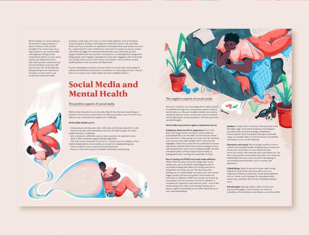
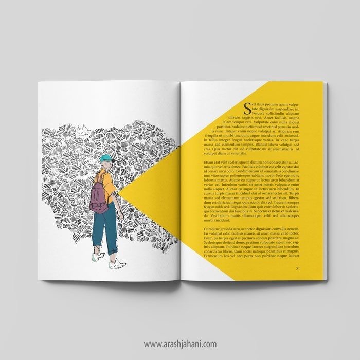
The image might appear at the beginning or between sections, offering a pause or a visual metaphor, but it doesn’t interrupt the flow. Here, illustration follows typography, not because it’s less important, but because the text needs space to breathe. Here you see a few examples where typography is leading clearly:

When Illustration Takes the Lead
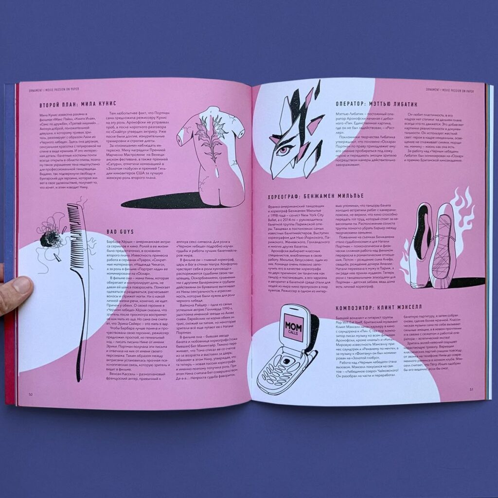
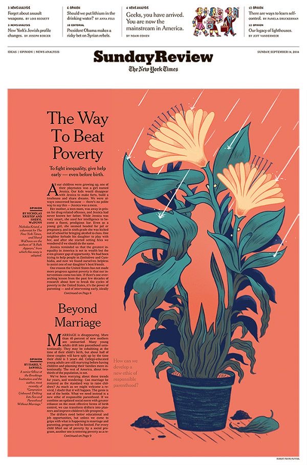
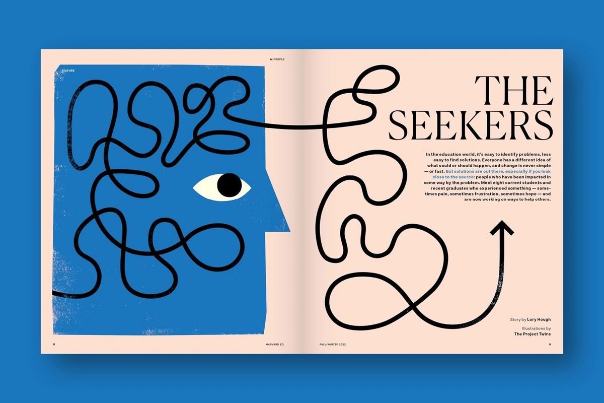
Then there are moments when illustration is the main entry point. Think of magazine covers, opening spreads, or essays built around a strong idea or mood. In those cases, illustration often pulls the reader in first, while typography steps back and becomes quieter. Type becomes simpler, calmer, sometimes even neutral just enough to support the image without competing with it. When done well, this kind of layout feels generous. It gives the illustration room to speak and trusts the reader to slow down. Here are a few examples for this:
It’s All About The Balance
The most interesting editorial design doesn’t feel like a hierarchy at all. It feels like a dialogue. Illustration and typography react to each other. One leads for a moment, then steps back. The other responds. Problems usually appear when both try to dominate at the same time like loud type paired with expressive illustration. Or when neither has a clear role, leaving the layout flat and forgettable.
What We Can Learn From This
For illustrators, it helps to think beyond the single image. How does the illustration live on the page? What does the typography already say and what doesn’t it say yet?
For designers, illustration shouldn’t be treated as decoration added at the end. It’s part of the storytelling. When illustration and type are developed with mutual respect, the result feels intentional, calm, and confident.
Final Thoughts
So who leads, and who follows? The honest answer is: it changes and depends. The best editorial layouts don’t force a winner. They create space for collaboration. When illustration and typography trust each other, the reader feels it and it feels natural.
Sources
https://fiveable.me/editorial-design/unit-4
https://www.numberanalytics.com/blog/impact-of-typography-in-editorial-design
https://page-online.de/typografie/fonts-im-editorial-design-die-besten-tipps-und-trends/