Product II – Embodied Resonance – Initial Signal Testing and Electrode Placement

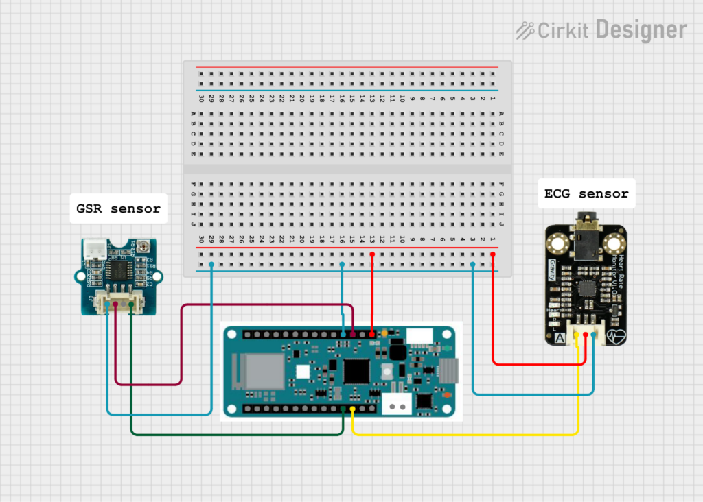
After completing the hardware setup, the next step was to verify whether the system was capable of producing usable physiological signals. For this purpose, a minimal Arduino sketch was written to read raw analog values from the ECG and GSR sensors and stream them via the serial interface. The goal at this stage was not data recording or analysis, but a basic functional test of the signal paths. The code continuously reads the ECG signal from analog input A1 and the GSR signal from analog input A2, printing both values as comma-separated numbers to the Serial Monitor. A short delay was introduced to limit the sampling rate and ensure stable serial transmission.

const int ecgPin = A1;

const int gsrPin = A2;

void setup() {

  Serial.begin(115200);

}

void loop() {

  int ecgValue = analogRead(ecgPin);

  int gsrValue = analogRead(gsrPin);

  // print CSV row: ecg,gsr

  Serial.print(ecgValue);

  Serial.print(“,”);

  Serial.println(gsrValue);

  delay(5);

}

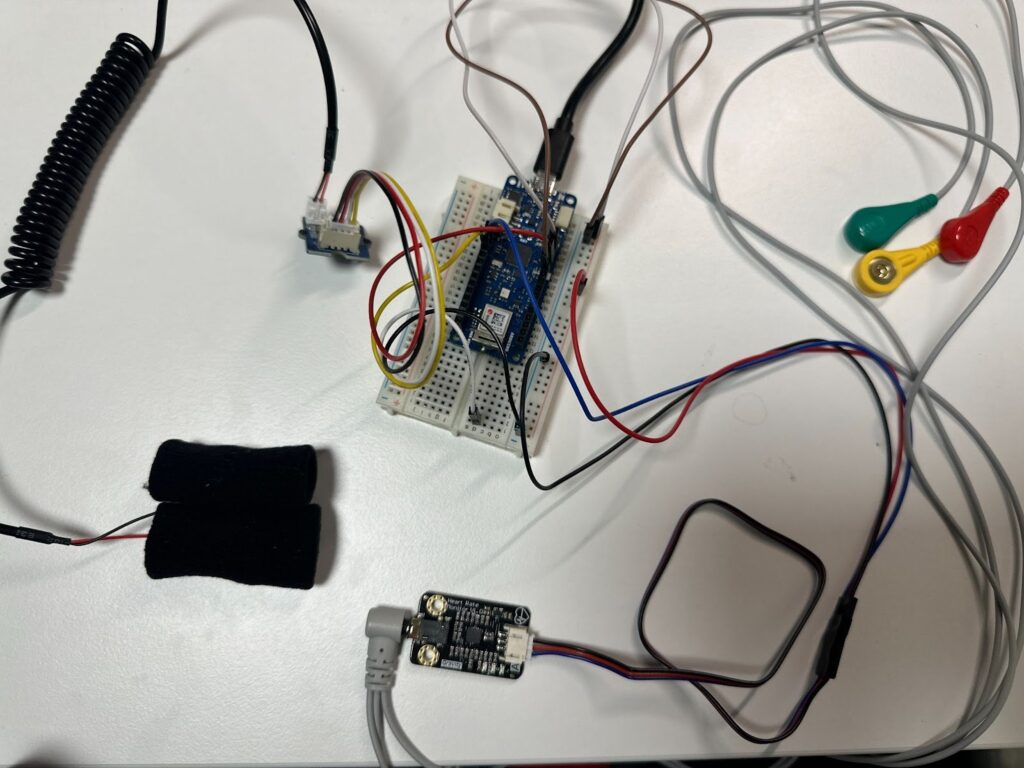
Once the code was running, the next critical step was the physical placement of the ECG electrodes. This proved to be one of the most challenging parts of the initial testing phase. Online sources provide a wide range of DIY electrode placement schemes, many of which are inconsistent or oversimplified. In particular, a previously referenced HRV-related Arduino project suggested placing electrodes on the arms. This configuration was tested first, but the resulting signal made it difficult to identify clear R-peaks in the serial plotter, which are essential for ECG interpretation and HRV analysis.

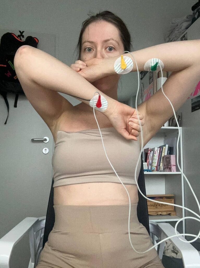
Example of ECG electrode placement as proposed in the “Arduino and HRV Analysis” project and author’s implementation. https://emersonkeenan.net/arduino-hrv/ 

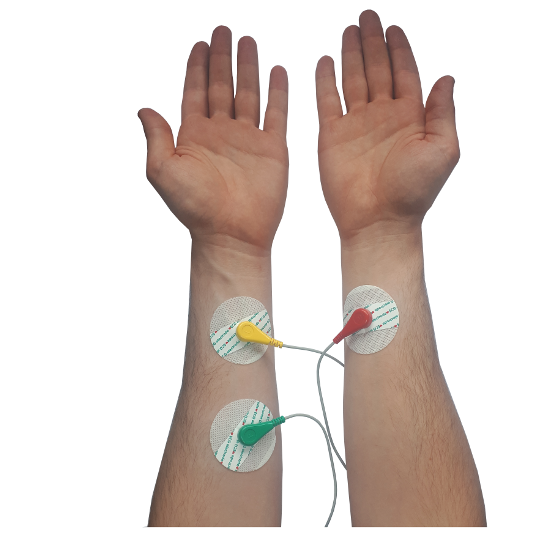
The official documentation of the ECG sensor instead recommended chest-based electrode placement. However, this approach also required careful positioning to achieve a clean signal. 

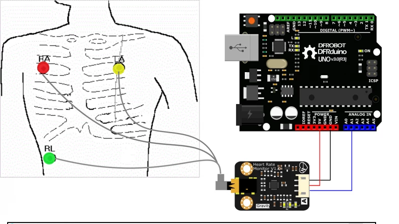
ECG electrode placement on the chest as recommended in the official sensor documentation.

https://www.dfrobot.com/product-1510.html

The most reliable guidance was found in a tutorial video presented by a medical professional, which explained proper ECG electrode placement in practical terms. The key insight was that electrodes should not be placed directly on bone. Instead, they must be positioned on soft tissue—below the shoulder and above the rib cage.

The ECG cables were clearly labeled by the manufacturer:

L (left) electrode placed on the left side of the chest

R (right) electrode placed symmetrically on the right side

F (foot/reference) electrode placed on the lower left abdomen, below the rib cage

Additionally, skin preparation proved to be essential. Degreasing the skin before attaching the electrodes significantly improved signal quality. After applying these corrections and restarting the Arduino sketch, distinct ECG peaks became clearly visible in the serial output.

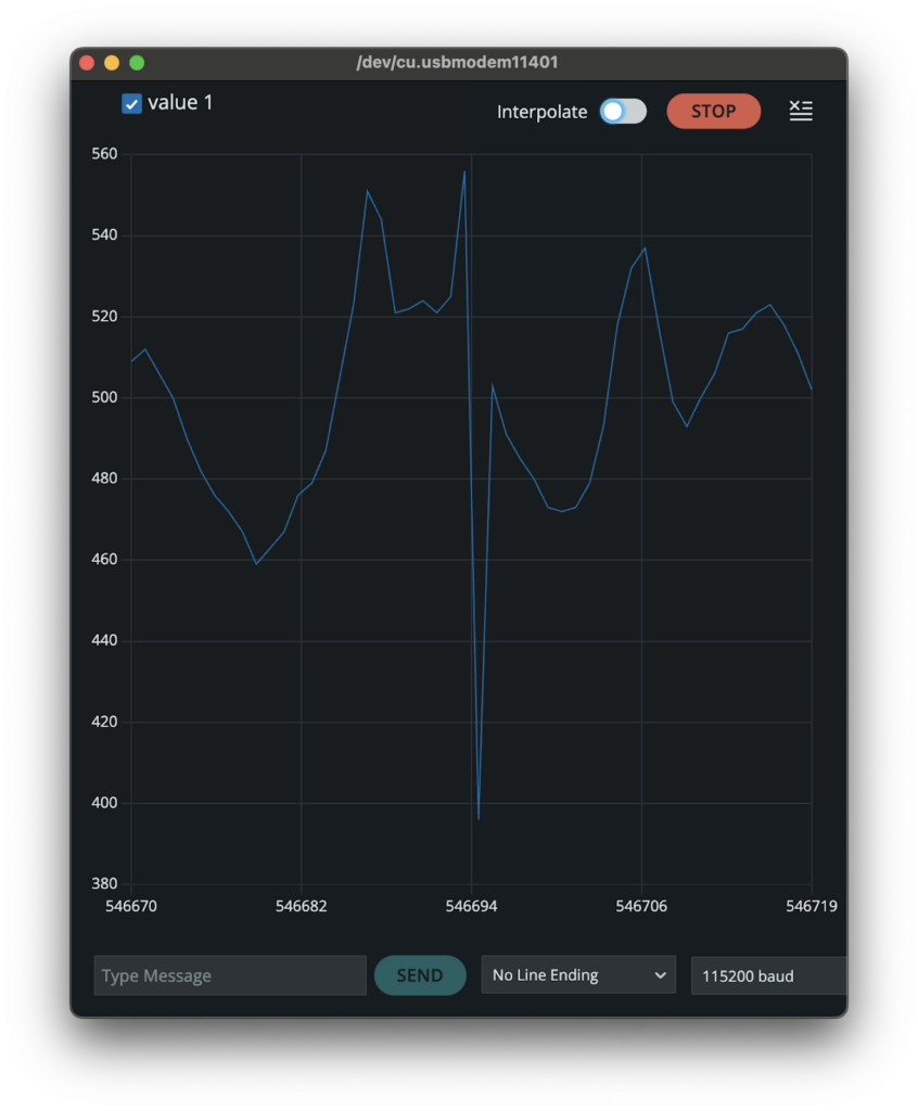
Raw ECG signal displayed in the Serial Plotter, showing clearly identifiable R-peaks during initial signal testing.

In contrast, the GSR sensor required far less preparation. It was simply attached to the fingers, and a signal was immediately observable. However, even during these initial tests it became evident that the GSR signal was highly noisy and would require filtering and post-processing in later stages of the project.

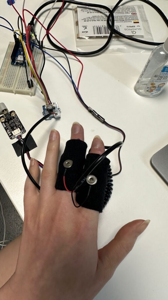
GSR sensor placement on the fingers during data acquisition.

Several practical limitations of the Arduino IDE became apparent during this testing phase. One major drawback was the inability to adjust the grid or scaling in the Serial Plotter, which made live signal inspection inconvenient. Furthermore, the current version of the Arduino IDE no longer allows direct export of serial data to CSV format from the monitor. This limitation necessitated additional tooling and custom scripts in later stages to enable proper data logging and analysis.

Product I – Embodied Resonance – Hardware Selection and System Setup

RECAP:
Embodied Resonance investigates how the body of a person with lived experience of war responds to auditory triggers that recall traumatic events, and how these responses can be expressed through sound. The heart is central to this project, as cardiac activity – particularly heart rate variability (HRV)—provides detailed insight into stress regulation and autonomic nervous system dynamics associated with post-traumatic stress disorder (PTSD).

The conceptual direction of the work is shaped by my personal experience of the war in Ukraine and an interest in trauma physiology. I was drawn to the idea that trauma leaves measurable traces in the body—signals that often remain inaccessible through language but can be explored scientifically and translated into sonic form. This approach was influenced by The Body Keeps the Score by Bessel van der Kolk, which emphasizes embodied memory and non-verbal manifestations of trauma.

In the previous semester, the project focused on exploratory work with existing physiological datasets. A large open-access dataset on stress-induced myocardial ischemia was used to study cardiac behavior under rest, stress, and recovery conditions. Although not designed specifically for PTSD research, the dataset includes participants with PTSD, anxiety-related disorders, and cardiovascular conditions, offering a diverse basis for analysis.

During this phase, Python tools based on the NeuroKit2 library were developed to compute time- and frequency-domain HRV metrics from ECG recordings. Additional scripts transformed these parameters into MIDI patterns and continuous controller (CC) data for sound synthesis and composition. Initial experiments with real-time HRV streaming were also conducted, but they revealed significant limitations: many HRV metrics require long analysis windows and are computationally demanding, making them unsuitable for stable real-time sonification.

In the current semester, corresponding to the Product phase, the project transitions from simulation-based exploration to work with my own body. During earlier presentations, concerns were raised regarding the ethical implications of experiments that could potentially lead to re-traumatization, particularly when involving other participants with war-related trauma. In response, I decided not to extrapolate the experiment to other Ukrainians at this stage and to limit the investigation to my own physiological responses.

Furthermore, instead of exposing myself to recorded sirens at arbitrary times, I chose to record my ECG during the weekly civil defense siren tests that take place every Saturday in Graz. This context offers a meaningful contrast: for most residents of Austria, the siren test is a routine element of everyday life, largely stripped of emotional urgency. For someone with lived experience of war, however, the same sound carries associations of immediate danger. By situating the recordings within this real, socially normalized setting, the project examines how a familiar public signal can produce profoundly different embodied responses depending on personal history.

Before starting the experimental recordings, it was necessary to select and acquire appropriate sensors and a microcontroller. Prior to purchase, a short survey of available biosensing hardware was conducted, with particular attention paid to signal quality, availability of documentation, and the existence of example projects demonstrating practical use. An additional criterion was whether the sensors had been previously employed in projects related to heart rate variability (HRV) analysis.

For ECG acquisition, the DFRobot Gravity Heart Rate Monitor Sensor was selected. This sensor offered a favorable balance between cost and functionality, providing all required cables as well as disposable electrodes. Importantly, it had been used in a well-documented HRV-focused project, which served as a valuable technical reference during development and troubleshooting. In addition to ECG, a galvanic skin response (GSR) sensor from Seeed Studio was included to explore changes in skin conductance as an additional physiological marker of stress. While GSR was not part of the previous semester’s research, it was included experimentally to assess whether this modality could provide complementary information. At this stage, the structure and usefulness of GSR data were not yet fully predictable and were treated as exploratory. As a microcontroller, the Arduino MKR WiFi 1010 was chosen. 

The full list of acquired components is as follows:

  • Arduino MKR WiFi 1010
  • DFRobot Gravity Heart Rate Monitor Sensor (ECG)
  • DFRobot Disposable ECG Electrodes
  • Seeed Studio GSR Sensor
  • Seeed Studio 4-pin Male Jumper to Grove Conversion Cable
  • Breadboard (400 holes)
  • Male-to-male jumper wires
  • Male-to-female jumper wires
  • Potentiometers (100 kΩ)
  • LiPo Battery 1S 3.7 V 500 mAh (not used in final setup)

The total cost of the hardware provides amounted to approximately 80 EUR. The initial motivation for this choice was the possibility of wireless data transmission via WiFi or Bluetooth. In practice, however, wireless communication was not required. Due to the high motion sensitivity of both ECG and GSR sensors, recordings had to be performed in a largely static position, making a wired USB connection to the computer sufficient. For this reason, a battery intended for mobile operation was ultimately not used.

For software configuration, the Arduino IDE was installed. Although I had prior experience working with Arduino hardware several years ago, the interface had changed significantly. To support the Arduino MKR WiFi 1010, the SAMD Boards package was additionally installed via the Boards Manager. After software setup, all components were connected according to a simple wiring scheme that required no additional electronic elements. 

Figure 1. Wiring diagram of the experimental setup with Arduino MKR WiFi 1010, ECG sensor, and GSR sensor.

The Arduino ground (GND) was connected to the ground rail of the breadboard, and the 5 V output was connected to the power rail.

The ECG sensor was connected as follows:

GND (black wire) → ground rail on the breadboard

VCC (red wire) → 5 V power rail

Signal output (blue wire) → analog input A1 on the Arduino

The GSR sensor was connected as follows:

GND (black wire) → ground rail on the breadboard

VCC (red wire) → 3.3 V output on the Arduino

Signal output (yellow wire) → analog input A2 on the Arduino

Figure 2 illustrates the complete wiring configuration of the system, including the Arduino MKR WiFi 1010, ECG sensor, GSR sensor, and breadboard power distribution.

Figure 2. Physical hardware configuration used for ECG and GSR data recording.

IMPULSE: Semester End Talks

As our semester neared its end, there were several different talks scheduled to help us get a clearer perspectives of our master’s thesis, future work perspectives and maybe life in general. And even though all of these topics tend to drive my pulse up, the talks were really helpful, reassuring and inspiring. So I want to reflect on the thoughts and ideas that came up during those last couple of days and how I might implement them into my plans.

First off, we had a talk with Hansjürgen Schmölzer, who was supposed to help us get an idea of what kind of career we might want to pursue after our Master’s and what possibilities we even have. While we only talked briefly about the kind of work I might want to do and my values and wishes, we quickly got into the topic of my master’s thesis, more specifically my practical workpiece. Now, I found out 5 minutes before our talk that Hansjürgen is an incredibly successful Austrian documentary filmmaker and, coincidentally, my practical workpiece IS a documentary. So, naturally he gave me lots of helpful tips, insights and hard truths once I had told him about my plans. I was able to get some feedback about some of the ideas I had and was still unsure about and he gave me some great creative input. However, he also kept me down to Earth and clearly told me if some of my visions were simply not feasible within the time limitations I have set for myself.

My second talk was with Roman, where we talked more about the topic of my thesis and I feel like every time I meet with him, my topic somehow changes a little but also becomes a lot clearer and I leave with newfound motivation to get started. (thank you Romaaaan!) We also talked about my workpiece and my plans for it, and while Hansjürgen Schmölzer seemed to think that 30 minutes were simply not enough time to establish the story in the way that I had planned, Roman was rather sceptical if I really wanted to make the film this long.

So in conclusion, getting feedback and help from people that know more than you and have more experience is incredibly helpful and eye-opening, but can also be rather confusing at times and lead to more of a mess to untangle at first. But I believe that it is worth it to take the time to sit down and go through all of the feedback you have received from different sources, also consider why people might think that way and then categorise it in a way that is helpful to you and your process. Also always stay true to your own opinions and values.

The last talk we had scheduled was with Ursula Lagger, where we talked more so about the written part of the thesis. In this talk I kind of surprised myself with how much I could already say about my topic and my plans and how much thought I have actually already put into it. With the exhibition and everything else that stressed me out lately, the thesis kind of slipped to the back of my mind where it stayed, lurking in the dark and whispering ominous warnings at times, but didn’t concern me enough to actually act on it. So, when it was finally time to face that sleeping dragon, I was pretty stressed, but it turns out that past me had actually already put some effort into taming it and maybe the distance even helped me see the bigger picture now.

So, sometimes we need a scheduled stressor to help us see that what we had been avoiding this whole time wasn’t as bad as we thought, anyway. However, the talk with Ursula Lagger was not only good for stressing me out, but it was also really helpful in clearing a lot of things up where my own thoughts and plans had been rather blurry so far.

To conclude, feedback talks really stress me out beforehand but always prove to be really helpful after the fact, so I am very glad that FH provides an environment where I am forced into them.

Impulse #8: The Last Supper

The Last Supper is one of the most iconic images of Christianity and the Catholic Church. Leonardo da Vinci’s painting is not only deeply embedded in religious visual culture, but also loaded with symbolic gestures, spatial hierarchies, power relations and narratives of belonging and exclusion. Over centuries, this image has been reproduced, cited and reinterpreted countless times, becoming almost untouchable in its status. Precisely because of this strong visual and symbolic charge, contemporary artistic reinterpretations of the Last Supper are particularly revealing when viewed through the lens of interaction and participation.

In the exhibition DU SOLLST DIR EIN BILD MACHEN at Künstlerhaus Vienna, the works of Timm Ulrichs and Irene Andessner stood out as a powerful impulse for my design and research process. Rather than creating another static image, both artists transform the Last Supper into a performative act — a lived, temporal situation that unfolds through human presence, roles and interaction.

In 1976, Timm Ulrichs staged the Last Supper as a reenactment with students and friends. He placed himself in the role of Jesus, while in front of him lay a cake shaped like an open book. A piece of it had already been eaten, and the inscription “Take, eat, this is my body. Timm Ulrichs” was still visible. This small but deliberate detail shifts the meaning of the ritual: the sacred act becomes simultaneously personal, ironic and bodily. Consumption, authorship and belief collapse into one gesture. The work is not primarily about provocation, but about making visible how meaning is produced through action and participation.

Thirty-five years later, Irene Andessner revisited Ulrichs’ approach in a series of performances. Her intervention is subtle yet radical: she reverses the gender roles of the table. Andessner herself takes the place of Jesus, Ulrichs occupies the role traditionally associated with John or Mary Magdalene, and the apostles are portrayed by women from the art and cultural field. What remains visually recognizable as “The Last Supper” is transformed conceptually into a commentary on power, hierarchy and exclusion within religious traditions.

From an interaction design perspective, these works can be understood as the transformation of a religious image into a social interface. Roles function as interaction rules, the table as a shared space, the bodies as carriers of meaning. The audience does not merely observe; it witnesses a reconfiguration of a deeply familiar ritual. Meaning emerges not from explanation, but from participation, presence and subtle deviations from expectation.

What makes these reenactments particularly compelling are the small details: the cut cake, the visible children, the exchanged roles. These elements invite closer observation and interpretation, encouraging viewers to engage more deeply with the ritual rather than passively consuming its image. In contrast to institutionalized liturgical settings, where participation is often clearly defined and limited, these artistic approaches open up space for reflection, identification and critique.

For my master’s research, these works highlight the potential of performative and interactive reinterpretations of religious rituals. They demonstrate how interaction does not need to rely on digital interfaces alone, but can emerge through social constellations, embodied participation and symbolic shifts. In a context where many people feel distanced from the Church as an institution, such approaches suggest alternative ways of engaging with spiritual themes — not by simplifying or commodifying them, but by allowing ambiguity, complexity and shared experience.

The Last Supper, reimagined as an interactive performance, becomes less a fixed symbol and more a living process. This shift from image to interaction is a crucial impulse for exploring how contemporary media and design practices might support critical, reflective and inclusive forms of spiritual experience today.


Links:

https://kaernten.orf.at/v2/news/stories/2510367

https://www.kuenstlerhaus.at/besuch/kalender/ausstellung/475/du-sollst-dir-ein-bild-machen.html

#20 Overlays: Wabi Sabi

For the CMSI exhibition Overlays, my fellow student and friend (shoutout to my girl) Elisabeth Seiler and I decided to create our own shared exhibition piece. We wanted to contribute something together, something personal, instead of working alone. Our goal was to develop a project that fits the exhibition but also represents our work and style.

Working with CRT TVs

Very early on, we knew we wanted to work with old CRT televisions (Röhrenfernseher). They matched the 2000s aesthetic of the exhibition perfectly, and we loved the idea of using a special and slightly unusual output device. Showing animations on an old TV feels very different from showing them on modern screens. The imperfections of the image give it a lot of character and charm.

Ideas and Inspiration

At the beginning, we spent a lot of time brainstorming. We created moodboards, collected visual inspiration, and talked about different themes and ideas for what we could show on the TVs. One thing was clear from the start: we wanted to show animated content. Take a look at one part of our moodboard:

Finding the Theme: Wabi-Sabi

After many discussions, we decided on the theme Wabi-Sabi.
Wabi-Sabi is a Japanese concept that focuses on the beauty of imperfection, transience, and incompleteness. It encourages us to accept flaws, cracks, and signs of aging as something meaningful instead of something negative. Things don’t have to be perfect to be beautiful. This idea fit our project and the old televisions very well. We researched a lot in the history and artsytle of WabiSabi as well. Here you can see how it usually looks like and what we used as inspirations for our projects:

The Technical Setup

Next, we focused on the technical side. Old CRT TVs can still be used as output devices, but you need some extra equipment. We used:

  • a CRT TV with Scart or Cinch input
  • an HDMI to Scart/Cinch adapter
  • a laptop or media player to play the animations

The modern video signal is converted so the old TV can display it. The image quality is lower, but that was exactly what we wanted. The blur, flickering, and color distortion are part of the aesthetic. We were lucky to get the TVs for free from an old hotel, which no longer needed them. This also fit the Wabi-Sabi idea of reusing old objects and giving them new meaning. It took as some time (and a lot of nerves) bit in the end we manged it.

Creating the Animations

Once everything was set up, we started animating. Lizzy and I each created our own animation, both based on the same theme but in our individual styles.

I chose to create an illustrated animation in my own visual style and storytelling approach. I wanted to communicate Wabi-Sabi in a poetic and emotional way. In my animation, two animals talk to each other: a fox and a mouse. The message is subtle and hidden between the lines. The fox explains to the mouse why it’s okay to feel broken sometimes, and why imperfections are not something to be ashamed of. I created the illustrations in Procreate and animated everything later in After Effects.

Final Thoughts

Our exhibition piece was not just about the final result, but about the process itself. Working together, combining old technology with animation, and exploring a meaningful theme was a very valuable experience for both of us. In the end, everything came together naturally: old screens, new stories, and beauty in imperfection. Happy us!

IMPULS 10 – Themenrecherche

Mein finaler Impuls summiert all die Recherche zu meinem Masterarbeitsthema 🙂
Mein Fazit ist: Das Lesen und wirklich Schreiben von wissenschftlichen Artikeln war mega hilfreich beim Definieren meiner Bereiche und auch sehr bestätigend. Ich kann das ganze Thema jetzt in einem konkreteren Kontext betrachten und konnte festigen, dass es nicht aus der Luft gegriffen ist.

—–

Meine Masterarbeit untersucht, wie Markenpersönlichkeit in zeitgenössischen, beschleunigten Kommunikationskontexten visuell konstruiert wird und welche Rolle Motion Design in dieser Inszenierung spielt. Auf Basis von Prozessanalysen, Case Studies und Expert:inneninterviews werden strukturelle Muster in Brandingprozessen identifiziert, aus denen ein exemplarischer Motion-integrierter Gegenprozess abgeleitet wird.

(Also Magda Sprache:
Step 1 Anschauen wie Brandingprozesse funktionieren (Prozesse, Wie man Werte darstellt usw… Case Studys Anschauennnn, Experten usw.) und wann Motion ins Spiel kommt (Motion Idenitity, Parameter, usw siehe DesRes letztes Semester)

Step 2 Beschleunigte Kommunikationskontexte (Andere Wahrnehmung, Aufmerksamkeitsspanne, whatever von SoMe) BEIDE Aspekt kombinieren in meinem Prozess!)

Ich untersuche Branding-Prozesse und entwickle ein alternatives Prozessmodell, in dem Motion Design integraler Bestandteil der Markenentwicklung ist. Der Output ist ein exemplarischen Gegenentwurf auf Basis beobachteter Muster. (Framework / Workflow / Leitfaden.)

PRAKTISCHE ARBEIT:

Der erarbeitete Workflow veranschaulicht, ODER das Endergebnis anhand von dem ich den Workflow erarbeitet habe.

1) Forschungsaspekt? Was ist das “neue”? 

Ich soll nicht nur informationen sammeln die es schon gibt sondern neue Forschung betreiben
Ich teste einen alternativen Prozess als „Design Experiment“ und entwickle nicht nur ein Modell sonder prototype es…

– ein exemplarischer Gegenprozess, der aus meinen Befunden entsteht

– plus ein Proof-of-concept, der zeigt: was ändert sich dadurch konkret, welche Einflüsse hat es

„Research through Design“ (Erkenntnis entsteht durch Gestaltung.)
+
Ich binde „beschleunigte Kommunikationskontexte“ konkret in die Prozessentscheidungen ein

Viele reden über Social Media, wenige übersetzen es in konkrete Prozess-Schritte:
– Welche Touchpoints werden früher berücksichtigt?
– Welche Constraints (Tempo, Frequenz, Rhythmus, Formatlogik) beeinflussen Identität?
= ein Prozessmodell, das Social/Plattform-Realitäten nicht nur erwähnt, 

  sondern operationalisiert (eben mit Motion)

Diese Arbeit leistet einen Beitrag, indem sie die Integration von Motion Design in Brandingprozesse systematisch kartiert (Cases + Interviews), ein Kategoriensystem zur Beschreibung von Motion-Integration entwickelt und daraus einen exemplarischen Motion-integrierten Workflow als designforschungsbasierten Gegenentwurf ableitet, mit dem Branding an beschleunigte Kommunikationskontexte angepasst werden kann

2) Messbarkeit?
Ev. Fokus auf Motion identity, damit man Branding nicht zu arg thematisieren muss 

Wie mache ich das messbar?

– klare Variablen (was beobachte ich?)

– klare Kodierung (wie ordne ich es ein?)

– klare Auswertung (wie komme ich von Daten zu Muster?)

ANSATZ für Kapitel in der Arbeit

1. Einleitung (nicht zu genau nehmen, schneidet alles an)

1.1 Ausgangslage

– Veränderung Markenkommunikation durch digitale/beschleunigte Medien
– zunehmende Bedeutung von Bewegung in visuellen Identitäten

1.2 Problemstellung

– Markenpersönlichkeit wird visuell konstruiert
– Motion Design spielt dabei eine Rolle, wird aber oft nachgelagert gedacht. 

Motion-Idenitity ist zwar ein Begriff, aber keine gängige Praxis.

1.3 Ziel der Arbeit

– Untersuchung aktueller Brandingprozesse
– Analyse der Rolle von Motion
– Entwicklung eines exemplarischen Motion-integrierten Prozesses

1.4 Forschungsfrage und Subfragen

1.5 Methodischer Überblick

2. Theoretischer Rahmen

2.1Motion Identity

2.1.1 Markenpersönlichkeit und visuelle Identität

– Definitionen
– Persönlichkeit als wahrgenommenes Konstrukt
– Visuelle Attribute als Bedeutungsträger

2.1.2 Motion Design im Branding (siehe DesRes2025)

– Motion Identity
• Motion Design vs Motion Identity vs Motion System


– Bewegung als Teil visueller Systeme

• Motion Principles / Mechanics / Behavior

• Wann hat Bewegung Bedeutung?

• Wann ist sie nur Schmuck?
– aktueller Stand der Praxis

2.2 Beschleunigte Kommunikationskontexte (siehe DesRes2026)

– Wahrnehmung (verkürzte Aufmerksamkeit und visuelle Verdichtung)

– Social Media, Motion-first world
– Wie Aufmerksamkeit im digitalen Raum verteilt wird

3. Methodik

3.1 Forschungsdesign

– was ist qualitative Designforschung

3.2 Case Studies

– Auswahlkriterien
– Untersuchungsparameter (z.B. visuelle Attribute, Motion-Rolle, Prozessphasen

  • Motion Behaviour Achsen (z.B. organisch/linear, glitchy/smooth …)
  • Motion-Hierarchie (primär/sekundär, „motion silence“)
  • Touchpoint-Set (Stage/SM/UI/Print-to-motion))

3.3 Expert:inneninterviews

– wer, warum, …
– Leitfaden
– Auswertungsmethode

3.4 Prozessanalyse und Mapping

– wie Prozesse visualisiert werden
– welche Kriterien verglichen werden

4. Analyse

4.1 Analyse der Branding-Cases

– visuelle Konstruktion von Persönlichkeit
– Rolle von Motion
– Zeitpunkt der Motion-Integration

4.2 Auswertung der Interviews

– wiederkehrende Aussagen
– Problemstellen
– Muster

4.3 Prozess-Mapping

– typische Abläufe (basierend auf Quellen + Experten)
– Stellen, an denen Identität entsteht und an denen Motion eintritt

4.4 Ableitung struktureller Muster

(z.B. „Motion kommt spät“, „Persönlichkeit entsteht vor Bewegung“, etc.)

5. Problemdefinition

5.1 Zusammenführung der Ergebnisse

– wo liegt der Bruch im aktuellen Prozess?

5.2 Auswirkungen auf Markenpersönlichkeit

– was geht verloren?
– was wird vereinfacht?

Designproblem definieren.

6. Experimenteller Gegenprozess

(Hier kann ich ähnlich wie bei DesRes letztes Semester Prozess-Erkenntnisse aufgreifen usw)

6.1 Zielsetzung des alternativen Prozesses

6.2 Entwicklung des Motion-integrierten Workflows

– Phasen
– Entscheidungslogiken
– Rollen

6.3 Beispielanwendung

– abstraktes Case Setup
– kurze Motion-Experimente

– … 

7. Diskussion

7.1 Einordnung der Ergebnisse

– Bezug zur Theorie

7.2 Grenzen der Arbeit

7.3 Implikationen für Brandingpraxis und Motion Design

8. Fazit & Ausblick

– Beantwortung der Forschungsfrage
– Zusammenfassung
– mögliche Weiterführungen

Impuls #6 From Cinderella and Aladdin

A few weeks ago, I re-watched the original The Beauty and the Beast (1991), not just scrolling through it while doing other things, but really watching. I remember being hit by how soft, warm, and calming the visuals felt especially compared to so many modern animations in current films that feel loud, polished, and fast. That experience got me thinking: why does the old Disney style feel so nostalgic and relaxing? Why don’t many modern films have that same vibe? And is there anything artists and designers today can take from it?

The Hand-Drawn World of Old Disney

Old Disney films, from Snow White to The Lion King, were all made (as you probably know) with hand-drawn animation. Artists drew every movement frame by frame on paper or transparent cels (Folienanimation), and painters filled them with soft colors. This is a slow, human, organic process you cant find so often today anymore.

That means also that tiny things you might not consciously notice like slight line wobble, uneven strokes, or the way color blends into the background are all part of what makes these films feel so alive. There’s a texture you just can’t get when everything is generated by computer. In fact, people who make animation today will often point out that the human touch in hand-drawn frames, as the tiny imperfections and personal style, is what gives old animations their emotional depth.

Why That Style Feels Nostalgic and Calming

There are a few reasons this style resonates so strongly:

  • The organic lines don’t look perfect so they feel familiar and warm instead of cold and to clean.
  • Colors were hand-chosen, often softer pastel and watercolor-like, giving scenes a painted, storybook mood.
  • The movement has a rhythm. It isn’t trying to be hyperrealistic.
  • And, of course, a lot of our nostalgia comes from having grown up with those films (including the Bambi-Trauma). They’re tied to memories, comfort, and childhood.

Why Modern Films Often Don’t Have That Same Vibe

Animation has changed quickly over the last years. Most films use computer generated imagery (CGI). CGI is amazing you can make richly detailed worlds and effects that were impossible before. But part of its nature is smooth precision. Every line, shadow, and object is mathematically perfect. That makes visuals feel almost polished but it also removes some of that personal, tactile quality.

And because CGI pipelines are expensive and fast-moving, studios rely on visual formulas: shiny surfaces, dramatic lighting, fast camera moves. That’s great for spectacle, but it can lose the calm and handmade feel that older animations naturally had.

Not Really Lost

Still, the old way definitely isn’t completly gone. Some studios and creators today are building on that traditional art style:

  • Studio Ghibli has kept hand-drawn animation alive in feature films like Spirited Away, where backgrounds feel like watercolors and every gesture seems intentional.
  • Cartoon Saloon, an Irish studio behind films like Wolfwalkers, mixes hand-drawn linework with modern tools in a way that feels alive and expressive.
  • Even Disney themself sometimes experiment with hybrid styles. Disney’s short Paperman used technology to blend hand-drawn lines with CGI to capture that old look in a new way.

So the trend isn’t really returning exactly to old Disney, it’s more like artists are rediscovering why the old look works emotionally and trying to bring that feeling into new tools and technologies.

What We Can Learn From It

If you love that slow, warm, nostalgic, hand-crafted feeling (as me), there’s a lot you can take into your own work even if you use digital tools:

  • Let your lines have personality instead of perfect precision.
  • Think about color like a painter: mood first, brightness and lighting second.
  • Study how classic animations pace movement, not every shot needs motion or drama, sometimes a quiet moment says more.
  • Don’t be afraid to slow down your visual rhythm to create calm and space on the page or screen.

Personal Reflection

For me, watching The Beauty and the Beast again was a reminder that art doesn’t have to be fast, flashy or damn loud to be meaningful. That old Disney style has a soul something that makes you pause, breathe, and just be present. It’s not just nostalgia talking (I promise); there’s real craft in every frame, and that craft still has a place in modern creativity and design. In our times where everything is so loud and fast, I am sure these values are getting more and more important. Even if we never go back to drawing every frame by hand in blockbuster movies, the essence of that style can still influence how we make art today – and maybe that’s the real magic.

Sources

https://www.adobe.com/de/creativecloud/animation/discover/cel-animation.html

https://www.movingstonedigital.com/hand-drawn-animation/

https://time.com/6081937/spirited-away-changed-animation-studio-ghibli

https://disneyanimation.com

Serie: Sketchbook – Disney (PS: check out my Impuls Post #1 to hear more about that)

IMPULS 9 – Kurzfilm

Ein Kurzfilm über’s Loslassen, oder eher Loslassen vom Kurzfilm? (Mit Happy End)

Der Ausgangspunkt für diesen Impuls ist kein einzelner Drehtag, sondern das ganze Semester!
Ein Semester das geprägt war von einem Kribbeln aus Stress, Verantwortung und Euphorie (wenn man merkt, dass aus einer Idee langsam ein echter Film wird!)

Ich war bei unserem Kurzfilm „Blau wie der Morpho“  als… Producerin(?) dabei und schildere hier im Impuls all meine Learnings aus den langen Drehtagen und noch längeren Nächten in der Pre-Production.

Vom „Blockbuster“ zur Awareness-Geschichte

Gemeinsam mit Kata und Joschua entwickelten wir bereits im vorherigen Semester die ursprüngliche Storyline, getrimmt auf das Schema nach Blake Snyder für Blockbuster. Groß gedacht, dramatisch, aber leider ein bisschen zu groß für den Rahmen eines Semesters.

Als es dieses Semester ans tatsächliche Umsetzen ging, war klar: Ganz so wie es jetzt ist funktioniert das nicht, wir mussten etwas neu denken.

Nach einem privaten Meetup mit Noah und Peter, bei dem wir lange über Kurzfilme und emotionale Advertisements gesprochen haben, kam die Idee, den Film stärker in Richtung „Awareness“ zu entwickeln. Reduzierter, bisschen intimer und etwas realistischer. „Eine Geschichte, die nicht laut ist, sondern nachhallt.“
Diese Idee brachte eine neue Dynamik ins Team und wir begannen, die Story neu zu strukturieren, kürzer zu denken, fokussierter zu schreiben.

Diskussionen, Konflikte und Neuaufstellung

Was nach einem klaren Prozess klingt, war in Wahrheit alles andere als linear.
Zwischen Zwischenpräsentationen, Latenight-Work-Sessions und parallelen FH-Projekten entstanden Spannungen. Und plötzlich wurde ds gesamte Filmkonzept wurde infrage gestellt.
Und genau hier wurde es herausfordernd, denn wir wollten Harmonie im Team, aber irgendwie mussten Entscheidungen getroffen werden.

Wir strukturierten das Team neu, hielten noch mehr Rücksprache, versuchten, alle Perspektiven ernst und mit ein zu nehmen. Das Story-Team wurde größer – vielleicht ein bisschen zu groß. Und während immer mehr Meinungen dazukamen, standen Alina und ich durch Ausstellung, andere Projekte und Selbstständigkeit ohnehin schon ziemlich unter Strom. Für mich persönlich war es extrem schwer, das „Kurzfilm-Baby“ aus der Hand zu geben – vor allem im Storywriting, das mir unglaublich viel Freude macht. Aber mit Blick auf das große Ganze war klar: Ich kann nicht überall gleichzeitig sein. Also entschieden wir uns bewusst für neue Rollen – schluss mit Storywritting für Magda.

Director & Producer – irgendwie gemeinsam

Alina übernahm offiziell die Rolle der Directorin und ich rückte zunehmend in die Producing-Richtung.
In der Praxis waren wir aber vieles gemeinsam: Koordinatorinnen, Vermittlerinnen, Entscheidungsträgerinnen, Motivatorinnen.

Rückblickend war das genau der richtige Schritt. Ich konnte Verantwortung abgeben, Aufgaben klarer abstecken und meine Energie strategischer einsetzen.

Wir arbeiteten in der Preproduction, ähnlich wie bei der Ausstellung, mit Workforces:
Story-Team, Location-Scouts, Technik-Team, Styling, Hair & Make-up, …

Diese Struktur war Gold wert. Plötzlich hatte jedes Thema Menschen, die sich zuständig fühlten. Und wenn sich jemand zuständig fühlt, passiert auch etwas.

Vom Konzept zum Set

Es war unglaublich spannend zu beobachten, wie sich alles langsam zusammenfügte:
Casting-Gespräche. Locations, die plötzlich real statt nur im Kopf existierten. Kostüme, die einer Figur Charakter gaben. Alina, die asl Director wirklich alles im Überblick hatte und viele kreative Entscheidungen treffen musste hat das alles super koordiniert.

Am Drehtag selbst wurde mir nochmal bewusst, wie viele Zahnräder ineinandergreifen müssen, damit ein Film funktioniert. Es geht nicht nur um Regie oder Kamera, es ist ein Zusammenspiel aus Organisation, Vertrauen und klarer Kommunikation (und einem Peter, der alle Rolle gleichzeitige machen kann, wenn er muss.)

Producing – Stress und Faszination

Producing bedeutet ständig den Überblick zu behalten. Das betrifft die Zeit und Ressourcen, aber auch allgemein alle Menschen am Set und deren Stimmung.

Ich glaube, das Burnout-Risiko in diesem Job ist groß, weil man überall mitdenkt und oft als Erste merkt, wenn irgendwo etwas kippt. Aber gleichzeitig war es unglaublich erfüllend, diesen Prozess zu begleiten. Nicht permanent jede kreative Entscheidung selbst treffen zu müssen, sondern Rahmenbedingungen zu schaffen, in denen gute Entscheidungen möglich sind.

Was bleibt?

  • Große Ideen müssen manchmal kleiner gedacht werden, um stärker zu werden.
  • Ein zu großes Team braucht klare Struktur.
  • Verantwortung abzugeben ist schwer – aber notwendig.
  • Gute Kommunikation rettet Projekte.
  • Und: Es ist ein besonderes Gefühl zu sehen, wie aus einer Idee im Kopf ein echter Film entsteht.

Am Ende bin ich unglaublich stolz auf das, was wir gemeinsam geschaffen haben. Nicht nur auf das Ergebnis, sondern auf den Weg dorthin.

Unsere Schauspieler:innen lobten unser vorgehen am Set, die Professionalität, die Rollenverteilung, die Art wie wir Konflikte gehandhabt haben und wie gut wir auch mit Zeitdruck umgegangen sind. Das war sehr schön zu hören, vorallem von außenstehenden.

Großes Danke an alle, die sich mit so viel Engagement eingebracht haben. You rockkkk

IMPULS 8 – Overlays: Verantwortung, Teamwork & ein bisschen Wahnsinn

Irgendwie bin ich in diese Rolle hineingerutscht.
Tutorin, Speakerin, Klassensprecherin, Klassen-Mama – irgendwas dazwischen. Und vermutlich war genau das der Grund, warum ich schließlich mitten in der Organisation unserer Ausstellung Overlays gelandet bin.

Dieser Impuls ist der Ausstellung gewidmet. Und allem, was davor passiert ist

Immer diese Organisationnnnn

Overlays war nach der Koordination der Kurzfilme und meinem frischen Tutorinnen dasein, mein dritter Posten in organisatorisch Verantwortung dieses Semester. Gemeinsam mit Alina war ich Major Speaker für Media Design – das hieß: Koordination, Abstimmung, Entscheidungen treffen. Und zwar nicht nur für uns selbst, sondern für das ganze Major.

Ab Dezember trafen wir uns regelmäßig mit den anderen Major-Speaker:innen. Themen wie Floor Planning, Budget, Präsentationsflächen, technische Anforderungen – alles musste abgestimmt werden. Parallel dazu diskutierten wir innerhalb unseres Majors:

Was zeigen wir? Wie zeigen wir es?
Und Media-Spezifisch vor allem: Wie vermeiden wir eine Aneinanderreihung von Screens mit „irgendwelchen Filmen“? Uns war wichtig, dass Media Design räumlich denkt. Dass man merkt, dass Gestaltung mehr ist als Content auf Displays.
Der „Cinema“-Bereich mit zwei Kurzfilmen wurde zu einem zentralen Element. Zusätzlich planten wir eine Screen-Wall – inspiriert von einer Ausstellung, die ich in der Schweiz gesehen hatte – sowie eine eigene Fläche für Passion Projects. Jede:r aus dem Major sollte die Möglichkeit haben, etwas einzureichen und auszustellen.

Zwischen Kurzfilm, Selbstständigkeit und Ausstellung

Zeitgleich liefen an der FH mehrere Projekte, dazu meine Selbstständigkeit und einige Projekte nebenher – und der Kurzfilm, der mir zuerst in der Konzeption sehr am Herzen lag und mich im Laufe des Prozesses eher organisatorisch beschäftigte.

Ganz nebenbei hatte sich auch mein gewohntes Media-Arbeits-Setup mit Kata durch ihr Schweiz-Semester aufgelöst. Ich war es gewohnt, Dinge zu zweit als eingespieltes Team zu stemmen. Plötzlich war vieles offen.

Und dann kam Alina. (Wie ein Engel, wirklich.)
Ohne sie wäre das alles nicht machbar gewesen – weder Ausstellung noch Kurzfilm noch der Rest drumherum. Wir konnten uns zu 100 % aufeinander verlassen. Wir hatten ähnliche Visionen, ähnliche Ansprüche und vor allem: eine klare, ehrliche Kommunikation. Auch in stressigen Momenten. Und von dem Stress gab es genug.

Transparenz, Workforces & Verantwortung

Uns war wichtig, den Prozess transparent zu gestalten. Niemand sollte das Gefühl haben, ausgeschlossen zu sein oder keine Möglichkeit zur Initiative zu bekommen. Deshalb gab es eine Unmenge an Zwischenstand-Präsentationen und Gruppenbesprechungen – rückblickend startete kaum eine Woche oder sogar eine Kurs-Einheit ohne einen groben Überblick über den Stand der Dinge (sei es Kurzfilm oder Exhibition).

In weiterer folge haben wir dann auch Teams, sogenannte „Workforces“, definiert. Jede hatte eine:n interne:n Leader:in. So konnten wir organisatorische Aufgaben verteilen und Verantwortung abgeben.

Und hier ein Learning, das sich bestätigt hat: Ein Team ist nur so gut wie seine Leader, denn wenn niemand Verantwortung übernimmt, passiert am Ende nichts.

Zum Glück hatten wir unglaublich viele engagierte, kompetente und bemühte Menschis im Studium, die diese Ausstellung mit der Kraft von hundert Wikingern getragen haben. Wirklich. Ohne diesen Einsatz wäre Overlays nicht das geworden, was es war.

Was ich gegen Ende des Prozesses allerdings kaum noch hören konnte, war:
„Ach, war ja eh alles easy.“ Und „Macht’s es nicht so kompliziert.“

Liebevoll gemeint, manchmal scherzhaft – aber wenn man als Verantwortliche den Kopf hinhalten muss, wie Alina und ich, und man mitten in Budget-Tabellen, Raumplänen, Abstimmungen, Deadlines und zwischenmenschlichen Spannungen steckt, fühlt sich „easy“ ganz anders an.

Natürlich konnte nicht jede:r alle Stresspunkte und Diskussionen kennen, die Alina und ich täglich jonglierten – dennoch war es mir super wichtig zumindest ein wenig Wertschätzung und Verständnis von jenen Seiten zu erfahren, die sich im Prozess nach dem Motto „Mir ist eh egal“ eher raushalten wollten. Am Ende waren aber alle engagiert und am werken und irgendwie glücklich oder zumindest „ok“ – und damit haben sich dann alle kleinen und großen Wogen geglättet.

Ein weiteres Learning: Nicht jeder Senf ist mein Senf.
Man darf Meinungen anhören, aber man muss sie nicht alle übernehmen.
Klingt logisch, mit all dem demokratischen handeln und jedemenge Harmoniebedürfnis aber garnicht einfach.

Was ich gelernt habe

  • Ein gutes Team ist Gold wert. Es macht selbst stressige Phasen tragbar – und manchmal sogar lustig.
  • Hilfe bekommt man nur, wenn man nach Hilfe fragt.
  • Aufgabenverteilung ist essenziell. Aber genauso wichtig ist es, einzuspringen, wenn irgendwo Stricke reißen. Diese Balance zu finden, ist schwierig.
  • Mit einem klaren Plan und smarter Arbeitsteilung sind 90 % der Arbeit schon erledigt.
  • Es gibt unglaublich viele kompetente, engagierte Menschen in unserem Studium. Wenn sie Verantwortung übernehmen, entstehen richtig coole und fetzige Dinge.

Und vielleicht das Wichtigste:
Organisation ist unsichtbare Arbeit. Man sieht am Ende die Ausstellung, die Screens, die Filme, die Besucher:innen. Aber davor stehen Monate an Abstimmungen, Entscheidungen, Unsicherheiten und Diskussionen.

Und jetzt?

Am Ende bin ich super glücklich mit Overlays.
Großes Danke an alle, die sich reingehängt haben. Da waren echte Macher:innen am Start. You rockkkk

Würde ich es nochmal machen?
Lieber nicht. Aber wahrscheinlich schon.
Irgendwo macht es mir ja doch Spaß, coole Dinge auf die Beine zu stellen.

IMPULS 7 – ORF Koralmbahn

Zwischen Projekten, Deadlines und allem, was rund ums Studium sonst noch passiert, blieb ehrlich gesagt nicht viel Zeit für „klassisches“ Konsumieren – also Filme schauen oder Bücher lesen. Dafür durfte ich durch unsere Projekte Eindrücke sammeln, die mindestens genauso viel Stoff für einen Impuls liefern.

Einer davon: unser Auftrag für den ORF zur Eröffnung der Koralmbahn.

Wohl kaum zu übersehen – dank motivierter Studienkolleg:innen und einer dezenten Portion Instagram-Dokumentation – durften Tanja Kobler und ich im Dezember an einer Live-Produktion mit dem ORF mitarbeiten.

Wie kam es dazu?

Unser Studiengang war beim Klanglicht vertreten – und offenbar nicht nur für die Besucher:innen ein Highlight. Schon am Abend unserer Abschlussfeier in der Antoniuskirche kursierte das Gerücht, dass jemand vom ORF Interesse an unserer Installation gezeigt hatte.

Und dann Stand tatsächlich die Anfrage im Raum!

Das Bürokratische „Behind the Scenes“ mal schnell übersprungen, freuten sich
Tanja und ich über die Anfrage, ob wir uns vorstellen könnten, die Live-Show zur Koralmtunnel-Eröffnung visuell mitzugestalten.

Worum ging es konkret?

Zur feierlichen Eröffnung des Koralmtunnels wurde sowohl vor Ort als auch live aus dem ORF Landesstudio Steiermark berichtet. Im Studio selbst sollten – inspiriert vom Klanglicht – hohe LED-Paneele als visuelles Element im Hintergrund integriert werden.

Unsere Aufgabe war weniger technischer Natur (Christoph Neuhold und Christian Stoisser begleiteten uns technisch durch den Prozess.), sondern klar gestalterisch:
Wir entwickelten die Visuals, die während Interviews, Moderationen und Beiträgen im Hintergrund liefen. „Subtil, aber präsent“, visuelle Atmosphäre, die unterstützt, ohne abzulenken.

Setup & Start

Mit Anfang Dezember wurde von Seiten der FH das LED-Wall-Setup konstruiert und zusammengesetzt – mit Fokus darauf das Setup in weiterer Folge weiterzuverwenden, wie sich später herausstellte. Anstatt dem 3 Meter hohen Tower, würden 3 Wände konstruiert, die flexibel positioniert und einfacher transportiert werden konnten.


Mit 04 Dezember ging’s dann auch für Tanja und mich los! Die erste Wand wurde für Trailer und Co. im ORF Landesstudio positioniert und eine erste „Vision“ wurde uns kommuniziert.

Das Briefing lies einiges an Freiheit offen (zynische Münder würden sagen es war schwammig) aber mit Fokus auf Tunnel, Züge und der Farbe rot konnte man in eine grobe Konzeptionsphase starten! Tanja und ich setzen uns also Zusammen, besprachen die Rahmenbedingungen, sammelten Ideen und starteten mit einem „visuellen Brainstorming“

Unser Prozess

Was folgte, war ein kreativer Sprint, voller Tests, Schleifen und ehrlichem Aussortieren.

Phase 1 – Ideenfindung
Ähnlich wie beim Klanglicht starteten wir mit offenem Experimentieren. Unterschiedliche Stile, Geschwindigkeiten, Texturen. Wir wollten verstehen, wie sich Details auf die vertikalen LED-Streifen übersetzen.

Erste Erkenntnis:
Was am Bildschirm wirkt, wirkt auf einer LED-Wand noch lange nicht.

Also: testen, verwerfen, neu denken.

Wir arbeiteten parallel, sammelten Snippets und Ansätze in einem gemeinsamen Pool und bauten sie in Roman’s Mockups ein, um die Visuals realitätsnah zu simulieren.

Phase 2 – Testen im Studio
Ein entscheidender Moment war das erste Live-Testen auf den tatsächlichen Paneelen. Gemeinsam mit Christoph Neuhold und Christian Stoisser wurden unsere Entwürfe technisch durchgespielt.

Hier zeigte sich schnell, welche Ideen funktionieren und welche zwar schön gedacht, aber im Raum nicht funktional sind. Es wird aussortiert, neu strukturiert und etwaige Ideen noch ergänzt, bevor es an ein erstes Feedback mit den Kund:innen ging

Phase 3 – erstes Feedback & Fokussierung
Mit dem ORF wurden die unterschiedlichen Stilrichtungen besprochen:
Wie schnell dürfen Bewegungen sein? Wie viel Dynamik verträgt eine Livesendung?
Was unterstützt das Setting, ohne Moderator:innen zu „erschlagen“?

Am Ende wurde eine Richtung definiert.

Phase 4 – Rethinken, Erweitern, Schärfen, Testen

Zurück am Schreibtisch sortieren wir heftig aus, was blieb war die getestete Basis. In diesem neuen Rahmen werden also weitere Visuals entwickelt, die die selbe Idee und den selben Style verfolgen. Es gab immer wieder internes Testen, es wurden alle Gedanken und Feedbacks notiert und eine Auswahl an von Visuals definiert Ab diesem Punkt ging es für Tanja und mich nicht mehr ums Suchen der Ideen, sondern ums Schärfen, Geschwindigkeit anpassen und Sequenzen strukturieren.

Phase 5 – Auswahl und Feinschliff

Die ausgewählten Visuals wurden dem ORF im finalen Setup präsentiert und es wurde eine finale Auswahl basierend auf den geplanten Sequenzen getroffen. Die letzten Änderungen wurden eingearbeitet, bevor die Loops bzw 20min Sequenzen final rausgerendert und ins Setup gespielt wurden. 

Es entstanden mehrere 20-Minuten-Loops, die den Ablauf der Sendung strukturiert begleiteten.
Zwar gab es immer wieder kleine Technische Hürden zu überwinden, aber mit dem Support des FH-Teams stand dem finalen Setup nichts mehr im Weg

Der Live-Tag

Generalprobe war ruhig, die Technik stabil und unsere Visuals funktionierten.

Am 12.12. war es dann ernst.

Headsets auf. Skript in der Hand.
… und genau fünfzehn Visuals in drei Stunden aktivieren. Klingt überschaubar.

Auf mehreren Kanälen liefen gleichzeitig Absprachen, Updates, kurzfristige Änderungen. Das wichtigste Mantra: Nicht wechseln, wenn wir live im Studio sind.

Die drei Stunden vergingen überraschend schnell.
Unsere Visuals liefen stabil, wir lauschten den Gesprächen übers Headset (für Detaileinblicke in den Prozess ;)) und ein paar Klicks später war es auch schon vorbei!

Resümee: 

Live-TV ist viel stressiger als Gedacht

Fehler passieren (auch live) letztendendes juckt aber he keinen also no hard feelings

Man kann auch in kurzer Zeit ziemlich coole Dinge auf die Beine stellen, wenn das Team motiviert ist und man mit etwas plan dran geht

Resümee’s schreiben ist leichter wenn’s noch nicht 2 Monate her ist (sorry aaah, aber es war echt cool und wir haben viele spannende Eindrücke gewonnen)

Danke an Roman für die Unterstützung (mental wie auch via After-Effects Mockups)
Danke an Christoph Neuhold, Christian Stoisser und Daniel Fabry für die Möglichkeit, die Organisation und das “Technik im Griff haben”

GaLiGrü, euer Studio Matria (2/3)