In my first Blogpost I highlighted some large-scale events from around the world. These events are more or less connected to the western world or the way of living there.
In the next steps I would like to find out if there are some similar events on other continents, that can highlight the change in culture and design through its appearance.
Possible Events for Africa:
1. African Football Championship (Africa Cup of Nations – AFCON)
2. FESTAC – Festival of African Arts and Culture
3. Durban International Film Festival (DIFF)
4. Cape Town International Jazz Festival
5. Lake of Stars Festival (Malawi)
6. Marathon des Sables, Sahara
7. Chale Wote Street Art Festival (Ghana)
8. AFRIMA – All Africa Music Awards
9. Nile Valley International Film Festival (Egypt)
10. Afrochella (Ghana)
The next step will be about getting to know more about these events and if they could help to examine the interactions between social trends and the design language on the African continent.
Sustainable graphic design is no longer a theoretical ideal, it is a practical approach driving real-world change. Across industries, organizations and designers are adopting innovative solutions to reduce environmental impact while maintaining high-quality design. This post will highlight case studies and examples that illustrate how sustainable practices are being effectively implemented.
Case Studies of Sustainable Design
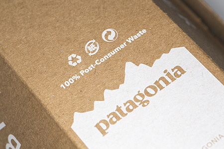
Patagonia: Eco-Conscious Branding and Packaging Patagonia’s commitment to sustainability extends to every facet of its branding. Their product tags and packaging are made from post-consumer recycled paper and printed with soy-based inks. This reduces waste and aligns with their broader environmental mission. As Wendy Jedlicka highlights in Packaging Sustainability, Patagonia’s approach demonstrates the power of integrating sustainable practices into business strategy while maintaining strong visual appeal.
Patagonia: Eco-Conscious Branding and Packaging
Google: Digital Sustainability Practices Google exemplifies energy-efficient digital design. Their teams implement lightweight design strategies, reducing website energy consumption and enhancing user experience. By optimizing code, compressing images, and utilizing renewable energy-powered servers, they lead in reducing the digital carbon footprint, as discussed in Green Graphic Design by Brian Dougherty. Their approach highlights the importance of applying sustainability principles to digital media, an often-overlooked aspect of graphic design.
Google: Digital Sustainability Practices
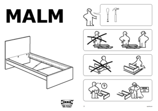
IKEA: Circular Design Innovations IKEA’s design ethos extends to sustainability in packaging and product instructions. Their flat-pack furniture not only reduces transportation emissions but also showcases minimal ink usage in manuals. Additionally, IKEA’s commitment to offering modular, repairable furniture emphasizes the importance of designing for longevity, a concept championed in Cradle to Cradle by William McDonough and Michael Braungart.
Ikea’s Minimalistic Manuals
Lessons Learned from Best Practices
These examples demonstrate that sustainable design is both achievable and beneficial:
Collaboration is Crucial: Sustainable solutions often emerge from partnerships with suppliers and innovators, such as Patagonia’s use of eco-conscious printing processes.
Scalability is Possible: From global leaders like Google to smaller studios adopting waterless printing, sustainable design principles can be applied at any scale.
Consumer Engagement Matters: Design doesn’t just reduce environmental harm, it also educates and inspires consumers to make more sustainable choices.
Challenges and Opportunities
Despite progress, designers still face hurdles when implementing sustainable practices:
Cost Barriers: Eco-friendly materials and processes can be more expensive, especially for smaller projects.
Knowledge Gaps: Many designers lack access to training or tools for sustainable workflows.
Client Resistance: Convincing clients of the value of sustainability often requires presenting evidence of its long-term benefits.
References
Dougherty, B. (2008). Green graphic design. Allworth Press.
Jedlicka, W. (2011). Packaging sustainability: Tools, systems, and strategies for innovative package design. Wiley.
McDonough, W., & Braungart, M. (2002). Cradle to cradle: Remaking the way we make things. North Point Press.
Recycled Paper: Premium options like Mohawk Options or Neenah Environment ensure high quality while using post-consumer materials.
Eco-Friendly Certifications: Work with suppliers certified by the FSC or Rainforest Alliance.
Environmental Impact Calculators The Environmental Paper Network provides tools to estimate the environmental costs of paper choices and explore sustainable alternatives.
Digital Tools
Website Carbon Calculator: Estimate the energy consumption of websites to identify optimization opportunities.
Ecofont: A typeface designed to reduce ink consumption during printing.
Packaging Design Resources
Packaging design offers significant opportunities for innovation in sustainability. In Packaging Sustainability: Tools, Systems, and Strategies for Innovative Package Design, Wendy Jedlicka highlights examples of eco-friendly packaging solutions that illustrate the principles of sustainable design:
Apple’s Minimalist Packaging: Designed with fewer components and made from recycled materials, Apple’s packaging reflects a commitment to efficiency and sustainability.
Apple’s Minimalist Packaging
Patagonia’s Recycled Content: By using post-consumer recycled materials, Patagonia minimizes environmental impact and aligns packaging with its broader environmental mission.
Biodegradable Innovations: Certain brands are now utilizing plant-based materials like cornstarch polymers, which decompose more easily in the environment.
Refillable or Reusable Packaging: Products like refillable containers for cosmetics and personal care items reduce waste by encouraging multiple uses.
References
Jedlicka, W. (2011). Packaging sustainability: Tools, systems, and strategies for innovative package design. Wiley.
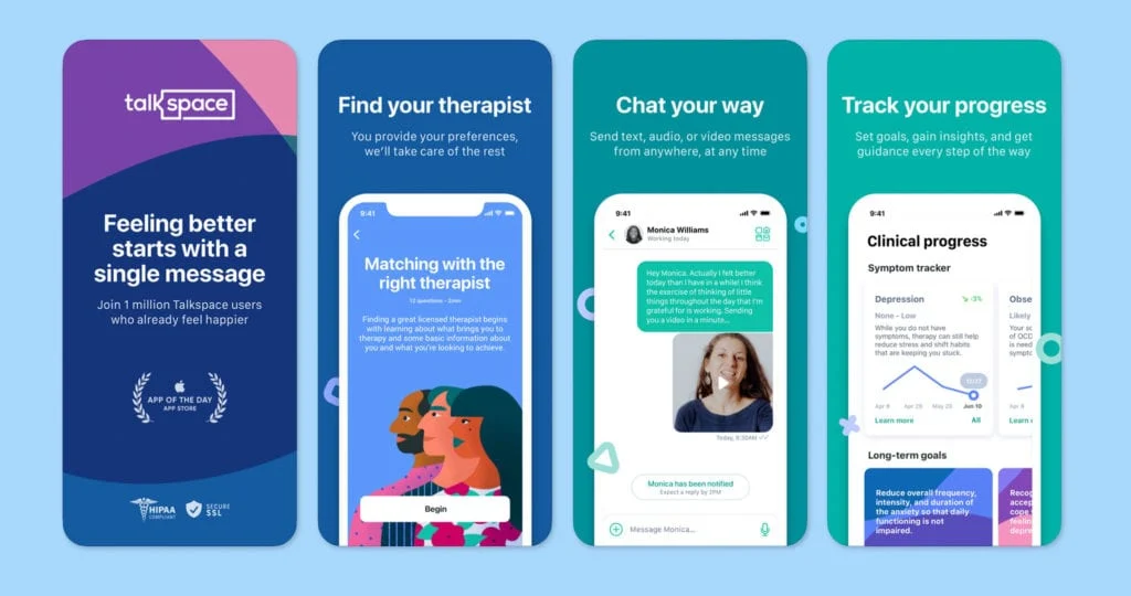
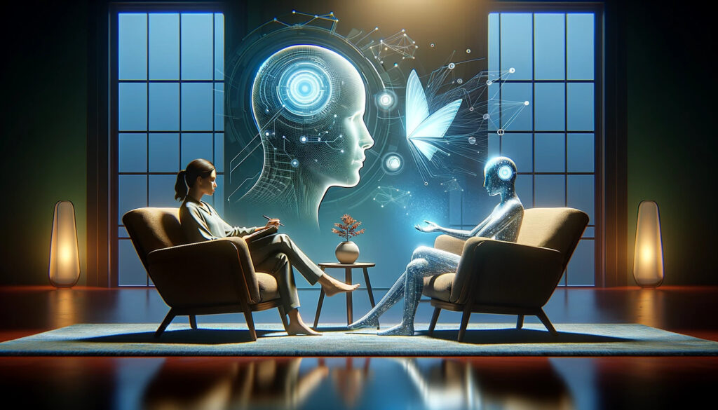
In today’s fast-paced world, stress and anxiety are part of daily life for many people. Finding mental health support has never been more important, but traditional therapy is often expensive and hard to access. That’s where technology comes in. Apps like Calm, Headspace, Wysa, BetterHelp, and Talkspace are helping millions of people take care of their mental health by offering tools like guided meditation, mood tracking, AI-powered chatbots, and even direct access to therapists.
Smartphones have made mental health care more accessible than ever. Mobile health apps offer a private and convenient way to improve mental well-being, breaking down barriers like cost, access, and stigma. There are now hundreds of thousands of health apps, with a significant number focused on mental health, and they’re popular with both users and clinicians. However, there are still concerns about security, privacy, and how effective these apps really are.
One of the most exciting developments in this space is the use of chatbots, AI-powered tools that allow users to have conversations about their mental health. These chatbots are available 24/7, creating a safe space for users to share sensitive information without fear of judgment. They can also provide immediate support when human connections aren’t available. But they’re not perfect. Sometimes their responses are too simplistic or even wrong, which can frustrate users. And while some people find chatbots comforting, others may rely on them too much, which could lead to feelings of isolation.
These tools have incredible potential, but there’s still room to improve. How can we design these apps to be even more effective? How do we make them feel personal and calming? Can design and artificial intelligence work together to create better tools for mental health support? These are the questions I’ll explore in this blog series, focusing on how thoughtful design, like intuitive layouts, smooth transitions, and calming animations, can make a difference. I’ll also look at how AI can act as a “digital companion” that provides personalized and empathetic support.
Central Research Questions
This project focuses on two key questions:
How can UX/UI design elements make mental health apps more calming and accessible?
What role can AI play in providing personalized and empathetic mental health support?
To answer these questions, I’ll look at how clear navigation and interactive features can help users feel more relaxed and supported. I’ll also explore how chatbots and AI systems can create a sense of trust and connection by feeling more human and empathetic. Finally, I’ll consider ethical issues, like protecting user privacy while using data to personalize the experience.
Why This Matters for Designers
Good design isn’t just about making something look nice, it’s about solving problems and improving people’s lives. Mental health apps are a great example of how design can make a real difference. Micro-interactions, like a gentle animation when you complete a task, can help users feel supported and motivated. These small touches might seem minor, but they create a sense of care and connection.
Colors also play an important role. Calming shades of blue and green can help users feel more relaxed, while warm tones, used sparingly, can create feelings of safety and comfort. Simplicity is key: clear, uncluttered layouts can help users navigate the app without feeling overwhelmed.
Information architecture – how content and features are organized, is another critical piece. A well-designed app might prioritize frequently used tools like mood tracking or journaling, while keeping other features easily accessible but out of the way. This reduces mental load and ensures users can focus on their well-being.
What makes this project especially exciting is the opportunity to design for emotional connection. It’s not just about functionality, it’s about creating an experience that feels personal and meaningful. With mental health challenges on the rise, designers have a chance to create tools that genuinely help people feel better.
Challenges I Expect to Face
Designing mental health apps comes with unique challenges. Personalization is essential, but it requires sensitive user data, which raises concerns about privacy and security. People need to feel confident their information is safe, so building trust is a top priority.
Another challenge is finding the right balance between simplicity and functionality. Apps need enough features to be useful, but too many can overwhelm users. Testing and user feedback will be crucial to getting this right.
The design also needs to avoid overstimulation. Too many animations, notifications, or bright colors can cause stress instead of reducing it. Ensuring the design feels calm and supportive is key.
Chatbots, while promising, present their own challenges. Poorly designed responses can frustrate users or even cause harm in a crisis. Making chatbots feel empathetic and reliable, while avoiding over-dependence, will require thoughtful design and testing.
Have you ever used ChatGPT to ask for advice or encouragement, like it’s a therapist? I have. It made me realize how much potential AI has to provide meaningful support. Mental health is something we all deal with at some point, and the idea of creating tools that make support more accessible feels deeply personal to me.
This project isn’t just about building an app, it’s about creating something that feels like a companion. A tool that understands what users need, offers comfort, and helps them feel calmer and more in control. Combining thoughtful design with AI to make a real impact on people’s lives is what excites me most about this project.
What’s Coming Next
In the upcoming blog posts, I’ll explore topics like color psychology and how specific colors can create calming digital environments. I’ll also dive into micro-interactions and how small design details, like animations and transitions, can make apps feel more intuitive and relaxing.
Another focus will be analyzing successful mental health apps, such as Calm, BetterHelp, and Wysa, to understand what makes them work. I’ll also look closely at the potential and challenges of chatbots, exploring how they can provide round-the-clock support while addressing their current limitations, like handling crises and overly simplistic responses.
The ultimate goal is to develop a foundation of ideas for creating mental health apps that blend thoughtful design with AI. These could include guidelines or even a prototype that shows how these ideas come to life in a practical, user-friendly way.
Sources
“BetterHelp | Professional Therapy With A Licensed Therapist.” BetterHelp. Accessed: Dec. 2, 2024. [Online.] Available: https://www.betterhelp.com/
“Calm – The #1 App for Meditation and Sleep.” Calm. Accessed: Dec. 2, 2024. [Online.] Available: https://www.calm.com/
“Headspace: Meditation and Sleep Made Simple.” Headspace. Accessed: Dec. 2, 2024. [Online.] Available: https://www.headspace.com/
M. D. R. Haque & S. Rubya. (2023). An overview of chatbot-based mobile mental health apps: Insights from app description and user reviews. JMIR mHealth and uHealth, 11, e44838. https://doi.org/10.2196/44838
M. Neary & S. M. Schueller. (2018). State of the field of mental health apps. Cognitive and Behavioral Practice, 25(4), 531–537. https://doi.org/10.1016/j.cbpra.2018.01.002
The K-pop industry is deeply rooted in visuality and design. The carefully decided visual elements, from album covers and music videos to stage outfits and choreography, play a central role in the global appeal of K-pop. In the following, it is explored how visuality and design shape the branding of K-pop, with an emphasis on the construction of identity, the role of fashion, and the impact of media aesthetics in creating a consistent and powerful image.
The Role of Visual Identity in K-pop
At the core of K-pop branding is the creation of a unique visual identity for each idol or group. This visual identity includes not only the appearance of the idols but also the overall aesthetic that is used to represent the group’s concept. K-pop groups are known for reinventing themselves with each album or comeback, adopting new concepts, fashion styles, and visual themes that keep their brand new and engaging.
For example, the girl group BLACKPINK has consistently maintained a dual visual identity: “black” represents their fierce and edgy side, and “pink” reflects a softer, more glamorous side. This contrast is mirrored in their fashion, music videos, and promotional content, allowing fans to easily recognize their brand (Kang, 2020).
Album Design and Conceptual Imagery
Album covers, photo books, and promotional materials are crucial tools for establishing a group’s visual identity. K-pop agencies invest heavily in creating concept-driven album designs that reflect the group’s narrative and style. Each album release becomes an opportunity to express the group’s evolving image through design, often including specific colors, textures, and motifs that align with the concept of the music.
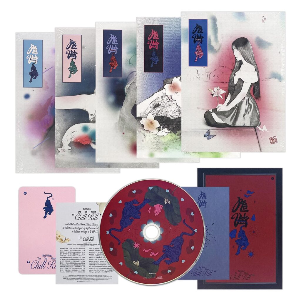
For instance, Red Velvet’s album designs often emphasize the contrast between the “red” (bold, energetic) and “velvet” (soft, elegant) sides of their concept. The album covers use a combination of strong, eye-catching colors and luxurious textures to reflect these contrasting themes.
Music Videos as Visual Branding Tools
Music videos are perhaps the most significant platform for K-pop artists to showcase their visual branding. The high-budget, cinematic quality of K-pop videos sets them apart from Western music videos, with intricate choreography, extravagant set designs, and dramatic costume changes that emphasize the group’s identity. According to Lee (2021), K-pop music videos function not only as promotional tools but as full-fledged artistic expressions that integrate visual storytelling with sound, offering fans an immersive experience.
The music video for BTS’s “Blood Sweat & Tears” is a prime example of how visual aesthetics can enhance the branding of a group. The video is filled with complex symbolism, artistic references, and surreal imagery that connect with the group’s ongoing narrative about personal growth, struggle, and self-awareness. The careful selection of colors, lighting, and set design communicates deeper emotional and philosophical messages, adding layers to the group’s image that resonate with global audiences.
Fashion and Styling as a Branding Strategy
Fashion plays a pivotal role in K-pop branding, as idols are often seen as style icons whose outfits become instant trends. Designers and stylists work with K-pop agencies to create signature looks for idols that align with the group’s concept and image. These fashion choices are not simply about clothing—they are an extension of the group’s brand and identity.
For instance, Stray Kids have been known for their bold and experimental style choices that reflect their energetic, youthful, and at times rebellious identity. Stray Kids’ wardrobe is often a mix of streetwear, high fashion, and industrial elements, conveying their raw, authentic image.
The members’ individual styles also contribute to the group’s overall branding. Each member has a distinct fashion sense, ranging from minimalist and sleek (Bang Chan’s leather jackets and fitted outfits) to more daring and bold looks (Hyunjin’s experimental streetwear styles). These personalized fashion choices add a layer of individuality to their collective identity, allowing fans to connect with the group on a deeper level.
Choreography and Stage Design as Visual Branding
K-pop idols are known for their highly synchronized, visually stunning dance routines that not only demonstrate their talent but also reinforce the group’s identity. The performance of these choreographies, combined with the visual elements of lighting, set design, and camera work, creates a cohesive aesthetic that is memorable for audiences.
For example, ITZY’s choreography is designed to reflect empowerment and confidence, aligning with their brand identity as a girl group that encourages self-expression and independence.
The Interplay of Visuality and Narrative in K-pop Branding
Creating a Cohesive Visual Storyline
In K-pop, the visual elements are often tightly interwoven with the group’s narrative and concept. Each album cycle tells a story, and this narrative is conveyed through the design elements—whether through the progression of album concepts, the symbolism in music videos, or the evolution of fashion styles. K-pop agencies carefully concept this narrative, ensuring that every visual detail serves a purpose and enhances the group’s overarching theme.
Engaging Fans through Visual Content
In K-pop, fans are deeply invested in the visual branding of their favorite idols, often forming strong emotional connections to the aesthetic choices that define each group. The use of fan-centric visual content, such as teaser images, behind-the-scenes footage, and concept photos, keeps fans engaged and involved in the branding process. This content provides fans with a sense of exclusivity, making them feel like they are part of the group’s visual journey.
Moreover, the growing importance of social media platforms like Instagram, Twitter, and Weverse allows fans to engage directly with the group’s visual identity. Fans frequently interact with idol photos, share concept images, and even create their own fan art based on the group’s aesthetics. This fan-driven content not only strengthens the group’s branding but also fosters a sense of community and belonging.
Conclusion
Visuality and design are at the heart of K-pop branding. From album art and music videos to fashion and stage design, every visual element serves to create a distinct identity for K-pop groups that resonates with fans worldwide.
Ultimately, K-pop’s mastery of visual branding has transformed it into a multi-sensory experience, where music, fashion, and visual design work together to create an immersive and unforgettable global phenomenon.
Sources
Kang, H. (2020). *Fan-driven Marketing and K-pop: The Role of Fans in Shaping Identities and Brands*. Asian Journal of Communication, 30(4), 435-450.
Kim, Y. (2019). *Fashion as Branding: The Role of Style in K-pop’s Global Appeal*. Fashion Theory, 23(2), 227-247.
Lee, J. (2021). *Music Videos as Visual Branding Tools in K-pop*. Journal of Media and Communication Studies, 23(1), 15-27.
Es sollte eine Kunst-Ausstellung in Zusammenarbeit mit einem visuellen Künstler erstellt werden. Dabei soll den kreativen Prozess des Künstlers/der Künstlerin durch die Messung von Gehirnströme mittels EEG während der Entstehung seiner Gemälde beobachtet werden. Die EEG-Daten werden anschließend durch generative Designs in statische Grafiken übersetzt und als großformatige Drucke neben den jeweiligen Gemälden präsentiert, um den Besuchern einen Einblick in den kreativen Schaffensprozess zu geben. Ein interaktiver Teil ermöglicht es den Besuchern, selbst ein EEG-Gerät auszuprobieren und ihre Gehirnaktivitäten in Echtzeit als visuell ansprechende Grafiken zu erleben. Das Projekt verbindet Kunst und Technologie, indem es komplexe, dynamische biologische Daten in greifbare, visuelle Kunstwerke transformiert.
Diese Idee und Ausstellung fände ich auch persönlich sehr spannend. Jedoch bin ich sehr abhängig von einer zweiten Person, was ich erstmal vermeiden will. Ohne die zweite Person und der Ausstellung handelt es sich hauptsächlich um ein grafisches Projekt, in dem Gehirnströme Dargestellt werden. Finde ich interessant, jedoch habe ich die Befürchtung, dass hier im Laufe der Arbeit viel Wissen im Medizinischen/Neurologischen Bereich angehäuft wird. Mir ist jedoch sehr wichtig, dass ich in meiner Masterarbeit Fähigkeiten in Bereichen vertiefe, die ich beruflich weiterverfolgen will.
Also kommt hier eine neue Idee
Idee ist die Entwicklung einer digitalen, interaktiven Galerie in Form einer Web-App. Diese Galerie wird als Plattform dienen, auf der selbst entwickelte interaktive Kunst- und Designexperimente präsentiert und von den Nutzern entdeckt werden können. Der Schwerpunkt liegt dabei auf visueller Kreativität und Animation. Die “digitale Galerie” würde eine Sammlung von Animationen und Designexperimente beinhalten, die mithilfe von Tools wie p5.js, Processing, Canvas.js und Greensock realisiert werden. Besucher der Website haben die Möglichkeit, in Echtzeit mit den Animationen zu interagieren und verschiedene visuelle Effekte zu erkunden. Die Galerie könnte kontinuierlich erweitert werden, indem neue Projekte und kreative Experimente hinzugefügt werden.
Forschungsfrage: “Wie können interaktive Web-Anwendungen, die auf visueller Kreativität und Animation basieren, das Benutzererlebnis verbessern und zur Erkundung künstlerischer Inhalte anregen?“
Eingrenzung: Das Projekt könnte sich speziell auf die Frage konzentrieren, wie Nutzer durch interaktive visuelle Elemente in Echtzeit mit den Inhalten interagieren. Dies könnte untersucht werden, indem verschiedene Arten von Animationen und Interaktionen (z. B. Mausbewegungen, Klicks oder Gesten) getestet werden, um herauszufinden, welche Designs die Benutzer am stärksten einbinden. Darüber hinaus könnte das Thema auf den Einsatz bestimmter Technologien wie p5.js und Greensock begrenzt werden, um deren jeweilige Stärken im Hinblick auf kreative Coding-Experimente und Animationen zu erforschen.
Aber ich bin noch nicht wirklich zufrieden mit dem Thema, bzw. brauche ich noch konkreten Kontext oder eine spannendere Forschungsnische. Darum geht die Suche nach einer Idee weiter. Momentan sind mich noch folgende Varianten von dieser Idee eingefallen:
Genauere Verfeinerung
Psychologische Wirkung von Web-Animationen
Forschungsfrage: Wie beeinflussen visuelle Stile und Interaktionsmöglichkeiten die Wahrnehmung von Animationen im Web?
Ansatz: Experimentieren mit unterschiedlichen visuellen Stilen (z. B. minimalistisch, überladen) und untersuchen, wie diese die Aufmerksamkeit und das emotionale Erlebnis der Nutzer beeinflussen.
Forschungsfrage: Inwiefern unterscheiden sich Nutzererlebnisse zwischen statischen Designs und dynamischen, interaktiven Animationen?
Ansatz: Erstellung von zwei Versionen der Galerie (statisch und dynamisch) und A/B-Tests durchführen, um die Auswirkungen auf Engagement und Nutzerzufriedenheit zu messen.
Forschungsfrage: Welche Interaktionstypen (z. B. Mausbewegung, Touch, Gesten) fördern das Engagement mit animierten Webinhalten?
Ansatz: Implementation von verschiedene Interaktionsmöglichkeiten und Tests, welche Art von Input (z. B. Gestensteuerung vs. Maussteuerung) zu mehr Engagement und positiverem Feedback führt.
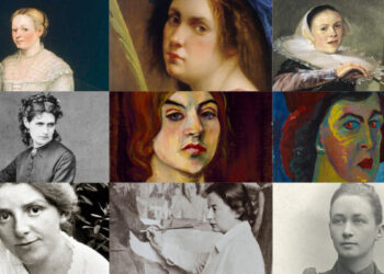
Ich fände es auch spannend, die einzelnen Unterseiten an weibliche Künstlerinnen der Geschichte zu widmen und den jeweiligen Stil an ihre Kunst anzulehnen. Also „moderne, digitale Kunstgalerie zur Representation von Künstlerinnen der Geschichte“ zu erstellen.
Forschungsfrage: Wie können interaktive, digitale Kunstgalerien genutzt werden, um das Bewusstsein für die Werke und den Einfluss weiblicher Künstlerinnen der Geschichte zu fördern und die Nutzererfahrung zu bereichern?
Ethik und Inklusion: Bewusst auch weniger bekannte Künstlerinnen, insbesondere aus unterrepräsentierten Regionen oder Communities.
Designvielfalt: Experimente mit der Frage, wie sich klassische Kunststile in ein digitales Medium übersetzen lassen, ohne ihren Charakter zu verlieren.
Dieses Thema ist allgemein wichtig, weil weibliche Künstlerinnen in der Kunstgeschichte oft übersehen oder marginalisiert wurden, obwohl sie einen bedeutenden Beitrag zur kulturellen und kreativen Entwicklung geleistet haben. Als kreative Feministin ist es mir natürlich besonders ein Anliegen.
Public spaces like parks, squares, and plazas are essential to urban life. These areas should offer opportunities for relaxation, escaping the busy city life and connection with others. But, most of the time people are for themselves, lacking meaningful interactions. This phenomenon is particularly striking in urban neighborhoods, where anonymity is growing, and the sense of community is shrinking. However, several studies have shown that belonging to a community has a positive effect on people’s mental and physical health (Cramer, Pawsey 2023), (Kitchen, Williams, Chowhan 2011). Baumeister and Leary (1995) describe belonging even as a fundamental human motivation.
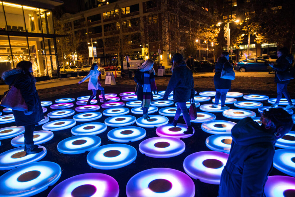
Therefore, the research investigates if interactive installations have the potential to transform the public space into an environment that breaks the social isolation by creating playful experiences that invites people to interact with the installation itself and create a space that encourage social engagement. Can such shared experiences between different people of different background and ages help to strengthen the sense of belonging, strengthen the community and connection within a neighborhood and create a space where people come together?
Personal motivation I am living in a new neighborhood with a great nice park as the center of it, which actually could be a great place of community and interactions. However, the park is rarely used by residents of the neighborhood, primarily due to its lack of amenities. Only few weeks ago few benches were installed, but overall, the space remains largely uninviting.
Next steps In the next step, I would like to take a closer look at urban design with a focus on public spaces. How are they defined and what must be considered when constructing a public space. I also want to focus on the social dimensions of public spaces. In the second part of research I will dive deeper into the design aspect. That includes learning about interactive installations, the different types available, tools and methods used to create them and studying best practices.
Bringing all these topics into a cohesive concept and finding a type or direction for interactive installations that can be universally used in different public spaces, can be challenges during this research.
Literature K. M. Cramer and H. Pawsey, „Happiness and sense of community belonging in the world value survey“, Current Research in Ecological And Social Psychology, Bd. 4, S. 100101, Jan. 2023, doi: 10.1016/j.cresp.2023.100101.
P. Kitchen, A. Williams and J. Chowhan, „Sense of Community Belonging and Health in Canada: A Regional Analysis“, Social Indicators Research, Bd. 107, Nr. 1, S. 103–126, März 2011, doi: 10.1007/s11205-011-9830-9.
Baumeister, Roy F. and Leary, Mark R., “The Need to Belong: Desire for Interpersonal Attachments as a Fundamental Human Motivation”, Psychological Bulletin 1995, Vol. 117, No. 3, 497-529
Teil 1: Pyro-Advektion – Dynamische Partikeleffekte leicht gemacht
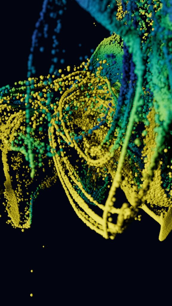
In diesem Abschnitt möchte ich eine Technik vorstellen, die ich kürzlich entdeckt und mit Begeisterung getestet habe: Pyro-Advektion. Diese Methode ermöglicht es, beeindruckende visuelle Effekte in kurzer Zeit zu erzeugen.
Die Grundidee hinter Pyro-Advektion ist wie folgt: Auf einem Trägermaterial (z. B. einem Mesh) wird ein sogenannter Pyro-Emitter platziert, der Rauch- oder Feuereffekte generiert. Über diesem Trägermesh wird eine weitere Ebene mit Partikeln eingefügt. Jeder Partikel wird dann mit einem sogenannten Pyro-Advektionstag versehen. Das bedeutet, dass die Partikel von den erzeugten Rauch- oder Feuereffekten beeinflusst und mitgetragen werden.
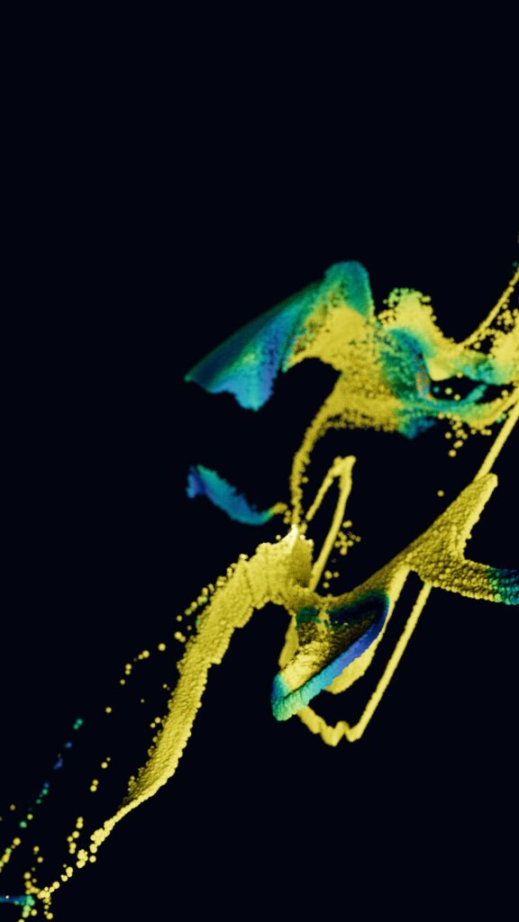
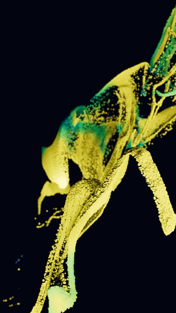
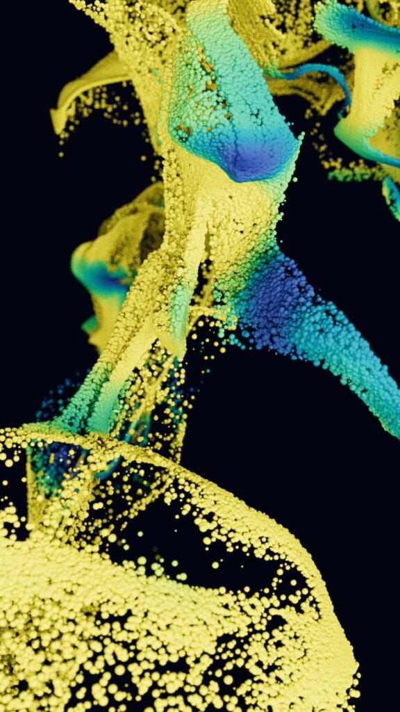
Schaltet man den eigentlichen Pyro-Effekt aus und zeigt nur die Partikel, entstehen organisch wirkende, dynamische Simulationen. Diese Technik könnte nicht nur in kreativen Animationen, sondern auch bei spezifischen Projekten wie Video-Mapping oder Objektanimationen in der Kirche wertvolle Dienste leisten. Hier ein Beispiel aus meinen Tests, das den beeindruckenden visuellen Charakter dieser Methode zeigt.
Teil 2: Subsurface Scattering – Licht und Material realistisch simulieren
Ein weiterer faszinierender Effekt in der 3D-Animation ist das Subsurface Scattering. Diese Technik simuliert, wie Licht durch ein Objekt dringt und dabei teilweise von seinem Inneren reflektiert wird. Ein gutes Beispiel ist Wachs: Wird eine Lichtquelle an die Seite eines Wachsklumpens gehalten, scheint das Licht durch das Material hindurch, wodurch ein weicher, diffuser Effekt entsteht.
Während Subsurface Scattering schon lange in der 3D-Welt bekannt ist, war es traditionell rechnerintensiv und oft schwer zu kontrollieren. Mit modernen Tools wie Cinema 4D (insbesondere in Verbindung mit Redshift) ist dieser Effekt jedoch einfacher und effizienter zu erzielen. Ich habe verschiedene Modi und Einstellungen getestet und konnte beeindruckende Ergebnisse bei deutlich kürzeren Renderzeiten erzielen.
Gaussian Splatting und Polycam: Neue Möglichkeiten für 3D-Scans
Im zweiten Teil des Blogeintrags möchte ich mich intensiver mit Gaussian Splatting und der Plattform Polycam befassen. Polycam bietet eine beeindruckende Möglichkeit, 3D-Modelle von Objekten zu finden oder selbst zu erstellen. Die Plattform enthält zahlreiche bereits gescannte Objekte, einschließlich solcher aus dem kirchlichen und christlichen Kontext, was für meine Projekte besonders spannend ist.
Ich habe einige dieser Scans heruntergeladen, um sie in Testszenen zu verwenden. Eine dieser Statuen wird sogar in einem anderen Projekt zum Einsatz kommen. Soweit ich das beurteilen kann, stammen die meisten Scans auf Polycam von Amateur*innen, die z. B. Smartphones wie iPhones für das Einscannen nutzen. Dennoch sind die Ergebnisse bemerkenswert. Die Dateien, die in der kostenlosen Version im GLTF-Format bereitgestellt werden, lassen sich unkompliziert in Cinema 4D importieren. Sie enthalten sogar Texturen und können direkt bearbeitet werden. Anbei drei Renderbeispiele mit Skulpuren aus Polycam, Licht, Textur, Compositing in C4D
Für mein Vorhaben in der Kirche stellt dies eine hervorragende Technik dar: Kunstwerke und Strukturen können schnell und effizient in 3D-Modelle umgewandelt werden. Leider besitze ich derzeit kein iPhone, plane aber, mir eines auszuleihen, um selbst Scans durchzuführen. Im Stadtpark von Graz habe ich bereits einige Skulpturen entdeckt, die sich für 360-Grad-Scans eignen. Dort möchte ich verschiedene Testreihen durchführen, um die Qualität und Anwendbarkeit der Technik zu prüfen.
Positive Aspekte und Herausforderungen von Polycam
Ein großer Vorteil von Polycam ist die einfache Bedienbarkeit und die Möglichkeit, auf eine riesige Sammlung von gescannten Objekten zuzugreifen. Für kreative Projekte ist dies ein wahrer Schatz: eine Art Baukasten, der eine Fülle von Inspiration und sofort nutzbaren Ressourcen bietet.
Allerdings sind alle Inhalte, die Nutzer*innen hochladen, öffentlich einsehbar. Das führt dazu, dass es auf der Plattform auch weniger hochwertige oder fragwürdige Inhalte gibt. Bei einigen Scans ist unklar, woher die Objekte stammen oder unter welchen Bedingungen sie gescannt wurden. Für ernsthafte Projekte muss also eine sorgfältige Auswahl getroffen werden.
Teil 4: Rendersetup und praktische Umsetzung
Für die kommenden Projekte plane ich, mein Rendersetup zu optimieren. Dazu werde ich wieder auf Shadowcloud zurückgreifen, um komplexe Simulationen wie Partikelsysteme oder großflächige Animationen effizient zu rendern. Ein Monatsabo bietet die nötige Flexibilität für Tests und finale Renderings.
Teil 5: Inspiration durch Aron Demetz
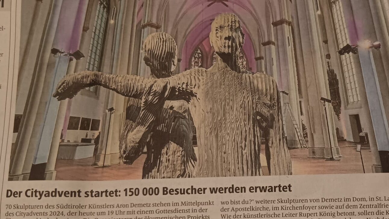
Eine spannende Entdeckung zum Abschluss: In meiner Heimatstadt Münster findet derzeit eine Ausstellung des Südtiroler Künstlers Aron Demetz statt. Er arbeitet mit Holz und erschafft beeindruckende Skulpturen, die durch ihre Detailliertheit und emotionale Tiefe bestechen. Besonders interessant ist, dass diese Ausstellung in der Überwasserkirche stattfindet – ein Kontext, der stark mit meinen eigenen Masterarbeitsideen korrespondiert.
Ich plane, mich mehr mit Demetz’ Arbeiten auseinanderzusetzen, da sie eine spannende Schnittstelle zwischen traditioneller Kunst und moderner Ästhetik bieten. Seine Werke könnten wichtige Inspirationen für mein eigenes Projekt liefern.
In this blog, I will research the ways of extending the perception of art in museums that can help emerge into art, understand the context and meaning of the work, and connect with the artwork, its time, and its artist on a deeper level. My initial idea of expanding interaction with art was only 3D scanning and printing in a way of presenting a reproduction of the original relief, color, and small details next to the original work. So that the audience could quite literally touch the art they consume and perceive it not only with sight but touch as well, that could be a way to open more interpretations, and emotions gained from art. However, I believe it could be not only touch but other senses involved. What if you could start hearing, feeling the temperature, tasting, and touching the already existing piece of art, that was previously only seen from far?
My motivation initially stemmed from my interest in visual art. As someone interested in painting, I find many small details of art fascinating, particularly the texture and relief of the paint. Usually, in galleries and museums, it is not allowed to approach a painting closely, let alone touch it. However, I believe it would be a truly wonderful experience to touch the artwork and feel the thick, rigid brushstrokes, droplets, and highlights with my own hands. This gave me the idea of recreating the relief of the original painting so that visitors could touch the art and feel a stronger connection with the artist who lived centuries ago. However, later I realised a bigger problem and respectively a bigger idea. It is not only about the interest in touching a piece of art but deeply immersed in the history and the context of art.
Studies have determined that the average time a person spends gandering at a piece in a museum is between 15 seconds and 30 seconds. That’s plenty of time to figure out what the image is attempting to represent (or not, if you’re looking at abstraction). But that’s not nearly enough time to fully experience the work. Given this fact, we should also consider the average attention span of the adult at this day and age, which is just 8. 25 seconds. Hence, it is not a rarity to see a person not willing to read a description of the art and to just look at it for a few seconds. Sometimes we can even see people not stopping once in a museum, sometimes we see bored public yawning while listening to a guide, sometimes there are no guides or descriptions at all, only art behind a barrier and glass.
In fact, a large number of people are interested in art and want to visit different cultural sites. Of course, the percentage depends on cultural, educational, and personal factors, but the study’s 2017 edition, based on answers from 27,969 respondents, found visual and performing arts attendance overall up by 3.6% since 2012, with 132.3 million U.S. adults (53.8% of all U.S. adults) attending a visual or performing arts activity at least once in the previous year. However, a deeper understanding of art is available for visitors who have formal art education or deep familiarity with art history, the majority engage at a surface level. One of the main problems of an existing barrier to understanding is a lack of accessible or engaging information. Thinking about a younger audience we can more prominently point out the fact that they need more interactivity and technology in museums.
So what are the existing tools in museums that help get into the history and the context of the specific artwork? Let’s start with the most trial and common ones: information panels, audio guides, guided tours, talks, brochures, and booklets. Relatively new ways to explore art in museums – online databases, interactive maps online on museum apps and websites, social media posts, quizzes, and treasure hunts. Also thematic installations and interactive technologies such as AR, VR, and Interactive displays. I would like to focus on the last two categories and start a deeper research on them.
In the upcoming posts, I would like to first understand a little bit about how people behave in museums and how they perceive art in museums. Later I need to learn about the existing experiences of museums incorporating interactive technologies and analyse their success or errors. I would like to understand the technology of 3D scanning and printing, in which museums is this embodied and how and what lessons can be learned from their experience. Apart from 3d, there are plenty of other ways to interact with the public that must be studied in this blog. The question is why these tools are not widespread in the museums, how can they be enhanced to bridge the gap between seeing and understanding art?
Keeping up with doctor’s appointments, scheduling, looking for printed medical findings from 2 years ago, these are all outdated processes everyone still deals with. With online portals like ELGA, the Austrian Government has started the process of digitizing the Austrian Healthcare system. Still, there is room for improvement.
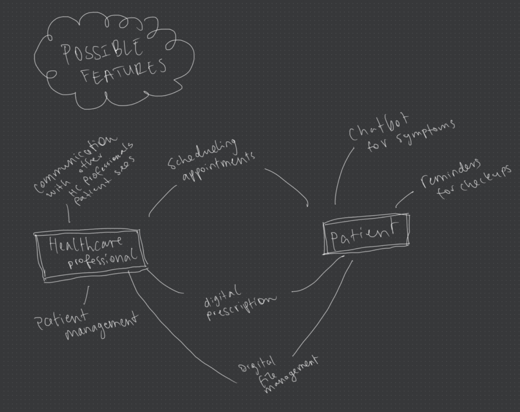
This thesis explores the rollout of a national health administration tool designed to streamline processes, improve data accessibility, and foster better communication among healthcare providers and patients. An all-in-one tool, where patients and healthcare professionals can communicate, confidently share information, and – most importantly – prioritize the patient’s health efficiently.
A key focus of this thesis is to investigate whether patients are willing to embrace digital health tools within the national health administration framework, particularly given the sensitive nature of health-related topics. By conducting surveys and interviews, the research will assess patient attitudes, digital literacy, and perceived barriers to adoption.
The main challenge here is to fit the needs of a extremely broad user group. The needs and pain points of the healthcare professional and the side of the patient will be examined in order to find out wether or not such a tool could be realistic, or if the concerns data privacy outweigh the benefits.
In this blog I would like to identify best practices, challenges, and opportunities for creating a more efficient and user-centered health administration system.
Personal Motivation
I’ve always struggled with keeping up with medical appointments, as I’m sure most of you do. After I moved to Graz in October and faced the challenge of finding new doctors I was shocked at how difficult it is to find a doctor (in various fields) that takes new patients.
I was wondering how mortality rates could be tied to the challenges of getting regular medical checkups and found this study that confirmed my hypothesis (McQueenie, 2019): Missed appointments are a major indicator of all-cause mortality, especially among individuals with mental health issues. Current primary healthcare appointment systems fail to effectively address the needs of these patients. Therefore, future interventions must prioritize strategies to enhance attendance to regular doctor’s appointments.
My plan is to further investigate the touchpoints we have with the health care system and find difficulties and challenges. I would also like to ask around in my friend group (kind of like a informal mini survey) to see if they agree that this is an issue and what they find challenging so I can see what other topics I should focus on.
eHealth Strategie Österreich https://www.sozialministerium.at/Themen/Gesundheit/eHealth.html Powell, John & Arvanitis, Theodoros. (2015). Welcome to the Digital Health revolution. Digital Health. 1. 10.1177/2055207614561571.
Joaquin, J. G. (2023). Designing for health: A guide to health and wellness technology.
Hartlep, M. (2015). Durchblick trotz Wolke: Verwaltung von osteopathischen Praxen per Software. https://doi.org/10.1016/S1615-9071(15)30011-3
Klauber, u. a. Krankenhaus-Report 2019 : Das digitale Krankenhaus.https://permalink.obvsg.at/fhj/AC15332383
McQueenie R, Ellis DA, McConnachie A, Wilson P, Williamson AE. Morbidity, mortality and missed appointments in healthcare: a national retrospective data linkage study. BMC Med. 2019 Jan 11;17(1):2. doi: 10.1186/s12916-018-1234-0. PMID: 30630493; PMCID: PMC6329132.