#05 Visualization Impacts: How Data and Gamification Drive Eco-Consciousness

In a world saturated with information, visualization and gamification have emerged as powerful tools to simplify complex ideas, improve learning, and influence behavior. When it comes to sustainability, presenting data visually—through tools like infographics, interactive apps, or gamified experiences—can significantly boost awareness and motivate eco-conscious actions or promoting digital sustainability.

The Power of Data Visualization

Data visualization transforms abstract numbers into meaningful insights. Studies show that:

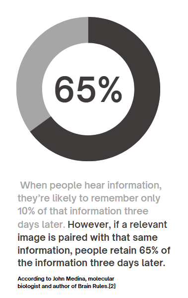
90% of information transmitted to the brain is visual, and people process visuals 60,000 times faster than text. Infographics, charts, and other visual tools increase the likelihood of remembering information , this means that carbon emissions, energy usage, or waste statistics—often hidden in dense reports—become instantly understandable when visualized. For example, seeing a pie chart that breaks down carbon emissions by activity makes it easier to grasp where one’s biggest impacts lie.

Gamification Makes Learning Stick

Gamification—adding game-like elements such as goals, rewards, or challenges—enhances engagement and motivates users to take action.

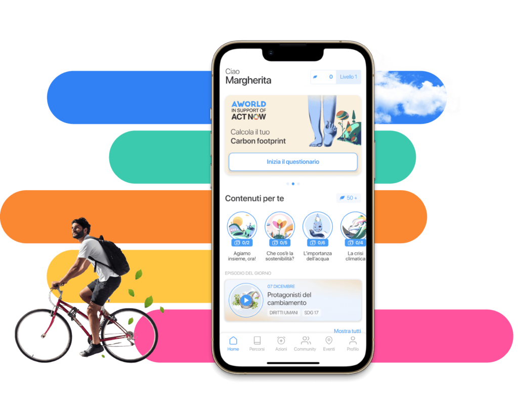
  • Gamified apps like eco2log, which track and reward users for reducing their carbon footprint, turn data into a journey of self-improvement.
  • Users are more likely to retain information and build habits when feedback is interactive and rewarding.

For example, an app might visualize a user’s digital energy use (like GB streamed) as a tree. The tree thrives when they make sustainable choices, such as streaming in lower resolutions or reducing data usage.

Successful Examples of Visualization in Action

UN’s Carbon Footprint Calculator
The United Nations’ online tool uses interactive sliders and graphs to show how choices in transport, food, and housing affect emissions. It’s an excellent example of visualizing complex data in an engaging, accessible way.

https://peggada.com/en/4-apps-to-help-you-calculate-and-reduce-your-carbon-footprint/

Chasing Ice Documentary
This film used stunning time-lapse visuals of melting glaciers to drive awareness of climate change. The emotional impact of visuals was a key factor in its success.

Piktochart Campaigns
Infographics created with platforms like Piktochart have simplified sustainability statistics, making them widely shareable on social media and accessible to non-expert audiences .

Visualization has the potential to transform how we understand and act on sustainability. When data is clear, engaging, and actionable, it sticks with us—and motivates change.

Resources:
https://www.tiny.cloud/blog/content-visual-imagery-guide/#stk-2-6

https://piktochart.com/blog/data-visualization-statistics/#the-effectiveness-of-data-visualization

#04 Can awareness help?

How do the users behave and respond to design interventions, such as carbon impact calculators or green streaming options? In the next paragraphs I would like to describe one scientific research from Germany made in January 2024 aimed to understand how feedback from the CFTA eco2log app affects consumer behavior and their carbon footprint.

The Study

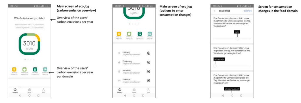
This research involved 216 university students who used the CFTA eco2log app—a tool designed to calculate individual carbon emissions in four major consumption areas: mobility, food, heating, and household activities. Participants entered their current consumption habits into the app, which provided detailed feedback on their carbon footprint, both overall and in each domain.[1]

Screenshots of the App, https://www.sciencedirect.com/science/article/pii/S0959652623041392#dfig1

After receiving feedback, participants planned modifications to their consumption and entered these future plans into the app. The app then recalculated their estimated emissions based on these planned changes, giving participants an opportunity to reflect on their behaviors and make more sustainable choices.[1]

Key Findings

Awareness Sparks Action

The study revealed that awareness drives change. When participants were confronted with their actual carbon footprint, they were motivated to plan significant reductions in their emissions. On average, participants aimed to reduce their overall carbon emissions by 22.5%.However, the reductions varied by domain:

  • Household activities saw the largest reduction (34.7%).
  • Heating came next (26.9%), followed by food (16.4%).
  • Mobility had the smallest reduction (12.0%), and this change was only marginally significant.

Feedback Drives Domain-Specific Changes

Interestingly, the app’s feedback was most effective in encouraging changes in the exact area where it highlighted high emissions. For example, feedback about high emissions from heating inspired participants to plan significant reductions in heating-related consumption. There were minimal cross-effects—feedback on one domain (e.g., mobility) didn’t strongly influence behavior in other areas (e.g., food).

Awareness Gaps

The study also showed that participants struggled to estimate their carbon footprint accurately, especially in specific domains. While they could gauge their overall footprint somewhat reliably, they often underestimated or overestimated emissions in individual areas like food or heating. This underscores the importance of tools like the CFTA app, which provide precise, data-driven feedback.[1]

What Does This Mean for Sustainability?

The study demonstrates that design interventions like the CFTA eco2log app can effectively encourage more sustainable behaviors by raising awareness and providing actionable feedback. However, it also highlights the need for tailored approaches. Not all users respond equally—some changes, like reducing food-related emissions, require different strategies than those for mobility or household activities.

Conclusion

Awareness alone is a powerful first step, but tools that provide specific, domain-focused insights are key to driving meaningful, lasting behavior changes. The principles tested in the study—awareness, actionable feedback, and domain-specific insights—are equally relevant and powerful in encouraging more sustainable behaviors in the digital world. Creating tools to measure and share the energy footprint of online activities could be the first step toward a greener digital future.

Resources:

[1] Stefan Hoffmann, Carbon footprint tracking apps. Does feedback help reduce carbon emissions?,
Journal of Cleaner Production, Volume 434, 2024, 139981, ISSN 0959-6526,https://www.sciencedirect.com/science/article/pii/S0959652623041392#dfig1

#4 Editorial Illustration

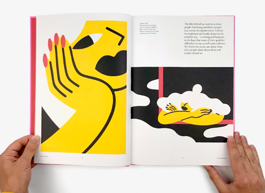
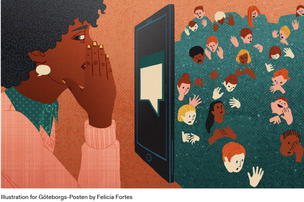
Editorial illustrations are creative and artistic images used in print and digital media such as magazines, books, newspapers, or even social media articles and blogs. These illustrations are meant to visually represent the content of the text or support a message.

Editorial illustrators have a responsibility, especially when dealing with sensitive topics like politics, society, race, or gender. The way they present these topics can significantly influence how readers perceive them. They need to be aware of the possible impact of their representations and ensure their work doesn’t reinforce stereotypes or prejudices. This ethical responsibility is an important part of editorial work.

Purpose

The main role of editorial illustrations is to make text easier to understand. They help to explain complex or abstract ideas more clearly and can evoke emotions that bring the reader closer to the topic. By highlighting certain aspects of the content, illustrations can emphasize key points or leave room for interpretation. In addition to engaging with the text, illustrations also help capture the reader’s attention and break up monotonous text.

Styles and Techniques

Editorial illustrations can use different styles depending on the message or mood that needs to be conveyed. These can range from traditional hand-drawn images to modern digital designs. Techniques like collage, infographics, or minimalist drawings are also common. The style often depends on the medium. For example, graphics in internet blogs may use simple, flat designs, while children’s books often feature more playful and detailed illustrations.

The creative process

The creative process in editorial illustration involves several steps. First, illustrators need to understand the themes and concepts of the article or story to create relevant and appealing visuals. They typically work closely with editors or art directors to make sure their illustrations support the main message of the text clearly and effectively. It’s also important for illustrators to work within the required deadlines for publication.

Resources

#03 Everyday impact of basic individual actions online

Whether we’re scrolling through TikTok, sharing moments on Instagram, or firing off texts and emails, our days are filled with digital interactions. These actions feel easy and harmless, but they carry an environmental cost many of us overlook. By understanding the true cost of our digital habits, we can take small, informed steps toward reducing our online carbon footprint.

Which age group has the biggest impact?

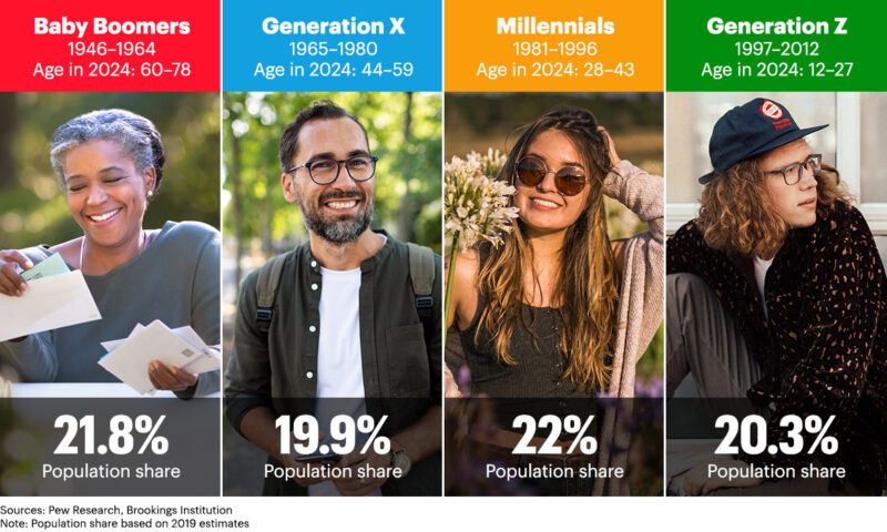
While all age groups contribute to the digital carbon footprint, it’s no surprise that Gen Z has the largest impact. Individuals aged 18-24 send an average of 124 text messages per day, which results in 652.3 grams of CO2 annually. This is roughly equivalent to a 5 km car ride! In comparison, older age groups, like those aged 55 and above, produce significantly fewer emissions. It’s important to recognize that while younger generations are the most active digital consumers, their habits also present an opportunity for change. [1]

https://www.quad.com/insights/leaving-the-nest-as-generation-z-comes-of-age-household-care-brands-see-a-golden-opportunity-for-growth

The Environmental Impact Of “Doom Scrolling”

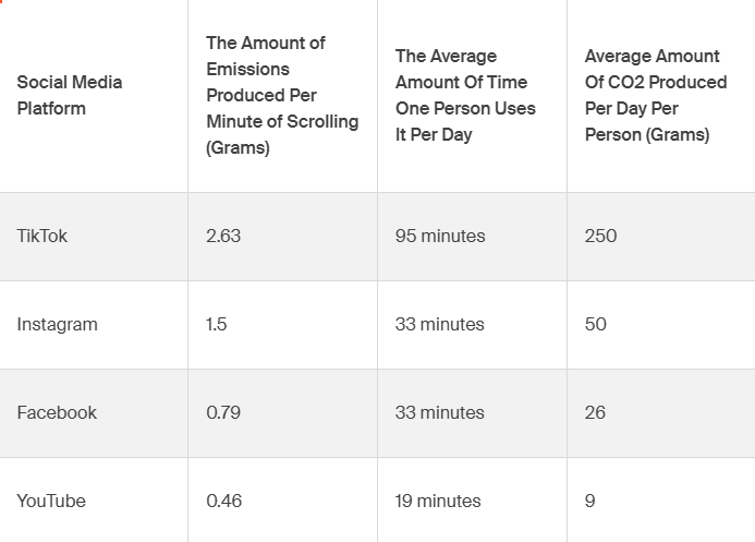
Social media platforms like TikTok and Instagram are part of daily life for billions of people. However, each minute spent scrolling contributes to a significant carbon footprint due to the energy consumption of the data centers that power these platforms. TikTok, for instance, emits 2.63 grams of CO2 per minute of use. With an average user spending 95 minutes per day on the app, this results in over 250 grams of CO2 daily, which is comparable to driving a car for 4 km. [1]

Which social media platforms produce the most emissions? 

Not all social media platforms have the same environmental impact. TikTok leads the way in terms of emissions, as its video-heavy content consumes more data and energy. On average, TikTok emits 2.63 grams of CO2 per minute of use. Instagram follows closely behind, with its visual-based content requiring significant data storage. Platforms like Facebook and YouTube also contribute heavily due to their massive user bases and video streaming services, making them some of the most energy-intensive platforms to use.

“To put this even more into perspective, air travel emits around 133 grams of CO2 per mile per passenger for short-haul flights. So, doom-scrolling for one day equates, on average, to the same emissions for about seven passengers per mile on one of these flights.[1]”

The Environmental Impact Of Mindless Texts And Emails

Even sending a simple “LOL” or a quick “OK” by text adds up. In the U.S., the average person sends 61 texts per day, and each message emits 0.014 grams of CO2. Over a year, this equates to 310 grams of CO2, or the same as charging your phone 32 times. Similarly, sending work emails can have a surprisingly large environmental cost. On average, each email contributes about 2 grams of CO2, leading to over 2,000 grams per year.[1]

Resources:

[1] Cody Slingerland, Tech Carbon Footprint: How Much Does Online Activity Contribute To Emissions? https://www.cloudzero.com/blog/tech-carbon-footprint

What Tesla Got Right (and Wrong) About UX/UI Design

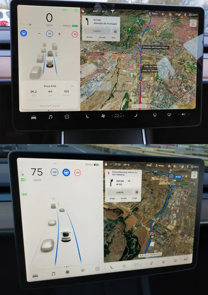
Tesla has long been a leader in transforming the way we think about cars, especially when it comes to technology and user experience. The company’s bold design decisions, such as the large touch interface, have revolutionised the automotive industry. But with innovation comes both praise and criticism. Here’s a closer look at what Tesla’s UX/UI design has done well – and where it could improve.

(Source: https://ecomento.de/2019/09/02/tesla-model-3-interieur-jetzt-ohne-leder/)

What Tesla has done well:

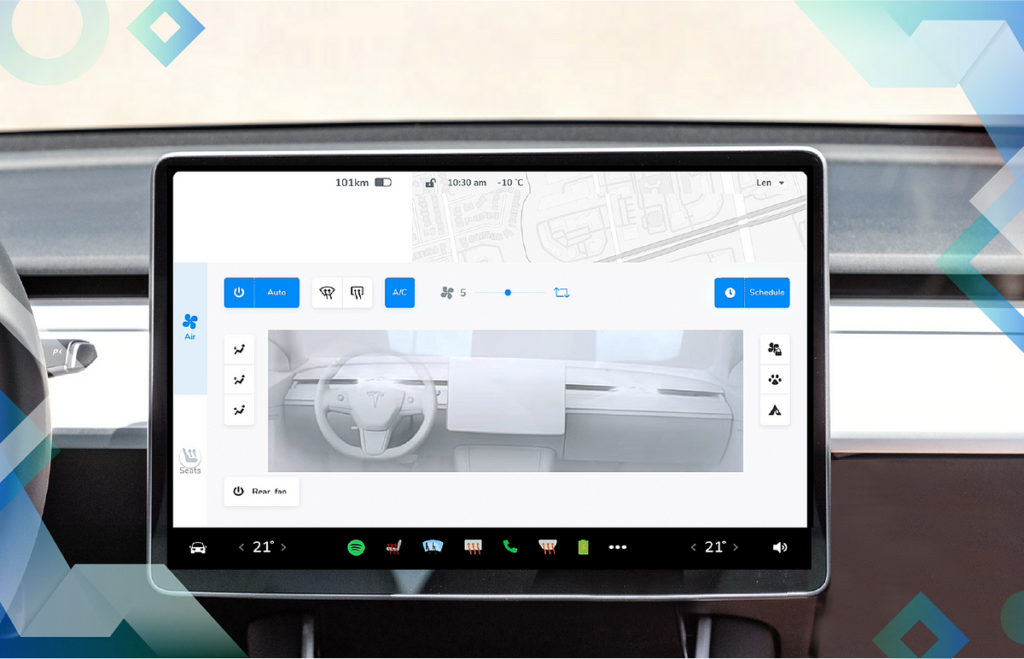
One of Tesla’s most notable contributions to the automotive world is its minimalist design, especially in the dashboard of its vehicles. The central touchscreen of the Tesla Model S and Model 3 is sleek and streamlined, allowing users to interact with many of the car’s features through an intuitive digital interface. The move has eliminated the need for many physical buttons, simplifying the driving experience and creating a more modern, technically advanced feel.

Tesla also stands out by integrating software updates through an over-the-air (OTA) system. This means that, even after purchase, a Tesla car is continually upgraded with new features and bug fixes delivered directly to the vehicle, similar to how smartphones are updated. This user experience flexibility is a game changer in automotive design.

(Source: https://uxplanet.org/case-study-wellnesslivings-ux-ui-design-team-s-enhancements-to-tesla-s-new-v11-0-dashboard-design-21730e00178e)

What Tesla did wrong:

However, not all aspects of Tesla’s UX/UI have been widely complimented. One of the most common criticisms is the size and placement of some of the buttons on the touchscreen. Many users find that adjusting basic functions like the HVAC system or wipers while driving can be frustrating. These controls are often small and not always intuitively located, making it difficult for drivers to access them quickly and safely.

Another common complaint is the lack of customisation of Tesla’s infotainment system. Unlike some competitors, Tesla does not offer Apple CarPlay or Android Auto, which could provide users with additional navigation options, such as Waze integration. While Tesla’s large map display is much appreciated, the system lacks route planning for multiple destinations, which can be a significant annoyance for users who rely on complex navigation for their trips.

(Source: https://uxplanet.org/analyzing-the-new-tesla-ui-2020-48-26-8dccd52dd594)

Opinion:

Overall, Tesla has pushed the boundaries of automotive UX/UI design, making cars more like smartphones on wheels. The integration of cutting-edge technologies like touchscreen interfaces and OTA updates has changed the face of the industry. However, the company needs to continue to refine its design, especially when it comes to usability during active driving. As Tesla and other manufacturers continue to innovate, it will be interesting to see how they manage to balance futuristic design with practical and user-friendly interfaces that keep safety and ease of use in mind.

References:

https://uxmag.com/articles/teslas-groundbreaking-ux-an-interview-with-user-interface-manager-brennan-boblett

https://www.invisionapp.com/inside-design/tesla-ui-design/

https://ux.rachelsdesign.com/tesla-case-study/

https://uxplanet.org/case-study-wellnesslivings-ux-ui-design-team-s-enhancements-to-tesla-s-new-v11-0-dashboard-design-21730e00178e

The Future of Automotive UX

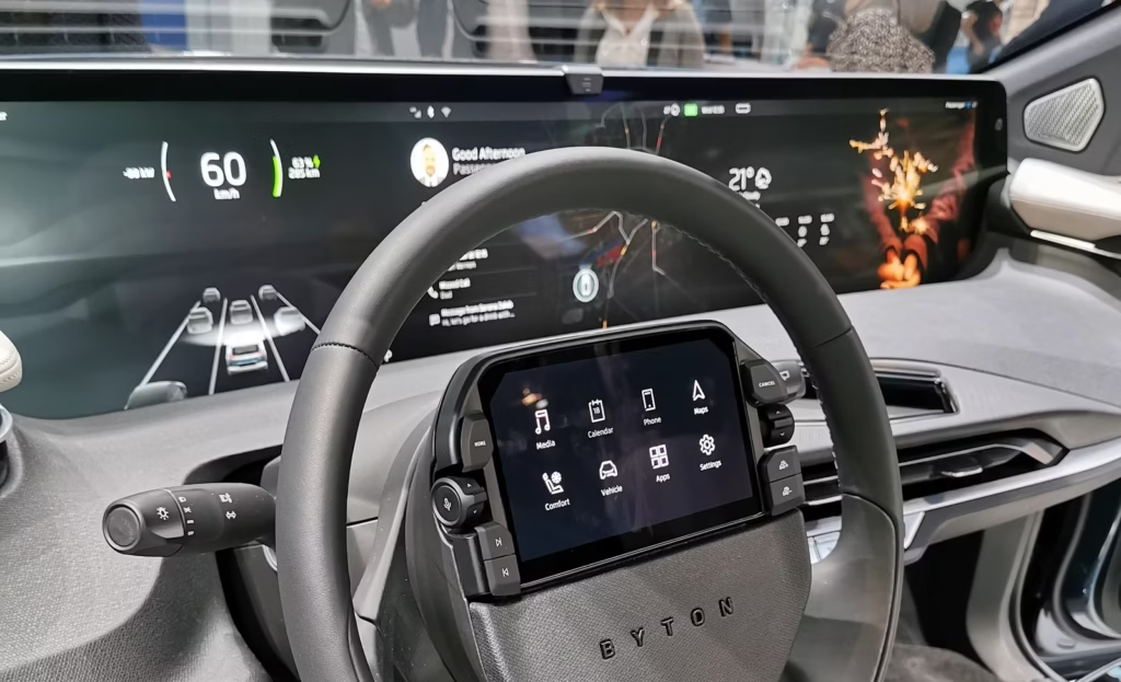
The automotive industry is undergoing a change and user experience (UX) design is at the forefront of this development. As vehicles become more connected, intelligent and user-centric, the future of automotive UX promises to redefine the way we interact with cars. Below is a look at the key developments that are shaping this future.

Sustainability and Intelligent Design

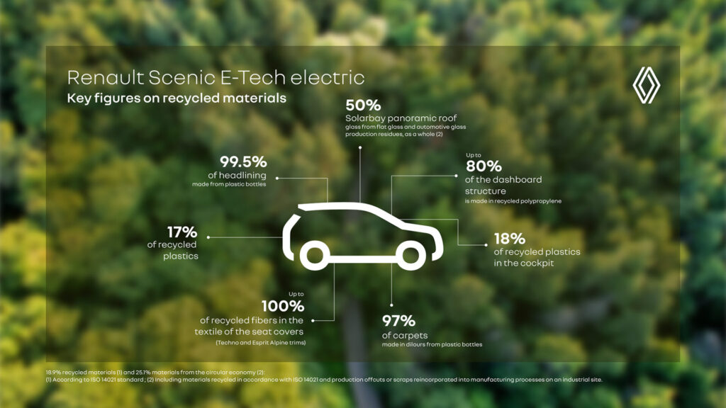
As sustainability becomes a global priority, automotive UX is adapting to promote eco-friendly practices. Game-based interfaces encourage fuel-efficient driving behaviours, while electric vehicles (EVs) offer advanced features such as intelligent climate control systems that optimise energy use. In addition, automotive manufacturers are incorporating sustainable materials into vehicle interiors to align with environmental goals.

(source: https://www.renaultgroup.com/en/news-on-air/top-stories-2/design-talks-eco-design-rewrites-the-future-of-cars/)

Advanced Driver Assistance Systems (ADAS)

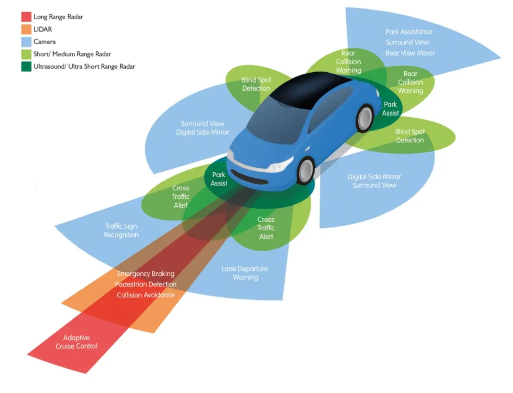
Safety remains at the forefront of automotive UX innovation. Advanced Driver Assistance Systems (ADAS) include features such as forward collision warning, lane departure warning, adaptive cruise control and automated parking. These technologies not only improve safety, but also reduce driver stress by taking over repetitive or difficult tasks.

(Source: https://www.wardsauto.com/vehicles/transforming-the-future-of-vehicle-ownership-with-adas-technology)

AI-driven personalisation

Artificial Intelligence (AI) is revolutionising the in-car experience by enabling hyper-personalisation. Vehicles are now able to learn user preferences, such as seat positioning, climate control and entertainment choices, to create tailored experiences. AI-powered voice assistants are also becoming more intuitive, enabling natural conversations that eliminate the need for memorised commands. This integration of generative AI enhances convenience while fostering a deeper connection between users and their vehicles.

(Source: https://www.ramotion.com/blog/automotive-ux-design/)

References:

https://nix-united.com/blog/ai-in-automotive-a-new-edge-of-the-automotive-industry/

https://www.uxconnections.com/future-trends-and-innovation-in-the-automotive-industry/

https://rightware.com/blog/the-future-of-automotive-ux-from-the-designers-perspective/

https://medium.com/@sreelakshmis.dilip/exploring-the-latest-trends-in-automotive-ux-a39ec4f9e95c

1.1. Bridging the Physical and Digital Worlds: Transforming Museum Experiences through Interactive Technologies

Traditional museum experiences typically involve passive observation. However, by integrating interactive technologies such as touch screens, VR/AR, and motion-sensing installations, museums can improve their exhibits and make them more engaging. Additionally, incorporating DIY elements that allow visitors to create or contribute actively ensures a participatory and enriching experience.

Research Question and Sub-Questions
My central research question is:
How do DIY elements (visitors creating their own experience) and interactive technologies improve engagement and retention in learning within museums?

This question is supported by sub-questions like:
How can these methods be adapted for different age groups?
Can these methods foster community building within museum spaces?
Can DIY experiences remain truly “hands-on” when combined with advanced tech?

DIY Elements:
DIY elements in museums enable visitors to actively engage by creating or developing exhibits. This hands-on participation boosts creativity, problem-solving, and a deeper connection to the content, improving both engagement and learning. Studies show that visitor satisfaction increases significantly when exhibits involve personal input, with 49% of respondents preferring interactive exhibits. [1]

Interactive Technologies:
Technologies like AR, VR, and motion sensors offer dynamic, immersive experiences, enriching emotional and intellectual engagement. AR overlays digital content on physical exhibits, while VR transports visitors to virtual spaces, increasing their understanding. Research highlights how these technologies create personalized, engaging experiences. [2]

image source: Science Museum

Relevant Institutions
A list of museums and science centers that I intend to explore in greater depth. This research will focus on their exhibits, educational programs, and the impact they have on the community.

Personal Motivation
By exploring this topic, I hope to uncover creative methods to make museums more interactive and engaging. My goal is to transform these spaces into environments where learning is enjoyable and becomes a shared adventure. In doing so, I hope to help people connect with one another and create memorable experiences that they can truly enjoy together.

Next Steps
In the next steps, I plan to:

  • Analyze existing examples of interactive museum experiences. (reference “Relevant Institutions”)
  • Investigate how community building happens through cooperative DIY activities.
  • Evaluate the impact of interactive exhibits on information retention.
  • Compare non-technology-based tangible interactions to those using tech in museum settings.

Sources

  1. X. Li, “Interactive elements in museum design,” Journal of Museum Studies, vol. 15, no. 3, pp. 211–230, 2020.
  2. D. Baker and R. White, “The effectiveness of digital technologies for the visitor’s experience,” Journal of Digital Learning, vol. 11, no. 2, pp. 145–160, 2018.
  3. Exploratorium. [Online]. Available: https://www.exploratorium.edu.
  4. Science Museum. [Online]. Available: https://www.sciencemuseum.org.uk.
  5. CoSA Graz. [Online]. Available: https://www.museum-joanneum.at/cosa-graz.
  6. Experimentarium. [Online]. Available: https://www.experimentarium.dk.
  7. The Tech Interactive. [Online]. Available: https://www.thetech.org.

Multimodal Typography

Typographic metalanguage/multimodal typography and how it influences our sense of culture, identity and belonging

After a lot of brainstorming and research (which took a long time, since my idea of a topic is extremely broad and doesn’t satisfy my wish for a clear vision of its potential) the topic I decided to go further into is typography and its communicative power beyond the words you read. 

The paper “typographical landscaping” poses some interesting views on this: 
Letterforms, types, and scripts are always emplaced or spatialized, and situated within specific temporal trajectories. They are part of the semiotic landscape, or, rather, of historically layered semiotic landscapes that we move through or that “move” in front of our eyes in a constant interplay of discourses, genres, and styles interacting with land, built environment, and bodies. Thus, landscape can be understood as both a view and a representation of a view. (Source)

Everyone is aware of the example of Blackletters/Fraktura as the probably best known connection of culture/society and typography, so I won’t go into that as much. More interesting to me in the first part of this were examples from other cultures and times, but also Kurrent (German Cursive Writing), which also suffered under the Nazi Regime, and had to give up its post as the main writing system in Austria. Lesser known than Fraktur, Kurrent currently is being forgotten by most as we speak, since it was last taught in schools during the second world war and shortly after. The question now is, if this uprising and downfall of Kurrent, though obviously in connection with cultural developments, had any influence of its own, and cultural relevance it carried and that has thus been left behind. (Source)

In multicultural areas with multiple languages like Switzerland, the use of typography can help to unite or separate. With 4 official languages and therefore no uniform national language, typographical, linguistic and writing systems contribute to the sense of national identity and belonging, and help overcome internal cultural differences. (Source)

This parallels the development of Devanagari as a national script in India, uniting the different writing systems and languages to shape the national identity. Devanagari uses unified Glyphs, that then are adjusted in pronunciation according to the area and language. (I would personally compare it to latin writing being used in different languages with mostly the same glyphs, but the research into Devenagari has been minimal so far so I wouldn’t bet on it.) (Source)

One example that goes a bit more into linguistics that the graphic part of writing and typography is the “appropriation of the letter k in the Spanish linguistic landscape”, where instead of using regular ways of writing words that include c or qu, anarchists protested the rules of the language, by replacing it with a k instead. This started being picked up by not only people but also corporations, as for example a spanish bank employed this writing quirk in their ads, on one hand recognizing this show of protest, while on the other hand trivializing it. This lead to some of the groups that started the movement, to abandon it all together after it was picked up on this scale. (Source)

Thus, not only does typography pose a playground to subvert rules and create protests, but can turn into a political, cultural and societal battleground when these movements are picked up by outsiders, bystanders, or people profiting off it. In “Is your font racist? Metapragmatic online discourses on the use of typographic mimicry and its appropriateness”, Dimitrios Meletist talks about the practice of typographic mimicry. This term describes typefaces that are created to resemble another script (for example “Chinese Style” latin typefaces. In the article, typographic mimicry is handled as a practice highly influential on society and culture, as well as public perception of the mimicked culture, due to reinforced or -established stereotypes. (Source)

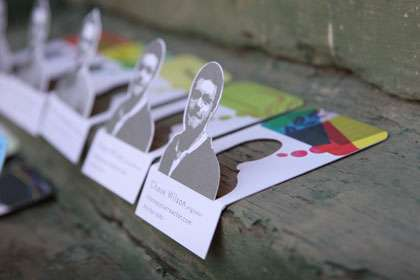
From 2D to 3D with the Laser cutter

My research on the “Trotec Laser Cutter” in our FabLab at the FH has provided insights in the design possibilities with paper and thicker flat materials and turning them into 3 dimensional works. The laser cutter allows for three primary operations: engraving, etching, and cutting, from which you can obtain foldable shapes for displays or prototypes.

Artistic Designs

When working on artistic or decorative projects where precise dimensions are less critical, the kerf’s impact can often be disregarded. In these cases, the focus shifts to the aesthetic aspects and the overall visual appeal of the design, enabling greater creative freedom.

Proof-of-Concept or Rapid Prototyping

In the early stages of a project, such as proof-of-concept development or rapid prototyping, speed and iteration often take precedence over precision. At this stage, accounting for kerf may not be necessary. Quickly fabricating prototypes allows for efficient testing and refinement of the design without being hindered by minor details like kerf adjustments.

Inspiration

Possible Materials

Kerf cutting

This is a technique that takes advantage of the kerf by weakening your material to allow for flexible sections (shown below). This works best in thinner wood materials, with downloadable templates

Understanding and accounting for kerf is an important aspect of designing for laser cutting. Kerf refers to the width of material that is removed during the cutting process, resulting in the laser beam vaporizing or melting away a small portion of the material. While kerf may seem like a minor detail, it can affect the overall dimensions and fit of your final design. There are instances where considering kerf is crucial:

  • Interlocking Parts: If you’re designing parts that need to fit together snugly, such as puzzle pieces or interlocking joints, you must account for the kerf. Failing to adjust the design for kerf could result in parts that are too loose or too tight, compromising the functionality of the final assembly. In such cases, you can offset the design by the kerf width to ensure a precise fit.
  • Enclosures and Boxes: When creating enclosures or boxes with tabs and slots, the kerf should be taken into account to achieve proper alignment and fit. Without accounting for kerf, the slots may be too narrow, preventing the tabs from fitting correctly, or they may be too loose, resulting in an unstable structure. By adjusting the design dimensions based on the expected kerf, you can ensure the pieces fit together seamlessly.
  • Dimensional Accuracy: If your design requires precise dimensions, such as when creating parts that need to fit into existing objects or mechanisms, accounting for kerf is essential. Neglecting to adjust for kerf could lead to components that are slightly larger or smaller than intended, affecting the overall functionality and fit of the final product.

Resources:

Designing for Connection: The Impact of Social Validation in the Digital Age

Since we’ve been exploring a lot of cognitive- and neuro-basics, that are important to understand the principle behind Neurodesign, I wanted to highlight another very important part, which is important to consider while working on any project. As designers we focus on the creative work, but still our work envolves humans, to understand how to communicate with them through our work is crucial. Hence why I decided to research more on the topic of human behaviour and social structures.

Have you ever attended a church or religious service that was not one that you were used to? It might have gone something like this. You weren’t sure what was going to happen next, people were responding or praying or singing of chanting in what seemed like a foreign language. They seemed to be sitting or standing of kneeling at cues. You surreptitiously stole glances at everyone around you and tried to imitate what they were doing. If everyone stood up and put a paper bag on their heads and turned around three times, you probably would’ve looked to see where your paper bag was.

The question is simple: Why is the behavior of others so compelling to us? Why do we pay attention to and copy what others do? It’s called social validation. An instinctive and biological human need our society has become to guilt trip.

Because most people view themselves as independent thinkers, meaning that they like to think they are unique individuals with their own opinion and thoughts. The truth, however, is, that the need to fit in and belong is wired into our brains and our biology. We want to fit in, because evolutionary we were dependent on our social grouping. This is such a strong drive, that when people are in a unknown social situations, they will look to others to see how to behave. It’s not conscious process we don’t know that we’re doing it. 

THE BYSTANDER EFFECT

In a study from Latane and Darley (1968), participants sat in a room and completed questionnaires. While they completed their paperwork, smoke was released into the room from a vent. The experimental conditions varied:

• In one experimental condition, there was only one subject in the room, and that subject was not aware of the study.

• In another, there were three individuals in the room, but two were aware of the experiment. Those two were instructed to act unconcerned and continue to fill out their questionnaires while smoke filled the room.

• In a third experimental condition, there were three subjects in the room, all of whom were entirely unaware of the experiment.

So what did the people do? Did anyone take action by leaving the room and reporting the smoke? In the first condition, 75 percent of the subjects left the room and reported the smoke. In the second condition, only 10 percent of the subjects left the room and reported the smoke. In the third experiment, 38 percent left the room and reported the smoke. This research supports the notion that we look to others to validate what our behavior should be. The research shows that this is especially true when we’re uncertain about what to do.

In a more recent study on the bystander effect (Markey, 2000), Markey asked whether the bystander effect would also work in chat groups:

• If you asked a question in a chat group, would your sex determine how long it would take to get an answer?

• Would the number of other people (bystanders) in the chat room affect the time it would take to get help?

• Finally, if you asked for help from a specific person and addressed him by name, would you receive help faster?

The results? Gender didn’t have an effect, but the more people who were present in the chat group, the longer it took for someone to get help. Each additional person added to the chat group added about three seconds to the time it took to get help. For example, with only two people in the chat room, it took 30 seconds to get a response. With 19 people in the chat room, it took over 65 seconds to get a response. If you addressed a particular person, then it was as though no one else were in the room, and it took only 30 seconds to get a response.

WHY WOULD YOU LISTEN TO TOTAL STRANGERS?

Imagine you’re at a chain superstore looking for an HD flat-screen television. You stand there and stare at the large wall of HD televisions showing NASCA races. An innocent bystander walks by and you grab him and say “What do you think of this TV? Did you buy one? Would you buy it again if you had to do it all over?” He tells you his opinion and walks away. You grab the next person you see and say, “Hey there, do you have this TV? What do you think of it?” She tells you her opinion and walks away. You are at the store for 13 hours gathering opinions. This goes on until you feel secure in a decision. Sounds absurd? In the “real world,” it is absurd. Online, it’s not so absurd However, you won’t need 13 hours to browse products on a Web site. The online version of consumer feedback is faster. You can gather data by reading ratings and reviews. We will avidly read reviews from total strangers, and these reviews will sway our decision on whether, what, and when to buy. Why? We don’t know who the people reviewing the product are, where they come from, their likes and dislikes, or if they are anything like us-and yet, we trust them. If we see that a product has received only one out of five stars, we don’t even take a closer look. It’s social validation at work. What do others think?

How does social validation affect how we use websites?

Online ratings and reviews influence us greatly-most powerfully at a non-conscious level. There are lots of ways to use ratings. Some are more effective than others. For example, the site that follows doesn’t put any rating information on the first page. We have to click on a specific product before the rating appears. This means they aren’t using social validation as effectively as they could. By waiting until a later screen to show rating information, they risk losing our attention. We may never get to the next screen to even see the ratings.

RECENT RESEARCH ON WEB SITE RECOMMENDATIONS FOR PRODUCTS VERSUS “EXPERIENCES”

Website visitors’ decisions when buying digital cameras (Product Condition) and choosing tourist destinations (Experiences Condition). The researchers were interested in whether recommendations would be equally influential for both products and experiences. When recommendations were provided for a particular item, that item sold 20 percent more volume than an item for which there were no recommendations. If recommendations were provided for a particular travel destination, that destination was selected 10 percent more often than a destination for which there was no recommendation. If a photo of the person accompanied the travel recommendation, the travel experience condition increased to 20 percent. What did others do? Another effective variation is to show what other people actually ended up buying. When the conscious mind kicks in. There is one way the conscious mind might kick in to the conversation. Sometimes (but it’s rare), we start to get suspicious. This usually happens only if we have information that leads us to doubt ratings. For example, a friend of mine used to work at a company that hired people to post positive product ratings. “What if they’re all fake?” she asked. Now her cortex (new brain) is disagreeing with her old brain. Her old brain says, “I want to be like everyone else,” even when she’s not aware it’s saying that. But her new brain says, “Maybe this isn’t accurate data.” The old brain will probably win in the end. If she reads some reviews that are not 100 percent positive, and if the people writing those reviews seem like a “real” person who actually used the product, then the new brain’s objections can be squelched fairly easily.

“Listen to others? Not me, I’m logical”

Ratings and reviews work unconsciously to activate our need for social validation. But they also give us the rationalization we need or want after we have made our decision unconsciously. Data, charts, graphs, and statistics allow us to tell ourselves we are making the wise choice.

TELL ME A STORY

The most powerful ratings and reviews involve narratives and storytelling. Reviewer feedback is most powerful when we know more about the reviewers than just their names and the dates their feedback was posted. We listen more closely to people we know and trust. If we are listening to someone we don’t know, then we will try to (unconsciously) determine if the person is like us. We are also very influenced by stories. Taking this into account, what kinds of ratings and reviews will influence us the most? Were most influenced (in this order) when:

We are most influenced when we know the person and the person is telling a story. It is unlikely that we will be reading a review online by someone we actually know. That brings us then to #2. We are somewhat less influenced when we don’t necessarily know the person, but it’s still someone we can imagine because there is a persona, a name (or company name). Again, it always helps if the person is telling a story. We’re even less influenced when we don’t know the person, and we can’t imagine them, but we are provided with a story. We are least influenced when we don’t know the person, and we’re provided with only a rating.

CONCLUSION

Social validation not only influences our purchase decisions, but it also affects other behavior, such as how we might experience a Website. For example, a highly-rated video might influence us to watch the video ourselves, thereby influencing our behavior. Showing how many people performed a particular action at the Website is powerful. We’re called to act when we know what others have experienced with a product, or we know what they’re doing at a Website, or we even know what they are doing right now. We will do what others are doing. We will be drawn to belong.

Incorporating an understanding of social validation into the education of designers is crucial because it deepens their ability to create meaningful, user-centered designs. As we’ve seen, human behavior is strongly influenced by social dynamics—whether in physical environments or digital spaces. When designers grasp the innate need for connection and the unconscious drive for social validation, they can create experiences that resonate more deeply with users. This insight helps designers craft not only visually appealing projects but also emotionally compelling ones that guide user behavior and engagement. Recognizing that people are drawn to what others are doing, thinking, or experiencing allows designers to predict and influence how their work will be received. By learning these cognitive and social patterns, designers can move beyond aesthetics and build designs that foster community, trust, and a sense of belonging. This approach not only enhances user satisfaction but also drives more effective, purposeful design outcomes. Therefore, integrating these principles into design education ensures that future designers are equipped to create experiences that connect, engage, and ultimately, succeed.