This is a Dior Window Display in winter 2024 – Paper Crafts Store Display Innovation Luxury Dior Visual Merchandising
In the field of luxury visual merchandising, Dior is not only synonymous with fashion brands, but also a beacon of unique creativity and craftsmanship. Throughout its history of window dressing, Dior has always been in tune with contemporary trends and has often been at the forefront of visual merchandising.
Today, as awareness of sustainable development takes root, Dior is living up to its name and putting its brand philosophy into practice. The window display is not only a visual feast, but also a perfect combination of environmental awareness and luxury design, a collision between nature and technology. Through carefully designed props, professional craftsmanship and cutting-edge display technology, Dior once again demonstrates its leadership in visual merchandising.
Merchandising Elements
1. Custom Paper Crafts of Animal Series
Graceful white swans symbolizing Dior’s noble elegance
In an era defined by constant connection, waiting has become a paradox. Moments of pause—once natural and even necessary—are now often filled with distractions like scrolling through our phones. But what if these transitional periods were reimagined not as empty spaces but as opportunities for connection and reflection?
The Psychology of Waiting
Waiting is a deeply human experience. Psychologists describe it as a state that exposes our relationship with time, control, and expectation. Studies reveal that environments can significantly influence how we perceive waiting. Bright lighting and cold spaces, for example, can amplify feelings of impatience, while warm colors and calming sounds can soothe and even shrink our perception of time.
In today’s hyper-individualistic culture, the isolation of waiting is amplified. We are more likely to disengage from the world around us, retreating into personal bubbles of content and communication. The result? Lost opportunities for organic social interactions, empathy, and moments of shared humanity.
Research reveals that our perception of wait times is heavily influenced by anxiety and uncertainty. When we don’t know how long we’ll have to wait or why the delay is occurring, our stress levels increase significantly. This phenomenon is known as waiting anxiety. In contrast, environments that offer clear communication about waiting times or provide distractions can significantly reduce stress, even if the actual wait time remains unchanged.
Designing for Connection
Some designers and artists have taken up the challenge of reimagining these spaces. Studio Swine’s Can City transformed the urban act of waiting into a moment of collaboration and creativity, sparking connections in a city often dominated by hurried routines. In Tokyo, Nakagin Capsule Tower’s compact communal areas emphasized shared experiences in transitional spaces, offering a striking contrast to the isolation of modern architecture.
Reimagining waiting spaces can create environments where connection and interaction take precedence over isolation. One example is the Waiting Room Project by artist Jana Napoli. In this project, Napoli transformed a sterile hospital waiting room into a space designed to encourage social interaction. By incorporating art and communal seating, she helped alleviate the tension and isolation often associated with waiting, turning it into a shared experience.
Waiting in the Age of Fragmentation
Our century has been described as one of “splintered modernity”—a time when our communities, relationships, and even our own attention are fragmented. Waiting, often considered an annoyance or inefficiency, offers a counterpoint to this fragmentation. By embracing it as a communal and reflective experience, we can combat the isolation that characterizes much of modern life.
The design of these spaces can be subtle but impactful. Small interventions—like public seating arranged to encourage conversation or calming elements like plants and natural light—can turn waiting into an act of engagement. The artist Candy Chang’s Before I Die walls are a beautiful reminder of how public spaces can inspire self-reflection while creating a shared narrative of hope and aspiration.
A Return to Rituals
Ultimately, waiting is an ancient ritual—one that, when acknowledged and designed thoughtfully, has the power to reconnect us to ourselves and to others. Instead of rushing to fill every pause with distraction, perhaps we should allow ourselves to feel the weight of waiting.
So next time you’re waiting—whether at a bus stop, in a line, or for an uncertain future—look around. What do you notice? And what might design do to turn that moment into something worth remembering?
Sources Maister, D. H. (1985). The Psychology of Waiting Lines. Ulrich, R. S., et al. (1991). Healing Spaces: The Science of Place and Well-Being. Cambridge, MA: Harvard University Press. Bauman, Z. (2000). Liquid Modernity. Cambridge, UK: Polity Press. Napoli, J. (2013). Waiting Room Project. Studio Swine. (n.d.). Can City. University of Cambridge (2018). Study on communal activities in waiting spaces. Kurokawa, K. (1977). Metabolism in Architecture. London, UK: Studio Vista. Insights into the Nakagin Capsule Tower and its social design.
As most of you know, Austria is always kind of slow with optimizing processes and digitizing traditional burocratic systems. In this blog post I would like to sum up the technology / touchpoints with the main digital health systems you might have come across.
As I’m insured at SVS my experience might differ to yours. My plan is to analyze the differences there are between the different insurances.
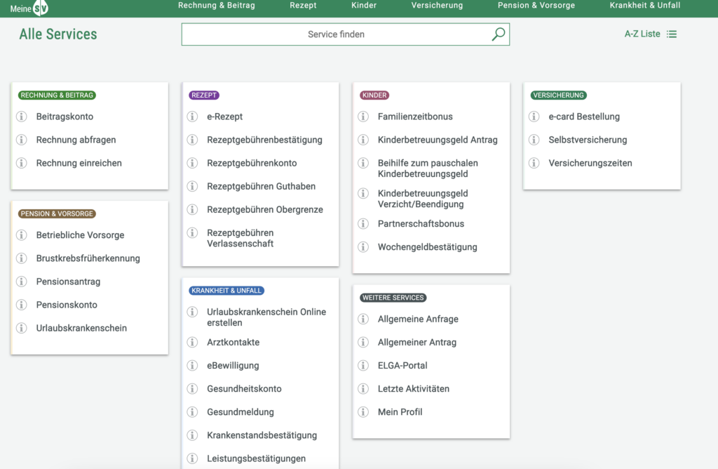
Meine SV
A digital service platform in Austria that serves as a personal online portal for citizens to manage their social security and health insurance matters efficiently. Launched to simplify access to important services and information, MeineSV allows users to handle various administrative tasks related to their social security in a user-friendly manner.
Key features of MeineSV include:
Personalized Access: Users can log in to the platform using their secure electronic identification (e-ID), providing a personalized experience tailored to their individual social security needs.
Comprehensive Services: Through MeineSV, users can access a range of services, such as checking their insurance status, viewing payroll information, and managing health insurance details. This centralization streamlines the process of handling social security matters.
Online Applications: The platform enables users to submit applications for various social security benefits, including pensions, unemployment benefits, and family allowances, all through an online interface.
Document Management: MeineSV allows users to upload and manage relevant documents, facilitating easier communication with social security authorities and reducing the need for physical paperwork.
Information Access: The platform provides users with access to vital information regarding their rights and obligations under the social security system, helping them stay informed about changes and updates.
App
The MeineSV App offers an App for easier access on-the-go.
Elga
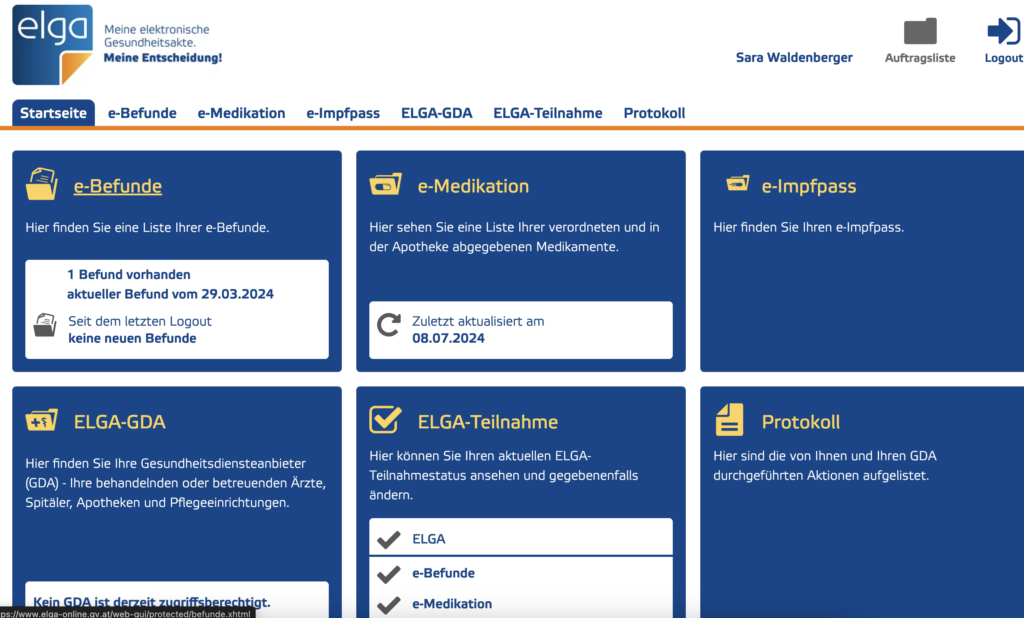
ELGA, or the “Elektronische Gesundheitsakte,” is Austria’s electronic health record system designed to improve the management and accessibility of patient health information.
Key features of ELGA include:
Centralized Health Records: ELGA allows for the storage and sharing of patient health data, including medical history, medications, allergies, and treatment plans, ensuring that healthcare providers have access to up-to-date information.
Vaccination documentation: A digital overview of vaccinations.
Patient Control: Patients have the ability to manage their own health records, granting or revoking access to healthcare professionals as needed. This empowers individuals to take an active role in their healthcare.
Interoperability: The system is designed to ensure that different healthcare providers can easily share information, improving coordination of care and reducing duplication of tests and procedures.
Enhanced Continuity of Care: By providing healthcare professionals with immediate access to a patient’s medical history, ELGA supports better decision-making and continuity of care, especially during emergencies.
Data Security and Privacy: ELGA places a strong emphasis on protecting patient data, implementing strict security measures to ensure the confidentiality and integrity of health information.
Currently there is no mobile application of Elga.
What is missing?
Both online portals have significant benefits that should be combined into one system in my opinion. One significant feature that is missing is that there is no possibility of contacting the healthcare professional directly via the platform. Also there is no possibility of setting reminders for future checkups or vaccinations which I would find extremely helpful.
Next Steps
For my next post I would like to create a small informal questionnaire (as mentioned in my first post) and also find out if anybody uses the two mentioned platforms and what they like/ dislike about them.
Traditional marketing strategies often rely on, but also shape binary gender stereotypes, presenting products as either “for men” or “for women.” However, as societal perceptions of gender become more fluid, advertisers are starting to rethink these conventions. This shift not only reflects changing cultural values but also represents a strategic move to connect with broader, more diverse audiences.
The Historical Role of Gender in Advertising
Think of the clichés: rugged men enjoying a “Männerbier” or women cheerfully cleaning kitchens in detergent commercials. For decades, campaigns reinforced these archetypes. These ads relied on binary gender roles as a way to create targeted messaging—and, to some extent, they were effective.
However, these traditional strategies also perpetuated stereotypes, suggesting that certain products were only suitable for one gender. The result? A growing disconnect with younger generations who see gender as less rigid and who expect brands to align with their inclusive values.
The presentation of gender roles
Young children gain basic understanding by watching and copying what they see. Young girls are targeted by advertisements that provide a range of stimuli that shape and influence their internal gender constructions. The color pink is often used in ads aimed at young girls, and the subjects are usually depicted in tidy and serene settings, playing with dress-up dolls and toys that simulate everyday activities that women are expected to perform, such as cooking and cleaning.This persists throughout childhood and maturity in a variety of cases.
Advertising depictions of women weaken them in five ways, according to Goffman: relative size, feminine touch, function ranking ritualization of subordination, and sanctioned withdrawal. Advertisements from this era also enforced expectations that women should take care of their children, keep their surroundings clean, and serve their husbands.Female subjects are frequently depicted as dependent on men to carry out more mentally or physically taxing activities for them, and as helpless in any other area than what is expected of them. In the past, tech advertising has frequently portrayed women in conventional domestic or supportive roles, reflecting broader cultural expectations of women.
Men have historically been portrayed in advertisements as independent, breadwinners, tough, invulnerable, athletic, and generally more capable than their female counterparts. Men in advertisements are usually pictured as leaders in and out of the household, being able to accomplish extreme tasks with little effort or assistance. When shown in advertisements with women, men are typically seen in a dominant position both socially and physically. There were a few attempts to loosen up those gender roles in the advertisements in the 1980s by companies such as Apple, showing a gender norm deconstructing ad during the 1984 Super Bowl half time show.
Creating the “ideal” body image
Advertising often showcases idealized and heavily edited bodies, which can lead to significant psychological effects, particularly body dissatisfaction. Children are especially vulnerable, as consuming these images often results in self-objectification, where individuals view their bodies from an external, critical perspective. This can lead to body shame, appearance anxiety, and even eating disorders or disordered eating behaviors.
Advertising often depicts female bodies as objects of desire, reflecting the male gaze. Hyper-feminine, obedient, or sexually objectified representations of women are common, and phallic imagery is occasionally employed to imply sex. Women who compare themselves to idealized models and celebrities may experience anxiety, despair, and body dissatisfaction as a result. Older women are largely excluded from these narratives of sexuality, with media reinforcing the notion that maintaining femininity requires preserving youthful bodies. Advertising often profits from the sexualization of young women while ignoring the sexuality of aging women.
Male bodies in advertising are similarly idealized but in different ways. Men are typically portrayed as dominant, strong, and physically controlling, especially in imagery involving women. This dominance is often illustrated through firm physical holds or the male gaze directed at women, who remain passive subjects. The ideal male body is depicted as muscular and powerful, with aging men facing societal pressure to defy aging in order to retain their masculinity and societal power. Male body imagery is often used in advertising regardless of its relevance to the product, perpetuating unrealistic and narrow ideals of masculinity. Therefore, in both cases, the portrayal of bodies in advertising reinforces harmful stereotypes, contributes to body dissatisfaction, and perpetuates unattainable standards of beauty and worth.
You are driving in your car (old brain is moving muscles, scanning the road, new brain is processing visual data and talking to the old brain so that you stay between the lines), and you are thinking about an argument you had with your brother over the weekend (new brain is remembering the argument, mid brain is reliving the argument emotionally). You are, after the fact, thinking about the things you should have said, but didn’t. You feel upset that you didn’t defend yourself (mid brain feeling upset, new brain thinking about things to say, old brain still driving the car). Suddenly, a car in front of you brakes (old brain notices that something has changed that needs attention, old brain floods system with hormones to heighten your ability to fight or flee, old brain has you slam on brakes, mid brain feels scared that you almost had an accident and relieved that you didn’t, new brain analyzes situation and thinks about what you might have done differently). While you drive the rest of the way home, you relive the near miss (new brain plays the memory over and over, mid brain feels the emotions again).You decide not to be angry with your brother any more, life is too short (mid brain feels forgiving and happy, new brain makes decision to call brother on phone, but decides to wait until you get home since talking on a cell phone while driving may not be a good idea right now, old brain is still driving the car).
Our physical bodies and the parts of the brain that govern them are inextricably linked with the parts of our brain that regulate emotions and the parts of the brain that deal with conscious thought and reasoning. These are separate systems in the brain, but they all work together. Our feelings and our reasoning are affected by our physical movement. It is our old brain that is regulating digestion and sleep, but there are controls in the mid brain that govern our emotions and feelings and can then affect our digestion and sleep. And what we think of as our “mind” (the new brain) has an effect on emotions, feelings, and digestion and sleep, too. Although we have three different brain systems, they are all connected and interrelated. We’ve inherited a mindset that tells us that the mind and body are separate, but the research and data show us they are not. Antonio Damasio (1994) calls this separation of mind and body “Descartes’ Error.”
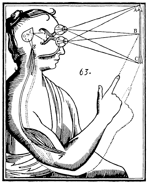
Illustration of the “flawed” mind and body dualism by René Descartes.
But since the new brain is the only part of brain functioning that we are conscious of, we think it is the most important player. Our mid brain (emotions) and old brain (auto-matic functioning) processing are, for the most part, unconscious, but here’s the interesting thing: our behavior and our decision-making is just as affected, actually, even more affected by our old brain and our mid brain than it is by our new brain.
What does this mean? It means that we think we make decisions about how to act and what to do consciously, but actually most of our decision-making and behavior is governed by unconscious processing. We can’t really separate what we do consciously from the unconscious aspects.
HAVE YOU HAD A BRILLIANT UNCONSCIOUS THOUGHT LATELY?
The new frontier of thought is actually the unconscious. The latest idea is that we are processing information and “thinking” unconsciously all the time.This is why when we are trying to solve a problem and we stop working on it and go to lunch, the solution will suddenly appear as we are munching on our sandwich or driving in the car back to work. Your unconscious was working on the problem, but you weren’t aware of it.
Wilson (2002) defines the unconscious as “mental processes that are inaccessible to the conscious mind, but influence judgments, feelings or behavior… shortcuts that size up our environment, interpret and initiate behavior quickly.”
Imagine a day without the unconscious. We wouldn’t be able to get through five minutes. The estimate from neuroscientists is that our five senses are taking in 11 million pieces of information every second. And now many of those are we processing consciously? A mere 40! So we need the unconscious to deal with the other 10,999,960 pieces of information each second, or we would be overwhelmed in a matter of seconds. Our unconscious mind lets us process all the incoming data from our environment, and it instantly decides whether it is good or bad, something to avoid and run away from, or something to run toward. Our unconscious is a huge efficient shortcut tool, showing us what to pay attention to consciously.
“Automatic cognitive processes are internal automatons that help us navigate a multifaceted and complex environment by slicing it into easily digestible bites. They…can thus free our very limited-capacity consciousness from many burdens.”
Ran R. Hassin (Hassin, 2005)
You’re sitting in front of a computer screen that is divided into four quadrants. The experimenter tells you to watch for an X that is going to appear in one of the quadrants and to press one of the four buttons in front of you to indicate which quadrant the X is in. This experiment was performed by Lewicki in 1988.
The participants didn’t know it, but there was a complex rule about where the X would appear. For example, the X never appeared in the same square two times in a row; the location of the third X was dependent upon the location of the second. The location of the fourth X was dependent upon the location of the set of Xs for the previous two trials. Lastly, an X never appeared in a spot unless it had appeared in at least two of the other squares.
The rules were complicated, but participants learned them. That was evident since as they continued, their performance steadily improved, they got faster and faster at pressing the correct buttons. But not one of the participants could articulate what the rules were. Nor were they aware they were learning rules. Yet their performance improved. Their unconscious mind was learning the rules for them and guiding their behavior about which button to press. Just when participants were starting to perform well, the rules suddenly changed. The participants then started making mistakes, and their response times increased. They noticed that they weren’t doing well, but they didn’t know why. They had no awareness that there were rules that no longer worked. Interestingly, they consciously looked for reasons as to why their performance had deteriorated. They said things like they had “lost the rhythm” or that the experimenters were flashing subliminal pictures on the screen to distract them (which wasn’t true).
We often don’t know why we do the things we do. But we are quick to make up a reason that we actually believe, even though it’s not true. Psychologists call this confabulation. Our unconscious minds are very smart. But we don’t control them.
WHAT MAKES US CLICK?
Most Website-Owners have their Websites for a reason. There are target behaviors that they want us to engage in-quite often, even several target behaviors. An e-commerce site wants us to choose products and buy them. A non-profit site wants us to loan money to help small business owners in different parts of the world. A Fortune 1000 company wants us to be impressed with what they do and buy more stock in the company. A site based on ad revenue wants us to come to the site and then click on an ad. A site that is trying to get acquired wants us to come to the site and register to be a member so that the company can say they have x million registered members. Almost all Websites have target behaviors. How do they get us to engage in the target behavior? How do they get us to buy, register, donate, and click? What makes us click?
To get us to click, they have to persuade us. But don’t make the mistake of thinking that the best way to persuade us is to make a logical presentation. As we learned most behavior and decision-making isn’t conscious. That means that they will have to engage the mid brain and the old brain, in addition to the new brain. We want to think that we are making logical decisions, even though we aren’t. The most effective Websites are Websites that talk to all three brains. When the Web site engages all three brains, then we click.
Old Brain:
Since the old brain focuses on survival instincts and basic needs like safety and comfort, to appeal to this part, websites should ensure clear navigation, fast loading times, and predictable patterns to minimize cognitive load and frustration (Nielsen Norman Group, 2006). For instance, using contrasting colors for call-to-action buttons makes actions immediately visible and instinctive, reducing effort in decision-making.
Lymbic System:
Visual elements, such as appealing imagery, engaging videos, and emotion-driven copy, can elicit positive feelings and a sense of trust (Petersen et al., 2009). For example, e-commerce websites often use customer testimonials or happy lifestyle images to create emotional resonance, increasing users’ trust and engagement.
Neocortex:
The new brain handles higher-order reasoning and decision-making. Websites must provide informative, structured content and logical layouts to engage the new brain. For instance, product comparison tables in tech retail sites (e.g., Apple or Amazon) help users make rational, informed decisions by clearly presenting features and benefits.
By addressing all three brain systems, a website can create a seamless, intuitive, and emotionally engaging user experience, improving overall satisfaction and usability.
Sources:
Damasio, A. (1994). Descartes’ Error: Emotion, Reason, and the Human Brain. New York: G.P. Putnam’s Sons.
Descartes, R. (1641). Meditations on First Philosophy. (J. Cottingham, Trans.). Cambridge: Cambridge University Press. (Original work published 1641).
MacLean, P.D. (1970). The triune brain in evolution: Role in paleocerebral functions. Springer Science & Business Media.
Panksepp, J. (1998). Affective Neuroscience: The Foundations of Human and Animal Emotions. Oxford: Oxford University Press. (For emotional processing in the brain and its impact on physical and mental states).
Craig, A.D. (2002). How do you feel? Interoception: The sense of the physiological condition of the body. Nature Reviews Neuroscience, 3(8), 655-666. (For the interconnection between brain systems and bodily states).
The practice of gender fluidity in K-pop boy groups is not just a product of individual styling, it is also a carefully created communicative strategy that challenges traditional gender norms and appeals to a global audience. In the following, it will be explored how K-pop boy groups, with a particular example of Stray Kids’ member Felix, use design principles to communicate and perform gender fluidity. By analyzing Felix’s styling, visuals, and public persona, it will be demonstrated how communication design—through fashion, visuals, and branding—functions as a key tool in creating and discussing fluid representations of gender.
The Role of Communication Design in K-Pop
In K-pop, design elements such as costumes, choreography, stage settings, music videos, and promotional materials work together to construct specific identities and narratives for each idol and group. These elements are carefully designed to communicate not only the group’s music but also their personas, values, and messages to their audience.
When it comes to gender fluidity, K-pop groups like Stray Kids use visual and stylistic choices to send subtle and overt messages about the fluidity of gender expression. This can be seen in the blending of traditionally masculine and feminine aesthetics.
Felix of Stray Kids: Visual Communication of Gender Fluidity
Felix’s role within Stray Kids offers a compelling example of how gender fluidity in K-pop is shaped. His styling, makeup, and stage presence are strategically constructed to convey an image that transcends conventional gender roles.
Stray Kids Felix:
1. Fashion as Semiotic Communication
Fashion in K-pop is more than just a form of self-expression: it is a communicative tool designed to signal specific messages to the audience. In Felix’s case, his fashion choices blend masculinity with femininity, challenging the norms of male idol styling. By wearing flowing fabrics, skirts, makeup, long hair, and accessories typically associated with femininity, Felix’s image communicates gender fluidity while maintaining a sense of power and assertiveness – especially through his remarkable deep voice.
Design Semiotics: Felix’s fashion choices, like wearing pastel-colored shirts or fancy details, can be read as signifiers of gentleness, tenderness, or vulnerability. In contrast, more structured clothing, dark colors, and sharp cuts signify strength, confidence, and control.
Color Palette: Color plays a significant role in gendered communication. In the K-pop industry, colors like pink or lavender are often considered feminine, while black or deep red might be linked to masculinity. Felix’s wardrobe often mixes these contrasting colors—such as pairing pink with darker shades—which reinforces the message that masculinity and femininity are not opposing categories but can coexist in a single individual.
Felix traditionally more feminine representing:
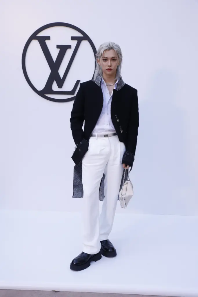
Felix mixing traditionally more feminine AND masculine elements:
Felix traditionally more masculine representing:
2. The Branding and Visual Identity of Stray Kids
Beyond Felix’s individual styling, Stray Kids as a group employs visual design strategies to create a collective identity that embraces gender fluidity. In their music videos, promotional materials, and live performances, the group often uses androgynous aesthetics—unisex outfits, bold makeup, and fluid expressions of masculinity and femininity. The overall visual identity of Stray Kids communicates a message that aligns with inclusivity, where gender is not an obstacle but a space for creative expression.
Branding and Marketability: The visual branding of Stray Kids has been designed to appeal to a diverse global fanbase that includes individuals across the gender spectrum. Branding is not just about selling products but also about promoting an identity that resonates emotionally with consumers. Stray Kids’ embracing of fluid gender representations can be seen as a conscious effort to cultivate a brand that values self-expression, individualism, and inclusivity, which are key themes in the global conversations surrounding gender today.
The Impact of Visual Design on K-Pop Audiences
The design choices made by K-pop groups like Stray Kids have profound implications for their audience. By challenging traditional gender norms through styling, performance, and media presentation, K-pop idols create a visual language that communicates new possibilities for gender expression. This language speaks not only to fans within South Korea but also to a global audience, where conversations around gender fluidity are becoming more mainstream.
Conclusion
The visual and performative strategies employed by K-pop boy groups, particularly Felix of Stray Kids, highlight the important role of communication design in reshaping societal norms around gender. Using fashion, color, choreography, and branding, Felix embodies a fluid approach to gender identity, communicating new possibilities for self-expression and challenging the traditional boundaries of masculinity and femininity. By integrating gender fluidity into their visual strategies, K-pop groups provide both an aesthetic and a social commentary, promoting a global dialogue about the fluidity of gender in contemporary society. In this way, visuality not only shapes the public image of K-pop idols but also contributes to broader cultural and societal shifts towards more inclusive representations of gender.
Kwon, H. J. (2017). K-Pop and the Globalization of Korean Popular Culture. Journal of Asian Studies, 76(2), 323-348.
Kang, H. (2020). The Androgynous Aesthetic in K-Pop: Gender Fluidity and Identities in the Performances of Korean Pop Stars. Media, Culture & Society, 42(6), 978-994.
Cho, H. (2021). Transcending Gender: The Visual and Performative Strategies of K-Pop Boy Groups. Asian Journal of Communication, 31(5), 513-531.
Choi, S. (2019). Fashion and Identity in K-Pop: The Role of Style in the Construction of Masculine Identities. Fashion Theory, 23(4), 489-514.
Song, J. (2022). Gender Fluidity in K-Pop: The Case of Stray Kids Felix. Global Music and Gender Studies, 8(3), 142-159.
As promised, I would like to first dive a little bit into behavior of visitors in museums. To do so, I will review the article called “Art Perception in the Museum: How We Spend Time and Space in Art Exhibitions”, the present study aimed to replicate and expand on the study of Smith and Smith (2001).The main aim was to analyse museum visitors’ behaviour in terms of viewing duration and distance, how often people returned to a painting and how behaviour changed throughout such reassessments.
Keypoints of the “Smith and Smith” study
In their 2001 study, Smith and Smith provided foundational research into the impact of factors like age, gender, and group size on viewing times in museums. They discovered that museumgoers typically spend significantly more time observing artworks—27.2 seconds longer on average—than in controlled lab experiments, where viewing times are often under three seconds.
The study also brought attention to the role of viewing distance, noting that visitors intuitively adjust their proximity to artworks based on personal preferences, unlike the fixed distances common in lab studies. These insights underline the importance of replicating natural museum behavior in experimental settings to better understand art perception.
Lastly, Smith and Smith emphasized the social dynamics of museum visits, observing that a substantial portion of visitors attended in groups. Roughly 19.3% came with one other person, and 3.3% were in groups of three, transforming art observation into a collective social event. This group interaction was noted to influence the overall art experience, highlighting how social contexts can shift perception from individual to shared engagement.
Methods of the “Art Perception in the Museum” study
They tested a total of 225 visitors (126 female, M(age) = 43.3 years) attending the special exhibition on Gerhard Richter by unobtrusively observing them from a balcony above, which was barely detectable by typical visitors; 104 people visited the paintings on their own (category single), 100 visited them with one other person (category pair), 11 in a group (category group) of two or more, and 10 with their children (category family—here the children were not observed further, but a focus was set to the person who first attended the respective artwork). A total of four persons attended the exhibition with a wheelchair, two with a folding chair, and one with a walking stick; no other accessories in this respect were recorded. None of the participants detected the observers and so were naïve to the purpose of the study.
The six paintings which were utilized for the study were all positioned side by side on one wall of the only hall in the entire exhibition; the two observers assessing visitor behaviour were situated on a balcony above the hall overseeing the entire scene of interest. On the floor, the tile sizes were exactly 50 × 50 cm, allowing the easy assessment of viewing distance between visitor and painting with a resolution of 50 cm accordingly.
To record visitor behavior, the researchers used a custom Android app on Sony tablet PCs. This app enabled quick and precise data collection, such as viewing distance in 0.5-meter increments (aligned with the floor tiles), timing of observations, and demographic details like gender, age, and whether visitors were accompanied or used mobility aids. Observers could track individuals revisiting paintings, building a comprehensive history of their interactions. This method ensured accurate, intuitive data logging while maintaining naturalistic observations.
Two observers were located on the balcony, with Observer 2 assisting the experimenter Observer 1, who entered the data. This was done first of all to ensure objective data entry and was also used for tracing visitors who might potentially come back. The observers tried to focus on single visitors to capture their entire viewing behaviour with regard to the paintings under observation. This made it necessary to test single, randomly chosen persons in depth, so the duration of the total testing was considerably long as many visitors take quite a while to wander through the whole exhibition.
Results
Viewing Time of Artworks
People were found to spend very different amounts of time in front of different artworks, here between 25.7 s and 41.0 s on average—note: although the exact durations differed from the Smith and Smith study, they also documented such a various viewing behaviour with a range of viewing duration from 13.2 s to 44.6 s.
Visitors viewed the artworks quite selectively, omitting 2.5 out of the given range of six pictures—a clear sign of selective viewing behaviour even in a special art exhibition showing a very limited number of paintings.
In contrast to Smith and Smith, they did not find any substantial differences among group sizes. Category single visitors showed a mean viewing duration at first attendance of 35.6 s, category pair showed 31.4 s, group showed 36.5 s, and family showed 36.4 s. In accordance with the Smith and Smith study, we could not find any significant difference between female (M = 34.6 s) and male visitors (M = 32.7 s).
Given this total viewing time perspective, visitors spent 50.5 s on one artwork. In fact, visitors who viewed an artwork at least once showed a 51% probability of returning to it at least once more.
Viewing Distance From Artworks
Regarding the different viewing distances at which visitors choose to inspect the paintings, we again observed that conditions were very different to the typical ones employed in lab research. On average, the visitors in the present study distanced themselves from a painting M = 1.72 m across all viewings, which was not substantially different from the distance they used when only initial viewings were analysed (M = 1.75 m). First of all, the essential difference between a museum and a lab context is mainly that a museum offers enough space for visitors to choose their personal distance from an artwork. On what basis visitors choose their distance remains unclear, but it is seemingly done by intuition without any deeper rationale behind it. This intuition seems to have a basis in the extension of the artwork, here the canvas size: The larger the artwork the more viewing space is chosen.
Sociality factor
One great difference between a museum context and a lab setting is the typical presence of many people in the same hall, the sociality factor. We indeed detected an effect of group which was very compatible with the obtained effect of the Smith and Smith study: Pairs of visitors took longer viewing times, often because they debated on the painting, but more than two persons attending a painting together even outperformed pairs. The additional categorization of family showed the shortest viewing times—probably due to ongoing caretaking issues, especially for parents with small children.
Conclusion
Once again, the present study made clear that viewing artworks in a museum context is very different to a typical lab setting: First of all, visitors of art museums invest money, time, and intellectual effort beforehand to get to the exhibition hall, they show more skills and motivation to deeply process artworks, and, screening the demographics of typical visitors, they are mostly older and possess more knowledge of art and so also show different heuristics in assessing the quality of art. Second, the whole social setting is very different with people walking around in a relatively silent and focused—but still communicative and interactive—way. Third, the viewing distances from paintings is very different, typically larger. Fourth, the viewing duration is also self-chosen and fundamentally (much) longer than in typical lab settings.
Educating Clients Many clients are unaware of the environmental impacts of traditional design practices. Designers can bridge this gap by presenting evidence-based insights. For example:
Highlight lifecycle impacts, such as the energy consumption of digital assets or the deforestation risks linked to non-FSC-certified paper.
Share case studies like Patagonia’s eco-conscious branding or IKEA’s circular design innovations to demonstrate that sustainability aligns with quality and consumer appeal (Packaging Sustainability, Jedlicka, 2011).
Presenting Cost-Effective Solutions A common misconception is that sustainability always comes at a high cost. Designers can dispel this by proposing cost-neutral or even cost-saving strategies:
Digital optimization reduces hosting costs while enhancing sustainability.
Using recycled materials and lightweight packaging can lower shipping expenses.
Framing Sustainability as a Brand Differentiator Sustainability isn’t just an environmental choice, it’s a strategic advantage. Consumers are increasingly favoring brands that demonstrate environmental responsibility. Designers can position sustainable solutions as a way to enhance brand reputation and customer loyalty (Green Graphic Design, Dougherty, 2008).
Fostering Industry Conversations
Graphic designers are influential participants in broader conversations about sustainability. Advocacy at the industry level can amplify their impact:
Joining Professional Networks Organizations like the AIGA Sustainability Task Force or the Green Web Foundation provide platforms for designers to share best practices and collaborate on solutions.
Hosting Workshops or Panels Designers can host events that explore sustainable innovations, engaging clients and industry peers in meaningful discussions.
Pushing for Standards and Certifications Encouraging adoption of eco-labels like FSC certification or energy-efficient hosting standards can help normalize sustainable practices.
References
Dougherty, B. (2008). Green graphic design. Allworth Press.
Jedlicka, W. (2011). Packaging sustainability: Tools, systems, and strategies for innovative package design. Wiley.
McDonough, W., & Braungart, M. (2002). Cradle to cradle: Remaking the way we make things. North Point Press.
Colors play a significant role in shaping how we feel and interact with the world. They influence emotions, guide decisions, and even impact mental well-being, making them a powerful tool in designing mental health apps. The right colors can create an environment that feels calming, inviting, and supportive – essential qualities for apps aimed at improving mental health.
Research shows that cool colors, like blues and greens, are strongly associated with calmness, relaxation, and trust. These shades are often used in mental health apps to create a sense of serenity and support. On the other hand, warm colors, such as yellows and oranges, can evoke energy and optimism but must be used sparingly to avoid overstimulation.
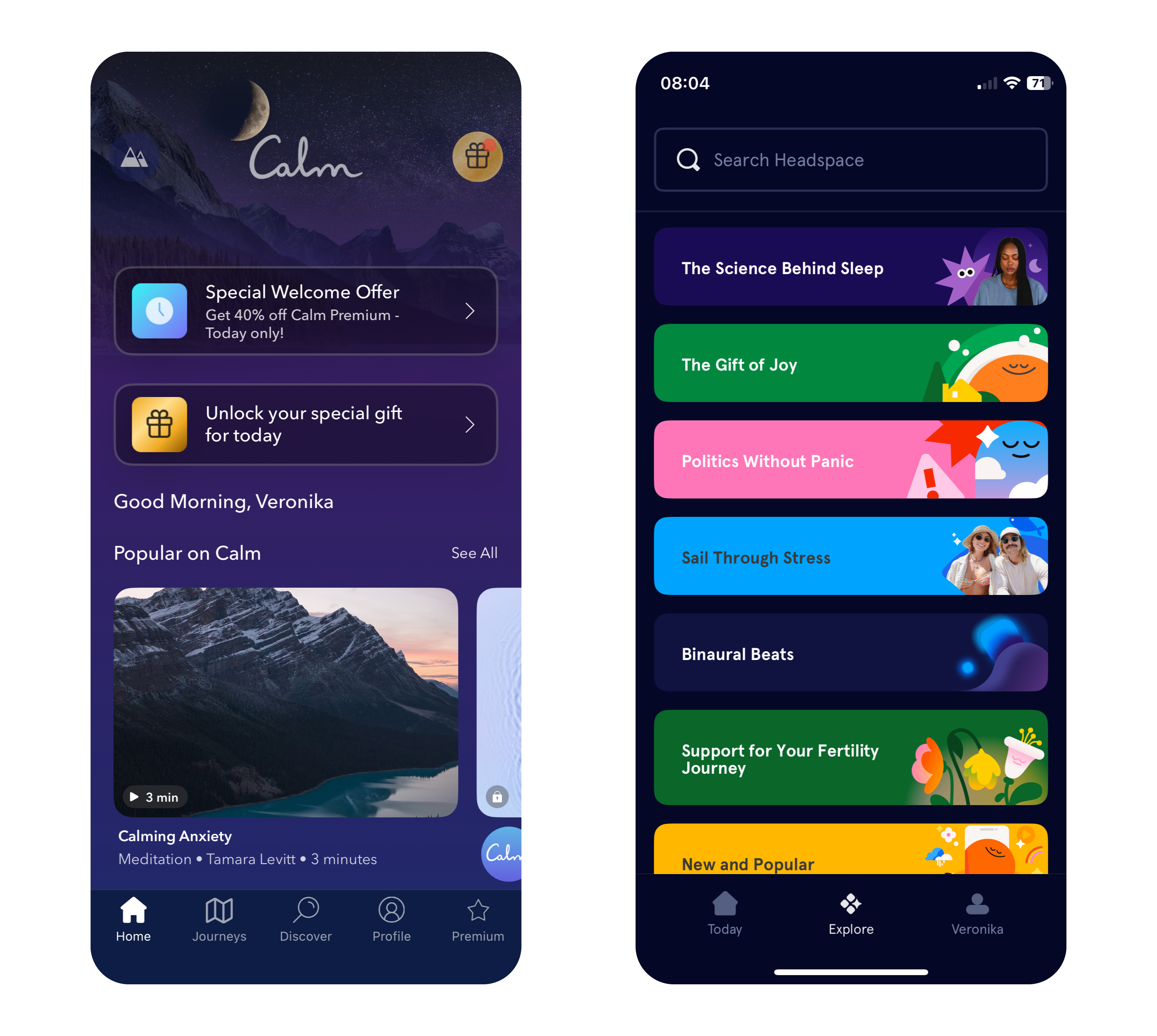
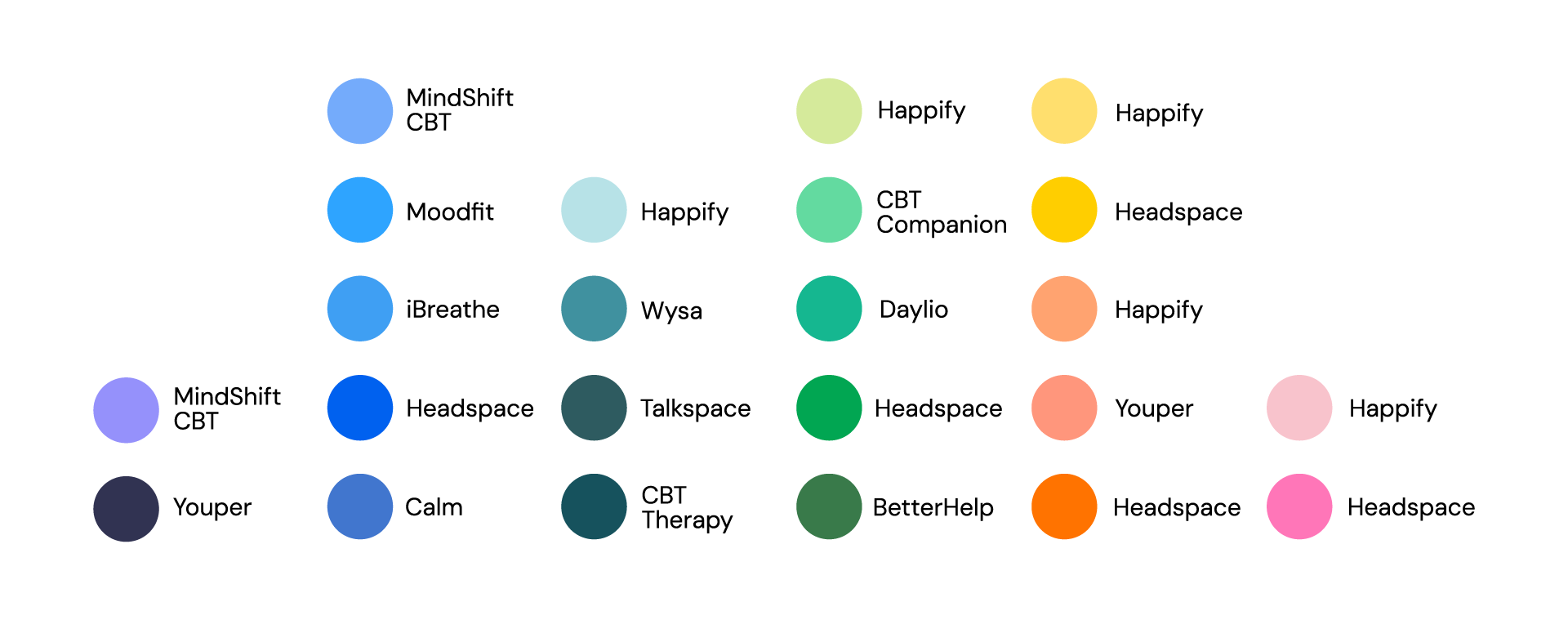
Apps like Calm and Headspace use color in very different ways to great effect. Calm primarily employs soothing shades of blue and purple to evoke tranquility, while Headspace takes a bold approach with its vibrant and varied palette. This variety helps make meditation and mindfulness more approachable, particularly for younger users who may be new to these practices.
Why Color Choices Matter in Mental Health Apps
The connection between color and emotion is deeply rooted in psychology. Blue and green tones, often linked to nature and open spaces, can subconsciously reduce stress and promote relaxation. In contrast, red, while energizing in small doses, may heighten anxiety if overused, making it less suitable for calming designs.
The neurological effects of color also play a key role. Studies show that exposure to blue tones can lower heart rates, while green shades improve focus and concentration – both valuable qualities for mindfulness and mental health practices. By leveraging these responses, designers can craft apps that not only look appealing but also enhance users’ mental states.
Insights from Research: Colors for Personalities and App Types
Personality traits influence color preferences. Extroverts tend to favor vivid, warm colors like red, orange, and yellow, while introverts prefer cooler, softer shades like blue, green, and pastel tones. Gender can also play a role, with women often gravitating toward softer hues like purple and light blue, while men tend to prefer bold primary colors like strong blues and greens.
Dynamic color schemes, where apps adjust their hues based on the user’s mood or time of day, are gaining popularity. For example, an app might use vibrant tones in the morning to energize users and shift to muted blues in the evening to promote relaxation. This adaptability can create a more personalized and supportive experience for users.
Balancing Color with Function in Mental Health Apps
Color choices should enhance an app’s purpose rather than detract from it. While greens and blues are staples in mental health app design, designers must carefully balance them with accents to maintain engagement without overstimulating users.
Headspace’s vibrant palette provides an excellent example of balance. By pairing warm hues like orange and yellow with cool tones, it creates a playful yet calming environment. This blend ensures the app remains visually engaging while maintaining its focus on mindfulness and relaxation. In contrast, Calm leans into simplicity, using gradients and minimalistic design to immerse users in tranquility.
Consistency in color use is equally important. Abrupt changes in tone can confuse users or create unease, especially for those managing anxiety or mood disorders. A seamless visual flow across an app reassures users and enhances their experience, encouraging them to engage more regularly with the app’s features.
Image: Primary Colors in Popular Mental Health Apps
Sources
A. Volkova & H. Cho. (2024). Warm for fun, cool for work: the effect of color temperature on users’ attitudes and behaviors toward hedonic vs. utilitarian mobile apps. Journal of Research in Interactive Marketing, Vol. ahead-of-print, No. ahead-of-print.https://doi.org/10.1108/JRIM-03-2024-0149
„Calm – The #1 App for Meditation and Sleep.“ Calm. Accessed: Dec. 9, 2024. [Online.] Available: https://www.calm.com/
„Headspace: Meditation and Sleep Made Simple.“ Headspace. Accessed: Dec. 9, 2024. [Online.] Available: https://www.headspace.com/
R. M. Romeh, D. M. Elhawary, T. M. Maghraby, A. E. Elhag & A. G. Hassabo. (2024). Psychology of the color of advertising in marketing and consumer psychology. Journal of Textiles, Coloration and Polymer Science, Vol. 23, No. 2. doi: 10.21608/jtcps.2024.259025.1272
S. Garrido, B. Doran, E. Olliver & K. Boydell. (2024). Desirable design: What aesthetics are important to young people when designing a mental health app? Health Informatics Journal, Vol. 30, No. 4. https://doi.org/10.1177/14604582241295948
Inclusivity means recognizing the diverse needs and perspectives of users and making intentional choices that reflect that diversity. That’s why it goes beyond aesthetics and ensures that products, experiences, and communication are accessible and meaningful to all people, regardless of gender, background, or ability.
When it comes to typography, iconography, and visual elements, inclusivity starts with challenging traditional norms. Avoiding gendered fonts and symbols can help create more neutral designs that appeal to a broader audience. For example, opting for clean, simple typography without overt associations to masculinity or femininity helps ensure that the message remains the focal point, not the stereotypes embedded in the design.
More than gender
Using universally recognized symbols, avoiding cultural biases, and designing for clarity and simplicity ensures that icons are easily understood by diverse groups. It’s important to consider how different symbols are interpreted across cultures, as the meaning of an icon can shift depending on context. For example, certain color choices or shapes may hold different connotations in various regions, so being mindful of this variability is essential for inclusivity. Incorporating accessibility and considering the needs of individuals with visual, auditory, cognitive, or physical disabilities through using high-contrast color schemes, ensuring that fonts are legible, providing alt text for images, and offering multiple ways of interaction are all part of creating a design that works for everyone. Testing designs with diverse user groups and iterating based on their feedback ensures that the design is truly inclusive, rather than assuming it works for everyone based on one perspective.
Challenges in Moving Beyond Gendered Design
Inclusive design presents several challenges, starting with balancing the diverse needs of users. Ensuring that designs work for people with different abilities, backgrounds, and preferences requires compromises between accessibility, usability, and aesthetics. Designers must navigate cultural differences, as color associations vary widely across regions. For instance, while white symbolizes purity in Western cultures, it is associated with mourning in many Asian countries. Balancing global relevance with local sensitivity is crucial in creating truly inclusive designs.
Resistance to change can be another barrier, especially in industries with traditional design approaches. Technological constraints, such as platform limitations or issues with responsive design, can also hinder accessibility. Additionally, some critics argue that removing all gendered elements risks creating designs that feel overly generic or lacking in personality. The challenge for designers lies in striking a balance between neutrality and distinctiveness.
Ultimately, inclusive design requires empathy, awareness, and a commitment to creating products and experiences that reflect the richness of human diversity. By consciously integrating these principles into design processes, we can build a more equitable and accessible world for all.