As part of the ongoing series on spatial mixing approaches in practice, this post shifts the focus from artistic decisions to a technical reflection on the workflows used throughout the project. The following sections outline how different immersive production approaches influenced working methods, creative flexibility, and playback outcomes.
Workflow Overview
This chapter outlines the different production and mixing workflows used throughout the project. While all recordings were carried out using the same studio environment and similar recording setups, two distinct immersive audio workflows were applied during the course of the project.
The first workflow is based on Ambisonics and reflects my initial approach to immersive music production. This workflow was primarily explored during the production of Standby and served as an entry point into working beyond stereo formats.
As the project progressed, a second workflow based on Dolby Atmos was introduced and applied to the subsequent tracks Alter Me and Caught In Dreams. This shift allowed for a comparative evaluation of both approaches in terms of practical handling, artistic possibilities, and production implications.
All projects had about 120–150 individual tracks. Recording was carried out using Cubase and Reaper, depending on the session requirements. Ambisonics mixing was performed in Reaper, while Dolby Atmos productions were realized using Cubase 15 and Nuendo 13. The following blog entries describe both workflows separately, focusing on their respective structures and characteristics.
Continuing the series on spatial mixing approaches in practice, this post focuses on two spatial strategies applied in Caught In Dreams that intentionally challenge listener perception. Both examples explore motion and verticality as expressive devices and examine their role as structural and narrative tools within immersive music production.
Motion as Creative Risk
An experimental spatial decision was made during a two-bar drum fill preceding the second chorus. In this section, the drum signal is rotated around the listener. This moment coincides with the lyric “turning nights into nightmares” and was intended to briefly destabilize the listening perspective.
This decision was approached deliberately as a creative risk. While the movement can be perceived as engaging and expressive, it also raises questions regarding distraction and musical focus. The example was included to provoke reflection on how much spatial motion is appropriate within groove-based music and where the boundary between expressive effect and overuse may lie.
Vertical Movement as Formal Break
A further spatial strategy occurs during a short bridge following the second chorus. This section represents a moment of realization, expressed in the lyrics “I woke up and realized it was just a dream.” At this point, multiple elements—including ride cymbals, guitars, and vocals—are shifted upward in the vertical dimension.
This vertical movement functions as a formal break rather than a continuous effect. After this section, the mix collapses back toward a more frontal and dry presentation, reintroducing a mono-oriented guitar similar to the intro. The contrast emphasizes the narrative shift and prepares the listener for the final section of the song.
The spatial strategies discussed above were realized using two different immersive audio workflows. The following blog posts provides a comparative reflection on these workflows and their implications for music production and playback.
As part of the ongoing series on spatial mixing approaches in practice, this post shifts the focus from Alter Me to the second track discussed in detail: Caught In Dreams. The following sections outline the song’s emotional context and a key spatial mixing strategy applied during its production.
Song Context and Emotional Arc
Caught In Dreams addresses the realization that certain dreams and ideals can become dangerous illusions. The song reflects a gradual loss of grounding driven by the desire for more, leading to a feeling of being trapped within one’s own expectations. While the track maintains a dreamy and indie-inspired character, it also aims to confront the listener with the consequences of losing balance and perspective.
Reduced Masking Through Spatial Placement
A central advantage of immersive mixing in Caught In Dreams lies in the increased spatial capacity compared to stereo production. By distributing sound sources across multiple loudspeakers rather than concentrating them within a left–right panorama, significantly more space is available. This spatial separation reduces the need for aggressive EQing and helps to minimize masking between competing elements.
As a result, overlapping frequency ranges—for example in the low-mid region—become less problematic, as spatial separation supports perceptual differentiation between sources.
The use of a dedicated center speaker further contributes to this effect. Unlike a phantom center, which relies on equal energy from the left and right channels, a discrete center channel allows the lead vocal to be placed alone in one speaker. This reinforces intelligibility and reduces interference with other centrally positioned elements.
A direct comparison between the stereo vocal mix and the immersive version demonstrates that the 3D mix achieves a more open vocal sound with reduced masking, not primarily through equalization, but through spatial distribution. This example highlights how immersive audio can create mix clarity by reallocating elements in space rather than by removing frequency content.
As part of the ongoing series on spatial mixing approaches in practice, this post continues the analysis of Alter Me. After examining spatial width and impact, the focus now shifts to vocal arrangement and spatial density as key compositional tools in immersive mixing.
Vocal Arrangement and Spatial Density
Vocal production played a central role in my spatial productions and mixes. The lead vocal remains dry and clearly localized in the center channel, providing a stable perceptual anchor throughout the song. Reverberation and delay are routed to the other channels.
In the verses, vocal processing is kept relatively restrained, using slapback delay and reduced reverb to maintain focus. In the chorus, longer delay throws and increased reverberation are introduced to enhance perceived size.
Backing vocals are treated as a spatial and structural element rather than as additional layers only. In the verses, they are reduced in number, less widely distributed, and processed with minimal reverb. In the chorus, backing vocals become more numerous, more saturated, spatially wider, and more reverberant. This increase in spatial density contributes significantly to the perceived size of the chorus while maintaining a clearly localized lead vocal.
The following blog posts focus on selected spatial mixing approaches applied in practice during the production of this EP. Rather than providing complete production breakdowns, the emphasis lies on specific spatial decisions that were consciously made to support musical structure, narrative development, and listener perception.
The series begins with Alter Me and examines how spatial width, focus, and contrast were used as compositional tools within an immersive mixing context. Subsequent posts will expand on these ideas by exploring additional spatial strategies applied in other tracks of the project.
Alter Me – Spatial Mixing Decisions
Song Context and Narrative Function
Alter Me is conceived as a dialog with one’s own addiction. The song portrays addiction as an internal voice that initially appears supportive and reassuring, but gradually reveals its manipulative and destructive nature. As the song progresses, this internal conflict becomes more explicit, culminating in an emotional outburst during the chorus.
The spatial design of the track was used to support this narrative by differentiating between internal and external perspectives and by reinforcing contrasts between sections.
Spatial Width and Impact
The introduction of Alter Me consists of a single guitar, a snare roll, and several sustained E-bow layers. These E-bow sounds are spatially distributed and move around the listener, creating a highly immersive and enveloping sound field. The intention was to represent the intrusive and surrounding nature of the “addiction voice” before the band enters.
When the full band enters, the spatial strategy changes noticeably. Drums, bass, and guitars are deliberately focused toward the front, and the overall spatial width is reduced. During production, it became clear that an extremely wide and immersive intro can reduce the perceived impact of the band entry. By slightly narrowing the spatial image before the entry, the contrast between intro and chorus is increased, resulting in a stronger sense of impact and energy.
This observation was particularly noticeable during studio monitoring and binaural listening. Interestingly, playback in the Cube emphasized different aspects of this contrast, highlighting how playback environments can influence spatial perception.
Additionally, spatial width is further enhanced by adding multiple, largely uncorrelated signals. Different performances, variations in timing, timbre, and spatial position contribute to a wider and more complex spatial image.
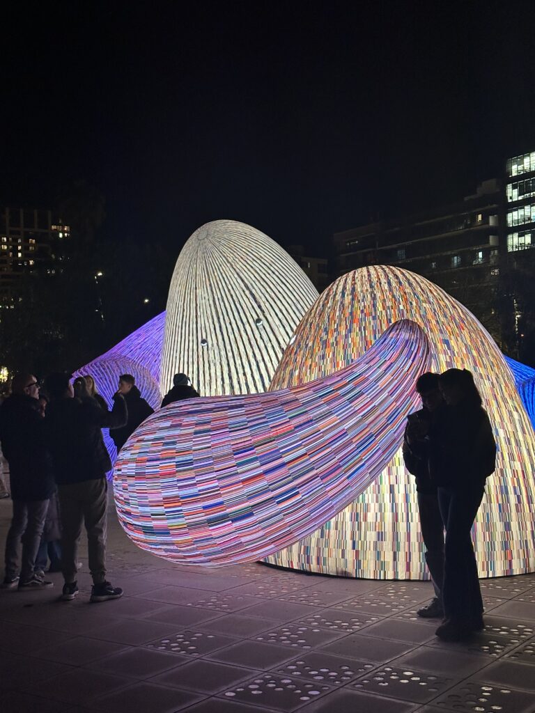
I traveled to Barcelona to see the Llum Festival (among other things). I was curious about it and the art. Even though the festival is mainly focused on media art and light installations, I still found a lot of inspiration there. It showed me new ways of thinking about space, atmosphere, and how art can change the feeling of a city at night.
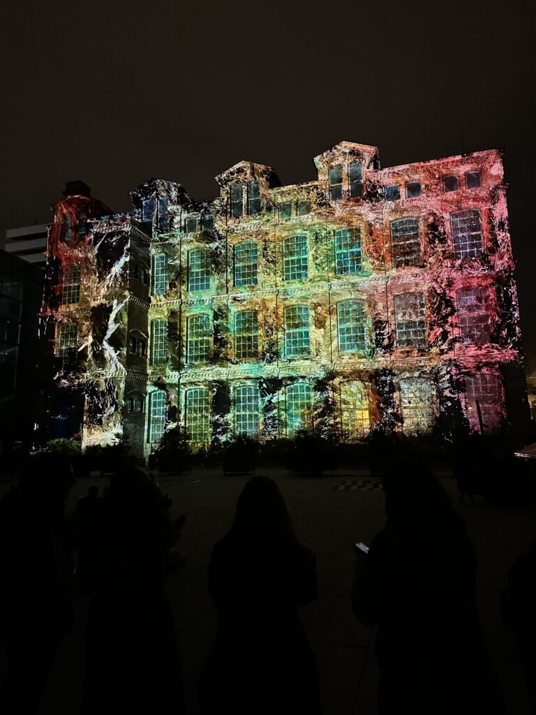
The Llum Festival is an annual light and media art festival that takes place in Barcelona, mainly in the Poblenou area. For a few nights, streets, buildings, and public spaces are transformed by light installations, projections, and digital artworks created by artists, designers, and architecture schools. Many of the works play with technology, movement, sound, and interaction. It’s very similar to Klanglicht in Graz.
In this article, I want to capture the moments and installations that stayed with me the most. These were the pieces that caught my attention, sparked ideas, or simply made me stop and look for a little longer.
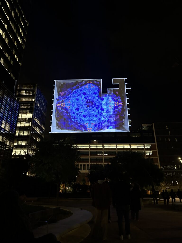
The Rhythmen of the Ocean
One of my absolute favorite installations at the Llum Festival was “The Rhythm of the Ocean” by the visual studio Desilence, paired with music by composer Suzanne Ciani. This piece stood out immediately because it used a big open space in a powerful way, making the message feel immersive and meaningful. I really liked the flowing visuals and sound that moved like waves around you, it was very magical. It felt like you were inside the ocean and reminded me of Atlantis.
What I liked most was that the installation wasn’t only visually impressive, but also meaningful. Toward the end, text was projected that explained how much waste ends up in the ocean every day and how this pollution affects our environment. By using such a big surface and clear text at the end, the artists made sure the message couldn’t be ignored. For me, this combination of scale, movement, and environmental awareness is what made this installation one of my favorites at the festival.
Mantra Intervention
Another installation I really enjoyed was “Mantra Intervention” by the creative duo STUDIO MO:YA (designers Roland Mariacher and Werner Huber) presented as part of the Llum Festival’s main programme. And you might remember their names, because Moya is based in Graz and also participated at Klanglicht. And to be honest, they were definitely one of the best installations at the festival.
It was an interactive and generative piece that immediately drew me in because it let visitors participate with the art. At one screen, people could change the colours themselves, and brightly rectangles would pulse and lighten up to the rhythm of the music. What made it especially fascinating was watching how the piece constantly recalculated and evolved in real time, so no two moments looked the same, it was always shifting. This mix of interaction, generative visuals, and live rhythm made Mantra Intervention one of the most memorable parts of my visit.
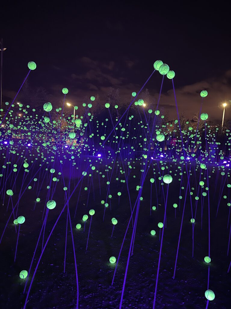
Bulla
Another installation that I really liked was “Bulla” by Lola Solanilla. This piece was set up in the Àgora Berta Cáceres in Parc de les Glòries (next to Off- Area if you remember). Walking into it felt almost like stepping into a mystical, magical world. The work was made up of almost 4,000 luminous spheres (Golfballs on rods) suspended over a large area, creating a soft, dreamlike landscape of light that you could walk around.
What I liked most about “Bulla” was the vibe it had this unreal, almost enchanted atmosphere that made the space feel a bit mysterious. The play of light and shadows, and how the spheres floated above the ground, made it feel like you were in some kind of glowing cosmic field.
The whispering Mountains
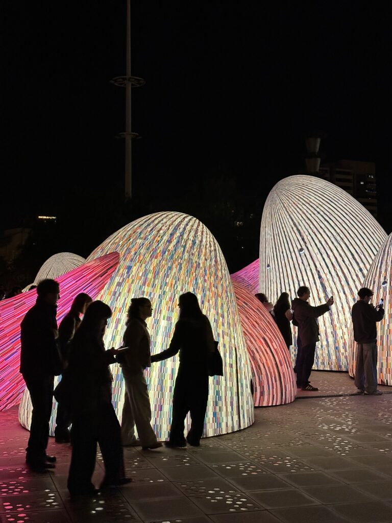
Another piece I really liked at the Llum Festival was “The Whispering Mountains” by ENESS. This installation used inflatable sculptures spread out in the Parc del Centre del Poblenou, and the whole vibe felt really cool and magical. Walking among and through these soft, glowing shapes gave the space a kind of playful, other‑worldly feeling.
I especially enjoyed this installation because it felt alive, the shapes and light looked almost like friendly creatures with eyes blinking and subtle movements that gave them emotion. This cute, expressive quality made the artwork feel personal and engaging, not just a static display of light. For me, that artistic approach was one of the reasons “The Whispering Mountains” stood out as one of the best installations at the festival.
Final Thoughts
Overall, I found the Llum Festival very beautiful and interesting. Even as a Communication Designer, it was a great source of input and inspiration. The professional installations were impressive and really cool. But to be honest, compared with Klanglicht, I had expected a bit more from Barcelona. (After all, it’s a huge city with a strong design background). While there were some truly amazing pieces, there were also many installations by students that sometimes felt rushed or not fully thought out (not just student installation felt like this). I also noticed that some works might have been even more striking if it had been darker overall, but the city itself is already quite brightly lit at night, which limited the effect in some areas.
Still, despite these small points, I’m really glad I went. All in all, it was a very beautiful and inspiring experience, and it gave me plenty to think about and reflect on creatively.
After the first drum recording session laid the foundation for Standby, a second session was planned with a stronger focus on experimentation and refinement.
In total, two major drum recording sessions were conducted during the project. The first session, which formed the basis for Standby, has already been described in previous blog entries. The second session took place in September 2025 and involved significantly more preparation time, setup complexity, and experimental testing.
This second session was characterized by an increased focus on exploration and critical listening. Considerable time was spent finding suitable microphone positions and evaluating their sound, resulting in a much more intensive and hands-on recording process.
Experimental Room Microphone Approaches
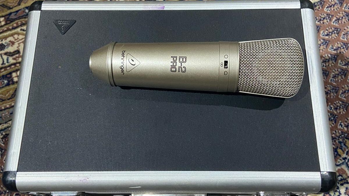
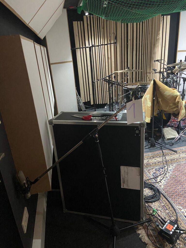
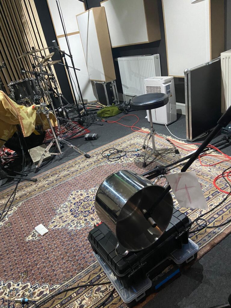
During the second recording session, a wide range of unconventional room microphone techniques were tested. For this purpose, several older Behringer B2 large-diaphragm condenser microphones were used, which I was able to borrow from a friend for the session.
Various microphone constellations were explored, often with the intention of minimizing direct sound capture and emphasizing early reflections and reverberant components instead.
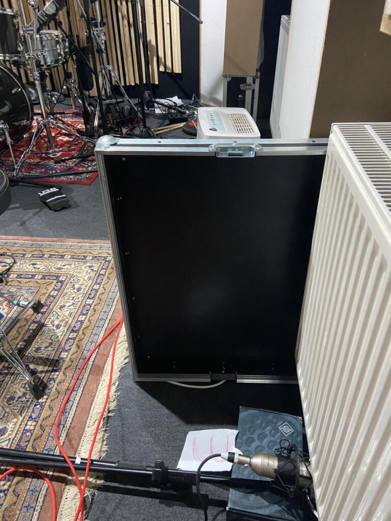
Due to the limited room size, achieving a clean separation between direct sound and room response proved challenging. Nevertheless, multiple strategies were tested, including shielding direct sound and placing microphones in acoustically reactive positions. Additional experiments were conducted by capturing resonant objects within the room, such as a large metal pot or a radiator, in order to introduce controlled resonances—through postproduction, the so-called “dirt”—into the drum sound.
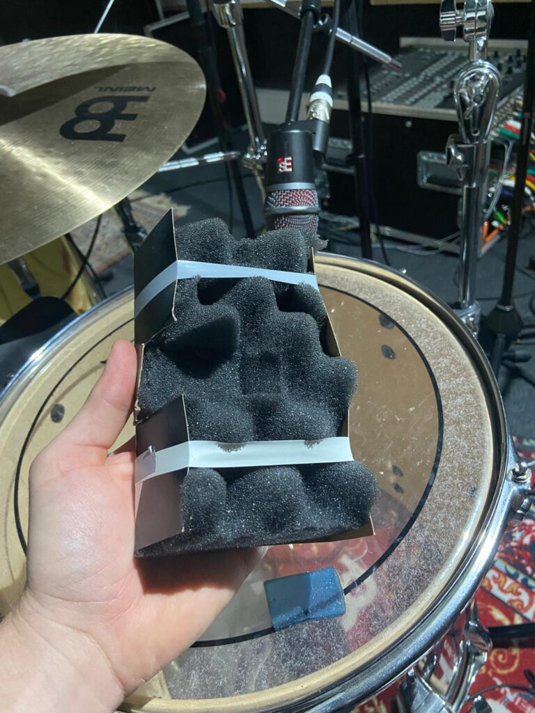
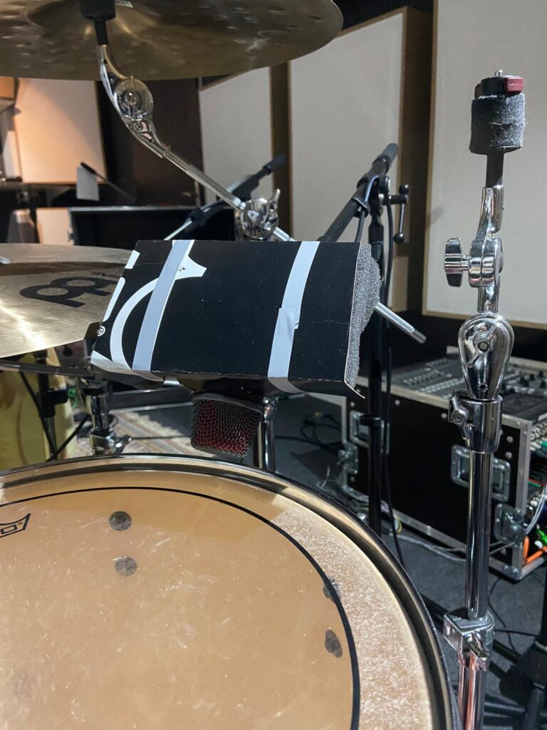
We also built temporary drum shields to reduce cymbal bleed, particularly for the snare and tom microphones.
Evaluation and Consequences
In practice, many of these experimental approaches resulted in signals that were perceived as overly diffuse or lacking clarity. Even after phase alignment and corrective processing, the room microphones often introduced a smeared or unstable drum image. Within an immersive context, this effect was further amplified, as spatial placement of these signals tended to pull the perceived drum position away from a stable frontal image.
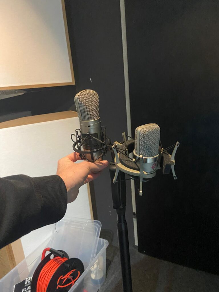
As a result, the use of room microphones was significantly reduced. The most effective and reliable solution proved to be the “Droom” microphone setup (A/B stereo placement) positioned directly in front of the drum kit. This configuration provided a coherent spatial impression of the room while maintaining a clear and stable drum image. The “Droom” signal was spatially distributed behind the listener to increase envelopment and, in some cases, dynamically automated—for example, becoming more prominent during choruses. This technique proved highly successful and is considered a valuable approach for future productions.
The refined recording strategies directly influenced the production of the following tracks Alter Me and Caught In Dreams.
After completing the first recording, production and mixing phase, my interest in increasing our production quality got higher. I especially wanted to gain more knowledge in the field of mixing and recording — particularly drum recording.
Having “caught the bug” during the initial sessions, I became increasingly curious about unconventional approaches to capturing drum sound, especially in the context of immersive music production. Influences from producers and engineers such as Moses Schneider and Hans-Martin Buff encouraged me to further explore alternative recording strategies and to actively test the potential of non-standard microphone placements.
Für meinen siebenten Impuls möchte ich endlich einmal etwas über die schier endlosen Weisheiten des WanderingDP mit euch teilen. Seit einigen Monaten schaue ich nun seine Pay-per-View Videos und bin nämlich echt schwer davon beeindruckt, wie genau und praktisch er auf Dinge eingeht. Als erstes möchte ich daher sein “Framework” zusammenfassen, das ist eine sechsteilige Videoserie, in denen er quasi die wichtigsten Aspekte moderner Kameraarbeit erklärt.
1. Upstage Lighting
Als ersten Punkt führt er hier sogenanntes Upstage Lighting ein. Dabei geht es im Grunde darum, wenn möglich, Kamera und Key auf unterschiedliche Seiten der Line of Action zu legen. Das führt automatisch dazu, dass die Kamera immer auf der Schattenseite des Subjekts ist und bietet daher einfach maximalen Kontrast. Laut O´Sullivan kreiert diese eine Sache bereits automatisch 80% eines kontrastreichen Looks.1
2. Der Point-of-Control
Seine Vorgehensweise beim Einleuchten einer Szene ist dabei quasi zu einhundert Prozent vom sogenannten Point-of-Control abhängig, also dem Licht in einer Szene, das man nicht oder nur sehr schwer kontrollieren kann. Draußen ist das klassischerweise die Sonne oder der Himmel an sich, aber auch Reflektionen oder heiße Spots im Hintergrund sind möglich. Drinnen liegt der Point-of-Control eigentlich fast immer in den Fenstern oder manchmal auch im ambient light. Das erste was ich also gemacht habe, wenn ich die Schauspieler im Raum platziert und den Frame gesetzt habe, ist ich suche diese Punkt und belichte dann für genau diesen, sodass mir eben der Himmel, das Fenster, die Spiegelung etc. nicht ausbrennt, sondern dass dieser Punkt genau richtig belichtet ist, da ich ihn ja nicht kontrollieren kann. Erst dann versuche ich die Szene mit dem restlichen mir verfügbaren Licht zu balancen.2
3. The Lighting Triad
Unter der Lighting Triad versteht O´Sullivan quasi seine Art des klassischen Dreipunktlichts. Damit beginnt er die Szene quasi wirklich zu leuchten, nachdem er zuerst den Frame gesetzt und auf den Point-of-Control belichtet hat. Die Triade besteht dabei aus dem Key (auf der gegenüberliegenden Seite der line of action von der Kamera), einer Menge negative fill statt klassischem fill light (auf der selben Seite wie der Kamera) und einem Kicker, ebenfalls auf der Kameraseite. Der große Unterschied zum klassischen Dreipunktlicht ist also, dass er auf der Fill-Seite immer versucht maximal viel Licht durch neg wegzunehmen, statt mit Lampen hinzuzufügen. Dies führt zu maximaler Kontrolle und maximalem Kontrast.3
4. Room Tone
Bei Room Tone geht is im Grunde um das Level der Umgebung, des Hintergrunds oder auch Ambientes. Heißt: Schon alle Lichter, die wir schon gesetzte haben bzw. die schon da sind: das Key, Kicker, die Fenster etc. beleuchten automatisch ja nicht nur das Subjekt, sondern die ganze Szene. Dabei muss man aber sichergehen, dass zum Beispiel der Hintergrund auch genug Licht abbekommt, gerade wenn er zum Beispiel weit weg vom Subjekt ist, weil es mitten im Raum steht. Denn während wir beim Point-of-Control extra auf diesen Belichten um sicherzugehen, dass er nicht clipped, möchten wir natürlich auch nicht, dass der Hintergrund zu dunkel ist und absäuft. Was O´Sullivan also macht ist, er bringt eine vierte Lichtquelle (Triad +1) ins Spiel, die so groß und so stark diffused wie möglich ist. Zum Beispiel eine große overhead Softbox, deren einziger Sinn ist, dem gesamten Raum eine schattenlose durchgängige Illumination zu geben, um zu verhindern, dass einzelne Elemente zu dunkel sind und Strukturen erkennbar bleiben. Ist der Room Tone bereits schon zu stark, stopped er in der Kamera beispielsweise durch ND oder Blende runter, und verstärkt die Kraft von Key und Kicker, bis das Verhältnis zwischen Vorder- und Hintergrund passt.4
5. The L of the Room
Eigentlich hätte dieses Kapitel wohl ganz an den Anfang gehört, denn beim L of the Room definiert O´Sullivan seine Vorgehensweise, wenn er aufs Set oder beim Recce auf die Location kommt. Dort sollte nämlich geklärt werden, wohin man die Subjekte der Szene stellt/setzt und von wo die Kamera das ganze filmt. Das L des Raums hilft dabei, genau diesen optimalen Spot zu finden, nämlich den, der am meisten Tiefe im Bild erzeugt. Für maximale Tiefe ist einmal eines klar, das Subjekt sollte nie direkt vor einer Wand stehen, da das im Grunde das flachste Bild ergeben würde, stattdessen sind die Ecken des Raumes immer besser geeignet. Und die beste Ecke findet man, indem man sich die zwei angrenzenden Wände einer Ecke immer als L vorstellt, da bei rechteckigen Räumen ja eine immer länger sein wird als die andere. Die perfekte Ecke ist dabei jene, in der die lange Seite des L´s die Wand mit den Fenstern ist und die kurze Seite keine Fenster hat. Diese Ecke macht es am einfachsten Tiefe zu erzeugen und gleichzeitig Upstage Lighting (von draußen durchs Fenster) zu praktizieren und ist damit vielleicht nicht der einzige, aber der einfachste Ort für ein gutes Bild.5
6. Salt and Pepper
Als wirklich letzten Schritt, bevor auf Rec gedrückt wird versucht O´Sullivan dann noch die letzten 1-2% aus dem Bild rauszuholen, deshalb die Analogie zu Salz und Pfeffer. Im Grunde, und das ist ja nicht nur sein Grundsatz, geht es ihm dabei so viele Iterationen zwischen Hell und Dunkel wie möglich zu schaffen – also so viel Kontrast wie möglich. Dafür arbeitet er in den letzten Minuten, wenn Subjekt, Kamera, Key, Roomtone usw bereits stehen, noch daran irgendwo kleine Highlights zu platzieren um das Bild interessanter zu machen. Also zum Beispiel noch einmal Licht von draußen durch ein Fenster zu bringen und auf die Wand fallen zu lassen, oder mit einem Spotlight Mount so etwas noch einmal zu imitieren. Auch die letzte Ausrichtung, also dass die Kamera noch einmal einen Grad nach links oder rechts geht, damit sich Schatten und Lichter in Hinter- und Vordergrund nicht überlappen, sondern abwechseln, zählt noch in diese letzten Steps.6
Fazit
Ich finde O´Sullivan ist eine wahnsinnig gute Ressource für gut und praktikabel vermitteltes Wissen. Ich weiß nicht inwiefern seine Videos geeignet als Quellen für die Masterarbeit sein können, gerade jene Inhalte hinter der Paywall, die ja dann nur schwer von Prüfer oder Begutachter nachvollziehbar sind. Falls nicht, werde ich versuchen ähnliche Theorien in publizierter Literatur zu finden. Fürs Verständnis sind seine Ansätze aber einfach unersetzbar.
Lesbian representation often gets erased — especially in post-socialist contexts. Gay male imagery was sometimes more visible, even if still marginalized. But lesbians? Even more hidden.
So when we find photographs of lesbian couples, friends, activists — they feel precious.
Many images are subtle. Two women sitting close. Hands almost touching. A look that lingers a bit too long. There’s often ambiguity.
And maybe that ambiguity was intentional.
In a hostile environment, subtlety can be protective. You don’t always need spectacle to be queer. Sometimes queerness lives in small gestures.
But invisibility also hurts. When there are fewer images, it becomes harder to build historical narratives. That’s why these photographs matter so much. They fill gaps.
They remind us that lesbian lives existed, loved, organized, created.