Reading is a universal skill, yet the way it is taught can vary significantly depending on the language and script in question. While many are familiar with how reading is taught in Latin-alphabet-based languages, such as English or Spanish, the methodologies for teaching reading in non-Latin script languages are equally fascinating and diverse.
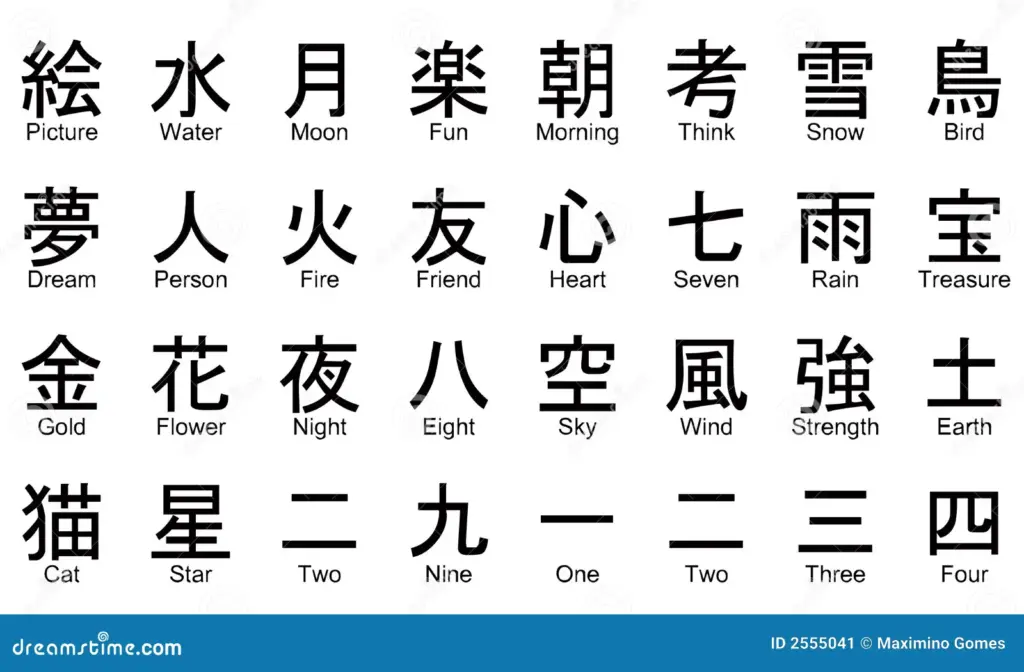
For example: Chinese is one of the most widely spoken languages in the world, yet its writing system is fundamentally different from alphabetic systems. Instead of letters, Chinese uses characters that represent morphemes or entire words.
Logographic nature Chinese characters are logograms, meaning each character represents a meaning rather than a phonetic sound. Teaching children to read involves memorizing thousands of characters and understanding their meanings and pronunciations.
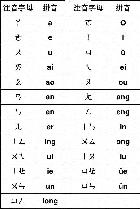
Logographic naturePinyin System To support early learners, Mandarin utilizes Pinyin, a romanized system that teaches the phonetic sounds associated with words. This acts as a bridge to help learners connect spoken and written language to sound words out before they master characters.
Learning to read and write in Chinese often involves understanding the stroke order and the composition of characters, which are made up of radicals that hint at meaning or pronunciation.
Different Reading Directions Across Languages One of the fascinating aspects of global reading practices is the variation in reading direction, which shapes both cognitive processes and instructional strategies:
Left to Right: Languages like English, Spanish, and Russian are written and read from left to right, which is the most common reading direction worldwide.
Right to Left: Languages such as Arabic, Hebrew, and Persian are read from right to left. This requires readers to adapt their visual and cognitive orientation to process information differently.
Top to Bottom: Traditional Chinese and Japanese texts were historically written and read vertically, from top to bottom and right to left. While horizontal text is now more common, traditional formats are still used in certain contexts, such as literature or calligraphy.
Choosing a topic for any significant project, whether it’s a master’s thesis or a creative endeavor, is often deeply personal. For me, the inspiration came from a unique and cherished experience: babysitting a little girl from the age of six months until her current age of eight years. Watching her grow and develop has given me a profound appreciation for the early stages of learning, especially the pivotal process of learning to read. Especially during the COVID lockdowns in 2020, I spent a huge amount of time with her. Both the parents had to keep working as essential personnel and I split my time between online studies and going to their house to babysit. I witnessed her first words, her first attempts to recognize letters, and her eventual transition to reading full sentences with confidence. Through every stage, I saw how critical the early years are for laying the foundation of literacy skills. Especially for a kid that is raised bilingual. I saw firsthand how challenges in reading could lead to frustration but also how the right tools, encouragement, and patience could foster excitement and growth.
At the heart of my research and effort lies a clear goal: to create meaningful, effective learning materials for preschoolers. I aim to combine my personal experience with rigorous academic research to design tools that are engaging, developmentally appropriate, and inclusive. Here’s what I envision as the outcomes of my work:
Developing interactive learning materials Preschoolers learn best when they’re having fun. I plan to create interactive and visually engaging materials that captivate young minds. These tools will incorporate storytelling, colorful illustrations, and hands-on activities to make the learning process enjoyable and effective.
Promoting a love for reading Ultimately, I hope to spark a lifelong love for reading in children. By creating materials that celebrate curiosity, imagination, and discovery, I want to show that reading is not just a skill but a gateway to endless possibilities.
This picture was included with the permission to share it on this site alone. Do not use in any other context.
Learning to read is a crucial milestone in a child’s development and forms the foundation for lifelong learning. To support children successfully, various didactic approaches and methods have been developed. In this article, I will provide an overview of the most common methods of teaching reading and their practical applications.
1. Whole-Word Method The whole-word method focuses on recognizing words as whole units, similar to visual symbols. Children learn to identify high-frequency words quickly through repetition and associations. This method is particularly suitable for early learning stages to create a sense of achievement. Criticism includes limited ability to decode unfamiliar words.
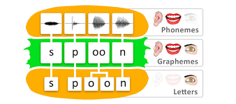
2. Phonemic-Synthetic Method This method emphasizes the relationship between letters and sounds. Children learn to translate letters into sounds and combine them into syllables and words. This systematic approach is especially effective in developing a deep understanding of the alphabetic principle.
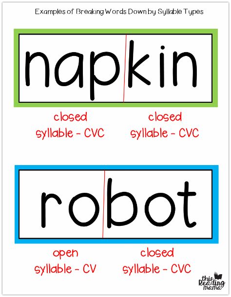
3. Syllable Method The syllable method relies on teaching syllable structures as the building blocks of reading. By focusing on syllables, the complexity of words is reduced, which is particularly helpful for multisyllabic words. This method has proven especially effective for children with reading difficulties.
Reading fluency and text comprehension are two essential aspects of the reading process. But how can children be supported effectively in developing these skills? Reading Aloud: Regular reading aloud improves pronunciation and helps increase reading speed and accuracy. Paired reading, where a child and an adult take turns reading, is a particularly effective method. Repeated Reading: Reading the same text multiple times builds confidence and speed. This method is especially effective for fostering the automation of word recognition. Comprehension Strategies: Encourage children to ask questions, make predictions, and summarize the content in their own words.
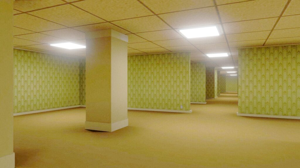
There’s a strange, almost haunting allure to liminal spaces. These are the empty hallways, deserted office corridors, and endless parking garages that feel frozen in time, places that seem familiar but lack the warmth of human presence. The internet phenomenon of “the backrooms” captures this perfectly: infinite, fluorescent-lit spaces that feel uncanny and unsettling.
But why do these spaces affect us so deeply? And how can this eerie, detached quality inspire design?
What Makes Liminal Spaces Feel Eerie?
Liminal spaces are defined by their “in-between” nature. They exist in transition zones neither fully occupied nor abandoned. The sense of eeriness comes from their detachment from human purpose. These are places meant for passing through, not staying, and when devoid of people, they lose their intended function and feel unnervingly off.
Liminal spaces often share distinct characteristics that contribute to their unsettling aura. Uniformity is a key feature, with repetitive patterns, identical rooms, and featureless designs that evoke a suffocating monotony. Harsh fluorescent lighting adds to the unease, bathing everything in an unnatural, sterile glow that feels alien and cold. Finally, these spaces are marked by an unsettling emptiness devoid of personal touches, warmth, or signs of life creating an uncanny void that leaves viewers feeling disconnected and adrift.
Liminal Spaces in Art
Designing the Uncanny
In design, certain elements can evoke an atmosphere of unease or intrigue, challenging the viewer’s comfort while sparking curiosity. Repetition and uniformity, for example, create visual tension. Grids or patterns that repeat endlessly can feel hypnotic yet slightly disorienting, keeping the viewer caught between fascination and discomfort. Similarly, hyper-clean, over-processed aesthetics can feel detached and impersonal; while visually striking, they risk losing warmth and connection, leaving an impression of sterility. Muted color palettes and flat lighting can further heighten this effect, washing designs in tones that feel distant or overly neutral, evoking stillness or even lifelessness.
Typography can also play a role, with stretched letters, misaligned kerning, or unconventional placements subtly disrupting the norm, creating a feeling of dissonance. These elements, while not inherently eerie, tap into the same sense of ambiguity and unease that draws us to the unfamiliar and the imperfect.
What’s fascinating is how the eerie feeling of liminal spaces parallels the direction modern design is heading, especially with the rise of AI. While AI-generated designs excel in precision and efficiency, they often lack the human touch that makes design feel alive. Like liminal spaces, these creations can feel too perfect, too detached, and ultimately soulless.
The Role of Supermodernity in Liminal Design
The eerie feeling of liminal spaces is deeply tied to the concept of supermodernity, a world obsessed with speed, efficiency, and transient experiences. In supermodern environments, spaces like airports, hotel lobbies, and highway rest stops prioritize functionality over identity. These are “non-places,” devoid of history or emotional connection.
In design, supermodernity’s influence can be seen in the rise of templates, algorithms, and hyper-efficiency. This has led to a flood of designs that, while functional, often feel detached or impersonal. Interestingly, the aesthetics of liminal spaces highlight this very tension. They reflect the soullessness of mass-produced environments and challenge us to think critically about the designs we create. Are we leaning too heavily into efficiency at the expense of meaning?
Why Liminality Resonates
There’s a reason why images of liminal spaces go viral. They capture a shared, almost primal unease, a reminder of what’s lost when spaces or designs lack humanity. For designers, this eerie aesthetic offers a powerful way to provoke thought and engage emotions.
By borrowing elements from liminal spaces, we can create work that taps into this sense of unease. Whether it’s through uniformity, emptiness, or a deliberate lack of “soul,” these designs challenge the viewer to confront feelings of isolation and detachment.
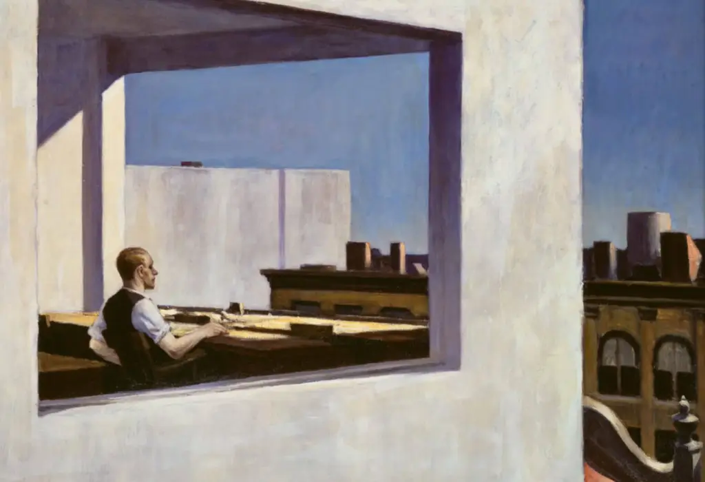
Edward Hopper – Office in a Small City
Liminal spaces, both physical and digital, are unsettling reminders of a world increasingly defined by transitions and non-places. In design, they force us to confront the consequences of detachment and explore how we can create meaning within the eerie and the unfamiliar.
By embracing the unease of liminal aesthetics, designers have the opportunity to craft work that lingers in the mind: haunting, thought-provoking, and eerily beautiful. However, as we explore this visual language, we must also recognize the broader concerns of soullessness and detachment already present in contemporary design. The challenge lies in balancing these eerie, intriguing elements with a sense of humanity and connection, ensuring that our creations evoke emotion and meaning rather than reinforcing the cold, impersonal trends that risk alienating us further.
Sources
Augé, Marc. Non-Places: Introduction to an Anthropology of Supermodernity. Verso, 1995. Fisher, Mark. The Weird and the Eerie. Repeater Books, 2016. Hatherley, Owen. “Why Is Modern Design So Soulless?” The Guardian, 2018. https://www.theguardian.com McClelland, Samuel. “AI and the Future of Creative Work.” Journal of Digital Culture, 2023. What Are Liminal Spaces?” The Aesthetics of Eerie Environments, Medium. https://medium.com
Head-Up Displays (HUDs) are becoming an essential tool in modern vehicles, providing essential driving information without requiring the driver to look away from the road. However, designing HUDs that work seamlessly in both bright daylight and dim nighttime conditions presents significant challenges. To ensure optimal visibility and usability, designers must consider adaptive brightness, contrast and colour schemes tailored to different lighting environments.
The challenges of lighting
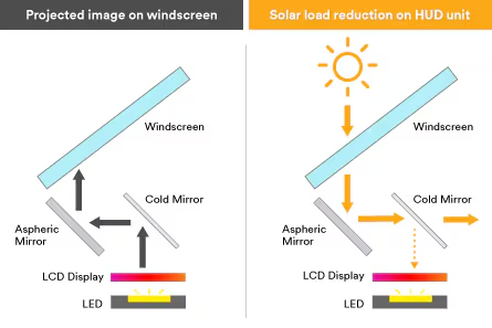
Driving environments can change dramatically between day and night, affecting how information is perceived on HUDs. In bright sunlight, glare and reflections can wash out display elements, making them difficult to read. Conversely, at night, overly bright HUD elements can cause eye strain and distract the driver from concentrating on the road.
An effective solution to lighting challenges is adaptive brightness. Using ambient light sensors, HUDs can automatically adjust their brightness levels to suit the environment. For example, during the day the display can increase in brightness to reduce glare from sunlight, while at night it can be lowered to reduce strain on the driver’s eyes.
High contrast between HUD elements and their backgrounds is critical for readability, especially in difficult lighting conditions. Designers can use bold, high-contrast text and symbols to ensure clarity. For example, white or light-coloured text on a dark background works well at night, while dark text on a lighter background improves visibility during the day.
Appropriate colour schemes can improve readability and reduce cognitive load. During the day, bright colours such as green, blue or orange can help highlight important information, while at night, softer tones such as muted blues and greys prevent excessive brightness. Red should also be avoided at night, as it can impair night vision.
Real-world implementations
Automotive manufacturers are developing advanced HUD systems with lighting adaptability. For example, some systems use micro-mirror technology to dynamically adjust brightness based on ambient conditions, while others integrate multiple layers of colour and contrast to enhance visibility.
Designing HUDs that perform well in all lighting conditions is essential for safety and usability. By incorporating adaptive brightness, optimising contrast and carefully selecting colour schemes, designers can create HUDs that are effective and comfortable to use both day and night. As automotive technology continues to evolve, addressing these lighting challenges will remain a critical aspect of HUD design.
NASA’s data sonification project converts astronomical observations into sound. By assigning different frequencies or instruments to distinct wavelengths of light (X-ray, optical, infrared), cosmic phenomena such as the Bullet Cluster, Crab Nebula, and Supernova 1987A can be “heard”. These audio interpretations highlight features like dark matter, spinning neutron stars, and supernova shockwaves, providing a new, immersive way to experience and understand the universe.
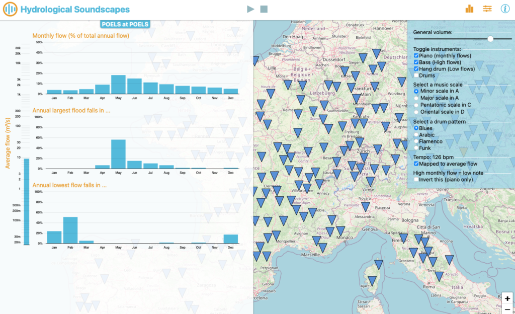
Hydrological Soundscapes | Ivan Horner and Benjamin Renard (2023)
This app visualizes river hydrological data from thousands of global hydrometric stations in both bar charts and musical form. Each of four hydrological variables (average flow, monthly flows, monthly frequency of annual daily maxima, and monthly frequency of annual 30-day averaged minima) controls different musical elements, such as tempo, pitch, volume, and instrument choice. Users are encouraged to wear headphones for the best experience and can either follow a brief tutorial or start exploring immediately.
This passage describes a musical representation of library traffic patterns throughout the year. Each “row” of notes corresponds to a different time of day (weeks, mornings, afternoons/evenings, and nights) and is placed in a progressively higher pitch range. School breaks, weekends, and term times are reflected in gaps or surges in the music, illustrating how library hours and visitor numbers change across the summer, fall, winter, and spring quarters. Nights are only represented during school terms, highlighted by two-note arpeggios in the highest pitch range.
Multisensory Data: Insights from “DATA AND DASEIN”
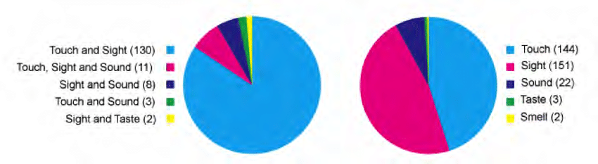
In the dissertation “DATA AND DASEIN – A Phenomenology of Human-Data Relations,” by T. Hogan a review of 154 data representations revealed that most rely on sight (151) and touch (144) to interpret data (Figure 1, B). A smaller subset (22) also incorporated sound, and even fewer tapped into taste or smell. Moreover, 139 examples combined both sight and touch, while only 11 used more than two sensory channels (Figure 1, A).
Figure 1: A: Pie chart (right): distribution of sensory modalities usedin combination with other modalities. B: Pie chart (left):Combinations of sensory modalities.
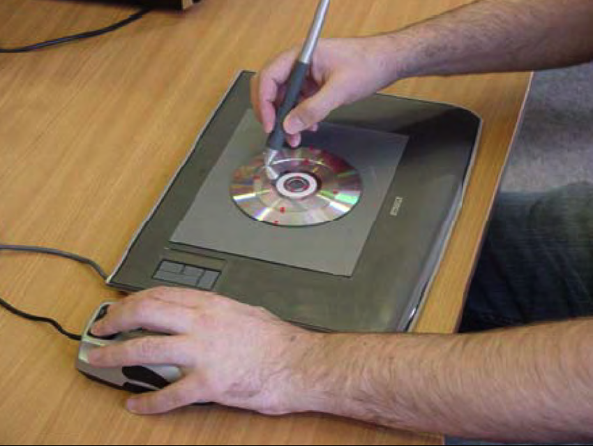
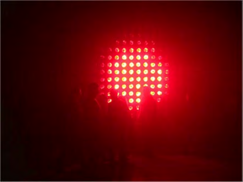
One standout example is Tac-tile (Figure 2), designed for visually impaired users. By combining tactile (via vibrotactile feedback through a stylus) and auditory (adjusting pitch through speakers) elements, Tac-tile highlights how multiple modalities can enable a richer, more inclusive data exploration. This concept extends beyond assistive technology: artist Ryoji Ikeda’s Data.anatomy[civic] [2] merges audio and dynamic graphics to immerse audiences in the intricate data driving Honda Civic car design. Meanwhile, Perpetual (Tropical) SUNSHINE [3] (Figure 3) uses infrared light bulbs to convey real-time temperature data from stations around the Tropic of Capricorn, translating environmental data directly into heat and light. And in more experimental territory, Data Cuisine by Moritz Stefaner [4] explores taste, smell, and sight to transform data into “edible diagrams.”
Figure 2: Tac-tile system. Graphics tablet augmented with a tangiblepie chart relief, with dynamic tactile display [1]Figure 3: Perpetual (Tropical) SUNSHINE by fabric
These examples underscore the creative possibilities of thinking beyond purely visual representations. When designers and researchers integrate multiple sensory channels, they can unlock new forms of engagement, accessibility, and emotional resonance.
Reference
T. Hogan, Data and Dasein – A Phenomenology of Human-Data Relations, Ph.D. dissertation, Bauhaus-Universität Weimar, Weimar, Germany, 2016, sect. 5.5.1.1 (Sensory Modalities).
[1] Steven A. Wall and Stephen A. Brewster. “Tac-tiles: MultimodalPie Charts for Visually Impaired Users.” In: Proceedingsof the 4th Nordic conference on Human-computerinteraction changing roles – NordiCHI ’06. Association forComputing Machinery (ACM), 2006. doi: 10.1145/1182475.1182477. url: https://doi.org/10.1145%2F1182475.1182477. [2] Ryoji Ikeda. data.anatomy.civic. website. 2012. url: http://dataanatomy.net/. [3] fabric | ch. Perpetual (Tropical) SUNSHINE. (2006). website.2012. url: http://www.fabric.ch/pts/. [4] Moritz Stefaner. Data Cuisine. website. 2014. url: http://data-cuisine.net/.
Flat design is a design approach that focuses on minimalistic design elements. This design stil avoids 3D effects, shadows and realistic textures and concentrates on flat, two-dimensional elements. Flat design is minimalistic and avoids decorative elements. The clear and plain aesthetic particularly popular in web design. This approach promotes the universal comprehensibility and ensures that important content is in the front.
Key features of flat design
Simple shapes: Rectangles, circles and clear linies
Strong colours: Vibrant, often primary and secondary colours
Minimalistic typography: Clear, well-readable fonts without decorations
Icons and symbols: Universally understandable symbols often replace long texts
No effects: No shadows, gradients or overlays
The history of flat design
The roots of flat design go back to the 1940s and 1950s, particulary in the areas of graphic design and art. Movements such as Bauhaus and the Swiss school of graphic design laid the foundations on simplicity and funcionality. The Flat design was developed as a counter-movement to realistic and detiled styles such as skeuomorphism.
Skeumorphism is a design style in which digital elements imitate real objects and materials to make them more familiar and intuitiv. Examples are wood and leather textures in apps or a recycle bin icon for deleting files.
With the spread of smartphones and the need to enable clear and fast interactions on small screens, flat design began to gain popularity. Microsoft was one of the pioneers when they introduced a completly flat design concept with the release of Windows Phone 7 in 2010. In 2013, Apples followed with iOS 7 and mostly abandoned skeumorphism. This change marked the beginning of a broad trend that extended to websites, apps and software.
Why is flat design so popular?
The popularity of flat design is closely connected to the needs of modern users and technologies. Here are several reasons why flat design plays such a significant role in web design:
Mobile First: Flat design is perfect for responsive web design, as it relies on simple elements and clear structure that can be easily scaled.
Fast charging times: By avoiding complex graphics and effects, the amount of data that a website has to load is reduced.
Contemporary aesthetics: Flat design conveys modernity and clarity.
Ease of use: navigation elements are clearly recognisable and the user journey is made simple and more intuitive.
Brand identity and recognition: by using clear colour palettes and minimalist shapes, brands can communicate their identity more clearly.
Use of flat design on websites:
Flat design is used particularly frequently on websites. There are a few aspects to bear in mind:
Create a clear hierarchy: Through the specific use of sizes, colours and spacing rules, users can quickly identify the most important content. For example, bold colours can be used for call-to-actions such as ‘Buy now’ or ‘Learn more’.
Use bold colour palettes: Colour choice plays a central role in flat design. Clear and vibrant colours should be used. Ideally, the colour palette should contain three to five colours.
Icons: Icons replace complex graphics and offer a universal and visual language. A paper aeroplane, for example, can stand for the ‘send’ option.
Use typography consciously: Without elaborate graphic elements, typography takes centre stage. A sans serif, simple and clearly legible font should be avoided.
Emphasise interactive elements: Flat design can sometimes appear too plain. It is therefore important to clearly emphasise interactive elements such as buttons or links, for example with a hover effect. Animations can also be used to liven things up.
What is Semi-flat design?
Semi-flat design is a mix of flat design and some realistic details. It uses simple shapes and colors, similar to flat design, but adds subtle elements like shadows or layers to create depth. This combination makes the design look clean and minimal while still appearing slightly three-dimensional. It is popular because it is easy to use, visually appealing, and gives a modern feel.
Advantages and disadvantages of flat design
Like every design style, flat design also has its strengths and weaknesses.
Advantages:
Clarity: Content is in the foreground, which improves readability.
Scalability: Perfectly suited for responsive design.
Modernity: Looks contemporary and appealing.
Performance: Fast loading times thanks to reduced graphics.
Disadvantages:
Monotony: If implemented incorrectly, flat design can appear boring.
Comprehensibility: Without shadows or gradients, buttons and other interactive elements can appear less intuitive.
Limited creativity: Minimalism can present designers with challenges when it comes to presenting complex information in an appealing way.
Das Ziel meiner Arbeit liegt darin, die Geschichten von Personen zu beleuchten, die aufgrund von Diskriminierung – sei es durch Geschlecht, Herkunft, soziale Zugehörigkeit oder andere Vorurteile – nicht die Anerkennung in der Kunst erfahren haben, die ihnen zusteht. Indem ich diese Geschichten erzähle, möchte ich nicht nur ihre Beiträge zur Kunst sichtbar machen, sondern auch auf die strukturellen Ungerechtigkeiten hinweisen, die dazu führten, dass ihre Werke und ihr Wirken lange Zeit übersehen oder marginalisiert wurden. Es geht darum, diesen Menschen Gehör zu verschaffen und ihre Kunst in unsere heutige Zeit zu holen, um zu zeigen, wie wichtig sie ist. Gleichzeitig soll ihre Geschichte dazu anregen, darüber nachzudenken, wie die Kunstwelt in der Vergangenheit mit Vielfalt und Gleichberechtigung umgegangen ist.
Stichworte
Ich habe ein kleines Brainstorming gemacht, was genau ich repräsentieren will. Folgende Schlagwörter sind hier besonders prominent erschienen:
„Vergessene Künstlerinnen“, „Diskriminierte Kunst“, „Verbrechen in der Kunst“, „Unterrepräsentierte Kunstbewegungen“, „Kunst und Minderheiten“, „queere Kunstgeschichte“
Ursprünglich war mein Wunsch ein feministisches Projekt mit Fokus auf Frauen zu erarbeiten, aber hier gibt es schon sehr viel Aufarbeitung. Natürlich ist das Thema bis heute ein Problem, und man kann auch schwer sagen, dass es schon auserzählt ist, aber die queere Kunstgeschichte ist vielleicht eine Nische, die noch weniger Aufmerksamkeit bekommen hat. Oder vielleicht waren männliche homosexuelle Künstler doch weniger ein Tabu-Thema als meine Hypothese es vermuten lässt. Ich kann mir auch gut vorstellen, das queere Frauen extrem wenig bis keine Repräsentation in dieser Szene hatten. Hier ist aber auch die Schwierigkeit, überhaupt an wissenschaftliches Material zu kommen. Dazu recherchiere ich noch.
Experten Interviews
Ich habe von unserer Lektorin Stefanie Egger einen Kontakt zu einer Frau bekommen, die sich für die Digitalisierung von Kunst einsetzt und die sicherlich einen wertvollen Einblick hat, welche Gruppierung oder auch Hinweise auf Geschichten von Einzelpersonen, die noch unterrepräsentiert sind.
Außerdem werde ich auch meinen alten Kunstgeschichte Professor (der selber Künstler ist) dazu kontaktieren, dieser ist in der Kunstszene gut vernetzt und hat durch seinen Beruf und auch seiner Lebenserfahrung viel Informationen, die meine Arbeit vorantreiben könnte.
Bücher
Women Artists: The Linda Nochlin Reader
Hidden Histories: 20th Century Women Artists
Film: Big Eyes
Es gibt einen Film, den ich vor ca. 10 Jahren mal gesehen hab und der mich echt unglaublich mitgenommen bzw. auch inspiriert hat. Und zwar war das “Big Eyes” (2014), in Spielfilm der auf die wahre Begebenheit der unterdrückten Künstlerin Margaret Keane durch ihren Ehemann Walter basiert. Ihre Werke wurden nämlich zunächst nicht ihr, sondern ihrem Ehemann zugeschrieben. Walter, selbst ein erfolgloser Künstler, erkannte das kommerzielle Potenzial von Margarets Gemälden und vermarktete sie erfolgreich – jedoch unter seinem Namen. Margaret wurde dabei mehr und mehr in die Rolle seiner „Kunstsklavin“ gedrängt, die heimlich arbeitete, während er den Ruhm einheimste. Aufgrund der gesellschaftlichen Strukturen der Zeit hatte Margaret zunächst keine Möglichkeit, sich gegen diesen Betrug zu wehren. Margaret macht schließlich die Wahrheit öffentlich bekannt und zieht gegen Walter vor Gericht. In einem Prozess wird sie aufgefordert, live im Gerichtssaal ein Gemälde anzufertigen, um zu beweisen, dass sie die wahre Künstlerin ist – und wird damit befreit.
Da Margaret Keane heute eine der bekanntesten Künstlerinnen ihrer Zeit ist, eignet sich ein solcher Fall nicht optimal für meine Zwecke. Aber die Art des emotionalen Storytellings dieses Films und das ein einzelner Fall auch representativ für ein systematisches Problem viel aufzeigen kann finde ich besonders inspirierend auch für meine Arbeit.
Was mir jedoch im Zuge der Recherche zu dieser Story aufgefallen ist, ist, dass es extrem häufig vor kam, dass Frauen “im Schatten” von Männern standen und tatsächlich männliche Kollegen, Lehrer, Partner oder Familienangehörige deren Arbeiten im eigenen Namen vertrieben haben.
„Revisionist History“ ist ein Podcast, der von Malcolm Gladwell moderiert wird. „Revisionist History“ untersucht Themen, Ereignisse oder Personen, die in der Vergangenheit übersehen, missverstanden oder falsch interpretiert wurden. Gladwell betrachtet diese Geschichten aus neuen, oft überraschenden Blickwinkeln, um zu zeigen, wie kleine Details, kulturelle Verzerrungen oder historische Blindspots größere Konsequenzen haben können.
Datenbanken und Web-Projekte
Auf folgende Webseiten bin ich bei meiner Recherche bisher gestoßen. Diese könnten auch bei weiterer Nachforschung interessant sein.
“Herstory” = Der Begriff “Herstory” ist ein Wortspiel, das sich aus dem englischen Wort “history” ableitet, jedoch mit dem Fokus auf Frauen und ihre Geschichten. Während history wörtlich “seine Geschichte” (aus his-story) suggerieren kann, betont herstory“ihre Geschichte” (her-story), um auf die oft übersehene oder unterrepräsentierte Rolle von Frauen in der Geschichte hinzuweisen.
Der Begriff wird häufig in feministischen Kontexten verwendet und zielt darauf ab, die traditionelle Geschichtsschreibung zu hinterfragen, die oft von männlichen Perspektiven dominiert ist. Herstory setzt sich dafür ein, vergessene oder marginalisierte Beiträge von Frauen sichtbar zu machen, sei es in der Politik, Wissenschaft, Kunst oder anderen Bereichen. Es geht darum, die Geschichte inklusiver zu gestalten und alternative Perspektiven zu beleuchten.
Sophie Taeuber-Arp (1889–1943): Eine Schweizer Künstlerin, deren Beiträge zur Dada-Bewegung oft ihrem Mann Hans Arp zugeschrieben wurden. Ist anscheinend in der Schweiz bereits sehr bekannt. Cool daran ist, dass sie die Großtante von Silvia Boadella ist, und ein lebender Nachkomme würde vielleicht viel interessanten Input hinzugeben können.
Chronologisches Storytelling auf Web-Plattformen bedeutet, dass eine Geschichte oder Ereignisse auf einer Webseite in der Reihenfolge erzählt werden, in der sie tatsächlich passiert sind. Digitale Werkzeuge wie Bilder, Videos oder interaktive Elemente machen die Inhalte dabei lebendiger und spannender. Ein bekanntes Beispiel ist „Scrollytelling“. Hier wird der Inhalt so präsentiert, dass sich die Geschichte beim Scrollen nach und nach entfaltet. Das ist besonders bei längeren Artikeln oder Reportagen beliebt, weil es die Leser*innen stärker einbindet und den Text weniger statisch wirken lässt. Quelle: https://www.vev.design/blog/scrollytelling-tools/
Zweck
In meiner Arbeit soll es um die Repräsentation von Minderheiten in der Kunst gehen. Darum wurde auch Chronologisches Storytelling gewählt, um mit einer öffentlich zugänglichen Methode auf kreative Weise einen emotionalen Zugang zu schaffen.
Ein gutes Buch zu diesem Thema ist „Digital Storytelling: Form and Content“, das erklärt, wie digitale Plattformen genutzt werden können, um spannende Geschichten zu erzählen. Quelle: https://link.springer.com/book/10.1057/978-1-137-59152-4
Fallbeispiele
ÖBB History
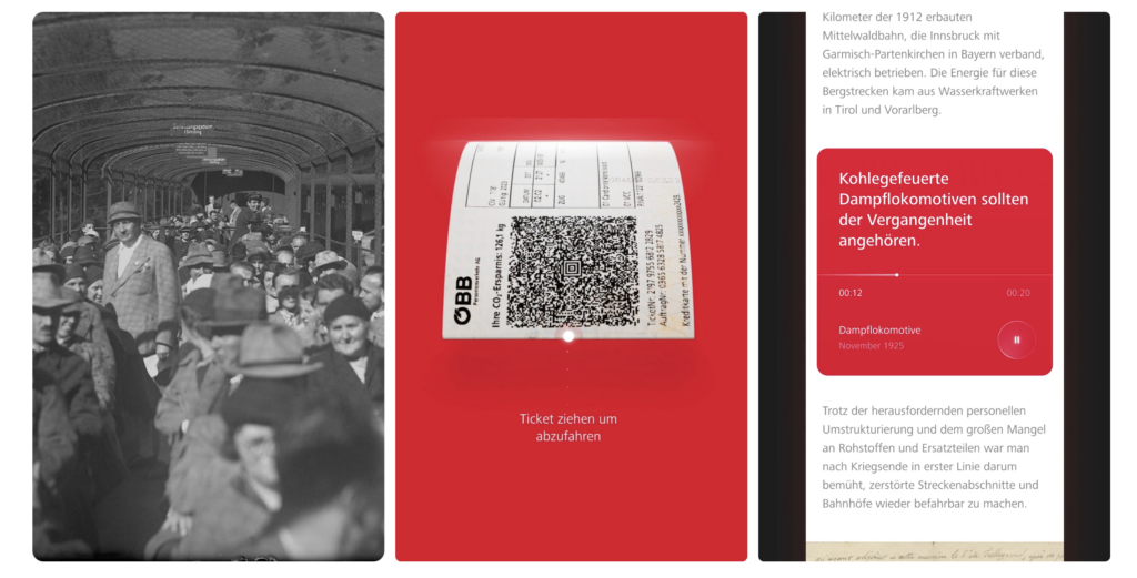
Als erstes fällt mir bei dem Thema direkt die ÖBB History page von der Agentur wild in Wien ein.
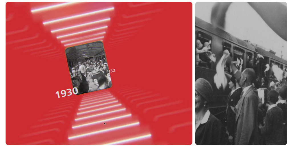
Die Website bietet eine interaktive Zeitreise durch die Geschichte und Zukunft der Österreichischen Bundesbahnen. Im Fokus stehen die wichtigsten Ereignisse der letzten 100 Jahre, bedeutende Errungenschaften sowie die weniger bekannten, dunkleren Kapitel ihrer Geschichte.
Interaktion erhält man zum Beispiel durch Scrolling in einer Timeline, es gibt aber noch zusätzlich unkonventionellere Aktionen wie z.B. ein Ticket ziehen oder Datepicker betätigen um in der Zeit zu springen und verschiedene Arten von Slider.
Es wurde aus meiner Sicht nicht zuuu viel an Effekten hinzugefügt, was die Website auch überladen kann, aber einzelne, sehr ausgeklügelte Animationen die super abgestimmt sind auf den Anwendungsfall gewählt. Meiner Meinung nacht ist das schon eine der coolsten kommerziellen Webseiten, die ich bisher gesehen habe.
Leider ist sie aktuell nicht mehr online: https://oebb-history.at/en. Aus dem Grund hab ich dem Entwickler Team geschrieben, ob es die wieder geben wird oder ob ich anderwertig nochmal darauf zugreifen kann. Da ich schon einmal Kontakt mir der Agentur hatte, kann ich gegebenenfalls auch technisch Nachfragen, wie die Umsetzung genau gelaufen ist und wo es vielleicht Challenges bzw. Tipps für mich gab/gibt.
Ukrain War Non Profit
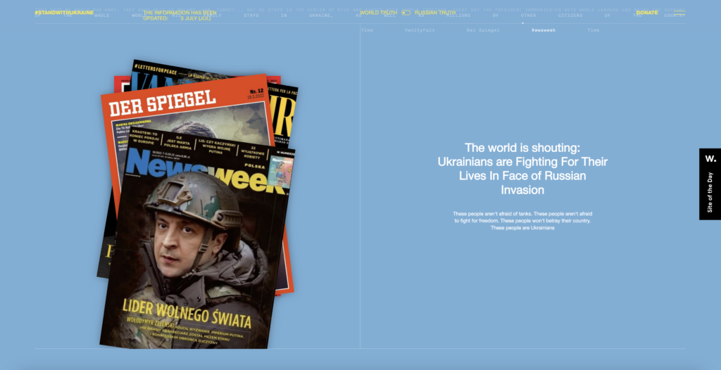
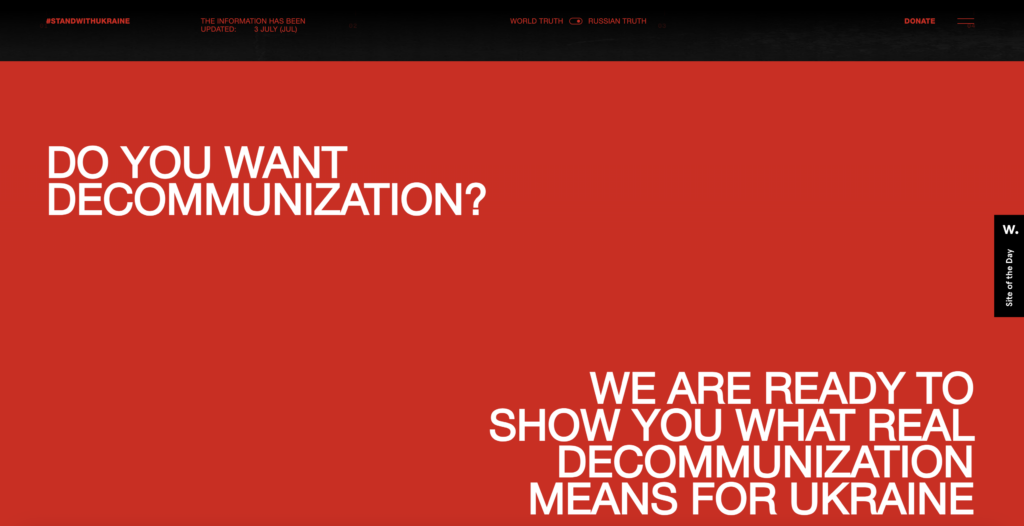
Diese Website ist ein non profit Projekt von “The First The Last” Agentur in USA. Sie macht das geschehen in der Ukraine auf eine weise erlebbar und sorgt somit auf eine emotionale Weise für Support durch User, die am Ende zur Hilfe aufgerufen werden.
Fachlich gesehen wird auch hier über verschiedene Interaktionsmöglichkeiten ein immersives Erlebnis geschaffen.
Besonders spannende Idee: über einen switch button kann man zwischen “World truth” und “russian truth” die Ansichten wechseln.
Mein take-away davon: Ich finde es besonders spannend, wenn Webseiten sich komplett in ihrer art der Interaktion und im Design auf den erlebbaren Content fokussieren. Auf diese Weise bekommt eine Webseite, mit deren Funktionen so vieles möglich gemacht werden kann, eine viel tiefere Bedeutung.
Progressive overload, the principle of gradually increasing the stress placed on the body to build muscle and strength, is a cornerstone of effective fitness programs. Traditionally, it requires manual adjustments to weights, repetitions, or intensity based on performance. However, as fitness technology advances, automating this process through apps could revolutionize the way people train. This blog post explores how automated progressive overload could work in a fitness app, its benefits, and why this approach could make strength training more efficient and accessible.
What Is Progressive Overload and Why Does It Matter?
Progressive overload is essential for muscle growth and strength gains. Without progressively challenging the muscles, the body adapts to the current workload, leading to a plateau in progress. The process involves increasing weight, repetitions, or intensity over time. For example, if you performed three sets of squats at 100kg last week, adding an extra 2.5kg or an additional repetition in the following session ensures your muscles continue to adapt and grow.
The benefits of progressive overload include
Consistent Growth: It ensures that muscles are regularly challenged, leading to hypertrophy and strength gains.
Adaptability: It works for all fitness levels, from beginners to advanced athletes.
However, manually tracking and adjusting these variables can be daunting, especially for beginners. This is where automation could come in handy.
How Would Automated Progressive Overload Work in an App?
An app designed to automate progressive overload would collect and analyze user data, such as:
Performance Metrics: Weight lifted, repetitions completed, and sets performed.
Feedback: User ratings on how difficult the workout felt (e.g., using the Rate of Perceived Exertion, or RPE).
Recovery Tracking: Information on rest, sleep quality, and fatigue levels.
Based on these inputs, the app would dynamically adjust training variables. Here’s how it might look:
Data Collection: After a workout, the user logs performance metrics and recovery status.
Analysis: The app uses algorithms to evaluate whether the user can safely increase weight, repetitions, or intensity.
Adjustments: The app updates the training plan for the next session, ensuring the user progresses while avoiding overtraining.
For example, if a user completes three sets of 8 reps at 80kg on the bench press and rates the difficulty as moderate, the app might recommend increasing the weight to 82.5kg in the next session.
Benefits of Progressive Overload Automation
Personalization Automated systems can tailor training programs to individual needs, making adjustments that account for performance, recovery, and fitness goals. This level of customization ensures optimal progress for each user.
Consistency Manual tracking can lead to inconsistencies, especially for users new to strength training. An app eliminates guesswork, providing a reliable structure for progression.
Efficiency By handling adjustments automatically, the app allows users to focus on executing their workouts rather than worrying about programming. This is particularly beneficial for those with limited time or knowledge.
Motivation Through Metrics Seeing regular, data-driven improvements can boost motivation and adherence. Automated tracking highlights small victories, keeping users engaged in their fitness journey.
Safety Automation can reduce the risk of overtraining by ensuring progression aligns with recovery status. Apps can recommend deload weeks or lighter sessions when necessary.
The Case for Automation: A “Set-It-and-Forget-It” Approach
For many users, especially beginners, automating progressive overload provides a stress-free way to train effectively. By trusting the app’s recommendations, users can focus entirely on performing their exercises. This approach democratizes access to effective programming, making it accessible even to those without prior fitness knowledge.
However, even with automation, user input remains vital. Feedback on difficulty and recovery ensures the system adapts accurately. Advanced users might also appreciate manual override options for added control.
Conclusion
Automating progressive overload in a fitness app bridges the gap between effective training and accessibility. By leveraging data and algorithms, such apps ensure consistent, personalized progress without the need for manual adjustments. The benefits are clear: efficiency, motivation, and safety, all while maintaining the fundamental principle of progressive overload.
As fitness technology continues to evolve, automated systems could become the norm, simplifying strength training and empowering more people to achieve their fitness goals. The future of strength training lies not just in lifting heavier weights, but in leveraging smarter tools to get there.
Sources:
1. Schoenfeld, B. J., & Grgic, J. (2019). Progressive overload revisited: principles for optimizing strength and hypertrophy. Journal of Strength and Conditioning Research.
2. Dr. Muscle. (n.d.). “How progressive overload works and how our app automates it.” Retrieved from dr-muscle.com.
3. StrengthLog. (n.d.). “What is progressive overload, and how can it help you build muscle?” Retrieved from strengthlog.com.
4. ACSM. (2021). Guidelines for resistance training and progression. American College of Sports Medicine.