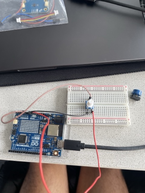
So my initial project about the CO2 emissions in AUT had 13 steps on a timeline you could loop through with key controls. So I’m thinking how am I gonna set my Arduino parts up, to work with my existing concept? This blogpost should tell you about my first steps, trying to figure that out. Connecting the parts—trying to get progress towards the concept of my existing one.
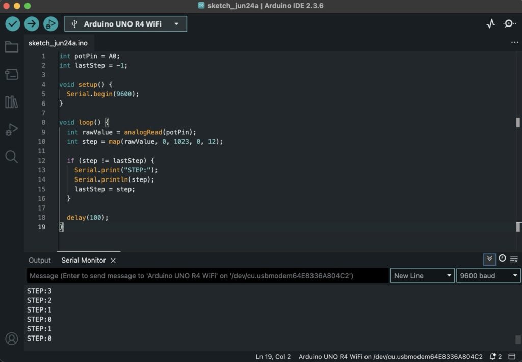
My thoughts creating this code were pretty loose at first. I just wanted to get some kind of input from the potentiometer, without fully knowing what I’d do with it yet. I had the concept of a CO2 visualization in the back of my mind, and I knew I had split the data into 13 time periods earlier, so I figured I’d map the potentiometer to 13 steps and see what happens. It was more about testing how I could interact with the data physically, using whatever tools I had lying around. The code itself is super basic—it just checks if the current step has changed and then sends that info over serial. It felt like a small but useful first step.
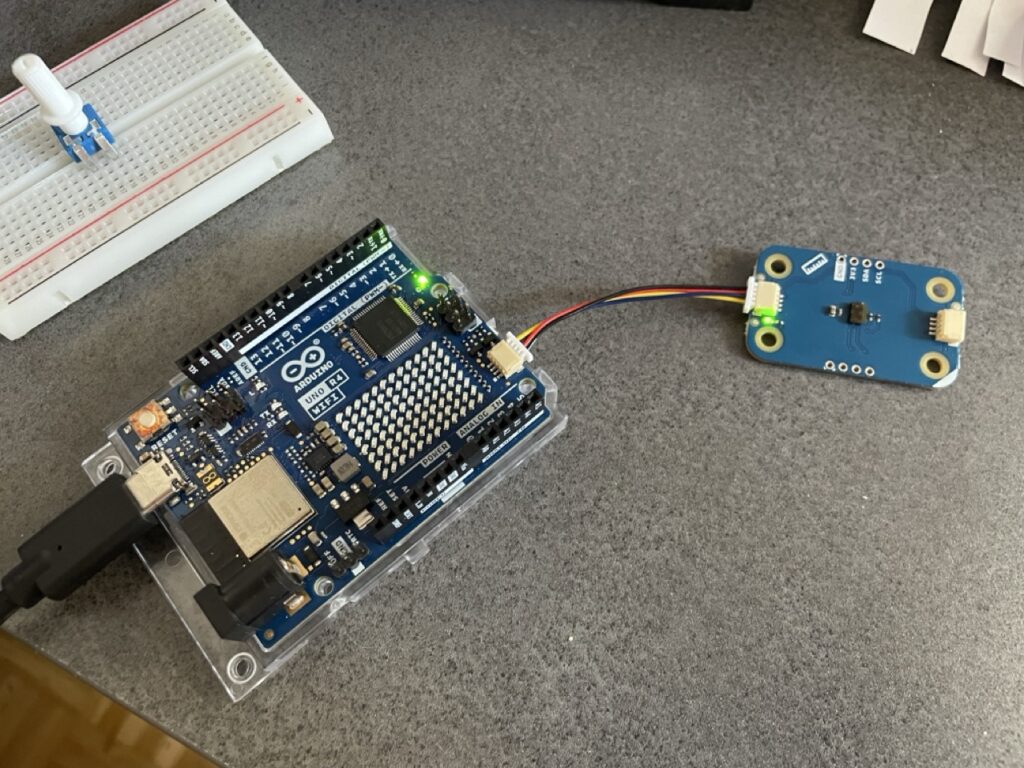
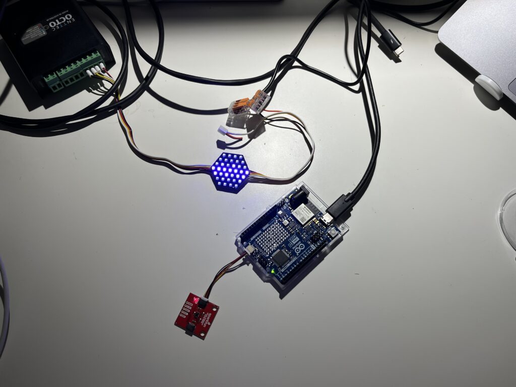
Also i integrated a distance modulino already thinking about how i could use this one for my prototype.
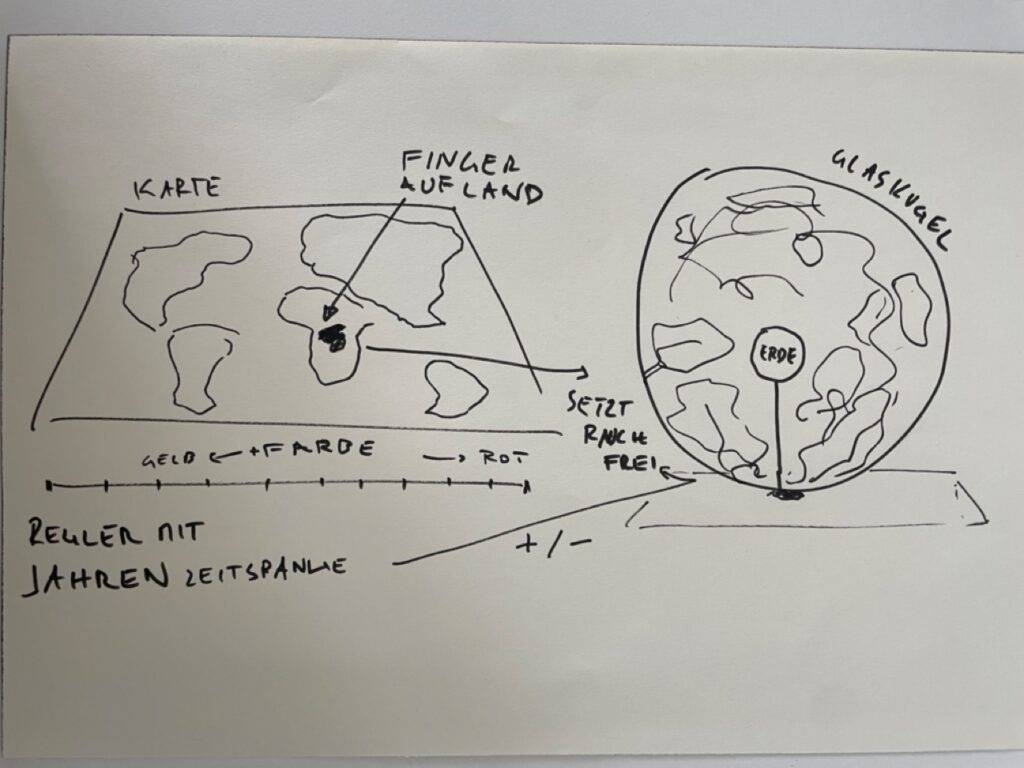
With a very basic setup from the library, to get the input of the sensor. I wrote a sketch that just triggers true or false when i move my hand over the sensor. I am thinking about my very first idea of the design week, to trigger an interaction/visualisation when i step on a plate with the shape of the country I want to see the emission data of. Maybe I can go in this direction this time? I want to give you another picture to show you what I mean.
Of course, this will not be realizable now but thinking about the map interaction could be a good concept for the technological boundaries I have set with my pieces I got from the FH.
During a past project, I started working with data about Austria’s annual CO2 emissions. I created my own dataset using global emission data, filtered down by country and year—all done with Python, which I was using for the first time, very interesing technology—so convenient. It was a bit of a learning curve, but also really cool to see the results take shape.
One thing that stood out was how certain moments in history, like war times, had a visible effect on the emission levels. That connection between historical events and environmental data got me thinking: how can I turn this into something people can interact with and experience beyond just reading numbers?
From Makey Makey to Arduino
I started with a simple setup using Makey Makey to build a basic interaction. It worked for a quick demo, but I quickly realized I wanted more control and flexibility. So now, I’m shifting to Arduino. I found a few components at the FH lab and I’m planning to use those to build something more responsive and physical. I’m not totally sure yet how I want everything to work, but I’m interested in seeing how these parts could represent parts of the data—like maybe scrubbing through time or showing intensity of emissions with light or movement.
Just Starting to Explore
Right now, I don’t have a clear final concept, and I’m okay with that. This part of the process is more about experimenting, testing out ideas, and seeing what happens when the data meets the physical world. I think there’s a lot of potential in making climate data more tangible—not just for me, but for others who might interact with it. So my next step is to start playing with the Arduino board, hook up the sensors, and just try stuff. Maybe something will click, maybe I’ll go in a totally new direction. Either way, I’m curious to see where it leads.
Three cups of coffee, an A4 sheet of foam board, and a stack of scavenged textures later, I finally have a first physical model of flood risk in the Tulln area. It is rough, flimsy in places, and already shedding, but it’s also the most concrete (and tactile!) expression of my idea so far.
Choosing “A4” over “A-Lot”
I promised myself to work small this time. An ~A4 footprint forces ruthless simplification:
Only the Danube’s immediate floodplain.
No elevation gain because there is almost none in that area.
2 flood scenario (HQ 30 & HQ 100).
That constraint kept the materials list tight and the cutting tolerable with a hobby knife.
Thirty-Minute Build
Print → Trace → Cheat Printer died, so I traced the WISA map contours right off my screen onto scrap paper, then onto materials—eyeballing when necessary.
Knife workQuick, approximate cuts of cardboard, cork, felt, and foam.
Base & WaterCraft-foam ribbon for the Danube; its cool, slick surface instantly stands out.
Land UsesFelt for green, cork for sealed areas. Simple rectangles keep the skyline abstract.
Flood OverlaysRough side of each sponge = HQ 30; soft cellulose side = HQ 100. Cut to match the WISA outlines and glued as over-lays.
Total build time: ~30 minutes.
First Blind Pass
With eyes closed I traced from river outward:
Foam river – instantly identifiable.
Rough sponge – HQ 30; its grit jolts the fingertip.
Cardboard steps – subtle, but enough curb-height to prove the land does rise.
What I Learned
At A4 scale every millimetre matters. Flood zones have to be chunky enough to feel but not so thick they dwarf the elevation logic.
Textures communicate hierarchy if the height difference is consistent. Soft-but-low worked only when the sponge sat at the same level as the surrounding terrain.
Material memory is powerful. Sandpaper felt “urban” without explanation, reaffirming research on intuitive texture cues.
Further thoughts
Movable Sponge OverlaysCut each HQ zone as a separate, magnet-backed piece. Users can lift, align, or stack them to see extent differences.
Sliding FilmPrint HQ 30 and HQ 100 outlines on transparent acetate (raised ink or puff-paint). Slide the film over the base map; tactile bumps show where water spreads further.
Stackable “Risk Chips”Punch small, uniform discs out of sponge: light-touch discs for HQ 100, rough discs for HQ 30. Drop them into a recessed Danube channel to build a tactile bar-chart of depth along chosen transects.
Add a braille / raised-symbol legend to the bottom edge.
Run a short thinking-aloud test with at least three users, including one low-vision participant.
Before any code or visuals, I need to be clear about the emotional arc of the installation. The users would be free to feel peace, tension, or any emotion, which would make the space restorative (biophilic), provocative (biophobic).
Build the Decay Engine
This is the technical heart of the project. I’m designing a system that remembers and changes based on how it’s treated through inputs like the time spent in front of the work; motion, sound, or proximity and speed, frequency, or intensity of interaction.
The outputs would resolve into blur, color shift, fragmentation, erosion of digital textures and the sound could be detuning, fading, glitching. Tools I’m considering for a final product are TouchDesigner, Max/MSP with OSC (for generative sound) and Sensors (motion, mic, or camera input)
Micro-Prototypes
Rather than build the full system at once, I’ll start with small sketches like a digital painting that becomes more glitchy if you interact with it.
I’ve proceeded to improve the lamp’s physical design and technical implementation after creating the initial proof of concept to test the fundamental interaction loop. The objective at this point is to make the prototype more like the final experience, which I envision to be soft, ambient, emotionally soothing, and user-friendly.
Shifting from ZigSim to Arduino + Sensor
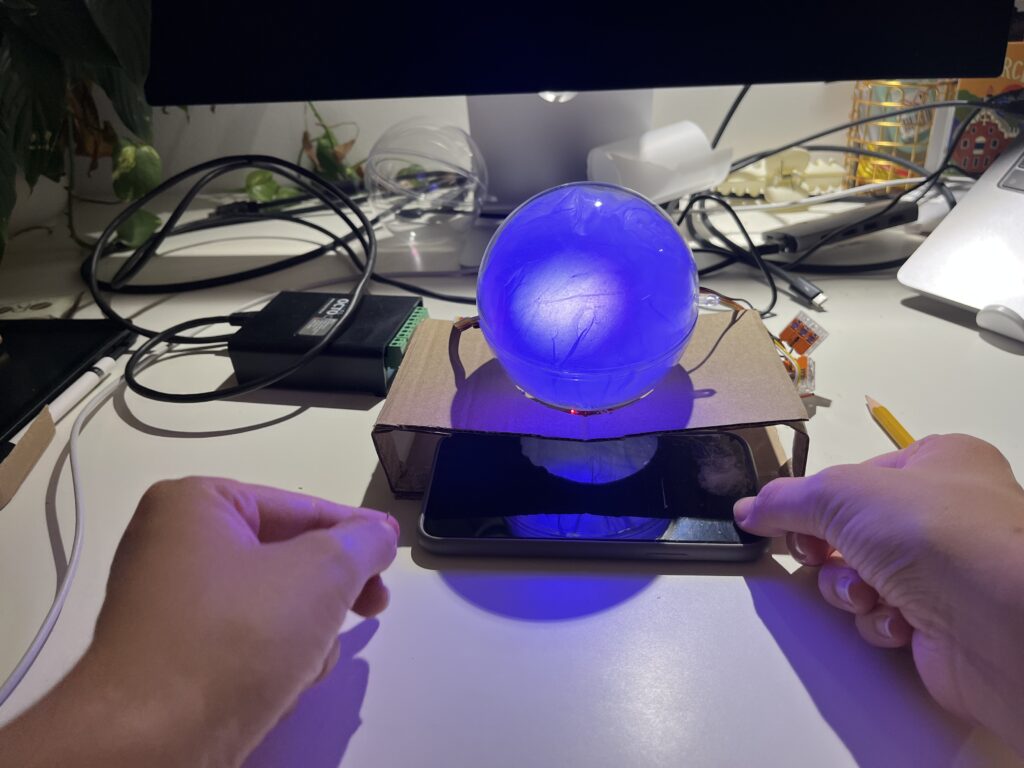
In this step of the prototype, I moved away from using ZigSim with the mobile sensor, to using an Arduino board with a proximity sensor. The sensor detects when the phone is placed in the dock and sends this data to Max/MSP, which then triggers visual feedback in Resolume Arena. This allowed for a more modular and scalable system: the phone becomes a passive actor in the setup, while the lamp actively reflects the user’s engagement or disengagement with it.
Redesigning the Dock
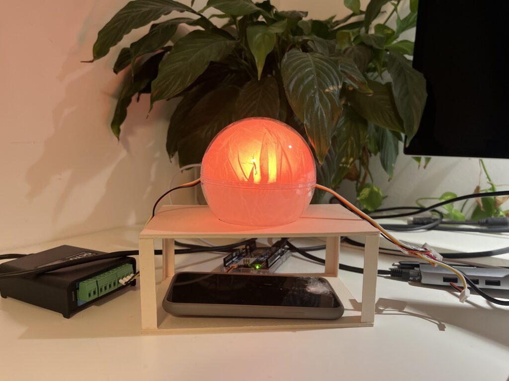
Since the first prototype of the dock was too big and bulky, I shifted toward a rectangular, low-profile dock that takes up less space and fits more naturally into the physical environment of a desk. When I built the second prototype, I realized that it wasn’t high enough, because you almost couldn’t put the phone in it. When I built the third prototype, I made it a bit higher so that you could put the smartphone in easily.
The lamp
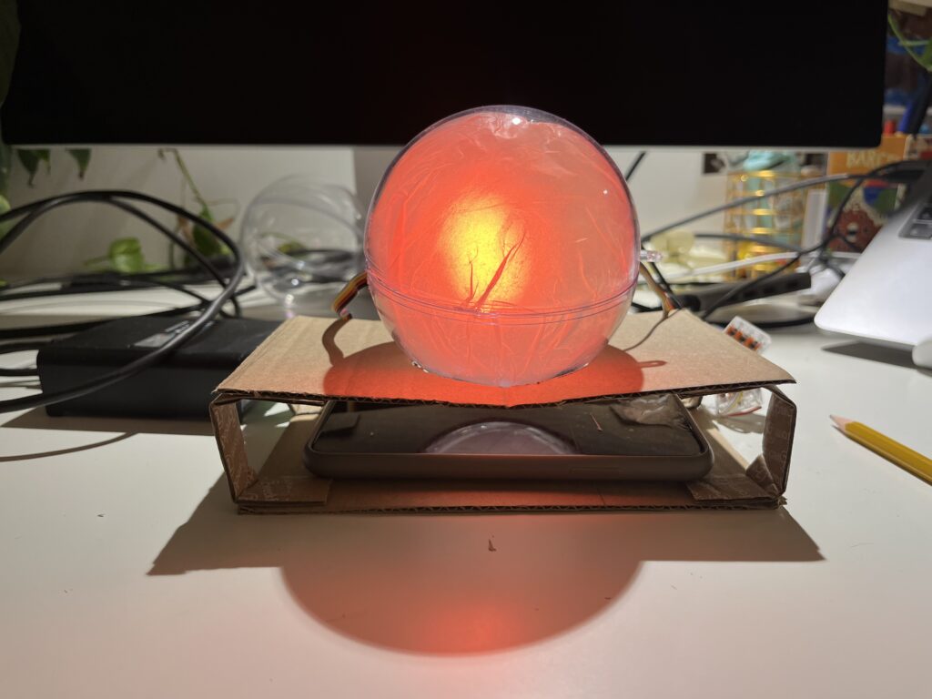
In the first prototype, I experimented briefly with using transparent paper to diffuse the LED strips, and I decided to take that idea further. For this version I put a LED hexagon into a see-through sphere. To avoid hard and direct light, I lined the inside of the sphere with transparent paper, softening the light and creating a much more ambient, almost lantern-like glow. This resulted in a less like “technology” and more like calming object. The light is still the primary feedback. When the phone is placed on the dock, the LED hexagon glows with a gentle, diffused light, signaling the beginning of a focus session. Is the phone removed the color of the light changes – not to shame the user, but to offer a reflective signal. This fits the principles of Calm Technology: feedback is present but not dominant. The lamp becomes a kind of behavioral mirror – always gentle, never forceful.
Some more thoughts – Creative Prompts
In the last session Birgit suggested an interesting shift in perspective – what if distraction wasn’t always something negative, but could actually hold meaning? That idea really stuck with me. I haven’t implemented it into the prototype yet, but I’ve been thinking a lot about it, especially because I know how common it is, especially in creative fields, to feel guilty when we’re not being “productive” or working on something for school. That guilt is exactly what I don’t want people to feel when they use the Focus Lamp.
As someone who works creatively, I’ve often noticed how much time I can end up spending on my phone, especially on social media. And after a while, I started to feel like I was losing a bit of my spark and creativity. That feeling is part of what inspired this project in the first place. So now I’m considering integrating an app after all, not as the main feature, but as a gentle companion to the lamp.
The idea is that if someone is in focus mode and still picks up their phone, instead of being punished or shamed, they’re offered a creative prompt. Something light and inspiring to nudge them in a different direction during that moment. For example: “Draw what’s around you for 10 minutes,” “Read 10 pages of something,” or “Stretch for a few minutes.”
It’s not about blocking the phone or enforcing discipline. It’s about helping people reconnect – with their creativity, their bodies, their curiosity – especially in those moments when they’re about to drift into passive scrolling. It should just be a small nudge, maybe in the right direction.
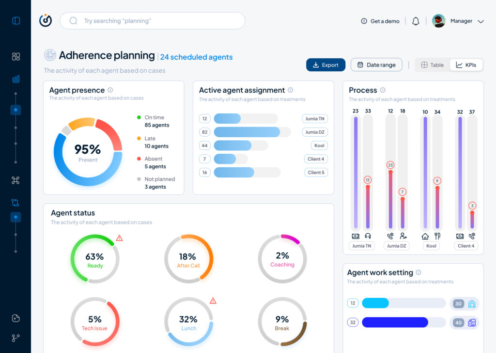
As part of my SaaS project, one of the user interfaces that had to be done is the Steering dashboard but it required a lot of back and fourth of feedback, iterations and meetings to finally come to a great enough version in terms of functionality and business but as a product designer and using Lean UX as a methodolgy , at some stage I had to do an iteration test.
Macro and Steering are the fundamentals of what consists this interface, they serve the business internally as much as they serve it externally with clients and prospects.
Macro: refers to the holistic overview of an insights dashboard and its part of the macro-micro dynamic that I’m using as a system thinking for the whole project.
Steering: provides a real-time view of every KPI needed to make better decisions and steer the business towards a better course.
This testing/iteration process shows the first level of a user interface that required little user interview, user feedback and zero iteration but it served as a good foundation and a stepping stone to a later version that will pave the way to the “final” iteration.
The first version was even called ‘Adherence Planning’ which was an innacurate term of what we are trying to achieve and also because it defined only one aspect of the whole dashboard.
It had the basic insights that we want to show without much output but it was limited, inefficient and not value driven on a business level.
So after much stakeholder’s feedback we iterated that version to a much effective version that visualised the data in a much more functional manner and I did that through designing the work force performance gauge chart, rearranging the cards to suit the data monitoring priority, tweaked the charts and their colors on a UI level for more effective anomaly identification, streamlied the data visualisation with proper alerts identification and finally made the 3 dots ‘kebab’ compartment the drawer where every additional setting is hidden, and here is where I arrived:
The Steering Dashboard is now much more structured and serves the decision making business goal on a decent level, every KPI can be checked and monitored in real time along with checking the business performance in terms of profit and loss through the “Work force performance” gauge.
What I learned
A disruptive data vizualisation product can never be done, but through proper UI UX design, testing, iterating and coming up with the optimal solutions, it can reach a certain level of efficient structure that will propel it to achieve some of the business goals that were far further in the roadmap of the product experience and all of the above can only be done through collaboration and proper communication within a team.
All and all, I’m just getting started and i’m thrilled to work more on the refinement of both my skills and everything that I get involved in
I have a confession: I have never donated blood in my life. I have donated plasma around 4 times during my early 20s but my main motivation here was the 40€ that were offered after the donation. I have wanted to donate blood often but it always seemed like a lot of work. There was never the time, the places were too far away or I had just recently got a piercing or tattoo which forbid me to donate…the usual excuses. But I never really actively tried to book an appointment or go to a donation campaign when i was eligible to do so.
In my dream world where there is an e-health application for all things medical, blood donation would be an easy and accessible process where you get a notification every couple of months to remind you to donate blood at a place near you. Not an extra app, website or random instagram post you see and then forget it exists.
How to book an appointment
Option 1: Web
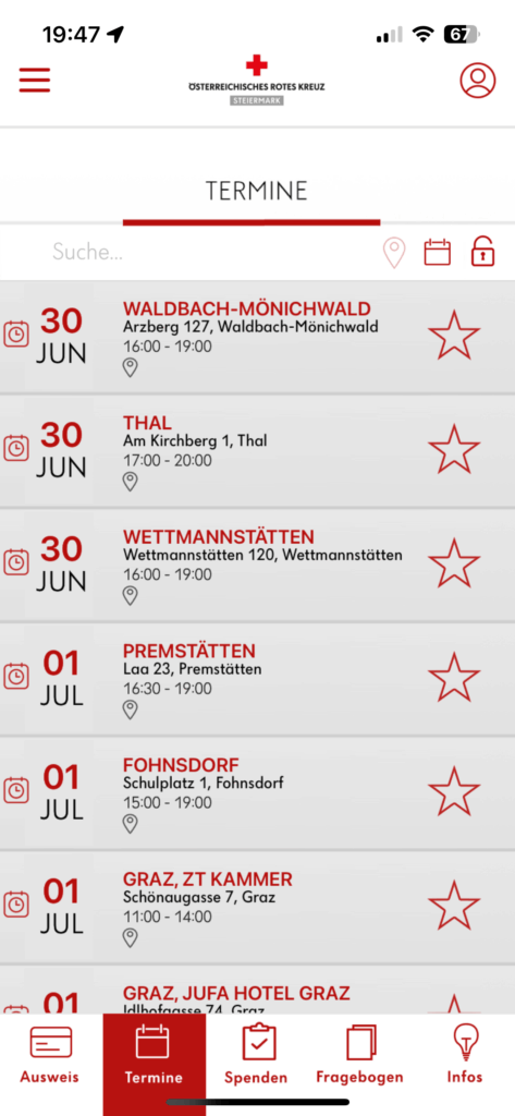
In a quick google search “blut spenden graz” I was directed to the website of the Red Cross. Overall I was pleasantly surprised by how simple it was to book the appointment via the browser. The only thing that was annoying was that the initial page to see available appointments was all appointments in Styria and not filtered by Graz. I would also have loved to have a map and see my location to see where exactly the locations were because I don’t know my way around Graz that well jet. But apart from the fact that the design was a little outdated the process was pretty simple and within 5 minutes I had my appointment booked.
Available appointments in Styria, a little overcrowded.Simple radio button selection
Option 2: Mein Blut App
Next I downloaded two apps from the Red Cross. I was a little confused that there were two apps and I still don’t really know whats the difference but more on the other one later. The Mein Blut app downloaded faster so thats the one I tried first. I quickly created an account and was onboarded into the app. I really liked that different sections were highlighted.
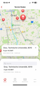
I liked the map feature so I could choose the closest location to me. But even though i granted permission to the app to use my location, I wasn’t able to see my location in the app and had to find my closest location by zooming in from the entirety of the whole Austrian map.
Overall the app had a simple design and was easy to navigate through. Booking an appointment was straightforward but unfortunately I was not able to fill out the questionnaire in this app. I was directed to the “Meine Blutspende” app. Annoying!
Option 3: Meine Blutspende App
I’m guessing that this is the more “official” app. At first glance it seems more outdated. “Mein Blut” is much more modern but I’m assuming that it’s not available in Styria.
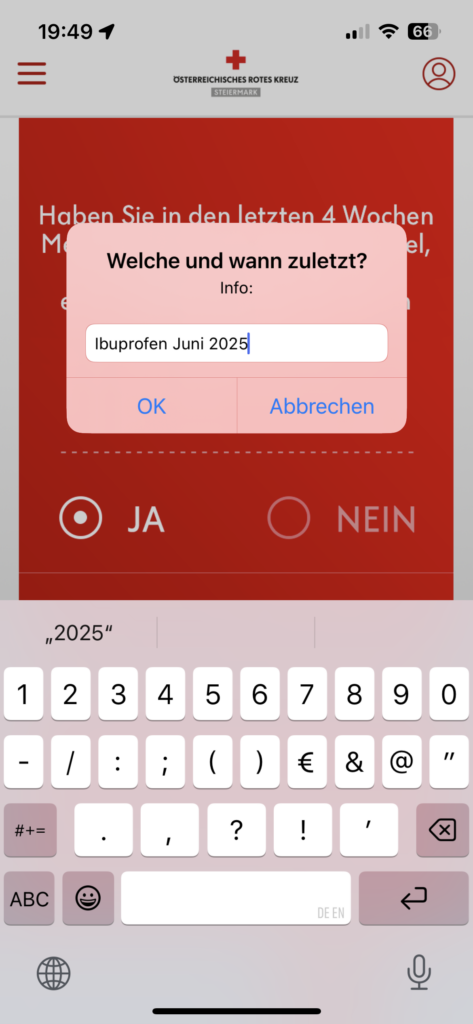
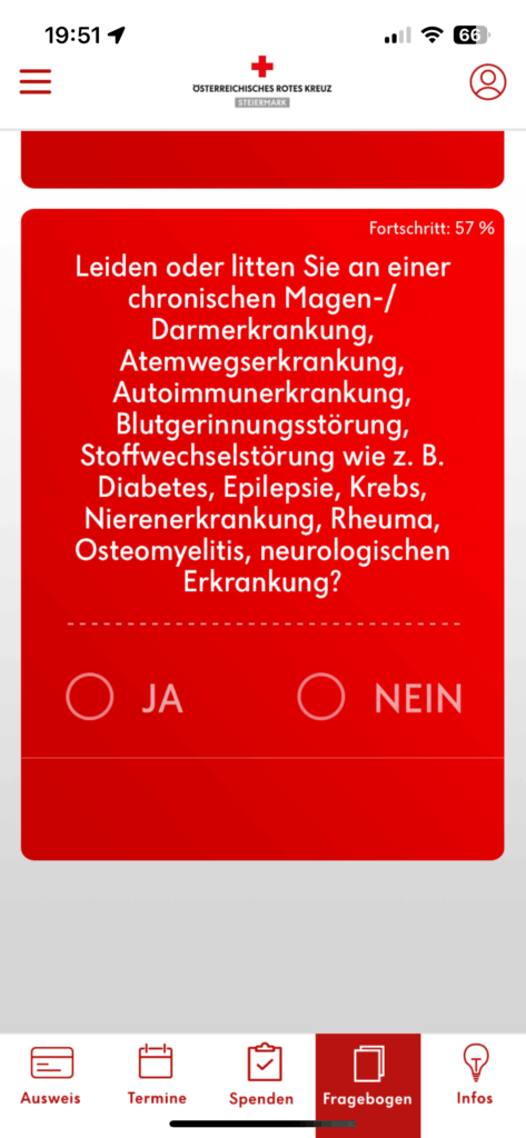
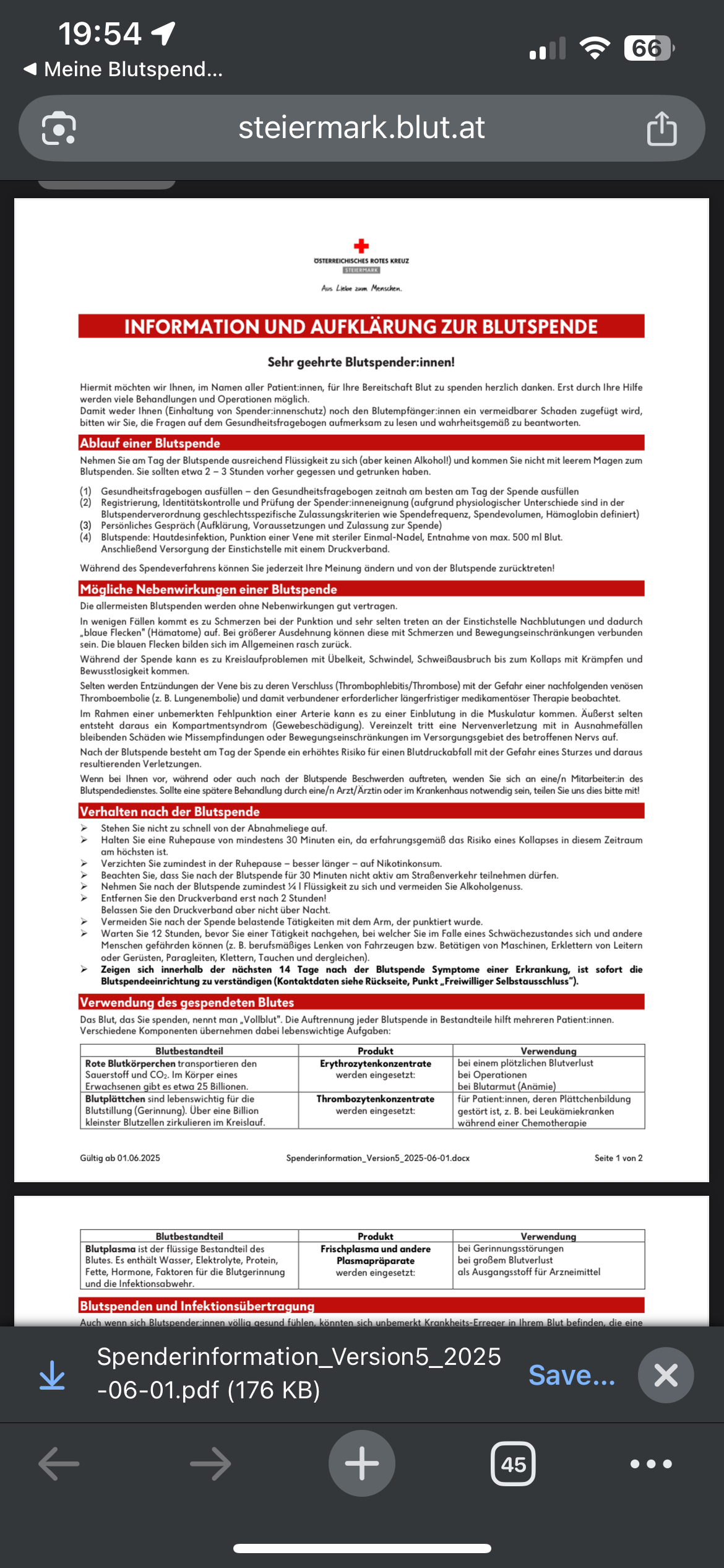
Selecting process was weird because you had to click the very unnoticeable gray “Auswahl übernehmen” ButtonAgain not filtered by exact location despite me granting the app my GPS Very strange input of mandatory dataTerrible formatting. Very hard to read because of the red background, font and the center aligned text.Reading about agreeing to the conditions and about the process inside this pdf was just simply horrible. I think this should be part of the app and structured in a more readable way.
QR Code after completing the questionnare revealed that this is only valid for one day. I was not aware of this and now I will have to do the whole thing again the day before my appointment. Annoying!
After testing the different ways for booking donation appointments I can conclude that there is lots of room for improvement with the booking process. Let’s see what I will come up with in my next blog post.
As I researched the development of web art, I became fascinated by its growth in the early 2000s. At that time platforms like Flash helped web art thrive. But as Flash was discontinued and web optimization, e-commerce and SEO became more important, web art started to fade, becoming a smaller part of the internet.
For my prototype, I wanted to see if it’s possible to bring web art back in a new way—through vibecoding, a method where creativity guides coding to produce art. Because I didn’t have enough time to fully create a web art website, I decided to let participants make small digital art artifact using p5.js. With the help of ChatGPT and DeepSeek, three people created their own art in just 15 minutes.
The participants were diverse in terms of age and experience: one was 60 years old and had never used AI for coding before; another was 25 with no coding experience; and the third was 24 and knew basic JavaScript. After the activity, I asked them about their experience and how they felt during the session.
What I learned from this experiment is that with a little guidance and some basic knowledge of the subject, AI can make it easier for people to get involved in web art. Even with limited experience, the participants were able to create their own pieces quickly. AI and vibecoding, therefore, can open the door for anyone to join the world of web art.
Looking at this, I think web art might be ready for a comeback. Thanks to AI tools, more people can now experiment and contribute, even without advanced skills. The time could be right for web art to return and gain new life.
So even though I really liked working with the Pomodoro timer / physical prototyping I’ve decided to move forward in this Blog with the Blood donation App since it ties closer with my idea for my Master’s Thesis.
In this post I want to give a little bit of a summary about why blood donations are important and why we/ Austria struggle with having enough blood reserves.
In short
Blood donation shortage; one is needed every 90 seconds (1,000 daily).
Reduced donor participation due to the pandemic and summer vacations.
Hospitals require more blood especially in summer (higher risk of injuries)
Donations last a maximum of 42 days, requiring constant replenishment.
Eligible doners: Ages 18 to 70, must meet health and legal criteria.
Expanded to include intersex, non-binary, and some previously excluded individuals after assessment.
Donation takes around 10 minutes
Donation is about 465 ml of blood
Image Source: APA/ERWIN SCHERIAU
Austria is currently facing a shortage of over 5,000 blood donations. Experts are stressing the urgent need for donations, urging all Austrians to show solidarity and donate blood, as each donation can save a life. Tanner noted that soldiers and civilian staff are leading by example in this initiative, with a total of 135 blood donation events planned across all nine federal states this year.
The demand for blood is constant, with a blood donation needed every 90 seconds for surgeries, emergency situations, and chronic illness care. The number of donations tends to drop significantly during the summer months due to vacations, even though the need remains high. New eligibility criteria introduced in June aim to enhance donor safety but may restrict donation frequency for some individuals. Therefore, the Red Cross emphasizes the importance of encouraging young people to donate blood. [1]
New regulations for blood donation in Austria have been introduced to enhance safety and increase donor eligibility. Despite the life-saving importance of blood donations, only 3.4% of the population donates regularly. As of early June, individuals are now allowed to donate less frequently—men can donate four times a year, while women can donate three times. This change is based on scientific findings that highlight the risk of iron deficiency from excessive donations.
The new rules have expanded the pool of eligible donors, allowing intersex, non-binary individuals, and those without gender designation to donate. Additionally, people who have previously had malaria or autoimmune diseases can now donate after a medical assessment, as they were previously excluded.
As summer approaches, the Red Cross is particularly urging potential donors to step forward, as the need for blood increases during this season due to a higher incidence of accidents. Blood has a limited shelf life of 42 days, making it essential to maintain a steady supply.
Donating blood not only helps others but also offers health benefits for the donor, as blood is tested, and individuals are notified if any issues are detected. [2]
How does a blood donation work?
The blood donation process begins with the decision to help others, followed by a visit to a donation center where potential donors complete a medical questionnaire. Medical assessments are conducted, including checking blood pressure and hemoglobin levels. The actual donation is quick, taking about 10 minutes, after which donors can relax and enjoy snacks and drinks. [3]
Next steps
I would like to analyze the various methods available for booking a blood donation appointment and assess the user-friendliness of the process. Additionally, I want to explore the motivations behind why individuals choose to donate blood, as well as the factors that deter them from doing so. It is important to consider whether the donation process is perceived as complicated or if there are accessibility issues that may hinder potential donors.