Democratising Web Art with Vibecoding

What happens when you give someone just 15 minutes to turn a creative idea into a web artwork — without planning, rules, or polish? Can you, without prior knowledge of coding create something meaningful in a short amount of time?

That’s exactly what my prototype is trying to explore.

The Idea

In this prototype, participants are invited to sit down, open Processing, and bring a web-based art idea to life. They have only 15 minutes — no tutorials, no perfection. I want to bring people from different experience levels to this session to compare the results.

How It Works

  1. A person joins the session.
    They bring an idea for a small digital artwork — something they want to try or express.
  2. They have 15 minutes.
    In that time, they generate code for Processing using AI Tools like ChatGPT or DeepSeek to make their idea real. It doesn’t have to be finished or perfect — it just has to feel right.
  3. The results are saved.
    Each step or version they create is collected, so we can see how their idea grows or changes during the session.
  4. A short interview follows.
    After the session, I ask a few quick questions:
    • How did it go?
    • Did the result match what you imagined?
    • What surprised you?

What I Want to Learn

This project is about more than just quick and dirty artworks. I want to understand:

  • How people think creatively under time pressure
  • What kinds of ideas can appear in a short vibecoding session
  • If the vibecoding session finishes with a product that matches the expectations of the participants

17 – Clickable Prototype v1

After all the sketches, user flows, and planning, I finally pulled everything into a quick clickable prototype (Figma is awesome for this, btw). It’s still an early version, but it gives a solid feel of how the app might look and behave. I wanted to see how the Home, Activity, and Settings tabs work together and how smooth the experience feels when clicking through it all.

Here’s a short walkthrough video showing the prototype in action:

Working on this helped me catch a few small details I hadn’t noticed before, like the pacing between steps and where extra feedback could better guide the user. Overall, seeing it come to life, even in a simple form, was a great way to confirm if the structure works.

Next, I’ll refine the flow, tidy up interactions, and start testing how others respond. It’s exciting to finally transition from an idea to something tangible you can click through.

16 – Pulling It All Together

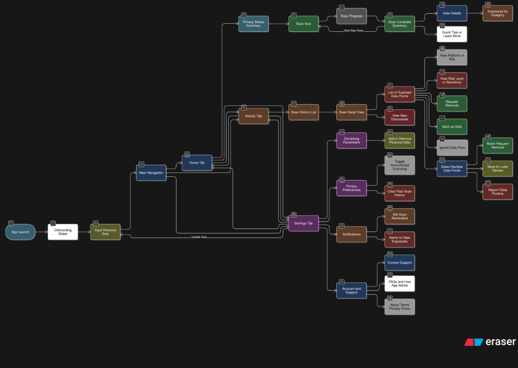
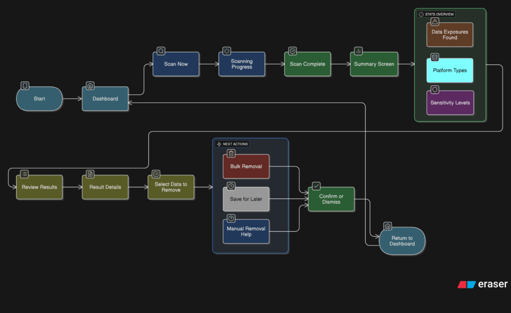
After spending time designing each part of the app on its own, I knew the next step was to figure out how it all fits together. It’s one thing to have a solid Home tab, a clear Activity tab, and a flexible Settings area. But the real challenge is making the tool feel like one connected experience instead of just three separate features sitting side by side.

So I started mapping the full user journey, from the moment someone opens the app for the first time to the moment they take their first action. The goal was to make sure every screen, every tap, and every option felt like part of a bigger flow.

It starts with Home. This is where the user gets a quick update on their privacy status and can tap one button to begin scanning. Once the scan is done, they’re either shown a clean summary that says everything looks good, or they’re nudged to go check out their results in the Activity tab.

That handoff between Home and Activity became really important. It needed to feel natural, not like you’re being dropped into another part of the app. So I kept asking myself questions like, “What happens after a scan?” and “What does the user want to do next?” The answer is usually some version of “check what was found” or “see if anything needs action.”

Once they land in Activity, the results are organized clearly. Old scans are listed with summaries, and new findings are labeled in a way that stands out without being too loud. From there, users can open a scan, review the exposed data, and decide what to do. They might request a removal, ignore it, or save it for later.

Then there’s Settings, which sits quietly in the background but plays a big role in shaping how the app works. Before a user ever hits “Scan Now,” the tool has already been set up to know what data to look for and where to search. That part happens quietly but meaningfully. And at any point, the user can return to the Settings tab to update what they’re tracking or change how often they want to scan.

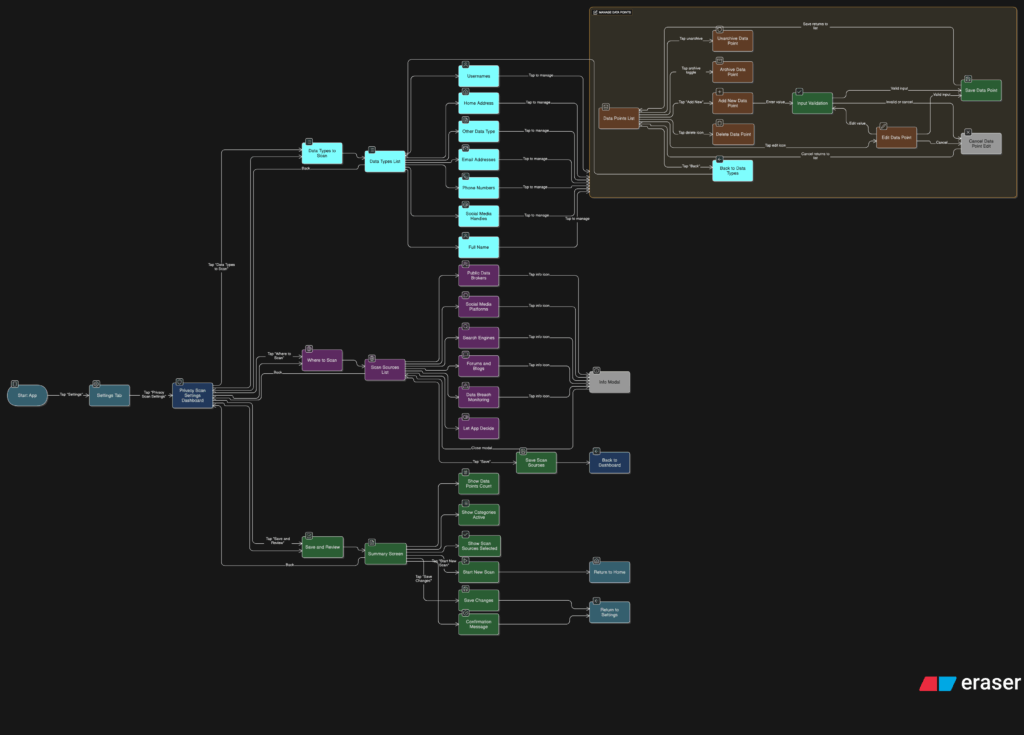
Full App Flow

The more I worked on this flow, the more I realized how important rhythm is. The app should never feel like it’s asking too much at once. It should guide, not demand. There’s a gentle back-and-forth between checking your privacy, understanding your exposure, and deciding what to do about it. That rhythm is what makes the whole thing feel usable.

At this point, the main structure is starting to come together. There are still things to work out, like onboarding, empty states, and what the app says when no data is found. But now that the core journey is mapped, I feel more confident about shaping the rest of the experience.

16. Final prototype and reflections

Overall, I’m very grateful for this assignment because I had been wondering for the past year how to find time to finally learn about chatbot development. Although it’s not directly related to my primary master’s thesis topic, it still connects to part of it. As I mentioned earlier, I plan to test the bot with private doctors or small businesses. If it works as I hope, I would love to integrate it into my design service offerings.

2.6. “The Hidden Side of Graz”

After extensive experimentation with the Touch Board, I’m excited to share a short video showcasing the final prototype in action. This interactive map invites people to discover Graz through touch and sound. Each spot on the map hides a small surprise: a sound, a memory, a piece of the city waiting to be heard. Everything you see here was designed to feel handmade and screen-free, turning simple tech into something a little more magical.

Watch the video to see how it all comes together.

And here’s the video with all the sound stories.
Hope you enjoy 🙂

#14 Preparing to build a prototype

After outlining a national-level idea for a tactile map of Austria in my last post, I quickly realized: starting small is smarter. Not only because of time and material constraints, but because detail matters and working at a regional scale allows me to dive deeper into how elevation, infrastructure, and flood risk actually intersect.

So for my next prototype, I’m focusing on the region around Tulln, and potentially Vienna if time allows. This area offers a compelling intersection of topography, hydrology, and urban development all wrapped around the Danube, Austria’s largest and most flood-prone river.


Why Tulln?

  • It’s a mid-sized town with both urban and rural textures, making it ideal for mixed-surface representation.
  • It lies directly along the Danube, with several documented flood events in recent years.
  • Its relatively flat terrain offers subtle elevation changes—challenging but manageable for tactile representation.
  • Data is available: flood risk maps, land use info, and elevation contours are easier to source at this scale.

Plus: I have a personal reference point for it living close by, which helps in imagining scale and interpretation.


What the Data Says: A Quick WISA Deep-Dive

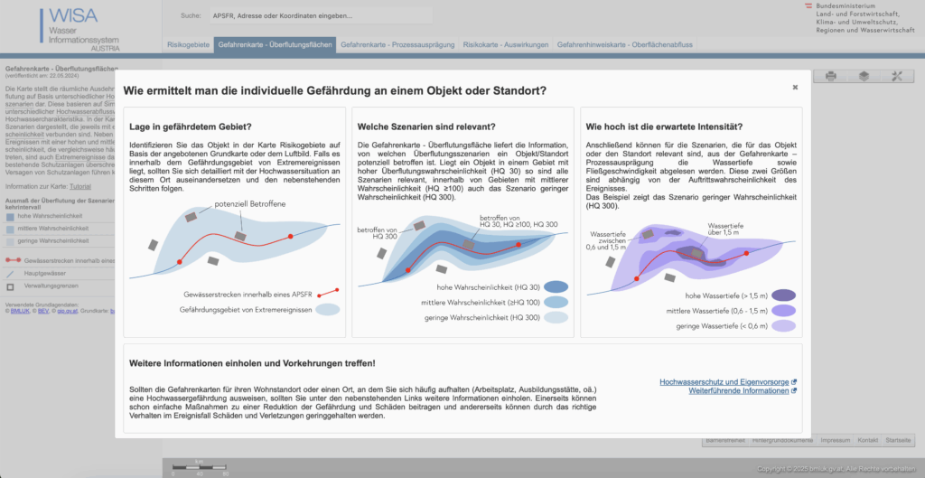
I spent an evening inside the WISA (WasserInformationsSystem Austria) portal, specifically the second-cycle hazard and risk maps:

https://maps.wisa.bmluk.gv.at/gefahren-und-risikokarten-zweiter-zyklus

Key takeaways:

  1. Three flood scenarios dominate planning: HQ30, HQ100, HQ300 (30-, 100-, 300-year events).
  2. Each scenario maps expected water depth and flow velocity—crucial for picking tactile textures.
  3. In the Tulln/Vienna stretch, HQ100 zones hug both banks, widening dramatically at meander bends.

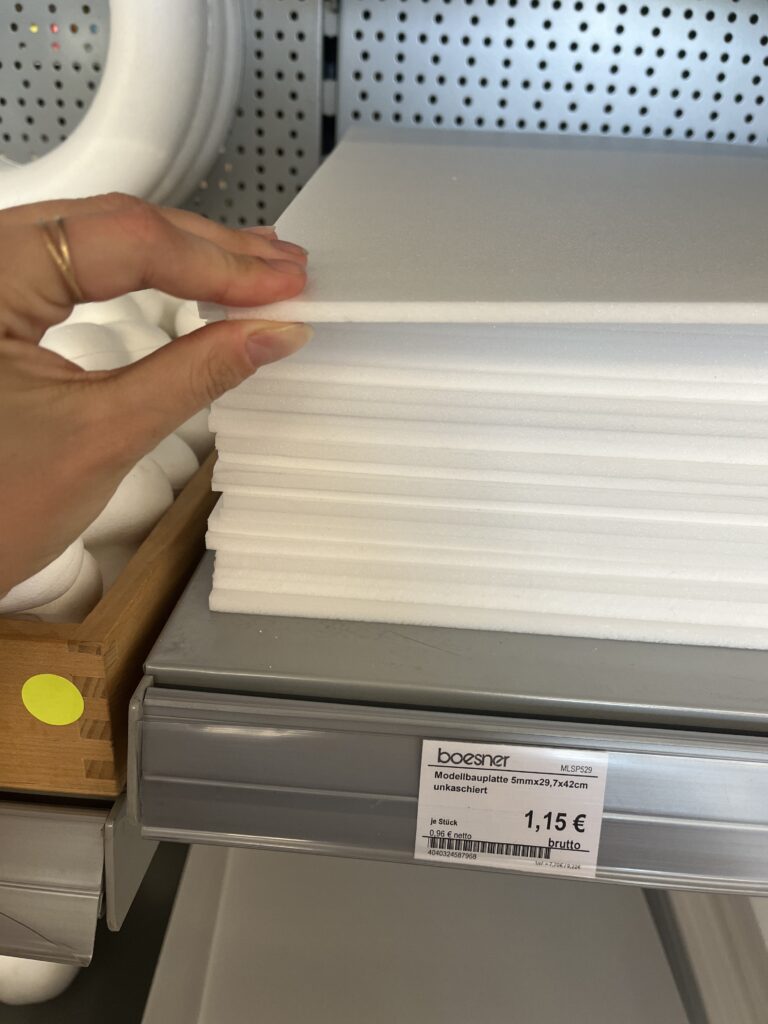
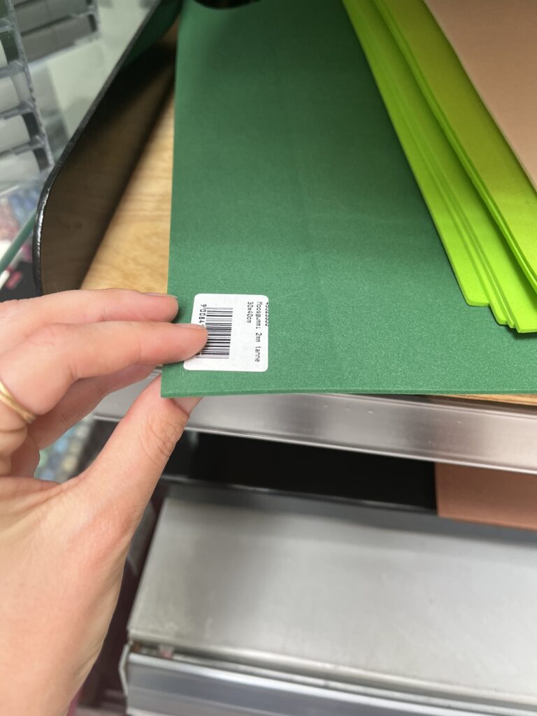
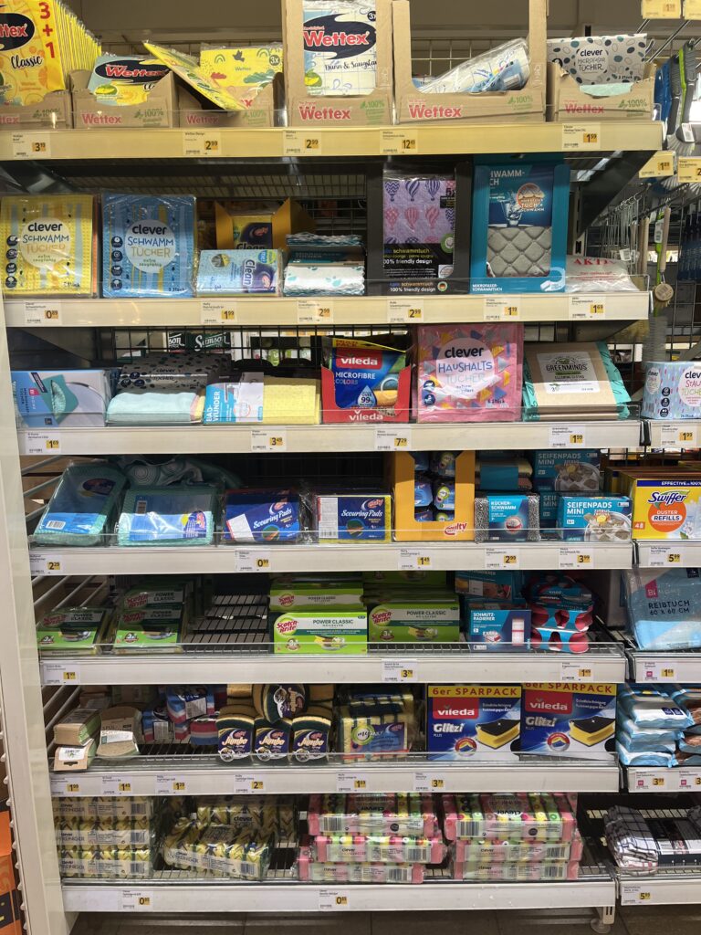
Material Scouting (aka “Foam Feel-Up” Day)

I’ve been to a few shop looking at different materials to see what would work best.

Prototype Blueprint (Version 0.1)

LayerData SourceTactile Encoding
Elevation (4 bands)data.gv.atcardboard (stacked)
HQ100 flood zoneWISA hazard mapScrub Sponge (Reinigungsschwamm)
Sealed landdata.gv.atcompressed cork board
Green spacedata.gv.atfelt fabric
Danube + major tributariesWISA hazard mapsmooth craft foam

The aesthetic goal isn’t prettiness; it’s readability by hand. Every texture must scream its meaning in under two seconds of fingertip contact.

Scope Check

  • Board size: A4 fits on a lap, lowers material costs, easy for the first prototype
  • Layers: 3–4 elevation steps + 1 sponge overlay = max 5 tactile heights.
  • Geography: Tulln centre + ~5 km buffer on each side; Vienna only if the first build behaves.

Next Up: Cutting, Gluing, (Re-)Cursing

In my next Blog Post I’ll document the messy middle:

  1. Printing and tracing simplified contours.
  2. Foam-board surgery (scalpel + podcasts).
  3. Flood-sponge wrestling: how do you glue something that’s meant to feel like water?
  4. First blindfold test: can a friend locate “safe ground” by touch alone?

Fingers crossed (and hopefully uncut).

15 – Defining What Gets Scanned

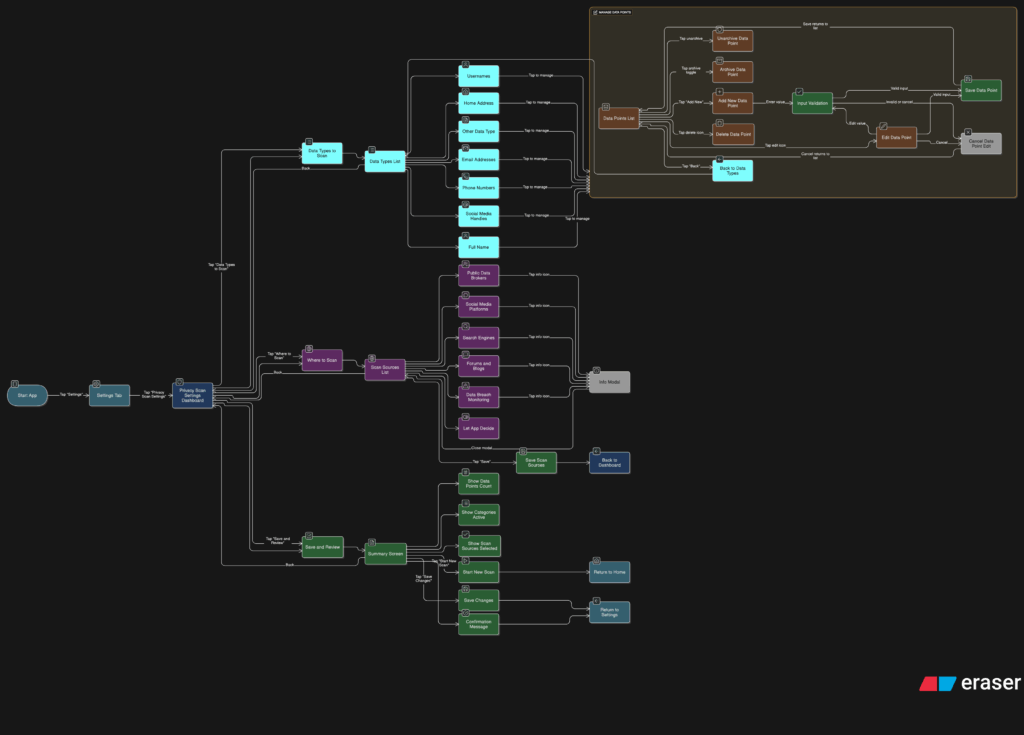
After sketching out how users would scan their data and review the results, I knew it was time to focus on something deeper. If someone’s trusting this tool to find their personal data online, they should be able to control exactly what it’s looking for and how it behaves. That’s where the Settings tab comes in, specifically, the part that lets people manage the data points the app scans for.

This is more than just a list of preferences. It’s the part of the app that decides how useful the tool really is. If it can’t scan for the right things or look in the right places, then it doesn’t matter how nice the interface looks. So I started thinking through the user journey here. What does it feel like to set this up for the first time? How easy is it to update your info later? What happens when someone wants to remove or change something?

I broke it down into a few simple flows. When someone taps into this section, they see a list of data types like full names, email addresses, phone numbers, home addresses, usernames, and social media handles. Each one has a toggle, so they can decide which categories they want the app to track. Tapping into a category opens a list of actual data points. For example, under “email addresses,” you might see:

Users can add new entries, remove old ones, or give them a label like “Work” or “Personal” to keep things organized. It should feel simple, like updating a contacts list.

User flow of the entire settings tab
Zooming into the Scan Preferences

Another part of this section is where the app should scan. Some people might want full control, while others may prefer a more hands-off setup. So I imagined a second area where users can select the types of platforms the app should search, like:

  • Public data brokers
  • Social media sites
  • Search engines
  • Forums or blogs
  • Data breach records

By default, the app could suggest a recommended setup, but users who want to go deeper can switch things on or off based on what they care about.

I also wanted to give users a quick summary before they leave this section. Something that says, “You’re scanning for 6 data points across 4 categories.” Just a simple, reassuring message that confirms everything’s set up the way they want. From there, they can either save changes or jump straight into a new scan.

This part of the tool gives people full control over what they’re sharing with the app and what the app is doing for them. It also needs to feel like something they can come back to anytime. Maybe they changed their email or want to track a new phone number. It should be easy to update without starting from scratch.

14 – What the Activity Tab Unlocks

Once I felt like the Home tab had a solid direction, I shifted my focus to the Activity tab. This is the part of the app that lets users look back and understand what the tool has found over time. If the Home tab is about quick action, the Activity tab is about reflection and detail. It’s where things get a bit more layered.

I started by asking a few questions. After a scan is done, what would someone want to do next? What would they expect to see if they tapped into their past results? The obvious answer was, they’d want to understand where their data showed up, how serious it is, and what actions they can take. So that became my starting point for the user flow.

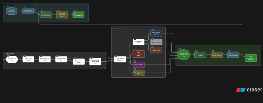
The journey into the Activity tab begins with a list of past scans. Each entry shows the date, how many exposures were found, and a quick status, like “3 removals in progress” or “Last checked 4 days ago.” This lets the user get a feel for their privacy over time. From there, tapping into any scan opens a detailed breakdown.

Inside that scan detail view, I imagined a set of cards or sections for each exposure. Each card would show where the data was found, maybe on a marketing site, a data broker list, or a forum. It would also show what kind of data was found, like a phone number or full name, and whether the app could help remove it. There would be a clear action button like “Request Removal” or “Ignore for Now,” giving the user simple choices without pressure.

User flow of the activity tab

Another part I thought about was how to show overall progress. Maybe there’s a visual indicator on the main Activity screen that shows how your privacy is improving over time. Something like a simple line graph or a color-coded “privacy score” that updates as you take action. I don’t want it to feel gamified, but it should feel encouraging. Like you’re making progress, not just looking at problems.

One small but important touch I sketched out was what happens when there are new exposures. Maybe we highlight them with a subtle label like “New since last scan” or bump them to the top of the list. This way the user’s attention naturally goes to the most important updates.

This part of the app is where people go to feel more in control. It’s not just a log of past activity. I wanted it to feel full of helpful options without overwhelming anyone.

13 – Home Tab, How should it work?

After figuring out the broader structure of the tool, the next step was to zoom in and really understand what should happen on the Home tab. This is where everything begins. It’s the screen someone sees the moment they open the app, so it needs to be clear, simple, and useful right away.

I started thinking through the experience from a user’s point of view. What would they be trying to do here? Most likely, they just want to know how exposed their personal data is and what they can do about it. They’re not coming in to explore every setting or dig through past reports. They want a quick answer to a big question: “Am I okay online?”

So I mapped out the user flow for this part. It starts with a clean welcome screen that gives a clear privacy status. This might say something like “You have 3 data exposures found” or “You’re all clear.” Just enough to give the user a sense of where things stand. From there, the most important action is the Scan Now button. This is the main thing the app offers, and it needs to be obvious and easy to tap.

Once the user hits that button, the app begins scanning for their data across different online sources. I imagined a simple progress indicator, maybe a friendly loading animation or a visual scan bar. No need for too many details yet. Just a sense that the app is working quietly in the background to find their information.

After the scan is complete, the user is taken to a short summary. This is where the tone really matters. It shouldn’t feel scary or overwhelming. It should feel clear and in control. Something like
“We found 4 pieces of your personal data online. Tap to review and take action.”

Home tab user flow
User flow to perform a scan

I also had to think about smaller touches. What if the user has never scanned before? Do we show an empty state with a short message that explains the tool? What about returning users? Should they see their last scan result or a prompt to scan again?

These are the kinds of small questions that start to stack up once you begin thinking through a full user journey. The challenge is to give people just the right amount of information without making things feel too heavy.

At this stage, I’m keeping things flexible. The layout will probably change as I move on, but the flow feels right. Welcome the user, show them where things stand, let them take action quickly, and offer a calm, clear summary when the scan is done.