12- Finding Structure

I’ve been reflecting a lot since the speed dating session. The feedback was clear: people grasped the purpose of the prototype almost instantly, which was uber-good. I didn’t have to over-explain, and that felt like a win, though I knew it needed more structure. The project was described as having a “careful” personality, which I really appreciated. It aligns perfectly with the tone I’m aiming for: clear, intentional, and respectful of people’s data.

So I took a step back to think more about how the privacy scrubbing tool should actually work as a whole. Since I’m building this as a mobile app or possibly a mobile-first web app, I needed to start mapping out how the experience would feel from the first moment someone opens it. Rather than focusing only on how the home screen looks, I started thinking about how all the different parts of the app connect and what role each one plays.

The idea was to shape a full user journey, not just a set of screens. I wanted the app to feel like it had a clear rhythm, starting on the Home tab where you get a quick view of your privacy status and can run a scan right away. That screen would offer a calm summary, like “We found this much of your data online,” along with a clear suggestion for what to do next. The one-tap scan button would live here too, ready when needed. From there, I thought about how the app should guide the user. Should the tabs always be visible? How do we help users understand where they are and what to do next? How do we balance helpful information with simplicity?
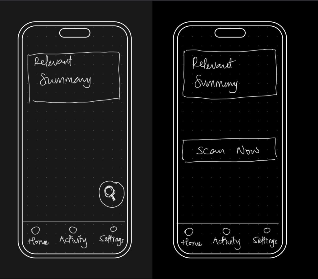
The big realization was that the entire experience could be organized around three core areas: the Home, Activity, and Settings tabs. Each one would represent a different phase of the user’s interaction with the app — starting, reviewing, and customizing. It seems simple now, but this framing helped everything start to click into place.

So I began from scratch, just trying to map out what each section really needed to do.

  • Home would be where everything starts. It’s where the user gets a quick status update and triggers a scan.
  • Activity would give access to deeper insights about past scans and new discoveries.
  • Settings would let the user control everything else, especially what the tool is scanning for in the first place.

This new framing gave me something solid to work with. I was no longer thinking screen by screen or feature by feature. I was thinking system-wide. What kind of flow did I want someone to experience? What should feel immediate? What should feel controllable? What should feel private? I started writing down questions like:

  • What’s the first thing someone wants to know when they open a tool like this?
  • What’s the minimum information they need to feel informed, but not overwhelmed?
  • How do I make it feel helpful, but not invasive?

The answers pointed toward simplicity and calm. Not a flashy dashboard. Not a scary privacy alert system. Just a clear, steady interface that makes you feel like someone’s helping you take care of something that’s long overdue.
Blogpost #3 – tangible science

In this post I want to dive deeper into tangible interfaces and embodied interaction especially in terms of learning and understanding new scientific topics and abstract concepts. The goal here is to gain a better understanding of how and why [inter]active engagement is beneficial in learning and understanding and how this is important in interaction design.

Two key theories I have discovered and make a good base for a project like this are constructivist learning and kinesthetic learning.
In constructivist learning the teacher isn’t the main focus and learning is centered around building new knowledge on past experience and previous learnings. Its important that students actively participate and go through a meaningful process of learning („meaning-making”, rather that learning by heart from a textbook): „The central tenet of constructivism is that human learning is constructed and that learners construct new knowledge on the basis of prior learning“. This active participation with the environment and the experience means that the learners stay engaged all throughout, constantly applying knowledge, having to think critically and adapt and modify their knowledge. [1]
What this active engagement can mean is seen in kinetic learning, where sensory-motor elements have been researched in relation to education and learning. What was found is that learning, retention, application, engagement and focus can be enhanced by such approaches: „By engaging in experiential, hands-on activities, learners are encouraged to explore, experiment, and adapt to the demands of the learning environment.“ There are different concepts and approaches which kinesthetic learning uses. These could be interesting base concepts for future interaction projects, or at least starting points for prototypes:


Hands-On Experiments and Labs
Role-Playing and Simulation
Manipulatives and Tactile Learning Tools
Field Trips and Outdoor Learning
Project-Based and Problem-Based Learning (PBL)
Movement and Active Breaks

Kinesthetic learning can be applied to many different topics and subjects reaching from STEM to languages or arts and music. A nice example of the hands on approach is employing these methods in abstract subjects like math. Numbers, values and metrics can be made a lot more tangible and applicable to real world scenarios in hands on experiments with physical representations. I feel like the value of new learning approaches really becomes very clear here, as math is a very stigmatized (often hated) subject, yet it’s mostly taught in only one (very theoretical) way [2]. A nice example for grasping values more easily was a case study where the carbon footprint of certain foods was actually represented in their weight (Each model’s weight mirrors its carbon footprint, from 50 grams for half a kilo of potatoes to 13 kilograms for half a kilo of beef) [3].


Like I already said, the implications for interaction design are great and learning concepts like these are not only a great foundation for projects but are also becoming increasingly more relevant. There are many interesting sources to be found, especially from psychological research standpoint. It will be interesting to see how these findings can be turned into actual learning concepts and products.


[1] Constructivist learning
Chand, Satish Prakash. “Constructivism in education: Exploring the contributions of Piaget, Vygotsky, and Bruner.” Children 10 (1995).

[2] Kinesthetic Learning
Oladele, Oluwaseyi. “Kinesthetic Learning: Hands-On Learning and Active Engagement.” ResearchGate, 2024. https://www.researchgate.net/publication/385619069_Kinesthetic_Learning_Hands-On_Learning_and_Active_Engagement.

[3] Case Study
Wong, Chia-Hao, Chen Ling, Yuchen Yang, and Masahiko Inami. “Case Study: Leaf+—Supporting Tangible User Interface Prototyping for Soft Materials.” In Extended Abstracts of the 2024 CHI Conference on Human Factors in Computing Systems, 1–7. New York: ACM, 2024. https://dl.acm.org/doi/abs/10.1145/3623509.3635272.

Blogpost #1 – First prototype and speed-dating

Prototype
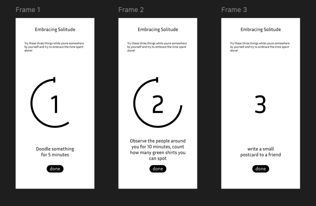
For my first Prototype I picked up my research topic from last semester, where I looked into loneliness from different angles and standpoints. The central question I’ve been researching, was wether interaction design can help combat feelings of loneliness. I added the factor of interaction in public spaces as a research component, because loneliness itself is already such a big and complex topic. What I looked into during my research were installations, interactions with strangers and oneself, building communities and finding out what creates a feeling of community. For my prototype I wanted to try out a slightly different angle, where I was not primarily trying to fix the loneliness part by eliminating it through interaction with several people or creating a community, but rather focus on getting familiar or even comfortable with the feeling itself. The approach was to take away the stigma and fear around being alone somewhere and associating this with negative emotions, but rather reframing it and embracing solitude. The very basic goal here was to find out wether it could be beneficial being mindful and present in a situation and understand that being alone isn’t a bad thing and doesn’t equate to being lonely.

I chose the form of an App as a quick and easy first approach. This wouldn’t be a medium I would want to use for an actual project, since I believe we should shift our focus away from phones and screens ESPECIALLY when it comes to mindfulness and getting more in touch with our selves and other people. However, for the sake of the prototype this medium was fine for now. It’s a simple set of three screens that invite a person to sit with their solitude and focus on different things like their surroundings and their thoughts, instead of overthinking their aloneness (in a public space). The prototype serves as a reminder of how you spend your time alone and maybe even appreciate it.
The people I talked to during the „speed-dating“ process understood my topic pretty well and were able to see where I was going with this. I think it would have needed a bit more quiet time to fully test wether this concept works, but the approach itself was accepted pretty nicely.

Interview
Another thing that confirmed this and validated the approach was my interview with a classmate that I conducted for an exercise. When I asked her about loneliness, she said that she often feels most alone not necessarily when she’s by herself in public, but when she doesn’t feel understood, for example in a past relationship. She admitted that she doesn’t enjoy being out alone and prefers to share experiences with someone else. What was really helpful to hear for me in the context of this prototype was her comment on what helps her feel less alone: “Wenn viele Menschen im selben Raum sind, fühlt man sich automatisch weniger alleine. Das Teilen des Alleinseins kann verbinden.” She described a feeling of shared solitude (not needing to talk, but not feeling invisible either). Another thing she mentioned was also very interesting because this was the approach I had for a second prototype I considered. For this one I had made small cards with conversation starter topics for public spaces. This later aligned with something I talked about with my interview classmate, because she said that in order for her to actually start an interaction with a strange in a public space the context needed to be right. She described needing somewhat of an „invitation“ or in this case maybe just a conversation-starter-promt to initiate an interaction.

Reflection
Especially with social media, constant online connectedness and availability we’re not used to being alone anymore. While the loneliness epidemic is very real (!), maybe sometimes we’re not as lonely as we think we are, we’ve just developed a warped sense of the feeling. Starting to understand that our own company is also worth something can be an important step to a less lonely society.

This prototype helped me shift my own thinking. It showed me that I don’t have to solve loneliness by pushing people toward social connection. Sometimes, it can support connection with oneself by creating small spaces of reflection, comfort, or acceptance. I’m still not sure whether this is the direction I want to continue in, and I’ve since decided to pivot my topic. But this early experiment still valuable and insightful.

#13 Combining Elevation, Floods, and Touch

After experimenting with spaghetti mountains and 1:10,000 land-consumption patches, I’ve found myself drawn toward a new direction – one that combines topography, climate data, and tactile experience into a single, tangible system. This post is about bringing those earlier experiments together under a more urgent, nationally relevant theme: flood risk in Austria.


Where I’m Coming From

So far, my prototypes have had one foot in playful material exploration and the other in physical data storytelling:

  • The Spaghetti Schlossberg turned abstract elevation data into a tactile mountain – wobbly and imperfect, but rich with potential.
  • The Land Use Patch made daily land consumption physically touchable, swapping colors for textures to communicate proportion, pressure, and permanence.

While they felt like separate ideas at first, both were really about the same thing: using touch to interpret spatial data in a more embodied way.


A Shift in Focus: Austria, Climate, and Tactile Maps

After researching climate impacts in Austria, especially the floods in 2024 in Vienna and Lower Austria, I began asking a new question:

What would it feel like to touch the places most vulnerable to climate risk?

This led me to the idea of creating a tactile flood risk map of Austria, combining elevation and flood zones into one cohesive, touchable landscape. The concept builds directly on what I’ve done so far: layering materials, mapping by hand, and treating texture as information.


Inspiration: Harrison Cole and Tactile Environmental Mapping

A major turning point came when I watched Harrison Cole’s video on tactile maps. His research for his phd shows how important carefully designed tactile maps are and how they can communicate both geographic and thematic information – not just where things are, but how they relate, change, and affect us.

Especially relevant were:

These examples helped me see that tactile design isn’t just about accessibility, but also about expanding the way everyone can perceive environmental risk – with their hands, not just their eyes.


What I’m Building Next

For my next prototype, I’m sketching out a physical map of Austria that shows both elevation and flood-prone areas. Here’s the plan:

  • Stacked cardboard or foam to build elevation in simplified contour layers.
  • Flood zones represented using sponge, felt, or soft rubber – anything that feels “wet” or absorbent.
  • Possibly include overlays from my land-use prototype (gravel, concrete, grass) to link impermeable surfaces to higher flood risk.

By combining these, I hope to answer:

  • Can we physically feel the risk tied to elevation and development?
  • How does texture communicate urgency or vulnerability better than visuals alone?
  • Could this be used in climate education or planning contexts?

Why Flood Risk?

Austria isn’t immune to climate impacts. The floods in Vienna and along the Danube aren’t isolated events. They’re part of a broader pattern of intensifying risks tied to both urban development and changing weather patterns.

A tactile map could:

  • Make climate data more accessible to visually impaired users.
  • Create a more memorable experience for general users.
  • Encourage reflection and conversation around geography, infrastructure, and preparedness.

Final Thoughts

What began as two strange lo-fi experiments have merged into something more purposeful. This third prototype will be a test of that synthesis: Can elevation, land use, and flood vulnerability live on the same board? Can they tell a story not just visually, but viscerally?


References & Links

12. Our Deep Connection to Nature: The Biophilic Power of Sound

Sound moves us, heals us, and shapes how we think and feel. But what if part of its power lies in something even more primal, our connection to the natural world?

Here lies an intersection of sound, neuroscience, and biophilia our innate tendency to seek harmony with nature.

Music as a Cognitive Enhancer

Let’s start with what we already know: ssound activates multiple areas of the brain. It can help us focus; enhance creativity and Problem-Solving; but also in theprocess of rehabilitation and memory.

Biophilic Soundscapes

Here’s where biophilia enters the conversation.

Coined by biologist E.O. Wilson, biophilia refers to the innate human attraction to nature. We are wired to find comfort in the sound of a forest, the rhythm of waves, or the chirping of birds. Interestingly, music can mimic these elements, creating biophilic soundscapes that soothe the nervous system and enhance mental health. Think of ambient tracks that use rain, wind, or rustling leaves or classical compositions that follow natural cadences or imitate birdsong.
These sounds create a kind of sonic shelter, reconnecting us to environments where we feel most at ease, even when we’re stuck indoors or stressed out.

The Other Side

On the flip side, there’s biophobia, a stress response to environments (or sounds) that feel unnatural, threatening, or chaotic. Harsh alarms, dissonant chords, or industrial noise can trigger anxiety and discomfort. And while some music uses this intentionally it’s important to recognize the psychological impact.

Why This Matters

Understanding music through the lens of biophilic and biophobic systems adds a powerful dimension to how we use it.
Our brains evolved alongside birdsong, rustling trees, and the pulse of the earth. So next time you press play, ask yourself: does this music bring me closer to nature—or push me away from it?

#15 Prototyping

TOPIC IS CHOSEN: urban planning

Introduction and background

The project went in the direction of urban gardening and creating good city spaces for people. I have been very inspired by Jan Gehl, the danish architect behind the “human friendly cities” movement and the urban strategy company Gehl. They work with relationships between people, their communities, and the broader systems that sustain the planet.

The key difference between standard of living and quality of life, as I see it, is that standard of living comes down to the money we have and how we spend it, whereas quality of life is about the time we have and how we spend it. One is more about quantity, the other is more about quality

Gehl 2019

David Sim, the creative director at Gehl, wrote an article about the Soft City, of how to design the physical environment of our cities and towns, neighbourhoods, and streets to give us more time for the things that give us meaning (Gehl 2019). They emphasis that the “time left” in your day, should be spent doing something meaningful and not commuting, or running stressful errands far away from where you live. Their take on the problem is to design urban spaces that gives you closer proximity to the places we visit on a daily basis like school, work, shops, parks, and freetime activities.

Ideation

When in the universe of urban planning, I wanted to do something that could contribute to solving more than one problem. What if I tried to design a space in the city that could do this?

From research, I found that green areas do good for people and the environment. Therefore, I went into the universe of urban gardening. Also that co-locating everyday activities into one place in close proximity to home would give better lives as you would spend less time in transit. A necessity for these spaces is also that it can bring enjoyment and fulfilment, for example by making a practical task like getting to work more pleasantly by biking through a park (Gehl 2019). So how to give peoples lives more meaning through urban spaces?

The idea came down to create a space between the houses, that could function as a place to rest, to meet with your neighbours or friends, and to give you the opportunity to work on a garden. These assets I thought to be a good combination, and something that both can boost an individuals life, but also boost the community in the neighbourhood.

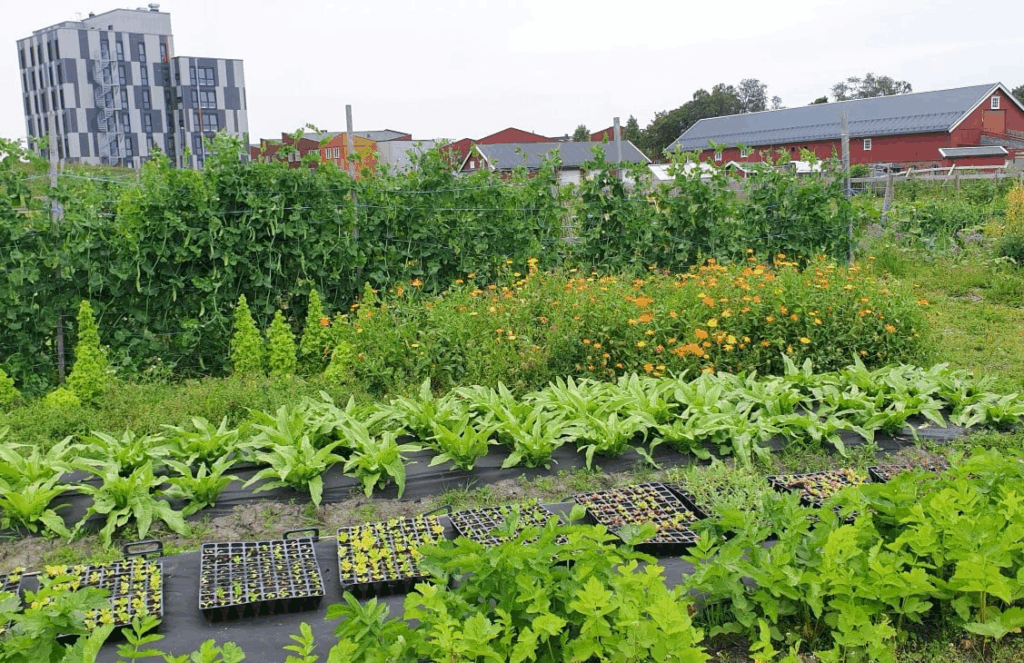
An inspiration for vegetable garden is a garden association in Trondheim (see picture below), by study town in Norway, where you can sign up and join gardening in the middle of the city. When a member, you both contribute, but also get to enjoy the benefits and the produce.

Local vegetable garden, Markedshager Norge

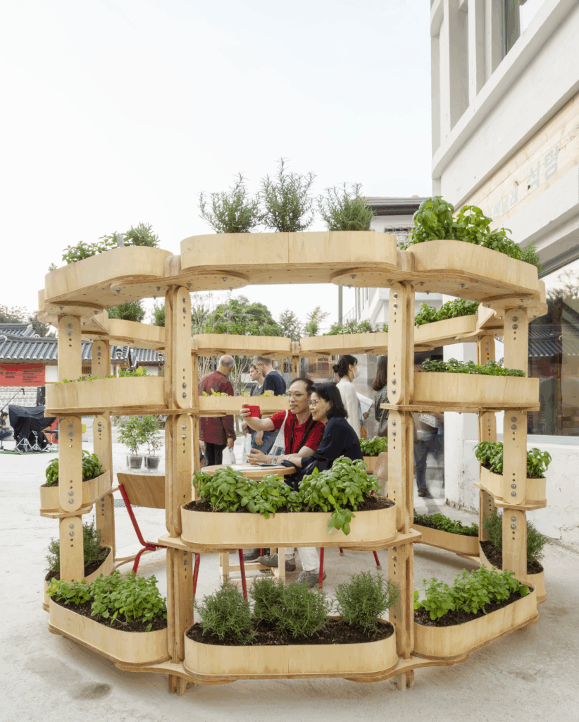
Other inspiration is “Grow more”, a modular urban gardening set that accommodates a hangout area:

Grow more, by Sine Lindholm

What I want to include is:

  • seating area to hang out
  • something green, either vegetable garden or also just bushes or trees
  • modularity, self planning system?

Should be:

  • inviting
  • intuitive
  • aesthetically pleasing

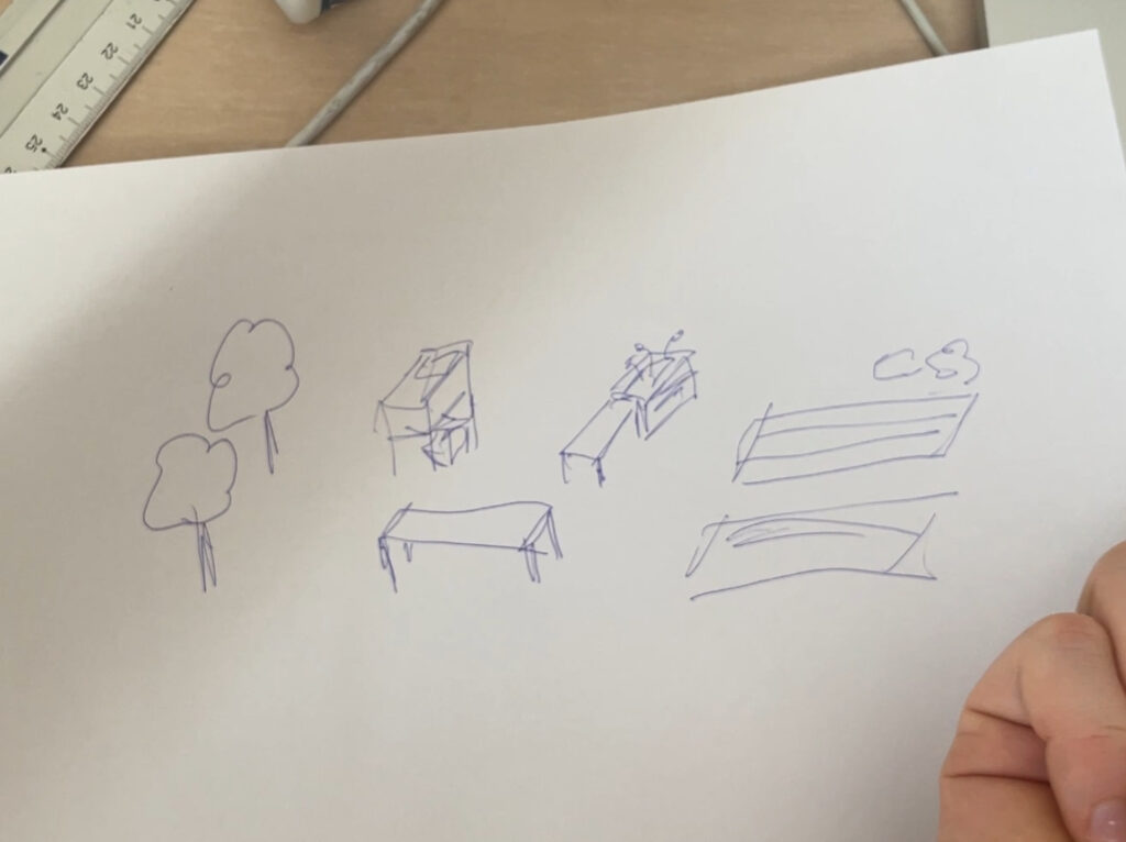
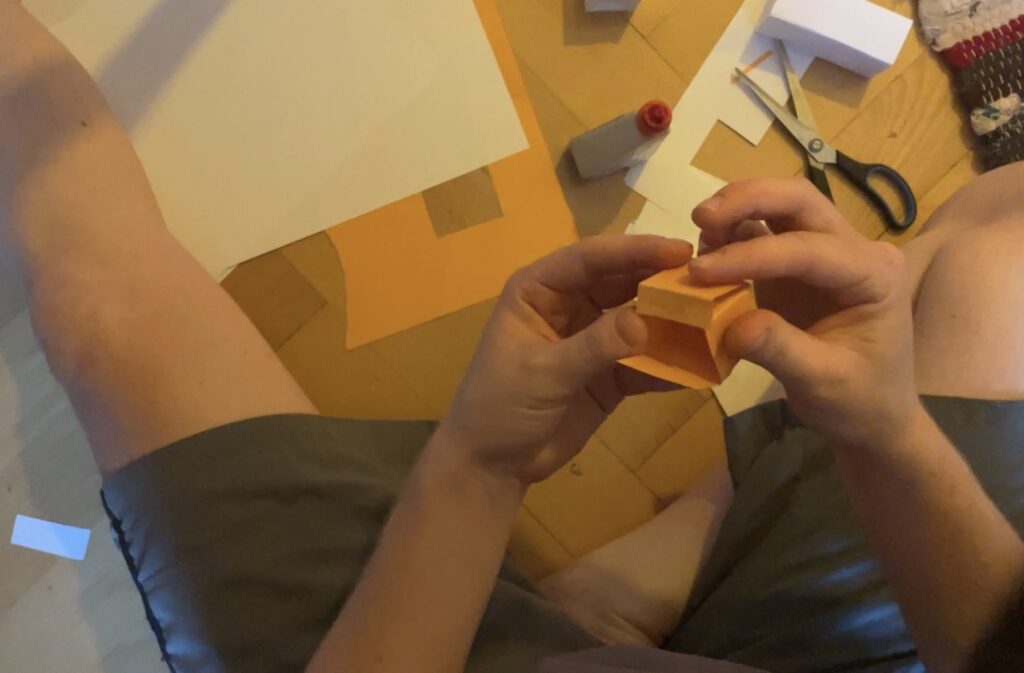
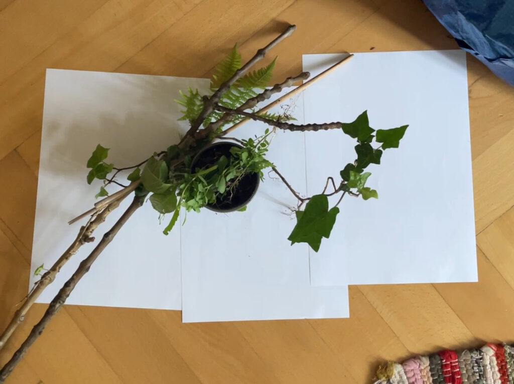
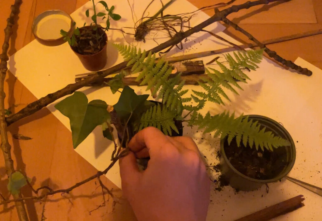
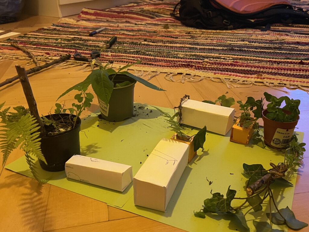
Ideation prosess shown through pictures

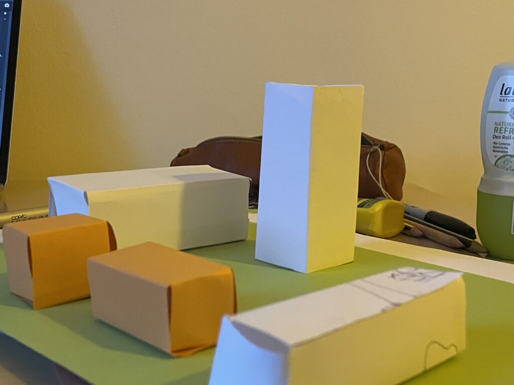
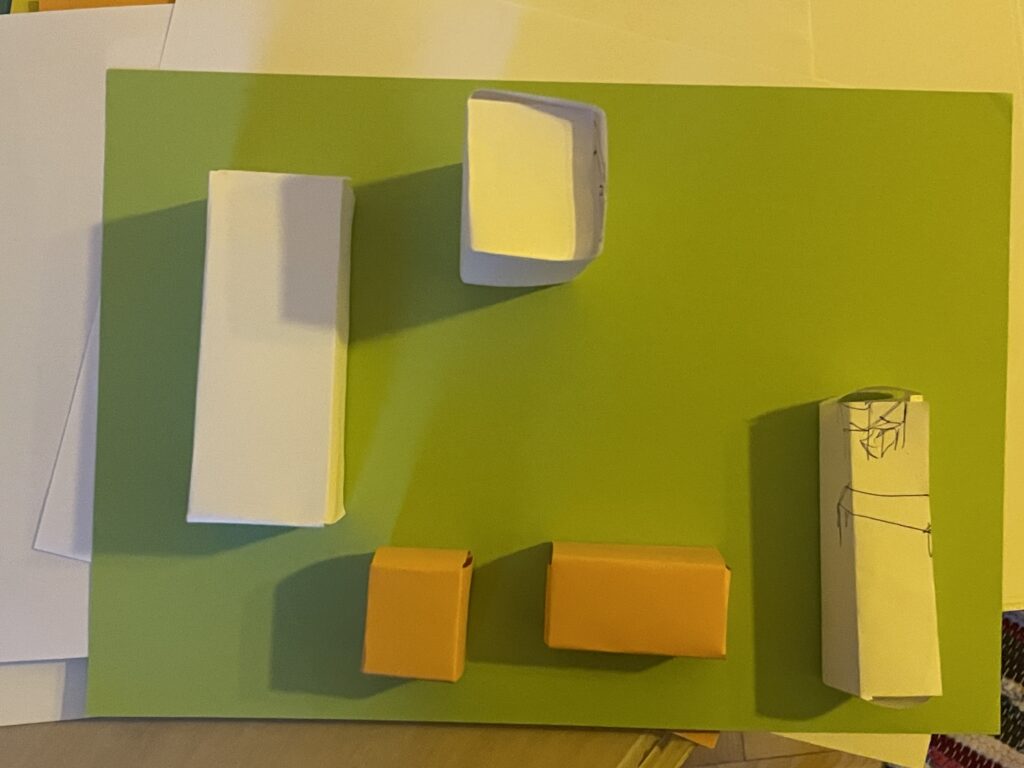
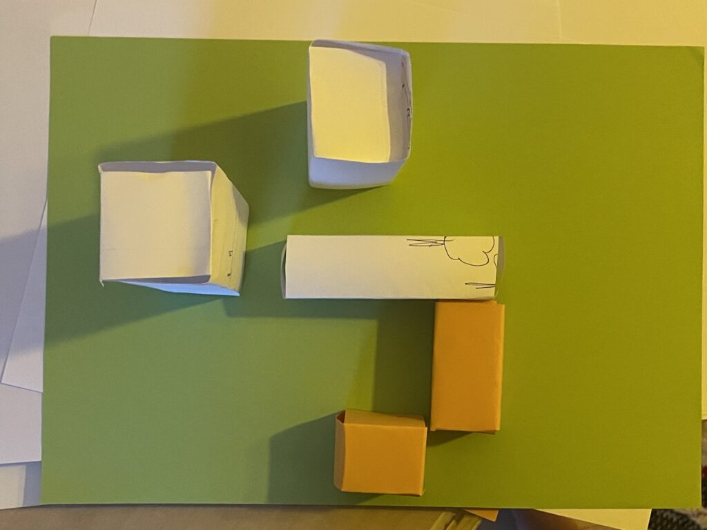
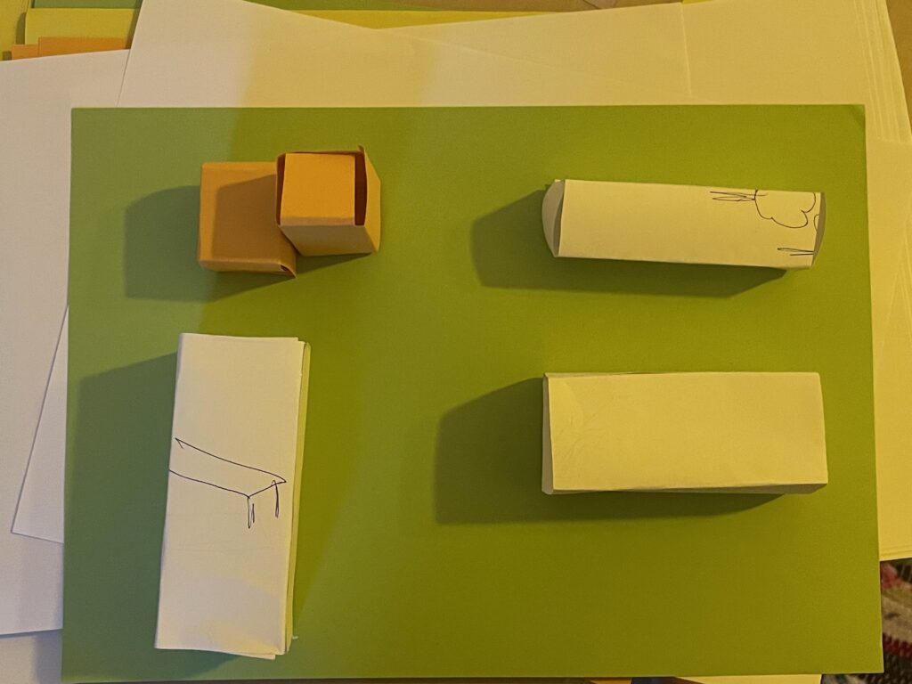
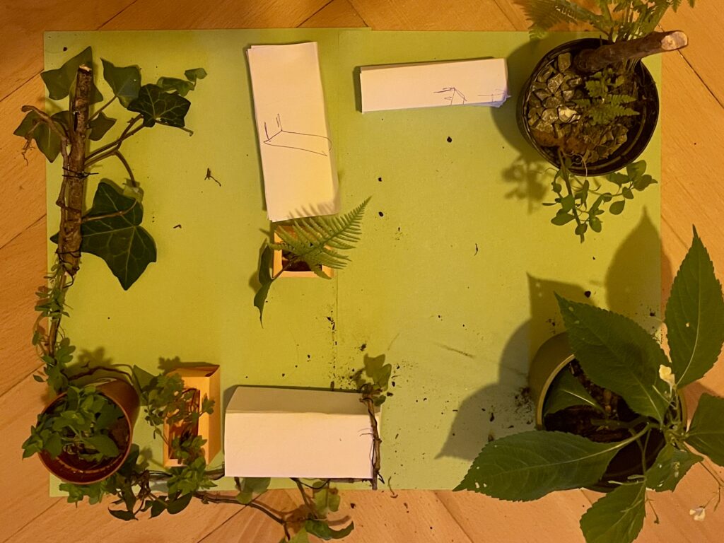
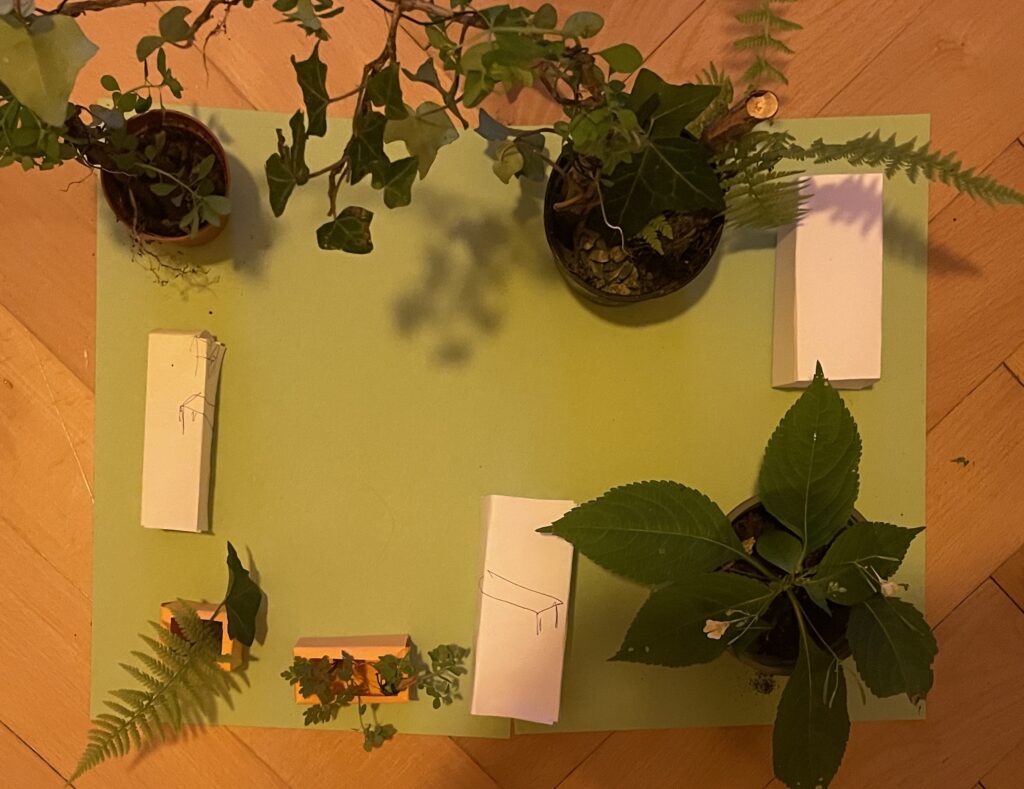
I am very glad I chose paper when prototyping the modules. The end result worked perfectly fine for visualising the idea, even though each one of them where very lo-fi and not perfect.

The idea

The final idea is a modular set of seating area, plant boxes, tool crates, work benches and everything else needed for the urban gardening space. In the first round, I want to make a toolkit for planning and envisioning the space – for anyone who would like to implement this. In the future, I would like to make real size modules and try them out in an actual city context.

For the first prototype, the modules consist of a set of paper boxes in different shapes that represent different assets for the urban space. They can be assembled in different ways to quickly and easy test different setups for the space. The vision is that the act of planning and putting together the modules is a perfect activity for a neighbourhood community – for them to co-design, work together and therefore gain more relation and responsibility of the area (and each other!).

Using found objects/trash

For the second prototype, I really wanted to use real life things, but especially found things. My vision was that with different textures, colours and actual plants, the idea of the modules could become more real. Therefore, I went down in the backyard of my apartment and gathered everything I could find from sticks, plants and trash. I found this part of the process especially fun, since I have a profound love for miniature things and figures. Like, I LOVE lego and small model worlds – I think I need to get myself a terrarium because THE SMALL PLANTS? Love it.

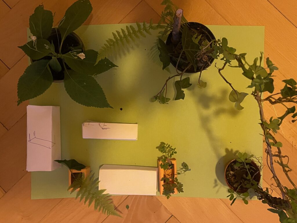
Final prototype

This is the final visualisation of how the blocks can be used with more context and details added. In this way, it is easier to envision how the final, real world space would look like.

For the process video, see the next blog post.

Sources:

Gehl, Jan & Sim, David. 2019. Soft City: Building Density for Everyday Life. Island Press. Excerpt published at: https://www.gehlpeople.com/knowledge-hub/publications/soft-city-the-time-of-your-life

Lindholm, Sine. https://www.sinelindholm.com/new-page-3

Markedshager Norge. 2022. Trøndelag – Oppstartsprogram for markedshager i 2022/23. https://www.markedshage.no/kalender/2022/10/trondelag—oppstartsprogram-for-markedshager-i-202223/

2.5. Building My First Phygital Prototype: A Touch-Based Story Map of Graz

After testing the Touch Board’s basic functionality, I began developing a full working prototype that links place, sound, and interaction into a tactile map of hidden Graz stories. The idea? Visitors touch different points on a map to reveal short audio snippets, each one tied to a local legend or curious landmark. Below, I’ll walk you through the full process of bringing this lo-fi phygital experience to life.

Creation of the Map

From Idea to Interaction
I knew I wanted each touchpoint to reveal a different layer of the city. Something you wouldn’t notice in a regular guided tour. The early concept centered around a physical map enhanced with conductive elements that trigger audio clips. The experience needed to be screen-free, intuitive, and portable.

Core goals:

  • Highlight unusual or forgotten spots in Graz
  • Keep the setup simple and playful
  • Combine touch, sound, and visual storytelling

Deciding on the Content
I wanted the experience to feel like a walk through Graz’s secret personality, curious, playful, sometimes surreal. I avoided the most obvious tourist sites and instead chose places that are either tucked away, easily missed, or rich with local legend. Each spot adds a different tone or texture to the map:

  • Der Kleine Elefant
  • Glockenspiel
  • Double Spiral Staircase
  • Kunsthaus Graz
  • Der Türke

Together, these five spots form a kind of “hidden Graz sampler”, part folklore, part urban oddity, part emotional landscape.

Designing the Map
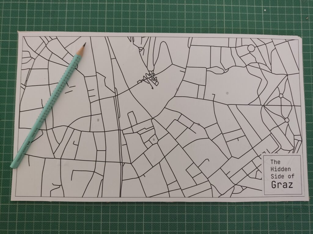
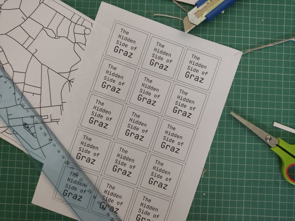
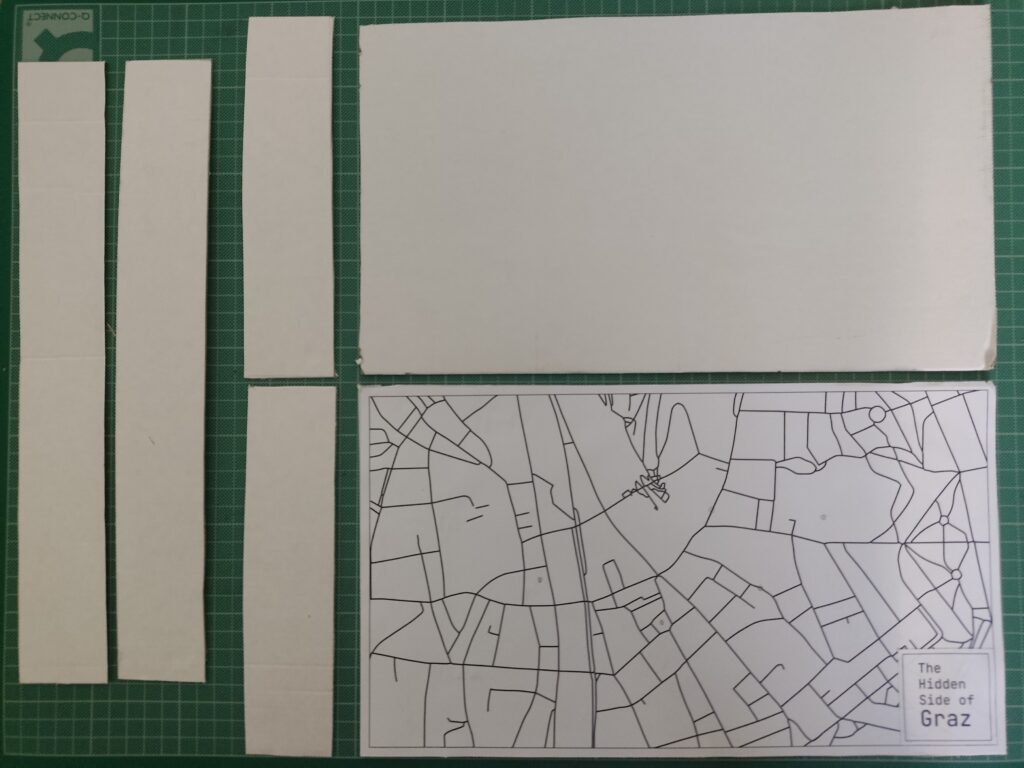
To keep the locations roughly geographically accurate, I used Snazzy Maps to pin my selected places. There are many styles to choose from, so I picked a minimal line-drawing style. I took a screenshot, imported it into Illustrator, and used Image Trace to vectorize the lines for a cleaner look.

I also added custom name tags for each spot, arranged everything into an A3 layout, and sent it to print.

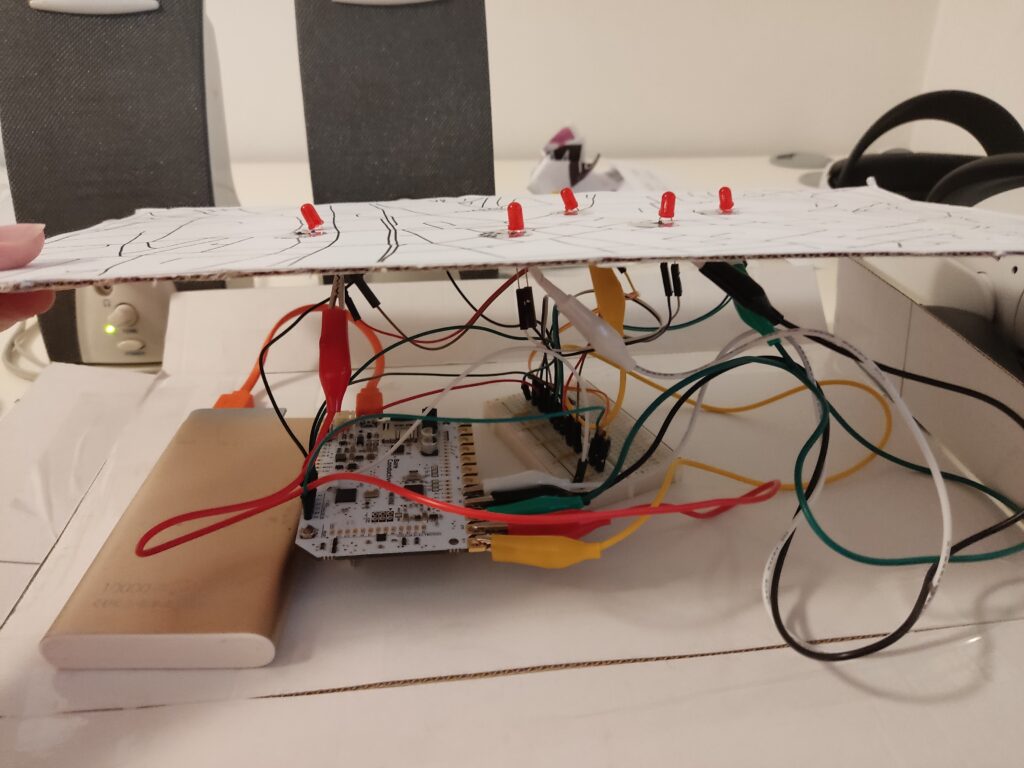
Each location was represented by a small circle symbol on the printed map. I used copper tape and stick them directly on paper, then connected them to the Touch Board’s electrodes using crocodile clips and jumper wires.

Crafting the Audio
I wanted the audio to feel charming and a bit mysterious, so I wrote short descriptions for each location and turned them into narrated clips using an online text-to-speech AI tool. Each clip is around 20 seconds long. To make them more immersive, I layered in soft background sounds using Premiere Pro.

Tools used:

Here are the short audio texts:

Der Kleine Elefant
Tucked high above a quiet Graz street, a tiny stone elephant watches the world go by. It’s a gentle echo of 1629, when a real circus elephant marched through the city, astonishing everyone. This little statue keeps that memory alive.

Glockenspiel
In the heart of Graz, when the clock strikes 11, 3, or 6, wooden shutters creak open high above Glockenspielplatz. A boy and a girl twirl to the chime of 24 bells, and at the end, a golden rooster flaps its wings and crows. It’s like a music box tucked into the rooftops.

Double Spiral Staircase
Inside an old building, two stone staircases spiral like vines, crossing paths again and again. They separate, meet, part, and rejoin, like two people forever drawn to each other. Built in 1499, they’re called the “stairs of reconciliation”, a quiet dance carved in stone.

Kunsthaus
Across the Mur, among red-tile rooftops, lives a blue, blob-shaped creature. It looks like it came from space. Locals call it the “Friendly Alien”, a living sculpture, glowing with energy. Inside, the art is always changing.

Der Türke
Look up at Sporgasse 2. There’s a wooden man in a turban watching the street. Legend says that during the 1532 siege, a cannonball crashed through a window and struck a Pascha’s roast. Shocked by the blast, the Turks fled Graz. The figure still stands there, watching… and remembering.

Wiring & Materials

  • 1x Touch Board
  • 1x microSD card
  • 1x microSD card reader
  • 1x Speaker
  • 1x USB power bank (for portability)
  • 1x USB cable (for power and code upload)
  • 5x LED (for basic feedback)
  • 5x 220 Ohm resistor
  • 1x Breadboard
  • 21x Jumping Wires
  • 5x Crocodile Clips
  • Bare Conductive’s “Touch MP3 with LEDs” example code

To enhance the presentation, I created a cardboard box to hide the microcontroller, battery, and all the wires. The result features a map on top, with circle-shaped copper tape marking the interactive areas. By hiding the components inside the cardboard box, this setup made the experience feel more like an artifact than a technology demonstration.

User Test

I brought the prototype to a few friends and watched how they used it. Here’s what I noticed:

What worked:

  • Most people figured it out without explanation
  • They were surprised by the sounds and intrigued by the stories
  • The LED made the experience feel “alive”

What could improve:

  • Some conductive areas needed more pressure to respond
  • People held their finger down the whole time instead of tapping once
  • Audio volume was a bit low in noisy environments

Reflections

Building this prototype showed me how simple tech, when well-combined, can lead to memorable interactions. The most exciting part wasn’t the circuitry; it was watching someone touch a spot on a map and hear something they didn’t expect. That brief surprise, that moment of discovery, is what I want to design more of.

Blog Post 7: Final Video and Reflection of EV Charging UX Project

i

Reflection

After completing all six blogposts, I can honestly say this project has been one of the most meaningful and eye-opening experiences in my design journey so far. Coming from a background where I mostly design websites, this was one of the first times I actively left my comfort zone. Instead of staying behind the screen, I went out into the real world to observe and interact with actual users, something that brought an entirely new perspective to my design process.

One of the biggest challenges during this project was balancing university life with on-field research. It was often hard to find time between classes and other commitments, but I realized how important it was to physically be on-site, at charging stations, in parking lots, observing real behaviors and asking the right questions. This kind of research, although sometimes chaotic or unplanned, gave me insights I would never have gained just by doing desk research.

A big thank you goes to my girlfriend for helping me throughout the process and also to her father, who kindly provided his electric vehicle for testing and documentation. Without their support, I wouldn’t have been able to simulate such realistic use scenarios.

Through the user tests I conducted and the interviews I held, I became much more aware of how inconsistent and often frustrating the user experience at EV charging stations still is today, from unclear interfaces and error messages to accessibility issues that are simply being ignored. It’s something I just couldn’t leave as it is, so I decided to dive in and see how design can actually help.

What really pushed me to include accessibility in my scope was a talk I attended at WebExpo, which reminded me that inclusive design doesn’t happen by accident. It has to be a conscious decision. Even though I wasn’t able to interview users in wheelchairs for this phase, it became clear to me how critical their needs are and that they are still often overlooked in public infrastructure. That’s why I’ve decided to explore this further in my Master’s thesis, where I’ll have more time and space to go deeper and also include more diverse perspectives.

The prototype I created is not a finished product, it’s a set of mid- to high-fidelity frames that visualize potential solutions. But even at this stage, seeing things come to life helped me immensely in understanding where the problems lie and how users interact with the interface. These prototypes made testing and iteration so much more tangible and I gained valuable feedback that will shape the next versions.

Looking back, I’ve not only developed skills in field research, user testing, and accessibility, I’ve also learned to trust the process of going out, listening, observing, and embracing the unpredictable. It’s exciting to think that this might just be the beginning of a much bigger journey in designing more inclusive and user-friendly mobility experiences.

#14 International Design Week

Between 12th and 16th of may we attended International Design Week. This was a week that students and professors from different universities met here in Graz and were invited to work with us on a range of different projects. We could choose between 13 different projects lead by 13 different professors. I chose to do the “Design and Culture” workshop with Moses Lugonvo from Uganda. This workshop was about unearthing unity in diversity through design expressions for cultural change. We were to use film as the chosen medium to convey this message, but had pretty free constraints.

The reason I chose to write about the design week, is that it brought a lot of new impressions, thoughts and inspirations. For me, I found it very exiting to work with film with others who was very good at it. I learned a lot, both about film-making, the art of reaching out to strangers, and cooperating with such a big group of people.

For the project, the group decided to collectively make a film about the different cultures you can find in Graz. The motive was to give an impression that the footage is form around the world, when we actually filmed shops with different cultural backgrounds located in Graz. We went out to Turkish kebab shops, Afghan, Nigerian and Indian grocery stores, and others – to talk to the people that worked there about culture.

From going out and trying to make strangers say yes to tell you their story, I learned a lot. It was very difficult to not get an immediate “no”. Then to communicate our project at idea, and also make them comfortable with being on camera. But in between all the hassle, some of the people we asked opened their arms and welcomed us in their stores. We were told stories, we got free drinks and foods, and got trusted by these strangers. It was a very cool experience.

A little teaser of the final film:

What I learned from this project, is how important and valuable it is to talk to people and hear their stories. I also found it very exiting to be working with talented people who knew how to make film (Noah), and to be part of such a cool project! What I also found out, is that 11 people on 1 filmproject, where we do not have definite roles is a lot of hassle. A lot of the time went to discussing and agreeing on ideas – also because only 1 of the 11 had worked properly with film before…

But in total I am very satisfied and have gained a lot I will take with me in my next projects.