IMPULSE #3 – A Talk

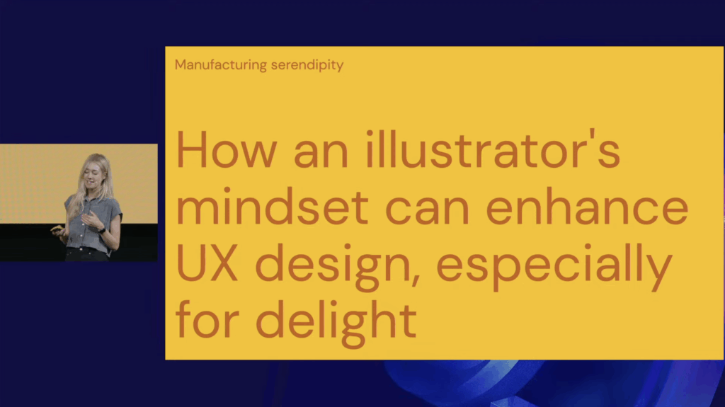
Even though I couldn’t attend the George UX Conference in Vienna on 5th of November, I watched the recorded talks afterward. One immediately stood out: “Manufacturing Serendipity: Designing Delight at Scale with a Little Help from AI” by Mick Champayne, an illustrator-designer from Google. The talk unexpectedly resonated with the direction my master’s thesis is slowly taking: multidisciplinary design identity, AI as a creative bridge, staying calm amidst many skills, and the psychology of being a generalist designer.

At first, I wasn’t excited about revisiting AI in my research. Lately, it has felt overwhelming, and I even thought: “Let’s move away from AI this semester.” But then… the talk reminded me: AI is the elephant in the room. You can’t escape it, and its presence has moved from novelty to ubiquity. Mick presented it not as a threat, but as a playful, human tool, a spark for creativity.

Mick shared how being both an illustrator and a UX designer initially felt like living in two worlds: order equals UX, chaos equals illustration. This resonated deeply with me because I’ve often felt split between multiple design selves: UI/UX, visual storytelling, graphic design, motion design, interaction design … Her experience reassured me that embracing these differences doesn’t dilute identity, it can strengthen it.

A particularly fascinating part was how she trained her own AI model using her illustration work. She fed the machine her best pieces as a data set, and the results at first were bizarre: strange proportions, odd humor. Instead of rejecting the accidents, she embraced them, now using AI mostly for first drafts. She redraws and reinterprets the outputs, extending her own style rather than replacing it. This combination of machine draft and human reinterpretation felt directly relevant to my thesis: AI can act as a bridge connecting skills, not a replacement.

Mick also described using AI as a “creative spark factory”, particularly for projects outside her expertise. For example, she helped design Google easter eggs for Swifties (Taylor Swift fans), creating a playful scavenger-hunt-like experience that blended illustration, pop culture, storytelling, and UX. Her principles for creativity, translating feelings, fostering curiosity, and looking for happy accidents, felt like rules for surviving and thriving as a generalist.

Another highlight was her process of “vibe coding” in Gemini, moving rapidly from idea to tiny playable prototype. Her team even holds DGIF: Delightful Generation of Ideas and Features every Friday. And her definition of delight, shifting something from “it works” to “I love it”, captured something essential about creating meaningful experiences. I also appreciated her humor: her illustrations are playful, sometimes chaotic, often feminine, incorporating absurdities like butts, boobs, and farts, showing how personality and joy can coexist in professional design.

Watching this talk sparked a personal realization: I want to start digital illustration. One of my “other design selves” seems ready to be explored. More importantly, it reassured me that exploring multiple creative paths isn’t a distraction, it’s central to my identity as a designer. For my thesis, it clarified something vital: it’s not about choosing a single design identity, but understanding how multiple identities can coexist and fuel creativity. Mick’s work demonstrates a real-world example of blending art, UX, and AI into a coherent practice, showing that curiosity, experimentation, and calm engagement with chaos can be a source of innovation.

Stuff Worth Clicking A.K.A. Accompanying Links

Disclaimer: This blog post was written with the help of AI for better grammar and correct spelling.

Impulse #2 – Finding Inspiration and Ideas

Yesterday I had a big block trying to find an idea for my next assignment. Honestly, I felt quite lost. I was sitting at my desk, just staring at my laptop and got more frustrated every minute. My brain felt completely blank and I was starting to get angry at myself, because I felt I was wasting so much time especially since I had plans to meet a friend later. I could feel how the pressure of “I need to get an idea now” totally blocked all my creativity.

I almost canceled on my friend, but then I thought maybe it is a good idea to step back from the project for a while, since I was already frustrated anyway. I am happy I did it. At my friends’ place I told her about the struggles, and she asked me a bunch of questions about what project and what I need to do. This already helped me to start getting some initial ideas.

At some point of the conversation, she stood up and grabbed a graphic design book. I was a bit confused at the beginning because the book was mostly filled with posters and logos from throughout the years and this was not really my assignment topic. But she told me whenever she feels stuck with a project, she looks into the book to get some fresh inspiration.

She gave me a little challenge:

  1. Pick a random page for the aesthetic.
  2. Pick a random page for the theme/topic.
  3. Pick a random page for the character or the main element.


It was really fun flipping through the book and finding inspiration in things where I wouldn’t normally look. I arrived at her place with zero ideas and two hours later I left with a brain filed with new ideas and inspiration. Just by talking to her and flipping through that book.

What I take away from this evening

It showed me once again, that when I want to work on a creative project, I can’t just sit in front of my laptop and wait for the perfect idea to just pop into my head. It just doesn’t work for me to force creativity on the spot especially while being in the same environment all the time.

In addition, I realized that I sometimes rely too much on inspiration from digital tools like Pinterest, but it only shows you things based on what you like, so honestly there is no new input that challenges your thinking.

Two reminders for my future creative blocks:

* Inspiration can be everywhere and sometimes it is better to close the laptop and to look for inspiration in the real world. Looking at a random book, observing the surroundings or just talking to someone who might give me a random starting point I need to get moving.

* Taking a break, especially if I am already frustrated, can be very helpful. Even if it’s just for an hour. It can help to get some new and fresh ideas.

So, don’t get stuck in front of the laptop. Change the environment and start with a random input to see where it leads you.

And shoutout to Stefi <3

AI was used to check spelling and grammar and better clarity.

#4 IMPULS: Besuch der CoSa-Ausstellung

Anfang November besuchten wir mit dem Studiengang das CoSa Museum im Joanneumsviertel Graz, um Inspiration für unsere eigenen Ansätze rund um Gamification und Ausstellungskonzepte zu sammeln. Da mich der Besuch inhaltlich für das Projekt eine Zeit lang beschäftigt hat, möchte ich ihn hier als Thema einer Reflexion wählen. Besonders spannend fand ich, wie unterschiedlich die einzelnen Ausstellungen gestaltet waren und wie stark dies meine eigene Motivation und Wahrnehmung beeinflusst hat.

Finanzen

Die erste Ausstellung, die ich besucht habe, beschäftigte sich mit dem Thema Finanzen. Zu Beginn bekam man eine kleine Karte, mit der man in verschiedenen Räumen Quizzfragen beantworten konnte. Die Punkte wurden gespeichert und man erhielt am Ende sogar einen „Kassenbon“ mit dem eigenen Score. Die Idee ist Besucher*innen zu motiviert, alle Stationen zu durchlaufen und spielerisch Wissen zu sammeln. Was mir eigentlich relativ egal ist. Generell funktioniert so ein künstliches Belohnungssystem bei mir nie. Ich bin immer nur mit sachen zu motivieren, wo ich auch tatsähclich den Erfolg erkenne. Für andere dagegen war es ein großer Anreiz, möglichst viele Punkte zu sammeln.

Science

Die zweite Ausstellung hat mir viel mehr zugesagt und ich hab auch super lange dort Zeit verbracht. Sie behandelte Themen wie optische Täuschungen, Krankheiten und Laboranalysen oder den Aufbau eines Autos. Ich habe mich ewig in dem nachgebauten Krankenhausraum aufgehalten, in dem man “Blutproben” entnehmen und anschließend im Labor analysieren konnte. Dort gab es drei fake Patienten, die geheilt werden mussten. Und anhand deren Aussagen, Untersuchungen am Körper selber, dem Patientenzettel am krankenbett, die Werte im Computer und der Blutprobe hat man dann eine Diagnose stellen können. Außerdem gab es noch einen weiteren Computer in dem man sich über die möglichen Krankheiten informieren konnte und so rückschlüsse aus den Symptomen ziehen konnte.

Einfluss auf unser eigenes Game-Design-Projekt

Besonders diese zweite Ausstellung hat mich auch inhaltlich inspiriert und zwar so sehr, dass sie direkt in unser Projekt in der Game-Design-Vorlesung eingeflossen ist.

In diesem Projekt haben wir eine Ausstellung konzipiert, in der Besucher*innen auf spielerische Weise Mikroben und Teile ihres eigenen Körpers entdecken können. Ziel ist es, den typischen Ekel vor Bakterien herauszufordern und vielleicht sogar abzubauen. Die Besucherinnen sollen durch Neugier, Berührungspunkte und kleine spielerische Aufgaben merken, wie faszinierend – und wie nah – diese mikroskopische Welt eigentlich ist.

Die hands-on-orientierte Methode der zweiten CoSa-Ausstellung hat uns dabei direkt beeinflusst:

  • Interaktivität statt “oberflächlicher” Gamification
  • Neugier als Antrieb statt Punkte als Belohnung

Gerade durch diese Inspiration haben wir eine Idee entwickelt, die sowohl wissenschaftlich als auch spielerisch funktionieren soll und Menschen für ein oft unangenehmes Thema öffnet.

IMPULSE #3 – Video “The Role of AI in Electric Charging”

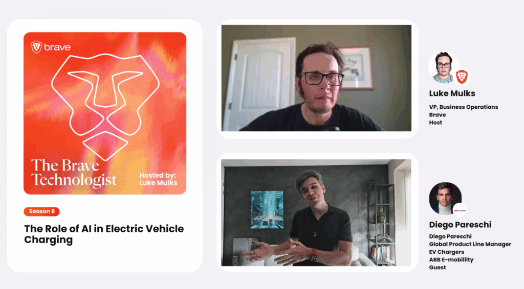
For my third impulse, I watched the podcast episode “The Role of AI in Electric Vehicle Charging” with Diego Pareschi from ABB E-mobility. It was my first time listening to someone who actually designs global charging products, not just talking from theory. This felt very relevant for my Master thesis about the User Experience of EV charging, because he connected UX, AI and business in a very clear way.

Diego started by saying that EV charging is still not easy and not frictionless. There is so much to optimize in user experience, energy efficiency and software. This confirmed something I already felt: the problems are not only technical, but also human. People are confused, frustrated or anxious when charging. For my research, this is an important starting point: I am not just designing a nicer interface, I am working in a system that still has a lot of friction.

He explained the key problems step by step. First, location: drivers often have trouble just finding where a charger is. Second, reliability: will the charger actually work when I arrive? Third, compatibility: does this station work with my specific car and plug? Then waiting times and payment: how long do I need to charge and how can I pay (app, subscription, credit card)? I realised that my own interviews and surveys must cover exactly these pain points. If I ignore one of them, my picture of the user experience will not be complete.

The discussion about standards was also interesting. There are different plugs and standards around the world (CCS1, CCS2, etc.), and then Tesla introduced NACS. Diego compared it to USB and USB-C. For users, this means less cognitive load if the plugs are more standardised. This connects directly to interaction design: the fewer decisions the user has to make before charging, the better. In my thesis I can link physical standardisation (plugs) with digital standardisation (more consistent interfaces across providers).

The most inspiring and also new knowledge gaining part for me was how AI is used. Diego described projects with universities where they analysed user behaviour and location together. They look at how long people charge, how much energy they take, what kind of errors happen (for example, payment failures because the user needs too long to find a credit card) and where the station is placed (near cinema, restaurant, supermarket, gas station). With clustering they created “profiles” of charging behaviour linked to points of interest. This shows that behaviour at a restaurant charger is very different from behaviour at a charger near a cinema or gas station.

For my research, this is a big insight: context matters a lot. A 30–40 minute charging session becomes acceptable or even pleasant if the location fits the user’s plans. So when I design my prototype or interview guide, I must always ask: “Where is the user? What are they doing while the car is charging?” Not only “What does the screen look like?”.

Diego also talked about inclusivity. He said EV charging is complex and new, but “simplicity is the real innovation”. That sentence stayed in my mind. There are standards like ADA for accessibility, but they had to be adapted to fit real charging situations. He mentioned design elements like lights: even if the screen is confusing, everybody understands green (available) and red (problem). This is a strong reminder for my thesis: good UX is not only about detailed menus, sometimes a clear light signal can support or even replace text for stressed users or people with limited tech skills.

Overall, this video gave me an important impulse: my research should not only focus on what happens on the screen, but also on the whole ecosystem around it like location, behaviour, inclusivity and even future AI-supported services. In my next steps, I want to use these ideas to refine my interview questions: I will ask users not just “How did you use the charger?”, but also “Where were you, what did you do while chargin, and what made the experience feel easy or hard?”. This will help me move closer to the real, messy, human experience of EV charging.

AI disclaimer: AI was used to help structure and formulate this blog post.

IMPULSE #2 – Reflections on “Observing the User Experience” (Book)

Observing the User Experience – Book from Mr Baumann

Last week I challenged myself to read “Observing the User Experience” (Goodman, Kuniavsky, Moed, 2012). This was not easy, but necessary, because my Master’s research depends on strong qualitativ methods. The book is known in the UX community and the authors are recognized experts, as Mr Baumann told me (He owns this book and borrowed it to me). When I borrowed it, my plan was to dive deeper into UX research methods and figure out which techniques are honest and suitable for my thesis, not just the easiest way to get quick results.

What I read and learned

The book is well structured and does a good job keeping things clear, organized and easy to navigate. It offers an overview of many UX methods but for my research, I was most interested in Chapter 6 (Interviewing), Chapter 9 (Field Visits and Observation) and also Chapter 12 (Surveys). In Chapter 6, I learned about how to select the right people for interviews: there are three steps to do this → define the target group, find representatives, and convince them to join. The most important filter is user behavior, not demographics or random criteria.

The part about structuring interviews gave me a simple but powerful model:

  • Start every interview with a short introduction and make clear you are a neutral, professional and respectful partner
  • Warm-Up: Help the user focus and step away from daily routine.
  • Ask general questions about their experiences, expectations and opinions.
  • Go deeper with specific questions on the product or service.
  • Always wrap up so participants are not left confused or stressed.

I realized that many surveys and interviews fail because researchers do not prepare correct (who to ask, how to ask, what order to ask things). The books structure for interviews (S. 129f) actually makes it much easier for me to plan honest conversations that show the real pain and frustration users have, not just surface level feedback.

Why is this important for my Master Thesis?

I want my research about the User Experience of EV Charging to be meaningful: not just collecting some survey numbers and simple opinions, but really finding out where users struggle, what confuses them, what they need and what can I improve. This is only possible if I use well designed or/and structured interviews and observations. Just sending out a Google Form will never be enough.

Because EV charging is both a technical and emotional experience (as I wrote in Impulse #1), interviews and field visits help me to see both sides. Users might tell me about real technical problems (errors, slow speed, location issues), but also about fears and annoyances that are invisible in hard data. The book convinced me that i need to pick honest, difficult methods, not just “easy” online surveys. Obviously online surveys arent always that “easy” but you know what i mean 😉

Taking action for my Research

For my next steps I want to:

  • carefully plan my user interviews using the structures from the book
  • not just ask easy questions. I want to challenge users to speak about pain, failures, and surprising moments
  • use a mix of interviews and onsite observations at charging stations. (maybe for a next impulse event i could actually observe a EV Station for one or more hours)
  • I must recruit the RIGHT people: real EV drivers with different backgrounds and experiences.

My goal is now clear that i not only want data as research, but direct contact and uncomfortable truths. This will make my Master Thesis stronger and more useful for future designers and researchers.

References:

Goodman, Elizabeth, Mike Kuniavsky, and Andrea Moed. Observing the User Experience: A Practitioner’s Guide to User Research. 2nd ed. Waltham, MA: Morgan Kaufmann, 2012.

AI Disclaimer: AI helped to brainstorm, review structure, and improve clarity.

IMPULSE #1: How Real Is User Experience (EV Charging)?

Bachler Birgit – Design & Research Lesson

This week, I had a lesson about what it means to do research for my master thesis. We talked about new knowledge for our research, problem-solving, and something called “ontology”, questions about what is real. To be honest, it was not easy. I learned that there are different ways to see reality in research: positivist, interpretivist and a combination named pragmatist.

The positivist believes that true facts exist, like numbers and statistics. For example “how many minutes does it take to charge a car?” or “how many users get an error on a charging app?” These are real facts, they do not change if you ask different people.

The interpretivist thinks that reality is different for each person. It is about their feelings, stories, and culture. So, if someone says, “i hate waiting at this place this place is scary at night” that is also a real experience even if another person feels fine in the same place.

Pragmatists, we learned from Mrs. Bachler, try to use the best tool for the job. They take a bit of numbers/facts and a bit of stories/feelings of users to get the best answer. I like this idea, but if I am honest, I think it is easy to use this as an excuse to never choose a clear way or goal for my research. I need to be careful, because “doing a little of everything” often means doing nothing well.

For my master thesis, about the user experience of electric vehicle charging, this is a real problem. What am I really trying to find out? Do I want to know the hard numbers (like what percent of people fail to start charging, or if I want to learn what the experience feels like, like, why some people feel anxious or annoyed when using a charger. If I just do a survey online and some interviews, is this really enough? Am I just following the easy path?

If I want my research to matter, I need a purpose. Should I track what happens in real time at a charging station with observations and video? Should I build a prototype for a new app and test it with users to see actual mistakes and pain points? Should I dive deep and follow drivers for a day to understand their journey? Only then can I give something new to my field.

I notice now: if I am not clear with my method, I will waste a lot of time collecting weak data. I need to ask if my research question strong enough for both methods or am I just being lazy? Do I really have access to enough drivers or good locations, or am I lying to myself?

For next steps, I will read “Observing the User Experience” (Goodman et al., 2012) which I borrowed from Mr Baumann, to see which qualitative methods really show user pain and mistakes. I must choose honest, difficult methods, not only the easy ones. In the next blog I will probaply reflect if I have the courage to do research that is uncomfortable, but new.

References:

Goodman, Elizabeth, Mike Kuniavsky, and Andrea Moed. Observing the User Experience: A Practitioner’s Guide to User Research. 2nd ed. Waltham, MA: Morgan Kaufmann, 2012.

Knowledge from Birgit Bachlers Lesson with many notes

Disclaimer: AI was used to help brainstorm and structure this post.

IMPULS #3: Klanglicht Reflektion

Heuer habe ich mir die volle Dröhnung Klanglicht gegeben: wie letztes Jahr habe ich für Birgit Lill (Kuratorin der Bühnen Graz für das Klanglicht Festival) als Assistenz/Aushilfe gearbeitet und heuer zusätzlich an unserer Arbeit für die Antoniuskirche gewerkt. In retrospektive bin ich aber super happy damit, wie alles verlaufen ist.

Antoniuskirche

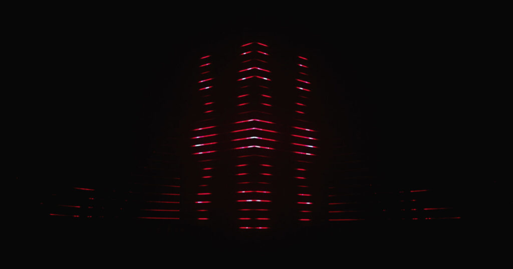
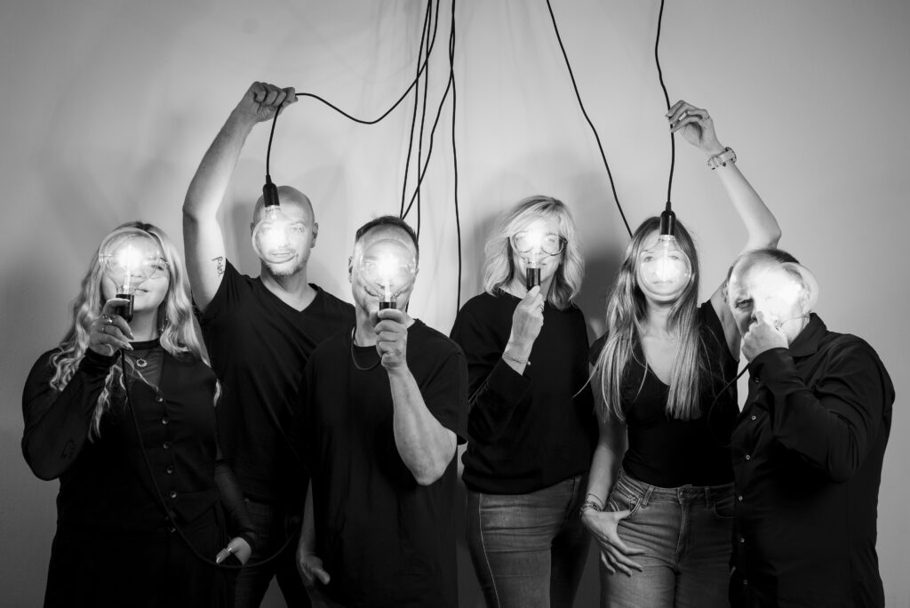
Mein Team war super motiviert: Magda, Tobi, Flo, Luki, Felix und ich haben uns voll ins Zeug gehängt, damit das Projekt cool wird. Wir haben im Sommer eine Richtung gefunden, wohin das ganze gehen kann und das hat uns bis zum Schluss super durchgetragen. Und der Fakt, dass Luki einen bomben Sound für uns komponiert hat, hat uns natürlich auch in die Hände gespielt. “Pandemonium” hieß unser Stück und wir sind sehr stolz drauf. Magda und ich dürfen ev. sogar in abgewandelter Form Animationen auf dem Turm für den ORF machen, das ist schon cool!

Bühnen Graz

Ich hab mich auch schon wieder sehr über die Zusammenarbeit mit dem Team Klanglicht gefreut, weil es letztes Jahr super funktioniert hat. Heuer hatte ich bereits eine genaue Liste mit meinen Tätigkeiten, kannte die zuständigen Personen, hatte meine eigenen Adobe vorlagen für die nötigen Produkte und so weiter – das hat den Prozess schon viel verschnellert. Und zusätzlich dazu konnte ich wertvolle Blicke hinter die Kulissen erhalten und auch erfahren, was bei der Organisation eines so großen und kunstvollen Events für Challenges gibt.

Klanglicht Festival Highlights

Meine persönlichen Highlights von Klanglicht, natürlich außer der Antoniuskirche, war „Flux“ von Collectif Scale im Landhaushof und „Echoes of Light” von Onionlab in der Stadtpfarrkirche. Unglaublich coole Licht und Ton Projekte:

Immer nach Klanglicht fühle ich mich super motiviert, inspiriert und freue mich einen Lebensweg eingeschlagen zu haben, bei dem so etwas einen Teil davon spielt. Leider habe ich auch mittlerweile realisiert, dass man von solchen Kunstinstallationen nur schwer bis nicht wirklich leben kann. Nur vereinzelte Künstler weltweit schaffen das, und die meisten Agenturen, die solche Installationen machen, machen sonst auch viele “normale” kommerzielle Projekte, um sich solchen “Passion Projects” auch widmen zu können. Aber das ist doch auch ein wertvolles Learning. Nachdem ich mit Magda und noch jemanden nächstes Jahr unser eigenes kleines Studio gründe, kann es ja unser Ziel sein, in freien Zeiten oder gemeinsam abends so passion Projects zu verfolgen. Vielleicht können wir dann auch mal auf Ernst beim Klanglicht ausstellen. Nächstes Jahr versuchen wir jedenfalls noch für die Young Masters Exhibition was zu zaubern und hoffen, dass wir da ausgestellt werden.

Bezug Masterarbeit

Ich bin mir noch nicht sicher, welche von drei Ideen ich für meine Masterarbeit verfolge. Dafür würd ich gern meine Ideen mal mit Birgit challengen, da komme ich immer ganz gut weiter. In einer der Ideen würde die Darstellung auch für einem Exhibition Space möglich sein, ähnlich von der Interaktion wie heuer die MO:YA Jungs im Schauspielhaus waren. Also mit einem Pult und vereinfachter Interaktion und dann einer abstrakten Form von Screen oder Projektion. Wobei ich wahrscheinlich am ehesten mit Web Technologie arbeiten würde, weil da mein Know-How am meisten drinnen steckt.

IMPULS #2: Junge Schweizer Grafik

Museum für Gestaltung, Zürich
Besuch am 09.11.2025

Ich bin nach Zürich gereist und dort ins Museum für Gestaltung (Toni-Areal) gegangen. Dort läuft gerade die Ausstellung „Junge Grafik Schweiz!“, in der Arbeiten von Designer:innen Mitte 20 bis Mitte 30 gezeigt werden – also hätte quasi ich sein können, wenn ich was gscheites studiert hätte (spaaaaß).

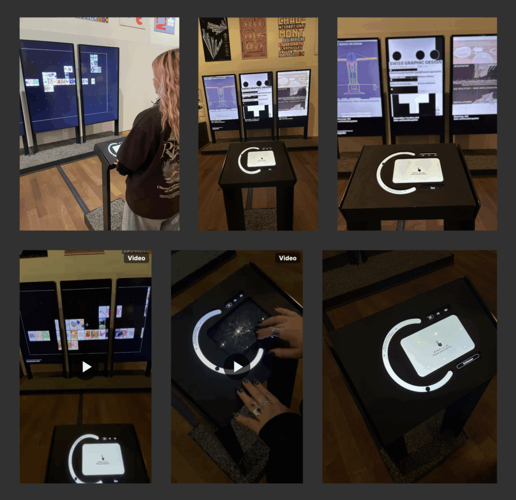
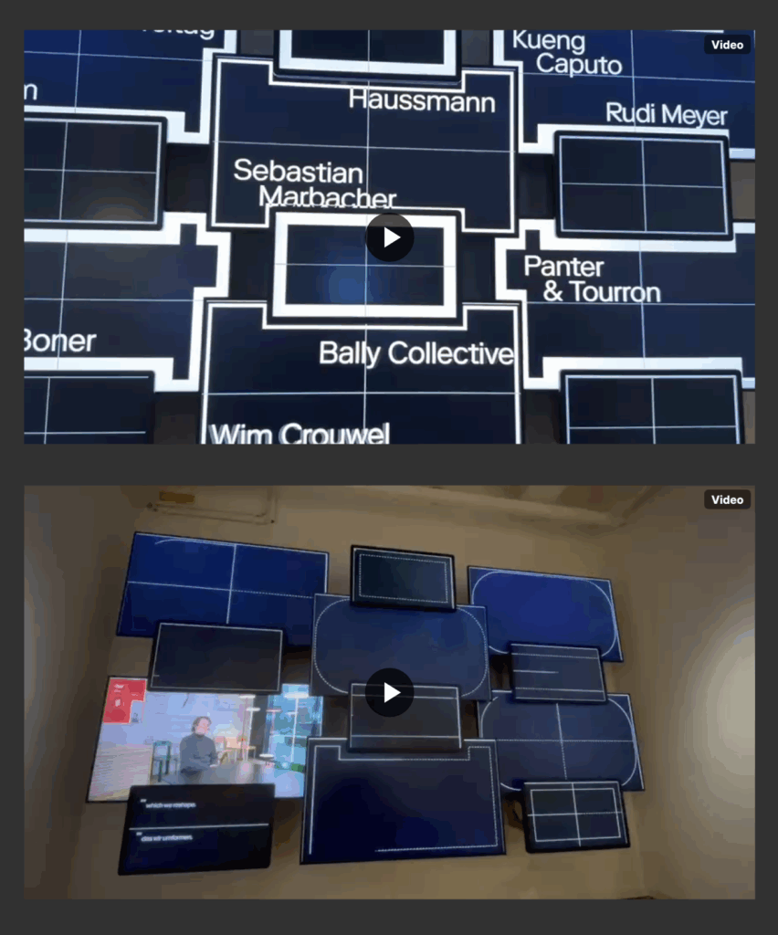
Die Ausstellung zeigt die aktuelle Schweizer Grafikszene: Zwölf Studios und Gestalter:innen – u.a. Data-Orbit, Dirtygraphik, Outline Online, Studio 11×1, Unstated oder Office Ben Ganz – wurden eingeladen, jeweils einen eigenen Raum bzw. eine Installation zu gestalten. Statt klassischer Poster-Schau fühlt sich das eher wie eine Reihe kleiner Welten an, die man hintereinander betritt: mal sehr digital, mal super haptisch, oft beides gleichzeitig. Durch ein ausgeklügeltes CI fühl es sich aber immer noch wie eine zusammengehörige Exhibition an und nicht zusammengewürfelt.

Was wurde gezeigt?

Es geht um das super interessante Überschneidung aus Tradition und Technologie: Schweizer Rasterstrenge trifft auf experimentelle Typo, AI, Creative Coding und sehr viel Bewegtbild.
Nachdem ich selber im Exhibition Organisationsteam für ESC bin, hab ich auch fleißig dokumentiert und mitgeschrieben. Das ist mir besonders hängen geblieben:

  • Multi-Screen-Setups statt „ein großer Screen“
    Mehrere Bildschirme in verschiedenen Formaten waren fast überall – und es hat mich überrascht, wie wenig „seamless“ das eigentlich sein muss, um gut zu funktionieren. Oft waren die Screens einfach aneinandergereiht oder übereinander geschichtet, teilweise mit harten Kanten.
  • Eine Interview-/Loop-Installation
    Besonders fasziniert hat mich eine Arbeit, in der Interviews und Studio-Porträts auf einem ganzen Grid aus Screens verteilt waren. Die Übergänge haben jeweils angekündigt, welches Studio als nächstes auftaucht, und dann wurde auf einen der Bildschirme „hineingezoomt“, wo das eigentliche Interview lief. Daneben ein kleiner Screen nur für Untertitel. Hat super funktioniert.
  • Sound im Ausstellungsraum
    In einem Bereich wurden gerichtete Lautsprecher eingesetzt, die den Ton jeweils zu einem Screen „schicken“. Das ist im großen Raum spannend, weil man direkt vor dem Screen relativ klar hört, ein paar Schritte weiter aber nur noch einen leisen Soound wahrnimmt.
  • Analog & Digital als Wand-Collage
    Mehrere Räume haben Poster, Bücher, Plakate mit digitalen Screens gemischt: Screens an die Wand gelehnt, Regale in leichter Schräglage, Bücher wie in einem Bookshelf, dazu Overlays, Transparenzfolien, kleine Karten, die man mitnehmen kann. Dieses Prinzip „Wall of Stuff“: Comdes-Wall, Poster-Archiv, Private-Projekte-Ecke fühlte sich extrem nah an dem, was ich mir für unsere eigene Masterausstellung vorstellen kann.
  • Typo-Wand mit Mini-Screens
    Eine Arbeit war im Grunde eine große Typo-Wand („Fonts are tools…“) mit vielen kleinen Screens, die sich wie dreidimensionale Typoblöcke davor in den Raum geschoben haben. Meine Erkenntnis: Kleine Screens können im Raum in Kombination mit Analogem sehr stark wirken.
  • Web / Interface im Großformat
    Ein anderer Raum hat Websites und Interfaces auf riesigen Screens gezeigt – inklusive Scroll-Situationen und Videoloops. Das war für mich als jemand, der viel im Web arbeitet, ein Reminder: Man kann digitale Oberflächen auch ganz cool ausstellen, wenn man sie gut skaliert, in ein klares Raster setzt und die Umgebung (Rahmen, Hintergrundfarbe, Anordnung) mitdenkt.

Link, falls sich jemand für die Ausstellung interessiert:

https://museum-gestaltung.ch/de/ausstellung/junge-grafik-schweiz

Impulse #3: Reflections on Vertigo 

In the end of october, we had the opportunity to take part at the Klanglicht festival. Very interesting for me thinking of my master theses, because it is an art installation, addressing the theme “rush” inside sacred architecture. I thought: Is this even accept or does it offend people because of the architecture that hold already layers of meaning, history, and emotions? 

I think it’s a great way of letting young artists have the opportunity of showing their artwork in a place that is mostly unused. Maybe also a way to let people rethink their relationships with the church overall. 

Until now/then, I had been circling around themes connected to religion, especially the visual world that surrounds it. But the more I worked on my Klanglicht installation, the clearer it became that my real interest lies somewhere deeper: in the growing distance between younger generations and the Church, and in the complex reasons behind this shift. 

My team installation explored the theme of the forest and the ongoing tension between city and nature. So: how can we visualize the conflict between these two worlds? How can we make people feel the push and pull between the natural and the constructed, between chaos and control, stillness and noise?  

During our design phase, we had mainly positive reactions to our concept. Our idea explored the conflict between city and nature, movement and stillness, and how shifting perspectives can create emotional resonance. We used light, color, distortion, and distance to communicate that tension. For a long time, we felt confident in our approach, but during the preparation phase, we received critiques which were notably more critical. The comments weren’t unkind — just different. They challenged our assumptions about what the piece was communicating and how viewers might interpret it differently than we intended. 

At first, I must admit, it felt unsettling. After so much encouraging feedback, it’s easy to fall into a kind of creative comfort zone. You start to believe your concept is clear, your visuals strong, your message consistent. This moment reminded me how every perspective is shaped by personal experience, values, and expectations.  

It reminded me that design and art are never universal — every viewer, every participant, brings their own background, experiences, and beliefs into the interpretation. Especially in our context, showing our work inside a church, the meaning of light, distance, and color becomes even more layered. What might seem purely aesthetic to one person can carry deep symbolic or emotional connotations for another. 

The idea of conflict — not just between city and nature, but also between perception and intention — became something I kept thinking about afterward. It directly connected to the questions I’m exploring in my master’s thesis, where I deal with religion, faith, and representation. 

I came to the conclusion that I wasn’t interested in analyzing religious symbols themselves. What truly fascinates me is the underlying emotional and cultural distance that so many people my age experience toward religion have. I have noticed this in conversations with friends, in social debates, even in how faith is portrayed in media. Many young people seem to separate belief from institution, or they turn away completely. 

The contrast in feedback during our Klanglicht process helped me understand why this topic resonates so strongly with me. It showed me how multiple interpretations can coexist — none of them inherently right or wrong, but all influenced by lived experiences. This insight connects directly to my thesis: if I want to understand why young people distance themselves from religion, I need to approach the subject through dialogue, reflection, and openness, rather than fixed assumptions. 

Looking back, I’m actually grateful for that critical feedback. It disrupted my confidence just enough to make me think deeper. I could re-examine my intentions and had the reminder that no creative work will ever be interpreted the same way by everyone. Understanding these and the dynamics is essential for my thesis. Rather than studying religious symbols, my work will investigate the inner landscapes of young people today: their doubts, their values, their frustrations, and their hopes. Just like in the installation, the goal for me now is not to provide definitive answers, but to create space for reflection. 

Dissclaimer: AI was used here for a better wording 

IMPULSE #2 – Video Essays

This impulse started in the most unplanned way possible: boredom. I was aimlessly scrolling through YouTube when the original Everything Is a Remix series popped up. I clicked on it just to have something in the background, and then ended up watching the whole thing, plus the 2023 edition right after.

At first, it didn’t seem relevant to my Design & Research work at all. The documentary begins with the music industry, showing how songs recycle melodies and structures. Then it shifts to movies, pointing out how Hollywood endlessly reuses storylines, characters, and visuals. I didn’t expect any of this to spark anything academically useful… but it did.

The more I watched, the more the core message hit me: creativity is combination. Nothing begins as a pure, untouched idea. Designers, musicians, filmmakers, we’re all remixers. We borrow, reshape, merge, distort, and evolve things that already exist. That’s not a flaw of the creative process, it is the creative process.

This came at the perfect moment for me, because I’ve been stressing a lot about finding a unique topic for my Master’s thesis. The fear of “this isn’t original enough” has been in my head for months. But this documentary reminded me that originality is kind of a myth. Every famous movie, interface, or design moment has roots somewhere else. Creativity happens through exposure to many sources, not by inventing something out of thin air.

One part I loved was the reminder that copying is how we learn. Nobody starts out original. Kids copy drawings. Musicians learn by copying songs. Designers remake interfaces, posters, and layouts before they know how to create their own style. Copying gives you understanding, transforming gives you creativity. That’s exactly what the documentary showed again and again.

The most interesting section for me was about interfaces. It showed how early computers developed (especially Apple’s Macintosh) and how much of it came from remixing ideas from Xerox PARC and other pioneers. Even the updated 2023 version keeps those examples, but adds new ones from the 2020s, which makes it even easier to understand today in 2025. Interfaces evolve the same way music and film do: through constant borrowing and refining.

Then came the AI chapter, which was uncomfortable in a good way. The documentary explained diffusion models: how AI takes noise and patterns it into images based on millions of existing pictures. But is that learning? Or copying? It’s a controversial space where remixing meets ethics, and it made me think a lot about how designers work with tools that blur the lines between influence and imitation. Even memes, which get remixed endlessly, raise questions about ownership.

What surprised me most was how directly this documentary ties into the things I maybe want to explore this semester, especially around being a multidisciplinary designer and navigating all the influences, tools, and expectations that come with that. It made me think: How do designers form their identity when everything they create is built from other things? What does “original” even mean in a world where everything is borrowed, remixed, and reinterpreted? And how do generalist designers stay grounded when there are endless directions to pull inspiration from?

The series didn’t answer these questions, but it opened the door to them. It reminded me that having many interests isn’t a weakness or a sign of being unfocused, it’s actually the raw material creativity feeds on. Being a generalist might feel overwhelming at times, but it also gives you a wider palette to work with.

So yes, a random YouTube suggestion ended up calming me down. I don’t need to chase some impossible idea of “pure originality.” I just need to keep remixing, learning, and combining things in my own way.

Stuff Worth Clicking A.K.A. Accompanying Links

Disclaimer: This blog post was written with the help of AI for better grammar and correct spelling.