IMPULSE #1: Reflecting on the book “Designing Interactions” – What responsibility really hides behind an interface?

I got a week with Bill Moggridge’s “Designing Interactions”(huge thanks to Prof. Baumann) and it felt like sitting in a long, honest conversation with the people who built the interfaces we now use everyday. The interviews and case stories walk through the shift from early graphical interfaces and the mouse, all the way to mobile devices, games, and speculative futures, and you start to see how every design decision quietly teaches users how to think about technology. For my thesis on ethical design and digital footprints, this book is a reminder that interaction design is never neutral; it always shapes what users notice, what they ignore, and how aware they are of the traces they leave behind. Some chapters really highlight the ​importance of how design shapes how humans leave digital footprints and it really opened further curiosities.

The early GUI stories around the mouse and the desktop metaphor are a good reminder of how much power metaphors have. Designers were not only drawing icons; they were defining how people imagine “working” inside a computer, using windows, folders, and simple interactions. Translating this to my thesis, I realize current privacy banners, “activity” views, and history logs are also metaphors that teach people what a digital footprint is. If the interface hides most of the trail or wraps it in vague language, users will assume there is not much going on. That is already a design decision, not an accident.

The chapter “From the Desk to the Palm” is where the digital footprint issue becomes impossible to ignore. These chapters walk through how interactions left the desk and moved into pockets, hands, and everyday routines. Once devices became mobile and always connected, data stopped being something people “entered” and became something that is constantly generated in the background. For my work, this underlines a key ethical challenge: people are not always consciously “using” a product when their data is being collected. Ethical interaction design must therefore find ways to surface what is happening in the background without overwhelming people.

Then “Adopting Technology” stories highlight the negotiation between what is technically possible and what is acceptable or understandable for users. Designers keep running into constraints and tradeoffs, and those constraints end up shaping the final product. I see a clear parallel here with privacy-by-design: if ethical constraints and data-minimization rules are built into the process early, they can shape the interaction in the same way as technical limits. This helps me think of ethics not as an add-on checklist, but as part of the design brief.

Also, the “People and Prototypes” chapter gives me a practical hook. He describes a process grounded in talking to people, building quick prototypes, and iterating under constraints. For my thesis, I can borrow this structure and explicitly define “ethical constraints” around data collection, consent, and transparency, then test them through prototypes. Instead of just saying “this design is ethical,” I can show how those constraints influenced specific interaction choices.

There is also value in the more future-focused material. The speculative and “alternative nows” work shows designers imagining other ways technology could fit into society, not all of them comfortable. This inspires me to think about what a future interface would look like if it treated digital footprints as something to be clearly seen and managed, rather than hidden. For example, could a product visualize data trails in real time, or let users rehearse different “data futures” depending on the choices they make?

For my thesis, this impulse leads to three concrete moves: first, to treat metaphors and mental models as central when designing how people understand their digital traces. Second, to adopt a “people, prototypes, constraints” process that includes ethical and privacy constraints from the start. Third, to use speculative scenarios to question today’s defaults and imagine interfaces that actively help people manage their footprints instead of quietly expanding them.


Some relevant accompanying links:

Here is a link to the publisher’s page for “Designing Interactions”, which gives a clear overview of the structure, chapters, and focus of the book:
https://www.penguinrandomhouse.com/books/655668/designing-interactions-by-bill-moggridge/9780262134743

For another perspective, this review summarises the key themes and interviews in the book and helps me cross-check which parts are most relevant to interaction design practice and my thesis:
https://www.pdma.org/page/review_designing_int

Lastly, this introduction to interaction design offers a concise explanation of how interaction design shapes user behavior and expectations, which supports my argument that design decisions influence how people understand their digital footprints:
https://www.interaction-design.org/literature/book/the-encyclopedia-of-human-computer-interaction-2nd-ed/interaction-design-brief-intro


Disclaimer: This blog post was developed with AI assistance (Perplexity) to help structuring and phrasing my reflections.
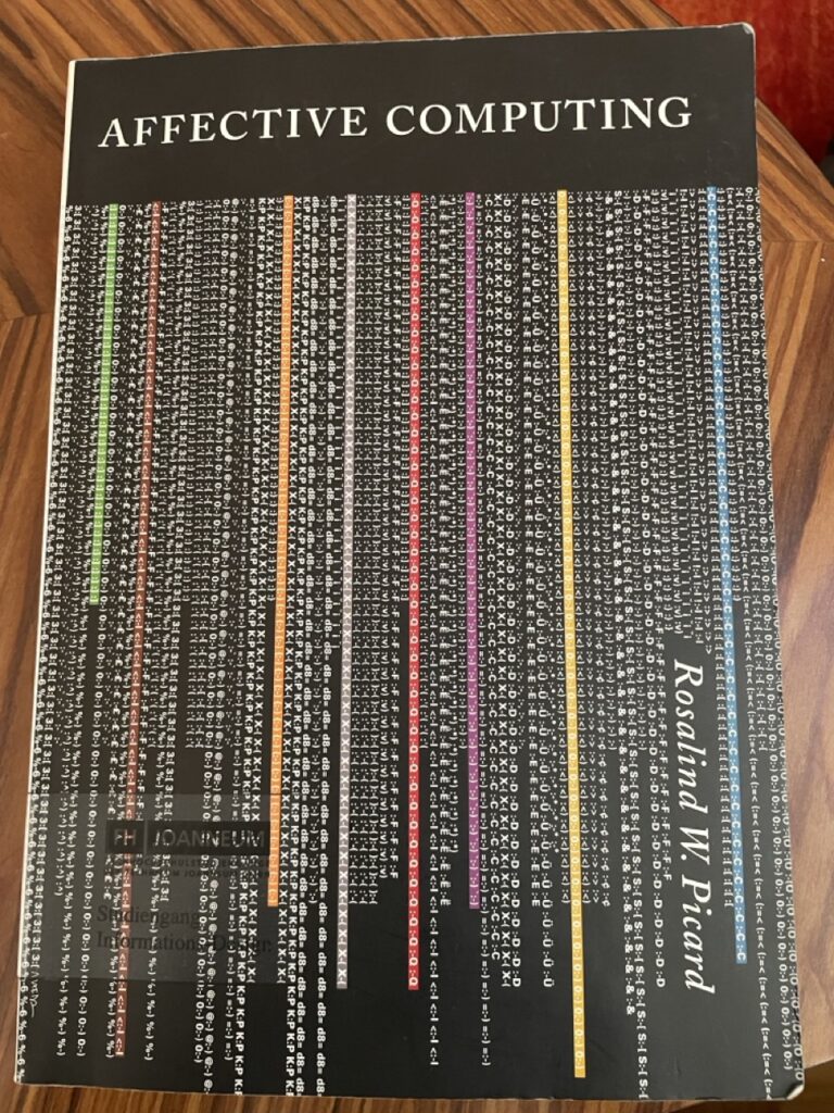
Impulse #1: Affective Computing, Rosalind W. Picard

The work Affective Computing by Rosalind W. Picard from the year 2000 proposes a fundamental paradigm shift in computer science, challenging the traditional view that intelligent machines must operate only on logic and rationality. Picard’s work provides a comprehensive framework for the design of computational systems that relate to, arise from, or influence human emotions.

In Interaction Design we want interfaces that are easy to use and look good. We spend our time while working on projects thinking about usability, efficiency and aesthetics. For us in design, this means a functional interface isn’t enough anymore. If a system doesn’t register that a user is confused or frustrated, it’s not truly successful. Picard essentially launched a new field dedicated to building technology that can sense, interpret, and respond to human emotional states.

Adaptive Interfaces enhanced by Computer Vision Systems

A central connection between affective computing and my work in emotion detection for computer vision lies in the development of adaptive user interfaces. Picard emphasizes that computers often ignore users’ frustration or confusion, continuing to operate rigidly without awareness of emotional signals. By equipping systems with the ability to recognize facial expressions, stress indicators, or declining engagement, interfaces can dynamically adjust elements such as difficulty level, information density, feedback style, or interaction pacing. This emotional awareness transforms an interface from a static tool into an intelligent communication partner that responds supportively to users’ needs. In learning environments, for example, a tutor system could detect when a student becomes overwhelmed and automatically provide hints or slow down the content. In safety-critical settings, such as driver monitoring, emotion recognition can alert systems when attention or alertness drops. Thus, integrating affect recognition directly contributes to more human-centered, flexible, and effective interfaces, aligning with Picard’s vision of computers that interact with intelligence and sensitivity toward humans.

Computer Vision in UX-Testing

Computer vision–based emotion recognition can significantly enhance UX testing by providing objective insights into users’ emotional responses during interaction. Rather than relying solely on post-task questionnaires or self-reporting, facial expression analysis and behavioral monitoring enable systems to detect in real time when a user experiences frustration, confusion, satisfaction, or engagement. Picard highlights that current computers are affect-blind, unable to notice when users express negative emotions toward the system, and therefore cannot adjust their behavior accordingly. Integrating affective sensing into UX evaluation allows designers to pinpoint problematic interface moments, identify cognitive overload, and validate usability improvements based on measurable affective reactions.

In summary, the intersection of affective computing, computer vision, and adaptive interfaces offers a protential research path for my master thesis. By enabling systems to detect emotional reactions through facial expressions and behavioral cues, UX testing can become more insightful and responsive, leading to interface designs that better support the users needs. Building on Picard’s foundational ideas of emotional intelligence in computing, my research could contribute to developing affect-aware evaluation tools that automatically identify usability breakdowns and adapt interactions in real time.

Impulse #4 – Wreck this journal

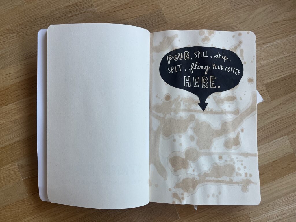
Early this week I found myself procrastinating again and I stumbled upon a book I got for Christmas some years ago: Wreck this Journal by Keri Smith. The author stated in her acknowledgment that this book is dedicated to perfectionists all over the world; and I totally understand why. I would say I am a perfectionist myself and to be honest the idea of “destroying” a totally new book made me feel a bit unwell, but I guess that’s where real creativity and inspiration start, outside of your comfort and what you know.

This book has around 220 pages, where each page is a creative prompt, an invitation to mess around, destroy, let loose and have fun, it feels like a permission to play. I journaled a lot in my teenage years and I wanted everything to be perfect especially the first few pages. One of the first prompts was to “spill coffee on this page”. It took me some time to really bring myself to do it, knowing that the coffee will not just spill on this page, but also the rest of the book. I was stressed to be honest. But while doing it, felt quite freeing and fun. I mean there are still some pages, where I am having a hard time doing them, but I guess this is just a process. I am so used to try to make everything perfect and shiny. Every project needs to be efficient and optimized and there is no room for mistakes or failure. So maybe with every page I give myself the permission to just have fun.

I think this book is in a strong relation with the “Do First, Think Later” idea I wrote about in my last blog. The prompts are weird and illogical, like taking the journal to the shower, but it helps to start creating on an impulse without planning it too much. It’s all about just start doing it, get messy and see where the chaos leads. This book forces you to start with your gut instead of overthinking it with your head.

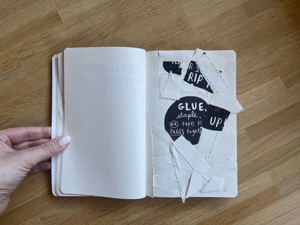
There are also a lot of pages where you need to destroy the page like it ripping it apart, crumbling it up or cutting into several pages. The good thing about having to destroy things is that you basically can’t fail. This removes all the pressure, self-judgement and need for perfectionisms. It’s all about the activity itself rather than the outcome. It’s all about fun and having a good time, embracing the imperfection.

Another important aspect of the book is, that they work with creative constraints like draw the page with glue. Instead of having infinite choices of a blank canvas you can get a silly prompt that forces you to get creative within a given limit or constraint. I think having a clear prompt can prevent the paralysis of endless choices that sometimes block the creativity.

Even though this is an analog book, which gives more ideas to get chaotic, messy and imperfect than a website, but I think the core ideas can be translated into the digital creative playground, and I think this webspace should exactly be a place for creatives to just let go, get chaotic, mess around. It should be a place where not everything needs to be perfect, it should be a place to just have fun and be creative.

AI was used to check spelling and grammar and better clarity.

Impulse #3 War with Myself – Essays on Design, Culture & Violence, Ian Lynam

After finishing Design Against Design, I read Ian Lynam’s War With Myself, and for me it felt like a continuation of the same kind of reflection. It was again a strong reminder of how closely design is connected to the systems around us. Lynam does not only talk about design as a practical activity. He also looks deeply into the cultural and historical forces that influence it. He explains how design still carries traces of empire, violence, and inherited aesthetics, even when we do not want to see them. What we often call “good design” can in fact be part of narratives of power and exclusion.

Similar to Lo, Lynam points out the uncomfortable truth that design is never neutral or only visual. Every decision — a typeface, a layout, or a digital system — belongs to a larger cultural structure. It can repeat old hierarchies, even when we believe we are designing something modern or progressive. The struggle he describes happens both inside and outside the designer. It is the designer questioning their own education, habits, and biases. It is the realization that our work can unintentionally support cultural dominance or aesthetic violence simply by following what we have learned to see as “normal.”

For Lynam, meaningful design is not about showing cultural references or using the language of critique on the surface. Instead, it means asking which histories we continue, whose aesthetics we center, and which voices are missing. He argues that real responsibility in design does not come from performative actions or quick activist gestures. It comes from facing the uncomfortable history of the discipline itself. According to him, design becomes more ethical only when we accept both its problematic sides and its potential — not as a tool for branding or personal style, but as a way to question, disrupt, and rethink how culture is represented.

Lynam’s ideas also raise important questions for digital work. When we look at his arguments through the lens of web design, they become even more relevant, because digital interfaces shape everyday life at a massive scale. To better understand how his thinking can influence our own practice, the following four key learnings show how the themes from War With Myself translate directly into web design.

Design is shaped by history and culture, not only by aesthetics

Lynam shows that design is never created in isolation. It always carries influences from history, politics, and culture — including difficult topics such as colonialism and violence. This means designers must understand the past to avoid repeating harmful patterns in the present.

„Good design“ can still support systems of power

The book explains that even professional, clean, or widely accepted design can reinforce existing hierarchies. Without critical thinking, designers can easily reproduce ideas that exclude or silence certain groups, even if this is not their intention.

Designers must question their own training and assumptions

A central theme is the inner conflict of the designer. Lynam encourages us to reflect on what we learned in school, what we consider “normal,” and where our biases come from. This self-reflection is necessary to understand how our practice might contribute to cultural dominance.

Ethical design requires confronting uncomfortable truths

Lynam argues that real responsibility does not come from surface-level activism or aesthetic gestures. Instead, ethical design means engaging with the uncomfortable history of the discipline, asking critical questions, and being willing to rethink how we represent culture through our work.

Relation to web design practice

For web design, Lynam’s ideas are especially meaningful because digital interfaces have a strong influence on how people see and interact with the world. 

Websites and apps often follow established patterns that look neutral but actually come from specific cultural and historical traditions. This means that web designers also have a responsibility to question their choices and understand the systems they are part of. Whether it is the structure of a navigation menu, the use of certain interaction patterns, or the way content is presented, every decision carries values and assumptions. By looking at web design through Lynam’s perspective, it becomes clear that ethical and thoughtful digital design requires more than good visuals — it requires awareness, critical reflection, and a willingness to challenge what is considered “normal” in the digital space.

Lynam, I. (2024) War With Myself: Essays on Design, Culture & Violence. Set Margins Publications.

AI (Perplexity and ChatGPT as well as DeepL) was used to check spelling and grammar and better clarity.

Hosting Applications (Homelabbing_2) – Impulse #2

In my last blog post I wrote about my first steps in homelabbing, to clarify in homelabbing you try to setup a home server environment to run services, test and learn new stuff. Some examples: Host a cloud service, a picture backup service, a home NAS (Network Attached Storage), your own streaming service or even a Minecraft server. I set up a “home server” an old laptop got it a new operating system and installed the first services.

After this first success, I felt ready to dive deeper. To really host a service, that I can use, maybe even outside of my home network. And the first thing, that came to my mind was a Minecraft server. My cousin had done it, other friends had done it, so it can’t be that hard. And it really isn’t. The documentation is good, all in all it’s just installing java & the basic server run file. I just had one issue, which was exposing a port to the internet, which I could solve after a while of searching through forums. (I ended up finding the answer in the docs, just not where I looked.)

Now, I had used the terminal, I had a service running, why not set up something that I can use in a more productive way? And this one, didn’t go so well. See for a lot of the services most people run on their homelab you need a separate software for them to run properly, most of the time that is Docker. In short, Docker solves the “It works on my machine…” problem, a lot of new software has. (Here is a Network Chuck tutorial explaining Docker in more detail: https://youtu.be/eGz9DS-aIeY?si=aSPVoBCwRwZ6zaLs) It basically creates the perfect environment to run a certain piece of software. And just getting that to work, took me a while, reading documentation, forums, watching video tutorials.

After I had setup Docker and it was running properly, I decided to install a Remote Desktop application, so I could make changes to my home server from where ever I wanted, without having to use the old laptop to do so. I planned to hook it up to my home network and leave it running, without having to open it up to make changes. Through a Reddit post I discovered RustDesk, an open source remote access software, which can be self hosted through Docker. And for the first time, installing a new service just worked. The Docs were easy to follow and in less than an hour, I had RustDesk running.

After this first success I really wanted to have a service running, that would provide a benefit to my day to day life. Three different ones really caught my eye: PiHole, a network wide ad-blocking service, Immich, a Google Photos like picture backup cloud and n8n, a patching tool similar to Max that let’s you create Ai supported automations. (I provided Links to the projects below)

Sadly It was not all fun and games. Like all good homelabbing projects I ran into another problem, which had put this whole experience to a hold. Everything I had done until now ran through the W-Lan of my apartment, which is suboptimal, it clogs up the WiFi for other mobile devices and is slower, compared to a wired connection. Since I planned to put the server somewhere in the apartment and never move it again, I wanted to hook it up immediately. This lead to the laptop not booting, so I couldn’t do anything while it was hooked up to the network, but it would work fine when I unplugged it.

Impact for my Masters Thesis

Thinking back now, when I tried to set up Docker, this actually was my first encounter with a big problem in open source: Bad newcomer onboarding and difficult documentation. As I would find out later, during deepening my research in open source, this is also one of the areas that experts see the most use for UX work, creating an easy to understand onboarding and easy to read documentation. It’s a hit or miss. Sometimes it takes hours to troubleshoot a problem and reading through forum posts, to find the solution, that works for you.

What still stuck with me this whole time, thinking about open source, was the thought of coming into a new area or hobby and trying to solve a problem I don’t truly understand. I have used open source software before, I read docs and learned a lot, still finding a research question or a problem to solve is hard. I guess I need to dive deeper into this whole field to truly understand it. Everything I thought about felt strange, a new person coming in and trying to solve a problem that they read about in some forum or book. This lead me more into the direction of documenting, how to contribute as a designer in the first place or how to run/ start an open source project, since I really like the way of providing a product for others to use and change, best case for free.

Accompanying Links

Here are some links to the different services I mentioned im the blog post:

https://rustdesk.com

https://minecraft.wiki/w/Tutorial:Setting_up_a_Java_Edition_server

https://n8n.io

https://immich.app

https://www.docker.com

https://pi-hole.net

Impulse #2 Design against design

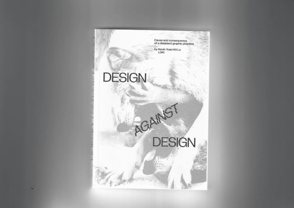
I recently read the book Design Against Design by Kevin Yuen Kit Lo. It was a really good read and I learned a lot about design and the power it holds. Tho a lot of points made are obvious, most of the time we Designers dont think about them that much. Its important to hear them again and again to remember what power design holds.

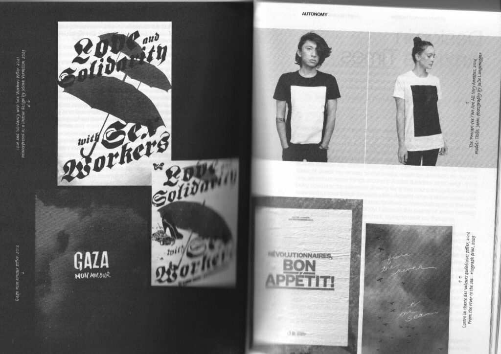
In the book, Lo writes about how graphic design often ends up reinforcing the very system it claims to critique. He writes about the tension between wanting to work in solidarity with social movements while operating within an industry built on commodification. The designer, he says, has to confront the reality that every aesthetic choice sits inside a political and economic structure. True resistance is less about producing “radical-looking” visuals and more about participating in relationships, communities, and struggles that exist outside of commercial design. For him, design becomes meaningful only when it serves collective goals rather than brand visibility or personal authorship.


After finishing the book and thinking about topics for my thesis I sat down again and tried to distill my key learnings from the book. Here are six points I found to be very helpful for myself.

Design is never neutral

Lo insists that graphic design always takes a position because it mediates language, visibility, and voice, even when it claims to be “just” functional. 

“Socially engaged” work is structurally constrained

The book shows how client relationships, funding models, and institutional contexts limit how radical a design practice can be, even when it works with progressive causes. 

Dissident practice is about relationships, not just aesthetics

Lo frames dissident graphic practice as a way of working with movements over time: building trust, sharing risks, and recognizing the designer as one collaborator among many rather than a neutral expert. 

Materiality and production matter politically

The book links politics to the material conditions of design: how things are printed, circulated, and produced, and how those choices intersect with labor, scarcity, and access. 

Autonomy is partial and negotiated

Lo is critical of romantic ideas of the fully autonomous radical designer; instead, he describes autonomy as something limited, negotiated inside real economic and institutional constraints. 

Formal experimentation can be tied to struggle

The book connects typographic and layout experimentation to political and emotional conditions: dissonance, urgency, refusal, solidarity, and care. 

Relation to web design practice

As Im very much into web design and as it looks right now – this will also be the outline topic for my thesis, I wanted to connect these learnings, coming mainly from a graphic design stand point, to web design.

Design Against Design encourages treating the website not just as an interface but as an arena where power, labor, and community are negotiated through form. It invites designers to question supposedly “standard” patterns—dark patterns, extractive tracking, engagement‑at‑all‑costs—and to explore dissident alternatives that foreground accessibility, mutual aid, and situated narratives, even when that means resisting established best practices or business metrics.

Lo, K.Y.K. (2024) Design against design: cause and consequence of a dissident graphic practice. Eindhoven: Set Margins.

AI was used to check spelling and grammar and better clarity.

Impulse #3 – Die Kreativmaschine

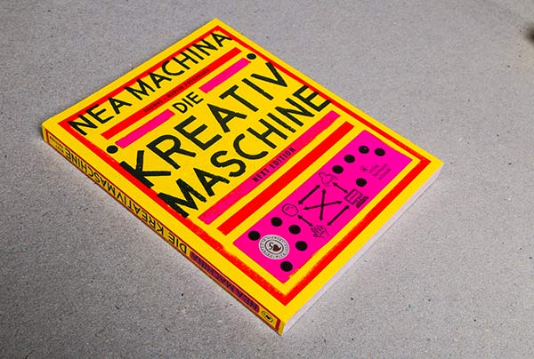
Two weeks ago, we had a class with Konrad Baumann where he brought some of his books. This big yellow book caught called “Nea Machina. Die Kreativmaschine” caught my attention. At this time, the idea for my Master’s Thesis slowly starting to grow, focusing on creativity. So, I was very curious about what the “Kreativmaschine” could be.

source: https://www.poschauko.de/neamachina/

The book is a work of Thomas and Martin Poschauko, two multidisciplinary creative professionals whose work goes from fine art, design, creativity research and academic teaching. It is based on an experiment they did: They wanted to see how many different art pieces they could create within four months. The core constraint or template was that each art piece had to be a portrait with the title “Nea Machina”. In those four months they created 1000 different variants. The book showcases the results of the experiment. However, while working on the variations they started to analyze their work and also the process, which led them to their own creative methodology: Die Kreativmaschine. Therefore, the book not only displays their work, but also gives an insight into the theoretical essence and principles.

The core idea of the Kreativmaschine

The Kreativmaschine consists of four components: head, gut, hand and computer. Those four elements are further separated into two different levels:

  • Idea Level: Head and Gut
  • Tool Level: Hand and Computer
source: https://www.poschauko.de/neamachina/

The idea level represents the origin of an idea, which is essential for any creative work. It addresses the question: “From which inner drive does design emerge?”
* The head refers to a planned, conceptual approach that relies on clear structures of thought. Logic plays an important role here.
* The gut, by contrast, is emotional and non-rational. It involves intuitive action and is associated with playful, unsystematic, and not immediately logical approaches.

The tool level describes the technical realization of an idea.
* The hand stands for all manual techniques, such as painting or constructing installations – anything that involves real, physical materials.
* The computer, on the other hand, represents digital design carried out on the computer using graphic software.

The authors shared their observation: they realized that every time they created a variation on the computer, their next inspiring idea involved creating something by hand. They stated that the rotation of the four elements in both levels is what kept them going and gave them inspiration for the next variation that kept the whole experiment running.

While the Kreativmaschine is the central concept of the book, they also cover several other core topics:
* Independence from the computer
* Letting go of control leads to higher quality
* Escape the everyday
* Do first – think later
* The good feeling as a creative force
* Artist or designer
* The special tool “hand”
* Free perception

This book, and specially the concept of the Kreativmaschine provide a good theoretical framework for my Master’s Thesis on encouraging playful, low-pressure creativity as counter to productivity culture.

One thing that stuck with me was the core topic “Do first – think later”, because I feel like we are so used to the opposite. We think before we do, we want to plan everything before we start to be as efficient as possible when working on the project. I think it is generally a good approach in life, but maybe not always the best approach for creative projects. The authors said that sometimes the good ideas come from just starting and seeing where it leads you. So, starting with your gut instead of with your head. The book shows that spontaneous, non-rational and imperfection can be the key to breaking creative blocks and foster real inspiration.

Link to their website:
https://www.poschauko.de/neamachina

AI was used to check spelling and grammar and better clarity.

Impulse #4: Reflections on the “Wir und die Autonomie” Exhibition in Bolzano 

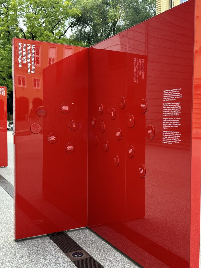
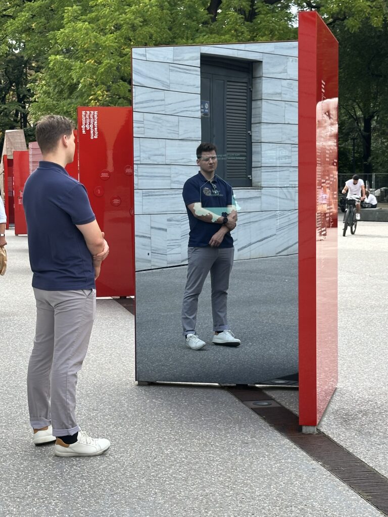
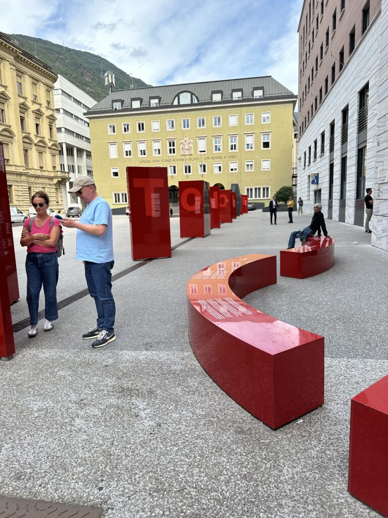
On a recent trip to Bolzano, I visited the permanent exhibition “Wir und die Autonomie” at Silvius-Magnago-Platz — an immersive public installation exploring the history, meaning, and everyday impact of autonomy in South Tyrol. What fascinated me most was not only the content, but how the entire exhibition was designed to be interactive, multisensory, and deeply human. It blended architecture, sound, reflection, and data visualization so naturally that the experience felt less like reading history, and more like stepping into a living narrative. 

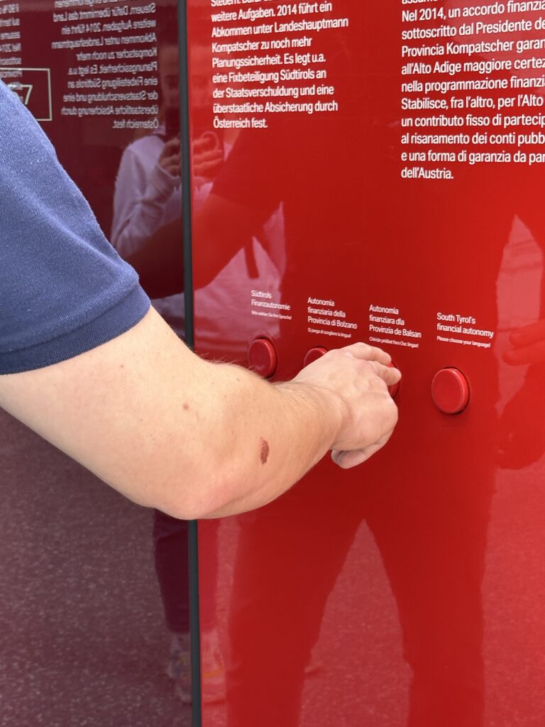
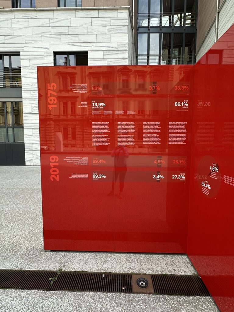
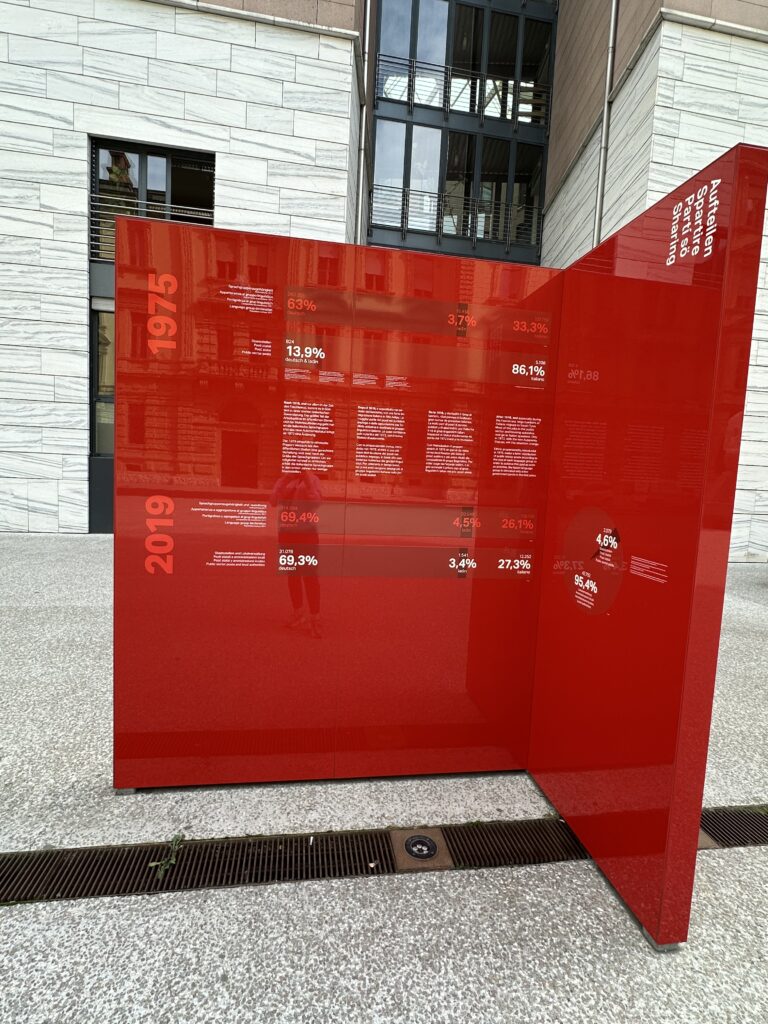
The exhibition is organized into a parcours of nine stations — each one representing a letter in the word “AUTONOMIE”. This clever structure immediately signals that autonomy is not a single concept, but a composition of many parts, each contributing to the region’s unique identity. As I moved from station to station, I could listen to different local dialects through audio installations, read statistics that were visualized through engaging and clear diagrams, and interact with mirrored screens that reflected both information and my own presence back at me. 

The use of mirrored surfaces was particularly striking. They served as a reminder that autonomy is not just a political framework — it is personal. It involves human perspectives, lived experiences, and emotional connections. Standing in front of the screens, seeing myself within this historical and cultural context, I felt the exhibition quietly ask: What is your position within this story? What is your relationship to identity, language, and belonging? 

South Tyrol’s autonomy is deeply intertwined with questions of cultural preservation, multilingualism, and political negotiation. The exhibition made clear how autonomy protects minority languages such as German and Ladin, while balancing coexistence with Italian-speaking communities. It also reflected on the struggles that led to today’s agreements and on how autonomy continues to evolve. 

What impressed me was how the exhibition managed to translate these complex historical and political layers into forms that were easy to engage with: emotional storytelling, sound, spatial design, and accessible data. It is a reminder that design can make even heavy subjects feel approachable, that facts and feelings can co-exist without contradiction.

This experience influenced how I think about my own master’s thesis. My topic revolves around understanding why younger generations increasingly distance themselves from religion and the Church. 

But I have been struggling with one part of my thesis: How can I translate this topic into interaction design? 

I see fragments of possibilities: narrative spaces, reflective installations, projections, sound — but I still don’t have a fully developed concept. The connection between research and interactive output is not yet clear to me. 

Visiting the autonomy exhibition helped me recognize what might be missing. It showed me how data, personal stories, emotion, and design can be merged into an interactive experience without becoming overwhelming or didactic. It demonstrated how abstract topics — identity, history, political agreements — can be made tangible through sensory engagement. And it reminded me that interactivity doesn’t always need to be loud or playful; it can also invite reflection, self-awareness, and dialogue. 

Seeing how the exhibition translated complex themes into accessible formats gave me confidence that my own topic, too, can be transformed into an interactive installation. Perhaps not through literal symbols or religious imagery, but through emotions, perspectives, and the invisible distance people feel. 

The “Wir und die Autonomie” exhibition started as a normal cultural visit, but ended to be a small design lesson for me. It showed me how identity, data, and personal experience can coexist in one space, and how interactivity can help visitors engage with delicate or complex topics. It also reminded me that good design doesn’t deliver answers; it opens space for questions. 

This insight is something I will carry into my thesis process. Even though I’m still searching for the right interactive form, I now see more clearly how design can help make intangible issues visible — and how experiences can spark reflection where words alone sometimes fail. 


Links:  

https://autonomie.provinz.bz.it/de/dauerausstellung-wir-und-die-autonomie

https://www.uibk.ac.at/media/filer_public/05/55/05550982-9ba9-4aa1-8167-246071537252/texte_mit_luecken_und_schraegen_interpretationen.pdf

https://www.meinbezirk.at/wieden/c-politik/eine-stele-erzaehlt-die-geschichte-der-suedtiroler-autonomie_a7736332

Dissclaimer: AI was used here for a better wording 

IMPULSE #4 – Reflecting on concerns about Plug & Charge and insights from Nidec Podcast

For my fourth impulse I focused on recent challenges in EV charging that question my initial research direction. I watched a podcast with Andrea Caviglia, Head of Global Product Management at Nidec, a major player in e-mobility charging solutions and brainstormed next research steps with the support of Perplexity. This reflection brings together my notes from the video and critical thoughts about my Master thesis after learning about Plug & Charge technology.

Andrea explained that many EV user experience challenges remain despite technical progress. The core problem is that charging is still a new technology creating friction, fear, and anxiety for users. Two main challenges he highlighted in video are “range anxiety” (thats the fear of not reaching the next charger) and the time users have to spend at chargers. This means the charging process must be fast and the waiting time should be used well. The interface (charger and app) should be intuitive and show clear real-time updates about charging status, kilowatts used, time remaining.

This confirms my thesis focus: user experience is central, but also complex and emotional, not just technical. Andrea mentioned multiple payment options are common in EV charging, with app subscriptions, RFID, credit cards, and even QR codes being used to make payments simple and flexible. This aligns with what I know, but also shows how the ecosystem is still diverse without a fully unified system.

The video also explained the fast-paced nature of the e-mobility market, constantly evolving with new charging standards like “mega charging” for buses and trucks. It showed that product design must carefully consider all touchpoints, ensuring hardware reliability, simplicity, and real-time communication within the IoT ecosystem. This means robust, user-friendly solutions are essential for customer satisfaction and reuse.

One highlight relevant for me is how Plug & Charge works. This new technology allows cars to register automatically and start charging on connection without manual steps to start or pay. This sounds like a great UX improvement but also challenges my thesis. If charging becomes nearly effortless for users, will detailed work on charging interfaces even be necessary?

I concluded that while Plug & Charge reduces friction at one stage, many other UX challenges remain:

  • Where and how do users find chargers?
  • How do they trust the charger and its status through app or physical signals?
  • How inclusive and accessible are stations for all users?
  • How can the waiting time be designed as valuable time?
  • How do users handle errors or machine failures?

So, Plug & Charge is part of the solution but not the whole picture. For my next research steps, I want expand my focus beyond “start and pay UX” to the full charging experience ecosystem, including location, trust, accessibility and also cognitive/emotional factors.

I also openly admit that after watching this and discussing with AI (Perplexity), I had to rethink and refine my thesis topic and methods. I realize that being flexible and critically examining assumptions is crucial in fast-moving tech fields.

Next steps I will pursue:

  • Refine my research questions to cover the broader user experience, not only payment and session start
  • Include qualitative interviews that explore user fears, waiting time use and trust in automated systems
  • Consider field visits to observe real user interactions with Plug & Charge and older systems
  • Study accessibility and inclusivity aspects from both tech and human factors
  • Follow the evolving standardization and AI integration in charging ecosystems

At the end i can really say that these impulse right now are really helpful for me to get my arse up and start doing something for the thesis because learning of these new technologies now is shifting my recent state of research to a really new approach. So this really deepened my understanding now and clarified that my thesis can add value by focusing on the unexplored parts beyond Plug & Charge’s convenience.


Reference:

Nidec Conversion. EV Charging Infrastructure. Nidec Conversion, 2025. https://www.nidec-conversion.com/

Podcast by Boldare, featuring Andrea Caviglia, Global Product Management Head at Nidec, 16.12.2024: https://www.youtube.com/watch?v=hxqNfUQ79P0

AI Disclaimer: AI helped me brainstorm next steps and organize my reflections.

Reinstalling (Homelabbing_1) – Impulse #1

Quite a while ago I found an old laptop at my parent’s place. A very old machine, I used back when I was like 15 years old. Not very flashy but at that time a good device to do what I needed to do, which was school work and playing Minecraft. At that time I was really into home automation, doing things myself, creating my own NAS (Network Attached Storage) or hosting other applications. So after getting my old Laptop, I started to test some stuff. The first thing, I noticed was that the laptop was very slow. I don’t know what 15 year old me did to that thing but it sure wasn’t the best for the hardware.

After doing a little research, on how to breathe life into an old laptop, I stumbled across Linux. For those who don’t know, Linux is a light weight open source, mostly free, operating system. Just like Windows or MacOS. And let me tell you, choosing the right Linux distribution to run on my machine was another rabbit hole, since there are so many. There are ones optimised for hacking, or to look like MacOS, or to be very light weight (ArchLinux). In the end I decided to use the most common Linux “Distro” (short for distribution): Ubuntu. Which is supposed to give me a similar experience to windows and is one of the most widely used Distros. (Which comes in handy, when trying to troubleshoot anything, since someone most likely already fixed that same problem.)

Next steps included, going through old data and clearing out old junk, erasing all data and installing a fresh installation of Ubuntu. And I got to say getting to this point too a while, but after the laptop booted into the home screen of Ubuntu it felt great! But what to do now? One of the “simplest” thing I could think of was trying to connect the laptops storage to my home network, so I could use the old guys storage capacity to exchange data from one device to another, without plugging in an USB stick, or saving backups of very important data. To accomplish this, I used Samba (another open source project), which let me expose a folder to my network. Setting this up took a lot of trail and error, as well as a lot of terminal commands. But now I can get data from my MacBook to my Windows PC without attaching and detaching anything.

Starting this project was a lot of fun. A bunch of new things to learn and new possibilities arise. After this first success I got a bunch of other ideas which I could now host on my own, a cloud service, a Minecraft server or a google photos like application to save and share pictures.

Impact for my Masters Thesis

But what does this have to do with my masters thesis? A lot of the software used when creating a home lab is free and open source. Additionally the freedom to host your own services for free, because someone created free software for you to use, is great! Nevertheless it is a fun project, to get into computers and hosting one’s own cloud service feels great and has a lot of advantages (and disadvantages).

All those possibilities got me thinking, why and how do people create software used by thousands and millions of users? What drives open source projects? How are they financed? So in short this was the start of my interest in open source and the reason, why I want to dive deeper into this topic in my masters thesis. I am sure, there is more to uncover, to try out and to learn.

Accompanying Links

If you start to build your home lab, there is a bunch of stuff you need to know about and Network Chuck provides an amazing overview of most relevant topics. From explaining Linux to n8n (an Ai automation software) to hosting your own NAS. The videos are easy to follow and beginner friendly, in other words the perfect start for newcomers.
Here is a link top his YouTube channel: https://www.youtube.com/networkchuck

When trying to do anything on Linux you will need to use the terminal. Installing apps, bluetooth doesn’t work, advanced settings. open the terminal. As a beginner, I didn’t understand what I was writing in this text input. So I used this website: https://explainshell.com/# (another open source project), that explains every command that is put into the terminal.

The last link I want to share is the website of samba, the software I used to open up a folder to my home network. As they say on the website: “Samba is an important component to seamlessly integrate Linux/Unix Servers and Desktops into Active Directory environments.”
https://www.samba.org